Archive for the '3D' Category
DVDs and Blu-rays for your letter to Santa
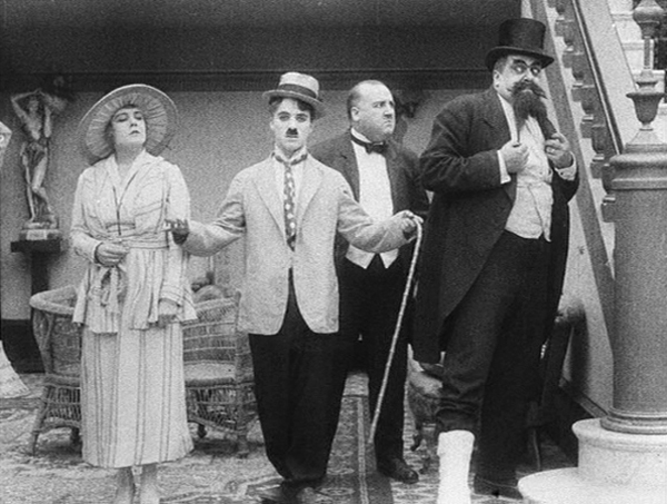
The Cure (1917)
Kristin here:
One occasional feature of our blog has been to point out new releases on DVD and Blu-ray, especially of titles that haven’t gotten much publicity. Some of these are easily available at major sources like Amazon, while others have to be ordered directly from their publishers, often abroad. But if you have a multi-standard player, don’t hold back. Ordering from abroad isn’t as intimidating as it might seem. Many sites have English-language sales pages.
We’ve done a lot of these entries by now. You can find them through the DVD category in the list at the right, but I thought it might be useful to give links to all of them here, with brief indications of what each deals with. Some of the DVDs are probably out of print by now, but in this era of eBay and third-party sellers, one can usually track down such things. Then I’ll give a rundown on some recent releases.
The first was Dispatch from the Land of the Long White Cloud, written when David and I were fellows at the University of Auckland in May, 2007. I discussed some of the DVDs of New Zealand films that I had found in stores there. Some are famous, some obscure.
2008 was either a great year for DVDs or we just had more time to deal with them. On January 18, I posted Tracking down Aardman creatures, a guide to the classic animated films of Nick Park, Peter Lord, and their colleagues at Aardman. At the time it was probably the most complete information one could get on these films. Of course, Aardman has gone on to make other films and TV series, but this was the studio’s golden age. On February 1, I described with two boxed sets dealing with early sound films in All singing! All dancing! All teaching! As the title implies, these are a boon to film teachers, as well as buffs and researchers. In Coming attractions, plus a retrospect (June 6), David discussed the release of Robert Reinert’s very peculiar silent film, Nerven, and in Summer show and tell (July 28, 2008), he briefly dealt with a miscellaneous set of DVDs and books that we discovered during our annual visit to Il Cinema Ritrovato and other destinations. On December 10, in Preserving two masters, I discussed the restored version of Lubitsch’s Das Weib des Pharao (which at that point wasn’t out on DVD) and a Walter Ruttmann set.
2009 was a pretty good year, too. On February 18, I wrote about the Flicker Alley release of Abel Gance’s influential classic La roue, including historical background on the film, in An old-fashioned, sentimental avant-garde film. David took the occasion of of a new Criterion boxed set to summarize the work of the fine Japanese director Shimizu Hiroshi (May 9). On May 21, in Forgotten but not gone: more archival gems on DVD, I described two major boxed sets, one of Lotte Reiniger’s lovely but seldom-seen fairy-tale shorts, and one of early Belgian avant-garde cinema–and yes, the early Belgian avant-garde cinema includes some important titles. On August 2, David again caught up with the mixed batch of DVDs and books picked up in Europe over the summer or sitting in the stack of mail upon his return, in Picks from the pile. Finally, on November 9 I discussed the British release of Dreyer’s Vampyr with a very worth-while commentary track by Guillermo del Toro, who said, among other things, “I am not Carl Dreyer, and I should shut up.”
In February of 2010, I wrote DVDs for these long winter evenings, dealing with three sets with the work of three crucial filmmakers: Georges Méliès, Ernst Lubitsch (most of the German features), and Dziga Vertov. In October, it was More revelations of film history on DVD: a documentary on Veit Harlan, a new series of Soviet silent films, and the Flicker Alley set of Chaplin’s Keystone films. (For the follow-up, see below.) On November 28, Silents nights: DVD stocking-stuffers for those long winter evenings covered little-known Norwegian and Danish silents, a rare Expressionist film, Ford’s The Iron Horse, hilarious Max Davidson comedies, and the Kalem company.
For some reason it was a full year before we posted more DVD coverage in our second Christmas-gift-themed entry, Classics on DVD and Blu-ray, in time for a fröliche Weihnachten! (November 29, 2012). It probably took us that long to get through all the discs we picked up in Bologna and elsewhere. The title reflects the heavily German coverage: early Asta Nielsen films, Pabst’s first feature, the release of Das Weib des Pharao on DVD and Blu-ray, as well as the 1939 Hollywood version of The Mikado.
Earlier this year, on June 20, we posted our most recent DVD/Blu-ray entry, Recovered, discovered, and restored: DVDs, Blu-rays, and a book. It deals with a burst of releases of Norwegian silent films, a new entry in the “American Treasures” archive series, and some American films, famous and obscure.
Now more DVDs are piling up, and the time seems ripe for a third set of holiday-present suggestions, to give or hope to receive.
Caligari, restored at last
In our survey of the ten best films of 1920, I mentioned that Das Cabinet des Dr. Caligari was one of the films that lured me into film studies during my undergraduate days. I know it very well. I was tempted to go to one of the screenings of the recent restoration this year at Il Cinema Ritrovato, but it was opposite other films I had never seen before, so I passed it up. Luckily now Kino Lorber has brought that restoration out on DVD and Blu-ray (sold separately).
The negative of Caligari does not survive in its entirety, but the restoration has taken the usual steps to fill it in and provide authentic tinting. The information comes from titles at the beginning of the DVD print:
The 4K restoration was created by the Friedrich-Wilhelm-Murnau-Stiftung in Wiesbaden from the original camera negative held at the Bundesarchiv-Filmarchiv in Berlin. The first reel of the camera negative is missing and was completed from different prints. Jump cuts and missing frames in 67 shots were completed by different prints.
A German distribution print is not existing. Basis for the colours were two nitrate prints from Latin America, which represent the earliest surviving prints. They are today at the Filmmuseum Düsseldorf and the Cineteca di Bologna.
The intertitles were resumed from the flashtitles in the camera negative and a 16mm print from 1935 from the Deutsche Kinematek-Museum für Film und Fernsehen in Berlin.
The digital image restoration was carried out by L’Immagine Ritrovata-Film Convservation and Restoration in Bologna.
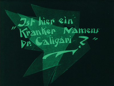
The images are definitely clearer, with more detail visible than in prints I have seen before, and the film runs more smoothly. An inauthentic intertitle has been removed. In most prints, when the grumpy town clerk hears that Caligari wants a permit to exhibit a somnabulist, he calls him a “Fakir” and turns him over to his underlings to deal with. That title is now gone, and it’s clear that Caligari is annoyed at the man’s disdainful attitude rather than a specific insult. The intertitles have their original jagged, Expressionistic graphic design (see above) rather than the plain backgrounds used in many prints hitherto available.
There are optional English subtitles. The modernist musical track fits well with the film.
The supplements include a short essay which I provided and a documentary, Caligari: How Horror Came to the Cinema. The restoration is also available from Eureka! in the United Kingdom, with a different set of supplements and with DVD and Blu-ray sold together.
Flooded by flickers
If you want a lot of good laughs and have 1005 minutes to spare, Flicker Alley’s “The Mack Sennett Collection Volume One” offers 50 restored shorts which Sennett acted in, wrote, directed, and/or produced. (This 3-disc set is available only on Blu-ray.)
The films are presented in chronological order, starting with a 1909 comic short directed by D. W. Griffith at American Biograph and starring Sennett, The Curtain Pole. Two comedies directed by Sennett at American Biograph follow. In 1912 he founded Keystone, represented starting with The Water Nymph (1912) and ending with A Lover’s Lost Control (1915). In 1915 Sennett became one of the three points in the Triangle Film Corporation, along with co-founders Griffith and Thomas Ince. Keystone continued operating as Triangle Keystone, and films from that production unit from 1915 to 1917 are included. At that point Sennett went independent as Mack Sennett Comedies, making mainly two-reelers, beginning in this collection with Hearts and Flowers (1919) and running to The Fatal Glass of Beer (1933). See here for a complete list of titles. Each of the three discs contains a group of films as well as a set of bonuses at the end.
Sennett built a team of excellent comedians, including at various points Ben Turpin, Chester Conklin, Charlie Chaplin, Ford Sterling, Wallace Beery, Louise Fazenda, Mabel Normand, and others. The action typically moves at a breakneck pace, and the editing is similarly fast. Being able to go back and watch some of these routines again, perhaps in slow motion, is ideal for making sure you catch every throw-away gag.
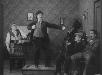
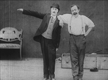
A Clever Dummy shows off the dexterity of the cross-eyed Turpin. Two inventors build a mechanical dummy, modeling “him” on the janitor played by Turpin. At first the dummy is a rather cheap-looking fake, but Turpin plays him in some scenes and the janitor in others. Then he decides to masquerade as the dummy, and his antics persuade some vaudeville agents to buy him for their show (left below). Once in the theater, he defies a stagehand’s (Conklin) efforts to make him stand quietly (right):
Savor these a few at a time, and you’ll have entertainment for months to come.
Of course, some of that 1005-minute total comes in the bonuses. There are newsreel and television appearances by Sennett, including “This Is Your Life, Mack Sennett” (1954) and a half-hour radio appearance on the Texaco Star Theater in 1939.
Back in 2007, we posted an entry called Happy Birthday, Classical Cinema!, where we explained how the guidelines and techniques that came to underpin what we now call classical Hollywood cinema came together in 1917. At the end we offered a list of the ten best films of that year, and thus inadvertently our annual ninety-year celebration, “The ten best films of …” came into being. On it were two Charlie Chaplin films, The Immigrant and Easy Street.
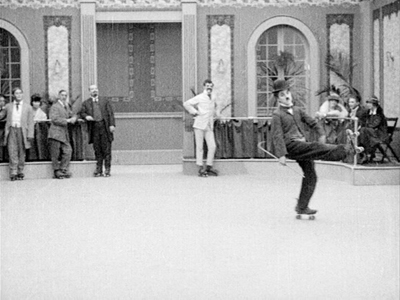
They were both made during the third phase of Chaplin’s career, when he had left Keystone and gone first to Essanay and then to Mutual. Those who find the pathos in many of Chaplin’s films from the 1920s onward might plausibly consider his Mutual period to be the height of his career. The twelve films are not all equally brilliant, however. One watches Chaplin developing a better sense of story-telling to go with the slapstick. The Rink comes across as two one-reelers stitched together. In the first half having Charlie does a fairly conventional waiter schtick, but when he visits a rink on his lunch-hour, the films moves into high gear as he performs a dazzling set of moves on skates:
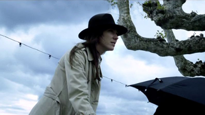
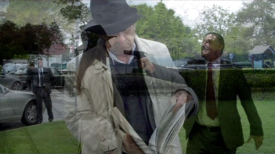
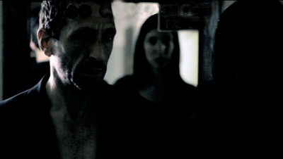
Other films show Chaplin learning to make a sustained, tight story built of non-stop gags, none more skillfully than The Cure. An alcoholic forced into a sanatorium evades all attempts to make him shape up while charmingly defending the heroine from an offensive, gout-ridden villain (see top, where all involved briefly strike a pose).
Flicker Alley has released a steelbox commemorative set of five discs, two Blu-ray and three DVD, to celebrate the centenary of Chaplin’s first appearance as the Little Tramp–though of course that appearance had been made at Keystone.
For a list of film titles and bonus features, see here.
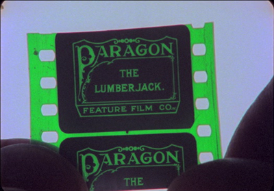
If these sets contain some of the most famous films and performers of their day, another recent Flicker Alley release, We’re in the Movies: Palace of Silents & Itinerant Filmmaking, turns to some of forgotten and obscure offerings of the silent era: films made in small towns by independent regional producers, using local citizens for their casts. Earlier this year, David wrote about Wheat and Tares, a 1915 film made in his home town by the Penn Yan Film Corporation. That’s not one of the locally made films included in We’re in the Movies, but this two-disc set (both DVD and Blu-ray) does contain The Lumberjack, a short film made in Wausau, Wisconsin and discovered in the early 1980s by Stephen Schaller, then a graduate student in film studies here at the University of Wisconsin-Madison.
Schaller didn’t just discover the film. He created a lovely, poignant documentary, When You wore a Tulip and I Wore a Big Red Rose (1983), about the making of the film and the history of the one print and how it survived. He tracked down and interviewed several elderly people who had been involved with its making. These included Florence Gilbert Evans, the only surviving cast member, and relatives and friends of others “actors.” At intervals throughout the film, he interviews Louise Elster, who had accompanied silent films on piano in local theaters. She provides a lively commentary on such accompaniments and plays examples as skillfully as she must have done in the day. (Modern-day silent-film accompanists might find many tips from this documentary.)
The only problem with the film is that no identifying titles are superimposed to tell us who these people are, and often their names are not mentioned in the interview excerpts included. One has to struggle at times to figure out who the speakers are and what they had to do with The Lumberjack. Names are only given in the final credits, and even then their connections to the film are not specified. Still, the story of the film’s making comes together clearly enough.
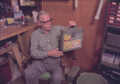
Schaller reenacts the finding of the film itself in a scene with Robert S. Hagge. Hagge, who apparently worked at the Grand Theater, where the sole print resided until 1946, when he took it to his home:
The poignancy of The Lumberjack‘s history emerges gradually as we get to know those involved and their histories. One of the producers was accidentally killed during a quarry explosion staged for the film. Settings shown in the movie are compared with the current appearances of the same places, with some beautiful old buildings preserved and others replaced by bland modern structures. There is a hint that the making of the film created an excitement that transformed the lives of the Wausau citizens involved. When You Wore a Tulip and I Wore a Big Red Rose illustrates the power of even the most modest of films and the inevitable losses caused by the passage of time.
The set also includes a 2010 documentary, Palace of Silents: The Silent Movie Theater in Los Angeles, devoted to a theater built in 1942 and dedicated for over 68 years to showing silent films. The rest of the contents are The Lumberjack and other early local films.
These films strike me as an excellent way of intriguing students and film fans about the silent era of the movies.
Oktoberfest as seen through the movies
I was somewhat surprised to see the new two-DVD set in the Filmmuseum München series: Oktoberfest München 1910-1980. It’s an interesting approach, gathering together the surviving films about a single annual event, Munich’s famous Oktoberfest. As the accompanying booklet points out, the Oktoberfest was a venue where early traveling exhibitors set up their tents to show movies, though little documentation of these shows survives. No one knows when the first films about or set at the festival were made. The earliest one to survive is from 1910.
Oktoberfest was and is more than beer-drinking. There are parades, rides, and various fairground activities as well.
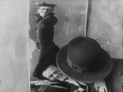
To many film historians, one of the attractions of this collection will be a film starring the comedian Karl Valentin, Valentin auf der Festwiese. The nominal plot involves Valentin taking his wife to the festival while planning to meet his mistress there and sneak away. This story gets shunted aside for most of the film’s length, however, as the couple wander through various sideshow tents. We see their grotesque reflections in a fun-house mirror (above), and the camera perches in a ferris-wheel seat to record the long-delayed confrontation of wife and mistress.
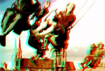
One curiosity of the set is a 3D film from 1954, Plastischer Wies’n-Bummel. The analglyph 3D glasses (red and cyan) required for the effect are included in the set. I found it something of an effort to resolve the 3D in many shots, but there are some dramatic depth effects involving balloons and some fairground swings that work quite well:
The booklet is in German, English, and French, and there are optional subtitles in English and French. The DVD set can be ordered online here.
Making a list, Czeching it twice
When we were in Prague this summer, Michal Bregant, head of the National Film Archive, gave us some books and DVDs related to early Czech animation.
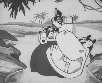
One was a catalog published by the archive, Czech Animated Film I 1920-1945 (2012, bilingual in Czech and English), with a short historical introduction and descriptions of all the known films of the period. It relates to a two-DVD set, Český animovaný film 1925-1945 (Czech animated film). This delightful collection contains 30 shorts and has optional English subtitles. Some of the cartoons are outright imitations of American series of the day, such as Hannibal in the Virgin Forest (1932), clearly inspired by early sound cartoons from Disney and Warner Bros.:
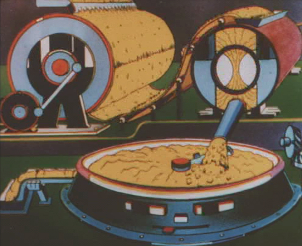
There are also two early György Pál (later aka George Pal) cartoons. Many of the shorts, though, are advertisements. As in other countries where major filmmakerss like Len Lye were doing inventive work for ads, Czech animators came up with some amazing images. Margarine never looked as good as in Irena and Karel Dodal’s 1937 Gasparcolour short for the Sana brand, The Unforgettable Poster (see bottom).
The Dodals were the most important Czech animators of this era, as is shown in a well-illustrated biography, The Dodals: Pioneers of Czech Animated Film, by Eva Strusková (published by the National Film Archive in 2013). It’s in English and comes with a DVD. (There is some overlap between its contents and those of the two-disc set.)
Both are musts for animation experts and fans. The Dodals is available from Amazon. The DVD set won as “Best Re-discovery 2012/13” at the Il Cinema Ritrovato awards last year. It and the catalog can be ordered directly from the National Film Archive website or from a specialized cinema shop in Prague, Terry Posters (this link takes you to the English-language version of the site).
The Unforgettable Poster (1937)
Say hello to GOODBYE TO LANGUAGE
DB here:
Godard is making trouble again. Adieu au langage–known now as Goodbye to Language– is doing better in the US than any of his films have done in the last thirty-some years. It has a per-screen average of $13,500, which is about twice that attained by Ouija in its opening last weekend.
But that average represents only two screens, and it’s going to be hard to expand because Goodbye to Language is in 3D. Many art houses would love to play it, but they lacked the money to upgrade to 3D during the big digital conversion of recent years. Even high-powered venues in New York, Los Angeles, and Chicago don’t have 3D installed. Here in Madison we’re showing it as a benefit for our Cinematheque. But the film’s prospects may be brightening.
Re-seeing it (twice) at the Vancouver International Film Festival back in September, I was struck by a few more ideas about it. Kristin and I avoid listicles, but after writing an expansive entry on the film, all I’ve got at this point is some scattered observations. Two ragtag comments are semi-spoilers, and I’ll warn you beforehand.
The Power of post As far as I can tell, Godard hasn’t used the converging-lens method to create 3D during shooting. Instead of “toeing-in” his cameras, he set them so that the lenses are strictly parallel. He and his DP Fabrice Aragno apparently relied on software to generate the startling 3D we see onscreen.
This reminds me that postproduction has long been a central aspect of Godard’s creative process. Of course he creates marvelous shots while filming, but ever since Breathless (À bout de souffle, 1960), when he yanked out frames from the middle of his shots, he has always made post-shooting work more than simply trimming and polishing. His interruptive aesthetic is made possible by editing that wedges in intertitles (sometimes the same one several times). He breaks off beautiful shots and drops in bursts of music that snap off just before they cadence.
In both sound and image, the post-production process for Godard is a kind of transformation, an openly admitted re-writing of what came from the camera. He slaps graffiti on his own film. In Narration in the Fiction Film, I argued that our sense of a Godard film being “told” or narrated by the director proceeds partly from his ability to create the impression of a sort of Cineaste-Emperor, a sovereign master who is governing what we see and hear at any given moment. The collage principle suggests someone behind the scenes pasting these fragments together. Not only his commentary (once whispered, now croaked) but every shot-change and bit of music and noise, every intertitle and look to the camera all bear witness to Godard as God. Before he cut a strip of film; now he twiddles a knob or guides a slider. In all cases, we still feel his playful, exasperating hand.
Godard’s famous collage aesthetic relies on aggressive changes to image and sound in postproduction that all but deface the surfaces of his movie. No surprise, then, that Godard 3D lays out those surfaces boldly, with distant planes sharply edged and volumes that stretch out before us.
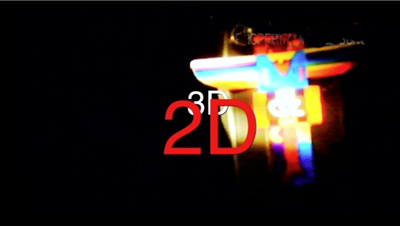
Yet with his superimposed titles, sometimes hovering among the audience, he can flatten volume and stack up planes like playing cards. It’s partly a joke that the 2D title below is closer to us than the 3D one behind it, but even that sticks out further than the unidentifiable light array that is farthest away.
The Rule and the exception. Just as Hollywood cinema erected rules for plotting, shooting, and editing, it has cultivated rules for “proper” 3D filming. An informative piece by Bryant Frazer points out some ways that Godard breaks those rules. Still, just calling him a maverick makes him sound merely willful. Part of his aim is to explore what happens if you ignore the rules.
This is Godard’s experimental side: He considers what “good craftsmanship” traditionally excludes, just as the Cubists decided that perspective, and smooth finish, and other features of academic painting blocked off some expressive possibilities. To get a positive sense of what he’s doing, we need to understand what the conventional rules are intended to achieve. Consider just two purposes.
1. 3D, the rules assume, ought to serve the same function as framing, lighting, sound, and other techniques do: to guide us to salient story points. A shot should be easy to read. When 3D isn’t just serving to awe us with special effects, it has the workaday purpose of advancing our understanding of the story. So, for instance, 3D should use selective focus to make sure that only one figure stands out, while everything else blurs gracefully.
But 3D allows Godard to present the space of a shot as discomfitingly as he presents his scenes (elliptical, they are) and his narrative (zigzag and laconic, it is). As in traditional deep-focus cinematography, we’re invited to notice more than the main subject of a shot, but here those piled-up planes have an extra presence, and our eye is invited to explore them.
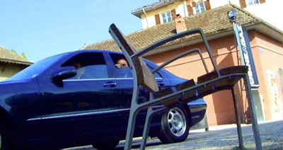
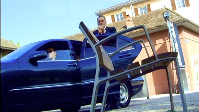
2. According to the rules, 3D ought to be relatively realistic. Traditional cinema presents itself as a window onto the story world, and 3D practitioners have spoken of the frame as the “stereo window.” People and objects should recede gently away from that surface, into the depth behind the screen. But Adieu au langage gives us a beautiful slatted chair, neither fully in our lap nor fully integrated into the fictional space. It juts out and dominates the composition, partly blocking the main action–a husband bent on violence hustling out of his car.
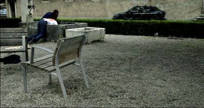
That chair, or one of its mates, reappears, usually with greater heft than the human characters shoved nearly out of sight behind it.
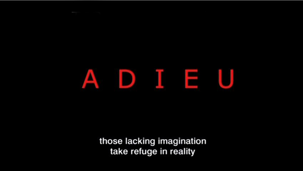
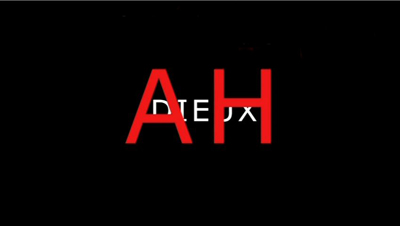
In sum, visual realism of the Hollywood sort is only one mode of moviemaking. Godard lets us know from the very start that he’s after something else. The film’s first title announces: “Those lacking imagination take refuge in reality.” Goodbye to Language is an adventure of the imagination.
Innovation, intractable. Godard has been around so long that some of his innovations—jump-cuts, interruptive intertitles—have become common in mainstream movies. But there remains an intractable core that is just too difficult to assimilate, and he has always been a few jumps ahead of people who want to de-fang his experiments.
Supposedly Picasso told Gertrude Stein: “You do something new and then someone comes along and makes it pretty.”
A fresh eye. French thinkers have long pondered the possibility that language separates us from the world. It drops a kind of scrim that keeps us from seeing things in their innocent purity. Given the film’s title, I suggested in an NPR interview that Godard’s use of 3D, along with the insistence on the dog Roxy, is aiming to make us perceive the world stripped of our conceptual constructs (language, plot, normal viewpoints, and so on). Personally, the idea that language alienates us from some primordial connection to things seems to me implausible, but I think it’s a central theme of the film. This very talky movie exploits a paradox: we must use language to say goodbye to it.
Learning curve. Critics put off by Godard, I think, have too limited a notion of what criticism is. They seem to think that their notion of cinema, fixed for all time, is a standard to which every movie has to measure up. They are notably resistant to a simple idea: We can learn something from films. Not only can we learn things about life but we also learn things about cinema. We learn things that we never realized that film can do.
But then, how many critics actually want to learn something about cinema, which can only happen the way we learn anything: by wrestling with something that strikes us as difficult?
Two soft spoilers ahead!
On re-viewing, I was struck by other ways in which the two long parallel stories echo one another: a big bowl of flowers, later one of fruit; the repetition of “There is no why!”; and an odd colorless or nearly colorless image of each principal woman.
As with so much else in the film, Godard posits his own slippery version of a parallel-universe plot, and this overall formal option is underscored by these stylistic choices. In the first prologue, the woman on the left above is also given to us in a color shot, as if the disparity color/black-and-white points ahead to the nearly black-and-white color shot to come.
The (apparent) deaths of the principal men are rendered very obliquely, but apparently out of story order. This juggling with chronology, a staple of modern cinema, is fairly rare in Godard, at least as I recall.
Clearly, 3D is becoming something we cinephiles need to face up to. I balked at the beginning, but I’ve come around. Important filmmakers like Godard, Herzog, and Wenders are working with it. Just as important, we’ve never until now been able to study 3D movies closely. I remember watching Bwana Devil and others on a flatbed in the Library of Congress in the early 1980s, but if I stopped on any frame, I couldn’t tell what the 3D effect was like. Of course any 2D print of a classic 3D title represents only one camera’s view.
The victory of digital projection yielded a benefit I hadn’t foreseen when I wrote Pandora’s Digital Box. After Dial M for Murder came out in BD in 2012, I realized I needed to upgrade. We bought a bargain TV and BD player just when 3D TV had been declared dead. Now our 3D collection has expanded to include Hong Kong titles as well as favorites like Wreck-It Ralph, Gravity, and A Very Harold and Kumar 3D Christmas. Costs of 3D discs are sometimes low, and while you need a bigger monitor than we have to approach the force of a big-screen viewing, we can at least study a director’s use of the format frame by frame.
So for viewers who can’t get to Goodbye to Language in theatres but who have a 3D TV may take heart: Kino Lorber will be releasing a 3D Blu-ray disc.
Vadim Rizov has a brief but intriguing interview with Aragno in Filmmaker Magazine. “”Hollywood says you shouldn’t have more than six centimeters between cameras, so I began at twelve to see what happened.” Obviously a simpatico collaborator.
I discuss aspects of Hitchcock’s use of 3D in Dial M for Murder here.
P.S. 4 November 2014: The distribution of Goodbye to Language has become a cause célebre. Justin Chang surveys the situation in Variety.
P.P.S. 13 November 2014: Geoffrey O’Brien’s enthusiastic appreciation of the film not only illuminates it but conveys the excitement of seeing it.
P.P.P.S. 14 November 2014: Two more thoughts, after seeing the film again last night at our Cinematheque screening. First, the “unidentifiable light array” I mention above is actually on the cover of the French edition of A. E. Van Vogt’s The World of Null-A shown later in the film. Second, this time I noticed that the war imagery in the film’s first part subsides in the second, to be replaced, it seems, by Roxy’s wanderings–a more lyrical, peaceful counterweight to the horrors invoked earlier. The pivot would seem to be the first helicopter crash at the end of the first part. There among the flaming ruins we can see the burned head of a dead dog. Roxy’s proxy? Anyhow, the original survives, exuberantly, in the film’s second long part.
Goodbye to Language.
ADIEU AU LANGAGE: 2 + 2 x 3D
Adieu au langage (2014).
DB here:
Godard’s Adieu au Langage is the best new film I’ve seen this year, and the best 3D film I’ve ever seen. As a Godardolater for fifty years, I’m biased, of course. And I might feel that I have to justify taking a train from Brussels to Paris to watch it (twice). But the film seems to me superb, and it gets better after several more (2D) viewings.
People complain that Godard’s movies are hard to understand. That’s true. I think they provide two different sorts of difficulty. He lards his dialogue and intertitles with so many abstract (some would say pretentious) thoughts, quotations, and puns that we’re tempted to ask what he is implying about us and our world. That is, he poses problems of interpretation—taking that to mean teasing out general meanings. What is he saying?
I think that this type of difficulty is well worth tackling, and critics haven’t been slow to do it. Scholars have diligently tracked the sources of this image or that barely-heard phrase. Adieu au langage provides another field day; there are movie clips, some quite obscure, and citations (maybe some made-up ones) to thinkers from Plato and Sartre to Luc Ferry and A. E. van Vogt. Ted Fendt has discovered a massive list of works cited in the film, and even his list, he acknowledges, is incomplete.
I confess myself less interested in interpretive difficulties. I don’t go so far as my friend who says, “Godard is a poet who thinks he’s a philosopher.” But I do think that he uses his citations opportunistically, scraping them against one another in collage fashion. In particular, I think that by having characters quote, quite improbably, deep thinkers, he’s trying for a certain dissonance between the abstract idea and the concrete situation.
What situation? That brings us to the second sort of difficulty. It’s often rather hard to say just what happens, at the level of plot, in a Godard film. From his “second first film,” Sauve qui peut (la vie) (1980), “late Godard” (which has lasted over thirty years, much longer than “early Godard”) has made the story action quite hard to grasp. Oddly enough, most reviewers pass over these difficulties, suggesting that story actions and situations that we scarcely see are fairly obvious. (Reviewers do have the advantage of presskits.)
The brute fact is that these movies are, moment by moment, awfully opaque. Not only do characters act mysteriously, implausibly, farcically, irrationally. It’s hard to assign them particular wants, needs, and personalities. They come into conflict, but we’re not always sure why. In addition, we aren’t often told, at least explicitly, how the characters connect with one another. The plots are highly elliptical, leaving out big chunks of action and merely suggesting them, often by a single close-up or an offscreen sound. Godard’s narratives pose not only problems of interpretation but problems of comprehension—building a coherent story world and the actions and agents in it.
We ought to find problems of comprehension fascinating. They remind us of storytelling conventions we take for granted, and they push toward other ways of spinning yarns, or unraveling them.
Case in point: Adieu au langage.
Since the film will be appearing in the US this fall, under the title Goodbye to Language, I want to encourage people to see this extraordinary work. But I’m also eager to talk about it in detail. So here’s my compromise, a four-layered entry.
I’ll start general, with some sketchy comments on some of Late Godard’s narrative strategies. In a second section I make some speculative comments on Godard’s use of 3D. No real spoilers here.
Then I’ll offer an account of the opening fifteen minutes. If you haven’t yet seen the film, this section might be good preparation. But part of experiencing the film is feeling a bit at sea from the start, so this section might make the film more linear than it would appear on unaided viewing. You decide how much of a preview you want.
The last section briefly surveys the overall structure of the film, and it is littered with spoilers. Best read it after viewing.
Spoilers notwithstanding, nothing stops you from eyeing the pictures.
Ecstasy of the image
Film Socialisme (2010).
Much in Adieu au langage is familiar from other Godard films. There are his nature images–wind in trees, trembling flowers, turbulent water, rainy nights seen through a windshield–and his urban shots of milling crowds. All of these may pop in at any point, often accompanied by fragments of classical or modern music. Again he returns to ideas about politics and history, particularly World War II and recent outbreaks of violence in developing countries. His standard techniques are here too. The film begins before, and during, the credits, which appear in brusque slates often too brief to read. Music rises, often just enough to cue an emotional response, before being snapped off by silence or an abrasive noise.
In his narrative films, as opposed to the collage essays like Histoire(s) du cinéma, we get scenes, but those are handled in unusual ways. He tends to avoid giving us an establishing shot, if we mean by that a shot which includes all the relevant dramatic elements. He often has recourse to constructive editing, which gives us pieces of the space that we are expected to assemble. Although Godard’s early films relied on this a fair amount, it became pronounced in his later work, where he tweaks constructive cutting in unusual ways. I discuss one example here.
Often we get an image of one character but hear the dialogue of an offscreen character. And the shot of the lone character may hang on quite a while, so that we wait to see who’s speaking. By delaying what most directors would show immediately, Godard creates, we might say, a stylistic suspense. I can’t prove it, but I suspect the influence of Bresson, who said to never use an image if a sound will suffice.
When Godard doesn’t give us unanchored close-ups or medium-shots, he may do something more drastic. A signature device of his later work is the shot which stages its action in ways that make the characters hard to identify. He may shoot in silhouette (Notre musique, 2003).
More outrageously, he may frame people from the neck or shoulders down (Bresson again?) and make us wait to discover who they are (Éloge de l’amour).
Such decapitated framings are disconcering, since orthodox cinema highlights faces above all other body areas. When we can’t access facial expressions, then the dialogue, gestures, postures, and clothes become very important. Godard can, of course, combine these strategies (below, Éloge de l’amour; also the Film Socialisme image above). In this shot, the man standing in the background is an important character but we never see him clearly.
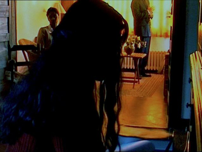
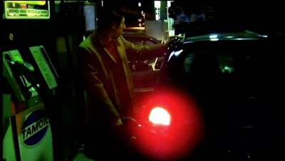
Godard’s opaque “establishing” shots may be very condensed and laconic; he jams in a lot of information, partial though it is. In one shot of Adieu au langage, a dog approaches a couple on a rainy night and the woman urges her partner to take him in. All we see, however, is the man gassing up the car (and we don’t see him all that clearly).
We hear (dimly) the dog’s whimpering and the woman’s plea, but we see neither one.
Godard frets and frays his scenes in other ways. He creates ellipses, time gaps between shots that may leave us uncertain. What happened in the interval? How much time has passed? He also interrupts the scene through cutaways to black frames, objects in the scene, or landscapes; the scene’s dialogue may continue over these images, or something else may be heard.
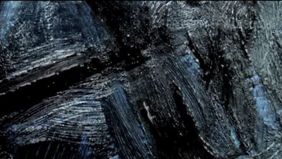
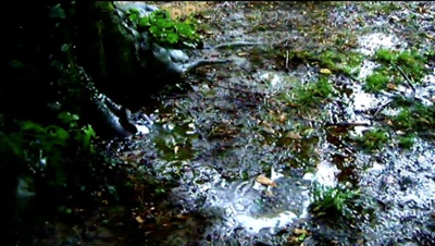
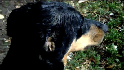
At greater length, the scene can open up onto a digression, a collage of found footage, intertitles, or other material that seems triggered by something mentioned in the scene. In Film Art: An Introduction, we argued that one alternative to narrative form is associational form, a common resource of lyrical films or essay films. Godard embeds associational passages in his narratives, the way John Dos Passos embedded newspaper reports in the fictional story of his USA trilogy. Sometimes, though, the associations are textural or pictorial. At one point in Adieu au langage, Godard associates licked black brushstrokes on a painting with churned mud and the damp streaks on the coat of the dog Roxy.
By fragmenting his scenes, Godard gets a double benefit. We get just enough information to tie the action together somewhat, and our curiosity about what’s happening can carry our narrative interest. But the opaque compositions and the bits and pieces wedged in call attention to themselves in their own right. Blocking or troubling our story-making process serves to re-weight the individual image and sound. When we can’t easily tie what we see and hear to an ongoing plot, we’re coaxed to savor each moment as a micro-event in itself, like a word in a poem or a patch of color in a painting.
But those images and sounds can’t be just any image or sound; they hook together in larger patterns that sometimes float free of the plot, and sometimes work indirectly upon it. The best analogy might be to a poem that hints at a story, so that our engagement with the poetic form overlaps at moments with our interest in the half-hidden story.
Where, some will ask, is the emotion? We want to be moved by our movies. I suggest that with Late Godard, we are mostly not moved by the plot or the characters, though that can happen. What seizes me most forcefully is the virtuoso display of cinematic possibilities. The narrative is both a pretext and a source of words and sounds, forms and textures, like the landscape motifs that painters have used for centuries. From the simplest elements, even the clichés of sunsets and rainy reflections, the film’s composition, color, voices, and music wring out something ravishing.
We are moved, to put it plainly, by beauty–sometimes exhilarating, sometimes melancholy, often fragmentary and fleeting. Instead of feeling with the characters, we feel with the film. For all his exasperating perversities, Godard seeks cinematic rapture.
3D on a budget
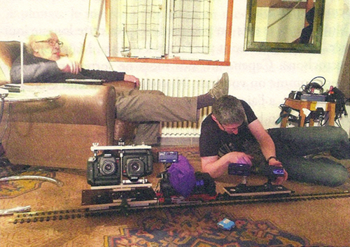
The smallest set of electric trains a boy ever had to play with? Photo: Zoé Bruneau.
Most of the 3D films I’ve seen strike me as having two problems.
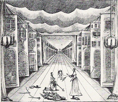
First, there is the “coulisse effect.” Our ordinary visual world has not only planes (foreground, background, middle ground) but volumes: things have solidity and heft. But in a 3D film, as in those View-Master toys, or the old stereoscopes, the planes we see look like like cardboard cutouts or the fake sections of theatre sets we call flats or wings (coulisses). They lack volume and seem to be two-dimensional planes stacked up and overlapping. Here’s an example from a German stage setting of 1655, with the flats painted to resemble building facades.
In cinema, the thin-slicing of planes seems to me more apparent with digital images that are rather hard-edged to begin with. (3D film was more forgiving in this respect.) Sometimes the flat look can be quite nice, as in Drive Angry (2011). In this action sequence, the planes prettily drift away from one another, with no attempt to suggest realistic space.
Apart from the coulisse effect, there’s the problem that the 3D impression wanes as the film goes along. I’ve long thought it was just me, but other viewers report perceiving the depth quite strongly at the start of the movie and then sensing it less after a while, and maybe not even noticing it unless some very striking effect pops up. Part of this is probably due to habituation, one of the best-supported findings in psychology. Maybe, as we get accustomed to this fairly peculiar 2.5D moving image, it becomes less vivid.
More than our perceptual habituation might be at stake. Filmmakers may reduce depth during certain scenes to save money on postrproduction effects. Some gags in A Very Harold and Kumar 3D Christmas (2011) rely on old-school, smack-in-the-eye, paddle-ball depth, but much of the middle of the film doesn’t employ it. By tipping up the glasses and checking how much displacement is in the image, I’ve been surprised to find that remarkably long stretches of 3D films have little or no stereoscopy.
My impression is that Adieu au langage has overcome the problems I mentioned. Granted, many of the shots have sharply-etched images that emphasize the thinness of each plane. But other shots have unusual volume. Several factors may contribute to this. Unusual angles sometimes give foreground elements a greater roundness. This happens in the low-angle tracking shots created by the toy-train rig shown above.
In addition, the relatively low resolution of some of the images avoids creating hard contours.The wavering blown-out softness may enhance volume.
Perhaps as well the slight tremors of the handheld camera mimic one of the factors that yield volume for our normal vision: the very slight movements of our head and body. Such shots shift the aspect enough to suggest the thickness of things.
Godard maintains the sense of depth in a tiny ways. For instance, he discovers that the crackling snow on a TV monitor can yield shimmering depth in the manner of Béla Julesz’s random-dot stereograms. Julesz sought to show that 3D vision wasn’t wedded to perspective cues or the identification of recognizable objects–a conclusion that ought to appeal to the painterly side of Godard.
Production stills indicate that Godard shot the film with parallel lenses. Instead of creating convergence by “toeing in” the lenses during filming, he and his crew played with the images in postproduction to control planes and convergence points. What they did exactly, I don’t know, but the results yield, for me at least, some strong volumes and a continual impression of depth that doesn’t wane.
I wish I could analyze the film’s 3D technique more exactly, but I don’t know enough about the craft of stereoscopic cinema or Godard’s creative process. What this film shows, however, is that 3D is a legitimate creative frontier. In the credits, as usual Godard brusquely lists his equipment, from the high-end Canon 5D Mark II (and Canon is proud to be associated with him) to small rigs like GoPro (in 3D) and Lumix. What is clear is that filming in 3D can be pictorially adventurous with cameras costing a few hundred dollars.
Nature, the ultimate metaphor
Now I’ll concentrate on the first few minutes, at the risk of potential spoilers.
The narrative in Adieu au langage is sketchy even by Godardian standards. Normally he gives us some characters in a defined situation (though it takes a while for us to grasp what that situation is), and a series of more or less developed dramatic scenes that advance a sort of plot. In Passion (1982) a movie director recreates famous paintings on film while a factory owner, his wife, and a worker get embroiled in his project. Detective (1985) carries us through a stay of several people at a luxury hotel. Je vous salue Marie (1985) gives us not one but two plots (Adam and Eve, Joseph and Mary). Éloge de l’amour follows a young writer in his exploration of art dealing and commercial filmmaking.
Adieu au langage doesn’t give us a plot even as skimpy as these. Instead, Godard builds his film out of a bold use of ellipsis and a strict patterning of story incidents. The ellipses are exceptionally cryptic. We must, for instance, eventually infer, on slight cues, that a couple has been together for at least four years, and that the man has stabbed the woman. We learn, with almost no emphasis, that both of the women have ties to Africa–hence the footage of street violence and the recurring question of how to understand that continent.
These very vague plot elements are arranged in a rigorous pattern. This patterning will seem very schematic in my retelling. But it’s not obvious when you see the film. Godard wraps his film’s grid in digressions, sumptuous imagery, and, of course, striking 3D effects.
To get a sense of both the firm architecture and the wayward surface, let’s look at the opening. The first fifteen minutes of Adieu au langage introduce in miniature what the rest of the film will be doing.
A montage of citations before the credits is followed by a fuzzy image of a neon sign. Now we get a sort of overture. Frantic video shots of a crowd under attack and running to a fire are followed by a clip from Only Angels Have Wings and a close-up of the dog identified in the credits as Roxy. That’s followed by a black frame dotted with points of white light. That image will become a little clearer later (stylistic suspense again). Then a title superimposes the numeral one in red with the word, “La Nature.”
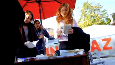
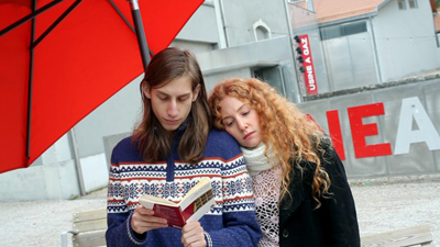
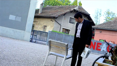
What ensues, after a shot of a ferry approaching a pier, is a fairly disjunctive scene. A booksellers’ table stands across the street from the Usine a Gaz, a cultural center in Nyon, Switzerland. People casually gather there: a redheaded woman (Marie), a young man in a sweater who seems to be the bookseller, a woman on a bicycle (Isabelle), and the older man Davidson (later identified as a professor), here seen from the rear.
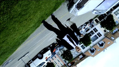
The cockeyed low-angle framing might make you think that this is Godard’s Mr. Arkadin, but it suggests footage from a camera or cellphone simply left tipped on some surface behind the table. In that respect it would make manifest the line in Éloge de l’amour: “The image, alone capable of denying nothingness, is also the gaze of nothingness upon us.”
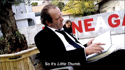
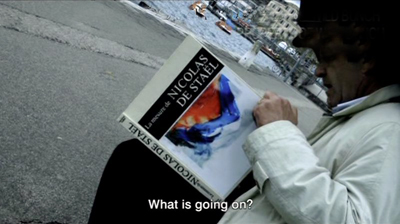
Soon Davidson is sitting in the street commenting on Solzenitsyn’s Gulag Archipelago as a “literary investigation.”
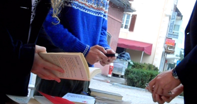
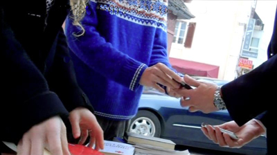
A question he asks Isabelle behind him leads to a punning exchange about the thumb (pouce) that we use on our phones, which leads to a question about Tom Thumb (Poucette), a pun on “push” (pousser), and the suggestion that digital icons are like Tom’s trail of pebbles to the giant’s castle. The little skein of associations knots in a remarkable shot of two pairs of hands tickling their mobiles while another person’s hands examine books.
As the men swap phones, a car coasts through the shot in the background.
This scenic fragment, suppressing faces that would help us identify characters, is characteristic of Godard’s approach in the whole film. He isolates gestures and surroundings, letting sound suggest the scenic action; and often the most important narrative action—here, the arrival of the car carrying a gunman—is a minor element in the frame.
So far, we’ve seen one of Godard’s strategies for hiding his story action: ellipsis. Time is skipped over (Davidson behind the table/ in a chair/ then perhaps behind the table), and bits of scenic action are omitted. There is also the opaque framing that impedes character recognition. What about digression? ? We’ve had one example in the Tom Thumb dialogue, but digression can be more overt. Godard can insert shots that have only a tangential narrative connection to the action.
The Godardian digression usually develops in a spreading web of associations that takes us on a detour. Here, one trigger seems to be the mention of Tom Thumb’s Ogre; another is the video display on the phones. These bits lead to a montage about Hitler, who, a woman’s voice reflects, left behind the belief that the state should handle everything. In a polyphony with the woman’s voice reflecting on Hitler, we get Davidson reflecting on how Jacques Ellul foresaw a good deal of the contemporary world. The associational links spread further, to images of the French revolution, crowds hailing Hitler, crowds at the Tour de France, and finally flowers and a voice reiterating a question at the scene’s start: How to produce a concept of Africa?
Now we’re back to the street, with the car pulling up. A chair that may have been Davidson’s is now empty. A man in a suit, the husband, emerges and lights a cigarette, looking off left. A woman, Josette, is in close-up—evidently the target of his look.
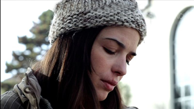
Since a black-and-white shot of Josette, head bent, was inserted in the Hitler montage, it’s possible that hers was the voice reciting the argument about the enduring trust in state authority. Perhaps she is reading? In any case, no sooner has a drama of sorts started than we get another digression. Marie reads aloud to us from a book held by the sweater boy. Again, the subject is state power and its inability to acknowledge its violence.
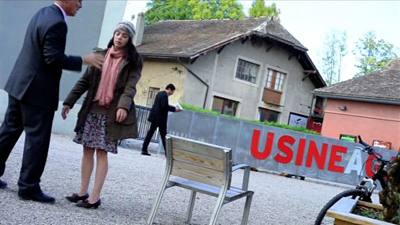
Domestic, not state-sponsored, violence is next on the agenda. A long shot shows the husband stalking up to Josette and berating her in German. The Usine sign is a big help in anchoring the action in the space we’ve seen, and Isabelle’s bike is visible on screen right.
Josette hangs stiffly on his arm, passively resisting and saying, “I don’t care.” He rushes out left. Gunshots are heard, and she jerks in spasmodic response. People rush through the frame. (We’ll never learn exactly what happened offscreen, though later there’s a hint that someone was shot.)
After the car has turned around and left in the way it came, Josette walks stiffly out of the frame. The man in the background who was startled by the husband’s abuse walks to the empty chair and pauses for a time to stare at it.
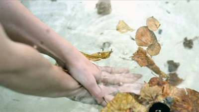
Cut to leaves floating on water, with hands washing and a man’s voice off saying: “I am at your command.”
So far, so Godardian. The narrative gist is that a woman has fled her husband, refused to return to him, and been approached by a different man who offers to join her. But the flow of images and sounds has made that gist very obscure, obliging us to absorb some fairly ravishing images and to listen to words, noises, and music as they form jagged, interruptive patterns.
And now something very unusual happens. Godard re-plays the events of “1-Nature” in a different location and time of year, using some new characters and some old ones.
A new section, “2” supered on “Metaphor,” appears. Its opening images run parallel to the overture that led up to “1.” After a shot of a swimmer (echoing the previous image of water), we get newsreel footage of combat and fire, and another film extract, this one from Les Enfants Terribles. A shot of Roxy along a river bank is followed by one of a hand opening and closing as a woman’s voice speaks of the “return” of language and a title repeats her insistence that she has made an image.
As at the start of “1,” the ferry comes toward the pier. And now we’re back with Davidson, now sitting along the edge of the water, again reading. His position and the tipped angle suggest a mirror-image of the earlier shot of him near the book table.
A link to the previous scene is provided when Marie and the sweater boy come to Davidson and say they’re going to America. The boy will study philosophy (obligatory quote from Being and Nothingness follows). Their conversation is interrupted by the arrival of the husband again, who shouts and fires his pistol. The shot announcing him is another skewed mirroring: his earlier entrance is inverted–again, as if a mobile phone’s camera had fallen.
The young couple flee and a woman, Ivitch, steps in to talk with Davidson. She shouts at the husband in German, “There is no why here!” ( a line that gets explained later in the film) and tells Davidson to ignore him. This moment offers a variant of the close shot of Josette when the husband had approached.
Ivitch asks Davidson, who evidently has been her professor during the previous term, questions about fighting unemployment by killing workers and about the difference between an idea and a metaphor.
In a new angle, Davidson meditates about images. As if to confirm the professor’s hunch that images murder the present, the husband lunges into the frame and yanks Ivitch out. We now get a shot in which the two cameras diverge: the left eye stays on Davidson, the right one pans over to Ivitch and the husband overlooking the lake. This offers a dense composition akin to that of the book-table shot, with figures piled on one another. The superimposition below is somewhat faithful to what we see, but it can’t convey your temptation to close one eye, then the other, in creating your own shot/reverse-shot editing.
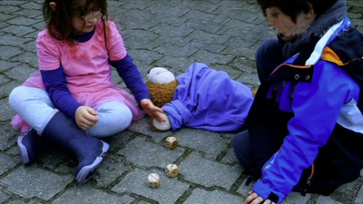
The husband paces around Ivitch, points the pistol, and hollers in German that she’s a dirty whore. She replies as Josette had: “I don’t care.” She walks back to Davidson on the bench, and shortly the husband strides back to the car waiting in the background. Davidson returns to Ivitch’s question about metaphor and then points out two kids playing with dice. These exemplify “the metaphor of reality.” Cut to the kids rolling three dice.
The image echoes Godard’s segment of 3 x 3D, where he puns on “D” as dés, or dice. The kiddies’ shot literalizes the metaphor: trois dés, 3D.
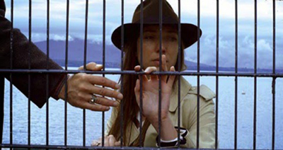
Finally we see Ivitch behind a grille, looking up, then down as we hear the ferry’s horn off. A man’s hand comes in from the left, voice off: “I’m at your command.”
This action repeats the end of the “1” section, but differently: There we saw Gédéon when he inspected Josette’s chair, and heard him say the same words over the leafy water shot. Here both the words and the face of the speaker, Marcus, are offscreen.
Again a woman is threatened by her violent husband and a man emerges to replace him. Again that action is occulted by verbal digressions, dislocated framings, and major characters–here, Marcus–not introduced in a normal fashion. Once more the separate pieces of the scene, straining to cohere, are pulled apart just enough to register as individual instants of beauty, shock, puns, metaphors, or just peculiarity.
Godard’s prospectus for Adieu au langage indicated: “A second film begins. The same as the first.” This describes, laconically, what we’ve seen in the first fifteen minutes. That parallel structure is laid out again with astonishing, yet mostly hidden, rigor in the film as a whole.
Two plus two
Maximal spoilers here.
Over the last thirty years or so, we’ve had plenty of films that replay sections of their stories. Sometimes that dynamic is motivated as time travel, as in Source Code or Edge of Tomorrow—“multiple draft” narratives that let characters, as in Groundhog Day, revisit situations until they master them. Sometimes the repetition has been motivated through varying point of view, so that we see the same action again, but from a different character’s perspective. Examples would be Go, Lucas Delvaux’s Trilogy, and Ned Benson’s recent Disappearance of Eleanor Rigby. Once in a while we get films that present the events as repeated but significantly and mysteriously different. This is what happens in some Hong Sang-soo films, such as The Virgin Stripped Bare by Her Bachelors, as well as in Lee Kwangkuk’s Romance Joe.
In all, this is a minor but important convention of modern screenplays. The replay plot is common enough for screenwriting guru Linda Aronson to consider it separately in her book The 21st Century Screenplay. Trust Godard to take this emerging norm and fracture it.
The opening I’ve just considered invites us to see the film as split into two storylines. Godard has explored duplex construction before, in Éloge de l’amour (with the second part in color video) and Film Socialisme (with its third “movement” appended to two long sections). Yet Adieu au langage offers something different.
Here we have multiples of two: a prologue bookended by an epilogue, the two opening parts that are mirrors of each other, and then two long sections that are uncannily symmetrical. Those sections continue the stories sketched out in the opening section. Each plotline bears the same title as before, but now presented in different graphics (the number and the words are not superimposed, but presented in separate title cards). What’s remarkable is the precise parallels and echoes set up between the pair of tales.
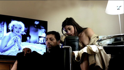
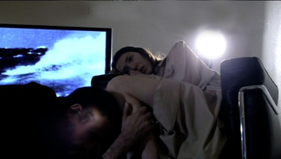
The couples were cast with resemblances in mind, and this affinity is expanded through rather precise doubling. Nearly every scene in the plotline of Josette and Gédéon has its counterpart in the one featuring Ivitch and Marcus. Two nude scenes, two toilet scenes, two bloody-sink scenes, two mirror scenes, two movie-on-TV scenes. There are parallel sequences of driving in the rain, of a woman fleeing into a forest, of Roxy wandering in the woods, of helicopters crashing, of men dying in fountains. As we saw in the early 1/2 segments, the shots’ framings often echo one another.
Godard has laid bare the device in the second story, when Marcus and Ivitch and Marcus talk in front of a mirror.
Marcus: Look in the mirror, Ivitch. There are both of them.
Ivitch: You mean the four of them.
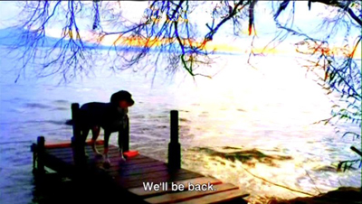
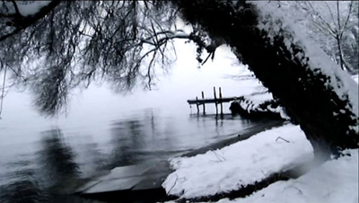
Rather than exact repetitions, we get repetition with variation. One couple takes Roxy in, the other (perhaps) does not. The first couple abandons Roxy on a pier in summer; in the second part, the pier in winter stands empty.
Most remarkably, the parallel scenes of the long section “2/Metaphor” proceed in almost exactly the same order as in “1/Nature”. Evidently Godard shot the bulk of the first story well before he shot the second. It’s as if the first film became the script for the second. In any event, the two long parts mirror one another with unusual precision. This geometrical structure recalls the “grid” organization of Vivre sa vie, but it’s not announced as boldly. Godard refuses to mark the parallel scenes in normal ways–with titles, or musical motifs. The labeling of the sections, 1 and 2 in the intro, 1 and 2 in the longer stretches, are sufficient for this laconic filmmaker.
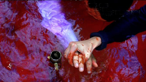
Just as Godard blurs the shape of individual scenes through digression and opacity, so he hides the tabular structure of the film behind interruptions, landscape shots, and above all the charmed wanderings of Roxy, who more or less takes over the last portion of the second part. In addition, certain images from the second part echo or condense images we’ve seen before. The blood-filled fountain at the end of the second tale echoes both the bloody sink of the first one and the floating-leaf fountain in the prelude, while the clasping hands seem to consummate the gesture begun in the grille shot. These hybrid images can only make the strict double-column scene lineup more difficult to notice.
The fact that the exceptionally exact parallels and orderings of the two parts aren’t remarked upon by critics (I began to sense them a little during my second pass) is a measure of how successfully Godard has camouflaged the film’s anatomy. What shall we call this tactic? Distant counterpoint? Barely discernible rhymes?
Second film, or two films (short and long) times two: We’re free to see the characters as couples running uncannily in synchronization, or as the same couple in two guises, or as two stories in parallel universes. More likely, though, Godard is distressing and disheveling the emerging conventions of replay plotting.
And yet the ending of “the second film, same as the first” isn’t quite the whole story either. Godard has always enjoyed setting up rigid structures and then spoiling them–cutting off the arc of a melody or chopping a shot that could have been breathtaking. So he cracks his elegant 2 + 2 structure by giving us an epilogue and a third couple.
Images recur: crowds on the streets, Roxy snuggling on a sofa, a TV (but this time with two empty chairs). We glimpse a man reading, but mostly we see one hand painting with water colors while another is writing in a journal. Godard’s familiar dichotomy between image and word is here tied to the harmony of an unseen, but clearly heard, man and woman making art in tandem. The male voice seems to be Godard’s; I can’t say whether the female voice belongs to his partner Anne-Marie Miéville, but the woman seems to understand Roxy best. She can even access his thoughts. (“He’s dreaming of the Marquesa Islands.”) Yet this couple has another parallel, shown a little earlier: Percy and Mary Shelley, a poet and a novelist, the latter seen finishing Frankenstein in the forest. This is at least one farewell to language, but it also implies that creativity binds a couple together.
Roxy Miéville, as he’s called in the credits, haunts the film. He checks out streams, train platforms, and tree roots. He is never seen in the same shot with the main characters; his link to them is tenuous. His ramblings suggest freedom, sensory alertness, and a trust in immediate experience that perhaps the people can’t attain. The final images after the credits show Roxy wandering off in the distance and then bounding eagerly back to someone who stands, of course, offscreen.
Godard: The youngest filmmaker at work today.
Many thanks to Robert Sweeney and Richard Lorber of Kino Lorber, a bold company that still believes in art films. It will be releasing Goodbye to Language on 29 October (not September as I erroneously stated in an earlier version of the entry.) Later the film will appear on Blu-Ray 3D. Thanks also to Marc Silberman for help with German translation and to Ben Brewster for advice on stage wings.
For an interesting memoir of the filming of Adieu au langage, see Zoé Bruneau’s En Attendant Godard (Paris, 2014). The photo of the camera train is drawn from p. 93 of her book.
An excellent evocation of the fizz of word and image in Adieu au langage is offered by James Quandt in Artforum (also in the September print edition). Some other stimulating appreciations of the film are Scott Foundas in Variety, Daniel Kasman for MUBI, and Blake Williams in Cinema Scope. A useful description of the film is by Jean-Luc Lacuve on the site of the Ciné-club de Caen.
Too bad the GoPro Fetch, a harnessed camera for dogs, wasn’t available for Roxy to use.
To get a sense of how complex Late Godard is at the level of narrative comprehension, see Kristin’s essay “Godard’s Unknown Country: Sauve qui peut (la vie),” in Breaking the Glass Armor: Neoformalist Film Analysis. I analyze strategies of storytelling in Godard’s 1960s films in Chapter 13 of Narration in the Fiction Film. She wrote about Film Socialisme on the blog here. For a discussion of Godard’s very fussy compositions, try this entry. I consider multiple-draft narratives more generally in the essay
“Film Futures” in Poetics of Cinema.
P.S. 30 Sept: Since Adieu au langage screened at TIFF, VIFF, and elsewhere, a great many critical responses have accumulated. Thanks to the assiduous passion of David Hudson, you can track them all at Fandor. My initial posting should have mentioned two more enlightening discussions of the film: Kent Jones’s Cannes thoughts and the heroic display of Godardiana assembled by Craig Keller at Cinemasparagus.
P.P.S. 15 October: The beat goes on. Ted Fendt’s astonishing list of “Works Cited” in the film, which I added to the body of the above entry, deserves another link here. And the ever-expandig Mubi deserves our thanks for making it available.
P.P.P.S. 29 October: And more, of course. Background on the production process from Fabrice Aragno for Filmmaker; David Ehrlich’s sensitive discussion on The Dissolve; and a story on NPR, with interviews with Héloïse Godet, Vincent Maraval, and (gulp) me. Thanks to Pat Dowell for asking me to participate.
P.P.P.P.S. 2 November: If you haven’t had enough, I posted another entry on the film.
P.P.S. 13 November 2014: Geoffrey O’Brien’s enthusiastic appreciation of the film not only illuminates it but conveys the excitement of seeing it.
GRAVITY, Part 2: Thinking inside the Box
Kristin here:
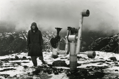
In my previous entry, I described Gravity as an experimental film. I had thought of it that way ever since seeing trailers for it online back in mid-September. I described it as reminding me “of Michael Snow’s brilliant Central Region, but with narrative.”
Last time I developed that notion in more detail and analyzed the narrative structure of the film. Now I’ll analyze the experimental aspects of the film’s style and the dazzling means by which they were created. I don’t have the technical expertise to explain the inventions and ingenuity that went into creating Gravity, so I have sought to pluck out the best quotations from the many interviews and articles on the film and organize them into a coherent layout of how its most striking aspects were achieved.
As in that entry, SPOILER ALERT. This is not a review but an analysis of the film. Gravity does depend crucially upon suspense and surprise, and I would suggest not reading further without having seen the film.
Screaming on the set
I’ve written about Cuarón’s use of long takes, a stylistic device that has drawn a huge amount of attention in the press. Here the editing is so subtly done that even someone like me, who typically notices every cut, missed a lot of them during early viewings. There are bursts of rapid editing, as when the ISS is struck by debris and is destroyed, or more conventional cutting, as when the camera follows the Chinese pod and surrounding remnants of the station as they heat up in the atmosphere.
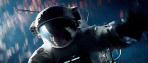
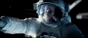
The long takes go beyond what Cuarón has done before. In Variety, Justin Chang describes one major difference: “As the movie continues, the filmmakers even add a new wrinkle, which Lubezki calls ‘elastic shots’: Takes that go from very wide shots to medium closeups, then segue seamlessly into a point-of-view shot, so the viewer is seeing the action through the character’s eyes, right down to the glare and reflections on a helmet visor.” Such moments are rare in Gravity, but one occurs in the “drifting” portion, shortly after the segment laid out above:
As Cuarón has pointed out, his long takes eliminate the need to cut in to closer views: “The language I have been working on with Chivo in these recent films is not one based on close-ups. We include close-ups as part of a longer continuous shot. So this all becomes choreography.” Another point he makes in this and other interviews is the influence of Imax documentaries on Gravity: “My process of exploring long takes fits in with that IMAX documentary notion, because when they capture nature it isn’t like they can go back and pick up the close-up afterward. There isn’t that luxury in space either. So then it falls to us to find a way to deliver that objective view, but then transform it into a more subjective experience.” Hence the “elastic shots.”
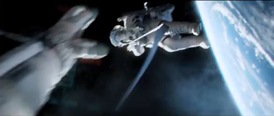
The long takes often dictate a refusal to cut in to reveal significant action. There is the moment in the epic opening shot, for example, when Shariff is suddenly killed in the background while in the foreground Kowalski tries to help Stone detach from her mechnical arm and into the shuttle. Did you see the flying piece of debris that struck his head? I didn’t, not until the fourth time I watched the film, knowing that it was coming and determined to spot it. It’s there, a little white dot that flashes through the frame in a split second. Shariff’s abrupt movement to the side, stopped with a jerk by his tether, is what we spot, since his bright white suit moves so suddenly and quickly, ending up against the pitch black of space:
A great deal happens in such moments of action, and we are left to spot what we can.
If these long takes are dazzling on the screen, think what they must have been like to witness being made. Lubezki has suggested how complicated the long takes in Gravity and earlier films were to shoot:
There are very few director/cinematographer teams working today as well known for a certain aspect of filmmaking as you and Alfonso are, which is that long extended take, or the seamlessly edited take. What it is like actually shooting those scenes?
I’m going to tell you something, the reality is that the movie was so new that when we finished a shot we would get so excited people would scream on set—probably me before anybody else. There were moments when we were shooting and Alfonso said ‘cut’ we would all just jump and scream out of happiness because we’d achieved something that we knew was very special.
In Children of Men, we also had moments like that. When we finished the first shot inside that car [the aforementioned ambush scene], the focus puller started crying. There was so much pressure that, when he realized he had done a great job, he just started crying.
There is something breathtaking about the achievement of complex long takes that seems not to arise from any other cinematic technique. I have seen Russian Ark three times now, and each time I feel an inexplicable tension, wondering whether the camera team will make it through the entire one-shot film without a mistake. I’ve already seen it happen, and yet it still seems unbelievable that they did.
In Gravity, of course, the “long takes” were not actual lengthy runs of the camera. Nor were they, as in Children of Men, several camera takes stitched together digitally to create lengthy single shots. Rather, they were created in the special-effects animation, with the faces of the actors being jigsawed into them through a complex combination of rotoscoping and geometry builds. (See this Creative Cow article for an example.)
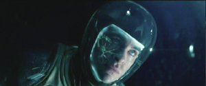
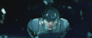
The choice to present the action in long takes was crucial to the look of the film. Most films set in space rely heavily on editing, since for decades the special effects needed to convey space walking were best handled in a series of shots. In Star Trek Into Darkness, Kirk flies through space toward a spaceship breaking up and surrounded by debris, a situation somewhat comparable to that in Gravity. The sequence is built up of many short shots of Kirk against shots of dark space, point-of-view shots through his helmet, and cutaways to characters inside the Enterprise conversing with him via radio. Here’s a brief sample of four contiguous shots:
The sequence conveys little sense of weightlessness, partly because the actor adopts a traditional superhero-style flying pose. With no air in space, there would be no need to compact oneself into a streamlined shape. The fast cutting keeps repeating similar compositions, as with frames 2 and 4 above, with the fast editing presumably intended to generate excitement. (Star Trek Into Darkness has at least 2200 shots in a little over two hours, while Gravity has about 200 in 83 minutes.) Gravity‘s success in creating a realistic environment in space is dramatically evident when contrasted with this film’s more traditional outer-space conventions.
But it turns out that the commitment to the long take led Cuarón toward less common choices about editing, staging, and lighting.
Follow the bouncing axis
For much of the film, there is minimal spatial stability for the characters or for our viewpoint into the diegetic world. There is no ground, so we cannot imagine the camera resting on anything. When outside the space vehicles, the camera moves nearly all the time. In an interview with ICG Magazine, director Alfonso Cuarón was asked, “So with the camera and characters in constant motion and changing perspective, how did you figure up from down?” He replied:
There is no point of departure because there is no up or down; nobody is sitting in a chair to orient your eye. It took the animators three months to learn how to think this way. They have been taught to draw based on horizon and weight, and here we stripped them of both.
Undoubtedly many scenes contain an axis of action running between the characters, but it is not of a traditional kind. Unlike in a classically edited film, in Gravity‘s action scenes in space, the axis is in constant, fleeting motion, and any given center line between two characters must in quick succession run not only left and right but also up and down, diagonally, in almost any direction. Any given screen direction set up by the axis is ephemeral and offers little to help orient us spatially. Eyeline directions mean very little, since there are few cuts to things that the characters have seen offscreen. (True, when characters look offscreen, they establish eyelines, and the camera sometimes pans from Stone or Kowalski to some object they have been looking at. But a pan from a person to an object automatically establishes the spatial relations between them, whether or not the character is looking at the object.)
As a result, the spatial cues used in continuity editing system are not so much eliminated as made irrelevant for long stretches. That system is meant, after all, to guide our understanding of the story space across cuts. There are exceptions, such as a brief shot/reverse-shot exchange: Stone, loosely attached to the International Space Station (ISS) by ropes, pleads with Kowalski not to untether himself from her and float away to die in space, and he insists that it is the only way to allow her to live. When Kowalski and Stone, tethered together, travel toward the ISS, he is always at screen left, she at screen right, with the strap joining them stretched out as a sort of visible axis of action; straight cut-ins to close views of each character, and even at one point Kowalski’s point of view, obey the 180-degree rule and create an almost conventional scene. Actions inside the spacecrafts are more oriented as well. In the ISS Stone moves weightlessly through a series of pods, all the while maintaining screen direction. Similarly, inside the vehicles, especially late in the film when Stone is strapped into seats, she is usually upright, her head oriented toward the top of the frame. Some sustained actions in space also keep her right-side up, as when she removes the bolts holding the parachute cords to the Soyuz landing vehicle.
In part because of such orienting devices, we are seldom seriously confused about where the characters are, or at least not for long. Otherwise we would not be able to comprehend the story action. Still, compared to typical classical films, Gravity conveys little sense of spatial stability. The disorienting simulation of weightlessness for characters and camera dominates the scenes outside the vehicles and creates a style that can truly be called experimental.
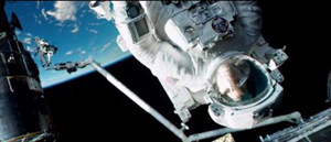
Take the brief segment (about 14 seconds) below, from the 13-minute opening shot. Stone has been standing at the end of a large mechanical arm which gets knocked off the space shuttle by a piece of hurtling debris. It spins rapidly, with the camera framing it from long-shot distance. The camera is not entirely static, reframing slightly, but we can see the earth in the background fairly clearly. Stark sunlight comes from offscreen left, and as Stone’s body whips through space, the shadows move accordingly around her, with the back of her body in deep shadow in the first frame and then her front shadowed in the second:
The fact that the light source, the sun, is offscreen left during this spinning segment suggests that the camera and hence our viewpoint are in a stable position. Yet that position is maintained for only a short time. At this point in the shot, the camera is essentially waiting for her to draw near in order for it to execute a change that will govern the penultimate part of the lengthy shot.
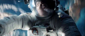
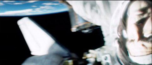
That happens when, after she has spun wildly toward and away from us several times, the camera “attaches” to her, so that we are now seeing her in medium shot and spinning with her. Instead of seeing the earth clearly, we see her while the blurred surface of the earth and the blackness of space alternate rapidly. This was the technique that led me, when I first saw the film’s trailers, to compare Gravity to Michael Snow’s Central Region:
Being closer to Stone, we can see more clearly the shadows coming and going; her face is sometimes illuminated brightly by the sun and sometimes in near darkness:
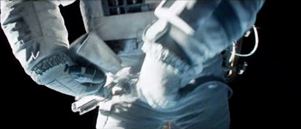
The function of the attachment to Stone, apart from allowing us to see her fear and confusion, is to show us that her hands are working to detach her from the arm, as a tilt down reveals:
As she soars off the arm and tumbles into the black depths of space, the camera leaves its “attachment” to her, and she spins away from it:
Cuarón’s commitment to the long take thus made him rely more than usual on events taking place within the frame–camera movement and figure movement in particular. Yet these movements had to occur in a microgravity environment radically different from the earthbound surroundings of Children of Men and Harry Potter and the Prisoner of Azkaban. This new constraint led to some technological innovations of remarkable originality.
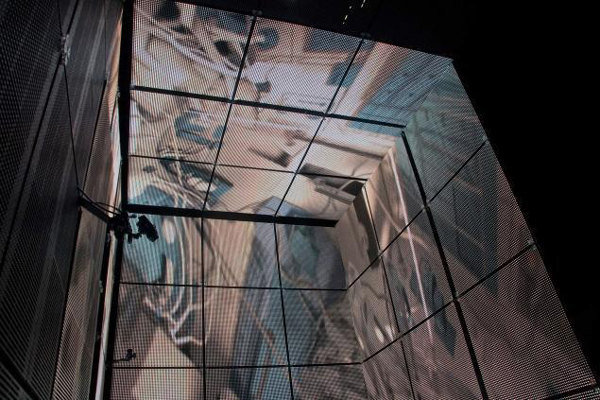
The LED Light Box
Early on it became clear that moving the actors through space on wires would not create the desired realism of weightlessness, and obviously they could not be whipped about and tumbled in ways that the film ultimately achieved. The actors would have to be relatively static, with the illusion of movement created through other means. One of the main challenges was to have the lighting on their stationery faces support that illusion. And it would have to be done perfectly in order to achieve the photorealistic depiction of space that the filmmakers were after.
Usually in watching a film heavily dependent on CGI, one notices elements that have been assembled into a single composition but don’t quite match each other. A matte painting that isn’t lit from precisely the same angle as all the other components stands out from the rest (as, it has to be admitted, happens in the best of CGI scenes, including those in The Lord of the Rings). The problem was solved for Gravity using the LED Light Box, a device frequently mentioned in the press coverage of the film but seldom explained. (See image at the top.) The concept is truly revolutionary, although I am not sure to what extent it would work for other films that did not present such peculiar challenges.
In American Cinematographer‘s article on Gravity, “Facing the Void,” cinematographer Emmanuel Lubezki explains why consistency of lighting is crucial and how he came up with his solution:
Lubezki emphasizes that Gravity‘s blending of real faces with virtual environments posed a tremendous challenge. “The biggest conundrum in trying to integrate live action with animation has always been the lighting,” he says. “The actors are often lit differently than the animation, and if the lighting is not right, the composite doesn’t work. It can look eerie and take you to a place animators call ‘the uncanny valley,’ that place where everything is very close to real, but your subconscious knows something is wrong. That takes you out of the movie. The only way to avoid the uncanny valley was to use a naturalistic light on the faces, and to find a way to match the light between the faces and surroundings as closely as possible.”
This challenge led Lubezki to imagine a unique lighting space that was ultimately dubbed the “LED Box.” He recalls, “It was like a revelation. I had the idea to build a set out of LED panels and to light the actors’ faces inside it with the previs animation.” Lubezki conducted extensive LED tests and then turned to [special effects head Tim] Webber and his team to build the 20′ cube and generate footage of the virtual environments, as seen from the actor’s viewpoint, to display inside it. While constructing the LED Box, the crew also solved problems involving LED flicker and inconsistencies.
Inside the LED Box, the CG environment played across the walls and ceiling, simulating the bounce light from Earth on the faces of Clooney or Bullock, and providing the actors with visual references as they pretended to float through space. This elegant solution enabled the real faces to be lit by the very environments into which they would be inserted, ensuring a match between the real and virtual elements in the frame.
This ingenious approach largely did away with traditional three-point lighting in the exteriors. As Lubezki explains in the AC article,
When you put a gel on a 20K or an HMI [Hydrargyrum medium-arc iodide], you’re working with one tone, one color. Because they LEDs were showing our animation, we were projecting light onto the actors’ faces that could have darkness on one side, light on another, a hot spot in the middle and different colors. It was always complex, and that was the reason to have the Box.
The crucial point here is that the lighting was being created by playing the previs animation of the earth, space, the moon, and the large reflecting objects like the space shuttle on the sides of this 20′ by 10′ box. In other words, the moving images from the nearly finished special effects were used to light the faces of the actors, and those faces were later joined to those very same special effects, in a more polished form, to create the final images.
Lubezki gives an excellent description of the Box in his interview with Bryan Abrams, a series of responses which is worth quoting at length. Note that Lubezki refers to the Box as an LED monitor–essentially a giant television screen turned inside out and surrounding the actor:
Can you touch upon some of the pieces of technology and equipment that were created to make Gravity possible?
To make this movie we used many different methodologies. For one of them, we invented this LED box that you’ve probably read about, which is basically this very large LED monitor that is folded into a cube. So all the information and images that you input into this monitor lights the actors, and you can input all of the scenes that were pre-visualized to create the movie—all the environments that we had created—and you can input them into this large cube so space itself is moving around the actors.
So it’s not Sandra Bullock spinning around like crazy, it’s your cameras.
Yes, instead of having Sandra turning in 360s and hanging from cables, what’s happening is she’s standing in the middle of this cube and the environment and the lighting is moving around her. The lighting on the movie is very complex—it’s changing all the time from day to night, all the color temperatures are changing and the contrast is changing. There were a lot of subtleties that you can capture with the box, subtleties that make the integration of the virtual cinematography and the live-action much better than ever before.
The effects of the LED projections are visible in the changes on Stone’s face in the extended example above. Here’s a brief example of changes on Kowalski’s face in the opening shot:
The harsh light in the right frame above is a real lamp. The LEDs could not produce a local, hard light intense enough to simulate the sun. The team placed “a small dolly and jib arm alongside the actors” with a lightweight spotlight. This was moved “according to the progression of the virtual sun.” Such harsh light was necessary because outside the atmosphere there is nothing to filter bright sunlight. Several moments where the actors’ faces and suits are severely overexposed reflect this technique:
The Box also contained a large video monitor, visible to the actor, which displayed the previs animation. Lubezki explains: “This was wonderful in a couple of different ways. The actor sees the environment and how objects are moving in that environment, and at the same time we can see the interaction of that light on the actor. We capture true reflections of the environment in the actor’s eyes, which makes the face sit that much better within the animation.”
Previs as environment
The fact that almost everything in the film was created digitally–including the space suits in which the actors bob and spin in the exteriors–necessitated an extraordinary amount of planning and pre-production. “Pretty much we had to finish post-production before we could even start pre-production, because of all the programming,” Cuarón says. This was one reason why there was such a long gap between Children of Men (2006) and Gravity. Four and a half years were spent in developing the new technology and preparing to shoot.
The team started with geography:
The filmmakers began their prep by charting a precise global trajectory for the characters over the story’s time-frame, so that Webber and his team could start creating the corresponding Earth imagery. Cuarón chose to begin the story with the astronauts above his native Mexico. From there, the precise orbit provided Lubezki with specific lighting and coloring cues. The cinematographer recalls, “I would say, ‘In this scene, Stone is going to be above the African desert when the sun comes out, so the Earth is going to be warm, and the bounce on her face is going to be warm light.’ We were able to use our map to keep changing the lighting.”
Next, the filmmakers defined the camera and character positions throughout the story so that animators at Framestore could create a simple previs animation of the entire movie. [“Facing the Void”]
Lubezki was completely involved in planning the digital lighting. He recalls, “I would wake up at 4 a.m., turn on my computer, I’d say good morning to my gaffer and start working on a scene. I would say, ‘Move the sun 60,000 kilometers to the north.’ That way I could put the lighting anywhere I wanted.”
The reference material for the earth imagery came in part from NASA reference footage and photos. You can get a sense of these from the NASA films posted online, although these are mostly done in fast motion, unlike the ones the filmmakers would have used. One good example is “Earth HD.” There, at 2:25 and again at 2:41, one of the most recognizable locations on earth, the Nile Valley and Delta, are visible:
A similar image of the Nile appears on earth as Kowalski and Stone slowly make their way from the space shuttle to the ISS, with him asking her about her hometown and any family she might have waiting for her. (I was also happy to see the area of the site where I work in Egypt, Tell el-Amarna, which lies about midway between the Delta at the upper left and the large bend in the river.)
This geographical plotting included some ellipses. Although commentators have suggested that the film takes place in real time, or nearly so, there are temporal gaps. Shortly after the first pass of the speeding debris field, Kowalski tells Stone to set her watch’s timer for 90 minutes, since he calculates that is when they will encounter the orbiting debris again. That happens when she exits the Soyuz vehicle to detach its parachute. She again sets her timer for 90 minutes, and the debris field shows up at the Chinese station, battering it to the point where it sinks into the atmosphere and breaks up into chunks melting from the friction of reentry. Thus a little over three hours should be passing in the 83 minutes of screen duration.
Cuarón more or less confirms this timetable when he describes the creation of the previs: “The screenplay describes a journey that takes place mostly in real time, with only a couple of time transitions. We travel around Earth three times, so in previs we planned out visuals with specific knowledge of where we’d be in orbit at any given point in the story, whether it was in sunlight or darkness.”
In the film there are very few places where we can assume a significant ellipsis occurs. After Stone enters the ISS, sheds her helmet and suit, and drifts in a fœtal position, there is a gap. It’s probably not long, since she still holds some hope of going to rescue Kowalski, but she pauses to recover after her trying experience. Later, there is a cut from her inside the landing module, not in the suit, to her emerging from the hatch fully suited up–a gap we might assume to be ten minutes or so. Most notably, the cut from the nighttime shot of the earth that includes the aurora borealis at the right to the extreme close-up of frost on the window ellides a longer stretch of time. Stone has become hoarse in the interval as she tries to send a mayday message via radio. In other cases, such as Stone and Kowalski’s slow journey toward the ISS, time seems to be somewhat compressed though not ellided.
Staging without a stage
A lack of depth cues hampered the animators charged with creating the previs. The absence of one major depth cue, aerial perspective (the tendency of layers of space in the distance to turn successively bluer and blurrier due to the filtering quality of the atmosphere), caused problems. Visual-effects supervisor Tim Webber, of the effects house Framestore, remarks:
You can’t rely on aerial perspective because without atmosphere there is no attenuation of image due to distance. And the lack of reference points [in space] can get you into trouble, like not being able to tell if the character is coming toward you or the camera is moving toward him. Even though we played it straight with respect to science and realism, we did put in more stars than you’d be able to see in daylight, just so there’d be some frame of reference to gauge movement.
Presumably Webber is referring here to the movement of the characters and objects through space, not the camera movement. (The lack of any “frame of reference” against which to sense movement is part of what makes the Star Trek scene illustrated above seem so unsophisticated.)
Naturally, since the actors were not standing on a floor or solid ground, the blocking was difficult, but it also had to be planned completely in advance:
Cuarón laughs as he recalls the surprises inherent in blocking characters in a zero-gravity environment. “The complications are really something because you have characters that are spinning. Say you want o start your shot with George’s face and move the camera to Sandra, who is spinning at a different rate. You start moving around her, and then you start to go back to George, only to realize that if you go back to George at that moment, you will be shooting his feet! So then you have to start from scratch. Sometimes you find amazing things accidentally, but sometimes you have to reconceive the whole scene.” [“Facing the Void”]
Finally, after all the planning, the previs animations were made. These had to be refined considerably so that they could adequately serve in the Light Box to illuminate the actors’ faces. According to Bill Desowitz, “The previs was so good, in fact, that the daughter of cinematographer Emmanuel (“Chivo”) Lubezki thought it was the real movie.”
The previs became so sophisticated because it evolved during preproduction. Cuarón recalled that Lubezki’s inspiration to create the LED Light Box changed the planning tactics:
Then that kind of had a ripple effect back into the previz, because originally they were going to just be a model that we could look back at, but we realized that the previz was more than that. That was something that [James] Cameron kept on talking about. He would say “I don’t use previz anymore, I use it as if it is the first painting on a canvas.” In other words it was the stuff that you kept on painting on top of and the thing with that is that it became very clear that in order to use these technologies, we needed to program stuff and the previz was going to have to be precise in terms of camera movements, choreography, timing and light.
As a result, the movie changed very little during principal photography. Senior visual-effects producer Charles Howell told American Cinematographer: “I think there were only about 200 cuts in the previs animation, [whereas] an average film has about 2,000 cuts. Because these shots had to be mapped out from day one, many of the lengthy shots didn’t really change in the three years of shot production. Because we did a virtual prelight of the entire film with, the whole film was essentially locked before we even started shooting.” [“Facing the Void”]
David counted 206 shots in Gravity, not including the two opening titles about life in space being impossible. This suggests that Howell is right, and that the film underwent little revision after the planning phase.
Several years ago I suggested on this blog that animated films, notably those of Pixar and Aardman, were on average better than mainstream live-action films because they had to be planned so carefully and thoughtfully. Gravity, being very close to an animated film, provides more evidence for that claim. Not that thought, time, and money can guarantee quality, but they certainly narrow the odds.
Iris in
The Light Box technology is astonishing enough, but within its confined space there also had to be a way to photograph the actors. In Lubezki’s interview with Bryan Abrams, he explains:
So we built the box, but that wasn’t it. To be able to shoot inside the box, we had to build a special rig that holds the camera and moves with motion control. So we had people build a very narrow, lightweight but sturdy rig to control the camera. If you imagine the big box of LEDs, it has a gap that is almost a foot and a half or two feet wide, and the camera has to go into the box and make all these moves to make the audience believe that Sandra is turning and turning, but it’s really the camera and the environment in the box that is moving. So we built the box, the rig, and then used a company called Bot & Dolly. These guys are from San Francisco, and they use robots from the automotive industry. They redid all the software for us, so we were able to use these robots to move the cameras and the lights around the actors. It was just a big ballet of gadgets and new technology for the film.
Bot & Dolly is a San Francisco company specializing in robots for the automobile industry. It built or perhaps modified an elaborate rolling, multiply-jointed camera mount called Iris especially for Gravity. It has been used in other features and in ads since then. (See image at the bottom.) An impressive demo film shows the Iris gracefully writhing about, quickly pointing the camera in many directions. (The camera in the film is a Red, though Gravity used an Alexa.) According to ICG Magazine, “The firm devised a Maya-based series of commands that allowed Framestore animators to direct the robots in ways that matched previs action in precise detail.” (Maya is the industry standard computer animation program.)
Typically this camera was inserted through an opening in the Light Box and swooped around the actor, who stood in a gyroscopic basket, seen in the production photo below. The photo shows one side of the Box open, though this would not be the case during shooting:
The combination of the Light Box and Iris made it possible to blend the special-effects shots and the live-action photography of the actors so smoothly that there is no “uncanny valley” effect, no sense of an obvious matte painting stuck into the middle of an image. The shots in Gravity are all photorealistic to a degree that is rare, if not unique, in recent effects-heavy films.
Iris brings us back to the comparison with Central Region. Snow built a special camera mount (below) designed to allow his images to rotate freely in almost any direction. During the three-hour film the camera never repeated any of its trajectories. Some images were close views of the pebbles on the ground; others were upside views of the bleak Canadian mountains in the distance. A nighttime segment was completely black except when the moon occasionally swept through the frame. The one area that the camera didn’t survey was the camera support itself, the “central region” of the title.
The vital difference between Snow’s machine and Iris is that the new system has no fixed anchor. Not only does it slide on a track, but everything it photographs can be digitally altered to erase any traces of the machine. It moves with entire freedom through a constructed space that has no central region, no fixed point around which everything else revolves.
Puppeteers and eyes
Gravity‘s utterly spherical space, beyond anything we normally find in commercial cinema, placed unusual demands not only on camera movement but also upon the actors’ blocking and performances. Our first entry on Gravity begins with a quotation from Sandra Bullock, which included the statement, “No character was like Stone, no film set was ever like these sets, not one member of this crew had ever done this before.” That may seem an exaggeration until one grasps how Bullock and Cuarón’s team built her character.
We all know from infotainment coverage that Bullock was isolated in the Light Box through entire days and that it was a trying experience. What doesn’t come through in such accounts is that she was often enclosed in the gyroscopic basket, visible in the photo of the Iris rig and Light Box above, as well as in the same setup visible behind Cuarón in this photo:
That was only the start of it. Anne Thompson’s interview with Cuarón and producer David Heyman reveals some of the details of blocking a character who is unrestricted by gravity:
AC: The physical aspect, not anybody can do what she did. On the one hand the physical discipline she went through to make this film, the training and the workouts. She also has an amazing capability for abstraction. Those emotional performances, it was as if they were an exercise in abstraction, like she was bonded to very precise cues. And physically that was very difficult: she trained and practiced like crazy, together with the stunt people and special effects. And the puppeteers from “War Horse” were helping her, supporting a leg or an arm, all the floating elements, they were creating approaching objects toward her in perfect timing. Then after she practiced so much her whole concern was only about emotions and performance.
Imagine a ballet dancer with really strict physical discipline in terms of what a body has to do, positions and precise choreography, who goes through months of training for one choreography so when they are performing they have expressiveness and emotion.
What was the most challenging scene to realize?
David Heyman: When Sandy comes into the ISS for the first time. She takes off her suit, then goes into fetal position, all in one shot. It was the most difficult. All the objects, getting the suit off, and into fetal position in such a way that it felt effortless, not as it was–she was sitting on a bicycle with one leg tied down leaning back in a 12-wire rig, with puppeteers. One of the things you forget about Sandy’s performance, which seems so truthful, is all the effort and physical exertion that went into making it, the precision of the technical aspects. She had to move her hands at a third of speed — zero G –while talking. Each shot connects with the next at very precise points where her head began and end and begin and end. She’s on a bicycle stringing uncomfortable with people moving around on 12 wires, through it all, with no gravity. Physically the body must not show the tension, so it looks effortless. What I loved about it is the performance behind the visor shines through, her eyes. You can’t slouch your shoulders to show sadness or weight, it’s just the eyes.
Bullock did all this with four 10′ by 20′ walls of LEDs projecting moving images of the earth and of exploding space stations around her. I think it is safe to say that this was a unique kind of performance.
The sounds of silence
As the film’s ominous opening titles point out, there is no sound in space. In keeping with the overall attempt to duplicate the effects of weightlessness immersively, Cuarón’s team limited the track to two types of sound: diegetic sounds heard by the characters and a non-diegetic, modernist musical track. In an interview with Cuarón, Wired‘s Caitlin Roper pointed out that there was an explosion in one of the trailers. Cuarón replied:
Yes, but that’s just the trailer. I honor silence. The only sound you hear in space in the film is if, say, one of the characters is using a drill. Sandra’s character would hear the drill through the vibrations through her hand. But vibration itself doesn’t transmit in space—you can only hear what our characters are interacting with. I thought about keeping everything in absolute silence. And then I realized I was just going to annoy the audience. I knew we needed music to convey a certain energy, and while I’m sure there would be five people that would love nothingness, I want the film to be enjoyed by the entire audience.
As in other areas of the film, we see the compromise between an experimental technique–an attempt to suggest the silence of space–and the desire to provide something more familiar for the broad audience. In this case, music acquires an expanded role, substituting for sound effects and conveying the rapidly shifting emotions of the scenes.
Sound effects are not entirely eliminated. Many sounds that the astronauts would hear via vibrations of things they come into contact with are included. In some cases these are fairly clear, as with the voices heard within their helmets–their own voices or others’ via radio. Other effects are heard in a distorted fashion. Glenn Freemantle, the supervising sound designer and editor, describes the process:
“When [Bullock] is in the suit, you hear her voice and her breathing, and you hear through her suit when she is in contact with things,” he explains. His team captured sounds by recording with contact mics at car plants and hospitals. “We even recorded through water with a [submerged] guitar,” he recalls.
One obvious example of distortion comes in the opening scene, when Stone is unscrewing bolts and sliding a panel out of the transmitting device she is working on. The sounds of the bolts and the sliding metal are audible but muffled, as though they were recorded under water or electronically manipulated.
Yet other sound effects not heard by the characters were relegated to musical expression. As Angela Watercutter put it in a Wired article based on interviews with Cuarón and composer Steven Price,
Every time there’s a collision in the movie the audience doesn’t hear a bang – they hear a sonic boom. The same goes for the characters’ — and, by extension, the audience’s — feelings of anxiety, claustrophobia, and agoraphobia. Much of what is seen in Gravity is terrifying, and when the audience can’t hear the horror of a space shuttle breaking apart or an airlock flying open, Price had to fill the void with his nerve-wracking score.
Cuarón dictated that one of the rules for the film’s score was the eliminating of percussion, to avoid the “cliché of action scoring.” Watercutter continues:
As a result the score for Gravity serves as more than just musical accompaniment – it also provides the movie’s sound effects. There are some non-music sounds that would be space audible, like the ones transmitted by vibrations characters feel in their spacesuits, but for the most part everything that happens in open space is accompanied only by Price’s music and the voices of Stone and astronaut Matt Kowalski (George Clooney), which “freed up the rest of the frequency spectrum for me,” Price noted.
Price used a mix of organic and electronic sounds to meld the natural world of space with the mechanical world one of the space exploration. There are also moments where he took an analog instrument – a cello, for example, or even a human voice – and ran its notes through a synthesizer or processor in order to create a whole new sound. And for the opening song on the score, “Above Earth,” Price took a track he was already working on and slowed it to about 1/60th its original speed. “Basically,” Price said, “what you’re hearing is the space between the notes.”
In an interview with Rolling Stone, Price discussed some of the aesthetic principles and functions he aimed for with his score:
Really it was all very much led by the character of Ryan. I tried to be with her all the time. The idea was that the music was up there in space and we made it very immersive and used a lot of elements and a lot of layering so that things would move around you all the time. The writing of those elements and what they were, were always influenced by what Ryan was feeling and where she was emotionally in the whole thing. And also where the camera was, where things were moving and what point of view the camera was facing, whether it was looking at them or kind of looking through their eyes. Some of it was melodic and some of it was intended to underscore a kind of emotional journey, and then there were a lot of sounds that were there to express real terror. It was those two extremes, really, expressing the beautiful nature of where they were but also absolutely a massively terrifying situation.
With little expertise in musical analysis, I can simply say that I hear the score as a combination of traditional instrumental music and electronically synthesized instrumental music. Under this, typically in tense passages, there are abrupt or charging percussive emphases, not using percussion instruments but, in some cases, deep string chords. Scenes of damage or tension are sometimes accompanied by sounds like stressed, grinding metal. Other sounds like distorted, high-pitched radio waves (in the “ISS” and “Fire” tracks) are included, reminiscent of electronic music of the 1960s.
Other critics have offered suggestive descriptions. Justin Chang’s review refers to “Steven Price’s richly ominous score, playing like an extension of the jolts and tremors that accompany the action onscreen.” David S. Cohen and Dave McNary’s Venice festival coverage characterizes the track: “Much of the action, even the debris storms, plays out against eerie silence, broken only by the score. The silence is more startling after the score builds to deafening crescendos, then stops abruptly. But during the interior scenes, the rumbles and groans of failing space gear are as frightening as the roars of any classic movie monster — even more so because their source is unseen.”
Price has contributed a remarkable score, one which is highly original and yet completely motivated by the story situation it accompanies.
The space between
The immersive, 360-degree surrounding and sound fields made Gravity a natural for 3D exhibition, but they also posed unique problems. Given the long takes, the need for complex camera movements, the demands of the LED Box, and the complicated acting conditions, it would have been very difficult to shoot the film in 3D. In most scenes, of course, there were no real objects juxtaposed in different layers of depth in front of the camera. Even the actors’ placements in long shots would have be created digitally. So the project had to be converted to 3D. But this forced choice actually yielded strong results.
The press coverage of popular cinema has come to treat films shot in 3D (“native” 3D) as pure and admirable and films converted to 3D after shooting as crass and compromised. But is there all that much difference? Even Avatar, the film made with an intention of promoting the universal use of 3D, had some converted footage. With conversion technology improving, the notion of waiting until after filming to create a movie’s 3D is becoming less onerous. As Variety‘s David S. Cohen pointed out earlier this year, Iron Man 3, Man of Steel, Star Trek into Darkness, and Pacific Rim have been post-converted with little objection from the public or press.
That conversion techniques for generating 3D images are not inferior became much more evident during the early decision-making process for shooting Gravity. Nikki Penny, the film’s executive producer, took some test footage shot by in 3D to Prime Focus World, a conversion house that ended up doing 27 minutes of Gravity. The filmmakers were trying to decide whether to shoot the live action portions in 3D or use conversion. In an article on Creative Cow, Debra Kaufman explains what happened:
The production had done a test shoot in 3D, which involved placing the cumbersome 3D rigs inside the cramped space capsule. When Penny brought the 3D live action footage to Prime Focus World, she asked that they test 3D conversion by utilizing a single eye from the same footage. The results convinced Cuarón and producer David Heyman that conversion would not only look as good as shooting in native 3D, and would be much easier and more efficient to accomplish.
That is, the footage shot by one of the two lenses in the 3D setup was separated out. It was then treated as if it were native 2D footage and put through a conversion process to create a 3D image. The result resulted in 3D that was not inferior to the original native-shot 3D. The lesson, I think, is that the question is not usually whether a film is shot in 2D and converted; it’s whether it was planned to be completed as a 3D film (and has sufficient budgets and skills invested in it) .
Gravity couldn’t be shot in native 3D, since in most scenes there were not real objects juxtaposed in different layers of depth in front of the camera. Also, the camera was too cumbersome to fit into the space-capsule sets. With so much of the characters’ surroundings done as CGI, however, the conversion to 3D could be done concurrently with the filming. Kaufman describes the process at Prime Focus World, one of the firms that handled the conversion:
Unlike the more typical post-production 3D conversion, Gravity involved PFW working on the 3D conversion during production. The work on 3D conversion began with six months of pre-production, during which the production’s Stereo Supervisor Chris Parks worked closely with the PFW team to explain his carefully plotted depth map, which contrasted the vast emptiness of space with the tight, nearly claustrophobic quarters of the space capsules.
From the beginning, the challenge for Prime Focus World would be to make sure that the 3D converted footage integrated seamlessly with the extensive 3D CGI. Both the live action footage and CGI would be 3D, but 3D from two different worlds, conversion and visual effects – and they would both be active or “live” during the production process. At the same time, the PFW team wanted to retain the creative flexibility of its View-D conversion process, while integrating the stereo VFX universe. What made it trickier was that, unlike a completed film, Prime Focus would be working with work-in-progress shots and an open edit.
For more on the technical aspects of the integration of converted footage and CGI, along with an example of the stages that went into creating a single shot, see the Kaufman article.
In an essay on ICG Magazine, Vision3 stereo supervisor Chris Parks describes some of the narrative functions of the film’s 3D:
We had a virtual camera at Framestore that let us control depth functions. When Sandra floated off in space, we separated her slightly from the starfield, using 3D to make her feel very small. At another point we went very deep, when we see her POV as her hands reach out to those of another astronaut coming to camera. At the point when they make contact, we increased the interaxial to five times normal, then scaled it back down as they separate and drift apart.
Parks also comments on the scene where Stone and Kowalski look through the shattered windows of the space shuttle and a crew member’s dead body suddenly falls into the shot:
Alfonso asked how the 3D could make this more powerful, but without just throwing something out into the audience to make them duck. We decided to float a little Marvin the Martian doll out into the audience, which is a kind of fun, lighthearted tension-breaker, and then we whip-pan right off that to the dead astronaut, which makes the emotional revelation more jarring.
In fact the Marvin doll (derived from Chuck Jones’s Warner Bros. cartoons) comes diagonally forward from the depths of the shuttle interior, and the camera pans with it as it moves out of the ship past Stone, who watches it and then turns back to look inside again. The corpse falls into the shot from above left, but not out toward the audience. It bumps Stone’s helmet, and the camera pans to reveal it more fully and continue almost nonchalantly onward to show another dead astronaut further back in the shuttle interior.
Finally, Parks points out an expressionist distortion of space for subjective purposes in the dream sequence where Kowalski joins Stone in the Soyuz landing vehicle:
It’s a dream sequence that doesn’t reveal itself as such right away. To give a subconscious impression that something different was happening, we pushed the top right corner into the set while pulling the bottom left corner ahead, skewing the whole view. That sense of unease represents, to me, how 3D can be expanded beyond just giant VFX movies. It’s a tool that can be most effective in very small spaces, as this one shot reveals.
Outside the dream scene, we see the wall panel of instrument controls at an angle to the camera, with Stone in her seat at the left. During the dream, the panel is suddenly turned so that it is almost straight into depth, so that we are pressed up obliquely against it. Stone’s seat at the left is further away from it. The result is that the space is strangely skewed during the dream.
In all, shooting in long takes, building each shot with CGI yet including complex camera and figure movement, canceling the sense of horizons and ground planes, and enhancing all these choices through 3D, has resulted in a film in which stylistic patterning becomes an object of fascination in its own right.
Despite the occasional joke about a Gravity sequel, it seems unlikely that Cuarón will tackle similar subject matter and formal strategies in his next film. Dealing with space without horizons and characters without weight was a formidable task. At the end of his Wired interview, asked what his next film will be, he replied, “Any movie in which the characters walk on the floor.” Welcome back, axis of action.
Most of the frames used here and in Part 1 were taken from a New York Times article containing a clip from the opening shot with commentary by Cuarón.
Thanks to Stewart Fyfe, who shared links to some of the sources cited in this entry.


