


Archive for the 'Film technology' Category
Historical film colors: A guest entry from Barbara Flueckiger
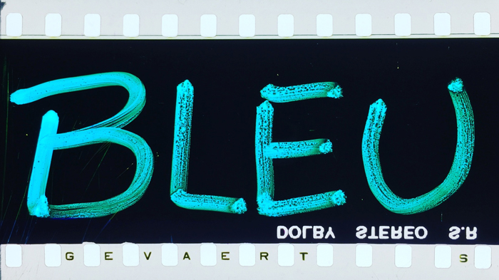
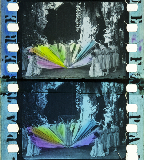
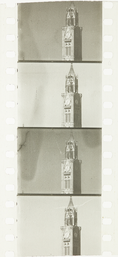
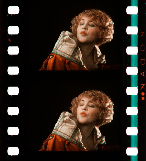
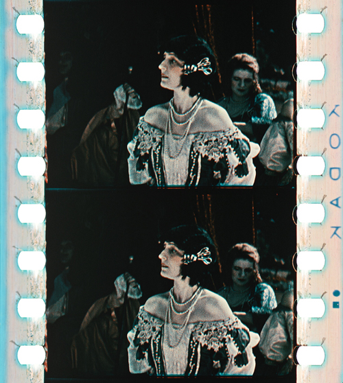
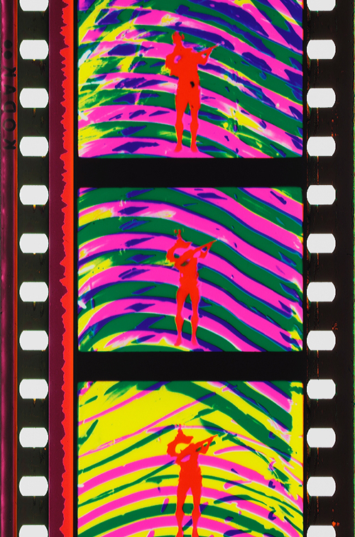
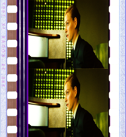
Trois couleurs: Bleu (France/Poland/Switzerland 1993, Krzysztof Kieślowski). Credit: Library of Congress. Photograph of the Agfa Gevaert safety print by Barbara Flueckiger.
Kristin here:
To the general film-going public, old films are in black-and-white. They may be vaguely aware that before The Wizard of Oz and Gone with the Wind, color film was invented.
The history of film color, however, is vastly more complicated than that. Prof. Barbara Flueckiger, of the University of Zurich, has devoted much of her career to studying that history. With Eva Hielscher and Nadine Wieylisbach, she co-edited the 2020 collection, Color Mania: The Material of Color in Photography and Film (Zurich: Eds. Lars Müller/ Fotomuseum Winterthur). Barbara has also spent the past decade leading a team who have created a recently inaugurated and invaluable website that acts as a boundless resource for information on color processes.
We are delighted that Barbara has accepted our invitation to write a guest blog entry for us. She describes the website and gives a succinct outline of the history of film color, loaded with beautiful illustrative frames. Most of these were taken from original archival prints that reveal how seldom–especially in this age of digital home video–we see color films as they looked when they were released.
Barbara Flueckiger
From their earliest days, films were colored. During the first three decades, most color imagery was obtained by applying dyes to black and white prints, either by hand, through stencils, or as tinting and toning of the filmstrips. From the beginning, however, many ideas emerged to capture colors directly on film as so-called mimetic colors. That could be done either by optical and mechanical means, such as colored rotary filters, or by chemical interventions, often in combination with optical configurations of cameras. Several hundred analog color processes and film stocks were invented in the first 100 years of film history. Many of them were never successful commercially.
Ali Baba et les quarante voleurs (France 1902, Ferdinand Zecca). Credit: BFI National Archive. Photograph of the stencil-colored nitrate print by Olivia Kristina Stutz.
This history is largely unknown to the general audience as well as to many film scholars and historians.
To close this gap in our knowledge, in 2011 I started to develop the Timeline of Historical Film Colors, a comprehensive web resource. I wanted to document the development of film colors from their prehistory in still photography in the 19th century to the latest developments in the analog domain. As of 2021, the platform contains hundreds of primary and secondary sources, patents, links, selected analyses, physical measurements and downloads, as well as more than 23,000 photographs of historical film prints and negatives. These items provide film historians, researchers, archivists, curators, film restorers and students easy access to a vast array of information. A tagging system connects the entries, galleries, photos and quotes to an underlying thesaurus containing certain topics, persons, aesthetic concepts, technologies, archives, genres, persons or companies. A comparison function allows side-by-side inspection of different prints of the same film.
Why film color?
The comparison function allows the side-by-side inspection of different prints of the same film.
High-resolution photographs displayed in galleries are a central part of the Timeline of Historical Film Colors. Early on I developed a method to photographically capture and document historical film materials in a standardized way. It uses a modular and calibrated camera set-up based on a DSLR camera with a macro lens and remote control from the computer to adjust all the parameters. It is crucial to show the full range of color processes in an aesthetically pleasing way, one that aims at recreating the visual impression on the bench, including the edge information and color distribution in the perforation area. These elements are vital for the identification of film stocks and the genealogy of prints.
These photos allow researchers and students to examine individual historical prints, since they often have to work with less-than-ideal digitizations on DVDs and Blu-rays that are just a faint echo of the historical source material. In recent years this photographic method has been adopted by my teams in the current research projects. Some archives, such as the Academy Film Archive, have started to use the method, and the BFI National Archive and the George Eastman Museum plan to do so soon.
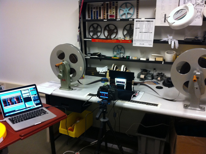
Our modular camera set-up in use at the bench.
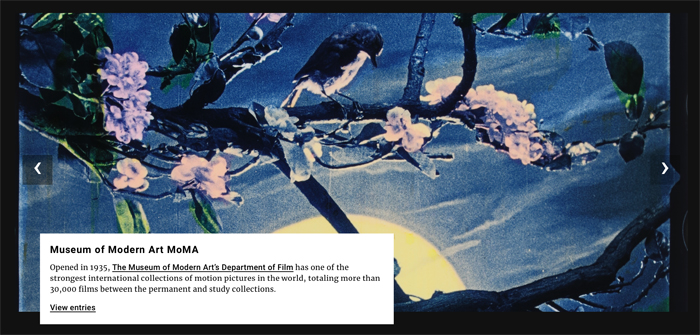
During the last years my teams and I visited many archives in Europe, the US and Japan to take these photographs, such as the Harvard Film Archive, EYE Filmmuseum Amsterdam, National Film Archive Prague, Deutsche Kinemathek Berlin, the Academy Film Archive, the Library of Congress, George Eastman Museum, the BFI National Archive, Cinémathèque française Paris, the UCLA Film & Television Archive, Bundesarchiv Filmarchiv Berlin, Museum of Modern Art, DFF Deutsches Filminstitut & Filmmuseum Frankfurt, the National Film Archive of Japan and others.
On the Timeline of Historical Film Colors each contributing archive is represented with a header slide that gives access to the film elements from their collection.
The lost colors of film history
Most films produced before the mid-1930s have been passed on in black-and-white prints. It was not until the famous FIAF conference in Brighton 1978 that the colors of the first decades of film history began to attract some attention from insider circles focusing on silent film.
To this day, the lack of awareness of film’s colorful past has persisted. Early applied colors such as tinting, toning, hand-coloring, and stencil-coloring are ephemeral by nature, since each exhibition print was dyed separately, in a variety of shades and hues. Moreover, these prints were produced with highly flammable nitrate cellulose as a base. Many deadly cinema fires in the early decades of the 20th century demonstrated the dangers of nitrate stock. Therefore, many original colored film prints have been hidden in cans sitting on the shelves in archives’ nitrate vaults. These facilities are fitted with special safety measures such as break-off walls and earth dams.
Eventually in the 1950s safety celluloid film stocks replaced nitrate. From that point on, new prints of colored early films were made on safety stock from the black-and-white camera negatives, intermediate negatives, or positive distribution prints. When colored distribution prints were used, the new copies were usually made only in black-and-white.
In the early 1980s a second threat to the history of colors in film became apparent. Martin Scorsese was among the prominent filmmakers and scholars who rang the alarm bell over the fading of so-called chromogenic stocks produced from the late 1930s to the 1980s. Due to the physical decay of mainly the cyan dye in these film stocks, original prints become nearly monochromatic, retaining mainly colors in the magenta to red spectrum. To this day, dye fading has remained one of the most pervasive problems for the search of authentic film colors.
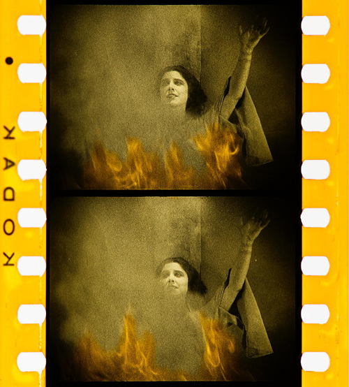
Color fading. Blade Runner (USA 1982, Ridley Scott). Credit: Library of Congress. Photograph of the Eastman Color Print Film by Joëlle Kost.
Applied colors
During the first three decades, so-called applied colors dominated. Historians estimate that about 80% of film prints were colored by tinting, toning, or hand- and stencil-coloring.
Tinting means submerging black-and-white film positives into dye baths, so that the prints’ gelatin emulsion acquired a more or less uniform, mostly monochrome color. Tinting can be identified by the inspection of the perforation area that is also uniformly colored. Toning, on the other hand, is a complementary process whereby the silver image is replaced by colored metallic pigments (metallic toning) or dyes (mordant or dye toning). In contrast to tinting, toning leaves the perforation area mostly colorless.
Tinting. Malombra (ITA 1917, Carmine Gallone). Credit: Cineteca di Bologna. Photograph of the tinted and toned nitrate print by Barbara Flueckiger.
Toning. Voyage autour d’une étoile (France 1906, Gaston Velle). Credit: Cineteca di Bologna. Photograph of the toned nitrate print by Barbara Flueckiger.
For these coloring processes the individual prints had to be cut into segments that were then dyed in batches and reassembled into the final distribution print. As a result, individual prints can vary considerably in their color schemes.
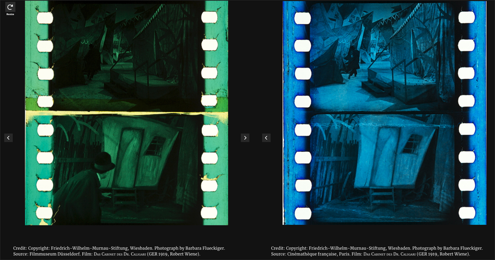
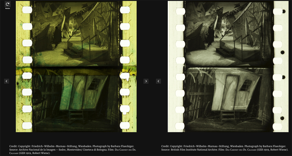
Comparison of four differently tinted and toned distribution prints of Das Cabinet des Dr. Caligari (Germany 1919, Robert Wiene). Copyright: Friedrich Wilhelm Murnau Foundation. Photographs by Barbara Flueckiger.
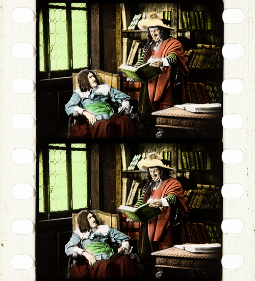
Whether tinting and toning schemes vary due to cultural norms and tastes has remained a topic of debate. To a high degree it is also uncertain who made the decisions about the coloring, except for cases where scripts, production notes, or film negatives indicate the attribution of colors. In addition to colored prints there were so-called copyright books that show the color scheme by single frames attached to the pages of the booklets, deposited at the Library of Congress by distributor George Kleine. Subtle shades emerged that often make it difficult to distinguish between the two, because the black silver image gives way to nuanced interactions with the tinting dyes in middle tones.
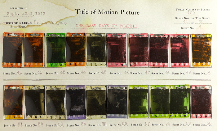
Copyright book from George Kleine: Gli ultimi giorni di Pompei (Italy 1913, Eleuterio Rodolfi). Credit: Library of Congress. Photograph Barbara Flueckiger.
In some cases, combining tinting and toning allowed for two colors to appear within a single image.
Tinting and toning combined. Sumurun (Germany 1920, Ernst Lubitsch). Credit: Bundesarchiv-Filmarchiv. Photograph of the tinted and toned nitrate print by Olivia Kristina Stutz.
The range and variety are even greater in the case of hand and stencil coloring. These techniques generally required the application of up to six dyes on each individual frame, either by hand through tiny brushes or by cut-out stencils. These laborious processes were demanding, given the small image area and the huge number of frames, generally 16 to 18 per second of running time. Hand-colored films show an uneven application of dyes with soft transitions between individual colors. For stencil coloring, each dye necessitated a separate, colorless print from which the stencils were cut out by needles or metallic styluses. As a result, shapes appear more or less sharp-edged. It was a mechanized version of hand coloring that allowed the coloring of feature-length films and higher numbers of distribution prints. Over the years, improved techniques were introduced to transfer the shapes from projected magnifications onto the film prints with the help of pantographs.
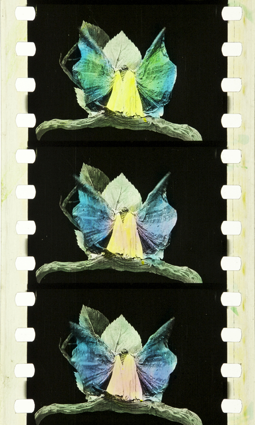
Hand coloring: Métamorphoses du papillon (France 1904, Gaston Velle). Credit: Library of Congress. Photograph of the hand-colored nitrate print by Barbara Flueckiger.
Stencil coloring. Cyrano de Bergerac (Italy/France 1923, Augusto Genina). Credit: EYE Filmmuseum Amsterdam. Photograph of the tinted, toned and stencil colored nitrate film by Barbara Flueckiger.
Needless to say, stencil and hand coloring were reserved for more ambitious or luxurious films. However, they also allowed for the creation of a higher reality effect in documentaries, travelogues, or fashion films by anticipating the development of mimetic colors. Exotic places, ethnicities, or historical settings were among the prevailing topics of stencil-colored films.

Documentary. La mangouste ou rat des pharaons (France 1914). Credit: Cineteca di Bologna. Photograph of the stencil-colored nitrate print by Noemi Daugaard.
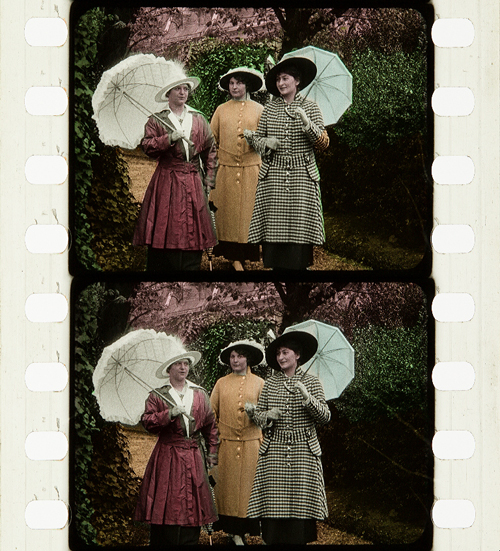
Fashion film. Modeflitsen (France 1918). Credit: EYE Filmmuseum Amsterdam. Photograph of the stencil-colored nitrate print by Bregt Lameris.
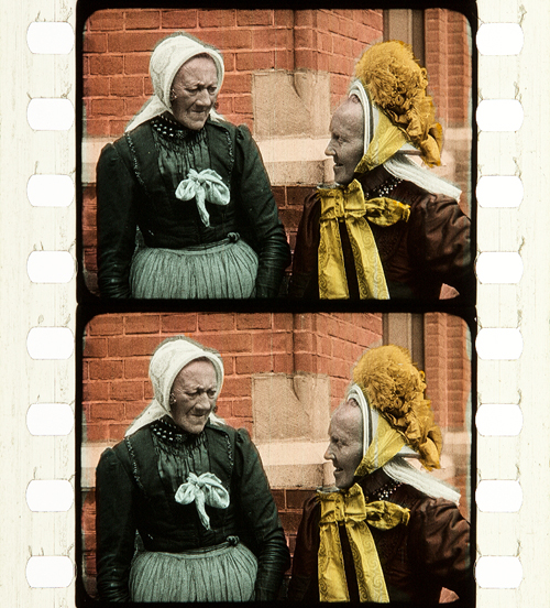
Travelogue. Coiffures et types de Hollande (France 1910, Alfred Machin). Credit: Cineteca di Bologna. Photograph of the stencil-colored nitrate film by Barbara Flueckiger.
In fact, the richness and scope of stencil-colored films can be fascinating to the modern viewer. That holds true for both the bolder color in the first decade of the 20th century or the more nuanced pastel shades that became increasingly prevalent in the 1920s.
Bold colors in early film. L’Amour d’esclave (France 1907, Albert Capellani). Credit: Library of Congress. Photograph of the stencil colored nitrate film by Barbara Flueckiger.
Subtle pastel shades in the 1930s. Elstree Calling (Great Britain 1930, André Charlot; Jack Hubert; Paul Murray; Alfred Hitchcock ). Credit: BFI National Archive. Photograph of the stencil colored nitrate print by Olivia Kristina Stutz.
A special case of applied colors is the Handschiegl process, a printing process developed by Max Handschiegl and Alvin Wyckoff, often used in Cecil B. DeMille’s films, especially for title cards. It produces highly detailed and precise colors with stunning effects.
Handschiegl. Joan the Woman (USA 1916, Cecil B. DeMille). Credit: George Eastman Museum. Photograph of the tinted, toned and Handschiegl nitrate print by Olivia Kristina Stutz.
Mimetic colors
Already in France in the 1860s, Charles Cros and Louis Ducos du Hauron separately wrote descriptions of many of the principles for achieving mimetic colors in still photography. As it turned out, however, it was a much more demanding task to develop solutions for moving pictures. Some of the problems related to the high throughput during projection of 16 or more single frames per second. Other problems resulted from much higher requirements for image size on the big cinema screen, where resolution and registration were paramount. Due to the rapid succession of frames necessary for the illusion of movement, minute deviations occurring between frames created disturbing amounts of flicker or color fringing. Contemporary commentators often labeled the result as “color bombardment” that caused “eye strain”.
To this day, mimetic colors combine two to four color components either in additive or subtractive admixtures. In the 19th century their development followed psychophysical insights into the human visual system by Thomas Young and Hermann von Helmholtz. They showed that color impressions are the result of physiological sensors in the human retina sensitive to three different spectral ranges of the visible light.
Additive colors
Additive admixtures operate with colored light where the sum of the three additive primaries red, green and blue results in white light. The earliest attempts to create colors on the screen by optical means employed additive principles by rotary filters in front of the camera and projector respectively. These included the three-color Turner Lee and the most successful additive two-color process Kinemacolor.
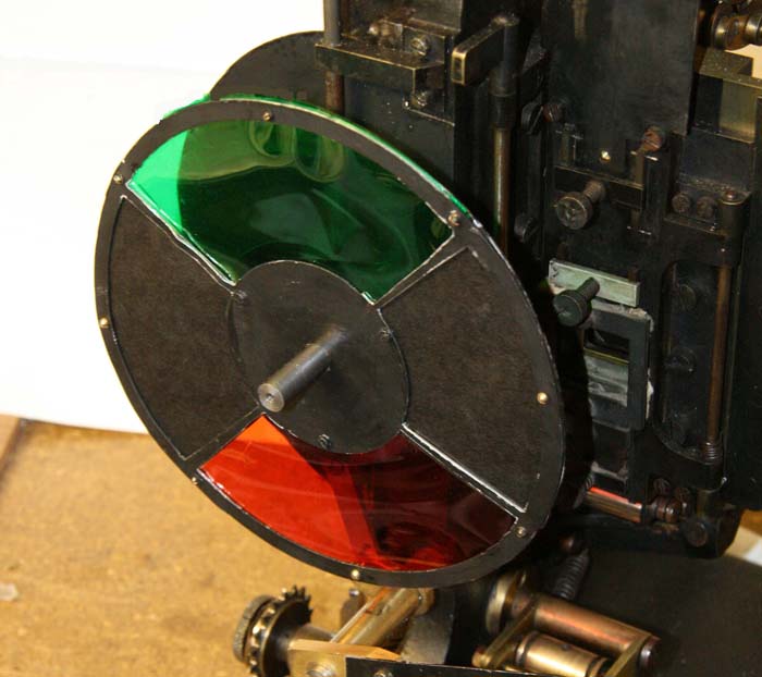
Rotary filter in front of the Kinemacolor projector used for David Cleveland’s and Brian Pritchard’s reconstruction. Credit: Brian Pritchard.
Kinemacolor positive from the Kodak Film Samples Collection. Credit: National Science and Media Museum Bradford. Photograph by Barbara Flueckiger in collaboration with Noemi Daugaard.
In Kinemacolor, rotary filters in red and green spinning in front of camera and projector recorded and transmitted the color information by temporal synthesis. The impression of color was created in the eyes of the spectators. Based on contemporary reports and digital reconstructions, the poor quality and limited color spectrum were readily apparent. Due to the temporal shift between the two successive frames with the red and green color separations, Kinemacolor and all processes operating by the same principle created color fringes and a headache-inducing amount of flicker.
Mroz Farbenfilm. Urlaubfarbenfilm F. Apfelthaler (AUT 1932, Friedrich Apfelthaler). Credit: Österreichisches Filmmuseum. Video and reconstruction by Giorgio Trumpy, David Pfluger and Martin Weiss.
Attempts with temporal synthesis were followed by additive processes that employed spatial synthesis by the application of beam splitters. In this configuration, up to three color records were taken through filters simultaneously to eliminate temporal parallax. But this approach introduced spatial parallax instead, and this arrangement could also create color fringes by poor registration. Gaumont’s Chronochrome process was certainly the most convincing attempt to combine three color separations with this principle.
Gaumont Chronochrome positive from the Kodak Film Samples Collection. Credit: National Science and Media Museum Bradford. Photograph by Barbara Flueckiger in collaboration with Noemi Daugaard.
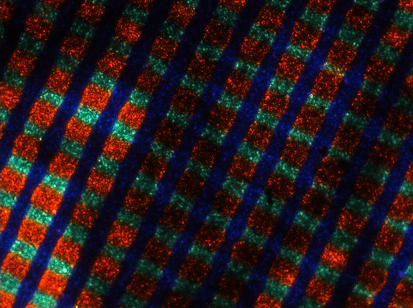
A third type operating with additive admixtures of light are the so-called screen processes. Additive colors are mixed, either by random, small-scale mosaic image elements or by organization into lines. Color impressions in these systems result from the fusion of the individual dots or lines into red, green and blue in visual perception. The effect resembles that of pointillist paintings where colors are divided into small dots.
Lenticular screen processes, by contrast, combine tiny lenses imprinted onto a black-and-white film strip with colored filters in front of the camera and projector.
Kodacolor lenticular filter for the projector. Lichtspiel/Kinemathek Bern.
Mosaic screens created by colored potato starch were popular in still photography with the Lumière brothers’ Autochromes, introduced in 1907 and widely used by professionals and advanced amateurs. The principle was later adopted in the Cinécolor process for color film but failed due to the uneven distribution of the starch particles. Among the line screen processes, Dufaycolor was the most successful one, widely used in documentaries and famously in Len Lye’s experimental films with direct animation painted directly onto the film strip and then captured and distributed on Dufaycolor film stock. Apparently, Lye was not convinced by the somewhat muted color palettes of the process.
Stereoscopic Autochrome Lumière. Exhibition Color Mania – Materiality of Color in Photography and Film, Fotomuseum Winterthur, September 7 to November 24, 2019. Photo by Barbara Flueckiger.
Photomicrograph of Cinécolor (20x). Credit: Photomicrograph by Silvana Konermann.
Cinécolor sample. Credit: Gert Koshofer Collection. Photograph by Barbara Flueckiger.
Photomicrograph of Spicer-Dufay, early Dufaycolor (20x). Credit: Photomicrograph by Silvana Konermann.
Dufaycolor. A Colour Box (Great Britain 1935, Len Lye). Credit: BFI. Photograph of the Dufaycolor di-acetate print by Barbara Flueckiger.
Lenticular films such as Kodacolor were also mostly used for home movies with the exception of Thomson color for Jacques Tati’s Jour de fête (France, 1949).
None of the additive principles proved to be successful for the long term. Many of them required special installations in the cinema, and most delivered poor results, most notably dim images.
Subtractive colors
Finally, subtractive admixtures became the norm. The three primaries cyan, yellow and magenta filtered the light, with black being the sum of these three subtractive colors. Two or three differently colored emulsion layers are attached to the film base, on one side or both sides of the film.
Most early two-color films were using double coated film stock. The earliest one was Kodachrome Two-color developed in 1915, presented in 1916 with the short film Concerning $1000, but mostly in use in the 1920s for fashion films, for the dance film The Flute of Krishna (USA 1926) by choreographer Martha Graham and for the experimental film [Kaleidoscope] by Loyd A. Jones. Kodachrome Two-color film was shot through a beam splitter and combined two emulsions in orange-red and bluish green on either side of the film carrier, with beige, brown and golden tones in the spectrum between the two color components.
Kodachrome Two-color Test Shoot No. III (USA 1922, Anonymous). Credit: George Eastman Museum. Photograph of the Kodachrome two-color double coated stock by Olivia Kristina Stutz.
Kodachrome Two-color. [Kaleidoscope] (USA ca. 1927, Loyd A. Jones). Credit: George Eastman Museum. Photograph of the Kodachrome two-color double coated stock by Barbara Flueckiger.
Sirius Farbenfilm. [Farbfilmversuche] (Germany 1920s or 1930, Ludwig Horst; Hans Horst). Credit: Deutsches Filminstitut DFF. Photograph of the Sirius color nitrate print by Barbara Flueckiger.
Multicolor. Credit: Gert Koshofer Collection. Photograph by Barbara Flueckiger.
Prizma II. The Glorious Adventure (Great Britain 1922, J. Stuart Blackton). Credit: BFI National Archive. Photograph of the tinted and Prizma II nitrate print by Olivia Kristina Stutz.
In the 1930s subtractive processes turned to three colors, most famously with Technicolor No. IV and the subsequent Technicolor No. V, which was printed from chromogenic camera negatives. Founded in 1915, the Technicolor Company went through many failures and set-backs, with the exception of a short color rush in the late 1920s with the two-color dye-transfer process Technicolor No. III. Following the series Great Events with 12 short films produced by the Technicolor company to establish the process, mostly musicals and a few other genres exploited the two-color process during this short boom. But some of them are highly remarkable, with sophisticated camerawork by Technicolor’s own cinematographer Ray Rennahan, including the musical Whoopee! (USA 1930, Thornton Freeland) choreographed by Busby Berkeley, King of Jazz (USA 1930, John Murray Anderson, Pál Fejös), Doctor X (USA 1932, Michael Curtiz), and Mystery of the Wax Museum (USA 1933, Michael Curtiz).
Technicolor No. III. Doctor X (USA 1932, Michael Curtiz). Credit: UCLA Film & Television Archive. Photograph of the Technicolor No. III dye-tranfer nitrate print by Barbara Flueckiger.
Technicolor No. III. King of Jazz (USA 1930, John Murray Anderson; Pál Fejös). Credit: Library of Congress. Photograph of the Technicolor No. III dye-tranfer nitrate print by Olivia Kristina Stutz.
While the technologies applied in Technicolor’s various processes changed considerably over the years, the beam splitter was one of the few constants. Both in Technicolor No. II and III, a beam splitter separated the two color records and captured them mirrored upside down on one black-and-white negative. The bulky and heavy Technicolor No. IV camera recorded the color separations on three black-and-white 35 mm negatives. From these three negatives matrices were produced as wash-off reliefs, ready for the dye-transfer of the three primaries onto the positive print. The result was a series of color images, along with the frame lines and the soundtrack as silver images.
For almost two decades Technicolor dominated the market for high-quality color films. Part of its success was due to a comprehensive package that included the camera, specialized cinematographers, and all the lab works executed exclusively in Technicolor’s own plants. One of the building blocks of Technicolor’s long-term dominance, however, was the so-called Color Advisory Service, famously led by color consultant Natalie M. Kalmus. She defined aesthetic guidelines for film productions shot with the process, informed by color norms related to concepts of “elevated taste,” located in a broader cultural context with references to the concept of “color consciousness.”
Technicolor No. IV. The Life and Death of Colonel Blimp (Great Britain 1943, Michael Powell; Emeric Pressburger). Credit: BFI. Photograph of the dye-transfer nitrate print by Barbara Flueckiger.
Technicolor No. IV. Blood and Sand (USA 1941, Rouben Mamoulian). Credit: BFI. Photograph of the dye-transfer nitrate print by Barbara Flueckiger.
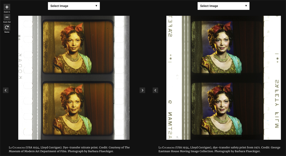
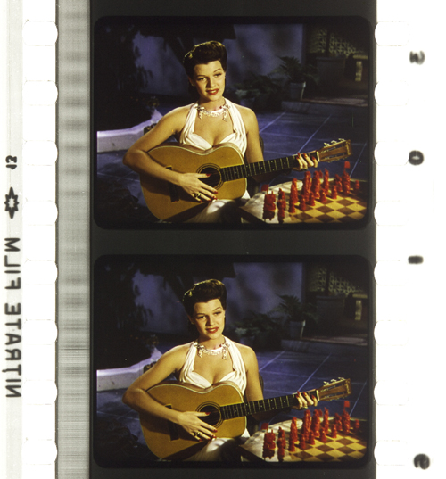
Technicolor No. IV. Gentlemen Prefer Blondes (USA 1953, Howard Hawks). Credit: Library of Congress. Photograph of the dye-transfer safety print by Barbara Flueckiger.
Despite all the efforts to control the color schemes, people often associate Technicolor with highly saturated, deep colors. On close inspection in our detailed analyses of color films, however, we have observed that many films adhere to the rules with mostly restrained color schemes and unsaturated backgrounds to guarantee optimal figure/ground separation. But there are also deviations from these self-imposed norms, surprisingly clashing hues even in films produced with Natalie M. Kalmus as color consultant.
Moreover, there is a great variability of different looks and color applications during the almost two decades. Individual color aesthetics were related to personal styles of cinematographers, directors or production companies, genres or changing preferences in fashion and design, and changing color compounds and recipes employed in the process. Technicolor’s idiosyncrasies – what we perceive as typical “Technicolor look” – are mostly due to the dye-transfer process itself. Pasty, dense colors in patchy structures create an almost opaque appearance on the screen, an effect somewhat like oil paint. When we work with the film elements on the bench in archives, we not only have to increase exposure considerably due to the density of the film stock, but we also notice the color layer’s almost sticky viscosity, often visible as a relief on the surface.
Compared to Technicolor, Gasparcolor produced much more saturated, brilliant and luminous colors. In fact, the process, developed in the early 1930s by Hungarian emigré Béla Gaspar in Germany, was possibly the most advanced and complex process at the time. In its principle–the silver dye-bleach process described by Raphaël E. Liesegang in the late 1890s – the silver acted as a catalyst for the local destruction of the dyes embedded in the three emulsion layers on the two sides of a reversal positive. It is thus a chromolytic reversal process. Due to the political circumstances during the Third Reich in Germany, Gaspar eventually had to flee.
Like Technicolor Gasparcolor required the recording of three color separations on black-and-white negatives. Since most of the Gasparcolor films were animations, these separations were captured in succession on adjacent film frames but could of course also have been shot through a beam splitter similar to Technicolor No. IV. In fact, only one documentary is widely known, Colour on the Thames (Great Britain, 1936), shot by Adrian Cornwell-Clyne. Among the films produced with Gasparcolor are famous avant-garde experimental films by Oskar Fischinger, Hans Fischinger, and Len Lye. Gasparcolor prints can easily be identified by the black perforation area and the colored soundtrack.
Gasparcolor. The Ship of the Ether (Netherlands 1934, George Pal). Credit: BFI National Archive. Photograph of the Gasparcolor nitrate print by Barbara Flueckiger.
Gasparcolor. Colour on the Thames (Great Britain 1935, Adrian Klein). Credit: BFI National Film Archive. Photograph of the Gaspar color nitrate print by Barbara Flueckiger.
Gasparcolor. Rainbow Dance (Great Britain 1936, Len Lye). Credit: Museum of Modern Art. Photograph of the Gaspar color nitrate print by Barbara Flueckiger.
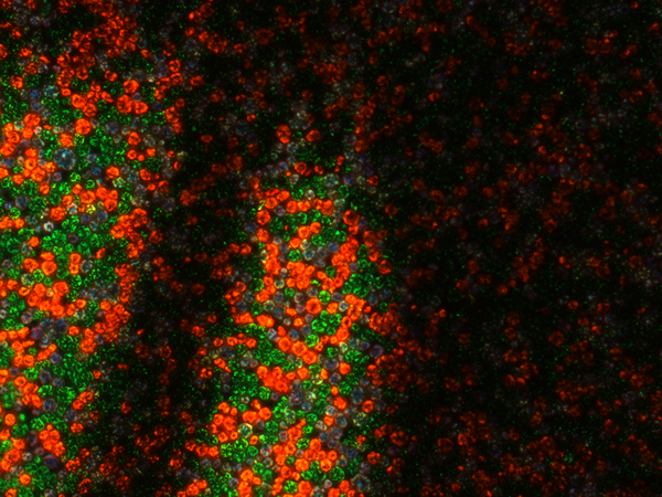
Both Technicolor and Gasparcolor prints stored in archives are in remarkably good shape, due to their stable colors. Ironically, chromogenic film stocks, the technical principle that ultimately won the competition and became the new standard, had the least stable dyes. Chromogenic means that the dyes need to be developed after exposure. Embedded in the emulsion of a single strip of film stock are three or more layers. These layers are sensitive to different spectra. All contain silver halides and the color-forming substances, so-called dye couplers that are subsequently developed into dyes. In a second stage the silver is bleached out and leaves the color information in the form of finely dispersed dye clouds in the three or more emulsion layers in cyan, magenta and yellow. The result is a highly translucent, glowing image whose fine-grain structure depends on the speed of the film stock. The slower the speed, the finer the grain.
In contrast to Technicolor the shooting of the chromogenic film could be done with normal cameras on one negative or camera reversal. Chromogenic films increasingly became the norm, starting with Agfa’s first negative-positive process Agfacolor. Emerging in the late 1930s, Agfacolor was promoted by German propaganda in a bid to counteract Technicolor’s dominance. Agfacolor had particularly soft colors in the pastel range with a typical, slightly darkened orange-tomato red. Difficulties in the blue range produced turquoise shades that become quite apparent in skies. Greens had a tendency to look brownish or blackened; shadows had a greenish tinge. Chromogenic multilayer film stocks were incredibly difficult to balance and to produce, requiring a high level of knowledge in physics and chemistry.
Agfacolor. Münchhausen (Germany 1943, Josef von Báky). Credit: Copyright Friedrich Wilhelm Murnau Foundation. Bundesarchiv Filmarchiv. Photograph of the Agfacolor safety print (acetate) by Barbara Flueckiger.
Agfacolor. Opfergang (Germany 1944, Veit Harlan). Credit: Copyright Friedrich Wilhelm Murnau Foundation. Filmmuseum Düsseldorf. Photograph of the Agfacolor Safety Print by Barbara Flueckiger.
Agfacolor. Grosse Freiheit Nr. 7 (Germany 1944, Helmut Käutner). Credit: Copyright Friedrich Wilhelm Murnau Foundation. Bundesarchiv Filmarchiv. Photograph of the Agfacolor nitrate print by Michelle Beutler.
Agfacolor. Der schweigende Stern (German Democratic Republic 1960, Kurt Maetzig). Credit: Bundesarchiv Filmarchiv. Photograph of the Agfacolor safety print by Josephine Diecke.
After World War II ended, the Allies were able to exploit German color-film patents. The result was the appearance of Fujicolor, Eastman Color, and many derivatives, such as Ferraniacolor, Ansco Color, and Sovcolor. The worldwide adoption of color in film production soon followed.
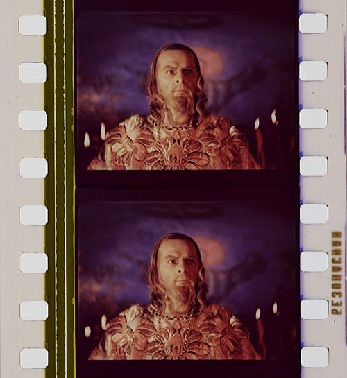
Sovcolor. Ivan the Terrible, Part II (Russia 1958, Sergei M. Eisenstein). Credit: Museum of Modern Art. Photograph of the Sovcolor safety print by Barbara Flueckiger. (The film was shot in the 1940s on captured Agfacolor stock, but the delay in the release of the film until 1958 meant that distribution prints were on Sovcolor stock.)
Fujicolor. Matador (Spain 1986, Pedro Almodóvar). Credit: Library of Congress. Photograph of the Fujicolor safety print by Barbara Flueckiger.
Eastman Color. Aliens (USA/Great Britain 1986, James Cameron). Credit: Academy Film Archive. Photograph of the Eastman Color Print Film Type 5384 by Joëlle Kost.
Eastman Color. Gattaca (USA 1997, Andrew Niccol). Credit: Library of Congress. Photograph of the Eastman EXR Color Print Film Type 5386 reference print by Barbara Flueckiger.
A plurality of styles emerged, less defined by technical limitations than by cultural contexts and individual preferences of filmmakers, art directors, costume designers, and cinematographers. Color aesthetics in film are not only created by hues, color schemes, and color contrasts, but also by lighting styles, by material properties of surfaces and textures, by depth of field, image composition, and by movement. The combination of these factors influences the image’s figure-ground relationships.
In the course of our research, we investigated a large corpus of more than 400 films – mainly from 1895 to 1995 – with a computer assisted workflow. A video annotation software has been developed based on our approach since 2017, when we figured out that tools available then were not well suited to the detailed annotation and visual analysis of film (color) aesthetics. The visual analysis and annotation software VIAN has been created by Gaudenz Halter in collaboration with the Visualization and MultiMedia Lab of the University of Zurich. The tools enable researchers to create detailed analyses including figure/ground separation and a large range of visualizations that make diachronic developments immediately evident or support the testing of new hypotheses.
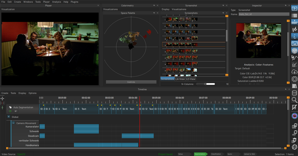
Video analysis and annotation software VIAN, developed by Gaudenz Halter. User interface.
A deepened understanding of color film technologies and aesthetics is an essential prerequisite for the scientifically sound digitization and restoration of color films, which is one of the most pressing topics today and therefore remains at the center of our research activities.
Acknowledgements
I would like to express my immense gratitude to Kristin Thompson and David Bordwell for publishing this blog post and for all the inspiration that guided my research.
A huge thank you to my teams ERC Advanced Grant FilmColors, SNSF Film Colors. Technology, Cultures, Institutions, ERC Proof-of-Concept VeCoScan.
Special gratitude is dedicated to all the film archives with their wonderful collections.
This project has received funding from the European Research Council (ERC) under the European Union’s Horizon 2020 research and innovation programme, grant agreement No 670446 FilmColors.
THE LIGHTHOUSE: A period film with period style
Kristin here:
David and I first saw Robert Eggers’ The Lighthouse at the Vancouver International Film Festival, and he wrote briefly about it at the time. About halfway through the screening or less, I realized that what I was watching was a modern combination of two important historical trends of 1920s German cinema: Expressionism and the Kammerspiel.
I am partial to German silent cinema, particularly Expressionist films, for their daring stylization. The movement gave rise to some great films by two masters, F. W. Murnau and Fritz Lang. I’m even fond of the leisurely pacing that characterizes so many Expressionist and Kammerspiel films. At times some scenes resemble the slow cinema of recent decades.
Kammerspiel was a larger trend in the theater of the day, and it has its equivalent in English and American drama, the chamber play. Most of the Kammerspiel films in Germany were written by the great scenarist Carl Mayer, also responsible for many of the Expressionist classics from Das Cabinet des Dr. Caligari on. Kammerspiel films include most notably Hintertreppe (Backstairs, Leopold Jessner, 1921), Sylvester (1923) and Scherben (1923). Some would consider Murnau’s The Last Laugh (1924) to be a Kammerspiel. Carl Dreyer also made one in Germany, Michael (1924, with a scenario by Thea von Harbou) and one in Denmark, The Master of the House (1925). Such films typically involve a small cast of characters who come into conflict in various ways, invariably ending badly, typically with death, suicide, murder, and/or imprisonment. The Lighthouse clearly qualifies.
The Lighthouse is also a horror film, or at least a lot of critics think so. Thus it fits cozily into the Expressionist movement, of which several Expressionist films are now considered early classics of the horror genre: Caligari, Nosferatu, Der Golem, Warning Shadows, Die müde Tod and other less well-known films.
Critics did not fail to notice The Lighthouse‘s links to silent cinema, and in particular Expressionism. Richard Newby’s review in The Hollywood Reporter remarks on: “The filmmaker’s decision to shoot the film in black-and-white and in the aspect ratio of 1.19:1, giving The Lighthouse the appearance of a silent film born of German Expressionism.” He also calls it, “Equal parts Lovecraftian horror story and existential chamber piece in the vein of Jean-Paul Sartre’s No Exit.”
Screen Daily reviewer Lee Marshall caught both the Expressionist and Kammerspiel aspects:
Shot in an expressionist black and white that harks back to cinema’s earliest years, The Lighthouse provides a marvellous chamber-drama platform for two actors, Robert Pattinson and Willem Dafoe, who seize the opportunity with gusto.
[…]
Referencing everything from German expressionist cinema of the 1920s to US silent comedy, the photography of Edward Weston and the from-the-ground-up perspective in the paintings of Andrew Wyeth, Jarin Blaschke’s photography is starkly compelling.
Manohla Dargis’ review in The New York Times explicitly notes German Expressionist cinema:
With control and precision, expressionist lighting and an old-fashioned square film frame that adds to the claustrophobia, Eggers seamlessly blurs the lines between physical space and head space.
The film’s more sustained pleasures, though, are its form and style, its presumptive influences (von Stroheim’s “Greed,” German Expressionism), the frowning curve of Winslow’s mustache, the whites of eyes rolled back in terror.
One might add that the dreams and hallucinations, shown from Winslow’s viewpoint, reflect the innovations of French Impressionist cinema of the 1920s. This sort of stylistic subjectivity, however, was highly influential and has been widely used ever since. It was quickly picked up in German cinema of the 1920s, and some of the classics of the day, especially The Last Laugh (1924) and Variety (1925), are more noted for their subjective camerawork than are the earlier French films that originated the practice. Overall, The Lighthouse has the flavor of a German film from the 1920s.
Lots of filmmakers have attempted to imitate silent cinema, and often they succeed to a degree. They shoot in black-and-white (but don’t add tinting and toning), put just music and maybe some sound effects on the track, and have some exaggerated acting. Perhaps they set the story in the past, as Michel Hazanavicius does with The Artist (2011). A more careful attempt is Blancanieves (2013).
No matter how careful the combination of such elements is, the result usually doesn’t really look like an old film. The Lighthouse really does look like a silent film, in the sense that it looks as if it were shot using the film stock available in that era. It does not, however, pretend to be a silent film, as The Artist does. The Lighthouse doesn’t eliminate the dialogue. Its narrative and tone bear distinct resemblances to those of German and French films of the 1920s, but its story is presented with more overt sexual content and extreme violence than mainstream silent movies would have included.
It helps that Eggers is clearly a cinephile and has watched a wide variety of films from many periods. Cinematographer Jarin Blaschke has also worked as a still photographer and also knows a great deal about older film stocks and lenses. They both knew a lot about films of all periods.
When asked in an interview for American Cinematographer what were the team’s “references” (films shown to crew members as models), Blaschke responded:
A bit of Béla Tarr for tonal dreariness and patient use of camera. Bergman’s camera language, as always. [Eggers’ liked the strong night lighting of In Cold Blood. There were some nautical silent films, including Flaherty’s Man of Aran, [which was shot] on orthochromatic stock with strong, direct close-ups. [The influence of] Eisenstein was there for montage, and bold, hard cuts. Optically, the films we watched from the ‘20s and ‘30s were very appealing in their subtle fringe distortions and the way highlights would shimmer. [p. 63]
In the end, the most influential references were M—an inspirational and modern film in terms of visual language—and Bresson’s Pickpocket, which influenced [our] use of close-ups, especially actions with hands. These helped steer The Lighthouse away from the purist confines of the turn of the century, and more toward early modernism.” [pp. 63-64]
M seems rather an odd choice, but Blaschke describes its inspiration in an interview for Kodak:
Watching that, I found a very modern film with surprising camera movement but more importantly: a modern, creative mastery in how visual information was withheld from the audience, how information was rewarded, and when,” says Blaschke. “With this new inspiration, I felt there was a highly-effective framework for me to express myself visually. Stepping away from a mere 19th-century emulation, we were on to something more surprising and layered.
In a DGA podcast interview, Eggers discusses the nearly-square aspect ratio:
And then, the boxy aspect ratio, we were shooting in 1:19.1, early-sound aspect ratio. There’s a Pabst film, Kamaradschaft, that takes place in a mine, which is probably the only other film that makes sense to use this aspect ratio, because Pabst is shooting vertical objects, like the smokestacks, and we have our lighthouse tower, and then the cramped mineshafts, and then the cramped interiors of this thing. Because we’re using spherical lenses, it’s actually taller, so it’s a great aspect ratio for these close-ups. You don’t need flab on the side. You just have Robert Pattison’s cheekbones, Willem Dafoe’s cheekbones in all their glory on these old lenses.
Who knows what other films are these two are familiar with? But one can assume that they watched some of the classic German films of the 1920s, both Expressionist and Kammerspiel.
The Lighthouse and German Silents
Early German Expressionist films often used jagged, abstract sets, more like paintings than like actual buildings or landscapes. Caligari is the most familiar instance, but here are a couple of examples from Von Morgens bis Mitternachts (1921, Karlheinz Martin).
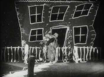
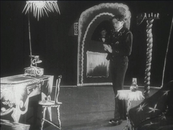
The second image demonstrates particularly well how light was often represented by streaks of paint. The overhead hanging lamp at the upper left is a fringe of spikes, and the flames on the huge candlestick at the left are five wisps of paint. Highlights from these “lights” are painted on the desk and chair at the lower left.
Hollywood films have seldom used distorted sets of this kind. They appear occasionally, as in Son of Frankenstein (1939, Rowland V. Lee) and Beetlejuice (1988, Tim Burton). Most of the time, though, when people speak of expressionist style in films noir or horror films, they’re talking about graphic effects created by lighting. That lighting is not created by streaks of paint but by fancy lighting effects. That’s mostly the case in The Lighthouse. The lighthouse tower and the service buildings around it were designed to be authentic copies of features in real historical lighthouses. The distorted stylization comes from lighting effects, from simple underlighting to patterns created by patterned holes in the lighthouse interior.
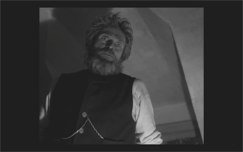
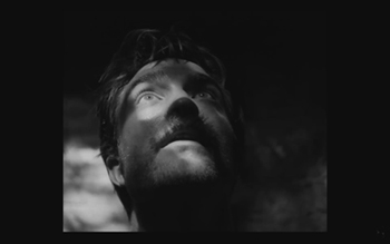
The same is true of acting. In German Expressionist films, actors’ faces were often painted, especially with dark patches around the eyes and pasty white skin. Compare this close-up of Ernst Deutsch’s face, as the Cashier in Von Morgens bis Mitternachts, with that of Robert Pattinson, where the distortions are created by light and shadow.
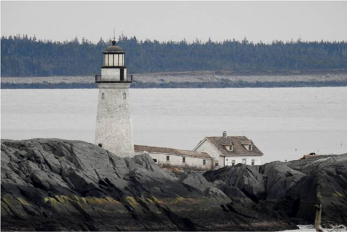
Most of the classic German Expressionist and Kammerspiel films were studio-created. Sets were built either in studios or on extensive backlots. In contrast, Eggers wanted to use an authentic lighthouse. Scouting failed to turn up one with adequate access roads, so the lighthouse and service buildings were built, with faithful adherence to period locales, near the tip of the Cape Forchu Lighthouse peninsula (down the road from a modern lighthouse).
This location is far from from isolated, but the film manages to create a sense of loneliness and dread nonetheless. The huge crashing waves and storms were not generated digitally but were practical effects. According to the Kodak story, “Most of the water work was shot in a large, emergency-responder’s training pool, capable of generating waves in varying sizes and patterns, located near Halifax.” The film contains a few digital effects, mainly to turn the peninsula into an island.
Eggers seems to share the sensibility of the German silent directors: “In a perfect world, I would have liked to have built every single building, for control, control, control, control, control.” (From the DGA interview)
As to Kammerspiel films, The Lighthouse reminds me most of Scherben, which deals with a man who works as a linesman for a railroad. He, his wife, and their daughter live in isolation in some woods and live a stultifyingly dull existence. The intrusion of a railroad inspector who seduces the daughter leads to drama as the linesman gradually becomes enraged and kills him. The style of the film is quite different from that of The Lighthouse, but the dynamics of conflict and gradual deterioration of the central character are somewhat similar–if more restrained in his slow burn and stolid demeanor.
Scherben only became generally available earlier this year, when I wrote about its Filmmuseum Edition DVD release. I have no idea whether Eggers ever saw it at an archive screening or in somewhere else. He more likely saw Hintertreppe, which has long been the only one of the classic Kammerspiele commonly accessible.
Bringing back orthochromatic, sort of
In the DGA interview, Eggers discusses the choice of film stocks:
We thought orthochromatic film stock would really be the way to go, which, among other things, the main thing about orthochromatic film stock is that it’s not sensitive to red, so red is rendered black. So the rosy skin tones on a Caucasian renders darker. So Eisenstein, that’s why all those Russian faces look so tan, and in Hollywood they’re wearing white pancake makeup to compensate for the orthochromatic stock [….] So we liked Double-X negative. The blacks bottom out suddenly in a way that’s very satisfying, as we remember it from watching old movies.
Apparently Eggers and Blaschke investigated having orthochromatic 35mm stock custom-manufactured for them, but the expense was too great. A cheaper way had to be found.
In the American Cinematographer interview, Blaschke describes testing Kodak’s Double-X 5222 35mm film, color 35mm negative film, and digital capture with an Arri Alexa: “In addition to much larger grain, the Double-X has more ‘tooth.’ Even if you match the overall contrast in the DI [digital intermediate], the Double-X had more ‘local’ or ‘micro’ contrast, which emphasizes texture and better differentiates similar tones” [p. 61]. (Double-X 5222 was introduced in 1959 and has been used on such films as Raging Bull [1980] and Schindler’s List [1993].)
Despite these advantages, however, Double-X is a panchromatic stock, with sensitivity to the entire visible spectrum. To solve this “problem,” Blaschke ordered a custom-made filter that would eliminate the red-to-mid-yellow end of the spectrum, thus simulating orthochromatic film effectively [AC, pp. 66-7].
The choice of lenses was also done with an eye to maintaining the artificial orthochromatic look. Blaschke tested many vintage lenses and settled on Baltars, designed in 1930s. The two used in the film were made in 1941 and 1944. In the Kodak interview, he says, “The vintage Baltars were the most shimmery of the bunch I tested, and really were the most stunning portrait lenses I have ever seen,” he says. “The highlights really glowed, but stopped just short of heavy-handedness. Optics like these could add a layer of complexity on top of our hard, orthochromatic look to pull people into the world of the film.” A rehoused 1905 50mm lens was used for some flashback images, and some replicas of 1840 Petzval lens designs were used in flashbacks and “heightened moments”[AC, p. 64]. Blaschke describes the effect in an interview on the Motion Picture Association website: “Blaschke says that for those more “out there sequences,” he had a special lens designed—called a petzval—that contains a lot of aberrations. “It creates a very squirrely look. The background almost falls out of focus, like a globe, and you get this very swirly effect.”
Lighting The Lighthouse
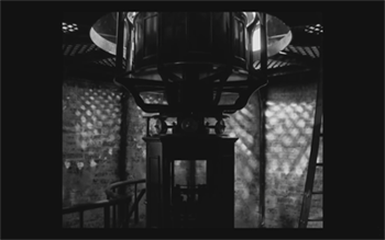
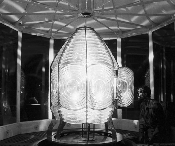
Those swirling light patterns you see on Pattinson’s face in the movie are a real phenomenon—we found ourselves just wanting to gaze into the Fresnel lens. We could have stayed all night staring into the light.
Robert Eggers, Cannes Press Release
Apparently the decision to set the film in the 1890s arose during the search for the ideal lighthouse. In an interview with Eggers in Architectural Digest, he remarks, “‘I wanted there to be a mystery in the light. Inside the beacon. So we knew we needed to set it in a period where we would have a Fresnel lens,’ he explains. Not many lighthouses still have functional ones today. ‘They look like Art Deco spaceships, and they are very magical and jewel-like. So we knew that was going to place us in the second half of the 19th century.'” (See the bottom for an image of the film’s custom-made Fresnel lens mesmerizing Winslow in the climactic scene.)
The decision to imitate orthochromatic film had a considerable impact on the lighting used. Ironically, it meant that a great deal of light from modern lamps, had to be used. Eggers admits as much in the DGA interview.
Obviously we weren’t lighting it like an old movie. We were lighting it using our practical fixtures, but of course, if this were an old movie, you would see the flame of the kerosene lamp and there would be a movie light lighting the scene. But what we did was we had a 600W halogen bulb on a flicker dimmer in all those scenes. And it was really, coming from Alexa and fast film stock, it was so bright. People were wearing sunglasses when we were doing night interiors.
Double-X is slow, even slower than color negative stocks. Modern digital cameras can typically shoot with less light than shooting on film requires. Putting together slow film stock, a filter (albeit one that cut down the light availability by less than one stop), and older, slower lenses meant that the cinematography crew had to use huge amounts of light, as a Variety interview with Blaschke explains:
Blaschke says he prefers to model his lighting in a real-life way, which was tricky on “The Lighthouse.” He and gaffer Ken Leblanc worked with Kodak Double-X stock — Blaschke calls it the only practical black-and-white film left after Plus-X was discontinued in 2011 — which is much less sensitive to light than even color film stock. Between the optics, the film stock and the filtration, Blaschke and Leblanc had to use about 15 to 20 times more light on set to get the look they wanted than on “The Witch,” which was shot on an Alexa.
“Even though it’s a very dark movie, the sets were actually blindingly bright,” says Blaschke. “We’d put 500- to 800-watt halogen bulbs in the lanterns that would flicker and were only a few feet from an actor’s face. The way we make movies now, people have gotten used to a very low light level; it’s trendy to shoot wide open, digitally at 800 or even 2,000 ASA. Our actors talked about how they couldn’t see each other sometimes, which I felt bad about.”
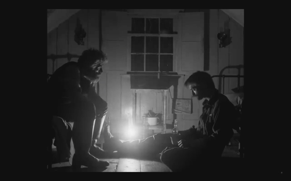
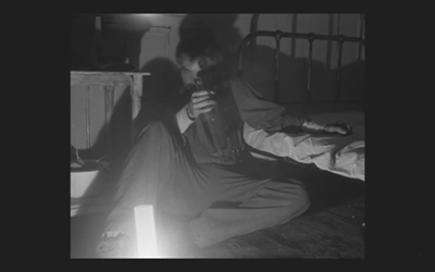
This halogen light is used in the night interiors, such as the scene of the drunken dance, below, and the later scene of the pair drinking in their shared bedroom, at the top of this section and the entry.
This combination of a very bright lamp with slow film and a filter cutting down part of the spectrum of light entering the lens meant that the light fell off very quickly away from the lantern. That effect is also very evident in these scenes. Backgrounds are dimly visible, and the actors often become silhouettes.
The result is a heightened sense of the two main characters being trapped together in small islands of light surrounded by blackness. We have no sense of how many lanterns the house contains, but we never see more than one at a time. At one point Winslow is seen in bed with a book, and the dim light from the window above him makes it hard to believe that he can see well enough to read. Even the daytime scenes are gloomy and gray. A low angle with the blank, light sky as rendered by the “orthochromatic” film makes Winslow and the dark rocks around him look nearly black.
Few silent films shot on orthochromatic film look this consistently dark, and it’s clear that the filmmakers were not simply trying to replicate the look of an old film. Blaschke admits as much in yet another of the many interviews on the film’s techniques: “It wasn’t about trying to make it look like older films but rather choosing a frame that lends itself to the tall and narrow sets and helps you visually withhold information from the audience. It also had a secondary effect of evoking compositions of 20th century modernist photography,”
In the DGA interview, after describing the various technical details of design, setting, and cinematography, Eggers explains:
This is fussy and it’s nerdy and it’s fun to talk about in this forum, but why do this? One, it says the movie’s old; it takes place in a time when black-and-white photography existed. But two, this is a bleak, austere story, and I feel like black-and-white is the best way to tell this story, and color is only going to mar things. Again, with this orthochromatic filter, it knocks our blue skies, which if we have them—which we really did—into something white and bleak and stark and harsh.
To get really nerdy about it, panchromatic film stock had largely replaced orthochromatic by the late 1920s and early 1930s, the only period in which a nearly square aspect ratio was standardly used. Moreover, the Baltar lenses were invented in the 1930s. Halogen lamps are a comparatively recent innovation in film lighting. So the combination of the ortho and the boxy look and the rest of it aren’t “authentic” in any strict sense. The filmmakers were not using lighting equipment of the 1920s or any modern equivalent. In short, they weren’t trying to replicate the look of any one specific type of old film. As a way of creating the illusion of an old film, as well as an appropriately grim tone, it works better than anything else I’ve seen.
A few final notes
First, I have seen The Lighthouse’s budget given as $4 million. That’s in the film’s Wikipedia entry, which cites an AP release from May 2019 that says only that the film’s budget was larger than that of The Witch but still modest. The New York Times ran a story about the film’s trailer in July, noting that the budget for The Witch had been $4 million, which Box Office Mojo also gives as the cost of the earlier film.
I have not been able to find a reliable figure for The Lighthouse’s budget, but clearly it was distinctly more than $4 million.
Second, according to Eggers in the DGA interview linked above, that’s real dirt (sifted to rid it of the odd pebble) that Winslow shovels down onto Wake in the climactic scene–not some namby-pamby ground chocolate. Not to mention that the puddle he’s lying in was frigid. Even the Expressionist actors didn’t go so far. The Academy should give Dafoe his Oscar already.
Third, watching The Lighthouse with a sell-out crowd in the biggest venue at the Vancouver International Film Festival, The Centre for the Performing Arts, was one thing. There people were eager to see this film, which had premiered in the Directors’ Fortnight thread at Cannes in May. It won the International Federation of Film Critics (FIPRESCI)’s prize for best film. It was quite another thing to watch it by myself during its run at a local multiplex.
The Lighthouse played at three multiplexes in Madison, with full-day schedules at each. It’s still playing at one of them, twice a day. I was alone when I saw it a few days ago at a 10:25 am screening. After being in a crowded festival audience, the second experience made me wonder how in the world such a challenging film made it into such wide release and how a more mainstream audience would react to it. (It maxed out at 958 theaters November 1-6 and has been falling since. Its gross through November 10 is $8,915,216 domestically; Box Office Mojo so far has no figures for foreign markets.)
The frames from The Lighthouse have mostly been taken from trailers. I have not cropped the frames reproduced above to their 1.19:1 format, since on theatrical screens, the audience sees the image as window-boxed, with black stretches on either side. (The exception is the bottom image, a press image released by distributor A24; it is either a frame with the black sides cropped or possibly a production still.) Perhaps Eggers and Blaschke’s idea would have been for theaters to move the screen’s masking to the edges of their images. Given the realities of modern exhibition, however, such versatility is not part of the screening technology. I found that the window-boxing on the big screen was a constant, subtle way to call attention to the unusual compositional results. What The Lighthouse will look like on various formats for streaming is hard to imagine.
Speaking of the aspect ratio, a number of critics have called 1.19:1 a silent-film format. In fact it was only used in the early sound era, when room had to be made on the filmstrip for the optical soundtrack; later the image was shrunk slightly into the classic Academy ratio of roughly 4:3. During the silent period there was no absolute standard ratio, though the image was in usually not far from the Academy ratio.
The American Cinematographer article cited is Patricia Thomson, “Stormy Isle,” AC (Nov 2019): 60-67.
In one of the quotations above, Blaschke says that Man of Aran (1934) was shot on orthochromatic film. This seems unlikely, given that Flaherty had made one of the first American features to use the new panchromatic film stock, Moana (1926). Kodak stopped making ortho in 1930. Possibly Flaherty, who started work on the film in 1931, did revert to ortho for it, but it seems unlikely.
Ernst Deutsch, who plays the Cashier in Von Morgens bis Mitternachts, was one of the great Expressionist actors of stage and screen. I have mentioned him before, for his role in Der Golem; when Von Morgens bis Mitternachts was released on DVD; and for his role in the non-Expressionist Das alte Gesetz, released on Blu-ray by Flicker Alley last year.
On horror and fantasy in German silent films, see my “Im Angang war …: Some Links between German Fantasy Films of the Teens and the Twenties,” in Paolo Cherchi Usai and Lorenzo Codelli, eds., Before Caligari: German Cinema, 1895-1920 (Pordenone: Edizioni Biblioteca dell-Immagine, 1990), pp. 138-161.
Baschke mentions Eisenstein as an influence in the editing, but presumably neither he nor Eggers had read Eisenstein’s essay arguing in favor of a square aspect ratio. His belief was that such a frame would give equal compositional weight to the horizontal and vertical dimensions of the screen. (“The Dynamic Square,” Jay Leyda, ed., Film Essays and a Lecture [New York: Praeger, 1970], pp. 48-65.
The photograph of the lighthouse set on Cape Forchu is by Dan Robichaud and appears in Carla Allen’s story on the filming in the local Digby Courier. A search for “Cape Forchu Lighthouse” on Google Maps yields many photos of the area and reveals the very rocky terrain over which Winslow pushed his wheelbarrow. The modern lighthouse is a popular tourist attraction, in case you ever visit Yarmouth in Nova Scotia. There is even a restaurant inside it. (Appropriately enough, “The grilled lobster and cheese sandwich was amazing,” according to one visitor.)
[January 13, 2020. Blaschke has been nominated for an Oscar in the Best Cinematography category. Unfortunately the film was not nominated in any other category, as it deserved to be.
February 8, 2020. Blaschke has won a number of awards for the film, most notably the American Society of Cinematographers Spotlight Award, and, just today, the Film Independent Spirit Award for best cinematography.]
The movie experience as format: A 3D state of the union

Kristin here:
On February 13, the day after I posted my blog entry, “3D in 2019: Real Dvided?,” I received an email message from Belgian film critic David Vanden Bossche. He had been intrigued enough by my post to investigate the number of 3D screenings on offer in Belgian cinema chains in comparison with “standard” or “premium” 2D screenings. I had found 3D screenings the distinct minority in our local Madison theatres, even early in films’ runs. David found the opposite in Belgium
To extend his investigation, David enlisted his colleague Tim Bouwhuis to analyze the proportions of 3D screenings in the Netherlands.
David and Tim’s resulting online article, “Filmbeleving als Format: A 3D State of the Union,” was posted on March 13 on Enola.be, a film and music site in Flemish. David kindly offered to send me an English translation of the piece. It turned out to be quite intriguing, since 3D in Belgium and the Netherlands is considerably more robust than in the US. I mentioned in my post that areas of the world outside North America have a higher proportion of 3D-equipped screens than we do here. The attention usually focuses on the Chinese market’s enthusiasm for 3D. This enthusiasm is often credited with encouraging Hollywood studios to keep making 3D films despite their waning popularity in North America. But other countries favor 3D as well, and it’s valuable to have an examination of a pair of small European markets.
Our thanks to David and Tim for allowing us to present their article here as a guest post.
On 12 February, following the American premiere of Alita: Battle Angel, Kristin Thompson posted a new entry, 3D in 2019: Real Dvided? Thompson investigated the state of 3D within the contemporary theatrical environment in the United States. Her conclusion was crystal clear: 3D’s share within American movie screenings has steadily declined in the last decade, when Avatar urged most theatre chains to make the switch to 3D projection. The numbers Thompson presents abundantly show that American multiplexes are less and less inclined to include large numbers of 3D screenings in their programs, and that 3D is losing ground to another ‘premium’ format such as IMAX.
Those findings were intriguing enough suggest a closer look into the Belgian situation. Because that is ultimately a small market, I contacted fellow film critic Tim Bouwhuis, who lives in the Netherlands and could thus provide some information on the particular situation in his home country. Our research allowed us to collect an acceptable amount of material and provide us with numbers that paint a rather different picture than the one to be found in Thompson’s piece. The data we collected show a different evolution for 3D in these two countries and possibly in the whole of Europe. Further research could shed some light on this. Even a limited study, however, offers some possible explanations for these differences. This entry will tackle some of them.
United States: RealDvided
Before dealing with the situation in Belgium and the Netherlands, it is probably a good idea to summarize what Thompson presents in her piece.
Starting with screenings in her hometown Madison, Wisconsin, she observes that 3D’s share in the number of screenings of recent blockbusters is surprisingly limited. Thompson broadens the scope with additional numbers from other cities, concluding that this is definitely not a local issue.
The growth in 3D emerges with the success of Avatar and the consequent peak in 3D earnings in 2010. Since then, 3D’s share of film grosses has been in decline. Production of 3D television sets – a prime feature in store windows just a few years ago – has all but halted. Even if one should exercise some prudence in declaring the death of 3D in a theatrical environment, it is safe to state that its intrusion into the living room has failed spectacularly.
It is remarkable that other ‘premium formats’ (Thompson refers to these as PLF – Premium Large Formats,’ a term we will stick with here) such as IMAX or various “ultra” and “grand” large-screen auditoriums (usually offering extra comfort and superior sound) are gaining in popularity, while 3D is on the decline. That means the public is willing to pay extra for a ‘premium’ – PLF upcharges are as high or higher than those of 3D – and apparently often prefers to pay for PLF rather than for 3D. This process obviously suits the theatres’ economic agenda: a large part of the extra income returns to the distributor and – as Thompson points out – there’s also the extra cost for 3D glasses. The upcharges may also make the visitor less inclined to spend money on food & beverages, a vital source of income for theatres. That means the final balance might be rather negative from the theatre’s point of view in the case of 3D revenues. The fact that PLF’s may net a larger profit thus adds another extra factor working against 3D.
One might expect that in case of Alita the figures would be rather different. The film is produced by James Cameron, one of 3D’s most prolific advocates and arguably one of the few directors – along with Ang Lee, Martin Scorsese, Werner Herzog, Gan Bi and (even) Jean Luc-Godard–who actually tried to explore the true potential of 3D’s formal cinematic language.
The numbers Thompson presents, however, show that even an “event” film such as Alita does not always encourage US theatre owners to schedule more 3D screenings. Thompson points out that there might also be a more practical issue at work here: the clarity of the image is one of the more troublesome issues 3D faces. To solve this, Cameron and Roberto Rodriguez (who took the directing honors when it turned out Cameron was too busy preparing the Avatar sequels) made sure the DCP’s (digital cinema package, used to send movies to theatres since the disappearance of film stock) came with a set of guidelines. These technical complexities, combined with pricey investments and low returns, make for a cocktail that encourages theatres to drastically cut back on the number of 3D screenings.
Belgium: The Kinepolis experience
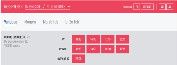
Intrigued by Kristin Thompson’s article, I gathered comparable statistics for Alita in Belgium. See the top image for an ad listing the formats available during the first week of release at Kinepolis Group theatres in Belgium.
That’s a lot of 3D ! No fewer than four of these six formats integrate 3D into the theatrical experience. Obviously, a film such as Alita is likely to receive such a treatment and definitely during its first week. It is also necessary to look – as Kristin Thompson did – at the relative percentage of 3D versus “standard” 2D screenings. A ten day interval seemed ideal to reassess the situation. Here are schedules for two Kinepolis theatres ten days after the film’s opening.
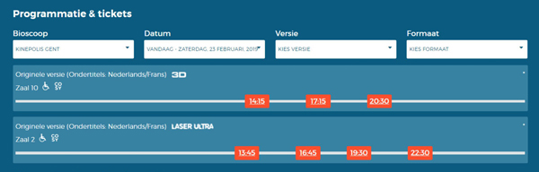

As it turns out – depending on the Kinepolis theatre one chooses to visit – 3D still makes up between 42 and 67 percent of Alita’s daily screenings. The highest number is reserved for Kinepolis Brussels, with the theatre being the only one equipped with a full-fledged IMAX screen. IMAX as a PLF in Belgium is used exclusively for 3D screenings, save for some very rare exceptions.
As pointed out already, Alita can be regarded as an exceptional production that integrates 3D as part of its raîson d’être and its promotion. Alita’s figures might be exceptional, so looking at a comparable title might be necessary. The Lego Movie 2 made its debut about three weeks later, is also shown in 3D and thus makes for a perfect comparison.

3D’s share is smaller here, but still 40 percent of the screenings are in the 3D format, a number well above the American averages.
Because two titles might still represent a distorted sample, we contacted Kinepolis Group Belgium and asked them to provide us with some material that would allow to have a better general idea about the significance of 3D within their total number of screenings and their profits and the way this share has evolved (or is evolving).
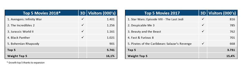
These numbers are clear enough to allow some conclusions. Both in 2017 and 2018, 4 out of 5 of the most popular films for Kinepolis Belgium were 3D movies. 2018’s numbers even show that both the relative share and the absolute numbers (and thus the weight of the top 5 and 3D) are indeed increasing. Obviously that does not mean that every paying visitor opted for 3D (or one of the various combinations of 3D and PLF), but as the general share of 3D screenings for every movie released in this format at Kinepolis theatres in Belgium is situated anywhere between 40 and 60 percent of the total number of screenings. That means this percentage can be applied to these numbers.
The Kinepolis representative pointed out that the percentage of 3D screenings for a movie is determined on the basis of the quality of the 3D imagery and the way the 3D format enhances the viewing experience. Alita is perceived to be a prime candidate for these arguments and thus the number for 3D screenings is very high and at the lower end for The Lego Movie 2. Even if one sticks to the lower end of the scale, however, the importance of 3D screenings within the total number of screenings is still remarkable.
Beyond Kinepolis
All those results lead to a single clear picture: unlike the American situation, 3D is still positions itself as the preferred “premium format” in Belgium. Its impact on the total number of screenings (in Kinepolis theatres) is still very significant and shows no signs of diminishing.
I believe there are a few elements at play to create this situation. One of the first emerges when we take a look at the Alita screenings outside of Kinepolis theatres. Another large chain of theatres, UGC, provides a useful comparison. (Most independent movie houses have not screened Alita). The schedule immediately below is for a UGC cinema in Antwerp, and below that, one in Brussels.
In Antwerp there is not a single 3D screening to be found; in UGC Brussels, there’s just one, while the same day lists 8 standard screenings. The discrepancy between these numbers and the ones at Kinepolis are easily explained: UGC has a very limited number of 3D screens.
Slowly it becomes clear that the very specific situation of the Belgian movie theatre environment is an important factor in all of this.
Kinepolis Group was formed through the joining of two large family companies, the Claeys & Bert Groups. At the start of the 19080s, they began setting up a chain of theatres that no longer consisted of the smaller movie theatres Belgium had known up to that point. Their theatres introduced multiplex to the country. “Decascoop” in Ghent (first 10 screens, with two added later) and the other early Kinepolis theatres benefited from the rise in ticket sales in the early eighties and consolidated their position by being the only theatres around the country able to show box-office hits such as E.T., The Extra-Terrestrial and the “Indiana Jones” trilogy, on multiple screens. 1988 saw the inauguration of Kinepolis Brussels – at that time one of the largest theatres in Europe – along with the first IMAX screen in the country (and most neighbouring countries).
At that time though, IMAX was a used only to screen spectacular documentary films that offered the sensation of flying through the Grand Canyon, diving into the ocean or being in outer space. Production of these films was rather limited. When the audience started to lose interest, Kinepolis halted its programming in 2005, just when the US market was taking its first steps towards IMAX screenings of regular releases. Christopher Nolan’s films were instrumental in the process that eventually turned IMAX into a popular “premium format.”
More or less simultaneously 3D resurfaced. The format enjoyed some popularity during the fifties (Hitchcock’s Dial M for Murder comes to mind) and returned in the early eighties, blessing film history with a few horrendous films as Jaws 3D and Friday The Thirteenth – Part III 3D. The more recent revival of 3D gained impetus with the releases of animated films, notably The Polar Express (2004) and Chicken Little (2005) and was given a boost by U23D (2008). Other animated and concert films followed, but it was Avatar, with its combination of 3D with the latest state-of-the-art special effects technology, that pushed theatre owners to convert their screens to digital projection, the necessary prerequisite for add-on 3D capability. Its huge success started an evolution that promised the full potential of the 3D cinematic language would finally be explored. When Scorsese, Lee, and Godard took up experiments, it even briefly seemed this would actually be true.
In the US, although Cameron’s smash hit dictated the rapid spread of 3D technology, the format still had to face competition from the already established IMAX format. That was not the case in Belgium or the Netherlands. Kinepolis Group – the dominant chain by now – solely promoted 3D, and this position dictated the whole theatrical environment. The IMAX screen reopened in 2016, when 3D was well established as the preferred premium format. IMAX was (and is) used almost entirely for 3D screenings.
It is necessary to include another element here: the exceptionally high projection standards at Kinepolis Group. When John McTiernan came to Brussels in 1988 to launch Die Hard, he claimed that there was probably no better projection of his film to be seen anywhere in the world. Those might have been the words of an overly enthusiastic director, but they illustrate the high technical standards within Kinepolis Group. Other theatre chains were more or less forced to follow suit.
Because quality projection became the standard, any other “premium” format faced a high hurdle when it came to distinguishing itself. “Laser Ultra” already offers an exceptional viewing experience on a very large screen, so further investment had to be justified by something beyond image quality or a larger screen. 3D offered such a distinctive element and extra added value and initially did not face any competition from PLF’s. When that changed, Kinepolis kept promoting 3D, with combinations: “Laser Ultra 3D” and “4DX,” which adds vibrations to the experience.
All of the above means that 3D’s position in the Belgian environment is very different from its position in the US. Obviously Kinepolis also needs to pay the distributors, but a new deal with RealD on the use of 3D glasses consolidates Kinepolis’ position and intensifies their efforts to promote 3D. All of this means that the format will remain popular in Belgium. In this way, Kinepolis Group’s market position also dictates 3D’s standing as the preferred “premium” format in Belgium.
The Netherlands: Experiences & attractions
The Kinepolis Group is also a dominant factor in the Netherlands, which makes comparing the situation in both countries an interesting endeavour. The Netherlands’ theatrical environment has two major chains, Pathé and Kinepolis, both of them part of larger European concerns. Pathé is part of the French group ‘Les Cinémas Gaumont Pathé’ – a company that has its roots in the early days of cinema. Pathé owns 28 theatres, spread out over 20 Dutch cities. Kinepolis is a branch of the Belgian company and owns 17 theatres in the Netherlands.
With 21 theatres, “Vue Nederland” also deserves to be mentioned, although their total seating capacity is rather limited and has its main focus on smaller provincial towns.
The rise of new technologies, PLFs and “extra” movie attractions such as 4DX, has lead to a situation in which standard screenings have become something of a curiosity in the multiplexes of most major cities. Almost every theatre in a major city boasts 3D, Dolby Atmos or another premium feature. Developments in sound and imagery are promoted: Pathé even distinguishes between Dolby Atmos and Dolby Cinema, with the first emphasizing immersive sound.
Six IMAX screens are spread throughout the country, although most of them would not stand up to a purist’s scrutiny: the largest one – Pathé Arnhem – measures 21×12 metres, whereas a standard IMAX screen is supposed to be at least 22x16m. The Dutch IMAX venues pale in comparison to Brussels’ enormous 27.6 x 19.3 screen.
This variety of screens, systems, and venues makes it difficult to get a good grip on the partition of different formats, so once again we turned to specific Alita screenings available on February 2, 2019 :
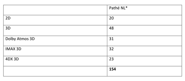
At first glance, standard 2D and 3D screenings are balanced by premium screenings. That perception changes, when we take into account that only 5 out of 25 theatres feature 4DX, 5 offer Dolby Atmos 3D and 6 offer IMAX. That means that in some theatres it has become all but impossible to see a standard 2D screening.
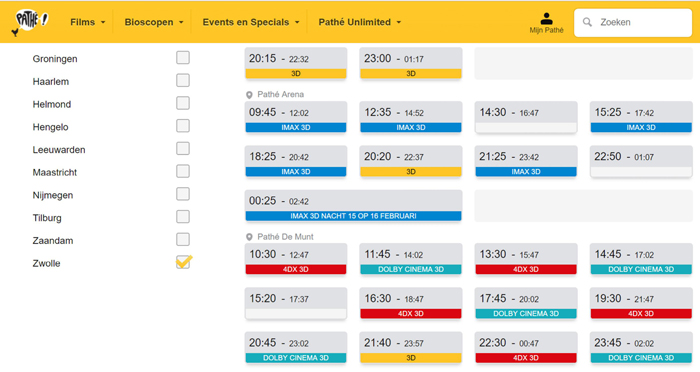
The most important factor here is the fact that theatres that offer 4DX/Dolby Atmos 3D/IMAX, focus almost entirely on these formats. Those theatres are usually situated in larger cities, thus rendering it almost impossible to see a standard screening there. Amsterdam/Rotterdam (see above and below) are prime examples: out of 44 combined screenings only three of them are standard screenings. In Scheveningen, Maatsricht or Eindhoven there are no standard screenings to be found at all on the same day.
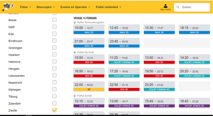
Most theatres are still located in smaller cities, and a general overview would thus suggest a rather balanced field of standard and 3D screenings. But even in those smaller venues – that do not offer the extra attractions 4DX, Dolby Atmos 3D or IMAX, the 3D screenings still outnumber standard screenings (see below)
3D vs 2D in theatres without 4DX, Dolby Atmos and/orIMAX as of February 15, 2019:
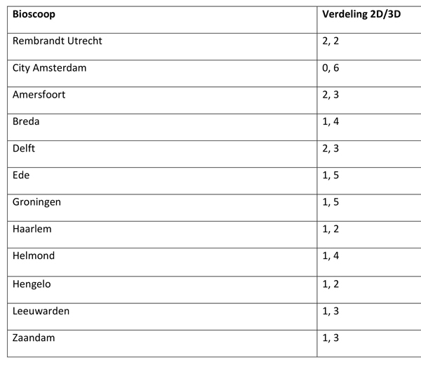
With 1 out of 3/3/4 , it is clear that 3D screenings are dominant in Pathé theatres. Even daytime screenings on weekdays are 3D, which relegates standard 2D screenings to the position of a rarity.
Kinepolis’ available number of formats in the Netherlands is more limited than in Belgium. Neither IMAX nor 4DX is an option here. For Alita that results in:
The Vue chain competes with Kinepolis and Pathé in offering DX theatres that combine Dolby Atmos with superior projection technology. As in Belgium, the dominant chain sets the technical standard. A select number of theatres offers D-Box chairs that move with the action on screen. The American film critic Jeffrey Wells describes D-Box chairs as “4 DX’s less dynamic cousin.” (D-Box is Canadian in origin, while 4DX is South Korean).
Pathé, Vue and Kinepolis promote their different PLFs in exactly the same way, using “experience” and “immersion” as unique selling propositions. With 4DX the movements and effects start competing with the images for the viewer’s attention, returning the cinematic experience in a ironic way to its attraction-based origins when it was something to be experienced at fairgrounds and other shows.
In sum, the Dutch theatrical environment resembles the Belgian. A high technical standard has become the zero-line for movie screenings and 3D has penetrated the market to such an extent that it is no longer perceived as being a “premium” format, which leads to a set of various attraction-based formats that try to justify the extra cost.
At this point Dolby Atmos, Imax, and 4DX are still perceived as novelties, but it is likely that exhibitors will need additional attractions in years to come. Rising admissions for PLFs and anything “premium” suggest that visitors are constantly looking for more immersive experiences (according to the “Dutch Foundation for Film Research” in their 2018 yearly review). The number of available PLFs has significantly risen in the last few years and as long as the dominant chains continue to invest in these formats, others will follow suit. Kinepolis and Pathé set the standard, competing chains adapt.
Whether or not the public is actually asking for these technologies remains a topic open to discussion. One could claim the public merely adapts to the industries’ innovations. Still, there is no denying that PLFs turn a large profit. In Pathé Rotterdam the regular ticket price for PLF is 18 euros, while a standard screening will cost you 11 euros. Despite the cut that needs to return to the distributors, the cost for 3D glasses, and the “hardware” investments, 3D in all its forms is dominant when it comes to movie screenings in the Netherlands. The late entry of IMAX into this environment (as in Belgium and contrary to the US) meant 3D had little or no competition and consolidated its position as the preferred “premium” format.
These conclusions to come with some nuances. The Dutch part of this piece limits itself to one title and three dominant chains. Independent movie theatres were not addressed and obviously Alita: Battle Angel has some standard screenings outside of the major theatre chains. There is enough conclusive evidence, however, to support the claim that standard screenings have all but vanished in the larger cities.
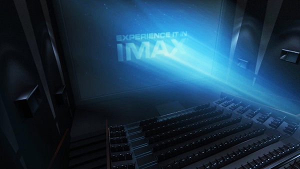
A publicity image for Kinepolis, Brussels.
Friendly books, books by friends
Moses and Aaron (1974).
DB here:
When the stack of books by friends threatens to topple off my filing cabinet, I know it’s time to flag them for you. I can’t claim to have read every word in them, but (a) we know the authors are trustworthy and scintillating; (b) what I’ve read, I like; (c) the subjects hold immense interest. Then there’s (d): Many are suitable seasonal gifts for the cinephiles in your life (which can include you).
Happy birthday, SMPTE
 Starting off in 1916 as the Transactions of the Society of Motion Picture Engineers, this peerless record of American moving-image technology has gone through many changes of name and format. It’s now The SMPTE Motion Imaging Journal. Its back issues have been a treasure house for scholars studying the history of movie technology, and it has outdone itself for its 100th Anniversary Issue, published in August.
It includes survey articles on the history of film formats, cameras and lenses, recording and storage, workflows, displays, archiving, multichannel sound, and television and video. There’s even an overview of closed-captioning. The issue costs $125 for non-SMPTE members, and it’s worth it. Many libraries subscribe to the journal as well.
A highlight is John Belton’s magisterial “The Last 100 Years of Motion Imaging,” which includes twenty-two pages of dense timelines of innovations in film, TV, and video. They stretch back beyond 1916, to 1904 and the transmission of images by telegraph. John’s article is provocative, suggesting that we might think of digital cinema as returning to film’s origins in handmade images for optical toys.
Lucas predicted that digital postproduction brought film closer to painting, and for more and more filmmakers that prediction is coming true. I was startled to learn that 80% of Gone Girl was digitally enhanced after shooting.
Yes, sir, that’s our BB
Die 3 Groschen-Oper (1931, G. W. Pabst).
During the 1970s, Bertolt Brecht’s name was everywhere in film studies. He epitomized what an alternative, oppositional, or subversive cinema ought to be. Cinema, even more powerfully than theatre, was a machine for producing illusions. So in his name critics objected to happy endings, plots that tidied up reality, characters with whom we ought to identify, messages that masked the real nature of bourgeois society. Films made all these things seem part of the natural order of things.
The Brechtian antidote was, as people used to say, to “remind people they were watching a film.” This was done by rejecting what he called the Aristotelian model and replacing it with the “alienation effect”: a panoply of distancing devices like intertitles, characters addressing the camera, actors confessing they were actors, and a display of the means of cinematic production (including shots of the camera shooting the scene).
 The promise was that once viewers were banished from the imaginary world of the film they would exercise their intellects and coolly appraise not only the fiction machine but its ideological underpinnings. Godard was the chief cinematic surrogate for Brecht, and La Chinoise (1967) became the big prototype of Brechtian cinema—unless you preferred the more austere version incarnated in Straub/Huillet’s Chronicle of Anna Magdalena Bach (1967) and their adaptation of Othon (1969). The ideas spread fast, helped by the user-friendly Brechtianism of Tout va bien (1972).
Brecht became part of Theory. In French literary and theatrical culture of the 1950s, his ideas on staging and performance had claimed the attention of Roland Barthes and other Parisian intellectuals. Godard was alert to the trend early, it seems; he had fun in Contempt (Le mépris, 1963) citing the two BB’s (the other was Brigitte Bardot, bébé), and letting Lang quote a poem by his old collaborator and antagonist. By the time Anglo-American film theorists were ready for semiotics, Brecht was offering support. Didn’t his anti-illusionism chime well with the belief that all sign systems were arbitrary and culturally relative?
My summary is too simple, but then so were many borrowings. Soon enough any highly artificial cinematic presentation might be called “Brechtian,” though usually minus the politics. In the academic realm, Murray Smith’s book Engaging Characters (1995) pointed out crucial weaknesses in the anti-illusionist, anti-empathy account. By then, the certified techniques were becoming part of mainstream cinema. Thereafter, we had Tarantino’s section titles and plenty of movies breaking the fourth wall. Brecht might have enjoyed the irony of using the to-camera confessions of The Wolf of Wall Street (2013) bent to support cynical swindling. Isn’t The Big Short (2015) a sort of Hollywoodized lehrstück (“learning play”)?
Brecht’s writings should be read and studied by every humanist and certainly everybody interested in film. They’re clear, blunt, and often sarcastic.
This beloved “human interest” of theirs, this How (usually dignified by the word “eternal,” like some indelible dye) applied to the Othellos (my wife belongs to me!), the Hamlets (better sleep on it!), the Macbeths (I’m destined for higher things!), etc.
Now Marc Silberman, our colleague here at Madison, has completed a trio of books that make the master’s work available. Bertolt Brecht on Film and Radio includes essays, scripts, and the Threepenny Opera lawsuit brief. There’s also Brecht on Performance and a complete revision of that trusty black-and-yellow volume dear to many grad students: Brecht on Theatre. The latter two collections Marc worked on with collaborators. All are indispensible to a cinephile’s education. As Brecht imagined a bold political version of music he called misuc; can we imagine a cenima?
From BB to S/H
Speaking of Straub and Huillet, every decade or so somebody comes out with a book about them. This time we have to thank the admirable Ted Fendt, in the twenty-sixth volume in the series sponsored by the Austrian Film Museum (as well as the Goethe Institute and Synema). Like the Hou Hsiao-hsien volume (reviewed here), Jean-Marie Straub & Danièle Huillet is fat and full of ideas and information.
 There are interviews, tributes from filmmakers (Gianvito, Farocki, Gorin), and Fendt’s account of distribution and reception of their films in the Anglophone world. This last includes charming facsimile correspondence, with one Huillet letter pockmarked by faulty typewritten o’s. As you’d expect, she is objecting to making a 16mm print of Moses and Aaron (1974) from the 35. (“No, definitively.”)
Starting things off is a lively and comprehensive survey of the duo’s careers by Claudia Pummer, with welcome emphasis on production circumstances and directorial strategies. The book wraps with a detailed thirty-page filmography and a substantial bibliography.
My thoughts about S/H are tied up with their earliest work, when I first learned of them. So I loved, and still love, Not Reconciled (1965) and The Chronicle of Anna Magdalena Bach. I also have a fondness for Moses and Aaron, Class Relations (1983), From Today until Tomorrow (1996), and Sicilia! (1998). I find others out of my reach, and several others I haven’t yet seen. People I respect find all their work stimulating, so I suspect it’s really a matter of gaps in my taste.
Whether you like them or not, they’re of tremendous historical importance. Without them, Jim Jarmusch and Béla Tarr, and of course Pedro Costa and Lav Diaz, would not have accomplished what they have. And especially in December 2016, we ought to find their unyielding ferocity inspiring. Remember them on Dreyer: “Any society that would not let him make his Jesus film is not worth a frog’s fart.” Brecht would have approved.
Stone’d
To the minimalism of Straub and Huillet we can counterpoint the maximalism of Oliver Stone, the most aggressive tabloid American director since Samuel Fuller (although Rococo-period Tony Scott gives him some competition). After two books on Wes Anderson, Matt Zoller Seitz has brought us a booklike slab as impossible as the man’s films. Can you pick it up? Just barely. Can you read it? Well, probably not on your lap; better have a table nearby. Does its design mirror the maniacal scattershot energy of films like JFK (1991), Natural Born Killers (1994), and U-Turn (1997)? Watch the title propel itself off the cover.
 The Oliver Stone Experience is basically a long interview, sandwiched in among luxurious photos, script extracts, correspondence, and the sort of insider memorabilia that Matt has a genius for finding. We get not only pictures of Stone with family and friends, on the set, and relaxing; there are bubblegum cards from the 40s, collages of posters and filming notes, maps, footnotes, and shards of texts slicing in from every which way. Newspapers, ads, and production documents are scissored into the format, including a Bob Dole letter fundraising on the basis of the naughtiness of Natural Born Killers. Beautiful frame enlargements pay homage to the split-diopter framings of Born on the Fourth of July (1989) and the shadow of the 9/11 plane sliding up a facade in World Trade Center (2006). When Stone had second thoughts about things he’d said, Matt had the good idea of redacting the interview like a CIA file scoured with thick black lines.
The whole thing comes at you in a headlong rush. Amid the pictorial churn and several essays by other deft hands, we plunge into and out of that stellar interview, mixing biography and filmmaking nuts-and-bolts. Matt gets deep into technical matters, such as Stone’s penchant for rough-hewn editing, as well as raising some big ideas about myth and autobiography. There are occasional quarrels between interviewer and interviewee. Out of the blue we get remarks like “Alexander was not only bisexual, he was trisexual,” which was not redacted.
The book’s very excess helps make the case for Stone’s idiosyncratic vision. Matt’s connecting essays, along with the vast visual archive he’s scavenged and mashed up, made me want to rethink my attitude toward this overweening, sometimes crass, sometimes inspired filmmaker. He now seems a quintessential 80s-90s figure, as much a part of the era as Reagan, Bush, and Clinton. Stone emerges as a resourceful defender of The Oliver Stone Experience, articulating a radical political critique with gonzo verve.
Rhapsody in white
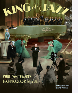 If lifting the Book of Stone doesn’t suffice for exercise, try another weighty and sumptuous item, King of Jazz: Paul Whiteman’s Technicolor Revue, by James Layton and David Pierce. Last spring the Museum of Modern Art premiered one of the most ravishing restorations I’ve ever seen, a digital version of King of Jazz (1930).
This period piece is in its own way as wild as an Oliver Stone movie. From its opening cartoon of Paul himself as a Great White Hunter bagging a lion, it’s a virtually self-parodying account of how a black musical tradition got netted, trussed up, and caged for the swaying delectation of white audiences. (No need to mention the irony of the name of our King.)
Along the way we have some straight-up songs (including some by Bing Crosby) spread among extravagant dance numbers. The Universal crane gets a workout as well. The music is infectious, the performers sweating to please, and the restoration–coming, I hope, to your screen soon–finally shows what two-color Technicolor could do. This is the definitive version of a film too often known in cut versions with shabby visuals and sound.
The book is an in-depth contextualization of the film, the studio, and the tradition of musical revues, both on stage and in film. It records the production and reception, with rich documentation throughout. The story of assembling the restoration is there too, and it’s a saga in itself. David is one of the moving spirits behind the online Media History Digital Library and its gateway Lantern. James is Manager of the Celeste Bartos Film Preservation Center at the Museum of Modern Art. Their collaboration has given us both a lush picture book and a serious, always enjoyable piece of scholarship. Their book proves the value of crowdsourcing: funded by online subscription, it was self-published. In this and much else, it can be a model for film historians pursuing questions that commercial and university presses might find too specialized. The result is a model of ambitious research, writing, and publishing.
Visiting Radio Ranch
Gene Autry in The Phantom Empire (1935).
For about thirty years I’ve been arguing that one fruitful research program in film studies involves what I call a poetics of cinema: the study of how, under particular historical conditions, films are made to achieve certain effects. This program coaxes the researcher to analyze form and style, study changing norms of production and reception, and consider how filmmakers work in their institutions and creative communities, with special focus on craft routines, work methods, and tacit theories about the ways to make a movie.
 A sturdy example of this approach has appeared from Scott Higgins. His Matinee Melodrama fulfills the promise of its subtitle: Playing with Formula in the Sound Serial. Scott has closely examined this widely despised genre, plunging into the 200 “chapterplays” produced in America between 1930 and 1956. They offer bald and bold display of the rudiments of action-based storytelling: “If Hitchcock built cathedrals of suspense from fine brickwork of intersecting subjectivities and formal manipulations, sound serials used Tinkertoys.”
Scott traces production practices and conventions, focusing in particular on two dimensions. First, to a surprising degree, serials rely on the conventions of classic stage melodrama, such as coincidence and more or less gratuitous spectacle. Second, the serials are playful, even knowing. Like video games, they invite viewers to imagine preposterous narrative possibilities, not only in the imagination but also on the playground, where kids could mimic what they saw Flash Gordon or Gene Autry do.
Matinee Melodrama investigates the implications of these dimensions for narrative architecture, visual style, and the film and television of our day. Scott closes with analysis of the James Bond series, the self-conscious mimicking of serial conventions in the Indiana Jones blockbusters, and the Bourne saga, and he shows how they amp up the older conventions. “Like the contemporary action film generally, the Bourne movies participate in a cinematic practice vigorously constituted by studio-era serials. That is, they blend melodrama with forceful articulations of physical procedure in scenes of pursuit, entrapment and confrontation.”
Poetics, frank or stealthy
The Red Detachment of Women (1971).
Scott’s book acknowledges the poetics research program, and so, even more explicitly, does a new collection edited by Gary Bettinson and James Udden. The Poetics of Chinese Cinema gathers several essays that usefully test and stretch that frame of reference.
One standard challenge to the poetics approach is: How do you handle social, cultural, and political factors that impinge on film? I think the best way to answer this is to treat these factors as causal influences on a film’s production and reception. More specifically, in the production process, what we now call memes function as materials—subjects, themes, stereotypes, and common ideas circulating in the culture or the filmmaking institution. In the reception process, they provide conceptual structures that viewers can use in making their own sense of the films that they’re given. And such materials will necessarily include other art forms; films are constantly adapting and borrowing from literature, drama, and other media.
 Both of these possibilities are vigorously explored in several essays in The Poetics of Chinese Cinema. For instance, Emilie Yueh-yu Yeh traces how Taiwanese and Japanese cultural materials are reworked by Hou Hsiao-hsien in his Ozu homage Café Lumière (2003). Peter Rist, a long-time student of Chinese painting, shows how Chen Kaige deploys cinematic means to revise landscape traditions to create a “Contemplative Modernism.” Victor Fan shows how the Hong Kong classic In the Face of Demolition (1960) adapts and revises a mode of narration already established in Cantonese theatre. In a clever piece called “Can Poetics Break Bricks?” Song Hwee Lim considers how digital technology feeds into a poetics of spectacle, specifically around slow-motion techniques that were emerging in pre-digital filmmaking.
Tradition is a key concept in poetics, and the editors explore important ones in their own contributions. Gary Bettinson studies the emergence of Hong Kong puzzle films in works like Mad Detective (2007) and Wu Xia (2011). Are they simple imitation of Hollywood, or are they doing something different? Gary shows them to have complicated ties to local traditions of storytelling. Jim Udden focuses more on stylistics in his account of Fei Mu’s 1948 classic Spring in a Small Town, remade by Tian Zhuangzhuang in 2002. By examining staging, cutting, and voice-over, Jim shows that the earlier film is in many ways more “modern” than it’s usually thought and is somewhat more experimental than the remake.
It might seem that the “model” operas and plays of the Cultural Revolution, epitomized in The Red Detachment of Women (1971) would resist an aesthetic analysis; they’re determined, top-down fashion, by strict canons of political messaging. But Chris Berry’s contribution shows that they’re amenable to close analysis too. Like Soviet Socialist Realism, they may be programmatic in meaning, but not in every choice about framing, performance, cutting, and music. Indeed, the fact that people both inside and outside China (me included) still find them pleasurable probably owes something to their “Red Poetics.” And in true Hong Kong fashion, many filmmakers in that territory plundered those soundtracks with shameless, drop-the-needle panache.
I should probably add that I have an essay in this collection too. It’s called “Five Lessons from Stealth Poetics,” and it surveys things I’ve learned from studying cinema of the “three Chinas”: Hong Kong, Taiwan, and the Mainland. What attracted me were the films themselves, but in exploring them I was obliged to nuance and stretch the poetics approach. Readers of this blog know the trick: in talking about particular movies, I also try to show the virtues of the approach I favor. In other words, stealth poetics.
This is a good moment to pay tribute to Alexander Horwath, moving into his final nine or so months of directing the Austrian Film Museum. He has been a major figure in European film culture, through his inspired programming and leadership in publishing the books and DVDs issued by the Museum. We’re very grateful for all he has done for us and for film historians around the world.
P.S. 11 December 2016: Thanks to Mike Grost for a title correction and John Belton for a name correction!
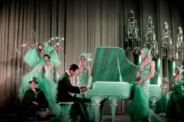
King of Jazz (1930).


