


Archive for December 2007
Happy birthday, classical cinema!, or The ten best films of … 1917
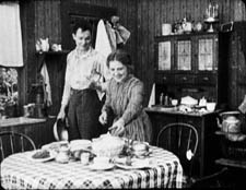
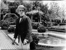
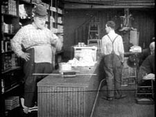
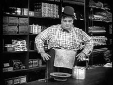
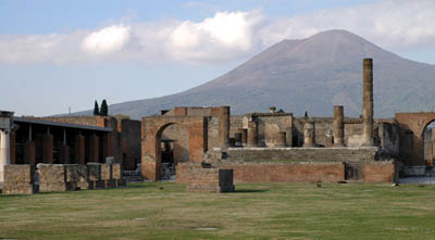
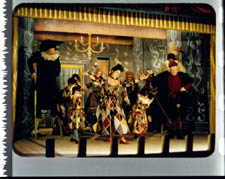
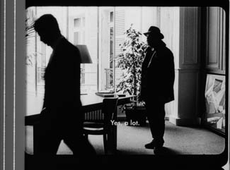
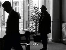
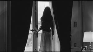
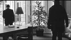
Wild and Woolly (1917).
KT:
Periodization is a tricky task for historians, and there are a lot of disputes about how to divide up the 110-plus years of the cinema’s existence. We all have to deal with it, though, if we want to organize our studies of the past into meaningful units. How to do that?
Do we divide the periods of film history according to major historical events? World War I had a huge impact on the film industry, to be sure, and we might say that one significant period for cinema is 1914-1918. Yet 1919 didn’t mark the start of a new period. The major European post-war film movements didn’t start then. French Impressionism arguably began in 1918, German Expressionism in 1920, and Soviet Montage in 1924 or 1925.
Carving up film history partly depends on what questions the historian is asking. If you’re studying wartime propaganda, 1914 and 1918 would provide significant beginning and end points. If you want to trace the development of significant film styles, it doesn’t seem very useful.
While historians have difficulties agreeing on periodization, just about everyone concurs that there were two amazing years during the 1910s when filmmaking practice somehow coalesced and produced a burst of creativity: 1913 and 1917.
One can point to stylistically significant films made before 1913. Somehow, though, that year seemed to be when filmmakers in several countries simultaneously seized upon what they had already learned of technique and pushed their knowledge to higher levels of expressivity. “Le Gionate del Cinema Muto” (“The Days of Silent Cinema”), the major annual festival, devoted its 1993 event to “The Year 1913.” The program included The Student of Prague (Stellan Rye), Suspense (Phillips Smalley and Lois Weber), Atlantis (August Blom), Raja Harischandra (D. G. Phalke), Juve contre Fantomas (Louis Feuillade), Quo Vadis? (Enrico Guazzoni), Ingeborg Holm (Victor Sjöström), The Mothering Heart (D. W. Griffith), Ma l’amor mio non muore! (Mario Caserini), L’enfant de Paris (Léonce Perret), and Twilight of a Woman’s Soul (Yevgenii Bauer). .
1917, by contrast, was primarily an American landmark. As 2007 closes, we thought it appropriate to wish happy birthday to the most powerful and pervasive approach to filmic storytelling the world has yet seen. That would be classical continuity cinema, synthesized in what was coming to be known as Hollywood.
DB:
In The Classical Hollywood Cinema and work we’ve done since, we’ve maintained that 1917 is the year in which we can see the consolidation of Hollywood’s characteristic approach to visual storytelling. This idea was first floated by Barry Salt, and our research confirms his claim. Over the ninety years since 1917 the style has changed, but its basic premises have remained in force.
Before classical continuity emerged, the dominant approach to shooting a scene might be called the tableau technique. Action was played out in a full shot, using staging to vary the composition and express dramatic relationships. Elsewhere on this site I’ve mentioned two major exponents of this approach, Feuillade and Bauer.
When there was cutting within the tableau setup, it usually consisted of inserted close-ups of important details, especially printed matter, like a letter or telegram. Occasionally the close-up of an actor could be inserted, usually filmed from the same angle as the master shot. The tableau approach was more prominent in scenes taking place in interiors; filmmakers were freer about cutting action occurring outdoors.
We shouldn’t think of the tableau as purely “theatrical.” For one thing, the master shot was typically closer and more tightly organized than a scene on the stage would be. Moreover, for reasons I discuss in Figures Traced in Light, the playing space of the cinematic frame is quite different from the playing area of the proscenium theatre. The filmmaker can manipulate composition, depth, and blocking in ways not available on the stage.
The tableau approach was the default premise of US filmmaking through the early 1910s. You can see it at work, for example, in this shot from At the Eleventh Hour (W. V. Ranous, 1912). Mr. and Mrs. Richards are in the study of Mr. Daley. After Richards has refused to sell his railroad bonds, Daley’s wife shows off her diamond necklace to the visitors.
At first the two couples are separated in depth, the men in the foreground and the women further back. In the first frame below, a new necklace has just been delivered, and a servant gives it to Mrs. Daley. Only the servant’s hand is visible, as she is blocked by Richards in the foreground. In the second frame, the two women come forward. Mrs. Daley holds the necklace up and Mrs. Richards oohs and ahhs over it, while her husband glances at Daley as if to wonder how he could afford it.
Instead of breaking the scene into closer views, spreading the characters’ reactions across separate shots, Ranous squeezes all of their actions and expressions into a tight space across the center of the shot. Nor does he provide a close-up of the necklace, which will be important in the plot. (1) We might be inclined to say that this is a “theatrical” shot, but on a stage the actions in depth (the women chatting, the servant handing over the parcel) wouldn’t be visible to everyone in the auditorium. Likewise, on a stage the packed faces in the later phase of the scene wouldn’t be visible to people sitting on the sides.
As films became longer, American filmmakers were starting to organize their plots around characters with firm goals. Conflicting goals would set the characters in opposition to one another, and at a climax, usually under the pressure of a deadline, the protagonist achieves or fails to achieve the goals. The plot also tends to build up two lines of action, at least one involving romance.
There’s no reason this conception of narrative could not have been applied to the tableau style; in many cases it was. But hand in hand with the rise of goal-driven plotting came a new approach to filming. Sporadically before 1917, filmmakers in many countries were exploring ways to build scene out of many shots. (If you want to know the process in the US in more detail, check out Early American Cinema in Transition by Charlie Keil.) By 1917, American filmmakers had synthesized these tactics into an overall strategy, a system for staging, shooting, and cutting dramatic action.
We know the result as the 180-degree system. This encourages the filmmaker to break a scene into several shots, taken from different distances and angles, all from one side of an imaginary line slicing through the space. Around 1917, this stylistic approach comes to dominate US feature films, in the sense that every film made will tend to display all the devices at least once. The system remains in place to this day, and it came to form the basis of popular cinemas across the world. (2)
Once you break a scene into several shots, some characters won’t be onscreen all the time. So you need to be clear about where offscreen characters are; you need to supply cues that allow the audience to infer their positions. So 1910s filmmakers developed various ways of “matching” shots.
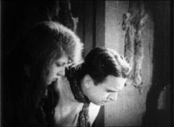
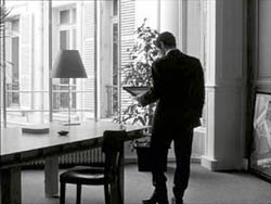
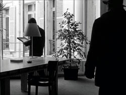
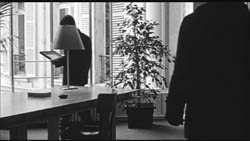
Shots can be connected by character looks, thanks to the eyeline match. Here’s an instance from Victor Schertzinger’s The Clodhopper (1917). First there is a master shot of the mother and son in their farm kitchen.
This is followed by a separate shot of each one. Their bodily positions and eyelines remind us that the other is just out of frame.
Although over-the-shoulder shooting hadn’t yet been developed, a conception of the reverse angle is at work here too. Schertzinger’s camera doesn’t shoot the actors perpendicularly, but takes up an angle on one that becomes an echo of that filming the other. Here’s another example of reverse angles from The Devil’s Bait (1917, director Harry Harvey).
The camera doesn’t just enlarge a portion of the space, as in the inserted shot in a tableau scene. The angle of view has changed significantly.
Changes of angle within the scene have become fairly complex by 1917. This strategy is apparent when the action takes place in a theatre, a courtroom, a church, or some other large-scale gathering point. The camera position changes often in this scene from The Girl without a Soul (director John Collins).
The concept of matching extends to physical movement too, through the match on action. This device allows the director to highlight a new bit of space while preserving the continuity of time. In Roscoe Arbuckle’s The Butcher Boy, the cut-in to Fatty (with a change of angle) also matches his gesture of putting his hands on his hips.
Interestingly, even this early, directors have learned to leave a little bit of overlapping action across the cut. If you move frame by frame, you’ll see that Fatty’s gesture is repeated a bit at the start of the second shot.
When a character leaves one frame, he or she can come into another space, from the side of the frame consistent with the 180-degree premise. This is matching screen direction. A cut of this sort lets us know that the next portion of the locale that we see is more or less adjacent to the previous one. In Field of Honor (director Allen Holuban), Wade crosses to Laura, who’s waiting in a carriage. A few years earlier, the director might have presented his greeting in a single deep-space long shot. Instead, Wade exits one shot and enters the next.
Again, the reverse-angle principle governs the camera setups. Wade moves along a diagonal toward the camera and away from it.
More generally, Field of Honor exhibits a polished handling of the new style: lots of reverse shots and eyeline matches, fades that bracket flashbacks, binocular points of view, rack-focus shots, and rapid cutting (there’s even a ten-frame shot). The point is not to claim Field of Honor as an undiscovered masterpiece but rather to indicate that by 1917 a director could handle all the devices with assurance.
Match-cutting devices had been used occasionally before 1917, but by that year filmmmakers melded them into a consistent and somewhat redundant method of guiding the audience through each scene.
The continuity system not only creates a basic clarity about characters’ positions. It can as well generate a speed and accentuation not easily achieved within a single shot. For example, Wade’s frame exit and entrance above is cut so as to skip over moments that he consumes crossing the driveway. Continuity editing enhances the rapid pace of US films, a quality immediately noted by foreign observers in the 1910s and 1920s.
Two of the best films of 1917 exploit the dynamism of continuity cutting. The Doug Fairbanks comedy western, Wild and Woolly, seems designed to prove that American films could proceed at breakneck speed. In climactic scenes, we’re caught in a whirlwind of fast cutting, with the pace set by the hyperactive protagonist, a financier’s son who longs to prove himself as a cowboy.
John Ford’s Straight Shooting proceeds at a more measured pace, but in its final shootout we see a prototype of all the main-street gundowns that will define the Western. Ford provides alternating shots of the cowboys advancing toward each other, framing each man more tightly and concluding with suffocating close-ups of each man’s face, highlighting the eyes.
Sergio Leone, eat your heart out.
Propelled by goal-driven characters and a linear arc of action, films like Wild and Woolly and Straight Shooting are completely understandable and enjoyable today. (But when will we have them on DVD?) Their stories are engrossing and their performances are engaging, but just as important their storytelling technique has become second nature to us. The narrative strategies that coalesced in 1917 remain fundamental to mainstream cinema.(2)
The Mystery of the Belgian Print
KT:
For decades now we have been visiting Brussels and working at the Cinémathèque Royale de Belgique/Koninklijk Belgisch Filmarchief. Sometimes I feel that we would know half as much about the cinema were it not for the unfailing hospitality we have been shown, initially by the great archivist Jacques Ledoux and now by his successor Gabrielle Claes. Our indebtedness to this institution and its staff are reflected in David’s named professorship; he is the Jacques Ledoux Professor of Film Studies. We dedicated our Film History: An Introduction, to Gabrielle.
We do whatever favors we can in return for such wonderful help. David lectures regularly at the biannual summer school run by the Flemish Service for Film Culture in partnership with the Royal Film Archive. (David wrote about the 2007 event in an earlier entry.) I try to identify silent films. I am not always successful, but I suppose over the years I have been able to put names to thirty-some mystery prints.
Silent films are more likely to be unidentified than sound ones because it was standard practice to splice in intertitles in the local language. Sometimes too the film’s title was changed. The film’s actors may be forgotten today, or the print may be incomplete, lacking the opening title and credits. Sometimes even the country of origin is unknown.
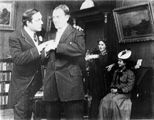
Back in the early 1990s I was asked to identify a five-reel nitrate print with the title Père et fils. It was an original distribution copy from the silent era. The information on the archival record card listed some possible identifications: Father and Son, a 1913 Vitagraph film or Father and Son, produced by Mica in 1915. It was tentatively thought to be American.
As I watched the film, it quickly became apparent that it was indeed American. It centered on the rivalry between a small dime store owned by the heroine’s father and a modern dime store being built in the same town. The hero is charged with the mission of driving the older store out of business.
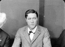
So we had our typical goal-driven plot. The style was what David has described as typical of 1917, so that was my tentative dating. I felt almost certain that the reels I was watching were not from a 1913 or 1915 movie. The film was a fairly modest item, done on a relatively low budget and not starring any actors that would be familiar to most modern viewers. I had seen the actor playing the hero before, however, and I thought he might be Herbert Rawlinson. By the time I finished the film, those were my clues: a medium-budget American film of c. 1917 concerning dime stores and perhaps starring Rawlinson.
My task turned out to be fairly simple. A little research after we returned home confirmed the Rawlinson guess. In preparing the write The Classical Hollywood Cinema, I had seen him in The Coming of Columbus (a 1912 Selig film) and in Damon and Pythias (Universal, 1914).
My next step was to consult the monumental, indispensible reference book, The American Film Institute Catalog. This multi-volume set, many years in the making, was originally published as books. It is now online, but available only to AFI members or through libraries. The catalogues were published by decade—thus obviating the problem of periodization. Each decade gets two volumes, one of entries on all the films, listed in alphabetical order. Credits, production companies, release dates, plot synopses, and other information are included. A second volume indexes the films by chronology, personal names, corporate names, subject, genre, and geography (i.e., where the films were shot).
Until now I had found little use for the subject index, but now it came to my aid. I turned to the Ds to see if there was an entry for dime stores. The AFI indexers were thorough, and sure enough, there was one entry: Like Wildfire. A check of the personal names index under Rawlinson, Herbert revealed that he had acted in a film called Like Wildfire, made in 1917 by Universal. Once I had the title, I checked its catalog entry and found that its plot description matched the film I had seen. Case closed.
Admittedly, in this instance the date wasn’t a crucial clue. Still, determining a film’s year of release can narrow down the possibilities. Thanks as well to the development of classical cutting, a close view of an actor helps in identifying him.

The Best of 1917
DB:
This is the season when everybody makes a list of best pictures. We have stopped playing that game. For one thing, we haven’t seen all the films that deserve to be included. For another, the excellence of a film often dawns gradually, after you’ve had years to reflect on it. And critical tastes are as shifting as the sirocco. Never forget that in 1965 the Cannes palme d’or was won by The Knack . . . and How to Get It.
Still, enough time has elapsed to make us feel confident of this, our list of the best (surviving) films of 1917, both US and “foreign-language.” Titles are in alphabetical order.
The Clown (Denmark, A. W. Sandberg)
Easy Street (U.S., Charles Chaplin)
The Girl from Stormycroft (Sweden, Victor Sjöström)
The Immigrant (U.S., Charles Chaplin)
Judex (France, Louis Feuillade)
The Mysterious Night of the 25th (Sweden, Georg af Klercker)
The Narrow Trail (U.S., Lambert Hillyer)
The Revolutionary (Russia, Yevgenii Bauer)
Romance of the Redwoods (U.S., Cecil B. De Mille)
Terje Vigen (Sweden, Victor Sjöström)
Straight Shooting (US, John Ford)
Thomas Graal’s Best Film (Sweden, Mauritz Stiller)
Wild and Woolly (US, John Emerson)
Next year, maybe we’ll draw up our list for 1918.
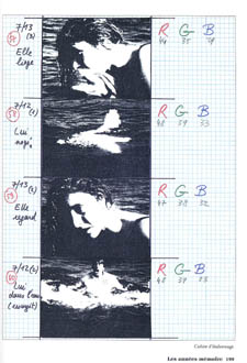
(1) For more on this scene and the film as a whole, see Kristin Thompson, “Narration Early in the Transition to Classical Filmmaking: Three Vitagraph Shorts,” Film History 9, 4 (1997), 410-434.
(2) Beyond The Classical Hollywood Cinema, see Kristin’s Herr Lubitsch Goes to Hollywood and Storytelling in the New Hollywood. I’ve talked about these issues in On the History of Film Style, Planet Hong Kong, Figures Traced in Light, The Way Hollywood Tells It, and essays included in Poetics of Cinema. The basics of classical continuity are presented in Chapter 6 of Film Art: An Introduction, and we trace some historical implications of it in Film History: An Introduction.
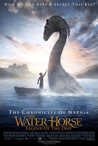
What does a Water Horse sound like?
Kristin here—
Sentimental Journey
Regular readers of this blog will recall that David and I spent this past May in New Zealand, as Hood Fellows at the University of Auckland.
I did not have much of an excuse to go back to Wellington during our sojourn, but I decided to go for a few days anyway. It’s my favorite city in New Zealand, partly because I have so many memories of exciting events there and partly because it’s an attractive place in itself. Once my lecturing duties in Auckland were done, I took a train, the Overlander, that runs much of the length of the North Island. It’s a 12-hour ride through some very spectacular scenery (including Mount Doom, aka Mount Ngaurhoe; check it out on Google Earth at 39˚ 9’ 25.58” S 175˚ 37’ 57.89” E) and dizzying viaducts over deep gorges.
I was in Wellington for three days, staying where I had stayed on my previous three visits—the Victoria Court Motor Lodge. I originally chose it on the recommendation of Melissa Booth, a publicist on The Lord of the Rings, who had kindly acted as my point person for the first trip. During this year’s stay I had meals with a couple of people I had interviewed who also became friends. Judy Alley was the merchandising coordinator for Rings and King Kong and now works in publicity at Weta Digital. Given my interest in the franchise aspects of Rings, interviews with Judy had explained a lot about the nuts and bolts of coordinating with licensees. Erica Challis, co-founder of TheOneRing.net, had moved to Wellington since I interviewed her in Auckland. We snatched a quick dinner before she went to play French horn in a rehearsal for Swan Lake.
I also finally got to visit Te Papa, the national museum. It’s one of the main destinations for visitors, yet I had never gone through it. I felt it was rude to do that with my cell phone turned on. Sort of like keeping it on in a movie theater. But when I was trying to juggle appointments to interview people, I didn’t dare turn it off. It was worth missing some tourist opportunities, though, since every now and then that phone did ring, sometimes with good news.
For instance, on my first visit in 2003, a week after I had requested permission to watch Peter Jackson supervising the sound mixing on The Return of the King, I got a call at 7:45 pm on a Friday night telling me I could do so the next day. (If you hope to be a director’s or producer’s assistant, be prepared for long hours.) When I showed up, it turned out he and the sound editors were working on the Shelob sequence. Sometimes it pays to sit by the phone.
Park Road Post
During my Wellington visit, I learned from Barrie Osborne that coincidentally a film he is producing was in the sound-mixing phase, and I was invited to come and sit in for a day. Barrie is an American, but he produced The Matrix in Sydney and spent a long time in New Zealand producing all three parts of Rings. Like so many people who came from abroad to work on the trilogy, Barrie fell in love with the place. Now he lives there part-time and works on a range of Australasian projects, including executive producing The World’s Fastest Indian, a Kiwi film, and Little Fish, an Australian drama. (I saw these back-to-back at the American Film Market in 2005, going from the upbeat crowd-pleaser Indian to Fish, a drama about heroin addicts with great performances from Cate Blanchett and Hugo Weaving—both worth a look if you missed them on their brief American releases.) He also championed The Frodo Franchise from the start, and the book probably wouldn’t exist now without his help.
The film he was finishing up was The Water Horse: Legend of the Deep, an adaptation of a popular children’s fantasy novel by Dick King-Smith. It will be released on Christmas Day and has a PG rating.
The mixing was taking place in Studio 2 of Park Road Post, the same place where I had watched Peter supervising the Shelob scene.
Park Road Post (formerly The Film Unit) is a state-of-the-art post-production facility that started moving into its new building gradually, starting in the summer of 2003. At that point only the sound studios and the offices along the corridor outside them were finished. A segment about 19 minutes into the “Soundscapes of Middle-earth” supplement on the extended-version DVD of Return shows the facility as it was then.
My first interview with Barrie was in one of those offices, with considerable construction noise right outside the window. Fortunately my microphone was directional enough that it didn’t overwhelm our conversation. (That office is seen in the “End of All Things” supplement on the same disk.)
By my third visit to Park Road Post, in late 2004, the editing rooms and the huge, beautiful front lobby had been finished, the garden in the center courtyard was being installed, and the processing laboratories were being built. Now the whole thing is finished, with a strange juxtaposition of beautiful modern design in the front and big windowless concrete buildings at the rear.
Park Road itself is a street in the Wellington suburb of Miramar, lined in one section by small houses and then by rows of undistinguished warehouses and small industrial buildings. Next door is the large California Garden Centre, a round, orange building. Gazebos and garden swings are displayed right up against the walls of the sound studios.
Walking from this mundane environment into Park Road Post is a disorienting experience. Suddenly one is in a modern building with a design heavily influenced by Frank Lloyd Wright. Natural wood, fireplaces, stained glass windows, cushy leather sofas. It’s a building that one doesn’t want to leave. It has almost an other-worldly quality, which is perhaps not surprising given that it was designed by Dan Hennah, the art director of Rings and Kong.
Making the place as attractive as possible was part of the brief that Peter and partner Fran Walsh handed Dan. As he told me, “It was partly about getting it technically correct and partly about creating an environment that, while being technically correct, was still human and homely and all those things—the comfort zone. So that you actually felt like getting up and going in there in the morning—rather than thinking, ‘Oh, God, I’ve got to go into that bloody hole again!’”
By now the ironic story has become famous. A 17-year-old Peter Jackson, aspiring to be a filmmaker, left school and applied for a job at the Film Unit back in the late 1980s. He was turned down, so he worked as a photo-engraver at a newspaper instead. Eventually he got enough backing to quit and finish Bad Taste (1987), his long-gestating first feature. A little over ten years later he bought the Film Unit, then housed in what he described to me as “a sort of ‘Soviet bloc’ feeling place.” During my first visit in 2003, the editing and lab facilities were still there, in a dreary-looking industrial complex out in the distant suburb of Lower Hutt.
Tracking The Water Horse
At the Water Horse sound mixing director Jay Russell was present, though he slipped out at intervals for meetings. As I was about to leave, he remarked that watching sound mixing is like watching paint dry. That’s what everyone says about mixing, but I find it fascinating.
Back in the late 1970s when David and I had the opportunity to spend about half an hour watching the great Walter Murch working on a scene for Apocalypse Now, it was a slow process. Mixing was done on film, so every repetition involved a pause for rewinding, threading the projector, and so on. Now, with high quality digital images being projected on the studio screen, mixers can almost instantly go back to the beginning of a segment by sliding a control handle or move to a different scene by typing in a file number. As a result, there may be many repetitions of the same series of shots, but there’s not that much down time.
The repetition isn’t boring, either, since you can listen for the tiny changes that the mixers make between projections of the scene. (See David’s account of his experiences watching James Mangold’s team mixing sound for 3:10 to Yuma.) There may also be pauses, but usually they’re for discussions among the sound team members. Some of this was just too technical for me to grasp, but what I could follow was fascinating.
That particular day came fairly late in the overall process. Jay was there because the work on the sound was close to finished. The team was concentrating on the final mix of reel 1. It was quite a contrast to the footage I had seen being mixed for Return. In that case a lot of unrendered effects shots were still in the edit, and many scenes hadn’t been locked down yet. Shots of Gollum often just showed him as a figure made up of silvery bands against a black background, and in some cases there was only a title describing the nature of the scene—a close-up of Treebeard looking left, for example. (Again, the DVD bonus chapter “The Soundscapes of Middle-earth” shows some vivid examples of the process.) In the case of The Water Horse, all the footage was finished, and the editing had been completed.
A lot of what goes on at this late stage is tweaking individual tracks. Even though there’s a full mix by this point, the team frequently take out all the tracks except one, so that a bustling city street scene may have densely layered traffic sounds and a musical track during one run-through and only a couple of characters’ footsteps in the next.
As with many films, some musical instruments were on separate tracks. Jay could ask for a drum beat to be turned up to provide a more distinct rhythm to a scene or for certain instruments to be favored so as to enhance the atmosphere of the Scottish setting.
Some of the people present had worked on Rings as well, so I knew a few of them already. It was great to see Rose Dority, post-production supervisor, again. Since my book isn’t really a making-of study, I hadn’t interviewed her, but she had been very hospitable. I also recognized Dave Whitehead, the supervising sound editor, who seems to have worked on half the films made in New Zealand over the past 13 years.
At lunch I got talking with Dave, and he told an anecdote about how some of the war chants of the Easterling attackers during the Battle of the Pelennor in The Return of the King were done. The sound department couldn’t use English, of course, and no texts had been provided. One tactic the recorders and mixers resorted to was spelling the names of their children, friends, and colleagues backwards. In fact I had been present the day those chants were being synchronized and remembered vividly how at the time Dave had explained that “Revilo!”—which sounded very aggressive when shouted in unison by male voices—was based on his son’s name, Oliver. Rose got into the mix as well, as “Ésor!” In the final mix, those chants are not really distinguishable as individual words, being parts of a dense mix of battlefield noises. Still, it was fun knowing that they were there.
The Water Horse mixing went on until mid-afternoon, when a group of people came into the studio for a run-through of the first reel. By that point I was pretty familiar with all the footage and could concentrate on the soundtrack rather than figuring out the plot from the scenes shown out of order up to that point.
Once the screening ended, Barrie asked various people if they had noticed anything that might need changing. Rather to my surprise he included me. Fortunately, rather than sitting there saying, “Ummmm … no,” I did have a suggestion about one sound that was slightly too loud and distracting during a suspenseful moment. That got duly noted down with the other comments and fixed during the final changes. That was an unexpected treat!
The Water Horse is a story of a Scottish boy who finds a strange egg that hatches into a little creature that will grow into the Loch Ness Monster. In the reel I saw, the landscapes were beautiful, a smooth mixture of footage shot in Scotland and in New Zealand. With both Weta Workshop and Weta Digital providing special effects, it naturally has high production values–including a carefully mixed soundtrack. It’s a children’s film, but from what I saw of it, parents will enjoy it as well. (The favorable Variety review is here.)
It’s a production by Walden, which specializes in family-friendly projects. The company seems to like New Zealand, given that much of the first Chronicles of Narnia film and part of the second were shot there.
Our voyage to Italy
“You’d better get going on a blog entry.”
“Aw, you write it.”
“No, you do it.”
“No, you do it.”
“Okay, let’s both do it.”
KT:
In keeping with our attempts to bring you information on cinema and the arts from around the world, we offer this entry from Naples, Italy. Our old friend Vito Zaggario invited us to present papers at a conference in Rome, “Una narrazione esplosa?” December 17 and 18.
We decided to take advantage of the opportunity to go early and visit Pompeii and Herculaneum, two of the spots on our must-see list. We based ourselves in Naples because the sites are a short train ride away.
How could we go to Naples and not think of cinema? An early great Neopolitan movie is Assunta Spina (1915), starring one of the foremost Italian divas of the era, Francesca Bertini. Naturally, though, the first one that came to mind was Rossellini’s Voyage to Italy (1954). Some of the places that Catherine (Ingrid Bergman) and Alexander (George Sanders) visit in the film still exist, so we went looking for them. Fortunately, we had no quarrels or plans for divorce, but we didn’t encounter any miracles during a street procession either. About all we saw on the sidewalks were piles of trash, a recurrent problem because of strikes and the camorra’s role in the waste-removal business.
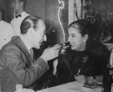
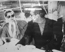
The restaurant Bersagliera, where Catherine watches Alexander flirt with another woman, is still there, a Naples landmark. It’s been somewhat redesigned, but is still very recognizable. In one corner a display of photos of luminaries who have dined at the Bersagliera includes snaps of Claudia Cardinale, Monica Vitti, and the wonderful local comedian Totò (below). Of course there’s also a signed two-shot of Ingrid and Roberto.
The seafood pasta, veal, and pepper steak were delicious, and not horribly expensive, even with the American dollar so low against the Euro.
Reminders of current cinema were evident in two billboards across from our hotel. As you know, American movie stars who would not compromise their dignity by appearing in ads in the U.S. routinely endorse products in other countries. Here a smiling Nicholas Cage publicizes a Mont Blanc watch.
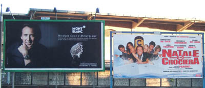
Right next to him was a billboard touting a new Italian comedy, Natale in crociera (“Christmas on a Cruise”). As I mentioned in an earlier entry, there are popular comedies made in a lot of foreign markets that we never hear of in the U.S. This is one of them. It’s the sixth in the popular Natale series, which, as the name suggests, are released in the Christmas season. Its director, Neri Parenti, also directed the ten Fantozzi comedies. Who says only Hollywood makes sequels and series?
We didn’t try to go to any movies while we were there. For one thing, we were busy in the evenings reading up on Pompeii and Herculaneum. For another, virtually all films shown in Italy are dubbed, and we don’t speak Italian.
Many of the artifacts found in the two ancient cities are on display in Naples’ National Museum of Archaeology. We decided to devote our first day to a visit there, hoping that seeing the decoration and artifacts found at the sites would give us a better sense of what the cities would have been like before 79 A.D., when a huge eruption of Vesuvius buried and preserved them.
Some more or less non-moving pictures
DB:
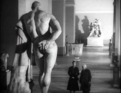
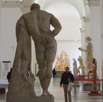
Not all the objects in the museum came from Pompeii and Herculaneum. I was especially eager to check on the statue of Hercules in the Farnese Collection. It appears in one of the finest scenes in Voyage to Italy, and though I couldn’t get Rossellini’s high angle, evidently made with a crane, it was possible to approximate his shot.
The collections at the two museums we visited, the archeological museum and the Capodimonte Museum, were spectacular and induced me, as museum trips do, to think about images, both still and moving. (Here and here are previous musings on the subject.)
Since I’m planning a book touching on relations between cinema and the pictorial arts, these come under the heading of Research as well as that of Fun. I got several ideas, but I’ll mention just two images that grabbed me.
While devoted mostly to ancient art, the Archaeological Museum was holding an exhibition of more recent painting and sculpture that dealt with classic themes, Pompeii among others. There were several quite interesting nineteenth-century narrative paintings there, but I saw nothing bolder in its compositional design than this 1896 piece by Giulio Bargolini on the Pygmalion story.
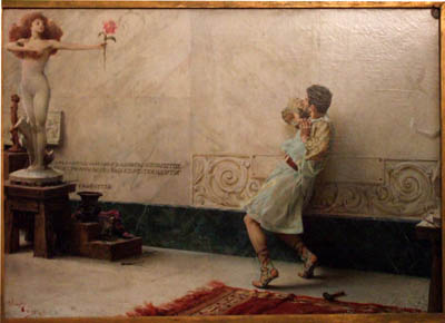
I like the way Galatea comes to life in the upper left cranny of the frame, while Pygmalion, recoiling from what he has created, is daringly off-center. His staggering is emphasized by all the space behind him that he can fall into.
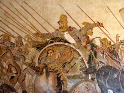
Still, the National Museum’s showpieces are from antiquity, and one of its masterpieces is the Pompeii floor mosaic showing Alexander’s victory over Darius. Made around 200 BC, it’s presumed to be a copy of a Greek painting.
I’ve been keen to see it since first encountering it in E. H. Gombrich’s magisterial Art and Illusion, a book that decisively shaped my thinking about film. Gombrich discusses the image as an example of the Greek discovery of the “eyewitness” principle, the strategy of representing a scene as it might look to an observer.
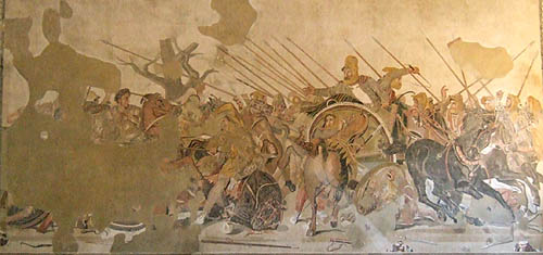
It certainly does that. Scanning the mosaic, I was reminded of the almost snapshot quality of its rendition of the battle. The left half is mostly gone, with the profile of Alexander the most intact bit. The right half, showing Darius’ forces at once resisting and fleeing, is a dazzling image.
 The thrusting spears and Darius’ outflung hand create a vivid thrust to the center, but the wheeling horses and plunging chariots counter this as they retreat to the right. There’s a remarkable amount of foreshortening, as with the horse’s rump in the center. We find shading and wrinkles on sleeves, and even Darius’ knuckles seem white with fear. I had never realized the amount of detail that could be captured in the mosaic medium.
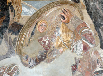
Critics have long noted the small vivid touches, such as the shocked expression on Darius’ face, the grim charioteer beside him, and the fallen soldier who glimpses his own doleful face reflected in a shield.
What struck me just as much as the freeze-frame action was the ways that the figures get tangled up. Later academic paintings of battles, of which the Capodimonte museum seems to have thousands, tend to separate out each important face and figure, with empty air framing them. Not this mosaic, which in certain parts creates a sense of frenzied panic by piling up gestures and body parts.
Clearly the artist knew how to pull a figure out of the melée. Darius is starkly isolated, by virtue of his height in the format and the empty space surrounding him. But behind and beneath him and his whip-cracking charioteer, his forces are in tumult. To look at just one bit: Here the snapshot quality is evident—the whip curls in mid-air—but in the lower right there’s also a collage of hands, heads, and single eyes of men and horses, cued by simple overlap.
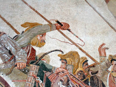
The sheer pressure of the confusion, the tension between retreating and standing fast, is rendered by these tightly stacked planes, crisscrossed by the diagonals of spears and the charioteer’s arm. I can imagine Eisenstein calling this an early case of montage, the colliding stimuli that create a synthetic, expressive image.
Sights and sites
KT:
Pompeii did not disappoint. December in Italy can be cold and rainy, but we were lucky and had sunny cool weather for our visit. Going during the off-season is definitely a good idea.
We were alone in some parts of the site, including the beautifully preserved amphitheater. It took us about six hours to walk from one end of the excavated portion to the other, though one could easily spend two days going slowly and savoring the bits of wall paintings and mosaics that have not been taken away to the museum, as well as the marble-tiled counters in the many bars and cafes, the steep, curving bleachers in the small and large theaters, and the many faint graffiti written by the ancient citizens. Almost everywhere one goes, the vast, looming presence of Vesuvius dominates the view.
The next day it turned much colder and very windy, though still sunny. The fact that the excavated portion of Herculaneum is in a vast pit helped protect us from the wind. Vesuvius’ mud and ashes buried the city 65 feet under current ground level. Again we encountered only a few other tourists as we strolled up and down the sidewalks of the town, looking into the houses, the taverns, and the temples. Again much of the wall decoration had been removed, but there were enough tile floors, mosaics, painted panels, and furniture to give a better sense of what the place must have looked like.
More on the Rome part of the trip later.
Godard comes in many shapes and sizes
DB here:
James Quandt started it.
The indefatigable Senior Programmer of the Cinémathèque Ontario emailed me in early 2004 to ask if I had any thoughts on the aspect ratios of Godard films. He attached an essay which eventually appeared in the gorgeous anthology, For Ever Godard. Reading a Quandt essay is like eating a ripe nectarine, tangy and nourishing. So you should find the original and indulge yourself. (1)
You might be asking what the term aspect ratio means. It refers to the ratio of the width to the height of the film image. The image was fairly square in the early silent era, then became roughly standardized at 4 x 3, or as the pros say, 1.33:1. Sound filming made the format a tad more horizontal, at 1.37. Anamorphic widescreen (CinemaScope and its brethren) was more or less standardized at 2.35 (more recently 2.40). Various non-anamorphic, or “flat” aspect ratios have appeared since the early 1950s. The US has favored 1.85, Europe has been known to use the squarer 1.66, and some films, like E. T., are designed for 1.75. Widescreen TVs are set at 16:9, or about 1.78:1, so that’s likely to be a common proportion in the future. We discuss aspect ratios at more length in Film Art: An Introduction (pp. 183-185 in the newest edition).
Filmies care about aspect ratios because shot composition matters. Sometimes the print is “hard-matted,” with the correct proportions given as black bars at the top and bottom of the frame, like video letterboxing. Here’s an example, from a 16mm print of Godard’s 1972 Tout va bien. It is hard-matted to 1.66. (The original film is in color.)
If the image isn’t hard-matted, the projectionist must insert an aperture plate that will mask the image properly. But what plate? Should she set it for 1.37? That’s a very rare option nowadays, and many theatres aren’t really designed to show it. Typically, if the print doesn’t indicate, the US projectionist will fall back on 1.85. Nowadays, if a Hollywood film isn’t in Scope, the projectionist is expected to use that ratio. Some shots will be problematic if the projectionist includes more than the 1.85 format allows. Here’s a full-frame film strip from The Hudsucker Proxy, where you can see that a chunk of the set is blocked or missing in the bottom area, and a microphone peeks into the frame from the top. (2)
Like many other movies, the films made by Godard since the mid-1970s show up at the projection booth without hard matteing. So at what ratio do we show them?
A great many careful viewers have voiced their views on the Internets, and I’ve learned a lot from the discussions here and here. In part this blog entry is an effort to introduce readers to this debate.
Moreover, this apparently film-wonkish question has wider implications. It can teach us a fair amount about how film images work, and the implications of any masking, matteing, or cropping of an image—especially on DVD. So if you’re interested in Godard, keep reading. If not, skip to the final section, “Relationships: The fundamental question,” where I talk about some artistic effects of cropping any film image.
It’s a just image, not just an image
James Q was mounting one of his typically ambitious retrospectives, this time on JLG, and so his essay posed a question that had long been ignored.
A disturbing discovery of the retrospective was how frequently the full-frame compositions of Godard’s late films have been ignored and overruled. Many of the prints are clearly marked by the lab with the widescreen ratios of 1.66 or (the almost standard) 1.85, and their subtitles are printed in the frame at the height indicated by those standards. Our meticulous projectionist Kate Mackay experimented with whole reels of films, showing them first in 1.33 and then in the prescribed wider screen ratio, revealing the violence done to the compositions when shown the latter way.
James found that several films, including Passion, Je vous salue Marie (Hail Mary), Nouvelle Vague, Hélas pour moi, and For Ever Mozart, looked “abjectly constricted” in 1.85. So James wrote the man himself.
Disturbed by some oddly cropped compositions in Éloge de l’amour, which result in seemingly unintentional beheadings and concretions, I consulted Godard by fax about the aspect ratio and he confirmed that it was indeed, as stated, 1.66 (rather old-fashioned in its own way). That he occasionally still seems to be jamming a 1.33 composition into a frame that cannot accommodate it suggests his instinctual preference for the open image.
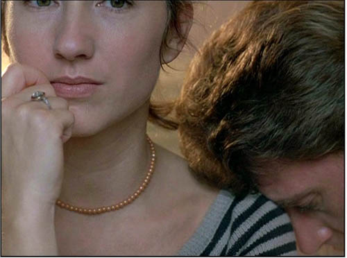
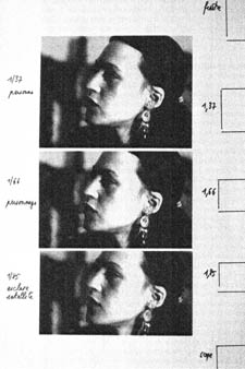
I couldn’t help James much at the time, but I did send him a couple of frames that favored squareish compositions and that came from 35mm prints. Other frames we reproduced, at 1.37, in both editions of Film History: An Introduction. The still that pretty much settles the matter for me is the gorgeous shot of Nathalie Baye and Johnny Hallyday at the top of this entry. Here’s the image as it is on a 35mm print.
Downsize that to 1.66 without losing those eyes!
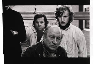
Later I sent James another killer example, drawn also from a 35mm print of Detective. (It’s in the new Film Art, p. 46.)
Here’s what it would look like in one try at 1.66 matteing.
I say “one try” at a matted version because I didn’t take as much off the top as a normal aperture plate would; I didn’t want to slice into the hands and the gun. Not only is the 1.37 image preferable (we get to see Claude Brasseur’s slumping posture) but 1.66 looks, as James says, jammed. The 1.37 ratio lets Godard load information in the very top of the shot, as we’ll see often in the examples to come. And, needless to say, at 1.85 the shot would make no sense.
Soon after James and I had our exchange, Godard—perhaps prodded by James’ query—sent a diagram to Cahiers du cinéma. (3) (Thank you, Craig Keller, aka evillights, who called attention to it on this thread.) The Cahiers editors report that Godard has asked that Notre musique be shown in 1.37. His photomontage lines up two shots from the film and arranges them according to the three major “flat” ratios, and for each one he supplies a tart annotation.
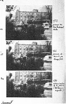
For the close-up of the woman, the captions translate as: 1.37 person. 1.66 character. 1.85 satellite slave. For the long shot of the street, we get: 1.37 Proof of Serbian bombing. 1.66 Proof diminished by Europe/ USA. 1.85 Extermination of proof (Milosovec acquitted).
Pretty strong evidence that JLG doesn’t like cropping the classic format. But these remarks are about Notre musique. What about the other films? Apart from the evidence onscreen and on the film strip, we can add one thing. Evidently he shoots at 1.37, but there’s also evidence that in the late stages of postproduction he seems to preserve that ratio. Here, for example, is a sheet of color timing instructions for Nouvelle Vague. (4) Godard has pasted in a frame for each shot in the sequence, and alongside he notes how much red, green, and blue he wants. The frames he mounted are 1.37.
Recently our Cinematheque has been holding a Godard retrospective, and I’ve taken the opportunity to revisit the aspect ratio issue. As an archival venue, we can screen at any ratio, even the squarish silent and early-sound ones. Our projectionist Jared Lewis has run the Godards at 1.37. They look fine.
Jared pointed out to me that one other factor leans toward screening them in the 1.37 format: the thickness of the spaces between frames. In a modern “full-frame” film like Hudsucker Proxy, there is very little space between the frames. The line separating one from another is quite thin. That tends to make the frames squarer, closer to 1: 1.2, as I mention in endnote 2.
In a classic sound film, there is often more space between the frames. Usually that space is black, but I can’t resist showing what it looked like in Technicolor.
This frame, from Renoir’s Golden Coach, shows the characteristic silver frame surround (and silver soundtrack) of a true Tech print. Nifty, huh?
Anyhow, the sort of thick spacing between frames that we get usually find in Godard prints, and that’s visible in the Baye/Hallyday frame above, favors the classic ratio. The thickness of these spacers is similar to what we find in a modern film that was explicitly designed for 1.37 screening, Hans-Jürgen Syberberg’s Parsifal (1982).
This array, Jared points out, gives different frame proportions than one would find in a print hard-matted to 1.66 or 1.85.
One more wrinkle. On the film strip, Godard’s frames aren’t all the same dimensions. Here are two from Je vous salue Marie; note that the first is taller, with narrower spacers, than the second.
Both, however, would be appropriately shown at 1.37.
How then are we to explain Godard’s saying the films should run at 1.66? Perhaps, as one of the online commentators has suggested, Godard assumed that 1.66 is the closest that most commercial venues can come to 1.37. Perhaps too he was just being contrary–that is, just being Godard.
Fortunately, some DVD producers seem to recognize his full-frame aesthetic. The UK version of Detective is full-frame and preserves my nifty shots. Also, the Cahiers du cinéma discs for Prénom Carmen, Hélas, and so on are at 1.37. Bowing to Godard’s wishes, Wellspring’s version of Notre Musique announces that it is presented “in its original theatrical aspect ratio of 1.33.” Although purists may say that virtually no theatres showed it that way, we should appreciate the gesture.
Relationships: The fundamental question
Even if you’re not that interested in Godard, everybody should be aware of what video cropping can do to the film image. I’m not talking about panning and scanning, that process which begins with a widescreen film, typically one of an aspect ratio 1:2.40, and extracts a 1.37 frame out of it for video purposes. This is deplorable, but most of us are alert to it. What’s more interesting is the sort of thing that happened when a film is cropped inaccurately, either in projection or for DVD.
My example will be from the first reel of Godard’s Éloge de l’amour/ In Praise of Love, which is available on DVD in a full frame version from Optimum in the UK and in a cropped version from New Yorker in the US. I won’t be focusing on the quality of each transfer, though the Optimum one looks superior to me.
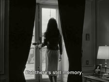
Nor will I do a detailed narrative account, because I find the characters and their interactions still fairly baffling. I’m always amazed that critics can praise a Godard film without ever getting down to explicating what’s literally happening in a scene. They write as if these films were telling their stories straightforwardly. Without help from the presskits, could journalists discern even the sketchy plots they refer to? A great deal of the fascination of Godard’s late works comes from his refusal of the most elementary forms of exposition–picking out characters, explaining their relations, and the like. There is always a story, but it’s about three-quarters hidden, and this seems to me to require a lot more analysis than people tend to give it.
Anyhow, in studying Éloge de l’amour‘s video versions, I learned that there can be a big difference between tiny numbers. For instance, the Optimum version is prepared at 1.35:1. No big deal between this and 1.37:1, surely? Except that the New Yorker version seems to have started from a 1.37 frame. Even though it’s cropped on the top and bottom, it consistently supplies a tad more information on the right and left edges, and these extra bits are visible in side-by-side comparison. First, a 35mm frame.
Needless to say, the projector’s aperture plate won’t preserve everything in the physical frame; at a minimum it masks off the curved corners. But if we look at the two video versions, there are some surprises.
The 1.37 version of this shot is of course much closer to the overall composition of the original. But more areas of the window frame (on the left) and the painting (on the right) are visible in the widescreen version than in the full-frame one. Did going for 1.35 shave off those areas? Moreover, New Yorker’s cropping is at 1.77, for all intents and purposes the same as 1.75. But to achieve this wide frame, the transfer of some shots seems to have been optically stretched a little. In some upcoming examples the faces are a bit plumper and the surroundings a bit more horizontally spacious.
Okay, maybe I’m splitting hairs. So let me assume that the UK DVD preserves a reasonable amount of the 35mm original. I want to consider some effects of the cropping we get in the US DVD. Some are obvious, some more subtle, and all go beyond this individual case to suggest the results of overcropping any movie.
(1) Of course we lose the top and bottom. In the full-frame shots from Hudsucker Proxy, no problem; the filmmakers are counting on the projectionist to mask the frame. But in Godard the cropping makes us lose stuff. Godard likes to frame heads pretty high in the shot, and this means that we often lose part of them.
Heads are trimmed in movies all the time, and it doesn’t much matter in close views. But in Éloge, Godard is composing long shots with heads quite high up. He will even daringly chop off heads himself. This is partly a strategy to conceal who is present, to block our recognizing characters by their faces. It also has the effect of activating areas of the frame that aren’t usually so important. We have to strain to see partially visible things, tucked away in bits of the shot.
In the example below, I submit, the original composition creates a tension among three centers of interest: the two very visible paintings and the almost indiscernible face of the art dealer standing by the rear window. That tension is lost when the 1.77 cropping lops off the head in the background. Significantly, the man offscreen left is talking about how classic painting displayed “relationships” (rapports)–presumably both personal and pictorial. “That’s the fundamental question.”
The framing of the assistant in the foreground, incidentally, shows that spotting a decapitation in a video version doesn’t necessarily mean that Godard wanted every head to be seen.
In a later scene, we strain to see the older man’s face as he bends over Bruno. As he speaks Picasso’s immortal line, his profile scrapes the very top of the shot, but not in the cropped version.
In most film shots, the upper half of the frame harbors what we look at first, so we’re probably most likely to notice when something goes missing there. But actually, the area at the bottom of the frame is important too, especially as part of Godard’s all-over approach to composition.
Throughout early scenes of the film, Godard’s compositions favor the art works and minimize the humans trafficking in them. So the picture (by Delacroix? Matisse?) on the coffee table is foregrounded when the art collector signs the papers proffered by a mostly unseen woman, but it vanishes in the cropped version.
Likewise, the old man on the bed can rub his glasses fretfully at the very bottom of the 1.37 format, but that performance detail goes for naught in the 1.77 format.
More generally, even when we scan the top half of the frame for major information, we tend to take for granted that people are anchored to a ground plane, the earth or the floor or whatever. Often, of course, film shots don’t show us this ground. But the material at the bottom of a distant view can weight the shot, providing a sense of gravity. Here, the dealer peering over his balcony is minimally tied to the patio ground (as minimally as he was visible in the earlier shots when his head grazed the upper edge, I suppose). But in the 1.77 version he floats free.
(2) The top and bottom zones include the corners of the frame as well, but I single them out for special mention because I like them so much. Again, we don’t expect key information to be tucked there, but it can happen—in Godard, in Tati (a big influence on the late Godard), and even in one remarkable shot in Lumet’s recent Before the Devil Knows You’re Dead. In the first reel of Éloge de l’amour, the best example I can find comes with the long-shot of the woman, turned from us, standing at the window. In the lower right corner of the shot sits a woman’s photograph on a table. The 1.77 frameline chops it off and makes it less segregated for our notice: we lose the spacing that separates it from the other objects on the table. Since the voice-over is meditating on memory, the photo adds an overtone to the shot, but less clearly in the cropped version.
Maybe it matters, maybe not; but it’s a lot harder to see in 1.77 than in the 1.37 transfer. Something similar happens with the businessman’s hand in the lower left of this shot.
(3) Cutting off top and bottom alters the shot scale. All other things being equal, cropping not only eliminates; it enlarges. Figures come closer to us. A medium shot becomes a medium close-up. All of the examples so far indicate this to some degree, but it comes across clearly in these variants.
Again, note the stretching. It seems that someone decided that the image had to be 1.75 and instead of cropping it, stretched the 1.66 one. Yikes!
(4) Overambitious cropping changes the compositional dynamics. In reducing information, it reorganizes the composition. Rudolf Arnheim (I blogged about his achievements here) suggested that we consider a picture as a field of vectors and forces, pushes and pulls, balance and imbalance, rival centers of attention. By changing the framing we change the relation of the figures to the edges, and this can alter the composition.
The clearest examples come from the sort of reframings we find when a Super-35mm film is rendered in home video versions in both 2.40 and 1.37.
In this shot from 8mm (the movie, not the gauge), the cashier questioned by Cage looks more isolated in the Scope framing, while in the full frame they seem closer together and he seems to press in on her. Cropping can change a lot.
Now consider this comparison.
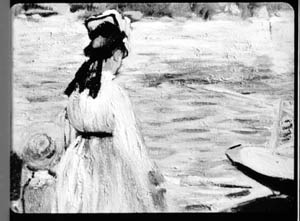
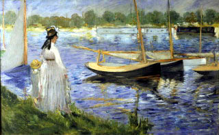
Godard’s original shot (here from 35mm) keeps the painting’s upper horizon, the darker, frothy waterline as a kind of backboard, halting the water’s recession into the distance. Graphically, the water on the right center becomes a negative space for the two figures, with the boy counterbalanced by the tip of the skiff.
But the cropped version loses the distant waterline, creating an infinite stretch of space top to bottom, and the boy’s head seems to float more freely. Most starkly, the skiff, by losing its shadow, seems to have swung more toward us.
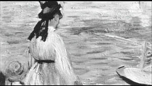
It’s worth noting that Godard himself is a mean hand at radical cropping. I’ll forebear from rambling on about what his original framing above does to the original, Manet’s Seine at Argenteuil (1874), but it could constitute a lesson in how framing changes effect and meaning.
Several factors come into play when we look at this shot from the two DVD versions.
The woman’s face is off-center in both images, but it looks more off-center in the 1.77 transfer. In fact, despite the extra bits on left and right, it is measurably more off-center, because of this transfer’s optical stretching. Yet I’d argue in addition that the cropping of the frame has squeezed the pictorial elements into a stronger horizontal to-and-fro, giving a sense that she has been pushed more out of the middle. You can see it more markedly if we crop it more drastically, and it may help to hide the others when you look at this.
This effect is akin to what happens in the cropping of the 8mm example: the spatial relations have reorganized in relation to the frame edges. Rapports again.
(5) Overcropping can affect the way we experience the time of the shot. Before you call the men in the white coats, I hasten to say that cropping is purely a spatial effect, but in cinema space is bound up with time.
We’ve seen that Godard manipulates the vertical dimension of the frame to an unusual degree, and the effect on time becomes apparent in one scene of Éloge in which Bruno talks with an older man, in a sort of casting session for his project. First we see Bruno alone, and as he walks to the window the old man comes in, his back to us. We presume it’s a man by the bulk, the gait, and the fedora, making its appearance in the upper right corner.
Or does a man come in? In the 1.77 version, at the corresponding point in the shot, we can’t tell it’s a man until the figure comes further into the room.
Godard’s reliance on the upper part of the frame allows us to discern the caller sooner in the 1.35 version. Seconds, even split-seconds, matter in cinema. Insofar as cropping affects the timing of a shot’s unfolding, it affects our experience.
( 6) Cropping affects perspective, the perceived distances and volumes of objects in the visual array. Blowing up the center of an image creates a flatter, more friezelike space than we discern in the original. This becomes evident in a later phase of the scene I just mentioned. After Bruno leaves the shot, the old man is left standing in the office.
The 1.77 image looks more like it was shot with a long lens than does the full-frame version. The result recalls the sort of perpendicular telephoto framings so common in the 1970s, in films like The Parallax View and The Conversation (below).
Godard has said that he preferred 30-40mm lenses for much of Sauve qui peut (la vie) because a focal length of 50mm (and presumably one longer than that) will “destroy perspective.” (5)
Many of these differences wouldn’t matter in most films, which aren’t composed as meticulously or as daringly. Hollywood images aren’t typically as dense as those in late Godard. (I must do a blog some day on fussbudget filmmakers like him.) But even if these niceties seem negligible, I think you’ll grant that the film would be much more compromised by being shown in a 1.85 ratio, the squarest option available in most commercial theatres today.
Critical discussions of Godard’s late films have treated them as poetic meditations, and that seems partly right to me. Yet few critics ask how they manage to create their lyrical, associative quality. I think, as I hope to show in a future blog, this has to do with his treatment of narrative (naturally) and his layout of scenes. But even before we get there, I think that we find in the very texture of his images (let alone his sounds) a daring decentering of faces and bodies—the usual nodes of our attention. If he often blocks the flow of our glance, it’s in order to rechannel it to unexpected areas and textures, crannies and gaps, within the image. And so we want all those areas and textures, along with the crannies and gaps, available to our eyes and minds.
(1) James Quandt, “Here and Elsewhere: Projecting Godard,” in For Ever Godard, ed. Michael Temple, James S. Williams, and Michael Witt (London: Black Dog, 2004), 126-139.
(2) Geek note: You may notice that this “full-frame” image isn’t itself in the 1.37 ratio. It’s very square. The reason is that many 1.85 frames will be exposed in the camera at a ratio of 1: 1.2! I believe this was standardized for the Panavision cameras of the 1970s and afterward, though I’d appreciate more information about this. See the entry on Panavision cameras in American Cinematographer Manual, fifth ed., ed. Charles G. Clarke (Hollywood: American Society of Cinematographers, 1980), 104. See also Rob Hummel, “Comparison of 1.85, Anamorphic and Super 35 Film Formats,” American Cinematographer Manual, eighth ed., ed. Rob Hummel (Hollywood: ASC Press, 2001), 24-29.
(3) Jean-Luc Godard, “Formats,” Cahiers du cinéma no. 591 (May 2004), 78.
(4) This image is taken from Jean-Luc Godard par Jean-Luc Godard, vol. 2: 1984-1998, ed. Alain Bergala (Paris: Cahiers du cinéma, 1998), 199.
(5) Jean-Luc Godard, “Propos rompus,” in Godard par Godard vol. 2, 466.
Thanks to Suzy Buenger and Nancy Marshall for identifying the Manet painting for me.
PS 15 Dec: And thanks to James Quandt, Michael Kerpan, and Yogesh Raut for a name correction I’m too embarrassed to specify further.
PS 7 April 2008: The issue is raised anew with Gus van Sant’s Paranoid Park. It’s designed to be shown at 1.37, with more than a few shots reminiscent of Godard. Joe Beres explains here.
PPS 25 January 2009: Ranjit Sandhu provides a lively and detailed discussion of aspect ratios and matteing strategies, along with remarks on Godard’s frames.
PPPS 21 Sept 2009: Thanks to editor John Olivio for a correction on the 1.78 aspect ratio.
JLG par JLG (1995).


