


Archive for May 2015
The waning thrills of CGI
Kristin here:
There have been rumblings lately about the surfeit of CGI-heavy films, especially superhero movies, and about a certain monotony in the results. Critics and fans are hailing Mad Max: Fury Road, in no little part because George Miller did stage much of the action, with real fantasy vehicles and hair-raising stunts, and employed CGI only when necessary. Among the diehard Peter Jackson fans over on TheOneRing.net, many argue that the emphasis on practical effects over digital in the Lord of the Rings trilogy should have been carried over to the Hobbit trilogy, despite the advances in CGI technology in the nine-year gap between them.
Earlier this month, Variety‘s Brian Lowry published an editorial laying out the problem. He concentrated on the superhero movies that have increasingly come to dominate the tentpole level of big-studio filmmaking:
The ability to mount enormous battles featuring multiple super-powered characters, however, has become its own trap. And while the results can be visually astounding, the movies regularly feel as lifeless and mechanized as the technology responsible for bringing those visions to fruition.
The why of it remains something of a mystery, but the outcome is frequently a hugely expensive–if often enough quite lucrative–tentpole release that certainly puts the money onscreen, yet nevertheless proves more numbing than exciting, even during what should be the show-stopping sequences.
The original “Avengers” was mostly a happy exception, even with its prolonged alien-invasion climax. “Age of Ultron,” while ambitious in exploring relationships among characters, becomes drearily repetitive as the heroes mow down another CGI horde, this time consisting of artificially intelligent robots.
[…]
The pattern has become predictable. “Iron Man,” a terrific movie overall — particularly in capturing the origin story — degenerated into a mundane brawl between two armor-clad characters. Ditto the “Hulk” reboot with Edward Norton, which culminated with the title character’s ho-hum showdown with another green behemoth, the Abomination.
One can argue, in fact, that the much-maligned second “Star Wars” trilogy sacrificed an element of its humanity in George Lucas’ embrace of a wholly digital filmmaking approach. At a certain point, watching droid armies being whacked to pieces begins to yield diminishing returns.
Put more simply, just because CGI wizardry allows you to do something, whether hoisting an entire city into the air or leveling skyscrapers willy-nilly, doesn’t always mean you should. Because while the box office figures might suggest otherwise, there is an audience out there that’s weary of these movies precisely because of the hollow quality to the inevitable final 30 minutes of unrelenting mayhem.
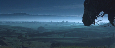
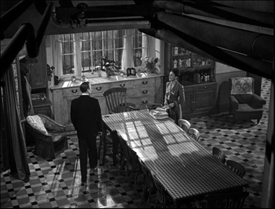
This struck a chord with me, because since the beginning of the year I have seen trailers for several CGI-heavy films. (How many of them begin with an ominous “helicopter shot” high over a CGI city, usually at night?) Most of them melt into each other in my memory, but I do recall that they included Insurgent (the teaser, below left) and Jupiter Ascending (trailer #3, below right).
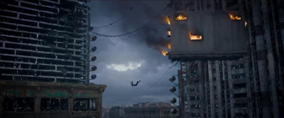
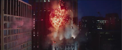
My reactions to the Insurgent and Jupiter Ascending images were: 1) another burning cityscape with a CGI person flying through the air, and 2) wild horses couldn’t drag me to these.
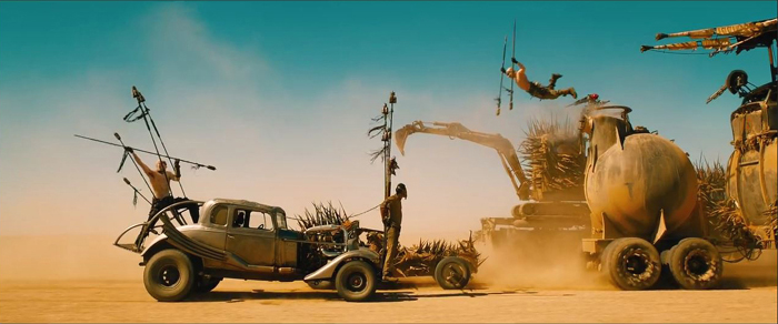
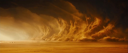
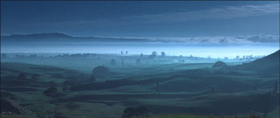
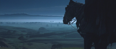
Compare these two frames with the image at the top of this entry. My reactions to the Mad Max: Fury Road teaser, which I only saw in HD on my computer, were: 1) what a gorgeous shot, 2) why is that guy doing that–he’s crazy, 3) George Miller and all these other people are crazy, and 4) I must see this film ASAP. The same qualities attracted me to The Road Warrior, but this time Miller had a far bigger budget, allowing him to create more vehicles and make them more elaborate.
The increasingly same old-same old quality about superhero films extends to science-fiction films and dystopian future ones.
CGI is a marvelous technology and has been used to create wonderful films, scenes, and characters. Gollum remains one of its most successful and memorable creations. I suspect that many, like me, remember that initial jolt of amazement in the scene in The Two Towers when the mild “Smeagol” and villainous “Gollum” sides of his nature talked to each other, and a sudden switch to shot/reverse shot made his split visible, as if he had two bodies:
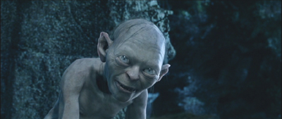
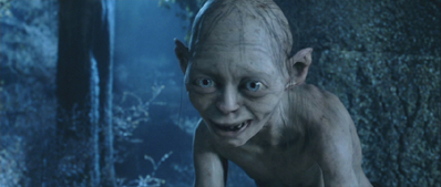
It was a brilliant way to handle the scene, but it also depended on us accepting Gollum as a character on the same plane of existence as Frodo and Sam. Yes, the technology for Gollum was improved for his reappearance in The Hobbit, but it wasn’t dramatically better, and the first trilogy was the real breakthrough.
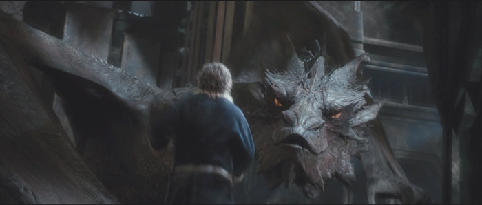
Smaug was another creation where one could hardly deny that CGI was used with astonishing complexity and skill (see bottom). The same is true for The Dawn of the Planet of the Apes and The Rise of the Planet of the Apes (also with effects by Weta Digital, which also managed to fill in scenes involving the late Paul Walker in Furious 7 without barely anyone noticing).
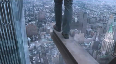
Lest all this become too Weta-centric, I also have seen the teaser for Robert Zemickis’ The Walk a few times. Again there’s a computer-generated cityscape, as in Insurgent and Jupiter Ascending, but the effect is quite different. It’s an attempt to create realism in a story based on actual events; the actor obviously can’t be placed high above New York, and the Trade Towers are gone. The effect is anything but clichéd. That I was to see, too.
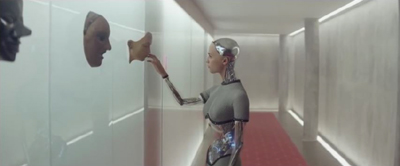
Another well-reviewed current science-fiction film, Ex Machina, uses CGI in an original way. David liked it less well than I did, but whatever one thinks of the film as a whole, the robot character Ava is not something we’ve seen on the screen before–at least, not done this way.
Historically, any art form goes through cycles. Hugely successful films will give rise to many imitators, and imitation eventually leads to cliché. The question is, will the filmmakers called upon to make big effects-heavy films make the effort to use CGI in an imaginative way? With sequel after sequel in the largest franchises already planned by the studios for years into the future, will the apparent assumption that flashy CGI is enough to attract the action-movie crowd prove wrong?
The madness of Mad Max
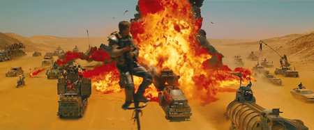
Despite the critics’ emphasis on the practical effects and real locations in Fury Road, it should be pointed out that Miller used quite a bit of CGI in the film. Indeed, he was no stranger to digital effects. For Babe (1995), his team used CGI to achieve the most realistic talking animals in films to that time. (Miller produced and wrote the script, with Chris Noonan directing; he directed Babe: Pig in the City.) Previously talking animals were usually done with puppets and animatronics, but Miller’s team used 3D scans of animals snouts and muzzles and manipulated the results. Babe won the 1996 Oscar for best visual effects. There were no exploding cities, giant armies, or battling superheroes, but experts recognized those moving animal mouths as cutting-edge stuff.
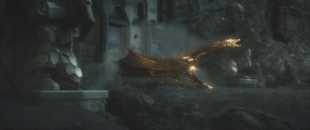
In Fury Road, CGI is used for effects that would be difficult, impossible, or prohibitively expensive otherwise. Furiosa’s missing left wrist and hand are an obvious example, as is the massive sandstorm that hits the fugitives and pursuers.
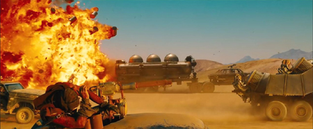
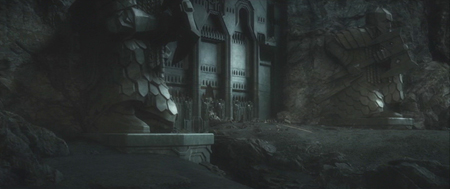
The blue night scene was shot day for night and then enhanced digitally, presumably with tinting and the addition of stars. The city which is the Citadel’s source of gasoline and is supposedly Furiosa’s goal as her truck sets out early in the film, is shown on the distant horizon but clearly was not built, since none of the action takes place there. The Citadel scenes were done in Australia, while most of the desert material was shot in Namibia. Some parts of the Citadel were built full-scale (e.g., the winch room), while green-screen replaced by digital set extensions supplied the rest. I think I spotted some digital matte paintings in some of the landscapes. But on the whole, Miller stuck to real locations, and most of the scenes of the chases were done with real vehicles and actors, chasing each other around the Namibian desert.
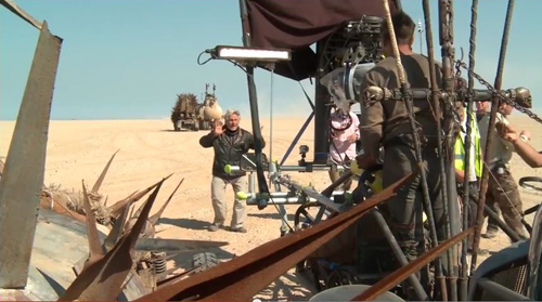
Miller commented, “We don’t defy the laws of physics–there are no flying human beings, no spacecraft–so it doesn’t make sense to do it as CGI. We’ve got real vehicles and real humans in a real desert, and you hope that all that texture will be up there on the screen.” Miller had in fact assumed that he would have to create the “pole cat” sequence, which has men perched on long, swaying poles atop speeding vehicles (above). Action unit director Guy Norris, however, shot a test scene on video, with no CGI. Miller was thrilled: “There were 10 pole cats swaying, coming down the road at speed, all of them on cars, and Guy was on one of the poles filming them. I choked up. I thought, ‘Wow, it’s real. It’s absolutely real.”
According to Simon Gray’s “Max Intensity” in the latest American Cinematographer (not yet online), “Months of rehearsals enabled the stunt crew to perform their choreographed sequences while the vehicles traveled at speeds up to 50 miles an hour.” (AC, June 2015, p. 42)
The reality of it comes through, as in this scene of one of many explosions. The stunt man flinching in the foreground is not the sort of thing you’d see if this were all being faked.
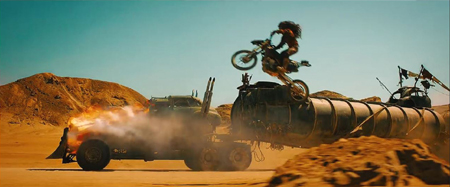
And some of the stunts are not all that different from what we saw in The Road Warrior or Beyond Thunderdome, both made in the pre-CGI days. This scene, for example, among the best in the film, where a motorcycle gang chases Furiosa’s rig.
One reason why Fury Road looks so good is results from Miller’s and and his cinematographer’s decision to avoid the look of most post-apocalyptic movies. Anne Thompson describes their approach: “The cliches of the genre were to desaturate the cinematography. So he and great Australian cinematographer John Seale (dragged out of retirement), saturated the color. ‘We were able to change the skies, and go against the idea that because it’s the apocalypse, there’s no longer any beauty in the world.'” (AC, June 2015, p. 48)
There are desert areas of Africa where the sand is the rich, peachy color that appears in the film. The Namibian desert, however, is not so colorful.
(George Miller, in the official Warner Bros. making-of publicity short)
The film’s senior colorist, Eric Whipp, describes the challenge of differentiating the largely brown, beige, and grey colors of the costumes and vehicles from such backgrounds: “The desert sand in Namibia is, in reality, closer to be gray color, but pushing it toward rich gold colors complemented the characters and vehicles, providing a strong, graphic look. The only other dominant color in the film was blue sky, which we embraced.”
The transformation of the desert into rich yellow and orange tones was done with what was obviously aggressive digital color grading. It runs marvelously counter to the dull blues, browns, and grays that form the dominant look of so many action films.
[May 31: On fxguide, Ian Failes has posted an excellent piece that lays out the practical vs. the digital effects in Fury Road.]
LOTR vs. The Hobbit
Reading Lowry’s comments made me think of Andrew Lesnie, who died recently at the young age of 59. Lesnie had unintentionally played a small but pivotal role in my attempts back in 2002-2003 to get permission to interview the Lord of the Rings filmmakers for my book, The Frodo Franchise. I needed to contact someone high in the production who could be a sort of sponsor for me, helping to gain New Line’s cooperation. The only people I figured could do that would be producer Barrie Osborne or Peter Jackson or Fran Walsh.
In November 2002, I was at a conference in Adelaide, Australia and met Annabelle Sheehan, who at that time was an administrator at the Australian School of Film, Radio and Television. When I told her of my potential project, she offered to put me in touch with Lesnie. I hesitated before responding. I knew that it would be wonderful to interview him, but my subject didn’t relate to cinematography at all. Moreover, he wasn’t in a position to sponsor such a project. Then Annabelle offered to introduce me to Barrie Osborne, which subsequently happened via email. The project became real at that point.
I’ve always regretted that I had no excuse to interview Lesnie. From interviews and his appearances in the supplements for the extended DVD editions of LOTR, he seems a genial man. I also admire the cinematography for LOTR. There’s a great variety in the lighting schemes, and he contributed some very striking moments to the film.
It’s of course very difficult to pin down exactly what Lesnie’s contributions to LOTR were in many scenes, given the considerable dependence on CGI. Still, I think he probably had more affect on the final look of LOTR than he did on The Hobbit. As the three parts of The Hobbit came out, it became increasingly clear that there were no shots or sequences that could stand comparison with the best things in LOTR. I think of well-conceived, dramatic shots like the one in The Fellowship of the Ring where a scene begins with a bucolic view out over a misty morning in the Shire, which is suddenly interrupted by ominous music and the entry from offscreen of one of the Black Riders’ horses.
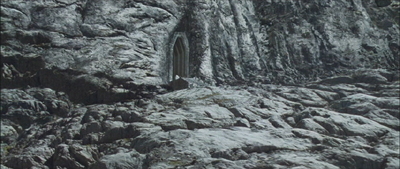
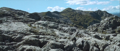
Another shot I admire is the first exterior after the long sequence of the passage through the Mines of Moria in Fellowship. Gandalf has just fallen into the abyss with the Balrog, and the others flee. The cut to an extreme long shot of the rocky terrain (filmed on Mt. Owen) outside the eastern gate to the Mines is jolting, seemingly switching from a color film to a black-and-white one. A trace of green plants at the lower left is virtually unnoticeable, and only as the camera arcs around to follow the remaining Fellowship’s movements away from the gate (which was added digitally) does a bit of blue sky appear at the upper right and eventually the green of the landscapes in the distance.
Although there are plenty of New Zealand locations in The Hobbit, I can’t think of any that are used as effectively as some of the ones in LOTR–most memorably the Edoras set, which was built full-size on Mount Sunday on the South Island. The swooping helicopter shots around the rocky promontory, with the snowy mountains revolving slowly around it, became iconic moments in the film.
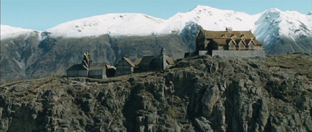
Viewers might think that those background mountains were added digitally, and certainly some scenes, including the ones set at Orthanc, did have backgrounds built up of mountains from a variety of places. The extreme long shots of Rivendell are a patchwork of elements. Not so for Edoras, however. David and I were privileged to fly around Mount Sunday in a small plane–after the Edoras set had been removed–and we saw more or less what one sees in the film.
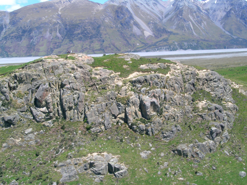
It was a different time of year, November (the Southern Hemisphere’s equivalent of May), but the mountains are clearly the same ones.
There was a helicopter camera team, so Lesnie might have had nothing to do with these circling shots, nor with the mountain photography for the magnificent Beacons Sequence in The Return of the King (to which the fires were added digitally).
![]()
Again, there is nothing to compare with this in The Hobbit, which, I would say, suffers from having so many sequences with CGI-created landscapes.
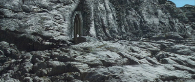
The only really memorable shot I can think of from The Hobbit is entirely digital, the emergence of Smaug from Erebor, covered in gold, at the end of The Desolation of Smaug. He bursts through the door and soars up away from the camera, shaking the gold off in sparkling droplets.
The shot of the dragon’s death is nearly as impressive, as Smaug falls slowly downward away from the camera.
The problems with The Hobbit arise, I think, because so much of it, especially in the third part, has been conceived as almost entirely digital. Compare these two pre-battle moments from The Return of the King and The Battle of the Five Armies.
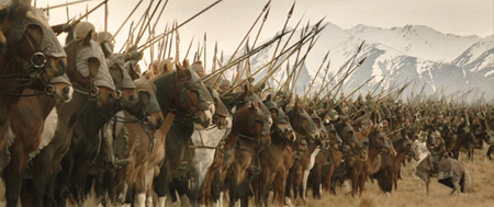
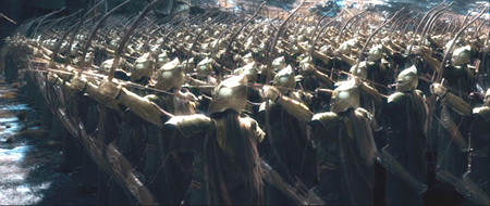
As Théoden addresses his troops before their charge during the Battle of the Pelennor, we are clearly watching real riders on real horses, their spears held at various angles. To be sure, the MASSIVE program was used to multiply horses and riders, but primarily in the extreme long shots. Hundreds of real ones were used in the scene. In the background we again see impressive non-CGI snow-covered mountains. There are four characters here about whom we care: Théoden, Éowyn, Merry, and Éomer. The Battle of the Five Armies shot of Thranduil’s troops, in contrast, involves perfect ranks of anonymous Elves, moving in synchronization. There is no actual landscape behind them, just vague patches of blue, brown, and white.
MASSIVE was used here as well, but for far more figures. Wasn’t the program devised to allow digital “extras” to move independently of each other rather than replicating a very limited number of gestures? It’s ironic, since in the film’s endless battle, characters moving in synchronization seem to be the rule. See the moment when the dwarves assemble their shields into a wall against the orcs, with Elves leaping effortlessly over them.
Which brings up the matter of seemingly weightless characters and creatures. There has been much discussion of the fact that Legolas and Tauriel leap about, stand on other characters’ heads while fighting, and bound up collapsing stone staircases. Admittedly, Tolkien says in the blizzard scene of The Fellowship of the Ring that Legolas’ “feet made little imprint in the snow.” But even assuming that Elves are very light, some of the antics in The Hobbit look plain silly.
And it’s not just Elves that zip about in this fashion. Partway through the Battle of the Five Armies, large rams appear out of nowhere. (I gather that their presence will be explained in the extended edition.)
Thorin, Kili, Fili, and Dwalin ride the rams up the sheer pinnacle to reach Azog’s command post. The rams bounce weightlessly and effortlessly up the steep cliffs, looking more like ping-pong balls than heavy animals. Indeed, gravity seems to be defied quite a bit in the films–even putting aside from the fact that the characters are able to survive impossibly long falls without a scratch. I can’t think of cases in LOTR where such things happen.
Much has been made of the fact that The Hobbit contains many echoes of LOTR, in terms of characters, scenes, and even specific repeated lines. I’ve complained about that myself. Yet there are many fans who prefer The Hobbit to LOTR–many of them fangirls obsessing over Richard Armitage (Thorin), Aidan Turner (Kili), Dean O’Gorman (Fili), and/or Lee Pace (Thranduil). Such fans proudly point to the “fact” that the second trilogy had higher box-office totals than did LOTR. In unadjusted dollars, yes. In adjusted dollars, LOTR made considerably more, and that without the benefit of 3D surcharges. I suspect this disparity arose from the fact that LOTR was so extraordinarily original, and because it balanced CGI and practical effects so effectively. The Hobbit tipped far in the direction of CGI, and it shows.
Many studios and filmmakers will continue to rely on the standard look of action/sci-fi/fantasy CGI, at least until it becomes so obviously repetitive that audiences lose interest. But films like Fury Road and LOTR offer models of how CGI and practical effects can be balanced for a much livelier film.
[April 18, 2016: Ex Machina, to the surprise of many, won the Academy Award for best special effects. This was probably because it was so original in its use of effects. After all, most special effects doesn’t equal best special effects.]
Nitrate days and nights
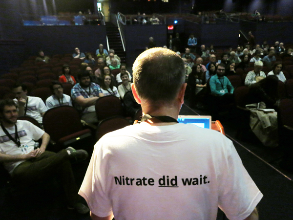
Paolo Cherchi Usai introducing a session of The Nitrate Picture Show.
DB here:
Our entries have been laggardly lately because of various factors: a trip to a family wedding in DC, work on a new edition of Film Art, a stubborn cold, and not least, a bustling trip to Rochester’s George Eastman House for The Nitrate Picture Show. This last event is the topic for today, and hoo boy was it something.
Handle with care, respect, and admiration
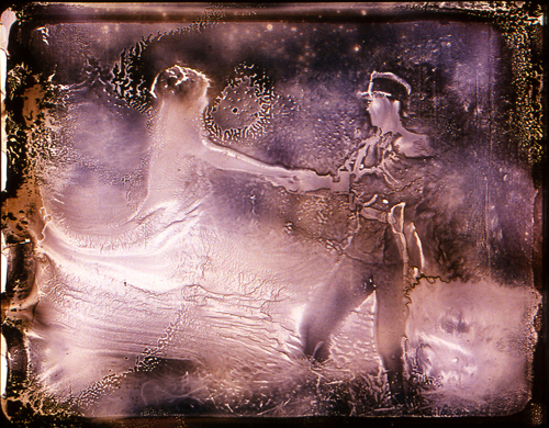
Light Is Calling (2004).
For the first fifty years or so of cinema, commercial feature films were shot and shown on nitrate-based film stock. The film emulsion, consisting of silver halide crystals (for black and white) or dyes (for color), was supported by the base, a clear, flexible strip. That strip was made of nitrocellulose.
 In a talk at the Picture Show, Roger Smither, editor with Catherine Surowiec of the definitive compendium This Film Is Dangerous, reviewed some essential features of nitrate. As most people know, it catches fire easily. Quentin Tarantino built the climax of Inglourious Basterds around a theatre fire deliberately set by touching off heaps of nitrate. Robert Flaherty famously barbecued his initial footage of Nanook of the North by smoking while he worked on editing it. No surprise that nitrocellulose was used in munitions, where it was often called “gun-cotton.”
Once ignited, nitrate is hard to control. It will burn under water, and it can feed on its own flames. A dramatic 1948 documentary screened at the Picture Show presented almost comically horrifying ways in which a nitrate fire resists extinction. Nitrate also produces highly toxic gases. For such reasons, nitrate projection booths are designed to slam shut tight and let the fire eventually exhaust itself. God help you if nitrate goes up in an open warehouse or theatre space.
It was this volatility that forced most national film industries to convert from nitrate-based stock to acetate, or “safety,” stock. In America, the process began soon after World War II and, among other advantages, allowed exhibitors to lower their fire-insurance costs. Other countries were slower to convert; at the Picture Show, some people mentioned that the Soviet Union was still using nitrate stock in the early 1960s. As for archives and laboratories storing nitrate films, conflagrations were distressingly common. Roger and Catherine’s book list dozens of major nitrate fires from 1896 to 1993.
Apart from its tendency to blow up, nitrate is chemically unstable and can decompose. Heat, moisture, and exposure to chemicals can wreck nitrate in a host of ways. It can become infiltrated with a blotchy growth that some find piquant (viz. Bill Morrison’s Light Is Calling, above). The base can flake off from the emulsion. A nitrate print can shrink, warp, blister, or become brittle. The film can start to smell, or turn to brown powder. Some of these problems are present with acetate as well, but combined with the possibility of nitrate combustion, acetate had an advantage.
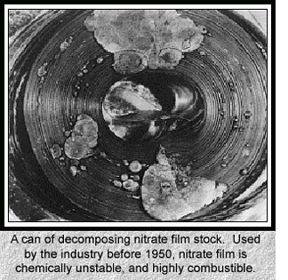 A string of well-publicized explosions in the 1970s at the Library of Congress, Eastman House, and the Cinémathèque Française resulted in millions of feet of film being lost. National governments became aware of the threat to their film heritage. Archivists seized upon the slogan, “Nitrate won’t wait,” and circulated scary images like the one on the left. Money was given, and thousands of feet of film were transferred to safety stock. In the process, however, a fair amount of nitrate was discarded. In 2000, Roger noted, archivists were surprised to learn that a great deal of nitrate around the world remained in good shape. The late Susan Dalton, our archivist here at Madison for many years, argued that all of today’s films should be transferred to nitrate, the most proven and reliable long-term format.
There was also an argument for keeping nitrate around on artistic grounds. As Roger put it: “It’s pretty.” Everyone I know agrees. In the late 1970s Kristin and I saw at MoMA a double bill of two nitrate prints, Gance’s La Roue and Ford’s How Green Was My Valley. They glistened. Later, attending the Pordenone Giornate del Cinema Muto and Bologna’s Cinema Ritrovato, we saw lots of nitrate prints and were always overwhelmed. The images, especially from very early films, seemed at once sharp in contour and soft in textures.
So nitrate images look great. But why? Some say that nitrate prints have more silver in the emulsion than acetate ones. In This Film Is Dangerous, John Reed suggests that the increased “silver load” yields solidity in shadow areas and vitality in white ones. He also speculates that nitrate-based copies may benefit from projector lenses, screen surfaces, and carbon-arc projection (this last a topic I’ve touched on briefly with respect to Technicolor). If all these factors are in play, the beauty of the copy may be only contingently related to nitrate as such.
Moreover, can we specify the Nitrate Look, in the way we can tell oil paint from water colors? Conducting an informal survey of archivists at the Picture Show, I could find no one who would claim that he or she could confidently spot a nitrate print simply from seeing it projected. Perhaps we are not yet at the stage of connoisseurship of a traditional art historian. Or it may be that foreknowledge that a print is a nitrate one biases us toward ascribing more beauty to the images. To get a precise sense of the Nitrate Look, Reed suggests we’d need an A/B test, running a nitrate print side by side with a fine-grain acetate positive from the same negative.
Richard Koszarski pointed out in conversation that watching a nitrate print we know we’re getting something old–if not an original (it could be a re-release print), at least a copy that audiences did see back in the day. Paolo Cherchi Usai, in introducing the Show, pointed out that the goal was not simply to screen a lot of classic films but to present an experience of cinema from another time. In addition, you have to admire the sheer robustness of these survivors: the prints have been shown a lot and still look lustrous.
To put the emphasis on the “nitrate experience,” nearly all the titles of the films were kept under wraps until we arrived. The goal was not to enhance or deflate the mystique of nitrate, but to call attention to the unique beauties of specific copies and to ask us to reflect on the purposes and consequences of film preservation. To the same end, in a lecture Kevin Brownlow surveyed his efforts to rescue rare footage by Chaplin, Gance, and others.
A panel discussion of archivists considered whether 35mm, in any form, was still viable for public showing. Answer: Most definitely. If a venue meets archival screening conditions, libraries are willing to loan copies. Just don’t count on nitrate ones. Paolo estimates that there are fewer than half a dozen nitrate-secure projection booths functioning in Europe and the US.
No pixels, please, we’re purists
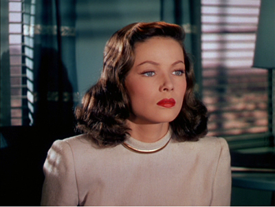
Leave Her to Heaven (1945).
Whatever the cause, the films looked undeniably spectacular. I was least taken with the 1930s Selznick items, A Star Is Born (1937, in a 1946 reissue print) and Nothing Sacred (1937). They have never seemed to me first-rate movies: I think the Cukor Star Is Born is far superior, and Nothing Sacred, after a lively opening, seems to me to run out of comic steam. Not enough characters, maybe; not enough twists, possibly; too much Walter Connolly, I’m sure. Twentieth Century beats it hands down. But of course the prints were very good, and the genial William Wellman, Jr., came by with informative background information keyed to his new biography of his dad. (Lest I seem to be opposed to Wild Bill, let me record my admiration for G. I. Joe, Battleground, The Ox-Bow Incident, and Track of the Cat.)
The Selznick prints suggested progress in 1930s Technicolor. I was struck by the problems of matching brightness and hues from shot to shot, or sometimes right after a cut, as early in A Star Is Born.
By the end of the decade, of course, with Snow White, The Wizard of Oz, and Gone with the Wind, Technicolor had created a more consistent palette.
The 1940s, the great era of Tech, was on rich display in other titles. I had to miss Black Narcissus, but this may have been the British Film Institute copy I’ve seen. I remember the color as being as both gloomy and ripely unrealistic. [Nope! It was the Academy copy, and everybody told me it was gorgeous.]
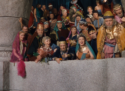
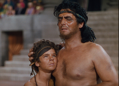
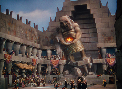
The copy of Leave Her to Heaven (from UCLA) made Gene Tierney’s ruby lips all but float off the screen at you. Even wilder was a demonically gorgeous print of Samson and Delilah from the Library of Congress. The movie is typically silly DeMille, but it’s fun to watch how a story you already know gets padded out with a fierce lion, bevies of dancing girls, and a somnolent George Sanders, the man who died of boredom.
The spectacle is what the audience was paying for, and the color design gave them their money’s worth. No movie I’ve seen lately galvanizes the spectrum the way this one does. The almost shadowless lighting makes every color pop. I don’t think I’ve ever seen as many shades of pink and purple in a movie, and the pastels admirably set off the burnished beefcake of Victor Mature.
Richard Koszarski, still on a roll, pointed out that Sunset Blvd., the film in which the Gloria Swanson character visits DeMille on the Samson set, features an odd homage. The phone table at the apartment of Artie Green (Jack Webb) boasts a statuette of the god Dagon, whose temple Samson pulls down.
Did Artie pilfer a model? Is it an in-joke like Pike’s Pale? Or a piece of remote cross-promotion? There’s always more to see.
Monochrome as multichrome
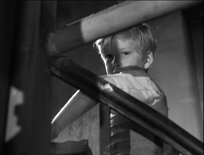
The Fallen Idol.
The black-and-white nitrate titles were just as astonishing. Casablanca had a subtle gray scale I had never noticed before; it would be worth comparing this print with the digital copy piped to theatres as part of the recent classics revival series. Can the latter be anything like this? The first Man Who Knew Too Much (1934) is no stranger to this blog; the 1943 print looked crisp and sounded exceptionally good.
Rene Clément’s Les Maudits (1947, “The Damned”) was previously unknown to me. It’s a remarkable wartime thriller, with long, tight tracking shots through a submarine and cramped, noirish deep-space compositions.
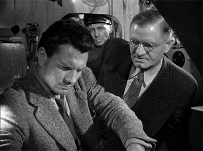
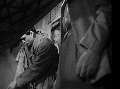
Clément employs a flashback narration that stems from the protagonist writing his memoir of the incident. It looks forward to Bresson’s Diary of a Country Priest, but in a way it’s a bit more daring, because it mixes the character’s voice-over but with the commentary of an impersonal objective narrator.
Somewhere between color and black-and-white was the delirious fantasy romance Portrait of Jennie. It has its problems, chiefly a subplot showing the painter Eben Adams working on a barroom portrait of Michael Collins, but there is a goofy grandeur to the whole enterprise. The magnificent corps of Eastman projectionists managed to re-create the splashy climax of original 1948 screenings. Not only does the image go green, but it gets bigger. Bosley Crowther reports it an apotheosis of kitsch.
Then, when a green flash of lightning electrifies the screen, which expands to larger proportions, and sound vents around the theatre roar with the ultimate and savage fury of a green-tinted hurricane, the final vulgarization of Mr. Nathan’s little fable is achieved.
The effect is indeed overblown, but I didn’t hear anybody in Rochester complain.
The final title, kept secret until the moment of projection, was The Fallen Idol, one of the great staircase movies in an era of great staircase movies. An exercise in Jamesian restricted viewpoint–What Maisie Knew, for the cinema–it confines us almost wholly to a little boy who worships the family butler but can’t quite fathom the currents of grownup unhappiness and betrayal swirling around him. Carol Reed’s love of low angles and looming foreground planes is kept under precise control, and the moments of suspense, notably the famous swooping circuit of the paper airplane, remain just as strong as ever.
I have to believe that James Card, legendary master of Eastman House, would have approved of the whole shebang. This is his centenary, and along with the Picture Show there was an informative display surveying the career of the man who, with saintly George Pratt at his side, gave Eastman House its unique cachet.
The Nitrate show drew about 300 passholders and as many as 100-150 locals for some shows. It’s planned as the first in a series. Next year’s session is slated for 29 April-1 May. See you there?
Thanks to Paolo Cherchi Usai and Jared Case for their hospitality during my visit. Thanks as well to the Eastman House staff, especially Deborah Stoiber, Jurij Meden, and Ben Tucker, who made the weekend memorable. In all, excellent programming and presentation!
An entertaining account of the preservation movement is Anthony Slide’s Nitrate Won’t Wait: Film Preservation in the United States (McFarland, 1992). It’s there I learned that Kemp Niver once pulled a gun on Raymond Rohauer. Archivists were tough in those days.
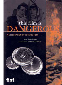
The stupendous volume edited by Roger and Catherine, This Film Is Dangerous: A Celebration of Nitrate Film (Brussels: FIAF, 2002) is full of information, anecdotes, and whimsy (poems, caricatures). On the history of the technology, the best starting points in this collection seem to me Deac Rossell’s “Exploding Teeth, Unbreakable Sheets and Continuous Casting: Nitrocellulose from Gun-Cotton to Early Cinema” and Leo Enticknap’s “The Film Industry’s Conversion from Nitrate to Safety Film in the Late 1940s: A Discussion of the Reasons and Consequences.” John Reed’s skepticism is recorded in “Nitrate? Bah! Humbug! A Personal View from an Archive Heretic.”
All of the films screened are available on DVD, but I want to signal Les Maudits, on the Cohen label, as a real find. My Star Is Born frames comes from the Kino Blu-ray release, itself drawn from the Eastman House print we saw.
A sunny spring day in Rochester: the perfect time to head into the Dryden Theatre for a movie.
P.S. 13 May 2015: During the fest I hung around with Richard Leskosky, retired prof and Ebertfest buddy, and he’s written a fine column about the event.
P.S. 15 May 2015: Thanks to André Habib for correcting my attribution to the Bill Morrison film; I’d originally identified it as Decasia. And thanks to Mike Pogorzelski of the Academy for correcting me on the source of Black Narcissus. I sure wish I hadn’t been too logy to stay for it.


