Archive for February 2011
More work for the eyes
DB here:
While in NYC I’ve been catching up with old friends, eating too much, and seeing movies. In my next entry I hope to write about movies and some venues showing same.
In an earlier blog, I wrote about research into the ways our eyes scan pictures. In his blockbuster follow-up Tim Smith shared his current research into tracking viewers’ eye movements when they watch a movie scene. Today, I go back to still images, inspired by a couple of visits to the place where Kristin is finishing up her fellowship, the Metropolitan Museum of Art.
3D or 2D?
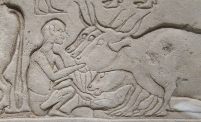
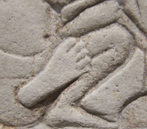
Sculpture, we say, is three-dimensional and painting is two-dimensional. That’s mostly true, but in the case of relief carving we have something in between. Consider the above nifty Egyptian shallow relief from the mid-fourteenth century BCE, the Amarna period, discovered in Memphis. A servant is force-feeding some cattle. As an effect of the lighting and the carving, his foot protrudes a bit from the overlapping surfaces behind him.
On a lesser scale, the same thing can happen with paintings. We commonly say that paintings are flat, relying on pictorial cues to suggest depth. But paint applied to a surface has its own thickness, a quality that is largely lost in reproductions. One of the virtues of seeing a painting in the flesh is that you can study (at least as closely as the guard ropes allow) the subtle ways in which even a little dab of paint can give the painting a tangible depth, sort of 2D plus.
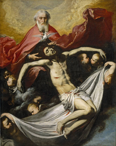
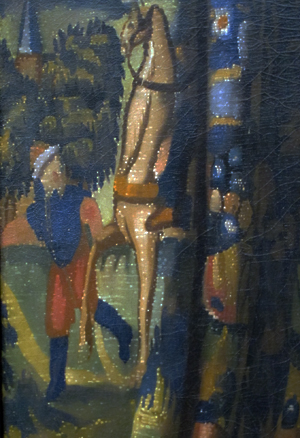
I first noticed this, I think, when I saw José de Ribera’s Holy Trinity (1636) in the Prado many years ago.
The painting wasn’t under glass, so I could see that Ribera had made Christ’s wound horrifying by laying a scab of paint on the picture surface. It was as if the canvas itself were bleeding. (More generally, that trip to the Prado convinced me that Dali’s work, and the Andalusian Dog film, made a lot more sense after you saw Spanish baroque art.)
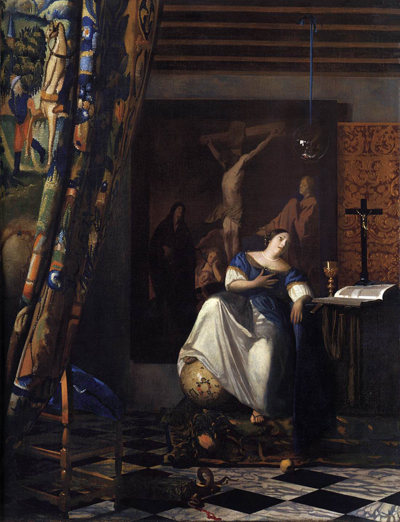
So at the Met last week I was inclined to keep my eye out for bits of paint that seem to lie on top of other patches. I was rewarded initially when I visited Vermeer’s great Allegory of the Faith (1670-1672). This has provoked many questions as to whether Vermeer used a camera obscura in planning, drawing, or even painting his images. Some claim to find the camera booth reflected in the crystal ball hanging over the lady’s head.
Peering at the tapestry curtain on the far left edge, I was gratified to find white speckles dappling it.
Some scholars propose that these stipples are the specular reflections that an optical instrument like the camera obscura create. Robert Huerta proposes, though, that these signature devices are used in a variety of ways in Vermeer’s paintings, often suggesting surface texture. Here, they are present only on the fabric, not in other areas of the painting; they stop at the curtain’s edge. Are they then Vermeer’s effort to represent needlework, slight bumps on the surface of the curtain? I have to leave it to experts.
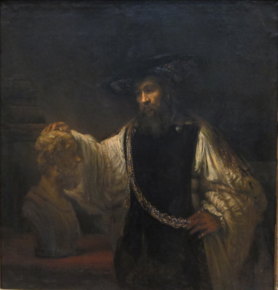
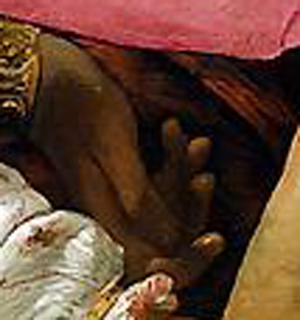
I’m more confident about what I saw in looking at Rembrandt’s Aristotle with a Bust of Homer (1653).
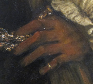
It’s a very big picture, nearly six feet high, but again my eye was caught by a detail. While Aristotle’s left hand rests against his elaborate belt, his pinky ring, a sharp, highlighted strip of paint, seems to protrude from the canvas.
The slight pop-out effect probably comes partly from the hard-edged ring set against the sketchy hand. Still, as far as I could tell, the dabs of paint sit on top, a thin layer of golden light. The ring’s gleam lights up the bottom corner of the picture. It works better than many 3D movie effects I’ve seen.
Misdirection
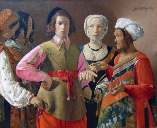
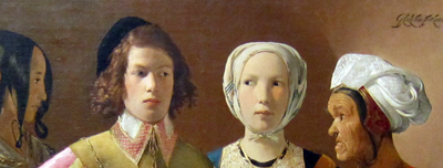
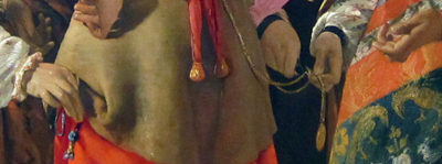
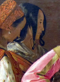
More amateur art appreciation, this time tied to our earlier theme of where you look in an image. There’s plenty of detail to study in Georges de La Tour’s The Fortune Teller (probably 1630s). 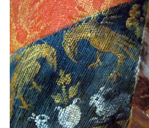 For one thing, we get a powerfully illusionistic representation of brocade in the sash of the wizened fortune-teller (right). However, what grabbed me was the composition of the drama. A somewhat condescending young man is paying the old woman, stereotyped as a gypsy, to have his fortune told. But the women surrounding him are her confederates. One woman is stealing his purse, the other is snipping off a medallion. The theft might be more evident to you looking at this tiny image, but the picture is so large (about 40 inches by 48 inches) that a gallery visitor must scan it in great saccadic sweeps. So I’d hypothesize that in front of the picture you don’t spot the grift right away.
I think that the painter has engineered a pretty game of misdirection. He has used cues that draw our eyes to one area of the frame and so one aspect of the drama, the exchange of glances, before letting us explore the frame to detect the pocket-picking. Several bottom-up, stimulus-driven cues work together to draw us toward the top half of the picture.
Framing is a major cue. When a picture cuts off the human body at the thigh or crotch we’re steered to the upper area of the frame. That’s where the action is likely to be; knees aren’t usually as expressive as heads.
Faces, as Tim’s analysis shows, are magnets for our attention, and the painter exploits this. The two women’s heads on the far left are played down: one is turned away, the other, with a neutral expression, is in profile and semidarkness. Her glance directs us to study the slightly suspicious expression of the youth and the edgy gaze of the central woman, and then imagine a drama played out. The head positions of the two central figures represent a compromise between readability (frontality is a strong attention-getter) and realism (people do share gazes). But the painter profits from the compromise by letting man and woman, facing front, move their eyes shiftily, raising the atmosphere of suspicion. The almost grotesque face of the fortune teller, a richer brown than those near her, also attracts our notice.
Another powerful cue is horizon-line isocephaly. The term is a mouthful, but the idea is worth knowing about. This common Renaissance technique places several heads, regardless of their distance from us or one another, along the same plane. It’s especially marked here because even the eyes of three figures fall almost exactly on the same line.
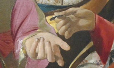
Centering in the picture format works to make the gesture of exchanging money very important. With the expressive hand gestures, we seem to have a complete story: The skeptical youth, dirt under his fingernails, has just paid the fortune-teller, who may be crossing his palm with silver in the course of her predictions.
There are other cues that keep our eyes exploring the upper half of the frame, such as the streak highlighting the hot-pink blouse. But all are merely decoys delaying our noticing the covert action in the bottom half of the image, the activity carried out entirely by hands.
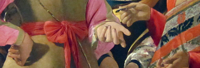
Hands are normally areas of high information content, second only to faces, I suppose. But the michievous hands of the pickpockets are low in the frame, one is in shadow, and both are subordinated not only to the faces but also to the more expressive hands just above: one on a hip, two gesturing around the coin.
It’s as if there are three layers: the heads, the hands executing the business transaction, and the hands underneath doing the real business. The third level harbors something still more covert. Only on several passes did I notice that the second, profiled woman on the left has her hand ready to receive the purse from the woman lifting it.
There’s a lot else to admire here, not least the way that the two women on the left seem to merge into one two-headed pickpocket, thanks to the shared contours, their orange vests, and the angle of the first woman’s arm.
I wish Tim or someone would try eye-scanning on this picture. In what order do viewers sample the layout? Do some viewers never look below and realize what’s going on?
In any case, my example shows the importance of top-down thinking. Recently preoccupied with eyes (in The Social Network) and visual scanning, I’d naturally be drawn to this image. I wouldn’t even care if it was the fake it’s sometimes claimed to be. But even that speculation involves top-down conceptual testing! If we entertain the prospect that The Fortune Teller was painted in the 1920s, then we might be inclined to see its cunning misdirection, and perhaps even the “cubistic” merger of the two women on the left, as influenced by modern art’s spatial ambiguities.
Bottom-up and top-down perception work smoothly together. The eye is sensitive to both stimuli and stored concepts; it’s driven by the environment and by the brain. The interplay of the two should fascinate anyone interested in cinema, which is at least partly a visual art.
PS 1 March: Tim Smith, our guest blogger last month, writes to remind me that the book I discussed in an earlier post, Land and Tatler’s Looking and Acting, makes reference to another famous de La Tour painting, The Cheat, and an eyescan study of it by Iain Gilchrist. The zigzag pattern of fixations suggests that people did indeed start with the faces of the players before discovering the cheating that’s going on. Eyescans of the painting are analyzed in John M. Findlay and Iain Gilchrist’s Active Vision: The Psychology of Looking and Seeing. Gilchrist discusses the painting in a fascinating illustrated lecture.
Some readers of my entry above have wondered if eyescan experiments could study how magicians misdirect us. Tim recommends Gustav Kuhn’s work on this problem, to which I can add this article: Peter Lamont, John M. Henderson, and Tim J. Smith, “Where Science and Magic Meet: The Illusion of a ‘Science of Magic,'” Review of General Psychology 14, 10 (2010), 16-21.
Dairyland, viewed from Medialand
Photo: Shahin Izadi.
DB here:
Kristin and I have been in Manhattan since the end of January. She has a fellowship at the Metropolitan Museum of Art for her Egyptological research (on Amarna statuary; more here). I’ve been getting together with old friends, going to movies, trying to get a little writing done, and, inevitably, surfing the Web. But who would have thought that Wisconsin in February would be so exciting?
We missed the eruption of protest that greeted Republican Governor Scott Walker’s plan to make the state’s public employees contribute more to their health care and pensions, as well as his effort to eliminate collective bargaining rights. So we’ve been forced to follow things through the wildly swinging spotlight of media. Still, the core story got through. We’ve been proud of our colleagues and fellow Badgers for resisting this aggressive assault on public sector unions. A batch of videos can be found here.
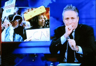
Cheeseheads on the march
Reading people’s comments on the Web I find some puzzling reactions. I’ll sum up a couple.
*Wisconsin workers have an exceptional contract in tough times; I pay a lot more for my insurance and pension. Stop being crybabies!
But:
A. It’s not surprising that unions get their members benefits that non-union workers don’t get. You want a good deal? Consider unionization. Otherwise, you have no reason to complain that other people are more enterprising than you. (This is sort of parallel to the demand that you’re a loser unless you become “entrepreneurial.”)
B. If you want to see Wisconsin workers yanked down to your level, then you ought to be in thermonuclear fury about CEOs, stockbrokers, bond agencies, and investment bankers raking in such big bucks. Are you prepared to ask them to take the same cuts? It won’t do to say they’re in private enterprise, since their industries receive no-bid contracts, consultancies, government subsidies, tax breaks, and other deals on a scale that taxpayers are only now starting to realize.
 C. Speaking of sweet deals, we have Walker’s preferred method of employee negotiation: Be related to the Fitzgerald brothers, Scott (Senate Majority Leader) and Jeff (Assembly Speaker). When their father Stephen (pictured right) was trounced 2-to-1 in his bid to become Dodge County sheriff, Governor Walker’s administration appointed him head of the State Patrol. Dad’s salary, in these budget-cutting times that demand tough sacrifices from all? A plump $105,678 per year, as well as a strong pension—one, like those in other state law-enforcement sectors, that is exempt from Walker’s shared-costs mandate.
*Public sector employees are lazy. Teachers get two months off a year, and DMV clerks are rude. Actually, in Wisconsin the public schoolteachers work long hours and quite successfully; we get good educational results, ahead of those in non-unionized states. Moreover, all the DMV clerks I’ve met are very courteous and friendly. There are no rude DMV clerks in my state. (Please apply my reply, suitably altered, to any one-off recollections you have of lazy or rude workers in any public sector–highway, police, firefighting, etc. Remember the motto: “The plural of anecdote is not data.”)
In sum, consider moving to Wisconsin if you want good services and friendly public servants. But if this bill is enacted, don’t come unless your last name is Fitzgerald.
The perplexity that is Jon Stewart
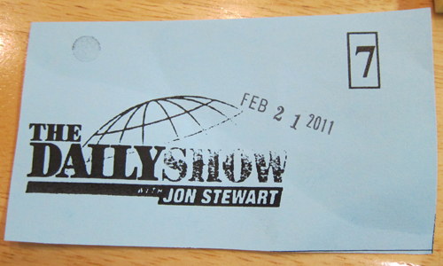
Kristin and I had another chance to be reminded of home on Monday. Along with sisters Diane and Darlene, niece Kamini, and friend Janice, we went to a taping of The Daily Show. Alas, photo-taking was forbidden inside, but that constraint was balanced by a nice surprise. Jon Stewart ran two segments about the Wisconsin situation. (Here is the program.) I realized several things, including:
- The Daily Show set is rather chintzy.
- The music is very loud.
- I might have been the third-oldest person in the audience. (A couple up front seemed to have the edge.)
- Jon is funnier on TV than in person. Proof: We watched the show that night and laughed more at jokes we’d already heard than we did when he first uttered them.
- Jon is funnier attacking conservatives than he is attacking liberals. Proof: The only wheeze he could muster about the protests was to run clips of people chanting union slogans and add something to the effect that the sixties are back. Further proof: After our visit, the show had funnier coverage provided by John Oliver on Tuesday night (which dealt briskly with a picketer’s malformed swastika placard) and John’s own riff on Wednesday.
- As in his Sanity rally, Jon presents himself as even-handed in talking about a situation that is weighted toward the very well-off. His segment implied a parallel between the Wisconsin activists and the Tea Partyers, but I suspect he realized that this equation doesn’t work very well. For one thing, the Wisconsin people didn’t bring firearms along. So Jon’s claim about Badgers forming the “Bizarro Tea Party” focused on the media coverage, claiming tit-for-tat bias. He counterpointed Fox News cheering the Tea Partyers and knocking the Madison demonstrators, with MSNBC cheering the demonstrators and knocking the Partyers. I was unmoved, because there are substantial differences between the two situations, and between the networks as well. (For instance, MSNBC criticizes the Democrats far more than Fox criticizes Republicans.) In sum, funny as Jon sometimes is, he’s not a good umpire. He’s better as a player.
One Beast we should feed
Far more entertaining than anything on The Daily Show was the prank played Tuesday by the Buffalo Beast. (Go here: The Beast website has crashed, perhaps from excessive demand. Some backstory is here.) Walker was cheerfully eager to share his strategies in a twenty-minute phone call with somebody, anybody, claiming to be David Koch. Remarkably, in his chat with the purported out-of-state gazillionaire, Walker complains that many protesters seem to be “outsiders” meddling in his state’s politics. This after Koch has set up an agitprop storefront in Madison.
Can an ordinary citizen not named Koch or Fitzgerald command the Gov’s attention for twenty minutes on any subject? Let’s see! I’ll try to call him now….Oops, the state has shut off the phone line.
Incommunicado, I can only mull the prospect of further consequences. Walker might suffer damage from his casual admission that he had considered planting troublemakers in the crowd. (He abandoned the tactic out of fear that it would backfire.) Personally, I’d prefer to see a bribery charge. During the call, Mr. Not David Koch invites my governor to be his guest flying to California for entertainment. My man’s reply: “Outstanding.” If Walker is recalled at the end of the year, this cozy chat will have shown decisively that he is simply too big a dunce even to be a governor.
For the time remaining in Walker’s tenure, the tête-à-tête suggests one way to save a chunk of change. Koch Industries has investments in many states; one of its Wisconsin firms produces toilet paper. And Koch lobbyists have evidently been attracted by a little-noticed provision in Walker’s budget repair bill to sell off state-owned power plants via no-bid contracts. So we could smooth the transaction by simply asking the Koch brothers to pay this year’s salaries and benefits for the governor and all Republican legislators. That gesture would save at least $4 million in salaries alone. But $49,943 before taxes doesn’t go very far these days, so perhaps the legislators would organize to demand that the Kochs raise their wages.
PS 25 February: More media mediation: Inevitably, a Downfall clip applied to the Wisconsin situation. Thanks to colleague and fellow blogger J. J. Murphy (whose list of best 2010 indie films is here).
PPS 27 February: On the threshold of the evacuation of the Capitol: A probing, exhilarating on-the-spot report from Abe Sauer, including more information on the Kochs’ investment and presence in Wisconsin, is here.
PPPS 28 February: A CEO, a Tea Partyer, and a union member are sitting around a table. In the center is a plate holding a dozen cookies. The CEO reaches over and takes eleven. He then says to the Tea Partyer, “Watch out, that union guy wants a piece of your cookie.” (Thanks to Darlene B.)
PPPPS 1 March: Jon provides a somewhat more caustic treatment on Monday’s Daily Show. Not hilarious, even a little smarmy, but further evidence that Jon is best when he’s not doing Houdini-like contortions to appear fair-minded.
PPPPS 4 March: Jon comes through at last with what he does best.
Time piece
Christian Marclay, The Clock (2010).
DB here:
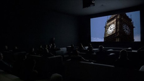
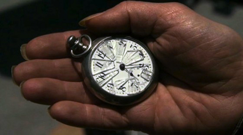
Normally I wouldn’t comment on a movie after seeing only 10.4 % of it, but there are always exceptions. The Clock, which played at the Paula Cooper Gallery during our stay in Manhattan, runs 24 hours. It’s a compilation of over 3000 film clips, mostly from Hollywood but also from Europe and Asia. Some of the footage is easily recognized, but a lot of it I couldn’t identify.
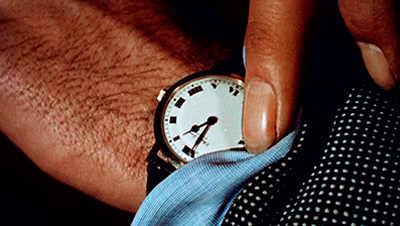
The premise, or gimmick, is that every snippet of a scene is purportedly connected in some way to the passing of time measured on a clock. Characters check their watches, or the camera shows a wall clock or digital alarm clock or countdown device. There are tiny clocks and gigantic ones. If the whole thing has a star, it might be Big Ben, who reappears surprisingly often.
A nice idea, but why stretch it over twenty-four hours? So that the creator Christian Marclay can assemble scenes that synchronize perfectly with the passage of time in projection. A shot shows a watch at 11:55 AM; you look at your watch; it’s 11:55 AM. Wherever the piece is screened, it must start precisely at the corresponding local time. The Clock isn’t just about clocks; it is a clock.
The project teases you into lame puns, which I’ve been unable to resist. But my visits set me thinking about what makes The Clock unique and pleasant. Maybe it’s a little too pleasant.
Collage without closure
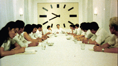
The Black Cannon Incident (1986).
In its collage of compiled material, what The Clock does is quite familiar to cinephiles. For a long time, experimental filmmakers have built works out of footage from mainstream movies. One of the most famous, Joseph Cornell’s Rose Hobart (1935), powerfully illustrates how the collage principle can pry images from their narrative context and call attention to their poetic or graphic qualities. The assemblage artist Bruce Conner did something similar in A Movie (1958), which creates anassociational form out of newsreels and old Hollywood sequences. Although both Rose Hobart and A Movie still evoke vague narrative expectations, Craig Baldwin whipped together found footage to create a hallucinatory narrative in Tribulation 99: Alien Anomalies under America (1991). An urgent, hard-bitten voice-over tells of CIA conspiracies and interplanetary conquest while we see images scavenged from cheap science-fiction films.
Nowadays plenty of filmmakers, especially on the Web, have snipped footage from old films to develop a theme. Jim Emerson has done it with close-ups, and Matt Zoller Seitz, Aaron Aridillas, and Steven Santos have created a video essay around guns in American film. Last summer, at the new facility of the Cinematek in Brussels, I found thematic loops running on their video monitors. Sometimes there was an interplay among them, so that characters one screen seemed to be looking at those in another. Some of the Cinematek loops in fact centered on clocks.
So the principle of compilation collage didn’t seem new to me. But Marclay refreshes it by the other central premise of The Clock: its time structure, which syncs moments indicated onscreen with moments of viewing.
Some fiction films (e.g., Cleo from 5 to 7, Nick of Time) and TV shows (e.g., 24) have played with the conceit of making the duration of the piece (“real time”) correspond to the amount of time covered in the plot. (Usually, however, the film fudges it.) But in The Clock, there’s no overarching plot, so the duration of that action can’t be determined. Marclay gives us real time with a vengeance, in the relentless correspondence between screen clocks and audience clocks.
Without this exact synchronization, The Clock would be an enjoyable but unexceptional found-footage movie. The onscreen clocks check the flow of the images like centers of magnetic force. They form nodes around which each set of shots revolves, like a musical key that a melody can drift from and return to.
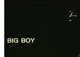 This patterning too has parallels in the experimental film tradition, I think. What P. Adams Sitney famously called Structural film was a 1960s-1970s trend that often built the awareness of time into a film’s overall pattern. A simple example is Robert Nelson’s Bleu Shut (1970). A clock runs in the right corner of the frame to measure the time consumed by a film that is, we’re promised by a woman’s breathless voice-over, “exactly thirty minutes long.” (She lies.)
A less explicit instance is Hollis Frampton’s Zorns Lemma (1970). In its central section, one by one a string of images replaces one-second shots of signs marking the letters of the Latin alphabet. The shot-changes set up a steady beat, and the pattern locks in a sense of momentum. Although we’re surprised by what images replace the letters, our expectations get focused on the inevitability of all the alphabet shots being deleted. There’s no literal clock, but we can sense this event slowly fulfilling itself. In addition, some of the replacement images show processes moving toward completion, such as dried beans steadily filling up a container. I’m tempted to say that in many Structural films, an actual or tacit clock tracing the film’s movement toward closure becomes a sort of non-narrative equivalent of a deadline in a storytelling movie.
The Clock doesn’t provide exactly that sense of closure, since it has no end point. It’s on a loop and, like a real clock, can be reset according to the time zone of the venue. But the nodal clock images make us aware of the film’s relentless unfolding, and its sync principle has affinities with the Structural tradition’s commitment to a precise time-based architecture. That tradition had its own sources, of course, including the experiments of the Fluxus movement, a trend that also influenced Marclay.
Top-down time
Tracing parallels shouldn’t lead us away from the unique qualities that make The Clock so appealing. For one thing, the fact that there isn’t a continually running readout, as in Bleu Shut or in an iPod slider, enables the film to test our feeling for passing time. Not every shot shows a clock; indeed, most shots in the portions I saw don’t. As we get captivated by clock-less images and follow their development within a scene, the arrival of a timepiece reminds us of the structuring principle. The appearance of a clock creates something like a punchline, while also letting us realize how loose our sense of duration in a movie usually is.
This test-like quality of the film, an important aspect of Structural film that Sitney points out, is reinforced by Marclay’s central idea. We are primed to scan the shots for clocks. Indeed, the search for the clock can reshift our sense of what is important about the scene. In an earlier entry, I discussed how Alfred Yarbus’ experiments in tracking eye movements assigned people tasks, such as estimating the social status of people in a painting. This created “top-down,” concept-driven search behavior. The Clock does the same thing, with the only explicit instruction being the title and our background knowledge of the piece’s procedures.
The result of our top-down search that we pay attention to clocks in the corners of shots or out of focus in the background, in scenes in which time isn’t really at stake. Normally we probably wouldn’t notice these items, but spotting them gives us a reward and allows us to admire Marclay’s cleverness. Some scenes seem to lack clocks altogether, but that doesn’t make them filler; a stretch of clockless footage only sharpens the fun when one shows up.
With shots pried free of narrative demands, you start to discriminate details, like the designs of numerals and brand identities. As you see the names Bulova, GE, Tissot, Hamilton Beach, and all the rest, you realize that it isn’t only James Bond films that use watches for product placement.
I’ve said that the film isn’t narrative in the same way that Craig Baldwin’s fantasy collages are. Yet it does tease us with some narrative expectations. If you recognize the footage, then you can summon up your memory of the story. If you don’t recognize the footage, you might still recognize the generic situation (investigation, pursuit, lovers’ confrontation, awakening in the morning). And the whole shebang does get you thinking about the role of time in narrative.
In this regard, the film makes an almost didactic point: Stories, at least those we’ve become used to, need clocks. They set the story world in motion, they measure its changes, and above all they provide deadlines that generate suspense, surprise, and satisfaction. The Clock makes deadlines especially apparent as we approach noon, when we get not only images from High Noon but also a flurry of other 12:00 PM shots (Titanic, for one). Noon is a really important moment in Central Standard Movie Time. I didn’t see the midnight stretch of The Clock, but I bet it’s a hell of a show.
Perfect timing
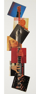 Like the compilation filmmakers, Marclay wants crosstalk among his bits, but the stretches of The Clock I saw don’t create much friction. There’s a lot of continuity from shot to shot: One character in one movie walks out a door, and we cut to another character from another movie entering a new locale. Music links scenes smoothly. Although Marclay was influenced by the diffuse, chance organizations promoted by John Cage, some of his earlier work emphasized through-line linkages and blending as well. Marclay’s famous record-album collages allow a unified figure to emerge as a gestalt binding together disparate images. On the right, you can see this happening in Guitar Neck (1992), which virtually diagrams the sort of smooth juxtapositions we get in The Clock.
The result has a fairly slick texture. It goes down easily. I admire the way that Marclay and his assistants have rummaged through a vast archive and pulled together a majestic, utterly entertaining assembly. But emotionally it’s mostly cold. The year-end obituary tributes on Turner Classic Movies, reminding us that the perfect faces and bodies gliding past us are definitively gone, are more throat-catching than anything I saw here. Along another dimension, so are Conner’s A Movie and his dissection of the JFK assassination, Report (1963-67). Just as important, none of what I saw seemed to me particularly challenging or discordant, and in this regard The Clock parts company with the comparable film traditions.
Structural film was notoriously demanding, ruffling viewers’ perceptions and trying their patience. And experimental compilations were often seeking to shake us up, sometimes in absurd ways. An earlier blog entry of ours illustrates how Baldwin’s Mock Up on Mu (2008) builds disconcerting scenes out of bits taken from other movies. A man and woman constantly shift their identities and positions while their conversation continues without missing a beat.
Crucial to the classic compilation films is the central innovation of collage: the fragments do not blend into a smooth whole. There are clashes between one shot or clutch of shots and the next. There’s also a sense of material differences. Each piece of scuffed or distressed footage retains something of its own integrity. In his sound work, Marclay too claimed an interest in the “sound patina” of vinyl LPs:
When a record skips or pops or we hear the surface noise, we try very hard to make an abstraction of it so it doesn’t disrupt the musical flow. I try to make people aware of these imperfections and accept them as music; the recording is a sort of illusion, while the scratch on the record is more real.
But the shots in The Clock are mostly scrubbed clean of imperfections, presenting a sleek surface that facilitates the flow across shots. The movie is a pure product of the DVD era, with all those gleaming images so easily appropriated. At times Marclay manages to match weather conditions, with rain in one scene carrying over into the next. This tactic creates an intriguing sense that the two movies are set in a shared world, but it makes the gaps between the images even narrower.
For about twenty years there has been a controversy in the gallery world about whether the burgeoning tradition of “artists’ films” owes anything to avant-garde film traditions. It’s often summarized as the difference between the white cube of the gallery and the black box of the movie theatre. By setting The Clock alongside collage compilation films, am I guilty of comparing apples and oranges? For instance, the films have fixed beginnings and endings, whereas The Clock is an installation that can be entered at any point. It’s not a film but rather, to use a current phrase, a “time-based audiovisual work.” Moreover, some will argue that Marclay’s lineage doesn’t consist of Cornell, Conner, Baldwin, and Structural Film but rather Fluxus, Minimalism, Punk, and Scratch-and-Mix. (Marclay has devised a turntable he can play like a guitar.)
All of which carries some weight, but I see enough common features between the two traditions to make my main point: Based on what I sampled, this is an ingratiating work, virtuosic in a Postmodernist way. But it doesn’t risk the roughness, the boring patches, and the confusions of the film traditions I’ve invoked. Perhaps the most condemnatory thing you can say about The Clock is that it runs like clockwork.
But maybe things get more disruptive in the 89.6 % I wasn’t able to see.
This entry was written fairly early in The Clock‘s Manhattan run. (Thanks to James Schamus for tipping me to it.) I had no trouble getting in at 10:40 AM and staying until about 1:15. But it quickly became a sensation. A friend and I tried to visit on a chilly Friday night and confronted a long line. I heard from others that the line was just as forbidding at 5:00 AM. The problem, of course, is that you could wait a very long time, since there’s no set point when many are likely to leave. (Nobody will say, “This is where we came in.”) This New York Times article traces the rise of the Clock cult. The article also confirms that midnight is a high point of the video.
Yet another Times piece discusses The Clock as akin to recorded music, making some points related to mine above. Here is a loving account by Jerry Saltz, who logged nineteen hours on duty. Easy to enjoy and admire, Marclay’s piece probably deserves to be added to Christian Lander’s list of Stuff White People Like.
A good overview of the artist’s earlier work can be found in Jennifer Gonzalez et al., Christian Marclay (London: Phaidon, 2005). My quotation comes from p. 33.
On the experimental compilation film, see William C. Wees, Recycled Images: The Art and Politics of Found Footage Films (New York: Anthology Film Archives, 1993). See also Stefano Basilico, ed., Cut: Film as Found Object in Contemporary Video (Milwaukee Art Museum, 2004). P. Adams Sitney’s Visionary Film, second edition and thereafter, provides the most influential account of the Structural tradition. Scott MacDonald discusses Zorns Lemma at length in Avant-Garde Film: Motion Studies. For incisive analyses of how compilation and Structural films elicit particular activities from their viewers, see James Peterson’s Dreams of Chaos, Visions of Order.
Thanks to Jim Kreul and Jonathan Walley for guidance in the controversy about artworld and filmworld traditions. Jonathan’s essay “Modes of Film Practice in the Avant-Garde,” in Tanya Leighton’s collection Art and the Moving Image: A Critical Reader, is a useful guide to these and other trends. I advance some notions about the user-friendliness of another artist’s film project in this entry on Matthew Barney’s Cremaster cycle. Kristin and I have written about associational form in Conner’s A Movie in our book Film Art: An Introduction.
Watching you watch THERE WILL BE BLOOD
DB here:
Today’s entry is our first guest blog. It follows naturally from the last entry on how our eyes scan and sample images. Tim Smith is a psychological researcher particularly interested in how movie viewers watch. You can follow his work on his blog Continuity Boy and his research site.
I asked Tim to develop some of his ideas for our readers, and he obliged by providing an experiment that takes off from my analysis of staging in one scene of There Will Be Blood, posted here back in 2008. The result is almost unprecedented in film studies, I think: an effort to test a critic’s analysis against measurable effects of a movie. What follows may well change the way you think about visual storytelling.
Tim’s colorful findings also suggest how research into art can benefit from merging humanistic and social-scientific inquiry. Kristin and I thank Tim for his willingness to share his work.
Tim Smith writes:
David’s previous post provided a nice introduction to eye tracking and its possible significance for understanding film viewing. Now it is my job to show you what we can do with it.
Continuity errors: How they escape us
Knowing where a viewer is looking is critical to beginning to understand how a viewer experiences a film. Only the visual information at the centre of attention can be perceived in detail and encoded in memory. Peripheral information is processed in much less detail and mostly contributes to our perception of space, movement and general categorisation and layout of a scene.
The incredibly reductive nature of visual attention explains why large changes can occur in a visual scene without our noticing. Clear examples of this are the glaring continuity errors found in some films. Lighting that changes throughout a scene, cigarettes that never burn down, and drinks that instantly refill plague films and television but we rarely notice them except on repeated or more deliberate viewing. In my PhD thesis I created a taxonomy of continuity errors in feature films and related them to various failings during pre-production, filming, and post-production.
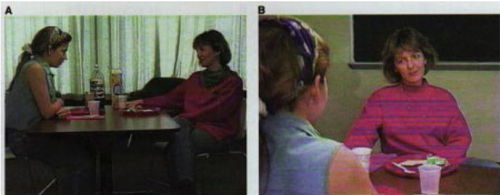
Our inability to detect continuity errors was elegantly demonstrated in a study by Dan Levin and Dan Simons. In their study continuity errors were purposefully introduced into a film sequence of two women conversing across a dinner table. If you haven’t seen it before, watch the video here before continuing, and see how many continuity errors you can spot.
Two frames from the clip used by Levin and Simons (1997). Continuity errors were deliberately inserted across cuts (e.g., the disappearing scarf), and viewers were asked after watching the video whether they noticed any.
The short clip contained nine continuity errors, such as a scarf that changed colour, then disappeared, plates that changed colour and hands that changed position. During the first viewing, viewers were told to pay close attention but were not informed about the continuity errors. When asked afterwards if they noticed anything change, only one participant reported seeing anything and that was a vague sense that the posture of the actors changed. Even during a second viewing in which they were instructed to detect changes, viewers only detected an average of 2 out of the 9 changes and tended to notice changes closest to the actors’ faces such as the scarf.
Although Levin and Simons did not record viewer eye movements, my own experiments investigating gaze behaviour during film viewing indicate that our eyes will mostly be focussed on faces and spend virtually no time on peripheral details. If you as a viewer don’t fixate a peripheral object such as the plate, you are unable to represent the colour of the plate in memory and can, therefore not detect the change in colour when you later refixate it.
Tracking gaze
To see how reductive and tightly focused our gaze is whilst watching a film, consider Paul Thomas Anderson’s There Will Be Blood (TWBB; 2007). In an earlier post, David used a scene from this film as an example of how staging can be used to direct viewer attention without the need for editing.
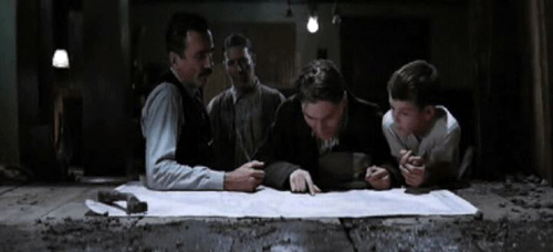
The scene depicts Paul Sunday describing the location of his family farm on a map to Daniel Plainview, his partner Fletcher Hamilton, and his son H.W. The entire scene is treated in a long, static shot (with a slight movement in at the beginning). Most modern film and television productions would use rapid editing and close-up shots to shift attention between the map and the characters within this scene. This frenetic style of filmmaking–which David termed intensified continuity in his book The Way Hollywood Tells It (2006)–breaks a scene down into a succession of many viewpoints, rapidly and forcefully presented to the viewer.
Intensified continuity is in stark contrast to the long-take style used in this scene from TWBB. The long-take style, which was common in the 1910s and recurred at intervals after that period, relies more on staging and compositional techniques to guide viewer attention within a prolonged shot. For example, lighting, colour, and focal depth can guide viewer attention within the frame, prioritising certain parts of the scene over others. However, even without such compositional techniques, the director can still influence viewer attention by co-opting natural biases in our attention: our sensitivity to faces, hands, and movement.
In order to see these biases in action during TWBB we need to record viewer eye movements. In a small pilot study, I recorded the eye movements of 11 adults using an Eyelink 1000 (SR Research) eyetracker. This eyetracker uses an infrared camera to accurately track the viewer’s pupil every millisecond. The movements of the pupil are then analysed to identify fixations, when the eyes are relatively still and visual processing happens; saccadic eye movements (saccades), when the eyes quickly move between locations and visual processing shuts down; smooth pursuit movements, when we process a moving object; and blinks.
Eye movements on their own can be interesting for drawing inferences about cognitive processing, but when thinking about film viewing, where a viewer looks is of most interest. As David demonstrated in his last post, analysing where a viewer looks whilst viewing a static scene, such as Repin’s painting An Unexpected Visitor, is relatively simple. The gaze of a viewer can be plotted on to the static image and the time spent looking at each region, such as a characters face or an object in the scene can be measured.
However, when the scene is moving, it is much more difficult to relate the gaze of a viewer on the screen to objects in the scene. To overcome this difficulty, my colleagues and I developed new visualisation techniques and analysis tools. These efforts were part of a large project investigating eye movement behaviour during film and TV viewing (Dynamic Images and Eye Movements, what we call the DIEM project). These techniques allow us to capture the dynamics of gaze during film viewing and display it in all its fascinating, frenetic glory.
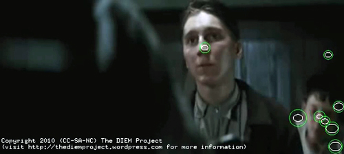
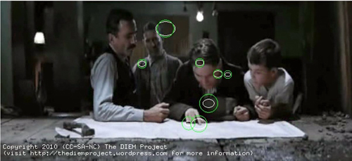
To begin, the gaze location of each viewer is placed as a point on the corresponding frame of the movie. The point is represented as a circle with the size of the circle denoting how long the eyes have remained in the same location, i.e. fixated that location. We then add the gaze location of all viewers on to the same frame. Although the viewers watched the clip at different times, plotting all viewers together allows us to look for similarities and differences between where people look and when they look there. This figure shows the gaze location of 8 viewers at one moment in the scene. (The remaining 3 viewers are blinking at this moment.)
A snapshot of gaze locations of 8 viewers whilst watching the “map” sequence from There Will Be Blood (2007). Each green circle represents the gaze location of one participant, with the size of the circle indicating how long the eyes have been in fixation (bigger equals longer).
You have a roving eye
Plotting static gaze points onto a single frame of the movie allows us to see what viewers were looking at in a particular frame, but we don’t get a true sense of how we watch movies until we animate the gaze on top of the movie as it plays back. Here is a video of the entire sequence from TWBB with superimposed gaze of 11 viewers.
You can also see it here. The main table-top map sequence we are interested begins at 3 minutes, 37 seconds.
The most striking feature of the gaze behaviour when it is animated in this way is the very fast pace at which we shift our eyes around the screen. On average, each fixation is about 300 milliseconds in duration. (A millisecond is a thousandth of a second.) Amazingly, that means that each fixation of the fovea lasts only about 1/3 of a second. These fixations are separated by even briefer saccadic eye movements, taking between 15 and 30 milliseconds!
Looking at these patterns, our gaze may appear unusually busy and erratic, but we’re moving our eyes like this every moment of our waking lives. We are not aware of the frenetic pace of our attention because we are effectively blind every time we saccade between locations. This process is known as saccadic suppression. Our visual system automatically stitches together the information encoded during each fixation to effortlessly create the perception of a constant, stable scene.
In other experiments with static scenes, my colleagues and I have shown that even if the overall scene is hidden 150milliseconds into every fixation, we are still able to move our eyes around and find a desired object. Our visual system is built to deal with such disruptions and perceive a coherent world from fragments of information encoded during each fixation.
The second most striking observation you may have about the video is how coordinated the gaze of multiple viewers is. Most of the time, all viewers are looking in a similar place. This is a phenomenon I have termed Attentional Synchrony. If several viewers examine a static scene like the Repin painting discussed in David’s last post, they will look in similar places, but not at the same time. Yet as soon as the image moves, we get a high degree of attentional synchrony. Something about the dynamics of a moving scene leads to all viewers looking at the same place, at the same time.
The main factors influencing gaze can be divided into bottom-up involuntary control by the visual scene and top-down voluntary control by the viewer’s intentions, desires, and prior experience. As part of the DIEM project we were able to identify the influence of bottom-up factors on gaze during film viewing using computer vision techniques. These techniques allowed us to dissect a sequence of film into its visual constituents such as colour, brightness, edges, and motion. We found that moments of attentional synchrony can be predicted by points of motion within an otherwise static scene (i.e. motion contrast).
You can see this for yourself when you watch the gaze video. Viewers’ gazes are attracted by the sudden appearance of objects, moving hands, heads, and bodies. The greater the motion contrast between the point of motion and the static background, the more likely viewers will look at it. If there is only one point of motion at a particular moment, then all viewers will look at the motion, creating attentional synchrony.
This is a powerful technique for guiding attention through a film. But it’s of course not unique to film. Noticing points of motion is a natural bias which we have evolved by living in the real world. If we were not sensitive to peripheral motion, then the tiger in the bushes might have killed our ancestors before they had chance to pass their genes down to us.
But points of motion do not exist in film without an object executing the movement. This brings us to David’s earlier analysis of the staging of this sequence from TWBB. This might be a good time to go back and read David’s analysis before we begin testing his hypotheses with eyetracking. Is David right in predicting that, even in the absence of other compositional techniques such as lighting, camera movement, and editing, viewer attention during this sequence is tightly controlled by staging?
All together now
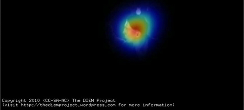
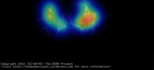
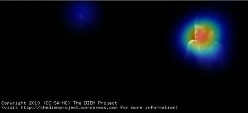
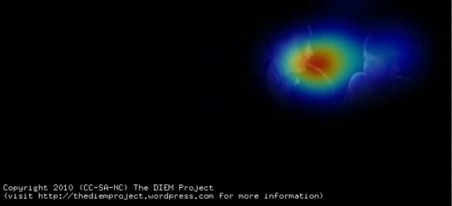
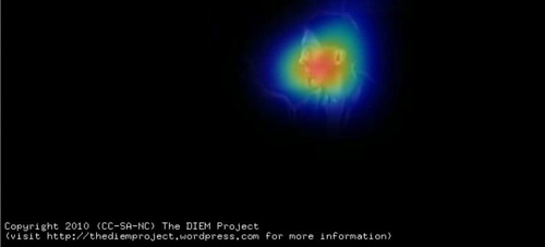
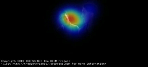
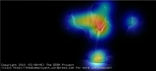
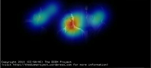
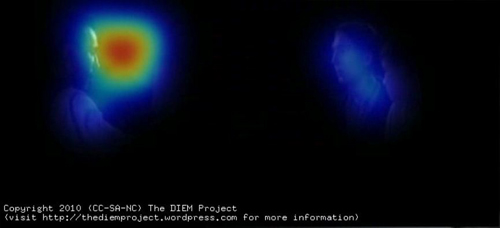
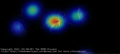
To help us test David’s hypotheses I am going to perform a little visualisation trick. Making sense of where people are looking by observing a swarm of gaze points can often be very tricky. To simplify things we can create a “peekthrough” heatmap. A virtual spotlight is cast around each gaze point. This spotlight casts a cold, blue light on the area around the gaze point. If the gazes of multiple viewers are in the same location their spotlights combine and create a hotter/redder heatmap. Areas of the frame that are unattended remain black. By then removing the gaze points but leaving the heatmap we get a “peekthrough” to the movie which allows us to clearly see which parts of the frame are at the centre of attention, which are ignored and how coordinated viewer gaze is.
Here is the resulting peekthrough video; also available here. The map sequence begins at 3:38.
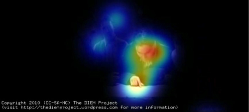
Here is the image of gaze location I showed above, now matched to the same frame of the peekthrough video.
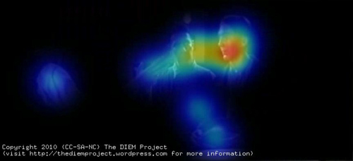
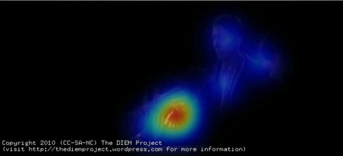
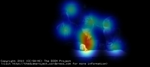
The gaze data from multiple viewers is used to create a “peekthrough” heatmap in which each gaze location shines a virtual spotlight on the film frame. Any part of the frame not attended is black, and the more viewers look in the same location, the hotter the color.
David’s first hypothesis about the map sequence is that the faces and hands of the actors command our attention. This is immediately apparent from the peekthrough video. Most gaze is focused on faces, shifting between them as the conversation switches from one character to another.
The map receives a few brief fixations at the beginning of the scene but the viewers quickly realise that it is devoid of information and spend the remainder of the scene looking at faces. The only time the map is fixated is when one of the characters gestures towards it (as above).
We can see the effect of turn-taking in the conversation on viewer attention by analyzing a few exchanges. The sequence begins with Paul pointing at the map and describing the location of his family farm to Daniel. Most viewers’ gazes are focused on Paul’s face as he talks, with some glances to other faces and the rest of the scene. When Paul points to the map, our gaze is channeled between his face and what he is gazing/pointing at.
Such gaze prompting and gesturing are powerful social cues for attention, directing attention along a person’s sightline to the target of their gaze or gesture. Gaze cues form the basis of a lot of editing conventions such as the match an action, shot/reverse-shot dialogue pairings, and point-of-view shots. However, in this scene gaze cuing is used in its more natural form to cue viewer attention within a single shot rather than across cuts.
As Paul finishes giving directions, Daniel asks him a question which immediately results in all viewers shifting the gaze to Daniel’s face. Gaze then alternates between Daniel and Paul as the conversation passes between them. The viewers are both watching the speaker to see what he is saying and also monitoring the listener’s responses in the form of facial expressions and body movement.
Daniel turns his back to the camera, creating a conflict between where the viewer wants to look (Daniel’s face) and what they can see (the back of his head). As David rightly predicted, by removing the current target of our attention the probability that we attend to other parts of the scene is increased, such as H. W., who up until this point has not played a role in the interaction. Viewers begin glancing towards HW and then quickly shift their gaze to him when he asks Paul how many sisters he has.
Gaze returns to Paul as he responds.
Gaze shifts from Paul to Daniel as he asks a short question, and then moves to Fletcher as he joins the conversation.
The quick exchanges of dialogue ensure that viewers only have enough time to shift their gaze to the speaker and then shift to the respondent. When gaze dwells longer on a speaker, such as during the exchange between Fletcher and Paul, there is an increase in glances away from the speaker to other parts of the scene such as the other silent faces or objects.
An object that receives more fixations as the scene develops is Paul’s hat, which he nervously fiddles with. At one point, when responding to Fletcher’s question about what they grow on the farm, Paul glances down at his hat. This triggers a large shift of viewer gaze, which slides down to the hat. Likewise, a subtle turn of the head creates a highly significant cue for viewers, steering them towards what Paul is looking at while also conveying his uneasiness.
The most subtle gesture of the scene comes soon after as Fletcher asks about water at the farm. Paul states that the water is generally salty and as he speaks Fletcher shifts his eyes slightly in the direction of Daniel. This subtle movement is enough to cue three of the viewers to shift their gaze to Daniel, registering their silent exchange.
This small piece of information seems critical to Daniel and Fletcher’s decision to follow up Paul’s lead, but its significance can be registered by viewers only if they happened to be fixating Fletcher at the time he glanced at Daniel. The majority of viewers are looking at Paul as he speaks and they miss the gesture. For these viewers, the significance of the statement may be lost, or they may have to deduce the significance either from their own understanding of oil prospecting or other information exchanged during the scene.
The final and most significant gesture of the scene is Daniel’s threatening raised hand. As Paul goes to leave, Daniel stalls him by raising his hand centre frame in a confusing gesture hovering midway between a menacing attack and a friendly handshake. In David’s earlier post he predicted that the hand would “command our attention.” Viewer gaze data confirm this prediction. Daniel draws all gazes to him as he abruptly states “Listen….Paul,” and lifts his hand.
Gaze then shifts quickly; the raised hand becomes a stopping off point on the way to Paul’s face. . .
. . . finally following Daniel’s hand down as he grasps Paul’s in a handshake.
We like to watch
The rapid sequence of actions clearly guide our attention around the scene: Daniel – Hand -Paul – Hand. David’s analysis of how the staging in this scene tightly controls viewer attention was spot-on and can be confirmed by eyetracking. At any one moment in the scene there is a principal action signified either by dialogue or motion. By minimising background distractions and staging the scene in a clear sequential manner using basic principles of visual attention, P. T. Anderson has created a scene which commands viewer attention as precisely as a rapidly edited sequence of close-up shots.
The benefit of using a single long shot is the illusion of volition. Viewers think they are free to look where they want but, due to the subtle influence of the director and actors, where they want to look is also where the director wants them to look. A single static long shot also creates a sense of space, clear relationship between the characters, and a calm, slow pace which is critical for the rest of the film. The same scene edited into close-ups would have left the viewer with a completely different interpretation of the scene.
I hope I’ve shown how some questions about film form, style, practice, and spectatorship can be informed by borrowing theory and methods from cognitive psychology. The techniques I have utilised in recording viewer gaze and relating it to the visual content of a film are the same methods I would use if I was conducting an experiment on a seemingly unrelated topic such as visual search. (See this paper for an example.)
The key difference is that the present analysis is exploratory and simply describes the viewing behaviour during an existing clip. What we cannot conclude from such a study is which aspects of the scene are critical for the gaze behaviour we observe. For instance, how important is the dialogue for guiding attention? To investigate the contribution of individual factors such as dialogue we need to manipulate the film and test how gaze behaviour changes when we add or remove a factor. This type of empirical manipulation is critical to furthering our understanding of film cognition and employing all of the tools cognitive psychology has to offer.
But I expect an objection. Isn’t this sort of empirical inquiry too reductive to capture the complexities of film viewing? In some respects, yes. This is what we do. Reducing complex processes down to simple, manageable, and controllable chunks is the main principle of empirical psychology. Understanding a psychological process begins with formalizing what it and its constituent parts are, and then systematically manipulating and testing their effect. If we are to understand something as complex as how we experience film we must apply the same techniques.
As in all empirical psychology the danger is always that we lose sight of the forest whilst measuring the trees. This is why the partnership between film theorists and empiricists like myself is critical. The decades of film theory, analysis, practice and intuition provide the framework and “Big Picture” to which we empiricists contribute. By sharing forces and combining perspectives, we can aid each other’s understanding of the film experience without losing sight of the majesty that drew us to cinema in the first place.
On the importance of foveal detail for memory encoding, see J. M. Findlay, Eye scanning and visual search, in The Interface of Language, Vision, and Action: Eye movements and the visual world, ed. J.M. Henderson and F. Ferreira (New York: Psychology Press, 2004), pp. 134-159. Levin and Simons’ continuity-error experiment is explained in D. T. Levin and D. J. Simons, “Failure to detect changes to attended objects in motion pictures,” Psychonomic Bulletin and Review4 (1997), pp. 501-506.
A note about our equipment and experimental procedure. We presented the film on a 21 inch CRT monitor at a distance of 90cm and a resolution of 720×328, 25fps. Eye movements were recorded using an Eyelink 1000 eyetracker and a chinrest to keep the viewer’s head still. This eye tracker consists of a bank of infrared LEDs used to illuminate the participant’s face and a high-speed infrared camera filming the face. The infrared light reflects of the face but not the pupil, creating a dark spot that the eyetracker follows. The eyetracker also detects the infrared reflecting off the outside of the eye (the cornea) which appears as a “glint”. By analysing how the glint and the centre of the pupil move as the viewer looks around the screen the eyetracker is able to calculate where the viewer is looking every millisecond.
As for the heatmaps, the greater the number of viewers, the more consistent the heatmaps. The present pilot study used gaze from only 11 viewers, which introduces a lot of noise into the visualisations. Compare the scattered nature of the gaze in the TWBB video to a similar scene visualised with the gaze of 48 viewers. We would probably see the same degree of coordination in the TWBB clip if we had used more viewers.
For a comprehensive discussion of attentional synchrony and its cause, see Mital, P.K., Smith, T. J., Hill, R. and Henderson, J. M., “Clustering of gaze during dynamic scene viewing is predicted by motion,” Cognitive Computation (in press). Social cues for attention, like shared looks, are discussed in Langton, S. R. H., Watt, R. J., & Bruce, V., “Do the eyes have it? Cues to the direction of social attention,” Trends in Cognitive Sciences 4, 2, pp. 50-59. For more on our inability to detect small discontinuities, see Smith, T. J. and Henderson, J. M., “Edit Blindness: The relationship between attention and global change blindness in dynamic scenes,” Journal of Eye Movement Research (2008) 2 (2), 6, pp. 1-17.
For further information on the Dynamic Images and Eye Movement project (DIEM) please visit http://thediemproject.wordpress.com/. This research was funded by the Leverhulme Trust (Grant Ref F/00-158/BZ) and the ESRC (RES 062-23-1092). To view more visualisations from the project visit this site. The DIEM project partners are myself, Prof. John M Henderson, Parag Mital, and Dr. Robin Hill. Gaze data and visualisation tools (CARPE: Computational and Algorithmic Representation and Processing of Eye-Movements) can also be downloaded from the website. When using or referring to any of the work from DIEM, please reference the Cognitive Computation paper cited above.
Wonderful work in this area has already been conducted by Dan Levin (Vanderbilt), Gery d’Ydewalle (Leuven), Stephan Schwan (KMRC, Tübingen), and the grandfather of the recent revival in empirical cognitive film theory, Julian Hochberg. I am indebted to their pioneering work and excited about taking this research area forward.
Finally, I would like to thank David and Kristin for inviting me to describe some of my work on their wonderful blog. I have been an avid follower of their work for years and David has been a great supporter of my research.
DB PS 26 February: The response to Tim’s blog has been astonishing and gratifying. Tens of thousands of visitors have read his essay here, and his videos have been viewed over 700,000 times on sites across the Web. I’m very happy that so many non-psychologists–scholars, critics, and filmmakers–have found something of value here. The extended discussion on Jim Emerson’s scanners site, in which I participated a little, is especially worth reading. For more comments and replies from Tim and his team, go to Tim’s Continuity Boy blogpage and the DIEM team’s Vimeo page. At Continuity Boy, Tim will post more videos based on his group’s experimental efforts.
DB PS 18 October: Tim has posted a new, equally interesting experiment on tracking non-visible (!) movement on his blogsite.


