


Godard comes in many shapes and sizes
Friday | December 14, 2007 open printable version
DB here:
James Quandt started it.
The indefatigable Senior Programmer of the Cinémathèque Ontario emailed me in early 2004 to ask if I had any thoughts on the aspect ratios of Godard films. He attached an essay which eventually appeared in the gorgeous anthology, For Ever Godard. Reading a Quandt essay is like eating a ripe nectarine, tangy and nourishing. So you should find the original and indulge yourself. (1)
You might be asking what the term aspect ratio means. It refers to the ratio of the width to the height of the film image. The image was fairly square in the early silent era, then became roughly standardized at 4 x 3, or as the pros say, 1.33:1. Sound filming made the format a tad more horizontal, at 1.37. Anamorphic widescreen (CinemaScope and its brethren) was more or less standardized at 2.35 (more recently 2.40). Various non-anamorphic, or “flat” aspect ratios have appeared since the early 1950s. The US has favored 1.85, Europe has been known to use the squarer 1.66, and some films, like E. T., are designed for 1.75. Widescreen TVs are set at 16:9, or about 1.78:1, so that’s likely to be a common proportion in the future. We discuss aspect ratios at more length in Film Art: An Introduction (pp. 183-185 in the newest edition).
Filmies care about aspect ratios because shot composition matters. Sometimes the print is “hard-matted,” with the correct proportions given as black bars at the top and bottom of the frame, like video letterboxing. Here’s an example, from a 16mm print of Godard’s 1972 Tout va bien. It is hard-matted to 1.66. (The original film is in color.)
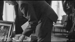
If the image isn’t hard-matted, the projectionist must insert an aperture plate that will mask the image properly. But what plate? Should she set it for 1.37? That’s a very rare option nowadays, and many theatres aren’t really designed to show it. Typically, if the print doesn’t indicate, the US projectionist will fall back on 1.85. Nowadays, if a Hollywood film isn’t in Scope, the projectionist is expected to use that ratio. Some shots will be problematic if the projectionist includes more than the 1.85 format allows. Here’s a full-frame film strip from The Hudsucker Proxy, where you can see that a chunk of the set is blocked or missing in the bottom area, and a microphone peeks into the frame from the top. (2)
Like many other movies, the films made by Godard since the mid-1970s show up at the projection booth without hard matteing. So at what ratio do we show them?
A great many careful viewers have voiced their views on the Internets, and I’ve learned a lot from the discussions here and here. In part this blog entry is an effort to introduce readers to this debate.
Moreover, this apparently film-wonkish question has wider implications. It can teach us a fair amount about how film images work, and the implications of any masking, matteing, or cropping of an image—especially on DVD. So if you’re interested in Godard, keep reading. If not, skip to the final section, “Relationships: The fundamental question,” where I talk about some artistic effects of cropping any film image.
It’s a just image, not just an image
James Q was mounting one of his typically ambitious retrospectives, this time on JLG, and so his essay posed a question that had long been ignored.
A disturbing discovery of the retrospective was how frequently the full-frame compositions of Godard’s late films have been ignored and overruled. Many of the prints are clearly marked by the lab with the widescreen ratios of 1.66 or (the almost standard) 1.85, and their subtitles are printed in the frame at the height indicated by those standards. Our meticulous projectionist Kate Mackay experimented with whole reels of films, showing them first in 1.33 and then in the prescribed wider screen ratio, revealing the violence done to the compositions when shown the latter way.
James found that several films, including Passion, Je vous salue Marie (Hail Mary), Nouvelle Vague, Hélas pour moi, and For Ever Mozart, looked “abjectly constricted” in 1.85. So James wrote the man himself.
Disturbed by some oddly cropped compositions in Éloge de l’amour, which result in seemingly unintentional beheadings and concretions, I consulted Godard by fax about the aspect ratio and he confirmed that it was indeed, as stated, 1.66 (rather old-fashioned in its own way). That he occasionally still seems to be jamming a 1.33 composition into a frame that cannot accommodate it suggests his instinctual preference for the open image.
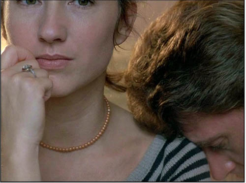
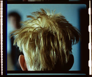
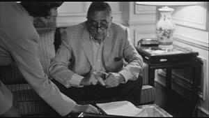
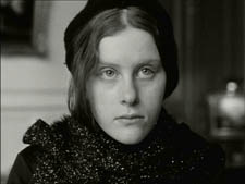
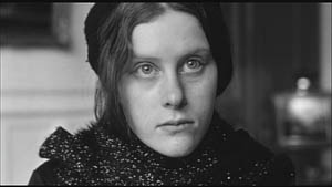
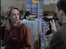
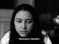
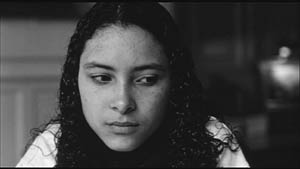
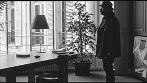
I couldn’t help James much at the time, but I did send him a couple of frames that favored squareish compositions and that came from 35mm prints. Other frames we reproduced, at 1.37, in both editions of Film History: An Introduction. The still that pretty much settles the matter for me is the gorgeous shot of Nathalie Baye and Johnny Hallyday at the top of this entry. Here’s the image as it is on a 35mm print.
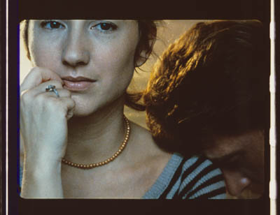
Downsize that to 1.66 without losing those eyes!
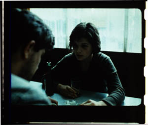
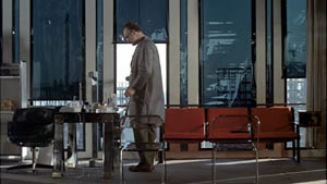
Later I sent James another killer example, drawn also from a 35mm print of Detective. (It’s in the new Film Art, p. 46.)
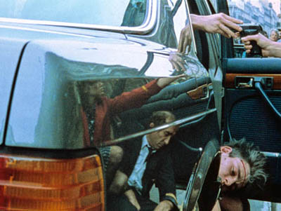
Here’s what it would look like in one try at 1.66 matteing.
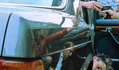
I say “one try” at a matted version because I didn’t take as much off the top as a normal aperture plate would; I didn’t want to slice into the hands and the gun. Not only is the 1.37 image preferable (we get to see Claude Brasseur’s slumping posture) but 1.66 looks, as James says, jammed. The 1.37 ratio lets Godard load information in the very top of the shot, as we’ll see often in the examples to come. And, needless to say, at 1.85 the shot would make no sense.
Soon after James and I had our exchange, Godard—perhaps prodded by James’ query—sent a diagram to Cahiers du cinéma. (3) (Thank you, Craig Keller, aka evillights, who called attention to it on this thread.) The Cahiers editors report that Godard has asked that Notre musique be shown in 1.37. His photomontage lines up two shots from the film and arranges them according to the three major “flat” ratios, and for each one he supplies a tart annotation.
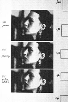
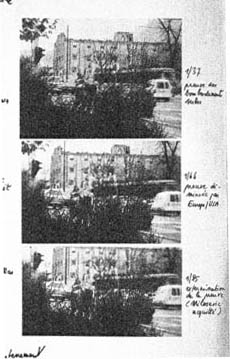
For the close-up of the woman, the captions translate as: 1.37 person. 1.66 character. 1.85 satellite slave. For the long shot of the street, we get: 1.37 Proof of Serbian bombing. 1.66 Proof diminished by Europe/ USA. 1.85 Extermination of proof (Milosovec acquitted).
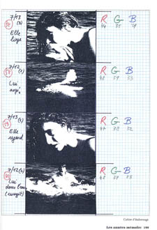
Pretty strong evidence that JLG doesn’t like cropping the classic format. But these remarks are about Notre musique. What about the other films? Apart from the evidence onscreen and on the film strip, we can add one thing. Evidently he shoots at 1.37, but there’s also evidence that in the late stages of postproduction he seems to preserve that ratio. Here, for example, is a sheet of color timing instructions for Nouvelle Vague. (4) Godard has pasted in a frame for each shot in the sequence, and alongside he notes how much red, green, and blue he wants. The frames he mounted are 1.37.
Recently our Cinematheque has been holding a Godard retrospective, and I’ve taken the opportunity to revisit the aspect ratio issue. As an archival venue, we can screen at any ratio, even the squarish silent and early-sound ones. Our projectionist Jared Lewis has run the Godards at 1.37. They look fine.
Jared pointed out to me that one other factor leans toward screening them in the 1.37 format: the thickness of the spaces between frames. In a modern “full-frame” film like Hudsucker Proxy, there is very little space between the frames. The line separating one from another is quite thin. That tends to make the frames squarer, closer to 1: 1.2, as I mention in endnote 2.
In a classic sound film, there is often more space between the frames. Usually that space is black, but I can’t resist showing what it looked like in Technicolor.
This frame, from Renoir’s Golden Coach, shows the characteristic silver frame surround (and silver soundtrack) of a true Tech print. Nifty, huh?
Anyhow, the sort of thick spacing between frames that we get usually find in Godard prints, and that’s visible in the Baye/Hallyday frame above, favors the classic ratio. The thickness of these spacers is similar to what we find in a modern film that was explicitly designed for 1.37 screening, Hans-Jürgen Syberberg’s Parsifal (1982).
This array, Jared points out, gives different frame proportions than one would find in a print hard-matted to 1.66 or 1.85.
One more wrinkle. On the film strip, Godard’s frames aren’t all the same dimensions. Here are two from Je vous salue Marie; note that the first is taller, with narrower spacers, than the second.
Both, however, would be appropriately shown at 1.37.
How then are we to explain Godard’s saying the films should run at 1.66? Perhaps, as one of the online commentators has suggested, Godard assumed that 1.66 is the closest that most commercial venues can come to 1.37. Perhaps too he was just being contrary–that is, just being Godard.
Fortunately, some DVD producers seem to recognize his full-frame aesthetic. The UK version of Detective is full-frame and preserves my nifty shots. Also, the Cahiers du cinéma discs for Prénom Carmen, Hélas, and so on are at 1.37. Bowing to Godard’s wishes, Wellspring’s version of Notre Musique announces that it is presented “in its original theatrical aspect ratio of 1.33.” Although purists may say that virtually no theatres showed it that way, we should appreciate the gesture.
Relationships: The fundamental question
Even if you’re not that interested in Godard, everybody should be aware of what video cropping can do to the film image. I’m not talking about panning and scanning, that process which begins with a widescreen film, typically one of an aspect ratio 1:2.40, and extracts a 1.37 frame out of it for video purposes. This is deplorable, but most of us are alert to it. What’s more interesting is the sort of thing that happened when a film is cropped inaccurately, either in projection or for DVD.
My example will be from the first reel of Godard’s Éloge de l’amour/ In Praise of Love, which is available on DVD in a full frame version from Optimum in the UK and in a cropped version from New Yorker in the US. I won’t be focusing on the quality of each transfer, though the Optimum one looks superior to me.
Nor will I do a detailed narrative account, because I find the characters and their interactions still fairly baffling. I’m always amazed that critics can praise a Godard film without ever getting down to explicating what’s literally happening in a scene. They write as if these films were telling their stories straightforwardly. Without help from the presskits, could journalists discern even the sketchy plots they refer to? A great deal of the fascination of Godard’s late works comes from his refusal of the most elementary forms of exposition–picking out characters, explaining their relations, and the like. There is always a story, but it’s about three-quarters hidden, and this seems to me to require a lot more analysis than people tend to give it.
Anyhow, in studying Éloge de l’amour‘s video versions, I learned that there can be a big difference between tiny numbers. For instance, the Optimum version is prepared at 1.35:1. No big deal between this and 1.37:1, surely? Except that the New Yorker version seems to have started from a 1.37 frame. Even though it’s cropped on the top and bottom, it consistently supplies a tad more information on the right and left edges, and these extra bits are visible in side-by-side comparison. First, a 35mm frame.
Needless to say, the projector’s aperture plate won’t preserve everything in the physical frame; at a minimum it masks off the curved corners. But if we look at the two video versions, there are some surprises.
The 1.37 version of this shot is of course much closer to the overall composition of the original. But more areas of the window frame (on the left) and the painting (on the right) are visible in the widescreen version than in the full-frame one. Did going for 1.35 shave off those areas? Moreover, New Yorker’s cropping is at 1.77, for all intents and purposes the same as 1.75. But to achieve this wide frame, the transfer of some shots seems to have been optically stretched a little. In some upcoming examples the faces are a bit plumper and the surroundings a bit more horizontally spacious.
Okay, maybe I’m splitting hairs. So let me assume that the UK DVD preserves a reasonable amount of the 35mm original. I want to consider some effects of the cropping we get in the US DVD. Some are obvious, some more subtle, and all go beyond this individual case to suggest the results of overcropping any movie.
(1) Of course we lose the top and bottom. In the full-frame shots from Hudsucker Proxy, no problem; the filmmakers are counting on the projectionist to mask the frame. But in Godard the cropping makes us lose stuff. Godard likes to frame heads pretty high in the shot, and this means that we often lose part of them.
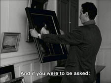
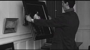
Heads are trimmed in movies all the time, and it doesn’t much matter in close views. But in Éloge, Godard is composing long shots with heads quite high up. He will even daringly chop off heads himself. This is partly a strategy to conceal who is present, to block our recognizing characters by their faces. It also has the effect of activating areas of the frame that aren’t usually so important. We have to strain to see partially visible things, tucked away in bits of the shot.
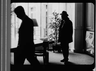
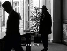
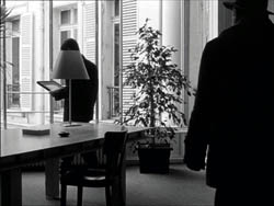
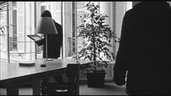
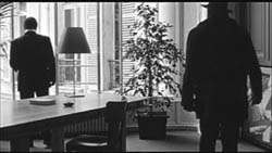
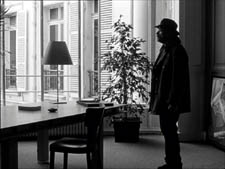
In the example below, I submit, the original composition creates a tension among three centers of interest: the two very visible paintings and the almost indiscernible face of the art dealer standing by the rear window. That tension is lost when the 1.77 cropping lops off the head in the background. Significantly, the man offscreen left is talking about how classic painting displayed “relationships” (rapports)–presumably both personal and pictorial. “That’s the fundamental question.”
The framing of the assistant in the foreground, incidentally, shows that spotting a decapitation in a video version doesn’t necessarily mean that Godard wanted every head to be seen.
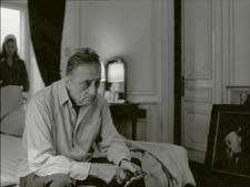
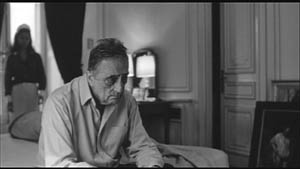
In a later scene, we strain to see the older man’s face as he bends over Bruno. As he speaks Picasso’s immortal line, his profile scrapes the very top of the shot, but not in the cropped version.
In most film shots, the upper half of the frame harbors what we look at first, so we’re probably most likely to notice when something goes missing there. But actually, the area at the bottom of the frame is important too, especially as part of Godard’s all-over approach to composition.
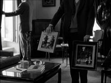
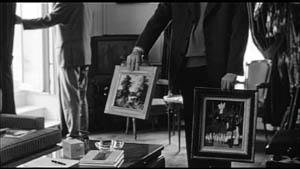
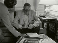
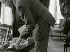
Throughout early scenes of the film, Godard’s compositions favor the art works and minimize the humans trafficking in them. So the picture (by Delacroix? Matisse?) on the coffee table is foregrounded when the art collector signs the papers proffered by a mostly unseen woman, but it vanishes in the cropped version.
Likewise, the old man on the bed can rub his glasses fretfully at the very bottom of the 1.37 format, but that performance detail goes for naught in the 1.77 format.
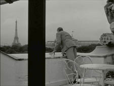
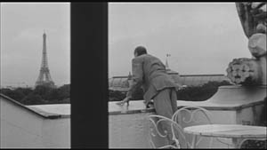
More generally, even when we scan the top half of the frame for major information, we tend to take for granted that people are anchored to a ground plane, the earth or the floor or whatever. Often, of course, film shots don’t show us this ground. But the material at the bottom of a distant view can weight the shot, providing a sense of gravity. Here, the dealer peering over his balcony is minimally tied to the patio ground (as minimally as he was visible in the earlier shots when his head grazed the upper edge, I suppose). But in the 1.77 version he floats free.
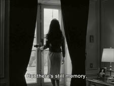
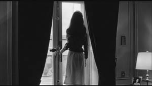
(2) The top and bottom zones include the corners of the frame as well, but I single them out for special mention because I like them so much. Again, we don’t expect key information to be tucked there, but it can happen—in Godard, in Tati (a big influence on the late Godard), and even in one remarkable shot in Lumet’s recent Before the Devil Knows You’re Dead. In the first reel of Éloge de l’amour, the best example I can find comes with the long-shot of the woman, turned from us, standing at the window. In the lower right corner of the shot sits a woman’s photograph on a table. The 1.77 frameline chops it off and makes it less segregated for our notice: we lose the spacing that separates it from the other objects on the table. Since the voice-over is meditating on memory, the photo adds an overtone to the shot, but less clearly in the cropped version.
Maybe it matters, maybe not; but it’s a lot harder to see in 1.77 than in the 1.37 transfer. Something similar happens with the businessman’s hand in the lower left of this shot.
(3) Cutting off top and bottom alters the shot scale. All other things being equal, cropping not only eliminates; it enlarges. Figures come closer to us. A medium shot becomes a medium close-up. All of the examples so far indicate this to some degree, but it comes across clearly in these variants.
Again, note the stretching. It seems that someone decided that the image had to be 1.75 and instead of cropping it, stretched the 1.66 one. Yikes!
(4) Overambitious cropping changes the compositional dynamics. In reducing information, it reorganizes the composition. Rudolf Arnheim (I blogged about his achievements here) suggested that we consider a picture as a field of vectors and forces, pushes and pulls, balance and imbalance, rival centers of attention. By changing the framing we change the relation of the figures to the edges, and this can alter the composition.
The clearest examples come from the sort of reframings we find when a Super-35mm film is rendered in home video versions in both 2.40 and 1.37.
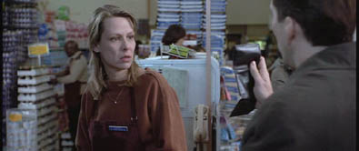
In this shot from 8mm (the movie, not the gauge), the cashier questioned by Cage looks more isolated in the Scope framing, while in the full frame they seem closer together and he seems to press in on her. Cropping can change a lot.
Now consider this comparison.
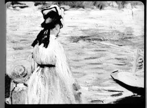
Godard’s original shot (here from 35mm) keeps the painting’s upper horizon, the darker, frothy waterline as a kind of backboard, halting the water’s recession into the distance. Graphically, the water on the right center becomes a negative space for the two figures, with the boy counterbalanced by the tip of the skiff.
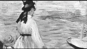
But the cropped version loses the distant waterline, creating an infinite stretch of space top to bottom, and the boy’s head seems to float more freely. Most starkly, the skiff, by losing its shadow, seems to have swung more toward us.
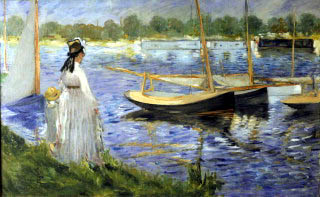
It’s worth noting that Godard himself is a mean hand at radical cropping. I’ll forebear from rambling on about what his original framing above does to the original, Manet’s Seine at Argenteuil (1874), but it could constitute a lesson in how framing changes effect and meaning.
Several factors come into play when we look at this shot from the two DVD versions.
The woman’s face is off-center in both images, but it looks more off-center in the 1.77 transfer. In fact, despite the extra bits on left and right, it is measurably more off-center, because of this transfer’s optical stretching. Yet I’d argue in addition that the cropping of the frame has squeezed the pictorial elements into a stronger horizontal to-and-fro, giving a sense that she has been pushed more out of the middle. You can see it more markedly if we crop it more drastically, and it may help to hide the others when you look at this.
This effect is akin to what happens in the cropping of the 8mm example: the spatial relations have reorganized in relation to the frame edges. Rapports again.
(5) Overcropping can affect the way we experience the time of the shot. Before you call the men in the white coats, I hasten to say that cropping is purely a spatial effect, but in cinema space is bound up with time.
We’ve seen that Godard manipulates the vertical dimension of the frame to an unusual degree, and the effect on time becomes apparent in one scene of Éloge in which Bruno talks with an older man, in a sort of casting session for his project. First we see Bruno alone, and as he walks to the window the old man comes in, his back to us. We presume it’s a man by the bulk, the gait, and the fedora, making its appearance in the upper right corner.
Or does a man come in? In the 1.77 version, at the corresponding point in the shot, we can’t tell it’s a man until the figure comes further into the room.
Godard’s reliance on the upper part of the frame allows us to discern the caller sooner in the 1.35 version. Seconds, even split-seconds, matter in cinema. Insofar as cropping affects the timing of a shot’s unfolding, it affects our experience.
( 6) Cropping affects perspective, the perceived distances and volumes of objects in the visual array. Blowing up the center of an image creates a flatter, more friezelike space than we discern in the original. This becomes evident in a later phase of the scene I just mentioned. After Bruno leaves the shot, the old man is left standing in the office.
The 1.77 image looks more like it was shot with a long lens than does the full-frame version. The result recalls the sort of perpendicular telephoto framings so common in the 1970s, in films like The Parallax View and The Conversation (below).
Godard has said that he preferred 30-40mm lenses for much of Sauve qui peut (la vie) because a focal length of 50mm (and presumably one longer than that) will “destroy perspective.” (5)
Many of these differences wouldn’t matter in most films, which aren’t composed as meticulously or as daringly. Hollywood images aren’t typically as dense as those in late Godard. (I must do a blog some day on fussbudget filmmakers like him.) But even if these niceties seem negligible, I think you’ll grant that the film would be much more compromised by being shown in a 1.85 ratio, the squarest option available in most commercial theatres today.
Critical discussions of Godard’s late films have treated them as poetic meditations, and that seems partly right to me. Yet few critics ask how they manage to create their lyrical, associative quality. I think, as I hope to show in a future blog, this has to do with his treatment of narrative (naturally) and his layout of scenes. But even before we get there, I think that we find in the very texture of his images (let alone his sounds) a daring decentering of faces and bodies—the usual nodes of our attention. If he often blocks the flow of our glance, it’s in order to rechannel it to unexpected areas and textures, crannies and gaps, within the image. And so we want all those areas and textures, along with the crannies and gaps, available to our eyes and minds.
(1) James Quandt, “Here and Elsewhere: Projecting Godard,” in For Ever Godard, ed. Michael Temple, James S. Williams, and Michael Witt (London: Black Dog, 2004), 126-139.
(2) Geek note: You may notice that this “full-frame” image isn’t itself in the 1.37 ratio. It’s very square. The reason is that many 1.85 frames will be exposed in the camera at a ratio of 1: 1.2! I believe this was standardized for the Panavision cameras of the 1970s and afterward, though I’d appreciate more information about this. See the entry on Panavision cameras in American Cinematographer Manual, fifth ed., ed. Charles G. Clarke (Hollywood: American Society of Cinematographers, 1980), 104. See also Rob Hummel, “Comparison of 1.85, Anamorphic and Super 35 Film Formats,” American Cinematographer Manual, eighth ed., ed. Rob Hummel (Hollywood: ASC Press, 2001), 24-29.
(3) Jean-Luc Godard, “Formats,” Cahiers du cinéma no. 591 (May 2004), 78.
(4) This image is taken from Jean-Luc Godard par Jean-Luc Godard, vol. 2: 1984-1998, ed. Alain Bergala (Paris: Cahiers du cinéma, 1998), 199.
(5) Jean-Luc Godard, “Propos rompus,” in Godard par Godard vol. 2, 466.
Thanks to Suzy Buenger and Nancy Marshall for identifying the Manet painting for me.
PS 15 Dec: And thanks to James Quandt, Michael Kerpan, and Yogesh Raut for a name correction I’m too embarrassed to specify further.
PS 7 April 2008: The issue is raised anew with Gus van Sant’s Paranoid Park. It’s designed to be shown at 1.37, with more than a few shots reminiscent of Godard. Joe Beres explains here.
PPS 25 January 2009: Ranjit Sandhu provides a lively and detailed discussion of aspect ratios and matteing strategies, along with remarks on Godard’s frames.
PPPS 21 Sept 2009: Thanks to editor John Olivio for a correction on the 1.78 aspect ratio.
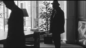
JLG par JLG (1995).
Last Modified: Friday | July 17, 2015 @ 11:31 open printable version
This entry was posted
on Friday | December 14, 2007 at 10:57 am and is filed under Art cinema, Directors: Godard, Film and other media, FILM ART (the book), Film comments, Film technique, Film technique: Cinematography, Film technique: Editing, Film technique: Staging, Film technique: Widescreen, New media: Technology, Readers' Favorite Entries.
Responses are currently closed, but you can trackback from
your own site.


