Archive for the 'Animation' Category
Moana’s roundabout voyage back to the multiplex: A guest post by Nicholas Benson and Zachary Zahos
I dimly remember hearing in late 2020 that the sequel to Moana (2016) was going to be Moana: The Series, streaming on Disney+ rather than a theatrical feature. David and I liked Moana very much, but in those of Covid and non-theater-going, it seemed a minor thing. A series wasn’t appealing, and we could just ignore it. Then about a year ago it was re-announced as a theatrical feature. I just assumed that the powers-that-be had simply decided that what was by that time being called Moana 2 would make more money by being released “Only in theaters,” as the posters inevitably pointed out.
That was true, but there’s much more lurking behind such a decision. Straight to streaming or released to theaters first? has become a puzzling question for studios as they discover that the huge profits they assumed their new streaming services would bring in were not all that huge or maybe not profits at all.
I am delighted to have two experts, Nicholas Benson and Zachary Zahos, who follow the distribution strategies of the film industry, contribute a guest post on how Moana 2’s change from modest Disney+ series to a box-office hit creeping up on the total domestic gross of Wicked reflects major shifts in the industry’s decisions about releasing options.
Nicholas Benson received his Ph.D. in Media and Cultural Studies from the University of Wisconsin-Madison and is now an Assistant Professor in the Department of Communication and Media at SUNY Oneonta. His current work considers the intersection of discourses of storytelling and management within franchise production cultures. Zachary Zahos also received his Ph.D. from the University of Wisconsin-Madison and is currently serving as Public History Fellow at the Wisconsin Center for Film and Theater Research. Back in September Zach and Matt St. John contributed a entry to this blog, examining a claim that movie lovers had stopped going to theaters.
Thank you, Nick and Zach, for your contribution to our understanding of the current tangled distribution systems of the current industry! Over to you.
The curse has been lifted—at Walt Disney Pictures.
After a run of box-office bombs, Disney’s flagship film studios bounced back in 2024: Pixar with Inside Out 2, 2024’s top-grossing film, and Walt Disney Animation Studios with Moana 2, which just cleared $1 billion globally. Even Mufasa: The Lion King, a CGI prequel produced by Disney’s live-action division, looks destined to overcome a weak start to become a profitable “sleeper hit.”
The cynical read on all this is that Disney, to quote The Town’s Matt Belloni, “engineered” a surefire 2024 by pushing riskier bets, such as Pixar’s Elio and the Snow White remake, to this calendar year. But, at the end of the day, adaptive engineering, risk mitigation, studio chicanery, whatever you call it—this is how Hollywood lives to tell another tale, and you need not look further than Moana 2 for a revealing case of Disney executives reading the horizon and changing course.
Moana 2’s present status, as a resounding theatrical success, interests us in particular due to the roundabout journey—and P.R. spin—it took to get here. For those unaware, the film now playing in multiplexes called Moana 2 was greenlit in 2020 as a television series (titled Moana: The Series) for the company’s streaming platform Disney+. It was only last February when CEO Bob Iger announced that this project was instead heading to theaters under the new title Moana 2. While the trades were quick to discuss the financial calculus behind such a shift (per Deadline: “after misfires … more Moana is a safe bet for the House of Mouse”), Disney has been careful to publicly attribute this decision to creative, rather than business-minded, imperatives. For instance, Jennifer Lee, former CCO at Disney Animation, told Entertainment Weekly in September:
We constantly screen [our projects], even in drawing [phase] with sketches. It was getting bigger and bigger and more epic, and we really wanted to see it on the big screen. It creatively evolved, and it felt like an organic thing.
As genuine as this sentiment might be, we sincerely doubt that Moana 2’s last-minute about-face, from streaming series to theatrical film, emerged from creative disagreements alone. The film industry has changed rapidly over the last five years—streaming has undergone its own boom and bust cycle during this time, with vintage concepts like advertising, bundling, and return-on-investment, bringing Hollywood executives down to earth. In short, the Walt Disney Company that announced Moana: The Series in 2020 is different from the one that released Moana 2 in theaters last month.
Longtime readers will recall this blog’s fondness for the first film, as shared by David, Kristin, and Jeff Smith. We count ourselves Moana fans, as well, while also agreeing with critical consensus that Moana 2 lacks the inspiration (or songs) of the original.
But what follows is not a review. While we will make reference to certain storytelling choices present in the film, our main goal here is to argue that Moana 2—or, more specifically, the production and circulation context surrounding it—is symptomatic of a global industry in flux. As the world’s largest legacy entertainment company, Disney is not one to buck trends but rather to reinforce them. An engaged analysis of Disney’s recent executive-level decisions offers us a chance to gauge which way the winds of commerce are blowing.
Yet the company’s sheer scope, both internally and across its multi-generational audiences, invariably creates sites of tension and contest. We see that in Jennifer Lee’s public assurances concerning Disney’s creative community, and not its C-suite, steered Moana 2 into theaters. But we also see such tension and contest in how Moana 2’s production history throws long-standing hierarchies at the Walt Disney Company into relief. As a result of Disney+ and recent executive initiatives which we will delve into here, the line separating the company’s film and television output has become increasingly blurred, as have the rules for successfully exploiting marquee franchises, particularly those geared toward younger audiences.
What is clear to us is that, even in success, Disney+ has failed to solve all of its parent company’s problems and in the process has created several new ones. This is not simply because of profit margins, but also because such investments, from both studio and audience, run downstream from discursive categories like “film,” “television,” and “streaming.”
In the case of Moana 2, the shift of Disney’s prized sequel from the “streaming television” to the “theatrical film” column, months out from release, occurred in large part due to the promise of greater financial returns. That much seems obvious, no matter what Jennifer Lee and other creative executives say, given how most studios across the industry have learned to love movie theaters again.
But we do not wish to suggest these leaders are lying through their teeth, either. As strategic as Lee’s statement to Entertainment Weekly may have been, she does seem to genuinely represent the values and norms of the world’s most famous animated film studio. Where else but movie theaters do you go when you design your expensive franchise sequel to be “bigger and more epic”? So, while Moana 2 sailed back to multiplexes amidst an industry-wide correction away from pyrrhic victories in streaming, its journey looks especially inevitable if you account for the particular industrial apparatus from which the film came.
We’ll expand on these ideas by teasing out a few historical threads relevant to Moana 2’s production. These concern Disney+, Disney Animation Studios, and the Walt Disney Company, as well as the latter’s general playbook toward franchising animated entertainment.
Disney+ and the business of animation today
Disney’s recent theatrical rebound is notable given the obstacles—some of them industry-wide, others self-inflicted—its film division has faced since its peak in 2019. That year, Walt Disney Studios reported $11.1 billion in worldwide theatrical revenue, with a record seven films (among them the animated sequels Toy Story 4 and Frozen II) each surpassing $1 billion at the global box office. In November of 2019, the company launched its Disney+ streaming platform. While it always seemed destined to succeed, Disney+ exploded in growth months later as the COVID pandemic closed theaters and Disney’s theme parks.
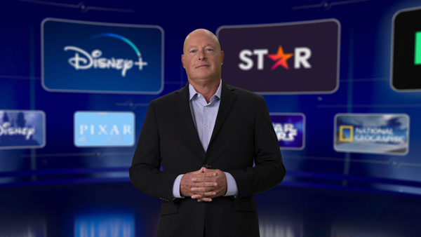
Since that high-water mark, Disney’s films have struggled, partially due to counterproductive distribution decisions and a streaming-focused production pipeline. On the distribution side, during the pandemic then-CEO Bob Chapek (above) launched Disney+’s day-and-date “Premier Access” program and arranged for Pixar’s latest films, beginning with Soul (2020), to skip theaters and instead premiere on the streaming platform. While this strategy fueled subscriber growth, almost every animated film Disney released to theaters in its wake, most notably Lightyear (2022) and Strange World (2022), underperformed at the box office. Analysts have attributed this cold streak to a range of causes, including the notion that Disney’s streaming release strategy had “conditioned audiences” to wait for theatrical releases to hit streaming.
Much ink has already been spilled on another contributing pop psychology phenomenon, that of “franchise fatigue.” The idea that audiences are burned out by the proliferation and interconnectedness of so much franchise material may not be neatly supported by the data. The top 10 movies of 2024 were all franchise properties, after all. It is a more credible notion if one examines Disney’s many spin-offs on streaming. Since 2019, the company’s marquee film production companies, among them LucasFilm and Marvel Studios, have shifted resources to producing long-form television series for Disney+. LucasFilm and Marvel respectively launched their Disney+ slates with The Mandalorian and WandaVision, both of which were well received and highly rated. But ever since, Disney’s streaming series have attracted increasingly mixed critical responses (even after controlling for toxic fan reactions) and diminishing viewership numbers (here and here).
That does not mean all Disney+ originals are destined for failure. What seems increasingly clear is that certain forms of programming, such as animation, perform more consistently, albeit under a typically lower ceiling of viewership. In October, The Hollywood Reporter published a 3000+ word article headlined, “Is Disney Bad at Star Wars? An Analysis.” To be clear, the piece answers its core question with, “On balance, no.” Nevertheless, this article is relevant to this discussion in that it contrasts the strong ratings of the Star Wars animated series on Disney+ with the franchise’s live-action series for the same platform. New animated series like The Bad Batch have more than earned their keep, with their large volume of episodes (usually 16 per season vs. 8 for live-action series) driving viewer engagement at a fraction of the cost of their recent live-action counterparts.
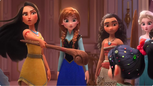
So, Disney+ is a sensible launching pad for new animated Star Wars series. Does that make it also wise to premiere the latest Disney Princess tale on the same platform? (Despite Moana 2’s “Still not a princess!” joke, in the eyes of Disney, she officially is one, as the Princesses scene in Ralph Breaks the Internet, below, demonstrates.) Well, that depends.
Traditionally, Disney has had three main paths for exploiting animated franchise content: theatrical distribution, commercial television, and direct-to-video (DTV). Each of these had clear advantages and disadvantages, and for many years these three paths looked fairly straightforward. Theatrical distribution, both then and now, is prestigious and visible to a large, diverse audience, and it comes with the potential for massive global box office revenues and merchandising opportunities which can immediately counteract the large budget.
The other two categories—commercial television and DTV—were lucrative paths for many years at the Walt Disney Company, but under the Disney+ paradigm have begun to appear less distinct from the theatrical option. Commercial television traditionally came with less expectation that it feel cinematic, and therefore could be made on a smaller budget. Television series promise a smaller, more concentrated audience of children or existing fans and a long tail financial model that relies on revenue generated through ad support and future syndication possibilities. DTV content, for its part, follows a similar model to commercial television but at an even lower scale of cost, with accordingly lower (but faster) profit potential.
The visibility of commercial television content within the Disney animated fold is moderate (and outright low for DTV). Millions of children apparently watched the Tangled (2010) spin-off Rapunzel’s Tangled Adventures, which was produced by Disney Television Animation and aired from 2017 to 2020 on the Disney Channel. We don’t expect you, reader, to have heard of this show, though at the same time we would be surprised if you never before heard of Tangled. Thus, even resounding successes of this type will remain off the radar of the general, adult-aged public, and so commercial television spin-offs, even if not the highest quality, will not inherently hurt the brand as a large film can.
It’s on this last point, regarding visibility, where the project formerly known as Moana: The Series was always destined to be different. With the company’s flagship studio, Disney Animation Studios, producing it, the budget leaped beyond any animated project Disney produced before for television or DTV. Launching Moana: The Series exclusively on Disney+ had potential upside, but as we will see, these benefits began to look questionable.
Moana’s voyage toward streaming…

Moana: The Series was first announced, by Jennifer Lee, at the virtual Disney Investor Day event in December 2020. The broader theme of the investor’s day was Disney’s new structure, which separated content creation from distribution in a bid to turn to what newly appointed CEO Bob Chapek referred to as a “DTC [direct-to-consumer] first business model.” The Moana series thus joined a slate of other Disney+ releases, including day-and-date release movies like Raya and the Last Dragon (2021), Marvel series such as Loki (2021-2023), and limited series such as WandaVision (2021). Though executives continued to gesture towards the importance of “legacy distribution platforms,” such as theatrical and linear television, the focus was on the corporation’s investment in Disney+. As Chapek put it in his opening statement:
We knew this one-of-a-kind service featuring content only Disney can create would resonate with consumers and stand out in the marketplace and needless to say Disney+ has exceeded our wildest expectations.
The idea to expand the Moana franchise into a series, therefore, was a direct result of corporate confidence in DTC platforms as the future of distribution. Chapek’s new corporate structure promised a streamlined production pipeline that seemed to completely separate the creation and production process from the distribution process — in other words, creatives would generate content and then the distribution team would figure out the best way to get that content to the consumer. Chapek explained the structure in a statement:
Managing content creation distinct from distribution will allow us to be more effective and nimble in making the content consumers want most, delivered in the way they prefer to consume it. Our creative teams will concentrate on what they do best—making world-class, franchise-based content—while our newly centralized global distribution team will focus on delivering and monetizing that content in the most optimal way across all platforms, including Disney+, Hulu, ESPN+ and the coming Star international streaming service.
This new agnostic approach to distribution seemed to lead to a general confusion about how to staff DTC productions. The Moana follow-up presented a mixed bag in terms of who was brought back from the original production. Voice talent Dayne Johnson and Auliʻi Cravalho respectively reprised their roles as Maui and Moana. However, original Moana directors Ron Clements and John Musker were absent. Instead, Jason Hand, Dana Ledoux Miller and David G. Derrick Jr. (above) were hired to co-direct and run the series. Hand, who had the most experience working with Disney animation of the three, started his career at Disney in 2005, as a layout artist on the DTV sequels Tarzan 2: The Legend Begins and Lilo & Stitch 2: Stitch Has a Glitch. Disney has a well-known apprenticeship program and tends to hire and promote from within, so it’s not out of the ordinary that a series like this would be given to greener talent looking to gain experience.
That said, Moana: The Series’s production team was indicative of a broader ambivalence the company seemed to have about how much to invest in, and therefore how to staff, DTC content. While the series Baymax! (2022) brought in Big Hero 6 (2014) director Don Hall as showrunner, other series like Zootopia+ (2022) and the upcoming Tiana (2025) did not bring back the same directing or writing teams from the original films. Instead, Zootopia+ was directed by Trent Correy and Josie Trinidad, who previously worked in the Animation and Story departments on Zootopia, respectively. Tiana is reportedly being run by Joyce Sherri, who served as staff writer for the Netflix miniseries Midnight Mass (2021).
…and back to the multiplex
News on the Moana series remained sparse from 2020 until February 2024, when Bob Iger announced during a CNBC interview that the series would now be a theatrical feature slated for a fall 2024 release. The news came shortly before a Q1 earning call where he assured shareholders that “the stage is now set for significant growth and success, including ample opportunity to increase shareholder returns as our earnings and free cash flow continue to grow.”
Iger’s assurance came on the heels of a tumultuous few years for Disney, after a series of box-office failures and an internal struggle for power that resulted in the ousting of CEO Bob Chapek and a return to the post for Iger. While the issues faced by Disney were multifaceted, the all-in approach to DTC content was central to the company’s financial struggles. Subscriber fees could only generate so much revenue, and that revenue didn’t seem enough to sustain the enormous content library required to maintain a streaming platform. In September of 2022, Bob Chapek indicated to Hollywood Reporter that Disney+ had a content problem. As Chapek put it:
It’s important to go back to when Disney+ was launched and what the hypothesis was about how much food you had to give that system for it to truly maximize its potential, and I would say we dramatically underestimated the hungry beast and how much content it needed to be fed.
The extent of this issue became apparent during a 2023 lawsuit against Disney by investors alleging Disney hid the actual costs of running the service to offer the appearance of profit potential. Though the service is reportedly now profitable, since its inception Disney+ has racked up over 11 billion dollars in losses, showing that the DTC, subscription-based model has not been the massive success it was predicted to be in 2020.
In late 2024, as the premiere for the re-titled Moana 2 approached, those who worked on it related to press outlets various versions of how the series abruptly shifted to a theatrical film. We can return to that September Entertainment Weekly profile to see a few explanations side-by-side. For instance, co-director David G. Derrick Jr. described the decision to pivot from a series to a feature film as a moment of “mutual realization” between the studio’s various teams:
It became apparent very early on that this wanted to be on the big screen. It felt like a groundswell within the whole studio.
Co-director Dana Ledoux Miller framed it as a push from the creatives, out of a desire to showcase their work. She suggested the project had “the best artists in the world” and added:
Why are we not letting them shine on the biggest screen in the biggest way?
This rhetoric stood in sharp contrast to Chapek’s 2020 Investor Day video, in which he seemed to downplay the importance of theatrical distribution in favor of the convenience of DTC exhibition. At that point, there was no sense that artists would feel minimized by having their work showcased on DTC platforms. Instead, these new comments by the creative team touted theatrical exhibition as a prestigious honor and the only way to showcase quality artistic achievement.
In other words, after years of the studio relegating several projects to Disney+ or day-and-date releases, Moana 2’s pivot feels like a pointed reinvestment in the theatrical experience. Jennifer Lee reinforced this perspective when she said to Entertainment Weekly:
Supporting the theaters is something that we talked about. … We love Disney+, but it will go there eventually. You could really put it anywhere, but these artists create stories that they want to see on the big screen and that we want the world to see on the big screen.
When the show was reworked as a movie, the absence of certain high-profile talent associated with the first Moana—especially popular songwriter Lin-Manual Miranda—became apparent. The official reason for Miranda’s absence was that he was already committed to another Disney theatrical project, Mufasa: The Lion King (2024). While Moana composers Mark Mancina and Opetaia Foa’i did return to score the movie, the new songs for the sequel were primarily composed by Abigail Barlow and Emily Bear. The two were, as Billboard put it, “the youngest (and only all-women) songwriting duo to create a full soundtrack for a Disney animated film.” Until that point their only real credit was writing an unsanctioned viral musical based on the Netflix show Bridgerton (2020 – ). Though having young women write the music for a musical about young women was a positive move for Disney, the pair’s relative inexperience became more conspicuous when the Disney+ show was transformed into a tentpole feature film. In its review of the film, The Hollywood Reporter noted that “Miranda’s absence is unfortunately felt” throughout the musical numbers. Variety, more pointedly, called the new batch of songs, “imitation-Lin-Manual knockoffs.”
The lack of personnel continuity between Moana and Moana 2 highlights the general disorganization within Disney’s new corporate structure. Despite the claim that content can be created and then distributed wherever by reading the will of the data gods, the reality is projects still seem to work best when the venue of the exhibition is known during the early stages of production. When Disney has done theatrical sequels they tend to staff them with creative talent from the original. Jennifer Lee oversaw the creation of Frozen 2 (2019), Andrew Stanton returned for Finding Dory (2016), and Pete Doctor directed Inside Out 2 (2024). Though Miranda claims he was otherwise preoccupied, one wonders if he would have still worked on Mufasa: The Lion King had he known the Moana follow-up was destined for a theatrical release.
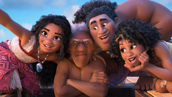
While this is primarily an industry analysis, even a cursory look at Moana 2’s narrative reveals the editorial marks left by this unusual production. As with the first film, the sequel tasks Moana with breaking an ancient curse, except this one was set by a storm god named Nalo, who drove the different peoples of Polynesia apart. With this clear objective, Moana remains a classical, goal-oriented protagonist, but the seams begin to show once you look at the other characters. Curiously, Nalo remains an off-screen antagonist, who is not properly introduced until a mid-credits scene that mimics Thanos’s first appearance in The Avengers (2011). The journey is also now populated by a group of secondary characters easily identified by a defining trait (e.g., Moni is a huge Maui fanboy). The first act, set on Moana’s well-populated island of Motunui, feels especially abridged from the project’s looser, episodic origins, and the onslaught of new characters leaves little room for the emotional depth and character development that many critics respect about the first film (here and here).
The seams where Moana: The Series was stitched together into Moana 2 are not only evident in the story, but in the production and promotion as well. Being forced into the throes of a giant A-list press junket was probably not what these first time directors signed up for; it’s certainly something the team behind the direct-to-video Cinderella II: Dreams Come True (2002) never had to deal with, and for good reason.
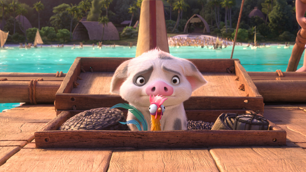
Yet Moana 2’s directors were left answering questions about decisions made in the first movie they had little or no control over. For example, the cute pig Pua, whom fans felt was underused in the original movie, took on a more prominent role in the sequel. When asked by CinemaBlend if they responded to any feedback about the first film, director/writer Dana Ledoux Miller responded:
Look, people really wanted Pua in that first movie on the canoe. I wasn’t around, but we put Pua on the canoe now.
While not overly awkward, the exchange highlights the behind-the-scenes break in continuity. Similarly, young songwriters who should be establishing their own identity were instead having their work compared to the beloved music of Lin-Manuel Miranda. Ultimately, while this has financially paid off for Disney, Moana 2 was clearly a ship built for the smaller more secluded waters of Disney+. Though it has survived, the tepid reviews suggest it may have been only by the skin of its teeth.
Riding the popcorn-bucket wave
Moana 2 is not only indicative of the pitfalls of the DTC model but highlights the inherent potential of theatrical distribution, especially for franchised content. Despite lukewarm reviews, the movie has already earned record numbers at the box office. More importantly, it has reignited interest in the brand more broadly. Moana became the latest entry in a list of high-profile collectors’ popcorn buckets distributed by theaters (above).
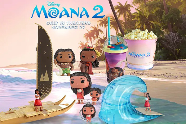
While they might seem like a gimmick, these popcorn buckets have become an integral aspect of the theatrical distribution model and the “post-pandemic ‘identification’ of moviegoing.” They  work in favor of both the theaters and the studios by raising awareness about the films and the brand. As one journalist pointed out, “I didn’t realize Despicable Me 4 was happening until I saw the popcorn bucket.” With the release of toy lines (Funko dolls aplenty, including Pua, above and left), popcorn buckets (and nacho boats!), and theme park tie-ins, the hype machine that spins around a massive theatrical release has become somewhat intuitive over the past century in a way that DTC models have difficulty emulating, even with the benefit of synergy within vertically integrated corporate structures.
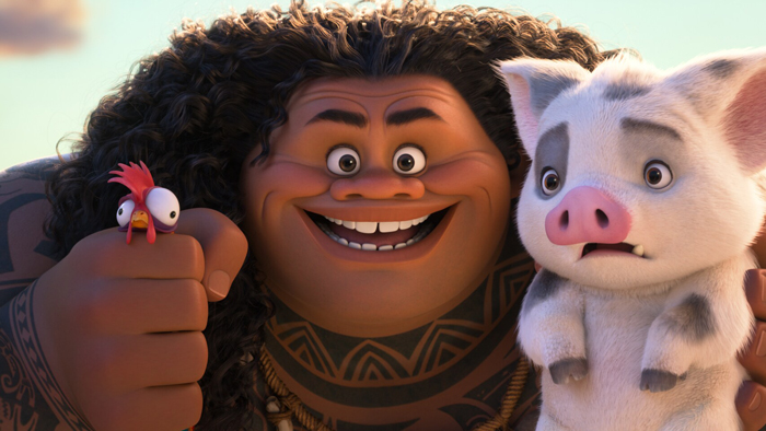
Though box-office numbers are important, this hype is equally valuable. In this way, Moana 2 was a success even before it debuted. The trailer for Moana 2 broke the record for the most-watched trailer for a Disney movie ever, reaching over 178 million views in 24 hours. Likely not coincidentally, that trailer ended with an image of Maui holding Pua, announcing that this cute character was, as Miller had put it, “on the canoe” and (more importantly) ripe for new licensing deals. When Moana 2 was announced to be a movie, it kicked off one of the largest and most lucrative global merchandising campaigns in recent memory. Apart from Moana merchandise, there were brand partnerships with airlines to local Hawaiian food chains. Imagery flooded public spaces. Hasbro introduced cutting-edge 3D printing technology to inject toys and dolls as quickly as possible into the marketplace. This success, both in theaters and retail, suggests that even if somewhat clunky, the 11th-hour decision to turn a television show into a movie seems to have been financially prudent – at least in this instance.
New rules, some of them old
During Disney’s 2024 Q4 earnings call, Bob Iger admitted, seemingly unintentionally, the motivation for recent subscription price increases for Disney+. According to Iger, these streaming price hikes were designed less to generate revenue through subscriber fees and more to shift consumers to the ad-supported model:
It’s not just about raising pricing, it’s about moving consumers to the advertiser-supported side of the streaming platform. … The pricing that we recently put into place, which is increased pricing, was actually designed to move more people in the AVOD [advertising video-on-demand] direction because we know that the ARPU [average revenue per user] — and interest in it from advertisers in streaming — has grown.
Iger’s comments point to how these companies are starting to recognize (or grapple with) where the actual value of the streaming service lies within the broader corporate structure: specifically, how the streaming service functions, or serves, the vast media franchises these companies have restructured around. Until recently, executives imagined them as vertically integrated platforms that allowed corporations to get content directly to consumers without the need for middlemen (though, with the exception of Comcast, third-party telecom companies still control the actual distribution pipeline, complicating the notion that these are truly vertically integrated systems). As this system evolves to support ads, content will need to be capable of sustaining viewers over time and selling ad space to sponsors. In other words, despite all the obfuscation of what will likely amount to a transition period, streaming services seem destined to be mostly a different distribution platform for what had been commonly known for the past century simply as commercial television.
Despite some disruptions over the past several years, theatrical distribution continues to hold a privileged position in the cultural zeitgeist, especially for high-profile properties. Movies can air on TV, but the experience of watching them is still culturally different from that of watching something in a movie in the theater. The act of going to the movies is an event apart from one’s day-to-day life (one must schedule a movie, what David called “appointment viewing”), while television, regardless of its distribution mechanism, remains intertwined with the cadence of one’s daily routine.
Take, for example, a recent review of Mufasa: The Lion King (2024) in Polygon. Writer Petrana Raduloviv opines that the movie would have fared better as a video-on-demand release:
Mufasa: The Lion King, the 2024 movie about Simba’s majestic father, seems like it could exist right alongside Simba’s Pride, The Lion King 1 ½, and the animated TV show The Lion Guard. Except instead of being cheaply thrown together for young audiences, it was directed by Academy Award winner Barry Jenkins (Moonlight, The Underground Railroad), with a script from Catch Me If You Can screenwriter Jeff Nathanson, and music from Lin-Manuel Miranda.
In other words, the string of Lion King sequels might lead people to think that this latest one could be treated like the previous ones, being presented DTV. The celebrity talent involved, however, kindled enough interest to lure audiences into theaters and make Mufasa a hit.
Despite claims to the contrary, lines between various exhibition sites remain strong. DTV content and theatrical releases are seemingly different cultural categories that, in turn, invite different reading strategies. As the above quote suggests, success is, in part, based on expectations, and expectations tend to be tied directly to the site of the exhibition. As media conglomerates consolidate and organize transmedia franchises, they must negotiate the utility and corporate value of each exhibition site at their disposal. The task for media producers over the next few years is to calculate the financial value of these cultural categories and use that to calibrate the production costs of their various franchise proliferations. In short, this difference in cultural capital between these two exhibition sites constitutes a difference in industrial strategy as corporations seek to exploit and profit from their various properties in myriad ways. How this shakes out will have lasting effects on the future of film and television creation for decades.
Studios are grappling with these questions of medium-specificity, appropriate exhibition, and franchise management in real-time. New rules are being forged that will shape the future of distribution. As we see it, streaming is unlikely to collapse theatrical and television into a single system but instead offer a hybrid exhibition site that seems to fill the role of both commercial television and the direct-to-video market.
What complicates streaming currently is that it has traditionally been subscriber-supported and therefore followed a premium cable, rather than a commercial television, model of production (see Amanda D. Lotz for more on this distinction). Unlike the commercial television or direct-to-video route, where the value for those exhibition options was tied to their lower production costs, streaming tends to demand a similar quality production to film since it’s not really competing with broadcast television. Instead its rival is seemingly premium cable programming like Game of Thrones. Therefore, it’s very expensive, sometimes more expensive than film production.
Streaming tends to look for a larger audience and is not aimed at exploiting as much as expanding a story world as a franchise. This strategy may be something that fans of that particular story world want, but a general audience would rather watch individual stories than dive into an elaborate franchise saga. Streaming shows also tend not to consistently generate the same cultural impact as a theatrical release (is anyone talking about The Skeleton Crew?). In other words, as it exists, streaming offers the worst of all worlds for media conglomerates looking to exploit their intellectual properties in ways that generate revenue and help the brand. Shows are expensive to produce, they can generate bad press and harm the brand, but they have very little potential to generate large revenues.
We would argue that this is likely why Moana: The Series was reworked into Moana 2 and prepared for a theatrical run. Though the budget has not been officially revealed, based on industry sources, the budget was likely close to the $150 million budget of the first movie. In other words, it’s not because the story got “too big,” but because the budget was too big to justify it being tossed into the increasingly large pile of disposable Disney+ content.
Moana 2 is part of a clear trend. In 2023 The Mandalorian’s final season was transitioned from a Disney+ series to the upcoming theatrical release, The Mandalorian and Grogu (2026). Inside Out 2 (2024) enjoyed a successful box office run as a traditional Pixar theatrical release. A few months later, after the movie hit streaming services, the short, animated spin-off series Dream Productions (2024) debuted on Disney+. The four-episode limited series was produced on a severely reduced budget concurrently with the feature film production. However, mid-production Disney cut the episode order from seven to four.
When Moana: The Series was announced in 2020, Disney also announced a Tiana musical series based on the Princess and The Frog (2009). Though it was set to be released in 2023, it’s still in development – perhaps preparing to shift into a feature film. Disney has also systematically canceled or prepared to phase out many of its more expensive shows, even popular ones. Shows such as Ahsoka, Andor, and The Acolyte are all being canceled after one or two seasons. This suggests that Moana 2 did not evolve on a whim, but rather as part of a broader systematic move away from expensive Disney+ series and towards high-profile theatrical content. As Disney builds its advertising infrastructure, we’ll likely see Disney+ pursue things like Young Jedi Adventures (2023): franchise spin-offs aimed at families and children that are relatively cheap to produce and have syndication potential.
Yet Moana 2 also highlights a unique value of streaming over other forms of exhibition: data. Moana (2016) was the most streamed movie of 2023. Because of this, Disney knew that Moana (2016) was popular among their fanbase. This likely gave Iger and others some confidence that even without the A-list creative talent behind the scenes, the property alone could carry a sequel to a box office win, which in turn results in positive press and better stock performance. Similarly, the popularity of The Mandalorian (2019 -) as the second most streamed series on Disney+, behind only The Simpsons, likely factored into the choice to greenlight The Mandalorian and Grogu (2026) for theatrical release. We would likewise guess that the greenlighting of Frozen 3 and Zootopia 2 was likely less about some burning creative need to expand those stories and more about promising Disney+ data.
The decision to release the Moana sequel in theaters also reflects the obvious point that theatrical movies generate a higher profile than DTV series. Once they end their theatrical runs and are offered on streaming services, the desire to see them may lead to new subscribers.
Ultimately, what we see is not the erasure of one form of exhibition in favor of streaming, or competition between theaters, television, and streaming services, but the formation of a nascent symbiosis between these sites, as media conglomerates consider their place within each corporate enterprise.
Our gratitude to Matt St. John for inspiring and improving this piece.
We would also like to thank Kristin for her edits and insights on contemporary animation.
Relevant to this discussion is a newly filed lawsuit suing Disney for copyright infringement over the Moana franchise. Entertainment Weekly broke this news on January 12, and it goes without saying that we will follow this case as it proceeds.
Tracking down Aardman creatures in 2008
Cracking Contraptions: The Tellyscope.
David’s health situation has made it difficult for our household to maintain this blog. We don’t want it to fade away, though, so we’ve decided to select previous entries from our backlist to republish. These are items that chime with current developments or that we think might languish undiscovered among our 1094 entries over now 17 years (!). We hope that we will introduce new readers to our efforts and remind loyal readers of entries they may have once enjoyed.
On Friday, December 15, Chicken Run: Dawn of the Nugget will have its American streaming release on Netflix. I’ve been a fan of the film’s producer, Aardman, since David and I saw a compilation of the three original Wallace and Gromit shorts, including the sublime The Wrong Trousers, in a theater. On January 28, 2008 I posted a long entry on Aardman’s history to that time, including a chronology of all its releases. Aardman has been so productive since then that I could not possibly update this entry. The company has been extremely successful in the area of television series, such as those featuring Shaun the Sheep, thus multiplying the number of titles created. Nevertheless, I think this entry offers some useful information on the early period of the studio.
Kristin here—
David and I are currently plugging away on revising our Film History textbook. In setting out to update the section on Aardman animation, I ran into difficulties pinning down the dates of certain television series or the director of a given short film. Indeed, I was quite surprised at the dearth of complete chronologies or filmographies for such a famous and important company.
The obvious sources such as Wikipedia and the Internet Movie Data Base, are helpful but sketchy. Aardman’s own “History” section on its official website is even briefer–and ends in 2005. The filmography in Peter Lord and Brian Sibley’s coffee-table book, Creating 3-D Animation (p. 189), is far from complete. (I must confess that I’m still using the first edition, but even so the filmography is sketchy for the period it covered. The revised edition came out in 2004.) Each source was, however, incomplete in different ways. I decided to try and compile as comprehensive a chronology/filmography as I could as a research and reference tool. This turned out to be a considerable task. Given how little of this work will end up in the textbook, I decided that I might as well offer it to the world.
I expected to find one or more fan-originated sites that would provide additional information, as so often happens in the world of popular culture. The main “unofficial” site that came up when I Googled Aardman is actually an online shop with scarcely any actual information.
What follows is not by any means complete. It’s more like a rough draft for a filmography, though it’s more detailed than any that I have found so far. No doubt it has gaps and perhaps inaccuracies. One problem I encountered is that dates given in various filmographies seem to waver between when a film was made, when it was copyrighted, and when it was released to theaters or first shown in TV. I’ve tried to stick to release/broadcast dates when I could find them.
Aardman has produced many ephemeral animations for station-identification logos, credit sequences, and websites, as well as perhaps hundreds of commercials. I’ve made no attempt to include commercials, apart from the Heat Electric series, which are available on DVD. The following primarily includes television shorts and series, as well as films.
My main sources of information are: The Internet Movie Datebase; the history section of Aardman’s official website (which ends with 2005); the Big Cartoon Database’s Aardman page; Lord and Sibley’s Creating 3-D Animation; Insideaard (a booklet included in the British DVD Aardman Classics); and the credits of various Aardman films on DVD and on AtomFilms. Some details have been filled in from the Wikipedia entries on Nick Park and Steve Box. The main Aardman entry is so far rather sketchy, though it includes some films not listed in other filmographies and links to entries on the individual films and series, given below.
[Added January 29: Aardman itself might seem to be the ideal place to start, but the company doesn’t currently have a list of all its productions. It recently hired an archivist who, among other tasks, plans to compile such a list, including the commercials. In the meantime, this entry can serve as a stop-gap reference source.]
* indicates a music video, as identified in Lord and Sibley.
1970s
c. 1972, Friends and amateur animations Peter Lord and David Sproxton sell an untitled cel short featuring a “Superman” gag (illustrated on p. 10 of Lord and Sibley) to the BBC for about ₤15, for its “Vision On” series (producer Patrick Dowling; aimed at deaf children). The superhero’s name, Aardman, would give the pair’s company its name.
 1976 Aardman Animation founded.
1978 Two films for Animated Conversations series, BBC: Down and Out (copyright 1977) and Confessions of a Foyer Girl (left; both dir. Lord and Sproxton). First use of real-life interviews for soundtracks.
1980s
1979-1982 Morph shorts for BBC. Initially part of Vision On series, then Take Hart, and finally on its own as The Amazing Adventures of Morph (dated 1981-83 in Lord and Sibley; 1980-81 on imdb).
c. 1982 Aardman starts making commercials. This becomes the financial staple of the studio and allows the company to move into larger facilities and hire more staff. Thereafter Aardman has produced 25-30 commercials a year. Lord and Sibley’s filmography contains a list of the products/companies for which Aardman made commercials from 1982 to 1998, but listed alphabetically without individual dates. (A few of these are on YouTube, such as this one for Chevron.)
1983 Conversation Pieces series: Sales Pitch, Palmy Days, Late Edition, Early Bird, and On Probation (dir. Lord and Sproxton). All shown during one week on Channel Four for its first anniversary.
1985 Nick Park joins Aardman full time.
1986 Babylon (Lord and Sproxton) First film that Nick Park worked on. Channel Four.
* Sledgehammer (dir. Stephen Johnson; Aardman’s portion animated by Park, Lord, Richard Goleszowski) Peter Gabriel music video.

1986-91 Aardman provides the Penny segments for five seasons of Pee-wee’s Playhouse, CBS.
* 1987 My Baby Just Cares for Me (dir. Lord; right).
Going Equipped (dir. Lord).
* Barefootin’ (dir. Goleszowski) On YouTube.
* 1988 Harvest for the World (one sequence, dir. Sproxton, Lord, and Goleszowski).
 1989 Lip Sync series: Next (dir. Barry Purves; left), Ident (dir. Goleszowski; first appearance of Rex the Runt), Going Equipped (dir. Lord), Creature Comforts (dir. Park), War Story (dir. Lord) Channel Four.
Creature Comforts spawns the Heat Electric series of ads.
A Grand Day Out (dir. Park) Produced by the National Film & Television School and finished with help from Aardman. The introduction of Wallace & Gromit.
Lifting the Blues (dir. Sproxton).
1990s
1990 Steve Box joins Aardman.
1990-91 Rex the Runt: How Dinosaurs Became Extinct (dir. Goleszowski).
 1991 Adam (Lord; right).
Rex the Runt: Dreams (Goloeszowski).
1992 Never Say Pink Fury Die (dir. Louise Spraggon).
Love Me … Loves me Not (dir. Jeff Newitt).
1993 The Wrong Trousers (dir. Park). Co-financed by Aardman and the BBC. Shown during the Christmas season.
Not without My Handbag (dir. Boris Kossmehl) Channel Four.
 1994 Pib & Pog (dir. Peter Peake; left).
1995 A Close Shave (dir. Park), shown on the BBC at Christmas.
The Title Sequence (dir. Luis Cook and Dave Alex Riddett).
The Morph Files (dir. Lord and Sproxton) BBC.
1996 Rex the Runt: North by North Pole (Goleszowski) “Pilot”.
Wat’s Pig (dir. Lord) Channel Four.
Pop (dir. Sam Fell)
* Never in Your Wildest Dreams (dir. Bill Mather).
 1997 Dreamworks pre-buys the U.S. rights to Chicken Run.
Stage Fright (dir. Box, right).
Owzat (dir. Mark Brierly)
1998 Humdrum (dir. Peake) Channel Four and Canal +.
Al Dente (dir. Brierly).
Rex the Runt (dir. Goleszowski) 13 episodes for BBC2, aired December 1998 to January 1999.
The Angry Kid series (dir. Darren Walsh) 3 episodes posted on the internet by AtomFilms.
* Viva Forever (dir. Box).
1999 The Angry Kid (dir. Darren Walsh) 13 episodes distributed on the internet by AtomFilms.
Minotaur and Little Nerkin (dir. Nick Mackie) Theatrical release.
Rabbits! (dir. Sam Fell).
2000s
2000 The Angry Kid (dir. Walsh) episodes 14-25 (continuation of season one).
Chicken Run (dir. Lord and Park) Aardman’s first feature. Released in the U.S. by DreamWorks and in the U.K. by Pathé.
Non-Domestic Appliance (dir. Sergio Delfino) This and the next four films were posted on AtomFilms in 2003.
Chunga Chui (dir. Stefano Cassini).
Comfy (dir. Seth Watkins).
Ernest (dir. Darren Robbie)
Hot Shot (dir. Michael Cash).
 2001 Rex the Runt (dir. Golwszowski; left) second season, BBC2, 13 episodes, aired September to December.
The Deadline (dir. Stefan Marjoram) A CGI short imitating Aardman’s traditional claymation style, made for an Aardman retrospective in New York. Nickelodeon subsequently commissioned twenty one-minute episodes with the same characters to create the series The Presenters (The Deadline on YouTube.).
2002 Cracking Contraptions (dir. Lloyd Price and Christopher Sadler) Ten episodes shown by BBC during the Christmas season.
Chump (dir. Fell) Theatrical.
2003 Creature Comforts (dir. Goleszowski) First season, 13 episodes, ITV1.
The Angry Kid moves from the internet to BBC3.
2004 The Angry Kid: Who Do You Think You Are? (dir. Walsh) 22 minute film outside the series.
2005 Wallace & Gromit in The Curse of the Were-Rabbit (dir. Box and Park) Released in the U.S. by DreamWorks and in the U.K. by United International Pictures.
Planet Sketch (dir. ?) 13 episodes, 2005-2006. For a breakdown of episodes, see the Wikipedia entry.
Creature Comforts, second season, ITV starting in October.
2006 Flushed Away (dir. David Bowers and Fell) Distributed in the U.S. by DreamWorks and in the U.K. by United International Pictures. Aardman’s first CGI feature.
Purple and Brown (dir. Richard Webber) 21 episodes, Nickelodeon U.K. (Episode list on Wikipedia; a collection of the YouTube postings have been collected here, with some repetition.)
2007 January, DreamWorks terminates its five-feature contract with Aardman (claiming a write-off of $25 million for Wallace & Gromit in The Curse of the Were-Rabbit and $109 million for Flushed Away).
Pib and Pog (dir. Peake) Five shorts for the AtomFilms site: The Kitchen, X-Factor, Peter’s Room, Daddy’s Study, and The Dentist (copyright date 2006).
April, Sony announces that it has a deal to distribute Aardman features.
Shaun the Sheep (dir. Sadler) 20 episodes, BBC, first series March, second series September.
Creature Comforts America (dir. ?) CBS, seven episodes. Three episodes aired in June, and the rest were cancelled due to low ratings.
The Pearce Sisters (dir. Cook) Theatrical.
Chop Socky Chooks (dir. Delfino) 26 episodes, Cartoon Network (For character list, see Wikipedia entry).
2008 Creature Discomforts (dir. Steve Harding-Hill) Four public-service spots featuring disabled characters (with sound provided by people with disabilities), on ITV beginning January (also online).
Wallace and Gromit in Trouble at Mill (dir. Park) Half-hour Wallace & Gromit film to be shown by the BBC at Christmas.
[February 19, 2009: This films was shown under the title Wallace and Gromit: A Matter of Loaf and Death. The DVD is currently available for pre-orders on Amazon.UK and will be released March 23.]
1000 Sing’n Slugs (dir. ?) Bonus disc for re-issue of Flushed Away.
2009 Announcement of Timmy (dir. Jackie Cockle) Spin-off from “Shaun the Sheep” aimed at pre-schoolers. 52 ten-minute episodes for BBC.
These features are currently announced as in progress: Tortoise vs. Hare (2009), Pirates (2009), Untitled Wallace & Gromit project (2010), Operation Rudolph (2010), and The Cat Burglars (2010).
Aardman has a CGI department mainly used for commercials and station-identification logos, including BBC’s three Blob spots, Nickelodeon’s Presenters, and BBC2’s Booksworms
Lord and Sibley list an undated, untitled public-information film on HIV/AIDS.
DVDs and the Internet
I won’t attempt a complete list of DVDs, given that some of these films have been repackaged in various compilations. I’ll mention the ones in our own collection, which cover most of what is available on DVD.
Leaving aside the Wallace & Gromit films for now, the crucial DVD for the studio’s output is Aardman Classics, which contains 25 shorts plus 12 Heat Electric ads that use interviews with animals in the style of Creature Comforts. Unfortunately this DVD was issued only in the U.K. [Added January 22: It was also issued in Australia with Region 4 coding.] It’s still available, and if you have a multi-standard player and are interested in Aardman, I can’t recommend it highly enough. It contains most of the films to 1998, going back to Confessions of a Foyer Girl and Down and Out. Presumably for rights reasons, it does not include the classic music video, Sledgehammer.
 American viewers restricted to Region 1 DVDs have far less available to them. The American DVD of Creature Comforts (now out of print) contained only three other Aardman films: Wat’s Pig, Adam, and Not without My Handbag (left)—among the best, no doubt, but far from the cornucopia on Aardman Classics.
Sledgehammer is included on the Peter Gabriel: Play the Videos DVD. I assume the quality there is distinctly better than the many copies available on YouTube and elsewhere on the Internet. By the way, the Quay Brothers did the rest of the animation for Sledgehammer.
Some of the TV series are available on DVD. Both seasons of “Rex the Runt” were released as a boxed set in the U.S. It’s rather pricey but has a 260-minute running time and some minor extras. The British DVD of the first season of The Angry Kid is now out of print. Both seasons of the British series Creature Comforts are available as a set in the U.S. The ill-fated “Creature Comforts America” has also been released. So far the two “Shaun the Sheep” series are only available in the U.K., separately or in a boxed set containing both.
Chicken Run, Wallace & Gromit in The Curse of the Were-Rabbit, and Flushed Away are all out on DVD. (The Were-Rabbit disc includes the classic 1997 Steve Box short, Stage Fright, as well as some good making-of supplements.) I had held off ordering Flushed Away in the hope, probably vain given the film’s weak U.S. box-office showing, that an edition with making-of bonuses will be forthcoming. Now, however, a re-issue (NTSC, but with no region coding) is coming out on February 19. (U.K. here.) It includes a second “all-new slugtacular disc,” 1000 Sing’n Slugs (not sold separately). Forget the making-ofs, my pre-order is in!
Finally, the all-important question: which DVD of the three classic Wallace & Gromit shorts to purchase? For once the American disc, “Wallace & Gromit in Three Amazing Adventures,” has the advantage, in that it includes all ten episodes of the “Cracking Contraptions” series. These are all available on the Aardman website, but for a larger image and better visual quality, fans will want the DVD. The British disc, “Wallace & Gromit: Three Cracking Adventures!” has only the three films and a bonus, “The Amazing World of Wallace & Gromit,” a brief history of Aardman that I remember as being pretty good.
Apart from its own website, the official outlet for Aardman shorts on the Internet is AtomFilms, which currently has lists 37 titles under the category The Best of Aardman. A group of very short films, Non-Domestic Appliance, Chunga Chui, Comfy, Ernest, and Hot Shot (all copyright 2000 but posted in 2003) look to me as if they might have been training exercises for young animators who also worked on Chicken Run. A group of classic films are available: Creature Comforts, Minotaur and Little Nerkin, War Story, Wat’s Pig, Stage Fright, Hundrum, Pop, Owzat, Adam, Al Dente, and Loves Me, Loves Me Not. The original Pib and Pog is also there, as well as a Pib and Pog series of five original shorts posted in 2007. Another series, A Town Called Panic, has six episodes; it is a Belgian production (copyright 2002; see the Wikipedia entry for episodes, characters, and links) which Aardman distributes. It was posted on Atom Film in 2007. There are also several Angry Kid episodes.
There are many Aardman items on YouTube. Many are bad copies of films available elsewhere, but there are some treasures to be found among them. I leave it to you to continue the search.
I would appreciate any corrections, additions, or other significant links that readers can provide.
In a 2006 post, I discussed the problems Dreamworks had in distributing Flushed Away in the US, and in a 2007 post, I discussed the departure of Aardman from Dreamworks.
Cracking Contraptions: The Autochef.
Wisconsin Film Festival 2021: Here and there
Calamity: A Childhood of Martha Jane Cannary (2020).
Kristin here:
Last time I wrote about three Middle Eastern films. Now I’m writing about three films that are all over the map and presented in no particular order. Such are the pleasures of film festivals, including the Wisconsin Film Festival, which wraps up Thursday, May 20. At 11:59 pm, all the films will be taken offline and we can all look forward to next year’s festival–with luck, back on the big screens of Madison.
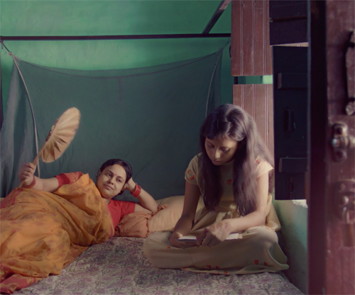
The Village House (2019, India)
Achal Mishra’s first feature is a slow, entrancing, nostalgic love letter to his parents’ sprawling villa. The film is broken into three parts, set in 1998, 2010, and 2019. There is no real storyline, apart from the inevitable dissolution of the large extended family that inhabits the house in the first part. There is little dramatic conflict, either. Instead Mishra films everyday activities: men playing card games and teasing each other, women perpetually cooking or caring for a new baby, boys lured away from a game of hide-and-seek to go pick mangoes. It’s the sort of ideal of capturing the quiet poetry of life that the Neorealists never quite achieved.
Mishra admits to being strongly influenced by Ozu and Hou Hsiao-hsien (in his podcast discussion with programmer Jim Healy), and it shows, though there is never overt imitation. The camera never moves, and there are nearly as many shots of empty locales as those with people present. Idle conversations are lingered over in long takes.
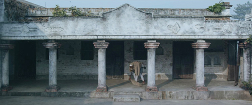
Mishra also mentions Wes Anderson, and there certainly are quite a few planimetric shots in the film (above). The three time periods are also set off from each other by different aspect ratios: nearly square for 1998 (also above), widescreen for 2010 (second frame below), and full anamorphic widescreen for 2019. The purpose of these contrasting framings are quite different from Anderson’s in The Grand Budapest Hotel, where the the shots imitate the film ratios of the historic periods that the story moves among.
The narrow rectangle of the 1998 scenes suggests the crowded bustle of the house. From side to side it’s full of food (yet again above) and people in many shots.
We don’t get much of a sense of the geography of the house, just that it’s full of rooms where ordinary things are going on. We also probably have some trouble figuring out who all the characters are (especially since the jumps forward in time have different people playing them). Still, there’s always something to look at and listen to.
By 2010, the house is aging and the village offers fewer opportunities. One of the sons can’t find a job and wants to sell a plot of land to get money to start a pharmacy. Perhaps the biggest drama in the film comes when an older man tries to talk him out of it. The mundane is still present, though, as one brief scene consists of one character telling another, “The toilet door needs repair, and the kitchen door is jammed.” This casual-sounded remark turns out to be a hint of things to come.
The village still offers traditional festivals, but the sense of community has become less idyllic.

Slowly, however, the family members leave, culminating in the wordless departure of the old grandmother at the end of the 2010 scene.
The final third opens into full widescreen, with more extensive views of the house, empty or nearly so. These don’t give us a much better sense of its geography, but definitely a sense of its desertion by all by an elderly caretaker and some intrusive goats.
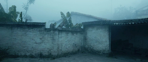
The renovation of the house starts at this point, though we are not shown what it eventually came to look like.
The Village House is available to stream anywhere in the USA until the end of the festival.
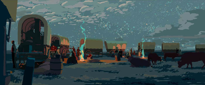
Calamity: A Childhood of Martha Jane Cannary (2020, France)
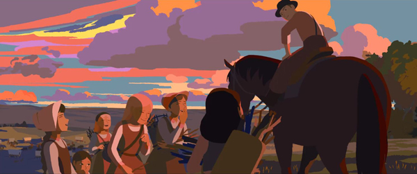
Rémi Chayé’s film won the Cristal for a Feature Film (top feature) at the Annecy International Animation Film Festival for 2020, and it’s easy to see why. Done with hand-drawn images, it has a look all its own. The unblended areas of color create a simple but beautiful set of images (top and above).
The story is aimed primarily at children. It tells an imagined tale of the childhood of Calamity Jane (about which very little biographical information survives), who gains skills and self-confidence when her widowed father is injured during a wagon-train journey west. It’s a woke story for the modern age, as young Marsha endures bullying from the guide’s son and ridicule over her tomboyish clothes and behavior.
Some of her achievements are bit over-the-top, but there’s a tall-tale aspect to the narrative–as is emphasized by scenes in which characters boast of their own acts of bravery around the campfire. It’s entertaining enough, but adults will probably be more impressed by the visuals.
The film is in French with subtitles. I would say that any child not old enough to read subtitles would probably be scared by some of the bullying, violence, and near disasters that occur, though older kids could probably handle them pretty well, given that all ends happily.
Calamity is also available nationwide for the duration of the festival.
Fear (2020, Bulgaria)
I went into Ivaylo Hristov’s Fear knowing little about it except that it deals with a middle-aged Bulgarian widow who captures a lone African refugee. At first she is afraid and suspicious of him but gradually, of course, comes to feel sympathy and even friendship for him. Something of a cliché in this day and age, I thought.
It turned out to be far more complex than a warmhearted tale of a bigot changing her ways. For a start, it’s a throwback to the more cynical of the black comedies of the Czech New Wave, with a similar kind of humor directed against the local authorities, primarily the border patrol and the mayor. They are required by law to feed and house refugees coming across the border before sending them onto the next facility. Most people crossing the Bulgarian border are on their way to Germany. Bamba, whose family have been killed in an unnamed African country, is going there, as are a small, hapless group of Afghans rounded up by the border patrol.
That patrol is mocked, as in the absurd line-up by height in the image at the bottom. They are completely unprepared to accommodate the Afghans, herding them first into the closed local school and later into the open-sided apartments in an abandoned construction site. These are not, however, the bumbling but largely harmless officers of The Firemen’s Ball. Underneath the gags, they are racist, ignorant bullies, roughing up the completely passive Afghans during the round-up. A chillingly funny interview of the officer in charge by a local TV reporter goes on in the foreground, with her repeatedly asking if the Afghans are armed and violent. When he replies that he’s never caught one with weapons or met any resistance, she begs for an anecdote of a time when the patrol was threatened. Again he says there wasn’t one, and she turns to the camera, triumphantly announcing that her audience has witnessed the dangers of letting refugees across the border.
The main story starts quietly by characterizing our heroine, Svetlana, as fearful. She has just lost her teaching job, and we learn that she goes regularly to the cemetery to talk with her dead husband. She lives alone in the country and sleeps with a hunting knife under her pillow. Jobless and not having received her last pay, she goes hunting and runs across Bamba on a forest path. Terrified, she marches him at gunpoint to the border-patrol office, which is deserted because of the mission to capture the Afghans. She tries the Mayor (above), but is told to deal with him herself.
On the first night she ties him up in the yard but eventually allows him to sleep in a locked room on an air mattress. Gradually she becomes more hospitable, to the point where the villagers begin to gossip about her, doing the things that people shocked by interracial couples do–killing Svetlana’s dog and tossing rocks through the window.
In between such episodes Svetlana and Bamba talk to each other, he in perfect British-accented English and she in Bulgarian. We learn a lot about both, but they learn little about each other and can only convey ideas like “I want to wash your clothes” with hand gestures. Nevertheless gradually trust and even warmth are established.
One could argue that Bamba is a bit too close to being a Magic Negro. Not only does he speak perfect English, but he’s a medical doctor. He’s patient and polite and does his share of the chores around the house once Svetlana lets him in. Still, it’s hard to imagine a plausible plot in which a less respectable-looking, working-class black man could win her over in the same way. Plus he is an engaging character, and he makes the dour Svetlana turn into one, so we are unlikely to complain.
The film is shot in impressive black-and-white anamorphic widescreen. There is one spectacular shot that’s quite breathtaking. It’s a drone image, starting on a simple sea view, moving backward through an open-sided room in the building under construction, and continuing on and on to reveal an immense, rambling, unfinished complex.


Did some entrepreneur envision turning the town into a seaside resort and lose funding partway through? We never know, but it provides an odd contrast with the poverty of many of the residents of a seemingly failing town. The only connection to the plot is that the Afghans spend a miserable time trying to live there until the border patrol gives up and trucks them further into the country in search of a place that can deal with them.
Fear turned out to be one of my favorite films of the festival, alongside Sun Children. It’s available for streaming only in Wisconsin through tomorrow.
The Festival’s Film Guide page links you to free trailers, podcasts, and Q&A sessions for many of the films.
Thanks as ever to the untiring efforts of Kelley Conway, Ben Reiser, Jim Healy, Mike King, Pauline Lampert, and all their many colleagues, plus the University and the donors and sponsors that make this event possible.

Fear (2020)
German classics for the pandemic and beyond
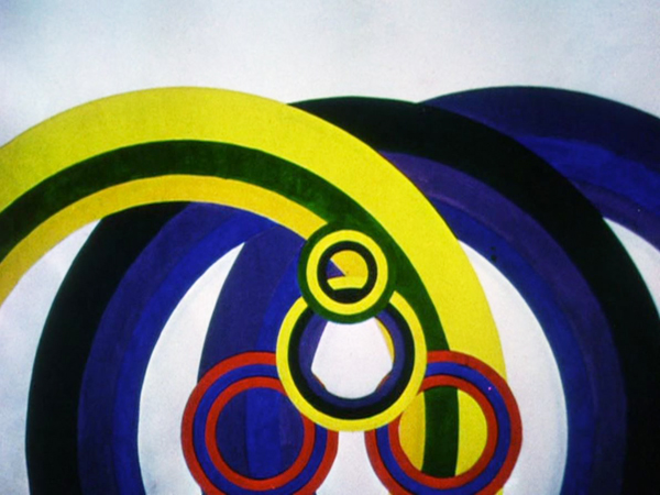
Kreise (Circles, 1934).
Kristin here:
Recently I acquired discs of the work of two important German directors of the silent and early sound periods. The first is a new Blu-ray/DVD edition of Paul Leni’s Waxworks from Flicker Alley. The second is a pair of DVD releases of Oskar Fischinger shorts, which I recently ordered from The Center for Visual Music, co-founded by Fischinger’s daughter Barbara. All are vital for anyone interested in these two major figures in German film history.
Telling scary stories
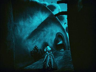
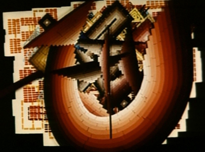
As with so many cinema classics, I first saw Paul Leni’s Wachsfigurenkabinett (Waxworks) during my grad-school years. The print was 16mm and very dark. It was hard to get any real sense of its pictorial design. I had seen Das Cabinet des Dr. Caligari in my first film course and had been hugely intrigued by how different it was from the movies I was used to. It was one of the films that lured me into cinema studies. Since then I have been partial to German silents of the 1920s and especially those of the Expressionist movement. Waxworks was made in 1924, which also saw such high points of the decade as Fritz Lang’s Die Nibelungen, F. W. Murnau’s The Last Laugh, and Carl Dreyer’s second German-made film, Michael. Still, the poor print did not give much sense of how it fit into the creative trends of the mid-1920s. Later I saw it in a 35mm archival print on a flat-bed viewer. That print was also too dark to allow a judgment of its aesthetic and historic importance.
At last, however, a restoration by the Deutsche Kinemathek and the Cineteca di Bologna (released on combination Blu-ray and DVD by Flicker Alley in the USA, from the British Eureka! print) has revealed the set design and impressively bold lighting that suggest why it is considered one of the classics of the Expressionist movement.
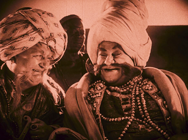
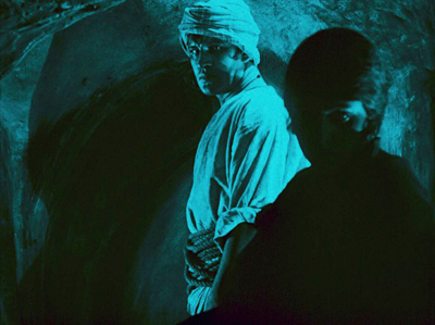
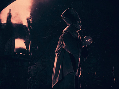
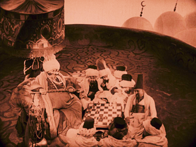
While Expressionist stage plays had tended to use stylized settings and acting to create frantic denunciations of contemporary politics and society, German Expressionist films usually remained within popular genres. Horror, fantasy, and science fiction could justify the distortions of the sets as ways of creating strange, often menacing worlds. Waxworks fits right into the horror genre. Set in a carnival sideshow booth, the frame story sets up the premise of the proprietor hiring a young man to write publicity tales about three wax figures of monstrous figures from history and legend: Caliph Haroun-al-Raschid, Ivan the Terrible, and Jack the Ripper. We see the three tales played out as the hero writes them.
The villains are played by Emil Jannings (see bottom), Conrad Veidt, and Werner Krauss, three top male stars of the era. They do not, however, appear together, since their stories are self-contained vignettes. The narrative returns between the imbedded stories to the table where the young man writes and a romance quickly blooms between him and the sideshow owner’s daughter. The two actors playing them, Wilhelm Dieterle (later to have a career as a director in Hollywood as William Dieterle) and Olga Belajeff, appear as the central victimized couple in each inner tale.
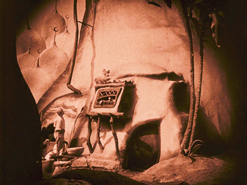
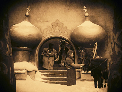
A different style is used for each of these three tales. The first story (in this print, at least) tells of Haroun trying to seduce the beautiful wife of a Baghdad baker. The settings are of the melting-clay variety familiar from Der Golem and Kriemhild’s Revenge. The image at the top of this section shows the baker’s home, with its sagging doorway and artificial trees. The image below displays a typical technique of designing sets to echo the shapes of the actors, as the doorway in the rear imitates Haroun’s blobby outline in the foreground.
The Ivan the Terrible episode comes next, maintaining the blobby look, but with more solid-looking, often symmetrical sets. Here Ivan emerges from his palace.
The brief third episode has suspenseful visions of Jack the Ripper pursuing the couple in nightmare fashion, with multiple superimpositions of the implacable killer.
Apart from these techniques, the improved visual quality of the film reveals a dark style of lighting that helps explain where the influences on Hollywood film noir came from. The opening of the frame story takes place at night, and a chiaroscuro look is established with a sophisticated use of Hollywood’s three-point lighting, which had only reached Germany a few years earlier.
There are some other daring uses of foreground silhouettes, as when the jealous baker watches his wife move away into darkness (left) or Ivan’s poison-maker realizes that he has been doomed to die (right).
These are only a few of the many frame-grabs I made while watching this visually dramatic print. I could post many more, but I’ll end with this interesting comparison that I noticed. On the left, a shot from the Haroun episode as he plays chess with courtiers, and on the right, an interior of the house where the Woman from the City is lodging in Murnau’s Sunrise (1927).
The Waxworks we see today is not the original German version. The original negative was lost in a Paris customs-house fire in 1925. The most complete surviving version was the one released in the UK in 1926. Where it was deteriorated, footage from other surviving release prints was substituted. This English version was about 25 minutes shorter than the German one, with the footage removed mainly from the frame story and from the exposition about the wedding of the young couple in the Ivan episode. The premiere of the film in Berlin had the stories in a different order: Ivan, then Jack, than Haroun. Possibly this aimed at a more cheerful ending for the film, but the order was changed shortly thereafter, presumably to that of the British and other release versions.
The severe hyperinflation in Germany in the mid-1920s led to financial problems, and these curtailed the shooting of the film. One intended episode about Rinaldo Rinaldini, a fictional “Robber Captain,” was never shot, though the wax figure of Rinaldini is clearly visible in the sideshow lineup of miscreants. The Jack the Ripper story was never shot in full, though the shapeless nightmare sequence was shot without benefit of script. It ends up as a short but frightening climax to the film. As a result of all this, the Haroun episode is fairly lengthy, the Ivan one less so, and the Jack the Ripper one brief but memorable. Essentially what we have is a restoration of the British version.
The restored version uses the intertitles from the British print, as the German ones have not survived, and the tinting and toning are also based on the British print. The accompanying booklet has an essay on the history of the film and its versions by Richard Combs, a sketch of Leni’s career by Philip Kemp, and a description of the restoration by Julia Wallmüller. Adrian Martin contributes the insightful commentary. One charming extra is a short, Rebus-Film Nr. 1 (1926), part of a series of eight brief crossword-puzzles that audiences could play along with in the program of short subjects before the feature. These included animations and experimental montage-style superimpositions done by the brilliant German cinematographer Guido Seeber. I got all the answers right. Could you? (Actually, they’re very easy, as they would have to be in a theatrical situation.) The Blu-ray is regions A, B, and C. For more technical and historical background on the film, see Jan Christopher-Horak’s review of the Flicker Alley release. (It’s entry number 260; you’ll need to scroll down to find it.)
Leni continued on in the horror mode late in his career in Hollywood, making The Cat and the Canary (1927), The Man Who Laughs (1928), and The Last Warning (1928), all at Universal. These, along with the various films of Lon Chaney, notably The Hunchback of Notre Dame (1922) and The Phantom of the Opera (1925), built the foundation for Universal’s famous horror films of the 1930s.
The Visual Music of Oskar Fischinger
In my recent year-end entry “The Ten Best Films of … 1930,” I included Oskar Fischinger’s series of “Studies” from that year: short films of white shapes (drawn in charcoal on white paper and shown in negative) zipping around the screen in time to musical pieces. These run from Study No. 2 to Study No. 7, though others numbered up to 12 were made in 1931-32. Study No. 4 is apparently lost, and No. 1 is listed on the Fischinger Archive website (linked below) as having been accompanied by live organ music and never released on home video, while the subsequent ones were done with recorded music.
In that entry I linked to the Center for Visual Music as the sole source of two DVDs collecting Fischinger’s work. (I have discovered one other source. See the end of this entry.) At the time I had ordered them, and they subsequently have arrived. It was a great pleasure to sit down and watch both straight through. The films are delightful and lift the spirits. My viewing was on Inauguration Day, when my spirits were already quite lifted, and Fischinger’s An American March (1941), set to Sousa’s “The Stars and Stripes Forever” (above), was especially cheering on a day when our country got rid of a fake president and welcomed a real one.
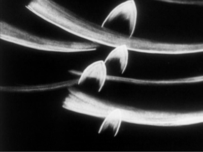
Although Fischinger used both popular and classical pieces, he retained a similar, recognizable style for both. The black-and-white films were relatively simple, as in Study No. 6.
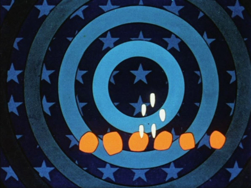
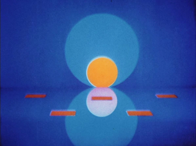
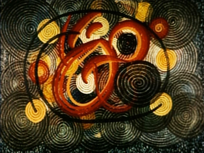
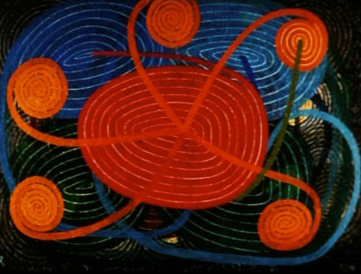
Like his contemporary, New Zealand animator Len Lye, Fischinger adopted color early and used the soft but extraordinarily vibrant Gaspar Color system. Most of his films of the 1930s employed it, as in Circles (at top) and Composition in Blue (1935).
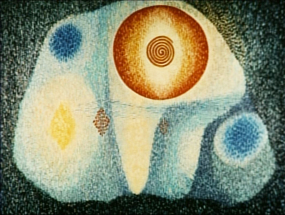
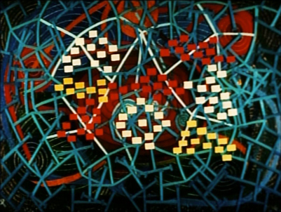
His masterpiece, at least in my opinion, is his last significant film, Motion Painting No. 1. It is his longest film at eleven minutes and is set to Bach’s Brandenburg Concerto No. 3. It also departs from his usual modes of animation. Rather than substituting a new drawing or moving abstract shapes in space slightly between exposures, he added a brushstroke per frame, creating a continuously moving line that gradually created a series of compositions that changed the image completely as the line proceeded relentlessly and obliterated what went before. Thus across the film there is no pause in the line’s movement as it paints over its earlier progression. Here are some of the stages of its mutations. (Spoiler alert!)
While these two discs contain nearly all of Fischinger’s important films, a conspicuous absence is An Optical Poem, which is an abstract animation of the usual sort made by Fischinger but for a major studio. MGM produced it as one of the seven-minute cartoons that were shown among the shorts in movie-theater programs for decades. Set to Liszt’s “Hungarian Rhapsody Number 2,” it’s typical Fischinger, with lively colored discs and other shapes darting around. The main difference is that here he was working in Technicolor. As smaller discs pass behind larger ones, a distinct sense of depth is often achieved.
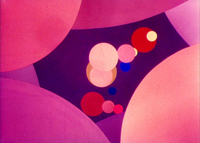
The reason for An Optical Poem‘s absence from the CVM discs is presumably because it is the only Fischinger film not controlled by the Estate. Fortunately the gap has been filled by its inclusion in Flicker Alley’s set, “Masterworks of American Avant-garde Experimental Film 1920-1970,” which I reviewed when it was released in 2015. Flicker Alley obtained permission from Warner Bros. and Turner Entertainment, which now control MGM’s library. This allowed them to include the original MGM logo and title, plus an introductory opening text that tries to prepare the audience for what’s to come. (These are missing from the prints posted online.)
Between the two CVM discs and the Flicker Alley set, we now have good copies of all but some minor, often unfinished works by Fischinger. The CVM discs do not contain much in the way of supplements, but one can get much more information from William Moritz’s Optical Poetry: The Life and Work of Oskar Fischinger (2004). More information, including a bibliography of books and articles on the filmmaker, can be found on the website of CVM’s Fischinger Archive. Fischinger died in 1967, and several years later his wife Elfriede sent a collection of his equipment and the material used in his animated films to the Deutsches Filminstitut in Frankfurt. This collection included the plexiglass sheets upon which Motion Painting No. 1 was created.
Thanks to Lee Tsiantis for a correction to the Oskar Fischinger section!
January 27, 2021. Thanks to Cindy Keefer of the Center for Visual Music for providing some additional information on the availability of Fischinger’s films. A number of art museums and specialty bookshops have sold the CVM DVDs in the past. The only place that is still doing so, as far as I can tell, is Walther Koenig‘s fine bookshop in Berlin. The CVM also has some excerpts and complete films on their Vimeo channel.