William Cameron Menzies: One Forceful, Impressive Idea
David Bordwell
March 2010
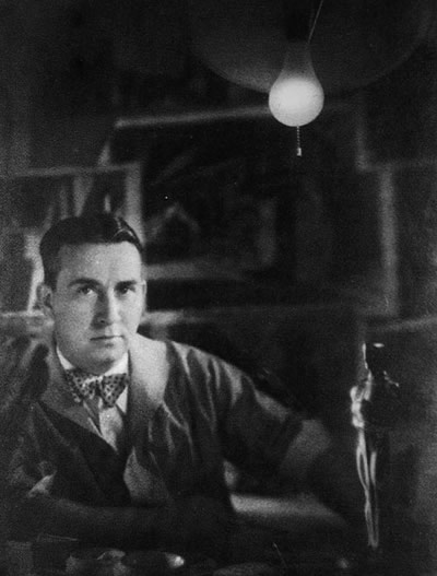
William Cameron Menzies (photo by Karl Struss)
William Cameron Menzies was a wunderkind. He started working on films in 1919
when he was twenty-three; ten years later he won an Academy Award. By the time
he died in 1956, he had participated in over seventy films. Why has nobody written
a book about him?
Don’t look at me. After several years sporadically tracking his career,
I’m aware that this is a mammoth task. Here I want just to float some ideas
about a filmmaker as distinctive, and sometimes as delirious, as Busby Berkeley.
Like Berkeley, Menzies shows that a strong imagination can yank the screen away
from weak directors. Like Berkeley, he shows that the studio system gave considerable
leeway to flamboyant, even peculiar imagery, as long as it could be somehow motivated
by story and genre. Just as important, he shows how exceeding the limits of that
sort of motivation can seem daring, or maybe just cockeyed.
Pictorial beauty and early talkies
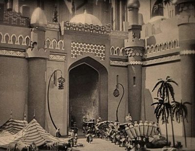
Menzies is today remembered chiefly as Gone with the Wind’s production
designer, a term and role that originated on that production. He had already
earned acclaim as art director for Fairbanks’ Thief of Bagdad (1924,
below), Barrymore’s Beloved Rogue (1927), and The Dove (1927)
and The Tempest (1928), which jointly won him his first Oscar. His prestigious
projects included Rosita (1923), Foreign Correspondent (1940),
Korda’s Thief of Bagdad (1940), Meet John Doe (1941), For
Whom the Bell Tolls (1943), Spellbound (1945), and Arch of
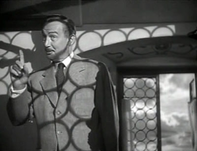
Triumph (1948). He took up directing as well, signing Things to Come (1936),
the more cult-friendly Invaders from Mars (1953), several shorts and
B-pictures, and portions of films signed by others, notably Gone with the Wind.
At the start Menzies made his name with monumental sets, often stylized in what
he called “romantic” fashion. These sets were well-suited to costume
pictures and period fantasies. 1 1
After these triumphs, he felt confident enough to declare that the art director
was not merely the person who designed the sets. A stage designer could concentrate
on setting and leave the moment-by-moment unfolding of the action to the director.
But cinema was a pictorial art, built out of motion within the frame and a rapid
succession of shots. So composition took on a special importance. Each shot had
to have “one forceful, impressive idea.”2 The
art director should sketch the phases of the action, and indicate the camera’s
viewpoint, the lens used, and any trick effects. Once the set was built, the
final filming “reproduces the composition line for line.”3
Sound movies had lost the pictorial splendor of the great
silent era, but Menzies thought that could be recovered if someone coordinated
the overall look of the film, including lighting (traditionally the province
of the cinematographer) and figure movement (a task for the director). In 1929–1930,
Menzies began to campaign for this new production role by giving lectures, signing
articles, and publishing his drawings of film shots. Unlike most set designs,
which show empty settings or people in undramatic poses, Menzies’ drawings
look more like what we now call storyboards.
Magazines were happy to publish these dynamic images, and sympathetic journalists
took up Menzies’cause. A New York Times article from 1930 notes
that he makes sketches that follow the script “as closely as possible.
These drawings not only will show the backgrounds for the action but also suggest
the action itself, so that the eye for composition that an artist has will not
be wasted on mere back-drops.”4 Two
visitors to Hollywood praised his dynamic images and spared a sneer for those
who didn’t understand them.
We must regret that often in the production of the films with which he
has been associated the supposed needs of the story have prevented him from exercising
his full artistic powers in the direction of more vivid picture-making. The number
of directors who know the value of true pictorial art in the movies is yet limited.5
Menzies’ work convinced these writers that the set designer could become
the master planner, “the illustrator of the film.”6 Significantly,
Menzies began his working life as an illustrator of children’s books.
To show the power of his new conception of pictorial design,
Menzies gravitated toward certain types of imagery. Neither his writings nor
his drawings addressed the demands of dialogue scenes, which in early talkies
were necessarily blandly, even awkwardly composed. Filmmakers relied on shooting
with multiple cameras, a tactic that worked against that single bold design that
Menzies thought every shot ought to have. Instead, his imagination sparked to
atmospheric shots and action scenes.
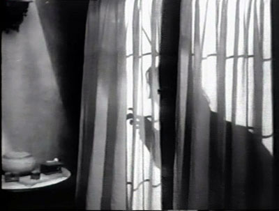
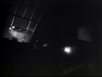
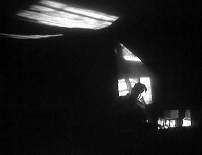
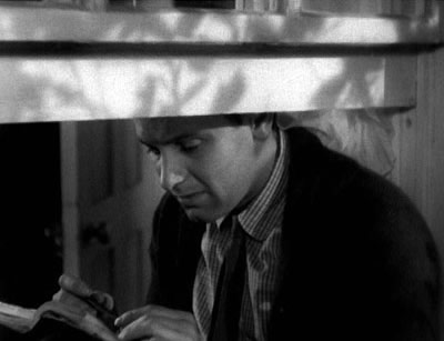
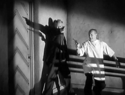
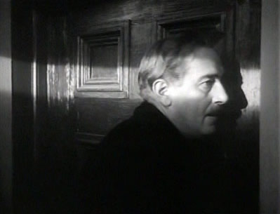
In The Bat (1926) he had already experimented with frames slashed by
diagonals and wrapped in shadows.
In this frame, it’s not the prowling Bat but his shadow that opens the
door.
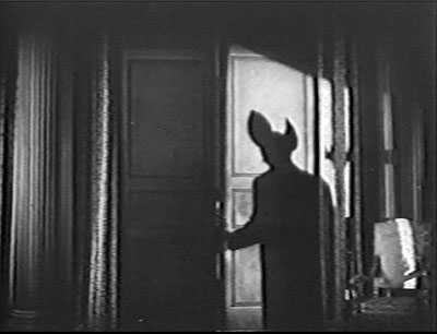
We shouldn’t be surprised that such images recall German Expressionism.
Menzies acknowledged his admiration for Caligari and The Golem,
and he claimed to have held Murnau in special regard. He was also probably influenced
by his mentor Anton Grot, a set designer who specialized in chiaroscuro and laid
out sets by calculating what lens would be used.7
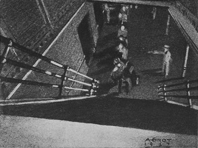
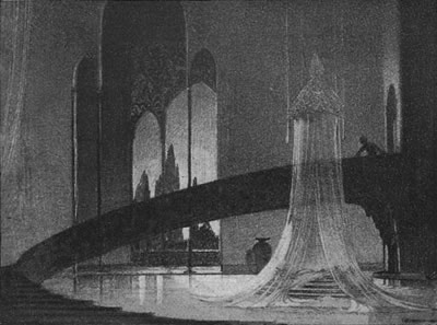
Anton Grot sketch for A Ship Comes In (1928).
By 1929, Menzies had decided that the cinematic illustrator could show his
stuff in passages of violence and “melodramatic action.” Such scenes
achieved greater emotional vibrancy with bold lines, stark tonal contrasts, silhouettes,
extremely high or low camera positions, and—a Menzies favorite—forced
perspective. (From his first film with Grot, The Naulakha, 1918, he
learned that drastic foreshortening could make sets seem bigger.) He also advocated
using wide-angle lenses and building ceilings on sets to permit low angles.8
To exploit such heightened visual expression, Menzies turned to the crime film.
Three films from early sound years show this side of his talent. The least distinctive
is Raffles (1930), an amiable crook melodrama. The bulk of it doesn’t
live up to its flashy opening, in which the gentleman thief breaks into a jewelry
store safe.
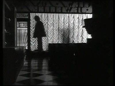
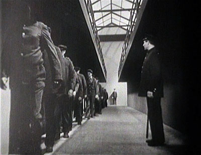
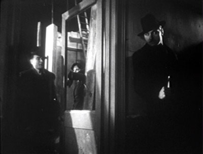
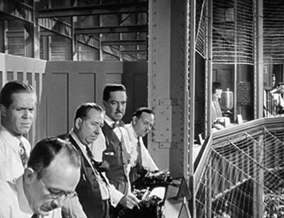
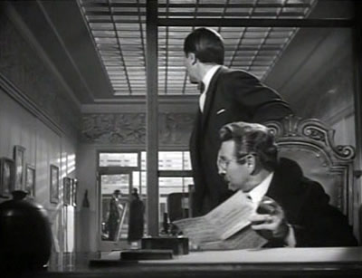
Alibi (1929), directed by Roland West, has some passages of inert
dialogue, but it is pretty adroit visually, with police-investigation transitions
that look forward to M and some surprisingly flexible editing for an
early talkie. There’s an occasional proto-depth shot.
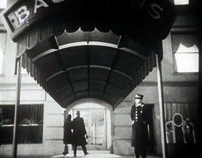
Menzies’ love of monumental central perspectives is announced in the
opening sequences of convicts in prison and of Bachmann’s night club.
Menzies claimed much later that Bulldog Drummond (1929) was
the first film in which he prepared “a complete layout of every camera
setup.”9 The
dream of total preparation on paper was to become a leitmotif across his career,
but even at this point it fell far short of achievement. Bulldog Drummond has
many bland multicamera stretches, and nearly all its striking continuity sketches
are not fulfilled in the final product. Still, many images in these films have
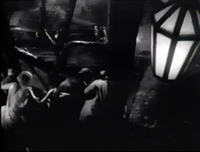
a graphic vividness rare in early talkies. The asylum in Bulldog Drummond is
more or less out of Expressionism, and claw-handed silhouettes evoke Nosferatu.
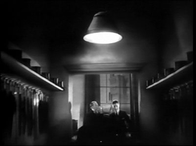
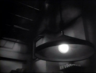
Again we find grandiose central perspectives, off-kilter angles, and objects,
particularly lamps and lanterns, dominating the foreground.
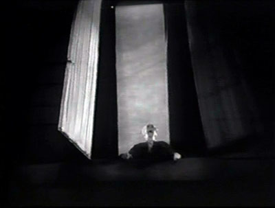
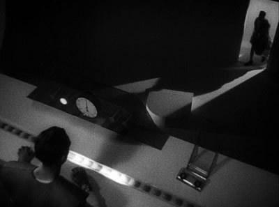
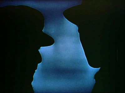
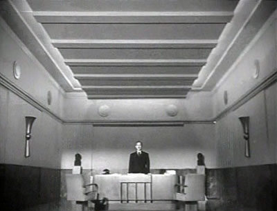
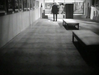
Menzies’ love of the vertical dimension of the shot
leads him to split the frame into halves, the top dominated by empty space, the
bottom harboring an abnormally low point of interest.
Such shots subordinate the characters to the overall play of masses and edges,
fulfilling Menzies’ idea that the art director can “create his design
with a broad arrangement of lines and values, and then apply to these lines and
values the realism of architecture, figures, and properties.”10 It’s
a brutally Modernist approach: Chisel out the composition as a pure play of graphic
energies, and then fit your setting, props, and players into it.
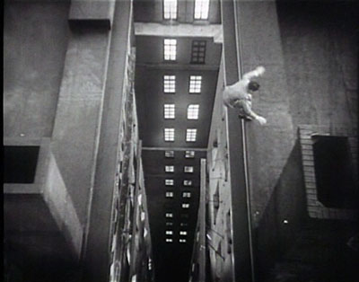
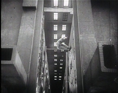
Even in action scenes, the human figures are dominated by the larger design.
They move through vast spaces, often overwhelmed by stabbing verticals and plunging
perspectives. One shot in Alibi turns a cityscape into nightmarish outcroppings,
and there is a chilling moment when a fleeing crook leaps across rooftops and
then falls backward into an apparently bottomless canyon between buildings.
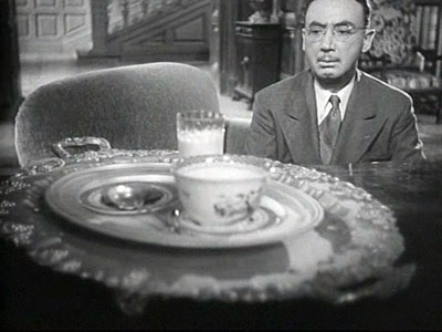
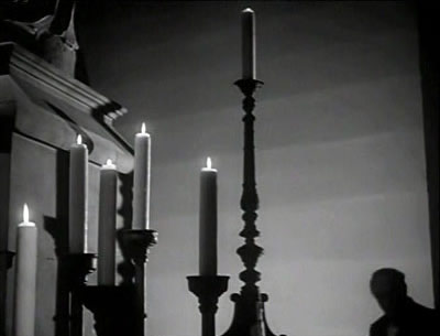
Drummond peers into the laboratory of the asylum, and we get a shot with an
outsize hanging lamp in the foreground; when he fires his pistol and extinguishes
the light, his silhouette in the background pops into view.
Eyes of an astigmatic worm
The 1929–1930 crook movies look as if Menzies had struck a bargain with his directors:
You handle the dialogue scenes and give me the atmospheric establishing shots,
the connective tissue, and the chases. The ultimate example of the one-off effect
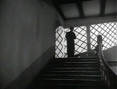
is probably The Green Cockatoo, filmed in Britain in 1937 but not released
until 1940. Menzies was brought on to direct it, but it was taken from his hands
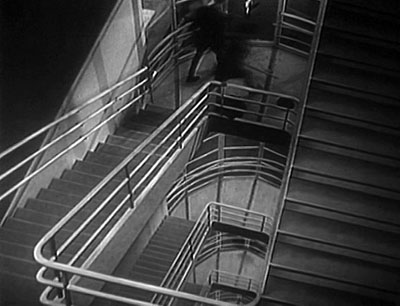
and redone by William K. Howard and Thornton Freeland, both uncredited. Only
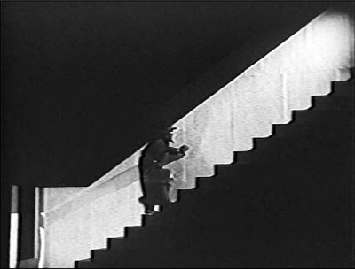
one sequence, a noirish cat-and-mouse game on a staircase, has visual flair, but it doesn’t go beyond
what we sometimes find in American crime films of the era.
More thoroughgoing was Menzies’ contribution to two
fantasies. For Alice
in Wonderland (1933) he collaborated on the script and concentrated on creating
ingenious special effects, none of which display the compositional dynamism of
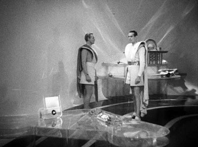
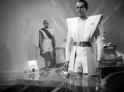
the 1929–1930 films. Things to Come (1936) was something else
again. Menzies was given the post of director, but he worked under two powerful
overseers, producer Zoltan Korda and writer H. G. Wells, who had negotiated a
degree of control over the project unprecedented for an author. The film has
become a classic for its vision of a world ravaged by war and healed by science
and rational planning. Along with the set designer Vincent Korda, Menzies gave
the city of the future an even more towering vertical thrust than we find in Metropolis.
The fantastic premise of Things to Come gave Menzies freedom to indulge
his love of unusual angles. Art director Lyle Wheeler told him he was “no
damn good” as a director because all he cared about were steep compositions. “He
wanted to photograph ceilings and didn’t give a damn what the actors were
saying.”11
Menzies liked low angles because they made for cleaner design. Straight-on
angles swathed the players in distracting décor, but a face seen against
sky or ceiling stood out vividly. In interiors, ceiling corners and the edges
of walls contributed V-shaped vectors. High angles could yield sharp diagonals
just as easily.
The important thing was to avoid the neutral presentation, to charge every
moment with the sort of visual energy seen in Art Nouveau or Art Deco or the
Modern Style. With the aim of dynamizing every image, Things to Come imbues static dialogue scenes with a mild version of the interplay between figures and
setting that we find Eisenstein’s Alexander Nevsky and Ivan
the Terrible. An underground cell is dominated by a huge pipe that pokes
into every shot. Another interior displays vectors on rooftop and floor.
The motif is sustained later when Oswald Cabal comes forward and his head
remains pinched within the wedge formed at the back of the set. Menzies was starting
to conceive the scene as not simply a string of striking images but as a decorative
accompaniment to the dramatic development.
These efforts seem a bit forced, I think, because Menzies simply lacks Eisenstein’s
resourcefulness in finding graphic motifs to fill his frames. Things to Come’s
strongest effects, it seems to me, appear in the frightening opening that juxtaposes
announcements of impending war with imagery of Christmas shopping. The anxiously
pitched shots, accompanied by harsh musical cuts in Arthur Bliss’s score,
evoke a society dancing toward catastrophe.
It’s fitting that when the bombardment starts, the first building blown
to bits is the gargantuan Modern Style cinema.
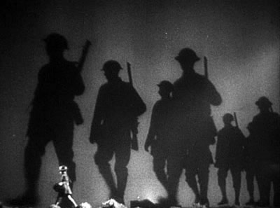
The sequences that Menzies is said to have directed of Gone with the Wind betray
his signature techniques: silhouettes, diagonal masses, low-slung camera positions,
central perspectives alternating with skewed ones, and brooding Gothic effects.
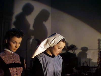
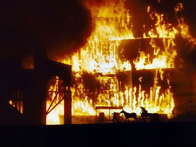
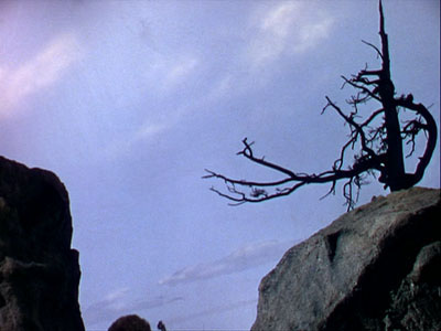
His fondness for a very low horizon line, perhaps inspired by Soviet filmmakers,
can be seen in the “burning of Atlanta” sequence, yielding probably
the most astonishing shot in the film.
It seems to rework a more stylized image scheme we find in a montage sequence
in Things to Come.
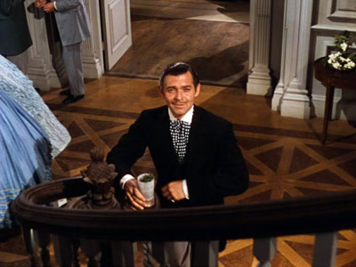
Once you’re exposed to the Menzies Touch, it’s hard not to see
even an apparently simple shot, like that of Rhett Butler at the foot of the
stairs, as a geometrical display. Squint, and it’s easy to see the curving
banister culminating in his torso while the flooring and shadows behind him mark
out his head.
Beyond those sequences he actually directed, Menzies designed the overall
look of Gone with the Wind, including its changing color palette.12 But
did he dictate the film’s breakdown into shots as well? Selznick famously
advocated “pre-cutting” as a time- and money-saver, claiming in a
1937 memo, “I hope to have Gone with the Wind prepared almost
down to the last camera angle before we start shooting.”13
This would seem to be the ideal test of Menzies’ conception of the “film
illustrator.” Yet by January of 1939, once shooting had started, Selznick
had to admit that “A picture of this size in importance cannot be created
to the last inflection in advance of production; there must be a certain leeway
in production as we go along.”14 That
leeway was necessary partly because Selznick was constantly rewriting scenes,
sometimes the day before shooting. By May, to hurry the schedule along, he was
urging staff to “substitute simple angles that do not take time” for “elaborate
angles”—of course, a Menzies speciality.15 Alan
David Vertrees’ painstaking study of the scripts and the surviving continuity
sketches and storyboards confirms that the film often diverges from the “pre-cut” designs.16
Vertrees argues persuasively that Menzies’ role
was not only to secure a unifying look for the film but to serve as the producer’s
representative in discussions with the director, the cinematographer, and Technicolor
consultants. Menzies became in effect the hand and eye of Selznick’s conception
of the movie. He was, according to Selznick in another memo, “the final
word on these matters…responsible for the physical aspects of the production
and for the color values of the production and any difference [of opinion among
the creative staff] should be settled by him.”17
On the whole, Gone with the Wind displays a much
more subdued (some would say subtle) approach to design and framing than we find
in Menzies’ 1929–1930
crime films and in Things to Come. The other films on which he collaborated
at the time display his typical bargain: a few bursts of visual panache sandwiched
within more orthodox shooting and cutting. Mr. Lucky (1943), directed
by H. C. Potter, is a brisk and orthodox RKO item that occasionally spares a
moment for a flashy transition or a flamboyantly centralized composition, as
when the gambler Joe learns to knit. Most striking is a very early pair of shots
in which Joe, the owner of a gambling cruiser, strides down a row of slot machines
and finds one paying out. The reverse shot shows a maintenance man.
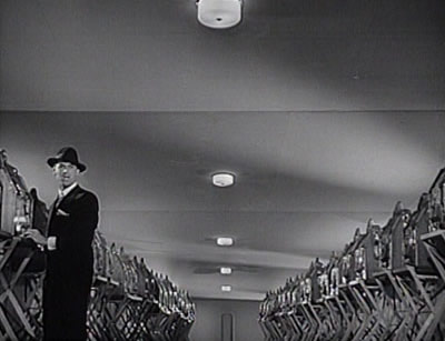
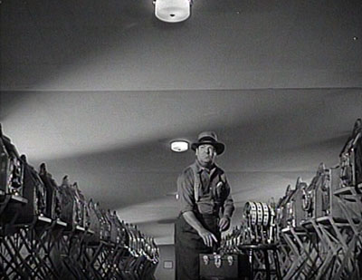
The shockingly low horizon lines and the perspective that seems to go on forever
return us to Menzies’ love of the monumental image created by forced perspective.
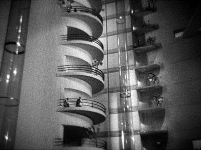
Chopping off the human figure and planting it at the very bottom edge of the
frame is somewhat better motivated in this exchange from Korda’s Thief
of Bagdad (1940), when the negative space at the top of the shot does duty
for the looming djinni.

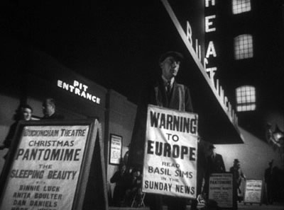
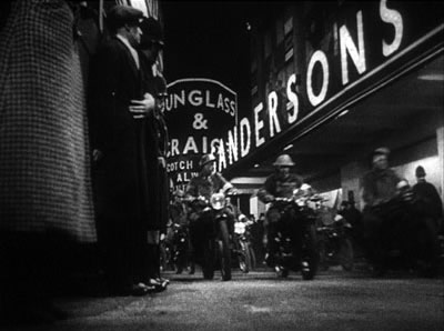
Menzies’ influence is more pervasive in John Cromwell’s So
Ends Our Night (1941). Centering on refugees from Nazi-occupied countries,
it took a political stand that was quite brave for early 1941. Yet for Menzies
this was a film of “melodramatic escape” and so justified “violation
of perspective.” In one daffy passage he explains:
If it heightened the drama
to shoot a tree from the viewpoint of an astigmatic worm sitting on a leaf of
that tree, or even from that of the tree looking at itself [!], we did in so
far as the new 28mm lens and our imagination would permit.18
The
result is another film that anticipates Kane through cramped compositions,
lowered ceilings, wide-angle lenses, and skewed vanishing points.
In the climax, a man’s leap from a building is shown as a faint shadow
flitting down windows from landing to landing.
The film’s tight facial close-ups pay off in a graceful tracking shot
in which a wife under surveillance by the authorities is followed, nearly cheek
to cheek, by her husband urging her to divorce him.19
Did Menzies somehow abduct these films from their named directors? Surely his
stature in the industry by 1940 gave him considerable clout. By now he was frankly
claiming control over a film’s look. The production designer, he told the New
York Times, has the task of “coordinating every phase of the production
not covered by dialogue and action of the players.”20 With
breathtaking casualness, he declared that the director’s job is to work
with actors while the production designer supervised the cinematographer, set
designer, costume designer, and other artisans. How much pressure he was able
to exert on each of these productions, I can’t say, but clearly he had
even more control over his work with Sam Wood.
Where to put the camera
Sam Wood was older than Menzies by several years, but he started directing at
about the same time as the young set designer began his career. From A City
Sparrow (1920) on, Wood became known as a reliable journeyman at Famous
Players-Lasky before shifting to MGM in the late 1920s. There he turned out comedies
and sports movies before taking charge of the Marx Brothers’ Night
at the Opera (1935) and A Day at the Races (1937). After directing Goodbye,
Mr. Chips (1939) in England, Wood left MGM in 1939 to go independent. He
made Raffles (1939) for Sidney Howard’s independent company and Kitty
Foyle (1940) for RKO.
Wood had seen Menzies’ prowess at full stretch on Gone with the Wind,
for which Wood shot several sequences. After Sol Lesser acquired Thornton Wilder’s
Pulitzer-Prize winning play Our Town, William Wyler was slated to direct
but had to drop out. Lesser turned to Wood, and the production design went to
Menzies. This began a three-year collaboration on five films that are among the
most visually striking, not to say narratively peculiar, in Hollywood cinema.
In Our Town (1940), The Devil and Miss Jones (1941), Kings
Row (1942), The Pride of the Yankees (1942/1943), and For Whom
the Bell Tolls (1943) Menzies’ pictorial imagination reigned. We have
testimony on one project from James Wong Howe:
Kings Row I loved doing. William Cameron Menzies designed the
sets and did the sketches for the shots; he’d tell you how high the camera
should be. He’d even specify the kind of lens he wanted for a particular
shot; the set was designed for one specific shot only, and if you varied your
angle by an inch you’d shoot over the top. . . . Menzies created the whole
look of the film; I simply followed his orders. Sam Wood just directed the actors;
he knew nothing about visuals.21
Menzies, according to a contemporary, put it more abruptly: “Sam Wood
never knew where to put the camera, so I told him.”22
But what did Menzies tell him, through his drawings? As we’d expect, silhouettes,
big settings, and bold perspectives—some maniacally centered and others
skewed, but all driving the eye toward a visual node.
But now Menzies seems to be playing
with solutions to a lingering problem: How to give dialogue sequences the visual
punch that he applied to transitions and scenes of physical action? How to give
conversations pictorial beauty? “He
could take the most ordinary thing in a picture,” noted art director Ted
Haworth, “and make it so cinematically fascinating.”23
One sign of this impulse is Menzies’ effort
to rethink the close-up. In the Wood collaborations of 1940–1943, the camera
is set rather close to the players. (This may have been one of Woods’ contributions
to the pair’s style.)
Formerly a director of big sets and hollow spaces, Menzies now builds vigorous
compositions around the human face.
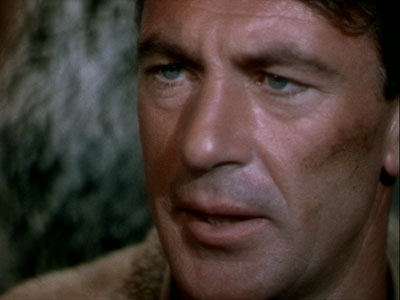
The films Menzies directed gave
such shots a special thrust by cutting abruptly from a long shot to a rather
big close-up without the way station of a midsize shot. A cameraman once said
to him: “Let’s pull back to
a long shot now and show the chin and hair.”24
Sometimes the faces are vastly enlarged. Haworth again: “Bill Menzies’ philosophy
was that if you were going to show a close-up, make it closer than any close-up
has ever been.”25
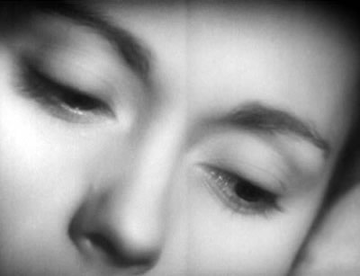
Even when the faces are not preternaturally
large, to a greater degree than in Things
to Come or Gone with the Wind they are caught within the same
V’s of setting and lighting that were formerly reserved for long shots.
Most conservatively, that means letting corners or radiating shadows in the background
give prominence to a player.
But sometimes that means having diagonals slash not across a landscape but
across a face.
Instead of canting the camera, Menzies lets lighting and wall edges create
quasi-abstract diagonals.
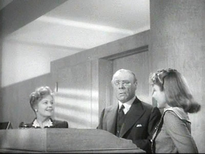
Another way to dynamize dialogue is through depth. That can be accomplished through
the sort of big foreground and distant background that Welles and Toland made
famous.
More often, Menzies prefers to use the wide-angle lens to jam several faces
in the frame rather close to one another.
Aggressive depth would of course become a common compositional
strategy for other directors in the 1940s, but Menzies was playing with unusual
forms of it fairly early. The Wood collaborations recast shot/reverse shot in
somewhat eccentric ways.
Perhaps most startling is his habit of pushing faces to the very bottom of
the shots, in the way he would handle bodies in long shots in the crime films.
Perhaps one shot in Our
Town sums up the emerging Wood-Menzies look. A pattern
of light and architecture creates a wedge in which a face and a shadow stand
out starkly, while the low angle and the calculatedly unbalanced framing let
the traditional center of interest—Emily, who may be dying—at the
very bottom edge.
In all these tactics, the frame edges play unusually strong roles, cropping
visual elements and chopping up the scene’s space. Menzies had little use
for camera movement, so his shots, the result of his hundreds of sketches in
the script margins, come to resemble panels in comic strips.
Our Town takes a drama usually performed on a
bare set and steeps it in Gothic chiaroscuro. It’s a useful reminder that
this play, so often taken as a hallmark of middlebrow affirmation, is actually
shot through with foreboding; early on, the stage manager tells us that a character
we’ve
just met will die some years later. If Copland’s score brings out the poignancy
and yearning in the story, the imagery is far grimmer.
Perhaps Menzies and Wood decided that if the movie version of the play had to
have props and settings, those should be stylized somehow. So everything looms.
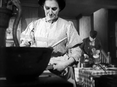
A pump broods over a kitchen counter, and chickens look monstrous when seen
from below. The monumental fantasy sets of Menzies’ youth have become a gigantism of the homespun.
The dominant strategy for the dialogue scenes is tightly framed depth, with faces
pressed close to one another.
Call this “compressed deep space”: The frame is packed with elements
arrayed in marked depth, but the distances between planes are not great.
Broader shots exhibit the same jamming of the frame. The two primary households
in the town are cramped, and the crosscutting between them not only sets up narrative
parallels but invites us to see them as extensions of the same low-lying architecture.
In these interiors the figures scarcely have room to move; even Emily as a ghost
has to slip in between her mother and her earlier self.
True “deep-focus” imagery is reserved for the graveyard hallucination,
with mother and dead daughter in the same frame. Anticipating the special effects
in Citizen Kane, this shot was accomplished with a split screen.
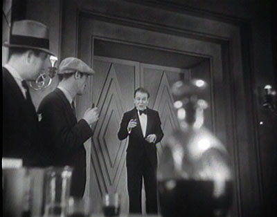
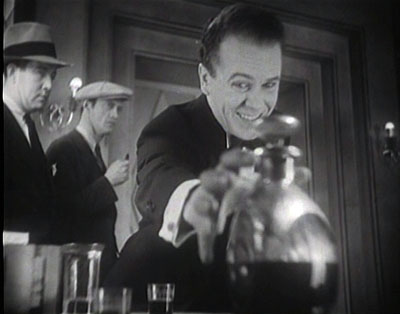
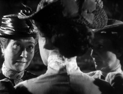
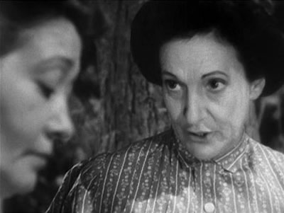
In plot, Kings Row is the anti-Our Town. “A
good clean town,” says the sign under the credits, but you wouldn’t
know it from the contagion of madness that sweeps through the movie. “A
good place to raise your children”? The respectable fathers of Kings Row
lock up their wives and daughters and amputate the legs of the lads who dare
to come courting. Class warfare is rampant, old women weep powerlessly, and the
girl loved by the timid young physician behaves like one demented. She will be
poisoned by her father.
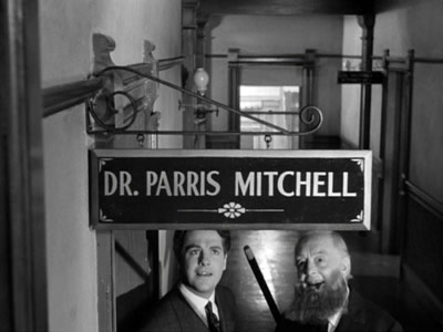
This inspires the young doctor Parris to head to Vienna to study psychiatry.
Returning to Kings Row, he will find plenty of business, and his reward will
be a new version of his beloved. The childhood scenes are shot straightforwardly,
but as adulthood pulls the characters into a spiral of hysteria, the film introduces
hard-edged shadows, thunderstorms, canted angles, oppressive ceilings, oversize
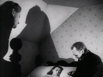
lamps, big close-ups, and a flagrant deep-focus technique. When Parris calls
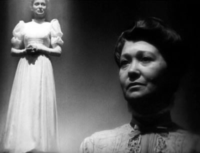
on his ailing grandmother, we get an image more complicated than the celebrated
shot of Susan’s suicide in Kane.
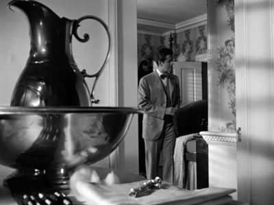
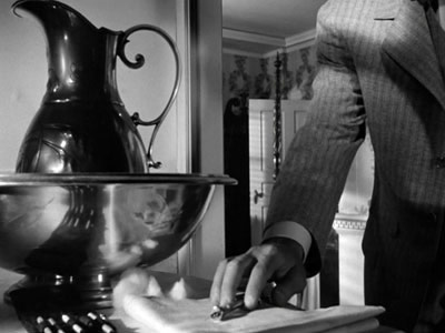
The carafe is a decoy, taking up a huge chunk of the frame but inconsequential
compared to the syringe. That grows in importance as Parris lunges forward to
discover it.
He realizes that the old woman’s care has passed to the palliative phase,
but the framing hides his face. At this point the nurse Anna enters the background.
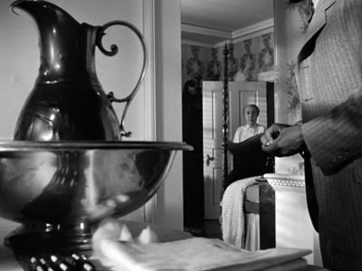
As she comes forward to explain that the disease is cancer, the camera tilts
up and her head fits perfectly into the vectors formed by the ceiling corners.
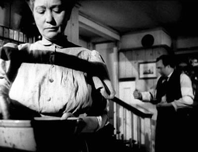
They close the door as Anna tells Parris that his grandmother will die in
a few days.
Anna moves offscreen to cry as Parris returns to the bedroom to stare down
at his grandmother.
A less flamboyant but equally moving scene takes place
around another bedside, when after recoiling from the woman who has nursed him,
the anguished amputee Drake clutches the bedstead and then acknowledges his need
for her by stretching one arm into the distance. The wide-angle lens exaggerates
the burst of his arms to the foreground and then accelerates the thrust of his
right hand back toward Randy.
Shot in the summer of 1941, after the spring release of Citizen Kane, Kings
Row looks as if Welles’ film had given Menzies permission to push
further in the expressive and Expressionistic direction taken in Our Town.
Yet the extremes are motivated to a considerable degree by the melodramatic fluctuations
of the action. As the plot moves toward resolution, the florid style abates and
we’re back to the more orthodox technique of the childhood scenes.
Between Our Town and Kings Row, Wood
and Menzies made a comedy, and its visual style is even more offbeat than what
we see in its mates. The
Devil and Miss Jones centers on workers’ agitation at a department
store. The owner, the pompous and life-denying mogul John P. Merrick, goes undercover
disguised as a new salesman. Soon he comes face to face with his store’s
petty bosses, obtuse policies, and quarrelsome customers. He admires Mary Jones
and her coworker Elizabeth, whom he will later start to romance. The ebullience
and self-sacrifice of Miss Jones and her agitator boyfriend Joe lead Merrick
to embrace their cause. At one point he ends up picketing himself.
The film continues
the compressed deep-space look of Our Town, with
several faces packed alongside one another, but what is most striking is a tactic
of unbalanced and decentered framing of those faces.
Menzies is one of the few filmmakers (apart from Ozu and Mizoguchi) to give
the bottom third of the frame its due. We saw one example in the Mr. Lucky slot-machine
battalions above, but there it was a one-off flourish. The Devil and Miss
Jones, made two years earlier, supplies so many instances that you start
to see this compositional oddity as normal.
At one point the key event, Mary peering under Merrick’s elbow, lies
almost flat along the bottom frameline.
It’s hard to provide a robust functional explanation
for these shenanigans. I’m inclined to take them as pure experiments, since
they create a sort of visual rigidity that is hard to integrate with comedy.
(The relevant comparison here might be the way that Gregg Toland’s deep-focus
schemas somewhat freeze up the players in Hawks’ Ball of Fire.)
The
decentering strategy is perhaps better motivated in the film that followed Kings
Row, Pride
of the Yankees. This story of Lou Gehrig follows one conventional biopic
arc: Origins—Striving—Success—Personal
Happiness—Tragedy of a Career Cut Short. (Another example is The Glenn
Miller Story, 1954). But there’s nothing ordinary about the film’s
visual design. We get the Menzies bottom-heavy look from almost the start, with
the second scene shoving the boy Lou’s face down against the frame edge.
Shot/reverse shot is even more off-balance than in Miss Jones.
And where another film would play out the pathos of Sam’s response to
Lou’s final address in a close-up, Wood-Menzies tucks it into the lower
left corner, highlighted by architectural diagonals and the other sportswriters’ stares.
Again, this pictorial strategy is hard to square with traditional genre motivation.
It seems to be an effort to create a deliberately offbeat style that not only
binds the film together but serves as an authorial signature. (If you think the
handwriting might have been Wood’s, consider that his other baseball yarn
of the period, The Stratton Story of 1949, bears no trace of these techniques.)
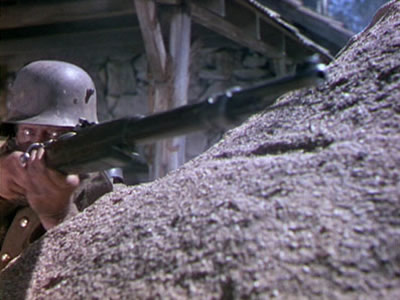
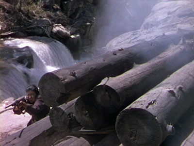
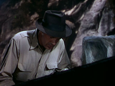
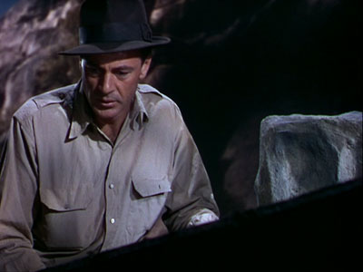
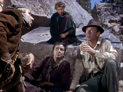
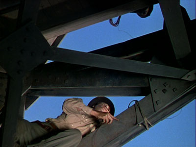
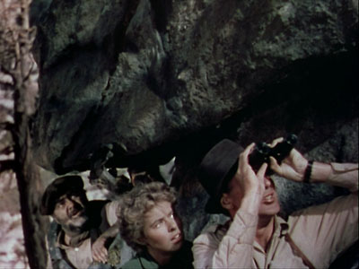
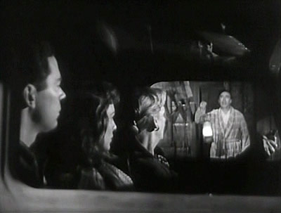
For Whom the Bell Tolls changes the game somewhat. A large amount of
it was filmed in exteriors (the Sierra mountains doing duty for Spain), and in
Technicolor. In some respects, it is Menzies’ most flamboyant achievement
of the era, a feast of pictorial design laid over a somewhat static plot.
Given three days to prepare to blow up a strategic bridge,
Robert Jordan, an American fighting for the Republican cause, must join a band
of guerrillas. Among them is Maria, a refugee who was raped by the Nationalists
when they took over her town. The nominal leader of the guerrillas is the shifty
Pablo, but the driving force is his wife Pilar, who can mobilize the men vigorously.
Robert and Maria fall in love quickly; the drama is provided by the band’s
efforts to plan the demolition and Pablo’s wavering support of the mission.
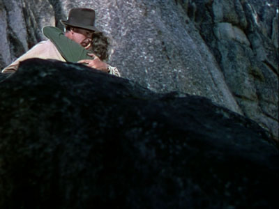
From
the very first shot after the opening title, we are in Menzies territory. Characteristic
jet-black silhouettes, tightly packed into the frame, are even more striking
in color.
The huddled gatherings of the band are remarkable for sustaining depth of
field with the slow Technicolor process, and action scenes are propelled by stark
vectors provided by rock formations or logs.
Menzies’ eye for expressive color remains remarkable; when Robert crouches
over the dead Anselmo, smoke curls into the frame like a shroud.
Most of the scenes between Robert and Maria are shot straightforwardly, as
if setting off their relationship from the war maneuvers filmed in low angles
and steep perspectives.
But the decentered framing, which can look so arbitrary and showoffish, becomes
a motif associated with the couple and reaches a kind of climax in the film’s
final stages. We get the decentering when they reconnoiter, and much later when
they’re reunited after the firefight.
At the end, when the wounded Robert
urges Maria to go, she is turned and pulled away by Pilar, and the two women
sink below the frameline.
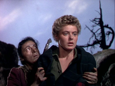
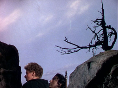
This sort of downward departure has
been a signal of closure in earlier Wood-Menzies efforts. Lou Gehrig steps down
into a block of shade as he retires from baseball, and the Stage Manager of Our
Town leaves
by literally dropping out of sight.
Going solo
Each of the Wood-Menzies films of 1940–1943 deserves more detailed analysis than
I can supply here. There’s also the matter of their last collaboration
on Ivy (1947), a more pictorially restrained enterprise. 26 But
I’ll conclude by considering the films of the 1940s and 1950s that Menzies
directed.
Two of these, Drums in the Deep South (1951) and the 3-D effort The
Maze (1953), are of striking banality (except for the occasional decentered
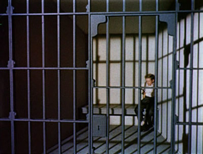
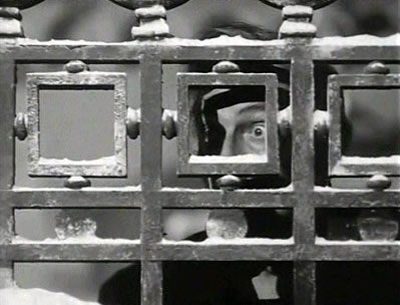
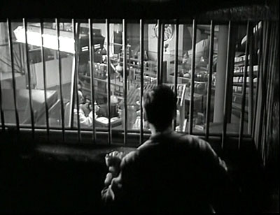
head). By contrast, Invaders from Mars (1953) indulges in Menzies’ eccentricities
of set design and composition pretty freely. Admirers of the film point to the
Caligaresque forest and the forced perspective of the jail cell.
There are as
well his customary bare walls and strenuous viewpoints.
Once seen, Invaders
from Mars isn’t forgotten, but the stylistic
signatures don’t seem to me to compensate for arid and schematic designs,
lugubrious pacing, and special effects of a pretty jejeune nature. The fantastic
plot offers no ballast for Menzies’ urge to float into abstraction. I’d
argue that two other films that he signed benefited from realistic constraints
on his pictorial imagination.
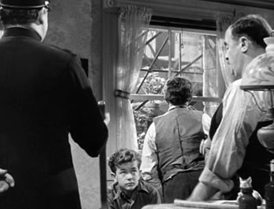
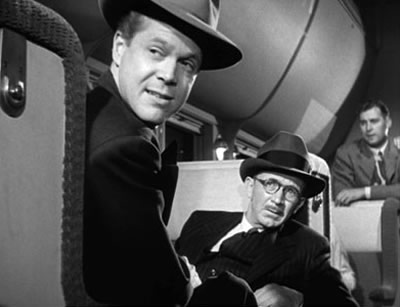
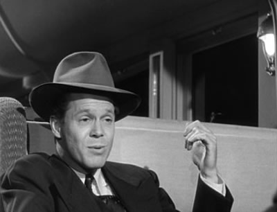
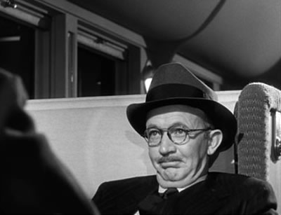
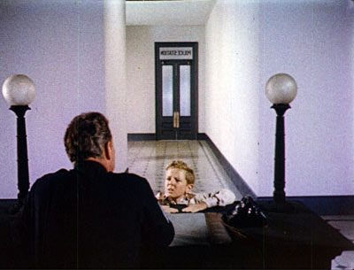
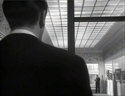
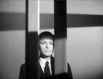
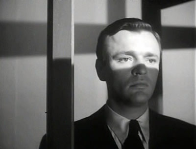
In The Whip Hand (1951) a
journalist on a fishing trip to a Minnesota town discovers a nest of Soviet scientists
bent on poisoning Chicago’s
water supply. The mystery is reasonably well-sustained, despite an over-explicit
opening scene showing Russian officers pinpointing the town on a US map. The
film employs solid character players, particularly Raymond Burr as a hotelkeeper
exuding false bonhomie. Menzies’ predilictions are somewhat toned down
now because his more moderate solution to the problem of enlivening dialogue
had become standard practice. Thanks to Kane and perhaps the Menzies/Wood
films, the tight, deep-space imagery of the conversations were stock in trade
of American cinema of the period.
What looked striking in 1940 had become
commonplace ten years later. But Menzies was still able to invoke bursts of graphic
tension, as when the innkeeper and a lab technician are caught in a hail of bullets
and a pattern of striped shadows.
Menzies’ most worthwhile solo
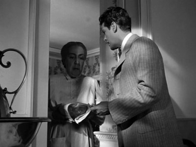
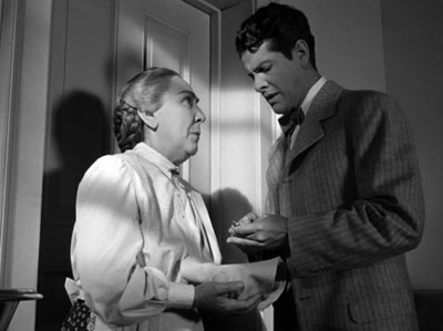
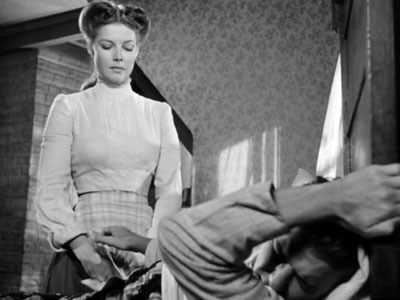
feature, I believe, is Address Unknown (1944).
Like So Ends Our Night, it’s a wartime drama with a strong political
message. Two fathers, Martin Schulz and Max Eisenstein, are partners in an art
gallery. Max’s daughter Griselle accompanies Martin’s family to Germany,
while her fiancé, Martin’s son Heinrich, stays in San Francisco
with Max to run the gallery. Once in Germany and exposed to Hitler’s rise,
Martin chooses to conform and even asks Max, who is Jewish, to stop writing to
him. At the same time, Griselle is launched on a stage career but courageously
challenges the censor. Out of cowardice Martin lets her be caught and killed.
Thereafter he starts to receive messages, apparently from Max, that the Nazis
intercept and take to be in code. Gradually Martin finds himself alone to face
the wrath of the authorities. It’s revealed that Heinrich has sent the
letters in revenge for the loss of Griselle. He has deliberately sent his father
to his death.
Unusually for a Hollywood movie, the film doesn’t build its plot around
a sympathetic protagonist. Martin nervously slips into pleasing his Nazi masters,
and Griselle becomes a figure of our allegiance only briefly. It would be too
much to call this a Brechtian exercise, but the refusal to tell the story through
the normal arc of the Griselle-Heinrich romance and the concentration on the
mechanics of correspondence give the film a drier, more detached air than we
find in most wartime propaganda. The usual iconography of swastikas, flags, and
armbands was deliberately omitted, so that the drama is really that of two elders,
an exchange of offspring, and the contrast between a weak father and a courageous
daughter in a moment of political crisis.
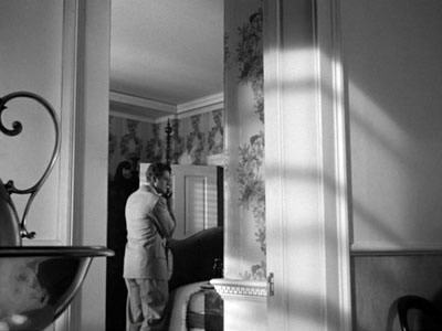
Visually Address Unknown is quite satisfying. No longer are Menzies’ stock
images sprinkled over the screenplay; now they become part of a consistent, albeit
unusual style. Menzies’ vast corridors and offices find a natural justification
in the government bureaucracy that Martin joins and the official style of National
Socialism.
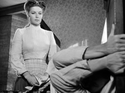
Menzies’ beloved decenterings now serve dramatic purposes, most memorably
during Griselle’s scandalous stage performance. At one point the director
lurks backstage in a composition recalling Ivan the Terrible.
Likewise, treating Max’s art gallery in train-tunnel fashion risks looking
ponderous until we realize that the axis running from the office to the front
door of the showroom gets developed across the film. First it is a space for
welcoming a customer.
But when Max learns of Griselle’s death, the looming ceilings are replaced
by a floor as lonely as a plain.
Martin’s decline is played out through a cluster of motifs of setting
and lighting. He and his wife move into their German estate, and patterns of
circles in the windows are laid over them.
Later, as Martin starts to fear every mail delivery, Menzies uses the circular
shapes to enclose the butler striding to the postal box.
As the nets close in, Martin peers through the window pane.
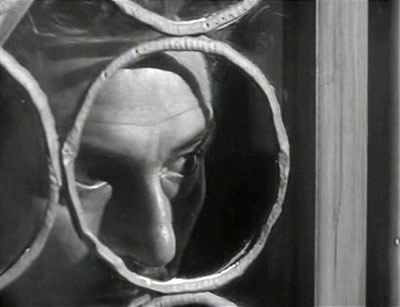
At the climax, however, he is caught in a new patterns of light: a strip across
the eyes, a network across his body.
He watches his executioners arrive
through a squarish grillwork.
This modulation in imagery is recapitulated
when the epilogue reveals Heinrich as the author of the damning letters. First,
he stands in the office looking down the gallery at Max, and a reverse angle
presents him in a grid.
Our final shot of him offers a stripe
of light comparable to that crossing his father’s face.
The motifs link
the son to the father whom he has condemned to death. The pattern is simple,
but it shows that Menzies had the capacity to go beyond one-off effects and build
an associative chain that accompanies the drama as a sort of pictorial score.
The “film illustrator” has gone beyond illustration
to subtly shape the movie’s visual texture.
Legacy of an idea
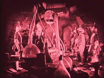
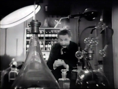
You can make the case that Menzies is an overblown, repetitive illustrator. He
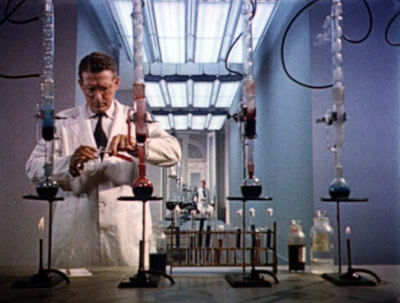
recycles images over and over. The beakers bulging on lab tables are there early
on.
The Beloved Rogue (1926)
Bulldog Drummond (1929)
Invaders from
Mars (1953)
One schema, that of the plunging view
through a high window, reappears in movies twenty years apart.
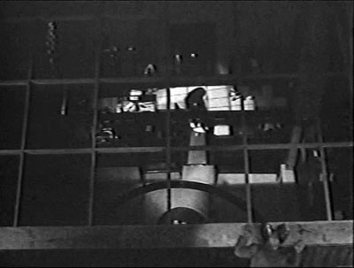
The Bat (1926)
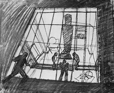
A drawing for Bulldog
Drummond
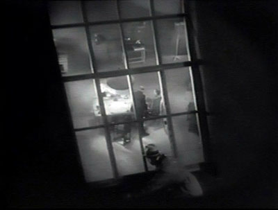
Bulldog Drummond (1929)
Whip Hand (1951)
As early as 1930,
Harry Alan Potamkin was deploring Menzies’ “arty” impulses, “which
depend for their appeal on the public’s general ignorance of the antiquity
and derivation of the devices employed, expressionistic light-designs and Méliès
virtuosity.”27 And
undeniably arty he was. Although he paid lip service to the Hollywood idea that
visual style should be “motivated” and that “every shot must
contribute in some manner to the story,” he makes movies of flagrant artificiality.28 In
the article celebrating shooting from the viewpoint of an astigmatic worm, he
also says, “My work is the less noticeable the better it is.”29 Like
so many Hollywood practitioners, he was caught between a desire to try something
wild and the need to justify it, at least in public, as fulfilling traditional
purposes.
Apart from his own films, his example
evidently spurred several new creative practices in studio cinema. If he did
not invent the storyboard, he surely popularized it, and along with it the new
role of production designer. As early as 1941, Harry Horner, production designer
on The Little Foxes, was declaring
that the task of the art director was that of “designing a visual score
to the film manuscript. Each camera set-up should be considered according to
its dramatic value, and also according to its visual artistic composition.”30
Menzies’ manner of dynamizing dialogue scenes through vivid compositions
was taken up by his successors. More broadly, the general 1940s trend toward
locked, centrifugal images may owe something to Menzies as well as to Welles
and Wyler. As Boris Kaufman put it: “The space within the frame should
be entirely used up in composition.”31 Menzies’ love
of the vertical axis, the corners of the image, and the vital frame edges fulfill
that purpose, and he may have inspired others as well. Perhaps Welles learned
something from him; Anthony Mann certainly did.32 More
recently, those who admire the absurdly inflated portrayal of corporate life
seen in The Hudsucker Proxy ought to thank Menzies for leading the way.
The Coen brothers’ distended wide-angle mode, using both deep central perspective
and skewed angles for 1930s-ish montage sequences, is a contemporary equivalent
of his forceful images.
During the 1930s a depth aesthetic
was emerging as one creative option, but while Wyler pursued its more stable
possibilities, Menzies pushed it to an unusually frantic pitch. Then, as the
deep image was becoming normalized in the early 1940s, he was eager to take it
in unexpected directions. His oddities, pursued with zeal and a considerable
degree of commercial success, don’t fit into any
tradition neatly. That may be enough to guarantee his continuing value.
[For some personal reflections on my
interest in Menzies, see this
blog entry.]
1 :
For background on Menzies’ silent cinema work, see Beverly Heisner, Hollywood
Art: Art Direction in the Days of the Great Studios (Jefferson NC: McFarland,
1990), 41–49.
2 : Menzies, “Cinema
Design,” Theatre Arts Monthly 13 (September 1929), 681.
3 :
Menzies, “Pictorial
Beauty in the Photoplay,” Cinematographic Annual vol. 1 (Hollywood
CA: ASC, 1930), 177. See also “The Layout for Bulldog Drummond,” Creative
Art 5 (October 1929), 729–734.
4 : Anonymous, “As
a Director Views the Art of Settings,” New York Times (12 January
1930), 113.
5 : Jan and Cora Gordon, Star-Dust
in Hollywood (London: Harrap, 1930), 181.
6 : Gordons, 179.
7 : Fred J. Balshofer
and Arthur C. Miller, One Reel a Week (Berkeley: University of California
Press, 1967), 130.
8 : Menzies, “Pictorial
Beauty,” 176.
9 : Ezra Goodman, “Production
Designing,” American Cinematographer 26, 3 (March 1945), 82.
10 : Menzies, “Cinema
Design,” 682.
11 :
Lyle Wheeler, quoted in Mary Corliss and Carlos Clarens, “Designed for
Film,” Film
Comment 14, 3 (May–June 1978), 57.
12 :
On Gone
with the Wind’s color design, see Scott Higgins, Harnessing the
Technicolor Rainbow: Color Design in the 1930s (Austin: University of Texas
Press, 2007), Chapter 7. A very thorough account of the making of the film, with
superb color illustrations, can be found in Ronald Haver’s David O.
Selznick’s Hollywood (New York: Knopf, 1980), 236–311. Haver’s
book includes other information on the collaboration of Selznick and Menzies.
13 : Memo from
David O. Selznick, ed. Rudy Behlmer (New York: Viking, 1972), 151.
14 : Memo from
David O Selznick, 189.
15 : Memo from
David O. Selznick, 206.
16 : Alan David Vertrees, Selznick’s
Vision: Gone with the Wind and Hollywood Filmmaking (Austin: University
of Texas Press, 1997), Chapters 3 and 4.
17 : Memo from
David O. Selznick, 190.
18 : William Cameron
Menzies, “Production Designed By—Mr. Menzies, Specialist in Illusion,
Reveals a Couple of His Fancy Tricks,” New York Times (1 December
1940), X5.
19 : Kent Jones provides
an eloquent appreciation of this shot and the film as a whole in “State
of Desire,” Film Comment 43, 3 (May/ June 2007), 22.
20 : William Cameron
Menzies, “Production Designed By,” X5.
21 : Quoted in Charles
Higham, Hollywood Cameramen: Sources of Light (London: Thames and Hudson,
1970), 88.
22 : Richard Sylbert
quoted in Vincent Lo Brutto, By Design: Interviews with Film Production Designers (Westport,
CT: Praeger, 1992), 52.
23 : Quoted in Lo
Brutto, By Design, 21.
24 : Quoted in Ezra
Goodman, “Production Designing,” 83.
25 : Quoted in Lo
Brutto, By Design, 21.
26 :
David Cairns offers a discerning, more affirmative account of Ivy here.
27 : Harry Alan Potamkin, “Reelife,” Close
Up 7 (December 1930), 391.
28 : Quoted in Scot
Holton and Robert Skotack, “William Cameron Menzies: A Career Profile,” Fantascene no.
4 (1978), 6.
29 :
Menzies, “Production
Designed By—,” X5.
30 : Harry Horner, “Designing
Films,” Theatre Arts 25, 11 (November 1941), 794.
31 :
Quoted in Edward L. de Laurot and Jonas Mekas, “An Interview With Boris
Kaufman,” Film Culture 1, no. 4 (Summer 1955): 5.
32 :
See John Hambly and Patrick Downing, The Art of Hollywood: Fifty Years of
Art Direction (London:
Thames Television, 1979), 4, 90–97.
|


