David Bordwell's website on cinema   click for CV

Home

Blog

Books

Perplexing Plots: Popular Storytelling and the Poetics of Murder

On the History of Film Style pdf online

Reinventing Hollywood: How 1940s Filmmakers Changed Movie Storytelling

Film Art: An Introduction

Christopher Nolan: A Labyrinth of Linkages pdf online

Pandora’s Digital Box: Films, Files, and the Future of Movies pdf online

Planet Hong Kong, second edition pdf online

The Way Hollywood Tells It pdf online

Poetics of Cinema pdf online

Figures Traced In Light

Ozu and the Poetics of Cinema pdf online

Exporting Entertainment: America in the World Film Market 1907–1934 pdf online

Video

Hou Hsiao-hsien: A new video lecture!

CinemaScope: The Modern Miracle You See Without Glasses

How Motion Pictures Became the Movies

Constructive editing in Pickpocket: A video essay

Essays

Rex Stout: Logomachizing

Lessons with Bazin: Six Paths to a Poetics

A Celestial Cinémathèque? or, Film Archives and Me: A Semi-Personal History

Shklovsky and His “Monument to a Scientific Error”

Murder Culture: Adventures in 1940s Suspense

The Viewer’s Share: Models of Mind in Explaining Film

Common Sense + Film Theory = Common-Sense Film Theory?

Mad Detective: Doubling Down

The Classical Hollywood Cinema Twenty-Five Years Along

Nordisk and the Tableau Aesthetic

William Cameron Menzies: One Forceful, Impressive Idea

Another Shaw Production: Anamorphic Adventures in Hong Kong

Paolo Gioli’s Vertical Cinema

(Re)Discovering Charles Dekeukeleire

Doing Film History

The Hook: Scene Transitions in Classical Cinema

Anatomy of the Action Picture

Hearing Voices

Preface, Croatian edition, On the History of Film Style

Slavoj Žižek: Say Anything

Film and the Historical Return

Studying Cinema

Articles

Book Reports

Observations on film art

THE HATEFUL EIGHT: A movie is a really big thing

Saturday | December 19, 2015

HATEFUL 8 prints 600

Photo: Barbara Grassia.

DB here:

The latest dispatch from the Hateful Eight platter farm in Valencia CA, overseen by veteran film guru Chapin Cutler of Boston Light & Sound. Chapin writes:

This is a picture of the last three Hateful Eight prints leaving our print assembly location in Valencia. They are destined for local LA presentation locations.

Most of the other prints have been delivered or will be today [18 Dec.].

All locations have had their equipment delivered, save one;  due to facility issues, that venue’s equipment will be delivered Monday. By Sunday night or early Monday morning, all but the expected and remaining nine venues will be complete. The remaining nine will be done by end of day, Wednesday, 23.

Just to remind you, from Chapin’s previous message:

Each shipping case is 5 ft. x 5 ft. by 1 ft. thick. When loaded, it weighs about 400 lbs. . . . With the reel full, out of the box, the film and reel weigh about 250 lbs. Four people can easily lift it onto a platter deck.

I’m asking Santa for one.


Thanks to Chapin for his work on the project and his cooperation with our blog. Thanks as well to the thriving and inspiring Art House Convergence.

If you haven’t yet seen the list of Hateful Eight 70mm venues and showtimes, you can find it here.

P.S. 23 December 2015: Thanks to Gary Meyer of Art House Convergence, here’s a link to a very full story on the rehabbing of projectors for Tarantino’s Great Experiment.

P.P.S. 31 December 2015: Be sure to check this suspenseful tale of projecting the movie…with Tarantino in the audience.

Modest virtuosity: A plea to filmmakers, old and young

Sunday | December 13, 2015

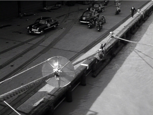
Long shot wharf 500

Panic in the Streets (1950).

“It’s where you put the camera and what’s in front of you [that’s important],” Deakins said. “There’s too much obsession these days about digital film…it’s becoming so technically-orientated, and that’s just distracting from what’s actually being put in front of the lens.”

DB here:

Every now and then I get worried by the repetitive look of recent films. I want to beg filmmakers (young ones especially) to try something else.

What could they do? Start with what to avoid. They could suspend the walk-and-talk, the tendency to rely on singles, the bumpy handheld takes, the swoopy crane shots, and the urge to cut on every line of dialogue. They could back off, in other words, from intensified continuity and go for something more daring and original.

More positively, there are some relatively unexplored areas of film style that yield results that are forceful and graceful. Today’s example: ensemble staging that minimizes camera movement and cutting. Minor spoilers.


Some basics

It’s a demanding technique. Essentially the filmmaker has to shape a scene among several actors in ways that guide our attention to the key pieces of information. That guidance is done through performance, framing, lighting, and other tactics. Beyond highlighting the major points of the scene, staging can create what critic Charles Barr called “gradation of emphasis.” Because several elements of the action are all visible at once, some can become primary, some secondary; and this interplay enriches our understanding of the scene.

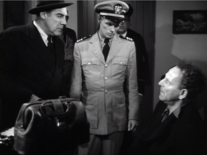
So take this scene from Elia Kazan’s Panic in the Streets (1950). A dead man has been found to carry the Bubonic plague virus, and Dr. Clinton Reed is investigating people who have come in contact with him. A restaurant owner and his wife have denied knowing the victim, but now Reed and Police Captain Warren have learned that the wife has come down with the plague. They visit the apartment, too late to save her. Her husband Mefaris comes in and learns that she has died—and that she might have lived had the couple told the truth.

The two-minute scene plays out in just two shots, both with slight panning movements. The scene’s impact owes a lot to the performances: the line readings, facial expressions, and gestures, including the wonderful way that Richard Widmark rips off his surgical mask in angry frustration. But the scene also benefits from small but significant rearrangements of the actors in the frame. This staging ties together the performance elements in a smoothly rising flow.

Here’s the scene. I’ll try to indicate some practical directing principles at work.

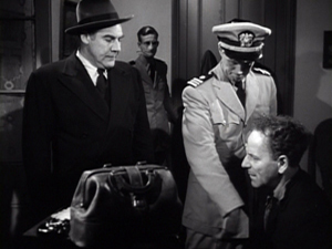
After Captain Warren has sent his men to find the husband, we have our principal players in the middle ground in a framing from the knees up (the plan-américain). As is common in 1940s dramas, the scene will be given added depth, not only by the patrolman behind Warren but by the junior officer Paul behind Reed, coming out of the sickroom. That depth is activated when Reed comes forward to pack his briefcase and orders Paul to burn the bedding, and Warren orders the patrolman to close the bedroom door.
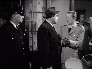
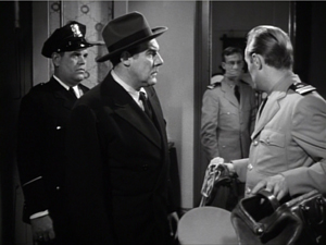
screenshot_01     screenshot_03

The opening and closing of the door becomes an important pictorial element, but for now it simply clears the background for the two-shot involving Warren and Reed talking of the death certificate. Noise from offscreen motivates the camera’s pan left to follow Warren as he meets the husband, Mefaris, coming in.
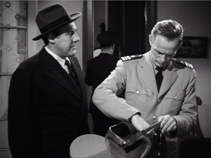
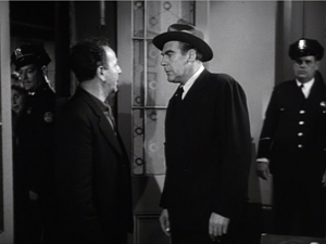
screenshot_04     screenshot_05

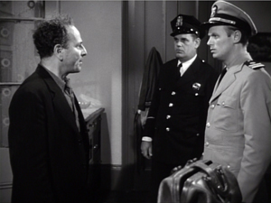
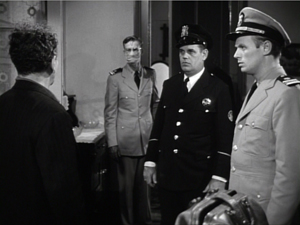
Mefaris confronts Reed and demands to know what’s happening. When he calls his wife, Paul steps out, guiding our attention to him as a sign of death. Mefaris begins to guess. The phlegmatic patrolman, who’ll feature throughout the scene, is there to keep Mefaris under control.
screenshot_06     screenshot_08

The risk is that we’ll watch that centrally place cop and miss something else, so Kazan takes care to make him impassive. Later, he’ll be more distant, in shadow, and out of focus. More generally, such ancillary characters need to keep still and stare at what we’re supposed to be watching.

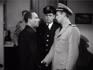
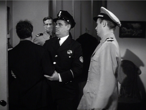
Mefaris comes closer to Reed, blocking our view of Paul. Reed tells him his wife is dead. Mefaris tries to go to her room, but the patrolman shows his value by restraining him—and opening up a slot for us to see Paul, who confirms Reed: “She’s dead, mister.”
screenshot_10     screenshot_11

This sort of unnoticeable blocking and revealing through slight shifts in actors’ position goes back to 1910s cinema but is seldom used today.

Finally accepting the grim news, Mefaris ponders and comes forward. Without cutting, Kazan has brought him and Reed into closer visibility. As ever, a Cross refreshes the composition. And as Reed asks questions, his head blocks the patrolman so that we can concentrate on Mefaris’ indignant reaction.
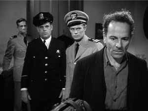
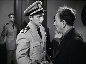
screenshot_13     screenshot_16

Mefaris’ refusal to talk is the climax of the shot. We cut to Warren at the door and the camera pans with him to confront Mefaris angrily.
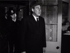
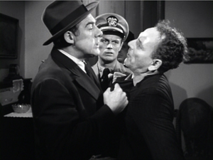
screenshot_17     screenshot_20

Now only Reed is visible in the background, squeezed between the two faces. Mefaris finally identifies Poldi as the man they need to find. Warren shoves him down and the space, quite clenched just a moment before, opens up. As gradation of emphasis, we get Reed brushing at Mefaris’ lapel after Warren’s meaty hands have crumpled it. After Warren’s outburst, Reed’s anger at Mefaris seems to have turned into a flicker of compassion.
screenshot_22     screenshot_24

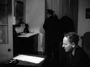
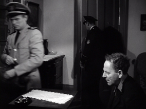
Warren and Reed depart, just as Paul returns to the death room and the patrolman closes the door. The final framing leaves nothing to distract us from Mefaris, brought low by grief and his fatal failure to cooperate.
screenshot_26     screenshot_28

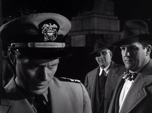
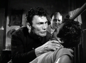
Kazan is, we might say, a “post-Welles” director in that he, like many others, adopted the vigorous use of depth staging and wide-angle cinematography made famous in Citizen Kane. It’s not hard to find elsewhere in Panic in the Streets some more flagrant instances of in-your-face deep focus, with big heads and exaggerated distant points.
screenshot_69     screenshot_71

In the scene above, the depth is nothing like so aggressive. It is, we might say, modestly virtuoso—a clean, unnoticeable, but well-calibrated piece of staging that unfolds the action so that we always know where to look.


Why not?
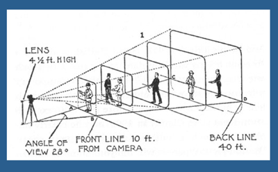
Diagram 400

I  anticipate some objections from a skeptical filmmaker.

“This scene isn’t cinematic. There isn’t enough cutting and it’s lacking close-ups.”

Today, though, everybody acknowledges that cutting isn’t the be-all and end-all of cinema. Directors get lots of credit for sustaining their shots, if it’s done with a self-congratulatory virtuosity. (See Gravity, Birdman, the opening sequence of Spectre.) In particular, a lengthy walk-and-talk shot is greeted as a bold stroke. So clearly the absence of cutting is okay if you make a big deal of it.

Close-ups are important, but maybe not as much as we think. Today’s style often relies too much on close-ups, partly because people think they won’t read well on small monitors and other displays. But those displays are getting bigger and sharper. I suspect that you’d find the Blu-ray edition of Panic in the Streets plenty okay for home viewing.

 “Put it another way. This is too theatrical.”

Too reliant on actors, then? But what mainstream cinema isn’t? And isn’t today’s standard style, bombarding us with facial close-ups, quite “theatrical” in making the actor—and not even the body, just the face—the center of our attention?

Moreover, as I’ve argued here and elsewhere, the space of a shot is the opposite of the space onstage. Theatrical space is wide and rectangular, and actors tend to arrange themselves laterally, across the stage. Cinematic space–the space captured by the camera–constitutes a pyramid, extending narrowly away from the lens, and so it favors depth. (See the diagram above.) Theatrical space is calculated for the sightlines throughout the auditorium; cinematic space is calculated for one sightline, that of the camera. Accordingly, a film can have staging in depth that wouldn’t work onstage. You couldn’t arrange the Panic scene this way in live theatre; some people couldn’t see the background action clearly, because the foreground figures would mask it.

If “theatrical” also means “too tied to the proscenium,” that objection fails too. Granted, this is a scene that suggests a missing fourth wall. The camera doesn’t penetrate the space enough to suggest the entire room. Shortly, though, I’ll show you that this approach can be more immersive, activating areas behind the camera (and so behind us).

“It’s not realistic. People don’t stand and talk that way.”

Cinema ≠ reality.

“It’s too risky. Too much can go wrong with all that shifting in one shot.”

You need skillful actors who can time their lines, hit their marks, and coordinate with one another. If one thing goes wrong, you have to start again. Shrinking from this, directors opt for plenty of coverage to adjust pacing and select the best performances during editing. “The important thing for the editor is coverage,” notes Ridley Scott. “That’s why I always have multiple cameras, so I can shorten the scene.”

So, yes, it’s risky. But risk is celebrated in the noisy virtuosity of the flamboyant long takes. Why not take risks in this more unusual way?

“It’s too hard! I never learned how to do these things.”

Once upon a time, every director knew how to stage scenes like this. The “tableau cinema” of the 1910s cultivated a rich set of creative choices about staging, and directors proved very versatile in exploring them. With the arrival of continuity editing in the 1910s, a degree of de-skilling took place, but directors still retained some sense of dynamic staging. We see it in 1930s and 1940s films too.

Now, much later, this sense is all but gone. Is ensemble staging taught in film schools? Could even our best directors of today—Wes Anderson, Paul Thomas Anderson, Quentin Tarantino, et al.—pull off a scene in this manner? Soderbergh couldn’t do it when he tried in The Good German. (I look forward to seeing if Todd Haynes makes the effort in Carol.)

On the whole, though, I agree: It’s hard today. Neither directors nor actors nor DPs are, I think, well-versed in what’s necessary to stage scenes this way. Most directors, and nearly all viewers, have simply forgotten that this rich menu of expressive techniques ever existed. So why not revive it?


Post-grad work
Wall 400

One other objection occurs to me.

“Ensemble staging of this sort is too modest. In an age of directorial bravura, where every filmmaker tries to punch above his weight, nobody will notice if I direct scenes this way. And getting the next job demands that my contribution get noticed. I’m competing with a lot of eye candy out there.”

I’d agree. But there is a lot of leeway in this approach for more self-conscious effects. Maybe most viewers and even filmmakers wouldn’t notice the robust delicacy of the scene above. But how about offering something more audacious that stays within the parameters of this style?

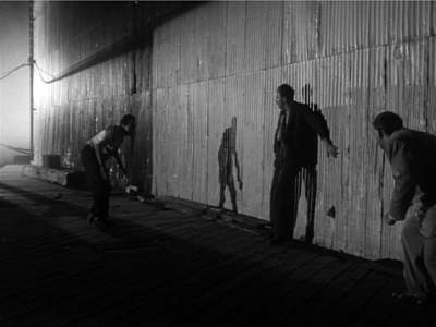
Try this earlier scene from Panic in the Streets. Reed, his assistant Paul, and local officials are now identifying the plague virus and are beginning to figure out how to deal with it. I hope I’ve primed you to notice the less-quiet virtuosity on display here.

A director today might have shown us the body, the reporters photographing it, and the medical team in one vast shot, perhaps from a high angle that craned in. Or perhaps we’d have gotten a long walk-and-talk taking Reed through a hospital corridor as he snaps out orders to all the staff involved.

Instead, Kazan leaves a lot of this material offscreen, to be inferred through details. The plaguey corpse lies just outside the lower frame line, but we won’t realize this for a while. And the reporters are offscreen, “behind us.” So we’re inside the proscenium. Part of the interest of the scene is not just following the ongoing drama but figuring out what’s going around us.

In this more complex scene, Kazan threads characters through the space, making some more prominent and then letting them fall back. He obeys Alexander Mackendrick’s dictum:

Composing in depth isn’t simply a matter of pictorial rich­ness. It has value in the narrative of the action, the pacing of the scene. Within the same frame, the director can organize the action so that preparation for what will happen next is seen in the background of what is happening now.

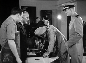
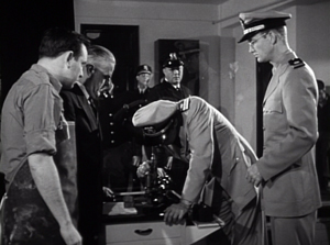
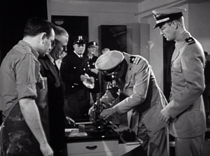
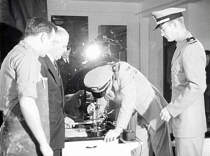
We start with Reed and his team bent over the microscope. In the background a patrolman passes. For an instant the frame flares up.
screenshot_30     screenshot_31

Reed looks up, slightly annoyed, but when it happens again we can see that it’s the result of a photographer’s flash. In the distance, after Reed bends over, we can see the patrolman blowing his nose. Because we know that the plague is loose, that simple gesture becomes a warning. And on the big screen you can now notice the vague reflection of the photographer in the window between Reed and Paul. The second fading flashbulb tells us where to  find this man’s phantom image.
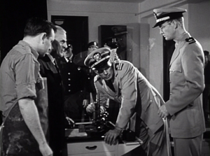
screenshot_32     screenshot_35     screenshot_36

So the action develops in three zones.: the cops in the distance, the team at the microscope, and the offscreen police photographers behind us. Two of these zones get closed off when the photographers leave and Reed orders the curtains drawn.
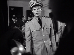
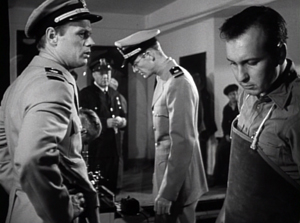
screenshot_43     screenshot_44

The space goes shallow as we get a succession of two-shots, the first with the health officer who comes forward and learns that he must cremate the corpse, the second with the morgue supervisor.
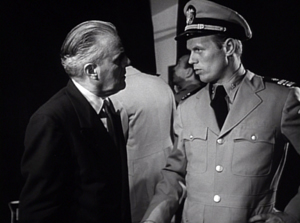
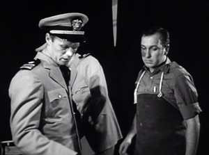
screenshot_41     screenshot_42

Now we get a pause. Reed, isolated against the curtains, stares down at the corpse, trying to work out a plan. As in the earlier scene, a simple pan brings Paul to him for a final two-shot. The serum has arrived, and this sets up the second phase of the scene.
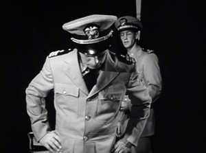
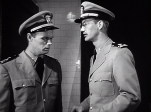
screenshot_47     screenshot_49

The scene has developed around two nodes: the microscope bench in the middle ground and the still-unseen corpse in the foreground. This use of depth has fulfilled Mackendrick’s dictum, as the action around the ‘scope has prepared us for the series of one-on-one instructions Reed issues to his team. As in the earlier scene, this shot ends with the figures closer to the camera than they were at the start.

As in the earlier example, we get a cut. (Critics have often talked about single-shot scenes. What about studying two-shot scenes? I suggest we start with Mizoguchi.) Reed heads outside for another encounter, this time with a police official, who gets emphasized not through cutting but by letting his head block that of the morgue supervisor.
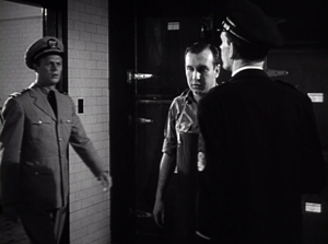
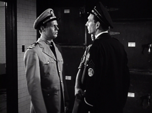
screenshot_50     screenshot_52

We pan with Reed as he goes to the corridor and the gathering group. More blocking and revealing: As Reed asks the cop about people who’ve been in contact with the corpse, he pivots and the composition frames the sniffling cop in the vanishing point.
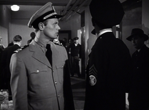
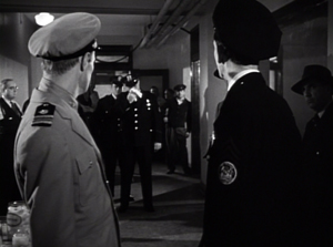
screenshot_72     screenshot_54

Today a filmmaker might give us a big close-up of this poor guy, playing up his misery. But that would suggest that he’ll become an important story factor. He’s actually not in danger, so his minor status in the frame is completely appropriate.

For similar reasons, no need to cut in to Reed addressing the assemblage of men; none will prove significant. Instead, the action moves back to the foreground. First, Reed thanks the morgue attendant.
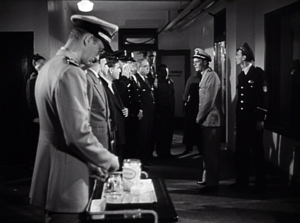
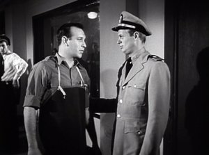
screenshot_57     screenshot_61

More important, and more virtuoso, is the way that the key dramatic elements in what follows are framed in a tight space between Paul and Reed in the foreground. First it’s the official in charge of cremation, then it’s the two skeptics.
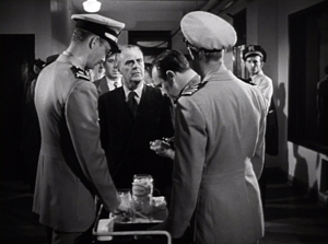
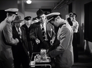
screenshot_62     screenshot_63

Once more a shot ends in the closest framings so far. As a complaining civilian quarrels with Reed, both advance to the camera and Reed obliges him to take his medicine. The shot ends with the man wincing and lowering his head as the needle goes in; not such a tough guy after all.
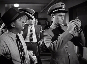
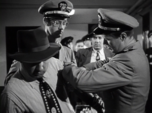
screenshot_65     screenshot_68

Far from being simply of casual interest, these reluctant ne’er-do-wells anticipate the stubbornness and stupidity that Reed will encounter when he ventures into the city among the populace.

It seems to me that this sequence, with the flashbulbs and the curtain and the line-up for the vaccine, provides a self-assured command of craft that is as exuberant as anything in today’s flashy direction. If you can be flashy in a quiet way, this scene manages it.

This kind of staging can give cuts extra force. In the first scene, the cut to Warren ratcheted up the tension: Reed’s persuasion failed to win over Mefaris, so brute force is the next step. In the mortuary scene, the cut to the corridor as Reed passes through is more perfunctory, but it at least maintains the fluidity of the action.

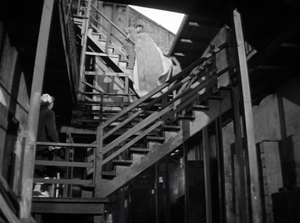
A more dramatic instance of saving your cut for maximum impact comes near the climax, when Poldi is carried down a precarious staircase and his crooked boss Blackie flings his body over the railing. The cut to the extreme long-shot shocks you with how far he must fall.
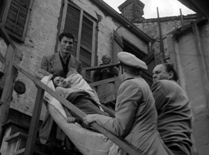
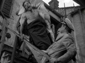
screenshot_74     screenshot_75     screenshot_77

There is much else to admire in Panic in the Streets; it’s a fine instance of Joe MacDonald’s location cinematography as well. I use it as simply an example of how much classical cinema has to teach us. It’s a pity that our filmmakers have unlearned some of its lessons, but it’s not too late—especially for brave young filmmakers—to relearn them.


For an example of lateral, rather than depth-based, ensemble staging, see our most popular entry, “Watching you watch There Will Be Blood.” Use the category tableau staging to access entries on the principles I’ve mentioned. The whole subject is discussed in more detail in Chapter Six of On the History of Film Style and in Figures Traced in Light: On Cinematic Staging. It’s also treated in my video lectures How Motion Pictures Became the Movies and CinemaScope: The Modern Miracle You See without GlassesThe diagram of the visual pyramid is from Ben Brewster and Lea Jacobs, Theatre to Cinema: Stage Pictorialism and the Early Feature Film (Oxford University Press, 1997), 170.
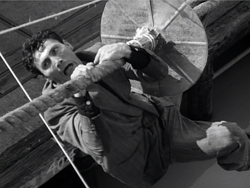
Wharf Jack 500

Panic in the Streets.
THE HATEFUL EIGHT: The boys behind the booth

Saturday | December 5, 2015

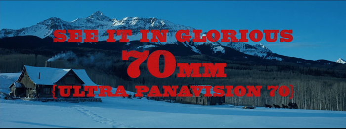
See It 700

DB here:

By now everybody knows that Tarantino’s forthcoming The Hateful Eight was shot on film in the Ultra Panavision 70 format. This anamorphic widescreen process yields a projected aspect ratio of 2.76–in a word, humongous. An early version of it, MGM Camera 65, was employed on Ben-Hur (1959), but Panavision quickly developed a new generation of cameras and renamed the process. It wasn’t heavily used; supposedly Khartoum (1966) was the last film shot in the format.

The process by which Tarantino, ace cinematographer Robert Richardson, and the enthusiastic boffins at Panavision revived Ultra Panavision 70 is detailed  in the current American Cinematographer (alas, not yet online). The production is an extraordinary tale. But what about exhibition? Luckily, the widescreen fans among us can glean a lot about that from veteran projectionist Paul Rayton’s interview with Chapin Cutler, co-owner of Boston Light & Sound. It was the task of Chapin and his team to find over 100 projectors, refurbish them, test them, and set them up in theatres all over America.

Chapin is a legendary figure in movie exhibition. Trained as a projectionist during his college years, he and Larry Shaw have made BL&S one of the very top companies for installation and maintenance of theatre projection equipment. He has supervised theatrical setups at festivals (Sundance, Telluride, TCM), industry gatherings (CinemaCon), and at some of the world’s top-notch theatres.

He’s more than a professional’s professional: He loves film and prides himself on delivering a powerhouse show. He was a natural choice for a movie geek like Tarantino to arrange the roadshow screenings of The Hateful Eight.

Chapin has discussed the nearly military precision necessary to fulfill Tarantino’s mandate in The New York Times and The Boston Globe. You should read these pieces for essential background. When Chapin added some new information courtesy of the listserv of the Art House Convergence, I jumped at the chance to include you in the audience. I know that many of our readers are keen to devour whatever they can learn about this film, one of the year’s major American releases.

So here are Chapin’s notes on how you prepare and ship out 100+ 70mm film prints.

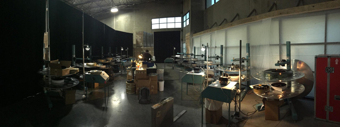
For those of you that are interested in these things, attached is a picture of our “platter farm” in Valencia CA. This is where all the prints are being made up.

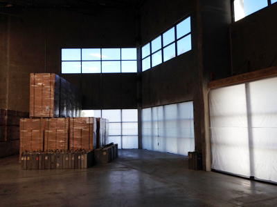
The space before, in Academy ratio.

Before

The space after, in sort of Ultra Panavision.

after 700

We are getting the prints as 1000 ft. loads, so we have to assemble 20 rolls to make a print up.

About 90 of the prints will be made up for platter operation and shipped totally assembled. The prints are being ultrasonically welded so that it is one continuous piece of film; no splices. The remaining prints are going out for reel to reel houses.

On the right of the frame above you can see part of one of the shipping cases. It is 5 ft. x 5 ft. by 1 ft. thick. When loaded, it weighs about 400 lbs. On the platter next to it, there is a partially disassembled platter reel. With the reel full, out of the box, the film and reel weigh about 250 lbs. Four people can easily lift it onto a platter deck.

We have a dedicated team of four folks working 7 days a week to get this done.

All this makes you appreciate the effort behind the scenes that makes this remarkable enterprise work. (So far, there have been a couple of problematic press screenings, but a dozen or so other shows–notably last night’s SAG screening at the Egyptian–have gone off perfectly.) Whatever you think of Tarantino as a filmmaker (I like him), he deserves credit for exposing a new generation to the volcanic fun of a roadshow presentation. And we should thank Chapin, the guru with the bandit mustache, as well.

Photo credits: Chas. Phillips.

hat 700

The Hateful Eight.

The first Sherlock and other video releases for the holidays

Tuesday | December 1, 2015

Our Lady of the Sphere Flicker Alley

Our Lady of the Sphere (Lawrence Jordan, 1969)

Kristin here–

Our friends at Flicker Alley have offered three major releases since early October: Masterworks of American Avant-garde Experimental Film 1920-1970 (October 6), Sherlock Holmes (November 10), and Chaplin’s Essanay Films 1915 (November 17). This may seem ridiculously fast-paced, but it is partly explained by a delay in the release of Sherlock Holmes. All three editions package Blu-ray and DVD versions together.

In the move from 16mm to digital, avant-garde cinema was initially left behind. Eventually big boxes and series of DVD releases made a huge number of experimental short films available to audiences who may 9 Variations on a Dance Theme 2have had little access to such fare before. In quick succession, Unseen Cinema: Early American Avant-Garde Film 1894-1941 (2005), Kino’s three-volume series Avant-Garde: Experimental Cinema 1920s and ’30s (2005), Experimental Cinema 1928-1954 (2007), and Experimental Cinema 1922-1954 (2009), and the forth volume of the “American Treasures” series, Avant-Garde Film 1947-1986 (2009) were released.

Now we have another ambitious set, Masterworks of American Avant-Garde Experimental Film 1920-1907.  Fans of experimental cinema who have purchased all of the earlier sets might wonder if there is room for yet another extensive collection of American films.  Won’t there be a lot of overlap? The answer is a definite no. The body of work by important avant-garde filmmakers is extensive enough to support many boxed-sets.
I can find not a single film in the seven DVDs in Unseen Cinema (which takes a rather broad view of what counts as avant-garde) that is duplicated here. The same is true of the Avant-Garde Film 1947-1986 set.  The Kino boxed sets (two discs each) are heavily slanted toward international films, and there is a slight overlap. Flicker Alley’s website has a list of all 37 titles included in Masterworks.

It’s impossible to deal with all the films included in the set here. (The film illustrated at the top is one of them.) I’ll just say that I was happy to see Hilary Harris’ 9 Variations on a Dance Theme (1966/67, right). We used to show it in the introductory film course we taught back in the mid-1970s, when Film Art had not yet been dreamt of. It’s a lovely film in itself, but it also might possibly be the clearest way to get across the ideas of form and style that one could find. Starting with a long shot of the dancer in a segment that simply records her movements, documentary style, the film repeats the same music and choreography eight times, with the cinematography and editing rendering a progressively abstract set of images.

Flicker Alley has put together an essential collection of films that will be new and exciting to many fans. The extras include, generously, three other experimental films. A a helpful booklet contains an introduction by Bruce Posner and brief program notes and filmmaker bios.


The Return of Sherlock Holmes 

Sherlock Holmes CU

Until recently the 1916 version of Sherlock Holmes, based on the play by William Gillette, was lost. That seemed exceptionally unfortunate, not only for legions of Holmes fans but for anyone interested in late Victorian stage practices. Gillette’s performance as Holmes was considered the defining one, influencing subsequent portrayals. The play, which was produced in the US in 1899, had the cooperation of Arthur Conan Doyle, whom Gillette consulted during the period when he was writing it. The film version was a precious record from the time when the Holmes series was still being written.

In fact, Conan Doyle had killed Holmes off in 1893 in “The Final Problem,” and at the time when he authorized the play, he still had not resurrected his popular character. Gillette’s play influenced the later stories with such additions the character of the young servant Billy, a character invented by Gillette and later used by Conan Doyle.

In one of those happy endings that occasionally happen with lost films, a copy was discovered in the Cinémathèque française. Not just any old copy but the original nitrate negative of the French release version, which was shown as a serial in four parts in 1919. Apparently no footage was lost, and the main difference between the restored version that we have now and the original American feature film is that the new intertitles have been translated from those of the French release.

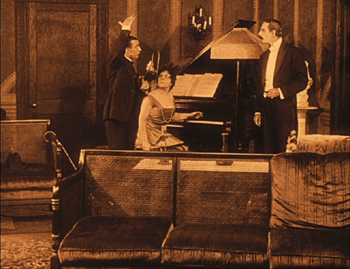
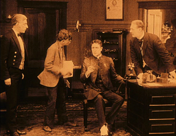
The original play has four acts, and the film has compromised between maintaining the interior setting of each act for a long stretch of the film and opening it out with brief exterior scenes and cutaways to other locales. One very lengthy section of the film takes place in the isolated house used by the villains to imprison the heroine, Alice. The sets are somewhat reminiscent of the stage, and yet they have been extended forward, and at times we see at least three walls and perhaps part of a fourth. In many cases,  the stage-style set is made more cinematic through the simple device of adding some furniture in the foreground (left). In others, the characters are strung out in a line across the playing space, as in the final “act,” which takes place in Dr. Watson’s office (right).

Sherlock Holmes hideout set      Sherlock Holmes Watson's office

Physically, Gillette makes a convincing Holmes in terms of the way Conan Doyle describes him, and his performance is restrained and usually lacking in expressivity–which works for a character noted for not exhibiting emotion. Unfortunately Gillette added a love interest for Holmes. Doyle, who apparently didn’t care what others did with Holmes now that he was rid of him, gave his permission. This would be bad enough in itself, but Alice is quite young looking, and Holmes is much older than she. Gillette had originated the role seventeen years earlier, when he was 46. By the time the film was made, he was 63, and though he doesn’t look that old in the film, the age difference between Holmes and Alice is obvious.

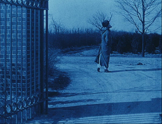
Given the survival of the negative, the Blu-ray/DVD transfer is impressive. Serpia toning is used in most scenes, while dark blue tinting represents night exteriors, many of which are nicely filmed (see bottom). The music is by Neil Brand, one of the best accompanists in the business.

There are generous bonuses, including some earlier comic shorts based around the character, Conan Doyle’s Fox Movietone interview, and a typescript of Gillette’s play. The set comes with a booklet with short essays on Gillette and his play, the film adaptation, the restoration, and the music.


The Little Tramp takes shape

The-Tramp-Charlie-eyes-money

Jeffrey Vance begins his essay on Chaplin in the booklet accompanying Chaplin’s Essanay Comedies 1915 with this observation:

If the early slapstick comedy of the Keystone Film Company represents Charles Chaplin’s cinematic infancy, the films he made for the Essanay Film Manufacturing Company are his adolescence. The Essanays find Chaplin in transition, taking greater time and care with each film, experimenting with new ideas, and adding textue to the Little Tramp character that would become his legacy. Chaplin’s Essanay Comedies would become his legacy. Chaplin’s Essanay comedies reveal an artist experimenting with his palette and finding his craft.

The unstated conclusion to the series of companies where Chaplin worked during the 1910s is that the Mutual period saw Chaplin’s maturity as an artist. Flicker Alley has now completed its epic survey of all three periods, with copies restored by the Cineteca Bologna and Lobster Films in cooperation with Blackhawk Films and the Chaplin Mutual and Essanay Project. Many archives provided material. For those who first saw Chaplin in worn 8mm and 16mm copies, these prints are a revelation.

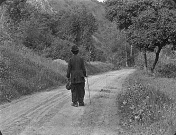
Chaplin’s tinkering with his Tramp character is evident in the most famous short in the set, The Tramp. It begins and ends with the character on the road, going nowhere in particular. In between are sandwiched broad slapstick scenes, quieter comic moments, and a big of the pathos that would become increasingly central to the Tramp.

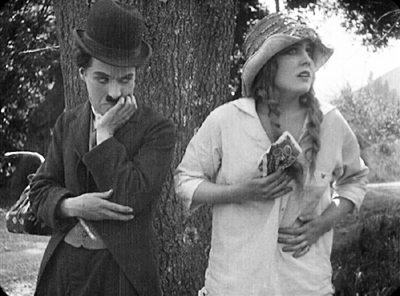
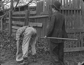
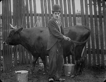
Early in the film he is capable of saving an innocent farm girl with a wad of money from a trio of thieving hobos, then stealing the money himself (above), and then relenting and giving it back.  His comic pacing is sometimes off–way off in an overlong scene of the Tramp, who gets a job at the heroine’s farm, repeatedly poking a fellow farmhand with a pitchfork (a pretty cliched gag to begin with). The Tramp’s clueless attempts at milking a cow work distinctly better, as he tries everything, including turning the cow’s tail into a pump handle. That’s the sort of visual punning that would become one of Chaplin’s comic strengths. There are some funnier scenes, as when the Tramp is forced to bunk in with the farmhand and suffers agonies from his roommate’s smelly socks.

The Tramp Charlie & pitchfork     The Tramp Charlie & Cow

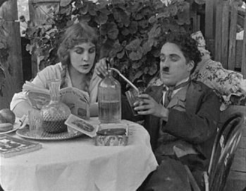
Some quietly funny moments are better, though, as when the Tramp, having been wounded in the leg while trying to foil a burglary attempt, sits complacently enjoying his leisure and assuming that the heroine is in love with him. The absent boyfriend, well-dressed and handsome, soon shows up and, recognizing the inevitable, the Tramp removes himself from the triangle and takes to the road once more. Perhaps more than any other image, this one summarizes how Chaplin’s Tramp was thought of for many years and by millions of people.

The Tramp Charlie & selzer     The Tramp last shot

Bonuses include some films using discarded footage or cutting together scenes from already-released shorts, as Essanay tried to capitalize as much as possible on Chaplin’s extraordinary international popularity. There is also a booklet with Vance’s essay and a set of program notes. Each of these has a brief description of the restoration process, which is a nice thing to see in a supplement.

Sherlock Holmes Alice at night

Sherlock Holmes (1916)

David Bordwell
top of page

have comments about the state of this website? go here