


Archive for the 'Animation: Pixar' Category
Oscars by the numbers
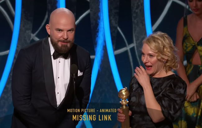
Director Chris Butler: “Well, I’m flabbergasted!” with producer Arianne Sutner.
Kristin here:
The Oscars are looming large, with the presentation ceremony coming up February 9. But did they ever really go away? As I’ve pointed out before, Oscar prediction has become a year-round obsession for amateurs and profession for pundits. I expect on February 10 there will be journalists who start speculating about the 2020 Oscar-worthy films. The BAFTAs (to be given out a week before the Oscars, on February 7) and Golden Globes have also become more popular, though to some extent as bellwethers of possible Oscar winners. The PGA, DGA, SAG, and even obscure critics groups’ awards have come onto people’s radar as predictors.
How many people who follow the Oscar and other awards races do so because they expect the results to reveal to them what the truly best films of the year were? How many dutifully add the winners and nominees to their streaming lists if they haven’t already seen them? Probably quite a few, but there’s also a considerable amount of skepticism about the quality of the award-winners. In recent years there has arise the “will win/should win” genre of Oscar prediction columns in the entertainment press. It’s an acknowledgement that the truly best films, directors, performers, and so on don’t always win. In fact, sometimes it seems as if they seldom do, given the absurd win of Green Book over Roma and BlacKkKlansman. This year it looks as if we are facing another good-not-great film, 2017, winning over a strong lineup including Once upon a Time in … Hollywood, Parasite, and Little Women.
Still, even with a cynical view of the Oscars and other awards, it’s fun to follow the prognostications. It’s fun to have the chance to see or re-see the most-nominated films on the big screen when they’re brought back to theaters in the weeks before the Oscar ceremony. It’s fun to see excellence rewarded in the cases where the best film/person/team actually does win. It was great to witness Laika finally get rewarded (and flabbergasted, above) with a Golden Globe for Missing Link as best animated feature. True, Missing Link isn’t the best film Laika has made, but maybe this was a consolation prize for the studio having missed out on awards for the wonderful Kubo and the Two Strings and other earlier films.
It’s fun to attend Oscar parties and fill out one’s ballot in competition with one’s friends and colleagues. On one such occasion it was great to see Mark Rylance win best supporting actor for Bridge of Spies, partly because he deserved it and partly because I was the only one in our Oscar pool who voted for him. (After all, I knew that for years he had been winning Tonys and Oliviers right and left and is not a nominee you want to be up against.) Sylvester Stallone was the odds-on favorite to win, and I think everyone else in the room voted for him.
Oscarmetrics
 Pundits have all sorts of methods for coming up with predictions about the Oscars. There’s the “He is very popular in Hollywood” angle. There’s the “It’s her turn after all those nominations” claim. There are the tallies of other Oscar nominations a given title has and in which categories. And there is the perpetually optimistic “They deserve it” plea.
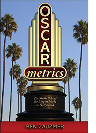
For those interested in seeing someone dive deep into the records and come up with solid mathematical ways of predicting winners in every category of Oscars, Ben Zauzmer has published Oscarmetrics. Having studied applied math at Harvard, he decided to combine that with one of his passions, movies. Building up a huge database of facts from the obvious online sources–Wikipedia, IMDb, Rotten Tomatoes, the Academy’s own website, and so on–he could then crunch numbers in all sorts of categories (e.g., for supporting actresses, he checks how far down their names were in the credits).
An early test of the viability of the method came in the 2011 Oscar race, while Zauzmer was still in school. That year Viola Davis (The Help) was up for best actress against Meryl Streep (The Iron Lady). Davis was taken to be the front-runner, but Zauzmer’s math gave Streep a slight edge. Her win reassured Zauzmer that there was something to his approach. His day job is currently doing sports analytics for the Los Angeles Dodgers.
Those like me who are rather intimidated by math need not fear that Oscarmetrics is a book of jargon-laden prose and incomprehensible charts. It’s aimed at a general public. There are numerous anecdotes of Oscar lore. Zauzmer starts with Juliet Binoche’s (The English Patient) 1996 surprise win over Lauren Bacall (The Mirror Has Two Faces) in the supporting actress category. Bacall was universally favored to win, but going back over the evidence using his method, Zauzmer discovered that even beforehand there were clear indications that Binoche might well win.
Zauzmer asks a different interesting question in each chapter and answers it with a variety of types of evidence. The questions are not all of the “why did this person unexpectedly win” variety. For the chapter on the best-animated-feature category, the question is “Do the Oscars have a Pixar bias?” It’s a logical thing to wonder, especially if we throw in the Pixar shorts that have won Oscars. Zauzmer’s method is not what one might predict. He posits that the combined critics’ and fans’ scores on Rotten Tomatoes genuinely tend to reflect the perceived quality of the films involved, and he charts the nominated animated features and winners in relation to their scores.
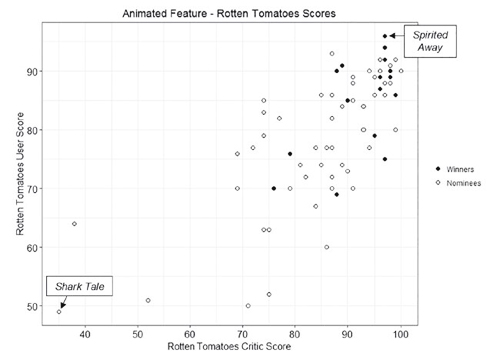 The results are pretty clear, in that Spirited Away is arguably the best animated feature made in the time since the Oscar category was instituted in 2001. In fact, I’ve seen it on some of the lists of the best films made since 2000, and it’s not an implausible choice either way. Shark Tale? I haven’t seen it, but I suspect it deserves its status as the least well-reviewed nominee in this category.
Using this evidence, Zauzmer zeroes in on Pixar, which has won the animated feature Oscar nine times out of its eleven nominations. In six cases, the Pixar film was the highest rated among that year’s nominees: Finding Nemo, The Incredibles, WALL-E, Up, Inside Out, and Coco.
In two cases, Pixar was rated highest but lost to a lower-rated film: Shrek over Monsters, Inc., and Happy Feet over Cars. I personally agree that neither Shrek nor Happy Feet should have won over Pixar. (Sorry, George Miller!)
Zauzmer finds three cases where Pixar did not have the highest rating but won over others that did: Ratatouille beat the slightly higher-rated Persepolis, Toy Story 3 should have lost to the similarly slightly higher-rated How to Train Your Dragon, and Wreck-It Ralph was way ahead on RT but lost to Brave. Wreck-It Ralph definitely should have won, and the sequel probably would have, had it not been unfortunate enough to be up against the highly original, widely adored Spider-Man: Into the Spiderverse.
The conclusion from this is that the Academy “wrongly” gave the Oscar to Pixar films three times and “wrongly” withheld it twice. As Zauzmer points out, this is “certainly not a large enough gap to suggest that the Academy has a bias towards Pixar.” This is pleasantly counterintuitive, given how often we’ve seen Oscars go to Pixar films.
Oscarmetrics offers interesting material presented in an engaging prose style, more journalistic than academic, but thoroughly researched nonetheless.
In his introduction, Zauzmer points out that the book only covers up to the March, 2018 ceremony. It obviously can’t make predictions about future Oscars, though it might suggest some tactics you could use for making your own if so inclined. Zauzmer has been successful enough in the film arena that he writes for The Hollywood Reporter and other more general outlets. You can track down his work, including pieces on this years Oscar nominees, here.
Screenplaying

Design by Christina King.
DB and Kristin here:
Two years ago DB reported on the gathering in Brussels of the Screenwriting Research Network (here and here). This year, thanks to our colleagues J. J. Murphy and Kelley Conway, our department hosted the conference. Again, it was chock-a-block with stimulating papers. We also introduced our visitors to the Wisconsin Center for Film and Theater Research, which houses thousands of screenplays. It wasn’t all work, either. Participants were spotted lingering at our lakeside terrace or making their way through the cafes and saloons lining State Street. We believe it’s fair to say that a hell of a time was had by all.
Since there were simultaneous sessions, nobody could attend everything, and we can’t run through all the papers we heard. (So do consult the program for more information.) Herewith, some highlights that set us thinking.
In the key of keynote

Larry Gross and Jon Raymond.
The four keynoters encapsulated the conference’s very wide range. In a workshop keynote Jill Nelmes, Editor of the Journal of Screenwriting, offered a historical survey of screenwriting research in all media, with special emphasis on television. The Big Hollywood Movie was covered by Kristin, whose paper, “Extended How?” examined the ways in which directors’ cuts and extended editions handle the multi-part structure she posits as a foundation of contemporary Hollywood. We won’t say more here, since she may turn it into a blog for this site.
Larry Gross had already started off the conference with a bang by taking us to Japan. Larry has written 48 HRS, Streets of Fire, Geronimo, True Crime, and other mainstream studio pictures, as well as television episodes, TV mini-series, and independent films like Prozac Nation and We Don’t Live Here Anymore. He also writes outstanding film criticism for Sight and Sound, Film Comment, and other journals, and he teaches screenwriting at New York University. Scott Macauley’s informative March interview with Larry is at Filmmaker Magazine.
 Larry’s keynote, “The Watergate Theory of Screenwriting,” tackled the question of how filmmakers decide to share story information with the audience. What do the characters know and when do they know it? What does the audience know, and when? Storytelling, Larry suggested, develops out of the interplay of these two sets of questions. He added, perhaps hoping to provoke purists who consider film to be sheer self-expression: “Thinking about the audience is not always reactionary.”
He illustrated his ideas with an in-depth examination of Kurosawa’s Ikiru. He had long thought the film “an official liberal-humanist classic,” until a course with Annette Michelson at NYU showed him that there was a lot to ponder there. Specifically, Kurosawa starts by telling the audience the end of the story: Watanabe will die of cancer. But he doesn’t know that, and neither do all the people he encounters. The strategy denies us a lot of suspense, so to hold our interest Kurosawa must engross us by delineating his relations with his colleagues, with the mothers petitioning for the neighborhood sump to be drained, and with the stray people he meets casually on his night out.
Larry showed how carefully Kurosawa played off the characters’ indifference, misunderstanding, and lack of awareness. In particular, the neighborhood wives display to Watanabe what Maurice Blanchot called “the ignorance and spontaneity of true affection.” Ikiru’s refusal to explain what it means typifies a kind of cinema that asks the audience to share the burden of understanding. “Ikiru understands how a screenplay can be composed with the audience.”
Jon Raymond’s keynote carried things to independent US film. Jon has become famous for a novel (The Half-Life) and short stories (Livability), as well as for his screenplays for Kelly Reichardt’s features. The most recent, the forthcoming Night Moves, is currently in competition at Venice. The teaser title of Jon’s address, “Screenwriting as Earth Art,” turned out to be a reference to the fact that most of his stories take place in the vicinity of his home. He has found satisfaction by composing on familiar ground.

In younger days Jon tried painting and filmmaking; a Public Access feature based on the comic strip Crock turned out to be “a movie best experienced in fast forward.” But he found that writing offered the most creative satisfaction. At the same time, while assisting Todd Haynes on Far from Heaven, he met Kelly Reichardt, who was looking for a property to adapt on a small budget. The result was Old Joy, “a New Age western,” in which two men display the violence latent in the new passive-aggressive masculinity flourishing on the Coast. Jon believes that Reichardt’s handling created a cinematic parallel to the dense intricacy of a short story.
In later collaborations, Jon mapped his patch of Portland in other ways. Seeing the annual migration of workers to Alaskan canneries, and hearing the train whistles wafting through his neighborhood, he created the story that became Reichardt’s Wendy and Lucy (above). Reichardt began adapting the story to film before he had finished writing it. Similarly, Jon merged the booming housing market of the 2000s and the history of the Oregon Trail into a project that paralleled today’s gentrification with nineteenth-century colonization. Reichardt turned his screenplay into Meek’s Cutoff, a “desert poem” that completed what some have called their Oregon Trilogy. For Jon, the trilogy constitutes an alternative regional history, one that traces the process of “sowing the land with failure, betrayal, and humiliation.”
Plots and no plots

The Adventures of André and Wally B (1984).
More than most areas of filmmaking, screenwriting reminds us of the institutional framework surrounding most creative work cinema. Scholars studying the screenplay are naturally often pursuing the endless revisions, refusals, and rethinks that a film goes through in the preparation phase. It’s easy to see this as a one-versus-one struggle, but in many cases the process takes place within a social environment possessing its own roles and rules.
Ian MacDonald offered an excellent example in his study of the work processes behind the UK television soap opera Emmerdale. He proposed that we replace model of industrial film production as an auto factory with that of a carpet factory. Instead of the TV episode being seen as a discrete unit, like a car, it should be conceived as an ongoing fabric woven of many threads. In Emmerdale and other series, the unit of production isn’t the episode but rather the story line. Each episode is sliced out of a much bigger stretch of ongoing patterns. Ian illustrated this with the writers’ planning chart that was mounted on the wall.
The vertical column represents scenes, marked off as episodes. The characters are color-coded cards connected by solid liness that weave their way through the scenes. These waves are the melodies; the scenes are the bar-lines. In each episode, two or three characters are given prominence, while the subordinate ones contribute their harmonies. Ian’s discussion reminded me of how Hong Kong filmmakers did much the same thing in the 1980s: plotting films reel by reel and color-coding certain elements—gags, fights, and chases—to make sure that each reel had its share of attractions. This is the sort of insight into structure that institutional research can yield: Structure is these people’s business.
Other Hollywood studios envy Pixar for to its appealing, carefully structured stories. Richard Neupert showed how that tradition goes back to the earliest years at Pixar. Even in demo films which were made to show off technological innovations, the makers tried to reveal how computer animation, even in its early, simple form, could create engaging tales. At a period when computer animation could only render smooth, simple shapes, the Pixar team found appropriate subject matter, with highly stylized characters in The Adventures of André and Wally B and Luxo, Jr.
Remarkably, these tiny films have balanced “acts.” Each is 80 seconds long and has a key action at exactly 40 seconds in: the entrance of Wally B and the moment when the little Luxo lamp jumps on a ball. Similarly, Red’s Dream‘s parts run 50-100-50 seconds. This care in timing continued with the features: Toy Story’s midpoint comes when Woody finally shifts strategies, realizing he has to work with Buzz. And what about Pixar’s perceived slump in recent years? someone asked during the question session. Neupert pointed out that Pixar’s founders have aged, and there may no longer be quite the sense of excitement and discovery pushing the team to surpass others and themselves.
Sometimes institutional traditions come into conflict. Petr Szczepanik’s talk traced in meticulous detail how screenplay development in Czechoslovakia was altered in the years from 1930 to the 1950s. Czech filmmakers developed their own system of moving from theme and story germ to final screenplay. But with the Communist takeover there came the demand to add the Soviet model of the “literary screenplay,” a detailed specification of scenes, dialogue, and the like. Filmmakers resisted this, preferring the customary and more flexible “technical screenplay” that was largely the province of the director. Petr mentioned new screenwriting trends pioneered by Frank Daniel that gave directors the authority to modify the literary format. By the late 1950s, filmmakers had found ways to make the literary screenplay a less rigid blueprint for filming.
Back in the USSR, the screenwriting institution found even the literary screenplay a difficult basis for mass output. Maria Belodubrovskaya’s talk focused on “plotlessness” as a rallying cry and term of abuse in the 1930s-1940s Soviet film. There were long debates about whether “themes” sufficed to make a film or whether you needed strong plots in the Hollywood vein. Film-policy supervisor Boris Shumyatsky urged the latter course, and the popular success of Chapayev (1934) seemed to support his case. By the late 1930s, though, Shumyatsky was purged and the tide turned against strong plots. Film executives found a concern with plot too “Western” and “cosmopolitan,” and annual film production became based on themes rather than stories. Most provocatively, Masha suggested a lingering influence of Soviet Montage storytelling, which based films on vivid but loosely linked episodes. She illustrated her case with an analysis of Pudovkin’s In the Name of the Motherland (1943), with its diffuse lines of action and sudden reversals and omissions.
Back we go

Scarface (1932).
Naturally, Madison wouldn’t be Madison without strong papers on the history of cinema, and many conference presentations suited the tenor of the joint.
 Stephen Curran offered an enlightening study of one of the least-known but most colorful figures in early American screenwriting, a man with the dashing name of Captain Leslie T. Peacocke. He was credited with over 300 screenplays, including Neptune’s Daughter (1914). He acted, directed, and wrote novels too. He was one of the first script gurus, writing magazine columns on the craft and eventually the early manual Hints on Photoplay Writing (1916).
Stephen surveyed Peacocke’s contribution to the emerging scenario market. Peacocke believed that successful screenwriting couldn’t be taught, but he could give hints about developing original stories, thinking in visual terms, and practical craft maneuvers like snappy names for characters. During the Q & A, Stephen added that a great deal of Peacocke’s rhetoric was aiming to raise his own profile in the industry. In conversation afterward, Stephen praised the Media History Digital Library and Lantern (flagged in an earlier blog) for immensely helping research into early film. Here, for example, is Peacocke’s 216-item dossier on Lantern.
Andrea Comiskey argued that for the same period, we can study scripts and extrapolate craft practices that otherwise go undocumented. Her focus was the disparity between what manuals like Peacocke’s said and what actually got jotted down in working scenarios. Studying several screenplays from the American Film Company of Santa Barbara, she found that the manuals’ recommended stylistic approach was revised in the course of shooting.
The manuals proposed that each scene would be built out of a lengthy single shot (called, confusingly, a “scene”) which could at judicious moments be interrupted by an “insert.” An insert was usually a letter or piece of printed matter read by the characters, but it might also be a detail shot of a prop, hands, or an actor’s face.
In preparing scenarios, the writers assigned numbers to each “scene,” as the manuals recommended. But Andrea found that in the filming, the director and cameraman added shots, breaking down the action into more bits. This was, in effect, a move away from the strict scene/insert method and a shift toward what would become the classical continuity system. To maintain a paper record for the editor, the interpolated shots would be recorded and labeled in fractions. Instead of a straight cut from 6 to 7, the filmmakers might wedge in 6 ½, 6 ¾, and so on. Here’s an extract from Armed Intervention (1913), courtesy Andrea.

Strange as this sounds to us today, it was preferable to renumbering the shots, which could cause confusion. (Is shot 17 the original 17 or the later one?) The fractions kept the footage consistent with the scenario across the production process. So it turns out that (as usual?) filmmakers were a bit ahead of the screenplay gurus, even back in the 1910s.
Lea Jacobs asked a question about the transition from silent to sound film: How did filmmakers manage the pacing of dialogue? Silent movies had great freedom of pacing, while the shift to talkies seemed to many filmmakers to slow things down. Lea’s research indicated that two strategies for speeding things up emerged: creating shorter scenes and shortening dialogue passages within them. She reviewed how these ideas emerged in Hollywood’s own discourse in the 1930s and in certain films. In the first years of sound, scenes were rather long (often because they were derived from stage plays) and speeches were similarly extended. But in the 1931-1932 season, she argued, short scenes and quicker repartee became more common.
She traced the process in three films of Howard Hawks, from the stagy Dawn Patrol (1930) through The Criminal Code (1931), which opens in the new style but then turns to longer sequences, and then to Scarface (1932). The gangster film shifted toward shorter scenes and more laconic dialogue than did other genres, and Scarface displays this in full flower. Tony Camonte’s takeover of the South Side beer trade is presented in six harsh, violent scenes that add up to little more than three minutes. Workers in the sound cinema, it seems, were soon pushing toward that rapid tempo we identify with the 1930s.
 Storyboards have now entered academic studies. Chris Pallant and Steven Price offered some historical insights by comparing some early storyboards by William Cameron Menzie with those of early Spielberg films. When Menzies was storyboarding Gone with the Wind, he called it “a complete script in sketch form” and “a pre-cut picture.” Selznick’s publicity director characterized it: “The process might be called the ‘blue-printing’ in advance of a motion picture.” The striking revelation was that the storyboarding was not done after the script was finished. Menzies worked from the book, and the storyboard and script were created in parallel. Menzies’ storyboard for the 1933 Alice in Wonderland revealed a similarly elaborate process. It was 624 pages long, with one page per intended shot. Each page contained a sketch at the top, a paragraph describing the planned technological traits of the shot (such as lens length), and the traditional screenplay dialogue at the bottom. It’s hard to imagine many people other than a genius like Menzies being able to provide such a comprehensive plan for a film. (A sketch for Alice is on the right here. DB has written about Menzies here and here.)
Spielberg used sketches in addition to a screenplay from the start. Duel, surprisingly enough, was supposed to be shot in a studio, but the director insisted on working on location. The sketches he made for it do not resemble a traditional storyboard but instead are like pictorial maps framed from an extremely high angle. He also plotted out the paths of the vehicles with overhead views of the roads. The storyboards for Jaws were done from the novel at the same time that the script was being written, just as Menzies had done with Gone with the Wind. (The same thing happened with Jurassic Park.) Storyboards were vital, among other things, for telling the crew which of the four versions of the shark would be used. One fake shark had only a right side, another a left, and which one was needed depended on the direction the shark was crossing the screen. The speakers distinguished between the “working” storyboard and the “public” one. The public one is what sometimes get published, but it usually has each image cropped to remove the information about the shot (e.g., who will work on it) noted underneath.
Brad Schauer contributed to a roundtable on the American B film back when The Blog was in its infancy. He has been researching the role of B’s in the industry for many years, and he brought to our event some new ideas about them in the postwar period. His paper, “First-Run and Cut-Rate” showed that there were still plenty of theatres showing double bills in the 1950s and 1960s (DB can confirm it), and the market needed solid, 70-90 minute fillers. One answer was the “programmer,” or the “shaky A” that featured somewhat well-known talent, color, location shooting, and familiar genres (Westerns, swashbucklers, horror, crime, comedy, and science fiction). Shot in half the time of an A, with budgets in the $500,000-$750,000 range, programmers fleshed out double bills and sometimes broke into the A market.
What does this have to do with screenwriting? Brad decided to test whether Kristin’s ideas about four-part structure (here and here) held good with programmers. Looking at several, he came up with a plausible account that films like Battle at Apache Pass and Against All Flags simply compressed the four parts into short chunks, typically running fifteen to twenty minutes. In The Golden Blade, Rock Hudson formulates his goal (revenge) two and a half minutes into the movie.
Too few things happen?

La Pointe Courte (1955).
In most films, Agnes Varda said, “I find that too many things happen.” How can screenplay studies move beyond Hollywood’s jammed dramaturgy to consider the more spacious sort of storytelling we find in “art cinema”?
Colin Burnett offered a general overview of art-cinema norms that is somewhat parallel to our and Janet Staiger’s The Classical Hollywood Cinema. To a great extent, of course, “art films” differ from classically constructed films. They can be more ambiguous, more reflexive, more stylized and at the same time more naturalistic. They often replace a tight causal chain with episodic construction and nuances of characterization. The protagonists may have complex mental states; they may have inconsistent goals, or no goals at all; they may be passive; they may have shifting identities.
Yet Colin argued against claims that art films lack narrative altogether. “Art films offer reduced scene dramaturgy, rarely its complete absence.” They possess structuring devices comparable to Hollywood acts. A film’s large-scale parts may be based on a character’s development, on changes in space or time, or on variations of action and/or reaction. A question was raised as to whether such a broad category as art cinema could be characterized in such ways. Given the enormous range of types of films made in the Hollywood tradition, however, it seems possible that the art cinema could be described in a similar fashion. (For our thoughts on the matter, go here and here.)
A great many art-film strategies can be seen as stemming from modernism in literature and the other arts. As if offering a case study illustrating Colin’s argument, Kelley Conway focused on La Pointe Courte. Varda’s first film is now coming to be considered the earliest New Wave feature. But Varda wasn’t the prototypical New Waver. She wasn’t a man, she wasn’t a cinephile, and she took her inspiration from high art, not popular culture. A professional photographer who loved painting and literature, she brought to this film (made at age 26) a bold awareness of twentieth-century modernism. The result was a striking juxtaposition of stylization and realism, personal drama and community routine. In La Pointe Courte, we might say, neorealism meets the second half of Hiroshima mon amour.
Inspired by Faulkner’s Wild Palms, Varda braided together two stories. While families in a fishing village live their everyday lives, an educated couple work through their marriage problems in a long walk. Remarkably, Varda had not seen Rossellini’s Voyage to Italy. After supplying background on the production process, Kelley focused on matters of performance. She explained how Varda, well aware of Brechtian “distanciation,” made the couple’s dialogue deliberately flat. By contrast, the villagers’ lines, through scripted, were treated more naturalistically. La Pointe Courte emerges as an anomie-drenched demonstration of how little you need to make an engrossing movie.
To script or not to script (or to pretend not to script)

Maidstone (1970).
The SRN embraces research into the absence of a script as well. At one limit is the work of avant-gardists like Stan Brakhage. John Powers’ “A Pony, Not to Be Ridden” discussed how non-narrative filmmakers used paper and pencil to organize their work, much as a poet might make notes on a draft. John’s examples were three films by Brakhage, each developed out of sketches and jottings assembled after shooting but before editing. Unconstrained by any script format, Brakhage had to invent his own version of storyboarding and screenplay notes.
Compilation filmmakers also discover their structure in the process of collecting and sifting material. Documentarist Emile de Antonio, whose collection resides in our WCFTR, had to build his screenplay up after he had assembled some material. “A script won’t be ready,” he remarked, “until the film is finished.” Vance Kepley’s paper showed that In the Year of the Pig was the result of a massive effort of “information management.” De Antonio sought out press clippings, sound recordings, and news footage and then had to create an archive with its own system of labeling, cross-references, and easy access.
De Antonio started with the soundtrack, which was itself a montage of found material, and then created a “paper film,” cutting and pasting vocal passages and descriptions of images. At the limit, he charted his film’s structure with magic-marker notations on large strips of corrugated cardboard, as Vance illustrated.

One panel session took a close look at improvisation in fiction features. Line Langebek and Spencer Parsons gave a lively paper with the innocuous title “Cassavetes’ Screenwriting Practice.” Explaining that Cassavetes did use scripts (“sometimes overwritten”), and he relied on actors to help create them in workshop sessions, they proposed thinking of his work as exemplifying the “spacious screenplay.” Their ten principles characterizing this sort of construction include:
Write with specific actors in mind. Use a “situational” dramaturgy rather than a rise-and-fall one. The work is modeled on free jazz, with moments set aside for specific actors. Even minor actors get their solos. Shoot in sequence, so that emotional development can be modulated across the performances.
Line and Spencer’s precise discussions cast a lot of light on the specific nature of Cassavetes’ creative process and pointed paths for other directors. They added that the spacious screenplay is really for the actors and the director; the financiers should be given something more traditional.
Norman Mailer called Cassavetes’ films “semi-improvised.” He tried to go further, J. J. Murphy explained in “Cinema as Provocation.” Mailer wanted his three films Wild 90, Beyond the Law, and Maidstone to be completely improvised, utterly in the moment. “The moment,” he proclaimed, “is a mystery.” Mailer opposed the “femininity” he claimed to find in Warhol’s films, so he encouraged his male players to indulge their machismo playing gangsters, cops, and aggressive entrepreneurs. J. J., whose book on Warhol stressed the psychodrama component of the films, finds Mailer no less devoted to having his players work out their problems through unrestrained behavior. The climax of Maidstone, in which an enraged Rip Torn begins to strangle Mailer, becomes the logical outcome of Mailer’s needling provocation of his actors. How ya like the mystery of this moment, Norman?

Within the Hollywood industry, improvisation is identified strongly with Robert Altman’s films, but Mark Minnett‘s “Altman Unscripted?” shows another side to his work. Focusing on The Long Goodbye, Mark finds that the film doesn’t vary wildly from the script. The principle plot arcs aren’t changed, although Altman decorates them by letting minor characters inject some novelty. He encouraged the guard who does impressions of Hollywood stars, and he gave latitude to Elliott Gould, whose improvisation elaborates on the issues of trust and bonding that are embedded in the script. Some scenes are condensed or altered, as often happens on any production, but the Altman mystique of freewheeling, anything-goes creativity isn’t borne out by the film. Altman’s characteristic touches are built around what’s “narratively essential,” as laid out in the screenplay.
We learned a lot more at the conference than we can cover here. For example, Jule Selbo brought to our attention Sakane Tazuko, a woman screenwriter-director in 1930s Japan. Rosamund Davies explored the ways in which transmedia storytelling could enhance historical dramas. Carmen Sofia Brenes traced out how different senses of verisimilitude in Aristotle’s Poetics might apply to screenwriting. We learned of a planned encyclopedia of screenwriting edited by Paolo Russo and a book on the history of American screenwriting edited by Andy Horton. Not least, there was Eric Hoyt, whose “From Narrative to Nodes” showed how digitized screenplays could be used to graph character action and interaction over time. (A nice moment: When asked if his analytic could be rendered in real time, he clicked a button, and the thing moved.) Once more we’re in the x-y axes of Emmerdale and In the Year of the Pig, but now in cyberspace. Eric’s results on Kasdan’s Grand Canyon appears here on the right, but only as an enigmatic tease; he will be contributing a guest blog here later this fall.
In other words, you should have been here. Next time: October in Potsdam, under the auspices of Kerstin Stutterheim at the Hochshule für Film und Fernsehen “Konrad Wolf.” DB was at this magnificent facility last year for another event, and we’re sure–to coin a phrase–a hell of a time will be had by all.
Thanks very much to J. J. and Kelley, as well as to Vance Kepley, Mary Huelsbeck, and Maxine Fleckner Ducey of the WCFTR. Special thanks to Erik Gunneson, Mike King, Linda Lucey, Jason Quist, Janice Richard, Peter Sengstock, Michael Trevis, and all the other departmental staff that helped make this conference a big success.
Thanks also to Noah Ollendick, age 12, who asked a smart question.
P.S. 4 Sept: Thanks to Ben Brewster for a correction!

J.J. Murphy and Kelley Conway, conference coordinators.
Atmos, all around: A guest post by Jeff Smith

Today we have a guest entry by our friend and colleague Jeff Smith. Jeff teaches here at the University of Wisconsin–Madison in the Film Studies area. He’s an expert on cinema sound, particularly music. His book The Sounds of Commerce: Marketing Popular Film Music is a trailblazing explanation of the ties between 1960s Hollywood and the music industry. It combines analysis of scoring with discussions of business decisions that shaped audience’s response to movie soundtracks. His forthcoming book is on how critics have understood the impact of the HUAC hearings and the Hollywood Blacklist, with emphasis on films that seem to comment on Cold War politics.
Jeff has written extensively on sound practices in contemporary American cinema. What better person to explain and analyze the newest sound technology in Hollywood movies?
Director Peter Jackson calls it “the completely immersive sound experience that filmmakers like myself have long dreamed about.” Mark Andrews, who made his feature film directorial debut with Pixar’s Brave, says, “It’s more 3D than 3D images.” “It” is Dolby Atmos, a new cinema sound system that promises to change the way you see and hear movies. Does it?
The buzz

Dolby Atmos made its debut with Brave at last year’s Los Angeles Film Festival. A handful of scenes from earlier films, including Rise of the Planet of the Apes and The Incredibles had been test-mixed in the new Atmos system for demonstration purposes. But Brave is the first film to use the new platform from start to finish.
If you haven’t heard of Dolby Atmos, you’re not alone. When Brave opened, there were only fourteen theatres in the country that were capable of showing the film in Atmos. These tended to be high-end movie theatres, such as AMC’s six Enhanced Theatre Experience venues, which typically charge a premium ticket price.
The list of theatres wired for Atmos has grown since then, but the number remains quite small. At this point, there are 37 theatres in the U.S. that feature Dolby Atmos, a tiny fraction of the country’s nearly 40,000 screens. A little more than a third of these theatres are located in California. Approximately another third are clustered in just five states: Florida, Illinois, New York, Texas, and Washington. Most of these theatres are in the suburbs of major metropolitan areas. True, the recently opened Palms Theatre in Muscatine, Iowa (population 22,886) incorporated an Atmos system in its XL Digital Auditorium, but presumably it was part of its building plan. For existing theatres, an upgrade carries a hefty price tag of between $30,000 and $100,000. So Dolby Atmos may not be coming soon to a theatre near you.
Yet more and more films are being mixed for Atmos. Dolby has announced that more than twenty films will feature the new platform in 2013, a significant increase over the twelve films distributed with this format in 2012. The roster includes three of the most eagerly anticipated studio tentpoles of the summer season: Paramount’s Star Trek Into Darkness, Pixar’s Monsters University, and Warner Bros. Superman reboot, Man of Steel. Still, does the new system justify the expensive theatre conversions and the higher ticket prices that will follow?
Two channels. Then five + one. Now, how about sixty?

Dolby Digital Surround 5.1.
According to the Dolby website, Atmos grew out of the company’s efforts to introduce Dolby 7.1. For years, the flagship for Dolby’s digital surround sound technology was their 5.1 system. The digit 5 referred to the number of channels that could be used by sound mixers: three channels for speakers behind the screen (left, center, and right) and two channels for all the surround speakers that line the side and back walls of the auditorium (left surround and right surround). The .1 in 5.1 refers to the Low Frequency Effects channel (LFE) that sent sounds between 3 to 120 Hz to a subwoofer located behind the screen in the front of the auditorium. These low-frequency sounds trigger acoustic vibrations that add a kinesthetic kick to onscreen explosions and car crashes.

With Toy Story 3 in 2010, Dolby introduced two additional channels to their 5.1 platform. The 7.1 system subdivides the surround speakers. Instead of two channels for the surrounds (left surround and right surround), Dolby 7.1 offers sound mixers four channels (left side surround, left rear surround, right side surround, and right rear surround).
Dolby 7.1 came fairly late to the game, however. Sony already had introduced its own 7.1 system in 1993 with the premiere of John McTiernan’s Last Action Hero. Yet despite the eight-channel capability of Sony Dynamic Digital Sound, (SDDS), it never really caught on, largely because of the added expense of executing a 7.1 sound mix in addition to the standard 5.1 one. To date, more than 1400 films were mixed for the six-channel version of SDDS. Only 97 films received an eight-channel mix.
In the 2000s, Sony gradually began to phase out its 7.1 system. Filmmakers stopped building eight-channel mixes in SDDS in 2007. Moreover, about ten years after introducing SDDS, Sony stopped manufacturing decoders for SDDS content, citing decreased demand. SDDS had always lagged behind its competitors in the battle for screens, so Sony’s decision was not terribly surprising. Although new films continue to be mixed in SDDS to meet the needs of exhibitors that continue to use the system. Most theatre owners have replaced SDDS with one of Dolby’s systems. Sony promised exhibitors it would continue to make parts and service for current SDDS products available until 2014. But the electronics giant acknowledged that it was shifting its attention to digital cinema technologies that were already in development.
Considering Sony’s history and exhibitors’ reluctance to upgrade to an eight-channel system, it’s surprising that in 2010, Dolby would launch its own 7.1 counterpart. But maybe not so surprising, because Dolby’s new channels were differently placed. Sony’s 7.1 system had added channels to the speakers behind the screen. Instead of three front channels (left, center, and right), SDDS had five (left, left center, center, right center, and right). These extra sound sources probably made little difference to most moviegoers. Adding channels behind the screen made for smoother panning of sounds that seem to move across the space depicted in a shot, but it did nothing to increase the sense of spatial immersion.
In contrast, Dolby added its two extra channels to the surround areas. Its 7.1 platform treats the interior of the theatre as seven spatially distinct zones. The additional channels in the surround array enables mixers to position sound elements more precisely. This “zoning” of the surrounds offers mixers a wider variety of options for the placement of sounds, and it more closely approximates the way that sounds in real life come at us from several different directions.
Now Dolby Atmos pushes the premises of this aspect of Dolby 7.1 to the nth degree. While Dolby 7.1 makes a leap from six channels to eight channels, Dolby Atmos makes a leap from eight channels to sixty-four channels, a gigantic change from all of Atmos’ predecessors. Using the old nomenclature that described the sound platform as a ratio of speaker channels to LFE channels, we might call Dolby Atmos a 62.2 system! It offers more than sixty separate and distinct speaker channels as well as an optional channel for additional subwoofers located in the back corners of the auditorium. More importantly, with the vastly expanded number of speaker channels, Atmos enables mixers to position a single sound element in the theatre with unprecedented clarity and precision.
Say you have a screen door banging in the wind. In Dolby 5.1, if a mixer wanted to send that banging noise to the right surrounds, it went to every speaker in the array. In effect, it wouldn’t sound like a single door, but rather several doors banging in unison. In Atmos, however, if a mixer wants to position that banging sound in a particular part of the auditorium, he can treat it in a manner analogous to the way it would be heard in the real world. The sound is emitted from a single point of origin and is heard as a punctual effect rather than as aural ambience emanating from a broader area of the theatre.
All about the panning
Beyond its multiplication of channels, Dolby Atmos addresses certain limitations in earlier platforms. Simplifying a bit, we can say that for content providers Atmos is “all about the panning.” Atmos adds a couple of speakers on each side that are placed close to the screen to facilitate smoother pans for sounds that move from onscreen to offscreen.
The surround speakers in Atmos have a frequency range that closely matches that of the speakers behind the screen. This aspect of Atmos addresses a common complaint about more traditional digital surround systems. In those, the surround speakers have a narrower frequency range than the front ones. As a result, when sounds were panned from onscreen to offscreen, the audience could hear changes in timbre and fidelity. The extra subwoofers in Atmos ameliorate this problem since they help to “bass manage” the surrounds, thereby allowing sounds in them to have a much “fatter” low end.
Besides adding subwoofers to increase the number of LFE channels, theatre owners have the option of adding left center and right center channels to the speakers behind the screen. This allows for smoother pans of sounds made by characters or objects that move across the screen. In this respect, Atmos combines the best features of Dolby 7.1 and Sony’s eight-channel system.
Up in the air

In platforms like Dolby 5.1, sound is situated almost entirely on one plane. The speakers behind the screen are at roughly the same height as are the surround speakers that line the sides and back wall of the auditorium. Dolby Atmos expands the auditory field by adding speakers to the theatre’s ceiling.
These additional speakers create an overhead sound plane, which enhances the sound mixer’s ability to localize sounds in the auditorium. In real life, of course, we hear all kinds of things overhead–bird calls, airplanes, building construction. Although mixers can use these ceiling speakers for sounds that are important in the story that unfolds onscreen, Dolby’s literature usefully reminds us that overhead ambient sound can enrich a film’s setting. A chirping cricket placed in one of the overhead speakers can convey the feeling of sitting at night beneath a forest canopy.
Admittedly, this new feature of Atmos technology merely represents a refinement of something filmmakers could do before. But previous sound technologies suggested an overhead sound plane through a psychological illusion. When the characters in Das Boot, for example, hear the pinging sounds of a British destroyer’s sonar system above their submarine, we might hear that sound originating above our heads. Yet its point of origin is no different from any other sounds that we hear in Das Boot.


Characters’ upturned gazes bias our response as we watch them anxiously awaiting the detonations of the depth charges released by the destroyer.
The extra surround channels and the overhead sources all create a more enveloping ambience and more punctual sound events—ultimately, a more realistic aural environment. Dolby’s innovations should be especially appealing for films projected in 3-D. Atmos, as its proponents note, offers a 3-D sound to match 3-D picture.
Is the recent popularity of 3-D cinema, though, the only factor in Dolby’s push to get more exhibitors on board with Atmos? Curiously, it comes right on the heels of Dolby’s introduction of its 7.1 system. Over the years, Dolby has continually pressed its R & D division to develop new sound technologies. But, in bringing both Dolby 7.1 and Atmos to the marketplace in about a two-year time span, I still have to wonder, “Why now?”
Backward compatibility

Fans of Atmos argue that it represents nothing less than a paradigm shift for cinema sound technology. That may prove to be true if more exhibitors decide to invest in it. But if we are witnessing a paradigm shift, it is one made possible by another paradigm shift, one of even greater historical import. I’m thinking here of the sweeping change that took place as theatres changed to digital projection.
David has written extensively on this topic, and you can find his account of this change in his e-book, Pandora’s Digital Box, a recasting of several blog entries under that name. Actually, the shift to digital projection didn’t demand Atmos. But it certainly made it possible.
Look closely at a single frame of 35mm film. Like an archeological record, it preserves thirty-plus years of cinema sound innovation. Left of the picture area, you can see the twin optical sound stripes, encoded as wavy lines, that are used for older Dolby Stereo systems. Dolby continually refined its initial four-channel stereo system, ultimately introducing Dolby SR in 1986 as the last generation of its signature noise-reduction technology. (The SR stands for Spectral Recording.) These optical stripes on a 35mm print are still necessary for any theatre still using analog sound.
Just to the right of these optical stripes you can see dashed white lines used for DTS time code. DTS is a digital surround sound technology that uses compact discs to store and play back the film’s audio. The white lines maintain sync between picture and sound.
On the extreme left and right edges of the film strip, outside the perforations, is a speckled light blue stripe. That encodes the audio data for SDDS playback. The information in the two stripes is redundant, but that’s necessary because SDDS is decoded by a sound reader that mounts on the top of a 35mm projector. By putting the information on both sides of the frame, Sony’s design avoids any potential problems in threading the SDDS decoder.
Lastly, in between the sprocket holes on the left side, you can see the audio information for Dolby Digital. Like the SDDS stripes, these gray patches of Dolby Digital audio are encoded as data blocks that are read by a digital sound head. They send the information to a Dolby Cinema Sound Processor.
In our 35mm strip, a huge amount of audio information, along with the film image itself, is jammed into a space that’s less than an inch and a half wide. Throughout the 1990s and 2000s, this “quad track” – that is, one analog system and three digital formats – proved to be very versatile. The audio could be played back in any theatre, regardless of the particular type of sound system that is used. The quad track allowed studios to avoid the distribution nightmare of having to match prints to screens using different audio systems. The one-size-fits-all approach also enabled multiplex exhibitors to move a print from one screen to another without worrying about compatibility.
But suppose we had to add another type of audio data to 35mm film, one that is capable of supporting more than sixty different audio channels. There just isn’t enough empty space on a 35mm print to make such an innovation possible. So even if Dolby’s engineers envisioned the potentiality of an overhead sound plane and of a cinema sound processor capable of supporting 64 different outputs, there was no practical way to add the audio information needed for Dolby Atmos and retain the compatibility offered by the quad-track 35mm.
Enter the Digital Cinema Package. With the large-scale conversion to digital projection, the prospect of innovating a system like Dolby Atmos suddenly took on new life. The audio files for Dolby Atmos are embedded in the DCP alongside the files for 5.1 and 7.1. Like the audio in 35mm film, the DCP is designed for maximum compatibility. The Dolby Atmos files are ingested into the theatre’s server along with all of the other audio and picture files found in a DCP. But for any theatre that is not wired for Atmos, the server simply ignores the Atmos files and uses the main audio track file for standard playback. More importantly, if there is any communication problem between the server and the Atmos sound processor, the system simply reverts to a Dolby Surround 7.1 or 5.1 mix, ensuring that a show can continue without delay. Even more impressively, the Atmos system even detects a damaged speaker or amplifier. Its flexible rendering system automatically works around the faulty component, sending the necessary audio data to other parts of the replay chain. So a show will continue despite a technical problem, and a narratively important sound effect or line of dialogue will not be lost due to a damaged speaker or amplifier.
The backward compatibility found in the Atmos system has long been an aspect of Dolby’s business strategy. When Dolby introduced its four-channel Stereo technology in 1975, it did so in a way that accommodated the needs of theatre owners who wanted to retain their existing sound systems. Dolby Stereo used a matrix system that mixed four channels of audio information down to the binaural optical stripes found on a standard 35mm print. After the projector’s sound head read these optical soundtracks, the information contained in them was then sent to a sound processor that “unpacked” the binaural stereo and sent the signals to the appropriate speakers in the auditorium. Dolby’s matrixing system, though, was prone to certain amount of cross-talk between the screen channels, and it occasionally caused a sound to be sent to the wrong output in the four-channel mix.
As a company concerned about backward compatibility, Dolby was willing to live with trade-offs. On one hand, the Dolby matrixing system avoided the kinds of format complications found in multi-channel systems that used magnetic striping. On the other hand, because of the potential for bleed between channels, some sound editors were reluctant to experiment with directional sounds in Dolby Stereo mixes. In practice, the surround channel in Dolby Stereo was reserved mostly for ambient noise, things that added texture to a film’s aural environment but that did not flaunt the precise directionality made possible by multi-channel playback.
Sound historians Jay Beck and Mark Kerins point out that such timidity has also characterized a good deal of sound work in the Digital Surround era. Contemporary sound designers strive to create immersive audio environments for films, but they also opt not to localize specific sounds that would draw our eyes away from the screen. In particular, designers shy away from assigning sudden loud sounds to the rear surround channels. Because the sound originates behind the audience, viewers are likely to be startled, which can be inappropriate to the mood of the story. Worse, the audience may turn to see what caused the unexpected noise. This is called the “exit-door” effect, because it pulls the viewer out of the story as if somebody had slammed the emergency exit.
Sound editors are much bolder about localizing individuated or punctual sounds in an Atmos mix. With 64 different channels to play with, Atmos offers myriad possibilities for audio experimentation. For content-providers, Atmos presents a “brave new world” for cinema sound. But this leads to a larger question: What is it like to see a film in Atmos?
Multi-channel sound with a Scottish lilt

While I was in Los Angeles last August doing research, I decided to spend a sunny Sunday morning at the movies. The City of Angels has a bevy of terrific movie theatres showing Hollywood’s latest, but the choice was easy. I headed to see Pixar’s Brave at Hollywood’s El Capitan Theatre, then one of only ten theatres in the country wired for Dolby Atmos.
El Capitan opened in 1926 as one of three theatres run by legendary showman Sid Grauman. Unlike Grauman’s nearby Egyptian and the famous Chinese Theatre, El Capitan was a venue for live performances. After a decline in attendance in the late 1930s, El Capitan was refurbished and reopened as the Hollywood Paramount Theatre. For several years, it remained a flagship for Paramount Pictures until the late 1940s, when the U.S. Supreme Court and the Justice Department forced all of the studios to divest their exhibition holdings. Until 1991, El Capitan was owned and managed by a series of different companies, including the Pacific Theatres Circuit.
That all changed in the late eighties when Disney offered to lease El Capitan from Pacific Theatres with an eye toward using it as a venue for premiering new films. Disney spent millions restoring the theatre’s original décor, although it seems to have been “imagineered” into a faux 1920s picture palace, complete with a Mighty Wurlitzer organ. Disney also restored El Capitan’s original name perhaps in an effort to sever the theatre from its earlier associations with Paramount. El Capitan is now Disney’s own flagship theatre in Hollywood and is fully integrated with their other businesses. Indeed, the Sunday morning that I attended Brave I was surrounded by families visiting it as one of the stops in Disney tour packages.
As a premium venue, El Capitan offers much more than your usual movie experience. As I walked in to find a seat, a talented organist played a medley of songs from classic Disney films, like Pinocchio’s “When You Wish Upon a Star,” and from more recent titles, such as Toy Story’s “You’ve Got a Friend in Me” and The Lion King’s “Circle of Life.”
There was plenty of other pre-show entertainment.: a couple of trailers, a brief light show, and song and dance numbers featuring costumed Disney characters. Unlike the organ medley, though, these live performances did not use music from Disney films, but instead drew from the Great American songbook. Mickey and Minnie danced to Astaire-Rogers tunes, followed by patriotic songs, including George M. Cohan’s “You’re a Grand Old Flag” and “The Yankee Doodle Boy.” The program culminated with a short medley of Scottish songs that introduced Disney’s newest princess, Merida.

This final number provided a more or less seamless segue into the start of Brave.
I didn’t know quite what to expect from the film, which has hailed as a change of pace for Pixar, a company that had developed a reputation for targeting a “family film” demographic centered on pre-teen boys. Despite the fact that Pixar had broken new ground with the film’s red-haired, tartan-clad heroine, Brave received middling reviews. By August, it was perceived as a bit of an underperformer, having earned “only” half a billion dollars worldwide. (Such is the high bar set by Pixar titles.)
I quite enjoyed Brave, not least because it was in Atmos. For the most part, Atmos lived up to the hype, offering a sonic experience that was unlike anything I’d heard in theatres before. In a way, Atmos simply refines things that could be accomplished in Dolby 5.1 or 7.1. Yet certain moments of Brave lived up to the promise of a fully three-dimensional sound that matches a film’s 3-D images. I’m not an audio engineer or sound technician. I’m really just a guy who likes going to the movies, albeit one who is a tad more attuned to the vagaries of digital surround sound mixes. So I’m offering some “in the moment” impressions of the Atmos system. If I’ve made any grievous errors in description, chalk it up to either faulty memory or the power of cognitive illusion.
I first became aware of Atmos as something different early on during a rather ordinary scene in which Merida receives “princess training” from her mother. As Merida recites a poem, the Queen, standing above her, instructs her to project her voice saying, “Enunciate! You must be understood from anywhere in the room or it’s all for naught.”

Cut to Merida. When she replies under her breath, “This is all for naught,” the Queen shoots back “I heard that!”

During this brief shot that holds on Merida, Emma Thompson’s mellifluous response as the Queen issues from one of the left rear surround speakers.
The localization of the Queen’s voice creates a brief “point of audition effect” as it realistically places us in the middle of the diagonal space that separates Merida from her mother. The moment also playfully demonstrates the Queen’s instruction to Merida to be heard from “anywhere in the room.”
Another example of Atmos’ innovative use of offscreen sound occurs during the family dinner scene in which Fergus is retelling the story of his confrontation with Mordu. After Merida sits down at the table, Fergus is about to take a bite from a leg of poultry. At this moment, we hear the sound of barking dogs swiftly panned through the right side surround speakers in the auditorium.

The dogs then burst into the frame from off right.

The use of spot sound effects in the surround speakers is quite conventional, but the panned barking had a smoothness and swiftness that I had not heard before.
This moment is interesting for another reason. Although this is admittedly a bit speculative, I believe it showcases Atmos’ ability to exploit a kind of aural correlate of the Phi Phenomenon. The Phi Phenomenon refers to an optical illusion involving the movement of light. Gestalt psychologist Max Wertheimer noticed in experiments conducted in the early 1910s that when two lights were flashed on and off rapidly enough, subjects saw them not as two flashing lights, but rather as a single light that appeared to move back and forth. Many neon signs exploit this perceptual illusion.
The same is true of this rapidly panned sound in Dolby’s Atmos, which is made possible by the system’s “pan-through array.” Because the sound editor can use positional metadata to send the sound of the bark to each of the right side surround speakers for just a couple milliseconds of time, our mind does not hear it as a group of fragmented sounds, but instead hears it as a single sound that zips through the space of the auditorium.
Later, while galloping in the woods, Merida finds herself thrown into the middle of a Stonehenge-like circle. As Merida gets her bearings, we hear a breathy, echoey, high-pitched sound coming from one of the right surround speakers. Cueing us by Merida’s glance into the space off right, director Mark Andrews cuts to a shot over Merida’s shoulder that shows a blue wisp off in the distance.


The use of a sound effect in the surround channels to steer our attention to offscreen space may be one of the most conventional aspects of digital sound aesthetics. Yet this moment is a bit unusual. It positions one localized sound effect against a bed of ambient sounds that are sent to all of the speakers in a geographical zone. In fact, this is an aspect of Atmos that Dolby showcases to content-providers. Unlike systems that are wholly channel-based, Atmos allows sound editors to locate a single sound effect in an individual speaker at the same time that other groups of sounds are fed to the system as a channel-based submix. The combination of “beds” and aural objects is captured in a visual diagram provided by Dolby.

The graphic of the bed shows a variety of gray-colored flora and fauna. The aural objects are represented as a green frog and a blue songbird. When the two images are combined, the green frog and blue bird stand out as individually colored objects set off against the bed of gray background elements. Background and foreground effects can all be developed individually and then blended at a later stage of postproduction. Atmos refines the creative possibilities found in other digital surround sound systems in a way that preserves current workflows.
Up until now, I have not said much about Atmos’ ability to exploit an overhead plane of sound. This may strike you as a bit curious since the legendary sound designer, Gary Rydstrom, discussed this aspect of Atmos in the Hollywood Reporter as one of the technology’s most appealing features. Describing a scene where Merida goes to retrieve an arrow that she has launched, Rydstrom says:
You hear the arrow ‘swish’ go through the theatre and land way back behind the audience. Then she goes into the forest. I love putting sound in the ceiling, things like scary forest birds. For a little girl, the forest feels even taller and more imposing if you can have weird sounds way up high.
Rydstrom’s description beautifully captures the way this moment from Brave works onscreen. Yet because I had read his comments before seeing the film, it was a little less powerful than some other events on the overhead sound plane. A moment I found more striking comes when the queen realizes that a magic spell has turned her into a bear. The bear flails about the room, ultimately falling backward onto her four-poster bed.


After falling through the bottom of the bed, the bear then bolts upright to smash through the canopy. Aurally, this moment is rendered as a loud crash located in the speakers suspended from the ceiling. The placement of the sound beautifully punctuates the bear’s sudden upward thrust, adding a sonic punch to the sight gag.
Probably the most vivid demonstration of Atmos’ capability comes in a scene in which Merida is caught in a thunderstorm. Sitting in the balcony of El Capitan, I felt pulled into the thick of events unfolding onscreen. If you shut your eyes, you could almost feel the patter of raindrops, the whoosh of the wind, and the violent clamor of thunderclaps.
Admittedly, such scenes can seem pretty powerful in a theatre using a more conventional digital surround system. A Dolby 5.1 or 7.1 mix can create comparable aural immersion by simply sending submixes of the storm’s sounds to different zones within the theatre. I suspect that the impact of the Atmos mix came less from its ability to isolate particular sound effects than it did from the additional subwoofers placed in the back corners of the theatre. With three subwoofers, loud sounds seem flung at you from all directions. Thanks to the additional LFE channel, the sound waves from those thunderclaps triggered even stronger shakes and rumbles. (The extra subwoofers also enhanced Mordu’s ferocious roars during the epic confrontation, shown up top, that resolves Brave’s plot.) The overhead speakers also played a subtle role in creating the feeling of being caught in a storm. The sense of a three-dimensional environment is undoubtedly heightened by the sound of rain droplets falling and spattering above one’s head.

Is Dolby Atmos the great leap forward for cinema audio that its proponents claim? The answer depends upon the weight you place on potentiality vs. established practice. Atmos definitely creates opportunities for precise placement of sounds in the auditorium. That in turn offers new prospects for audio/visual coherence. As Dolby puts it in the white paper: “If a character on the screen looks inside the room toward a sound source, the mixer has the ability to precisely position the sound so that it matches the character’s line of sight, and the effect will be consistent throughout the audience.”
Yet the specific purposes to which Atmos was put in Brave – the use of spot sounds to activate offscreen space; the use of surround speakers for panned or moving sounds; the creation of a immersive, 3D aural environment; the use of loud noises to viscerally impact the audience – are all things that its predecessors accomplished, going all the way back to Dolby’s pioneering four-channel system. Atmos does these things either a little better or a lot better, depending upon the specific system you’re comparing it with.
Perhaps my description of Brave suggests that the advantages of Atmos are more subtle than spectacular. Perhaps you feel that contemporary movies are sound-polished enough already. If so, Atmos probably won’t hold much appeal for you as a moviegoer.
The bigger question for me is whether it will be widely adopted by theatre owners. A key aspect of Dolby’s sales pitch for Atmos is that it is scalable to almost any size of theatre. If your theatre is too small for a 62.2 configuration, you can reduce the speaker array and get some of the benefits of Atmos’ improved surround definition and overhead sound plane. Dolby says its minimum configuration for Atmos is 9.1. But if the best that you can do for your theatre is 9.1, then perhaps Dolby’s 7.1 system is a more sensible option.
The exhibitor’s ability to mix and match components in Atmos was something I experienced firsthand during a recent visit to the ShowPlace ICON in Chicago. The ICON has two screens wired for Atmos, but those auditoriums weren’t equipped with the optional subwoofers that were in the system at El Capitan. Why? With two additional subwoofers, there is increased risk of sound bleeding over to the neighboring auditoriums of a multiplex. This wasn’t a problem for El Capitan, a huge, standalone theatre.
In any case, the costs to upgrade all the screens in a multiplex would be prohibitive, particularly at a time when many theatre owners are still smarting from expenditures of converting to digital projection. For that reason, Atmos may be introduced as 3D was, with one or two screens per venue at first. The decision to do an Atmos upgrade may devolve upon the question of what particular sound system is good enough to meet the needs of both theatre owners and patrons.
Yet the threshold for “good enough” is not static, and theatre owners may find themselves under increasing pressure as home theatre technologies become ever more sophisticated. If Quentin Tarantino is right that watching digital projection in a movie theatre is like watching a giant television screen in someone’s living room, then Atmos really offers exhibitors something to differentiate the multiplex from the home theatre. With 4K televisions already showing up at big-box retailers, cinema audio may provide exhibitors with the best means of luring movie fans out of their living rooms. After all, are you really ready to deploy a couple of dozen speakers around your walls and from your ceiling?
At several points in this post, I cited information made available in a white paper prepared by Dolby that explains the key features of Atmos to content providers and exhibitors. Additionally, Dolby’s website offers lots of other information about their Atmos system: a list of theaters wired for Atmos, a roster of films mixed in the process, and a short video explaining some of the differences between Atmos and other systems.
Information about Brave in Atmos can be found in two articles published by The Hollywood Reporter that are available here and here. There’s also a video interview with Brave’s sound design team. A brief history of the El Capitan can be found on the theatre’s website.
Film scholars Jay Beck and Mark Kerins both have written excellent histories of Dolby’s Atmos’ predecessors. Beck’s 2003 Ph.D. dissertation, “A Quiet Revolution: Changes in American Film Sound Practices, 1967-1979,” offers a terrific account of Dolby’s innovation of its pioneering four-channel stereo system. For a sampling of Beck’s analysis of Dolby Stereo aesthetics, see his essay, “The Sounds of ‘Silence’: Dolby Stereo, Sound Design, and Silence of the Lambs” in Lowering the Boom: Critical Studies in Film Sound, coedited by Beck and Tony Grajeda. Kerins’ work, on the other hand, focuses more squarely on Dolby 5.1 and what he calls a “digital surround sound style.” See Kerins’ Beyond Dolby (Stereo): Cinema in the Digital Sound Age.
For more on Atmos, see Eric Dienstfrey’s excellent explanation on our UW media blog, Antenna.
Wanda, the biggest cinema chain in China and purchaser of the AMC chain in the US, recently announced a major commitment to Atmos in its Mainland cinemas.

Annies to Oscars: this year’s animated features

Awards scene in The Pirates! Band of Misfits.
Kristin here:
On February 1, the Annie Awards were given out. These are the honors bestowed by the International Animated Film Society. Up for best animated feature were the five Oscar nominees in the same category–Brave, Frankenweenie, ParaNorman, The Pirates! Band of Misfits, and Wreck-It Ralph–plus three others–Hotel Transylvania, Rise of the Guardians, and The Rabbi’s Cat. Rather to my surprise, Wreck-It Ralph took the top honor.
This seems like a good occasion to follow up on some of my entries on animation posted here years ago and to present some comments on the five Oscar nominees.
Mainstream fare
Remember when entertainment journalists were suggesting that there were getting to be too many big-studio animated features in the market each year? Remember when supposedly there just wasn’t that much demand and that cartoons were starting to eat into each other’s box-office takings? No? I do, partly because back on January 23, 2007, I blogged on the subject. I said at the time, “The ‘too many toons’ issue looks to me like a tempest in a teapot.”
For one thing, animated features were actually doing very well at the box-office:
In 2006, the ten highest domestic box-office grossers included four CGI hits: Cars, #2, Ice Age: The Meltdown, #7, Happy Feet, #8, and Over the Hedge, #10. On the worldwide chart, these four films rank high as well: Ice Age: The Meltdown, #3, Cars, #5, Happy Feet, #10, and Over the Hedge, #11. In the domestic market, 6 other toons make the top 100. So, 4 out of 10 toons are in the top ten, while 6 out of 90 live-action films make that short-list. I’m no math whiz, but that looks like 40% versus 6.6% to me.
Since 2006, animated features have increased in number, as witnessed by the fact that the Academy of Motion Picture Arts and Sciences upped the number of nominees in that Oscar category from three to five for the 2010 awards. Actually, the rules are more complicated than that:
All submissions sent to the Academy will be screened by the Animated Feature Film Award Screening Committee(s). After the screenings, the committee(s) will vote by secret ballot to nominate from 2 to 5 motion pictures for this award. In any year in which 8 to 12 animated features are released in Los Angeles County, either 2 or 3 motion pictures may be nominated. In any year in which 13 to 15 films are released, a maximum of 4 motion pictures may be nominated. In any year in which 16 or more animated features are released, a maximum of 5 motion pictures may be nominated.
The 2010 and 2012 Oscars each had five nominees in the category, while for 2011 there were again only three. This year there are again five, and it seems likely that this will continue to be the case.
In 2012all but one Hollywood studio had at least one animated feature among its five top-grossing films. So much for such films crowding each other out of the market. Totals below are worldwide and include the grosses only to December 31:
Sony: Hotel Transylvania, #4 ($313.2 million, still in release; $324.3 million as of Feb. 3)
Warner Bros.: none
Fox: Ice Age: Continental Drift, #1 ($897.3 million)
Disney: Brave, #2 ($538.3 Million)
Disney: Wreck-It Ralph, #3 ($283.6 million, still in release; $376.6 million as of Feb. 3)
Universal: Dr. Seuss’ The Lorax, #3 ($349.6 million)
Paramount: Madagascar 3: Europe’s Most Wanted, #1 ($743.3 million)
Paramount: Rise of the Guardians, #3 ($261.2 million, still in release; $297.8 million as of February 3)
The first six of these films were in the 20 top-grossing American films of 2012; Rise of the Guardians was #30.
(These figures are from “Studio figures hit sky high” by Ian Sandwell, in the January 25, 2013 issue of Screen International. Unfortunately the charts of studio hits aren’t in the online version of the article.)
People no longer suggest that there are too many animated films. In fact, they’re a predictable mainstay of the studios, partly because they have proven themselves capable of generating lucrative franchises, just like those big action-packed CGI fantasy and sci-fi films. People are now suggesting that maybe there are too many of those in the market, cannibalizing each other’s grosses.
The Return of Handmade Animation
In recent years, some members of the industry, the punditry, and the general audience have complained that small, independent films and even foreign fare have elbowed their way into the live-action categories. The best-picture category was reportedly increased from five titles to up to ten slots specifically to make sure that some blockbusters would make the list and draw in a larger audience for the televised Oscar ceremony. Still, The Hurt Locker beating Avatar has been pointed to innumerable times in order to claim that the Academy voters are out of touch with the broad popular audience’s tastes.
Wait a minute. The box-office charts are themselves in touch with the broad audience’s tastes as expressed by tickets sold. The Oscars are supposed to be about honoring the year’s best films, not the biggest earners, aren’t they? This year’s best-picture nominees again reflect the Academy’s willingness to cast a somewhat wide net, with a very low-budget film (Beasts of the Southern Wild) and a foreign one (Amour) sitting cheek-by-jowl with hits like Django Unchained and Les Misérables. Despite the expansion in the number of nominees, the really big hits that also garnered critical acclaim, notably The Dark Knight Rises and Skyfall, didn’t make the list.
The same phenomenon has crept into the animated-feature list. Only two of the nominees come from those six that were in the top-twenty box-office hits: Brave and Wreck-It Ralph. The other three were all box-office disappointments to some extent: Frankenweenie, ParaNorman, and The Pirates! Band of Misfits. (Or, to call it by its funnier British release title: The Pirates! In an Adventure with Scientists!)
These three were all created via stop-motion animation. In contrast, all the hits in the list above were CGI, as was the mid-level grosser, Rise of the Guardians.
This is not to say that the three stop-motion film completely avoided computer effects. As Iain Blair pointed out recently in Variety, they made use of new technologies. ParaNorman worked innovatively with 3D laser printing to create huge numbers of slightly different faces for the puppets. (More on that below)
The Pirates! mainly used puppets, but there digital effects done in-house, creating water, fire, smoke, fog, and so on, including the whale. Basically, Aardman’s using special effects in a puppet film the way live-action films use them. (A 3D printer was used to create different mouths to achieve variety of expression, a technique somewhat comparable to that used for ParaNorman.)
While Frankenweenie used puppets and miniature sets, it also included digital technology, like scenes done against greenscreens with clouds and background vistas added as effects:

So why were the three films made mostly by hand all less successful than the year’s big CGI toons? I would have thought that most people can’t tell the difference, and those who can don’t care. The characters in most CGI animation are basically imitations of puppets, and good stop-motion animation can look nearly as smooth as the digital equivalent. I doubt that audiences are consciously avoiding puppet-based films.
On the basis of these three films, one might almost believe that stop-motion films are become the art-house fare of the animated sector of the industry. I don’t think that’s the case, though. It’s probably just an odd coincidence likely to be limited to 2012. If anything, I suspect that the dominance of the list of nominees by stop-motion films reflects the Academy’s animation wing’s appreciation of the work and skill that goes into such painstaking work. They clearly took note of films that used this technique, including The Pirates!, which was released way back in April. Which is not to say that CGI-based animation involves less work or skill. It just isn’t quite so vivid and obvious.
The Pirates! was unquestionably a failure in the USA. This harks back to my entry kvetching that Flushed Away was sunk by DreamWorks, for lack of trying to turn Aardman into a recognizable brand like Pixar. Now Sony has done the same with The Pirates! In 2011, Sony also released Arthur Christmas to poor business; it’s a hilarious and charming film, well worth a watch. I suspect The Pirates! has little chance for an Oscar, especially without the magical Nick Park name. (Park has won five Oscars on six nominations. He couldn’t win six, since Creature Comforts and A Grand Day Out were nominated opposite each other!) But suppose The Pirates! did win. It would join Wallace & Gromit in The Curse of the Were-Rabbit, that other DreamWorks “flop” that won Best Animated Feature. It made 71% of its worldwide gross outside North America.
Moving on to the other two stop-motion films: One thing that struck me last year after watching previews for ParaNorman, Frankenweenie, and Hotel Transylvania was that there were a surprising number of kids’ films based on horror-film premises. Some kids can take comic-scary stuff, some can’t. The ParaNorman DVD has garnered 246 five- and four-star reviews on its amazon.com page, but also 76 one- and two-star comments, mainly complaining that the film is too scary for young children. Frankenweenie probably aroused similar reactions. No doubt many parents anticipated this problem and didn’t take their kids to see these films. (I haven’t seen Hotel Transylvania, which has done better at the box-office, but it doesn’t seem to have the kind of morbid fascination with dead people and animals that the other two do.)
This year’s nominees

Wreck-It Ralph
I’ve seen all five of the features nominated for the animation Oscar this year. I try and see the big animated films of each year. I’ve been doing that for years now, and in late 2006 I posted an entry about why that is:
Among the new films I’ve seen in the past couple of years, I find that a significant proportion are animated. I don’t think that’s because I prefer animated films but because these days they are among the best work being created by the mainstream industry.
Why would that be? There are probably a lot of reasons, but let me offer a few.
Animated films, whether executed with CGI or drawings, demand meticulous planning in a way that live-action films don’t. David has written here about directors’ heavy dependence on coverage in contemporary shooting. Coverage means that many filmmakers don’t really know until they get into the editing room how many shots a scene will contain, which angles will be used, when the cuts will come, and other fairly crucial components of the final style. This is true even despite the fact that filmmakers increasingly have storyboarded their films (mainly for big action scenes) or created animatics using relatively simple computer animation.
People planning animated films don’t have the luxury of lots of coverage, and that’s probably a good thing. Storyboards for animated films mean a lot more, because it’s a big deal to depart from them. Every shot and cut has to be thought out in advance, because whole teams of people have to create images that fit together—and they don’t create coverage. There aren’t many directors in Hollywood who think their scenes out that carefully. Steven Spielberg, yes, and maybe a few others.
A similar thing happens with the soundtrack. In animated films, the voices are recorded before the creation of the images. That’s been true since sound was innovated in the late 1920s. Pre-recording means that images of moving lips can be matched to the dialogue far more precisely than if actors watched finished images and tried to speak at exactly the right time to mesh with their characters’ mouths. The lengthy fiddling possible with ADR isn’t an option. Most stars are used to recording their entire performances within a few days, picking up their fees, and moving on to more time-consuming live-action shooting.
I think the same remains true, though I would now credit David Fincher with planning his films down to each shot and cut. Still, even the increased use of pre-viz doesn’t seem to keep directors from shooting scenes from multiple angles and in many takes, encouraging a looseness in the editing.
Interestingly, Peter Ramsey, director of Rise of the Guardians, got his start as a storyboard artist for directors that included both Spielberg and Fincher. Ramsey was quoted in a recent Hollywood Reporter story on Rise of the Guardians, discussing that phase of his career: “You start learning to tell stories economically with the camera, connecting ideas on screen with the camera, blocking things so that they are simple but still dynamic.” I think that sort of planning still accounts for the excellence of such a high proportion of animated films.
That’s also why some of this year’s nominated animated films were among the best I saw last year. If David and I were in the habit of making up ten-best lists for current years, The Pirates! and Wreck-It Ralph would undoubtedly be on mine, right alongside films like Holy Motors and Leviathan. But we don’t, so I’ll just offer a few comments, starting with the film I would most like to see win the Oscar and ending with the one that least deserves it.
The Pirates! should win. It has the technical virtuosity that all Aardman features share. It also has a breakneck pace of clever and witty action and jokes.
The main plot premise has four pirates vying for the Pirate of the Year award, and the ceremony itself is handled as a parody of Oscar-style shows, down to the split-screen views of nominees in the audience (see top). Aardman films are known for putting jokey items in the sets, to be noticed or not. This time there are so many posters, objects, street and shop signs, and other throwaway gags that the filmmakers felt obliged to reprise them during the final credits!
One thing I noticed in watching the DVD, however, is that a lot of these small posters and maps and so on are not big enough to be read, at least on an ordinary-sized video monitor. Academy voters who didn’t see the film in theaters but watch it on screeners are likely to miss a lot of what makes The Pirates! so funny. Below is one frame of some of the larger items, from the Blu-ray version:

For me, a hair’s breadth behind The Pirates! comes Wreck-It Ralph. Besides winning the Annie for best feature, Wreck-It Ralph also won for in the feature categories for best direction, animated effects in an animated film, voice acting (Alan Tudyk as King Candy), and writing. Wreck-It Ralph has the same rapid-fire humor and inventiveness that characterizes The Pirates! without seeming derivative of Aardman’s approach. The notion of an old-style video-game villain trying to become a hero is original, with Ralph attending AA-style 12-step sessions with other villains (see top of this section). Pulling several characters from different games into the same plotline works well, too. Not being a gamer, I’m sure I missed a great many allusions to real games, but apparently a supplement on the Blu-ray disc will provide that information.
And another hair’s breadth behind Wreck-It Ralph comes ParaNorman, which won Annies in the feature categories for character animation and character design. The filmmakers innovated new 3D laser-printing technology that allowed them to make thousands of separate replacement faces so that the characters’ expressions could be changed frame by frame.

These replacement faces incorporated the color during the printing process, so that features like pink cheeks and freckles no longer had to be hand-painted and thus could be used more freely. (Even the most carefully applied pink applied by hand would shimmer from frame to frame.) As the making-of documentary Peeping through the Veil points out, Coraline, made with a similar face-replacement technique but with hand-painted color, could only use 13 freckles on the heroine’s face, with no pink on the cheeks. In ParaNorman, Norman’s friend Neil (some of whose replacement faces are shown in the illustration above) has innumerable freckles, as well as a pink nose and cheeks–all of which stay exactly in place.
The laser-printed faces also are translucent, allowing for subsurface light-particle scattering, allowing the puppets to have an appearance of realistic human skin (comparable to what was done digitally to create a believable Gollum in The Lord of the Rings and The Hobbit). The effect is particularly noticeable in the many backlit shots, where light passes through Norman’s prominent ears:

The effect of the new facial technology is a remarkably expressive set of characters.
The film’s premise is that Norman can see and interact with dead people, which makes him an outcast at his school, victimized by bullies and avoided by the rest of his classmates. The exception is Neil, equally bullied for his chubbiness and eccentricities. The setting is a New England town that exploits its history of witch-hunting for touristic purposes. As a threat from a real witch’s curse threatens the town, its modern inhabitants prove just as intolerant and prone to mindless violence as their ancestors. Confronted with the ghosts of past witch-hunters, they whip out their guns and become a mob. The whole thing is treated with grotesque stylization in the settings, character designs, and action. It’s highly entertaining, though certainly there are gruesome moments too strong for some children. But the result is a lesson in tolerance that softens the grotesquery.
I’d be pleased if any of these three films won the Oscar.
Distinctly behind these three comes Brave. Our regular readers know that we’re big admirers of Pixar. I’ve posted about Cars; we chatted about Ratatouille; David described a visit by Bill Kinder, Pixar’s Director of Editorial and Post-Production, to our campus; and their films frequently feature in our general discussions of animation. They have their own category in the menu at the right.
Brave represents a distinct recovery for Pixar after the disappointing Cars 2. I’m a fan of the original Cars, but it seems to me that the filmmakers made a huge mistake by turning Mater, so hilarious in the original, into a pathetic figure and Lightning McQueen, so charming to begin with, into a nasty guy who is barely in the film. Brave was definitely better, though I thought it a bit thin. It needed a subplot, maybe involving the mischievous triplet brothers, to flesh it out. Famously including Pixar’s first female lead character, it seemed to me to present an all-too-obvious story of a girl striving to do what everyone tells her girls don’t do (compete successfully with the guys, resist an arranged marriage). Are we really still at that early stage of creating “positive images” for girls? Having just seen Hayao Miyazaki’s extraordinary Nausicaä of the Valley of the Winds for the first time (in a 35mm print as part of the currently touring Miyazaki retrospective), I watched a princess of roughly the same age doing all sorts of daring things to save her country from ecological and military disasters, with none of the other characters ever mentioning that girls are supposed to leave such actions to the boys. It’s just not an issue, but Nausicaä is a pretty positive image. That in a film from 1984. The desire to be politically correct seems to have made the Pixar screenwriters rein in their imaginations a bit.
That said, it’s still a thoroughly entertaining film. Perhaps the most obvious strength is its sumptuous, evocative depictions of Scottish landscapes (see bottom). It’s no surprise that Brave won the Annie for best production design in a feature (as well as best editing).
I’m looking forward to Monsters University. Maybe it will have to inventiveness and density that we associate with the best Pixar films.
Fifth comes Frankenweenie. I enjoyed it, but it seemed to betray its origins as a short. Moreover, the logic of its premises escapes me. The early section that shows Victor’s love for his dog Sparky, Sparky’s death, and Victor’s resurrection of him using lightning à la Dr. Frankenstein is consistently amusing. Victor’s appropriation of household gadgets to rig his laboratory in the attic wittily captures the 1930s Universal horror films without trying to stick too closely to them. But then his creepy “friend” Edgar (read Igor) wants to try the experiment on a dead goldfish, which is resurrected–but invisible. This invisibility is never really explained, but it contradicts what happened with Sparky. Other kids try their luck or accidentally turn a rat and other dead animals into monsters, a tactic that seems designed to pad out the plot and generate danger to the community. These creations of monsters all seem to involve the same simple lightning strike that brought back Sparky, so why is he the same loving, cheery pet as before?
There’s also a sense that Tim Burton is drawing on auteurist tropes that have become distinctly familiar. We have a black-and-white film about the interaction of the living and the dead, as with Corpse Bride. Again there’s a character that resembles a classic figure from horror films of yesterday. In Edward Scissorhands it was Vincent Price, played by himself. In Ed Wood it was Bela Lugosi, played by Martin Landau. Here Landau is back to channel a similar figure, the teacher Mr. Rzyukruski, modeled on Price:

Again, Frankenweenie is an entertaining film, and the combination of smooth stop-motion animation and the CGI backgrounds make for an eerie combination, as in the pet-cemetery scene illustrated above. But it’s not Oscar-worthy. It didn’t win any Annies, but sadly, neither did The Pirates!
One last note. People complain, or at least point out, that a lot of live-action features these days are quite long, well over two hours in many cases. Yet animated features manage to tell their quick-paced, eventful tales succinctly: Brave (93 minutes), Frankenweenie (87 minutes), ParaNorman (92 minutes), The Pirates! Band of Misfits (88 minutes), and Wreck-It Ralph (108 minutes). This, of course, is partly for the benefit of the children in the audience, and partly because animation is so complex and expensive. Still, an adult walking out of any of these films can feel he or she has seen a movie satisfyingly packed with incident that moves along at a lively pace. Live-action directors might want to take a look at just how these films achieve that feeling.

Brave.


