by Kristin Thompson. Berkeley: University of California
Press, 2007.
400 pages, 6 × 9 inches, 12 color illustrations;
36 b/w illustrations.
[go
to Amazon | go to The Frodo Franchise blog]
Kristin and I were invited to the Palm Springs International Film Festival for its twentieth-anniversary outing. We didn’t need much persuasion. Single-digit temperatures in Madison provided some motivation, but the first-rate program was the decisive factor. We’re grateful to our old friend (and former student) Alissa Simon, one of the PSIFF’s programmers, for helping arrange our visit, and to Emily Davis and Steve Wilson for being maximally welcoming.
We’ve already seen about a dozen films, and once we get some time in the next few days we’ll be writing up our responses to such extraordinary movies as Tokyo Sonata (Kurosawa Kiyoshi), The Shaft (Zhang Chi), Tulpan (Sergey Dvortsevoy), Four Nights with Anna (Jerzy Skolimowski), and several more. For now, let this snapshot of the lively Skolimowski stand in for the dispatch we will be posting later this week. His return, after a hiatus of fifteen years, is most welcome.
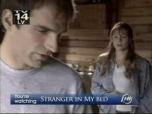
One of the many penalties of watching movies on TV is the prevalence of bugs.
This is the nickname adopted by media makers for those little channel logos and watermarks that hop onto your screen. Sometimes these translucent signatures surface at intervals, to minimally satisfy FCC channel identification demands. Others let you know the movie you’re watching, or will be later.
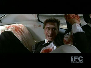
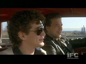
But just as often the bugs just squat in a corner forever, teasing your eye away from the movie. Bugs are to the 2000s what editing and time-compressing were to earlier eras. “Movies, uncut,” boasts the IFC bug. But not unspoiled.
Bugs are bad enough when they are hovering in a black vacuum, made forlorn by letterboxing.
But they really jump into competition when they take up part of the image. How can you watch what actors are doing when there’s something faintly readable floating up from below?
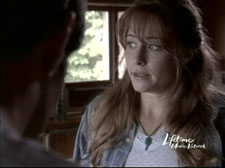
I find it impossible not to look at a bug occasionally. In dark shots, sometimes it’s the most visible thing on the screen. Even in bright shots I stare at it. Maybe I’m hoping that it will be different this time. Yet when it changes, as it does on the Lifetime channel, I watch it more attentively, which only makes me more annoyed.
It’s like the mesmeric spell of Time Code, ticking away the movie’s life, and yours.
I’m not the first to complain. An eloquent manifesto, originally called Squash the Bugs, dates back to 2000, when the infestation was starting. Several other souls participated in the movement.
We know why bugs are swarming all over TV. Somebody better dressed than you or me is worried that we will be recording A Christmas Story or Smokey and the Bandit or Stranger in My Bed. We might even try to sell copies, or post a clip online. In principle, the bug is a badge of ownership, warning that we could be prosecuted. In practice, nobody expects to sue every user, so bugs help spread the brand. It’s like putting a designer logo on a shirt, making you a walking ad. Who wouldn’t want their bug, microscopic as it is, all over YouTube (which of course tacks on its own bug)?
But like everything else that we take for granted, bugs aren’t new. In their earlier form, they’re rather likable.
Silent but deadly
Movie bugs go back to the first years of cinema, when producers were no less worried about media piracy than they are today. Between 1895 and 1915, films circulated very freely around the world, and enterprising crooks happily duped originals and passed them off as their own productions. To block this, filmmakers tried to find ways to keep their trademarks on the film.
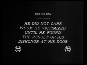
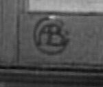
The obvious step was to put the trademark in the intertitles, and many companies did. Here is one for For His Son, a 1912 Griffith film from American Biograph. (What did the protagonist do for his son? He created a soft drink called Dopocoke, which turns the college boy into a hopeless addict.) Note the handsome AB insignia.
But of course a pirate could simply replace such original titles with ones of his own. The next logical step was to incorporate the trademark into the images, which couldn’t be replaced. Without the technology to create near-invisible superimpositions, the filmmakers took the obvious course.
They put the company logo into the set.
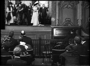
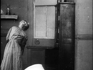
The AB circle typically appeared as a wall decoration. Biograph characters loved to furnish their surroundings to highlight this motif, preferring to put it at eye level and frame center. The logo could be found in unexpected places, like movie theatres (Those Awful Hats, 1908), and it could brighten the dreariest hovel (What Shall We Do with Our Old?, 1911).
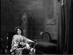
The plaque’s popularity stretched back to Civil War days (In the Border States, 1910), and even in medieval times a king might mount the stylish AB on a brick wall (The Sealed Room, 1909).
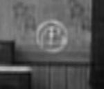
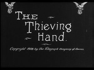
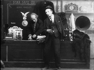
Not to be outdone, Biograph’s competitor, the Vitagraph company, had a beautiful soaring eagle logo, which conveniently furnished a striking V graphic.
Judging from the evidence of this 1908 film, however, Vitagraph had a sideline in manufacturing safes.
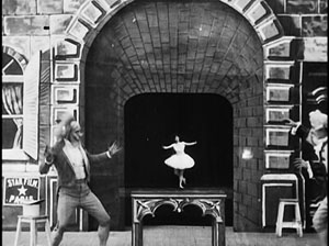
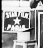
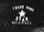
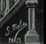
The practice of building the trademark into the mise-en-scene seems to have begun in France. Georges Méliès, whose fantasy films were popular around the world, took measures to counter piracy early. You can see his Star-Film logo on the building stone in the left corner of this frame from La Danseuse microscopique (1902). Shift it to the right corner and we’d have a modern-day bug.
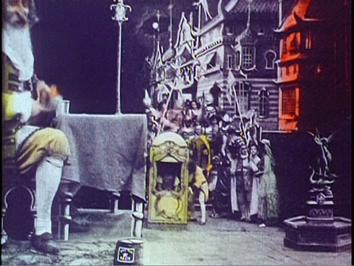
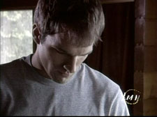
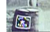
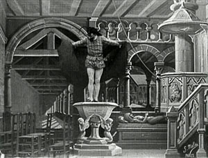
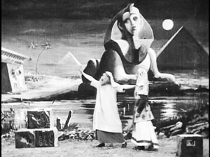
At the very top of this entry is a frame from Le Voyage de Gulliver à Lilliput et chez les géants (1902). There Méliès attached the Star-Film seal to the barrel sitting just left of center.
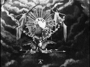
But Méliès didn’t always shove his imprimatur to the edge of the frame. In Le Tonnerre de Jupiter (1903) it sits just below the eagle that Zeus bestrides.
In the earlier Diable au convent (1899), Méliès exercised another option, simply signing his image as if it were a painting. To a large extent, it was.
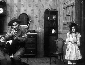
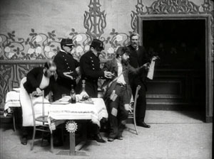
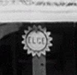
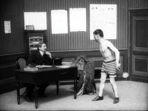
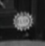
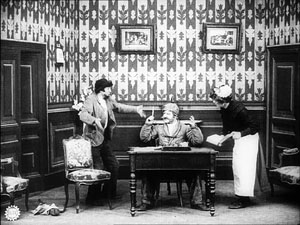
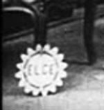
Léon Gaumont had two marques, each enclosed in a chrysanthemum ring. The most famous one is a majestic Gaumont, but an alternative, ELGE (that is, LG), haunts Alice Guy’s Billet de banque (1907). First, in a café, the logo is attached to a table, and later it’s a decorative baseboard in a police station.
In Guy’s Le Frotteur (1907), Gaumont simiply stuck its logo to a chair leg.
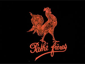
Then there’s the Pathé Frères rooster.
Easy enough to embed that, you’d think. Just have a rooster stroll through a shot now and then—not only barnyard scenes, but ones set in a courtroom or a factory. Still, roosters are pretty accessible to any film pirate, so Pathé went the more ordinary route of weaving its logo into the set.
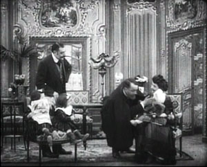
An insistent example comes in The Physician of the Castle (1907), possibly the source for Griffith’s The Lonely Villa (1908) and Lois Weber/ Phillips Smalley’s Suspense (1913). The plot is sort of a 1907 Panic Room. The logo is initially a plaque in the parlor of the castle, visible just behind the kneeling doctor.
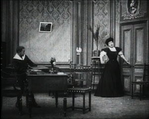
An identical plaque is perched in nearly the same spot on the wall of the doctor’s own parlor, as we can tell when his family is besieged by the invading tramps.
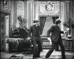
The tramps pass through another room, where the trademark stands proudly on another wall, on screen right.
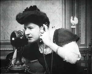
And when the wife tries to phone the husband for help, we get an insert that shows the Pathé cock nearly perched on her shoulder.
Why do I find the old bugs charming and the new ones annoying? I suppose it’s partly because the old ones were hand-crafted, not the result of keyboard twiddling. They are tangible. They are part of the scene’s space. Hard to see on DVD, the embedded marques are striking in 35mm projection, and spotting them is part of the pleasure of early film. Moreover, the filmmakers intended them to be there, or at least they accepted the need for them. But what director today is happy when the Sundance bug creeps into her compositions?
The old bugs seem to have gone extinct around 1912, but they will cling to their films. They bear witness to filmmaking of a specific time, and they anticipate problems that persist today. In tackling the threat of piracy, the old bugs seem at once naïve and intelligent. I see them as a rational solution to a hard problem, narrative consistency be damned. Today’s bugs, floating on top of the story world, seem more like corporate tattoos or graffiti. They don’t exist within the action, so you could argue that they are less disruptive. But they become a different sort of distraction, hovering halfway between the story world and the space of viewing. Bugs are spectres haunting the film.
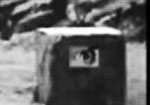
On rare occasions, a modern add-on can be appropriate. In a Méliès film on the recent Flicker Alley set, L’Oracle de Delphes (1903), some TV agency has clapped its own digital bug into the lower right corner. It really is about beetle-size, and it dares to be a single eye looking back at you. That icon adds a touch of peculiarity not out of keeping with the Méliès aesthetic.
You can argue that this smirch on the image is a minor sacrilege. But I suspect that the Master of Montreuil would have grinned in approval.
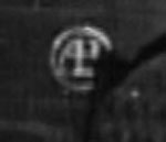
PS 19 January 2009: “Subliminal” bugs: I had hoped to include a frame illustrating the anti-piracy stamp used on current 35mm releases, but couldn’t find one quickly. This mark consists of a tight pattern of dots resembling a character in Braille. The stamp would presumably be copied if someone shot off the screen or ran the film through a telecine. How effective these bugs are at tracing pirate copies I can’t say, but you can detect them, especially in bright scenes; I usually notice one every third reel or so, just left of the center of the frame. I’ll keep looking for a frame and try to add one to this entry.
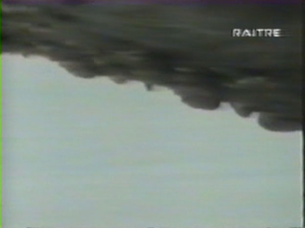
John Powers alerted me to the fact that even Michael Snow’s Région Centrale got the bug treatment when it was telecast on Italy’s RAI 3 TV. Thanks to John for this scary example.
P.P.S. 24 January 2009: On the Internets, ask and ye shall receive. Olli Sulopuisto wrote to link me to the Wikipedia entry explaining the domino dots, known as CAPs. The entry includes an illustration. Olli also contributed to Jim Emerson‘s scanners blog, which contains good commentary on CAPs from Jim and his readers.
P.P.P.S. 29 May 2013: Can anti-piracy bugs be integrated into the movie or TV show? Yes!
We ended 2007 with a salute to the 90th anniversary of the solidification of the classical Hollywood filmmaking system. 1917 was not only the year when all the guidelines—continuity editing, three-point lighting, and unified story structure—gelled in American cinema. It was also one of those years (like 1913, 1927, and 1939) when a burst of creativity took place internationally. For those years, it’s hard to keep one’s greats list to ten.
Enough of you enjoyed that entry that we thought we would come up with another list to end 2008. For some reason, 1918 doesn’t yield the plethora of great films that obviously should go on such a list. Maybe it’s the sheer accident of preservation. After a string of masterpieces from Douglas Fairbanks in 1917, there seems to be a dearth of his films extant from the following year. Some filmmakers, like Cecil B. De Mille, simply released fewer films in 1918. And of course, some masterpieces may still lie gathering dust on archive shelves, waiting to be discovered.
Still, great films were made that year, some familiar—some that should be better known. Some are available on DVD, and some are excellent candidates for release by some of the enterprising companies like Kino International, Image Entertainment, and Flicker Alley.
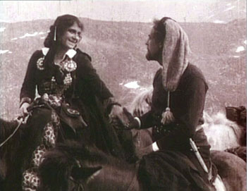
1. The list isn’t in rank order, but for me the outstanding film of 1918 is Berg-Ejvind och hans hustru, better known to most as The Outlaw and His Wife, by Victor Sjöström. This tale of an enduring love between a man hunted by the police and a rich landowner who falls in love with him, and, as one title says, “Hearth and home and every man’s respect—she gave it all up for his sake.” The result is one of the cinema’s great romances as the pair flees to the mountains and spend the rest of their lives amidst the natural landscapes that create spectacular backdrops for the action.
This year Kino also brought out a disc with the dynamite double bill of two tragedies Ingeborg Holm (1913) and Terje Vigen (1916). David and I have both written about the staging in Ingeborg Holm, and David has had much to say on tableau staging in 1910s cinema. Watch these three films, and you will understand why we consider Sjöström perhaps the great director of the decade. It’s a shame that more of his films are not available yet in the U.S. Buy copies of these, and maybe Kino will bring more of them out.
2. Another master of this era, Louis Feuillade, made a sequel to his Judex (1916): La Nouvelle Mission de Judex. David discusses both in the second chapter of his Figures Traced in Light. Although Judex is available on DVD, so far the second serial is not.
3. I suspect that Hearts of the World is one of those D. W. Griffith features that a lot of film enthusiasts have heard of but not seen. Remarkably, it’s not available on DVD. (Keep your old laserdisc if you’ve got one!) I have to admit, it’s not one of my favorite Griffiths, though it does have a charming performance by Dorothy Gish and contains scenes that were actually shot near the front lines in France.
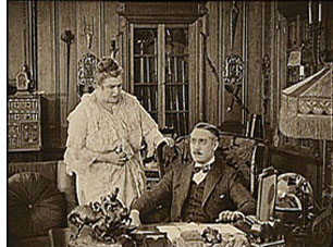
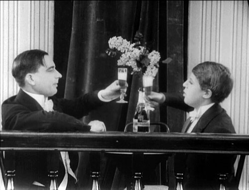
4. Ernst Lubitsch was making the transition from shorts to features in 1917 and 1918. While Carmen is historically important for his development toward his mature style, most audiences these days would probably find Ich möchte kein Mann sein (“I don’t want to be a man”) more entertaining. It’s a comedy about an independent young lady who escapes her strict governess and guardian by going out on the town disguised as a man—in the process joining her guardian without his recognizing her (see the frame at the bottom). Its star, Ossi Oswalda, was an outgoing blonde dynamo, quite different from Pola Negri, whom Lubitsch turned to for his later historical epics.
Kino has made several of Lubitsch’s films from the late 1910s and early 1920s available. Ich möchte kein Mann sein can be bought on a single disc with Die Austerinprinzessin (“The Oyster Princess,” 1919), another Oswalda comedy. I’d recommend getting it as part of the larger “Lubitsch in Berlin” set, which also includes the hilariously imaginative Die Puppe (“The Doll,” 1919), the Expressionist satire Die Bergkatze (“The Wildcat,” with Negri in her one comic role for Lubitsch, 1921), an Arabian-nights epic Sumurun (1920), and the historical epic Anna Boleyn (1921), as well as a documentary on Lubitsch.
5. In 1918 Cecil B. De Mille made a film that would change his career’s trajectory: Old Wives for New. At the time, this romantic drama that seemed risqué in its casual depiction of adultery, golddiggers, and especially divorce as creating a happy outcome. Up to that point De Mille had been working in a whole range of genres, creating imaginative films that helped define the classical style. The success of Old Wives for New led him to specialize in spicy romances known for their haute couture costumes. The film is available on a disc from Image that includes De Mille’s other major film of 1918, The Whispering Chorus.
6. Hell Bent, by John Ford, was long thought to be among his many lost westerns from the early years of his career. It was rediscovered in the Czechoslovakian archive and shown years ago in Pordenone at the Il Giornate del Cinema Muto festival. I must confess that I don’t remember it very well, apart from one spectacular tilt downwards as a stagecoach (?) races down a winding mountain road. Not as good as Straight Shooting, and Hell Bent survives in rocky shape (perhaps too much so for DVD release), but Ford films of this era are so rare that I’ve listed this one.
7. Like Lubitsch, in the late 1910s Charlie Chaplin was making a gradual transition from shorts to features. In 1916 and 1917 he released a remarkable string of Mutual two-reelers, from The Rink (December 1916) to The Adventurer (October 1917). In 1918, with A Dog’s Life and Shoulder Arms, he increased the films’ length to three reels, or roughly 45 minutes, and started releasing through First National. He also cut back on the number of titles released each year. Apart from a brief promotional film for war bonds, A Dog’s Life and Shoulder Arms were his only 1918 releases. Which is better? I suppose most people would say Shoulder Arms. To me it’s a toss-up.
8. David and I started attending Il Giornate del Cinema Muto in 1986, when the festival was launching its great series of national retrospectives. In quick succession, these retrospectives revealed three hitherto virtually unknown but major auteurs of the 1910s: the Swede, Georg af Klercker, in 1986; the Russian, Evgeni Bauer, in 1989; and the German Franz Hofer, in 1990. Bauer’s career ended with his death in 1917. Hofer remained active until the early 1930s. The Giornate’s German program contained only six of his films, however, and those from the 1913-1915 period. I suspect that means the later teens titles are lost.
In contrast, nearly all of af Klercker’s films survive, mostly in the original negatives. The prints shown at Pordenone were stunning. The director had a great eye for settings, using beaded curtains, mirrors, and other elements to considerable effect. He made three films in 1918: Fyrvaktarens dotter, Nobelpristagaren,Nattliga toner, the first two of which were shown in the 1986 retrospective.
Unfortunately since then the films have not been made widely available, either in prints or on DVD. Having not seen the two titles just mentioned since 1986, I can’t say that I remember them well enough to judge between them. So I’ll just leave all three films here, along with the advice to seize any chance you may get to see those or af Klercker’s other films.
(Given how little known af Klercker’s work is outside Sweden, I should point out a major English-language piece on the director’s style, Astrid Söderbergh Widding’s “Towards Classical Narration? Georg af Klercker in Context,” in editors John Fullerton and Jan Olsson’s Nordic Explorations: Film Before 1930 [Sydney: John Libbey, 1999].)
9. Stella Maris, directed by Marshall Neilan, was the first of five features Mary Pickford starred in in 1918. Its reputation lies mainly in the fact that Pickford played a double role, the bed-bound but lovely title character, and an ugly, slightly deformed orphan. In its outline, the story sounds abstract and overly symmetrical. Stella Maris’s relatives shut her off from all ugliness in the world, keeping her in happy innocence well into her teens. Unity, the orphan, has known nothing but deprivation. As Stella comes to glimpse the grim side of life, Unity is adopted and has glimpses of the beauties enjoyed by the rich. Both become miserable as a result.
The overall implication is pretty grim. Stella’s world is initially wonderful only because everyone lies to her. She becomes embittered when she finally discovers this. At the heart of the tale is the deception that life is beautiful. Unity, who has not been deceived, knows better from the start. Even one brief reference to the war, as a troupe of soldiers passes by the estate where Stella lives, makes it seem tragic—this in a film that came out about two months after the U.S. had entered World War I.
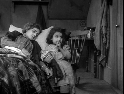
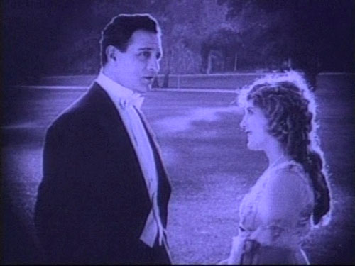
The balance between the two characters is made less artificial than it might sound by Pickford’s extraordinary performance—not so much as Stella, who is a rather passive version of the typical Pickford persona, but as Unity. The waif’s frequent disappointments and outright suffering create a strong effect that shadows even the quasi-happy ending. It’s a beautifully made film as well, with the use of glamorous backlight (as in the image at the top of this entry). Stella Maris is available on DVD from Image.
10. I have been hard put to find a feature to round out the list, so I’m substituting a group of shorts. They’re not masterpieces by any means, but each displays the talents of a great silent comic well on the way toward his most fruitful period.
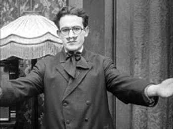
There’s no single great film to mark Harold Lloyd’s transition, but during 1918 he was developing his “glasses” character. He had had a modest success with his “Lonesome Luke” series from 1915 to 1917, where he essentially created a variant of Chaplin. In September, 1917, Lloyd first wore his famous black, lens-less glasses in Over the Fence. His early one-reelers wearing those glasses were still sheer slapstick, with little of the characterization that he would later develop to go with his new look. Arguably it was 1919 or even 1920 before he had fully nailed that persona. Still, during 1918 one can see him groping toward the formula.
Kino’s “The Harold Lloyd Collection” volumes contain four films from that year, all co-starring Lloyd’s regular co-stars, Snub Pollard and Bebe Daniels. The Non Stop Kid (the title on the film; filmographies mistakenly give it as The Non-Stop Kid; May 21), Two-Gun Gussie (May 19), The City Slicker (June 2, all three on volume 2), and Are Crooks Dishonest? (June 23, on volume 1). The development clearly came in fits and starts. Two-Gun Gussie and Are Crooks Dishonest? are both slapstick affairs involving tricks and mistaken identify. The Non Stop Kid, though, has Lloyd in a more familiar situation, using his wits to foil a crowd of suitors and win the heroine’s hand. The City Slicker has a similar feel to it, though unfortunately the end is missing. The Non Stop Kid also has Lloyd donning a disguise in the form of a false moustache that somewhat resembles the one he had worn as Luke. This scene has a startling effect, blending the glasses character and the Luke character.
1917 and 1918 formed the high point of the string of comic shorts directed by Fatty Arbuckle, in which he also co-starred with Buster Keaton and Al St. John. When Keaton went solo, he proved to be a far better director than Arbuckle. Arbuckle tended to simply face his camera perpendicularly toward the back of the set for every shot, just cutting to whatever scale of framing would best display a gag. Here it’s the perfectly timed and executed gags that dazzle, and the films are often hilarious. In 1918, the team made The Bell Boy, Moonshine, Out West, Good Night Nurse, and The Cook. The latter shows off Arbuckle and Keaton’s dexterity at juggling props and Fatty’s surprising grace, as when he improvises a Salome dance with a head of lettuce standing in for that of John the Baptist!
The 13 surviving Arbuckle-Keaton films (some with missing bits) are available on Eureka’s definitive boxed set, “Buster Keaton: The Complete Short Films.” (That’s Region 2 format only, and available from Amazon UK.) Image’s “The Best Arbuckle Keaton Collection” has 12 films, missing only the more recently rediscovered The Cook. Image brought out The Cook on a disc with Arbuckle’s A Reckless Romeo (1917, sans Keaton). Kino’s two separately available volumes of “Arbuckle & Keaton” (here and here) contain 10 shorts total, again missing The Cook.
Apart from all these films, it’s worth noting that in the world of animation, 1918 saw the release of Winsor McCay’s fourth cartoon, The Sinking of the Lusitania, and Dave Fleischer’s first, Out of the Inkwell, which launched the enduring series.
Perhaps it came from watching the Odessa Steps sequence, projected in hazy 8mm, on the bedroom wall during my teenage years. Or maybe it was seeing my first Bruce Lee movie in the early 1970s. In any case, at some point I became a connoisseur of action sequences. Eventually I was able to indulge this tendency by writing about Eisenstein, but also by studying Asian action film.
I became convinced that martial arts movies from Japan and Hong Kong constituted as important a contribution to film aesthetics as did the Soviet Montage movement. Through shot-by-shot and even frame-by-frame analysis, I tried to show that these movies were exploring ways that cinema could arouse us kinesthetically. Their use of composition, cutting, color, music, and physical motion was not only beautiful but also engaging on levels that we didn’t fully understand. (Perhaps now that we know about mirror neurons we’re in a better position.) Certain turns in the action make us laugh, but not in derision. We laugh in jubilation, and sometimes out of admiration for sheer audacity. At their most ambitious, these films achieved the physical-emotional ecstasy that Eisenstein found in sharply executed “expressive movement.”
A jolting blur
So it was with a definite sadness that I watched, from the 1980s onward, the tendency of American filmmakers to give up on rendering physical movement with full force. Action sequences became jumbled arrays of short shots and bumpy framings. The clarity and grace of motion seen in classic Westerns and comedies, in the work of Keaton and Lloyd and Ford and Don Siegel and Anthony Mann, gave way to spasmodic fights and geographically challenged chases. At first, the chief perpetrators were Roger Spottiswoode and Michael Bay. Now it’s nearly everybody, and journalistic critics have recognized that this lumpy style has become the norm, even in the generally admired Bourne entries.
Classic Hong Kong and Japanese action scenes were “expressionistic” in the sense that their larger-than-life balletics and aerobatics amplified recognizable (if extreme) possibilities of the human body. The result was a carnal cinema, in which shooting and cutting aimed to enlarge and prolong graceful movement. By contrast, Hollywood action scenes became “impressionistic,” rendering a combat or pursuit as a blurred confusion. We got a flurry of cuts calibrated not in relation to each other or to the action, but instead suggesting a vast busyness. Here camerawork and editing didn’t serve the specificity of the action but overwhelmed, even buried it.
Why is the filmmaker reluctant to face the concrete, moment-by-moment facts of the fight? Maybe it’s fear of censorship, or maybe it’s just lack of interest in physical processes. By contrast, most of the great Hong Kong action directors have been themselves martial artists. To them a fight is a suite of tangible actions and micro-actions. Or maybe the new muddier approach seeks to hide the fact that the action is preposterous. Western audiences don’t like far-fetched action that isn’t comic, but the new action picture is touted as a return to realism. Bond is tough and Jason Bourne’s adventures are “gritty.” Yet realism comes at a price, in this case the loss of bodily movements elegant in their efficiency.
Defenders of the impressionistic approach say that it renders “what the action feels like.” But that would entail that the action feels fast and confusing. To whom? Maybe to a duffer like me, if I were dropped into the melee, but not to trained fighters. Bourne isn’t confused: his senses are alert, and his gestures are economical and smooth. So why render the scene as chaotic and show his gestures in jerky cuts? Any fighter overcome by the sensory overload handed to us would lose big.
The classic Asian approach also tries to make us experience how the action feels, but it starts by taking pains to show how it looks. Hong Kong filmmakers constructed a sequence on a firm foundation, and that meant making each shot impossible to misunderstand. They then built those crisp images into what I called the pause/ burst/ pause structure. This simple pattern, capable of great variation. creates a staccato exhilaration.
How? Here’s a first approximation. The stylistic orchestration of the fight trips off optical, auditory, and muscular responses in our bodies, while the pauses give the movement a chance to echo. Instead of a vague busyness, a sense that something really frantic but imprecise is happening, we get a marked rhythm alternating an exact visceral impact with tingling aftereffects. Eisenstein believed that when we see an expressive movement, we reflexively repeat that movement, albeit in weakened form. After one of these sequences you feel tired, but in a good way. We’ve been given a taste of what physical mastery feels like.
Transport
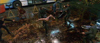
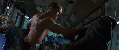
Compare the action scenes of the first Transporter film (2002) with those of Transporter 3 of this year. The first, directed by Hong Kong veteran Yuen Kwai (aka Corey Yuen), isn’t a patch on his best home-ground work (Ninja in the Dragon’s Den, Righting Wrongs, Yes, Madam!, Saviour of the Soul), but the bigger budget provided by Luc Besson gave him a chance to put Jason Statham through some energetic paces, particularly on the oil-slicked floor of a bus garage.
Yuen, a director who sacrifices even dialogue to pictorial rhythm, is fond of percussive insert shots (e.g., the garage scene’s crackling close-ups of Statham snapping bike pedals onto his shoes) and steep, tight angles that spread all of a fight’s players into a diagrammatic composition.
But Transporter 3, choreographed but not directed by Yuen, has buried precise, bone-whacking action under freeze-frames, superimpositions, ramping, color shifts, and other Tony Scott doodling.
Something more sober but just as nerveless is at work in Quantum of Solace. Here the jabbing handheld work of the Bourne pictures has been replaced by steadier framing and smoother traveling shots, but the hyperkinetic, what-did-I-just-see cutting is still there. Again, I think that the filmmakers are worried about the implausibility of the action scenes and so muffles them by a haphazard handling.
Back to basics
Most discouraging has been the way that many Asian filmmakers have taken up the Hollywood approach. Today’s standard Hong Kong action picture is likely to be as visually and kinetically disorganized as the Hollywood product. That’s why I can recommend, as a palate-cleanser if nothing else, Ryoo Sung-wan’s City of Violence (2006), a Korean film recently made available on DVD from Dragon Dynasty.
It is unapologetically formulaic. Pals in a teenage gang grow up to be gangsters and cops. Our protagonist, a big-city cop, returns to the hometown to discover that the weakest of the old crew has become a sadistic overlord. Fights ensue, culminating in a twenty-minute battle in which the hero and another schoolmate penetrate a restaurant where the villain is celebrating his new status. Thrashing their way through a crowded courtyard, then through a narrow tunnel of dining rooms, and finally into a two-story banquet hall, our heroes confront increasingly skilful fighters and eventually face off against their boyhood friend.
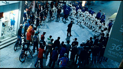
Ryoo keeps the action scenes fairly brisk and inventive. The most impressive early one shows the hero surrounded by a battalion of young thugs in a nighttime boulevard. The teens, in an obvious bow to The Warriors, come dressed in ingenious uniforms and display alarming skills with hockey sticks and baseball bats. As in Hong Kong films, judicious long shots keep us oriented to phases of the action.
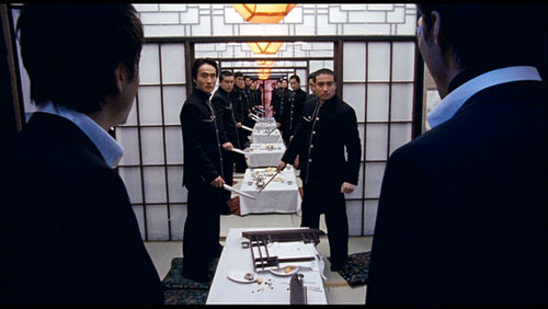
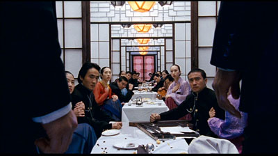
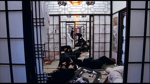
Borrowing unashamedly from John Woo’s Better Tomorrow series and countless Japanese swordplay films, City of Violence shows flashes of pictorial wit. The cop and his pal realize they’re confronting a platoon of bodyguards at supper when doors slide open to reveal a tunnel-vision perspective of fighters, blobs of black broken rhythmically by women’s pastel outfits.
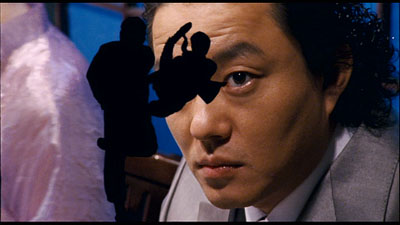
The film flaunts vivid color and icy focus in a way that much more expensive Hollywood genre movies, with their brackish palettes and soft edges, mostly avoid. (The realism alibi, again.) Even Ryoo’s use of CGI is playfully pretty, in a way that Casino Royale could be only in its credits sequence. Here the gang lord realizes his old pals are approaching.
I don’t want to oversell this film, but it does show that the classic Asian tradition has not expired. Running under ninety minutes without credits, City of Violence aims at nothing more than telling a familiar story with vigor—along the way making us gape and flinch. In a good way.
For arguments about Eisenstein and expressive movement, see my Cinema of Eisenstein, new ed. (Routledge, 2005). The case for Japanese and Hong Kong action films is made in Chapters 12-15 of Poetics of Cinema, and the pause/ burst/ pause pattern is analyzed in Chapter 8 of Planet Hong Kong: Popular Cinema and the Art of Entertainment. There, among other things, I try to give Yuen Kwai his due.