Archive for the 'Animation' Category
Color, shape, movement . . . and talk
Bonjour Tristesse.
DB here:
Our weekly Film Colloquium is sort of like your old high-school assembly, except that it’s fun. The Film Studies area meets nearly every Thursday afternoon at 4 to hear a paper by a grad student, a faculty member, or a guest. It’s a great forum for ideas and information, and it gives the speaker a chance to try out a talk before taking it to a conference or lecture gig. The local audience is, in my experience, the toughest I’m likely to encounter. And this spring, despite a heavy travel and work schedule, Kristin and I caught two outstanding presentations.
Not in color, but colored
By now we all understand that silent films were most often shown with musical accompaniment, and sometimes sound effects. But we tend to forget that most silent films were in color too.
By the early 1920s, 80% of films were colored in one way or another. There were a few efforts to record the actual colors in a scene, but most often color was added after filming. Areas of the frame might be painted over by stenciling or by freehand. More commonly, the shots were dipped into dyes, yielding images that were tinted (washing over the image and coloring the areas of white, as in the frames below) or toned (coloring the darkest areas and leaving the white areas white). Over the years, film prints were preserved in black and white, partly because color stock was more expensive than today. As a result, even archival prints lost the sense of what audiences actually saw. Today archivists labor to reconstruct what silent films looked like in all their rainbow glory.
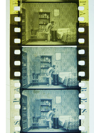 Professor Joshua Yumibe of Oakland University wrote his Ph. D. thesis on early color processes, and his Colloquium talk asked some powerful questions. We know that there was a transition in film artistry from the late 1900s to the early 1910s, a shift toward what Tom Gunning has called the “cinema of narrative integration.” As films became longer and were shown in more or less permanent venues, moviemakers began to tell more complicated stories. How, Josh asks, did this shift away from a cinema of isolated “attractions” affect practices of coloring? Do color processes affect the way stories were told? Do the color processes change how people saw the space on screen? How did the trade press respond to different strategies of coloring?
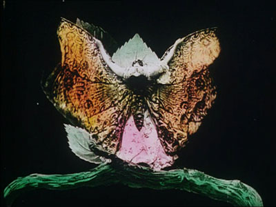
These are fascinating questions, and Josh’s exploration of them was careful and detailed. He has done enormous research on the various color processes, and he was able to trace several lines of development. For instance, he found that writers of the earliest years thought that color enhanced the sensual and emotional effects of the image, even creating an illusion of 3-D. In a shot like that of the butterfly dancer, people seem to have sensed that her multicolored shape was thrusting out of the screen toward them.
Josh argues that with the growing emphasis on narrative, color became more muted. Filmmakers were no longer aiming at momentary stimulation but at ongoing mood. Now tinting and toning came into their own. Color codes developed: blue for night scenes, yellow for sunlight, red for fire, amber for artificial light. Josh also explored the different ways in which European and US companies conceived of color; there seem to have been different color policies at Pathé and at American companies. But this wasn’t the end of change. In the 1920s, with the feature film now at the center of the theatre program, a wide variety of color practices emerged, including those isolated Technicolor sequences we find in films like The Wedding March.
The Q & A was as lively as the talk itself, and afterward, we repaired to a bar and thence to dinner. Josh’s talk was a model of deep, imaginative research and it kept us thinking and talking for a long time afterward. Not to mention his slide show, which regaled us with gorgeous shots that make you realize how much you’re missing when you see an old movie in black and white.
Bass, o profondo!
Another stimulating Colloq session was presided over by our old friend Jan-Christopher Horak, director of the UCLA Film and Television Archive. Chris was in town because our Cinematheque has been showcasing UCLA archival restorations across the semester, and he introduced our screening of The Dark Mirror. But we also got him to give a talk, and that was quite something.
Chris reminded me that we first met thirty years ago, here in Madison, when he came to do research on his dissertation. Since then Chris has been a top-flight scholar and author of many books. His Lovers of Cinema, published by our series at the UW Press, laid the groundwork for the popular film series Unseen Cinema. He’s also been one of the world’s leading film archivists, having supervised collections at Eastman House, the Munich Film Archive, Universal studios, and most recently UCLA.
Chris has long worked at the intersection of film, photography, and the graphic arts. He is one of the world’s experts on the 1920s German avant-garde; one of his early curatorial coups was a 1979 restaging of the pioneering Film und Foto exhibition of 1929. Chris has also long been fascinated by film publicity, having written a book on the subject. So it’s natural that he would gravitate toward studying the film-related work of Saul Bass, one of America’s greatest graphic designers.
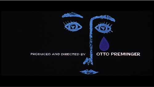
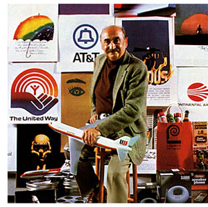 Chris’s talk focused not so much on Bass’s brilliant credit sequences for films by Preminger and Hitchcock as on Bass’s contributions to poster design. Bass turns out to have had a fascinating career, having worked in Manhattan advertising before moving to Los Angeles in 1948. Chris has found at least one early 1950s poster design that Bass probably executed, but he definitely worked for Preminger on publicity for The Moon Is Blue (1953) and Carmen Jones (1954)—the latter yielding to my mind one of the greatest credit sequences in film history. In 1955 Bass founded his own firm.
Throughout, he carried on the ideals of György Kepes, his teacher and a major conduit for Bauhaus ideas into America. Like his European models, Kepes promoted the idea of art as having cognitive value, teaching us to see the world in a new way. Kepes also emphasized that artworks could be of practical utility—an idea that chimed with Bass’s turn toward commercial design.
Chris was able to show that the Bauhaus tradition powerfully influenced Bass’s design principles. Who would have thought that the credits for The Seven Year Itch replayed Paul Klee? Obvious, though, when Chris showed us the images.
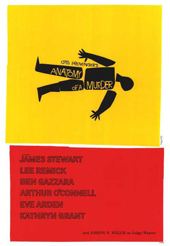
Chris emphasized two further points. First, Bass understood what we now call branding. We have to remember that it up to that time, most film publicity featured images of the stars, either in portraits or caught in typical scenes from the film. Bass’s poster design concealed the stars. Instead, he relied on dynamic geometrical design to capture a film’s mood in a powerful, stylized image. The result was an eye-catching logo, instantly recognizable: the flaming rose of Carmen Jones, the Vertigo whirlpool, the dismembered body of Anatomy of a Murder.
The key image could be repeated in newspaper ads, posters, credits, even the production company’s letterhead. When you saw the teaser trailer for Star Trek (“Under Construction”) dominated by that looming boomerang shape, you saw the heritage of Saul Bass. Who cares who’s in the movie? The very image is intriguing. No accident that Bass also designed many corporate logos, like the ATT bell and the United Way hand.
Chris’s second main point was that Bass was able to flourish because of the rise of independent production in the 1950s. Preminger, Hitchcock, and Wilder, acting as their own producers, could control the publicity for their films to a degree not possible for directors working in the classic studio system. Now films were sold as one-offs, and each film needed to pull itself above the clutter. In addition, Bass’s signature designs could set a director apart. In the 1950s, the Bass look was closely identified with his major clients like Hitchcock and Preminger, to the point that other designers for those directors tried to copy his style. I had always thought that Bass did the title design for Hurry Sundown, but Chris showed that it’s another artist’s pastiche of the master.
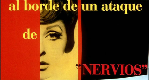
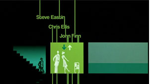 Chris’s talk reminded me that Bass contributed to making the opening credits a major attraction—not merely an overture, but an abstract treatment of the key story idea, a sort of graphic map that teases us into the main story. The opening sequences of Se7en and Catch Me If You Can (left) owe a lot to Bass’s idea that the credits should constitute a little movie, witty or ominous, tantalizing us with sketchy glimpses of what is to come. And Almodóvar’s diverting openings, probably the most sheerly enjoyable credit sequences we have today, are unthinkable without Bass. Synchronized with infectious music, Bass’s credit sequences can be seen as continuing the tradition of Walter Ruttmann and Oskar Fischinger, who back in the 1920s and 1930s made abstract films that advertised consumer goods.
For such reasons, I’m glad I hung around Madison after my retirement. With visiting researchers like Josh and Chris, who wants to go fishing?
Woman on the Verge of a Nervous Breakdown.
Thanks to Joshua Umibe for the silent-film illustrations. The first comes from Gaston Velle, Métamorphoses du Papillon / A Butterfly’s Metamorphosis (Pathé, 1904). Frame enlargement from Discovering Cinema (di. Eric Lange and Serge Bromberg, Lobster Film/Flicker Alley). The second comes from Albert Capellani’s Le Chemineau / The Vagabond (Pathé, 1905; tinted and toned). Frame enlargement Joshua Yumibe, courtesy of the Netherlands Filmmuseum.
Showing what can’t be filmed
DB, again:
People tend to think that documentary films are typified by two conditions. First, the events we see are unstaged, or at least unstaged by the filmmaker. If you mount a parade, the way that Coppola staged the Corpus Christi procession in The Godfather Part II, then you aren’t making a documentary. But if you go to a town that is holding such a procession and shoot it, you are making a doc—even though the parade was organized to some extent by others. Fiction films stage their events for the camera, but documentaries, we tend to think, capture spontaneous happenings.
Secondly, in a documentary the camera is seizing those events photographically. The great film theorist André Bazin saw cinema’s defining characteristic as its capacity to record the actual unfolding of events with little human intervention. All the other arts rely on human creation at a basic level: the novelist selects words, the painter chooses colors. But the photographer or filmmaker employs a machine that impassively records what is happening in front of it. “All the arts are based on the presence of man,” Bazin writes; “only photography derives an advantage from his absence.” This isn’t to say that cinema can’t be artful, only that it offers a different sort of creativity than we find in the traditional arts. The filmmaker works not with pure imaginings but obstinate chunks of actual time and space.
Given these two intuitions, unstaged events and direct recording of them, it would seem impossible to consider an animated film as a documentary. Animated films consist of almost completely staged tableaus—drawings, miniatures, clay, even food or wood shavings (in the works of Jan Svankmajer). And animated movies offer no recording in Bazin’s sense of capturing the flow of real time and space. These films are made a frame at a time, and the movement we see onscreen doesn’t derive from movement that occurred in reality. And of course you can make an animated film without a camera, for instance by painting directly on film or assembling computer-generated imagery.
Recently, however, we’ve been faced with animated films that claim documentary validity. How is this possible? Maybe we need to rethink our assumptions about what documentary is.
In certain types of documentaries, especially those in the Direct Cinema or cinéma vérité traditions, the assumption that we’re seeing spontaneously occurring events holds good. But a documentary can consist wholly of staged footage. Think back to those grade-school educational shorts showing a tour of a nuclear power plant. Every awkward passage of dialogue recited by the hard-hatted, white-coated supervisor was scripted. The whole show was planned and rehearsed, but that doesn’t detract from the factual content of the film.
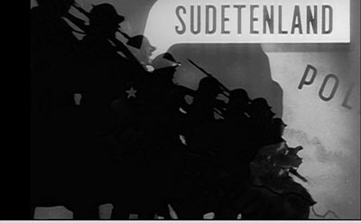
Go further. Recall those attack maps that are shown in war films, tracing the progress of an army through enemy terrain. Now imagine an entire film made of those animated maps. The maps might even be enhanced with a few cartoon images, as in the above shot from one of the Why We Fight films. The film would be entirely designed, presenting no spontaneous reality being captured by the camera. Yet it would plainly be a documentary, telling us that, say, the Germans marched into the Sudetenland in 1938 and proceeded on to Poland. So we don’t need photographic recording of actual events to count a film as a documentary either. Both the staging and the recording conditions don’t have to be present for a film to count as a documentary.
I’m not saying that the claims advanced in my nuclear-power film or my attack-map movie would necessarily be accurate. They might be erroneous or inconclusive or false. But that possibility looms for any documentary. The point is that the films, presented and labeled as documentaries, are thereby asserting that the claims and conclusions are true.
Film theorist Noël Carroll defines documentary as the film of “purported fact.” Carl Plantinga makes a similar point in saying that documentaries take “an assertive stance.” Both these writers argue that we take it for granted that a documentary is claiming something to be true about the world. The persons and actions are to be taken as representing states of affairs that exist, or once existed. This is not something that is presumed by The Gold Rush, Magnificent Obsession, or Speed Racer. These films come to us labeled as fictional, and they do not assert that their events and agents ever existed.
This isn’t just a case of a professor stating something obvious in a fancy way. Once we see documentary films as tacitly asserting a state of affairs to be factual, we can see that no particular sort of images guarantees a film to be a doc.
Take the remarkable documentaries made by Adam Curtis. These are in a way very old-fashioned. Blessed with a voice whose authoritative urgency makes you think that at last the veils are being ripped away, Curtis mounts detailed arguments framed as historical narratives. Freudian theory shaped the emergence of public relations, which was in turn exploited not just by business but by government (Century of the Self). Islamic fundamentalism grew up intertwined with US Neoconservatism, both being reactions to perceptions that the West was becoming heartlessly materialistic (The Power of Nightmares). Mathematical game theory came to form politicians’ dominant conception of human behavior and civic community (The Trap). The almost uninterrupted flow of Curtis’s voice-over commentary could be transcribed and published as a piece of nonfiction. True, there are some interpolated talking heads, but those experts’ statements could be printed as inset quotations.
What’s particularly interesting is that Curtis’ rapid-fire declamation accompanies images that often seem not to illustrate it, or at least not very firmly. Like the found footage in the preacher’s sermon “Puzzling Evidence” in True Stories, Curtis’ images are enigmatic, tangential, or metaphorical.
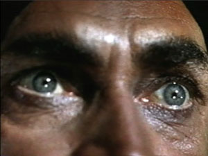
Here are a few seconds from the start of The Power of Nightmares. Eyes are staring upward, as if possessed.
We hear: [Our politicians] say that they will rescue us from dreadful . . .
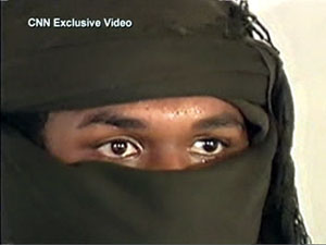
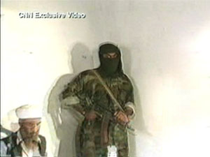
The eyes are replaced by a shot of a man wearing a cowl, and as this image zooms back the commentary continues.
. . . dangers that we cannot see and do not . . .
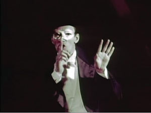
Cut to a magician or mime demanding silence.
. . . understand.
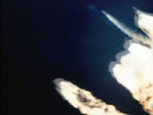
Cut to rockets being fired.
And the greatest danger . . .
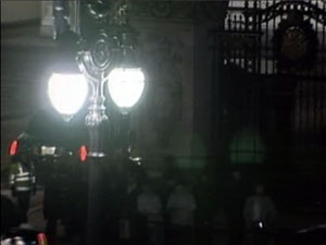
Cut to a procession of cars, seen from above, rounding a corner into a government compound at night.
. . . of all is international terrorism.
Cut to shot of security agent staring at us.
The ominous, not to say paranoid, tenor of the sequence is aided by the unexpected juxtapositions. For instance, you’d think that the shot of the iconic terrorist (anonymous, with automatic weapon) would be synchronized with the final line of the commentary, referring to “international terrorism.” Instead the commentary links the mention of terrorism to an image of government deliberation, and then to an image of surveillance (aimed at us, but also perhaps suggesting the previous high-angle shot was the spy’s POV). The wild-eyed close-up might belong to a terrorist, but is accompanied by claims about rescuing us from fearsome threats, so the eyes could also belong to someone panicked–especially since they contrast immediately with the sober eyes of the gunman in the cowl. Perhaps the first shot represents the fearful public ready to be led by the politicians playing on fear. And the insert shot of the mime becomes sinister but also comic, perhaps debunking the official position that our dangers are unseen and unknowable. In all, the sequence bubbles with associations that are less fixed and more ambiguous than we’re likely to find in a more orthodox documentary, like Jarecki’s Why We Fight.
My point isn’t to analyze the image/ sound relations in Curtis’s work, a task that probably demands a whole book. (This sequence takes a mere eleven seconds.) I simply want to propose that regardless of what pictures Curtis shows, his films are documentaries in virtue of a soundtrack constructed as a discursive argument that makes truth claims. The picture track often works on us less as supporting evidence than as a stream of associations, the way metaphors or analogies give thrust to a persuasive speech.
Just as we could have an account of Germany’s 1938 invasion of Czechoslovakia presented in cartoon form, we could imagine The Power of Nightmares illustrated with political cartoons. Once we’ve pried the image track loose from the assertions on the soundtrack, anything goes.
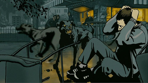
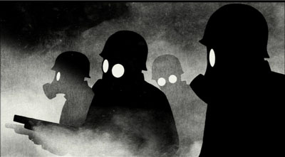
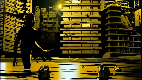
One example much on our minds now is Waltz with Bashir. Ari Folman interviews former Israeli soldiers. But instead of using film footage of their conversations and, say, still photos of the events in Lebanon they took part in, he provides (until the final sequence) drawings a bit in the Eurocomics mold of Tardi or Marc-Antoine Mathieu. The result takes the form of a memoir, admittedly. But in both literature and cinema, memoir is a nonfiction genre.
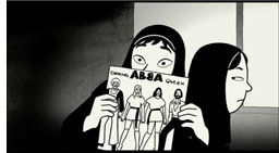 Another memoir supports the point. Marjane Satrapi’s autobiographical graphic novels, Persepolis and Persepolis 2, assert factual claims about her life. The claims are presented as drawings and texts rather than simply as texts, but that doesn’t change the fact that she presents agents and actions purported to have existed. True, on film the people whom she remembers are represented through voice actors speaking lines she wrote. But as with written memoirs (especially those that claim to remember conversations taking place fifty years ago), we can always be skeptical about whether the events presented actually took place.
Turning Satrapi’s published memoir into an animated film did not change its status as a documentary. If we had contrary evidence, we could charge her with fibbing about her family life, her rebelliousness, or her life in Europe. But we’d be questioning the presumptive assertions the film makes, not the fact that it is drawn and dubbed rather than photographed from life.
We’re tempted to see the animation in these films as adding a level of distance from reality. We’re so used to fly-on-the-wall documentaries that we may be suspicious of the cobra-like caricatures of the female teachers in Persepolis or the hallucinatory dawn bombardment in Bashir. Yet animation can show things, like the Israeli veterans’ dreams, that lie outside the reach of photography. And the artificiality doesn’t dilute the claims about what the witnesses say happened any more than does purple prose in an autobiography. In fact, the stylization that animation bestows can intensify our perception of the events, as metaphors and vivid imagery in a written memoir do.
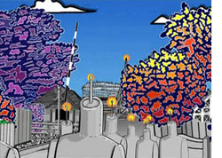 I realize I’m pointing toward a slippery slope here. Strip off the image track from Aardman‘s Creature Comforts and you have impromptu recordings of ordinary people talking about their lives. Those monologues could have been accompanied by documentary-style talking heads. Does that make Creature Comforts a documentary? I’d say not because the film doesn’t come to us labeled that way; it’s presented as comic animation using found soundtracks (like the movie based on the Lenny Bruce routine Thank You Mask Man). Then there are Bob Sabiston‘s rotoscoped films like Waking Life and The Even More Fun Trip, recently released on Wholphin no. 7. The latter (left) takes another documentary form, the home movie, as the basis for its animation. This seems to me an instance where the documentary category has the edge, but it’s a surely a borderline case.
Animated documentaries are likely to remain pretty far from our prototype of the mode. Still, we should be grateful that even imagery that seems to be wholly fictional—animated creatures—can present things that really happen in our world. This mode of filmmaking can bear vibrant witness to things that cameras might not, or could not, or perhaps should not, record on the spot.
André Bazin’s arguments for the documentary basis of cinema are set out in “The Ontology of the Photographic Image,” in What Is Cinema? ed. and trans. Hugh Gray (Berkeley: University of California Press, 1967), 9-16. Noël Carroll’s argument that documentaries are framed as presenting “purported fact” can be found in Theorizing the Moving Image (Cambridge: Cambridge University Press, 1996), 224-259. On the “assertive stance” of documentaries, see Carl Plantinga, Rhetoric and Representation in Nonfiction Film (Cambridge: Cambridge University Press, 1997), 15-25. Errol Morris interviews Adam Curtis here. Thanks to Mike King for pointing me toward The Even More Fun Trip.
PS 10 March: Harvey Deneroff writes:
Very much enjoyed your post on animated documentaries, a topic of some interest to and often discussed in the animation studies community. There was a panel on it during last year’s Society for Animation Studies conference and there will also be one at this year’s as well.
Two recent Oscar recipients for Best Animated Short Subject are also documentaries: Chris Landreth’s wonderful computer animated Ryan (produced by the NFB about animator Ryan Larkin, and features a lot of talking heads) and John Canemaker’s The Moon and the Son: An Imagined Conversation, which is about Canemaker’s father and mixes animation with home movies and photographs.
At least two winners in the Oscar Documentary Short Subject category were largely animated: Chuck Jones’ So Much for So Little (WB, 1949, which I believe was made for the US Public Health Service) and Norman McLaren’s Neighbours. The Story of Time, a 1951 British documentary which featured stop motion animation was nominated in the same category.
Also, the International Leipzig Festival for Documentary and Animated Film includes a section for animated documentary films.
Thanks to Harvey for this. I’m not sure I’d categorize Neighbours as a doc, but it’s a long time since I’ve seen it. On Harvey’s site he also has a note quoting Ari Folman on the difficulty of funding animated docs. And thanks to Ryan Kelly and Pete Porter for reminding me of Winsor McCay’s Sinking of the Lusitania from 1918.
Coraline, cornered
DB here:
It’s common for academics in one field to borrow ideas from other domains of research. But people outside academe sometimes object when a film scholar talks about movies using a term or idea originating elsewhere. These people usually think of themselves as hard-headed pros. Everything we need to understand film, they think, can be derived from the concepts already used by practitioners.
No doubt, we should be attentive to the ways in which filmmakers think and talk about their work. There’s a lot to be learned from shop talk and insider information–hence the enduring value of interviews, DVD commentaries, and the like. Yet no activity explains itself. Often practitioners do things intuitively, without making their background ideas explicit. We can often illuminate a filmmaker’s creative choices by spelling out the unspoken premises behind the work.
Further, filmmakers themselves have traditionally drawn ideas from other arts and sciences. For example, storytelling techniques referred to as exposition, point of view, or motivation have their origin in theories of literature and drama. Filmmakers have been quite pluralistic in their creative practices; why can’t critics and historians be open to outside influences?
Back in the 1980s I began speculating on how the film image represented space, and I adopted the then-current terminology of perceptual psychology. Researchers spoke of depth cues, those features of the real world that prompt our visual system to make fast inferences about a three-dimensional layout. Classic depth cues are the Gestalters’ figure/ ground relation, da Vinci’s “atmospheric perspective” (the haze that envelops more distant planes), and Helmholtz’s “kinetic depth effect,” the way that when you’re moving, closer objects change at a different rate than more distant ones.
These features can also be invoked in two-dimensional images, as I tried to show in Narration in the Fiction Film. Nowadays, deeper explanations of these effects are available using geometrical or computational approaches to perception. But depth cues remain a useful informal way of studying how artists manipulate images. For this reason, in Film Art: An Introduction, we’ve continued to itemize some depth cues that are important in cinema. These concepts furnish analytical tools for understanding things that filmmakers do spontaneously when they compose or light a shot.
So imagine my happiness when I hear filmmakers talk directly about depth cues.
In a fascinating article in American Cinematographer, Pete Kozachik, Director of Photography on Coraline, explains that the filmmakers were very conscious of perceptual factors throughout, and not just in creating the stereoscopic effect. For example, they designed and filmed our heroine’s alternative world in normal perspective, but her boring normal world was designed to seem off-kilter and flat by means of inconsistent depth cues within the shots. “The compositions match in 2-D, but the 3-D depth cues evoke a different feel for each room.”
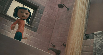
This is hard to illustrate in a two-dimensional medium, but the Coraline trailer offers some examples. Consider this image.
The tiles in the family shower don’t recede into the distance, either across or upward. They are more or less the same size, just arrayed along a diagonal. A degree of recession is supplied by tonality and lighting, but the corner of the shower stall remains somewhat ambiguous. If you try to do a Gestalt flip, you can see the corner as a chimney poking out at you rather than one receding inward. (To see this, try covering the rest of the shot with your hands.)
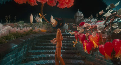
In the garden of the “Good Household,” however, the bricks recede naturalistically in shape and size. The lighting and tonal gradients create a strong sense of depth.
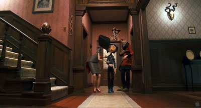
Here is the Good Family’s hallway.
It displays central perspective, with everything receding as it should (as if seen by a wide-angle lens).
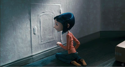
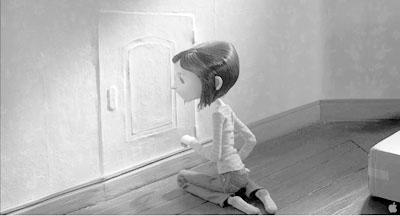
By contrast, here is an oblique shot of Coraline’s real-world bedroom. The doorway’s edges recede pretty steeply, but the baseboard doesn’t taper as it moves toward and past the corner. Instead, it moves in parallel lines. The same thing is happening with the floor planks.
You can see the effect more clearly if we drain the color and lower the contrast. (Sorry, Messrs. Selick and Kozachik.)
Now you can also see the weird, almost cubistic edges of floorboards poking up just behind the carton. Again, lighting and tonality create a sense of depth that the geometry of the edges denies. The depth cues within Coraline’s normal life are inconsistent.
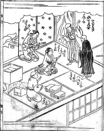
Stare at the rear stretch of the baseboard awhile, and you’ll find that its contours may look a bit wider than those in the foreground. This sort of “parallel perspective” can be found throughout Asian art. Here is a Japanese book illustration from 1713, in which many of the edges run in parallel perspective. Again, instead of meeting in the distance, diagonals seem to be converging out in front of the picture plane, making some areas appear wider in the rear than in the front.
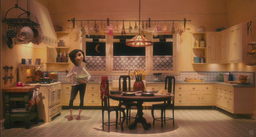
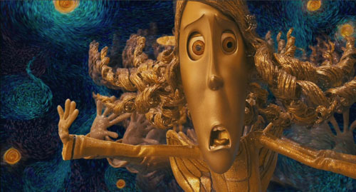
If my invocation of other artistic traditions seems a highfalutin way of talking about an animated movie, check the Van Gogh joke in the Coraline frame at the bottom of this entry.
Kozachik also explains how he spent a lot of time trying to vary the two images’ interocular distance, the distance between our two eyes, in order to give a greater sense of volume. The care paid off, at least for me. Coraline is the best 3D film I’ve seen, as well as the scariest. (For our take on Beowulf see this entry.)
In addition, Coraline helps me push a general point: Cinema is at least partly an affair of perception. Filmmakers are practical psychologists, artists who have mastered the skill of playing with our senses. We can open up their secrets a little by using tools borrowed from the sciences of mind.
For more on Coraline, see Bill Desowitz’s Animation World interview with Tadahiro Uesugi and his interview with Henry Selick. Background on the production is supplied by Thomas J. McLean’s article from last year.
For an overview of spatial perception, see Maurice Hershenson, Visual Space Perception (MIT Press, 1999). A more detailed account is Stephen E. Palmer, Vision Science: Photons to Phenomenology (MIT Press, 1999). A geometrical explanation of the kinetic depth effect is offered in James E. Cutting, Perception with an Eye for Motion (MIT Press, 1986).
Do sell us shorts, the sequel
This Way Up
Kristin here–
Last year I blogged about the program of Oscar-nominated live-action and animated shorts that played at our local Sundance multiplex. Award season has rolled around again, and Sundance will be among 60 theaters nationwide showing this year’s films. Some venues will open them on February 6, with others showing the program during the following weeks running up to the Oscar ceremony on February 22. (Sundance here will run them for a week starting February 13.)
It used to be very difficult to see the Oscar-nominated shorts, unless they were by Pixar or Aardman. Then Shorts International, a British company distributing its films via satellite and iTunes, and Magnolia Pictures, a theatrical and home-entertainment distributor, teamed up to make these programs available. The first set went out in early 2006, displaying the nominees for the year 2005. The press release for this year’s program says that the popularity of these theatrical releases has gone up 223% in the intervening period. On February 17, the 2008 nominees will be released on iTunes.
The first three years’ worth were released as DVDs, but there’s no such plan announced in the press release for this year. Links for the first two volumes can be found in last year’s entry. The one for the 2007 films is here. (Two of them, My Love and I Met the Walrus, were not included on the disc.)
Don’t take my opinions as guides for voting in your office Oscar pool. My choice for last year’s best live-action short, The Tonto Woman, didn’t win. Le Mozart de Pickpockets, which I dismissed as lightweight, did. I’m still baffled, since it’s quite a conventional little comedy. Maybe it’s because that was the only short among the five that involved a cute kid.
My favorite among the animated shorts, Même les pigeons vont au paradis, lost, but I did correctly predict that Peter and the Wolf among the 2007 animated nominees was the likely winner. Another cute kid plus Prokofiev equals Oscar bait. I voted for it in our faculty-grad student pool.
As I said last year, live-action shorts often have the feel of being portfolio projects—mainly because many of them are just that, first directorial efforts by film-school graduates trying to move from commercials to features. Perhaps as a result, they are very skillfully made but tend to stick to fairly conventional subject matter and treatment. They also go for Serious Themes, a tendency very evident in this year’s program. Of course, some people, including many Oscar voters, like Serious Themes.
Animated shorts, on the other hand, are often made by experienced pros and hence are often more daring and funny. Only one of this year’s cartoons goes for poignancy. I think most commentators assume that Presto, this year’s Pixar short, will walk away with the Oscar. Pixar always does. (At least in the shorts department. I am still annoyed that Shrek beat out Monsters, Inc.)
Here’s an overview of the program.
The Animated Shorts
 Lavatory Lovestory, dir. Konstantin Bronzit, Russia, 2006, 10 minutes. Bronzit has gone for minimalism, with black and white line drawings and no dialogue. A lavatory attendent in a men’s room suddenly starts finding bouquets in her tips jar and searches for her secret admirer. The flowers are the only touches of color. It’s well animated, contains many clever, amusing bits, and without getting mawkish about it, makes the point that love can come to anyone.
Octapody. Directed by Emud Mokhberi, Thierry Marchand, Julien Bocabeille, François-Xavier Chanious, Olivier Delabarre, and Quentin Marmier, France, 2007, 2:10. A computer-animated film that goes for a spare look, with relatively few complexly rendered surfaces. The stylization works well for a tale of two octopi in love, one of whom is snatched from their tank in a fish shop and sent off in a van, presumably to a 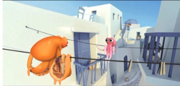 restaurant. The other gamely gives chase, freeing his? her? mate. More chasing ensues. All of this goes at a break-neck pace; note the length. I was glad to be watching on DVD, so I could go back and observe details that had whisked by almost imperceptibly. The expressions of the octopi are rendered vividly, despite the lack of mouths. Again, no dialogue, though the creatures occasionally make little peeping noises. The whole thing has the look of an earlier Pixar film, though one playing fast-forward. It would almost be plausible as an alternative to Presto, but I find it difficult to imagine the Academy membership voting for a two-minute film that it took six directors to make! (Only the first two listed above were nominated.)
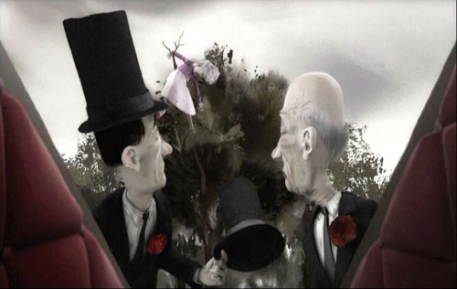
This Way Up. Directed by Smith & Foulkes, United Kingdom, 9 minutes, 2008. This was my favorite among this year’s shorts, always excepting Presto. It and Octapody are the ones I would want to have, to watch again and bring out for the entertainment of friends. It’s a macabre little tale of father and son undertakers who struggle to get the coffin of a sweet little old lady to its waiting grave. A dislodged rose petal in her house falls, setting off a Rube Goldberg-style string of events culminating in the crushing of their hearse. Setting out on foot, they encounter numerous obstacles, resulting in gruesome adventures with the corpse. These culminate when all three are catapulted into Hell.
The animation is complex and very well done. During the somber, slow first half, a color scheme of shades of gray is maintained (see above), but the lively, spectacular Hell sequence pops with garish colors and dazzling movement. I liked the subtle touches, like the indications that young Shank is bored with the family business. It’s so smart and well done that I think it’s the only entry that might have a chance of pulling off an upset.
I had never heard of Smith & Foulkes or the production company, Nexus Productions. Turns out they mainly make commercials and the occasional short. This Way Up was done for the BBC. I didn’t see Lemony Snicket’s a Series of Unfortunate Events, but Smith & Foulkes created The Little Elf, the brief, sickly sweet Disney pastiche that opens the film. You can see it and other films on the Nexus website–if you can figure out the links, which seem to dodge away when you try to click on them.
La Maison en petits cubes. Directed by Kunio Kato, Japan, 12 minutes, 2008. Visually this is appealing, with 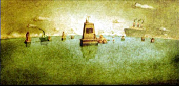 what appears to be watercolor painting based on the style of Lyonel Feininger. (His paintings, not his comic strips.) The premise is that the hero, an old sailor, and his neighbors live in houses built gradually upward with added cube-like rooms as the ocean that surrounds them rises.
Anti-global warming, I thought, but no, turns out that the stalagmite-like houses are symbols of life, while the ocean is time. The hero scuba-diving downward and remembering his wife and daughter in successively lower rooms, as they appear younger and younger. I found it overly sentimental. Some others will presumably find it pleasantly poignant.
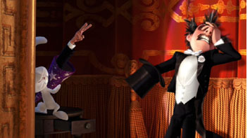 Presto. Directed by Doug Sweetland, USA, 5 minutes, 2008. Do I need to say anything about this? The vast majority of you presumably saw it when it was shown in front of WALL-E. It’s also on the WALL-E DVD. Presto is a pastiche of Warner Bros. cartoons of the golden era, though not one that looks merely derivative. Set in a vaudeville theater, it deals with a wascally, hungry rabbit punishing a magician who withholds his carrot. Not a wise-cracking Bugs Bunny type though, since there’s no dialogue. It proceeds at a breakneck pace and jams an absurd number of gags into its short running time.
The live-action shorts
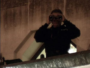
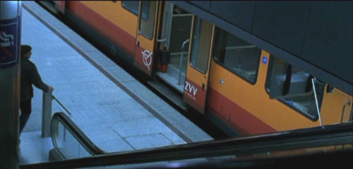
On the Line. Directed by Reto Caffi, Switzerland-Germany, 26 minutes, 2007. A psychological study of a guard in a Swiss department store who falls in love with a woman who works in the book section. At first he appears to be a creepy stalker, watching her in his office via security cameras and times his commutes home to be on the same train (see below). Possibly, though, he is just shy and awkward. On one train trip he sees a young man he takes to be his rival set upon by thugs and ducks out at a stop, leaving the man to be beaten to death. Thereafter he agonizes over his act, hiding it after he unexpectedly develops a relationship with the woman. The story manages to keep us guessing about the protagonist’s character, suggesting at times that he is simply a decent fellow who made one dreadful mistake. So often the acting in short, independent films is a weak point, but Roeland Wiesnekker and Catherine Janke are excellent as the two main characters.
New Boy. Directed by Steph Green. Ireland, 11 minutes, 2007. In New Boy, a recent immigrant from Africa immediately draws the hostility of two bullies on his first day in a new school. At first we may assume they 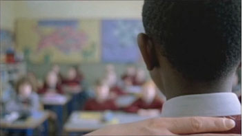 act out of racism, though the ending suggests that the problem is just boyish belligerence. The main sympathy for Joseph comes from a series of brief flashbacks to him at school in his original homeland, where his father is the teacher; one day some soldiers arrive and take him away to some unknown fate. The Irish teacher’s strict behavior with a boy who has endured such traumatic events ends up being key to the surprise ending—one which I found too optimistic to be plausible but definitely narratively satisfying.
Toyland. Directed by Jochen Alexander Freydank, 14 minutes, 2007. The Academy members love Holocaust films, so this film might well take the prize. Another film about a Christian boy and a Jewish boy who become close friends, only to have the Jewish family taken from their home to a train waiting to depart. To comfort her son, the Christian mother tells her son that they’re going to “Toyland” but that he can’t go along. Naturally he slips out and tries to do so. It’s a good film, I think, though the elaborate flashback structure is perhaps a little too ambitious for such a short narrative. Still, I give it credit for not going down the path that a spectator would almost automatically assume it will. (On the screener, this film was slightly squeezed and quite dark, so I haven’t supplied an illustration.)
The Pig. Directed by Dorte Høgh, Denmark, 22 minutes, 2008. This is a little lesson in ethnic tolerance that 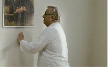 sneaks up on you. An elderly man checks into a hospital for a rectal operation and is then told he has polyps that may be cancerous. In the sterile environment, he battens onto a humorous painting of a pig, treating it as a sort of friend. It mysteriously disappears, and we suspect callous treatment by the hospital until we realize that the other patient in the room is Muslim. So no, the staff were being thoughtful toward that man’s family. Tensions rise as the protagonist insists on having his pig back, and the other patient’s son resists this on religious grounds. What to do if either side being tolerant means the other side is intolerant? Another surprise ending solves the matter pleasantly, which seems to be a common ploy in short films, as in short stories. I would probably vote for this film, though I suspect it will be seen as less hard-hitting than some of the others.
Manon sur le bitume. Directed by Elizabeth Marre and Olivier Pont, France, 15 minutes, 2007. A young 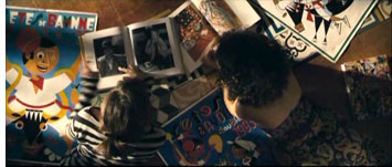 woman struck by a car lies on the asphalt, surrounded by onlookers. We hear her voice, speculating on what her friends will do after her death. As we see the scenes she imagines, we wonder if these are flashforwards or imaged scenes. Is she really dying? A very polished item which manages to cut among her various friends going about their work or meeting to mourn her and allows us to keep track of who they are. Very, very French.
I’m old enough to have grown up watching programs that included shorts. Cartoons, travelogues, even newsreels when I was very young, in addition to trailers. It’s a pity that shorts, which have traditionally been intended to be shown in small groups before a feature, are now clustered in a way that makes them rush by one after another. Still, it’s hard to see shorts on the big screen, so this year’s program is an opportunity to be seized.
On the Line


