Color, shape, movement . . . and talk
Wednesday | April 22, 2009 open printable version
Bonjour Tristesse.
DB here:
Our weekly Film Colloquium is sort of like your old high-school assembly, except that it’s fun. The Film Studies area meets nearly every Thursday afternoon at 4 to hear a paper by a grad student, a faculty member, or a guest. It’s a great forum for ideas and information, and it gives the speaker a chance to try out a talk before taking it to a conference or lecture gig. The local audience is, in my experience, the toughest I’m likely to encounter. And this spring, despite a heavy travel and work schedule, Kristin and I caught two outstanding presentations.
Not in color, but colored
By now we all understand that silent films were most often shown with musical accompaniment, and sometimes sound effects. But we tend to forget that most silent films were in color too.
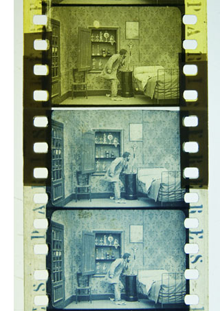
By the early 1920s, 80% of films were colored in one way or another. There were a few efforts to record the actual colors in a scene, but most often color was added after filming. Areas of the frame might be painted over by stenciling or by freehand. More commonly, the shots were dipped into dyes, yielding images that were tinted (washing over the image and coloring the areas of white, as in the frames below) or toned (coloring the darkest areas and leaving the white areas white). Over the years, film prints were preserved in black and white, partly because color stock was more expensive than today. As a result, even archival prints lost the sense of what audiences actually saw. Today archivists labor to reconstruct what silent films looked like in all their rainbow glory.
 Professor Joshua Yumibe of Oakland University wrote his Ph. D. thesis on early color processes, and his Colloquium talk asked some powerful questions. We know that there was a transition in film artistry from the late 1900s to the early 1910s, a shift toward what Tom Gunning has called the “cinema of narrative integration.” As films became longer and were shown in more or less permanent venues, moviemakers began to tell more complicated stories. How, Josh asks, did this shift away from a cinema of isolated “attractions” affect practices of coloring? Do color processes affect the way stories were told? Do the color processes change how people saw the space on screen? How did the trade press respond to different strategies of coloring?
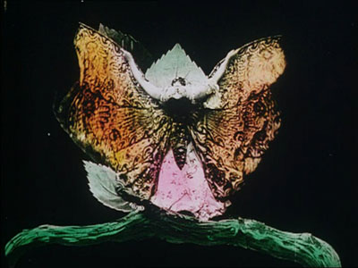
These are fascinating questions, and Josh’s exploration of them was careful and detailed. He has done enormous research on the various color processes, and he was able to trace several lines of development. For instance, he found that writers of the earliest years thought that color enhanced the sensual and emotional effects of the image, even creating an illusion of 3-D. In a shot like that of the butterfly dancer, people seem to have sensed that her multicolored shape was thrusting out of the screen toward them.
Josh argues that with the growing emphasis on narrative, color became more muted. Filmmakers were no longer aiming at momentary stimulation but at ongoing mood. Now tinting and toning came into their own. Color codes developed: blue for night scenes, yellow for sunlight, red for fire, amber for artificial light. Josh also explored the different ways in which European and US companies conceived of color; there seem to have been different color policies at Pathé and at American companies. But this wasn’t the end of change. In the 1920s, with the feature film now at the center of the theatre program, a wide variety of color practices emerged, including those isolated Technicolor sequences we find in films like The Wedding March.
The Q & A was as lively as the talk itself, and afterward, we repaired to a bar and thence to dinner. Josh’s talk was a model of deep, imaginative research and it kept us thinking and talking for a long time afterward. Not to mention his slide show, which regaled us with gorgeous shots that make you realize how much you’re missing when you see an old movie in black and white.
Bass, o profondo!
Another stimulating Colloq session was presided over by our old friend Jan-Christopher Horak, director of the UCLA Film and Television Archive. Chris was in town because our Cinematheque has been showcasing UCLA archival restorations across the semester, and he introduced our screening of The Dark Mirror. But we also got him to give a talk, and that was quite something.
Chris reminded me that we first met thirty years ago, here in Madison, when he came to do research on his dissertation. Since then Chris has been a top-flight scholar and author of many books. His Lovers of Cinema, published by our series at the UW Press, laid the groundwork for the popular film series Unseen Cinema. He’s also been one of the world’s leading film archivists, having supervised collections at Eastman House, the Munich Film Archive, Universal studios, and most recently UCLA.
Chris has long worked at the intersection of film, photography, and the graphic arts. He is one of the world’s experts on the 1920s German avant-garde; one of his early curatorial coups was a 1979 restaging of the pioneering Film und Foto exhibition of 1929. Chris has also long been fascinated by film publicity, having written a book on the subject. So it’s natural that he would gravitate toward studying the film-related work of Saul Bass, one of America’s greatest graphic designers.
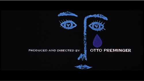
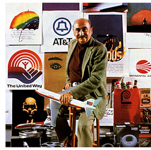 Chris’s talk focused not so much on Bass’s brilliant credit sequences for films by Preminger and Hitchcock as on Bass’s contributions to poster design. Bass turns out to have had a fascinating career, having worked in Manhattan advertising before moving to Los Angeles in 1948. Chris has found at least one early 1950s poster design that Bass probably executed, but he definitely worked for Preminger on publicity for The Moon Is Blue (1953) and Carmen Jones (1954)—the latter yielding to my mind one of the greatest credit sequences in film history. In 1955 Bass founded his own firm.
Throughout, he carried on the ideals of György Kepes, his teacher and a major conduit for Bauhaus ideas into America. Like his European models, Kepes promoted the idea of art as having cognitive value, teaching us to see the world in a new way. Kepes also emphasized that artworks could be of practical utility—an idea that chimed with Bass’s turn toward commercial design.
Chris was able to show that the Bauhaus tradition powerfully influenced Bass’s design principles. Who would have thought that the credits for The Seven Year Itch replayed Paul Klee? Obvious, though, when Chris showed us the images.
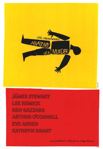
Chris emphasized two further points. First, Bass understood what we now call branding. We have to remember that it up to that time, most film publicity featured images of the stars, either in portraits or caught in typical scenes from the film. Bass’s poster design concealed the stars. Instead, he relied on dynamic geometrical design to capture a film’s mood in a powerful, stylized image. The result was an eye-catching logo, instantly recognizable: the flaming rose of Carmen Jones, the Vertigo whirlpool, the dismembered body of Anatomy of a Murder.
The key image could be repeated in newspaper ads, posters, credits, even the production company’s letterhead. When you saw the teaser trailer for Star Trek (“Under Construction”) dominated by that looming boomerang shape, you saw the heritage of Saul Bass. Who cares who’s in the movie? The very image is intriguing. No accident that Bass also designed many corporate logos, like the ATT bell and the United Way hand.
Chris’s second main point was that Bass was able to flourish because of the rise of independent production in the 1950s. Preminger, Hitchcock, and Wilder, acting as their own producers, could control the publicity for their films to a degree not possible for directors working in the classic studio system. Now films were sold as one-offs, and each film needed to pull itself above the clutter. In addition, Bass’s signature designs could set a director apart. In the 1950s, the Bass look was closely identified with his major clients like Hitchcock and Preminger, to the point that other designers for those directors tried to copy his style. I had always thought that Bass did the title design for Hurry Sundown, but Chris showed that it’s another artist’s pastiche of the master.
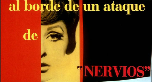
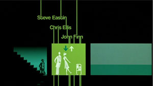 Chris’s talk reminded me that Bass contributed to making the opening credits a major attraction—not merely an overture, but an abstract treatment of the key story idea, a sort of graphic map that teases us into the main story. The opening sequences of Se7en and Catch Me If You Can (left) owe a lot to Bass’s idea that the credits should constitute a little movie, witty or ominous, tantalizing us with sketchy glimpses of what is to come. And Almodóvar’s diverting openings, probably the most sheerly enjoyable credit sequences we have today, are unthinkable without Bass. Synchronized with infectious music, Bass’s credit sequences can be seen as continuing the tradition of Walter Ruttmann and Oskar Fischinger, who back in the 1920s and 1930s made abstract films that advertised consumer goods.
For such reasons, I’m glad I hung around Madison after my retirement. With visiting researchers like Josh and Chris, who wants to go fishing?
Woman on the Verge of a Nervous Breakdown.
Thanks to Joshua Umibe for the silent-film illustrations. The first comes from Gaston Velle, Métamorphoses du Papillon / A Butterfly’s Metamorphosis (Pathé, 1904). Frame enlargement from Discovering Cinema (di. Eric Lange and Serge Bromberg, Lobster Film/Flicker Alley). The second comes from Albert Capellani’s Le Chemineau / The Vagabond (Pathé, 1905; tinted and toned). Frame enlargement Joshua Yumibe, courtesy of the Netherlands Filmmuseum.


