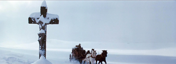
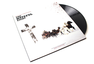
The Hateful Eight (2015).
DB here: Jeff Smith, our collaborator on the new edition of Film Art, is an expert on film sound. He has written earlier entries on Atmos and Trumbo.
The Academy Awards ceremony is upon us. Once again this year, I offer an overview of the two music categories: Best Original Song and Best Original Score. For the songs and some score cues I’ve provided links, so you can listen as you read.
This year’s nominees showcase music written in an array of musical styles for a wide range of narrative contexts. The composers and songwriters recognized for their work include some newcomers, some savvy veterans, and a pair of legends who have helped to define the modern film score.
As always, this preview is offered for non-sporting purposes. Anyone seeking insights for wagers or even the office Oscar pool is duly cautioned that they assume their own financial risks for any information they use. And since I was only half-right with last year’s prognostications, you might seek predictions from insiders at Variety and Entertainment Weekly.
Diversity in numbers: Best Original Song
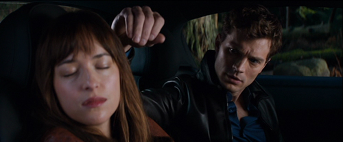
Fifty Shades of Grey (2015).
When the Oscars were announced a few weeks ago, they made headlines for all the wrong reasons. Noting the lack of racial diversity among the acting nominees, social media exploded, creating #OscarsSoWhite as a popular Twitter handle to draw attention to the situation. After a cacophony of tweets and retweets, several celebrities weighed in. Will Smith and others suggested that they planned to boycott the ceremonies.
The nominees for Best Original Song, though, are a pretty significant exception to the OscarsSoWhite meme. Both the performers of these five songs and the topics they address reveal that Oscar voters haven’t entirely ignored the fact that films can be a force for social change.
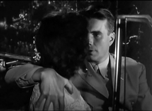
The Weeknd’s breakout year on the pop charts has continued with an Oscar nomination for “Earned It” from Universal’s hit of last spring, Fifty Shades of Grey. The Weeknd’s “Can’t Feel My Face” has enlivened playlists all year long, but “Earned It” is a slow-burn soul ballad that accompanies Christian and Anastasia’s ride home after his mother interrupts their morning tryst. The song was co-written by the Weeknd, Belly, Jason “Daheala” Quenneville, and Stephan Moccio, and features a simple two-chord pattern on the piano that eventually builds toward a more harmonically adventurous string passage. According to Moccio, the song was intended to reflect a male perspective, hinting at the darkness lurking underneath Christian’s sexual peccadillos.
The Weeknd, Quenneville, and Belly are all Canadian. But considering that the Weeknd and Quenneville are of African descent and that Belly is of Palestinian heritage, their nomination offers a modest riposte to the criticism leveled at the Oscars for their lack of racial diversity. However, since their song appears in one of the more critically reviled films to receive a nomination, it seems unlikely that “Earned It” will take home the prize next Sunday.
Tuning up nonfiction films: Nominated songs from docs

Racing Extinction (2015).
Two other nominations come from recent documentary films, continuing a trend begun with last year’s nod to Glen Campbell: I’ll Be Me. The first is for J. Ralph and Antony Hegarty’s “Manta Ray” from Racing Extinction, which examines the threat man poses to the survival of several bird species, amphibians, and marine animals.
Hegarty is only the second openly transgender person to receive a nomination, a quite pleasant surprise for fans of her work as a singer and songwriter. Hegarty initially made a splash in 2000 with the release of her band’s debut album, Antony and the Johnsons. Her breakthrough, though, came with the 2005 release I Am a Bird Now, which topped several critics’ year-end lists and won Britain’s prestigious Mercury Prize.
“Manta Ray” is a delicate waltz based upon a central theme from J. Ralph’s score for Racing Extinction. Although the song itself appears only over the closing credits, Ralph’s theme threads through the film, introduced during a key scene when a member of the filmmaking team removes a hook and fishing line from a manta ray’s dorsal fin. After the SARS outbreak in the early 2000s, commercial fishermen increasingly targeted manta rays since their gills were thought to have curative powers among practitioners of Chinese folk medicine.
Anchored by her soft, tremulous voice, Hegarty’s music has always exuded sensitivity and melancholy in almost equal measure. With Hegarty’s ethereal tones floating over Ralph’s simple piano accompaniment, “Manta Ray” not only captures the animal’s grace and beauty, but also hints at the tragedy of their steady decline.
Racing Extinction is not Hegarty’s first brush with Hollywood. Previously, her music was featured in James McTeigue’s V for Vendetta and in Todd Haynes’s I’m Not There. But given all the media attention to the Oscars, Sunday night will offer Hegarty a much bigger stage and a chance for the world to see her extraordinary gifts.
The other nominated song from a documentary is “Til It Happens to You,” which was written for Kirby Dick’s searing documentary on campus rape, The Hunting Ground. The film not only exposes college administrators’ efforts to cover up incidents of sexual assault, but also shows how two University of North Carolina rape survivors used Title IX legislation to draw attention to the problem.
“Til It Happens to You” brought Lady Gaga her first nomination and Diane Warren her eighth. Beyond the sheer star power brought by the pair, Gaga and Warren both have discussed their own experience as rape victims.
According to Variety, Gaga worried that the gravity of the film’s subject matter might not square with her outlandish diva persona: “I was very concerned that people would not take me seriously or that I would somehow add a stigma to it.” But her concerns appear to be unfounded. Warren reports that other survivors have reached out to her saying that the song and film is “making people feel less alone.”
Some of this reaction undoubtedly derives from the emotional gut punch delivered by the song’s lyrics. They not only describe the feelings of devastation felt by rape victims. They also express the difficulty of dealing with unfeeling bureaucrats and callous peers. The refrain of “Til It Happens to You” conveys the sense of isolation created by others’ inability to fully know what it’s like to walk in the victim’s shoes.
Licensed to Trill: The Spectre of Youth
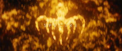
Spectre (2015).
Jimmy Napes and Sam Smith’s “Writing’s On the Wall” from Spectre adds another notch to James Bond’s gunbelt. Four previous Bond films have received nominations for Best Original Song. And in 2013, British chanteuse Adele took home a golden statuette for the title track of Skyfall.
For me, the piece is well crafted, but falls somewhere in the middle of the Bond music pantheon. Not quite the peaks of Shirley Bassey’s “Goldfinger” or Paul McCartney’s “Live and Let Die.” But also not the dregs of Rita Coolidge’s “All-Time High” or A-ha’s “The Living Daylights.” “Writing’s On the Wall” is vaguely Bond-ish in much the same way that Smith’s smash hit, “Stay With Me,” contained strong echoes of Tom Petty’s “I Won’t Back Down.”
The last nominee is “Simple Song #3” from Youth. Of all the nominees, David Lang’s piece is the one most firmly integrated into the film’s narrative. “Simple Song #3” is featured at the end of Youth, performed onscreen by singer Sumi Jo, violinist Viktoria Mullova, and the BBC Concert Orchestra.
The song is a classic “Adagio” structured around a repeated descending string figure. Gradually, other instruments are added, creating patterns of shifting harmony that surge beneath Jo’s vocal line.
Although “Simple Song #3” doesn’t appear till the end, the song is mentioned at several earlier moments as the work of the film’s protagonist, Fred Ballinger (Michael Caine). Ballinger is a retired composer and conductor lured back to the stage by an invitation from the Queen to perform for Prince Philip’s birthday. According to Lang, the piece offers a window into Ballinger’s psychology. It balances both the aspirations of his youth with the melancholy of a life lived apart from the woman he loved.
Placed in the film’s climax, Ballinger’s work provides an emotional capstone that operates at several levels. Given the complexity of its narrative function, “Simple Song #3” is not so simple.
Prediction: As a longtime Antony and the Johnsons fan, I would be delighted to see Hegarty and Ralph making their acceptance speech on Sunday night. But it seems to be Lady Gaga’s year so far. After winning a Golden Globe for her work on American Horror Story: Hotel, singing the national anthem at the Super Bowl, and performing a tribute to David Bowie at the Grammys, Gaga will cap off a stellar start to the new year by walking home with Oscar on her arm. It will also provide career recognition to Diane Warren, whose music has graced more than 200 different films and television shows. After last year’s disappointment, Warren finally will get the opportunity to be forever “Grateful.”
Old White Men and Even Older White Men: Best Original Score
Sicario (2015).
The nominees for Best Original Score are a group of seasoned craftsmen who collectively have received more than seventy Oscar nominations and have written music for more than seven hundred feature films. At age 46, Jóhann Jóhannsson is the youngster of the group. Carter Burwell and Thomas Newman both turned sixty late last year. And John Williams and Ennio Morricone are both octogenarians.
Jóhannsson is nominated for his score for Denis Villeneuve’s drug war thriller Sicario. The Icelandic composer received a nod last year for The Theory of Everying, but lost out to Alexandre Desplat’s charming Euro-pudding score for The Grand Budapest Hotel.
The score for Sicario, though, couldn’t be more different than that for The Theory of Everything. Where Everything’s music was lilting and lyrical, Sicario’s is tense and ominous, emphasizing rhythm, timbre, and texture over more conventional structures of melody and harmony. Several cues are organized around pounding drum patterns punctuated by sustained, dissonant blasts of strings and low brass. In an interview, Jóhannsson recalled, “I think the the percussion came first, and then I started to weave the orchestra into it. Very early on I decided to focus on the low end of the spectrum—focus on basses, contrabasses, low woodwinds, contrabassoon, contrabass clarinets and contrabass saxophone.”
Other cues also emphasize percussive textures, but with the instrument sounds processed so that they sound driven to the point of distortion. Even a more restrained cue like “Melancholia” still maintains a quiet intensity, structured around a cyclic harmonic pattern played on acoustic guitar in a vaguely flamenco style. The score is brutally effective in capturing the mood of Sicario’s taut action scenes. In fact, for me, Jóhannsson’s score was, without question, the best thing in the film.
The Old Hands: Carter Burwell and Thomas Newman
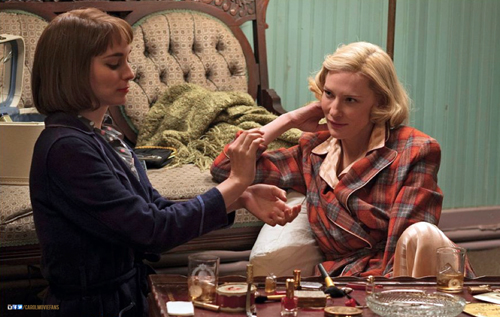
Carol (2015).
Carter Burwell received his first Oscar nomination this January for his score for Todd Haynes’ Carol. Burwell got his start on the Coen brothers’ debut, Blood Simple (1984), and has been a regular collaborator ever since. He has also worked regularly with a number of other filmmakers, such as Charlie Kaufman, Spike Jonze, and Bill Condon. Given the rather quirky and absurdist tone found in many of their projects, Burwell’s great gift is to provide music that emotionally grounds the characters, finding notes of lyricism, melancholy, and pathos in the strange stories of lovelorn puppeteers, sex researchers, and bumbling kidnappers.
For Carol, Burwell tried to capture the peculiar mixture of passion and distance that characterizes Therèse’s initial attraction to Carol. Because Carol comes across as both elegant and a bit aloof, Burwell not only utilized ambiguous harmonies, but also “cool” instruments, such as piano, clarinet, and vibes.
On his website, Burwell identifies three main musical themes in his score for Carol. The first is a love theme introduced in the film’s opening city scene. It presages the relationship even before we’ve been introduced to the characters. The second theme underscores Therèse’s fascination with Carol. Says Burwell, “This is basically a cloud of piano notes, not unlike the clouded glass through which Todd Haynes and Ed Lachman occasionally shoot the characters.” The third theme captures the characters’ sense of loss when they are separated. Knowing that Cate Blanchett and Rooney Mara would convey the characters’ pain in their performances, Burwell opted instead to use open harmonies (fourths, fifths, and ninths) to communicate their sense of emptiness.
Burwell orchestrated the music for chamber-size ensembles to maintain the sense of intimacy between the characters. Some cues feature as few as four instruments while others were performed by as many as 17 musicians.
Burwell’s spare, modest score is a departure from the style Haynes explored in his previous foray into this territory: his Douglas Sirk homage, Far From Heaven (2002). Elmer Bernstein’s score for that film was lush and emotionally expansive, aping Frank Skinner’s musical stylings in films like Magnificent Obsession (1954) and All That Heaven Allows (1955). Burwell wrote only 38 minutes of music. Yet it all is beautifully attuned to the film’s mood of quiet desperation.
Thomas Newman earned his thirteenth nomination for Bridge of Spies. (Insert Susan Lucci joke here.) Newman, of course, descends from film composing royalty as the son of the renowned classical Hollywood tuner, Alfred Newman. Yet, despite Newman the Younger’s distinguished career in Tinseltown, Newman the Younger has a long way to go to catch his pops. Alfred won nine Oscars and accrued more than forty nominations.
Newman’s music has graced some of the most beloved American films of the past three decades, such as The Shawshank Redemption, American Beauty, Finding Nemo, and Wall-E. Although he is known for his versatility, an NPR story on his score for Bridge of Spies notes that Newman has become known for passages that incorporate “quirky, layered piano writing and jagged string motifs.”
Newman and Spielberg save the score’s biggest moments for the film’s climax and epilogue. Indeed, more than half of the film’s score is backloaded into its last three cues, which together account for about 25 minutes of music. Displaying Newman’s full emotional range, “Glienicke Bridge” anxiously underscores the tense prisoner exchange that delivers Rudolf Abel back into Soviet hands. “Homecoming” features solo trumpet and oboe to convey James B. Donovan’s sense of validation now that his fellow commuters’ scowls of disapproval have turned to smiles of patriotic pride.
Newman’s score for Bridge of Spies is a very solid piece of work evincing the craft and refinement displayed by earlier masters like Jerry Goldsmith and John Barry. Yet the music’s modesty and conventionality make it the kind of score all too easy to overlook.
The Legends: John Williams and Ennio Morricone
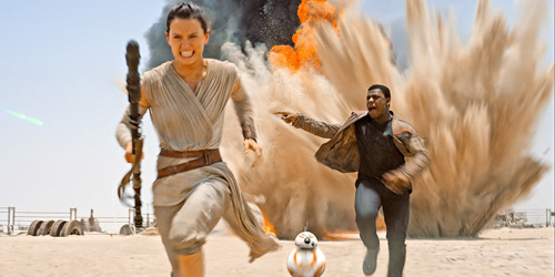
Star Wars: The Force Awakens (2015).
Oddsmakers have tabbed our final two nominees, John Williams and Ennio Morricone, as the most likely to take home the big prize. The former is nominated for Star Wars: The Force Awakens, the seventh film in George Lucas’s series and the seventh scored by Williams. Coming 48 years after the composer’s Oscar win for the first Star Wars film, Williams’s music updates the neo-Romantic style he helped to revive in the 1970s. It also adds new themes for key new characters, such as Rey and Kylo Ren.
Williams wrote a massive amount of music for The Force Awakens. (Indeed, the 102-minute score is more than double that of Newman’s score for Bridge of Spies.) But very little of it simply replicates materials from the previous films. By Williams’s own count, only seven minutes of the score function as “obligatory” references to his own immediately recognizable themes.
As in his previous work, Williams shows enormous skill in juggling the various leitmotifs that are attached to the film’s dramatic personae, often moving a motif through different instrument combinations in order to vary the color and timbre of each cue. And Williams’s sure touch with this material undoubtedly enhances J.J. Abrams’ everything-old-is-new-again approach to The Force Awakens, a strategy that seems to have satisfied long-time fans, many of whom probably have dusty old compact discs of the composer’s earlier Star Wars scores.
The score for The Force Awakens earned Williams’s his fiftieth nomination and it is a fine addition to his already considerable oeuvre. Still, considering that Williams has won Oscars on five previous occasions and the been-there- done-that aspect of the enterprise, it is hard to believe that this score will bring the composer his sixth statuette. Thankfully for him, Williams’s reputation as one of the greatest composers to work in the film medium is already firmly secured.
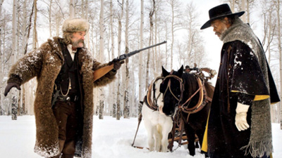
That leaves just Ennio Morricone, the equally legendary Italian composer whose collaborations with Sergio Leone redefined the sound of the Western. Nearly fifty years after Morricone’s theme from The Good, the Bad, and the Ugly topped U.S. record charts, Morricone garnered his sixth Best Original Score nomination for Quentin Tarantino’s The Hateful Eight.
The film marked Morricone’s return to the genre after several decades of avoiding it. According to the composer, most directors who approached him simply wanted him to replicate the sound of his great Spaghetti Western scores. Morricone preferred to pursue projects that let him stretch in other directions.
Tarantino gave the Maestro a free hand in developing the score of The Hateful Eight, and Morricone responded with one of his best scores in decades. Aside from his characteristic use of vocal chants as rhythmic accents, the score for The Hateful Eight largely avoids the sort of psychedelic touches and extravagant tone colors found in his Spaghetti Western scores. Gone are the electric guitar, ocarina, whistles, and coyote yelps that established Morricone as a kind of musical meme. Substituted instead are much more conventional orchestral colors with the strings and wind sections taking prominent roles in The Hateful Eight.
Perhaps one reason for this move back to classical Hollywood convention is due to the hybrid qualities of Tarantino’s story. As Peter Debruge noted in his Variety review, The Hateful Eight is “a salty hothouse whodunit that owes as much to Agatha Christie as it does to Anthony Mann.” Morricone himself seems to concur. In an interview with Rolling Stone, the composer added, “Quentin Tarantino considers this film a Western; for me, this is not a Western. I wanted to do something that was totally different from any Western music I had composed in the past.”
Morricone’s score has a “theme and variations” structure that shows him adeptly changing his tempo, texture, and instrumentation to adapt his main theme to new dramatic contexts. His Overture provides the basic template for the score. The low strings and winds play a sustained minor chord that sneaks into the soundtrack. After a few seconds, the upper voices enter playing chords on the first and third beats of each measure to outline the basic harmonic progression of the main theme. Eventually an oboe will enter playing a repeated interval as a counterrhythm over the top of this pattern.
This gives way to the strings, which intone a serpentine diatonic melody that provides the spine for the rest of the cue. Gradually, Morricone introduces more instruments, such as vibes and brass, to vary the tone color and even adds a simple bridge section that consists of a series of soft, chromatically descending chords. After a brief restatement of the main melody, the cue finishes with a series of long sustained chords marked by shifting harmonies in the inner voices. The clarinet plays a fragment of the main theme before it eventually fades out. The cue never comes to the kind of climax that a traditional cadential structure would provide. Instead it simply unwinds itself.
The central theme is probably given its most elaborate treatment in the main title, “L’Ultima Diligenza di Red Rock – Version Integrale.” A steady timpani pulse and a sustained pitch in the strings provide a pedal tone against which a new melody is introduced in the contrabassoon’s low register. This musical figure has a serpentine quality like the other, and it has been written to function as counterpoint to its predecessor at later moments when the two will be interleaved. Morricone gradually introduces more instruments to thicken the texture and even adds brass and pizzicato accents as embroidery atop the main theme. A hi-hat cymbal adds some rhythmic variety to the basic pulse of the timpani.
After a brief detour into some transitional material, the main melody returns, but now played by strings, xylophone, and muted brass instruments. The main musical figure continues to be restated with new ideas simply piled on top. As the music grows in both volume and intensity, Morricone adds trills and furious agitato string runs to create a cacophonous, but organized musical chaos. The cue climaxes with the melody played fortissimo in octaves by the violin section, soaring toward a sudden and abrupt stop. After a short pause, the contrabassoon quietly returns to play a brief musical coda that eventually fades to silence.
Morricone has long been a master of this type of musical structure. He’ll start with a simple musical idea, but then adds different countermelodies or obbligatos to vary its mood and tone. The ongoing accretion of elements creates the effect of a long crescendo that eventually finds release in silence. (For an earlier example of this kind of technique, see his cue for “The Desert” on The Good, the Bad, and the Ugly soundtrack.)
Beyond its purely musical effectiveness, though, “L’Ultima Diligenza di Red Rock” exudes a roiling tumult that fittingly captures the sense of deception and distrust that will pervade Minnie’s Haberdashery. The musical mood remains mostly dark and ominous throughout, leavened only by the bright solo trumpet fanfare that underscores Sheriff Chris Mannix’s reading of Major Warren’s Lincoln letter.
Tarantino’s trust in the Maestro was amply rewarded. This is a score that no one but Morricone could produce. As was the case with Jóhann Jóhannsson’s score for Sicario, it seems to be the best thing about The Hateful Eight. Tarantino wanted a soundtrack album for one of his own films that he could proudly place alongside other Morricone albums in his collection. He got it and then some.
Prediction: The Maestro finally gets his due! Although Morricone received an honorary Oscar in 2007 for his “magnificent and multifaceted contributions to the art of film music,” none of his individual scores have received awards from the Academy. I expect that to change next Sunday night. In fact, betting odds put Morricone’s chances of winning an Oscar for Best Original Score at 1 to 5. That means that a five dollar bet will net you one dollar profit if you win. That is about as close to a sure thing as you are likely to find in the gambling world. And even I’m not dumb enough to buck that trend.
In truth, I would be happy to see any of these composers take home the Oscar. I’ve enjoyed their contributions to the art of film music for much of my adult life. But, for me, the only real question is this: How long will the standing ovation be as Ennio Morricone prepares to give his acceptance speech? I put the over/under at 65 seconds.
Variety offers overviews of the nominees for Best Original Song here and Best Original Score here. Both pieces include comments from the composers and songwriters competing for this year’s awards.
You can find interviews with nearly all of the nominees for Best Original Score: Morricone, Williams (here and here), Newman, and Johannsson. Carter Burwell’s notes on Carol can be found on his website.
Emilio Audissino’s book on John Williams offers a terrific overview of the composer’s career. For a study of Morricone’s compositional techniques and style, see Charles Leinberger’s monograph on The Good, the Bad, and the Ugly in Scarecrow Press’s series of Film Score Guides. My book The Sounds of Commerce includes a chapter on Morricone’s spaghetti western scores.
More on Morricone: The Maestro weighs in on the film scoring process in Composing for the Cinema: Theory and Practice of Music in Film, which is coauthored with Sergio Miceli. You can listen to the opening cue of the score for The Hateful Eight here.
P.S. 25 February 2016: Thanks to Peter Brandon for a correction concerning the Canadian identity of The Weeknd, Quenneville, and Belly.
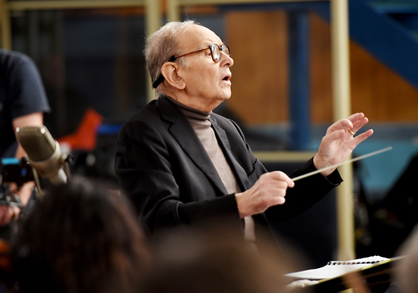
LONDON, ENGLAND – DECEMBER 08: Composer Ennio Morricone is seen during a Live Recording for the H8ful Eight Soundtrack at Abbey Road Studios on December 8, 2015 in London, England. (Photo by Kevin Mazur/Getty Images for Universal Music)


 In fewer than a hundred pages, many of which are occupied with color illustrations, Tony has done a lot. We get background on the production, with attention to Wong’s circuitous creative process. Beginning as Summer in Beijing, the project underwent constant rethinking, reshooting, re-editing, along with modifications even after the festival premiere. Tony draws attention to the film’s parallel with Days of Being Wild, also set in 1960s Hong Kong and Wong’s first essay in revise-as-you-go production.
 open printable version
| No Comments »
open printable version
| No Comments »