by Kristin Thompson. Berkeley: University of California
Press, 2007.
400 pages, 6 × 9 inches, 12 color illustrations;
36 b/w illustrations.
[go
to Amazon | go to The Frodo Franchise blog]
The indefatigable Senior Programmer of the Cinémathèque Ontario emailed me in early 2004 to ask if I had any thoughts on the aspect ratios of Godard films. He attached an essay which eventually appeared in the gorgeous anthology, For Ever Godard. Reading a Quandt essay is like eating a ripe nectarine, tangy and nourishing. So you should find the original and indulge yourself. (1)
You might be asking what the term aspect ratio means. It refers to the ratio of the width to the height of the film image. The image was fairly square in the early silent era, then became roughly standardized at 4 x 3, or as the pros say, 1.33:1. Sound filming made the format a tad more horizontal, at 1.37. Anamorphic widescreen (CinemaScope and its brethren) was more or less standardized at 2.35 (more recently 2.40). Various non-anamorphic, or “flat” aspect ratios have appeared since the early 1950s. The US has favored 1.85, Europe has been known to use the squarer 1.66, and some films, like E. T., are designed for 1.75. Widescreen TVs are set at 16:9, or about 1.78:1, so that’s likely to be a common proportion in the future. We discuss aspect ratios at more length in Film Art: An Introduction (pp. 183-185 in the newest edition).
Filmies care about aspect ratios because shot composition matters. Sometimes the print is “hard-matted,” with the correct proportions given as black bars at the top and bottom of the frame, like video letterboxing. Here’s an example, from a 16mm print of Godard’s 1972 Tout va bien. It is hard-matted to 1.66. (The original film is in color.)
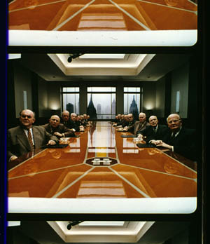
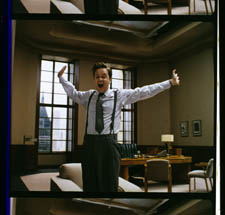
If the image isn’t hard-matted, the projectionist must insert an aperture plate that will mask the image properly. But what plate? Should she set it for 1.37? That’s a very rare option nowadays, and many theatres aren’t really designed to show it. Typically, if the print doesn’t indicate, the US projectionist will fall back on 1.85. Nowadays, if a Hollywood film isn’t in Scope, the projectionist is expected to use that ratio. Some shots will be problematic if the projectionist includes more than the 1.85 format allows. Here’s a full-frame film strip from The Hudsucker Proxy, where you can see that a chunk of the set is blocked or missing in the bottom area, and a microphone peeks into the frame from the top. (2)
Like many other movies, the films made by Godard since the mid-1970s show up at the projection booth without hard matteing. So at what ratio do we show them?
A great many careful viewers have voiced their views on the Internets, and I’ve learned a lot from the discussions here and here. In part this blog entry is an effort to introduce readers to this debate.
Moreover, this apparently film-wonkish question has wider implications. It can teach us a fair amount about how film images work, and the implications of any masking, matteing, or cropping of an image—especially on DVD. So if you’re interested in Godard, keep reading. If not, skip to the final section, “Relationships: The fundamental question,” where I talk about some artistic effects of cropping any film image.
It’s a just image, not just an image
James Q was mounting one of his typically ambitious retrospectives, this time on JLG, and so his essay posed a question that had long been ignored.
A disturbing discovery of the retrospective was how frequently the full-frame compositions of Godard’s late films have been ignored and overruled. Many of the prints are clearly marked by the lab with the widescreen ratios of 1.66 or (the almost standard) 1.85, and their subtitles are printed in the frame at the height indicated by those standards. Our meticulous projectionist Kate Mackay experimented with whole reels of films, showing them first in 1.33 and then in the prescribed wider screen ratio, revealing the violence done to the compositions when shown the latter way.
James found that several films, including Passion, Je vous salue Marie (Hail Mary), Nouvelle Vague, Hélas pour moi, and For Ever Mozart, looked “abjectly constricted” in 1.85. So James wrote the man himself.
Disturbed by some oddly cropped compositions in Éloge de l’amour, which result in seemingly unintentional beheadings and concretions, I consulted Godard by fax about the aspect ratio and he confirmed that it was indeed, as stated, 1.66 (rather old-fashioned in its own way). That he occasionally still seems to be jamming a 1.33 composition into a frame that cannot accommodate it suggests his instinctual preference for the open image.
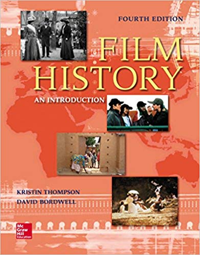
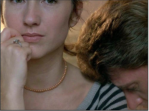
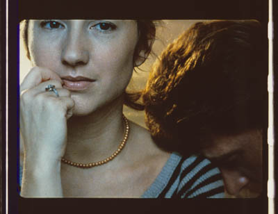
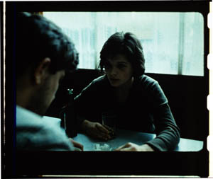
I couldn’t help James much at the time, but I did send him a couple of frames that favored squareish compositions and that came from 35mm prints. Other frames we reproduced, at 1.37, in both editions of Film History: An Introduction. The still that pretty much settles the matter for me is the gorgeous shot of Nathalie Baye and Johnny Hallyday at the top of this entry. Here’s the image as it is on a 35mm print.
Downsize that to 1.66 without losing those eyes!
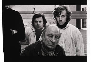
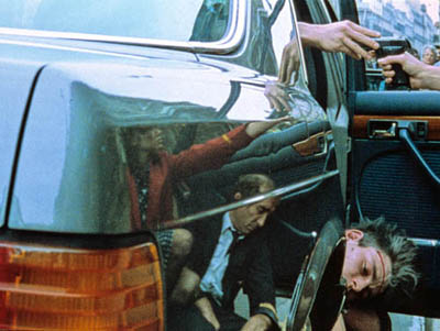
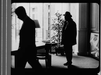
Later I sent James another killer example, drawn also from a 35mm print of Detective. (It’s in the new Film Art, p. 46.)
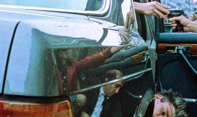
Here’s what it would look like in one try at 1.66 matteing.
I say “one try” at a matted version because I didn’t take as much off the top as a normal aperture plate would; I didn’t want to slice into the hands and the gun. Not only is the 1.37 image preferable (we get to see Claude Brasseur’s slumping posture) but 1.66 looks, as James says, jammed. The 1.37 ratio lets Godard load information in the very top of the shot, as we’ll see often in the examples to come. And, needless to say, at 1.85 the shot would make no sense.
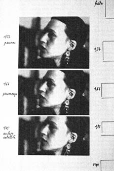
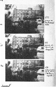
Soon after James and I had our exchange, Godard—perhaps prodded by James’ query—sent a diagram to Cahiers du cinéma. (3) (Thank you, Craig Keller, aka evillights, who called attention to it on this thread.) The Cahiers editors report that Godard has asked that Notre musique be shown in 1.37. His photomontage lines up two shots from the film and arranges them according to the three major “flat” ratios, and for each one he supplies a tart annotation.
For the close-up of the woman, the captions translate as: 1.37 person. 1.66 character. 1.85 satellite slave. For the long shot of the street, we get: 1.37 Proof of Serbian bombing. 1.66 Proof diminished by Europe/ USA. 1.85 Extermination of proof (Milosovec acquitted).
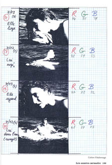
Pretty strong evidence that JLG doesn’t like cropping the classic format. But these remarks are about Notre musique. What about the other films? Apart from the evidence onscreen and on the film strip, we can add one thing. Evidently he shoots at 1.37, but there’s also evidence that in the late stages of postproduction he seems to preserve that ratio. Here, for example, is a sheet of color timing instructions for Nouvelle Vague. (4) Godard has pasted in a frame for each shot in the sequence, and alongside he notes how much red, green, and blue he wants. The frames he mounted are 1.37.
Recently our Cinematheque has been holding a Godard retrospective, and I’ve taken the opportunity to revisit the aspect ratio issue. As an archival venue, we can screen at any ratio, even the squarish silent and early-sound ones. Our projectionist Jared Lewis has run the Godards at 1.37. They look fine.
Jared pointed out to me that one other factor leans toward screening them in the 1.37 format: the thickness of the spaces between frames. In a modern “full-frame” film like Hudsucker Proxy, there is very little space between the frames. The line separating one from another is quite thin. That tends to make the frames squarer, closer to 1: 1.2, as I mention in endnote 2.
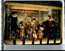
In a classic sound film, there is often more space between the frames. Usually that space is black, but I can’t resist showing what it looked like in Technicolor.
This frame, from Renoir’s Golden Coach, shows the characteristic silver frame surround (and silver soundtrack) of a true Tech print. Nifty, huh?
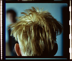
Anyhow, the sort of thick spacing between frames that we get usually find in Godard prints, and that’s visible in the Baye/Hallyday frame above, favors the classic ratio. The thickness of these spacers is similar to what we find in a modern film that was explicitly designed for 1.37 screening, Hans-Jürgen Syberberg’s Parsifal (1982).
This array, Jared points out, gives different frame proportions than one would find in a print hard-matted to 1.66 or 1.85.
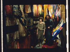
One more wrinkle. On the film strip, Godard’s frames aren’t all the same dimensions. Here are two from Je vous salue Marie; note that the first is taller, with narrower spacers, than the second.
Both, however, would be appropriately shown at 1.37.
How then are we to explain Godard’s saying the films should run at 1.66? Perhaps, as one of the online commentators has suggested, Godard assumed that 1.66 is the closest that most commercial venues can come to 1.37. Perhaps too he was just being contrary–that is, just being Godard.
Fortunately, some DVD producers seem to recognize his full-frame aesthetic. The UK version of Detective is full-frame and preserves my nifty shots. Also, the Cahiers du cinéma discs for Prénom Carmen, Hélas, and so on are at 1.37. Bowing to Godard’s wishes, Wellspring’s version of Notre Musique announces that it is presented “in its original theatrical aspect ratio of 1.33.” Although purists may say that virtually no theatres showed it that way, we should appreciate the gesture.
Relationships: The fundamental question
Even if you’re not that interested in Godard, everybody should be aware of what video cropping can do to the film image. I’m not talking about panning and scanning, that process which begins with a widescreen film, typically one of an aspect ratio 1:2.40, and extracts a 1.37 frame out of it for video purposes. This is deplorable, but most of us are alert to it. What’s more interesting is the sort of thing that happened when a film is cropped inaccurately, either in projection or for DVD.
My example will be from the first reel of Godard’s Éloge de l’amour/ In Praise of Love, which is available on DVD in a full frame version from Optimum in the UK and in a cropped version from New Yorker in the US. I won’t be focusing on the quality of each transfer, though the Optimum one looks superior to me.
Nor will I do a detailed narrative account, because I find the characters and their interactions still fairly baffling. I’m always amazed that critics can praise a Godard film without ever getting down to explicating what’s literally happening in a scene. They write as if these films were telling their stories straightforwardly. Without help from the presskits, could journalists discern even the sketchy plots they refer to? A great deal of the fascination of Godard’s late works comes from his refusal of the most elementary forms of exposition–picking out characters, explaining their relations, and the like. There is always a story, but it’s about three-quarters hidden, and this seems to me to require a lot more analysis than people tend to give it.
Anyhow, in studying Éloge de l’amour‘s video versions, I learned that there can be a big difference between tiny numbers. For instance, the Optimum version is prepared at 1.35:1. No big deal between this and 1.37:1, surely? Except that the New Yorker version seems to have started from a 1.37 frame. Even though it’s cropped on the top and bottom, it consistently supplies a tad more information on the right and left edges, and these extra bits are visible in side-by-side comparison. First, a 35mm frame.
Needless to say, the projector’s aperture plate won’t preserve everything in the physical frame; at a minimum it masks off the curved corners. But if we look at the two video versions, there are some surprises.
The 1.37 version of this shot is of course much closer to the overall composition of the original. But more areas of the window frame (on the left) and the painting (on the right) are visible in the widescreen version than in the full-frame one. Did going for 1.35 shave off those areas? Moreover, New Yorker’s cropping is at 1.77, for all intents and purposes the same as 1.75. But to achieve this wide frame, the transfer of some shots seems to have been optically stretched a little. In some upcoming examples the faces are a bit plumper and the surroundings a bit more horizontally spacious.
Okay, maybe I’m splitting hairs. So let me assume that the UK DVD preserves a reasonable amount of the 35mm original. I want to consider some effects of the cropping we get in the US DVD. Some are obvious, some more subtle, and all go beyond this individual case to suggest the results of overcropping any movie.
(1) Of course we lose the top and bottom. In the full-frame shots from Hudsucker Proxy, no problem; the filmmakers are counting on the projectionist to mask the frame. But in Godard the cropping makes us lose stuff. Godard likes to frame heads pretty high in the shot, and this means that we often lose part of them.
Heads are trimmed in movies all the time, and it doesn’t much matter in close views. But in Éloge, Godard is composing long shots with heads quite high up. He will even daringly chop off heads himself. This is partly a strategy to conceal who is present, to block our recognizing characters by their faces. It also has the effect of activating areas of the frame that aren’t usually so important. We have to strain to see partially visible things, tucked away in bits of the shot.
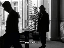
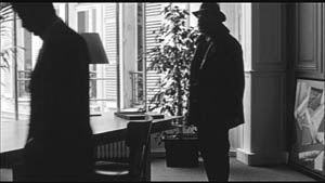
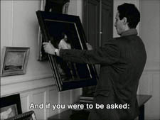
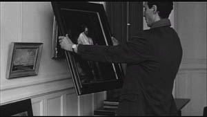
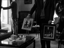
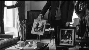
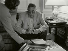
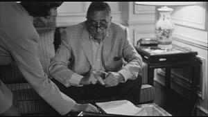
In the example below, I submit, the original composition creates a tension among three centers of interest: the two very visible paintings and the almost indiscernible face of the art dealer standing by the rear window. That tension is lost when the 1.77 cropping lops off the head in the background. Significantly, the man offscreen left is talking about how classic painting displayed “relationships” (rapports)–presumably both personal and pictorial. “That’s the fundamental question.”
The framing of the assistant in the foreground, incidentally, shows that spotting a decapitation in a video version doesn’t necessarily mean that Godard wanted every head to be seen.
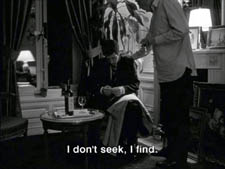
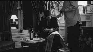
In a later scene, we strain to see the older man’s face as he bends over Bruno. As he speaks Picasso’s immortal line, his profile scrapes the very top of the shot, but not in the cropped version.
In most film shots, the upper half of the frame harbors what we look at first, so we’re probably most likely to notice when something goes missing there. But actually, the area at the bottom of the frame is important too, especially as part of Godard’s all-over approach to composition.
Throughout early scenes of the film, Godard’s compositions favor the art works and minimize the humans trafficking in them. So the picture (by Delacroix? Matisse?) on the coffee table is foregrounded when the art collector signs the papers proffered by a mostly unseen woman, but it vanishes in the cropped version.
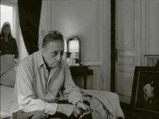
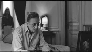
Likewise, the old man on the bed can rub his glasses fretfully at the very bottom of the 1.37 format, but that performance detail goes for naught in the 1.77 format.
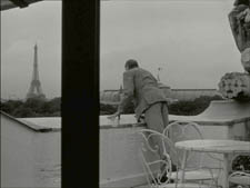
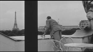
More generally, even when we scan the top half of the frame for major information, we tend to take for granted that people are anchored to a ground plane, the earth or the floor or whatever. Often, of course, film shots don’t show us this ground. But the material at the bottom of a distant view can weight the shot, providing a sense of gravity. Here, the dealer peering over his balcony is minimally tied to the patio ground (as minimally as he was visible in the earlier shots when his head grazed the upper edge, I suppose). But in the 1.77 version he floats free.
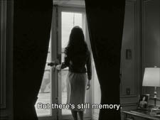
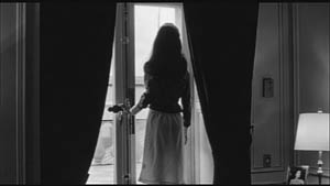
(2) The top and bottom zones include the corners of the frame as well, but I single them out for special mention because I like them so much. Again, we don’t expect key information to be tucked there, but it can happen—in Godard, in Tati (a big influence on the late Godard), and even in one remarkable shot in Lumet’s recent Before the Devil Knows You’re Dead. In the first reel of Éloge de l’amour, the best example I can find comes with the long-shot of the woman, turned from us, standing at the window. In the lower right corner of the shot sits a woman’s photograph on a table. The 1.77 frameline chops it off and makes it less segregated for our notice: we lose the spacing that separates it from the other objects on the table. Since the voice-over is meditating on memory, the photo adds an overtone to the shot, but less clearly in the cropped version.
Maybe it matters, maybe not; but it’s a lot harder to see in 1.77 than in the 1.37 transfer. Something similar happens with the businessman’s hand in the lower left of this shot.
(3) Cutting off top and bottom alters the shot scale. All other things being equal, cropping not only eliminates; it enlarges. Figures come closer to us. A medium shot becomes a medium close-up. All of the examples so far indicate this to some degree, but it comes across clearly in these variants.
Again, note the stretching. It seems that someone decided that the image had to be 1.75 and instead of cropping it, stretched the 1.66 one. Yikes!
(4) Overambitious cropping changes the compositional dynamics. In reducing information, it reorganizes the composition. Rudolf Arnheim (I blogged about his achievements here) suggested that we consider a picture as a field of vectors and forces, pushes and pulls, balance and imbalance, rival centers of attention. By changing the framing we change the relation of the figures to the edges, and this can alter the composition.
The clearest examples come from the sort of reframings we find when a Super-35mm film is rendered in home video versions in both 2.40 and 1.37.
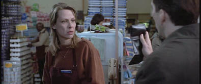
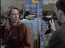
In this shot from 8mm (the movie, not the gauge), the cashier questioned by Cage looks more isolated in the Scope framing, while in the full frame they seem closer together and he seems to press in on her. Cropping can change a lot.
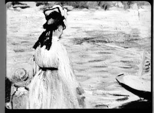
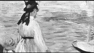
Now consider this comparison.
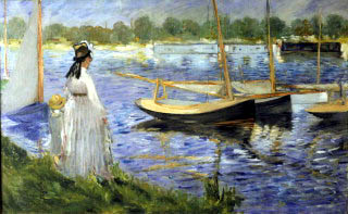
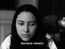
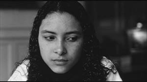
Godard’s original shot (here from 35mm) keeps the painting’s upper horizon, the darker, frothy waterline as a kind of backboard, halting the water’s recession into the distance. Graphically, the water on the right center becomes a negative space for the two figures, with the boy counterbalanced by the tip of the skiff.
But the cropped version loses the distant waterline, creating an infinite stretch of space top to bottom, and the boy’s head seems to float more freely. Most starkly, the skiff, by losing its shadow, seems to have swung more toward us.
It’s worth noting that Godard himself is a mean hand at radical cropping. I’ll forebear from rambling on about what his original framing above does to the original, Manet’s Seine at Argenteuil (1874), but it could constitute a lesson in how framing changes effect and meaning.
Several factors come into play when we look at this shot from the two DVD versions.
The woman’s face is off-center in both images, but it looks more off-center in the 1.77 transfer. In fact, despite the extra bits on left and right, it is measurably more off-center, because of this transfer’s optical stretching. Yet I’d argue in addition that the cropping of the frame has squeezed the pictorial elements into a stronger horizontal to-and-fro, giving a sense that she has been pushed more out of the middle. You can see it more markedly if we crop it more drastically, and it may help to hide the others when you look at this.
This effect is akin to what happens in the cropping of the 8mm example: the spatial relations have reorganized in relation to the frame edges. Rapports again.
(5) Overcropping can affect the way we experience the time of the shot. Before you call the men in the white coats, I hasten to say that cropping is purely a spatial effect, but in cinema space is bound up with time.
We’ve seen that Godard manipulates the vertical dimension of the frame to an unusual degree, and the effect on time becomes apparent in one scene of Éloge in which Bruno talks with an older man, in a sort of casting session for his project. First we see Bruno alone, and as he walks to the window the old man comes in, his back to us. We presume it’s a man by the bulk, the gait, and the fedora, making its appearance in the upper right corner.
Or does a man come in? In the 1.77 version, at the corresponding point in the shot, we can’t tell it’s a man until the figure comes further into the room.
Godard’s reliance on the upper part of the frame allows us to discern the caller sooner in the 1.35 version. Seconds, even split-seconds, matter in cinema. Insofar as cropping affects the timing of a shot’s unfolding, it affects our experience.
( 6) Cropping affects perspective, the perceived distances and volumes of objects in the visual array. Blowing up the center of an image creates a flatter, more friezelike space than we discern in the original. This becomes evident in a later phase of the scene I just mentioned. After Bruno leaves the shot, the old man is left standing in the office.
The 1.77 image looks more like it was shot with a long lens than does the full-frame version. The result recalls the sort of perpendicular telephoto framings so common in the 1970s, in films like The Parallax View and The Conversation (below).
Godard has said that he preferred 30-40mm lenses for much of Sauve qui peut (la vie) because a focal length of 50mm (and presumably one longer than that) will “destroy perspective.” (5)
Many of these differences wouldn’t matter in most films, which aren’t composed as meticulously or as daringly. Hollywood images aren’t typically as dense as those in late Godard. (I must do a blog some day on fussbudget filmmakers like him.) But even if these niceties seem negligible, I think you’ll grant that the film would be much more compromised by being shown in a 1.85 ratio, the squarest option available in most commercial theatres today.
Critical discussions of Godard’s late films have treated them as poetic meditations, and that seems partly right to me. Yet few critics ask how they manage to create their lyrical, associative quality. I think, as I hope to show in a future blog, this has to do with his treatment of narrative (naturally) and his layout of scenes. But even before we get there, I think that we find in the very texture of his images (let alone his sounds) a daring decentering of faces and bodies—the usual nodes of our attention. If he often blocks the flow of our glance, it’s in order to rechannel it to unexpected areas and textures, crannies and gaps, within the image. And so we want all those areas and textures, along with the crannies and gaps, available to our eyes and minds.
(1) James Quandt, “Here and Elsewhere: Projecting Godard,” in For Ever Godard, ed. Michael Temple, James S. Williams, and Michael Witt (London: Black Dog, 2004), 126-139.
(2) Geek note: You may notice that this “full-frame” image isn’t itself in the 1.37 ratio. It’s very square. The reason is that many 1.85 frames will be exposed in the camera at a ratio of 1: 1.2! I believe this was standardized for the Panavision cameras of the 1970s and afterward, though I’d appreciate more information about this. See the entry on Panavision cameras in American Cinematographer Manual, fifth ed., ed. Charles G. Clarke (Hollywood: American Society of Cinematographers, 1980), 104. See also Rob Hummel, “Comparison of 1.85, Anamorphic and Super 35 Film Formats,” American Cinematographer Manual, eighth ed., ed. Rob Hummel (Hollywood: ASC Press, 2001), 24-29.
(4) This image is taken from Jean-Luc Godard par Jean-Luc Godard, vol. 2: 1984-1998, ed. Alain Bergala (Paris: Cahiers du cinéma, 1998), 199.
(5) Jean-Luc Godard, “Propos rompus,” in Godard par Godard vol. 2, 466.
Thanks to Suzy Buenger and Nancy Marshall for identifying the Manet painting for me.
PS 15 Dec: And thanks to James Quandt, Michael Kerpan, and Yogesh Raut for a name correction I’m too embarrassed to specify further.
PS 7 April 2008: The issue is raised anew with Gus van Sant’s Paranoid Park. It’s designed to be shown at 1.37, with more than a few shots reminiscent of Godard. Joe Beres explains here.
PPS 25 January 2009: Ranjit Sandhu provides a lively and detailed discussion of aspect ratios and matteing strategies, along with remarks on Godard’s frames.
PPPS 21 Sept 2009: Thanks to editor John Olivio for a correction on the 1.78 aspect ratio.
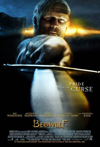
KT: I do not understand Beowulf. I don’t understand why the director who made one of the great modern Hollywood films, Back to the Future, and several very good ones, including Who Framed Roger Rabbit? and Cast Away, now has this fixation with creating nearly photo-realistic 3D digital images.
DB: I think that on the whole Zemeckis’ films have become weaker since Bob Gale stopped working with him. I like the sentiment of I Wanna Hold Your Hand and the crass misanthropy of Used Cars, and I think the Back to the Future trilogy mixes both in clever ways. But now almost every Zemeckis film seems to be less about telling a story than solving a technical problem. How to best merge cartoons and humans (Roger Rabbit)? How to push the edge of spfx (Death Becomes Her, Forrest Gump, Contact)? How to make half a movie showing only one character (Cast Away)? There’s a stunting aspect to this line of work, though I grant that it can lead to technical breakthroughs, as in Gump.
KT: I also don’t understand why most of the supposedly state-of-the-art effects technology looks distinctly cruder than the CGI in The Lord of the Rings, the first part of which came out six years ago. I don’t understand why studios that are trying to push 3D to a broad audience make a film with silly action aimed at teenage boys. That’s an OK strategy when you’ve got a $30 million horror film, but a budget of $150 million demands a lot broader appeal.
DB: And the evidence so far indicates Beowulf doesn’t have that appeal. The obvious comparison is 300, from earlier this year. According to Box Office Mojo it cost about $65 million to make, but it reaped $70 million domestically in its first weekend and wound up with $450 million theatrically worldwide. Beowulfgrossed $27.5 million in its first US weekend and currently sits at about $146 million worldwide. I’d think that this has to be a disappointment. Recall too that the Imax screenings have higher ticket prices, so there are fewer eyeballs taking in Angelina Jolie’s pumps, braid, and upper respiratory area.
In addition, sources suggest that a 3-D version of Beowulf will not be available on DVD, so the sell-through takings—the real source of studio profit—may be significantly smaller than average.
KT: It seems to me that the people who are pushing 3-D so hard and hoping for it to become standard in filmmaking are forcing it on the public too soon. It’s still fiendishly difficult and expensive to shoot live action material in digital 3-D, so most projects are animated. One approach, taken in Beowulf, is to motion-capture real people and animate the characters to make them appear as much like the real people as possible. The problem is that they still have a weird look about them, like moving dolls. People have complained about the dead-eyed gaze of the characters in The Polar Express, and though there’s apparently been an improvement between the two films, the eyes don’t always look as though they’re focusing on anything. It can be done, though; the extended-edition Lord of the Rings DVD supplements about Gollum show how much effort went into making his eyes have a realistic sheen and flicker.
I was also struck by how clunky some of the animation looked. Beowulf is supposedly state of the art, and it certainly had the budget of a major CGI film. Yet some of the rendering and motion-capture was distractingly crude. I noticed that particularly on the horses. Their coats looked pre-Monsters, Inc., and their movements at times reminded me of kids rocking plastic toys back and forth. I suspect this effect had something to do with a lack of believable musculature. If you look at the way the cave troll was done in The Lord of the Rings: The Fellowship of the Ring (again, demonstrated in the DVD supplements), there was a specific program to simulate the way muscles move on skeletons, even the skeletons of imaginary creatures. Now, six years later, we see these things that look like hobby-horses—and that all run alike.
The backgrounds were often strange as well, simple and flat-looking, like painted backdrops. There were some exceptions, with the seascapes and rocky crags pretty realistically done. But just plain hillsides and groups of tents and so on looked almost sketchy in comparison with the moving figures, and I noticed that at times some fog would be put in, presumably to cover that problem up. There certainly was some very good animation as well, most notably the dragon, but there was no consistency of visual style.
DB: I’d go farther and say that 3-D hasn’t improved significantly since the 1950s. It ought to work: just replicate the eyes’ binocular disparity by setting two cameras at the proper interval or, now, by manipulating perspective with software. Yet in films 3-D has always looked weirdly wrong. It creates a cardboardy effect, capturing surfaces but not volumes. Real objects in depth have bulk, but in these movies, objects are just thin planes, slices of space set at different distances from us. If our ancestors had seen the world the way it looks in these movies, they probably wouldn’t have left many descendants.
It would take a perceptual psychologist to explain why 3-D looks fake. Whatever the cause, I’d speculate that good old 2-D cinema is better at suggesting volumes exactly because the cues to depth are less specific and so we can fill in the somewhat ambiguous array.
By the way, in watching a 3-D movie I seem to go through stages. First, there’s some adjustment to this very weird stimulus: I can’t easily focus on the whole image and movement seems excessively fuzzy. Then adaptation settles in and I can see the 2 ¼-D image pretty well. But adaptation carries me further and by the end of the movie I seem to see the image as less dimensional and more simply 2-D; the effects aren’t as striking. But maybe this is just me.
Back to the Future, or at least 1954
DB: I’d like to think about it from a historical perspective for a while. The industry seems to be repeating a cycle of efforts that took place in 1952-1954. The American box office plunged after 1947 as people strayed to other entertainments, including TV, and so the industry tried to woo them back with some new technology. Today, as viewers migrate to videogames, the Internet, and movies on portable devices, how can theatres woo their customers? Answer: Offer spectacle they can’t get at home.
Beowulf brings together at least three factors that eerily remind me of the early 1950s.
(1) Obviously, 3-D. The first successful 3-D feature era was Bwana Devil, released in November of 1952. It was an uninspired B movie, but it launched the brief 3-D craze. Columbia, Warners, and other studios made major pictures in the format, most notably House of Wax (1953). But costs of shooting and screening 3-D were high, with many technical glitches, and apart from novelty value, the process didn’t guarantee a big audience. The fad ended in spring of 1954, when all studios stopped making films in the format.
The process has been sporadically revived, notably in the 1980s (Comin’ at Ya, Jaws 3-D) and once more it fizzled. So, ignoring the lessons of history and chanting the mantra that Digital Changes Everything, we try it again.
(2)Big, big screens. In September of 1952, Cinerama burst on the scene with its huge tripartite screen and multitrack sound. It attracted plenty of viewers, but it could be used only in purpose-built venues. Like 3-D, its technology could never replace ordinary 35mm as the industry standard. The contemporary parallel is Imax, which though very impressive will not replace orthodox multiplex screens—too expensive to install and maintain, pricy tickets. Like 3-D, it’s a novelty. (1)
(3)The sword-and-sandal costume epic. It’s a long-running genre, but it got significantly revived in the late 1940s. It was a logical input for the new technologies of widescreen—not Cinerama but more practical offshoots that gained more general usage.
From the standard-format Samson and Delilah (1949), David and Bathsheba (1951), and Quo Vadis (1951) it was a short step to The Robe (1953) and The Egyptian (1954) in CinemaScope, The Ten Commandments (1956) in VistaVision, The Vikings (1958) in Technirama, Hercules (1959) in Dyaliscope, Solomon and Sheba (1959) and Spartacus (1960) in Super Technirama 70, and Ben-Hur (1959) in anamorphic 70mm Panavision. It is, incidentally, a pretty dire genre; the peplum might be the only genre that has given us no great films since Cabiria (1914) and Intolerance (1916).
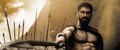
In parallel fashion, the revival of the beefcake warrior film with Gladiator (2000) coincided with innovations in CGI and thus furnished new forms of spectacle for Troy (2004), Kingdom of Heaven (2005), and 300 (2007). This trend paved the way for Beowulf. When screens get bigger, Hollywood hankers for crowds, oiled biceps, big swords, and nubile ladies in filmy clothes. Not to mention soundtracks with pounding drums, wailing sopranos, and choirs chanting dead or made-up languages. And the conviction that Greeks, Romans, and those other ancient folks spoke with British accents. The innovation of Beowulf is to turn a Nordic hero into a Cockney pub brawler.
In other words, it’s 1954 again. So if we ask, Will it all last? I’m inclined to answer, Did 1954?
KT: Yes, the studios see the new technology as one more way to lure people away from their computers and game consoles and into the theaters. Maybe that will work to some extent. There’s no doubt that a lot of the people who have seen Beowulf have praised it as a fun experience and as having effectively immersive 3-D effects. I’m surprised at how many positive comments there are on Rotten Tomatoes, where the average score from both amateur and professional reviewers is 6.5 out of 10. That’s not exactly dazzling, but it’s a lot higher than I would give it.
Even so, the film hasn’t lured all that many people away from their other activities. You’ve mentioned that Beowulf hasn’t done all that well at the box-office. It did much better in theaters that showed it in 3-D. If it hadn’t been for the 3-D gimmickry, it would probably have been dead in the water from the start. And if 3-D effects remain on the level of gimmickry, they will soon wear out their welcome. Presumably the people who have been going to Beowulf are to a considerable extent those who are already interested in 3-D, and I can’t believe there are huge numbers of people really passionate about the idea of someday being able to watch lots of films in 3-D. If more films like Beowulf come out—ludicrous, bombastic action with distracting animation problems—they’re not likely to make the prospect any more attractive.
Eventually somebody—James Cameron or Peter Jackson, perhaps—will make the first great 3D film, and then maybe the passion will spread.
3-D in 2-D
DB: I’m doubtful that there will ever be a great 3-D film, and especially from those directors. But one last historical note.
I think that ordinary mainstream cinema has been setting us up for the flashiest 3-D flourishes for some time. One of the goals of the Speilberg-Lucas spearhead was to amp up physical action, to make it more kinetic, and this often showed up as in-your-face depth. Spielberg used a lot of deep-focus effects to create a punchy, almost comic-book look, and who can forget the opening shot of Star Wars, with that spacecraft arousing gasps by simply going on into depth forever? Seeing the movie in 70mm on release, I was struck by how the last sequence of Luke’s attack mission was maniacally concerned with driving our eye along the fast track of central perspective. Did it foreshadow the tunnel vision of videogame action?
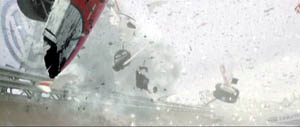
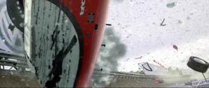
In any case, I think that aggressive thrusting in and out of the frame was integral to the style of the new blockbuster. Since then, our eyes have been assaulted by plenty of would-be 3-D effects in 2-D. In Rennie Harlan’s Driven (2001), the crashing race cars spray us with fragments.
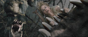
Jackson is definitely in the Spielberg line, favoring steep depth and big foreground elements. In King Kong, the primeval creatures lunge out at us, heave violently across the frame, and fling their victims into our laps.
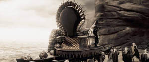
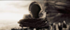
Such shock-and-awe shots recall American comic-book graphics. These affinities are at the center of 300, as we’d expect. For example, a cracking whip curls out at us in slow motion, like a two-panel series. Beowulf draws on this thrusting imagery, but inevitably it doesn’t seem fresh because so many 2-D films have already used it. Maybe the most original device is having the camera pull swiftly back and back and back, letting new layers of foreground pop in and shrink away. This is viscerally arousing in 3-D, but aren’t there precedents for it—in the Rings, in animated films, or some such?
Zemeckis tries to transpose into 3-D the style of what I’ve called, in The Way Hollywood Tells It, intensified continuity. This style favors rapid cutting, many close views, extreme lens lengths, and lots of camera movement. I found Zemeckis’ restless camerawork even more distracting than in 2-D. So I’m wondering if current stylistic conventions can simply be transposed to 3-D, or do directors have to be more imaginative and make fresher choices?
KT: That pull-back effect may be viscerally arousing, but in Beowulf it was usually pretty gratuitous and, for me at least, it called attention to itself in a way that was often risible. I don’t think there’s anything in Rings as crude as the shots in Beowulf that you’re talking about. In the opening scene of the latter, in the mead-hall, the camera zips into the upper part of the room, with rafters, chains, torches, and even rats whizzing in from the sides of the frame. None of that contributes to the narrative.
The flashiest backward camera movement, or simulated camera movement, I can think of in Rings is the one in the Two Towers scene where Saruman exhorts his army of ten thousand Uruk-hai to battle. The final shot is a rapid track backward through the ranks of soldiers holding flag poles. The point is to stress the enormous numbers of soldiers. There’s no gratuitous thrusting-in of set elements from the sides, just the cumulative effect of so many similar figures. The simulated camera also at one point “bumps” one of the flagpoles, causing it to wobble, but I take it that that’s an attempt to add a certain odd realism to the “camera” movement, not a knowing nudge to the audience. In Rings, the virtual camera usually follows action rather than moving independently through space. It tends to go forward or obliquely rather than backward.
As to transferring classical Hollywood style to 3-D or finding a whole new set of conventions to fit 3-D, Beowulf offers an object lesson. It uses a combination of the two. At times we have conventional conversations using shot/reverse shot, and at other times we have the swoopy-glidey style you described, with the camera zipping around the space and trying to see it from every angle within a few seconds.
The odd thing is, neither one works. The very close shot/reverse shot views of the digital characters make them look unnatural and emphasizes the not infrequent failure of their eyes to connect with each other. The swoop-glidey camera movements are silly and don’t stick to the narrative.
I’m not optimistic enough to think that directors can come up with a whole set of “fresher stylistic choices” to make 3-D work. Maybe Sergei Eisenstein, with his meticulous attention to every aspect of such topics, could have thought the issue through, but his solution would probably not be viable for the Hollywood studios. My own thought is that directors working in 3-D should probably stick to classical Hollywood style and avoid flashy stylistic effects. So far, the more blatantly 3-D something looks on the screen, the less it makes 3-D seem like something we want to watch on a regular basis. Think of the best films of this year: Zodiac, The Assassination of Jesse James by the Coward Robert Ford, Ratatouille, Across the Universe, and so on. Would any of them be better in 3-D? Probably not.
Plus, I don’t like watching movies through something. Movies should just be the screen and you. The 3-D glasses are definitely better now than in the earliest days of the cardboard, red/green versions. Still, the Imax glasses we used in watching Beowulf were heavy enough to leave a groove on my nose. Make the mistake of touching the lenses, and you’ve got a blur on one half of your vision of the film. In short, I think that 3-D still has to prove itself, and Beowulf didn’t add any evidence.
(1) PS 9 December: DB: I originally added in regard to Imax: “It’s actually waning in popularity, except in newly emerging markets like China.” This disparaging comment was misleading. Yesterday I learned from Screen International that Imax recently signed a deal with AMC to install 100 systems in 33 US cities. Oops! Today Paul Alvarado Dykstra of Austin’s Villa Muse Studios kindly wrote to point out the Hollywood Reporter‘s coverage, which gives background on the costs of installing and maintaining an Imax facility.
I was, obscurely, thinking of the traditional Imax programming of travelogues and documentaries. I failed to register that these have been largely displaced by screenings of blockbuster features, catching fire in 2003 with The Matrix Reloaded and proving successful with The Polar Express and other titles. Imax is now largely an alternative venue for megapictures, and its seesawing financial performance may have been steadied by moving into the features market.
PS 26 December: Travel has delayed our timely linking, but we couldn’t neglect Mike Barrier’s in-depth critique of Beowulfhere.
PPS 5 January 2008: Harvey Deneroff has a comprehensive and judicious discussion of the 3D situation here.
“What I like about looking is how many ways there are to see the same thing.”
Sadie Benning
DB here. Today no extended essay, just some jottings.
Some day I really must do an extended tribute to the Eureka/ Masters of Cinema DVD line. To call it the UK Criterion is partly right, given the painstaking transfers and the ample supplementary material. But Eureka ventures into some very fresh territory. A company that puts out the terminally peculiar Funeral Parade of Roses (Toshio Matsumoto, 1969) as well as a double-disc set of Mizoguchi’s Sansho the Bailiff and Gion Bayashi deserves points for audacity.
A recent batch of Eureka releases:
*Two cult animation items by René Laloux, Gandahar and Les maitres du temps. Fans of Fantastic Planet and the bande dessinée artist Moebius will snap these up, as much for the large booklets as for the discs.
*Then there’s Nosferatu. You say we’ve already got enough? Nope. First, we can never have too many of this, one of the greatest of silent films. Second, this version looks scarily definitive: a two-DVD set with the Murnau-Stifung restoration and the original score, plus a documentary, plus a book including some primary material along with essays by Enno Patalas, Gil Perez, Thomas Elsaesser, and Craig Keller.
*Sticking with Murnau (who directed, some say, in a white lab coat), Eureka offers a double-disc set of Tabu, also from the Murnau-Stiftung and with previously unseen scenes and title cards.
*Finally, there’s Peter Watkins’ Edvard Munch in its long version, with a booklet including a Watkins “self-interview.”
Unbelievably, many more great movies are on the way. Check the catalogue and preview lineup here.
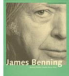
Also from overseas, the Austrian Filmmuseum adds a new title to its Synema book series, alongside Alexander Horwath’s remarkable dossier on Sternberg’s Case of Lena Smith (discussed in an earlier entry here) and many other books on experimental cinema. It’s the first book devoted to James Benning.
I have a personal interest. I met Jim when I came to Madison in 1973. He was working on his MFA in film and art, and he was one of four teaching assistants assigned to me. There was Doug Gomery, already an impressive film historian, soon to go on to fame for his work on the US film industry. There was Brian Rose, one of the most alert cinephiles I ever met, and one of the funniest. There was Frank Scheide, already an expert on Chaplin, Keaton, and their peers. And there was Jim, a master mathematician (helpful for computing grade curves) and the only filmmaker in the bunch. Jim and Frank, both serene, had a calming influence on the rather hyper Rose, Gomery, and Bordwell. It was a great team, my Dirty 1/3 Dozen, and I remember our collective grading sessions fondly.
Jim had already made Time and a Half, but his most famous works, starting with 81/2 x 11 (1974), were yet to come. He left Madison and went on to teach filmmaking at several places, settling finally at Cal Arts. I kept in occasional touch with him and his work. He visited our Wisconsin Film Festival with his remarkable, politically charged Four Corners, El Valley Central, and Los. I’ve seen him more frequently in the last few years because turn up at the same film festivals—me as an observer, him showing gorgeous and provocative films like 13 Lakes, 10 Skies, and One Way Boogie Woogie/ 27 Years Later.
So the book, edited by Claudia Slanar and Barbara Pichler, is very welcome. It just arrived, so I haven’t had a chance to read it through, but I signal it to all those interested in a filmmaker who has been enthralling and surprising us for thirty-five years. Apart from a career chronology and a complete filmography, it features essays by Julie Ault, Sharon Lockhart, Volker Pantenburg, Dick Hebdige, Amanda Yates, Scott MacDonald, Allan Sekula, Michael Pisaro, Nils Plath, and of course Sadie Benning, a mean hand with Pixelvision. Lockhart supplies lustrous shots of some Wisconsin beer bottles in Jim’s collection.
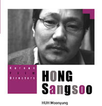
Speaking of books, not beer, the Korean Film Council has just published a series of trim books on major directors, both classic and contemporary. Each volume includes a detailed filmography and a lengthy interview. Some volumes are through-written by a single author, others consist of analyses and appreciations by various hands, including major Korean critics and Asian cinema expert Chris Berry.
The directors honored are Kim Dong-on, Im Kwon-taek, Lee Chang-dong, Kim Ki-young, Park Chan-wook, and Hong Sang-soo. This last volume, edited by Huh Moonyung, includes an homage by Claire Denis and a small essay by me, “Beyond Asian Minimalism: Hong Sang-soo’s Geometry Lesson.”
Speaking, again, of books. . . The paper edition of Phillip Lopate‘s American Movie Critics: An Anthology from the Silents until Now (The Library of America) has just come out. I found reading the first edition addictive, like eating peanuts and M & Ms. Now we need a second volume including Frank Woods (a critic close to Griffith), Welford Beaton, and other less-known early writers.
In the meantime, the new edition has grown to include an essay on Fincher’s fine Zodiac by Nathan Lee and internet pieces from Stephanie Zacharek (Salon.com) and your obedient servant. I’ve never imagined an essay of mine in a collection that includes my teenage idols Mencken, Macdonald, Sontag, and Sarris, so this volume amounts to a swell early Christmas present. Thanks to Mr. Lopate and Geoffrey O’Brien for all their help.
Speaking, yet again, of books. . . A plug is in order for Scott Higgins’ meticulous, engagingly written Harnessing the Technicolor Rainbow: Color Design in the 1930s, just out from Texas. I sat on Scott’s dissertation committee, and I was impressed by his imaginative research methods (e.g., using Pantone swatches as an objective measure of color hues in movies) and his sensitive attention to the way the movies look. Nobody before Scott has analyzed color in film so carefully. Scott is also attentive to production practices, so filmmakers interested in the history of technology should find a lot to chew on here. Several pages of original Technicolor frames support Scott’s case in graceful detail. No beer bottles, however.
More books from Wisconsin scholars: The above-mentioned Doug Gomery has a new book due out early next year, A History of Broadcasting in the United States. Lea Jacobs’ The Decline of Sentiment: American Film in the 1920s should follow soon. I’ve read the latter already, but both are without doubt worthy of your attention. If you like your American film history at once informationally solid and intellectually daring, you will like these items. Neither Doug nor Lea is a fan of conventional wisdom.
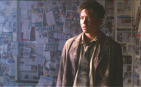
Finally, for fans of Hong Kong cinema: Johnnie To and Wai Ka-fai‘s Mad Detective (I filed a note on it from Vancouver) has been a hit in Hong Kong, beating Beowulf. An analog Lau Ching-wan can thrash a digital Ray Winstone any day of the week. Milkyway Image’s boundlessly energetic Shan Ding has set up a Facebook page as a place to chat about movies and, one hopes, to keep us apprised of developments in Mr T’s upcoming remake of Melville’s Cercle Rouge.
Mad Detective.
PS: Just learned about an informative interview with Jim Benning here, with more ravishing shots from 13 Lakes. This entry also includes several other links to web discussions of Jim’s films.
Earlier this month, when I was giving a lecture on Mizoguchi Kenji at our university museum, I showed two images from A Woman of Rumor (Uwasa no onna, 1954). It’s a little-known film of his, and it’s probably not up to his finest, but seeing the stills again on the big screen made me want to write about one scene. That scene displays aspects of Mizoguchi’s artistry that I touch on in one chapter of Figures Traced in Light and in the website supplement here.
This blog entry constitutes, I suppose, another supplement. After all, I couldn’t include in the book all the moments in Mizoguchi’s work that I find fascinating. But since comparison is a good way to get under a movie’s skin, my examination of a parallel scene from another movie may have more general interest. Even though Woman of Rumor doesn’t seem to be available on video, maybe looking at this pair of examples would inspire some readers to take an interest in one of the two or three greatest filmmakers who ever lived.
In the court of Regina
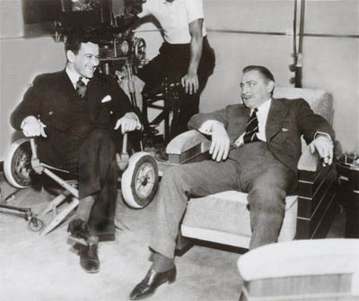
William Wyler and John Barrymore.
What a year 1941 was in the American cinema! We remember it for Citizen Kane but it also brought us How Green Was My Valley (a better film than Kane, I think), and items like Sergeant York (the biggest box-office hit), Dumbo, The Philadelphia Story, Suspicion, Ball of Fire, High Sierra, The Lady Eve, Meet John Doe, The Maltese Falcon, They Died with Their Boots On, and one of the most daring movies ever made in America, The Little Foxes.
An adaptation of Lillian Hellman’s play, The Little Foxes offers a study in unbridled capitalism. It shows how economic interests pit the South against the North and white against black. Psychologically, it analyzes a household gripped by the ruthless domination of the matriarch Regina (Bette Davis), the wiliest member of a family of grasping entrepreneurs. Regina has all but flattened her husband and is trying to make her daughter Alexandra oblivious to the family’s corruption.
The Little Foxes was also bold in its style—in its own way, as venturesome as Citizen Kane. It hasn’t been fully appreciated because Wyler is still thought of as a rather middlebrow talent, an overcautious director who toned down the flamboyance of Gregg Toland’s deep-space and deep-focus compositions.
Some day I hope to blog in defense of Wyler, middlebrow movies, and Midcult art in general. That would involve a detailed analysis of Little Foxes. (1) For now let’s just say that Wyler’s direction of the film won the admiration of no less than André Bazin. Bazin taught us to appreciate Wyler’s work, though with some prompting from Wyler and Toland (as I suggest here). Wyler was also appreciated by Mizoguchi, who, apparently grudgingly, told his screenwriter Yoda that he admired Wyler’s use of the “vertical frame.” (2) Later I’ll suggest one way of understanding that phrase. Mizoguchi met Wyler at the 1953 Venice Film Festival, when Ugetsu Monogatari was up against Wyler’s Roman Holiday for the Silver Lion.
One scene not discussed by Bazin or Mizoguchi, as far as I’m aware, has always gripped me. Regina’s brother Oscar has a wife, Birdie, who has turned into a passive alcoholic. Birdie has learned of plans to marry Xan off to Leo, her shallow son. Her will has been broken by Regina and Oscar, but she summons up the courage to blurt out to Xan that she mustn’t marry Leo, no matter how strongly the family insists. Xan, who has no inkling of how her family twists people to suit their ends, protests that no such thing could happen. But Oscar overhears Birdie warning Xan off.
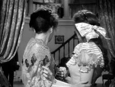
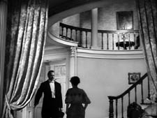
Birdie and Oscar are about to leave at the end of the evening. Wyler begins with a standard two-shot, very slightly off-center. But as Birdie frantically warns Xan, Oscar’s sleeve and pant leg appear in the lower left of the frame, with the swagged curtain at the doorway hiding his face.
For us, this creates suspense. Only after Birdie has babbled out her warning do the two women notice he’s there. Xan, not knowing how Oscar abuses Birdie, heads off to bed.
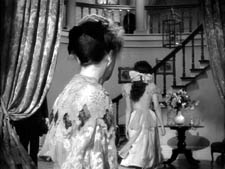
As she climbs the staircase (very important in the film and the original play, this staircase) and heads off to her bedroom, Wyler’s camera arcs to reveal Oscar. Wyler now cuts to show, more or less from Birdie’s point of view, Xan going into her room.
Birdie watches anxiously, then turns to face Oscar, with a look of resigned apprehension.
Again suspense: Oscar won’t punish Birdie with Xan watching, but the girl’s departure puts Birdie in jeopardy. In addition, Wyler’s shot of her reaction anticipates the wrath she’ll face. (Patricia Collinge’s fluent performance is equal to the dynamics of Wyler’s visuals.) These cuts anchor our empathy; Wyler has been saving the close-up of Birdie for this moment.
We return to the master framing as Birdie heads toward Oscar, passing into a patch of shadow. As she does so, he raises his hand abruptly.
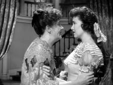
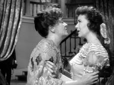
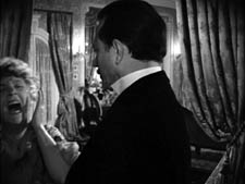
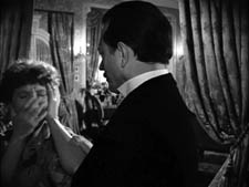
Wyler cuts to a two-shot. Oscar slaps Birdie so hard she seems to bounce against the left frame edge. She cries out and then tries to stifle her voice—a psychologically apt gesture for this woman who muffles her sorrows throughout the film.
Again, Wyler daringly sets a key action off-center. The brutal discontinuity of the cut, which crosses the axis of action and sharply changes shot scale, accentuates Oscar’s violence. It’s also rather elliptical; run the cut slowly, and you never see his hand strike her.
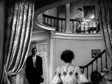
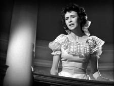
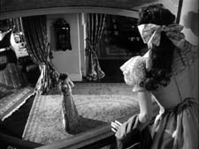
Xan hurries out of her room and comes to the banister, her face on the upper right balancing the placement of Birdie’s in the prior shot. In the next shot, we see, over her shoulder, Oscar stride out. Birdie follows meekly, assuring Xan that nothing’s wrong. The coda of the scene will emphasize Xan’s puzzled anxiety, a phase in her process of coming to understand the domineering fury that rules her family.
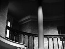
Low- and high-angle shots like this last pair recur throughout The Little Foxes, and I suspect that these are the sorts of thing Mizoguchi was invoking in mentioning Wyler’s “vertical” space. Wyler’s steep angles activate upper areas of the frame that many American directors hadn’t explored.
The act of overhearing a revealing conversation is a standard dramatic convention, but Wyler has refreshed and nuanced it. We know how it would be normally handled. We’d see either a shot showing Oscar stepping fully into the background, or a series of cuts showing first Birdie and Xan and then Oscar listening and watching. Wyler revises the standard schema, taking it for granted that we can pick up on a subtler cue than usual: just a bit of Oscar’s body intrudes.
As a result we have to be more alert. The information isn’t centered, but rather tucked into the lower left. And this option conceals Oscar’s face. Not that we’re doubting he’s angry, but delaying showing his anger builds up greater tension. Wyler, unlike today’s directors, knows when to build up to revealing things that we anticipate, making the final outburst more forceful when it comes. Further, the rest of the scene continues to deny us a clear view of Oscar’s anger, all of which gets squeezed into his gesture of slapping Birdie. It’s Birdie’s reaction that Wyler stresses, and Oscar’s contempt for her is conveyed simply by his bearing, his gesture, and his manner of stalking out of the foyer.
It’s not too much to talk about rigor here. The schemas dominating today’s filmmaking, the stylistic paradigm I call intensified continuity, would demand tight close-ups of everybody from the start. But providing them would make it harder for Wyler to raise the emotion when the startling slap comes. Maybe a contemporary director would render this spike in slo-mo, or with a wobbly handheld camera, but that tends to seem overbearing and pumped-up—as a lot of current stylistic pyrotechnics do. In any case, I’m betting that no American director today would use Oscar’s sleeve in the quietly ominous way Wyler does.
Mizoguchi’s game of vision
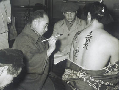
Mizoguchi Kenji, in glasses, during the making of Ugetsu.
Mizoguchi is renowned for his long takes, which are often sustained in distant views featuring considerable camera movement. In the Mizo chapter in Figures Traced in Light, I suggest that these stylistic choices spring from his effort to engage the viewer mesmerically—as he put it, “to work the viewer’s perceptual capacities to the utmost.” He asks us to downshift our attention to the finest details of the action, which he then modulates for expressive effect. I draw examples from various films across his career to show how he creates drama out of remarkably slight differences in character position, lighting, and other factors.
But what happens when he foreswears virtuoso camera movements and single-take scenes and breaks the drama up into several shots? Today, many ambitious directors seem to take pride in stretching out their takes, so cinephiles are sometimes inclined to see a cut as a loss of nerve and a concession to the audience. But I try to show in Figures that Mizoguchi sustains his concern for nuance when he creates an edited sequence. The modulation of fleeting details is to be found in his closer shots too.
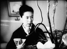
In A Woman of Rumor, Hatsuko runs a teahouse that funnels customers to the geisha establishment behind it. She has tried to protect her daughter Yukiko from the shame of her profession. Hatsuko has also been cultivating a young doctor she hopes to marry, giving him money to set up a clinic. Now the doctor, Matoba, has become attracted to Yukiko. The scene I’m examining takes place during the performance of a noh drama. Hatsuko leaves the auditorium and finds Yukiko talking with Dr. Matoba.
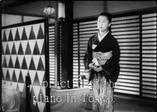
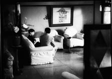
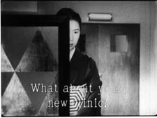
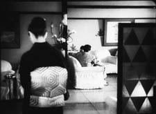
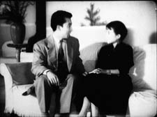
As she passes around a screen, she hears Yukiko saying she wants to learn piano in Tokyo. Hatsuko looks left, and Mizoguchi cuts to an approximation of her optical point of view on the couple in the lounge.
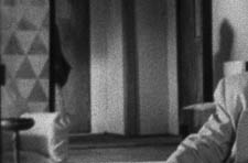
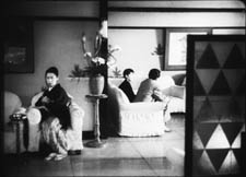
So far, so conventional. Mizoguchi seems to follow the intercutting option for treating a scene of overheard conversation. But he goes further. Having laid out the action, Mizoguchi starts the lesson in just-noticeable-details . . . with a sleeve. He cuts to a reverse shot putting Matoba and Yukiko in the foreground. Hatsuko is still back there, though. We can see her kimono sleeve on the left, poking out from behind the screen.
A sharp-eyed viewer might also spot Hatsuko’s shadow on a wall, in the center of the shot, over Matoba’s shoulder. This blow-up shows both the sleeve and her silhouette.
Here, friends, is one reason we want to watch films in 35mm, and projected really big.
It’s now that Yukiko says that she may leave her mother, and Matoba replies, “Maybe I’ll go too.” This is devastating to Hatsuko. The two people whom she loves most seem to care nothing for her. Her shocked reaction is given in a medium-shot showing her shifting out from behind the screen, her face partially hidden.
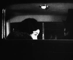
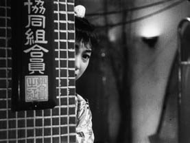
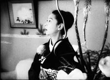
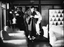
Mizoguchi has picked one variant of the overheard-conversation schema: shot of speakers/ reaction shot of eavesdropper. But he’s done so in his own way, using the barely discernible kimono sleeve to signal Hatsuko’s presence in the full shot of the couple. Likewise, the shot of Hatsuko listening is far from the usual close-up. Like other Japanese directors, Mizoguchi was fond of this arresting single-eye image. He used it earlier in his career, as shown in the first frame at the top of this entry, from Hometown (Furusato, 1930). The second frame is the last shot of his last film, Street of Shame (Akasen chitai, 1956). Quite a shot to end your career on, I’d say.
Most Japanese directors use this single-eye framing as a one-off flourish, but not Mizoguchi. The device epitomizes his demand that we concentrate on a detail. Isolating half a face gives impact to the slightest shift in the eye and eyebrow. Moreover, the split face reappears as a pictorial motif later in the scene.
As Matoba says he’ll go back to Tokyo for his doctorate, Mizoguchi cuts back to the setup for the second shot. Hatsuko moves left to sit on a chair around the corner from the sofa. This prepares for another, more prolonged game of visibility.
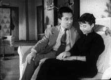
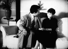
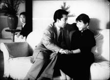
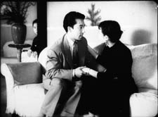
Now we get a thirty-second take of the couple on the sofa. As the scene develops, it becomes evident that Matoba is seducing Yukiko. Hatsuko slips in and out of visibility, her actions responding to and even echoing Matoba’s pressure on the girl. First, as he talks with Yukiko, we see Hatsuko’s sleeve and shoulder, between the vase and his shoulder. But as he slips his arm around Yukiko, her elbow moves aside, in an echo of his gesture.
Then, when Matoba presses his attention (“We’ll help each other . . . Depend on me”), Hatsuko’s face pops into view as her fingers emerge to grip the edge of her chair. Mizoguchi then lets her face subside, again slicing it in half.
In effect, this shot replays and expands upon the tactic governing the earlier two shots. Again we get the just-noticeable presence of the sleeve, but now rhyming with the action in the foreground. And again we get the facial reaction, impeded by a vertical cutoff, but this time in the distant shot rather than in a closer view. It turns out that those first four shots were training us for this more intricate game of vision.
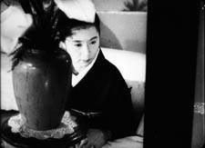
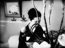
At the moment Hatsuko’s face is sliced in half, Mizoguchi cuts. Now he prolongs the close view as he had extended the full shot of the couple. In this thirty-second shot, we watch her reaction, played out in slight modulations—changes in her facial expression, changes in the aspect of her face that we see, and changing relations to the curling palm plant in the vase before her.
We get a new angle on Hatsuko, slightly high, as Matoba says, “I’ll tell her.” Hatsuko stands up abruptly and the camera tilts to follow her.
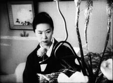
With the simple action of her rising up, Mizoguchi changes his composition sharply. Hatsuko’s position in the frame changes only a little bit, but the massive vase on the left gives way to the curling stalks on the right. Radically refreshing a shot through minimal means is one felicity of Mizoguchi’s art.
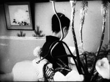
Then, as if the full import of Matoba’s betrayal dawns on her, Hatsuko lowers her head sadly. Again her eyes are split up, this time thanks to the twisting stalk. In a characteristic Mizoguchi gesture, she turns from the camera, as if ashamed to face us, but also summoning up reserves for the next emotional shift.
When she turns back, her face burns.
I take this to be the scene’s emotional climax. Mizoguchi could have given it to us much sooner, by having Hatsuko turn angry as she peeped out from behind the screen. Instead, his game of vision allowed him to build patiently toward this unimpeded shot of her reaction. It prepares us for the next stages of the drama, later scenes in which she will confront her patron and launch jealous accusations at Yukiko.
Now we hear the performance ending, and Hatsuko lifts her head. This phase of the scene ends when Mizoguchi cuts to audience members coming into the lounge and greeting her.
By 1954 Mizoguchi had surely seen The Little Foxes. Had he decided to redo Wyler’s virtuoso staging in his own manner?
Both directors work with similar ingredients: overheard conversation, depth shots, judicious close-ups, and partial views. But the narrational weightings differ. Wyler’s film aligns and allies us with the people talking, whereas A Woman of Rumor ties us to the listener. (3) Wyler’s eight shots take eighty-one seconds; Mizoguchi’s eight shots take about two minutes.
Wyler’s handling is brisk, tense, and remarkably nuanced within the Hollywood tradition. Mizoguchi gives us his scene more sedately, wringing just-noticeable differences out of unassertive performances and simple elements of setting. No slap here, just a drama of wounded pride, lost love, and jealousy played out in the face, back, and sleeve of Tanaka Kinuyo, shifting behind a floral arrangement. What Wyler gives us as one sharp effect, Mizoguchi turns into a delicate, prolonged game of vision.
Am I fussing over minutiae? No; Wyler and Mizoguchi did. We just have to follow where they lead. As I try to show in my essay on blinking in cinema (4), directors attend closely to things that might seem trivial. Our analysis needs to be as fine-grained as their craft and artistry.
Oh, yes: at Venice Ugetsu won the Silver Lion. Wyler had to be content with Roman Holiday’s three Academy Awards.
(1) I sketch some of the possibilities in On the History of Film Style (Cambridge: Harvard University Press, 1997), 225-227.
(2) For more on Mizoguchi’s competition with Wyler, see Figures Traced in Light (Berkeley: University of California Press, 2005), 134.
(3) I’m referring to Murray Smith’s deft analysis of what he calls alignment and allegiance in our relation to film characters. See Engaging Characters: Fiction, Emotion, and the Cinema (Oxford: Oxford University Press, 1995), Chapters 5 and 6.
(4) “Who Blinked First?” in Poetics of Cinema (New York: Routledge, 2007), 327-335.
PS 3 December: Thanks to Michael Kerpan for a name correction, and for the information that Woman of Rumor was once available on a French DVD.
PPS 27 February 2008: Good news. Now Woman of Rumor is available on the wonderful Eureka! Masters of Cinema series, along with the superb Chikamatsu Monogatari. The discs come with voice-over commentary by Tony Rayns and essays by Keiko McDonald and Mark LeFanu.






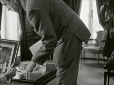
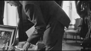
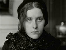
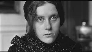
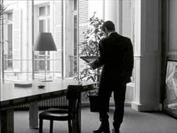
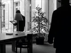
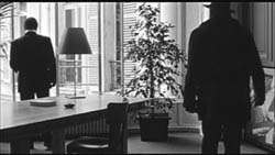
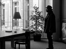
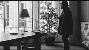
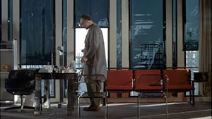
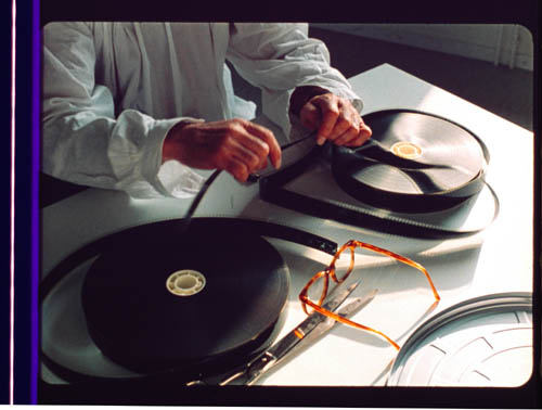
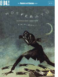 Some day I really must do an extended tribute to the Eureka/ Masters of Cinema DVD line. To call it the UK Criterion is partly right, given the painstaking transfers and the ample supplementary material. But Eureka ventures into some very fresh territory. A company that puts out the terminally peculiar Funeral Parade of Roses (Toshio Matsumoto, 1969) as well as a double-disc set of Mizoguchi’s Sansho the Bailiff and Gion Bayashi deserves points for audacity.
 Also from overseas, the
  Speaking of books, not beer, the