


Archive for the 'Film technique: Cinematography' Category
Welles at 101, KANE at 75 or thereabouts
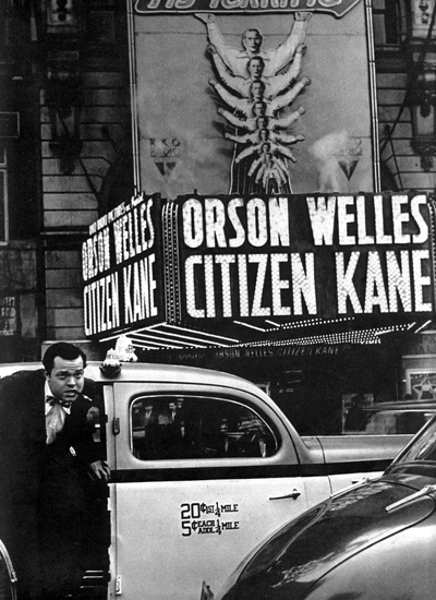
DB here:
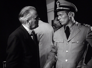
Kristin and I are one-third through our New York stay, and blogging has suffered. There have been talks to give, old friends to visit, new friends to meet, and movies and exhibitions to see. And there’ll be more activities of these sorts to come. But I can’t let 6 May pass without some acknowledgment of Orson Welles.
That’s partly because I just finished a draft of the Welles section of my 40s Hollywood manuscript. (Yeah, that beast was another distraction from blogging. All 158,000 rough-hewn words of it are now dispatched to some unwary readers.) So Welles was on my mind already when the anniversary of the “official” Citizen Kane release came up on 1 May.
Actually, by the time Kane had that roadshow release, it had been widely seen by the Hollywood community. In the face of the Hearst press’s attacks, RKO head George Schaefer held invitational screenings in early 1941 to build up support for the film. Variety estimated that by late March 1,200 producers, directors, writers, actors, and agents had seen the picture. The number was so big that RKO dispensed with a splashy Hollywood opening. (The article title is pure Varietyese: “So Many Cuffo Gloms at ‘Kane’ It Kayoes Idea of a $5.50 Preem,” Variety, 2 April 1941, 2, 20.) As a result, I think, Kane‘s influence began to be registered some months before its New York premiere, as the look of The Maltese Falcon (shot June and July of 1941) might suggest.
What I offer today, on the Boy Wonder’s birthday, is a consideration of that movie from an unusual angle looking not just at its originality but also at its shrewd consolidation of a variety of techniques.
Wellesapoppin’
We’re so used to considering Kane powerfully original that it’s worth remembering that it synthesizes a lot of traditions. I’m not thinking of Pauline Kael’s claim that it’s a culmination of the 1930s newspaper genre; as so often, she fails to persuade me. I’m thinking instead of the look and sound of the movie, as well as its storytelling strategies.
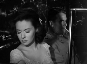
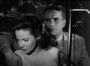
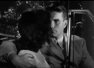
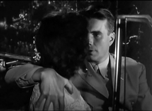
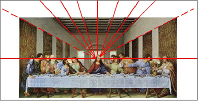
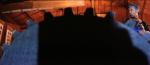
Depth staging and deep-focus cinematography are two techniques not always kept distinct in critical discussion. 1930s Jean Renoir films have plenty of depth staging but usually not so much deep focus. Citizen Kane won attention partly because it has plenty of both, and in exaggerated form. The figures often stretch very far back, someone or something is often rather close to the camera, and often all of them are sharply focused.
Without taking anything away from the boldness of Welles and cinematographer Gregg Toland, we should recognize that they reworked visual patterns—what I’ll call schemas—that were already circulating in filmmaking. Framings with big foregrounds, distant planes, and low angles weren’t unknown in silent films (Opium, 1919; Greed, 1925; A Woman of Affairs, 1928) and some early talkies (No Other Woman, 1933).
There was a sort of fad for such deep staging, especially with wide-angle lenses, during the late 1930s, though all the planes weren’t usually kept in focus. Some directors, such as John Ford (here and here) and William Wyler, favored deep images, while art director William Cameron Menzies (see here and here) made them part of his artistic signature. Below: Ford’s Long Voyage Home (1940), shot by Toland, and Menzies’ Our Town (1940), directed by Sam Wood.
It’s now acknowledged that many of Kane’s deepest shots weren’t actually made in the camera, but by means of special effects, particularly matte shots. Interestingly, this too wasn’t utterly original; compare the composite shot from Kane with the one from Mr. Moto’s Gamble (1935), which has an even more aggressive foreground.
Welles and Toland called attention to these techniques by a radical gesture: many of these deep shots are long takes from a fixed camera position. Most filmmakers who used these depth schemas inserted them into passages of orthodox scene dissection. The depth shots might establish a locale, or they might be inserted into a series of analytical cuts, or they might be part of a shot/ reverse shot pattern. But in Kane you’re forced to notice the Baroque plunge of space because the lengthy take rubs your nose in the flashy composition.
It’s clear that Kane crystallized a certain look that was picked up by John Huston, Anthony Mann with or without his DP John Alton, and many other directors. The Welles/Toland version of depth consolidated a visual style that dominated American black-and-white filmmaking into the 1960s. Typically, though, filmmakers didn’t rely on the fixed long take as much as Welles did in Kane. Even Welles gave up that option in favor of dynamic editing of deep-focus shots, as in The Lady from Shanghai (1948) and Othello (1952/1955).
Not everything is long takes and depth. The pictorial variety of the film is, I think, unprecedented. The “News on the March” sequence becomes a virtuoso exercise in all the techniques that the rest of the film won’t be using. For perhaps the first time in history, Welles artificially distresses his staged scenes to make them match archival footage. He adds scratches and light flares.
This newsreel is so film-savvy that it can build in jump cuts and fast-motion as guarantors of fake authenticity. One passage mimics two-camera reportage, allowing us to imagine paparazzi crouched and perched at a fence to grab clandestine shots of an elderly Kane.
Here the schemas that are borrowed come from archival and documentary traditions, repurposed to add realism to this fictional biography. Welles, as we’ve seen in the Great Ambersons Poster Mystery (here and here and here), was a smart-alec cinephile: your disobedient servant.
What about sound? Back in 1994, Rick Altman wrote a pioneering article showing how Kane manipulates our sense of auditory space, and he connected that to Welles’ use of radio conventions. Contrary to what we might expect, Welles’s soundtrack doesn’t create much “deep-focus sound”; Altman shows that our impression of that is created chiefly by an overall reverberation rather than precise placement of sonic events. Altman also stresses Welles’ use of sudden, loud sound events to start or end a scene–another radio technique.
Today we’re lucky to have a great many of Welles’ radio programs available on the Web, and we can appreciate how his rich soundscapes mingle noises, dialogue, and voice-over narration. These shows remain very gripping. Listening to Kane in the same spirit, I’ve been impressed with how talky it is, how sounds crash in on you, and how even bursts of silence can be startling. Welles told one biographer that he aimed to create spiky transitions, both visual and sonic, because he thought most films of the period were dull.
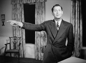
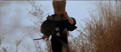
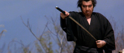
He had already made his stage reputation on “shock effects,” those stunning high points in particular productions: the death of Macbeth in the Harlem production (1936), an actor’s headfirst tumble into the orchestra pit in Horse Eats Hat (1936), the mob’s murder of Cinna the Poet in Caesar (1937), the guillotine scenes in Danton’s Death (1938), and police agents firing from the audience in Native Son (1941). He became known as a director of thrilling moments, ever willing to sacrifice steady buildup to anything that would astonish. Forties theatre critics had a name for it: “Wellesapoppin’.” That quality dominates Kane’s images and sounds.
Remembering, recounting, replays
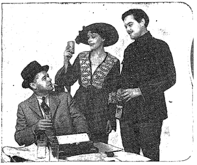
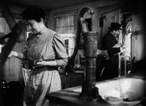
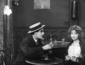
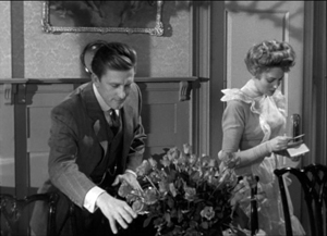
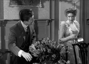
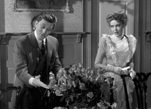
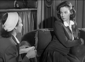
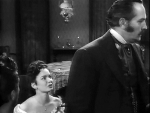
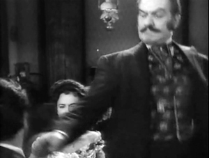
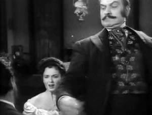
Otto Hullet, Barbara O’Neill, and Orson Welles in Sidney Kingsley’s Ten Million Ghosts (1936).
Just as Kane amplifies visual and auditory schemas already in circulation, the film does somewhat the same thing to narrative strategies. The key innovation here involves flashbacks and point of view.
Flashbacks were rare in the 1930s, but the early 1940s began a flashback craze that continued throughout the decade. Between August 1940 and December 1941, every top studio tried out flashbacks in a major release: The Great McGinty (Paramount), Kitty Foyle (RKO), I Wake Up Screaming (Fox), H. M. Pulham, Esq. (MGM), and Strawberry Blonde (Warners). A reviewer claimed that the “retrospective viewpoint” technique in A Woman’s Face, released the same month as Kane, “had of late become commonplace.” By September 1941 the Los Angeles Times critic considered the technique overused.
Even though the trend was already launched, Kane probably strengthened Hollywood’s inclination toward time-shifting. Again, it crystallizes in an influential way possibilities opened up in film, radio, theatre, and other media.
Kane’s central premise—a dead man recalled by one or more survivors—had been rehearsed in earlier films. The Power and the Glory (1933), scripted by Preston Sturges, was probably the most noted experiment in that vein. (For more, see this long-ago entry.) Another example was The Life of Vergie Winters (1934), which begins with a funeral procession and flashes back to the start of a backstreet love affair. (See this entry.) The Escape (1939) centers on a doctor who tells a crime reporter about a recently deceased neighborhood gangster, and flashbacks enact his tale.
These earlier examples stick to a single teller, while Kane offers reports on its dead man from five characters. Here again, however, there are precedents. In fiction and drama, trials have long served as motivation for flashbacks from multiple viewpoints. A major example, perhaps the first, is Robert Browning’s verse novel The Ring and the Book (1868-1869). Multiple tellers recounting events in flashback were staples of Hollywood courtroom dramas too. Beyond the trial-based format, Welles’ radio programs had welcomed multiple storytellers, sometimes embedding them within one another’s tales, sometimes letting them banter with each other.
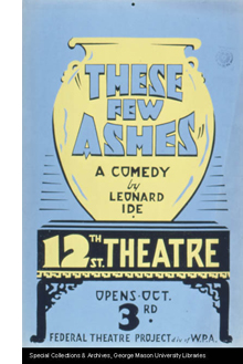
Kane assembles views on a person rather than evidence of a crime, but even this is not completely unknown. Some playwrights had tried out what Kane screenwriter Herman Mankiewicz had called the “prismatic” approach to an absent central character. Sophie Treadwell’s play Eye of the Beholder (1919) portrays an offstage woman as seen through the eyes of her former husband, her lover, her lover’s mother, and her own mother. The play These Few Ashes (1928) presents the life of a (supposedly) dead roué through the recollections of three women, each of whom sees him quite differently.
Then there’s reporter Thompson’s investigation. The Power and the Glory’s exhumation of the tycoon’s past is presented simply as his old friend’s recounting; it’s not the investigation of a mystery. Kane innovated in the biographical film genre by creating curiosity based on the dying man’s last word, “Rosebud.” That device shifts us to the terrain of the detective story. The dying message had become a mystery-tale convention from Conan Doyle onward, and Welles and Mankiewicz shrewdly recruited it for their purposes (although it’s not clear exactly who hears Kane say the crucial word).
In blending conventions of several genres, Kane motivates the flashbacks on diverse grounds. The film’s detective-story side is anticipated by The Phantom of Crestwood and Affairs of a Gentleman (1934); in both, flashbacks represent the suspects’ answers under questioning. Like The Escape, Kane uses a reporter’s search for a story to justify its flashbacks, and the reporter isn’t the protagonist (as he’d be in a typical newsman movie). And being something of a biopic, Welles’s film can trace the rise of a great man from the vantage point of old age, as in Edison, the Man (1940). By the way, that’s another film of the era using a journalist’s questioning to launch flashbacks to a person’s life.
Another wrinkle: Kane’s flashback organization skips around in the past. Episodes of Kane’s life are not presented in 1-2-3 order. Plays set in courtrooms, such as Elmer Rice’s On Trial (1914), had rendered flashbacks out of sequential order, and so had radio dramas. Welles’ 1938 radio adaptation of Dracula shuffles episodes in the manner of the source novel. Non-chronological strings of flashbacks weren’t common in film, but The Trial of Vivienne Ware (1932) and The Power and the Glory used them significantly.
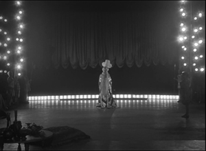
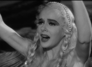
Even rarer is the replayed flashback, the scene from earlier in the film that is repeated, usually to reveal something we hadn’t caught on the first pass. Kane has occasion to present a brief replay from differing character viewpoints. Susan’s opera premiere is first treated curtly, as the object of the stagehands’ scorn. Later, in her flashback, the same scene registers the central characters’ reactions: a severe Kane, a bored Leland, the harried singing master, and above all the panicked Susan.
Replay flashbacks were rare in the 1930s, but The Witness Chair (1936) provides one example. After Kane, they would become more common, with Mildred Pierce (1945) offering one of the period’s most complex examples. (I discuss it here and here, with a video here.)
Even the coup de théâtre of following Kane’s death with a newsreel can be seen as revising a schema. “News on the March” isn’t exactly a flashback, but it provides exposition by shuttling among time periods in a manner characteristic of the film to come. Projected headlines and documentary footage, faked or actual, had found their way into 1930s theatre practice, notably in the WPA Living Newspaper productions. Many 1930s films opened with montage sequences using headlines, stock footage, and voice-overs like those in newsreels; The Roaring Twenties (1939) is a bold example. Gabriel over the White House (1933), with its mix of library footage and staged shots, anticipates Kane somewhat, as does Welles’ script for an uncompleted 1939 RKO project, The Smiler with a Knife, which includes a newsreel surveying the career of the fascist villain.
Another, less proximate source may be Sidney Kingsley’s 1936 Broadway play Ten Million Ghosts. This strident antiwar tract lasted only eleven performances and was never published; I took a look at a copy of the script last week. In the original production Welles played the naïve young poet André in love with the daughter of a munitions magnate during World War I.
Ten Million Ghosts includes a scene in which arms makers spend an evening watching a battlefront newsreel in their parlor. Kingsley’s purpose is to show the capitalists as utterly indifferent to the slaughter that the camera records.
They watch in silence for a while. Then there are technical comments on the explosives, shells, etc. as we see them hurl geysers of earth and men into the sky.
Was this embedded newsreel an early source for News on the March? Scholars have wondered. And there’s more.
As the film unwinds, André, who has learned that his family has been killed in the war, cries out in protest. Madeleine is torn between him and her father. To win her over her father angrily defends his double-dealing between both sides in the war. It’s all just business, he insists. Then we get this piece of action:
De Kruif rises, intercepting the beam of the projecting machine, his face highly lighted, his shadow, black and ominously magnified, thrown on the screen superimposed over the pictures of men writhing in bloody destruction.
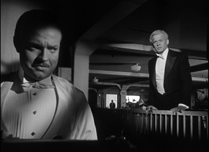
Was De Kruif’s moment in the play a visual idea that inspired Kane’s projection-room scene? If so, Welles and Toland revised the premise of the play. Instead of the rather obvious looming shadow cast on the screen, the story editor is a silhouette against the blank white rectangle, and then, in a reversed setup, he becomes another silhouette, this time splitting the projector beam.
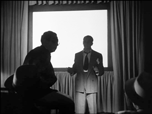
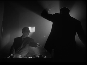
Welles told Peter Bogdanovich that he never saw the projection scene in Kingsley’s play because he was always back in his dressing room at that point. But as Pat McGilligan points out in his new biography Young Orson, Welles could hardly have been unaware of the film-within-the-play; many critics commented on it. More decisively, in the playscript, André is clearly onstage during the screening. He cries out against the carnage: “Look, look! Those are only pictures. . . Out there it’s real. . .” Peter Noble’s 1956 biography The Fabulous Orson Welles quotes Welles as declaring that this scene left a strong impression on him.
It’s not enough just to mention some sources. If you practice historically-slanted criticism, you need to ask not only “Where from?” but “What for?” In other words, you have to ask how elements that a filmmaker inherits get repurposed for the particular movie.
So, for instance, Kane’s depth-designed images held in long takes allow a more “theatrical” shift of attention within a visual field (driven largely by following who’s speaking). They also create contrasts of scale and visual weight. And each scene will have its specific demands that the depth technique fulfills. A depth shot can present cause and effect in the same frame, and it can build suspense by letting us await Kane’s interference in a foreground situation.
Similarly, Kane’s narrative strategies, synthesizing so many earlier efforts, blend to create a mystery that isn’t about whodunit but rather “why’d he do it?”
I’m not exactly saying that everything is a mashup. But that slogan does capture the fact that in art nothing comes from nothing. Kane blends several options that had been circulating in popular culture and high culture for some years. Like others before and since, Welles revised schemas tried out earlier; he combined some, exaggerated some, and infused many of them with new force. Because of his film’s prestige, he gave thrusting imagery, bold sonic manipulations, and complicated time shifts a new prominence in Hollywood filmmaking. The Forties had begun.
There are a several essential Welles sources. Apart from the many fine critical studies (see especially Jim Naremore’s Magic World of Orson Welles and Joe McBride’s What Ever Happened to Orson Welles?), the biographical surveys I habitually turn to are Welles and Peter Bogdanovich, This Is Orson Welles (Da Capo rev. ed., 1998), with a painstaking chronology by Jonathan Rosenbaum; the three-volume Simon Callow biography; Bret Wood’s Orson Welles: A Bio-Bibliography (Greenwood, 1990); Barbara Leaming’s Orson Welles: A Biography (Viking, 1985; my reference to shock effects is from p. 338); Frank Brady’s Citizen Welles (Scribners, 1990); and most recently Pat McGilligan, Young Orson: The Years of Luck and Genius on the Path to Citizen Kane (Harper, 2015). Pat’s discussion of Ten Million Ghosts is on pp. 366-367; Welles’ misremembering of the production is on p. 78 of This Is Orson Welles. A typescript of Kingsley’s play is held in the New York Public Library, at the Lincoln Center Library for the Performing Arts.
Rick Altman’s study is “Deep-Focus Sound: Citizen Kane and the Radio Aesthetic,” Quarterly Review of Film & Video 15, 3 (1994): 1-33. If it’s available without cost online, I haven’t found it. The programs “Dracula” (1938), “The Hurricane” (1939), and “The Adventures of Huckleberry Finn” (1940) provide vivid examples of multiple narrators and embedded flashbacks. For a comprehensive account of Welles’ radio work, see Paul Heyer, The Medium and the Magician: Orson Welles, the Radio Years 1935-1952 (Lanham, MD: Rowman and Littlefield, 2005). As for prismatic flashbacks, in the mid-1930s, Mankiewicz had built the plot of an unfinished play around the memories of people who had known John Dillinger. See Richard Meryman, Mank: The Wit, World, and Life of Herman Mankiewicz (New York: Morrow, 1978), 247, 258.
On Kane‘s visual style and its place in film history, see my accounts in The Classical Hollywood Cinema (1985) and On the History of Film Style (1997), as well as on this site (here and here especially). A detailed analysis of Kane‘s narrative strategies is in Chapter Three of Film Art: An Introduction, 11 ed., (New York: McGraw-Hill, 2016). The distinction between depth staging and deep cinematography is explored in Chapters Four and Five.
Off-center 2: This one in the corner pocket
DB here, again:
We got a keen response to my entry on widescreen composition in Mad Max: Fury Road. Thanks! So it seemed worthwhile to look at composition in the older format of 4:3, good old 1.33:1–or rather, in sound cinema, 1.37: 1.
The problem for filmmakers in CinemaScope and other very wide processes is handling human bodies in conversations and other encounters (such as stomping somebody’s butt in an an action scene). You can more or less center the figures, and have all that extra space wasted. Or you can find ways to spread them out across the frame, which can lead to problems of guiding the viewer’s eye to the main points. If humans were lizards or Chevy Impalas, our bodies would fit the frame nicely, but as mostly vertical creatures, we aren’t well suited for the wide format. I suppose that’s why a lot of painted and photographed portraits are vertical.
By contrast, the squarer 4:3 frame is pretty well-suited to the human body. Since feet and legs aren’t usually as expressive as the upper part of the body, you can exclude the lower reaches and fit the rest of the torso snugly into the rectangle. That way you can get a lot of mileage out of faces, hands and arms. The classic filmmakers, I think, found ingenious ways to quietly and gracefully fill the frame while letting the actors act with body parts.
Since I’m watching (and rewatching) a fair number of Forties films these days, I’ll draw most of my examples from them. after a brief glance backward. I hope to suggest some creative choices that filmmakers might consider today, even though nearly everybody works in ratios wider than 4:3. I’ll also remind us that although the central area of the frame remains crucial, shifts away from it and back to it can yield a powerful pictorial dynamism.
Movies on the margins
Early years of silent cinema often featured bright, edge-to-edge imagery, and occasionally filmmakers put important story elements on the sides or in the corners. Louis Feuillade wasn’t hesitant about yanking our attention to an upper corner when a bell summons Moche in Fantômas (1913). A famous scene in Musketeers of Pig Alley (1912) shows Griffith trying something trickier. He divides our attention by having the Snapper Kid’s puff of cigarette smoke burst into the frame just as the rival gangster is doping the Little Lady’s drink. She doesn’t notice either event, as she’s distracted by the picture the thug has shown her, but there’s a chance we miss the doping because of the abrupt entry of the smoke.
In Keaton’s maniacally geometrical Neighbors (1920), the backyard scenes make bold (and hilarious) use of the upper zones. Buster and the woman he loves try to communicate three floors up. Early on we see him leaning on the fence pining for her, while she stands on the balcony in the upper right. Later, he’ll escape from her house on a clothesline stretched across the yard. At the climax, he stacks up two friends to carry him up to her window.

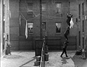
Thankfully, the Keaton set from Masters of Cinema preserves some of the full original frames, complete with the curved corners seen up top. It’s also important to appreciate that in those days there was no reflex viewing, and so the DP couldn’t see exactly what the lens was getting. Framing these complex compositions required delicate judgment and plenty of experience.
Later filmmakers mostly stayed away from corners and edges. You couldn’t be sure that things put there would register on different image platforms. When films were destined chiefly for theatres, you couldn’t be absolutely sure that local screens would be masked correctly. Many projectors had a hot spot as well, rendering off-center items less bright. And any film transferred to 16mm (a strong market from the 1920s on) might be cropped somewhat. Accordingly, one trend in 1920s and 1930s cinematography was to darken the sides and edges a bit, acknowledging that the brighter central zone was more worth concentrating on.
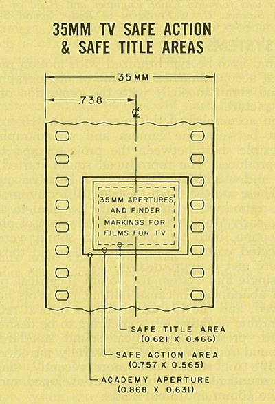
That tactic came in handy with the emergence of television, which established a “safe area” within the film frame for video transmission. TV cropped films quite considerably; cinematographers were advised in 1950 that
All main action should be held within about two-thirds of the picture. This prevents cut-off and tube edge distortion in television home receivers.
Older readers will remember how small and bulging those early CRT screens were.
By 1960, when it was evident that most films would eventually appear on TV, DP’s and engineers established the “safe areas” for both titles and story action. (See diagram surmounting this section.) Within the camera’s aperture area, which wouldn’t be fully shown on screen, the safe action area determined what would be seen in 35mm projection. “All significant action should take place within this portion of the frame,” says the American Cinematographer Manual.
Studio contracts required that TV screenings had to retain all credit titles, without chopping off anything. This is why credit sequences of widescreen films appear in widescreen even in cropped prints. So the safe title area was marked as what would be seen on a standard home TV monitor. If you do the math, the safe title area is indeed 67.7 % of the safe action area.
These framing constraints, etched on camera viewfinders, would certainly inhibit filmmakers from framing on the edges or the corners of the film shot. And when we see video versions of films from the 1.37 era (and frames like mine coming up) we have to recall that there was a bit more all around the edges than we have now.
All-over framing, and acting
Yet before TV, filmmakers in the 40s did exploit off-center zones in various ways. Often the tactic involved actors’ hands–crucial performance tools that become compositional factors. In His Girl Friday (1940), Walter Burns commands his frame centrally, yet when he makes his imperious gesture (“Get out!”) Hawks and DP Joseph Walker (genius) have left just enough room for the left arm to strike a new diagonal.
The framing of a long take in The Walls of Jericho (1948) lets Kirk Douglas steal a scene from Linda Darnell. As she pumps him for information, his hand sneaks out of frame to snatch bits of food from the buffet.
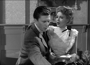
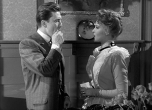
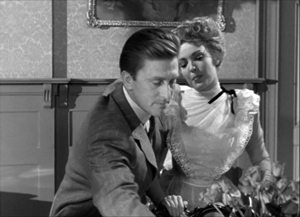
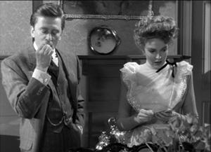
As the camera backs up, John Stahl and Arthur Miller (another genius) give us a chance to watch Kirk’s fingers hovering over the buffet. When Linda stops him with a frown, he shrugs, so to speak, with his hands. (A nice little piece of hand jive.)
The urge to work off-center is still more evident in films that exploit vigorous depth staging and deep-focus cinematography. Dynamic depth was a hallmark of 1940s American studio cinematography. If you’re going to have a strong foreground, you will probably put that element off to one side and balance it with something further back. This tendency is likely to empty out the geometrical center of the shot, especially if only two characters are involved. In addition, 1940s depth techniques often relied on high or low angles, and these framings are likely to make corner areas more significant. Here are examples from My Foolish Heart (1950): a big-head foreground typical of the period, and a slightly high angle that yields a diagonal composition.
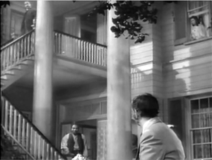
Things can get pretty baroque. For Another Part of the Forest (1948), a prequel to The Little Foxes (1941), Michael Gordon carried Wyler’s depth style somewhat further. The Hubbard mansion has a huge terrace and a big parlor. Using the very top and very bottom of the frame, a sort of Advent-calendar framing allows Gordon to chart Ben’s hostile takeover of the household, replacing the patriarch Marcus at the climax. The fearsome Regina appears in the upper right window of the first frame, the lower doorway of the second.
In group scenes, several Forties directors like to crowd in faces, arms, and hands, all spread out in depth. I’ve analyzed this tendency in Panic in the Streets (1950), but we see it in Another Part of the Forest too. Again, character movement can reveal peripheral elements of the drama.
At the dinner, Birdie innocently thanks Ben for trying to help her family with their money problems and bolts from the room, going out behind Ben’s back. The reframing brings in at the left margin a minor character, a musician hired to entertain for the evening. But in a later phase of the scene he will–still in the distance–protest Marcus’s cruelty, so this shot primes him for his future role.
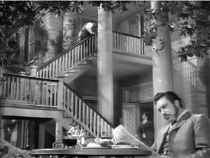
At one high point, the center area is emptied out boldly and the corners get a real workout. On the staircase, the callow son Oscar begs Marcus for money to enable him to run off with his girlfriend. (As in Little Foxes, the family staircase is very important–as it is in Lillian Hellman’s original plays.) Ben watches warily from the bottom frame edge. Nobody occupies the geomentrical center.
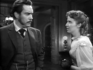
Later, on the same staircase, Ben steps up to confront his father while Regina approaches. It’s an odd confrontation, though, because Ben is perched in the left corner, mostly turned from us and handily edge-lit. Marcus turns, jammed into the upper right. Goaded by Ben’s taunts, he slaps Ben hard. Here’s the brief extract.
The key action takes place on the fringes of the frame, while the lower center is saved for Regina’s reaction–for once, a more or less normal human one. Even allowing for the cropping induced by the video safe-title area, this is pretty intense staging.
The corners can be activated in less flagrant ways. Take this scene from My Foolish Heart. Eloise has learned that her lover has been killed in air maneuvers. Pregnant but unmarried, she goes to a dance, where an old flame, Lew asks her to go on a drive. They park by the ocean, and she succumbs to him. Here’s the sequence as directed by Mark Robson and shot by Lee Garmes (another genius).
In the fairly conventional shot/ reverse-shot, the lower left corner is primed by Eloise’s looking down at the water and Lew’s hand stealing around her.
Later, when Lew pulls her close, (a) we can’t see her; (b) his expression doesn’t change and is only partly visible; so that (c) his emotion is registered by the passionate twist of his grip on her shoulder. Lew’s hand comes out from the corner pocket.
Perhaps Eloise is recalling another piece of hand jive, this time from her lost love.
For many directors, then, every zone of the screen could be used, thanks to the good old 4:3 ratio. It’s body-friendly, human-sized, and can be packed with action, big or small.
Mabuse directs
In other entries (here and here) I’ve mentioned one of the supreme masters of off-center framing, Fritz Lang. Superimpose these two frames and watch Kriemhilde point to the atomic apple in Cloak and Dagger (1946).
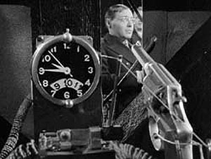
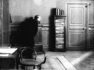
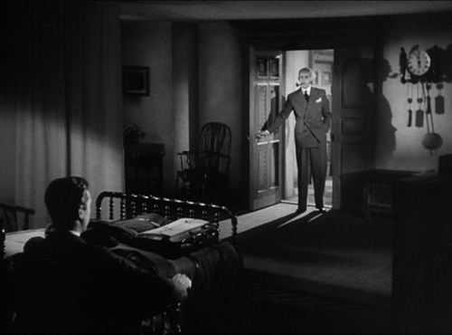
From the very start of Ministry of Fear (1944), the visual field comes alive with pouches, crannies, and bolt-holes. The first image of the film is a clock, but when the credits end the camera pulls back and tucks it into the corner as the asylum superintendant enters. (The shot is at the end of today’s entry.) Here and elsewhere, Lang uses slight high angles to create diagonals and corner-based compositions.
In the course of the film, pistols circulate. Neale lifts one from Mrs. Bellane (strongly primed, upper left), keeps her from appropriating it (lower center), and secures it nuzzling his left knee (lower right).
Later, Neale’s POV primes the placement of a pistol on the desktop (naturally, off-center), so that we’re trained to spot it in a more distant shot, perilously close to the hand of the treacherous Willi.
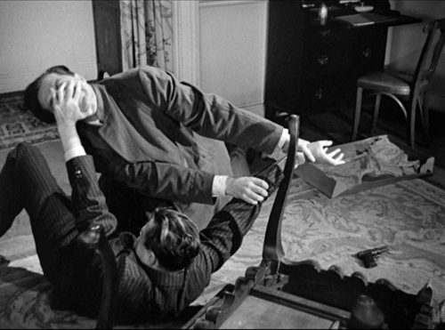
Amid so many through-composed frames, an abrupt reframing calls us to attention. Unlike Hawks and Walker’s handling of Walter in His Girl Friday, Lang and his DP Henry Sharp (great name for a DP, like Theodore Sparkuhl and Frank Planer) gives things a sharp snap when Willi raises his hand.
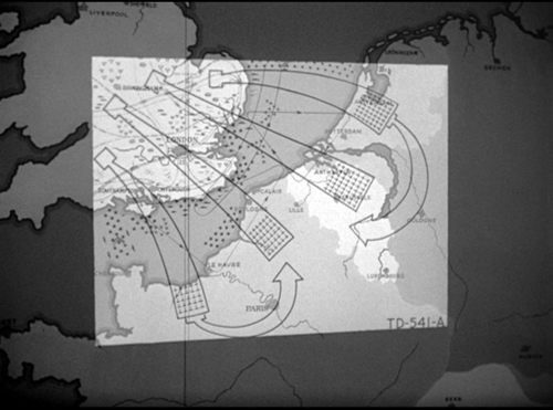
Lang drew all his images in advance himself, not trusting the task to a storyboarder. Avoiding the flashy deep-focus of Wyler and company, he created a sober pictorial flow that can calmly swirl information into any area of the frame. It’s hard not to see the stolen attack maps, surmounting today’s entry, as laying bare Lang’s centripetal vectors of movement. No wonder in the second frame up top, as Willi and Neale struggle in a wrenching diagonal mimicking the map’s arrows, that damn pistol strays off on its own.
Sometimes film technology improves over time. For instance, digital cinema today is better in many respects than it was in 1999. But not all changes are for the better. The arrival of widescreen cinema was also a loss. Changing the proportions of the frame blocked some of the creative options that had been explored in the 4:3 format. Occasionally, those options could be modified for CinemaScope and other wide-image formats; I trace some examples in this video lecture. But the open-sided framings in most widescreen films today suggest that most filmmakers haven’t explored the wide format to the degree that classical directors did with the squarish one.
More generally, it’s worth remembering that the film frame is a basic tool, creating not only a window on a three-dimensional scene but also a two-dimensional surface that requires composition–either standardized or more novel. Instead of being a dead-on target, the center can be an axis around which pictorial forces push and pull, drift away and bounce around. After all, we’re talking about moving pictures.
Thanks to Paul Rayton, movie tech guru, for information on 16mm cropping.
My image of the safe areas and the second quotation about them is taken from American Cinematographer Manual 1st ed., ed. Joseph C. Mascelli (Hollywood: ASC, 1960), 329-331. The older quotation about cropping for television comes from American Cinematographer Handbook and Reference Guide 7th ed., ed. Jackson J. Rose (Hollywood: ASC, 1950), 210.
I hope you noticed that I admirably refrained from quoting Lang, who famously said that CinemaScope was good only for…well, you can finish it. Of course he says it in Godard’s Contempt (1963), but he told Peter Bogdanovich that he agreed.
[In ‘Scope] it was very hard to show somebody standing at a table, because either you couldn’t show the table or the person had to be back too far. And you had empty spaces on both sides which you had to fill with something. When you have two people you can fill it up with walking around, taking something someplace, so on. But when you have only one person, there’s a big head and right and left you have nothing (Who the Devil Made It (Knopf, 1997), 224).
For more on the stylistics and technology of depth in 1940s American film, see The Classical Hollywood Cinema: Film Style and Mode of Production to 1960 (Columbia University Press, 1985), which Kristin and I wrote with Janet Staiger, Chapter 27, and my On the History of Film Style (Harvard University Press, 1997), Chapter 6. Many blog entries on this site are relevant to today’s post; search “deep-focus cinematography” and “depth staging.” If you want just one for a quick summary, try “Problems, problems: Wyler’s workarounds.” Some of the issues discussed here, about densely packing the frame, are considered more generally in “You are my density,” which includes an analysis of a scene in Lang’s Hangmen Also Die (1943).
Ministry of Fear (1944).
Off-center: MAD MAX’s headroom
From Mad Max: Center Framed, by Vashi Nedomansky.
DB here:
If you’re a filmmaker, how do you frame the action you’re shooting? Put aside documentary shooting, which doesn’t allow you as many options as staged filming does. A lot of your compositional decisions depend on the aspect ratio of the image.
After the mid-1910s, filmmakers relied heavily on close views—framing typically two or three people, or even just one. These “portrait” framings were well-suited to the 4:3 format that was standardized in the silent era. But what happens when filmmakers must compose in wider frames, especially the 2.35:1 format that became common with CinemaScope?
Too much scope in ‘Scope?
In classic Western painting and other traditions as well, a horizontal format is associated with fairly distant views of groups or landscapes.

Early ‘Scope filmmakers did sometimes favor distant, spread-out ensemble staging, with greater or less depth. (Below: Island in the Sun; Bad Day at Black Rock.)
I try to track some of those early options in this online lecture.
But as technology improved, filmmakers managed to shoot medium- and close shots in the wide format. They “tamed” ‘Scope to a more traditional continuity. And as there were pressures toward “intensified continuity,” filmmakers adapted those tenets to ‘Scope. They gave us close-ups, fast cutting, and roaming camera movements within the widescreen array.
Like all solutions, this involved trade-offs. The 4:3 format was well-suited to the human body, and even a tight facial close-up could fill it fairly well. But a single or even a two-shot, in anamorphic widescreen, can leave a lot of the frame vacant or relatively unimportant.
Cinematographer Boris Kaufman objected to the extra real estate. In traditional arts, the design should fit snugly into the format, with all areas contributing to the image’s effect:
The space within the frame should be entirely used up in composition.
But close views in widescreen typically leave a lot of dead space. If you put the figure in the center, that dead space can be on the sides.
The bilateral symmetry of Wes Anderson’s frames is achieved on the premise that the figure is facing straight out at the viewer, so Anderson has the problem of filling up the flanking areas.
Or the dead space can be bigger on one side of the frame than the other. In that case, the figure, even a close one, is placed off-center in the 2.35/2.40 frame. This can suggest that the object of attention is somewhere beyond the empty zone.
To avoid sheer dead space, you can try to settle something in the background. If it’s dramatically important, you can generate some nice compositional tension, in the manner of the wide-angle, deep-focus look of the 1940s.
So as with most creative options, making a choice involves (a) tradeoffs and (b) further choices, some of them fairly forced. Go with widescreen, and you have to fill the frame somehow. Make one choice, and you have some dead areas, but you can control the viewer’s attention. If you fill the areas with significant action, you need to find some dynamic compositions. But you divide the viewer’s attention. You now have to make people look where you want and when you want.
Cuts for composition
Now add in cutting. How do you cut widescreen shots together, say in a conversation scene?
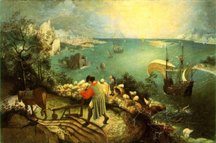
Go back to painting. Sometimes the most important item sits in the geometrical center of the picture format. Rudolf Arnheim points out that often the exact center is vacant and items are grouped around it. The result is a pictorial tension, with elements balanced, either symmetrically or in more complex patterns. In Bruegel’s Fall of Icarus, the major action is split–a dramatic splashdown, a world that doesn’t notice. The fall takes place somewhat off right of center, in a bright but far-offf area. It’s still almost indiscernible. The indifference of the peasants is given in the very composition of the image.
So too with cinema. In a single image, when the main point of interest isn’t dead center, there can be either symmetry, or important items grouped around the center.
Going beyond the single image, we find that editing can create a fairly gentle seesawing around the central area. A common tactic is shot/ reverse-shot, with over-the-shoulder framings. In widescreen, that option tends to make the center fairly empty.

Or you can try “compensatory” shot/ reverse-shot cutting, so that the empty area of the first shot is filled by the corresponding figure or action in the next shot.
This second isn’t a bad solution, since the two shots together satisfy Kaufman’s dictum in a roundabout way. They become a “cinematic” way of filling the horizontal format, but in time rather than purely in space. And in this instance the main characters’ angled eye levels fit together snugly, in the upper center.
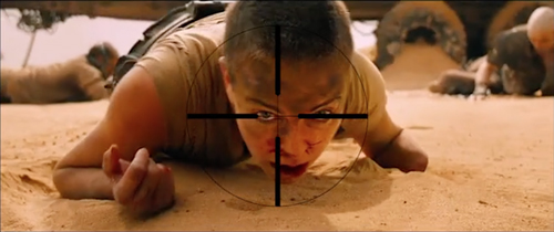
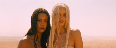
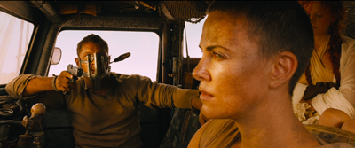
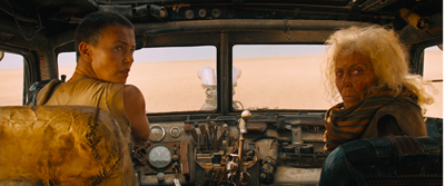
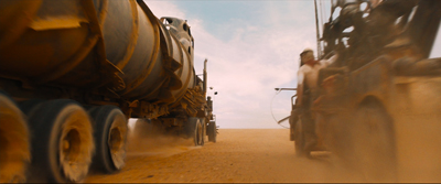
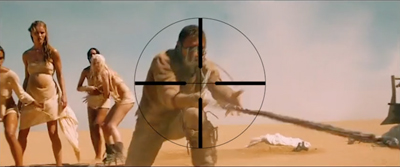
There can be a certain suspense added, as the second frame slowly fills up to reveal the item. When Furiosa looks off right, we cut to a shot of what’s caught her attention–an attack vehicle drawing into the frame on the right.
Assume, as most people do, that our attention fastens on certain aspects of the frame—typically those that attract us perceptually (brightness, movement, color, sound source, etc.) and that provide ongoing story information. So now you have to consider: How closely do you want your second shot to pick up on the crucial area of the first shot? That is, is the smoothest cut the one that starts the next shot with the viewer’s eye in the same part of the frame?
Some editors argue for this sort of continuity. “If the eye is led to one side of the screen,” notes one primer, “the action of character in the next shot might be located on that side also. Again, the purpose of the cut is to allow the eye to follow the movement.”
We’re back with our old friend the guided saccades, the fast, jerky eye movements that sample our environment. We’ve seen saccades at work in a single shot, thanks to staging that guides our attention. (Go here for a first-pass analysis, here for the eye-tracking evidence.) What about the cuts? The research of psychologist Tim Smith suggests that many editors intuitively try to match the point of interest across cuts. This is especially evident in the default zone, the geometrical center.
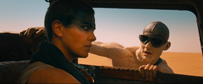
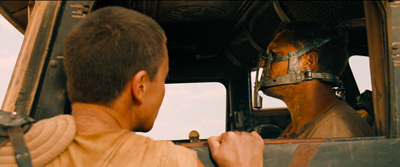
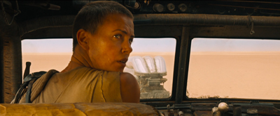
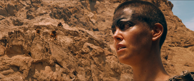
Keeping the viewer’s attention fastened on one area of the screen across the cut could be of great value in fast-cut action scenes. That way the viewer couldn’t miss the most important thing—a face, a gesture, a prop. This was the aim of George Miller in certain scenes of Mad Max: Fury Road. According to cinematographer John Seale, the centered compositions make it easier for the viewer to follow the action.
Your eye won’t have to shift…to find the next subject when you’ve only got 1.8 seconds of time to do that.
Vashi Nedomansky has created a striking video, complete with centered crosshairs, that shows the strictness of framing and composition during one action scene. Both long shots and fairly close ones are center-framed.
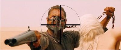
Vashi notes that Michael Bay and other directors seem to rely on fast cutting without due concern for where the viewer’s eye lands at the end of each shot. Combined with very short shots, compositional confusion can flummox us. We don’t know where we should be looking.
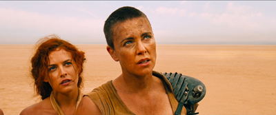
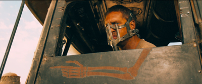
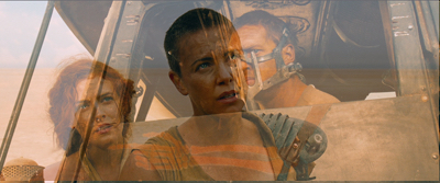
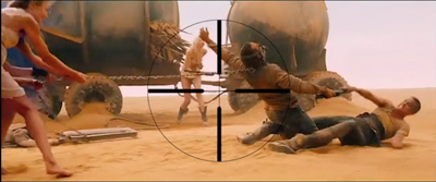
Miller uses a greater variety of compositions in other stretches of the film, as my illustrations above indicate. At times he applies his “matching zone system” to more off-center layouts. Furiosa is shown waiting for the biker gang to complete the deal, and she’s center framed.
We cut to one biker surveying the scene. He (she?) is positioned off-center, so that we get a certain foreground/background dynamic between him (her?) and the truck far in the background. Now cut to Furiosa, who’s now in the same area of her frame; the empty space on the left seems to confirm what her eyeline suggested about the biker’s position above the canyon. (Interestingly, Miller slightly breaks the axis of action to get this smooth graphic cut.)
Still, you can argue that for fast-cut scenes it’s better to adopt a brute-force simplicity of composition, favoring the center. (While of course assuming that ordinary continuity principles, such as matching of movement, screen direction, eyelines, and so on, are obeyed.) Tim Smith’s experiments have shown that all other things being equal, our eyes drift to the center of the format from shot to shot–a point that Arnheim also makes about “the power of the center” in all images. This visual habit is challenged by so-called empty-center painting of the 1960s and 1970s, as seen in Kenneth Noland’s Shadow on the Earth and Larry Zox’s Decorah.
Mad Max: Fury Road seems to me a superbly directed film in its chosen style, but we can find alternatives. What about fast cutting that tries, as a part of an action scene’s kinetic drive, to shuttle or bounce the viewer’s attention more widely across the frame? This option wouldn’t be helter-skelter in the Bay manner; it’s calculated, and engenders its own pictorial excitement.
Not exactly a picture scroll, but kind of
We can find many examples in the Asian action tradition. Take for example one of the extended pursuits in Benny Chan’s New Police Story, a 2004 Jackie Chan vehicle. Jackie is clambering up along an angled beam of the Hong Kong Convention Center, and the framing puts him far to the right, emphasizing the distance and steepness of the climb.
As he scrambles up, he seems not to notice that his pistol falls out of his pocket. But we do, because it stands out against the pale cladding as it slides down to the bottom of the slope. Miller would have given us a separate, centered shot of this crucial action, but here it becomes an instance of that “gradation of emphasis” that widescreen encourages.
Before Jackie can hit frame center, there’s a cut that reverses the design of the first shot. A low angle puts him at the far left corner of the frame as he reaches the top. We never really see Jackie in the center of the frame in either shot.
The two shots are cut fast (about 3 seconds each), but there’s no problem grasping the action. Hong Kong filmmakers realized that you could cut long shots quickly if the composition and lines of movement were very clear. There is, it turns out, enough time for the eye to catch up to the main point of the composition, but it does ask us to exercise.
A more percussive cut comes when Frank, also unarmed, searches out Joe, the gang leader, in a toy department. A snap-movement of the kind HK filmmakers love shows an off-center empty slot; Frank pops in from screen right.

Cut to Joe stalking Frank, seen in another slot. It’s an optical POV shot, but it’s also off-center, balancing the composition of the first shot. A cut back to Frank closes the POV pattern. Perhaps the oscillation around the frame center can prime us for the next shot.
To get a sense of this “all-over” frame composition, have a look at this sequence from Yuen Kwai’s Ninja in the Dragon’s Den (1982). The combat swiftly passes from the center to the sides or to a corner. Thanks partly to the architecture of the cabin and the mill wheel, and partly to the judicious framing, there’s a sense that Kaufman might be satisfied that the space in the frame is “entirely used up”–not in a single shot, but in the totality of shots. (I’ve left in the English dubbing so subtitles don’t distract your eye.)
Hong Kong filmmakers mastered dynamic compositions during fights, but they were seldom as eccentric as their Japanese colleagues. Once anamorphic widescreen became common in Japan, directors pushed points of interest to frame edges and exploited unusual framing.
Consider the shootout at the climax of Suzuki Seijin’s Underworld Beauty (1958). A gang has trapped the protagonist Miyamoto and a young woman in a boiler room and is subjecting them to some heavy ordnance. In one series of shots, we see a gunman fire to the right, and as a result of his strafing, one boiler starts to blow.
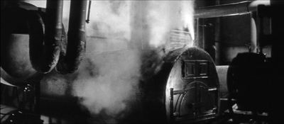
The progression of boiler shots shifts us more or less rightward across the basement, and the empty area on the far left of shot 3 suggests that the gunman remains offscreen in the upper left. Now we get a sort of establishing shot showing the two boilers of shot 2 more fully.
I think we’re inclined to place the offscreen gunman still in the upper left. The spraying boiler we’ve seen is now on frame left. What’s surprising is that Miyamoto and the woman are crouching way down in the lower right corner. As you watch the shot, you might not notice them at first, but Suzuki has them change position after a moment so their movement attracts our eye. In addition, the shot is fairly prolonged as the boss calls out to his prey, so viewers have time to discover them. This is, I think you’ll agree, a pretty bold use of the anamorphic frame.
Once we’ve noticed them, how does Suzuki cut closer to the couple? Unpredictably.
I feel a bump here every time I see it, because it’s hard to read the facial expressions from this angle. Instead, we get an almost abstract composition spread in a diagonal across the frame. Again, the geometrical center is less important than the shapes, edges, and tones that cross it.
At last we get something like an orthodox framing of the couple, eased by a match on action as the woman tips her head.
So the passage ends with a center-framed image. As often happens, decentering registers as an accent, a transitory departure from the baseline, the centered image. Not only will most action pass through the center, but we can be yanked to other regions in confidence that we’ll eventually return to it.
The shots in Underworld Beauty aren’t especially fast-cut, but I’ll close with another extract that is. This is the opening of Baby Cart at the River Styx (in the Lone Wolf and Cub series; dir. Misumi Kenji, 1972). Again, I’ve disabled the subtitles. (NB: Probably not best for children to see this.)
In a burst of shots, we get centered images, off-center ones, and radically off-center ones.
Continuity rules are respected and the camera is angled properly; but the compositions bounce from perfectly readable to perversely indiscernible. Some shots keep us in suspense about what’s about to happen, yet at no point is the action unclear. Again, the impact comes partly from simply composed, but highly varied, images.
George Miller’s strict target-framing is very powerful, but there are other options, even in fast-cut sequences. The idea of leading our attention across areas of the screen goes back to Eisenstein, the theorist-director who enjoyed zigzag graphic designs and the pictorial clatter created by a cut. One lesson: Every bit of the frame can be used, if only to jolt the viewer’s eye. All the action on the screen isn’t just in the story.
My quotation from Boris Kaufman is taken from Edward L. de Laurot and Jonas Mekas, “An Interview With Boris Kaufman,” Film Culture 1, no. 4 (Summer 1955): 5. The quotation about matching screen zones comes from Steven E. Browne, Video Editing: A Postproduction Primer, 3d ed. (Focal Press, 1997), 147. Bruce Block discusses “affinity continuums” from shot to shot in Chapter 7 of The Visual Story: Seeing the Structure of Film, TV and New Media, 2d ed. (Focal Press, 2013).
The Rudolf Arnheim book I’ve mentioned is The Power of the Center: A Study of Composition in the Visual Arts: The New Version (University of California Press, 1988). “Empty-center” painting is discussed by Thomas B. Hess in the essay of that title in New York (2 April 1973), 64-65 and in “Olitsky without Flattery,” New York (1 October 1973), 76-77. Hess describes paintings in which “the picture plane is stretched like a trampoline, with lots of spring action at its quivering edges.”
Tim Smith’s eye-tracking research is relevant to the framing principles I’ve been considering. Although he has yet to consider the more complicated cases of dispersed points of attention, he has found strong evidence that the default area remains the geometrical center of the screen. See his “Watching You Watch Movies: Using Eye Tracking to Inform Cognitive Film Theory,” in Psychocinematics: Exploring Cognition at the Movies, ed. Arthur P. Shimamura (Oxford, 22013), 170-171; the relevant video, with a heatmap of viewers’ attention, is here. Tim’s website is full of other examples from his research. Thanks to Tim for correspondence on this point.
Thanks also to Patrick Keating for email discussion of some of these matters.
I discuss principles of early widescreen shooting and staging in the online chapter “CinemaScope: The Modern Miracle You See Without Glasses.” See also the video lecture of the same name. For another example of radical decentering during a fast-cut combat, though put to different uses than in the Japanese examples here, see my entry on a King Hu jump cut.
Incidentally, we might wonder whether the centered compositions in Mad Max: Fury Road aren’t also acknowledging that on some displays (cable, streaming, airlines) these images will be cropped. To put important material too close to the frame edge risks losing it on downstream platforms. See “Filling the Box: The Never-Ending Pan-and-Scan Story.”
Ninja in the Dragon’s Den.
P.S. 1 March 2016: There’s a sequel to this entry here.
Modest virtuosity: A plea to filmmakers, old and young
Panic in the Streets (1950).
“It’s where you put the camera and what’s in front of you [that’s important],” Deakins said. “There’s too much obsession these days about digital film…it’s becoming so technically-orientated, and that’s just distracting from what’s actually being put in front of the lens.”
DB here:
Every now and then I get worried by the repetitive look of recent films. I want to beg filmmakers (young ones especially) to try something else.
What could they do? Start with what to avoid. They could suspend the walk-and-talk, the tendency to rely on singles, the bumpy handheld takes, the swoopy crane shots, and the urge to cut on every line of dialogue. They could back off, in other words, from intensified continuity and go for something more daring and original.
More positively, there are some relatively unexplored areas of film style that yield results that are forceful and graceful. Today’s example: ensemble staging that minimizes camera movement and cutting. Minor spoilers.
Some basics
It’s a demanding technique. Essentially the filmmaker has to shape a scene among several actors in ways that guide our attention to the key pieces of information. That guidance is done through performance, framing, lighting, and other tactics. Beyond highlighting the major points of the scene, staging can create what critic Charles Barr called “gradation of emphasis.” Because several elements of the action are all visible at once, some can become primary, some secondary; and this interplay enriches our understanding of the scene.
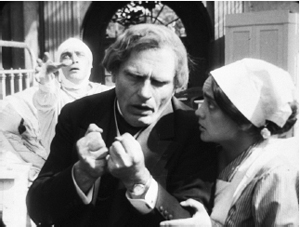
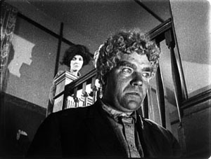
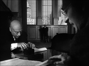
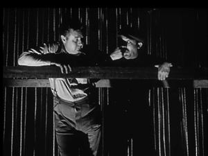
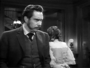
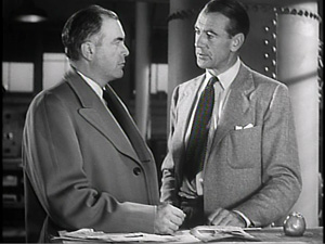
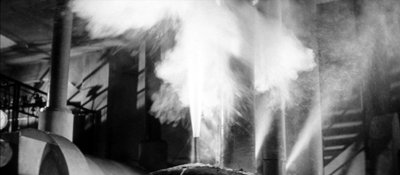
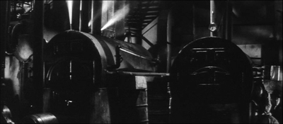
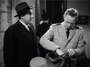
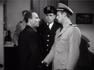
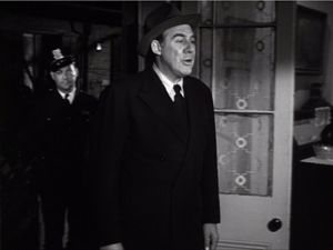
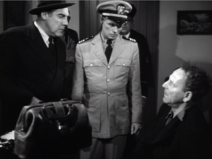
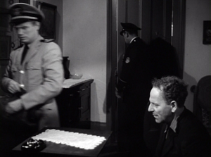
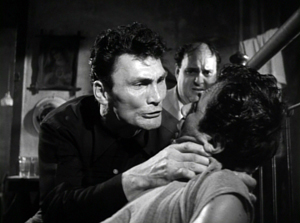
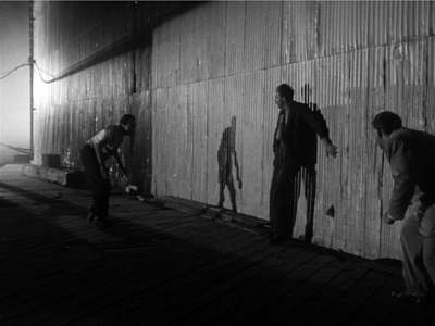
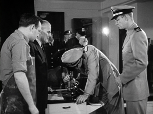
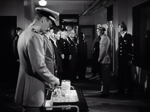
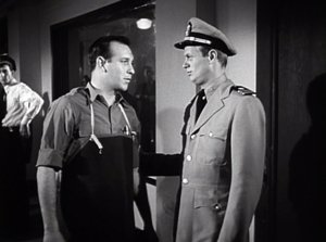
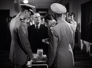
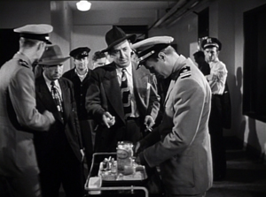
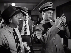
So take this scene from Elia Kazan’s Panic in the Streets (1950). A dead man has been found to carry the Bubonic plague virus, and Dr. Clinton Reed is investigating people who have come in contact with him. A restaurant owner and his wife have denied knowing the victim, but now Reed and Police Captain Warren have learned that the wife has come down with the plague. They visit the apartment, too late to save her. Her husband Mefaris comes in and learns that she has died—and that she might have lived had the couple told the truth.
The two-minute scene plays out in just two shots, both with slight panning movements. The scene’s impact owes a lot to the performances: the line readings, facial expressions, and gestures, including the wonderful way that Richard Widmark rips off his surgical mask in angry frustration. But the scene also benefits from small but significant rearrangements of the actors in the frame. This staging ties together the performance elements in a smoothly rising flow.
Here’s the scene. I’ll try to indicate some practical directing principles at work.
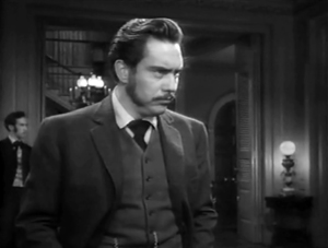
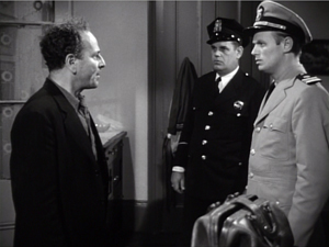
After Captain Warren has sent his men to find the husband, we have our principal players in the middle ground in a framing from the knees up (the plan-américain). As is common in 1940s dramas, the scene will be given added depth, not only by the patrolman behind Warren but by the junior officer Paul behind Reed, coming out of the sickroom. That depth is activated when Reed comes forward to pack his briefcase and orders Paul to burn the bedding, and Warren orders the patrolman to close the bedroom door.
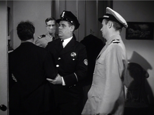
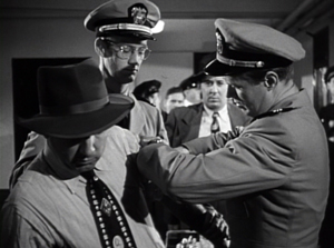
The opening and closing of the door becomes an important pictorial element, but for now it simply clears the background for the two-shot involving Warren and Reed talking of the death certificate. Noise from offscreen motivates the camera’s pan left to follow Warren as he meets the husband, Mefaris, coming in.
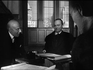
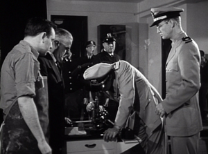
Mefaris confronts Reed and demands to know what’s happening. When he calls his wife, Paul steps out, guiding our attention to him as a sign of death. Mefaris begins to guess. The phlegmatic patrolman, who’ll feature throughout the scene, is there to keep Mefaris under control.
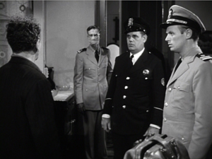
The risk is that we’ll watch that centrally place cop and miss something else, so Kazan takes care to make him impassive. Later, he’ll be more distant, in shadow, and out of focus. More generally, such ancillary characters need to keep still and stare at what we’re supposed to be watching.
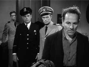
Mefaris comes closer to Reed, blocking our view of Paul. Reed tells him his wife is dead. Mefaris tries to go to her room, but the patrolman shows his value by restraining him—and opening up a slot for us to see Paul, who confirms Reed: “She’s dead, mister.”
This sort of unnoticeable blocking and revealing through slight shifts in actors’ position goes back to 1910s cinema but is seldom used today.
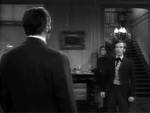
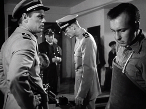
Finally accepting the grim news, Mefaris ponders and comes forward. Without cutting, Kazan has brought him and Reed into closer visibility. As ever, a Cross refreshes the composition. And as Reed asks questions, his head blocks the patrolman so that we can concentrate on Mefaris’ indignant reaction.
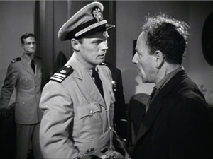
Mefaris’ refusal to talk is the climax of the shot. We cut to Warren at the door and the camera pans with him to confront Mefaris angrily.
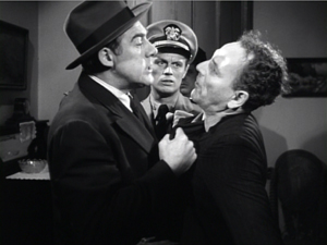
Now only Reed is visible in the background, squeezed between the two faces. Mefaris finally identifies Poldi as the man they need to find. Warren shoves him down and the space, quite clenched just a moment before, opens up. As gradation of emphasis, we get Reed brushing at Mefaris’ lapel after Warren’s meaty hands have crumpled it. After Warren’s outburst, Reed’s anger at Mefaris seems to have turned into a flicker of compassion.

Warren and Reed depart, just as Paul returns to the death room and the patrolman closes the door. The final framing leaves nothing to distract us from Mefaris, brought low by grief and his fatal failure to cooperate.
Kazan is, we might say, a “post-Welles” director in that he, like many others, adopted the vigorous use of depth staging and wide-angle cinematography made famous in Citizen Kane. It’s not hard to find elsewhere in Panic in the Streets some more flagrant instances of in-your-face deep focus, with big heads and exaggerated distant points.
In the scene above, the depth is nothing like so aggressive. It is, we might say, modestly virtuoso—a clean, unnoticeable, but well-calibrated piece of staging that unfolds the action so that we always know where to look.
Why not?
I anticipate some objections from a skeptical filmmaker.
“This scene isn’t cinematic. There isn’t enough cutting and it’s lacking close-ups.”
Today, though, everybody acknowledges that cutting isn’t the be-all and end-all of cinema. Directors get lots of credit for sustaining their shots, if it’s done with a self-congratulatory virtuosity. (See Gravity, Birdman, the opening sequence of Spectre.) In particular, a lengthy walk-and-talk shot is greeted as a bold stroke. So clearly the absence of cutting is okay if you make a big deal of it.
Close-ups are important, but maybe not as much as we think. Today’s style often relies too much on close-ups, partly because people think they won’t read well on small monitors and other displays. But those displays are getting bigger and sharper. I suspect that you’d find the Blu-ray edition of Panic in the Streets plenty okay for home viewing.
“Put it another way. This is too theatrical.”
Too reliant on actors, then? But what mainstream cinema isn’t? And isn’t today’s standard style, bombarding us with facial close-ups, quite “theatrical” in making the actor—and not even the body, just the face—the center of our attention?
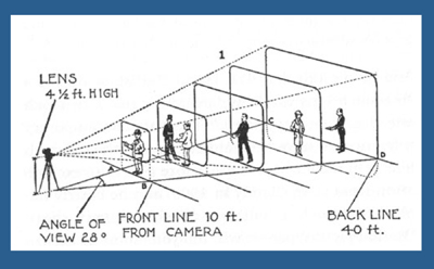
Moreover, as I’ve argued here and elsewhere, the space of a shot is the opposite of the space onstage. Theatrical space is wide and rectangular, and actors tend to arrange themselves laterally, across the stage. Cinematic space–the space captured by the camera–constitutes a pyramid, extending narrowly away from the lens, and so it favors depth. (See the diagram above.) Theatrical space is calculated for the sightlines throughout the auditorium; cinematic space is calculated for one sightline, that of the camera. Accordingly, a film can have staging in depth that wouldn’t work onstage. You couldn’t arrange the Panic scene this way in live theatre; some people couldn’t see the background action clearly, because the foreground figures would mask it.
If “theatrical” also means “too tied to the proscenium,” that objection fails too. Granted, this is a scene that suggests a missing fourth wall. The camera doesn’t penetrate the space enough to suggest the entire room. Shortly, though, I’ll show you that this approach can be more immersive, activating areas behind the camera (and so behind us).
“It’s not realistic. People don’t stand and talk that way.”
Cinema ≠ reality.
“It’s too risky. Too much can go wrong with all that shifting in one shot.”
You need skillful actors who can time their lines, hit their marks, and coordinate with one another. If one thing goes wrong, you have to start again. Shrinking from this, directors opt for plenty of coverage to adjust pacing and select the best performances during editing. “The important thing for the editor is coverage,” notes Ridley Scott. “That’s why I always have multiple cameras, so I can shorten the scene.”
So, yes, it’s risky. But risk is celebrated in the noisy virtuosity of the flamboyant long takes. Why not take risks in this more unusual way?
“It’s too hard! I never learned how to do these things.”
Once upon a time, every director knew how to stage scenes like this. The “tableau cinema” of the 1910s cultivated a rich set of creative choices about staging, and directors proved very versatile in exploring them. With the arrival of continuity editing in the 1910s, a degree of de-skilling took place, but directors still retained some sense of dynamic staging. We see it in 1930s and 1940s films too.
Now, much later, this sense is all but gone. Is ensemble staging taught in film schools? Could even our best directors of today—Wes Anderson, Paul Thomas Anderson, Quentin Tarantino, et al.—pull off a scene in this manner? Soderbergh couldn’t do it when he tried in The Good German. (I look forward to seeing if Todd Haynes makes the effort in Carol.)
On the whole, though, I agree: It’s hard today. Neither directors nor actors nor DPs are, I think, well-versed in what’s necessary to stage scenes this way. Most directors, and nearly all viewers, have simply forgotten that this rich menu of expressive techniques ever existed. So why not revive it?
Post-grad work
One other objection occurs to me.
“Ensemble staging of this sort is too modest. In an age of directorial bravura, where every filmmaker tries to punch above his weight, nobody will notice if I direct scenes this way. And getting the next job demands that my contribution get noticed. I’m competing with a lot of eye candy out there.”
I’d agree. But there is a lot of leeway in this approach for more self-conscious effects. Maybe most viewers and even filmmakers wouldn’t notice the robust delicacy of the scene above. But how about offering something more audacious that stays within the parameters of this style?
Try this earlier scene from Panic in the Streets. Reed, his assistant Paul, and local officials are now identifying the plague virus and are beginning to figure out how to deal with it. I hope I’ve primed you to notice the less-quiet virtuosity on display here.
A director today might have shown us the body, the reporters photographing it, and the medical team in one vast shot, perhaps from a high angle that craned in. Or perhaps we’d have gotten a long walk-and-talk taking Reed through a hospital corridor as he snaps out orders to all the staff involved.
Instead, Kazan leaves a lot of this material offscreen, to be inferred through details. The plaguey corpse lies just outside the lower frame line, but we won’t realize this for a while. And the reporters are offscreen, “behind us.” So we’re inside the proscenium. Part of the interest of the scene is not just following the ongoing drama but figuring out what’s going around us.
In this more complex scene, Kazan threads characters through the space, making some more prominent and then letting them fall back. He obeys Alexander Mackendrick’s dictum:
Composing in depth isn’t simply a matter of pictorial richness. It has value in the narrative of the action, the pacing of the scene. Within the same frame, the director can organize the action so that preparation for what will happen next is seen in the background of what is happening now.
We start with Reed and his team bent over the microscope. In the background a patrolman passes. For an instant the frame flares up.
Reed looks up, slightly annoyed, but when it happens again we can see that it’s the result of a photographer’s flash. In the distance, after Reed bends over, we can see the patrolman blowing his nose. Because we know that the plague is loose, that simple gesture becomes a warning. And on the big screen you can now notice the vague reflection of the photographer in the window between Reed and Paul. The second fading flashbulb tells us where to find this man’s phantom image.
So the action develops in three zones.: the cops in the distance, the team at the microscope, and the offscreen police photographers behind us. Two of these zones get closed off when the photographers leave and Reed orders the curtains drawn.
The space goes shallow as we get a succession of two-shots, the first with the health officer who comes forward and learns that he must cremate the corpse, the second with the morgue supervisor.
Now we get a pause. Reed, isolated against the curtains, stares down at the corpse, trying to work out a plan. As in the earlier scene, a simple pan brings Paul to him for a final two-shot. The serum has arrived, and this sets up the second phase of the scene.
The scene has developed around two nodes: the microscope bench in the middle ground and the still-unseen corpse in the foreground. This use of depth has fulfilled Mackendrick’s dictum, as the action around the ‘scope has prepared us for the series of one-on-one instructions Reed issues to his team. As in the earlier scene, this shot ends with the figures closer to the camera than they were at the start.
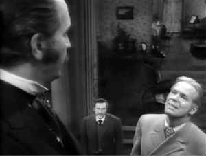
As in the earlier example, we get a cut. (Critics have often talked about single-shot scenes. What about studying two-shot scenes? I suggest we start with Mizoguchi.) Reed heads outside for another encounter, this time with a police official, who gets emphasized not through cutting but by letting his head block that of the morgue supervisor.
We pan with Reed as he goes to the corridor and the gathering group. More blocking and revealing: As Reed asks the cop about people who’ve been in contact with the corpse, he pivots and the composition frames the sniffling cop in the vanishing point.
Today a filmmaker might give us a big close-up of this poor guy, playing up his misery. But that would suggest that he’ll become an important story factor. He’s actually not in danger, so his minor status in the frame is completely appropriate.
For similar reasons, no need to cut in to Reed addressing the assemblage of men; none will prove significant. Instead, the action moves back to the foreground. First, Reed thanks the morgue attendant.
More important, and more virtuoso, is the way that the key dramatic elements in what follows are framed in a tight space between Paul and Reed in the foreground. First it’s the official in charge of cremation, then it’s the two skeptics.
Once more a shot ends in the closest framings so far. As a complaining civilian quarrels with Reed, both advance to the camera and Reed obliges him to take his medicine. The shot ends with the man wincing and lowering his head as the needle goes in; not such a tough guy after all.
Far from being simply of casual interest, these reluctant ne’er-do-wells anticipate the stubbornness and stupidity that Reed will encounter when he ventures into the city among the populace.
It seems to me that this sequence, with the flashbulbs and the curtain and the line-up for the vaccine, provides a self-assured command of craft that is as exuberant as anything in today’s flashy direction. If you can be flashy in a quiet way, this scene manages it.
This kind of staging can give cuts extra force. In the first scene, the cut to Warren ratcheted up the tension: Reed’s persuasion failed to win over Mefaris, so brute force is the next step. In the mortuary scene, the cut to the corridor as Reed passes through is more perfunctory, but it at least maintains the fluidity of the action.
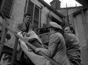
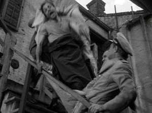
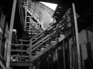
A more dramatic instance of saving your cut for maximum impact comes near the climax, when Poldi is carried down a precarious staircase and his crooked boss Blackie flings his body over the railing. The cut to the extreme long-shot shocks you with how far he must fall.
There is much else to admire in Panic in the Streets; it’s a fine instance of Joe MacDonald’s location cinematography as well. I use it as simply an example of how much classical cinema has to teach us. It’s a pity that our filmmakers have unlearned some of its lessons, but it’s not too late—especially for brave young filmmakers—to relearn them.
For an example of lateral, rather than depth-based, ensemble staging, see our most popular entry, “Watching you watch There Will Be Blood.” Use the category tableau staging to access entries on the principles I’ve mentioned. The whole subject is discussed in more detail in Chapter Six of On the History of Film Style and in Figures Traced in Light: On Cinematic Staging. It’s also treated in my video lectures How Motion Pictures Became the Movies and CinemaScope: The Modern Miracle You See without Glasses. The diagram of the visual pyramid is from Ben Brewster and Lea Jacobs, Theatre to Cinema: Stage Pictorialism and the Early Feature Film (Oxford University Press, 1997), 170.
Panic in the Streets.


