


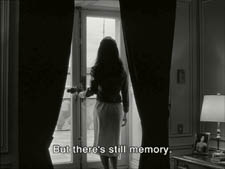
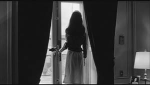
Archive for the 'Readers’ Favorite Entries' Category
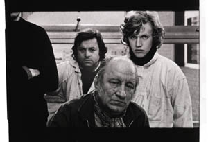
A behemoth from the Dead Zone
DB here:
The first quarter of the year is the biggest slump time for movie theatres. (1) Holiday fatigue, thin budgets, bad weather, the Super Bowl, and the distractions of the awards season depress admissions. If people go to the movies, they tend to catch up on Oscar nominees, and studios don’t want to release high-end films that might suffer from the competition. But screens need fresh product every week, so most of what gets released at this time of the year might charitably be called second-tier.
Ambitious filmmakers fight to keep out of this zone of death. You could argue that the January release slot of Idiocracy told Mike Judge exactly what Fox thought of that ripe exercise in misanthropy. Zodiac, one of the best films of 2007, opened on 1 March, and even ecstatic reviews couldn’t push it toward Oscar nominations. You can imagine what chances for success Columbia has assigned to Vantage Point (a 22 February bow). [But see my 4 Feb. PPPS below.]
Yet this is a flush period for those of us who like to explore low-budget genre pieces. I have to admit I enjoy checking on those quickie action fests and romantic comedies that float up early in the year. They’re today’s equivalent of the old studios’ program pictures, those routine releases that allowed theatres to change bills often. In their budgets, relative to blockbusters, today’s program pix are often the modern equivalent of the studios’ B films.
More important, these winter orphans are often more experimental, imaginative, and peculiar than the summer blockbusters. On low budgets, people take chances. Some examples, not all good but still intriguing, would be Wild Things (1998), Dark City (1998), Romeo Must Die (2000), Reindeer Games (2000), Monkeybone (2001), Equilibrium (2002), Spun (2003), Torque (2004), Butterfly Effect (2004), Constantine (2005), Running Scared (2006), Crank (2006), and Smokin’ Aces (2007). The mutant B can be found in other seasons too—one of my favorites in this vein, Cellular (2004), was released in September—but they’re abundant in the year’s early months.
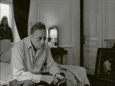
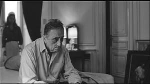
By all odds, Cloverfield ought to have been another low-end release. A monster movie with unknown players, running a spare 72 minutes sans credits, budgeted at a reputed $25 million, it’s a paradigm of the winter throwaway. Except that it pulled in $46 million over a four-day weekend and became the highest-grossing film (in unadjusted dollars) ever to be released in January. Here the B in “B-movie” stands for Blockbuster.
I enjoyed Cloverfield. It starts with a sharp premise, but as ever, execution is everything. I see it as a nifty digital update of some classic Hollywood conventions. Needless to say, many spoilers loom ahead.
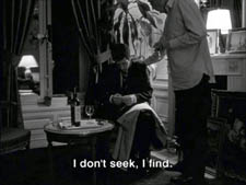
If you find this tape, you probably know more about this than I do
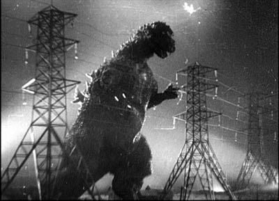
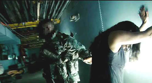
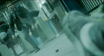
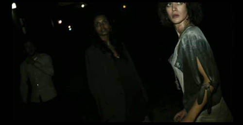
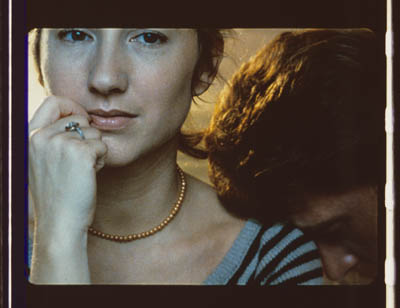
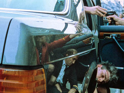
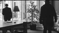
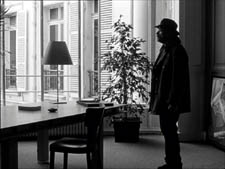
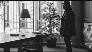
Everybody knows by now that Cloverfield is essentially Godzilla Meets Handicam. A covey of twentysomethings are partying when a monster attacks Manhattan, and they try to escape. One, Rob, gets a phone call from his off-again lover Beth, who’s trapped in a high-rise. He vows to rescue her. He brings along some friends, one of whom documents their search with a video camera. It’s a shooting-gallery plot. One by one, the characters are eliminated until we’re down to two, and then. . . .
Cloverfield exemplifies what narrative theorists call restricted narration. (Kristin and I discuss this in Chapter 3 of Film Art.) In the narrowest case of restricted narration, the film confines the audience’s range of knowledge to what one character knows. Alternatively, as when the characters are clustered in the same space, we’re restricted to what they collectively know. In other words, you deny the viewer a wider-ranging body of story information. By contrast, the usual Godzilla installment is presented from an omniscient perspective, skipping among scenes of scientists, journalists, government officials, Godzilla’s free-range ramblings, and other lines of action. Instead, Cloverfield imagines what Godzilla’s attack would look and feel like on the ground, as observed by one group of victims.
Horror and science fiction films have used both unrestricted and restricted narration. A film like Cat People (1942) crosscuts what happens to Irena (the putative monster) with scenes involving other characters. Jurassic Park and The Host likewise trace out several plot strands among a variety of characters. The advantage of giving the audience so much information is that it can feel apprehension and suspense about what the characters don’t know is happening. Our superior knowledge can make us worry about those poor victims oblivious to their fate.
But these genres have relied on restricted narration as well. Invasion of the Body Snatchers (1956) is a good example; we are at Miles’s side in almost every scene, learning of the gradual takeover of his town as he does. Night of the Living Dead (1968), Signs (2002), and War of the Worlds (2005) do much the same with a confined group, attaching us to one or the other momentarily but never straying from their situation.
The advantages of restricted narration are pretty apparent. You can build up uncertainty and suspense if we know no more than the character(s) being attacked by a monster. You can also delay full revelation of the creature, a big deal in these genres, by giving us only the glimpses of it that our characters get. Arguably as well, by focusing on the characters’ responses to their peril, you have a chance to build audience involvement. We can feel empathy and loss if we’ve come to know the people more intimately than we know the anonymous hordes stomped by Godzilla. Finally, if you need to give more wide-ranging information about what’s happening outside the characters’ immediate situation, you can always have them encounter newspaper reports, radio bulletins, and TV coverage of action occurring elsewhere.
People sometimes think that theoretical distinctions like this overintellectualize things. Do filmmakers really think along these lines? Yes. Matt Reeves, the director of Cloverfield, remarks:
The point of view was so restricted, it felt really fresh. It was one of the things that attracted me [to this project]. You are with this group of people and then this event happens and they do their best to understand it and survive it, and that’s all they know.
For your eyes only
Restricted narration doesn’t demand optical point-of-view shots. There aren’t that many in Invasion of the Body Snatchers or the other examples I’ve indicated. Still, for quite a while and across a range of genres, filmmakers have imagined entire films recording a character’s optical/ auditory experience directly, in “first-person,” so to speak.
Again, it’s useful to recognize two variants of this narrational strategy. One we can call immediate—experiencing the action as if we stood in the character’s shoes. In the late 1920s, the great documentary filmmaker Joris Ivens tried to make what he called his I-film, which would record exactly what a character saw when riding a bike, drinking a glass of beer, and the like. He was dismayed to find that bouncing and swiveling the camera as if it were a human eye ignored the fact that in real life, our perceptual systems correct for the instabilities of sensation. Ivens abandoned the project, but evidently he couldn’t get the notion out of his head; he called his autobiography The Camera and I. (2)
Hollywood’s most strict and most notorious example of directly subjective narration is Robert Montgomery’s Lady in the Lake (1947). Its strangeness reminds us of some inherent challenges in this approach. How do you show the viewer what your protagonist looks like? (Have him pass in front of mirrors.) How do you skip over the boring bits? (Have your hero knocked unconscious from time to time.) How do you hide the inevitable cuts? (Try your best.) Even Montgomery had to treat the subjective sequences as long flashbacks, sandwiched within scenes of the hero in his office in the present telling us what he did next.
Because of these problems, a sustained first-person immediate narration is pretty rare. The best compromise, exploited by Hitchcock in many pictures and especially in Rear Window (1954), is to confine us to a single character’s experience by alternating “objective” shots of the character’s action with optical point-of-view shots of what s/he sees.
What I’m calling immediate optical point of view is just that: sight (and sounds) picked up directly, without a recording mechanism between the story action and the character’s experience. But we can also have mediated first-person point of view. The character uses a recording technology to give us the story events.
In a brilliant essay on the documentary Kon-Tiki (1950), André Bazin shows that our knowledge of how Thor Heyerdahl filmed his raft voyage lends an unparalleled authenticity to the action. Heyerdahl and his crew weren’t experienced photographers and seem to have taken along the 16mm camera as an afterthought, but the very amateurishness of the enterprise guaranteed its realism. Its imperfections, often the result of hazardous conditions, were themselves testimony to the adventure. When the men had to fight storms, they had no time to film; so Bazin is able to argue, with his inimitable sense of paradox, that the absence of footage during the storm is further proof of the event. If we were given such footage, we might wonder if it was staged afterward.
How much more moving is this flotsam, snatched from the tempest, than would have been the faultless and complete report offered by an organized film. . . . The missing documents are the negative imprints of the expedition. (3)
What about fictional events? In the 1960s we started to see fiction films that presented themselves as recordings of the events as the camera operator experienced them. One early example is Stanton Kaye’s Georg (1964). The first shot follows some infantrymen into battle, but then the framing wobbles and the camera falls to earth. We see a tipped angle on a fallen solider and another infantryman approaches.

He bends toward us; the frame starts to wobble and we are lifted up. On the soundtrack we hear, “I found my camera then.”
The emergence of portable equipment and cinema-verite documentary seems to have pushed filmmakers to pursue this narrational mode in fiction. One result was the pseudo-documentary, which usually doesn’t present the story as a single person’s experience but rather as a compilation of first-person observations. Peter Watkins’ The War Game (1967) presents itself as a documentary shot during a nuclear war, and it contains many of the visual devices that would come to be associated with the mediated format—not only the flailing camera but the face-on interview and the chaotic presentation of violent action. There’s also the pseudo-memoir film, pioneered in David Holzman’s Diary (1967). Later examples of the pseudo-documentary are Norman Mailer’s Maidstone (1971) and the combat movie 84 Charlie MoPic (1989). (4)
As lightweight 16mm cameras made filming easier, directors adapted that look and feel to fictional storytelling. The arrival of ultra-portable digital cameras and cellphones has launched a similar cycle. Brian DePalma’s Redacted (2007), yet another war film, has exploited the technology for docudrama. A digital equivalent of David Holzman’s Diary, apart from Webcam and YouTube material, is Christoffer Boe’s Offscreen (2006), which I discussed here.
Interestingly, Orson Welles pioneered both the immediate and the mediated subjective formats. One of his earliest projects for RKO was an adaptation of Heart of Darkness, in which the camera was to represent the narrator Marlowe’s optical perspective throughout. (5) Welles had more success with the mediated alternative, though in audio form. His “War of the Worlds” radio broadcast mimicked the flow of programming and interrupted it with reports of the aliens’ attack. The device was updated for television in the 1983 drama Special Bulletin.
Sticking to the rules
Cloverfield, then, draws on a tradition of using technologically mediated point-of-view to restrict our knowledge. Like The Blair Witch Project (1999), it does this with a horror tale. But it’s also a Hollywood movie, and it follows the norms of that moviemaking mode. So the task of Reeves, producer J. J. Abrams, and the other creators is to fit the premise of video recording to the demands of classical narrative structure and narration. How is this done?
First, exposition. The film is framed as a government SD video card (watermarked DO NOT DUPLICATE), the remains of a tape recovered from an area “formerly known as Central Park.” This is a modern version of the discovered-manuscript convention familiar from the nineteenth-century novel. When the tape starts, showing Rob with Beth in happy times, its read-out date of April plays the role of an omniscient opening title. In the course of the film, the read-outs (which come and go at strategic moments) will tell us when we’re in the earlier phase of their love affair and when we’re seeing the traumatic events of May.
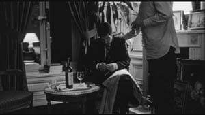
Likewise, the need for exposition about characters and relationships at the start of the film is given through a basic premise. Jason wants to record Rob’s going-away-party and he presses Rob’s friend Hud into service as the cameraman. Off the bat, Hud picks out our main characters in video portraits addressed to Rob. What follows indicates that Hud will be amazingly prescient: His camera dwells on the characters who will be important in the ensuing action.
Next, overall structure. The Cloverfield tape conforms to the overarching principles that Kristin outlines in Storytelling in the New Hollywood and that I restated in The Way Hollywood Tells It. (Another example can be found here.) A 72-minute film won’t have four large-scale parts, most likely two or three. As a first approximation, I think that Cloverfield breaks into:
*A setup lasting about 30 minutes. We are introduced to all the characters before the monster attacks. Our protagonists flee to the bridge, where Jason dies. Near the end of this portion, Rob gets a call from Beth, and he formulates the dual goals of the film: to escape from the creature, and to rescue Beth. Along the way, Hud declares he’s going to record it all: “People are gonna know how it all went down. . . . It’s gonna be important.”
*A development section lasting about 22 minutes. This is principally a series of delays. Rob, Hud, Lily, and Marlena encounter obstacles. Marlena falls by the wayside. They are given a deadline: At 0600 they must meet the last helicopters leaving Manhattan.
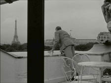
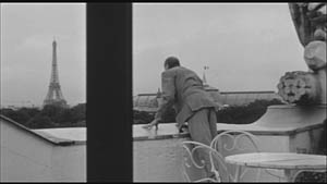
*A climax lasting about 20 minutes. The group rescues Beth and meets the choppers, but the one carrying Rob, Hud, and Beth falls afoul of the beast. They crash in Central Park, and Hud is killed, his camera recording his death at the jaws of the monster. Huddled under a bridge, Rob and Beth record a final video testimonial before an explosion cuts them off.
*An epilogue of one shot lasting less than a minute: Rob and Beth in happier times on the Ferris wheel at Coney Island—a shot left over from the earlier use of the tape in April.
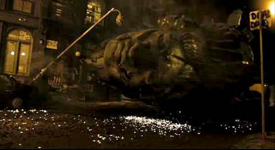
Next, local structure and texture. It takes a lot of artifice to make something look this artless. The imagery is rich and vivid, the sharpest home video you ever saw. The sound is pure shock-and-awe, bone-rattling, with a full surround ambience one never finds on a handicam. (6) Moreover, Hud is remarkably lucky in catching the turning points of the action. All the characters’ intimate dramas are captured, and Hud happens to be on hand when the head of Miss Liberty hurtles down the street.
Bazin points out that in fictional films the ellipses are cunning gaps, carefully designed to fulfill narrative ends—not portions left out because of the physical conditions of the shoot. Here the cunning gaps are justified as constrained by the physical circumstances of filming. When Hud doesn’t show something, it’s usually because it’s what the genre considers too gross, so the worst stretches take place in darkness, or offscreen, or strategically shielded by a prop when the camera is set down.
Mostly, though, Hud just shows us the interesting stuff. He turns on the camera just before something big happens, or he captures a disquieting image like that of the empty Central Park carriage.
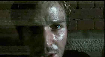
At least once, the semi-documentary premise does yield something evocative of the Kon-Tiki film. Hud has to leap from one building to another, many stories above the street. He turns the camera on himself: “If this is the last thing you see, then I died.” He hops across, still running the camera, but when a rocket goes off nearby, a sudden cut registers his flinch. For an instant out of sheer reflex, he turned off the camera.
Overall, Hud’s tape respects the flow of classical film style. Unlike the Lady in the Lake approach, the mediated POV format doesn’t have a problem with cuts; any jump or gap is explained as a moment when the operator switched off the camera. Most of Hud’s “in-camera” cuts are conventional ones, skipping over a few inconsequential stretches of time. There are as well plenty of hooks between scenes. (For more on hooks, go here.) Hud says: “I’ll walk in the tunnels.” Cut to characters walking in the tunnels. More interestingly, visible cuts are rare, which again respects the purported conditions of filming. Cloverfield has much longer takes than any recent Hollywood film I know. I counted only about 180 shots, yielding an average of 24 seconds per shot (in a genre in which today’s films average 2-5 seconds per shot).
The digital palimpsest
We could find plenty of other ways in which Cloverfield adapts the handicam premise to the Hollywood storytelling idiom. There are the product placements that just happen to be part of these dim yuppies’ milieu. There are the character types, notably the sultry Marlena and the hero’s weak friend who’s comically a little slow. There’s the developing motif of the to-camera addresses, with Rob and Beth’s final monologues to the camera counterbalancing the party testimonials in the opening. There’s the final romantice exchange: “I love you.” “I love you.” The very last shot even includes a detail that invites us to re-view the entire movie, at the theatre or on DVD. But let me close by noting how some specific features of digital video hardware get used imaginatively.
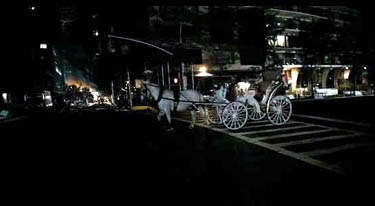
I’ve already mentioned how the viewfinder date readout allows us to keep the time structure clear. There’s also the use of a night-vision camera feature to light up those spidery parasites shucked off by the big guy. Which scares you more—to glimpse the pinpoint eyes of critters skittering around you in the dark, or to see them up close in a sickly green light?
More teasing is the fact, set up in the first part, that this video is being recorded over an old tape of Rob’s. That’s what turns the opening sequence of Rob and Beth in May into a prologue: the tape wasn’t rewound completely for recording the party. Later, at intervals, fragments of that April footage reappear, apparently through Hud’s inadvertently advancing the tape. The snippets functions as flashbacks, showing Rob and Beth going to Coney Island and juxtaposing their enjoyable day with this horrendous night.
Cleverly, on the tape that’s recording the May disaster something always prepares the audience for the shift. For instance, when Jason hands the camera over, we hear Hud say, “I don’t even know how to work this thing.” Cut to an April shot of Beth on the subway, suggesting that he’s advanced fast forward without shooting. Likewise, when Rob says, “I had a tape in there,” we cut to another April shot of Beth. As a final fillip, the footage taken in May halts before the tape ends, so we get the epilogue showing Rob and Beth on the Ferris wheel in April, emerging like figures in a palimpsest.
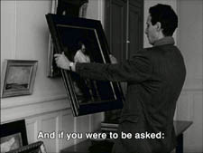
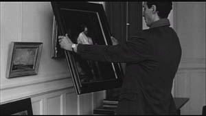
No less clever, but also a little poignant, is the use of the fallen-camera convention. It appears once when Beth has to be extricated from her bed. Hud sets the camera down by a concrete block in her bedroom, which conceals her agony. More striking is the shot when the camera, dropped from Hud’s hand, lies in the grass, and the autofocus device oscillates endlessly, straining to hold on his lifeless face.
In sum, the filmmakers have found imaginative ways of fulfilling traditional purposes. They show that the look and feel of digital video can refresh genre conventions and storytelling norms. So why not for the sequel show the behemoth’s attack from still other characters’ perspectives? This would mobilize the current conventions of the narrative replay and the companion film (e.g., Eastwood’s Iwo Jima diptych). Reeves says:
The fun of this movie was that it might not have been the only movie being made that night, there might be another movie! In today’s day and age of people filming their lives on their iPhones and Handycams, uploading it to YouTube. . . .
So the Dead Zone of January through March yields another hopeful monster. What about next month’s Vantage Point? The tagline is: 8 Strangers. 8 Points of View. 1 Truth. Hmmm. . . . Combining the network narrative with Rashomon and a presidential assassination. . . . Bet you video recording is involved . . . . See you there?
PS: At my local multiplex, you’re greeted by a sign: WARNING: CLOVERFIELD MAY INDUCE MOTION SICKNESS. I thought this was just the theatre covering itself, but I’ve learned that no recent movie, not even The Bourne Ultimatum, has had more viewers going giddy and losing their lunch. You can read about the phenomenon here, and Dr. Gupta weighs in here. My gorge can rise when a train jolts, but I had no problems with two viewings of Cloverfield, both from third row center.
Anyhow, it will be perfectly easy to watch on your cellphone. But we should expect to see at least one pirate version shot in a theatre by someone who’s fighting back the Technicolor yawn, giving us more Queasicam than we bargained for.
(1) The only period that rivals this slow winter stretch is mid-August to October, when genre fare gets pushed out to pick up on late summer business. [Added 26 January:] There are, I should add, two desirable weekends in the first quarter, those around Martin Luther King’s birthday and Presidents’ Day. Studios typically aim their highest-profile winter releases (e.g., Black Hawk Down, 2001) for those weekends.
(2) Joris Ivens, The Camera and I (New York: International Publishers, 1969), 42.
(3) André Bazin, “Cinema and Exploration,” What Is Cinema? Vol. 1, trans. and ed. Hugh Gray (Berkeley: University of California Press, 1967), 162.
(4) Not all pseudodocumentaries present themselves as records of a person’s observation. Milton Moses Ginsberg’s Coming Apart (1969) presents itself as an objective record, by a hidden camera, of a psychiatrist’s dealings with his patients. Like a surveillance camera, it doesn’t purport to embody anybody’s point of view.
(5) Jonathan Rosenbaum, Discovering Orson Welles (Berkeley: University of California Press, 2007), 28-48.
(6) For Kevin Martin’s informative account of the film’s polished lighting and high-definition video capture, go here (and scroll down a bit). For discussions of contemporary sound practices in this genre, see William Whittington’s Sound Design in Science Fiction (Austin: University of Texas Press, 2007).
PS: Thanks to Corey Creekmur for correcting two slips in my initial post!
PPS 28 January: Lots of Internet buzz about the film since I wrote this. Thanks to everyone who linked to this post, and special thanks for feedback from John Damer and James Fiumara.
Some people have asked me to comment on the social and cultural implications of Cloverfield’s references to 9/11. At this point I think that genre cinema has dealt more honestly and vividly with the traumas and questioning around this horrendous event than the more portentous serious dramas like United 93, World Trade Center, and the TV show The Road to 9/11.
The two most intriguing post-9/11 films I know are by Spielberg. The War of the Worlds gives a really concrete sense of what a hysterical America under attack might be like, warts and all. (It reminded me of a TV show I saw as a kid, Alas, Babylon (1960), a surprisingly brutal account of nuclear-war panic in suburbia.) Spielberg’s underrated The Terminal reminds us, despite its Frank Capra optimism, that the new Security State is run by bureaucrats with fixed agendas and staffed by overworked people of color, some themselves exiles and immigrants.
I think that Cloverfield adds its own dynamic sense of how easily the entitlement culture of upwardly mobile twentysomethings can be shattered. Genre films carry well-established patterns and triggers for feelings, and a shrewd filmmaker can channel them for comment on current events—as we see in the changing face of Westerns and war films in earlier phases of Hollywood history.
On this point, Cinebeats offers some shrewd responses to criticisms of Cloverfield here.
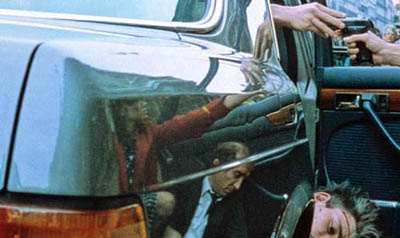
 Finally: In the new Creative Screenwriting an informative piece (not available online) indicates that the initial logline for Vantage Point on imdb is misleading. Screenwriter Barry Levy planned to present the assassination from seven points of view, but reduced that to six. As for my speculation that video recording/replay would be involved, a production still seems to offer some evidence. Shall we call it the Cloverfield effect? The same issue of CS has a brief piece on the script for Cloverfield.
PPS 30 January: Shan Ding brings me another story about the making of Cloverfield, and Reeves is already in talks for a sequel, says Variety.
PPPS 4 February: A recent story in The Hollywood Reporter offers a nuanced account of how Hollywood is rethinking its first-quarter strategies. Across the last 4-5 years, a few big releases have done fairly well between January and April; a high-end film looks bigger when there is less competition. The author, Steven Zeitchik, suggests that the heavy packing of the May-August period and the need for a strong first weekend are among the factors that will encourage executives to spread releases through the less-trafficked months. I hope, though, that tonier fare won’t crowd out the more edgy, low-end genre pieces that bring me in.
PPPPS 8 February: How often has a wounded Statue of Liberty featured in the apocalyptic scenarios of comics and the movies? Lots, it turns out. Gerry Canavan explains here.
Happy birthday, classical cinema!, or The ten best films of … 1917
Wild and Woolly (1917).
KT:
Periodization is a tricky task for historians, and there are a lot of disputes about how to divide up the 110-plus years of the cinema’s existence. We all have to deal with it, though, if we want to organize our studies of the past into meaningful units. How to do that?
Do we divide the periods of film history according to major historical events? World War I had a huge impact on the film industry, to be sure, and we might say that one significant period for cinema is 1914-1918. Yet 1919 didn’t mark the start of a new period. The major European post-war film movements didn’t start then. French Impressionism arguably began in 1918, German Expressionism in 1920, and Soviet Montage in 1924 or 1925.
Carving up film history partly depends on what questions the historian is asking. If you’re studying wartime propaganda, 1914 and 1918 would provide significant beginning and end points. If you want to trace the development of significant film styles, it doesn’t seem very useful.
While historians have difficulties agreeing on periodization, just about everyone concurs that there were two amazing years during the 1910s when filmmaking practice somehow coalesced and produced a burst of creativity: 1913 and 1917.
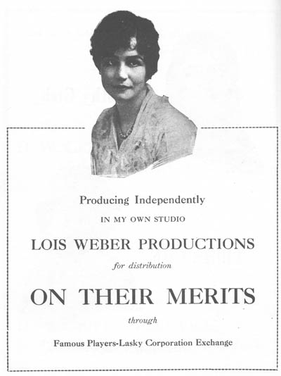
One can point to stylistically significant films made before 1913. Somehow, though, that year seemed to be when filmmakers in several countries simultaneously seized upon what they had already learned of technique and pushed their knowledge to higher levels of expressivity. “Le Gionate del Cinema Muto” (“The Days of Silent Cinema”), the major annual festival, devoted its 1993 event to “The Year 1913.” The program included The Student of Prague (Stellan Rye), Suspense (Phillips Smalley and Lois Weber), Atlantis (August Blom), Raja Harischandra (D. G. Phalke), Juve contre Fantomas (Louis Feuillade), Quo Vadis? (Enrico Guazzoni), Ingeborg Holm (Victor Sjöström), The Mothering Heart (D. W. Griffith), Ma l’amor mio non muore! (Mario Caserini), L’enfant de Paris (Léonce Perret), and Twilight of a Woman’s Soul (Yevgenii Bauer). .
1917, by contrast, was primarily an American landmark. As 2007 closes, we thought it appropriate to wish happy birthday to the most powerful and pervasive approach to filmic storytelling the world has yet seen. That would be classical continuity cinema, synthesized in what was coming to be known as Hollywood.
DB:
In The Classical Hollywood Cinema and work we’ve done since, we’ve maintained that 1917 is the year in which we can see the consolidation of Hollywood’s characteristic approach to visual storytelling. This idea was first floated by Barry Salt, and our research confirms his claim. Over the ninety years since 1917 the style has changed, but its basic premises have remained in force.
Before classical continuity emerged, the dominant approach to shooting a scene might be called the tableau technique. Action was played out in a full shot, using staging to vary the composition and express dramatic relationships. Elsewhere on this site I’ve mentioned two major exponents of this approach, Feuillade and Bauer.
When there was cutting within the tableau setup, it usually consisted of inserted close-ups of important details, especially printed matter, like a letter or telegram. Occasionally the close-up of an actor could be inserted, usually filmed from the same angle as the master shot. The tableau approach was more prominent in scenes taking place in interiors; filmmakers were freer about cutting action occurring outdoors.
We shouldn’t think of the tableau as purely “theatrical.” For one thing, the master shot was typically closer and more tightly organized than a scene on the stage would be. Moreover, for reasons I discuss in Figures Traced in Light, the playing space of the cinematic frame is quite different from the playing area of the proscenium theatre. The filmmaker can manipulate composition, depth, and blocking in ways not available on the stage.
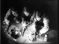
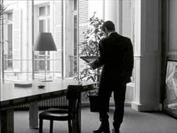
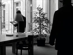
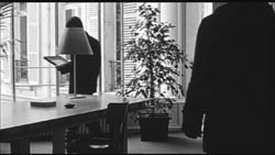
The tableau approach was the default premise of US filmmaking through the early 1910s. You can see it at work, for example, in this shot from At the Eleventh Hour (W. V. Ranous, 1912). Mr. and Mrs. Richards are in the study of Mr. Daley. After Richards has refused to sell his railroad bonds, Daley’s wife shows off her diamond necklace to the visitors.
At first the two couples are separated in depth, the men in the foreground and the women further back. In the first frame below, a new necklace has just been delivered, and a servant gives it to Mrs. Daley. Only the servant’s hand is visible, as she is blocked by Richards in the foreground. In the second frame, the two women come forward. Mrs. Daley holds the necklace up and Mrs. Richards oohs and ahhs over it, while her husband glances at Daley as if to wonder how he could afford it.
Instead of breaking the scene into closer views, spreading the characters’ reactions across separate shots, Ranous squeezes all of their actions and expressions into a tight space across the center of the shot. Nor does he provide a close-up of the necklace, which will be important in the plot. (1) We might be inclined to say that this is a “theatrical” shot, but on a stage the actions in depth (the women chatting, the servant handing over the parcel) wouldn’t be visible to everyone in the auditorium. Likewise, on a stage the packed faces in the later phase of the scene wouldn’t be visible to people sitting on the sides.
As films became longer, American filmmakers were starting to organize their plots around characters with firm goals. Conflicting goals would set the characters in opposition to one another, and at a climax, usually under the pressure of a deadline, the protagonist achieves or fails to achieve the goals. The plot also tends to build up two lines of action, at least one involving romance.
There’s no reason this conception of narrative could not have been applied to the tableau style; in many cases it was. But hand in hand with the rise of goal-driven plotting came a new approach to filming. Sporadically before 1917, filmmakers in many countries were exploring ways to build scene out of many shots. (If you want to know the process in the US in more detail, check out Early American Cinema in Transition by Charlie Keil.) By 1917, American filmmakers had synthesized these tactics into an overall strategy, a system for staging, shooting, and cutting dramatic action.
We know the result as the 180-degree system. This encourages the filmmaker to break a scene into several shots, taken from different distances and angles, all from one side of an imaginary line slicing through the space. Around 1917, this stylistic approach comes to dominate US feature films, in the sense that every film made will tend to display all the devices at least once. The system remains in place to this day, and it came to form the basis of popular cinemas across the world. (2)
Once you break a scene into several shots, some characters won’t be onscreen all the time. So you need to be clear about where offscreen characters are; you need to supply cues that allow the audience to infer their positions. So 1910s filmmakers developed various ways of “matching” shots.
Shots can be connected by character looks, thanks to the eyeline match. Here’s an instance from Victor Schertzinger’s The Clodhopper (1917). First there is a master shot of the mother and son in their farm kitchen.
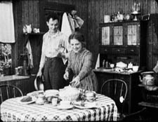
This is followed by a separate shot of each one. Their bodily positions and eyelines remind us that the other is just out of frame.
Although over-the-shoulder shooting hadn’t yet been developed, a conception of the reverse angle is at work here too. Schertzinger’s camera doesn’t shoot the actors perpendicularly, but takes up an angle on one that becomes an echo of that filming the other. Here’s another example of reverse angles from The Devil’s Bait (1917, director Harry Harvey).
The camera doesn’t just enlarge a portion of the space, as in the inserted shot in a tableau scene. The angle of view has changed significantly.
Changes of angle within the scene have become fairly complex by 1917. This strategy is apparent when the action takes place in a theatre, a courtroom, a church, or some other large-scale gathering point. The camera position changes often in this scene from The Girl without a Soul (director John Collins).
The concept of matching extends to physical movement too, through the match on action. This device allows the director to highlight a new bit of space while preserving the continuity of time. In Roscoe Arbuckle’s The Butcher Boy, the cut-in to Fatty (with a change of angle) also matches his gesture of putting his hands on his hips.
Interestingly, even this early, directors have learned to leave a little bit of overlapping action across the cut. If you move frame by frame, you’ll see that Fatty’s gesture is repeated a bit at the start of the second shot.
When a character leaves one frame, he or she can come into another space, from the side of the frame consistent with the 180-degree premise. This is matching screen direction. A cut of this sort lets us know that the next portion of the locale that we see is more or less adjacent to the previous one. In Field of Honor (director Allen Holuban), Wade crosses to Laura, who’s waiting in a carriage. A few years earlier, the director might have presented his greeting in a single deep-space long shot. Instead, Wade exits one shot and enters the next.
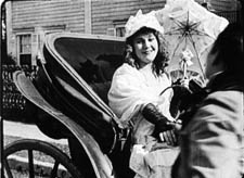
Again, the reverse-angle principle governs the camera setups. Wade moves along a diagonal toward the camera and away from it.
More generally, Field of Honor exhibits a polished handling of the new style: lots of reverse shots and eyeline matches, fades that bracket flashbacks, binocular points of view, rack-focus shots, and rapid cutting (there’s even a ten-frame shot). The point is not to claim Field of Honor as an undiscovered masterpiece but rather to indicate that by 1917 a director could handle all the devices with assurance.
Match-cutting devices had been used occasionally before 1917, but by that year filmmmakers melded them into a consistent and somewhat redundant method of guiding the audience through each scene.
The continuity system not only creates a basic clarity about characters’ positions. It can as well generate a speed and accentuation not easily achieved within a single shot. For example, Wade’s frame exit and entrance above is cut so as to skip over moments that he consumes crossing the driveway. Continuity editing enhances the rapid pace of US films, a quality immediately noted by foreign observers in the 1910s and 1920s.
Two of the best films of 1917 exploit the dynamism of continuity cutting. The Doug Fairbanks comedy western, Wild and Woolly, seems designed to prove that American films could proceed at breakneck speed. In climactic scenes, we’re caught in a whirlwind of fast cutting, with the pace set by the hyperactive protagonist, a financier’s son who longs to prove himself as a cowboy.
John Ford’s Straight Shooting proceeds at a more measured pace, but in its final shootout we see a prototype of all the main-street gundowns that will define the Western. Ford provides alternating shots of the cowboys advancing toward each other, framing each man more tightly and concluding with suffocating close-ups of each man’s face, highlighting the eyes.
Sergio Leone, eat your heart out.
Propelled by goal-driven characters and a linear arc of action, films like Wild and Woolly and Straight Shooting are completely understandable and enjoyable today. (But when will we have them on DVD?) Their stories are engrossing and their performances are engaging, but just as important their storytelling technique has become second nature to us. The narrative strategies that coalesced in 1917 remain fundamental to mainstream cinema.(2)
The Mystery of the Belgian Print
KT:
For decades now we have been visiting Brussels and working at the Cinémathèque Royale de Belgique/Koninklijk Belgisch Filmarchief. Sometimes I feel that we would know half as much about the cinema were it not for the unfailing hospitality we have been shown, initially by the great archivist Jacques Ledoux and now by his successor Gabrielle Claes. Our indebtedness to this institution and its staff are reflected in David’s named professorship; he is the Jacques Ledoux Professor of Film Studies. We dedicated our Film History: An Introduction, to Gabrielle.
We do whatever favors we can in return for such wonderful help. David lectures regularly at the biannual summer school run by the Flemish Service for Film Culture in partnership with the Royal Film Archive. (David wrote about the 2007 event in an earlier entry.) I try to identify silent films. I am not always successful, but I suppose over the years I have been able to put names to thirty-some mystery prints.
Silent films are more likely to be unidentified than sound ones because it was standard practice to splice in intertitles in the local language. Sometimes too the film’s title was changed. The film’s actors may be forgotten today, or the print may be incomplete, lacking the opening title and credits. Sometimes even the country of origin is unknown.
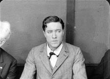
Back in the early 1990s I was asked to identify a five-reel nitrate print with the title Père et fils. It was an original distribution copy from the silent era. The information on the archival record card listed some possible identifications: Father and Son, a 1913 Vitagraph film or Father and Son, produced by Mica in 1915. It was tentatively thought to be American.
As I watched the film, it quickly became apparent that it was indeed American. It centered on the rivalry between a small dime store owned by the heroine’s father and a modern dime store being built in the same town. The hero is charged with the mission of driving the older store out of business.
So we had our typical goal-driven plot. The style was what David has described as typical of 1917, so that was my tentative dating. I felt almost certain that the reels I was watching were not from a 1913 or 1915 movie. The film was a fairly modest item, done on a relatively low budget and not starring any actors that would be familiar to most modern viewers. I had seen the actor playing the hero before, however, and I thought he might be Herbert Rawlinson. By the time I finished the film, those were my clues: a medium-budget American film of c. 1917 concerning dime stores and perhaps starring Rawlinson.
My task turned out to be fairly simple. A little research after we returned home confirmed the Rawlinson guess. In preparing the write The Classical Hollywood Cinema, I had seen him in The Coming of Columbus (a 1912 Selig film) and in Damon and Pythias (Universal, 1914).
My next step was to consult the monumental, indispensible reference book, The American Film Institute Catalog. This multi-volume set, many years in the making, was originally published as books. It is now online, but available only to AFI members or through libraries. The catalogues were published by decade—thus obviating the problem of periodization. Each decade gets two volumes, one of entries on all the films, listed in alphabetical order. Credits, production companies, release dates, plot synopses, and other information are included. A second volume indexes the films by chronology, personal names, corporate names, subject, genre, and geography (i.e., where the films were shot).
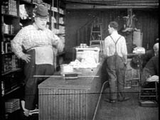
Until now I had found little use for the subject index, but now it came to my aid. I turned to the Ds to see if there was an entry for dime stores. The AFI indexers were thorough, and sure enough, there was one entry: Like Wildfire. A check of the personal names index under Rawlinson, Herbert revealed that he had acted in a film called Like Wildfire, made in 1917 by Universal. Once I had the title, I checked its catalog entry and found that its plot description matched the film I had seen. Case closed.
Admittedly, in this instance the date wasn’t a crucial clue. Still, determining a film’s year of release can narrow down the possibilities. Thanks as well to the development of classical cutting, a close view of an actor helps in identifying him.

The Best of 1917
DB:
This is the season when everybody makes a list of best pictures. We have stopped playing that game. For one thing, we haven’t seen all the films that deserve to be included. For another, the excellence of a film often dawns gradually, after you’ve had years to reflect on it. And critical tastes are as shifting as the sirocco. Never forget that in 1965 the Cannes palme d’or was won by The Knack . . . and How to Get It.
Still, enough time has elapsed to make us feel confident of this, our list of the best (surviving) films of 1917, both US and “foreign-language.” Titles are in alphabetical order.
The Clown (Denmark, A. W. Sandberg)
Easy Street (U.S., Charles Chaplin)
The Girl from Stormycroft (Sweden, Victor Sjöström)
The Immigrant (U.S., Charles Chaplin)
Judex (France, Louis Feuillade)
The Mysterious Night of the 25th (Sweden, Georg af Klercker)
The Narrow Trail (U.S., Lambert Hillyer)
The Revolutionary (Russia, Yevgenii Bauer)
Romance of the Redwoods (U.S., Cecil B. De Mille)
Terje Vigen (Sweden, Victor Sjöström)
Straight Shooting (US, John Ford)
Thomas Graal’s Best Film (Sweden, Mauritz Stiller)
Wild and Woolly (US, John Emerson)
Next year, maybe we’ll draw up our list for 1918.
(1) For more on this scene and the film as a whole, see Kristin Thompson, “Narration Early in the Transition to Classical Filmmaking: Three Vitagraph Shorts,” Film History 9, 4 (1997), 410-434.
(2) Beyond The Classical Hollywood Cinema, see Kristin’s Herr Lubitsch Goes to Hollywood and Storytelling in the New Hollywood. I’ve talked about these issues in On the History of Film Style, Planet Hong Kong, Figures Traced in Light, The Way Hollywood Tells It, and essays included in Poetics of Cinema. The basics of classical continuity are presented in Chapter 6 of Film Art: An Introduction, and we trace some historical implications of it in Film History: An Introduction.
Godard comes in many shapes and sizes
DB here:
James Quandt started it.
The indefatigable Senior Programmer of the Cinémathèque Ontario emailed me in early 2004 to ask if I had any thoughts on the aspect ratios of Godard films. He attached an essay which eventually appeared in the gorgeous anthology, For Ever Godard. Reading a Quandt essay is like eating a ripe nectarine, tangy and nourishing. So you should find the original and indulge yourself. (1)
You might be asking what the term aspect ratio means. It refers to the ratio of the width to the height of the film image. The image was fairly square in the early silent era, then became roughly standardized at 4 x 3, or as the pros say, 1.33:1. Sound filming made the format a tad more horizontal, at 1.37. Anamorphic widescreen (CinemaScope and its brethren) was more or less standardized at 2.35 (more recently 2.40). Various non-anamorphic, or “flat” aspect ratios have appeared since the early 1950s. The US has favored 1.85, Europe has been known to use the squarer 1.66, and some films, like E. T., are designed for 1.75. Widescreen TVs are set at 16:9, or about 1.78:1, so that’s likely to be a common proportion in the future. We discuss aspect ratios at more length in Film Art: An Introduction (pp. 183-185 in the newest edition).
Filmies care about aspect ratios because shot composition matters. Sometimes the print is “hard-matted,” with the correct proportions given as black bars at the top and bottom of the frame, like video letterboxing. Here’s an example, from a 16mm print of Godard’s 1972 Tout va bien. It is hard-matted to 1.66. (The original film is in color.)
If the image isn’t hard-matted, the projectionist must insert an aperture plate that will mask the image properly. But what plate? Should she set it for 1.37? That’s a very rare option nowadays, and many theatres aren’t really designed to show it. Typically, if the print doesn’t indicate, the US projectionist will fall back on 1.85. Nowadays, if a Hollywood film isn’t in Scope, the projectionist is expected to use that ratio. Some shots will be problematic if the projectionist includes more than the 1.85 format allows. Here’s a full-frame film strip from The Hudsucker Proxy, where you can see that a chunk of the set is blocked or missing in the bottom area, and a microphone peeks into the frame from the top. (2)
Like many other movies, the films made by Godard since the mid-1970s show up at the projection booth without hard matteing. So at what ratio do we show them?
A great many careful viewers have voiced their views on the Internets, and I’ve learned a lot from the discussions here and here. In part this blog entry is an effort to introduce readers to this debate.
Moreover, this apparently film-wonkish question has wider implications. It can teach us a fair amount about how film images work, and the implications of any masking, matteing, or cropping of an image—especially on DVD. So if you’re interested in Godard, keep reading. If not, skip to the final section, “Relationships: The fundamental question,” where I talk about some artistic effects of cropping any film image.
It’s a just image, not just an image
James Q was mounting one of his typically ambitious retrospectives, this time on JLG, and so his essay posed a question that had long been ignored.
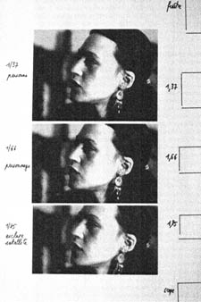
A disturbing discovery of the retrospective was how frequently the full-frame compositions of Godard’s late films have been ignored and overruled. Many of the prints are clearly marked by the lab with the widescreen ratios of 1.66 or (the almost standard) 1.85, and their subtitles are printed in the frame at the height indicated by those standards. Our meticulous projectionist Kate Mackay experimented with whole reels of films, showing them first in 1.33 and then in the prescribed wider screen ratio, revealing the violence done to the compositions when shown the latter way.
James found that several films, including Passion, Je vous salue Marie (Hail Mary), Nouvelle Vague, Hélas pour moi, and For Ever Mozart, looked “abjectly constricted” in 1.85. So James wrote the man himself.
Disturbed by some oddly cropped compositions in Éloge de l’amour, which result in seemingly unintentional beheadings and concretions, I consulted Godard by fax about the aspect ratio and he confirmed that it was indeed, as stated, 1.66 (rather old-fashioned in its own way). That he occasionally still seems to be jamming a 1.33 composition into a frame that cannot accommodate it suggests his instinctual preference for the open image.
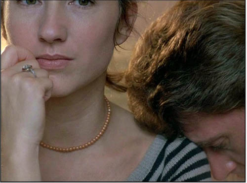
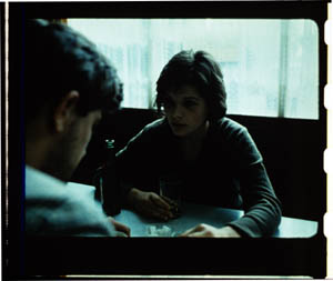
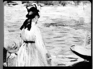
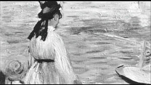
I couldn’t help James much at the time, but I did send him a couple of frames that favored squareish compositions and that came from 35mm prints. Other frames we reproduced, at 1.37, in both editions of Film History: An Introduction. The still that pretty much settles the matter for me is the gorgeous shot of Nathalie Baye and Johnny Hallyday at the top of this entry. Here’s the image as it is on a 35mm print.
Downsize that to 1.66 without losing those eyes!
Later I sent James another killer example, drawn also from a 35mm print of Detective. (It’s in the new Film Art, p. 46.)
Here’s what it would look like in one try at 1.66 matteing.
I say “one try” at a matted version because I didn’t take as much off the top as a normal aperture plate would; I didn’t want to slice into the hands and the gun. Not only is the 1.37 image preferable (we get to see Claude Brasseur’s slumping posture) but 1.66 looks, as James says, jammed. The 1.37 ratio lets Godard load information in the very top of the shot, as we’ll see often in the examples to come. And, needless to say, at 1.85 the shot would make no sense.
Soon after James and I had our exchange, Godard—perhaps prodded by James’ query—sent a diagram to Cahiers du cinéma. (3) (Thank you, Craig Keller, aka evillights, who called attention to it on this thread.) The Cahiers editors report that Godard has asked that Notre musique be shown in 1.37. His photomontage lines up two shots from the film and arranges them according to the three major “flat” ratios, and for each one he supplies a tart annotation.
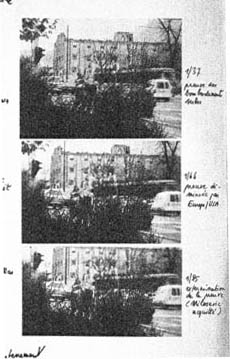
For the close-up of the woman, the captions translate as: 1.37 person. 1.66 character. 1.85 satellite slave. For the long shot of the street, we get: 1.37 Proof of Serbian bombing. 1.66 Proof diminished by Europe/ USA. 1.85 Extermination of proof (Milosovec acquitted).
Pretty strong evidence that JLG doesn’t like cropping the classic format. But these remarks are about Notre musique. What about the other films? Apart from the evidence onscreen and on the film strip, we can add one thing. Evidently he shoots at 1.37, but there’s also evidence that in the late stages of postproduction he seems to preserve that ratio. Here, for example, is a sheet of color timing instructions for Nouvelle Vague. (4) Godard has pasted in a frame for each shot in the sequence, and alongside he notes how much red, green, and blue he wants. The frames he mounted are 1.37.
Recently our Cinematheque has been holding a Godard retrospective, and I’ve taken the opportunity to revisit the aspect ratio issue. As an archival venue, we can screen at any ratio, even the squarish silent and early-sound ones. Our projectionist Jared Lewis has run the Godards at 1.37. They look fine.
Jared pointed out to me that one other factor leans toward screening them in the 1.37 format: the thickness of the spaces between frames. In a modern “full-frame” film like Hudsucker Proxy, there is very little space between the frames. The line separating one from another is quite thin. That tends to make the frames squarer, closer to 1: 1.2, as I mention in endnote 2.
In a classic sound film, there is often more space between the frames. Usually that space is black, but I can’t resist showing what it looked like in Technicolor.
This frame, from Renoir’s Golden Coach, shows the characteristic silver frame surround (and silver soundtrack) of a true Tech print. Nifty, huh?
Anyhow, the sort of thick spacing between frames that we get usually find in Godard prints, and that’s visible in the Baye/Hallyday frame above, favors the classic ratio. The thickness of these spacers is similar to what we find in a modern film that was explicitly designed for 1.37 screening, Hans-Jürgen Syberberg’s Parsifal (1982).
This array, Jared points out, gives different frame proportions than one would find in a print hard-matted to 1.66 or 1.85.
One more wrinkle. On the film strip, Godard’s frames aren’t all the same dimensions. Here are two from Je vous salue Marie; note that the first is taller, with narrower spacers, than the second.
Both, however, would be appropriately shown at 1.37.
How then are we to explain Godard’s saying the films should run at 1.66? Perhaps, as one of the online commentators has suggested, Godard assumed that 1.66 is the closest that most commercial venues can come to 1.37. Perhaps too he was just being contrary–that is, just being Godard.
Fortunately, some DVD producers seem to recognize his full-frame aesthetic. The UK version of Detective is full-frame and preserves my nifty shots. Also, the Cahiers du cinéma discs for Prénom Carmen, Hélas, and so on are at 1.37. Bowing to Godard’s wishes, Wellspring’s version of Notre Musique announces that it is presented “in its original theatrical aspect ratio of 1.33.” Although purists may say that virtually no theatres showed it that way, we should appreciate the gesture.
Relationships: The fundamental question
Even if you’re not that interested in Godard, everybody should be aware of what video cropping can do to the film image. I’m not talking about panning and scanning, that process which begins with a widescreen film, typically one of an aspect ratio 1:2.40, and extracts a 1.37 frame out of it for video purposes. This is deplorable, but most of us are alert to it. What’s more interesting is the sort of thing that happened when a film is cropped inaccurately, either in projection or for DVD.
My example will be from the first reel of Godard’s Éloge de l’amour/ In Praise of Love, which is available on DVD in a full frame version from Optimum in the UK and in a cropped version from New Yorker in the US. I won’t be focusing on the quality of each transfer, though the Optimum one looks superior to me.
Nor will I do a detailed narrative account, because I find the characters and their interactions still fairly baffling. I’m always amazed that critics can praise a Godard film without ever getting down to explicating what’s literally happening in a scene. They write as if these films were telling their stories straightforwardly. Without help from the presskits, could journalists discern even the sketchy plots they refer to? A great deal of the fascination of Godard’s late works comes from his refusal of the most elementary forms of exposition–picking out characters, explaining their relations, and the like. There is always a story, but it’s about three-quarters hidden, and this seems to me to require a lot more analysis than people tend to give it.
Anyhow, in studying Éloge de l’amour‘s video versions, I learned that there can be a big difference between tiny numbers. For instance, the Optimum version is prepared at 1.35:1. No big deal between this and 1.37:1, surely? Except that the New Yorker version seems to have started from a 1.37 frame. Even though it’s cropped on the top and bottom, it consistently supplies a tad more information on the right and left edges, and these extra bits are visible in side-by-side comparison. First, a 35mm frame.
Needless to say, the projector’s aperture plate won’t preserve everything in the physical frame; at a minimum it masks off the curved corners. But if we look at the two video versions, there are some surprises.
The 1.37 version of this shot is of course much closer to the overall composition of the original. But more areas of the window frame (on the left) and the painting (on the right) are visible in the widescreen version than in the full-frame one. Did going for 1.35 shave off those areas? Moreover, New Yorker’s cropping is at 1.77, for all intents and purposes the same as 1.75. But to achieve this wide frame, the transfer of some shots seems to have been optically stretched a little. In some upcoming examples the faces are a bit plumper and the surroundings a bit more horizontally spacious.
Okay, maybe I’m splitting hairs. So let me assume that the UK DVD preserves a reasonable amount of the 35mm original. I want to consider some effects of the cropping we get in the US DVD. Some are obvious, some more subtle, and all go beyond this individual case to suggest the results of overcropping any movie.
(1) Of course we lose the top and bottom. In the full-frame shots from Hudsucker Proxy, no problem; the filmmakers are counting on the projectionist to mask the frame. But in Godard the cropping makes us lose stuff. Godard likes to frame heads pretty high in the shot, and this means that we often lose part of them.
Heads are trimmed in movies all the time, and it doesn’t much matter in close views. But in Éloge, Godard is composing long shots with heads quite high up. He will even daringly chop off heads himself. This is partly a strategy to conceal who is present, to block our recognizing characters by their faces. It also has the effect of activating areas of the frame that aren’t usually so important. We have to strain to see partially visible things, tucked away in bits of the shot.
In the example below, I submit, the original composition creates a tension among three centers of interest: the two very visible paintings and the almost indiscernible face of the art dealer standing by the rear window. That tension is lost when the 1.77 cropping lops off the head in the background. Significantly, the man offscreen left is talking about how classic painting displayed “relationships” (rapports)–presumably both personal and pictorial. “That’s the fundamental question.”
The framing of the assistant in the foreground, incidentally, shows that spotting a decapitation in a video version doesn’t necessarily mean that Godard wanted every head to be seen.
In a later scene, we strain to see the older man’s face as he bends over Bruno. As he speaks Picasso’s immortal line, his profile scrapes the very top of the shot, but not in the cropped version.
In most film shots, the upper half of the frame harbors what we look at first, so we’re probably most likely to notice when something goes missing there. But actually, the area at the bottom of the frame is important too, especially as part of Godard’s all-over approach to composition.
Throughout early scenes of the film, Godard’s compositions favor the art works and minimize the humans trafficking in them. So the picture (by Delacroix? Matisse?) on the coffee table is foregrounded when the art collector signs the papers proffered by a mostly unseen woman, but it vanishes in the cropped version.
Likewise, the old man on the bed can rub his glasses fretfully at the very bottom of the 1.37 format, but that performance detail goes for naught in the 1.77 format.
More generally, even when we scan the top half of the frame for major information, we tend to take for granted that people are anchored to a ground plane, the earth or the floor or whatever. Often, of course, film shots don’t show us this ground. But the material at the bottom of a distant view can weight the shot, providing a sense of gravity. Here, the dealer peering over his balcony is minimally tied to the patio ground (as minimally as he was visible in the earlier shots when his head grazed the upper edge, I suppose). But in the 1.77 version he floats free.
(2) The top and bottom zones include the corners of the frame as well, but I single them out for special mention because I like them so much. Again, we don’t expect key information to be tucked there, but it can happen—in Godard, in Tati (a big influence on the late Godard), and even in one remarkable shot in Lumet’s recent Before the Devil Knows You’re Dead. In the first reel of Éloge de l’amour, the best example I can find comes with the long-shot of the woman, turned from us, standing at the window. In the lower right corner of the shot sits a woman’s photograph on a table. The 1.77 frameline chops it off and makes it less segregated for our notice: we lose the spacing that separates it from the other objects on the table. Since the voice-over is meditating on memory, the photo adds an overtone to the shot, but less clearly in the cropped version.
Maybe it matters, maybe not; but it’s a lot harder to see in 1.77 than in the 1.37 transfer. Something similar happens with the businessman’s hand in the lower left of this shot.
(3) Cutting off top and bottom alters the shot scale. All other things being equal, cropping not only eliminates; it enlarges. Figures come closer to us. A medium shot becomes a medium close-up. All of the examples so far indicate this to some degree, but it comes across clearly in these variants.
Again, note the stretching. It seems that someone decided that the image had to be 1.75 and instead of cropping it, stretched the 1.66 one. Yikes!
(4) Overambitious cropping changes the compositional dynamics. In reducing information, it reorganizes the composition. Rudolf Arnheim (I blogged about his achievements here) suggested that we consider a picture as a field of vectors and forces, pushes and pulls, balance and imbalance, rival centers of attention. By changing the framing we change the relation of the figures to the edges, and this can alter the composition.
The clearest examples come from the sort of reframings we find when a Super-35mm film is rendered in home video versions in both 2.40 and 1.37.
In this shot from 8mm (the movie, not the gauge), the cashier questioned by Cage looks more isolated in the Scope framing, while in the full frame they seem closer together and he seems to press in on her. Cropping can change a lot.
Now consider this comparison.
Godard’s original shot (here from 35mm) keeps the painting’s upper horizon, the darker, frothy waterline as a kind of backboard, halting the water’s recession into the distance. Graphically, the water on the right center becomes a negative space for the two figures, with the boy counterbalanced by the tip of the skiff.
But the cropped version loses the distant waterline, creating an infinite stretch of space top to bottom, and the boy’s head seems to float more freely. Most starkly, the skiff, by losing its shadow, seems to have swung more toward us.
It’s worth noting that Godard himself is a mean hand at radical cropping. I’ll forebear from rambling on about what his original framing above does to the original, Manet’s Seine at Argenteuil (1874), but it could constitute a lesson in how framing changes effect and meaning.

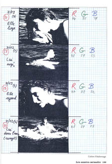
Several factors come into play when we look at this shot from the two DVD versions.
The woman’s face is off-center in both images, but it looks more off-center in the 1.77 transfer. In fact, despite the extra bits on left and right, it is measurably more off-center, because of this transfer’s optical stretching. Yet I’d argue in addition that the cropping of the frame has squeezed the pictorial elements into a stronger horizontal to-and-fro, giving a sense that she has been pushed more out of the middle. You can see it more markedly if we crop it more drastically, and it may help to hide the others when you look at this.
This effect is akin to what happens in the cropping of the 8mm example: the spatial relations have reorganized in relation to the frame edges. Rapports again.
(5) Overcropping can affect the way we experience the time of the shot. Before you call the men in the white coats, I hasten to say that cropping is purely a spatial effect, but in cinema space is bound up with time.
We’ve seen that Godard manipulates the vertical dimension of the frame to an unusual degree, and the effect on time becomes apparent in one scene of Éloge in which Bruno talks with an older man, in a sort of casting session for his project. First we see Bruno alone, and as he walks to the window the old man comes in, his back to us. We presume it’s a man by the bulk, the gait, and the fedora, making its appearance in the upper right corner.
Or does a man come in? In the 1.77 version, at the corresponding point in the shot, we can’t tell it’s a man until the figure comes further into the room.
Godard’s reliance on the upper part of the frame allows us to discern the caller sooner in the 1.35 version. Seconds, even split-seconds, matter in cinema. Insofar as cropping affects the timing of a shot’s unfolding, it affects our experience.
( 6) Cropping affects perspective, the perceived distances and volumes of objects in the visual array. Blowing up the center of an image creates a flatter, more friezelike space than we discern in the original. This becomes evident in a later phase of the scene I just mentioned. After Bruno leaves the shot, the old man is left standing in the office.
The 1.77 image looks more like it was shot with a long lens than does the full-frame version. The result recalls the sort of perpendicular telephoto framings so common in the 1970s, in films like The Parallax View and The Conversation (below).
Godard has said that he preferred 30-40mm lenses for much of Sauve qui peut (la vie) because a focal length of 50mm (and presumably one longer than that) will “destroy perspective.” (5)
Many of these differences wouldn’t matter in most films, which aren’t composed as meticulously or as daringly. Hollywood images aren’t typically as dense as those in late Godard. (I must do a blog some day on fussbudget filmmakers like him.) But even if these niceties seem negligible, I think you’ll grant that the film would be much more compromised by being shown in a 1.85 ratio, the squarest option available in most commercial theatres today.
Critical discussions of Godard’s late films have treated them as poetic meditations, and that seems partly right to me. Yet few critics ask how they manage to create their lyrical, associative quality. I think, as I hope to show in a future blog, this has to do with his treatment of narrative (naturally) and his layout of scenes. But even before we get there, I think that we find in the very texture of his images (let alone his sounds) a daring decentering of faces and bodies—the usual nodes of our attention. If he often blocks the flow of our glance, it’s in order to rechannel it to unexpected areas and textures, crannies and gaps, within the image. And so we want all those areas and textures, along with the crannies and gaps, available to our eyes and minds.
(1) James Quandt, “Here and Elsewhere: Projecting Godard,” in For Ever Godard, ed. Michael Temple, James S. Williams, and Michael Witt (London: Black Dog, 2004), 126-139.
(2) Geek note: You may notice that this “full-frame” image isn’t itself in the 1.37 ratio. It’s very square. The reason is that many 1.85 frames will be exposed in the camera at a ratio of 1: 1.2! I believe this was standardized for the Panavision cameras of the 1970s and afterward, though I’d appreciate more information about this. See the entry on Panavision cameras in American Cinematographer Manual, fifth ed., ed. Charles G. Clarke (Hollywood: American Society of Cinematographers, 1980), 104. See also Rob Hummel, “Comparison of 1.85, Anamorphic and Super 35 Film Formats,” American Cinematographer Manual, eighth ed., ed. Rob Hummel (Hollywood: ASC Press, 2001), 24-29.
(3) Jean-Luc Godard, “Formats,” Cahiers du cinéma no. 591 (May 2004), 78.
(4) This image is taken from Jean-Luc Godard par Jean-Luc Godard, vol. 2: 1984-1998, ed. Alain Bergala (Paris: Cahiers du cinéma, 1998), 199.
(5) Jean-Luc Godard, “Propos rompus,” in Godard par Godard vol. 2, 466.
Thanks to Suzy Buenger and Nancy Marshall for identifying the Manet painting for me.
PS 15 Dec: And thanks to James Quandt, Michael Kerpan, and Yogesh Raut for a name correction I’m too embarrassed to specify further.
PS 7 April 2008: The issue is raised anew with Gus van Sant’s Paranoid Park. It’s designed to be shown at 1.37, with more than a few shots reminiscent of Godard. Joe Beres explains here.
PPS 25 January 2009: Ranjit Sandhu provides a lively and detailed discussion of aspect ratios and matteing strategies, along with remarks on Godard’s frames.
PPPS 21 Sept 2009: Thanks to editor John Olivio for a correction on the 1.78 aspect ratio.
JLG par JLG (1995).
The magic number 30, give or take 4
David here–
When I was teaching, students often came to my office hours with variants of this question. “I want to direct Hollywood movies. When should I start trying to get into the industry?”
My answer usually ran this way:
Your prospects are almost nil. It’s tremendously unlikely that you will become a professional director. You may wind up in some other branch of the industry, though. In any case, start now. Aim for summer internships while you’re in school, and try to get a job in LA immediately after graduation—preferably through a friend, a relative, a relative of a friend, or a friend of a relative.
My answer still seems reasonable, but recently I’ve begun to wonder if it holds up across history. Suppose we refocus our goggles on the macro scale. At what ages do most Hollywood directors make their first feature? If we can come up with a solid answer, it would be one instance in which studying film history can have very practical consequences.
No country for old men
In any field, most people would expect to have their careers moving along by the time they hit their early thirties. But aspiring filmmakers may think that there’s a long period of preparation–working in a mailroom, sweating over screenplays–before they finally get to direct. Directing films is a top-of-the-heap role. Who would trust a young first-timer with a multimillion-dollar investment and authority over far more experienced performers and technicians?
Nearly everybody, actually.
Executives tend to be oldish and not fully aware of what the target movie audience likes. A few years ago a friend of mine, consulting for the studios, went to a meeting of suits and was told that all the new digital sampling and mixing software was purely an effort to steal music. He replied that there were legitimate creative uses of that technology. “For example?” one exec asked. My friend said, “Well, there’s Moby.” Nobody at the table knew who Moby was.
So hiring young people in touch with their peers’ tastes makes sense. Indeed, many of today’s top filmmakers started making features quite young. I haven’t made an exhaustive survey, but picking directors more or less at random yields some pretty interesting results.
Note: It’s hard to know how long a movie took to make, so I’ll use the release date as my benchmark. With the exceptions noted at the end, I haven’t checked people’s birthdays against day and month release dates. As a result, the ages of directors that I’ll be giving fall within a year of the releases. That works well enough to establish an approximate age range for a general tendency. And since it takes at least a year to get a project finished and released, we have to remember that most of these people started work on their first feature quite a bit earlier than is indicated by the age I give.
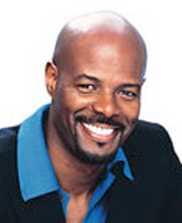
Start with directors who broke through in the 1990s and 2000s. Many were about 30 when their first features came out: Keenen Ivory Wyans (above; I’m Gonna Get You Sucka), Michael Bay (Bad Boys), David Fincher (Alien 3), and Spike Jonze (Being John Malkovich). A tad older at their debuts were Alex Proyas at 31 (The Crow), Cameron Crowe at 32 (Say Anything), James Mangold at 32 (Heavy), Karyn Kusuma at 32 (Girlfight), McG at 32 (Charlie’s Angels), David Koepp at 33 (The Trigger Effect), Allison Anders at 33 (Border Radio), and Mark Neveldine at 33 (Crank).
Actually these are the older entrants. A great many current directors completed their first feature in their twenties. Quentin Tarantino, Reginald Hudlin, Roger Avary, and Joe Carnahan debuted at 29, Sofia Coppola and Brett Ratner at 28, Peter Jackson and F. Gary Gray at 26.
Go a little further past 33 and you’ll find a few big names like Alexander Payne (35), Nicole Holofcenter (36), Simon West (36), and Ang Lee (38). Almost no contemporary directors broke into the game past 40. The most striking case I found is Mimi Leder, who signed The Peacemaker when she was 45.
On the whole, the directors who start old have found fame and power playing other roles. When you’re David Mamet, you can tackle your first feature at 40. (He’s my age; don’t think this doesn’t make me depressed.) If you’re a producer like Bob Shaye or Jon Avnet, you can start directing in your fifties. Actors, especially stars, get a pass at any age. Mel Gibson made his first feature at 37, Steve Buscemi at 39, Barbra Streisand at 41, Anthony Hopkins at 59.
Putting aside such heavyweights, the lesson seems to be this. In today’s Hollywood, a novice director is likely to start making features between ages 26 and 34. It’s also very likely that he or she will have already done professional directing in commercials, music videos, or episodic TV, as many of my samples did.
But what about the Movie Brats?
Is today’s youth boom a new development? The Baby Boomers will yelp, “No! Everybody knows that we invented the director-prodigy.” Look:
*Dementia 13: Francis Ford Coppola, 24. If you don’t want to count that, You’re a Big Boy Now was released when Coppola was 27.
*Who’s That Knocking at My Door?: Martin Scorsese, 25.
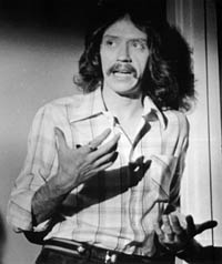
*Dark Star: John Carpenter (above), 26.
*THX 1138: George Lucas, 27.
*Night of the Living Dead: George Romero, 28.
*The Sugarland Express: Steven Spielberg, 28. If you count the TV feature Duel, subtract 2 years.
*Targets: Peter Bogdanovich, 29.
*Dillinger: John Milius, 29.
*Blue Collar: Paul Schrader, 32.
*Good Times (with Sonny and Cher): William Friedkin, 32.
*Easy Rider: Dennis Hopper, 33.
True, the 70s also revved up veterans like Altman and Ashby, but it was the new generation, we’re always told, who made the difference. Hollywood was run by old men who had brought the studio system to the brink of ruin. The twentysomethings smashed the barricades and made a place for young filmmakers.
It might have seemed that way at the time, but the belief was probably due to a quirk of history. The 1960s and early 1970s were in one respect a unique period in the history of American cinema. During those years, the studios had the widest range of age and experience ever assembled. For the first time in history, it looked like a retirement home.
Look at it this way. In the 1960s, films were being made by directors who had started in the 1950s (e.g., Arthur Penn, Sidney Lumet), as you’d expect. But at the same time there were films by directors who had started in the 1940s: Fred Zinneman, Sam Fuller, Robert Aldrich, Anthony Mann, Nicholas Ray, Vincente Minnelli, Robert Rossen, Robert Wise, Mark Robson, and many others. Furthermore, some of the biggest names of the 1960s were directors who had started in the 1930s, like George Cukor, Carol Reed, George Stevens, Otto Preminger, and Joseph Mankiewicz. More remarkably, the 1960s saw the release of films by masters who had begun in the 1920s, notably Hitchcock, Hawks, Capra, and Wyler.
And believe it or not, several directors who had begun in the 1910s were still active nearly fifty years later. John Ford is the most obvious case, but Chaplin, Alan Dwan, Henry King, Fritz Lang, George Marshall, and Raoul Walsh signed films in the 1960s. When Sidney Lumet celebrates a half-century of directing with the upcoming release of Before the Devil Knows You’re Dead, he will be considered a rare bird in today’s cinema; but in a broader historical context he doesn’t stand alone.
Interestingly, the arrival of the Movie Brats and the blockbuster brought nearly all the veterans’ careers to a halt. No matter what decade an old-timer started, by the mid-1970s he was most likely dead, retired, or making flops. Perhaps the Movie Brats’ sense of Hollywood as a haunted house was created in part by the felt presence of six decades of history.
The studio years
But what about those codgers? At what age did they get started? A look at the evidence suggests that the rise of the twentysomething Movie Brats has plenty of precedents.
The Hollywood studios ran a sort of apprentice system. In the 1920s and 1930s, short comedies and dramas were the era’s equivalent of music videos and commercials—ephemeral material that allowed youngsters to learn their craft. For example, George Stevens started as a cameraman, and at age 26 graduated to directing short comedies. Three years later he made his first feature (The Cohens and Kellys in Trouble, 1933).
Stevens wasn’t atypical. In the 1920s and 1930s, major directors seem to have started as young as they do now. King Vidor began in features at 25, Rouben Mamoulian at 26. Mervyn LeRoy’s first feature was released when he was 27, the same age that Keaton, Capra, and Sam Taylor entered the field. Byron Haskin and W. S. Van Dyke made their debuts at 28. Hawks started at 30, as did Victor Fleming, Lewis Milestone, and Joseph H. Lewis. Clarence Brown signed his first solo feature at 31, the same age as Jules Dassin and George Cukor at their debuts.
Even more remarkable is what went on during the 1910s. As Hollywood was becoming a film capital, it became a playground for twentysomethings. Lois Weber, Alan Dwan (who may have directed 400 movies), James Cruze, Reginald Barker, George Marshall, George Fitzmaurice, Raoul Walsh, and many others directed their first features before they were thirty. (At this point, a feature film could be around an hour. Kristin explains here.) Cecil B. DeMille was on the senior side, having directed The Squaw Man (1914) at age 33. Griffith was then even older of course, but having started in 1908, somewhat earlier than this generation, his authority waned as theirs rose. And he had started directing within my golden zone, at age 33.
Why so many youngsters? In the 1910s, the industry was growing rapidly and it needed a lot of labor. Few people went to college, so teenagers could take low-level jobs at the studios straight out of high school, or even without a secondary education. Moreover, Kristin reminds me that at this time life expectancy was much lower than today; in 1915 a white male on average would live only 53 years. Beginners hurried to get started, and bosses probably found comparatively few oldsters around.
At the other extreme, the World War II years seem to have been a tough time to break in. Anthony Mann, Nicholas Ray, Don Siegel, Richard Brooks, Robert Aldrich, Robert Rossen, and other gifted directors had to wait until their mid- to late thirties before taking the director’s chair in the second half of the 1940s. The 1950s somewhat put the premium on youth again with fresh blood, especially from the East Coast. The most famous instances are Stanley Kubrick (Hollywood feature debut at 28), John Frankenheimer (debut at 30), and John Cassavetes (Hollywood debut at 32).
In short, Hollywood has always favored fresh-faced novices. It’s not surprising. Young people will work exceptionally hard for little pay. They have reserves of energy to cope with a milieu dominated by deadlines, delays, long hours, and rough justice. They are more or less idealistic, which allows them to be exploited but which also infuses the creative process with some imagination and daring. The executives need wisdom, but the talent needs, as they say, a vision.
Some last questions
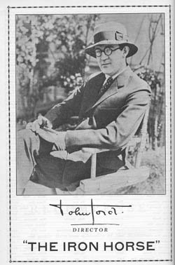
Of course in every era a few older hands start directing features comparatively late. Lloyd Bacon, auteur of the masterpiece Footlight Parade, didn’t make a feature (Broken Hearts of Hollywood, 1926) until he was thirty-seven, after dozens of shorts. Daniel Petrie was forty when his 1960 feature The Bramble Bush was released, and Julie Dash was forty when Daughters of the Dust came out. But you have to look hard to find careers starting this late. Most of the evidence I’ve seen indicates that first features skew young.
First question, then: Is the tendency to seize talent young unique to Hollywood, or is it a characteristic of other popular film industries? My hunch is that it has been a worldwide phenomenon. Eisenstein, who was 27 when he made Potemkin, was treated the oldest of his cohort of Soviet directors; at the other end of that scale were Gregori Kozintsev and Leonid Trauberg, who collaborated on their first film when they were 19! In Japan, Ozu, Mizoguchi, and Kurosawa started directing in their twenties. Michael Curtiz was 30 when he made his first feature, which happened to be Hungary’s first as well. The very name of the French New Wave was borrowed from a sociologist’s catchphrase for postwar twentysomethings. Today, in Europe or Asia, most beginning directors are in their mid-to-late twenties or early thirties. I suspect that everywhere the film industry gobbles up youth, both in front of and behind the camera.
Second, a question for further research. Hollywood hires a lot of first-timers, but how many of them build long-lasting careers? It’s sometimes said that it’s easier to get a first feature than a second.
Third, who’s the youngest director to make a Hollywood feature? The most famous candidate for the Early Admissions program is Orson Welles, who was 25 when Citizen Kane premiered. But on this score at least his old rival William Wyler had him beat. Wyler was 24 when he released his first feature. The fact that his mother was a cousin of Carl Laemmle, boss of Universal, doubtless helped him start near the top.
So is Wyler, at 24, the winner? No. John Ford, Ron Howard, and Harmony Korine were 23 when their first features opened. But wait: Leo McCarey was only 22 when his first feature (Society Secrets) was released in 1921. M. Knight Shyamalan’s first first feature, Praying with Anger, achieved a limited release in 1993, when he was 22.
Yet I think that William K. Howard has the edge. Born on 16 June 1899, he signed two features in late 1921, when he was 22, putting him abreast of McCarey and Shyamalan. But Howard also co-directed a feature that was released on 22 May 1921—about three weeks before his twenty-second birthday. Brett and Sofia and PJ, you are so over the hill.
(Once we move out of the US, the clear winner would seem to be Hana Makhmalbaf. When she was ten, she served as AD for her sister Samira on The Apple, and she signed a documentary feature when she was fifteen. “I used to get excited over the words sound, camera, action. There was a strange power in these three words. That’s why I quit elementary school after second grade at age eight.”)
Finally, how does a little knowledge of film history help us steer hopefuls on the road to Hollywood? It gives us a sharper sense of timing and opportunity. My best revised answer would be this.
Start as young as you can, in any capacity. For directing music videos and commercials, the window opens around age 23. For features, the best you can hope for is to start in your late twenties. But the window closes too. If you haven’t directed a feature-length Hollywood picture by the time you’re 35, you probably never will.
Unless your last name is Bruckheimer, Bullock, Kidman, Cruise, or Bale.
PS 16 Sept 2007: Some corrections and updates: I’m not surprised that my more or less random sampling missed some things. So I’m happy to say that we have new contenders in the youth category.
Charles Coleman, Film Program Director at Facets in Chicago, pointed out that Matty Rich was only 19 when Straight Out of Brooklyn was released in 1991. So my candidate, William K. Howard, is second-best at best.
 As for Hana Makhmalbaf, she’s been beaten too. Alert reader Ben Dooley wrote to tell me of Kishan Shrikanth, who was evidently ten years old at the release of his feature, Care of Footpath, a Kannada film featuring several Indian stars. Kishan, a movie actor from the age of four, has been dubbed the world’s youngest feature film director by the Guinness Book of World Records. You can read about him here, and this is an interview.
From Australia, critic Adrian Martin writes to point out that Alex Proyas made features before The Crow. “A clear case of Hollywood/ Americanist bias!! (Just kidding.) Proyas had an extensive career in Australia before the USA, and that includes his first, intriguing feature, Spirits of the Air, Gremlins of the Clouds, in 1989. Which puts him around 27 at the time!”
Finally (but what is final in a discussion like this?) over at Mark Mayerson’s informative animation blog, there’s a discussion about animation directors, who tend to be quite a bit older when they sign their first full-length effort. Mark’s reflections and the comments point up some differences between career opportunities in live-action and animated features.
PPS 27 December 2007: Malcolm Mays, currently 17 years old, is shooting a feature under studio auspices. Read the inspiring story here.


