


Archive for the 'New media: Technology' Category
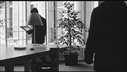
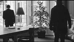
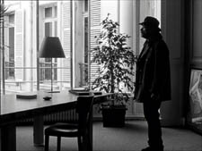
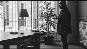
Manhattan: Symphony of a Great City
DB here:
In December Kristin and I attended a wide-ranging conference at Rome University devoted to “Exploded Narration”—the effects that digital technology has had on storytelling in film and television. As our host Vito Zagarrio put it, the question is one of continuity or rupture. Have new formats like HD, the Internet, and DVD revolutionized media storytelling? Or are they serving traditional approaches?
Many papers explored the “rupture” option, while Kristin and I offered presentations that emphasized continuity. You can find one version of my argument elsewhere on this site. Still, both of us also pointed up some innovations, or what I called “spillover” effects. As so often with such questions, the answer turned out to be complicated.
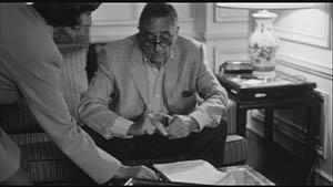
 We enjoyed the conference, and one standout aspect was the presence of Amos Poe. Poe is probably best known for his first feature, Alphabet City (1985), and for his 16mm film on the Punk scene, The Blank Generation (1976). His Triple Bogey on a Par Five Hole (1991) has also attracted attention. For three decades Poe has worked as a director, producer, screenwriter, and teacher. The Sundance festival is playing Amy Redford’s The Guitar, which Poe wrote and coproduced.
Amos was great fun. A soft-spoken man with a quick and wicked sense of humor, he enlivened our dinners at various ristoranti. He also spoke extensively about screenwriting, which he teaches at NYU and at NYU’s Florence program. Like many screenwriters, he’s extremely intelligent and articulate about his craft. Three examples:
*How to learn screenwriting? Get a script version of a film you admire. Read the first ten pages, then closely watch the first ten minutes of the movie. Go back and read the next ten pages, and go ahead and watch the corresponding ten minutes. And so on until the end. Do this with three first-rate films, and you will have a concrete, intuitive understanding of how a screenplay works.
*A screenplay, Amos points out, isn’t a short story or novel or play. It’s a movie in words. It must make the reader see and hear an imaginary film, and not only the action, either. Without indicating specific shots, the descriptions should suggest the flow of long-shots and close-ups (”Her lipstick leaves a smear on the cigarette butt”). “The screenwriter is a filmmaker.”
*Write sounds into the background of scenes, setting them up for fuller presence later. If a train becomes important late in the story, mention the wail of a distant train early in the screenplay. This sort of auditory planting quietly strengthens the structure of the story in your reader’s mind.
Amos must be a terrific teacher. I learned a great deal from his descriptions of contemporary film conventions, several of which I hadn’t noticed before. Don’t be surprised to find some of them creeping into future blogs.
Given Amos’ expertise in mainstream storytelling, the film he presented was quite a surprise. It’s called Empire II, and though you don’t normally call a three-hour movie a delight, I can’t think of a better word. After a week of tourism and no films, it was just the sensuous boost that my hungry eyes needed.
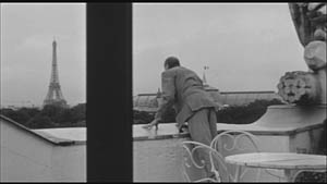
Man with a Video Camera
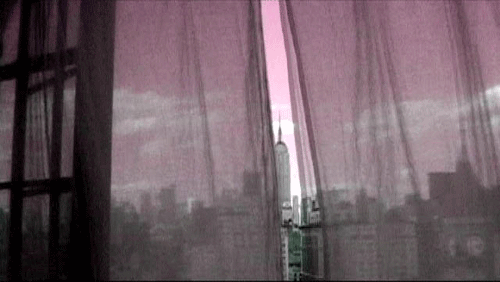
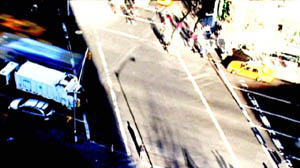
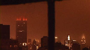
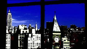
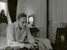
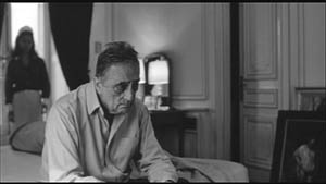
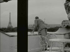
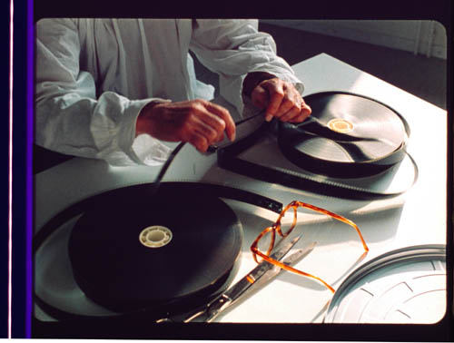
Poe’s apartment on Christopher Street yields a stunning view of the Manhattan skyline—the Chrysler Building, Jefferson clock tower, and of course the Empire State Building. He planted a Sony PD150 video camera at his window for a year, from 1 November 2005 to 31 October 2006, and took time-lapse shots. Through single-framing, he captured a total of 1 or 1 ½ seconds of every thirty seconds of real time. He shot traffic, people, skies, and the horizon. He did not look at the footage until after the year was up.
He wound up with sixty hours of imagery. He then made an absolute gesture. Using Final Cut Pro, he compressed all sixty hours into three. What was already highly elliptical, a string of tiny slices of action, became enormously accelerated.
Poe and his students then spent months blending up to forty tracks of music, spoken verse, and sound effects. It’s a crisp stereo mix, with remarkable audio-visual correspondences: whipping wind and ticking machinery sync up with snow and the tower clock. The music, which ranges from alt-rock to Keith-Jarrettish piano strumming, works sympathetically but not redundantly with the imagery. (No surprise that Poe has made music videos.) Shooting the film cost virtually nothing, but Poe spent about $100,000 for music clearances, though old friends like Patti Smith and Deborah Harry gave him their material for free.
The result is a city symphony, a lyrical tribute to the looks and sounds of New York. It joins the tradition of Walter Ruttmann and Dziga Vertov, as well as Paul Strand’s Manhatta (1921) and Jay Leyda’s Bronx Morning (1931). It also reminds you that Poe has roots in the downtown avant-garde. In 1972-1975, he often watched works by Jonas Mekas, Stan Brakhage, Michael Snow, Bruce Baillie, and Jack Smith at Millennium Film Workshop, and he made films for its Friday night open screenings. As a result, Empire II carries premises of lyrical and Structural cinema into the digital era.
The conditions of production are at once subjected to strict guidelines—a single year, only views from the window, the 20x compression—and open to chance. As with the films of Ernie Gehr, chance becomes more felicitous when set within a rigid frame. “I needed to create a base for accidents to happen.” Poe refused to cut or rearrange what he had (”I don’t edit unless I get paid for it”) and so he was ready to accept what came out. “I had to let go of the result.” That result mixes smoothness and fracture; the moon arcs like a golf ball, but traffic hammers relentlessly in a way recalling the last sequence of Man with a Movie Camera. Every so often there are calm islands of blank frames, provided by Poe’s occasional neglect to set focus or exposure.
Poe’s Book of Hours and Days
The title pays homage to Warhol’s 1964 film, so often discussed and so little seen. In many ways, though, Poe gives us an anti-Empire. Instead of a silent film, sound, both aggressive and immersive. (The stereo tracks shoot noises bouncing across channels, swallowing you up.) Instead of a single night, a year’s time span. Warhol shot Empire at 24 frames per second but insisted on projecting it at 16, slowing up time; Poe’s single-frame sampling and frantic acceleration speed time up. Warhol used for the most part a single camera position and shot in long takes, but Poe presents a flutter of shots. The framing is steady, but what we see flickers and pulsates, creating superimposition effects comparable to Ruttmann’s and Vertov’s slashing diagonals.
Warhol was withdrawn and impersonal, but Poe turned on the camera when he spotted something that looked interesting. He felt free to focus, reframe, zoom, and shift camera position for different angles on the life beyond his balcony. Likewise, the automaton Warhol (”I’d like to be a machine”) is counterposed to Poe’s more organic sensibility. He never lets us forget the flowers twitching on his windowsill, and their growth and rearrangements become traces of his daily life in the apartment.
The rules are simple and viewer-friendly. We instantly recognize the trappings of city life; we know the cycles of the seasons and the shifts between night and day. This cogent structure throws all our attention on what we see from moment to moment, and how we see it.
The Empire State Building and the skyline around it, along with the flowing clouds, remain stable reference points for a flurry of visual transformations. The taxis and pedestrians we glimpse move in jagged, incomplete rhythms very different from the smooth flow of fast motion in Godfrey Reggio’s films like Koyaanisqatsi.
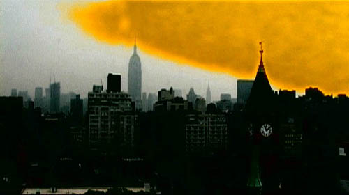
As you see, high angles, plays of focus, and tight framings provide energetic abstraction. Flaring exposure makes the Building look like it’s in flames, triggering echoes of the 9/11 attacks.
When the weather changes, the light does too. Raindrops become not only a pebbly surface on the windows but tiny filters. As with Warhol’s films, we have to change our conception of what counts as an event. Slight differences of framing and texture become visual epiphanies. Rain can be gray-green, and snow can go pale red. At times, the steeple clock face in the lower right becomes an imperturbable timekeeper, a sort of pictorial timecode, reminiscent of the clock in the corner of the shots of Robert Nelson’s Bleu Shut (1971).
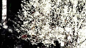
Spring comes about halfway through. It’s as lyrical as you’d expect, but again the colors startle. If snow can be red, then budding trees can be blindingly white.
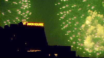
As in Ives’ Holidays Symphony, the festive iconography of Americana is made somewhat dissonant. July Fourth fireworks become splinters, and the slurred, jerky figures in the final Halloween chapter recall Mekas’ Notes on the Circus. Now shooting more continuously, with handheld shots and bumpy pans and zooms, Poe lets his 20x compression turn the parading ghosts, skeletons, nuns, and dark angels into scurrying hallucinations, complete with cellphones.
Empire II is at once exuberant and tranquil. What a pleasure to find a film devoted simply to seeking out beauty in everyday surroundings. “She celebrates the small,” sings Jimmie James while we see snow lashing the sidewalks. So does Poe. He has said that he made the film at a difficult period of his life, but what he has given us, I think, is jubilation.
PS 22 Jan: For more on Empire II, including a trailer, go to amospoe.com.
Godard comes in many shapes and sizes
DB here:
James Quandt started it.
The indefatigable Senior Programmer of the Cinémathèque Ontario emailed me in early 2004 to ask if I had any thoughts on the aspect ratios of Godard films. He attached an essay which eventually appeared in the gorgeous anthology, For Ever Godard. Reading a Quandt essay is like eating a ripe nectarine, tangy and nourishing. So you should find the original and indulge yourself. (1)
You might be asking what the term aspect ratio means. It refers to the ratio of the width to the height of the film image. The image was fairly square in the early silent era, then became roughly standardized at 4 x 3, or as the pros say, 1.33:1. Sound filming made the format a tad more horizontal, at 1.37. Anamorphic widescreen (CinemaScope and its brethren) was more or less standardized at 2.35 (more recently 2.40). Various non-anamorphic, or “flat” aspect ratios have appeared since the early 1950s. The US has favored 1.85, Europe has been known to use the squarer 1.66, and some films, like E. T., are designed for 1.75. Widescreen TVs are set at 16:9, or about 1.78:1, so that’s likely to be a common proportion in the future. We discuss aspect ratios at more length in Film Art: An Introduction (pp. 183-185 in the newest edition).
Filmies care about aspect ratios because shot composition matters. Sometimes the print is “hard-matted,” with the correct proportions given as black bars at the top and bottom of the frame, like video letterboxing. Here’s an example, from a 16mm print of Godard’s 1972 Tout va bien. It is hard-matted to 1.66. (The original film is in color.)
If the image isn’t hard-matted, the projectionist must insert an aperture plate that will mask the image properly. But what plate? Should she set it for 1.37? That’s a very rare option nowadays, and many theatres aren’t really designed to show it. Typically, if the print doesn’t indicate, the US projectionist will fall back on 1.85. Nowadays, if a Hollywood film isn’t in Scope, the projectionist is expected to use that ratio. Some shots will be problematic if the projectionist includes more than the 1.85 format allows. Here’s a full-frame film strip from The Hudsucker Proxy, where you can see that a chunk of the set is blocked or missing in the bottom area, and a microphone peeks into the frame from the top. (2)
Like many other movies, the films made by Godard since the mid-1970s show up at the projection booth without hard matteing. So at what ratio do we show them?
A great many careful viewers have voiced their views on the Internets, and I’ve learned a lot from the discussions here and here. In part this blog entry is an effort to introduce readers to this debate.
Moreover, this apparently film-wonkish question has wider implications. It can teach us a fair amount about how film images work, and the implications of any masking, matteing, or cropping of an image—especially on DVD. So if you’re interested in Godard, keep reading. If not, skip to the final section, “Relationships: The fundamental question,” where I talk about some artistic effects of cropping any film image.
It’s a just image, not just an image
James Q was mounting one of his typically ambitious retrospectives, this time on JLG, and so his essay posed a question that had long been ignored.
A disturbing discovery of the retrospective was how frequently the full-frame compositions of Godard’s late films have been ignored and overruled. Many of the prints are clearly marked by the lab with the widescreen ratios of 1.66 or (the almost standard) 1.85, and their subtitles are printed in the frame at the height indicated by those standards. Our meticulous projectionist Kate Mackay experimented with whole reels of films, showing them first in 1.33 and then in the prescribed wider screen ratio, revealing the violence done to the compositions when shown the latter way.
James found that several films, including Passion, Je vous salue Marie (Hail Mary), Nouvelle Vague, Hélas pour moi, and For Ever Mozart, looked “abjectly constricted” in 1.85. So James wrote the man himself.
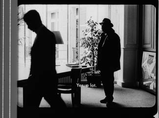
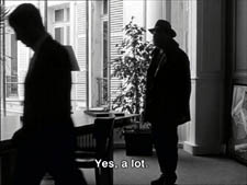
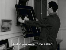
Disturbed by some oddly cropped compositions in Éloge de l’amour, which result in seemingly unintentional beheadings and concretions, I consulted Godard by fax about the aspect ratio and he confirmed that it was indeed, as stated, 1.66 (rather old-fashioned in its own way). That he occasionally still seems to be jamming a 1.33 composition into a frame that cannot accommodate it suggests his instinctual preference for the open image.
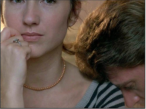
I couldn’t help James much at the time, but I did send him a couple of frames that favored squareish compositions and that came from 35mm prints. Other frames we reproduced, at 1.37, in both editions of Film History: An Introduction. The still that pretty much settles the matter for me is the gorgeous shot of Nathalie Baye and Johnny Hallyday at the top of this entry. Here’s the image as it is on a 35mm print.
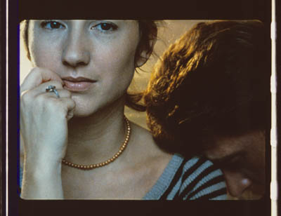
Downsize that to 1.66 without losing those eyes!
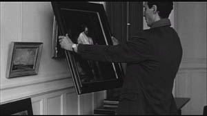
Later I sent James another killer example, drawn also from a 35mm print of Detective. (It’s in the new Film Art, p. 46.)
Here’s what it would look like in one try at 1.66 matteing.
I say “one try” at a matted version because I didn’t take as much off the top as a normal aperture plate would; I didn’t want to slice into the hands and the gun. Not only is the 1.37 image preferable (we get to see Claude Brasseur’s slumping posture) but 1.66 looks, as James says, jammed. The 1.37 ratio lets Godard load information in the very top of the shot, as we’ll see often in the examples to come. And, needless to say, at 1.85 the shot would make no sense.
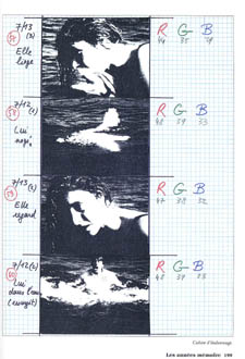
Soon after James and I had our exchange, Godard—perhaps prodded by James’ query—sent a diagram to Cahiers du cinéma. (3) (Thank you, Craig Keller, aka evillights, who called attention to it on this thread.) The Cahiers editors report that Godard has asked that Notre musique be shown in 1.37. His photomontage lines up two shots from the film and arranges them according to the three major “flat” ratios, and for each one he supplies a tart annotation.
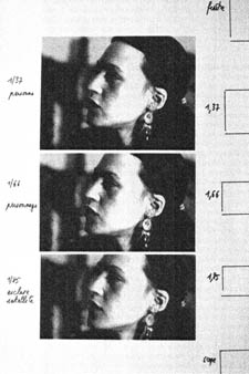
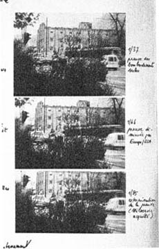
For the close-up of the woman, the captions translate as: 1.37 person. 1.66 character. 1.85 satellite slave. For the long shot of the street, we get: 1.37 Proof of Serbian bombing. 1.66 Proof diminished by Europe/ USA. 1.85 Extermination of proof (Milosovec acquitted).
Pretty strong evidence that JLG doesn’t like cropping the classic format. But these remarks are about Notre musique. What about the other films? Apart from the evidence onscreen and on the film strip, we can add one thing. Evidently he shoots at 1.37, but there’s also evidence that in the late stages of postproduction he seems to preserve that ratio. Here, for example, is a sheet of color timing instructions for Nouvelle Vague. (4) Godard has pasted in a frame for each shot in the sequence, and alongside he notes how much red, green, and blue he wants. The frames he mounted are 1.37.
Recently our Cinematheque has been holding a Godard retrospective, and I’ve taken the opportunity to revisit the aspect ratio issue. As an archival venue, we can screen at any ratio, even the squarish silent and early-sound ones. Our projectionist Jared Lewis has run the Godards at 1.37. They look fine.
Jared pointed out to me that one other factor leans toward screening them in the 1.37 format: the thickness of the spaces between frames. In a modern “full-frame” film like Hudsucker Proxy, there is very little space between the frames. The line separating one from another is quite thin. That tends to make the frames squarer, closer to 1: 1.2, as I mention in endnote 2.
In a classic sound film, there is often more space between the frames. Usually that space is black, but I can’t resist showing what it looked like in Technicolor.
This frame, from Renoir’s Golden Coach, shows the characteristic silver frame surround (and silver soundtrack) of a true Tech print. Nifty, huh?
Anyhow, the sort of thick spacing between frames that we get usually find in Godard prints, and that’s visible in the Baye/Hallyday frame above, favors the classic ratio. The thickness of these spacers is similar to what we find in a modern film that was explicitly designed for 1.37 screening, Hans-Jürgen Syberberg’s Parsifal (1982).
This array, Jared points out, gives different frame proportions than one would find in a print hard-matted to 1.66 or 1.85.
One more wrinkle. On the film strip, Godard’s frames aren’t all the same dimensions. Here are two from Je vous salue Marie; note that the first is taller, with narrower spacers, than the second.
Both, however, would be appropriately shown at 1.37.
How then are we to explain Godard’s saying the films should run at 1.66? Perhaps, as one of the online commentators has suggested, Godard assumed that 1.66 is the closest that most commercial venues can come to 1.37. Perhaps too he was just being contrary–that is, just being Godard.
Fortunately, some DVD producers seem to recognize his full-frame aesthetic. The UK version of Detective is full-frame and preserves my nifty shots. Also, the Cahiers du cinéma discs for Prénom Carmen, Hélas, and so on are at 1.37. Bowing to Godard’s wishes, Wellspring’s version of Notre Musique announces that it is presented “in its original theatrical aspect ratio of 1.33.” Although purists may say that virtually no theatres showed it that way, we should appreciate the gesture.
Relationships: The fundamental question
Even if you’re not that interested in Godard, everybody should be aware of what video cropping can do to the film image. I’m not talking about panning and scanning, that process which begins with a widescreen film, typically one of an aspect ratio 1:2.40, and extracts a 1.37 frame out of it for video purposes. This is deplorable, but most of us are alert to it. What’s more interesting is the sort of thing that happened when a film is cropped inaccurately, either in projection or for DVD.
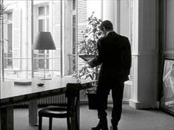
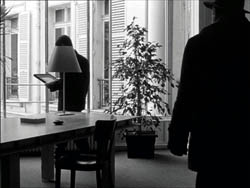
My example will be from the first reel of Godard’s Éloge de l’amour/ In Praise of Love, which is available on DVD in a full frame version from Optimum in the UK and in a cropped version from New Yorker in the US. I won’t be focusing on the quality of each transfer, though the Optimum one looks superior to me.
Nor will I do a detailed narrative account, because I find the characters and their interactions still fairly baffling. I’m always amazed that critics can praise a Godard film without ever getting down to explicating what’s literally happening in a scene. They write as if these films were telling their stories straightforwardly. Without help from the presskits, could journalists discern even the sketchy plots they refer to? A great deal of the fascination of Godard’s late works comes from his refusal of the most elementary forms of exposition–picking out characters, explaining their relations, and the like. There is always a story, but it’s about three-quarters hidden, and this seems to me to require a lot more analysis than people tend to give it.
Anyhow, in studying Éloge de l’amour‘s video versions, I learned that there can be a big difference between tiny numbers. For instance, the Optimum version is prepared at 1.35:1. No big deal between this and 1.37:1, surely? Except that the New Yorker version seems to have started from a 1.37 frame. Even though it’s cropped on the top and bottom, it consistently supplies a tad more information on the right and left edges, and these extra bits are visible in side-by-side comparison. First, a 35mm frame.
Needless to say, the projector’s aperture plate won’t preserve everything in the physical frame; at a minimum it masks off the curved corners. But if we look at the two video versions, there are some surprises.
The 1.37 version of this shot is of course much closer to the overall composition of the original. But more areas of the window frame (on the left) and the painting (on the right) are visible in the widescreen version than in the full-frame one. Did going for 1.35 shave off those areas? Moreover, New Yorker’s cropping is at 1.77, for all intents and purposes the same as 1.75. But to achieve this wide frame, the transfer of some shots seems to have been optically stretched a little. In some upcoming examples the faces are a bit plumper and the surroundings a bit more horizontally spacious.
Okay, maybe I’m splitting hairs. So let me assume that the UK DVD preserves a reasonable amount of the 35mm original. I want to consider some effects of the cropping we get in the US DVD. Some are obvious, some more subtle, and all go beyond this individual case to suggest the results of overcropping any movie.
(1) Of course we lose the top and bottom. In the full-frame shots from Hudsucker Proxy, no problem; the filmmakers are counting on the projectionist to mask the frame. But in Godard the cropping makes us lose stuff. Godard likes to frame heads pretty high in the shot, and this means that we often lose part of them.
Heads are trimmed in movies all the time, and it doesn’t much matter in close views. But in Éloge, Godard is composing long shots with heads quite high up. He will even daringly chop off heads himself. This is partly a strategy to conceal who is present, to block our recognizing characters by their faces. It also has the effect of activating areas of the frame that aren’t usually so important. We have to strain to see partially visible things, tucked away in bits of the shot.
In the example below, I submit, the original composition creates a tension among three centers of interest: the two very visible paintings and the almost indiscernible face of the art dealer standing by the rear window. That tension is lost when the 1.77 cropping lops off the head in the background. Significantly, the man offscreen left is talking about how classic painting displayed “relationships” (rapports)–presumably both personal and pictorial. “That’s the fundamental question.”
The framing of the assistant in the foreground, incidentally, shows that spotting a decapitation in a video version doesn’t necessarily mean that Godard wanted every head to be seen.
In a later scene, we strain to see the older man’s face as he bends over Bruno. As he speaks Picasso’s immortal line, his profile scrapes the very top of the shot, but not in the cropped version.
In most film shots, the upper half of the frame harbors what we look at first, so we’re probably most likely to notice when something goes missing there. But actually, the area at the bottom of the frame is important too, especially as part of Godard’s all-over approach to composition.
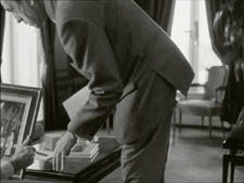
Throughout early scenes of the film, Godard’s compositions favor the art works and minimize the humans trafficking in them. So the picture (by Delacroix? Matisse?) on the coffee table is foregrounded when the art collector signs the papers proffered by a mostly unseen woman, but it vanishes in the cropped version.
Likewise, the old man on the bed can rub his glasses fretfully at the very bottom of the 1.37 format, but that performance detail goes for naught in the 1.77 format.
More generally, even when we scan the top half of the frame for major information, we tend to take for granted that people are anchored to a ground plane, the earth or the floor or whatever. Often, of course, film shots don’t show us this ground. But the material at the bottom of a distant view can weight the shot, providing a sense of gravity. Here, the dealer peering over his balcony is minimally tied to the patio ground (as minimally as he was visible in the earlier shots when his head grazed the upper edge, I suppose). But in the 1.77 version he floats free.
(2) The top and bottom zones include the corners of the frame as well, but I single them out for special mention because I like them so much. Again, we don’t expect key information to be tucked there, but it can happen—in Godard, in Tati (a big influence on the late Godard), and even in one remarkable shot in Lumet’s recent Before the Devil Knows You’re Dead. In the first reel of Éloge de l’amour, the best example I can find comes with the long-shot of the woman, turned from us, standing at the window. In the lower right corner of the shot sits a woman’s photograph on a table. The 1.77 frameline chops it off and makes it less segregated for our notice: we lose the spacing that separates it from the other objects on the table. Since the voice-over is meditating on memory, the photo adds an overtone to the shot, but less clearly in the cropped version.
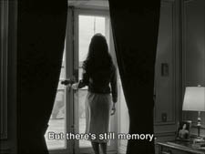
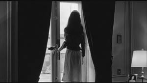
Maybe it matters, maybe not; but it’s a lot harder to see in 1.77 than in the 1.37 transfer. Something similar happens with the businessman’s hand in the lower left of this shot.
(3) Cutting off top and bottom alters the shot scale. All other things being equal, cropping not only eliminates; it enlarges. Figures come closer to us. A medium shot becomes a medium close-up. All of the examples so far indicate this to some degree, but it comes across clearly in these variants.
Again, note the stretching. It seems that someone decided that the image had to be 1.75 and instead of cropping it, stretched the 1.66 one. Yikes!
(4) Overambitious cropping changes the compositional dynamics. In reducing information, it reorganizes the composition. Rudolf Arnheim (I blogged about his achievements here) suggested that we consider a picture as a field of vectors and forces, pushes and pulls, balance and imbalance, rival centers of attention. By changing the framing we change the relation of the figures to the edges, and this can alter the composition.
The clearest examples come from the sort of reframings we find when a Super-35mm film is rendered in home video versions in both 2.40 and 1.37.
In this shot from 8mm (the movie, not the gauge), the cashier questioned by Cage looks more isolated in the Scope framing, while in the full frame they seem closer together and he seems to press in on her. Cropping can change a lot.
Now consider this comparison.
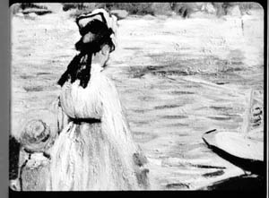
Godard’s original shot (here from 35mm) keeps the painting’s upper horizon, the darker, frothy waterline as a kind of backboard, halting the water’s recession into the distance. Graphically, the water on the right center becomes a negative space for the two figures, with the boy counterbalanced by the tip of the skiff.
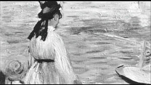
But the cropped version loses the distant waterline, creating an infinite stretch of space top to bottom, and the boy’s head seems to float more freely. Most starkly, the skiff, by losing its shadow, seems to have swung more toward us.
It’s worth noting that Godard himself is a mean hand at radical cropping. I’ll forebear from rambling on about what his original framing above does to the original, Manet’s Seine at Argenteuil (1874), but it could constitute a lesson in how framing changes effect and meaning.

Several factors come into play when we look at this shot from the two DVD versions.
The woman’s face is off-center in both images, but it looks more off-center in the 1.77 transfer. In fact, despite the extra bits on left and right, it is measurably more off-center, because of this transfer’s optical stretching. Yet I’d argue in addition that the cropping of the frame has squeezed the pictorial elements into a stronger horizontal to-and-fro, giving a sense that she has been pushed more out of the middle. You can see it more markedly if we crop it more drastically, and it may help to hide the others when you look at this.
This effect is akin to what happens in the cropping of the 8mm example: the spatial relations have reorganized in relation to the frame edges. Rapports again.
(5) Overcropping can affect the way we experience the time of the shot. Before you call the men in the white coats, I hasten to say that cropping is purely a spatial effect, but in cinema space is bound up with time.
We’ve seen that Godard manipulates the vertical dimension of the frame to an unusual degree, and the effect on time becomes apparent in one scene of Éloge in which Bruno talks with an older man, in a sort of casting session for his project. First we see Bruno alone, and as he walks to the window the old man comes in, his back to us. We presume it’s a man by the bulk, the gait, and the fedora, making its appearance in the upper right corner.
Or does a man come in? In the 1.77 version, at the corresponding point in the shot, we can’t tell it’s a man until the figure comes further into the room.
Godard’s reliance on the upper part of the frame allows us to discern the caller sooner in the 1.35 version. Seconds, even split-seconds, matter in cinema. Insofar as cropping affects the timing of a shot’s unfolding, it affects our experience.
( 6) Cropping affects perspective, the perceived distances and volumes of objects in the visual array. Blowing up the center of an image creates a flatter, more friezelike space than we discern in the original. This becomes evident in a later phase of the scene I just mentioned. After Bruno leaves the shot, the old man is left standing in the office.
The 1.77 image looks more like it was shot with a long lens than does the full-frame version. The result recalls the sort of perpendicular telephoto framings so common in the 1970s, in films like The Parallax View and The Conversation (below).
Godard has said that he preferred 30-40mm lenses for much of Sauve qui peut (la vie) because a focal length of 50mm (and presumably one longer than that) will “destroy perspective.” (5)
Many of these differences wouldn’t matter in most films, which aren’t composed as meticulously or as daringly. Hollywood images aren’t typically as dense as those in late Godard. (I must do a blog some day on fussbudget filmmakers like him.) But even if these niceties seem negligible, I think you’ll grant that the film would be much more compromised by being shown in a 1.85 ratio, the squarest option available in most commercial theatres today.
Critical discussions of Godard’s late films have treated them as poetic meditations, and that seems partly right to me. Yet few critics ask how they manage to create their lyrical, associative quality. I think, as I hope to show in a future blog, this has to do with his treatment of narrative (naturally) and his layout of scenes. But even before we get there, I think that we find in the very texture of his images (let alone his sounds) a daring decentering of faces and bodies—the usual nodes of our attention. If he often blocks the flow of our glance, it’s in order to rechannel it to unexpected areas and textures, crannies and gaps, within the image. And so we want all those areas and textures, along with the crannies and gaps, available to our eyes and minds.
(1) James Quandt, “Here and Elsewhere: Projecting Godard,” in For Ever Godard, ed. Michael Temple, James S. Williams, and Michael Witt (London: Black Dog, 2004), 126-139.
(2) Geek note: You may notice that this “full-frame” image isn’t itself in the 1.37 ratio. It’s very square. The reason is that many 1.85 frames will be exposed in the camera at a ratio of 1: 1.2! I believe this was standardized for the Panavision cameras of the 1970s and afterward, though I’d appreciate more information about this. See the entry on Panavision cameras in American Cinematographer Manual, fifth ed., ed. Charles G. Clarke (Hollywood: American Society of Cinematographers, 1980), 104. See also Rob Hummel, “Comparison of 1.85, Anamorphic and Super 35 Film Formats,” American Cinematographer Manual, eighth ed., ed. Rob Hummel (Hollywood: ASC Press, 2001), 24-29.
(3) Jean-Luc Godard, “Formats,” Cahiers du cinéma no. 591 (May 2004), 78.
(4) This image is taken from Jean-Luc Godard par Jean-Luc Godard, vol. 2: 1984-1998, ed. Alain Bergala (Paris: Cahiers du cinéma, 1998), 199.
(5) Jean-Luc Godard, “Propos rompus,” in Godard par Godard vol. 2, 466.
Thanks to Suzy Buenger and Nancy Marshall for identifying the Manet painting for me.
PS 15 Dec: And thanks to James Quandt, Michael Kerpan, and Yogesh Raut for a name correction I’m too embarrassed to specify further.
PS 7 April 2008: The issue is raised anew with Gus van Sant’s Paranoid Park. It’s designed to be shown at 1.37, with more than a few shots reminiscent of Godard. Joe Beres explains here.
PPS 25 January 2009: Ranjit Sandhu provides a lively and detailed discussion of aspect ratios and matteing strategies, along with remarks on Godard’s frames.
PPPS 21 Sept 2009: Thanks to editor John Olivio for a correction on the 1.78 aspect ratio.
JLG par JLG (1995).
A turning point in digital projection?
Kristin here–
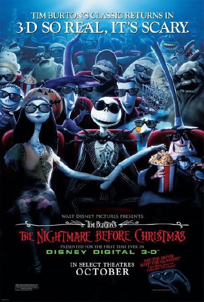
This past Friday, October 19, marked an historic moment in the history of Madison movie-going. We got our first permanent digital projection set-up, and not just digital, but 3D. The first film to be presented there was Tim Burton’s The Nightmare before Christmas.
We’ve had several big changes in the local theater scene recently. In May the first purpose-built Sundance Cinemas art-film multiplex opened. Madison, I gather, is considered a pretty good moviegoing market for its size. A more modest two-screen theater, the Hilldale, was shut down and demolished. Not such a bad thing, since the Hilldale, a two-screen house, was not aging well. We now have two multiple-screen theaters showing nothing but art films, Westgate and Sundance, as well as the Orpheum theater, University of Wisconsin union, and the Communication Arts Department’s Cinematheque showing art films part-time. Overall the city has a total of something like 60 screens for a population of just over 200,000.
Film vs. Digital: The Film Scholar’s Perspective
As film historians, David and I like to work directly with films. This summer he posted an entry on the joys and possibilities of analyzing films on a flatbed editing table. We used to insist that all the frame enlargements we used to illustrate our books be from film. We acquired hundreds of trailers and patiently cut them up, mounting them in slide frames to use in lectures. Naturally they looked great. For older films, we went to archives and used special photographic equipment to capture frames. Eventually DVD technology got good enough that we had to admit frames captured from them could look as good on the pages of a textbook as reproductions from our slides or negatives. Now Film Art and our other books contain illustrations from a mixture of sources.
But obtaining images for illustrations is a very different thing from watching a movie projected digitally in a theater. The images from a strip of real film have a distinctive look to them. They convey a sense of life. It’s a subtle thing, but the minute grains that make up the blacks, whites, and colors in the frames shimmer slightly from frame to frame. (That’s why a freeze frame makes an image look suddenly grainy. There’s no play of the particles from frame to frame to overlap and create a richness.) Digital projection throws visual information on the screen far faster, eliminating the shimmer and creating instead a fixed-looking image.
So we’re not in a great hurry to see 35mm projection disappear, and we watch the growth of digital exhibition with both interest and some trepidation.
The Slow Progress of Digital Projection
Digital projection has been around for years now, but for most of those years we lovers of 35mm film could largely ignore it. The earliest digital screenings of films in theaters took place way back in 1998, with satellites beaming The Last Broadcast into the few American houses with the proper equipped. Every now and then other digital advances would be touted, but the installation of digital projection equipment around the world has been slow.
Some of the reasons for that slowness are obvious. As usual with such technological breakthroughs, there have been competing systems. There still are. The cost of such a projection system is around $150,000. Tell your theater-chain owner holding nine sites, each with ten screens, that he or she needs to make an expenditure of $13.5 million and see what the response is. Especially if that owner has fairly new, expensive 35mm projectors already installed. The theater owners have argued that the distributors should pay part of the costs. The distributors, naturally, want the exhibitors to pay.
Both groups would gain advantages from digital. Among those are savings in printing up thousands of copies of a given film, usually at over a thousand dollars apiece, and shipping the very heavy prints via overnight courier service. There would be no physical prints going through projector gates and suffering scratches and breakage.
Assuming theater owners will end up paying for most or all of the conversion, they would want to charge extra in order to make up the costs of the equipment. There are undoubtedly people who think digital is superior, and they would pay a higher admission price. A lot of moviegoers, however, couldn’t care less whether the moving image they see in the multiplex is coming out of a 35mm projector or a digital one—and they’re probably not about to pay a dollar or two more to go in the digital auditorium that’s playing The Bourne Ultimatum rather than the one with the old-fashioned 35mm system.
Until now, that is. Modifications of projection systems that allow for 3-D projection have finally given exhibitors a selling point that will get patrons into theaters at advanced prices. Our local multiplex that is showing Nightmare is charging two dollars more for it than for films on its other screens. Apparently people will pay. Nationwide this weekend Nightmare is estimated to make $5,245,000 in 564 theaters, for a per-screen average of $9,122. That’s the highest average in the top 25 films. In contrast, 30 Days of Night, the top grosser at $16 million, has a $5,604 per-screen average.
The question remains, will people remain willing to pay extra for 3-D once its novelty value wears off?
2007 is increasingly being touted as the year when digital installations have speeded up most radically. The conversion will still be a slow process, but for the first time it becomes plausible to think that in the not too distant future digital might kill off 35mm projection. In the October 13-14 issue of The Hollywood Reporter, Gregg Kilday, its editor, suggests that 2009 will be the breakthrough year for digital 3-D. Two major 3-D projects, DreamWorks’ animated Monsters vs. Aliens and James Cameron’s Avatar, will debut within a few months of each other. The real question, he says, is whether enough theaters will be outfitted with digital projection by then. With big theater chains now adopting the new technology, it seems quite possible. (See here for an excellent summary of the current situation of theater conversion and 3-D films in the pipeline.)
Alone with my 3D Glasses
As I was sitting at my desk last Wednesday afternoon, finishing up my David Cronenberg entry, I got a call from a friend of ours, Tim Romano. Tim is an expert projectionist, perhaps the best in town. He’s the one theaters often call on to test new equipment and screen the big blockbusters ahead of time to check for flaws. Not surprisingly, Tim was testing the new digital projector by running Nightmare over and over, as if for a regular day’s screenings, but without an audience. Tim suggested that I might want to drop in and catch a screening. Naturally I headed for we call Point, which is really the Marcus Point UltraScreen Cinema.
As the name suggests, Point is part of the Marcus Theatres Corporation’s chain of 47 theaters (594 screens), scattered across Wisconsin, Illinois, Minnesota, Ohio, North Dakota, and Iowa. Some of the chain’s other theaters will be getting digital projection installations as well. The name Marcus is a big one here in the Midwest, since The Marcus Corporation also owns or manages 20 hotels in the area. Its theater chain is the seventh largest in the country.
Arriving at Point, I received my 3-D glasses from the ticket seller, obtained my snack of choice (Junior Mints), and headed for what proved to be an otherwise empty auditorium. I had missed the opening, but having seen the film a couple of times, I figured that didn’t matter. I was here to see what digital 3-D looks like.
When we go to the movies, David and I usually sit in the center of rows three to five, depending on the size of the screen. This time I sat in row five, but I quickly found the edges of the eyepieces were not wide enough to take in the entire screen. There’s an aisle across the auditorium behind the fifth row, so I sat at the front of the upper section of the house, approximately row eight. That worked fine.
I’m not sure the glasses I had were the same kind that are being used for commercial screenings. Still, my impression is that if you’re used to being down front, sitting a bit further back works well for this film.
Nightmare was originally made on 35mm film using stop-motion to animate puppets. It was transformed into a 3-D film using technology from a company called Real D, which also has been the major player in the move to install digital projection equipment in theaters.
Tim wasn’t, however, projecting Nightmare on a Real D projection setup. Just recently Dolby has moved into digital projection in a big way, and the Point installation is part of its rollout of competing equipment. (For details and other cinema chains using Dolby, see here.) Dolby may have the edge, since its projector works with existing white screens, while Real D’s requires a special silver one.
Happily, the new polarized glasses work better than earlier models. My experience with the older glasses was that one’s eyes sometimes had to struggle to resolve the images onscreen into three dimensions, and one could end up with a headache by the end of the movie. Dolby’s digital 3-D system makes perception of the depth effects automatic and effortless.
Speaking of the glasses, I was amused to note that publicity for the film (see the poster above) shows the characters wearing what look very much like sunglasses. Most probably people still think of 3-D glasses as clunky and cumbersome. This is clearly an attempt to counter that image and make the glasses look cool, like the ones sported by characters in Men in Black or The Matrix.
The depth effect is definitely impressive, even in a retro-fitted film like Nightmare. Because it was not originally produced in 3-D, most of the depth appears to extend behind the screen. I remember seeing 3-D films made in the 1950s that strive to thrust objects out at the audience—most effectively in House of Wax when a carnival barker has a paddle-ball that he bounces directly toward the camera. I rather prefer the depth behind the screen to the depth in front, which tends to be distracting. Whatever the promoters say about people wanting to feel themselves in the movie, I would prefer not to have projectiles coming at my face or actors tumbling into my lap.
The movement of the characters was fine most of the time. I found that rapid action caused a ghosting, blurred effect that was quite different from the rock-steady three-dimentionality of static or slowly moving figures. That ghosting may simply be an artifact of the process of turning 2-D into 3-D, and perhaps films made in 3-D will not have it.
Then there’s the matter of grain and other qualities of 35mm film. Certainly one can’t object to the lack of dust and scratches. The absence of grain is a little disconcerting, but it’s really hard to judge in an animated film like this. Presumably, though, it’s not significantly different from 2-D digital projection, which I’ve never seen. I suppose I shall get used to it.
The Current Trend
So Nightmare provides only a limited indication of what the future holds.
Thus far animated films have made up the bulk of the digital 3-D films released. It’s much easier and cheaper to build 3-D into a CGI cartoon (e.g., Disney’s Meet the Robinsons) than to use it on the set of a live-action film. Indeed, the current generation of 3-D features that include actors have employed motion-capture technology. The proof of that pudding will come with Robert Zemekis’s Beowulf, due out November 16.
The real future of 3-D will depend on it attracting adult audiences, and that means that more live-action films will need to be made. That’s not happening now because the technology remains to expensive, cumbersome, and touchy to be easily used on set. The technology is bound to advance, though.
In the meantime, possibly we can expect that for the near future, digitally equipped auditoriums will be a little like Imax is now. A multiplex might have one Imax screen, but it would never put Imax in all its other theaters. Similarly, a theater owner might be willing to pay that $150,000 to convert one projection system in a multiplex, with digital 3D remaining a special attraction, one which people are willing to pay a little extra for.
If such a scenario is fulfilled, then we may see 35mm and digital share the multiplexes of the world for a long time. You wouldn’t hear me complaining.
Rat rapture
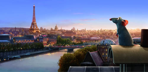
Recently we went to see Ratatouille and both loved it. We thought it was the best Hollywood movie we’ve seen this summer.
KT: Last October, in the infancy of this blog, I posted an entry on Cars. There I said, “For me, part of the fun of watching a Pixar film is to try and figure out what technical challenge the filmmakers have set themselves this time. Every film pushes the limits of computer animation in one major area, so that the studio has been perpetually on the cutting edge.” For Cars it was the dazzling displays of light and reflections in the shiny surfaces of the characters.
Figuring out the main self-imposed challenge in a new Pixar film is like a game, and I avoid reading any statements about the films by their makers ahead of time.
At first glance Ratatouille might seem to be “about” fur. True, there are lots of rats with impressively rendered fur—but fur was the big challenge way back in Monsters, Inc. Surely Pixar wasn’t repeating itself. To be sure, Monsters, Inc. contained only one major furry character, Sulley, and his fur was the long wispy type that some stuffed animals have. Difficult to render, no doubt, but different from the rats’ fur, which is dense, short, and has to ripple with the movements of the animals.
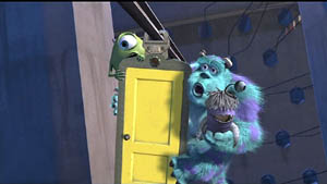
Not only that, but in Ratatouille, we see furry rats in all sorts of situations: just running round, crawling out of water and various other liquids, and in one virtuoso throwaway shot, emerging all fluffed up from a dishwasher. It’s all very impressive, but I didn’t think that was the main technical feat that the filmmakers were aiming at.
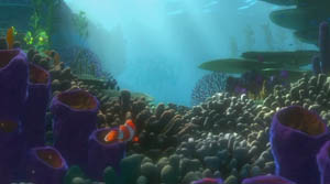
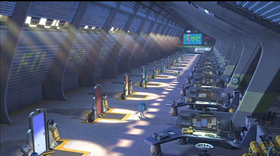
I quickly became aware that there was something different about the settings. Pixar films always have eye-catching settings: the beautiful and convincing underwater seascapes of Finding Nemo, the huge vistas of the factory in Monsters, Inc., the stylized domestic settings in the The Incredibles.
The Incredibles, the first film that Brad Bird directed for Pixar, was deliberately cartoony-looking, evoking the streamlined Populuxe look of 1950s cartoons. Ratatouille, his second effort, takes a very different approach. Here the settings are far more realistic and three-dimensional, approaching photo-realism in some of the Parisian street scenes. Often our vantage-point moves rapidly through these settings, twisting, turning, and plunging from high angle to low angle framings in a second. In the scene where the protagonist Remy is swept away from his family through the sewers until he emerges in Paris, the twists and turns of the pipes sweep by. Likewise, the camera explores the crevices of the restaurant’s crowded pantry.
The settings have a tangible and immediate presence beyond what we have seen in previous Pixar films, partly because so many objects in the surroundings are pulled into the action. Ingredients sit in bowls and jars that take up considerable portions of the kitchen set, and the rat dashes among them, sniffing to find the ones he needs for a new concoction. The lessons learned in Cars return here to make the shiny copper cooking utensils reflect their surroundings. The brick arch and floor tiles of the restaurant kitchen were individually tweaked, so that they don’t have the uniformity that CGI tends to give repetitive patterns. Dense combinations of bricks, tiles, wood panels, carpets, patterned wallpaper, glass, and Venetian blinds make every shot too busy for the eye to fully take in.
A delightful demonstration of all these features and more is given in the “Ratatouille QuickTime Virtual Tour.” 360-degree spherical space allows you to look up at the ceiling and down at the floor as well as scan the walls. (The download time is reasonably quick; you need to move your cursor into the window that opens and use it to scroll in any direction and at variable speeds. Use the shift key to zoom in and the control key to zoom out.)
DB: Two things, one general and one specific to Ratatouille:
(1) The idea of explaining artists’ works in terms of problems and solutions is common in art history and musicology, but not so common in film studies. It can be fruitful to consider that sometimes filmmakers face common problems and that they compete to solve them, or to find different problems they can solve.
I sometimes try to imagine what animators for other Hollywood studios thought when they walked out of Snow White and the Seven Dwarfs. Did the talents at Warners, Fleischer et al. just throw up their hands in despair? Disney must have been the Pixar of its day, challenging its rivals with a dazzling series of achievements along many dimensions. Disney had solved so many problems—of rendering color and depth, of catching detail and voluminous movement, of blending pathos with comedy—that the others could hardly compete in the same race. So it seems that they carved out other niches. Fleischer, though trying its hand at feature cartoons as well, concentrated on the familiar and presold comic-strip world of Popeye. Warners avoided child-oriented sentimentality and offered more insolent and whacked-out entertainment, personified in Bugs and Daffy. In today’s CGI realm, Pixar seems to set the pace, staking its claim before anybody else has realized the territory has opened up–though Aardman consistently offers something different.
(2) Along with the problems that you’ve mentioned, I was struck by what we might call a general task facing all animators: the need to display a sophisticated cinematic intelligence that fit contemporary tastes in live-action movies. So the pacing has to be fast (here, an average shot length of about 3.5 seconds), but it isn’t frantic. Today’s movies are overstuffed with details, so this is too; but here many stand out sharply. Central are all the minutiae of food and its preparation, which you mention below. Our friend Leslie Midkiff Debauche reports that her son, a chef, noticed the burn mark on Colette’s right forearm—a combat wound of the professional cook. Instead of the heavy satire and flatulence of the Shrek cycle, Pixar always gives us something that would engage us even if it weren’t animated.
Every director, I think, should study this film for lessons in making movement expressive. The velocity of our rats’ scampering depends on the surface they cross, and the differences in acceleration and braking are vivid. The vertigo-inducing river turbulence that carries Remy away from his clan displays the old Disney genius in rendering the behavior of water. There’s a caricatural difference in body language among all the characters, from the cadaverous Ego to the heaving movements of pudgy Emile and the spasmodic twirling of Linguini when Remy is at the controls. Shot scale is always well-judged. When there’s a moment of uncertainty about whether the kitchen team will support Linguini, the pause is accentuated by the fierce Horst taking a step forward toward the boy, in big close-up. Will this be the signal for the others to join him? The close-up conceals the key piece of information: Horst has stripped off his apron, and only when he lifts it into the frame do we realize that he’s walking out. Perhaps the visual expressiveness of silent filmmaking survives best today in animation.
KT: A secondary but still important challenge seemed to be the effort to find ways of rendering the textures of surfaces that are difficult to capture in animation. Most obviously the food—slices of carrots and tomatoes, stalks of celery—must look realistic and attractive if we are to believe that the dishes Remy devises are truly as scrumptious as the characters find them. (The film wisely sticks to soups, desserts, and, yes, ratatouille, sidestepping the problematic notion of an animal cooking other animals.)
Once you decide what you think the Pixar crew was working on extra hard in their newest film, it’s usually easy to find supporting evidence in interviews with the top people involved. For some reason Bird was reluctant to talk much about the big technical challenges for Ratatouille, but he gave a good summary in the interview on Collider.com:
I think our goal is to get the impression of something rather than perfect photographic reality. It’s to get the feeling of something so I think that our challenge was the computer basically wants to do things that are clean and perfect and don’t have any history to them. If you want to do something that’s different than that you have to put that information in there and the computer kind of fights you. It really doesn’t want to do that and Paris is a very rich city that has a lot of history to it and it’s lived in. Everything’s beautiful but it’s lived in. It has history to it, so it has imperfections and it’s part of why it’s beautiful is you can feel the history in every little nook and cranny. For us every single bit of that has to be put in there. We can’t go somewhere and film something. If there’s a crack in there, we have to design the crack and if you noticed the tiles on the floor of the restaurant, they’re not perfectly flat, they’re like slightly angled differently, and they catch light differently. Somebody has to sit there and angle them all separately so we had to focus on that a lot.
DB: This relates back to the idea that an animated film has to offer its own equivalent of what live-action has led viewers to expect. Since at least Alien and Blade Runner, we’ve come to equate realism with a worn-out world. No more spanking-clean spaceships, but rather creaky Gothic ones; no more shiny futures, only dilapidated ones. Bird acknowledges that once his team opts for more detailed settings, they have to look lived-in, rather than the rather generic ones we find in Toy Story and even The Incredibles. But then the food contrasts with this air of casual imperfection; it looks pristine.
KT: Speaking of food, in another interview, Bird expands on the difficulties of rendering it:
There was quite a bit of effort expended to make the food look delicious. Because if one of the things your movie is about is gourmet food, then you can’t have it not look delicious. And computers aren’t really very interested in making things look delicious. They’re interested in things looking clean and things looking geometrically precise, and usually hard not squishy – not tactile. Computers are great for perfection. They’re not great at organic things. We had to work really hard to get the food to look like you could taste it and smell it and enjoy it.
The interviews I’ve read don’t mention it, but the film also takes a small but impressive step toward solving the ever-difficult problem of rendering human skin. Most of the characters are given the usual smooth skin that we have come to expect in computer-animated films.
DB: Agreed! One of the things that put me off CGI animation years ago was the overpolished look of CGI surfaces. Volume without texture always looked plastic to me. But in Ratatouille, the Pixar team has made great progress in dirtying up the surfaces. That kitchen is full of spills and stains, but the faces are still pretty balloon-like, except for that villainous chef Skinner. He’s the most cartoony character, I suppose, and the range of expressions he passes through just in delivering a single line had me in stitches. The Termite Terrace legacy lives on in him.
KT: Yes, Skinner must have inspired the filmmakers. His face gets very sophisticated treatment. In most character animation, eyes and eyebrows are the main means of creating expressions in the upper half of the face. Several times, however, Skinner comes into extreme close-up, so that his expressions of rage and shock are complete with elaborate forehead wrinkles. There’s even a patch of pores on his nose. That degree of detail is used sparingly in this film, but perhaps we see a sign of things to come as the Pixar animators set up new hurdles to jump.
PS 25 August: For an interesting, more thematically oriented discussion of Ratatouille, see Michael J. Anderson and Lisa K. Broad’s entry on the Tativille blog.
PPS 31 August: Bill Desowitz has a lively and informative feature on the film, including behind-the-scenes interview material, at Animation World.


