Archive for the 'Experimental film' Category
The ten best films of … 1924
Die Nibelungen: Siegfried
Kristin here:
For a seventh year running, we skip ranking the current year’s films and instead hark back 90 years.
We started out with a list that was essentially an appendix to an entry, but soon we were dedicating whole entries just to the list. Our entries for past years are here: 1917, 1918, 1919, 1920, 1921, 1922, and 1923.
These lists are our way of calling attention to important silent films that some readers may have overlooked. In one case here we point out a largely forgotten film that deserves to be better known, in the hope that an archive will take the hint. With the proliferation of silent-film festivals, of DVD and Blu-ray releases with restored prints and supplemental material, and of TCM’s eclectic screenings of foreign and silent titles, there seems to be considerably more interest in these early classics. Herewith our choices for 1924.
For the last few years I’ve struggled to fill out the full list of ten films with truly deserving items. But as I’ve been predicting, the 1924 choices fell easily into place. As usual, some of these are obvious picks, already famous to most readers. Others are less obvious, and a few are unknown except to specialists. Some, though very important historically and artistically, are not currently available on DVD, which is a real shame.
At last, the USSR
Films in the Soviet Montage style make up one of the most important cinema movements of all times. The key filmmakers of the movement, Eisenstein, Pukovkin, Dovzhenko, Kuleshov, Kozintzev and Trauberg, and others began their work later than the German Expressionist and French Impressionist directors. But at last one joins our list, with Lev Kuleshov’s The Extraordinary Adventures of Mr. West in the Land of the Bolsheviks.
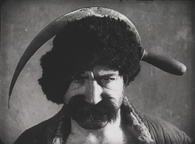
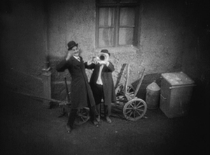
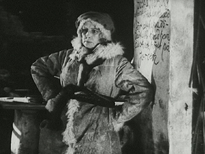
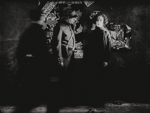
Although Kuleshov’s work has become more widely available, his most familiar work is still By the Law (1926), a grim tale of two members of a gold-prospecting team agonizing over how to bring to justice a colleague who has committed a terrible crime. Mr. West couldn’t be more different. This hilarious and grotesque comedy satirizes American perceptions of the new Soviet Union, as Mr. West, president of the YMCA, comes to for a visit, his faithful cowboy friend Jeddie in tow. They’re terrified of the barbaric land they expect to encounter, and a gang of thieves dupe Mr. West by dressing up in outfits that caricature West’s images of Bolsheviks (above).
In making the film, Kuleshov and his team drew upon the experiments they had been doing in his classes he ran of the early 1920s. Film stock was scarce and all he and his students could do was practice staging scenes and make short editing experiments. They explored the possibilities of “biomechanical acting,” a style based more on gymnastic control and energy than on psychological subtleties of facial expression.
Once the group did get the resources to make a feature, their delight is evident in the lively editing and the exuberant performances. Alexandra Khokhlova, a gangly woman who was married to Kuleshov and starred in most of his films, plays a vamp who tries to lure Mr. West into her toils. Pudovkin, who studied with Kuleshov before going into directing himself, is the well-dressed gang leader who pretends to guide Mr. West away from danger. Boris Barnet, also to become a major director, performs feats of derring-do as Jeddie tries to save Mr. West.
Mr. West is not only a satire on Western fears of post-Revolutionary Russia but also a parody of American serials. (The latter was something Barnet soon tried in an actual serial, his 1926 Miss Mend.)
Mr. West is available on DVD in Flicker Alley’s set, “Landmarks of Early Soviet Film.”
German Expressionism begins to wind down
Last year I was hard put to pick a film to represent the German Expressionist movement in the top ten. I chose Erdgeist but mentioned Schatten and Raskolnikow as runners-up. By 1924 there were fewer Expressionist films released, though the movement would linger on until 1927, mainly carried on by the two greatest directors who had worked in the Expressionist movement: F. W. Murnau and Fritz Lang. Each of these contributed a classic film in 1924: Murnau’s The Last Laugh and Lang’s two-part epic: Die Nibelungen: Siegfried and Kriemhild’s Revenge).
The Last Laugh isn’t really Expressionist. The sets are mildly in the style, but what really fascinated Murnau at this point was the freedom of camera movement introduced by French Impressionism. He set out to make a character study. Emil Jannings plays a doorman in a large hotel (none of the characters’ names are given). His regal bearing and fancy uniform bring him respect among his fellow employees and from relatives and neighbors in the lower-middle-class neighborhood where he lives. He has aged to the point where he carry large luggage and is abruptly demoted to work as a rest-room attendant.
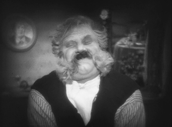
Murnau introduced what came to be known in Germany as the entfesselte Kamera, the “unfastened camera,” beginning in the opening shot where an elevator with a grill descends, carrying the camera and dramatically revealing the lobby. Murnau may have been directly influenced by one of last year’s top-10, Cœur fidèle, where Epstein put his camera on a spinning-swings carnival ride. Murnau saw other uses for the device. Like the Impressionists, he conveyed drunkenness through moving camera, though in this case he put the actor and camera on a turntable, so that the room spins past behind Jannings, conveying the dizzy happiness of the doorman at a party (above).
Using more imagination, Murnau follows sound with his camera. As the party ends, musicians exit to the apartment-block courtyard, and one plays a final tune under the window. Starting with a close-up, the camera “cranes” diagonally up and backward until the men are in long shot. A cut takes us to the doorman inside, happily listening.
Actually the camera was not on a crane. Murnau and cinematographer Karl Freund affixed a track over the courtyard with a small metal elevator underneath, so that the camera could move both back and forth and up and down. The camera was not literally unfastened in these cases, but it looked like it was.
Murnau wanted to end the film on a grim note with the protagonist seated alone in the hotel rest room. Commercial considerations led to a happier ending, however, with him unexpectedly becoming wealthy. The twist was so outrageous that Carl Mayer, the scenarist, considered it a comment on Hollywood’s insistence on happy outcomes. Hence the English title The Last Laugh. The original German means “The Last Man.”
The Last Laugh got distribution in the USA, but it was not a success. Hollywood practitioners studied it, though, and started hanging cameras from tracks themselves and trying other tricks. The track backward above a long, laden banqueting table soon became a cliché of Hollywood cinema.
Murnau would make two more mildly Expressionist films, Tartuffe (1925) and Faust (1926) before heading to Hollywood to make the ultimate hanging-camera film, Sunrise (1927)
The Last Laugh is available from Kino in the USA and Eureka! in the UK.
One of my favorite films of the 1920s is Lang’s two-parter, Die Nibelungen: Siegfried and Die Nibelungen: Kriemhilds Rache (Kriemhild’s Revenge). An adaptation of the ancient German myth, it mostly proceeds at a stately pace until the final battle scene. Some may find it slow, especially when compared with the lively, suspenseful Dr. Mabuse der Spieler (1922) and Spione (1928). Yet its leisurely presentation is appropriate to the subject matter. Equally important, lingering over images allows us to notice the details of the extraordinary settings and costumes, with their busy decorated surfaces and their startling arrangements within the shot.
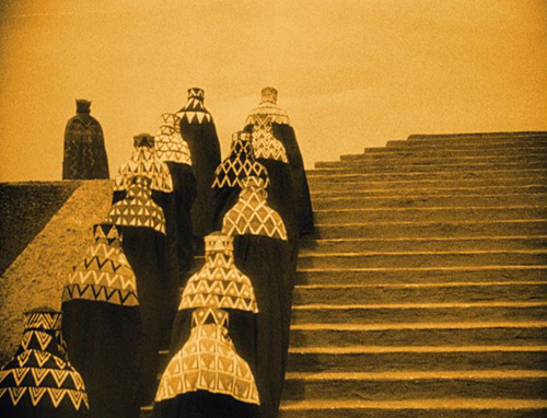
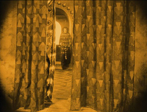
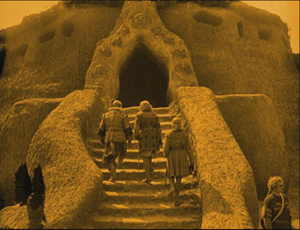
Take the image at the top of this entry. Brunhilde, having been forced to marry King Gunther against her will, envies her sister-in-law Kriemhild, who has married Siegfried, the man Brunhilde loves. In this shot, Brunhilde mounts the steps of Worms Cathedral to confront Kriemhild and assert her right to enter the cathedral first. We see her from behind and then at the upper left as her ladies follow her, wrapped in their patterned hoods and black cloaks, creating an almost abstract composition. Lang build the enormous stairway outside the cathedral in two stages and then used the set imaginatively to stage several ceremonies and dramatic conflicts.
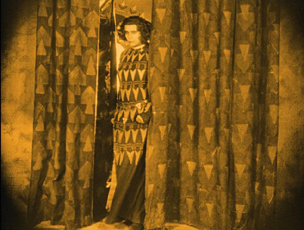
What makes this film Expressionist, I would argue, is the way the actors and settings interact, as in this moment when Brunhilde pauses by her window and then comes forward through the slightly parted curtain, exiting left. She pauses in the opening, her dress seemingly becoming part of the curtains for a moment.
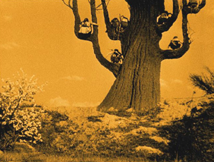
The similarity and the pause have no narrative function, but it’s a very Expressionist composition. Insistent symmetry and acting also contribute to the style. In the second plot, the Hunnish King Etzel asks for Krienhild’s hand in marriage. She agrees on the condition that he will aid her in exacting her revenge on Siegfried’s killers. Upon her move to the land of the Huns, the style becomes a more familiar sort of Expressionism, with distorted trees and buildings that looks like they were built of mud that settled oddly before drying:
The elements of the German tales are all here: love, betrayal, suicide, revenge, presented in images worth savoring.
Lang was inspired in his approach to the film’s visuals by some illustrations by Carl Otto Czeschka for a 1909 retelling of Die Nibelungen published in 1909. The heavy decoration on the knight’s shields and many other surfaces in the film somewhat resemble this image, for example:
Yet the resemblance is far from exact. Clearly Lang used elements from these illustrations and took them off in his own direction.
The film has recently been restored and looks great on Blu-ray. Kino in the US and Eureka! in England have brought it out. Both have DVD editions as well.
Scandinavia’s golden age drawing to a close
During the first half of the 1920s, the Swedish cinema was a victim of its own success. Victor Sjöstrom (who has figured in these lists in 1918 and 1921, as well as in our “Lucky ’13” entry), had headed to MGM, becoming Victor Seastrom. In 1924 he released his first two films in 1924: Name the Man and He Who Gets Slapped. The latter was the newly formed MGM’s first in-house production to be released. It was a huge success, no doubt in large part due to the growing stardom of Lon Chaney, and it put the studio on the map and allowed Seastrom to stay in Hollywood, notably for The Scarlet Letter (1926) and The Wind (1928).
Mauritz Stiller (also a previous top-10 choice) was about to head for Hollywood as well, but his final Swedish film is one of his finest. Gösta Berlings Saga, a epic adaptation of Selma Lagerlöf’s novel, was made in two parts lasting over three hours. Many people will know it as the debut film of Greta Garbo. Fans should be forewarned that she is an important character and appears in the early and late scenes but disappears for a long stretch in the middle.
[December 30: As our friend Antti Alanen points out, Garbo had already acted in a comedy, Luffar-Petter (Peter the Tramp, 1922) and in some short advertisements.]
The film begins with Berling, a drunken pastor in a small town, being relieved of his duties. He ends up being taken in the “Chevaliers” at Ekeby the country estate of Margaretha Samzelius, a tough middle-aged woman who runs a group of foundries she has inherited from a lover. The Chevaliers are a group of hangers-0n, men who can drink and laze about most of the time but who must be charming and entertaining at Samzelius’ many dinner parties. Berling has a number of chances to redeem himself but ends up harming the people around him and sinking lower into despair. He is finally redeemed by the love of the Garbo character, Elizabeth, the new bride of a wealthy neighbor, to whom, it turns out through a technicality–and happy coincidence–she is not actually married.
Hansen and Garbo make a gorgeous couple (below left), but they are upstaged by the great Swedish stage actress Gerde Lundequist as Samzelius:
As usual, the film contains lovely scenes in the Swedish landscapes. There are some impressive night sleigh rides, including a famous scene in which Berling and Elizabeth are chased across a frozen lake by wolves. There is also one of the most impressive fire scenes I can recall from the silent era, as Samzelius’ efforts to smoke the Chevaliers out of the guest house where they live and inadvertently sets fire to the big main house as well.
Unfortunately the film was cut down into a single feature for its release outside Scandinavia. The Story of Gosta Berling was the main version that circulated for many years. The Swedish Film Institute restored it in stages as more footage was found, but the current print, at 183 minutes, is still missing some footage.
Beware picking up an older video release with the truncated film. The restored version was released on DVD in the USA by Kino. The original Svensk Filmindustri release (with English, French, Portuguese, German, and Spanish subtitles), is available here. The same DVD comes in a box set of six Swedish silent classics, which is widely available from the usual online sources.
Carl Dreyer has popped up on this blog several times, usually in passing. Not surprising, since David wrote a book about him way back 1981. Here he makes his second appearance on our ten-best lists (the first having been for his first feature, The President, in 1919) with Michael.
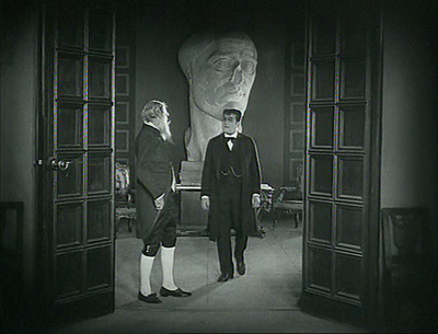
The film centers around a wealthy, aging artist, Claude Zoret. The main room of his house is decorated with several eye-catching pieces of sculpture, notably a mysterious battered head that looms in the background of many shots. Is it one of Zoret’s own works? Is it part of a collection of ancient statues? Much of the action takes place here, which has led some historians to place Michael in the tradition of the Kammerspiel. David calls it a borderline case. There are certainly scenes that leave Zoret’s studio, most notably one in a large theater set.
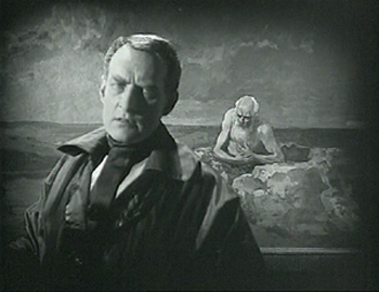
The film has been hailed as an early treatment of homosexuality. Although there is nothing overtly expressed, it is hard not to read such a subtext into the action. Zoret, wonderfully played by Danish director Benjamin Christensen, has many guests and admirers visit him, creating a little all-male coterie. He has taken in a young protegé, a very beautiful and very young Walter Slezak. Zoret refers figuratively to Michael as his son, but there seems to be another tie between the two. Moreover, there may be a hint that Charles Switt, a journalist apparently writing a biography of Zoret (at the center of the frame above), feels some jealousy toward the young man.
Trouble begins when a princess comes to commission a portrait from Zoret. Although he usually doesn’t do commissions, he is intrigued by her face and agrees. During her visits to the studio to pose, she meet Michael, who is immediately smitten. The affair continues as Michael becomes increasingly inconsiderate to Zoret,borrowing money to continue the affair and missing an important showing of his work. In contrast, Zoret shows unwavering generosity to Michael, despite being devastated by his desertion.
Ultimately Zoret paints his last work, showing an elderly, lonely man against a barren seascape. It is hailed as a masterpiece at a party which Michael does not attend.
The character study proceeds at Dreyer’s usual formal pace, and yet it is never dull. As much as any of his silent films, it looks forward in tone to his later sound ones.
A very nice print of Michael is available in the UK from Eureka! (not deliverable to the USA); Kino released what I assume is the same print in the USA.
She was nothing but a poor flower-maker
Every now and then I want to put a film on the list which is impossible to see unless you happen to live near one of the archives that has a print and they happen to program it. Still, in the hope of inspiring someone to restore it and make it available, I proceed.
The film is Jean Epstein’s L’Affiche (“The Poster”). Epstein first made our list last year for the much better known Cœur fidèle. L’Affiche is a bit like the earlier film, a simple melodrama made in the French Impressionist style. Its situation is highly conventional, and its plot depends on a massive coincidence.
The heroine is introduced as Marie, one of several women making artificial flowers. On her lunch break she thinks back to a romantic day she spent in the country. There she meets a young man, Richard. The couple go to an expensive restaurant, and Richard seduces Marie, and then abandons her, driving away alone the next morning.
Three years pass, and Marie has a small child, also named Richard. She enters him in a contest for the most beautiful child, with a cash prize, offered by an insurance company that wants to put the winner on their advertising posters. The boy wins, and Marie signs a 10-year contract for the rights to use little Richard’s image.
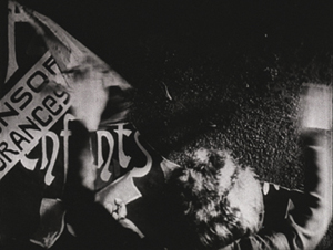
The child dies, however, and Marie visits his grave. As she leaves, she sees a huge poster with his image. The campaign has begun. Everywhere in Paris she goes, she sees the poster and finally begs the insurance company to end the campaign. The boss, however, refuses. Marie begins tearing down the posters, and she is soon arrested. Epstein handles the arrest scene without an establishing shot but builds it up through close-ups.
Initially we see only the back of Marie’s head and her arms tearing down a poster. There a cut-in to slightly closer framing as a policeman’s hand comes into the shot and touches her shoulder. A third shot shows her turning to the officer and staring in a way that suggests she is becoming mentally unbalanced. Finally a long shot establishes the scene as a second policemen enters to help arrest her.
It’s the sort of gradual revelation of space that Kuleshov was working with at the same time.
The boss of the insurance company is informed of this and sends his son to file a complaint against her. New copies of the poster are being put up all over town. The son is none other than the Richard who seduced Marie years before. Hearing her tale, he asks her forgiveness and takes her home to his parents. The father forbids their marriage, they marry anyway, and eventually (after his own younger child dies!), the boss blesses the marriage and agrees to take down the posters.
Summarized baldly, it sounds like an impossible plot to take seriously, but Epstein’s delicate, understated approach in presenting it and Nathalie Lissenko’s affecting performance as Marie manage to make it a great film. It’s full of Impressionist moments: Marie’s memory of her romantic day with Richard, a dance scene with rhythmic editing, a dream sequence, and plenty of gauzy shots and fancy wipes at transitions.
Earlier this year I complained because L’Affiche was not included in the big new box set of Epstein’s work, despite almost everything else from the period being there. It’s also not on the box set of films made at the Russian emigré studio, Albatros, even though Epstein’s other three Albatros films are there. I don’t whether there are rights problems or there simply isn’t a good enough print.
At least one streaming service claims to have L’Affiche available, but a search turns up numerous complaints about the site.
I should make mention of one other Impressionist film that came out in 1924. Perhaps it should be on the list rather than L’Affiche. It’s Marcel L’Herbier’s L’Inhumaine. L’Herbier appeared on our 1921 list for El Dorado, and even then I expressed reservations. Most of his films seem cold and by-the-numbers to me, not to mention a bit pretentious. But his films were historically important, and L’Inhumaine was influential in its use of art deco sets. At one time the film was available on DVD, but it seems to be out of print.
Three funny men …
And no, it’s not Chaplin, Keaton, and Lloyd this time. Chaplin didn’t release a film in 1924. His next would be what many would consider his funniest feature, The Gold Rush.
Over the years I’ve stressed that during the 1910s, the three great comics were working in shorts, honing their filmmaking and working up to their great series of features. By 1923 they had fully made the transition: Lloyd made Safety Last and Keaton Our Hospitality. Safety Last had a simpler plot, structured mainly by the stages of the hero’s climb up a building. Keaton went further with a complex story of a romance blooming between members of feuding families, using multiple locations, a developing causal line, and clever motifs. (We analyze it in Chapter 4 of Film Art: An Introduction.)
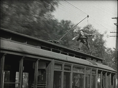
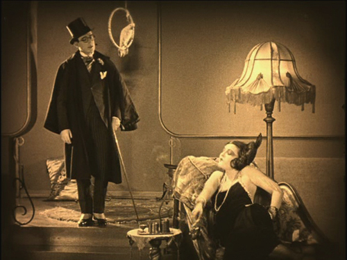
In 1924, Lloyd achieved a similar complexity with Girl Shy, one of his greatest films. He plays a bashful young tailor’s assistant who is terrified of women. Yet in secret he writes a guide for seducers, taking on the narrational persona of a jaded man of the world. Clearly he has taken his inspiration from movies of the day. The imaginary scenes from his book dramatize his success in gaining the love of a vamp (see bottom) and a flapper. The publishers decide that the book is so over the top that they will publish it as a comic story. During all this Harold develops a relationship with Mary, a quiet young woman from a wealthy family. When her father tries to buy Harold off, he pretends to spurn Mary. She is about to marry a rich man, but Harold determines to stop the wedding.
There develops one of the most epic chase scenes in all silent comedy, and indeed all cinema, as Harold commandeers all manner of vehicles, from cars and wagons to a firetruck and a speeding trolley (above).
Even Keaton never outdid that one. But from 1923 to 1927, these two each created a string of innovative, carefully crafted, hilarious films.
Girl Shy used to be available in a 3-DVD set from New Line, but that is no longer available–though one optimistic third-party seller offers it, still sealed in plastic, for $399.99). Now the individual releases of each DVD seem to be slipping out of print as well. Volume 1, which contains Girl Shy, is definitely out of print. Be forewarned: Volume 2, which includes the wonderful 1927 film The Kid Brother (look for it on a future list) seems like it’s not long for this world, and the same is true of Volume 3, with For Heaven’s Sake (1926).
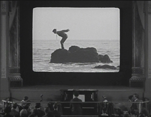
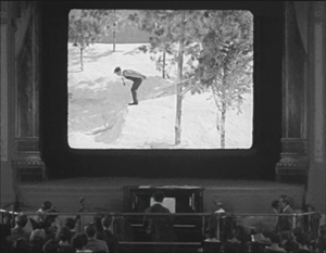
It was difficult to choose between Keaton’s two major releases of 1924, Sherlock Jr. and The Navigator. I chose the former mainly because of its perpetually astonishing transition from the frame story of a small-town projectionist unlucky in love to his dream of himself as a sophisticated detective. His dream takes the form of a movie, and the sleeping projectionist walks through the theater and into the onscreen action. With extraordinary precision, Keaton maintains a long-take framing of the pianist and audience in the auditorium while the hero onscreen undergoes a series of unexpected shot changes. In each he is in the same pose and position within the screen, but the backgrounds change arbitrarily, as when he begins to dive from a rock into the ocean and finds himself landing in a snowdrift:
The result is a marvelously convincing technical feat, giving the illusion of being a single shot as far as the theater is concerned and on the movie screen a character wandering through an appropriately dream-like series of edited shots. In general, Keaton was the most adept of the three great comics at using cinema technology to create gags, and this is his most elaborate attempt. (Though see also his short, The Playhouse, in which multiple exposures, flawlessly managed in-camera, create Keaton clones that play all the roles.)
The plot of the dream emerges after this virtuoso transition, and it remains hilarious throughout. The chase, while not quite as dazzling as the one in Girl Shy, has considerable variety of vehicles (one wonders if the two comics were consciously trying to best each other), including a passage where the hero rides the handlebars of a speeding motorcycle, unaware that the driver has fallen off.
Kino has packaged Sherlock Jr. together with Keaton’s early feature, The Three Ages (1923), and released them both on DVD and Blu-ray.
The third funny man was Ernst Lubitsch. The Marriage Circle was his second Hollywood film, and one of his best. Lubitsch had started out as a comic in silent shorts in Germany, but unlike the famous Americans, he entirely gave up acting to direct. Not that he directed only comedies, but his best films, including Lady Windermere’s Fan, Trouble in Paradise, and The Shop around the Corner, fall into that category.
The Marriage Circle is a light romantic comedy, following a chain of flirtations and misunderstandings. Prof. Stock has realized that his pretty young wife Mizzi has begun to neglect and nag him. She is soon attracted a newlywed, Dr. Braun. Mizzi happens to be an old friend of Braun’s wife Charlotte, which gives her opportunities to flirt aggressively with Braun. Charlotte is in turn admired by Braun’s medical partner, Dr. Mueller, though she laughs off his attempts to woo her.
It has often been pointed out that Lubitsch is a director of doorways. That’s not always true, but The Marriage Circle is built around visits. The five characters visit each other in various combinations, and the string of attempted seductions and jealousies builds. Stock encourages Mizzi’s pursuit of Braun, since he wants an excuse for a divorce. Charlotte naively pushes Braun into visiting Mizzi at home when she plays sick.
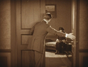
The sets and especially the doorways play a big role. Characters pause in doorways to take in a compromising situation they have interrupted. At one point Mizzi comes to Braun’s office. Mueller spots them in an embrace, but Braun claims he’s hugging his wife. Eager to alienate Charlotte from her husband, he opens the office door to reveal Charlotte in the waiting room:
This is the first film where one can see the “Lubitsch touch” in action. It’s an ability to use film techniques to hint at something naughty. Here the innuendos are aimed at the characters. We know more than any of them does, and the humor arises from watching them misinterpret what they see and hear. When they finally learn of their mistakes, they end the “circle” of the title.
The Marriage Circle is available to rent or buy in digital form on Amazon. I know nothing about the source or the quality. The only DVD easily available is a region 2 French one under the rather blah title Comédiennes. The print is distinctly soft (as the frame above suggests) but acceptable until a better one becomes available.
… and one not so funny
Greed is often spoken of as the film that historians and buffs would most like to see rediscovered. Part of it survives, of course–about two hours out of the original eight or so. Its producer, MGM, had it was edited down into a reasonably coherent feature, mainly by cutting out a number of characters and their subplots. I won’t say much about the film here, since it is already quite well-known.
The film is an adaptation of Frank Norris’ novel McTeague done in a naturalistic style, which was unusual for Hollywood films of that or any other day. It follows McTeague, an unlicensed dentist, who steals his friend Marcus’ girlfriend, Trina, and marries her. Their luck fluctuates, as Trina wins a lottery and McTeague is thrown out of work for not having a license. Trina becomes an obsessive miser, and McTeague, by now an alcoholic, murders her and flees to Death Valley with her money.
I find a lot of Greed heavy-handed and obvious. (I prefer the simpler Blind Husbands, which made our ten-best list for 1919.) It has an interesting style, however, with a lot of proto-Wellesian deep focus and low angles, complete with, in the case of the frame above, a hint of a ceiling. The final sequence in Death Valley is also very effective.
Apart from being 75% lost, Greed has never been released on DVD. (See Indiewire for comments on this.) In 1999 Turner Classic Movies edited a four-hour version, inserting production stills to suggest the missing scenes. This was reasonably effective, but it seems impossible to find a print of it that is not washed out and fuzzy. We’ve tried taping off TCM, as well as buying the VHS and laserdisc releases of that version. They all verge on unwatchable. I hope that the situation is not left where it is and that a true restoration is eventually done. My frame above comes from an archival 35mm print, so clearly better material exists.
The lost film that I would most like to see discovered is Lubitsch’s Kiss Me Again (1925). Given that it was made right before Lady Windermere’s Fan, there’s a good chance that it’s a masterpiece.
One of a kind
Last year I put Man Ray’s experimental short, La retour à la raison, on the list. Comparing experimental shorts to fiction features, though, seems unfair. This year I’m separating out the experimental category and will try to choose at least one film each year.
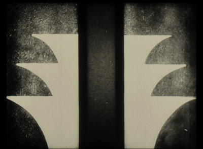
This year it’s Walter Ruttmann’s Opus 3, the third of his four films done with abstract animation.
All of the Opus films plus other Ruttmann shorts are available on a DVD set with Berlin, die Sinfonie der Grossstadt and Melodie der Welt. If you want to sample just Opus 3, which is about four minutes long, it has been posted multiple times on YouTube. Although a bit dark, this is the best copy I’ve found, and it has a nice, appropriate score by Hanns Eisler.
Bernard Eisenschitz made the connection between Lang and Czeschka in his massive Fritz Lang au travail (Cahiers du Cinéma, 2012) , pp. 38 and 42. Czeschka’s Nibelungen illustrations can be see along with the entire book on the Museum of Modern Art’s website, with a page-turning feature and the ability to enlarge the pages considerably. Individual illustrations can be found with a Google Images search on “Czeschka” and “Nibelungen.”
Thanks to Jonah Horwitz for a correction.
Girl Shy
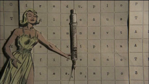
Swimming in Lethe: A Lewis Klahr film, now online
DB here:
I just learned that Lewis Klahr, a filmmaker we like a lot (go here and here), has posted a 2009 film online. See Lethe here in its HD glory, accompanied by a program note by Tom Gunning.
But hurry! It’s being taken down on Friday.
Thanks to Lux Artists Moving Image and Mousse magazine for making this and other artworks available. And thanks to Madison Film Forum for the link.
The ten best films of … 1923
Le brasier ardent.
Kristin here:
Six years ago David and I celebrated the 90th birthday of the classical Hollywood cinema with a post that included a list of what we considered the ten greatest (surviving) films of 1917. Choosing the ten best films of 90 years ago has become a custom, one which helps us avoid doing a ten-best list for the current year. It’s a way of drawing attention to some wonderful but often little-known films, for those who are interested in exploring the treasures of silent cinema.
For previous entries, click here: 1917, 1918, 1919, 1920, 1921, and 1922.
For some reason, that 1917 list was pretty easy to put together. In recent years, I’ve had more trouble. As I wrote last year, “For the past two years, I’ve noted that it was difficult to fill out the list of ten masterpieces. I keep thinking that I’ll get to a year where I won’t have to say that, but 1922 turns out not to be that year. Some titles were obvious, but the last one or two took some hunting.” Well, 1923 still isn’t that year. I’ve again had some trouble filling out the top ten.
Why? 1923 should be packed with worthy candidates. But oddly, some of the most significant directors of the era didn’t make films that year. This seems to have been partly because success brought greater ambitions. In 1923 Fritz Lang was preparing his epic two-part Die Nibelungen, guaranteed to show up in next year’s list. Abel Gance had embarked the long road to the release of Napoléon, four years later.
Carl Dreyer, who had made three films in 1919 and two each in 1920 and 1921, was bouncing around among companies and countries in the mid-1920s, and didn’t again release anything until his 1924 German-produced film, Michael.
Others made relatively unremarkable films. F. W. Murnau’s surviving film from 1923, Die Finanzen des Grossherzogs, serves mainly to prove that comedy was not his strong suit. Victor Sjöström’s Eld ombord (The Hell Ship) doesn’t match the masterpieces we find elsewhere in his career. Louis Feuillade’s 1923 feature Le Gamin de Paris is likewise unexceptional, though it’s of interest for showing his abandonment of complex staging and his conversion to American-style cutting, including angled shot/reverse-shots. (Of Feuillade’s 1923 installment film Vindicta, we can’t speak; we haven’t been able to see it.)
Other films are lost. John Ford made four films that year, only one of which survives: an incomplete, beat-up version of Cameo Kirby that doesn’t make it look like anything special. Murnau’s first 1923 film, Die Austreibung, seems to be gone. Mauritz Stiller’s The Blizzard is lost, and he, too, was probably already involved in his own 1924 two-part epic, The Saga of Gösta Berling.
[December 29: Brian Darr tweets that The Blizzard is not lost, which I am glad to learn. Its Wikipedia entry confirms that it is only partially lost, with about two-thirds of the film known to be preserved.]
Finally, the Soviet cinema, which was to make such major contributions to 1920s cinema, had not yet gotten off the ground.
Still, with some help from David, I’ve concocted a list with some great films and some near-great ones. The place to start was obvious.
From the ridiculous to the sublime
Some years now we’ve been watching the careers of Charles Chaplin, Harold Lloyd, and Buster Keaton delivering wonderful short films and inching toward even greater things. This was the year they blossomed.
Chaplin made a charming short feature, The Pilgrim, this year, but he also surprised everyone by making a sophisticated sex comedy (appearing only in an unrecognizable cameo as a porter). The title role of A Woman of Paris features Chaplin’s regular leading lady, Edna Purviance, as a village girl, Marie, who loses her young boyfriend Jean through a misunderstanding. She runs off to the city to become a rich man’s mistress and realizes too late what she has lost.
The plot centers largely around this romantic triangle and Marie’s indecision about whether to return to her boyfriend, who has become an impoverished artist in Paris, or to stay in the luxurious life that Pierre provides her. The affair between Marie and Pierre is handled in a sophisticated and yet subtle way. There are no love scenes, but at one point Pierre finds himself without a handkerchief and goes into the bedroom to pluck one casually out of drawer. Clearly he spends a lot of time in their love nest.
 At the same time, the film deals more generally with the gulf between the very wealthy and the working-class people who who serve them. In one well-known scene, a woman gives Marie a massage, and the camera stays mainly on the masseuse as she tries to maintain a neutral expression while obviously being shocked by the lurid gossip between Marie and a friend. In another, a kitchen assistant in a swanky restaurant cannot bear the odor of the aging game bird he has to fetch for the chef, but the chef and Pierre consider it a prime delicacy.
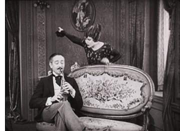
One of the strengths of the film is that it does not take the obvious approach of making Pierre into a fat, obnoxious oaf. On the contrary, Adolphe Menjou plays him as a witty, unflappable figure. He thinks nothing of arranging a marriage with a rich woman while planning to carry on his affair with Marie, but he puts up with her shifting moods and does genuinely seem to love her. The touch of having him play his saxophone while Marie has a tantrum and orders him out (right) typifies the light touch Chaplin applies to what is ultimately a tragic story.
A Woman of Paris was not well received upon its release, at least by the ticket-buying public, who expected a Chaplin film to star the Little Tramp and to be straightforwardly funny. The title at the beginning, where Chaplin explains that he does not appear in the film undoubtedly did little to appease them. Many critics were respectful, however, and other filmmakers recognized the new type of sophisticated comedy that he had introduced. Lubitsch, who was working on Rosita at the same studio, United Artists, was definitely influenced by it–as we shall see next year when his The Marriage Circle figures in the top ten of 1924. That film includes Menjou, playing a similar role, and in fact after playing minor roles for nearly ten years, he became a star with Chaplin’s film.
[February 10, 2014: Paul Duncan, Film Book Editor for Taschen, has kindly supplied figures showing that A Woman of Paris was profitable, if not as much as Chaplin’s other films: “It earned United Artists $634,000, of which $608,868.91 went to Regent Film (the company Chaplin formed to produce films for Edna Purviance). So with a production cost of $351,853.03, A Woman of Paris made a healthy profit, though, as you write, obviously it would have been more if it had been a comedy starring Chaplin.” Paul also informs me that Taschen’s The Charlie Chaplin Archives, which he is editing, will be published later this year.]
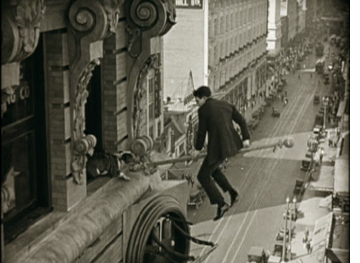 By 1923, Harold Lloyd had already done some shorts featuring nail-biting but hilarious comedy high up on skyscrapers. (See High and Dizzy in our 1920 entry.) In 1923 he took the same sort of premise into the feature-length Safety Last and created an indelible image: a brash young man hanging from a tilting clock. The gags go on story by story. After surviving the clock, Harold manages to get to the next level, only to be chased out a flagpole by a dog (left). Looking back, people tend to remember the vertiginous climb as the whole film, though remarkably, it takes place only over the last third. Earlier scenes involve a romance and misunderstandings that arise from the hero’s job at a department store.
Safety Last wasn’t Lloyd’s greatest film, but it launched the greatest period of his career. He’ll probably be joining us for these nostalgic lists every year now until 1927. The film is still available as part of New Line’s big box set of Lloyd’s films on DVD. (Buy that one, and you’ll be a step ahead of those future lists.) This summer the Criterion Collection brought Safety Last out on DVD and Blu-ray. There’s only that one feature on the disc, but it includes several supplements, including three newly restored Lloyd shorts and Kevin Brownlow’s 104-minute documentary, The Third Genius.
Keaton, too, entered a hugely creative streak in 1923. He made an amusing satire on Intolerance, the feature-length The Three Ages, in which Buster traces love through the stone age, the Roman era, and the Roaring Twenties. As Keaton himself acknowledged, “Cut the film apart and then splice up the three periods, and you will have three complete two-reel films.” He followed it up, however, with a masterpiece that displayed a complete command of story structure in the classical Hollywood mold: Our Hospitality. It’s arguably as fine as anything he ever made, except The General, which just edges it out.
Interestingly, Our Hospitality and The General are Keaton’s only two period pieces. (that is, if one excepts The Three Ages, which is far more farcical and does not attempt to recreate a realistic period atmosphere.) Both also take place in the South, and outdoors to a considerable extent. The milieu seems to have inspired him. Dealing with old-fashioned trains and other technology generated a lot of clever gags, and the fields, forests, and rivers helped give these two films a pictorial beauty that separates them from the Keaton’s other films.
Way back in 1978, when David and I were working on the first edition of Film Art: An Introduction, we wanted to include an extended analysis of a single film in each of the chapters on film technique. For mise-en-scene we chose Our Hospitality, which contains numerous uses of setting, costume, acting, and lighting brilliant enough to inspire a teacher and straightforward enough for students to notice and understand. Plus what better way to win over students who think that old black-and-white silent movies aren’t worth watching?
The story is simple. Willie McKay, the hero, travels from New York to the deep South, under the impression that he has inherited a mansion. The trip south on a very old-fashioned train supplies a long string of marvelous sight gags. There Willie meets the heroine, who shares his coach. Upon arrival, Willie discovers that his “mansion” is really a decaying house. Since the heroine has invited Willie to dinner, he wanders around to pass the time, unaware that he has inherited something else: a feud. The heroine’s family has a longstanding grudge against the McKays, and the father and two brothers are determined to shoot Willie. The only catch is that Southern hospitality dictates that they cannot kill him while he’s in their home.
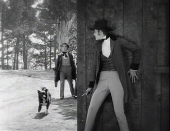
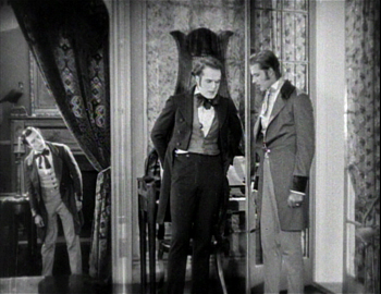
In our analysis in Film Art, we pointed to the many motifs Keaton uses in service of the narrative, such as the moment of the hero’s rescue of the heroine as an echo of the earlier fishing pole/waterfall gag. One stylistic motif of staging comes back several times: Keaton using foreground doors or walls to create depth staging of moments when people spy or eavesdrop on others. In the frame on the left below, one of the brothers waits to ambush Willie, who is unaware of his presence (or indeed of the feud itself). In the one on the right, Willie eavesdrops on the brothers in their house, learning that they intend to kill him but that he is safe inside the house. Now Willie learns what’s going on, while the brothers don’t realize that he’s overhearing their plan. Such compositions are a motif in the film, forming a way of manipulating the narration–usually giving us more information than the characters onscreen have.
Like Safety Last, Our Hospitality ushered in the prime of the comedian’s career. Keaton made a string of marvelous features that lasted until The Cameraman in 1928. He didn’t always sign the films as director (he’s listed as co-director of Our Hospitality, along with John Blystone), but his unerring sense of how to compose images for the entire frame, both its surface composition and in depth, suffuses all his films of this period.
I’ve mentioned that Lubitsch was working at United Artists in 1923. Rosita was his first American film, starring Mary Pickford. It’s certainly not a masterpiece on the level of The Marriage Circle or Lady Windermere’s Fan, but Rosita is a charming and impressive film, certainly at least as good as Lubitsch’s other lesser films of the decade, Forbidden Paradise and Three Women.
As I discuss in my book, Herr Lubitsch Goes to Hollywood, the director had already been tentatively using classical Hollywood style in his last two German films, Das Weib des Pharao and Die Flamme. In Rosita, he managed to balance a typical historical epic from his German period (Madame Dubarry, Anna Boleyn) with the light, vivacious appeal of his star. She plays the title character, a cheerful street musician who is in love with Don Diego, an impoverished nobleman and military officer. Rosita catches the eye of the lecherous king. Don Diego ends up condemned to death, and Rosita plots to save him.
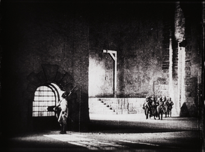
The sets were built on the enormous backlot of United Artists, where Douglas Fairbanks’ castle for Robin Hood had stood. The day after Rosita wrapped, the construction of the sets for The Thief of Bagdad began on the same lot. Indeed, one can detect a distinct similarity between Rosita’s big sets–city streets and a large prison–and those of the two Fairbanks films. This frame is a shot of the prison interior emphasizing a gallows in the background:
Given that this giant set was built in the open air, Lubitsch must have filmed this and other scenes at night, using the giant arc spotlights that had recently become a standard tool of Hollywood filmmaking to throw great swathes of illumination across the scene. In general, Rosita‘s style demonstrates that by 1923, Lubitsch had come fully to understand the American approach.
As a vehicle for Pickford, the film also is skillfully done, permitting her numerous intimate scenes that show off her charm. Given her star persona, the dramatic situation is leavened with humor in the interior scenes. Rosita’s poor family, a large, rowdy bunch, provides much of this, as when Rosita brings home a perfumed handkerchief and the impressed parents and children in turn bury their noses in it and sniff deeply. Rosita’s reactions to the King’s attempts to seduce her are also somewhat comic, though there is definitely a threat hanging over the situation.
Unfortunately, like all too many of the films on this year’s list, Rosita is difficult to see. It seems to have survived only in a Russian print, and a rather contrasty, worn one at that, as the frame above demonstrates. As long as that is the sole available material, a restoration might be too daunting. Still, in this day of digital manipulation, perhaps something could be done to improve the image quality. I hope at some point it will become available on home video. That also goes for Lubitsch’s other somewhat lesser films of the mid-1920s, Forbidden Paradise and Three Women.
Rosita’s reputation has suffered from strange statements Pickford much later made to Kevin Brownlow and which he published in The Parade’s Gone By. There she claims she and Lubitsch did not get along and that the resulting film was bad and a commercial failure. With the film itself unavailable for viewing, Pickford’s condemnation was accepted at face value. In fact, documents in the United Artists archive at the Wisconsin Center for Film and Theater Research overturn Pickford’s supposed dislike for Lubitsch. For years she tried to find financing to make another film with him, and in 1926 she called upon him for help in editing Sparrows. With the discovery of the Soviet print, it becomes apparent that Rosita was far from the disaster Pickford later claimed. Why her memories of her work with Lubitsch became so distorted late in her life we shall probably never know.
Overshadowed masters of French Impressionism
Abel Gance’s flashy La roue (on last year’s list) gets a lot of attention these days. He’s the high-profile representative of Impressionism. Yet 1923 saw the first fiction films from the director who was the movement’s modest heart: Jean Epstein. The very first, L’auberge rouge (“The Red Inn”) is a lovely film, but Cœur fidèle (“Faithful Heart”) epitomizes the quiet side of Impressionism. It’s story is as simple as they get: Marie is a barmaid whose foster parents try to force her to marry a thug, Petit Paul, while she is in love with the sensitive dock-worker Jean. The scenes around the waterside and the famous sequence in a carnival are all done with a realism blended with the subjective camera techniques that convey the characters’ thoughts, perceptions, and feelings in a way that was fresh at the time.
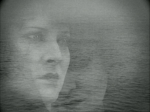
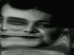
The exteriors were shot around the docks of Marseille, and Epstein uses superimpositions of the ocean to convey the lovers’ longing. Waves are sometimes superimposed over their figures, or one will look into the water and see the other’s face there, as when Jean envisions multiple images of Marie:
Shooting into a distorting mirror, Epstein uses the conventional Impressionist indicator of drunkenness as Petit Paul looks at a woman next to him in a bar:
Coeur fidèle has been released in the UK (Region 2) as a DVD/Blu-ray combo in Eureka!’s Masters of Cinema series. (This includes a helpful little booklet with excerpt from Epstein’s writings and a review of Cœur fidèle by René Clair.) It is also available as a Region 2 French DVD without English subtitles. As these frames indicate, the film survives in beautiful condition.
Along with La roue, Cœur fidèle proved hugely influential. It used the “unfastened camera” that later was credited to Murnau in The Last Laugh. Like Murnau, Hitchcock picked up Impressionist style, as reflected most obviously in his 1927 boxing film, The Ring. Hitchcock’s penchant for moving camera and subjectivity never went away. Hollywood, too, picked up the subjective techniques of Impressionism, especially in the 1940s films that David is studying now.
Unlike Cœur fidèle, Le brasier ardent (“The Burning Crucible”) was sophisticated, convoluted, and perplexing. It was one of two films directed in France by the Russian actor Ivan Mosjoukine for the émigré film company Albatros. (The earlier one is L’Enfant du carnaval, 1921; as far as I know, no print survives.) Earlier this year, upon the release of Flicker Alley’s box set of five Albatros films, I described Le brasier ardent:
It has a reputation as an audacious, surrealist, and almost incomprehensible film. This may be due to the fact that prints available in archives during the 1970s and 1980s lacked intertitles. The opening nightmare sequence is indeed disturbing, but at least with intertitles, we understand that it is only a dream. It begins with a wild-eyed man tied to a stake where he is about to be burned. The heroine stands looking on, resisting as the man pulls on her long hair, apparently intent on dragging her into the fatal flames to accompany him in death. Subsequent scenes of the nightmare show the heroine encountering different men, all played by Mosjoukine, culminating in a man in evening dress stalking her along a vaguely Expressionist street until she escapes and wakes up in bed.
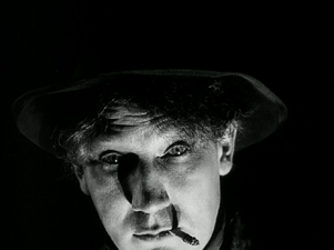
This nightmarish opening must have established vivid expectations in the spectators of 1923 as to what sort of film they were in for. After the heroine wakes up, however, what follows is quite different. The main plot is a stylized but quite amusing comedy. The heroine is a pampered wife, married to a rich man whom she does not love. She is faithful, but he is unreasonably jealous. He goes to a distinctly odd detective agency, one department of which is “Recovery of Lost Wives” (above), with “Success guaranteed!” and “Nothing to pay in advance!” Juxtaposed with the bizarre opening, this quirky humor might have eluded puzzled audiences of the day. Certainly the film itself was a failure, and Mosjoukine stuck to acting thereafter.
Unfortunately for the husband, Detective Z, whom he picks from the eccentric group pictured above, is the very man, again played by Mosjoukine, whom his wife has dreamed about. What follows is an odd tale with the detective and wife gradually falling love. Mosjoukine, known for his tragic, intense characters in the Russian cinema, plays such figures in the fantasy sequences–but in the main story he is allowed to play for laughs, gamboling and rolling on the floor like a puppy when the wife finally appears at his mother’s apartment and declares her love for him.
Mosjoukine should not, however, be allowed to overshadow his co-stars, Ermolieff actors who were also were to make their way into the wider French production of the day, including Impressionism. The wife is played by Nathalie Lissenko, one of the stars of the pre-Revolutionary cinema, who had acted opposite Mosjoukine in Russia. Among her 1920s roles was the protagonist of one of Epstein’s finest films, the largely unknown L’Affiche (1924). The husband is Nicolas Koline, who started his career with Ermolieff only after the company had left the Soviet Union. He will be familiar to silent-film fans from his performance as Tristan Fleury in Gance’s Napoléon.
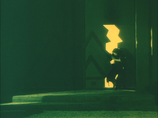
By this point, stylistic influences were beginning to pass back and forth between France and Germany. Le brasier ardent shows distinct touches of Expressionism in its decor, as when the heroine flees through a distorted door. (See top.)
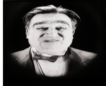 I have to admit that the third Impressionist film on our top-ten list, Germaine Dulac’s La souriante Madame Beudet (The Smiling Madame Beudet) is not one of my favorites. It hasn’t got much of a plot. A sensitive woman in a provincial town finds her husband crass and unpleasant until a final crisis brings them–at least temporarily–together. It’s not so much the simplicity of the story, however, as the rather heavy-handed use of subjective camera tricks to convey Mme. Beudet’s thoughts about her husband, as when a distorting mirror conveys her grotesque view of him (at right).
We’ve just seen a similar distortion in Cœur fidèle, above, to show a drunkard’s point of view. In Marcel L’Herbier’s El Dorado, from 1921, another distorted-mirror close-up suggests drunkenness without using a character’s point of view (see Film History: An Introduction, 3rd edition, p. 79).
The film has decided virtues, such as the lovely shots of the small provincial town in which the film’s exteriors were made, as well as the genuinely surprising and touching ending, which pulls back somewhat from the simplistic characterization of M. Beudet.
As with some of our choices from previous years, The Smiling Madame Beudet goes on the list partly because of its historical importance. Dulac was one of the early women directors to make a career in the cinema. Back in the days of 16mm, prints of this film were among the few Impressionist classics available for film club and classroom use, and the film became a staple in feminist-film courses.
Ironically, nowadays teaching the film is more difficult. Oddly enough, none of the mainstream labels has brought out a DVD with English subtitles. A German DVD, which includes two other short Dulac films, Invitation au voyage (1927) and the surrealist classic La coquille et le clergyman (1928), is available. The copy on this DVD is probably the same as the fairly good-quality Swiss archive print on YouTube, with bilingual French and German intertitles. For anyone with even an elementary knowledge of either language, the titles are not very challenging.
Caligarisme spreads
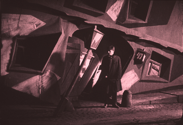
Caligarisme was the French word for cinematic Expressionism, which, as the example from Le brasier ardent shows, fascinating many French filmmakers.
Despite the lack of major contributions from Murnau and Lang, in 1923 the country’s cinema was going strong. Several films that fall slightly short of being masterpieces appeared. By this point the Expressionist film movement was well established, having begun in 1920 with Das Cabinet des Dr. Caligari. Some of its greatest films–Der müde Tod, Nosferatu and Dr. Mabuse der Spieler–had already appeared.
Three very good Expressionist films came out in 1923: Erdgeist (“Earth Spirit,” directed by Leopold Jessner), Schatten (“Shadows,” released abroad as Warning Shadows; Arthur Robison), and Raskolnikow (adapted from Crime and Punishment; Robert Wiene).
It’s really a toss-up as to which film should represent Expressionism on this year’s list. I give the edge to Erdgeist, largely because it and Von Morgens bis Mitternachts (“From Morn to Midnight”) are the two films from the movement that push the style the furthest. They come the closest to Expressionism as it existed in drama and the other arts. Most Expressionist cinema “tamed” the style a bit by applying it to genre tales: horror (Caligari, Nosferatu), fantasy (Der müde Tod), historical myth (Die Nibelungen), and science fiction (Algol, Metropolis). These two films, in contrast, depended on dramas where elemental human passions are released and taken to extremes, with the costumes, decor, makeup, and acting reflecting the characters’ inner states.
The film was based on the first of the two “Lulu” plays by Frank Wedekind: Erdgeist (1895) and its sequel Die Büchse der Pandora (Pandora’s Box, 1904). G. W. Pabst’s much better-known Pandora’s Box (1929) combines the two plays, which tell a continuous story about an amoral young woman who lives by exploiting wealthy men but drives them to extreme jealousy by flirting with other men.
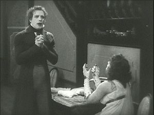
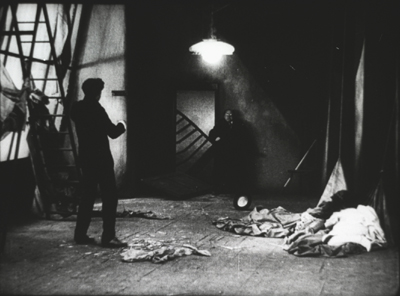
In Pabst’s film, Louise Brooks plays Lulu as a vivacious young woman, seemingly unaware of her disastrous effect on the men around her. Asta Nielsen plays the character in Jessner’s film as a ruthless, mature woman. The plot concerns Dr. Schön, a rich man who found Lulu on the streets when she was a child and has raised her with the intent of having her become his mistress. At the beginning, she is married to Dr. Goll but immediately begins seducing Schwartz, an artist hired to paint her portrait. In the image below, Goll bursts in on them in Schwartz’s studio and Lulu collapses at the right. The distorted stairway, the streaks of light painted on the set, and the jagged shadows all create the Expressionist look–as does the eerie blank glow of Goll’s glasses.
The acting is exaggerated and unnatural. Nielsen, foregoing all glamor, frequently holds a grimace on her face to the point where she almost looks like she is wearing a mask. In an early scene Goll moves his cane about, and she dances like a marionette attached to it by strings. (Puppet-like acting was a convention of Expressionist drama.)
Overall, the style is so grotesque and the characters so unpleasant as to make it clear why Erdgeist is one of the least remembered of the major Expressionist films. It is not available on home video. The print I saw about 16 years ago had Dutch intertitles and was somewhat dark. Perhaps, like Von Morgens bis Mitternachts, it will eventually be restored and released on DVD.
Two Expressionist films deserve brief mention as well.
Robert Wiene, the director of The Cabinet of Dr. Caligari, launched the Expressionist movement in cinema but never made another film that gained nearly as much attention. That’s a pity, because Raskolnikow is quite a good film–of all the Wiene films I’ve seen, probably his second best (though The Hands of Orlac, 1924, has its virtues). I found it difficult to decide between it and Erdgeist.
Crime and Punishment turns out to be, not surprisingly, a good fit for the style, with the hero’s increasingly bizarre view of the world literalized in the settings. The film seems to have had a higher budget than Caligari, and the sets are sturdier looking and more three-dimensional. (See bottom.) Wiene also had the good fortune to work with a group of Russian emigré theatrical actors who had trained under Stanislawski and worked at the Moscow Art Theater. Clearly they had to adapt their approach distinctly to achieve Expressionist performances, but they managed well. The lead, Gregori Chmara, makes a haggard and mercurial Raskolnikow.
Back in the 1970s, when I became intrigued by German Expressionist cinema, Schatten was considered one of the main classics. That was no doubt partly due to the limited number of Expressionist titles available for viewing at the time. It’s a good film, but its prominence in film history has declined a bit in the intervening decades, especially as the full surviving work of Murnau and Lang has been discovered and restored.
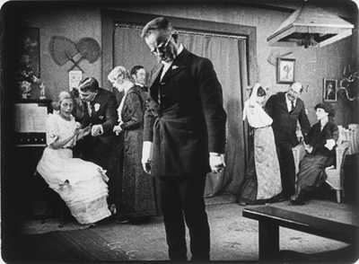
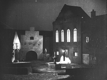
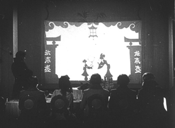
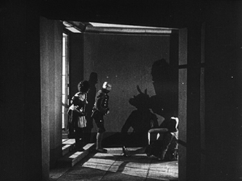
Schatten is an atypical Expressionist film. Not that many of its sets are distorted or simplified in the usual ways. (This is also true to some extent of designer Albin Grau’s other notable Expressionist film, Nosferatu.) Its few exterior shots, including the opening, show the most strongly Expressionist decor (below left). Part of the action consists of a shadow-puppet show put on by a wandering entertainer (below right). Its plot seems to magically unleash the passions of the onlookers, who begin to behave in odd ways. The male guests (and a servant) try to seduce their hostess, driving the master of the house into a jealous rage.
The shadow play creates its own distortions and stark, black and white imagery. Once the show is over, Robison often frames the distorted shadows of the characters more prominently than their actual bodies (again echoing some of the scene with the vampire in Nosferatu). In this corridor scene one of the servants slyly creates cuckold’s horns on another man’s head:
Shadows, with their natural capacity for distortion, not surprisingly appeared in many Expressionist films, though never so pervasively as in this one.
Raskolnikow is unfortunately not available on home video, at least in an acceptable copy. (The reviews for the Alpha release on Amazon deem it “unwatchable.”) Warning Shadows is available on DVD from Kino or to stream on Amazon (free to Prime customers).
Returning to our top-ten list, I yield the floor briefly to David, who has been studying Sylvester for another project.
German silent cinema is more varied than a litany of the official classics, from Caligari to Metropolis, would suggest. One of the most intriguing trends of the period involved what was called the Kammerspiel, or chamber-play, film. Kammerspiel films were far more naturalistic than Expressionist films. They concentrate on a very few characters in a drastically limited number of locales. Performance is often slow and understated, though action may freeze into somewhat contorted poses. The action typically takes place in a short time span, and it is built up out of everyday activities in working-class households—chores, job routines, the habits of family life. Eventually, however, the mundane milieu is likely to explode into violence.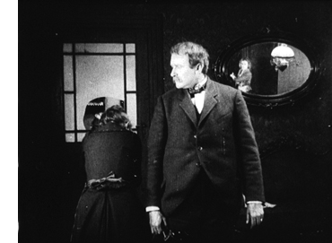
The versatile Carl Mayer (who worked on the script of Caligari) conceived of the early Kammerspiel film Scherben (Shattered, 1921), which defined the trend. In the same year the stage director Leopold Jessner released the remarkable Hintertreppe (Backstairs), which Kristin mentioned as a runner-up in her Best of 1921 list. Mayer also wrote the script for Sylvester (1923). Named for the feast day of St. Sylvester, 31 December, it’s known in English as New Year’s Eve. It’s not available on home video, but it’s worth seeking out in screenings. It remains a striking study in tabloid tragedy.
A café owner and his wife are busily serving crowds on New Year’s Eve. After a big meal and too many drinks, the wife and the mother-in-law fall to quarreling. The tensions around the table are constantly crosscut with the increasingly wild revelry in the café and the upper-class nightclub across the street. As midnight draws near, the women struggle for the husband’s loyalty. This petty quarrel will end in death.
Director Lupu Pick explores the limited space of the action by shooting the parlor from many angles, including ones that make daring use of a mirror (right). The street shots feature extravagant camera movements that look forward to the “unchained camera” made famous in Der letzte Mann (The Last Laugh, 1925), directed by F. W. Murnau and scripted by Mayer. With its strict limitation to a single night and its focus on domestic space, along with suggestions of the husband’s Freudian dependence on his mother, Sylvester showed how a fait divers could yield psychological drama.
The Kammerspiel film wasn’t a dead end. After Carl Dreyer’s borderline contribution to the trend, the Ufa production Michael (1924), back in Denmark he created probably the best of the lot: The Master of the House (Du Skal Aere Din Hustru, 1925). He later returned to the aesthetic in Two People (1945), and he continued to exploit its possibilities in his last features. Over the years after World War II, other directors were rediscovering Kammerspiel principles. We see fresh applications of the approach in Les Parents Terribles (Cocteau, 1948), Les Enfants Terribles (Melville, 1949), and of course Hitchcock’s Rope (1948) and Dial M for Murder (1954). As often happens, ambitious films of the sound cinema owe a good deal to innovative impulses of the silent era.
Welcome, experimental cinema!
One of the most remarkable films of 1923 is a mere three minutes long. Man Ray, an American painter and photographer who moved to Paris in 1921 and became involved in the Dadaist and Surrealist movements. He soon acquired a film 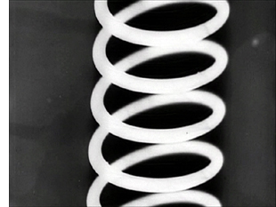 camera and later described how he shot bits of footage with it:
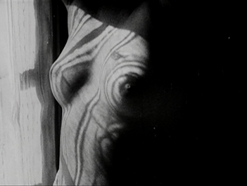
a few sporadic shots, unrelated to each other, as a field of daisies, a nude torso moving in front of a striped curtain with the sunlight coming through, one of [his] paper spirals hanging in the studio, a carton from an egg crate revolving on a string–mobiles before the invention of the word, but without any aesthetic implications nor as a preparation for future development: the true Dada spirit.
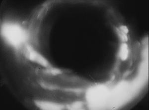
In 1923 Tristan Tzara advertised a Dadaist program in a Parisian theatre to be held the following evening, including a film by Man Ray as part of the entertainment. Ray had only a very small amount of footage ready. Faced with an overnight deadline, he supplemented it by using a technique he had already employed in still photography (the “rayograph”): placing small objects on a sheet of photographic paper in the dark, turning on the light briefly, and developing the image. The result was a series of sharply focused silhouette images of the objects against a plain background. This time Ray unrolled some raw negative film in a dark room, scattered nails, tacks, and other objects on it, exposed it to light, and developed the negative (right). Combined with the shots Ray had previously made, the result was a perfect Dada film, with randomly juxtaposed imagery that defied the audience to make any sense of what they were seeing. He titled it in ironic Dada fashion: Le retour à la raison (“The Return to Reason”).
Despite being cobbled together overnight, Ray’s film offers a broad exploration of the possibilities of abstract filmmaking. The opening, a rapidly shifting stippled screen, resembles the later flicker films of the 1960s avant-garde. The rayograph shots introduce an alien, high-contrast look–not surprising, given that these may have been the first cinema images produced without using a camera.
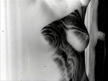
Ray also shifted between positive and negative imagery. This was not entirely new. Murnau had used short stretches of negative footage in Nosferatu the year before. But Murnau’s negative shots had a narrative function, to convey the eeriness of the environs of the vampire’s castle. In Le retour à la raison, Ray used negative imagery in an abstract way, to create startling juxtapositions of imagery that looked both similar and yet strikingly different. The tacks, nails, and springs in the rayograph stretches could be either stark white against black, as in the image to the right above, or the same shot repeated, but this time in black against white. The film ends with another positive/negative passage. The “nude torso moving in front of a striped curtain” is initially shown in a positive image, then in the same image flipped and shown in negative:
Ray was not the first to create an abstract film. In 1921 German filmmaker Walter Ruttmann probably made that conceptual leap in 1921 with Opus 1, a one-reeler with painted shapes moving around against a dark background. He followed this up with three further films, Opus 2 (1923), Opus 3 (1924), and Opus 4 (1925). (Good-quality prints with toning and appropriate musical accompaniment are available on YouTube: Opus 1 here, Opus 2 here, Opus 3 here, and Opus 4 here.)
I must confess that I probably should have at least mentioned Opus 1 in my entry on the best films of 1921. Still, Ruttmann’s films are far less daring than Le retour à la raison. It and its successors are basically efforts to do what so many filmmakers have tried since: to create the equivalent of a painting, but with motion. Ray’s film went much further, pushing the limits of the young art form in ways that had little precedent in the other arts, apart from Ray’s own highly experimental approach to still photography. There are even two fleeting stretches of film leader with illegible writing on them–a tactic one thinks of more in relation to, say, Bruce Conner’s A Movie (1958) than to the silent era. Much of the experimental cinema to come decades later was briefly probed here.
There are several copies of Le retour à la raison on YouTube. The best was posted by Dimitri Shubin, who also provides a piano score. The film is also available on disc 3 of the Unseen Cinema set of American experimental cinema. Unfortunately this copy has a considerable amount of breakup, particularly in the early flicker portions. (An HD version would perhaps help.) The version on Kino’s “Avant-Garde: Experimental Cinema of the 1920s and ’30s” set has the same problem and is distinctly shorter, apparently because it is running at sound speed. The copy provided by Shubin has the clearest, steadiest video image of the film I have seen. Ideally, of course, Ray’s film should be viewed on 35mm.
I regret that so many of our choices for this year’s list are not available on home video or even, except in very rare circumstances, for viewing on 35mm in archive screenings. Still, part of the purpose of this ongoing series is to call attention to obscure but worthy and important films. Perhaps an archivist or an enterprising DVD publisher will be inspired to restore some of the ones described here.
The quotation concerning The Three Ages comes from p. 217 of Rudi Blesh’s biography, Keaton (New York: Collier, 1966).
Mary Pickford’s strangely distorted claims about Rosita and her relationship with Lubitsch are expressed on pp. 129-34 of Brownlow’s The Parade’s Gone By (New York: Knopf, 1968). I go into more detail about the continuing Pickford-Lubitsch collegiality in the 1920s in Herr Lubitsch Goes to Hollywood, pp. 24-26.
For more examples of unusual German silent films, go elsewhere on this site here and here and here and here and here and here and here and here. Criterion has a new, authentic version of Dreyer’s Kammerspiel-influenced Master of the House forthcoming.
The Man Ray quotation comes from a detailed study of Le retour à la raison by Deke Dusinberre in the collection Unseen Cinema: Early American Avant-Garde Film 1893-1941 (New York: Anthology Film Archives, 2001), published to coincide with the release of the DVD set mentioned above.
Raskolnikow.
GRAVITY, Part 2: Thinking inside the Box
Kristin here:
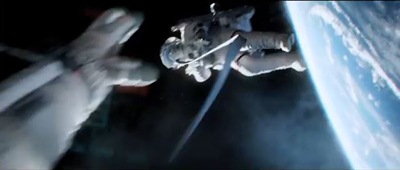
In my previous entry, I described Gravity as an experimental film. I had thought of it that way ever since seeing trailers for it online back in mid-September. I described it as reminding me “of Michael Snow’s brilliant Central Region, but with narrative.”
Last time I developed that notion in more detail and analyzed the narrative structure of the film. Now I’ll analyze the experimental aspects of the film’s style and the dazzling means by which they were created. I don’t have the technical expertise to explain the inventions and ingenuity that went into creating Gravity, so I have sought to pluck out the best quotations from the many interviews and articles on the film and organize them into a coherent layout of how its most striking aspects were achieved.
As in that entry, SPOILER ALERT. This is not a review but an analysis of the film. Gravity does depend crucially upon suspense and surprise, and I would suggest not reading further without having seen the film.
Screaming on the set
I’ve written about Cuarón’s use of long takes, a stylistic device that has drawn a huge amount of attention in the press. Here the editing is so subtly done that even someone like me, who typically notices every cut, missed a lot of them during early viewings. There are bursts of rapid editing, as when the ISS is struck by debris and is destroyed, or more conventional cutting, as when the camera follows the Chinese pod and surrounding remnants of the station as they heat up in the atmosphere.
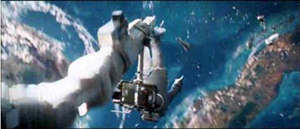
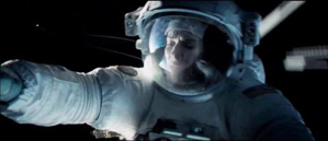
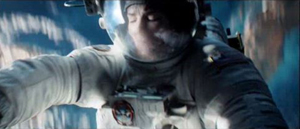
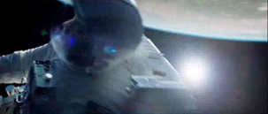
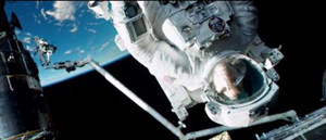
The long takes go beyond what Cuarón has done before. In Variety, Justin Chang describes one major difference: “As the movie continues, the filmmakers even add a new wrinkle, which Lubezki calls ‘elastic shots’: Takes that go from very wide shots to medium closeups, then segue seamlessly into a point-of-view shot, so the viewer is seeing the action through the character’s eyes, right down to the glare and reflections on a helmet visor.” Such moments are rare in Gravity, but one occurs in the “drifting” portion, shortly after the segment laid out above:
As Cuarón has pointed out, his long takes eliminate the need to cut in to closer views: “The language I have been working on with Chivo in these recent films is not one based on close-ups. We include close-ups as part of a longer continuous shot. So this all becomes choreography.” Another point he makes in this and other interviews is the influence of Imax documentaries on Gravity: “My process of exploring long takes fits in with that IMAX documentary notion, because when they capture nature it isn’t like they can go back and pick up the close-up afterward. There isn’t that luxury in space either. So then it falls to us to find a way to deliver that objective view, but then transform it into a more subjective experience.” Hence the “elastic shots.”
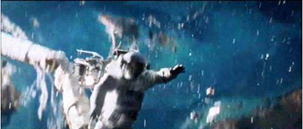
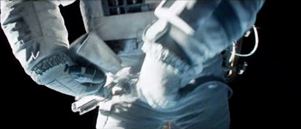
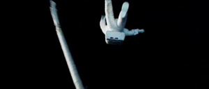
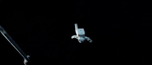
The long takes often dictate a refusal to cut in to reveal significant action. There is the moment in the epic opening shot, for example, when Shariff is suddenly killed in the background while in the foreground Kowalski tries to help Stone detach from her mechnical arm and into the shuttle. Did you see the flying piece of debris that struck his head? I didn’t, not until the fourth time I watched the film, knowing that it was coming and determined to spot it. It’s there, a little white dot that flashes through the frame in a split second. Shariff’s abrupt movement to the side, stopped with a jerk by his tether, is what we spot, since his bright white suit moves so suddenly and quickly, ending up against the pitch black of space:
A great deal happens in such moments of action, and we are left to spot what we can.
If these long takes are dazzling on the screen, think what they must have been like to witness being made. Lubezki has suggested how complicated the long takes in Gravity and earlier films were to shoot:
There are very few director/cinematographer teams working today as well known for a certain aspect of filmmaking as you and Alfonso are, which is that long extended take, or the seamlessly edited take. What it is like actually shooting those scenes?
I’m going to tell you something, the reality is that the movie was so new that when we finished a shot we would get so excited people would scream on set—probably me before anybody else. There were moments when we were shooting and Alfonso said ‘cut’ we would all just jump and scream out of happiness because we’d achieved something that we knew was very special.
In Children of Men, we also had moments like that. When we finished the first shot inside that car [the aforementioned ambush scene], the focus puller started crying. There was so much pressure that, when he realized he had done a great job, he just started crying.
There is something breathtaking about the achievement of complex long takes that seems not to arise from any other cinematic technique. I have seen Russian Ark three times now, and each time I feel an inexplicable tension, wondering whether the camera team will make it through the entire one-shot film without a mistake. I’ve already seen it happen, and yet it still seems unbelievable that they did.
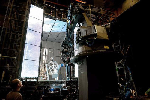
In Gravity, of course, the “long takes” were not actual lengthy runs of the camera. Nor were they, as in Children of Men, several camera takes stitched together digitally to create lengthy single shots. Rather, they were created in the special-effects animation, with the faces of the actors being jigsawed into them through a complex combination of rotoscoping and geometry builds. (See this Creative Cow article for an example.)
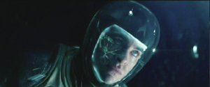
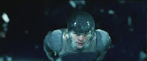
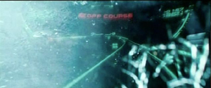
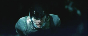
The choice to present the action in long takes was crucial to the look of the film. Most films set in space rely heavily on editing, since for decades the special effects needed to convey space walking were best handled in a series of shots. In Star Trek Into Darkness, Kirk flies through space toward a spaceship breaking up and surrounded by debris, a situation somewhat comparable to that in Gravity. The sequence is built up of many short shots of Kirk against shots of dark space, point-of-view shots through his helmet, and cutaways to characters inside the Enterprise conversing with him via radio. Here’s a brief sample of four contiguous shots:
The sequence conveys little sense of weightlessness, partly because the actor adopts a traditional superhero-style flying pose. With no air in space, there would be no need to compact oneself into a streamlined shape. The fast cutting keeps repeating similar compositions, as with frames 2 and 4 above, with the fast editing presumably intended to generate excitement. (Star Trek Into Darkness has at least 2200 shots in a little over two hours, while Gravity has about 200 in 83 minutes.) Gravity‘s success in creating a realistic environment in space is dramatically evident when contrasted with this film’s more traditional outer-space conventions.
But it turns out that the commitment to the long take led Cuarón toward less common choices about editing, staging, and lighting.
Follow the bouncing axis
For much of the film, there is minimal spatial stability for the characters or for our viewpoint into the diegetic world. There is no ground, so we cannot imagine the camera resting on anything. When outside the space vehicles, the camera moves nearly all the time. In an interview with ICG Magazine, director Alfonso Cuarón was asked, “So with the camera and characters in constant motion and changing perspective, how did you figure up from down?” He replied:
There is no point of departure because there is no up or down; nobody is sitting in a chair to orient your eye. It took the animators three months to learn how to think this way. They have been taught to draw based on horizon and weight, and here we stripped them of both.
Undoubtedly many scenes contain an axis of action running between the characters, but it is not of a traditional kind. Unlike in a classically edited film, in Gravity‘s action scenes in space, the axis is in constant, fleeting motion, and any given center line between two characters must in quick succession run not only left and right but also up and down, diagonally, in almost any direction. Any given screen direction set up by the axis is ephemeral and offers little to help orient us spatially. Eyeline directions mean very little, since there are few cuts to things that the characters have seen offscreen. (True, when characters look offscreen, they establish eyelines, and the camera sometimes pans from Stone or Kowalski to some object they have been looking at. But a pan from a person to an object automatically establishes the spatial relations between them, whether or not the character is looking at the object.)
As a result, the spatial cues used in continuity editing system are not so much eliminated as made irrelevant for long stretches. That system is meant, after all, to guide our understanding of the story space across cuts. There are exceptions, such as a brief shot/reverse-shot exchange: Stone, loosely attached to the International Space Station (ISS) by ropes, pleads with Kowalski not to untether himself from her and float away to die in space, and he insists that it is the only way to allow her to live. When Kowalski and Stone, tethered together, travel toward the ISS, he is always at screen left, she at screen right, with the strap joining them stretched out as a sort of visible axis of action; straight cut-ins to close views of each character, and even at one point Kowalski’s point of view, obey the 180-degree rule and create an almost conventional scene. Actions inside the spacecrafts are more oriented as well. In the ISS Stone moves weightlessly through a series of pods, all the while maintaining screen direction. Similarly, inside the vehicles, especially late in the film when Stone is strapped into seats, she is usually upright, her head oriented toward the top of the frame. Some sustained actions in space also keep her right-side up, as when she removes the bolts holding the parachute cords to the Soyuz landing vehicle.
In part because of such orienting devices, we are seldom seriously confused about where the characters are, or at least not for long. Otherwise we would not be able to comprehend the story action. Still, compared to typical classical films, Gravity conveys little sense of spatial stability. The disorienting simulation of weightlessness for characters and camera dominates the scenes outside the vehicles and creates a style that can truly be called experimental.
Take the brief segment (about 14 seconds) below, from the 13-minute opening shot. Stone has been standing at the end of a large mechanical arm which gets knocked off the space shuttle by a piece of hurtling debris. It spins rapidly, with the camera framing it from long-shot distance. The camera is not entirely static, reframing slightly, but we can see the earth in the background fairly clearly. Stark sunlight comes from offscreen left, and as Stone’s body whips through space, the shadows move accordingly around her, with the back of her body in deep shadow in the first frame and then her front shadowed in the second:
The fact that the light source, the sun, is offscreen left during this spinning segment suggests that the camera and hence our viewpoint are in a stable position. Yet that position is maintained for only a short time. At this point in the shot, the camera is essentially waiting for her to draw near in order for it to execute a change that will govern the penultimate part of the lengthy shot.
That happens when, after she has spun wildly toward and away from us several times, the camera “attaches” to her, so that we are now seeing her in medium shot and spinning with her. Instead of seeing the earth clearly, we see her while the blurred surface of the earth and the blackness of space alternate rapidly. This was the technique that led me, when I first saw the film’s trailers, to compare Gravity to Michael Snow’s Central Region:
Being closer to Stone, we can see more clearly the shadows coming and going; her face is sometimes illuminated brightly by the sun and sometimes in near darkness:
The function of the attachment to Stone, apart from allowing us to see her fear and confusion, is to show us that her hands are working to detach her from the arm, as a tilt down reveals:
As she soars off the arm and tumbles into the black depths of space, the camera leaves its “attachment” to her, and she spins away from it:
Cuarón’s commitment to the long take thus made him rely more than usual on events taking place within the frame–camera movement and figure movement in particular. Yet these movements had to occur in a microgravity environment radically different from the earthbound surroundings of Children of Men and Harry Potter and the Prisoner of Azkaban. This new constraint led to some technological innovations of remarkable originality.
The LED Light Box
Early on it became clear that moving the actors through space on wires would not create the desired realism of weightlessness, and obviously they could not be whipped about and tumbled in ways that the film ultimately achieved. The actors would have to be relatively static, with the illusion of movement created through other means. One of the main challenges was to have the lighting on their stationery faces support that illusion. And it would have to be done perfectly in order to achieve the photorealistic depiction of space that the filmmakers were after.
Usually in watching a film heavily dependent on CGI, one notices elements that have been assembled into a single composition but don’t quite match each other. A matte painting that isn’t lit from precisely the same angle as all the other components stands out from the rest (as, it has to be admitted, happens in the best of CGI scenes, including those in The Lord of the Rings). The problem was solved for Gravity using the LED Light Box, a device frequently mentioned in the press coverage of the film but seldom explained. (See image at the top.) The concept is truly revolutionary, although I am not sure to what extent it would work for other films that did not present such peculiar challenges.
In American Cinematographer‘s article on Gravity, “Facing the Void,” cinematographer Emmanuel Lubezki explains why consistency of lighting is crucial and how he came up with his solution:
Lubezki emphasizes that Gravity‘s blending of real faces with virtual environments posed a tremendous challenge. “The biggest conundrum in trying to integrate live action with animation has always been the lighting,” he says. “The actors are often lit differently than the animation, and if the lighting is not right, the composite doesn’t work. It can look eerie and take you to a place animators call ‘the uncanny valley,’ that place where everything is very close to real, but your subconscious knows something is wrong. That takes you out of the movie. The only way to avoid the uncanny valley was to use a naturalistic light on the faces, and to find a way to match the light between the faces and surroundings as closely as possible.”
This challenge led Lubezki to imagine a unique lighting space that was ultimately dubbed the “LED Box.” He recalls, “It was like a revelation. I had the idea to build a set out of LED panels and to light the actors’ faces inside it with the previs animation.” Lubezki conducted extensive LED tests and then turned to [special effects head Tim] Webber and his team to build the 20′ cube and generate footage of the virtual environments, as seen from the actor’s viewpoint, to display inside it. While constructing the LED Box, the crew also solved problems involving LED flicker and inconsistencies.
Inside the LED Box, the CG environment played across the walls and ceiling, simulating the bounce light from Earth on the faces of Clooney or Bullock, and providing the actors with visual references as they pretended to float through space. This elegant solution enabled the real faces to be lit by the very environments into which they would be inserted, ensuring a match between the real and virtual elements in the frame.
This ingenious approach largely did away with traditional three-point lighting in the exteriors. As Lubezki explains in the AC article,
When you put a gel on a 20K or an HMI [Hydrargyrum medium-arc iodide], you’re working with one tone, one color. Because they LEDs were showing our animation, we were projecting light onto the actors’ faces that could have darkness on one side, light on another, a hot spot in the middle and different colors. It was always complex, and that was the reason to have the Box.
The crucial point here is that the lighting was being created by playing the previs animation of the earth, space, the moon, and the large reflecting objects like the space shuttle on the sides of this 20′ by 10′ box. In other words, the moving images from the nearly finished special effects were used to light the faces of the actors, and those faces were later joined to those very same special effects, in a more polished form, to create the final images.
Lubezki gives an excellent description of the Box in his interview with Bryan Abrams, a series of responses which is worth quoting at length. Note that Lubezki refers to the Box as an LED monitor–essentially a giant television screen turned inside out and surrounding the actor:
Can you touch upon some of the pieces of technology and equipment that were created to make Gravity possible?
To make this movie we used many different methodologies. For one of them, we invented this LED box that you’ve probably read about, which is basically this very large LED monitor that is folded into a cube. So all the information and images that you input into this monitor lights the actors, and you can input all of the scenes that were pre-visualized to create the movie—all the environments that we had created—and you can input them into this large cube so space itself is moving around the actors.
So it’s not Sandra Bullock spinning around like crazy, it’s your cameras.
Yes, instead of having Sandra turning in 360s and hanging from cables, what’s happening is she’s standing in the middle of this cube and the environment and the lighting is moving around her. The lighting on the movie is very complex—it’s changing all the time from day to night, all the color temperatures are changing and the contrast is changing. There were a lot of subtleties that you can capture with the box, subtleties that make the integration of the virtual cinematography and the live-action much better than ever before.
The effects of the LED projections are visible in the changes on Stone’s face in the extended example above. Here’s a brief example of changes on Kowalski’s face in the opening shot:
The harsh light in the right frame above is a real lamp. The LEDs could not produce a local, hard light intense enough to simulate the sun. The team placed “a small dolly and jib arm alongside the actors” with a lightweight spotlight. This was moved “according to the progression of the virtual sun.” Such harsh light was necessary because outside the atmosphere there is nothing to filter bright sunlight. Several moments where the actors’ faces and suits are severely overexposed reflect this technique:
The Box also contained a large video monitor, visible to the actor, which displayed the previs animation. Lubezki explains: “This was wonderful in a couple of different ways. The actor sees the environment and how objects are moving in that environment, and at the same time we can see the interaction of that light on the actor. We capture true reflections of the environment in the actor’s eyes, which makes the face sit that much better within the animation.”
Previs as environment
The fact that almost everything in the film was created digitally–including the space suits in which the actors bob and spin in the exteriors–necessitated an extraordinary amount of planning and pre-production. “Pretty much we had to finish post-production before we could even start pre-production, because of all the programming,” Cuarón says. This was one reason why there was such a long gap between Children of Men (2006) and Gravity. Four and a half years were spent in developing the new technology and preparing to shoot.
The team started with geography:
The filmmakers began their prep by charting a precise global trajectory for the characters over the story’s time-frame, so that Webber and his team could start creating the corresponding Earth imagery. Cuarón chose to begin the story with the astronauts above his native Mexico. From there, the precise orbit provided Lubezki with specific lighting and coloring cues. The cinematographer recalls, “I would say, ‘In this scene, Stone is going to be above the African desert when the sun comes out, so the Earth is going to be warm, and the bounce on her face is going to be warm light.’ We were able to use our map to keep changing the lighting.”
Next, the filmmakers defined the camera and character positions throughout the story so that animators at Framestore could create a simple previs animation of the entire movie. [“Facing the Void”]
Lubezki was completely involved in planning the digital lighting. He recalls, “I would wake up at 4 a.m., turn on my computer, I’d say good morning to my gaffer and start working on a scene. I would say, ‘Move the sun 60,000 kilometers to the north.’ That way I could put the lighting anywhere I wanted.”
The reference material for the earth imagery came in part from NASA reference footage and photos. You can get a sense of these from the NASA films posted online, although these are mostly done in fast motion, unlike the ones the filmmakers would have used. One good example is “Earth HD.” There, at 2:25 and again at 2:41, one of the most recognizable locations on earth, the Nile Valley and Delta, are visible:
A similar image of the Nile appears on earth as Kowalski and Stone slowly make their way from the space shuttle to the ISS, with him asking her about her hometown and any family she might have waiting for her. (I was also happy to see the area of the site where I work in Egypt, Tell el-Amarna, which lies about midway between the Delta at the upper left and the large bend in the river.)
This geographical plotting included some ellipses. Although commentators have suggested that the film takes place in real time, or nearly so, there are temporal gaps. Shortly after the first pass of the speeding debris field, Kowalski tells Stone to set her watch’s timer for 90 minutes, since he calculates that is when they will encounter the orbiting debris again. That happens when she exits the Soyuz vehicle to detach its parachute. She again sets her timer for 90 minutes, and the debris field shows up at the Chinese station, battering it to the point where it sinks into the atmosphere and breaks up into chunks melting from the friction of reentry. Thus a little over three hours should be passing in the 83 minutes of screen duration.
Cuarón more or less confirms this timetable when he describes the creation of the previs: “The screenplay describes a journey that takes place mostly in real time, with only a couple of time transitions. We travel around Earth three times, so in previs we planned out visuals with specific knowledge of where we’d be in orbit at any given point in the story, whether it was in sunlight or darkness.”
In the film there are very few places where we can assume a significant ellipsis occurs. After Stone enters the ISS, sheds her helmet and suit, and drifts in a fœtal position, there is a gap. It’s probably not long, since she still holds some hope of going to rescue Kowalski, but she pauses to recover after her trying experience. Later, there is a cut from her inside the landing module, not in the suit, to her emerging from the hatch fully suited up–a gap we might assume to be ten minutes or so. Most notably, the cut from the nighttime shot of the earth that includes the aurora borealis at the right to the extreme close-up of frost on the window ellides a longer stretch of time. Stone has become hoarse in the interval as she tries to send a mayday message via radio. In other cases, such as Stone and Kowalski’s slow journey toward the ISS, time seems to be somewhat compressed though not ellided.
Staging without a stage
A lack of depth cues hampered the animators charged with creating the previs. The absence of one major depth cue, aerial perspective (the tendency of layers of space in the distance to turn successively bluer and blurrier due to the filtering quality of the atmosphere), caused problems. Visual-effects supervisor Tim Webber, of the effects house Framestore, remarks:
You can’t rely on aerial perspective because without atmosphere there is no attenuation of image due to distance. And the lack of reference points [in space] can get you into trouble, like not being able to tell if the character is coming toward you or the camera is moving toward him. Even though we played it straight with respect to science and realism, we did put in more stars than you’d be able to see in daylight, just so there’d be some frame of reference to gauge movement.
Presumably Webber is referring here to the movement of the characters and objects through space, not the camera movement. (The lack of any “frame of reference” against which to sense movement is part of what makes the Star Trek scene illustrated above seem so unsophisticated.)
Naturally, since the actors were not standing on a floor or solid ground, the blocking was difficult, but it also had to be planned completely in advance:
Cuarón laughs as he recalls the surprises inherent in blocking characters in a zero-gravity environment. “The complications are really something because you have characters that are spinning. Say you want o start your shot with George’s face and move the camera to Sandra, who is spinning at a different rate. You start moving around her, and then you start to go back to George, only to realize that if you go back to George at that moment, you will be shooting his feet! So then you have to start from scratch. Sometimes you find amazing things accidentally, but sometimes you have to reconceive the whole scene.” [“Facing the Void”]
Finally, after all the planning, the previs animations were made. These had to be refined considerably so that they could adequately serve in the Light Box to illuminate the actors’ faces. According to Bill Desowitz, “The previs was so good, in fact, that the daughter of cinematographer Emmanuel (“Chivo”) Lubezki thought it was the real movie.”
The previs became so sophisticated because it evolved during preproduction. Cuarón recalled that Lubezki’s inspiration to create the LED Light Box changed the planning tactics:
Then that kind of had a ripple effect back into the previz, because originally they were going to just be a model that we could look back at, but we realized that the previz was more than that. That was something that [James] Cameron kept on talking about. He would say “I don’t use previz anymore, I use it as if it is the first painting on a canvas.” In other words it was the stuff that you kept on painting on top of and the thing with that is that it became very clear that in order to use these technologies, we needed to program stuff and the previz was going to have to be precise in terms of camera movements, choreography, timing and light.
As a result, the movie changed very little during principal photography. Senior visual-effects producer Charles Howell told American Cinematographer: “I think there were only about 200 cuts in the previs animation, [whereas] an average film has about 2,000 cuts. Because these shots had to be mapped out from day one, many of the lengthy shots didn’t really change in the three years of shot production. Because we did a virtual prelight of the entire film with, the whole film was essentially locked before we even started shooting.” [“Facing the Void”]
David counted 206 shots in Gravity, not including the two opening titles about life in space being impossible. This suggests that Howell is right, and that the film underwent little revision after the planning phase.
Several years ago I suggested on this blog that animated films, notably those of Pixar and Aardman, were on average better than mainstream live-action films because they had to be planned so carefully and thoughtfully. Gravity, being very close to an animated film, provides more evidence for that claim. Not that thought, time, and money can guarantee quality, but they certainly narrow the odds.
Iris in
The Light Box technology is astonishing enough, but within its confined space there also had to be a way to photograph the actors. In Lubezki’s interview with Bryan Abrams, he explains:
So we built the box, but that wasn’t it. To be able to shoot inside the box, we had to build a special rig that holds the camera and moves with motion control. So we had people build a very narrow, lightweight but sturdy rig to control the camera. If you imagine the big box of LEDs, it has a gap that is almost a foot and a half or two feet wide, and the camera has to go into the box and make all these moves to make the audience believe that Sandra is turning and turning, but it’s really the camera and the environment in the box that is moving. So we built the box, the rig, and then used a company called Bot & Dolly. These guys are from San Francisco, and they use robots from the automotive industry. They redid all the software for us, so we were able to use these robots to move the cameras and the lights around the actors. It was just a big ballet of gadgets and new technology for the film.
Bot & Dolly is a San Francisco company specializing in robots for the automobile industry. It built or perhaps modified an elaborate rolling, multiply-jointed camera mount called Iris especially for Gravity. It has been used in other features and in ads since then. (See image at the bottom.) An impressive demo film shows the Iris gracefully writhing about, quickly pointing the camera in many directions. (The camera in the film is a Red, though Gravity used an Alexa.) According to ICG Magazine, “The firm devised a Maya-based series of commands that allowed Framestore animators to direct the robots in ways that matched previs action in precise detail.” (Maya is the industry standard computer animation program.)
Typically this camera was inserted through an opening in the Light Box and swooped around the actor, who stood in a gyroscopic basket, seen in the production photo below. The photo shows one side of the Box open, though this would not be the case during shooting:
The combination of the Light Box and Iris made it possible to blend the special-effects shots and the live-action photography of the actors so smoothly that there is no “uncanny valley” effect, no sense of an obvious matte painting stuck into the middle of an image. The shots in Gravity are all photorealistic to a degree that is rare, if not unique, in recent effects-heavy films.
Iris brings us back to the comparison with Central Region. Snow built a special camera mount (below) designed to allow his images to rotate freely in almost any direction. During the three-hour film the camera never repeated any of its trajectories. Some images were close views of the pebbles on the ground; others were upside views of the bleak Canadian mountains in the distance. A nighttime segment was completely black except when the moon occasionally swept through the frame. The one area that the camera didn’t survey was the camera support itself, the “central region” of the title.
The vital difference between Snow’s machine and Iris is that the new system has no fixed anchor. Not only does it slide on a track, but everything it photographs can be digitally altered to erase any traces of the machine. It moves with entire freedom through a constructed space that has no central region, no fixed point around which everything else revolves.
Puppeteers and eyes
Gravity‘s utterly spherical space, beyond anything we normally find in commercial cinema, placed unusual demands not only on camera movement but also upon the actors’ blocking and performances. Our first entry on Gravity begins with a quotation from Sandra Bullock, which included the statement, “No character was like Stone, no film set was ever like these sets, not one member of this crew had ever done this before.” That may seem an exaggeration until one grasps how Bullock and Cuarón’s team built her character.
We all know from infotainment coverage that Bullock was isolated in the Light Box through entire days and that it was a trying experience. What doesn’t come through in such accounts is that she was often enclosed in the gyroscopic basket, visible in the photo of the Iris rig and Light Box above, as well as in the same setup visible behind Cuarón in this photo:
That was only the start of it. Anne Thompson’s interview with Cuarón and producer David Heyman reveals some of the details of blocking a character who is unrestricted by gravity:
AC: The physical aspect, not anybody can do what she did. On the one hand the physical discipline she went through to make this film, the training and the workouts. She also has an amazing capability for abstraction. Those emotional performances, it was as if they were an exercise in abstraction, like she was bonded to very precise cues. And physically that was very difficult: she trained and practiced like crazy, together with the stunt people and special effects. And the puppeteers from “War Horse” were helping her, supporting a leg or an arm, all the floating elements, they were creating approaching objects toward her in perfect timing. Then after she practiced so much her whole concern was only about emotions and performance.
Imagine a ballet dancer with really strict physical discipline in terms of what a body has to do, positions and precise choreography, who goes through months of training for one choreography so when they are performing they have expressiveness and emotion.
What was the most challenging scene to realize?
David Heyman: When Sandy comes into the ISS for the first time. She takes off her suit, then goes into fetal position, all in one shot. It was the most difficult. All the objects, getting the suit off, and into fetal position in such a way that it felt effortless, not as it was–she was sitting on a bicycle with one leg tied down leaning back in a 12-wire rig, with puppeteers. One of the things you forget about Sandy’s performance, which seems so truthful, is all the effort and physical exertion that went into making it, the precision of the technical aspects. She had to move her hands at a third of speed — zero G –while talking. Each shot connects with the next at very precise points where her head began and end and begin and end. She’s on a bicycle stringing uncomfortable with people moving around on 12 wires, through it all, with no gravity. Physically the body must not show the tension, so it looks effortless. What I loved about it is the performance behind the visor shines through, her eyes. You can’t slouch your shoulders to show sadness or weight, it’s just the eyes.
Bullock did all this with four 10′ by 20′ walls of LEDs projecting moving images of the earth and of exploding space stations around her. I think it is safe to say that this was a unique kind of performance.
The sounds of silence
As the film’s ominous opening titles point out, there is no sound in space. In keeping with the overall attempt to duplicate the effects of weightlessness immersively, Cuarón’s team limited the track to two types of sound: diegetic sounds heard by the characters and a non-diegetic, modernist musical track. In an interview with Cuarón, Wired‘s Caitlin Roper pointed out that there was an explosion in one of the trailers. Cuarón replied:
Yes, but that’s just the trailer. I honor silence. The only sound you hear in space in the film is if, say, one of the characters is using a drill. Sandra’s character would hear the drill through the vibrations through her hand. But vibration itself doesn’t transmit in space—you can only hear what our characters are interacting with. I thought about keeping everything in absolute silence. And then I realized I was just going to annoy the audience. I knew we needed music to convey a certain energy, and while I’m sure there would be five people that would love nothingness, I want the film to be enjoyed by the entire audience.
As in other areas of the film, we see the compromise between an experimental technique–an attempt to suggest the silence of space–and the desire to provide something more familiar for the broad audience. In this case, music acquires an expanded role, substituting for sound effects and conveying the rapidly shifting emotions of the scenes.
Sound effects are not entirely eliminated. Many sounds that the astronauts would hear via vibrations of things they come into contact with are included. In some cases these are fairly clear, as with the voices heard within their helmets–their own voices or others’ via radio. Other effects are heard in a distorted fashion. Glenn Freemantle, the supervising sound designer and editor, describes the process:
“When [Bullock] is in the suit, you hear her voice and her breathing, and you hear through her suit when she is in contact with things,” he explains. His team captured sounds by recording with contact mics at car plants and hospitals. “We even recorded through water with a [submerged] guitar,” he recalls.
One obvious example of distortion comes in the opening scene, when Stone is unscrewing bolts and sliding a panel out of the transmitting device she is working on. The sounds of the bolts and the sliding metal are audible but muffled, as though they were recorded under water or electronically manipulated.
Yet other sound effects not heard by the characters were relegated to musical expression. As Angela Watercutter put it in a Wired article based on interviews with Cuarón and composer Steven Price,
Every time there’s a collision in the movie the audience doesn’t hear a bang – they hear a sonic boom. The same goes for the characters’ — and, by extension, the audience’s — feelings of anxiety, claustrophobia, and agoraphobia. Much of what is seen in Gravity is terrifying, and when the audience can’t hear the horror of a space shuttle breaking apart or an airlock flying open, Price had to fill the void with his nerve-wracking score.
Cuarón dictated that one of the rules for the film’s score was the eliminating of percussion, to avoid the “cliché of action scoring.” Watercutter continues:
As a result the score for Gravity serves as more than just musical accompaniment – it also provides the movie’s sound effects. There are some non-music sounds that would be space audible, like the ones transmitted by vibrations characters feel in their spacesuits, but for the most part everything that happens in open space is accompanied only by Price’s music and the voices of Stone and astronaut Matt Kowalski (George Clooney), which “freed up the rest of the frequency spectrum for me,” Price noted.
Price used a mix of organic and electronic sounds to meld the natural world of space with the mechanical world one of the space exploration. There are also moments where he took an analog instrument – a cello, for example, or even a human voice – and ran its notes through a synthesizer or processor in order to create a whole new sound. And for the opening song on the score, “Above Earth,” Price took a track he was already working on and slowed it to about 1/60th its original speed. “Basically,” Price said, “what you’re hearing is the space between the notes.”
In an interview with Rolling Stone, Price discussed some of the aesthetic principles and functions he aimed for with his score:
Really it was all very much led by the character of Ryan. I tried to be with her all the time. The idea was that the music was up there in space and we made it very immersive and used a lot of elements and a lot of layering so that things would move around you all the time. The writing of those elements and what they were, were always influenced by what Ryan was feeling and where she was emotionally in the whole thing. And also where the camera was, where things were moving and what point of view the camera was facing, whether it was looking at them or kind of looking through their eyes. Some of it was melodic and some of it was intended to underscore a kind of emotional journey, and then there were a lot of sounds that were there to express real terror. It was those two extremes, really, expressing the beautiful nature of where they were but also absolutely a massively terrifying situation.
With little expertise in musical analysis, I can simply say that I hear the score as a combination of traditional instrumental music and electronically synthesized instrumental music. Under this, typically in tense passages, there are abrupt or charging percussive emphases, not using percussion instruments but, in some cases, deep string chords. Scenes of damage or tension are sometimes accompanied by sounds like stressed, grinding metal. Other sounds like distorted, high-pitched radio waves (in the “ISS” and “Fire” tracks) are included, reminiscent of electronic music of the 1960s.
Other critics have offered suggestive descriptions. Justin Chang’s review refers to “Steven Price’s richly ominous score, playing like an extension of the jolts and tremors that accompany the action onscreen.” David S. Cohen and Dave McNary’s Venice festival coverage characterizes the track: “Much of the action, even the debris storms, plays out against eerie silence, broken only by the score. The silence is more startling after the score builds to deafening crescendos, then stops abruptly. But during the interior scenes, the rumbles and groans of failing space gear are as frightening as the roars of any classic movie monster — even more so because their source is unseen.”
Price has contributed a remarkable score, one which is highly original and yet completely motivated by the story situation it accompanies.
The space between
The immersive, 360-degree surrounding and sound fields made Gravity a natural for 3D exhibition, but they also posed unique problems. Given the long takes, the need for complex camera movements, the demands of the LED Box, and the complicated acting conditions, it would have been very difficult to shoot the film in 3D. In most scenes, of course, there were no real objects juxtaposed in different layers of depth in front of the camera. Even the actors’ placements in long shots would have be created digitally. So the project had to be converted to 3D. But this forced choice actually yielded strong results.
The press coverage of popular cinema has come to treat films shot in 3D (“native” 3D) as pure and admirable and films converted to 3D after shooting as crass and compromised. But is there all that much difference? Even Avatar, the film made with an intention of promoting the universal use of 3D, had some converted footage. With conversion technology improving, the notion of waiting until after filming to create a movie’s 3D is becoming less onerous. As Variety‘s David S. Cohen pointed out earlier this year, Iron Man 3, Man of Steel, Star Trek into Darkness, and Pacific Rim have been post-converted with little objection from the public or press.
That conversion techniques for generating 3D images are not inferior became much more evident during the early decision-making process for shooting Gravity. Nikki Penny, the film’s executive producer, took some test footage shot by in 3D to Prime Focus World, a conversion house that ended up doing 27 minutes of Gravity. The filmmakers were trying to decide whether to shoot the live action portions in 3D or use conversion. In an article on Creative Cow, Debra Kaufman explains what happened:
The production had done a test shoot in 3D, which involved placing the cumbersome 3D rigs inside the cramped space capsule. When Penny brought the 3D live action footage to Prime Focus World, she asked that they test 3D conversion by utilizing a single eye from the same footage. The results convinced Cuarón and producer David Heyman that conversion would not only look as good as shooting in native 3D, and would be much easier and more efficient to accomplish.
That is, the footage shot by one of the two lenses in the 3D setup was separated out. It was then treated as if it were native 2D footage and put through a conversion process to create a 3D image. The result resulted in 3D that was not inferior to the original native-shot 3D. The lesson, I think, is that the question is not usually whether a film is shot in 2D and converted; it’s whether it was planned to be completed as a 3D film (and has sufficient budgets and skills invested in it) .
Gravity couldn’t be shot in native 3D, since in most scenes there were not real objects juxtaposed in different layers of depth in front of the camera. Also, the camera was too cumbersome to fit into the space-capsule sets. With so much of the characters’ surroundings done as CGI, however, the conversion to 3D could be done concurrently with the filming. Kaufman describes the process at Prime Focus World, one of the firms that handled the conversion:
Unlike the more typical post-production 3D conversion, Gravity involved PFW working on the 3D conversion during production. The work on 3D conversion began with six months of pre-production, during which the production’s Stereo Supervisor Chris Parks worked closely with the PFW team to explain his carefully plotted depth map, which contrasted the vast emptiness of space with the tight, nearly claustrophobic quarters of the space capsules.
From the beginning, the challenge for Prime Focus World would be to make sure that the 3D converted footage integrated seamlessly with the extensive 3D CGI. Both the live action footage and CGI would be 3D, but 3D from two different worlds, conversion and visual effects – and they would both be active or “live” during the production process. At the same time, the PFW team wanted to retain the creative flexibility of its View-D conversion process, while integrating the stereo VFX universe. What made it trickier was that, unlike a completed film, Prime Focus would be working with work-in-progress shots and an open edit.
For more on the technical aspects of the integration of converted footage and CGI, along with an example of the stages that went into creating a single shot, see the Kaufman article.
In an essay on ICG Magazine, Vision3 stereo supervisor Chris Parks describes some of the narrative functions of the film’s 3D:
We had a virtual camera at Framestore that let us control depth functions. When Sandra floated off in space, we separated her slightly from the starfield, using 3D to make her feel very small. At another point we went very deep, when we see her POV as her hands reach out to those of another astronaut coming to camera. At the point when they make contact, we increased the interaxial to five times normal, then scaled it back down as they separate and drift apart.
Parks also comments on the scene where Stone and Kowalski look through the shattered windows of the space shuttle and a crew member’s dead body suddenly falls into the shot:
Alfonso asked how the 3D could make this more powerful, but without just throwing something out into the audience to make them duck. We decided to float a little Marvin the Martian doll out into the audience, which is a kind of fun, lighthearted tension-breaker, and then we whip-pan right off that to the dead astronaut, which makes the emotional revelation more jarring.
In fact the Marvin doll (derived from Chuck Jones’s Warner Bros. cartoons) comes diagonally forward from the depths of the shuttle interior, and the camera pans with it as it moves out of the ship past Stone, who watches it and then turns back to look inside again. The corpse falls into the shot from above left, but not out toward the audience. It bumps Stone’s helmet, and the camera pans to reveal it more fully and continue almost nonchalantly onward to show another dead astronaut further back in the shuttle interior.
Finally, Parks points out an expressionist distortion of space for subjective purposes in the dream sequence where Kowalski joins Stone in the Soyuz landing vehicle:
It’s a dream sequence that doesn’t reveal itself as such right away. To give a subconscious impression that something different was happening, we pushed the top right corner into the set while pulling the bottom left corner ahead, skewing the whole view. That sense of unease represents, to me, how 3D can be expanded beyond just giant VFX movies. It’s a tool that can be most effective in very small spaces, as this one shot reveals.
Outside the dream scene, we see the wall panel of instrument controls at an angle to the camera, with Stone in her seat at the left. During the dream, the panel is suddenly turned so that it is almost straight into depth, so that we are pressed up obliquely against it. Stone’s seat at the left is further away from it. The result is that the space is strangely skewed during the dream.
In all, shooting in long takes, building each shot with CGI yet including complex camera and figure movement, canceling the sense of horizons and ground planes, and enhancing all these choices through 3D, has resulted in a film in which stylistic patterning becomes an object of fascination in its own right.
Despite the occasional joke about a Gravity sequel, it seems unlikely that Cuarón will tackle similar subject matter and formal strategies in his next film. Dealing with space without horizons and characters without weight was a formidable task. At the end of his Wired interview, asked what his next film will be, he replied, “Any movie in which the characters walk on the floor.” Welcome back, axis of action.
Most of the frames used here and in Part 1 were taken from a New York Times article containing a clip from the opening shot with commentary by Cuarón.
Thanks to Stewart Fyfe, who shared links to some of the sources cited in this entry.


