Archive for the 'Directors: Ozu Yasujiro' Category
A modest extravagance: Four looks at Ozu
DB here:
Ozu Yasujiro was born on 12 December 1903. He died on 12 December 1963.
For Donald Richie
The film comes to us calmly, not trying to overpower us or sneak into our good graces: just a simple story that seems to tell itself. First there is the daily routine. People arise, go to work or school, greet their acquaintances, labor at their desks, meet friends at a bar or teahouse or coffeehouse. Gradually, as one character mentions or meets another, the film carries us to that one. Then we discover another network of people, also linked through everyday action and little courtesies. This movie, it seems, could sidestep from group to group forever, eventually introducing us to the population of Japan.
A plot coalesces. Someone has fallen in love; someone is unhappy; someone must pass an exam; someone must get married to oblige a parent. Now everything that we have seen starts to crystallize into a drama. But the narrative flow is so unpredictable, even diffuse, that we can scarcely imagine what the climax could be. Sometimes the action is just put on hold, and an idyll shows a character recalling days of prior happiness, or imagining recalling today as a moment of consummate peace.
Suddenly a crisis descends. Someone we have come to care about falls ill, or decides not to marry, or decides to marry someone else, or betrays a friend. And soon we are truly overpowered, with a climax that seems completely contingent. Why this? Why now? The characters may ask along with us, but they resign themselves to things. The epilogue is like a farewell. These people who have come to matter to us drift away to an uncertain future that has a touch of stoic serenity.
All very straightforward, even artless. But that’s at first glance. Take a second look, and you see a subtle architecture. The distantly connected characters actually form a table of contrasts. For every wilful father, a tolerant one; for every cheerful daughter, a morose one; for each flirtatious boss a kindly widower. Long ago Donald Richie pointed out the importance of parallelism in Ozu: every person or circumstance is echoed or inverted elsewhere. Into these parallels Ozu inserts prefigurations of future action, motifs which connect characters (gestures, lines of dialogue, props like watches or cups), and daring ellipses which skip over important events. (Once he has us hooked, he can tease us by withholding what we want to see.) The ending and epilogue have the inevitability of the final lines of a grand poem. Look closely, and each Ozu film has a magnificently filigreed structure, and everything that will happen seems quietly destined from the start.
Third look: The simplicity of style. What could be easier than to shoot each scene with a master shot, followed by medium-shots? Each character, no matter how minor, gets his or her “single,” and a cut very seldom interrupts a line of dialogue. Every person gets a chance to speak, and people listen to each other. Nobody interrupts. A few establishing shots will link one scene with another. The camera is set low in nearly every shot, as if to eliminate any decision about where else it might be put, and it almost never moves. This, surely, is Moviemaking 101.
Look again, and it all becomes staggeringly complicated. Each shot is composed meticulously, down to the arrangement of food on the table. The compositions mirror each other uncannily: every medium-shot single puts the person’s face in the same part of the frame, so that the eyes of one character weirdly coincide with those of another. Indeed, Ozu’s bold play with graphic qualities—lines, masses, and color—from shot to shot is without peer in mainstream filmmaking. Contrary to what critics still say, the camera position doesn’t mimic a seated person’s view. It’s obstinately low even in train corridors and on sidewalks. What it does is subject the entire visible world to a precise patterning.
Thanks to this maniacally repeated framing, layers of space bristle with tantalizing possibilities. A humdrum space becomes charged with muted dynamism. Mundane bits of setting, like a red teakettle or a hanging sock-tree, come alive. And the intermediate spaces which link scenes often don’t establish the new scene’s locale very clearly. Instead, they hook one area to another by visual or auditory rhymes. The transitions also play games with our expectations. We may think we are going one place, but something, perhaps only the shadow of rippling water cast on a screen, swerves us to somewhere else. Just as Shakespeare’s dialogue can be read as pure poetry, the surface texture of these films would entrance us even if there were no story to follow.
Thanks to his apparently simple stories and easily grasped technique, Ozu has captivated and moved audiences for eighty years. But this humble artisan who compared himself to a tofu seller created a cinema of which no other director dreamed. Modest in effect yet extravagantly precise in execution, Ozu’s films are at once amusing, rapturous, and experimental. He tests his characters, his medium, his audience, and himself. His films show us how profound a genre- and star-driven studio picture can be. At the same time they open up a vast realm of purely cinematic possibilities. No filmmaker has come closer to perfection.
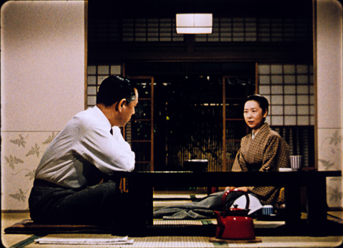
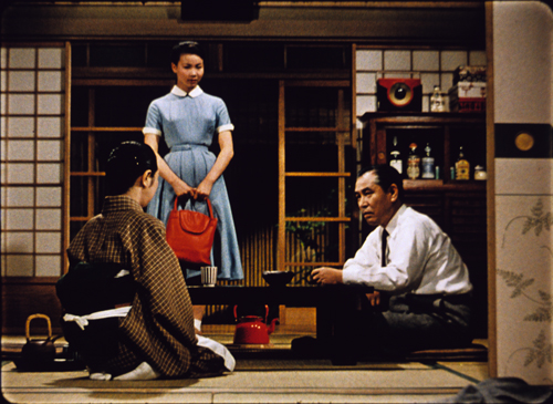
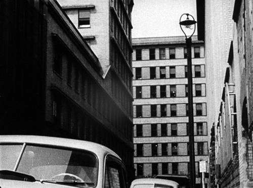
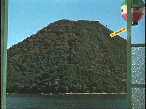
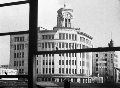
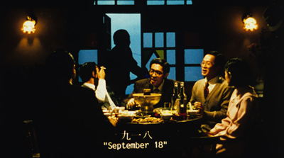
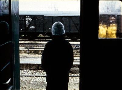
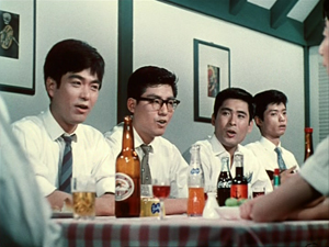
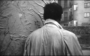
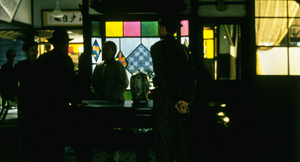
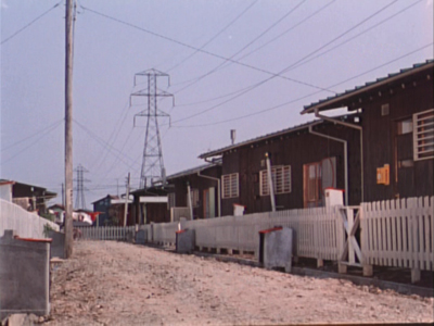
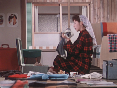
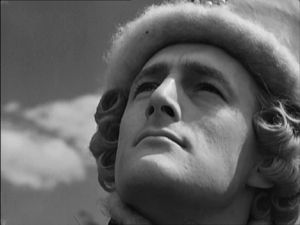
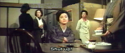
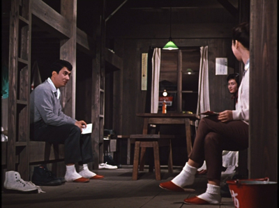
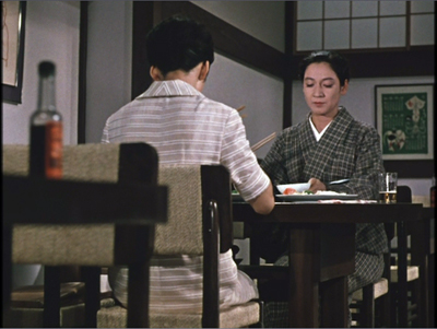
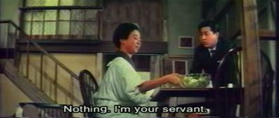
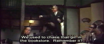
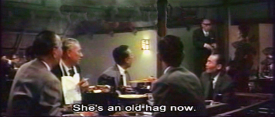
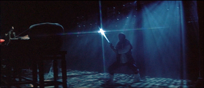
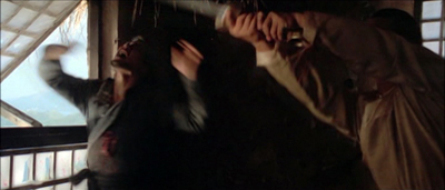
This essay originally appeared in slightly different form in Ozu Yasujiro: 100th Anniversary (Hong Kong International Film Festival, 2003). It is reprinted here by permission. Illustrations are from 35mm prints of Equinox Flower, Dragnet Girl, The Lady and the Beard, and Early Summer. DVD copies of Ozu films are available from the Criterion Collection in the US, the British Film Institute in the UK, and other sources elsewhere. A site showcasing all things Ozu is Ozu-san.com. My book, Ozu and the Poetics of Cinema, is out of print in hard copy, but a free pdf file is available for download here.
Good and good for you
Late Autumn (Ozu Yasujiro, 1960).
DB here:
Manohla Dargis of the New York Times has just written a piece that refers to some ideas that have appeared on this site. If you see the article online, you’ll find the links to appropriate entries, but if you’ve come here after reading the paper edition of the Times, you can find the Tim Smith essay she cites here. It is a remarkable piece of work, and it’s gratifying that Dargis has called attention to it. (Tim’s video experiments have received many hundreds of thousands of downloads already.) My table-setting entry, on task-driven looking, is here.
The backstory is simple. On this site in 2008, I took a slow, unemphatic scene from There Will Be Blood as an example of how a director can subtly guide our attention without cutting, camera movement, or auditory underlining. My analysis was guided by recognition of my own responses and some knowledge of traditions of cinematic staging. Tim, in his turn, used the tools of modern perceptual research to show that we can gain firmer knowledge of directorial craft. By tracking viewers’ eye-scanning, Tim demonstrates vividly that filmmakers can shape our experience of the action on a second-by-second basis. This not only helps us understand how we grasp images. It shows that humanistic inquiry and psychological research can collaborate.
Why so unserious?
Late Spring (Ozu Yasujiro, 1949).
Those who navigate Internet eddies and flows know that dozens of responses have swirled around Dan Kois’ “Eating Your Cultural Vegetables.” Kois wants to like long, slow movies, but after trying for years, he has found that he just can’t enjoy many of them. He can mimic, even anticipate, the judgments of those who do, but in his heart he finds most of the celebrated films boring. He’s now decided to give in to his impulse and declare that he needn’t pretend to enjoy Tarkovsky or Hou Hsiao-hsien:
As I get older, I find I’m suffering from a kind of culture fatigue and have less interest in eating my cultural vegetables, no matter how good they may be for me.
As one man’s confession of guilt and fatigue, this is doubtless sincere, although its sideswiping putdowns of viewers who praise such movies suggest more calculation than humility. Still, this cry from the heart has broader implications, as many Net writers have discussed. Kois’ complaint elicited not one but two responses from the New York Times film critics A. O. Scott and Manohla Dargis. For one thing, Kois’ essay seems to offer aid and comfort to people who are afraid to try something different. Indeed, it lets them feel superior to the phonies who claim to like such films. Moreover, Kois justifies the most superficial response a moviegoer can make. Simply shrugging off a film by saying, “It’s boring!” is about as uninformative a response as saying, “It’s interesting!” And one should always be suspicious of somebody, in the name of debunkery, telling us that we shouldn’t bother to know something.
Kois’ piece exploits the special status that film enjoys in today’s culture. High and low mingle. Because movies are so accessible, and Hollywood movies are so eager to give us what somebody has decided that we want, coterie tastes are dismissed as snobbism. Things seem different in other arts. Would the Times publish a piece in which someone confessed to finding Tarkovsky’s contemporary, the Soviet composer Sofia Gubaidulina, boring? No, because to talk about her is already to enter a restricted and high-level conversation. It goes without saying that a great many listeners would be bored by her music, but who cares what non-experts think about a modern composer? Film, however, is a free-fire zone; anybody’s opinion is worth a public hearing.
I’ve kept out of the fracas because I thought Kois’ piece was silly-season fluff. Of course I wrote my own replies in my head, such as We used to have a name for this: Philistinism. I also thought that the essay operated in bad faith. Kois wasn’t as apologetic as he tried to seem. He claims humility (he “yearns…to experience culture at a more elevated level”) when really disdaining this area of cinema and considering the people who claim to enjoy it mere poseurs. The exaggerations show, I think, that this is not a serious piece:
Surely there are die-hard Hou Hsiao-hsien fans out there who grit their teeth every time a new Pixar movie comes out.
Surely not.
Still, Kois’ complaint touches on something important about film history. We have a polarized film culture: fast, aggressive cinema for the mass market and slow, more austere cinema for festivals and arthouses. That’s not to say that every foreign film is the seven-and-a-half hour Sátántangó, only that demanding works like Tarr’s find their homes in museums, cinematheques, and other specialized venues. Interestingly for Kois’ case, many of the most valuable movies in this vein don’t get any commercial distribution. The major works of Hou, Tarr, and others didn’t play the US theatre market. Sátántangó is just coming out on DVD here, nearly twenty years after its original appearance. Most of us can’t get access to the most vitamin-rich cultural vegetables, and they’re in no danger of overrunning our diet.
The race is to the slowest
City of Sadness (Hou Hsiao-hsien, 1989).
For the historian, the polarization between fast pop movies and slow festival films asks to be explained. My take goes roughly this way.
From the 1940s through the 1960s, certain directors developed a new approach to telling stories. Antonioni, Dreyer, Bergman, and a few others opted for a style that relied on slower pacing and even “dead moments” that seemed to halt the narrative altogether. “Dedramatization,” it was sometimes called, and many rightly considered it a powerful innovation in the history of film as an art. But these films did get a purchase on the international movie market, often for other reasons (sex in Antonioni and Bergman, religiosity in Dreyer). They also came along at a time when there was a niche audience eager to have new cinematic experiences. (On this period see Tino Balio’s Foreign Film Renaissance on American Screens.)
But artists being artists, competition grew up. The long take, for instance, got longer and more virtuosic. Miklós Jancsó, shamefully ignored today, made a series of pageants of Hungarian history in superbly sustained, intricate camera movements; some of his films have only twelve shots. But his films are sumptuous compared to what we found elsewhere. From the late 1960s through the 1970s, it seems, a new generation of filmmakers competed to make ever more austere films. They often kept the camera fixed, framed the action at a distance, and sustained the shot for many minutes. The works of Jean-Marie Straub and Danièle Huillet are the high-water marks of this trend, but there were also Chantal Akerman, Theo Angelopoulos, and even Rainer Werner Fassbinder (Katzelmacher) and Wim Wenders (Kings of the Road). Werner Herzog’s successful career as a documentarist has perhaps let people forget that he once made very slow and demanding films like Fata Morgana; his Heart of Glass, screened in US arthouses in the 1970s, would surely not find a distributor today.
From a marketing standpoint, the avant-garde overplayed its hand. The new austerity came along just when Spielberg and Lucas were reinventing Hollywood. As movies got faster and louder, long-take minimalism looked perversely ascetic. Some of the directors, like Straub and Huillet, remained loyal to their project; others crossed over. It is quite a shift from Akerman’s Jeanne Dielman, 23 quai du Commerce, 1080 Bruxelles (1975), a 201-minute film mostly about housework, to the musical The Golden Eighties (1986) and A Couch in New York (1996). Likewise with Wenders’ Summer in the City (1970) and Wings of Desire (1987). I happen to admire both strains in these directors’ works, but there’s no doubt which is the more audience-friendly.
Today, directors who persist in long-take, slowly-paced storytelling are aiming chiefly at the festival market, which means that most of their films will be shown theatrically only, to be blunt, in France. But some of the greatest directors of our time, notably Hou Hsiao-hsien, Edward Yang, and Abbas Kiarostami, have done their best work in this mode. The US arthouse market has taken decades to discover them, through more accessible works like Flight of the Red Balloon, Yi Yi, and Certified Copy. Kois confesses to loving Yi Yi, so I’d urge him to look at Yang’s Terrorizers and A Brighter Summer Day, more rigorous but no less gripping films, though they lack the traditional arthouse bait of a charming child. Hou’s Red Balloon also has a cute kid and refers back to an arthouse classic, while Kiarostami, not normally given to couples and romances, offers us in Certified Copy a pleasantly teasing take on Antonioni and Resnais.
Minimalism of the 1970s variety got revived by 1980s American indies, notably Jim Jarmusch, but with more entertainment value. In later years he too crossed over stylistically; however unpredictable the plot maneuvers of Ghost Dog and Broken Flowers, they lack the long takes and open-ended unfolding of time we find in Stranger than Paradise. Even Kelly Reichardt, one of Kois’ targets, doesn’t give us anything like the severity of the 1970s generation. That makes the “purer” films from overseas that persist in this tradition even more off-putting. If Kois can’t take Meek’s Cutoff, as he claims, he’d find Hong Sangsoo (Oki’s Movie) or Liu Jiayin (Oxhide and Oxhide II) cinematic chloroform.
So Kois may assume that “boring” films have persisted in today’s film culture because of snobbism, but there are deeper reasons. The competition among filmmakers to push an aesthetic horizon further, the narrowing of audience tastes, the search for a budget-appropriate niche that could stand in opposition to the visual spectacle of the New Hollywood–these seem to me important factors in making slow movies a ghetto for cinephiles.
Why shouldn’t people follow Kois in giving up their vegetables? No reason, except that they’re missing some worthwhile cinematic experiences. Not all austere movies are good, but viewers who want to expand their cinematic horizons should consider the possibility of learning to look at certain movies differently. Kois can’t see that; he thinks that people who like the movies that bore him are usually phonies. But I believe that some of those admirers have developed a repertory of viewing habits that adjust to different cinematic traditions. If you can like both Stravinsky and rock and roll, why can’t you like Hou and Spielberg?
Look again, closer
Voyage to Cythera (Theo Angelopoulos, 1984).
This is the prospect opened up by Dargis’ latest article. She suggests that Kois’ response isn’t wholly based on taste. It may stem from literally not knowing how to look at certain kinds of movies.
Kois’ article treats most defenses of slow films as a matter of hand-waving and you-see-it-or-you-don’t attitudinizing. Again, he has a point: Those reactions are common, I think. The fact that cinephiles must face is that this sort of film is very difficult to talk about. We can point out the creative choices in Hollywood because narrative in some degree drives everything we see and hear. But when narrative relaxes, most viewers don’t know what to look or listen for.
The problem has haunted me for decades, ever since the 1970s when I took an interest in Ozu, Bresson, Dreyer, and Mizoguchi–all filmmakers felt, at the time, to be slow. I failed to come to grips with the problem in my 1981 book on Dreyer; I even anticipated Kois in calling Gertrud (another item that would never grace theatre screens today) boring–but I took that to be a good thing, as a challenge to conventional viewing habits.
What can I say? I was young. Since then, I think I’ve come up with better ways of talking about the other directors I mentioned, as well as some in their camp, such as Angelopoulos and Hou and Tarr. A lot of my answer comes down to the way, pace Dargis and Smith, they structure our attention.
My arguments are set out in the places I mention in the tailpiece of this entry. In brief, these filmmakers become engaging, even entertaining, when we realize that they are to some extent shifting our involvement from characters and situations to the manner of presentation. Not narrative but narration is what engages us. And we need, as Dargis points out, some schemas for grasping these alternative patterns. We have robust and refined schemas for following a story, but grasping the dynamics of narration, the how as well as the what, takes more practice, and perhaps some instruction from critics.
The process is like taking in an opera on two levels: following the stage action but also registering the patterns, the emotional highs and lows, of the music that accompanies–and sometimes overwhelms–it. Let Papagena and Papageno stammer each one’s name again and again. The repetition isn’t needed for the drama, but it’s thrilling on sheerly musical grounds.
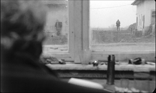
Now imagine that sort of development transposed to cinema, in which we can appreciate, at one and the same time, not only the story’s unfolding but the patterns that present it. The supreme master of this possibility, I think, is Ozu, perhaps cinema’s Mozart. But you can find the same qualities in more somber key elsewhere. For example, in watching Angelpoulos’ Voyage to Cythera, I think that you have to be prepared to see the arrival of track workers in yellow slickers, visible through the speckled window pane in the shot above, as a kind of visual epiphany, the quiet equivalent of a stunt in a summer tentpole picture.
Given a narrative mandate, we’re on the lookout for pictorial factors that affect the dramatic situation. But when narrative slows, other things, maybe not of narrative moment, pop out, like the yellow-garbed train workers on their handcar. At such moments, it’s not that our eyes roam around aimlessly; it’s that the director guides us in a different way, toward a visual search that isn’t wholly driven by plot considerations. Here’s a shot from Ozu’s End of Summer (1961).
The principal action is a party of young people singing. But the faces are no more important than the gleaming drinks on the table, a little suite of colors and shapes that become fascinating in themselves. (For instance, several of the liquids and bottle labels sit along the same horizon line, regardless of how far the drinks are from us.) You don’t discover this half-gag, half-still-life by groping: Ozu has lit it and composed it so that you’re invited to discover it. He has found a way to activate what in most movies would be filler material. And if you think that noticing colors and shapes on the tabletop is just trivial, consider that we enjoy staring at the same sorts of patterns in an abstract Kandinsky. Or is he cultural roughage too?
In an Ozu film, even though he cuts rather fast, we’re given time to see everything. But this isn’t random rummaging. It’s visual exploration guided by Ozu’s decisions about composition, lighting, and color. Something similar, I think, is going on with Tarr, although there it’s more a matter of texture and tactile qualities. His people shamble through mud, oily puddles, dusty corners, and tearing winds. In one shot of Damnation, a rain-soaked wall shrivels to match a wrinkled topcoat.
The story is still going forward, but by turning his protagonist from us and aligning him with the wall, Tarr has given his shot an extra layer of sensuous appeal. Try to remember the way any wall looked in Transformers 3, before it got blasted to rubble.
Slow movies let us look around, and good slow-movie makers give us something to see when we do. But what do we do when these accessory appeals don’t just accompany the narrative but swamp it? What if we lose track of the characters? The film may steer us to pictorial or auditory qualities that take over our perception.
The authorities are looking for a man in the family in Hou’s City of Sadness, but you have to rely almost solely on dialogue to identify what’s going on and who’s speaking.
The sheer pictorial beauty of the shot becomes a sort of anti-narrative pretext. But if you’re alert, you won’t take the plot off the table, because at one crucial moment a figure flashes through the far left background, more or less fully lit, who may be the suspect the cops are seeking.
Sometimes you have to destroy narrative in order to save it.
Hou asks that we engage with his distant, fixed images in a complex way, being patient but vigilant, enjoying abstract geometry while also sustaining old-fashioned suspense. It’s this dynamic between story and style, fastening on plot elements but also discovering accessory pleasures and patterns, that I think constitutes one delight of the sort of films that Kois finds boring.
Add Bresson, Mizoguchi, Dreyer, Tarkovsky, and others to my list of directors whose very different styles invite us to explore what the rapid pace of most narrative cinema refuses to dwell upon. These filmmakers invite us to grasp the space and time of a scene in a fresh way. The details and dimensions of a world surge forward, not simply as a backdrop for characters hurtling toward a goal, but as something valuable in their own right. For some viewers, me included, they do more. They also ask you to transfer those viewing skills to life outside the theatre. They encourage you to find a new way to look at our world.
Not all slow, minimalist movies are good. That’s why I think critics are obliged to rebut Kois with careful analysis, not the gaseous generalities about sublimity and eternal mystery to which we too often resort. Digging deeper, we can not only answer skeptics but expand our understanding of how cinema works. These films have opened windows for many of us. Why should we keep them to ourselves?
First, thanks to Manohla Dargis for enjoyable correspondence about these issues.
Tim Smith’s blog, Continuity Boy, is a good way to keep up with his energetic and expanding research program.
Dargis mentions the invisible gorilla experiments of Chabris and Simons. I talk about their relevance to film here and here.
Kristin has written on comparable matters in Tati; she even wrote an essay on M. Hulot’s Holiday called “Boredom on the Beach.” (It and an essay on Play Time are in her book Breaking the Glass Armor.) Tati’s films, in their spasmodic pauses and shamelessly repeated or sustained gags, could also count as part of the postwar dedramatization trend.
My initial arguments about different registers of viewer perception and cognition were made in Narration in the Fiction Film (1985). My case for Ozu is in Ozu and the Poetics of Cinema, available online. More recently, I’ve become interested in cinematic staging and have concentrated on challenging directors like Mizoguchi, Angelopoulos, and Hou; see On the History of Film Style (1998) and Figures Traced in Light (2005). All of these “slow” filmmakers ask us to be sensitive to unusual sorts of narrative patterning, and some purely non-narrative patterning. More thoughts on these matters can be found in The Way Hollywood Tells It (20006) and Poetics of Cinema (20007).
On this site, you can find similar lines of argument, especially about Béla Tarr, Mizoguchi Kenji, and silent directors like Louis Feuillade, Victor Sjöström and some Danish creators. See director entries for Hong Sangsoo, Liu Jiayin, and others mentioned above. Later this month I hope to post a bit more about how directors guide our attention without recourse to fast-paced editing–before editing was really invented.
Sátántangó (Béla Tarr, 1994).
Graphic content ahead
Kristin here:
Recently I received the June issue of Empire magazine. After the shock of realizing that, Ack! It really is almost June, I turned to the letters to the editor. I received an even worse shock when I read this one:
I recently discussed 2001: A Space Odyssey with my Film Studies teacher (I’m an A-level student), and mentioned (what the back of the DVD case says): “One of the most mind-blowing jump cuts ever conceived.” He told me the bone to satellite scene is actually a match cut. I then read issue 262 of Empire, and was very happy to see a Stanley Kubrick special. I noticed you also called it a “stunning jump cut”. After being told what a jump cut and what a match cut is and seeing a few examples (the jump cut at the start of Don’t Look Now, and then the match cut in 2001: A Space Odyssey), I am now confused as to why the DVD and Empire would call it a jump cut when it is a match cut.
Robby Burke, via email
It is a match cut. The offending writer has been put into a small room with only Eisenstein films for company. The moral of this story is always listen to your teachers, kids. And good luck to Owen Robinson on your Kubrick Film Studies unit. This is turning into hospital radio.
No wonder Mr. Burke is confused. His teacher and Empire both gave him answers that I would consider wrong, or at best imprecise to the point of vagueness. This rather surprised me. I enjoy reading Empire, which has somehow managed to keep itself fat and glossy when magazines like Entertainment Weekly have shrunk to the size of brochures. It even has occasional useful articles, like its retrospective section on Back to the Future in the April, 2010 issue. (As far as I can tell, this section has never made its way to the Empire website.)
The term “match cut” is, out of context, virtually meaningless. There are different kinds of match cuts, and not specifying which type one is referring to will leave Mr. Burke and the rest of us clueless as to what the teacher and the unnamed staff member for Empire mean.
Thinking I was missing something about the term “match cut,” I looked it up on Wikipedia and discovered that the teacher and the Empire staff member might have gotten their misinformation from the entry on that phrase. Its definition of a “match cut” is:
A match cut, also called a graphic match, is a cut in film editing between either two different objects, two different spaces, or two different compositions in which an object in the two shots graphically match, often helping to establish a strong continuity of action and linking the two shots metaphorically.
While the Empire use of “match cut” was only vague, this definition is simply inaccurate. The author goes on to say:
Match cuts form the basis for continuity editing, such as the ubiquitous use of match on action. Continuity editing smoothes over the inherent discontinuity of shot changes to establish a logical coherence between shots. Even within continuity editing, though, the match cut is a contrast both with cross-cutting between actions in two different locations that are occurring simultaneously, and with parallel editing, which draws parallels or contrasts between two different time-space locations.
I’ll agree that continuity editing is designed to smooth over the potentially disruptive quality of cuts. Matching anything within a scene is definitely different from cutting from an action in one place to a different action in a different place. But graphic matches are neither synonymous with “match cuts” nor the basis for continuity editing.
I also discovered that the “Further Reading” list at the bottom included two items, one of which was Film Art: An Introduction. One of those good news/bad news situations. The good news is, if you read the book, you will find out what graphic matches, and matches in general, really are. The bad news is, if you don’t, you might blame us for the contents of the Wikipedia entry.
A little detour into history
Most people don’t realize this, but David and I invented the term “graphic match.” As we recall, this happened in 1975. David was teaching a course that involved screening Yasujiro Ozu’s second color film, Ohayu (1959), a wonderful comedy about television, farting, and small talk. We had never seen the film before and were watching a 16mm print of it.
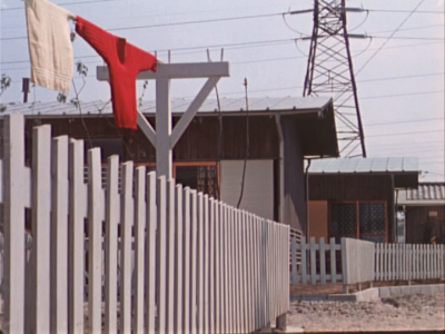
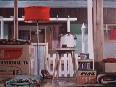
When the two shots below passed before our eyes, we both gasped and lunged for the projector. We ran the film back and watched the cut again. There was no doubt that Ozu had deliberately placed a bright red sweater in the upper left quadrant of the frame in one shot and a bright red lamp in the same basic position in the next shot. We didn’t know what to call this technique, so we dubbed it a “graphic match.” Two years later, when we started writing Film Art: An Introduction, we included the term as one technique of film editing and used Ozu’s match on red as one example. By now “graphic match” has been picked up to the point where we occasionally see it used in print.
If people, however, are tossing that term and “match cut” around so inaccurately–and even equating the two–then some definitions and examples seem in order.
Matcharama
“Match” as applied to editing simply means that some element is carried over from one shot to the next. That doesn’t necessarily mean that this element creates a sense of continuity.
In general, “continuity” means that a coherent space and time are continuing over the cut, so that the spectator’s understanding of a story isn’t disturbed by a sense that bits of time have been left out or that characters have changed positions at the cut. Most people watching a mainstream narrative film probably aren’t even aware of the editing, especially in conventional conversation scenes.
More specifically, “continuity” means a set of guidelines or loose “rules” that American filmmakers devised, mostly during the 1910s, to allow them to help create that clarity of narrative action in time and space. Within a scene, the most basic of these is the 180-degree rule or “axis of action,” the invisible line that runs through the scene perpendicular to the camera. If the camera stays on one side of that line, characters will stay in a consistent spatial relation to each other. Character A will be on the left in every shot, Character B on the right—unless one of them walks to a different part of the setting. In other words, the axis creates consistent screen direction.
The most basic kinds of matches are on appearance, position, action, and eyelines. Everyone knows that if a character is wearing a blue hat, showing her wearing a red one after the cut is a continuity error. Her appearance has not been matched. The same is true if she is resting her cheek on her hand in one shot, but has both hands flat on the table after the cut. If she is walking in one shot, she should not be running or standing still in the next. Even if the shots are made with a single camera and the actress repeats her actions, her position and movement should ideally be repeated so precisely that her action appears continuous. That’s a match on action, one of the most common continuity devices.
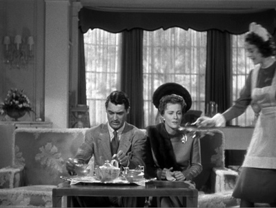
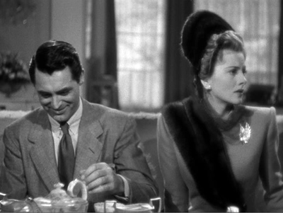
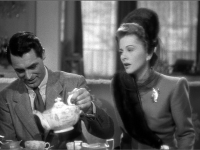
Smooth matches on action are difficult, especially if, as often happened in classic studio filmmaking, the two shots are made hours or even days apart. Even a supreme technician like Hitchcock can err. Here is a flagrantly mismatched passage from Suspicion. In the long shot, Johnnie (Cary Grant) reaches for the teapot with his left hand and starts to pour.
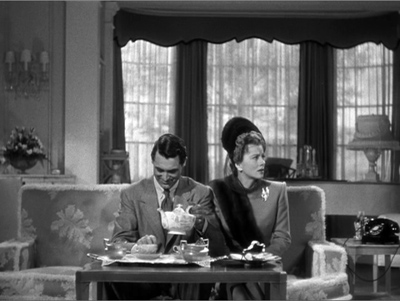
But then Hitchcock cuts in axially, the teapot is back where it was, and Johnnie once more reaches for it. By the time he’s pouring now, Lina has turned to watch him.
Editors traditionally like an overlap of 2-4 frames when they’re matching action on cuts, but this is a much longer overlap, something on the order of four seconds. Why we don’t usually notice such things is a source of considerable discussion in film circles.
The eyeline match is also very common. If a character looks at something offscreen, a cut shows us something in a different space, and we tend to assume that the character is looking at what we now see. Screen direction is important here, since if the character looks off right, when the next shot appears, we assume he is now offscreen left.
Not all continuity devices involve matches of these kinds. Crosscutting and flashbacks may move the action away from the space and even the time of a scene, but there are other cues that help us keep track of the ways in which these new spaces relate to the storyline.
None of this requires what we would consider a graphic match. Of course, if we see the same characters in the same setting from shot to shot, there will be an overall graphic consistency. They’re wearing the same costumes, and the background colors probably won’t shift greatly. But precisely because of that general consistency, we probably won’t notice the graphic qualities of the scene as being that important as elements of the editing. We’re busy following the story.
Graphic matches precise enough to be noticed as such tend to jolt us a little out of our smooth concentration on the story action. They are not the basic of continuity, as the Wikipedia definition claims. On the contrary, they often appear in films outside the continuity tradition. Abstract films often play on the graphic similarities (matches) or contrasts (mismatches) among shapes from shot to shot. Such abstract play is, in effect, their subject, and we pay attention to the pictorial flow as we would pay attention to story in a conventional narrative film.
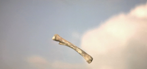
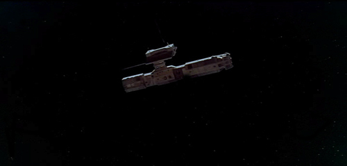
When close graphic matches or jolting graphic contrasts appear in narrative films, they may or may not play a narrative role. The famous bone/spaceship cut in 2001 is a graphic match. It’s not a match on action, since two different objects in completely different times and places are shown. It’s not a jump cut for the same reasons.
Here the graphic match is not really very close. The sky is bright and blue behind the bone, while it is dark behind the spaceship. Similarly, the bone is light in color, while the spaceship is initially dark, though it does brighten slightly as it moves. The only graphic element matched is the general shape and motion of the two objects.
The function, I assume, is to jolt the audience with the dramatic transition across millions of years and from earth into space. Thus here the graphic match has a narrative function, though it does not create the smooth movement from one scene to another that classical films tend to have. It’s more like what is sometimes called a “shock cut,” one which startles the viewer. The cut to the screeching cockatoo in Citizen Kane is one of the most famous examples, though it primarily involves sound and a strong graphic contrast.
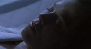
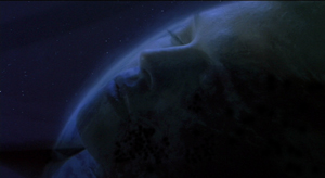
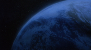
A transition somewhat similar to the one in 2001 occurs early in Aliens, an example which we use in recent editions of Film Art. A dissolve moves from a close-up of Ripley’s sleeping face to a view of part of the earth seen from space. Again there is a passage through time and space, though the interval is presumably only a few months. Here the graphic match is much closer than in the 2001 transition, with the colors as well as the shapes being kept fairly consistent. This graphic similarity and the dissolve that emphasizes it ease us from one scene to another rather than jolting and surprising us.
In the hands of an experimental filmmaker or of an unconventional director like Ozu, who avoids obeying Hollywood’s continuity guidelines, graphic matches don’t necessarily play a narrative role. They are included as an extra layer of engagement for the viewer. We don’t, or at least shouldn’t, expect to be able to interpret them. I would contend that the link between the red sweater and the red lampshade is there for pure pleasure. You can come up with an interpretation of the graphic match if you try hard enough—but if you do, please don’t tell me about it. I suspect it would interfere with my enjoyment of that scene when I next watch Ohayu.
I don’t think the cut serves even so modest a function as establishing space at the beginning of a scene. Here’s the shot that actually begins the scene and leads to the sweater and lampshade shots:
And here’s the one that follows the lampshade shot:
The woman is a minor character. She and her husband live in the suburban housing complex where the much of the action is set. They are more modern in their habits than their neighbors, wearing western clothes rather than kimonos and owning the only TV in the complex. They function primarily to introduce the two young boys in the central family of the story to TV, since they hospitably let the local kids visit them to watch it. The scene following the graphic match shows the wife packing to move. Their absence will precipitate a crisis when the boys demand that their parents buy them a television. The strife among the family members forms the basis for much of the rest of the action.
So the packing scene is important. Yet Ozu uses two shots that he wouldn’t need, thus delaying the scene’s beginning. The extreme long shot of the housing complex doesn’t tell us which house will form the setting for the upcoming scene. The red sweater is in the distance, but barely visible. We certainly wouldn’t notice it or get any clues about the narrative from it. Yet Ozu cuts to a closer view of the sweater and a towel. The houses in the background are all identical, and we don’t know which one belongs to which characters or which we will enter in the next shot.
The first interior view would be a logical establishing shot for the scene. The modern furnishings and especially the television box let us know where we are, and the boxes might hint that the inhabitants are packing to leave. So we are not surprised when we see the modern wife in the subsequent shot. But Ozu puts in the other two as part of his typical series of transitional shots that show the spaces between locales where action occurs.
The graphic match, I would suggest, is simply part of Ozu’s distinctive style. It’s playful and fits in with the general graphic beauty of his films, which includes bright splashes of color, careful compositions using the lines of the sets, and precise placements of props.
Returning to the Wikipedia entry for “match cut,” there is a section that mentions several examples, including the one that inspired Mr. Burke’s letter:
Stanley Kubrick’s 2001: A Space Odyssey contains a famous example of a match cut. After an ape discovers the use of bones as a tool and a weapon, there is a match cut to a spacecraft or satellite in orbit. The match cut helps draw a connection between the two objects as exemplars of primitive and advanced tools respectively.
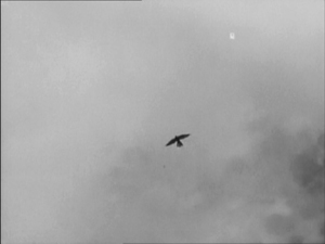
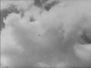
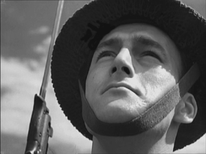
Michael Powell and Emeric Pressburger’s A Canterbury Tale contains the influence for the 2001: A Space Odyssey match cut in which a fourteenth century falcon cuts to a World War II aeroplane. The sense of time passing but nothing changing is emphasised by having the same actor, in different costumes, looking at both the falcon and the aeroplane.
An early example comes from Orson Welles’s Citizen Kane which opens with a series of match dissolves that keeps the lit window of C.F. Kane’s in the same part of the frame while the cuts take us around his dilapidated Xanadu estate, before a final match dissolve takes us from the outside to the inside where Kane is about to die.
Another match cut comes from Lawrence of Arabia (David Lean, 1962) where an edit cuts together Lawrence blowing out a lit match with the desert sun rising from the horizon. Director David Lean credits inspiration for the edit to the experimental French New Wave. The edit was later praised by Steven Spielberg as inspiration for his own work.
How the author knows that A Canterbury Tale (see below) influenced 2001 is not clear. The site footnoted (here) simply says that the cut (below) “anticipated” Kubrick’s scene in 2001. The film was released in the U.S. in early 1949, so possibly Kubrick saw it and remembered the scene nearly twenty years later. By the way, Powell and Pressburger create a double graphic echo, roughly matching the two similar dark objects against a light sky and making the two shots of the men looking upward strongly resemble each other as well.
The Citizen Kane opening, with its precise placements of the one lit window from shot to shot, is a good example of graphic matches. I am not going to touch the question of what a “match dissolve” is.
The cut from the match to the Jordanian desert horizon in Lawrence of Arabia is a trickier case. The match is placed in the left half of the anamorphic widescreen frame, while the sun rises in the right half. Moreover, the match shot is very bright, while the desert scene is fairly dark, with the sun only beginning to glow above the horizon a short way into the shot. Graphically there is not much to link them, though I think the spectator does get a strong sense of a connection between the match and sun. I’d say it’s a conceptual link, not a graphic one. It’s a link that we make on the basis of two bright objects that are not compositionally or spatially matched but simply juxtaposed.
Mr. Burke, your inquiry was perfectly reasonable, and I hope I have helped clear up your confusion.
We supply two flagrant examples of mismatched action, figure placement, and setting in Bringing Up Baby in this blog entry. Interestingly, probably no one but a professional notices them, because the relative positions of the major figures are consistent, as are the overall compositions of the shots. But then, as Dan Levin points out, we are not that sensitive to continuity disruptions in the real world either!
A Canterbury Tale.
A matter of ‘Scope
Killer Constable.
DB here:
Like most cinephiles of my vintage, I love anamorphic widescreen, especially in its early years. Even though CinemaScope as a trademarked format is long gone, its aspect ratio of 2.35 or 2.40 to 1 became the standard, and we tend to call any widescreen film of those proportions a “‘Scope” production.
Nowadays many films are in ‘Scope; it’s sensed as a cool ratio. Too cool, actually: I’m not sure that Cop Out and The Hangover needed to be in ‘Scope. Things were quite different in Asian cinema during the 1960s and 1970s, where directors had to learn how to master and exploit the new acreage available to them. I was reminded of their problems, and some of their dazzling solutions, when I visited films that were part of two big retrospectives at the Hong Kong Film Festival this year.
The Shochiku touch
Festival goers tend to ignore their cities’ round-the-year programming. We’ve shown films at our Cinematheque that would have drawn more strongly if they had been presented under the umbrella of a festival. A festival is a big, ballyhooed event, and people set aside time to plunge into it. They take it as an occasion to explore cinema. But that impulse isn’t as strong, I think, in other seasons.
Accordingly, the HKIFF has developed a smart strategy. It often launches a retrospective during the festival period but then continues it after the festival is finished. This enables the festival to spotlight the series more vividly and to engage viewers to return in the weeks to come. The drawback is that the strategy tantalizes us visitors, who wish we could stay on to get a full dose of Shimizu Hiroshi (subject of a 2004 roundup) or Kinoshita Keisuke (2005) or Nakagawa Nobuo (2006). This year’s hors d’oeuvres were even more scanty: only two of the films of Shibuya Minoru played during the festival, which ended Tuesday. The rest come later in April.
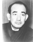 At the venerable Shochiku studio, after assisting Naruse Mikio and Gosho Heinosuke, Shibuya worked with Ozu on What Did the Lady Forget? (1937) before launching his own directing career. He made over forty films, the last one released in 1966. My own awareness of Shibuya before my visit was limited to the family dramas A New Family (Atarashiki Kazoku, 1939) and Cherry Country (Sakura no kuni, 1941), both in a mildly, though not rigorously, Ozuian vein.
The earlier film in the partial Shibuya retrospective was Righteousness (1957), an ensemble piece about a neighborhood still laboring under postwar hardships. The young Seitaro is in love with Michiko, but her mother offers her in marriage to her more prosperous roomer. Seitaro works as a mechanic for a bus company, where Fujita is a driver. Fujita has just married a young woman against his father’s wishes. The characters are introduced through the peripatetic Okyo, Seitaro’s mother, who peddles black-market goods to her neighbors. Fujita’s troubles mount up when his bus hits a child, and Seitaro must decide whether to reveal what he knows about the accident. The film builds well to two climaxes, the consequences suffered by Seitaro after he makes his painful decision and then Okyo’s denunciation of her neighbors. On the other side of the ledger, Fujita’s domestic troubles are resolved rather abruptly and implausibly. Still, Righteousness exemplifies the classic Shochiku formula of smiles mixed with tears, capped by a more-or-less upbeat resolution.
Shibuya was shadowed by Ozu even after the master’s death, for he was assigned to make a memorial film based on the last project planned by Ozu and screenwriter Noda Kogo. This was the film now circulating as Mr. Radish and Mr. Carrot (1965).
Chris Fujiwara has provided us an enlightening account of how Shibuya turned what would probably have been another subtle Ozu meditation on generational strife, in the manner of An Autumn Afternoon, into a more raucous comic melodrama. Yamaki is an executive who lives by strict routine, but he’s also pestered by his four daughters and his lothario brother. When a friend comes down with cancer and the brother reveals himself as an embezzler, Yamaki flees without warning. As his family fret about him, and quarrel among themselves, he settles in among working people, notably some prostitutes and a swindler selling Chinese medicine.
No one in the family displays much virtue, and even Yamaki is seen as cranky and oblivious to the needs of his wife and children. Radish and Carrot’s cynicism seemed to me too easy, and the physical comedy, such as Ryu Chishu’s bodily contortions, struck me as forced and overplayed. Stylistically, the film is eclectic and almost casual. It begins with a zoom and a whip pan. Thereafter, we get flash cuts, canted setups, and a fashion show. Unlike Righteousness, this film justifies Fujiwara’s claim, in a HKIFF catalogue essay not available online, that Shibuya sometimes embraced “visual excess.”
Ozu refused widescreen filming; he compared the ‘Scope frame to a roll of toilet paper. He may have realized that it would pose problems for his graphically matched cuts, deep and subtly imbalanced compositions, and other techniques he had refined over decades. Similarly, Radish and Carrot made me wonder if Shibuya was comfortable working in ‘Scope. He drops in some Ozuian corridor images, but at other times he mounts the sort of packed wide-angle shots common in 1960s Japanese anamorphic films.
When Ozu fills up his 4×3 frames, he gives us more to look at, along with more daring placement of figures. This is not your typical establishing shot.
Ozu’s signature shot is at a low height but seldom at a low angle. Shibuya’s compositions remind you what a real low-angle image looks like, with the camera tipped up considerably.
I know, it’s unfair to judge Shibuya’s film by the exalted standards of Late Autumn (1960), and we risk saddling him with purposes he didn’t have. He probably didn’t set out to make an Ozu pastiche. Yet we can, I think, fault Radish and Carrot sheerly on craft grounds. Two party scenes, one gathering men and one among wives, seemed to me almost haphazard in their spatial development. This cut, for instance, is more careless than anything I noticed in Righteousness.
In the second shot, on the far right side, a waitress is now in the frame next to the old man, and he has already turned and is talking to her instead of his classmates at the other table. When this film was made, younger directors, like Suzuki Seijun and Oshima Nagisa, were already handling ‘Scope with much more assurance. I look forward to seeing more Shibuya widescreen entries to learn if they made more polished use of the format.
Elegance and vulgarity
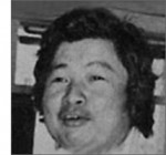 The other retrospective in question was devoted to Kuei Chih-hung (in Cantonese, Gwei Chi-hung), a Shaws director who has been overshadowed by the more famous Chang Cheh and Li Han-hsiang (here and here on this site). Kuei worked in several genres, including the sex movie and the horror film, and he was able to supply cheap items in quantity. But he stands out partly because he moved outside the opulent Shaw studio to shoot on locations. Working with an efficient crew and a lightweight camera, Kuei produced some films, like The Delinquent (1973) and The Teahouse (1974), that look forward to the social realism of the New Wave that followed. Like some New Wavers as well, Kuei highlighted the cruelty of class warfare in Hong Kong both past and present. Ironically, he ceased directing when he felt that the young generation had pushed things further than he could go.
The crime-centered plots of The Delinquent, The Teahouse, and Big Brother Cheng (1975) manage a fair amount of outrage at policing and justice in Hong Kong, as do Kuei’s contributions to a series of omnibus films called The Criminals. His excursions into exploitation fare with Bamboo House of Dolls (1973), Killer Snakes (1974), and the Hex cycle (1980 and after) show, if nothing else, how anxious Shaws was to retain market share in the face of the thrusting popularity of Golden Harvest releases. Obliged to go gross, the man didn’t flinch. The Boxer’s Omen (1983), a supernatural kickboxing yarn, features one rite that demands that celebrants chew food, spit it out, and pass it along to be eaten by others. (No fakery, everything done in one shot.) My tastes run more to something like Killer Constable (1980).
It’s a shooting-gallery plot. Constable Leng and his team are sent to recover gold stolen from the Empress’s palace, and one by one the fighters are eliminated in skirmishes with the thieves. Kuei pointed proudly to the social criticism in the film: “I simply wanted to depict how insignificant commoners are and how, under totalitarian rule, they turn out to be the victims.” Leng, preferring to kill lawbreakers rather than bring them to trial, pursues the bandits with unblinking ferocity. When he finds a miller who helped the gang, he decapitates the man in front of his wife and squalling baby. But Leng’s brutality meets its match in the bandits, who devise comparably sadistic ways to decimate his posse.
Killer Constable comes near the tail end of the Shaws output, just a few years before the company largely abandoned theatrical film production in favor of television. Kuei is thus able to absorb and advance some of the studio’s signature techniques. His film starts out in the splendor of high-key lighting and saturated color typical of Shaws court epics, but soon enough, sword battles play out by torchlight or in semidarkness.
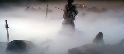
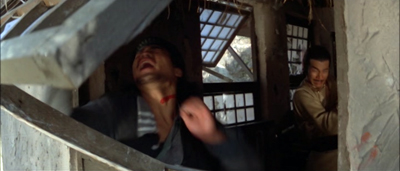
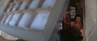
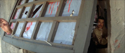
As for ‘Scope, Kuei had the benefit of a strong tradition. In action films, both Japanese and Hong Kong directors cultivated a “precisionist” use of the ratio that made parts of the composition–sometimes widely distant parts–click into place one by one, at a staccato pace. Here are phases of an early fight in Killer Constable.
The rhythm builds, from the cut to the new angle, then the peekaboo flip of the window, then the spotlighting of Leng in the lower right, and finally the thrusting hand of his victim in the extreme left, at which point the shot comes to rest.
‘Scope felicities like this may stem as much from the power of the tradition as from Kuei’s individual talent. In any case, his retrospective, like the Shibuya one, shows that we haven’t fully charted the range of expressive possibilities opened by popular Asian cinema in their early encounters with widescreen.
Chris Fujiwara’s survey essay, “Irony, Disenchantment, and Visual Excess: The Style of Shibuya Minoru,” appears in the HKIFF catalogue, available here. In Chapter 12 of Poetics of Cinema, I illustrate Japanese filmmakers’ relative laxity about the 180-degree matching system with a couple of shots from Shibuya’s A New Family. The passage in question may be one-off borrowing from Ozu.
The Hong Kong Film Archive book devoted to Kuei Chih-hung provides precious information not only on the director but also on the Shaws studio system. For more on widescreen style at Shaws see my online essay, “Another Shaw Production: Anamorphic Adventures in Hong Kong.” I discuss the rhythmic resources of Hong Kong combat in Chapter 8 of Planet Hong Kong.
Other continuing retrospectives at this year’s HKIFF are devoted to Abbas Kiarostami and Vietnamese cinema from 1962-1989. If you’re passing through town, you could do worse than check them out.
Thanks to Li Cheuk-to for correcting some information.
Opening title for Mr. Radish and Mr. Carrot.


