Archive for the 'Film technique: Performance' Category
GRAVITY, Part 2: Thinking inside the Box
Kristin here:
In my previous entry, I described Gravity as an experimental film. I had thought of it that way ever since seeing trailers for it online back in mid-September. I described it as reminding me “of Michael Snow’s brilliant Central Region, but with narrative.”
Last time I developed that notion in more detail and analyzed the narrative structure of the film. Now I’ll analyze the experimental aspects of the film’s style and the dazzling means by which they were created. I don’t have the technical expertise to explain the inventions and ingenuity that went into creating Gravity, so I have sought to pluck out the best quotations from the many interviews and articles on the film and organize them into a coherent layout of how its most striking aspects were achieved.
As in that entry, SPOILER ALERT. This is not a review but an analysis of the film. Gravity does depend crucially upon suspense and surprise, and I would suggest not reading further without having seen the film.
Screaming on the set
I’ve written about Cuarón’s use of long takes, a stylistic device that has drawn a huge amount of attention in the press. Here the editing is so subtly done that even someone like me, who typically notices every cut, missed a lot of them during early viewings. There are bursts of rapid editing, as when the ISS is struck by debris and is destroyed, or more conventional cutting, as when the camera follows the Chinese pod and surrounding remnants of the station as they heat up in the atmosphere.
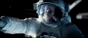
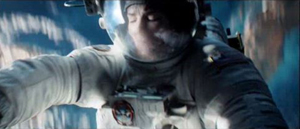
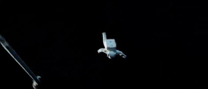
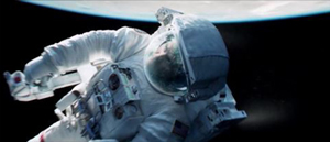
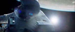
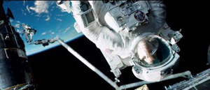
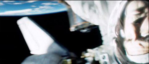
The long takes go beyond what Cuarón has done before. In Variety, Justin Chang describes one major difference: “As the movie continues, the filmmakers even add a new wrinkle, which Lubezki calls ‘elastic shots’: Takes that go from very wide shots to medium closeups, then segue seamlessly into a point-of-view shot, so the viewer is seeing the action through the character’s eyes, right down to the glare and reflections on a helmet visor.” Such moments are rare in Gravity, but one occurs in the “drifting” portion, shortly after the segment laid out above:
As Cuarón has pointed out, his long takes eliminate the need to cut in to closer views: “The language I have been working on with Chivo in these recent films is not one based on close-ups. We include close-ups as part of a longer continuous shot. So this all becomes choreography.” Another point he makes in this and other interviews is the influence of Imax documentaries on Gravity: “My process of exploring long takes fits in with that IMAX documentary notion, because when they capture nature it isn’t like they can go back and pick up the close-up afterward. There isn’t that luxury in space either. So then it falls to us to find a way to deliver that objective view, but then transform it into a more subjective experience.” Hence the “elastic shots.”
The long takes often dictate a refusal to cut in to reveal significant action. There is the moment in the epic opening shot, for example, when Shariff is suddenly killed in the background while in the foreground Kowalski tries to help Stone detach from her mechnical arm and into the shuttle. Did you see the flying piece of debris that struck his head? I didn’t, not until the fourth time I watched the film, knowing that it was coming and determined to spot it. It’s there, a little white dot that flashes through the frame in a split second. Shariff’s abrupt movement to the side, stopped with a jerk by his tether, is what we spot, since his bright white suit moves so suddenly and quickly, ending up against the pitch black of space:
A great deal happens in such moments of action, and we are left to spot what we can.
If these long takes are dazzling on the screen, think what they must have been like to witness being made. Lubezki has suggested how complicated the long takes in Gravity and earlier films were to shoot:
There are very few director/cinematographer teams working today as well known for a certain aspect of filmmaking as you and Alfonso are, which is that long extended take, or the seamlessly edited take. What it is like actually shooting those scenes?
I’m going to tell you something, the reality is that the movie was so new that when we finished a shot we would get so excited people would scream on set—probably me before anybody else. There were moments when we were shooting and Alfonso said ‘cut’ we would all just jump and scream out of happiness because we’d achieved something that we knew was very special.
In Children of Men, we also had moments like that. When we finished the first shot inside that car [the aforementioned ambush scene], the focus puller started crying. There was so much pressure that, when he realized he had done a great job, he just started crying.
There is something breathtaking about the achievement of complex long takes that seems not to arise from any other cinematic technique. I have seen Russian Ark three times now, and each time I feel an inexplicable tension, wondering whether the camera team will make it through the entire one-shot film without a mistake. I’ve already seen it happen, and yet it still seems unbelievable that they did.
In Gravity, of course, the “long takes” were not actual lengthy runs of the camera. Nor were they, as in Children of Men, several camera takes stitched together digitally to create lengthy single shots. Rather, they were created in the special-effects animation, with the faces of the actors being jigsawed into them through a complex combination of rotoscoping and geometry builds. (See this Creative Cow article for an example.)
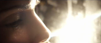
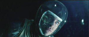
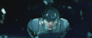
The choice to present the action in long takes was crucial to the look of the film. Most films set in space rely heavily on editing, since for decades the special effects needed to convey space walking were best handled in a series of shots. In Star Trek Into Darkness, Kirk flies through space toward a spaceship breaking up and surrounded by debris, a situation somewhat comparable to that in Gravity. The sequence is built up of many short shots of Kirk against shots of dark space, point-of-view shots through his helmet, and cutaways to characters inside the Enterprise conversing with him via radio. Here’s a brief sample of four contiguous shots:
The sequence conveys little sense of weightlessness, partly because the actor adopts a traditional superhero-style flying pose. With no air in space, there would be no need to compact oneself into a streamlined shape. The fast cutting keeps repeating similar compositions, as with frames 2 and 4 above, with the fast editing presumably intended to generate excitement. (Star Trek Into Darkness has at least 2200 shots in a little over two hours, while Gravity has about 200 in 83 minutes.) Gravity‘s success in creating a realistic environment in space is dramatically evident when contrasted with this film’s more traditional outer-space conventions.
But it turns out that the commitment to the long take led Cuarón toward less common choices about editing, staging, and lighting.
Follow the bouncing axis
For much of the film, there is minimal spatial stability for the characters or for our viewpoint into the diegetic world. There is no ground, so we cannot imagine the camera resting on anything. When outside the space vehicles, the camera moves nearly all the time. In an interview with ICG Magazine, director Alfonso Cuarón was asked, “So with the camera and characters in constant motion and changing perspective, how did you figure up from down?” He replied:
There is no point of departure because there is no up or down; nobody is sitting in a chair to orient your eye. It took the animators three months to learn how to think this way. They have been taught to draw based on horizon and weight, and here we stripped them of both.
Undoubtedly many scenes contain an axis of action running between the characters, but it is not of a traditional kind. Unlike in a classically edited film, in Gravity‘s action scenes in space, the axis is in constant, fleeting motion, and any given center line between two characters must in quick succession run not only left and right but also up and down, diagonally, in almost any direction. Any given screen direction set up by the axis is ephemeral and offers little to help orient us spatially. Eyeline directions mean very little, since there are few cuts to things that the characters have seen offscreen. (True, when characters look offscreen, they establish eyelines, and the camera sometimes pans from Stone or Kowalski to some object they have been looking at. But a pan from a person to an object automatically establishes the spatial relations between them, whether or not the character is looking at the object.)
As a result, the spatial cues used in continuity editing system are not so much eliminated as made irrelevant for long stretches. That system is meant, after all, to guide our understanding of the story space across cuts. There are exceptions, such as a brief shot/reverse-shot exchange: Stone, loosely attached to the International Space Station (ISS) by ropes, pleads with Kowalski not to untether himself from her and float away to die in space, and he insists that it is the only way to allow her to live. When Kowalski and Stone, tethered together, travel toward the ISS, he is always at screen left, she at screen right, with the strap joining them stretched out as a sort of visible axis of action; straight cut-ins to close views of each character, and even at one point Kowalski’s point of view, obey the 180-degree rule and create an almost conventional scene. Actions inside the spacecrafts are more oriented as well. In the ISS Stone moves weightlessly through a series of pods, all the while maintaining screen direction. Similarly, inside the vehicles, especially late in the film when Stone is strapped into seats, she is usually upright, her head oriented toward the top of the frame. Some sustained actions in space also keep her right-side up, as when she removes the bolts holding the parachute cords to the Soyuz landing vehicle.
In part because of such orienting devices, we are seldom seriously confused about where the characters are, or at least not for long. Otherwise we would not be able to comprehend the story action. Still, compared to typical classical films, Gravity conveys little sense of spatial stability. The disorienting simulation of weightlessness for characters and camera dominates the scenes outside the vehicles and creates a style that can truly be called experimental.
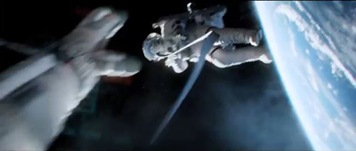
Take the brief segment (about 14 seconds) below, from the 13-minute opening shot. Stone has been standing at the end of a large mechanical arm which gets knocked off the space shuttle by a piece of hurtling debris. It spins rapidly, with the camera framing it from long-shot distance. The camera is not entirely static, reframing slightly, but we can see the earth in the background fairly clearly. Stark sunlight comes from offscreen left, and as Stone’s body whips through space, the shadows move accordingly around her, with the back of her body in deep shadow in the first frame and then her front shadowed in the second:
The fact that the light source, the sun, is offscreen left during this spinning segment suggests that the camera and hence our viewpoint are in a stable position. Yet that position is maintained for only a short time. At this point in the shot, the camera is essentially waiting for her to draw near in order for it to execute a change that will govern the penultimate part of the lengthy shot.
That happens when, after she has spun wildly toward and away from us several times, the camera “attaches” to her, so that we are now seeing her in medium shot and spinning with her. Instead of seeing the earth clearly, we see her while the blurred surface of the earth and the blackness of space alternate rapidly. This was the technique that led me, when I first saw the film’s trailers, to compare Gravity to Michael Snow’s Central Region:
Being closer to Stone, we can see more clearly the shadows coming and going; her face is sometimes illuminated brightly by the sun and sometimes in near darkness:
The function of the attachment to Stone, apart from allowing us to see her fear and confusion, is to show us that her hands are working to detach her from the arm, as a tilt down reveals:
As she soars off the arm and tumbles into the black depths of space, the camera leaves its “attachment” to her, and she spins away from it:
Cuarón’s commitment to the long take thus made him rely more than usual on events taking place within the frame–camera movement and figure movement in particular. Yet these movements had to occur in a microgravity environment radically different from the earthbound surroundings of Children of Men and Harry Potter and the Prisoner of Azkaban. This new constraint led to some technological innovations of remarkable originality.
The LED Light Box
Early on it became clear that moving the actors through space on wires would not create the desired realism of weightlessness, and obviously they could not be whipped about and tumbled in ways that the film ultimately achieved. The actors would have to be relatively static, with the illusion of movement created through other means. One of the main challenges was to have the lighting on their stationery faces support that illusion. And it would have to be done perfectly in order to achieve the photorealistic depiction of space that the filmmakers were after.
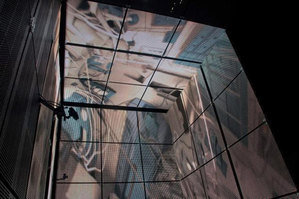
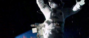
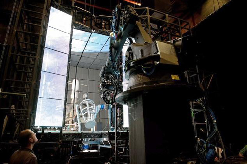
Usually in watching a film heavily dependent on CGI, one notices elements that have been assembled into a single composition but don’t quite match each other. A matte painting that isn’t lit from precisely the same angle as all the other components stands out from the rest (as, it has to be admitted, happens in the best of CGI scenes, including those in The Lord of the Rings). The problem was solved for Gravity using the LED Light Box, a device frequently mentioned in the press coverage of the film but seldom explained. (See image at the top.) The concept is truly revolutionary, although I am not sure to what extent it would work for other films that did not present such peculiar challenges.
In American Cinematographer‘s article on Gravity, “Facing the Void,” cinematographer Emmanuel Lubezki explains why consistency of lighting is crucial and how he came up with his solution:
Lubezki emphasizes that Gravity‘s blending of real faces with virtual environments posed a tremendous challenge. “The biggest conundrum in trying to integrate live action with animation has always been the lighting,” he says. “The actors are often lit differently than the animation, and if the lighting is not right, the composite doesn’t work. It can look eerie and take you to a place animators call ‘the uncanny valley,’ that place where everything is very close to real, but your subconscious knows something is wrong. That takes you out of the movie. The only way to avoid the uncanny valley was to use a naturalistic light on the faces, and to find a way to match the light between the faces and surroundings as closely as possible.”
This challenge led Lubezki to imagine a unique lighting space that was ultimately dubbed the “LED Box.” He recalls, “It was like a revelation. I had the idea to build a set out of LED panels and to light the actors’ faces inside it with the previs animation.” Lubezki conducted extensive LED tests and then turned to [special effects head Tim] Webber and his team to build the 20′ cube and generate footage of the virtual environments, as seen from the actor’s viewpoint, to display inside it. While constructing the LED Box, the crew also solved problems involving LED flicker and inconsistencies.
Inside the LED Box, the CG environment played across the walls and ceiling, simulating the bounce light from Earth on the faces of Clooney or Bullock, and providing the actors with visual references as they pretended to float through space. This elegant solution enabled the real faces to be lit by the very environments into which they would be inserted, ensuring a match between the real and virtual elements in the frame.
This ingenious approach largely did away with traditional three-point lighting in the exteriors. As Lubezki explains in the AC article,
When you put a gel on a 20K or an HMI [Hydrargyrum medium-arc iodide], you’re working with one tone, one color. Because they LEDs were showing our animation, we were projecting light onto the actors’ faces that could have darkness on one side, light on another, a hot spot in the middle and different colors. It was always complex, and that was the reason to have the Box.
The crucial point here is that the lighting was being created by playing the previs animation of the earth, space, the moon, and the large reflecting objects like the space shuttle on the sides of this 20′ by 10′ box. In other words, the moving images from the nearly finished special effects were used to light the faces of the actors, and those faces were later joined to those very same special effects, in a more polished form, to create the final images.
Lubezki gives an excellent description of the Box in his interview with Bryan Abrams, a series of responses which is worth quoting at length. Note that Lubezki refers to the Box as an LED monitor–essentially a giant television screen turned inside out and surrounding the actor:
Can you touch upon some of the pieces of technology and equipment that were created to make Gravity possible?
To make this movie we used many different methodologies. For one of them, we invented this LED box that you’ve probably read about, which is basically this very large LED monitor that is folded into a cube. So all the information and images that you input into this monitor lights the actors, and you can input all of the scenes that were pre-visualized to create the movie—all the environments that we had created—and you can input them into this large cube so space itself is moving around the actors.
So it’s not Sandra Bullock spinning around like crazy, it’s your cameras.
Yes, instead of having Sandra turning in 360s and hanging from cables, what’s happening is she’s standing in the middle of this cube and the environment and the lighting is moving around her. The lighting on the movie is very complex—it’s changing all the time from day to night, all the color temperatures are changing and the contrast is changing. There were a lot of subtleties that you can capture with the box, subtleties that make the integration of the virtual cinematography and the live-action much better than ever before.
The effects of the LED projections are visible in the changes on Stone’s face in the extended example above. Here’s a brief example of changes on Kowalski’s face in the opening shot:
The harsh light in the right frame above is a real lamp. The LEDs could not produce a local, hard light intense enough to simulate the sun. The team placed “a small dolly and jib arm alongside the actors” with a lightweight spotlight. This was moved “according to the progression of the virtual sun.” Such harsh light was necessary because outside the atmosphere there is nothing to filter bright sunlight. Several moments where the actors’ faces and suits are severely overexposed reflect this technique:
The Box also contained a large video monitor, visible to the actor, which displayed the previs animation. Lubezki explains: “This was wonderful in a couple of different ways. The actor sees the environment and how objects are moving in that environment, and at the same time we can see the interaction of that light on the actor. We capture true reflections of the environment in the actor’s eyes, which makes the face sit that much better within the animation.”
Previs as environment
The fact that almost everything in the film was created digitally–including the space suits in which the actors bob and spin in the exteriors–necessitated an extraordinary amount of planning and pre-production. “Pretty much we had to finish post-production before we could even start pre-production, because of all the programming,” Cuarón says. This was one reason why there was such a long gap between Children of Men (2006) and Gravity. Four and a half years were spent in developing the new technology and preparing to shoot.
The team started with geography:
The filmmakers began their prep by charting a precise global trajectory for the characters over the story’s time-frame, so that Webber and his team could start creating the corresponding Earth imagery. Cuarón chose to begin the story with the astronauts above his native Mexico. From there, the precise orbit provided Lubezki with specific lighting and coloring cues. The cinematographer recalls, “I would say, ‘In this scene, Stone is going to be above the African desert when the sun comes out, so the Earth is going to be warm, and the bounce on her face is going to be warm light.’ We were able to use our map to keep changing the lighting.”
Next, the filmmakers defined the camera and character positions throughout the story so that animators at Framestore could create a simple previs animation of the entire movie. [“Facing the Void”]
Lubezki was completely involved in planning the digital lighting. He recalls, “I would wake up at 4 a.m., turn on my computer, I’d say good morning to my gaffer and start working on a scene. I would say, ‘Move the sun 60,000 kilometers to the north.’ That way I could put the lighting anywhere I wanted.”
The reference material for the earth imagery came in part from NASA reference footage and photos. You can get a sense of these from the NASA films posted online, although these are mostly done in fast motion, unlike the ones the filmmakers would have used. One good example is “Earth HD.” There, at 2:25 and again at 2:41, one of the most recognizable locations on earth, the Nile Valley and Delta, are visible:
A similar image of the Nile appears on earth as Kowalski and Stone slowly make their way from the space shuttle to the ISS, with him asking her about her hometown and any family she might have waiting for her. (I was also happy to see the area of the site where I work in Egypt, Tell el-Amarna, which lies about midway between the Delta at the upper left and the large bend in the river.)
This geographical plotting included some ellipses. Although commentators have suggested that the film takes place in real time, or nearly so, there are temporal gaps. Shortly after the first pass of the speeding debris field, Kowalski tells Stone to set her watch’s timer for 90 minutes, since he calculates that is when they will encounter the orbiting debris again. That happens when she exits the Soyuz vehicle to detach its parachute. She again sets her timer for 90 minutes, and the debris field shows up at the Chinese station, battering it to the point where it sinks into the atmosphere and breaks up into chunks melting from the friction of reentry. Thus a little over three hours should be passing in the 83 minutes of screen duration.
Cuarón more or less confirms this timetable when he describes the creation of the previs: “The screenplay describes a journey that takes place mostly in real time, with only a couple of time transitions. We travel around Earth three times, so in previs we planned out visuals with specific knowledge of where we’d be in orbit at any given point in the story, whether it was in sunlight or darkness.”
In the film there are very few places where we can assume a significant ellipsis occurs. After Stone enters the ISS, sheds her helmet and suit, and drifts in a fœtal position, there is a gap. It’s probably not long, since she still holds some hope of going to rescue Kowalski, but she pauses to recover after her trying experience. Later, there is a cut from her inside the landing module, not in the suit, to her emerging from the hatch fully suited up–a gap we might assume to be ten minutes or so. Most notably, the cut from the nighttime shot of the earth that includes the aurora borealis at the right to the extreme close-up of frost on the window ellides a longer stretch of time. Stone has become hoarse in the interval as she tries to send a mayday message via radio. In other cases, such as Stone and Kowalski’s slow journey toward the ISS, time seems to be somewhat compressed though not ellided.
Staging without a stage
A lack of depth cues hampered the animators charged with creating the previs. The absence of one major depth cue, aerial perspective (the tendency of layers of space in the distance to turn successively bluer and blurrier due to the filtering quality of the atmosphere), caused problems. Visual-effects supervisor Tim Webber, of the effects house Framestore, remarks:
You can’t rely on aerial perspective because without atmosphere there is no attenuation of image due to distance. And the lack of reference points [in space] can get you into trouble, like not being able to tell if the character is coming toward you or the camera is moving toward him. Even though we played it straight with respect to science and realism, we did put in more stars than you’d be able to see in daylight, just so there’d be some frame of reference to gauge movement.
Presumably Webber is referring here to the movement of the characters and objects through space, not the camera movement. (The lack of any “frame of reference” against which to sense movement is part of what makes the Star Trek scene illustrated above seem so unsophisticated.)
Naturally, since the actors were not standing on a floor or solid ground, the blocking was difficult, but it also had to be planned completely in advance:
Cuarón laughs as he recalls the surprises inherent in blocking characters in a zero-gravity environment. “The complications are really something because you have characters that are spinning. Say you want o start your shot with George’s face and move the camera to Sandra, who is spinning at a different rate. You start moving around her, and then you start to go back to George, only to realize that if you go back to George at that moment, you will be shooting his feet! So then you have to start from scratch. Sometimes you find amazing things accidentally, but sometimes you have to reconceive the whole scene.” [“Facing the Void”]
Finally, after all the planning, the previs animations were made. These had to be refined considerably so that they could adequately serve in the Light Box to illuminate the actors’ faces. According to Bill Desowitz, “The previs was so good, in fact, that the daughter of cinematographer Emmanuel (“Chivo”) Lubezki thought it was the real movie.”
The previs became so sophisticated because it evolved during preproduction. Cuarón recalled that Lubezki’s inspiration to create the LED Light Box changed the planning tactics:
Then that kind of had a ripple effect back into the previz, because originally they were going to just be a model that we could look back at, but we realized that the previz was more than that. That was something that [James] Cameron kept on talking about. He would say “I don’t use previz anymore, I use it as if it is the first painting on a canvas.” In other words it was the stuff that you kept on painting on top of and the thing with that is that it became very clear that in order to use these technologies, we needed to program stuff and the previz was going to have to be precise in terms of camera movements, choreography, timing and light.
As a result, the movie changed very little during principal photography. Senior visual-effects producer Charles Howell told American Cinematographer: “I think there were only about 200 cuts in the previs animation, [whereas] an average film has about 2,000 cuts. Because these shots had to be mapped out from day one, many of the lengthy shots didn’t really change in the three years of shot production. Because we did a virtual prelight of the entire film with, the whole film was essentially locked before we even started shooting.” [“Facing the Void”]
David counted 206 shots in Gravity, not including the two opening titles about life in space being impossible. This suggests that Howell is right, and that the film underwent little revision after the planning phase.
Several years ago I suggested on this blog that animated films, notably those of Pixar and Aardman, were on average better than mainstream live-action films because they had to be planned so carefully and thoughtfully. Gravity, being very close to an animated film, provides more evidence for that claim. Not that thought, time, and money can guarantee quality, but they certainly narrow the odds.
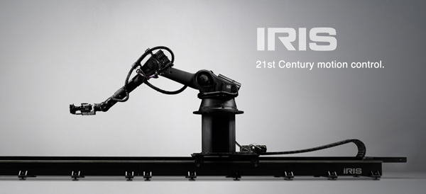
Iris in
The Light Box technology is astonishing enough, but within its confined space there also had to be a way to photograph the actors. In Lubezki’s interview with Bryan Abrams, he explains:
So we built the box, but that wasn’t it. To be able to shoot inside the box, we had to build a special rig that holds the camera and moves with motion control. So we had people build a very narrow, lightweight but sturdy rig to control the camera. If you imagine the big box of LEDs, it has a gap that is almost a foot and a half or two feet wide, and the camera has to go into the box and make all these moves to make the audience believe that Sandra is turning and turning, but it’s really the camera and the environment in the box that is moving. So we built the box, the rig, and then used a company called Bot & Dolly. These guys are from San Francisco, and they use robots from the automotive industry. They redid all the software for us, so we were able to use these robots to move the cameras and the lights around the actors. It was just a big ballet of gadgets and new technology for the film.
Bot & Dolly is a San Francisco company specializing in robots for the automobile industry. It built or perhaps modified an elaborate rolling, multiply-jointed camera mount called Iris especially for Gravity. It has been used in other features and in ads since then. (See image at the bottom.) An impressive demo film shows the Iris gracefully writhing about, quickly pointing the camera in many directions. (The camera in the film is a Red, though Gravity used an Alexa.) According to ICG Magazine, “The firm devised a Maya-based series of commands that allowed Framestore animators to direct the robots in ways that matched previs action in precise detail.” (Maya is the industry standard computer animation program.)
Typically this camera was inserted through an opening in the Light Box and swooped around the actor, who stood in a gyroscopic basket, seen in the production photo below. The photo shows one side of the Box open, though this would not be the case during shooting:
The combination of the Light Box and Iris made it possible to blend the special-effects shots and the live-action photography of the actors so smoothly that there is no “uncanny valley” effect, no sense of an obvious matte painting stuck into the middle of an image. The shots in Gravity are all photorealistic to a degree that is rare, if not unique, in recent effects-heavy films.
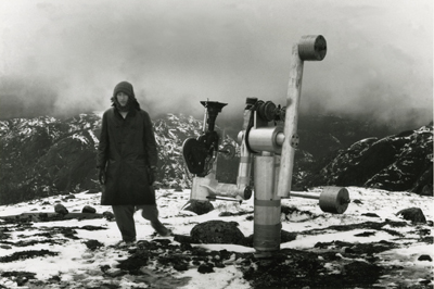
Iris brings us back to the comparison with Central Region. Snow built a special camera mount (below) designed to allow his images to rotate freely in almost any direction. During the three-hour film the camera never repeated any of its trajectories. Some images were close views of the pebbles on the ground; others were upside views of the bleak Canadian mountains in the distance. A nighttime segment was completely black except when the moon occasionally swept through the frame. The one area that the camera didn’t survey was the camera support itself, the “central region” of the title.
The vital difference between Snow’s machine and Iris is that the new system has no fixed anchor. Not only does it slide on a track, but everything it photographs can be digitally altered to erase any traces of the machine. It moves with entire freedom through a constructed space that has no central region, no fixed point around which everything else revolves.
Puppeteers and eyes
Gravity‘s utterly spherical space, beyond anything we normally find in commercial cinema, placed unusual demands not only on camera movement but also upon the actors’ blocking and performances. Our first entry on Gravity begins with a quotation from Sandra Bullock, which included the statement, “No character was like Stone, no film set was ever like these sets, not one member of this crew had ever done this before.” That may seem an exaggeration until one grasps how Bullock and Cuarón’s team built her character.
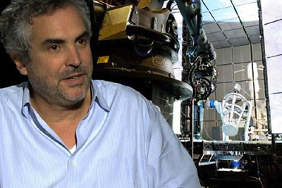
We all know from infotainment coverage that Bullock was isolated in the Light Box through entire days and that it was a trying experience. What doesn’t come through in such accounts is that she was often enclosed in the gyroscopic basket, visible in the photo of the Iris rig and Light Box above, as well as in the same setup visible behind Cuarón in this photo:
That was only the start of it. Anne Thompson’s interview with Cuarón and producer David Heyman reveals some of the details of blocking a character who is unrestricted by gravity:
AC: The physical aspect, not anybody can do what she did. On the one hand the physical discipline she went through to make this film, the training and the workouts. She also has an amazing capability for abstraction. Those emotional performances, it was as if they were an exercise in abstraction, like she was bonded to very precise cues. And physically that was very difficult: she trained and practiced like crazy, together with the stunt people and special effects. And the puppeteers from “War Horse” were helping her, supporting a leg or an arm, all the floating elements, they were creating approaching objects toward her in perfect timing. Then after she practiced so much her whole concern was only about emotions and performance.
Imagine a ballet dancer with really strict physical discipline in terms of what a body has to do, positions and precise choreography, who goes through months of training for one choreography so when they are performing they have expressiveness and emotion.
What was the most challenging scene to realize?
David Heyman: When Sandy comes into the ISS for the first time. She takes off her suit, then goes into fetal position, all in one shot. It was the most difficult. All the objects, getting the suit off, and into fetal position in such a way that it felt effortless, not as it was–she was sitting on a bicycle with one leg tied down leaning back in a 12-wire rig, with puppeteers. One of the things you forget about Sandy’s performance, which seems so truthful, is all the effort and physical exertion that went into making it, the precision of the technical aspects. She had to move her hands at a third of speed — zero G –while talking. Each shot connects with the next at very precise points where her head began and end and begin and end. She’s on a bicycle stringing uncomfortable with people moving around on 12 wires, through it all, with no gravity. Physically the body must not show the tension, so it looks effortless. What I loved about it is the performance behind the visor shines through, her eyes. You can’t slouch your shoulders to show sadness or weight, it’s just the eyes.
Bullock did all this with four 10′ by 20′ walls of LEDs projecting moving images of the earth and of exploding space stations around her. I think it is safe to say that this was a unique kind of performance.
The sounds of silence
As the film’s ominous opening titles point out, there is no sound in space. In keeping with the overall attempt to duplicate the effects of weightlessness immersively, Cuarón’s team limited the track to two types of sound: diegetic sounds heard by the characters and a non-diegetic, modernist musical track. In an interview with Cuarón, Wired‘s Caitlin Roper pointed out that there was an explosion in one of the trailers. Cuarón replied:
Yes, but that’s just the trailer. I honor silence. The only sound you hear in space in the film is if, say, one of the characters is using a drill. Sandra’s character would hear the drill through the vibrations through her hand. But vibration itself doesn’t transmit in space—you can only hear what our characters are interacting with. I thought about keeping everything in absolute silence. And then I realized I was just going to annoy the audience. I knew we needed music to convey a certain energy, and while I’m sure there would be five people that would love nothingness, I want the film to be enjoyed by the entire audience.
As in other areas of the film, we see the compromise between an experimental technique–an attempt to suggest the silence of space–and the desire to provide something more familiar for the broad audience. In this case, music acquires an expanded role, substituting for sound effects and conveying the rapidly shifting emotions of the scenes.
Sound effects are not entirely eliminated. Many sounds that the astronauts would hear via vibrations of things they come into contact with are included. In some cases these are fairly clear, as with the voices heard within their helmets–their own voices or others’ via radio. Other effects are heard in a distorted fashion. Glenn Freemantle, the supervising sound designer and editor, describes the process:
“When [Bullock] is in the suit, you hear her voice and her breathing, and you hear through her suit when she is in contact with things,” he explains. His team captured sounds by recording with contact mics at car plants and hospitals. “We even recorded through water with a [submerged] guitar,” he recalls.
One obvious example of distortion comes in the opening scene, when Stone is unscrewing bolts and sliding a panel out of the transmitting device she is working on. The sounds of the bolts and the sliding metal are audible but muffled, as though they were recorded under water or electronically manipulated.
Yet other sound effects not heard by the characters were relegated to musical expression. As Angela Watercutter put it in a Wired article based on interviews with Cuarón and composer Steven Price,
Every time there’s a collision in the movie the audience doesn’t hear a bang – they hear a sonic boom. The same goes for the characters’ — and, by extension, the audience’s — feelings of anxiety, claustrophobia, and agoraphobia. Much of what is seen in Gravity is terrifying, and when the audience can’t hear the horror of a space shuttle breaking apart or an airlock flying open, Price had to fill the void with his nerve-wracking score.
Cuarón dictated that one of the rules for the film’s score was the eliminating of percussion, to avoid the “cliché of action scoring.” Watercutter continues:
As a result the score for Gravity serves as more than just musical accompaniment – it also provides the movie’s sound effects. There are some non-music sounds that would be space audible, like the ones transmitted by vibrations characters feel in their spacesuits, but for the most part everything that happens in open space is accompanied only by Price’s music and the voices of Stone and astronaut Matt Kowalski (George Clooney), which “freed up the rest of the frequency spectrum for me,” Price noted.
Price used a mix of organic and electronic sounds to meld the natural world of space with the mechanical world one of the space exploration. There are also moments where he took an analog instrument – a cello, for example, or even a human voice – and ran its notes through a synthesizer or processor in order to create a whole new sound. And for the opening song on the score, “Above Earth,” Price took a track he was already working on and slowed it to about 1/60th its original speed. “Basically,” Price said, “what you’re hearing is the space between the notes.”
In an interview with Rolling Stone, Price discussed some of the aesthetic principles and functions he aimed for with his score:
Really it was all very much led by the character of Ryan. I tried to be with her all the time. The idea was that the music was up there in space and we made it very immersive and used a lot of elements and a lot of layering so that things would move around you all the time. The writing of those elements and what they were, were always influenced by what Ryan was feeling and where she was emotionally in the whole thing. And also where the camera was, where things were moving and what point of view the camera was facing, whether it was looking at them or kind of looking through their eyes. Some of it was melodic and some of it was intended to underscore a kind of emotional journey, and then there were a lot of sounds that were there to express real terror. It was those two extremes, really, expressing the beautiful nature of where they were but also absolutely a massively terrifying situation.
With little expertise in musical analysis, I can simply say that I hear the score as a combination of traditional instrumental music and electronically synthesized instrumental music. Under this, typically in tense passages, there are abrupt or charging percussive emphases, not using percussion instruments but, in some cases, deep string chords. Scenes of damage or tension are sometimes accompanied by sounds like stressed, grinding metal. Other sounds like distorted, high-pitched radio waves (in the “ISS” and “Fire” tracks) are included, reminiscent of electronic music of the 1960s.
Other critics have offered suggestive descriptions. Justin Chang’s review refers to “Steven Price’s richly ominous score, playing like an extension of the jolts and tremors that accompany the action onscreen.” David S. Cohen and Dave McNary’s Venice festival coverage characterizes the track: “Much of the action, even the debris storms, plays out against eerie silence, broken only by the score. The silence is more startling after the score builds to deafening crescendos, then stops abruptly. But during the interior scenes, the rumbles and groans of failing space gear are as frightening as the roars of any classic movie monster — even more so because their source is unseen.”
Price has contributed a remarkable score, one which is highly original and yet completely motivated by the story situation it accompanies.
The space between
The immersive, 360-degree surrounding and sound fields made Gravity a natural for 3D exhibition, but they also posed unique problems. Given the long takes, the need for complex camera movements, the demands of the LED Box, and the complicated acting conditions, it would have been very difficult to shoot the film in 3D. In most scenes, of course, there were no real objects juxtaposed in different layers of depth in front of the camera. Even the actors’ placements in long shots would have be created digitally. So the project had to be converted to 3D. But this forced choice actually yielded strong results.
The press coverage of popular cinema has come to treat films shot in 3D (“native” 3D) as pure and admirable and films converted to 3D after shooting as crass and compromised. But is there all that much difference? Even Avatar, the film made with an intention of promoting the universal use of 3D, had some converted footage. With conversion technology improving, the notion of waiting until after filming to create a movie’s 3D is becoming less onerous. As Variety‘s David S. Cohen pointed out earlier this year, Iron Man 3, Man of Steel, Star Trek into Darkness, and Pacific Rim have been post-converted with little objection from the public or press.
That conversion techniques for generating 3D images are not inferior became much more evident during the early decision-making process for shooting Gravity. Nikki Penny, the film’s executive producer, took some test footage shot by in 3D to Prime Focus World, a conversion house that ended up doing 27 minutes of Gravity. The filmmakers were trying to decide whether to shoot the live action portions in 3D or use conversion. In an article on Creative Cow, Debra Kaufman explains what happened:
The production had done a test shoot in 3D, which involved placing the cumbersome 3D rigs inside the cramped space capsule. When Penny brought the 3D live action footage to Prime Focus World, she asked that they test 3D conversion by utilizing a single eye from the same footage. The results convinced Cuarón and producer David Heyman that conversion would not only look as good as shooting in native 3D, and would be much easier and more efficient to accomplish.
That is, the footage shot by one of the two lenses in the 3D setup was separated out. It was then treated as if it were native 2D footage and put through a conversion process to create a 3D image. The result resulted in 3D that was not inferior to the original native-shot 3D. The lesson, I think, is that the question is not usually whether a film is shot in 2D and converted; it’s whether it was planned to be completed as a 3D film (and has sufficient budgets and skills invested in it) .
Gravity couldn’t be shot in native 3D, since in most scenes there were not real objects juxtaposed in different layers of depth in front of the camera. Also, the camera was too cumbersome to fit into the space-capsule sets. With so much of the characters’ surroundings done as CGI, however, the conversion to 3D could be done concurrently with the filming. Kaufman describes the process at Prime Focus World, one of the firms that handled the conversion:
Unlike the more typical post-production 3D conversion, Gravity involved PFW working on the 3D conversion during production. The work on 3D conversion began with six months of pre-production, during which the production’s Stereo Supervisor Chris Parks worked closely with the PFW team to explain his carefully plotted depth map, which contrasted the vast emptiness of space with the tight, nearly claustrophobic quarters of the space capsules.
From the beginning, the challenge for Prime Focus World would be to make sure that the 3D converted footage integrated seamlessly with the extensive 3D CGI. Both the live action footage and CGI would be 3D, but 3D from two different worlds, conversion and visual effects – and they would both be active or “live” during the production process. At the same time, the PFW team wanted to retain the creative flexibility of its View-D conversion process, while integrating the stereo VFX universe. What made it trickier was that, unlike a completed film, Prime Focus would be working with work-in-progress shots and an open edit.
For more on the technical aspects of the integration of converted footage and CGI, along with an example of the stages that went into creating a single shot, see the Kaufman article.
In an essay on ICG Magazine, Vision3 stereo supervisor Chris Parks describes some of the narrative functions of the film’s 3D:
We had a virtual camera at Framestore that let us control depth functions. When Sandra floated off in space, we separated her slightly from the starfield, using 3D to make her feel very small. At another point we went very deep, when we see her POV as her hands reach out to those of another astronaut coming to camera. At the point when they make contact, we increased the interaxial to five times normal, then scaled it back down as they separate and drift apart.
Parks also comments on the scene where Stone and Kowalski look through the shattered windows of the space shuttle and a crew member’s dead body suddenly falls into the shot:
Alfonso asked how the 3D could make this more powerful, but without just throwing something out into the audience to make them duck. We decided to float a little Marvin the Martian doll out into the audience, which is a kind of fun, lighthearted tension-breaker, and then we whip-pan right off that to the dead astronaut, which makes the emotional revelation more jarring.
In fact the Marvin doll (derived from Chuck Jones’s Warner Bros. cartoons) comes diagonally forward from the depths of the shuttle interior, and the camera pans with it as it moves out of the ship past Stone, who watches it and then turns back to look inside again. The corpse falls into the shot from above left, but not out toward the audience. It bumps Stone’s helmet, and the camera pans to reveal it more fully and continue almost nonchalantly onward to show another dead astronaut further back in the shuttle interior.
Finally, Parks points out an expressionist distortion of space for subjective purposes in the dream sequence where Kowalski joins Stone in the Soyuz landing vehicle:
It’s a dream sequence that doesn’t reveal itself as such right away. To give a subconscious impression that something different was happening, we pushed the top right corner into the set while pulling the bottom left corner ahead, skewing the whole view. That sense of unease represents, to me, how 3D can be expanded beyond just giant VFX movies. It’s a tool that can be most effective in very small spaces, as this one shot reveals.
Outside the dream scene, we see the wall panel of instrument controls at an angle to the camera, with Stone in her seat at the left. During the dream, the panel is suddenly turned so that it is almost straight into depth, so that we are pressed up obliquely against it. Stone’s seat at the left is further away from it. The result is that the space is strangely skewed during the dream.
In all, shooting in long takes, building each shot with CGI yet including complex camera and figure movement, canceling the sense of horizons and ground planes, and enhancing all these choices through 3D, has resulted in a film in which stylistic patterning becomes an object of fascination in its own right.
Despite the occasional joke about a Gravity sequel, it seems unlikely that Cuarón will tackle similar subject matter and formal strategies in his next film. Dealing with space without horizons and characters without weight was a formidable task. At the end of his Wired interview, asked what his next film will be, he replied, “Any movie in which the characters walk on the floor.” Welcome back, axis of action.
Most of the frames used here and in Part 1 were taken from a New York Times article containing a clip from the opening shot with commentary by Cuarón.
Thanks to Stewart Fyfe, who shared links to some of the sources cited in this entry.
What next? A video lecture, I suppose. Well, actually, yeah….
DB here:
We’ve said several times that this website is an ongoing experiment. We started just by posting my CV and essays supplementing my books. Then came blogs. We quickly added illustrations to our entries, mostly frame enlargements and grabs. Eventually, video crept in. In 2011 we ran Tim Smith’s dissection of eye-scanning in There Will Be Blood. Last year, in coordination with our new edition of Film Art: An Introduction, we added online clips-plus-commentary (an example is on Criterion’s YouTube channel), and near the end of the year Erik Gunneson and I mounted a video essay on techniques of constructive editing.
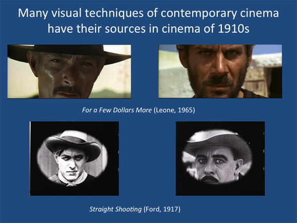
Today something new has been added. I’ve decided to retire some of the lectures I take on the road, and I’ll put them up as video lectures. They’re sort of Net substitutes for my show-and-tells about aspects of film that interest me. The first is called “How Motion Pictures Became the Movies,” and it’s devoted to what is for me the crucial period 1908-1920. It quickly surveys what was going on in cinema over those years before zeroing in on the key stylistic developments we’ve often written about here: the emergence of continuity editing and the brief but brilliant exploration of tableau staging.
The lecture isn’t a record of me pacing around talking. Rather, it’s a PowerPoint presentation that runs as a video, with my scratchy voice-over. I didn’t write a text, but rather talked it through as if I were presenting it live. It nakedly exposes my mannerisms and bad habits, but I hope they don’t get in the way of your enjoyment.
“How Motion Pictures Became the Movies” is designed for general audiences. I’ve built in comments for specialists too, in particular, some indications of different research approaches to understanding this period of change.
The talk runs just under 70 minutes, and it’s suitable for use in classes if people are inclined. I think it might be helpful in surveys of film history, courses on silent cinema, and courses on film analysis. If a teacher wants to break it into two parts, there’s a natural stopping point around the 35-minute mark.
Some slides have several images laid out comic-strip fashion, so the presentation plays best on a midsize display, like a desktop or biggish laptop. A couple of tests suggest that it looks okay projected for a group, but the instructor planning to screen it for a class should experiment first.
I plan to put up other lectures in a similar format, with HD capabilities. Next up is probably a talk about the aesthetics of early CinemaScope. I’d then like to spin off this current one and offer three 30-minute ones that go into more depth on developments in the 1910s.
The video is available at the bottom of this entry, but it’s also available on this page. There I provide a bibliography of the sources I mention in the course of the talk, as well as links to relevant blogs and essays elsewhere on the site.
If you find this interesting or worthwhile, please let your friends know about it. I don’t do Twitter or Facebook, but Kristin participates in the latter, and we can monitor tweets. Thanks to Erik for his dedication to this most recent task, and to all our readers for their support over the years.
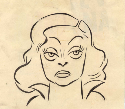
Bette Davis eyelids
Bette Davis, ca. 1950; caricaturist unknown. From Miguel Andrade’s site.
DB here:
Janet Frobisher, mystery writer, has murdered her husband. Naturally, she telephones her lover and asks him to come over. But before he arrives, Janet finds that the runaway George Bates has come calling. George has been her husband’s partner in bank fraud, and now they’ve gone further. They robbed the bank at gunpoint, and a policeman was shot. George faces Janet and demands to know where her husband is.
Nobody is likely to call Another Man’s Poison (1952) a masterpiece, or an undiscovered auteur gem. (Irving Rapper has, however, signed some better-than-average pictures.) Like many ordinary movies, though, it can tell us some interesting things about cinema if we look closely. Especially when that look takes in Bette Davis.
I had to restrain myself from adding a soundtrack link for this entry. You know the one. The earworm may be at work already. But having you listen while you read would probably only distract from my point.
Eyeball to eyeball
That point is one I’ve made before. We humans are very good at watching each others’ eyes. Evolutionary psychologists debate how that skill might have evolved, but there’s little doubt that we can “mind-read” on the basis of others’ gaze direction and other eye-related cues. Of all the arts, cinema probably has the most powerful ability to galvanize and channel our reactions solely through the way people use their eyes.
But what’s an eye? I argued in an earlier entry on The Social Network that eyeballs as such aren’t very expressive, despite poets’ claims to see the soul there. Dilations are about all you get. The real expressive work gets done by gaze direction, the brows, and the lids. Blinks help too. Lately, watching films from the 1940s and early 1950s for a book I’m planning, I was struck by how the great divas of that era used their eyes.
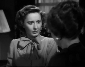
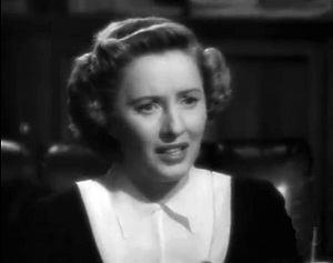
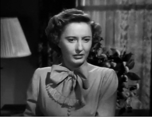
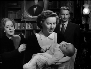
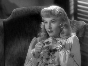
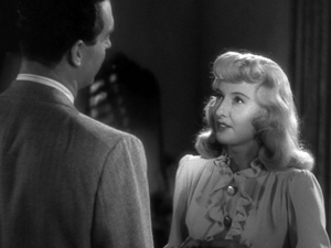
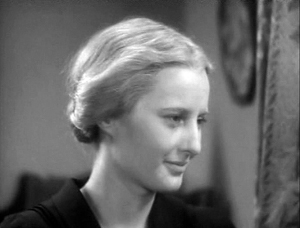
Consider for example Barbara Stanwyck in the Mitchell Leisen weeper No Man of Her Own (1951). Helen Ferguson has innocently assumed the identity of the dead daughter-in-law of a wealthy family, and she’s torn between revealing her lie and protecting her baby. So in most scenes her look is intent and direct. She uses the screen actor’s usual tactics of steady gaze and motivated blinks, with brows and mouth carrying the emotional impact (below, shocked anxiety; then distress).
Even when she’s thinking, her eyeline remains steady and she doesn’t play much with her eyelids.
What about when Stanwyck is much less innocent, as in Double Indemnity (1944)? Devious as she is, Phyllis Dietrichson meets Walter Neff’s eyes squarely. “There’s a speed limit in this state, Mr. Neff.”
When Phillis isn’t looking straight at Neff, it’s when she’s pretending to be demure and concerned about her husband’s safety—and acting as coy as Brigid O’Shaughnessy in The Maltese Falcon. But once Neff sees through her effort to insure her husband, she glares at him unwaveringly.
Part of Stanwyck’s star persona is the bold woman who responds frankly to whatever is put before her. When it comes to evasive maneuvers, though, there’s Bette.
Putting a lid on it
Publicity photo for Jezebel.
Her eyes are big and can be quite round, of course. They also sit remarkably centrally on her face, thanks to her high forehead; this quality is accentuated when her hair is brushed back, as it often is. What especially interests me today, though, is her eyelids. If Bette rolls her eyes at us in those Warners publicity shots, she can also create hooded eyes that suggest she’s harboring secrets.
Bette has remarkable control of those eyelids; she can close them to a very exact degree. In performance, the slight drooping of the upper lid, combined with a small shift in her gaze and a turn of her head, can shade the line or word she speaks. Add that sullen mouth and her vocal tone and rhythm, and you get a nuanced suite of micro-emotions.
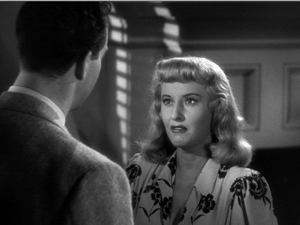
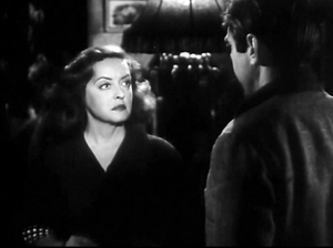
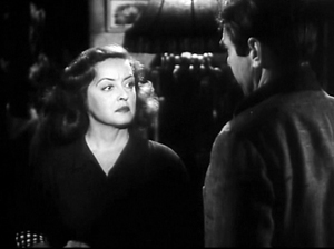
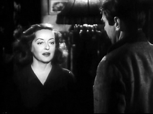
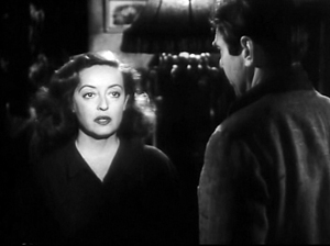
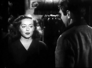
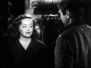
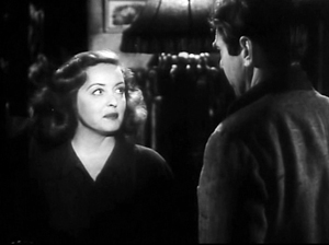
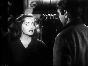
Take the moment in Another Man’s Poison after Janet Frobisher tells George that she’s killed her husband. She rushes into a two shot favoring her as George says: “You could’ve divorced him.” Her reaction is an eye-flick, evading his look but still radiating defiance.
Now begins a series of micro-movements that shift Janet’s reaction away from George. She explains how her husband kept her tied to him. “He/ was/clever”: On each word, her expression, eyelines, and eyelids change minutely. Then she pauses.
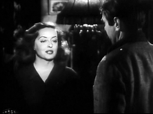
“He saw/ to that/ too” gets mapped onto three more changes, with traces of a smirk accompanying an eye-shift on the word “too.”
But Janet isn’t looking straight at George yet. She’s got more to say by way of explaining why divorce wouldn’t work: She and her husband continued to have sex. She puts it more indirectly: “He paid me”—pause when she lifts her eyes to look back at George—“visits.”
This instant of looking sharply back at George, as she had at the start of the shot, drives the point home and becomes the climax of this phase of the exchange. Eyelids, brows, chin, mouth, and gaze have all cooperated in creating an emotional detour away from and back to her questioner. Bette’s tiny side-glances show us a woman thinking and reacting to what she’s thinking, relishing what she’s going to say and then watching the effect of what she says. It all takes eight seconds.
Don’t be the wide-eyed ingenue
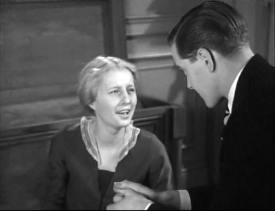
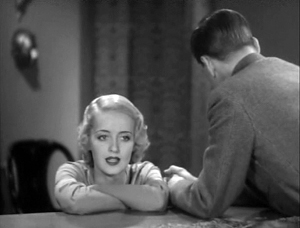
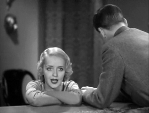
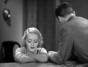
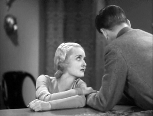
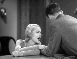
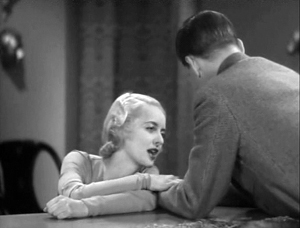
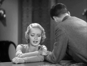
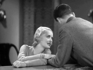
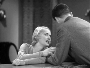
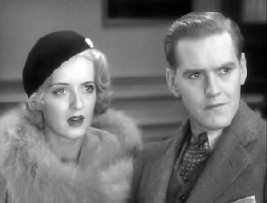
You can see the two stars’ technique operating very early in their careers. Stanwyck is the name star of So Big! (1932) and Davis is fifth-billed. Above, we find Stanwyck, playing the nobly suffering mother Selina, using her direct-gaze strategy (though as she ages, the eyes get a little pinched). By contrast, we have Davis as the saucy young illustrator Dallas O’Mara. Selina’s son Dirk asks Dallas why she doesn’t love him. When she answers, William Wellman’s staging gives Davis a little aria of face-time at the piano.
Dallas explains that she’s attracted to men who have confronted the rough side of life. I can provide only excerpts of what is a forty-second shot, full of shifts of head position, facial expressions, and eye movements, complete with finely calibrated eyelid work. The passage reminds us that Davis’ dynamic expressions and eye movements are often motivated by her playing characters full of jittery pep, talking fast and thinking faster. She will even deliver phrases with her eyes closed—here, speaking of men with hands scarred from work and struggle.
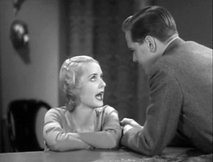
As she says, “You haven’t a mark on you, Dirk,” Dallas reaches across to grip his forearm. A new phase of the scene begins, but still with the suite of slight head turns and eyelid action.
Dallas says that if he’d kept on as an architect instead of taking refuge in a safe business job, his face would show it. As in Another Man’s Poison, Davis concludes her monologue by turning to face the man and deliver the final line directly. From early in the scene, however, Dirk has turned his face aside in shame.
Where would his marks of character show? “In your eyes, in your whole being.” She peers up at him, her face closer than at any other point in the scene, and her hand lifts from his arm to accentuate her frank but brutal blow to his pride.
Which makes our last view of her all the more arresting. In the final scene, Dallas meets Dirk’s mother and imagines her as an ideal subject for a portrait. Now the flighty young artist is riveted on the steady, serene gaze of the older woman.
In this climax, Dallas becomes what Dirk has called her—“a wide-eyed ingenue”—but in her rapt admiration she proves herself worthy to be Selina’s daughter-in-law.
Bette, eyeballing us
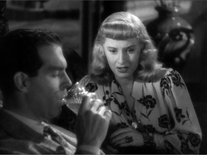
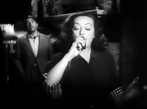
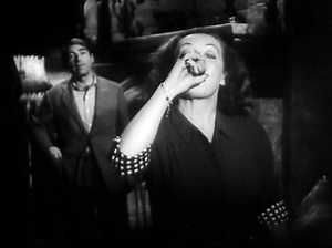
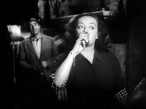
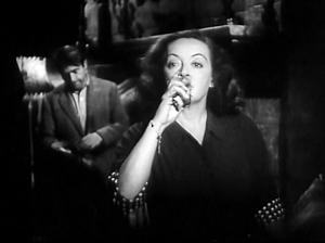
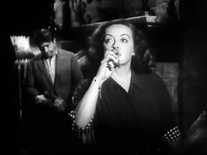
Now that we know the role Bette’s upper eyelids play, we can appreciate other moments when she milks their effects virtuosically. Go back to Another Man’s Poison. George tells Janet that he has the weapon used in the bank robbery—the pistol that bears her husband’s fingerprints. As George starts his line, she’s taking a drink in the foreground. Lifting the glass, she tips her head back too so that her eyes are just visible under her lids—and they’re looking out at us.
George says, “I’ve got the gun.” Janet lowers the glass, but she keeps it poised. Now her lids and eyelines present her reaction to George’s information that the pistol bears the husband’s fingerprints. You see her thinking about evasive action.
This moment in effect spotlights Davis’ use of her eyes; she’s frozen in place, and they’re the only things that move.
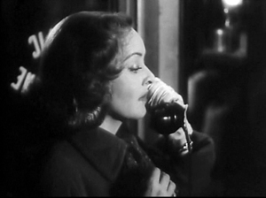
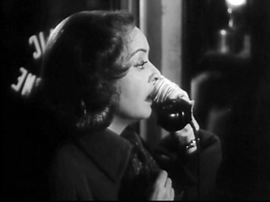
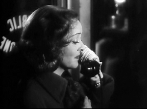
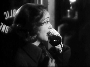
Early in the film, we’re given a sort of primer that trains us to watch Janet/ Bette’s eyelids. The first scene shows Janet making her call to her lover from a phone booth. It’s staged with her in profile, so that her brows and mouth are relatively unmoving and the eyelids, centered in the frame, become quite salient. I won’t try to follow all their tiny fluctuations, in coordination with the chin’s angle and the mouth, but these samples should give you the flavor. (Note the very slight difference between the first and the third image, and the second and the fourth).
A more frontal view of La Davis would have been a more characteristic star introduction, but it’s as if the film is saving her full-face firepower for later scenes.
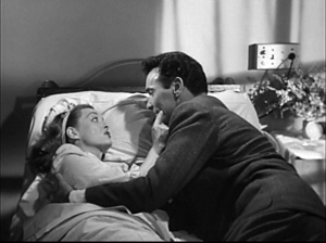
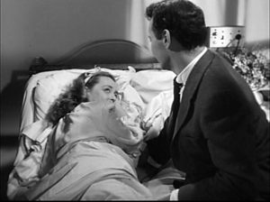
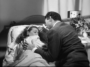
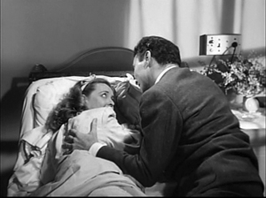
There’s other evidence that Bette was considered to be able to hold a scene by an eyelash. In Payment on Demand (1951), flashbacks from Joyce and David’s miserable marriage take us to happier days. One scene shows the couple embracing on a hospital bed after Joyce has given birth to their second child.
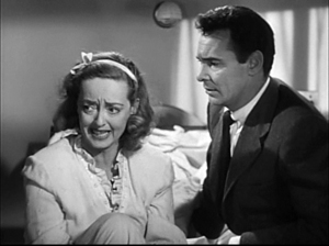
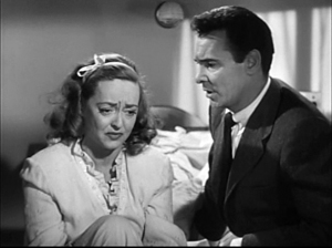
Joyce learns of David’s plans to move out of town, but she resists and sits upright. This brings her distraught reaction home to us with the now familiar coordination of eyeline, eyebrows, and eyelids with the mouth and shakes of the head—another suite of micro-behaviors I can merely sample here.
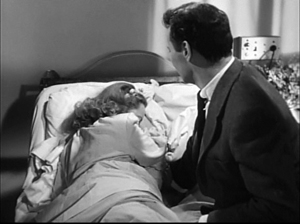
But then Joyce relaxes and falls back, hiding her face as the camera cranes up slightly.
Director Curtis Bernhardt has reframed the shot so that as Joyce curls up on the pillow, one eye peeps out. We don’t see her mouth replying to David’s lines, but we get the customary fractional eyelid changes, as in the phone booth scene above.
Eventually Davis moves her shoulder and reveals Joyce’s mouth, but for several seconds we’ve been obliged to follow the small movements of her lids as the only clue to her calming down—and getting her way with David. This is, needless to say, all done without a close-up.
Hollywood cinema is a highly formal cinema, as conventional in some ways as commedia dell’arte. Yet that doesn’t mean it must trade only in gross effects. Admittedly, much of today’s cinema has sacrificed nuance for brute force. All the better, then, that returning to even minor films from the studio era can remind us of how many opportunities the medium affords.
Bette Davis isn’t the only virtuoso performer, of course, and many of her contemporaries show the same kind of gifts, sometimes put to different ends. She offers a convenient illustration of how film actors can cultivate meticulous control over facial regions we don’t normally think about. She makes up for being short and rather slight by playing her face like a chamber ensemble, with every “voice,” eyelids included, contributing to the restless dramatic flow.
Okay, I know: The song was running through your head all the way through. You deserve a break. Go ahead, but you might as well watch something too.
On the evolutionary implications of our eye behavior, see Michael Tomasello et al., Why We Cooperate (Cambridge: MIT Press, 2009). Tomasello argues that the need for social cooperation favored signals of shared attention; to work together, we need to notice things that other people are looking at. He also points out:
All 200-plus species of nonhuman primates have basically dark eyes, with the sclera—commonly called the “white of the eye”—barely visible. The sclera of humans (i.e., the visible part) is about thee times larger, making the direction of human gaze much more easily detectable by others. A recent experiment showed that in following the gaze direction of others, chimpanzees rely almost exclusively on head direction—they follow an experimenter’s head direction up even if the experimenter’s eyes are closed—whereas human infants rely mainly on eye direction—they follow an experimenter’s eyes, even if the head stays stationary (pp. 75-76).
But tracking my eye direction helps you, not me; how could it have evolved? Tomasello hypothesizes that making eye direction salient developed in a cooperative social environment. It’s part of social intelligence, in which mind-reading works to everyone’s benefit in shared tasks.
A vast resource on all things Bette is this site. Some perceptive remarks on her acting style are at Uncle Eddie’s Theory Corner. Jim Emerson offers an interview with Miss Davis in a smoke-filled room, while Roger Ebert presents an admiring appreciation of All About Eve.
An earlier blog entry here reflects on the performance of another sacred diva of the period, Joan Crawford. If you’re interested in a wider account that fits such matters into a broader theoretical perspective, including folk psychology, try this essay.
Endurance: Survival lessons from Lumet
I don’t believe in waiting for the masterpiece. Masterful subject matter comes up only rarely. The point is, there’s something to advance your technique in every movie you do.
DB here:
Across half a century he outpaced his contemporaries. He was the last survivor of the vaunted 1950s generation of East-Coast TV-trained directors, men who went over to theatrical films just as the studio system was in decline. John Frankenheimer, Martin Ritt, Richard Lester, and Franklin J. Schaffner won big projects early on, but they also faded faster. As they were moving out of the game in the 1970s and 1980s, Lumet was getting his second wind. He ground movies out–good, so-so, or wretched–like a contract director of the studio days. Sometimes he had a strong stretch, as in the early 1980s, and sometimes not. He started in his early thirties with Jean Vigo’s cameraman Boris Kaufman, shooting crystalline black and white. At the end he was making a feature in high-definition video.
When Lumet died on 9 April, journalists were generous in their praise. But most of the eulogies seemed to me constraining. They overlooked his complicated role in postwar American film, and they neglected to supply the sort of historical context that make even his negligible films of interest. Concentrating on his official masterpieces (Dog Day Afternoon, Network), the obituaries cast him as a hard-nosed urban realist. That’s part of the story, but if we want a fuller picture of this long-distance runner, we need to trace his path in more detail. That in turn can teach us something about shifting generational opportunities in American cinema.
We can start by noting what the recent accolades seem to have forgotten: at the start of his career Lumet faced brutal hostility from the critical intelligentsia that ruled his home town.
Danger man
The Pawnbroker.
Reading 1960s film criticism, you might think that Sidney Lumet was the biggest threat to film art since the Hays Code. Young cinephiles today may be unaware of the vituperation that New York’s highbrow critics showered on him at the start of his career.
John Simon: “What is Lumet good at? Intentions, underlining, and casting.”
Manny Farber: “Giganticism is, of course, the main Lumet contribution [to The Group]. . . . Miss [Shirley] Knight, in a concentrated post-coitus scene atop [Hal] Holbrook’s chest, has a head the size of a watermelon.”
Andrew Sarris: “The Pawnbroker is a pretentious parable that manages to shrivel into drivel.”
Most tireless was Pauline Kael, who throughout the decades picked off nearly every Lumet movie with the casual contempt of Annie Oakley shooting skeet. From the backhanded compliment (“The Pawnbroker is a terrible movie and yet I’m glad I saw it”) to the eviscerating dismissal (Deathtrap is “an ugly play and what appears to be a vile vision of life”), Kael did not relent. She found Lumet’s staging “slovenly,” his color schemes inept; in Serpico “scene after ragged scene cried out for retakes.”
The hunt was in full cry in Kael’s 1968 essay, “The Making of The Group,” one of those behind-the-scenes journalistic forays that always end in tears for the production. Every such think-piece mysteriously assures the film’s commercial failure, while guaranteeing that posterity will remember each participant as a knave or a fool. Yet for sheer bloodthirstiness, Kael’s reportage easily surpasses that of her predecessor Lillian Ross in Picture.
Kael is out to show that the conditions of acquiring, producing, and marketing films have become almost utterly corrupt. No artist can survive the system. So she starts by establishing Lumet as merely a journeyman, shooting the script as a straightforward job of work.
But then things get rough. He is, for one thing, a poor craftsman.
He cannot use crowds or details to convey the illusion of life. His backgrounds are always just an empty space; he doesn’t even know how to make the principals stand out of a crowd . . . . Lumet is prodigal with bad ideas . . . . He will take the easiest way to get a powerful effect; in some conventional, terribly obvious way he will be “daring” . . . The emphasis on immediate results may explain the almost total absence of nuance, subtlety, and even rhythmic and structural development in his work. . . . I was torn between detesting his fundamental tastelessness and opportunism and recognizing that at some level it all works. . . . Because Lumet can believe in coarse effects he can bring them off.
He is also a severely deficient human specimen.
[He was] the driving little guy who talked himself into jobs . . . He seems to have no intellectual curiosity of a more generalized or objective nature . . . For Lumet, a woman shouldn’t have any problems a real man can’t take care of . . . . He’ll go on faking it, I think, using the abilities he has to cover up what he doesn’t know.
Kael has her generous moments, praising Long Day’s Journey into Night (1962), chiefly because of the performers, and in later years she would admire scenes in Dog Day Afternoon (1975). But usually her admiration boomerangs into a complaint (Lumet yields a fast pace, but that makes him slapdash). On the whole she and her Manhattan peers, who seldom agreed on anything, conceived Lumet as dangerous.
Why? Partly because they mostly set themselves against the middlebrow culture of the newspapers and newsweeklies. Many of Lumet’s early films were admired by staid critics. Praise from these quarters was anathema to the sophisticates. Somebody had to tell the Times’ Bosley Crowther that The Pawnbroker (1965) was not “a powerful and stinging exposition of the need for man to continue his commitment to society.”
Another strike against Lumet was his pedigree. He was said to have brought TV technique, simultaneously bland and aggressive, to theatrical cinema. Early live TV drama, confined by the home screen’s 21-inch format and weak resolution and hamstrung by punishing shooting schedules, pushed directors to rely on flatly staged mid-range shots, goosed up with close-ups, fast cutting, and meaningless camera movements.
Kael suggests that Frankenheimer, a common foil to Lumet at the period, managed in films like The Manchurian Candidate (1962) to convert the TV look into “a new kind of movie style,” though she never explains what that consists of. By contrast, Lumet simply followed the line of least resistance, emptying out his shots and “hammering some simple points home.”
There’s nothing on the screen for your eye to linger on, no distance, no action in the background, no sense of life or landscape mingling with the foreground action. It’s all there in the foreground, put there for you to grasp at once.
The TV style threatened to suffocate the glories of cinema: the full view, a more leisurely unfolding of action, a sense of life flickering on the edges of the plot. For Kael the TV-trained Lumet exemplifies the loss of the great tradition of artistic moviemaking personified in Jean Renoir.
Lumet was dangerous in another way. He seemed part of a trend toward heavy-handed showoffishness. Partly the trend was seen in the sweaty strain of Method acting, typified in Kazan’s work. Manny Farber proposed that the Method was at the center of the “New York film,” a fake realist package predicated on psychodrama, arty compositions, and liberal pieties. 12 Angry Men was “counterfeit moviemaking,” filled with “schmaltzy anger and soft-center ‘liberalism.’” Hard-sell cinema, Farber called it. Dwight Macdonald saw the same bludgeoning in The Fugitive Kind.
Lumet’s direction is meaninglessly over-intense; lights and shadow play over the close-up faces underlining lines that are themselves in bold capitals; every situation is given end-of-the-world treatment.
The new tendency toward self-conscious artifice didn’t just have New York roots. The French New Wave’s somewhat disjunctive cutting, unexpected camera movements, freeze-frames, and other flagrant techniques made audiences and filmmakers aware of film style to a new degree. Tony Richardson, John Schlesinger, and other directors scavenged these devices to give their films an up-to-date panache. Once more a critic needed to invent a new label for Lumet: Macdonald claimed that he was an exponent of the Bad Good Movie, “the movie that is directed up to the hilt, avant-garde wise,” in the vein of Mickey One, The Servant, The Trial, and the work of Godard. The Pawnbroker’s fragmentary flashbacks led Sarris to call it Harlem mon amour.
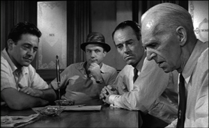
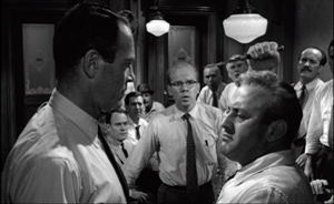
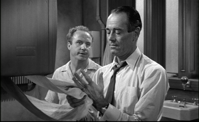
Harsh as they are, these comments do have a point. The early films shout and scream a lot, both dramatically and pictorially. Lumet admitted his love of melodrama, conceiving it not simply as overplaying but rather as conflict at the highest pitch of arousal: extreme personalities in extreme situations. So a silence is usually prelude to an outburst, and a bellow or a slap is never far off. The jury deliberations in 12 Angry Men (1957) become a group therapy session (or an Actors Studio class?) in which bigots must confess their traumas.
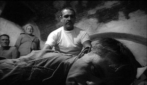
Stage Struck (1958) and The Group (1966) are pictorially innocuous, perhaps partly because they were shot in color, but The Fugitive Kind (1960) is a banquet of elaborate lighting effects whipped up by Kaufman. Macdonald wasn’t fair in his dismissal; the film is dominated by medium and long shots, with close-ups held in reserve for big moments, and the line readings don’t seem to me as overbearing as he suggests. Still, there is a sense of pressure, with very precise reframings and sets densely packed (mirrors, curtains, staircase railings) in a way that accords well with Williams’ overripe dialogue. There is an upside-down shot, and at some moments, as Macdonald notes, the illumination lifts or drops in magical ways—a surprise gift, Lumet claims, from Kaufman.
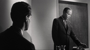
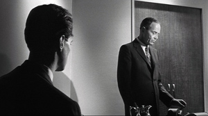
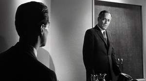
As a pluralist, Lumet would stage some scenes in full shots and long takes, sometimes at a surprising distance from the camera. But it was hard not to notice the other extreme. His most famous black-and-white films mixed in tight close-ups, oppressive sets, wide-angle distortions, and chiaroscuro. 12 Angry Men is relatively subdued in this regard, building toward more looming images at the climax, with some powerfully jammed ensemble frames.
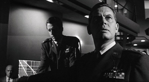
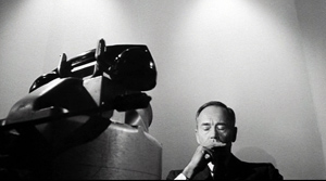
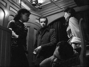
Fail-Safe (1964) surrenders itself to flamboyant shot design once we get into the war room and then into the President’s sealed chamber. Contra Kael, as in 12 Angry Men, many of these shots have busy backgrounds, albeit not of the Renoirian sort.
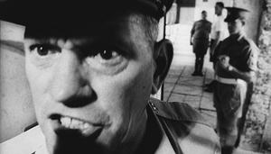
The Pawnbroker (1965) is Lumet’s most famous orgy of strident technique, with Sol Nazerman nearly as caged at his counter window as he was in the camps. Even more overwrought is The Hill (1965) in which short lenses pump officers’ raging faces into gargoyle shapes, with pores and welts and gobs of sweat thrust under our noses.
In sum, this is not the director eulogized in Entertainment Weekly: “He never tried to dazzle audiences with flash and style.”
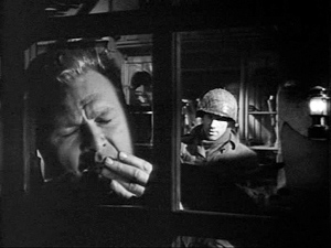
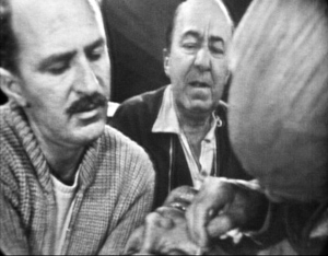
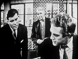
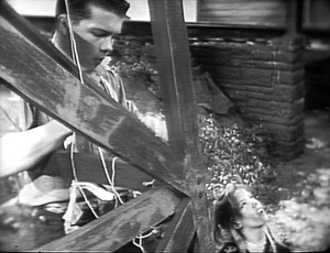
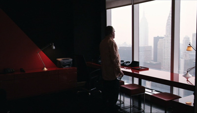
What critics didn’t note, however, was that the more outré look cultivated by Lumet, Frankenheimer, Ritt, and company fitted fairly snugly into 1950s Hollywood black-and-white dramatic style. The blaring deep-focus and violent close-ups exploited by the TV-born directors were already visible in the work of Mann (The Tall Target, 1951, below), Aldrich (Attack! 1956, below), Fuller, and many other directors.
During the 1950s what we might call roughly the “post-Welles” look was well-established for serious subjects and genre pictures alike. The Hill pushes things a bit, as Frankenheimer did in Seconds (1966), but the cramped, low-angle style on display in Lumet’s early work is part of a tradition that goes back years (and which had its echoes in many overseas directors, such as Bergman and Fellini). The wilder reaches of that style, it now seems clear, belonged to Fuller and company, not to mention the Kubrick of Strangelove and the Welles of Touch of Evil. Like Richardson, Schlesinger, and others, the TV émigrés may have gotten their wrists slapped for trying to map onto prestigious social-message movies the visual pyrotechnics already acceptable for program pictures.
Not incidentally, some directors had already found the wide-angle deep-focus look useful in their TV productions. Below are frames from Requiem for a Heavyweight (directed by Ralph Nelson, Playhouse 90, 1956); The Defender (directed by Robert Mulligan, Westinghouse Studio One, 1957); and Lumet’s own omnibus program Three Plays by Tennessee Williams (Kraft Television Theatre, 1958).
You can argue that their move to cinema actually smoothed out the directors’ style. The less square frame and bigger scale of the theatre screen made films like Frankenheimer’s debut The Young Stranger (1957) more spacious and relaxed than what could be seen on the box. 12 Angry Men was a polished effort, starting with an elaborately staged six-minute crane shot assembling the cast in the jury room, and using the width of the screen to enclose several faces. Looking back, we can see that Lumet offered something quite close to then-current Hollywood norms, and it looked less crude than what would be found on live TV of the period.
Still, The Pawnbroker and other films can be credited (or blamed) with helping spread the in-your-face style that would come to dominate American cinema of the next fifty years: disjunctive editing, slow motion, the arcing tracking shot (The Group), handheld shooting for moments of violence or anguish, glum color schemes (preflashing for The Deadly Affair), the teasing flashbacks that will be gradually filled in. Lumet’s early films are anthologies of most of today’s tics and tricks.
Yet by the time of his death, the director who was once feared as the vanguard of something new and awful had come to embody something old and trustworthy. Somehow the unambitious journeyman and pretentious copycat became a “classicist.”
How did that happen?
A prince of the city
Before the Devil Know You’re Dead.
Instead of indicating that he was joining or extending a tradition, Lumet reacted to the hailstorm of criticisms with surprising equanimity, at least in the interviews he gave so abundantly throughout his career. He was modest, acknowledging that many of his films turned out to be feeble, and he declared himself a learner. He tried different projects, he said, to improve himself. He wanted to learn to manage color, to work in different genres (e.g., the dark comedy Bye Bye Braverman, 1968), eventually to fall in love with digital video capture. To some extent Lumet changed because he really wanted to learn more and explore various sides of moviemaking.
Lumet always claimed that he didn’t apply a personal style to his projects; he tried to find the best way to handle the script. He thereby confessed himself to be what auteur critics of the 1960s were calling a “metteur-en-scène,” the director who judiciously enhances the material rather than transforming it to suit his personality. This was probably a good survival strategy in the new churn of the 1970s.
The mid-1970s was the Great Barrier Reef of American cinema. Virtually no members of Hollywood’s accumulated older generations, from Hitchcock and Hawks through the 1940s debutantes (Wilder, Dmytryk, Fuller, Siegel) and the 1950s tough guys (Aldrich, Brooks) to the TV émigrés, made it through to 1980. Many careers just petered out. The future belonged to the youngsters, the so-called Movie Brats. In this unfriendly milieu, Lumet fared better than most. He tried a semifarcical heist film (The Anderson Tapes, 1971) that mocked the rise of the surveillance society, with everybody wiretapping and taping and videoing everybody else. He mounted a classic mystery (Murder on the Orient Express, 1974), a musical (The Wiz, 1978), and a free-love romance (Lovin’ Molly, 1974). Of the items I’ve seen from these years, the most daring is The Offence (1972). This study of a sadistic British police inspector’s vendetta against a child molester offers a sort of seedy expressionism. In another gesture toward psychodrama, long conversations with the perpetrator reveal that the copper is a bit of a perv himself.
Lumet’s most successful rebranding took place in a sidelong return to the Pawnbroker milieu: low-end, location-shot, crime-tinged social commentary using New York theatre talent. Filming in color and casting off the baroque precision of the earlier work, he made his compositions more casual and his shot changes less precise. His cutting pace picked up: six seconds on average for Serpico (1973), five for Dog Day Afternoon (1975), both courtesy of the high priestess of the quick cut, Dede Allen. The driving tempo of these movies gave them an urgency that critics could tie to the ticking-clock plots, the atmosphere of urban pressure, and of course the extroverted acting of Al Pacino.
With the two crime films, and the satiric Chayefsky talkfest Network, Lumet remade his image. He was a New York filmmaker, offering raucous, hard-nosed, semi-cynical takes on corruption in the police, the justice system, politics, and the media. His protagonists tended to be Jews, Italians, and Irish, all working stiffs or bare-knuckle power brokers; and the enemy, again and again, turned out to be the Ivy elite. A tailor-suited WASP, male or female, was likely to sell you out. Only ethnic minorities knew the real score. The line could come from almost any mid-career Lumet film: “I know the law. The law doesn’t know the streets.”
The crowning achievement in this vein, for critics if not for audiences, was Prince of the City, a sprawling study of a cop’s patient years of taping and informing on his corrupt colleagues. More slowly paced than the earlier urban dramas, the film also marked Lumet’s move toward something else again. The style was drier and more sober, almost passive, emphasizing static and somewhat distant setups; the cutting slowed down to nearly nine seconds on average. As mid-period Lumet had blotted out the early years, now something more calm, even comparatively austere, came into view.
Whatever the project, however, by the later 1980s he was offering his own alternative to the fast-cut, whirlicam style that was bewitching young filmmakers. While directors in all genres were building scenes out of endless choker close-ups and cutting every four or five seconds, Lumet applied the brakes, lingering on two-shots, letting whole scenes play out in full frame, moving his actors around and ordaining a cutting pace close to ten seconds on average. The first eight minutes of The Verdict (1982) consist almost entirely of long shots and extreme long shots. The protracted takes and antic bodily contortions of Deathtrap might have come from a French boulevard farce; the first tight single of Christopher Reeves is delayed for half an hour. In an age in which critics decried the choppy confusion of tentpole action, the plainness on display in movies like Running on Empty (1988) and Night Falls on Manhattan (1997) looked anachronistic. Right to the end, Before the Devil Knows You’re Dead (2007) could spare a lengthy and distant shot to register a high-end drug boutique and shooting gallery. We had come from the Hysterical Lumet by way of the Gritty Lumet to the Restrained Lumet.
Acting in the frame
Yet he did not milk the urban crime vein dry. He continued to try a wide range of projects, even probing the Red Scare in Daniel (1983). The rationale was chiefly performance. Lumet was an “actor’s director.” He demanded at least two weeks of rehearsals, which included not only table readings but eventually full blocking of scenes, including fights and chases. Derived from his TV and theatre days, the method suited his belief that actors needed a firm structure in order to invent their characters. Interestingly, this actors-first rationale can be adjusted to any phase of the rough stylistic development I’ve plotted. The high-pressure facial shots of the early films can highlight the minutiae of the performances. But so can mid-shots that let actors build in bits of business.
Manny Farber praised the moment when Fonda in 12 Angry Men dries his fingers at length, one by one. It shows, Farber says, “the jury’s one sensitive, thoughtful figure to be unusually prissy” and provides a “mild debunking of the hero.” But it’s not the unintegrated detail Farber claims; Fonda’s coldness is set up early in the film, when he stands remotely from his peers and shows no interest in them as men. And Fonda was always a master of finger-work, which Lumet could exploit in fastidious framings. In Fail-Safe as the President tries to halt the bombers rushing toward the USSR, Fonda projects the man’s minutely controlled apprehensions by pausing to rub his fingertips together, off in the corner of the shot.
This micro-gesture suddenly leaps, as Eisenstein might say, into a new quality: a worried facial expression.
More explicit is the characterizing moment in The Verdict when Frank Galvin (Paul Newman) starts his day with a sugar donut and a full glass of whiskey. The setup is concise: He has crossed off the wakes he’s visited, and his palsied hand can’t pick up the glass without spilling some.
So Frank checks to see if anyone is looking before, like a dog, he bends his head to slurp off a little.
It’s a simple but powerful image of degradation, far removed from the trembling mouth and bulging brows of Steiger in The Pawnbroker.
Lumet cared as much for camera technique as for acting maneuvers. His book Making Movies provides a virtual manual of movie style as draftboard engineering. His gearhead side was probably another legacy of the buccaneering days of live TV and the New-Wave inspired awareness of artifice. He took inordinate pride in his “lens plots” and lighting arcs, charting purely technical changes that would weave their way through the film. (In this he was ahead of his time; now most filmmakers develop these technique arcs, or at least they say they do.) Despite this almost mechanical conception of technique, though, late Lumet rediscovered a bare-bones simplicity of performance and framing that was willing to risk looking flat. In Daniel, he lets the angry young man whose sister has wasted away into madness confront the poster agitating for their dead parents. No tracking in, no circumnambulating camera, no heightened cuts or nudging score. And no need to see Daniel’s face. Susan merely lifts her head.
It’s as if the visual rodomontade of the Movie Brats drove Lumet toward a new sobriety. When Galvin is preparing to try the case of the girl left in a coma through medical malpractice, he visits the hospital and takes Polaroids of her inert body. The slowly developing images not only give us the fullest view of the girl we’ve had so far. They also come to suggest his dawning realization that this is more than just a chance for big money.
Galvin starts to grasp that letting the hospital settle out of court will allow the officials to write off their mistake. There is a human cost to simply getting the check. If he does it, he will now be a better-paid ambulance chaser. Yet he doesn’t stand valiant for truth; the drunk is scared, drained of dignity, and he clutches his portfolio as a sad, ineffectual shield.
Offered the money, Frank takes out the photos and weighs them against the check. Then with a sigh of exhaustion, contemplating the fool’s crusade he’s launching, he returns the check and drops the pictures into his bag.
Very simple visual storytelling; it might have come from a 1930s movie. But this stark presentation of moral decision, given as a straightforward framing of a man’s body, achieves a measure of artistic nobility in a year that gave us Porky’s and Rocky III.
Telling it all, holding some back
Prince of the City.
It’s good to remember such moments of pictorial storytelling because Lumet’s films, especially the early ones, tend to be gabfests. If Eugene O’Neill, Tennessee Williams, and Paddy Chayefsky, along with the Method acting tradition, are your coordinates, you will be drawn to chatterboxes and blowhards. Lumet loved the spoken word, which was after all the mainstay of live TV (“illustrated radio,” it was sometimes called). It’s not clear that he ever shook the habit. His characters usually step onstage leaking exposition, announcing their pasts, their personalities, their plans, and their deepest feelings. This has the advantage of making plot premises clear, but it reduces the figures’ mystery and their ability to surprise us, or to complicate our feelings about them.
Sometimes Lumet did let story construction do heavier lifting. It happens in The Pawnbroker, because the nearly catatonic Nazerman speaks so little that the fusillade of flashbacks provides his backstory. More daringly, the large-scale back-and-fill of The Offence, peppered with small memories but also looping around the central incident in the interrogation room, seeks to reveal Sergeant Johnson’s affinities with the suspected child murderer. We need to remember Lumet’s early fondness for time-shifting plots before we declare Before the Devil Knows You’re Dead an old guy’s effort to catch up with Pulp Fiction.
Even without benefit of broken timelines, Lumet could occasionally hold back information to reshape our first impressions. Take the central revelation of Dog Day Afternoon, when cuddly Al Pacino reveals that his “wife” is not the woman he’s married to (a nice plot feint here) but the man whom he loves. This apparently sensationalistic twist comes early enough to modulate into pathos when Pacino’s character dictates his two wills.
Prince of the City realigns our sympathies in a more intricate way. At the start, Danny is presented as a tormented soul. We’re led to think that he turns snitch because of things we see: the invitation to go undercover, his brother’s and father’s angry concern that his pals are crooked, and above all the shameful efforts he makes to get drugs for his informant. Once he turns, however, he can’t limit the investigation, and at nearly the end his treachery has broken the most important ties in his life.
But “nearly the end” is the operative term, because Prince of the City boldly appends a ten-minute epilogue showing Danny being investigated himself. The Danny we saw at the film’s beginning may have been steeped in corruption; the drug bust we saw included, behind the scenes, a major ripoff of money; he has lied more than we realized; and it seems likely that he cheated on his wife with the prostitutes whom he supplied with drugs.
A modern filmmaker, or Lumet in his bodacious early mode, might have spiced these flat testimony scenes with lurid flashbacks. But sticking simply to Danny’s feeble, evasive stonewalling raises questions of his own vulnerability. Having watched him break down over years and having heroicized his suffering to a considerable degree, we have to judge him anew. Is he simply too weary to fight the charges, or has he been caught out? The ending might seem to allow for cynicism, but we can’t cast off our respect for what Danny has risked.
Further, Lumet intercuts the court scenes with government meetings about whether to prosecute Danny. In the manner of a Shavian problem play, this tactic obliges our sympathies to be clear-eyed. If The Verdict lays all its cards on the table and invites straightforward sympathy for Galvin, Prince of the City, by hiding major aspects of Danny’s character and circumstance, leads us to a more nuanced experience. The narrational dynamic of the film invites us to rethink our protagonist’s actions and decide whether to grant him mercy.
In the vanguard of a new style in the 1960s, Lumet remade himself as part of the 70s renaissance. That freed him to cover nearly every bet on the board, and some paid off. As hotshot younger directors sped past him into tentpole territory, he put the independent sector to use–financing through presales, working with stars on the way down and on the way up, releasing the films through boutique distributors, trying many options with a stubborn pragmatism. He handled failure, ignoral, and disdain better than probably any of us could. “Though his films are invariably flawed,” wrote Sarris in 1968, “the very variety of the challenges constitutes a sort of entertainment.” This zigzag career trajectory provides a unique, even heartening EKG of success and survival in the modern American film industry.
At the same time, he helped make audiences and critics more conscious of film technique, in ways both salutary and damaging. He was part of my film school: The very first movie I saw in a theatre during my freshman year of college was The Pawnbroker, and I revisited it several times. Here was a modern instance of “pure cinema,” worth comparing with A Hard Day’s Night and 8 1/2. (Yes, I hadn’t seen much.) Prince of the City has drawn me since I first saw it in a moldy two-screener in Florida and thought: “Can Hollywood have made a Brechtian film?” I leave for another time the tale of watching Prince in a nearly empty screening sponsored by Nick Cave.
You can probably tell that Lumet is not my favorite filmmaker. Several of his movies I earnestly hope never to see again, and even the ones I admire contain moments I would wish otherwise. But he has given me unique pleasures and prodded me to ask some questions that intrigue me. More broadly, I can’t understand the failures and accomplishments of modern American film without taking into account this marathon man.
For this entry, I haven’t managed to see or re-see as much of the Lumet output as I’d hoped, but the twenty-three films I revisited include his most famous titles (except for The Wiz, which might better be called infamous). My comments here supplement those I make about Lumet and his generation in The Way Hollywood Tells It, 145-147.
I’ve drawn my critics’ quotations from anthologies of their writings. The one I should probably signal explicitly is Pauline Kael’s “The Making of The Group,” in Kiss Kiss Bang Bang (Little, Brown, 1968). The piece is dated 1966, but I can’t prove that it was actually published then. I find it endlessly interesting, not least because it may help us trace some origins of critical clichés. I’m thinking not only of the art/ business dyad but also the appeal to Renoir as the prototype of the spontaneous film creator. Ironically, for at least some projects we have evidence that Renoir rehearsed his actors quite a bit and retook scenes until he was satisfied. Double irony: Somewhat before Kael was celebrating the careless grace of Renoirian spontaneity, he had in Testament of Dr. Cordelier (1959) turned to a multicamera technique for his own television project. Renoir and Lumet intersect in unexpected ways!
On live TV shooting methods, a succinct overview can be found in Erik Barnouw, Tube of Plenty (Oxford, 1975), 160-166, and of course Gilbert Seldes’ Writing for Television (Doubleday, 1952), which I’ve praised elsewhere on this site. Seldes scatters some intriguing comments on live TV drama through his The Public Arts (Simon and Schuster, 1956). Just as important, Criterion continues to serve film studies by releasing precious documents from early television. Watch the items included in The Golden Age of Television and the three Lumet/ Williams playlets folded into Criterion’s Fugitive Kind box to see what these directors were up against, and with what relief they must have greeted the wider choices available on film.
The indispensable sources on Lumet are the fine collection Sidney Lumet Interviews, ed. Joanna E. Rapf. It’s here that Gavin Smith can be found sketching a case for Lumet as continuing classic Hollywood while also pressing into “80’s modernism” (132). And of course everyone must read Lumet’s own Making Movies. On editing The Pawnbroker, see Ralph Rosenblum and Robert Karen, When the Shooting Stops… The Cutting Begins: A Film Editor’s Story (Penguin, 1975), 145-166. Glenn Kenny has an excellent 2007 interview with Lumet on digital techniques in the DGA Quarterly.
Credits: Stage Struck; Night Falls on Manhattan.


