Archive for the 'Art cinema' Category
Do sell us shorts
Kristin here—
I don’t think I’ve ever seen a single theater playing all five nominees for the best-picture Oscar. It’s happening now at the six-screen Sundance Cinemas here in Madison, plus they’ve got The Diving Bell and the Butterfly (nominated for director, cinematography, adapted screenplay, and editing) and Persepolis (animated-feature nominee). The latter is very impressive, and I think it would win in an ordinary year, but probably not when it’s up against Ratatouille.
[February 9. That outcome seems even more likely now. Last night Ratatouille won nine Annie Awards, prizes given out by the professional animation community. In the 35 years of those awards’ existence, only once has the top animated feature prize not gone to the film that went on to win the best animated film Oscar. Pixar’s accompanying short, Your Friend the Rat, won best short subject. It’s not eligible for an Oscar, since it was a supplement on the Ratatouille DVD and not shown theatrically.]
Films like these get widely seen, obviously. An awful lot of films, though, get nominated for Oscars that far fewer people will see. How many people fill out their office Oscar pool ballots knowing anything about the short animated and live-action films? Some you can track down online or on TV (HBO, Sundance, the IFC, and so on), but viewing them all would be difficult.
For three years now, however, Magnolia Pictures has been packaging the films in those two categories into a single program that goes out to theaters and then onto DVD. Magnolia is a small independent distributor, best known perhaps for its documentaries, including Enron: Smartest Guys in the Room and Capturing the Friedmans and for its imports like Ong Bak and The World’s Fastest Indian.
This year’s program, “The 2007 Academy Award Nominated Shorts,” is listed on the company’s website as playing in 80 theaters, though perhaps that number will rise. Many of the runs (including the one at our Sundance Cinemas) start on February 15, and others are scheduled from then on into April.
Thanks to Sarah Simonds, manager at Sundance, I was able to get an early look at the ten films on the program.
As one might predict, the range of quality is greater in the live-action films than in the animated ones. I’m not sure why that would be predictable, but I have my suspicions. There’s not much of a theatrical market for live-action shorts, which mainly get seen at festivals and on TV. They tend to be portfolio films, made by people trying to attract attention and move up to features. Hence they more often come from beginners. Animators who don’t want to work their way up through big studios—and who stand little chance of ever directing a major animated feature—or who simply value their independence may stick with shorts.
Another factor working in favor of animation is that it’s a medium that demands the detailed planning of literally every frame. No improvisation, no casual shooting in real locales, no direct sound. All in all, I think that if I were an Academy member, I’d have more trouble making a decision in the animated-shorts category.
Real, Live People
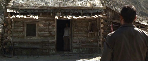
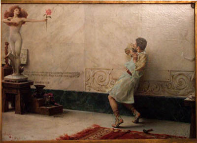
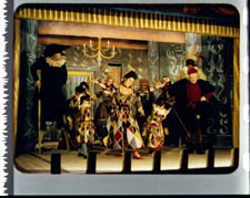
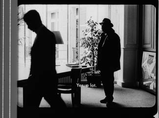
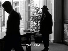
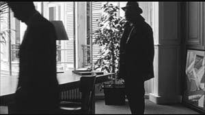
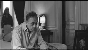
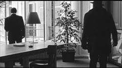
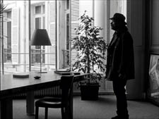
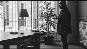
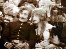
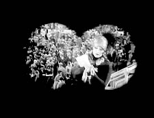
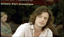
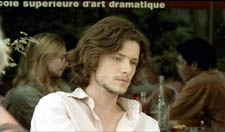
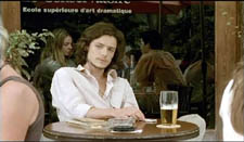
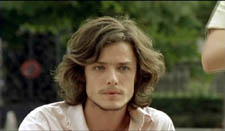
In the live-action category there’s no doubt that I would vote for The Tonto Woman, a UK short directed by Daniel Barber from an Elmore Leonard short story. Remarkably, Barber had mainly directed TV commercials before embarking on this, his first 35mm short, as a way of breaking into the film industry. He produced and funded it himself, with a ten-day shoot in Spain using locations and standing sets that had figured in such films as A Fistful of Dollars and The Good, the Bad and the Ugly.
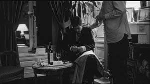
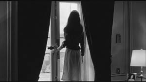
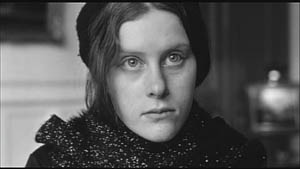
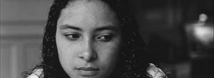
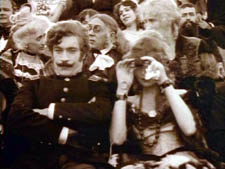
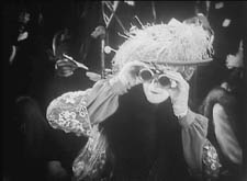
The result might be described as The Piano meets There Will Be Blood. A cattle rustler (well played by Anthony Quinn’s son Francesco) encounters a rich man’s wife (Charlotte Asprey) who is living in enforced seclusion after having been kidnapped and held for eleven years by Mojave Indians (image above). The film has landscapes with the epic quality of both There Will Be Blood and No Country for Old Men, and its drama has the depth of a feature film without feeling rushed in its 35 minutes.
Leonard’s website has a press release giving more details, as well as a profile of Berber. The latter suggests that the director has been contacted by people within the film industry. All I can say is, fund this man immediately. I definitely want to see what he could do at feature length.
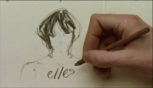
David has written quite a bit about the lively contemporary Danish cinema, including two entries on this blog, here and here. The country continues to be on a filmic roll in terms of Oscar nominations, with the short At Night being the one I’d vote if I were an Academy member and weren’t already voting for The Tonto Woman. It’s directed by Christian E. Christiansen and produced by Zentropa with support from the Danish Film Institute.
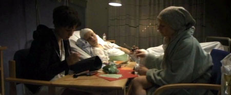
The subject matter sounds like the sort of thing that would ordinarily make me run the other way: three very young women with cancer bonding in the hospital ward they share. But the film avoids the touchy-feely clichés that so easily could sink such a project (except for a conventional Polaroid-photo montage of their little New Year’s party). It’s not just a sick-women’s-solidarity picture. One does come to care about these three and to understand how their illnesses make them better able to communicate with each other than with their families. It manages to pack a considerable emotional impact into forty minutes. Again, here is someone who could probably direct a fine feature film—and, given the current strength of the country’s industry, may well get the chance.
Tanghi Argentini is a charming comedy from Flemish director Guido Thys, dealing with an office worker who asks a colleague to teach him how to tango to impress a woman he has met on the internet. It combines a clever concept with a surprise twist at the end that works so well in both the short-story and short-film format. It’s entertaining but not so unusual or substantial that I would think of it as Oscar-worthy.
The two other films, France’s Le Mozart des Pickpockets (director/writer/actor Philippe Pollet-Villard) and Italy’s The Substitute (director Andrea Jublin), though both amusing, seemed surprisingly lightweight and conventional to have received nominations.
Puppets and Pictures
Trying to decide which of these animated shorts I would vote for is more difficult. Each is well-executed, entertaining, and imaginative. I tried thinking which I would want to watch again, which I would recommend to friends.
By those standards, there are again two stand-outs for me. I’d ultimately opt for Même les pigeons vont au paradis (Even Pigeons Go to Heaven), a French puppet film by Samuel Tourneux. It’s about a priest who attempts to sell a heaven-simulating machine to a miserly peasant about to be visited by the Grim Reaper. It’s fast-paced, very funny, and beautifully detailed in its depictions of the characters and settings. It’s not claymation, but it has some of the polish and wit of Aardman shorts.
 My close second choice would be a very different sort of film, My Love, from Russia, directed by Alexander Petrov. It’s a pretty, lyrical tale of a fifteen-year-old boy’s idealistic yearnings after a pretty servant girl and a more glamorous and mysterious woman who lives next door. The animation is impressionistic and shimmering, with constantly added brushstrokes transforming the compositions. Its visual style is derived from nineteenth-century Russian realist painting, especially that of Ilya Repin.
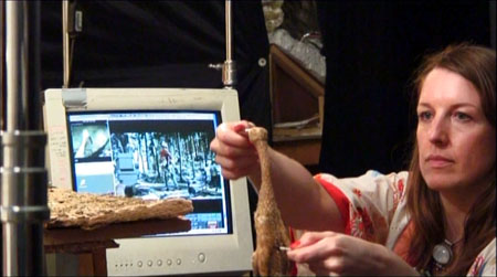
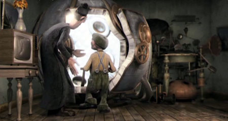
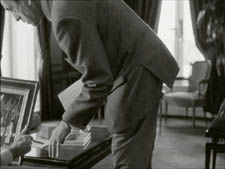
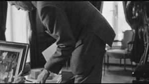
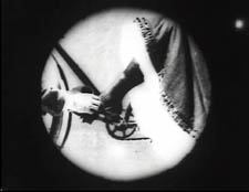
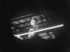
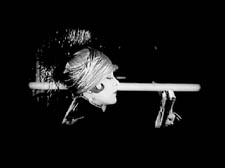
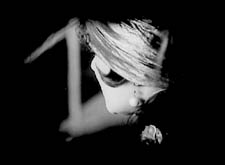
Suzie Templeton animating the Duck for Peter & the Wolf*
I suspect the Oscar winner might well be Peter & the Wolf, a British-Polish co-production that illustrates the classic Sergei Prokofiev tone poem. It was directed by Suzie Templeton and made at the Se-ma-for Studios in Łódź. There’s no doubt that it’s an impressive item, with elaborate miniature studio sets that could pass for real landscapes, precise and amusing puppets, and a mind-boggling frame-by-frame manipulation of furry puppets that leaves nary a ripple in their hair. (The photo above hints at how the latter feat was accomplished.) Still, the appeal of the original music is its evocation of events in our mind’s eye, and for me the literal playing out of those events at times carried a faint air of tedium. It’s the sort of prestige project that one can imagine a lot of Academy members loving.
 The same cannot be said for the edgier I Met The Walrus, from Canada. It’s derived from an existing soundtrack, a tape-recording made by a 14-year-old Jerry Levitan when he snuck into John Lennon’s hotel room and interviewed him. Now, many years later, director Josh Raskin has created an animated image track to accompany it. It’s a clever idea, but to me the illustrations of Lennon’s words soon became a bit too literal, and I found myself thinking that the animation was Terry Gilliam (in his Monty Python days, that is) meets Yellow Submarine meets Max Ernst collage-novel.
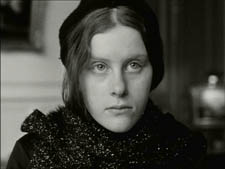
I’m very much of two minds about Madame Tutli Putli, the seemingly inevitable entry from the National Film Board of Canada (directed by Chris Lavis and Maciek Szczerborski). A puppet film four years in production, it is an extraordinary technical accomplishment. It deals with a mousey woman who takes a train journey that confronts her with bizarre and ultimately threatening events. The grim tone and grubby puppets and objects reminded me of Jan Svankmajer’s work.
The most disturbing thing about the images, however, is not the subject matter but the creepily realistic eyes. To me it was obvious that real eyes had been superimposed onto the puppets’ faces. Investigating how this had been done, I found this brief making-of demonstration on YouTube, which indeed revealed the main character to be a puppet with blank areas where the eyes would be. Looking further, I learned that the special effects were done by painter/animator Jason Walker, who devised a complicated process to coordinate the photographed eyes with the animation. Some demonstrations of that process are available here, and there is an interview with him here.
There’s no doubt that the technique is unnerving, and yet at the same time it’s distracting (if one notices it). Is it “fair”? Of course people have been combining live action and animation in various ways since the 1910s. Yet superimposing photographed elements in such a way as to make them appear to be part of the animation almost seems like cheating. Here one would be tempted to marvel at how skillfully the animators had simulated human eyes—a notoriously difficult subject to capture realistically. I suppose for many viewers the eyes and the rest of the image would blend seamlessly and not prove distracting. For me, it didn’t quite work.
Overall, the program is undoubtedly worth seeing on the big screen.
As to the previous two programs of Oscar nominees, see here for the list of 2005 shorts and here for the DVD; see here for the 2006 list and here for the DVD.
*The production image from Peter & the Wolf derives from a making-of short on the British release of the German-made DVD (from Arthaus Musik), which now seems to be out of print.
Our voyage to Italy
“You’d better get going on a blog entry.”
“Aw, you write it.”
“No, you do it.”
“No, you do it.”
“Okay, let’s both do it.”
KT:
In keeping with our attempts to bring you information on cinema and the arts from around the world, we offer this entry from Naples, Italy. Our old friend Vito Zaggario invited us to present papers at a conference in Rome, “Una narrazione esplosa?” December 17 and 18.
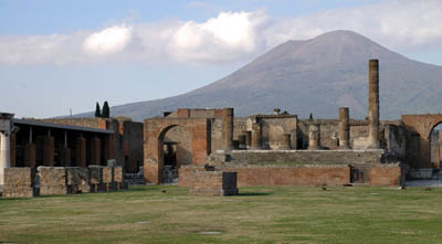
We decided to take advantage of the opportunity to go early and visit Pompeii and Herculaneum, two of the spots on our must-see list. We based ourselves in Naples because the sites are a short train ride away.
How could we go to Naples and not think of cinema? An early great Neopolitan movie is Assunta Spina (1915), starring one of the foremost Italian divas of the era, Francesca Bertini. Naturally, though, the first one that came to mind was Rossellini’s Voyage to Italy (1954). Some of the places that Catherine (Ingrid Bergman) and Alexander (George Sanders) visit in the film still exist, so we went looking for them. Fortunately, we had no quarrels or plans for divorce, but we didn’t encounter any miracles during a street procession either. About all we saw on the sidewalks were piles of trash, a recurrent problem because of strikes and the camorra’s role in the waste-removal business.
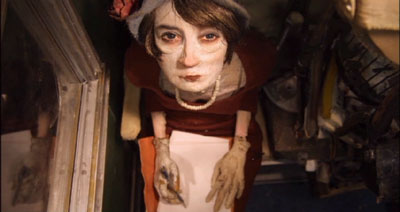
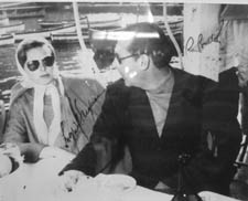
The restaurant Bersagliera, where Catherine watches Alexander flirt with another woman, is still there, a Naples landmark. It’s been somewhat redesigned, but is still very recognizable. In one corner a display of photos of luminaries who have dined at the Bersagliera includes snaps of Claudia Cardinale, Monica Vitti, and the wonderful local comedian Totò (below). Of course there’s also a signed two-shot of Ingrid and Roberto.
The seafood pasta, veal, and pepper steak were delicious, and not horribly expensive, even with the American dollar so low against the Euro.
Reminders of current cinema were evident in two billboards across from our hotel. As you know, American movie stars who would not compromise their dignity by appearing in ads in the U.S. routinely endorse products in other countries. Here a smiling Nicholas Cage publicizes a Mont Blanc watch.
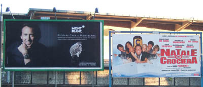
Right next to him was a billboard touting a new Italian comedy, Natale in crociera (“Christmas on a Cruise”). As I mentioned in an earlier entry, there are popular comedies made in a lot of foreign markets that we never hear of in the U.S. This is one of them. It’s the sixth in the popular Natale series, which, as the name suggests, are released in the Christmas season. Its director, Neri Parenti, also directed the ten Fantozzi comedies. Who says only Hollywood makes sequels and series?
We didn’t try to go to any movies while we were there. For one thing, we were busy in the evenings reading up on Pompeii and Herculaneum. For another, virtually all films shown in Italy are dubbed, and we don’t speak Italian.
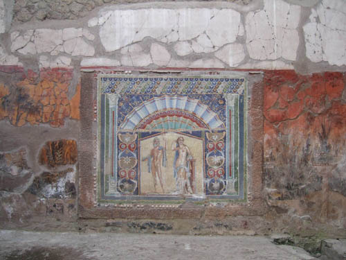
Many of the artifacts found in the two ancient cities are on display in Naples’ National Museum of Archaeology. We decided to devote our first day to a visit there, hoping that seeing the decoration and artifacts found at the sites would give us a better sense of what the cities would have been like before 79 A.D., when a huge eruption of Vesuvius buried and preserved them.
Some more or less non-moving pictures
DB:
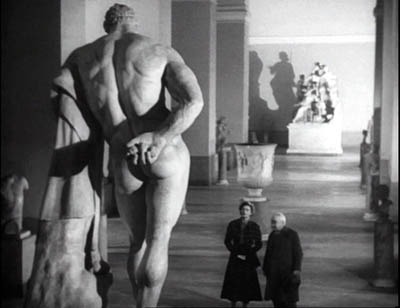
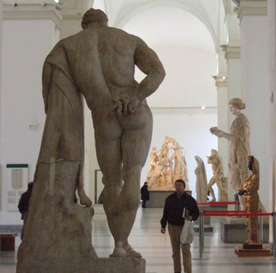
Not all the objects in the museum came from Pompeii and Herculaneum. I was especially eager to check on the statue of Hercules in the Farnese Collection. It appears in one of the finest scenes in Voyage to Italy, and though I couldn’t get Rossellini’s high angle, evidently made with a crane, it was possible to approximate his shot.
The collections at the two museums we visited, the archeological museum and the Capodimonte Museum, were spectacular and induced me, as museum trips do, to think about images, both still and moving. (Here and here are previous musings on the subject.)
Since I’m planning a book touching on relations between cinema and the pictorial arts, these come under the heading of Research as well as that of Fun. I got several ideas, but I’ll mention just two images that grabbed me.
While devoted mostly to ancient art, the Archaeological Museum was holding an exhibition of more recent painting and sculpture that dealt with classic themes, Pompeii among others. There were several quite interesting nineteenth-century narrative paintings there, but I saw nothing bolder in its compositional design than this 1896 piece by Giulio Bargolini on the Pygmalion story.
I like the way Galatea comes to life in the upper left cranny of the frame, while Pygmalion, recoiling from what he has created, is daringly off-center. His staggering is emphasized by all the space behind him that he can fall into.
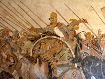
Still, the National Museum’s showpieces are from antiquity, and one of its masterpieces is the Pompeii floor mosaic showing Alexander’s victory over Darius. Made around 200 BC, it’s presumed to be a copy of a Greek painting.
I’ve been keen to see it since first encountering it in E. H. Gombrich’s magisterial Art and Illusion, a book that decisively shaped my thinking about film. Gombrich discusses the image as an example of the Greek discovery of the “eyewitness” principle, the strategy of representing a scene as it might look to an observer.
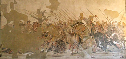
It certainly does that. Scanning the mosaic, I was reminded of the almost snapshot quality of its rendition of the battle. The left half is mostly gone, with the profile of Alexander the most intact bit. The right half, showing Darius’ forces at once resisting and fleeing, is a dazzling image.
 The thrusting spears and Darius’ outflung hand create a vivid thrust to the center, but the wheeling horses and plunging chariots counter this as they retreat to the right. There’s a remarkable amount of foreshortening, as with the horse’s rump in the center. We find shading and wrinkles on sleeves, and even Darius’ knuckles seem white with fear. I had never realized the amount of detail that could be captured in the mosaic medium.
Critics have long noted the small vivid touches, such as the shocked expression on Darius’ face, the grim charioteer beside him, and the fallen soldier who glimpses his own doleful face reflected in a shield.

What struck me just as much as the freeze-frame action was the ways that the figures get tangled up. Later academic paintings of battles, of which the Capodimonte museum seems to have thousands, tend to separate out each important face and figure, with empty air framing them. Not this mosaic, which in certain parts creates a sense of frenzied panic by piling up gestures and body parts.
Clearly the artist knew how to pull a figure out of the melée. Darius is starkly isolated, by virtue of his height in the format and the empty space surrounding him. But behind and beneath him and his whip-cracking charioteer, his forces are in tumult. To look at just one bit: Here the snapshot quality is evident—the whip curls in mid-air—but in the lower right there’s also a collage of hands, heads, and single eyes of men and horses, cued by simple overlap.
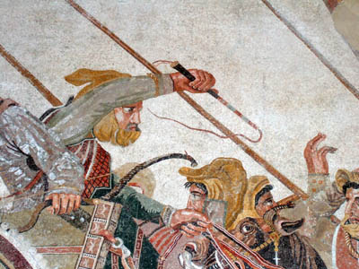
The sheer pressure of the confusion, the tension between retreating and standing fast, is rendered by these tightly stacked planes, crisscrossed by the diagonals of spears and the charioteer’s arm. I can imagine Eisenstein calling this an early case of montage, the colliding stimuli that create a synthetic, expressive image.
Sights and sites
KT:
Pompeii did not disappoint. December in Italy can be cold and rainy, but we were lucky and had sunny cool weather for our visit. Going during the off-season is definitely a good idea.
We were alone in some parts of the site, including the beautifully preserved amphitheater. It took us about six hours to walk from one end of the excavated portion to the other, though one could easily spend two days going slowly and savoring the bits of wall paintings and mosaics that have not been taken away to the museum, as well as the marble-tiled counters in the many bars and cafes, the steep, curving bleachers in the small and large theaters, and the many faint graffiti written by the ancient citizens. Almost everywhere one goes, the vast, looming presence of Vesuvius dominates the view.
The next day it turned much colder and very windy, though still sunny. The fact that the excavated portion of Herculaneum is in a vast pit helped protect us from the wind. Vesuvius’ mud and ashes buried the city 65 feet under current ground level. Again we encountered only a few other tourists as we strolled up and down the sidewalks of the town, looking into the houses, the taverns, and the temples. Again much of the wall decoration had been removed, but there were enough tile floors, mosaics, painted panels, and furniture to give a better sense of what the place must have looked like.
More on the Rome part of the trip later.
Godard comes in many shapes and sizes
DB here:
James Quandt started it.
The indefatigable Senior Programmer of the Cinémathèque Ontario emailed me in early 2004 to ask if I had any thoughts on the aspect ratios of Godard films. He attached an essay which eventually appeared in the gorgeous anthology, For Ever Godard. Reading a Quandt essay is like eating a ripe nectarine, tangy and nourishing. So you should find the original and indulge yourself. (1)
You might be asking what the term aspect ratio means. It refers to the ratio of the width to the height of the film image. The image was fairly square in the early silent era, then became roughly standardized at 4 x 3, or as the pros say, 1.33:1. Sound filming made the format a tad more horizontal, at 1.37. Anamorphic widescreen (CinemaScope and its brethren) was more or less standardized at 2.35 (more recently 2.40). Various non-anamorphic, or “flat” aspect ratios have appeared since the early 1950s. The US has favored 1.85, Europe has been known to use the squarer 1.66, and some films, like E. T., are designed for 1.75. Widescreen TVs are set at 16:9, or about 1.78:1, so that’s likely to be a common proportion in the future. We discuss aspect ratios at more length in Film Art: An Introduction (pp. 183-185 in the newest edition).
Filmies care about aspect ratios because shot composition matters. Sometimes the print is “hard-matted,” with the correct proportions given as black bars at the top and bottom of the frame, like video letterboxing. Here’s an example, from a 16mm print of Godard’s 1972 Tout va bien. It is hard-matted to 1.66. (The original film is in color.)
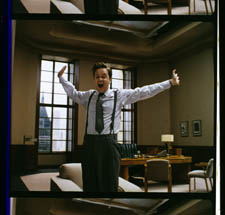
If the image isn’t hard-matted, the projectionist must insert an aperture plate that will mask the image properly. But what plate? Should she set it for 1.37? That’s a very rare option nowadays, and many theatres aren’t really designed to show it. Typically, if the print doesn’t indicate, the US projectionist will fall back on 1.85. Nowadays, if a Hollywood film isn’t in Scope, the projectionist is expected to use that ratio. Some shots will be problematic if the projectionist includes more than the 1.85 format allows. Here’s a full-frame film strip from The Hudsucker Proxy, where you can see that a chunk of the set is blocked or missing in the bottom area, and a microphone peeks into the frame from the top. (2)
Like many other movies, the films made by Godard since the mid-1970s show up at the projection booth without hard matteing. So at what ratio do we show them?
A great many careful viewers have voiced their views on the Internets, and I’ve learned a lot from the discussions here and here. In part this blog entry is an effort to introduce readers to this debate.
Moreover, this apparently film-wonkish question has wider implications. It can teach us a fair amount about how film images work, and the implications of any masking, matteing, or cropping of an image—especially on DVD. So if you’re interested in Godard, keep reading. If not, skip to the final section, “Relationships: The fundamental question,” where I talk about some artistic effects of cropping any film image.
It’s a just image, not just an image
James Q was mounting one of his typically ambitious retrospectives, this time on JLG, and so his essay posed a question that had long been ignored.
A disturbing discovery of the retrospective was how frequently the full-frame compositions of Godard’s late films have been ignored and overruled. Many of the prints are clearly marked by the lab with the widescreen ratios of 1.66 or (the almost standard) 1.85, and their subtitles are printed in the frame at the height indicated by those standards. Our meticulous projectionist Kate Mackay experimented with whole reels of films, showing them first in 1.33 and then in the prescribed wider screen ratio, revealing the violence done to the compositions when shown the latter way.
James found that several films, including Passion, Je vous salue Marie (Hail Mary), Nouvelle Vague, Hélas pour moi, and For Ever Mozart, looked “abjectly constricted” in 1.85. So James wrote the man himself.
Disturbed by some oddly cropped compositions in Éloge de l’amour, which result in seemingly unintentional beheadings and concretions, I consulted Godard by fax about the aspect ratio and he confirmed that it was indeed, as stated, 1.66 (rather old-fashioned in its own way). That he occasionally still seems to be jamming a 1.33 composition into a frame that cannot accommodate it suggests his instinctual preference for the open image.
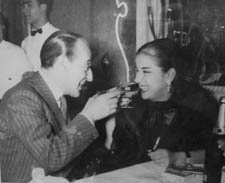
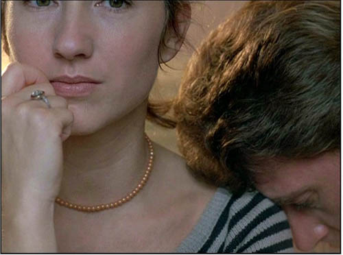
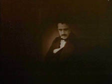
I couldn’t help James much at the time, but I did send him a couple of frames that favored squareish compositions and that came from 35mm prints. Other frames we reproduced, at 1.37, in both editions of Film History: An Introduction. The still that pretty much settles the matter for me is the gorgeous shot of Nathalie Baye and Johnny Hallyday at the top of this entry. Here’s the image as it is on a 35mm print.
Downsize that to 1.66 without losing those eyes!
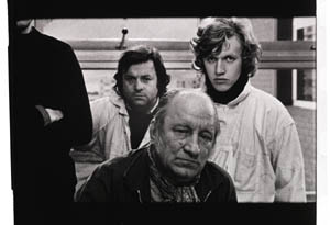
Later I sent James another killer example, drawn also from a 35mm print of Detective. (It’s in the new Film Art, p. 46.)
Here’s what it would look like in one try at 1.66 matteing.
I say “one try” at a matted version because I didn’t take as much off the top as a normal aperture plate would; I didn’t want to slice into the hands and the gun. Not only is the 1.37 image preferable (we get to see Claude Brasseur’s slumping posture) but 1.66 looks, as James says, jammed. The 1.37 ratio lets Godard load information in the very top of the shot, as we’ll see often in the examples to come. And, needless to say, at 1.85 the shot would make no sense.
Soon after James and I had our exchange, Godard—perhaps prodded by James’ query—sent a diagram to Cahiers du cinéma. (3) (Thank you, Craig Keller, aka evillights, who called attention to it on this thread.) The Cahiers editors report that Godard has asked that Notre musique be shown in 1.37. His photomontage lines up two shots from the film and arranges them according to the three major “flat” ratios, and for each one he supplies a tart annotation.
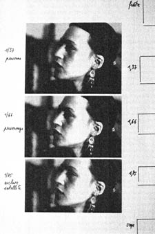
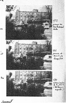
For the close-up of the woman, the captions translate as: 1.37 person. 1.66 character. 1.85 satellite slave. For the long shot of the street, we get: 1.37 Proof of Serbian bombing. 1.66 Proof diminished by Europe/ USA. 1.85 Extermination of proof (Milosovec acquitted).
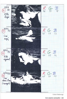
Pretty strong evidence that JLG doesn’t like cropping the classic format. But these remarks are about Notre musique. What about the other films? Apart from the evidence onscreen and on the film strip, we can add one thing. Evidently he shoots at 1.37, but there’s also evidence that in the late stages of postproduction he seems to preserve that ratio. Here, for example, is a sheet of color timing instructions for Nouvelle Vague. (4) Godard has pasted in a frame for each shot in the sequence, and alongside he notes how much red, green, and blue he wants. The frames he mounted are 1.37.
Recently our Cinematheque has been holding a Godard retrospective, and I’ve taken the opportunity to revisit the aspect ratio issue. As an archival venue, we can screen at any ratio, even the squarish silent and early-sound ones. Our projectionist Jared Lewis has run the Godards at 1.37. They look fine.
Jared pointed out to me that one other factor leans toward screening them in the 1.37 format: the thickness of the spaces between frames. In a modern “full-frame” film like Hudsucker Proxy, there is very little space between the frames. The line separating one from another is quite thin. That tends to make the frames squarer, closer to 1: 1.2, as I mention in endnote 2.
In a classic sound film, there is often more space between the frames. Usually that space is black, but I can’t resist showing what it looked like in Technicolor.
This frame, from Renoir’s Golden Coach, shows the characteristic silver frame surround (and silver soundtrack) of a true Tech print. Nifty, huh?
Anyhow, the sort of thick spacing between frames that we get usually find in Godard prints, and that’s visible in the Baye/Hallyday frame above, favors the classic ratio. The thickness of these spacers is similar to what we find in a modern film that was explicitly designed for 1.37 screening, Hans-Jürgen Syberberg’s Parsifal (1982).
This array, Jared points out, gives different frame proportions than one would find in a print hard-matted to 1.66 or 1.85.
One more wrinkle. On the film strip, Godard’s frames aren’t all the same dimensions. Here are two from Je vous salue Marie; note that the first is taller, with narrower spacers, than the second.
Both, however, would be appropriately shown at 1.37.
How then are we to explain Godard’s saying the films should run at 1.66? Perhaps, as one of the online commentators has suggested, Godard assumed that 1.66 is the closest that most commercial venues can come to 1.37. Perhaps too he was just being contrary–that is, just being Godard.
Fortunately, some DVD producers seem to recognize his full-frame aesthetic. The UK version of Detective is full-frame and preserves my nifty shots. Also, the Cahiers du cinéma discs for Prénom Carmen, Hélas, and so on are at 1.37. Bowing to Godard’s wishes, Wellspring’s version of Notre Musique announces that it is presented “in its original theatrical aspect ratio of 1.33.” Although purists may say that virtually no theatres showed it that way, we should appreciate the gesture.
Relationships: The fundamental question
Even if you’re not that interested in Godard, everybody should be aware of what video cropping can do to the film image. I’m not talking about panning and scanning, that process which begins with a widescreen film, typically one of an aspect ratio 1:2.40, and extracts a 1.37 frame out of it for video purposes. This is deplorable, but most of us are alert to it. What’s more interesting is the sort of thing that happened when a film is cropped inaccurately, either in projection or for DVD.
My example will be from the first reel of Godard’s Éloge de l’amour/ In Praise of Love, which is available on DVD in a full frame version from Optimum in the UK and in a cropped version from New Yorker in the US. I won’t be focusing on the quality of each transfer, though the Optimum one looks superior to me.
Nor will I do a detailed narrative account, because I find the characters and their interactions still fairly baffling. I’m always amazed that critics can praise a Godard film without ever getting down to explicating what’s literally happening in a scene. They write as if these films were telling their stories straightforwardly. Without help from the presskits, could journalists discern even the sketchy plots they refer to? A great deal of the fascination of Godard’s late works comes from his refusal of the most elementary forms of exposition–picking out characters, explaining their relations, and the like. There is always a story, but it’s about three-quarters hidden, and this seems to me to require a lot more analysis than people tend to give it.
Anyhow, in studying Éloge de l’amour‘s video versions, I learned that there can be a big difference between tiny numbers. For instance, the Optimum version is prepared at 1.35:1. No big deal between this and 1.37:1, surely? Except that the New Yorker version seems to have started from a 1.37 frame. Even though it’s cropped on the top and bottom, it consistently supplies a tad more information on the right and left edges, and these extra bits are visible in side-by-side comparison. First, a 35mm frame.
Needless to say, the projector’s aperture plate won’t preserve everything in the physical frame; at a minimum it masks off the curved corners. But if we look at the two video versions, there are some surprises.
The 1.37 version of this shot is of course much closer to the overall composition of the original. But more areas of the window frame (on the left) and the painting (on the right) are visible in the widescreen version than in the full-frame one. Did going for 1.35 shave off those areas? Moreover, New Yorker’s cropping is at 1.77, for all intents and purposes the same as 1.75. But to achieve this wide frame, the transfer of some shots seems to have been optically stretched a little. In some upcoming examples the faces are a bit plumper and the surroundings a bit more horizontally spacious.
Okay, maybe I’m splitting hairs. So let me assume that the UK DVD preserves a reasonable amount of the 35mm original. I want to consider some effects of the cropping we get in the US DVD. Some are obvious, some more subtle, and all go beyond this individual case to suggest the results of overcropping any movie.
(1) Of course we lose the top and bottom. In the full-frame shots from Hudsucker Proxy, no problem; the filmmakers are counting on the projectionist to mask the frame. But in Godard the cropping makes us lose stuff. Godard likes to frame heads pretty high in the shot, and this means that we often lose part of them.
Heads are trimmed in movies all the time, and it doesn’t much matter in close views. But in Éloge, Godard is composing long shots with heads quite high up. He will even daringly chop off heads himself. This is partly a strategy to conceal who is present, to block our recognizing characters by their faces. It also has the effect of activating areas of the frame that aren’t usually so important. We have to strain to see partially visible things, tucked away in bits of the shot.
In the example below, I submit, the original composition creates a tension among three centers of interest: the two very visible paintings and the almost indiscernible face of the art dealer standing by the rear window. That tension is lost when the 1.77 cropping lops off the head in the background. Significantly, the man offscreen left is talking about how classic painting displayed “relationships” (rapports)–presumably both personal and pictorial. “That’s the fundamental question.”
The framing of the assistant in the foreground, incidentally, shows that spotting a decapitation in a video version doesn’t necessarily mean that Godard wanted every head to be seen.
In a later scene, we strain to see the older man’s face as he bends over Bruno. As he speaks Picasso’s immortal line, his profile scrapes the very top of the shot, but not in the cropped version.
In most film shots, the upper half of the frame harbors what we look at first, so we’re probably most likely to notice when something goes missing there. But actually, the area at the bottom of the frame is important too, especially as part of Godard’s all-over approach to composition.
Throughout early scenes of the film, Godard’s compositions favor the art works and minimize the humans trafficking in them. So the picture (by Delacroix? Matisse?) on the coffee table is foregrounded when the art collector signs the papers proffered by a mostly unseen woman, but it vanishes in the cropped version.
Likewise, the old man on the bed can rub his glasses fretfully at the very bottom of the 1.37 format, but that performance detail goes for naught in the 1.77 format.
More generally, even when we scan the top half of the frame for major information, we tend to take for granted that people are anchored to a ground plane, the earth or the floor or whatever. Often, of course, film shots don’t show us this ground. But the material at the bottom of a distant view can weight the shot, providing a sense of gravity. Here, the dealer peering over his balcony is minimally tied to the patio ground (as minimally as he was visible in the earlier shots when his head grazed the upper edge, I suppose). But in the 1.77 version he floats free.
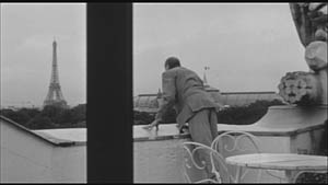
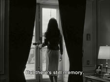
(2) The top and bottom zones include the corners of the frame as well, but I single them out for special mention because I like them so much. Again, we don’t expect key information to be tucked there, but it can happen—in Godard, in Tati (a big influence on the late Godard), and even in one remarkable shot in Lumet’s recent Before the Devil Knows You’re Dead. In the first reel of Éloge de l’amour, the best example I can find comes with the long-shot of the woman, turned from us, standing at the window. In the lower right corner of the shot sits a woman’s photograph on a table. The 1.77 frameline chops it off and makes it less segregated for our notice: we lose the spacing that separates it from the other objects on the table. Since the voice-over is meditating on memory, the photo adds an overtone to the shot, but less clearly in the cropped version.
Maybe it matters, maybe not; but it’s a lot harder to see in 1.77 than in the 1.37 transfer. Something similar happens with the businessman’s hand in the lower left of this shot.
(3) Cutting off top and bottom alters the shot scale. All other things being equal, cropping not only eliminates; it enlarges. Figures come closer to us. A medium shot becomes a medium close-up. All of the examples so far indicate this to some degree, but it comes across clearly in these variants.
Again, note the stretching. It seems that someone decided that the image had to be 1.75 and instead of cropping it, stretched the 1.66 one. Yikes!
(4) Overambitious cropping changes the compositional dynamics. In reducing information, it reorganizes the composition. Rudolf Arnheim (I blogged about his achievements here) suggested that we consider a picture as a field of vectors and forces, pushes and pulls, balance and imbalance, rival centers of attention. By changing the framing we change the relation of the figures to the edges, and this can alter the composition.
The clearest examples come from the sort of reframings we find when a Super-35mm film is rendered in home video versions in both 2.40 and 1.37.
In this shot from 8mm (the movie, not the gauge), the cashier questioned by Cage looks more isolated in the Scope framing, while in the full frame they seem closer together and he seems to press in on her. Cropping can change a lot.
Now consider this comparison.
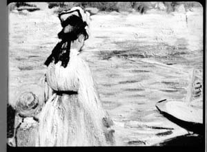
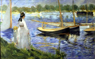
Godard’s original shot (here from 35mm) keeps the painting’s upper horizon, the darker, frothy waterline as a kind of backboard, halting the water’s recession into the distance. Graphically, the water on the right center becomes a negative space for the two figures, with the boy counterbalanced by the tip of the skiff.
But the cropped version loses the distant waterline, creating an infinite stretch of space top to bottom, and the boy’s head seems to float more freely. Most starkly, the skiff, by losing its shadow, seems to have swung more toward us.
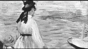
It’s worth noting that Godard himself is a mean hand at radical cropping. I’ll forebear from rambling on about what his original framing above does to the original, Manet’s Seine at Argenteuil (1874), but it could constitute a lesson in how framing changes effect and meaning.
Several factors come into play when we look at this shot from the two DVD versions.
The woman’s face is off-center in both images, but it looks more off-center in the 1.77 transfer. In fact, despite the extra bits on left and right, it is measurably more off-center, because of this transfer’s optical stretching. Yet I’d argue in addition that the cropping of the frame has squeezed the pictorial elements into a stronger horizontal to-and-fro, giving a sense that she has been pushed more out of the middle. You can see it more markedly if we crop it more drastically, and it may help to hide the others when you look at this.
This effect is akin to what happens in the cropping of the 8mm example: the spatial relations have reorganized in relation to the frame edges. Rapports again.
(5) Overcropping can affect the way we experience the time of the shot. Before you call the men in the white coats, I hasten to say that cropping is purely a spatial effect, but in cinema space is bound up with time.
We’ve seen that Godard manipulates the vertical dimension of the frame to an unusual degree, and the effect on time becomes apparent in one scene of Éloge in which Bruno talks with an older man, in a sort of casting session for his project. First we see Bruno alone, and as he walks to the window the old man comes in, his back to us. We presume it’s a man by the bulk, the gait, and the fedora, making its appearance in the upper right corner.
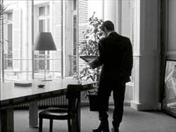
Or does a man come in? In the 1.77 version, at the corresponding point in the shot, we can’t tell it’s a man until the figure comes further into the room.
Godard’s reliance on the upper part of the frame allows us to discern the caller sooner in the 1.35 version. Seconds, even split-seconds, matter in cinema. Insofar as cropping affects the timing of a shot’s unfolding, it affects our experience.
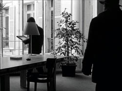
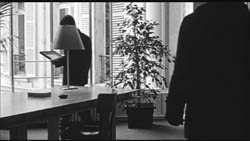
( 6) Cropping affects perspective, the perceived distances and volumes of objects in the visual array. Blowing up the center of an image creates a flatter, more friezelike space than we discern in the original. This becomes evident in a later phase of the scene I just mentioned. After Bruno leaves the shot, the old man is left standing in the office.
The 1.77 image looks more like it was shot with a long lens than does the full-frame version. The result recalls the sort of perpendicular telephoto framings so common in the 1970s, in films like The Parallax View and The Conversation (below).
Godard has said that he preferred 30-40mm lenses for much of Sauve qui peut (la vie) because a focal length of 50mm (and presumably one longer than that) will “destroy perspective.” (5)
Many of these differences wouldn’t matter in most films, which aren’t composed as meticulously or as daringly. Hollywood images aren’t typically as dense as those in late Godard. (I must do a blog some day on fussbudget filmmakers like him.) But even if these niceties seem negligible, I think you’ll grant that the film would be much more compromised by being shown in a 1.85 ratio, the squarest option available in most commercial theatres today.
Critical discussions of Godard’s late films have treated them as poetic meditations, and that seems partly right to me. Yet few critics ask how they manage to create their lyrical, associative quality. I think, as I hope to show in a future blog, this has to do with his treatment of narrative (naturally) and his layout of scenes. But even before we get there, I think that we find in the very texture of his images (let alone his sounds) a daring decentering of faces and bodies—the usual nodes of our attention. If he often blocks the flow of our glance, it’s in order to rechannel it to unexpected areas and textures, crannies and gaps, within the image. And so we want all those areas and textures, along with the crannies and gaps, available to our eyes and minds.
(1) James Quandt, “Here and Elsewhere: Projecting Godard,” in For Ever Godard, ed. Michael Temple, James S. Williams, and Michael Witt (London: Black Dog, 2004), 126-139.
(2) Geek note: You may notice that this “full-frame” image isn’t itself in the 1.37 ratio. It’s very square. The reason is that many 1.85 frames will be exposed in the camera at a ratio of 1: 1.2! I believe this was standardized for the Panavision cameras of the 1970s and afterward, though I’d appreciate more information about this. See the entry on Panavision cameras in American Cinematographer Manual, fifth ed., ed. Charles G. Clarke (Hollywood: American Society of Cinematographers, 1980), 104. See also Rob Hummel, “Comparison of 1.85, Anamorphic and Super 35 Film Formats,” American Cinematographer Manual, eighth ed., ed. Rob Hummel (Hollywood: ASC Press, 2001), 24-29.
(3) Jean-Luc Godard, “Formats,” Cahiers du cinéma no. 591 (May 2004), 78.
(4) This image is taken from Jean-Luc Godard par Jean-Luc Godard, vol. 2: 1984-1998, ed. Alain Bergala (Paris: Cahiers du cinéma, 1998), 199.
(5) Jean-Luc Godard, “Propos rompus,” in Godard par Godard vol. 2, 466.
Thanks to Suzy Buenger and Nancy Marshall for identifying the Manet painting for me.
PS 15 Dec: And thanks to James Quandt, Michael Kerpan, and Yogesh Raut for a name correction I’m too embarrassed to specify further.
PS 7 April 2008: The issue is raised anew with Gus van Sant’s Paranoid Park. It’s designed to be shown at 1.37, with more than a few shots reminiscent of Godard. Joe Beres explains here.
PPS 25 January 2009: Ranjit Sandhu provides a lively and detailed discussion of aspect ratios and matteing strategies, along with remarks on Godard’s frames.
PPPS 21 Sept 2009: Thanks to editor John Olivio for a correction on the 1.78 aspect ratio.
JLG par JLG (1995).
Three nights of a dreamer
DB here:
The close-up blogathon launched by Matt Zoller Seitz is over, but it contains enough specimens and analyses for a hefty book. It also inspired Jim Emerson to devote a cine-lyric to the close-up. I missed the deadline, so I suppose that this constitutes my sideways contribution to Matt’s enterprise.
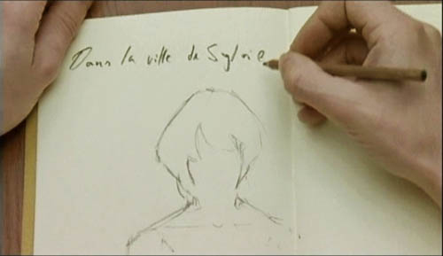
Sideways, because a full-blown analysis of In the City of Sylvia (En la ciudad de Sylvia; Dans la ville de Sylvie) would be a breach of decorum. Most people haven’t heard of this new film by José Luis Guerin, let alone seen it. I saw it at the Vancouver festival in September, and it will make its way through the festival circuit over the coming months and should show up on cable or DVD thereafter. But apart from calling attention to it as a remarkable film, I want to look at one of its most absorbing sequences and suggest some of its originality. Lee Marshall has already pointed out one of Sylvia‘s arresting features:
Guerin seems to have created pure drama without recourse to story. We’re always taught that story is the engine of drama. Not here: somehow Guerin has created an almost plotless film that has the dramatic tension of vintage Hitchcock. (1)
Although the story situation is slight, the tension we feel springs partly from vivid stylistic patterns. In other words: Minimal and uncertain story action is heightened by engaging visual narration. This narration in turn derives its power from one of the most traditional devices of filmic storytelling.
Consider the other person’s point of view
The point-of-view shot is a mainstay of cinematic storytelling, and its history is an intriguing one. Many of the earliest examples we have are motivated as views through optical gadgets. Two films by the Englishman G. A. Smith, both from 1900, handily show the options. Grandma’s Reading Glass justifies the point-of-view image as what the boy sees when he peers at granny through her big magnifier.
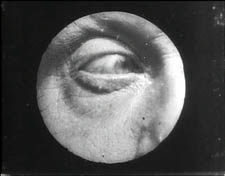
Smith’s As Seen through a Telescope motivates the cut-in POV shot as what our dirty old man in the foreground has an eye for.
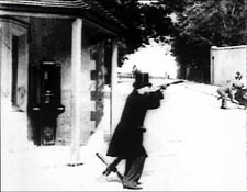
Fairly soon, this use of the magnifying POV shot was mingling with more straightforward ones. In The Birth of a Nation (1915), D. W. Griffith offers a rough-edged example. When the Stoneman brother and sister visit Ford’s Theatre on the night of Lincoln’s assassination, we see Elsie pointing out the famous actor John Wilkes Booth.
Booth is framed in an iris, which Griffith often uses to underscore an important image. But when Elsie studies Booth through her opera glasses, Griffith, usually not fastidious about such things, supplies the same irised image, now doing duty for the sort of magnifier-masking we get in the Smith films.
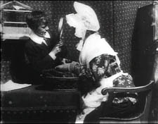
Presumably a more consistent technique would show Booth in long shot first, without the iris, and reserve the optical masking for replicating the view through the opera glasses. This is what happens in Ernst Lubitsch’s Lady Windermere’s Fan (1926), which contains a sequence built entirely around crisscrossed character looks. (1)
The woman of the world Mrs. Erlynne arrives at the racetrack and creates a stir, causing many men to watch her from all over the grandstand.
Note that Lubitsch has gone beyond Griffith by fitting the angle of Shot B to the viewer’s orientation, looking up. There are so many POV shots that at one point Lubitsch simply shows her from different angles and deletes the shots of each watching man.
This is a fascinating example of a process we often see in stylistic history. An “overlearned” visual convention can be treated elliptically; the filmmaker can leave out bits and we’ll fill them in. The binocular masking suffices to let us know that Mrs. Erlynne is being studied from afar. Moreover, Lubitsch gets an expressive bonus from being so concise. Now it doesn’t matter who’s watching, just that somebody is—actually, a lot of somebodies.
Later, after much more byplay with people looking at one another and misunderstanding what they see, Mrs. Erlynne sits down. Three gossips have been studying her, but now their view is blocked. So one gossip has to twist around to spy on her, and Lubitsch obligingly gives us a slightly tipped point-of-view framing—a full shot, without masking.
Adjusting her binoculars, the gossip is able to get a bigger view of Mrs. Erlynne, and she racks focus gleefully to catch a gray hair peeping out.
The visual narration in this sequence, already perfectly modulated, supplies the stylistic premise for Hitchcock’s Rear Window and all of its progeny, most recently Disturbia (2007). What might be overlooked is that by the 1920s the view through a device—field glasses, a microscope, a surveillance camera—had become a special, marked case. From then till now, the default POV pattern is the simple shot of a character looking, followed by an unadorned shot of what that person sees, from more or less the correct standpoint. Lubitsch’s sideways shot of the gossip’s view of Mrs. Erlynne, casually introduced, exemplifies the modern norm for presenting a character’s vision, and it’s so common that we seldom notice it.
POV shots: The basics
In his book Point of View in the Cinema, Edward Branigan itemizes the cues that the filmmaker can manipulate in creating a POV construction. (2) To simplify somewhat: Shot A shows a point in space and a character glance from that point. Shot B is taken from a camera position more or less approximating the point in A, and it shows an object. The shot-change presumes temporal continuity between A and B, and we assume as well that the character is aware of the object shown in B.
This seems like a complicated way of stating the obvious, but by teasing these elements apart, Branigan shows that each one can be manipulated in intriguing ways. For example, you can create a disorienting moment by violating the condition of temporal continuity. Ozu does this in Early Summer (1951), when Noriko and Aya decide to peek in at the man Noriko almost married. The two women tiptoe down a hall toward us as the camera tracks slowly backward. Ozu cuts to a forward-tracking shot that momentarily suggests a reverse angle POV on the corridor.
In fact, however, the camera movement is revealed to be the first shot of a new scene, among different characters, and we won’t ever see the man the two women went to spy on.
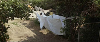
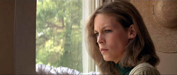
Here’s another interesting case, not cited by Branigan. In Halloween (1978), John Carpenter shows Laurie looking out a window and seeing Michael Myers in his mask, standing between fluttering washlines.
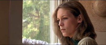
Cut back to Laurie, now frowning slightly.
Cut to a second POV shot; but now Michael has vanished.
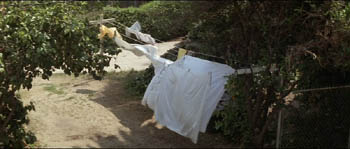
This simple change in shot B’s object, Michael himself, has an uncanny effect. Did Michael just walk away from the washline? If so, this is an odd way to present it. Why not show him walking away? Alternatively, did he just disappear? Surely not; Laurie would be shocked. Carpenter wins twice over. Without obviously violating realism or directly showing that Michael has supernatural powers, he gives Michael the ability to come and go in a ghostly fashion. By the end of the film, when he miraculously disappears after a fall that would kill an ordinary person, we are prepared to believe that he is indeed, as Dr. Sam Loomis says, the Boogyman.
Who is Sylvia? What is she that all the swains commend her?
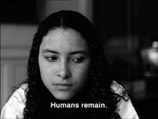
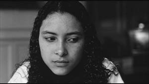
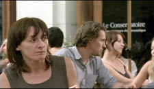
In the City of Sylvia centers on a young man staying at a hotel. We’re given no reason why he’s visiting the city, and no backstory about him. One day he’s sitting at a café. Now, across nearly twenty minutes of screen time he watches women and idly sketches them.
The sequence is a pleasure to watch, partly because of the constant refreshing of the image with faces, nearly all of them gorgeous, most of them female. Either Strasbourg has an extraordinary gene pool, or this café attracts only Ralph Lauren models. Yet the scene builds curiosity and suspense too, thanks to Guerin’s sustained and varied use of optical POV. He gives us an almost dialogue-free exploration of a cinematic space through one character’s optical viewpoint. (Stop reading here if you don’t want to know anything more about the film before you see it.)
The young man, known in Guerin’s companion film Unas fotos en la ciudad del Sylvia as the Dreamer, is almost expressionless as he scans the women’s faces. Slight shifts of his glance are accentuated by his habit of turning his head but keeping his eyes fixed. In over a hundred shots, Guerin uses some ingenious cinematic means to tease us into ever-greater absorption in the Dreamer’s visual grazing.
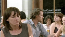
Fairly far into the sequence, Guerin gives us more or less the orthodox POV construction. The Dreamer looks at one woman at a table, and we see her return his look.
But here shot B isn’t really clean: the hands of the woman on the left sometimes block our view of the principal woman. This obtrusiveness is one of Guerin’s most basic strategies in the sequence. Inevitably, in passages before and after the cut I just showed, what the Dreamer is looking at is partially hidden in layers of faces and body parts.
Our prototype of the POV cut presumes a more or less single ‘point’ we are watching in shot B, but throughout this scene Guerin plays with this cue. He tantalizes us with several points to be observed, and he often obscures the most important ones. He also creates some startling juxtapositions. Near the very start we get this shot, which may or may not be the Dreamer’s POV.
By making the background girl seem to kiss the foreground guy, Guerin, as Eisenstein would say, “christens” his sequence. In effect, the image says: Watch out! Layered space will become important! When I saw this shot, I nearly jumped out of my seat.
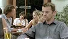
The Dreamer is treated no differently, at least at the start. In most movies, the POV construction is set up with a clear, clean framing of our looker in shot A. Here, though, at the start of the scene Guerin peels away layers to get to our man. For the first six shots of the café, we don’t know he’s on the scene. Then he’s shown out of focus, in the background of more prominent action. The woman in the foreground has been primed to be the shot’s subject. At the moment she shifts her gaze and we try to read her expression, a second woman on the distant right shifts aside to reveal the Dreamer behind her.
Surely this is the most unemphatic entry of a protagonist we’ve seen in a while! Guerin is able to add planes to block the main ‘point’ of shot B because he’s working with long lenses, a crowded space, and careful choreography. Even focus plays a role, as in this case; our Dreamer is pretty hazy.
One upshot of this strategy is that we’re plunged into a “cubistic” space, in which slightly varied camera angles pick up bits of space we’ve seen in earlier combinations and oblige us to assemble it all in our head. Be thankful for the guy in the blue shirt above, for he plays an anchoring role in several setups that would otherwise float free.
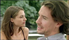
It’s hard to convey in stills how much fascination and frustration that this teasing style creates. Like the Dreamer, we’re given only glimpses of the women, and even though we don’t know his purposes—is he just an artist in search of beauty? a serial killer picking out victims?—the partial views lure us at several levels. We try to complete the faces. We try to infer the women’s state of mind from their expressions and gestures, which are far more animated than our Dreamer’s.
And a search for story plays a part here. We’re primed for some action to start, and we browse through these shots looking for anything that might initiate it. Each face the Dreamer spots promises to kick-start a plot: when the Dreamer gets a full view of one of these women, perhaps things will get going.
Without giving away every detail, I’ll just say that the sequence has a strong visual arc as the Dreamer starts paying more and more attention to certain women. And just as he finally gets a full view of one fabulous face, his attention wanders to . . . another layer, this time one inside the café.
As he gapes at the woman inside, layers pile up, creating a cubistic climax of all the optical obstructions we’ve encountered.
The motif of reflections will take over the rest of the film’s visual design, and eventually we’ll see that some of the Dreamer’s drawings evoke the piled-up and sliced-up faces in the café shots.
Later in the film, the Dreamer will explain why he’s in the city and why he’s scanning women. We’ll have a tram ride that Guerin compares with Sunrise, and a scene in a music club that not only parallels the café sequence but evokes Manet. We’ll also have occasion to compare this film with Bresson’s Four Nights of a Dreamer, a citation signaled from the outset.
All that is to come. Even if the later scenes weren’t as compelling as they are, this café sequence would make Sylvia one of the most adventurous films I’ve seen this year. By revising the simple, long-lived POV schema, Guerin has made it yield fresh feelings and implications. Like Lubitsch’s racetrack scene, this imaginative sequence provokes the jubilation you feel in the presence of calm, precise artistry.
(1) Lee Marshall, “Past Perfect,” Screen International (19 October 2007): 27. The web version is here, but it may require a subscription.
(2) I analyze the visual narration of Lady Windermere, which I think deserves to be ranked with Potemkin and Sunrise, in Narration in the Fiction Film (Madison: University of Wisconsin Press, 1985), 178-186.
(3) Edward R. Branigan, Point of View in the Cinema: A Theory of Narration and Subjectivity in Classical Film (The Hague: Mouton, 1985), 102-121.