by Kristin Thompson. Berkeley: University of California
Press, 2007.
400 pages, 6 × 9 inches, 12 color illustrations;
36 b/w illustrations.
[go
to Amazon | go to The Frodo Franchise blog]
The Matsuda Eigasha company of Tokyo deserves enormous credit for restoring and making available classic Japanese films. My first visit to the firm twenty years ago was a revelation. Matsuda Shinsui was a former benshi, or spoken-word film accompanist, and he and his sons were collecting old films so that he could accompany them in screenings. A great many of the films were chambara, or swordfight movies. Most survived only in fragments, but what tantalizing fragments they were! (1)
The company made several of the films available on VHS tape, accompanied by benshi commentary prepared by Mr. Matsuda. I came away with several of these treasures. On later visits I was able to watch some films that hadn’t been transferred to video, and several of those deserve to be more widely seen.
When Mr. Matsuda’s son kindly drove me to my train station, I noticed that his car had a VHS player and video monitor installed in the dashboard. So much for my Tokyo-ga experience.
In 1979 Matsuda Eigasha compiled a documentary on the swordplay star Bando Tomasaburo. Now Digital Meme has made it available on DVD, complete with English subtitles. Bantsuma: The Life of Tomasaburo Bando is obligatory viewing for everyone interested in Japanese cinema. Not only does it handily trace Bando’s remarkable career through stills, interviews, and surviving footage. It also supports something I’ve tried to show for some time: that the Japanese action cinema of the 1920s and 1930s was one of the most powerful and creative trends in world filmmaking.
Action and innovation
Some writers have thought that Japanese filmmakers were developing a culturally anchored approach to filmic storytelling independent of Western influences. But in Ozu and the Poetics of Cinema and two essays in my forthcoming Poetics of Cinema, I argue something different. By the early 1920s Japanese filmmakers had mastered Hollywood’s norms of visual storytelling. In the Matsuda documentary, this is evident from the clips from early Bando films like Gyakuryu (1924) and Kageboshi (1924). Long shots are broken up into closer views, and conversations are treated in reverse-angle shots of speaker and listener. Camera movements follow the characters as they walk or run.
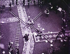
So far, so conventional. But many Japanese filmmakers revised the American approach, turning it into something more expressive and experimental. So, for example, a very steep high angle in Kirarazaka (1925) serves at first to show us that Bando is surrounded by fighters who use ladders to try to trap him. As the scene returns to this framing again and again, it becomes more abstract, with the fallen ladders becoming vectors of a geometrical shot design targeting the hero.
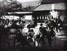
An even more remarkable example is Orochi (1925), a Bando film that survives intact and in fine shape. (Matsuda released it on VHS; I don’t think it’s on DVD yet.) The clip in the 1979 documentary shows one of Orochi‘s most dazzling passages. The hero, played by Bando, fights his way through a town, and, backed up against a wall, he’s trapped on all sides by his opponents. An extreme long-shot (below) shows us the situation, with Bando in the distant center. Many shots break this space down into opposing forces, Bando versus his adversaries, and quite fast cutting shows the men on either side of him.
The stretch that interests me most begins with a shot of Bando looking left.
The director Futagawa Buntaro then breaks the confrontation into separate shots of the other swordsmen. Nothing unusual about that. But most directors would have handled the next few shots of the standoff this way:
Shot of Bando looking left.
Shot of a combatant looking right (implicitly, back at him).
Shot of Bando looking right.
Shot of a combatant looking left (implicitly, back at him).
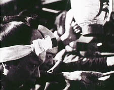
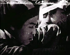
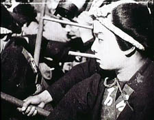
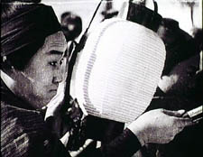
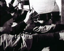
This way we’d get a clear, simple sense of the fact that he’s surrounded on all sides. Instead, Futagawa follows the shot of Bando looking left with no fewer than twelve very close shots of fighters, all looking rightward. For example:
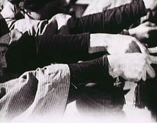
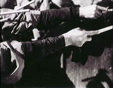
Then we get six shots of their arms outthrust, as here:
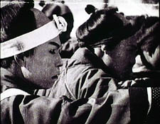
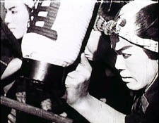
We then get a shot of several men looking straight to the camera, as if they represent the group directly in front of Bando, no longer at the left. Next there appear another ten shots of fighters looking leftward at Bando, all of them quite close to the camera. For example:
In both sets of shots, many images are composed to match each other graphically: the first group of faces tends to place each man on the left frame edge, while the second set puts most men at the far right. The first set of shots develops a pattern, moving from tight facial close-ups to shots of arms and swords thrusting toward Bando. The second set develops toward showing faces that are ever more cut off by the right frame edge.
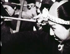
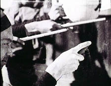
Add in the fact that all these shots are cut very quickly, ranging from four frames down to one! This is extraordinarily rare in 1925 cinema. (I talk more about how to study such passages in an earlier blog.) Words can’t really convey the way these images clatter against one another. Their percussive speed makes them graspable only as a tense thrust in one direction countered by an equally tense one opposite. Faces pile frantically up against Bando first one one side, then the other. The sense of linear force is strengthened by the shift from the cluster of face shots to that of the arms, with the transition handled in a pair of weird jump cuts along different men’s arms.
The transition from the first shot above to the second creates the impression that the man has jabbed with his spear, while the cut from the second to the third shot eases us to the forearm shots shown earlier.
This bravura passage is triggered by the initial shot of Bando, haggard and shaky. Perhaps the cascade of shots is motivated as subjective, reflecting his exhaustion in the face of entrapment. Just as likely, I’d say, is the fact that Futagawa took a stereotyped situation, the hero surrounded by his adversaries, and looked for a way to make it fresh, to use energetic stylistic innovation to amplify the story point emotionally and perceptually.
Nothing in the sequence violates continuity editing’s basic principles. The shots keep screen direction constant and character position clear. Indeed, the director has understood spatial continuity very deeply: the men to the left of Bando are pushed far to the left side of the frame, the men to the right are squeezed rightward, so that Bando is always implicitly filling the area they’re recoiling from. But what American director would have risked such a bold piece of cutting?
Orochi, let’s remember, was released the same year as Strike and Potemkin. If this passage had been known to the earliest generation of film historians, Japan might well have been greeted as another birthplace of daringly dynamic montage. (2)
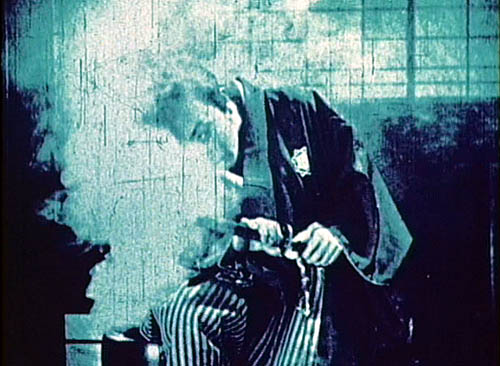
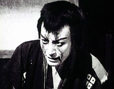
There are several other intriguing flourishes in the footage on display in Bantsuma, particularly a scene of Bando dying in a swirl of steam (this entry’s top image). But two points should be clear: this is innovative filmmaking of a high order, and it took place in a shamelessly commercial film industry. Mainstream filmmaking in Japan has been open to stylistic experiment to a degree rare in other popular cinemas. You can trace a line from the 1920s to the present, from the chambara directors through Ozu and Mizoguchi and Kinoshita and Suzuki Seijin right up to Kitano and Miike. Along a parallel path, Hong Kong action cinema pressed filmmakers toward creative renovation of film technique. (3) In this tradition, the action films of Bantsuma and his peers hold an honored place.
The lessons are familiar ones from this blog. Mass-market cinema harbors experimental impulses; creative directors working in well-known genres are often striving to push the limits. By attending to technique, we can discover a dazzling variety in areas of film history not usually considered “artistic.”
PS: Through Digital Meme, Matsuda has also made available a treasury of 55 animated films from the earliest years. The are at work on a DVD of early Mizoguchi films, including a fragment I’m keen to see from Tojin Okichi (Okichi, Mistress of a Foreigner, 1930).
(1) A large set of them has been available for some years on a DVD-ROM, also available from Digital Meme. For useful reviews, go to Midnight Eye and hors champ.
(2) ) I offer several other examples in the essays “Japanese Film Style, 1925-1945” and “A Cinema of Flourishes” in the forthcoming Poetics of Cinema.
(3) I make this argument in Planet Hong Kong and the essays “Aesthetics in Action” and “Richness through Imperfection” in Poetics of Cinema.
An Onion report brought to my attention by Stew Fyfe celebrates the comparative method (“Professor Sees Parallels between Things, Other Things”). I confess myself an admirer of this approach. We can learn a lot by setting two things alongside one another. It’s even better if we have a reason to do so.
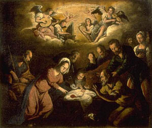
I thought about this when Kristin and I visited the Auckland Art Gallery in May. Their modern wing was hosting an intriguing Triennial show called Turbulence, an array of contemporary work, but I was more drawn to the Museum’s traditional collection. I saw a very nice Brueghel (he’s one of my favorites) and an arresting Adoration of the infant Jesus, painted by the rather minor Francisco Antolinez y Sarabia (1644-1700).
Though indifferently painted, it reminds me of El Greco in its tipped, piled-up figures. I enjoyed the acrobatic Madonna: Is she crouching, leaping, or tripping? It recalls Eisenstein’s point that much classic art creates impossible contortions which suggest various stages of movement, a point I discussed in a blog last year.
To get to those parallels: We wandered through the Gallery’s sturdy collection of British art and I was once again captivated by narrative painting of the late nineteenth century. Paintings have long been assigned the task of telling stories, but usually those stories were already well-known to the viewers, drawn as they were from history or mythology. In what’s come to be called “narrative painting,” the stories seem to be taken from life, although they’re really invoking our knowledge of prototypical situations.
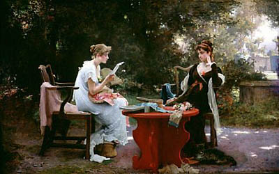
Without the advantage of easily recognized religious or mythological tales, such pictures usually rely on a title to coax us fill in the story. The title specifies the context for the concrete action we see. For example, two prosperous young women are sitting in a garden. One is reading from a sheet of paper. What’s going on?
The title, Her First Love Letter, helps us zero in on specific aspects of the action and fill in the situation. The girl on the left, bathed in light, leaning forward eagerly and wearing the pale frilly dress, can be seen as the more inexperienced of the pair, caught up in the anticipation of the young man’s ardor. The more worldly woman sits relaxed, perhaps a little skeptical but also tolerant of the ways of young love. You can’t see it in reproduction, but the flower in the darker woman’s bosom is a mere spatter of paint, the brightest bit of red in the picture. The painting is by Marcus Stone and dates from 1889.
Narrative paintings like this are evidently one source of early cinema’s approach to staging and composition. This “full shot” somewhat recalls the sort of thing we see throughout European filmmaking of the first twenty years. Staging the action on more or less the same plane, viewing from a distance characters grouped around a table, is very common at the time.
Another picture can teach us a bit about acting.
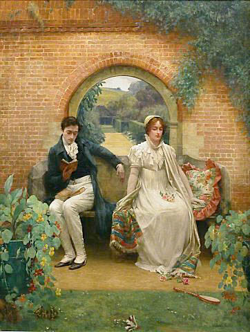
Here the body language and facial expressions yield hints. The man sits casually, the woman more rigid, and his arm is not quite brushing hers. Absorbed in his book, he seems unaware she’s there. She sits stiffly, with downcast eyes and an expression that seems stoic. You can even take her slight unfolding of the colorful shawl as an invitation to the touch that he doesn’t offer.
This painting, by Walter Sadler, is called Married (undated but presumably turn of the century). Once the title tells us that the couple are husband and wife, we can infer that their passion has subsided, largely through the husband’s self-absorbed inattention. Did he really need to take three books into the garden? The single-word title also lets us see certain elements as iconographic clues. The woman’s white dress and bouquet recall the wedding, and the fallen badminton birdie and racket suggest an earlier time when they played together. Kristin sees sexual symbolism in the flowers in her lap and the books in his. The gallery’s caption suggests that the turtle is going off to hibernate and that the blocked-off back garden suggests no future for the relationship.
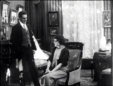
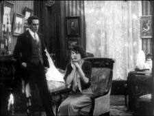
Putting aside the symbolic connotations, though, the strong cues supplied by the figures’ postures and expressions point us toward the sort of slight changes in body language provided by acting in early cinema. Some viewers think that early film acting was expansive and overblown, but that’s not always the case. Here is an instance from Evgenii Bauer’s Twilight of a Woman’s Soul (1913), in which Vera starts to confess an indiscretion to her admirer Prince Bol’skii. She raises her hands , an obvious indication of her anxiety, but more subtle is what’s going on below. At first her legs are turned toward him, but as she lifts her hands they shift a bit further away from him. Her small adjustment of her torso is a kind of accompaniment of the hand gesture, like a harmonic change accompanying a melody.
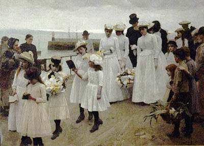
Both Her First Love Letter and Married lay their figures out along a line perpendicular to the viewer, a common strategy in early film. I discuss this in Figures Traced in Light; for other examples, see figs. 2A.7-11 here. The alternative is to arrange figures in depth, and one of the jewels of the Auckland collection illustrates this nicely. The title is more allusive than our others: For of Such Is the Kingdom of Heaven (1891), a reference to Jesus’s admonition to let children come to him (Matthew 19:14). The painter is Frank Bramley.
We are watching the funeral of a child, with the family carrying the almost weightless casket, swathed in flowers. In the picture’s suggestion of solemn movement, we might be tempted to say, we find early cinema before cinema. More to my point, though, is the way in which a diagonal layout creates a play between strong composition and rich ancillary effects.
The picture is composed along two lines, with the adult mourners grouped at the point where the procession intersects with the horizon. That horizon is given a widening sliver of light, a rolling wave that accentuates the heads of the two women right of center. The central bright patch of grays, whites and pastels is set off against the earth tones of the docks and the robust but respectful working-class onlookers. At the peak of the picture, the crowning moment of the angle formed by horizon and pier, is the bowed black head of the father.
The depth composition also guides our visual search, allowing us to discover a great variety of postures and facial views. The little girls in the center stride and sing from their hymnals dutifully, while the girl in the straw boater, bearing a huge bouquet, is staring at us—a disturbing effect, since her face is unhealthily gray. Will she be another victim?
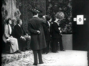
In the years after 1908 or so, many filmmakers adopted the diagonal layout as a dynamic way to play out scenes. Here’s an instance from Bauer’s Twilight of a Woman’s Soul. Vera is calling on a men’s club where they practice fencing and pistol shooting. They put on a show for her.
The diagonal draws our attention to the target, but Vera’s contrasting bright costume and her tilted face are further accented by putting her at the opposite end of the vector. All these factors make sure we note that her eye is on the handsome marksman, Prince Bol’skii. Receding compositions like this offered 1910s filmmakers a way to guide visual search in ways similar to Bramley’s painting.
Even more intriguing to me in For of Such Is the Kingdom of Heaven is the figure who’s evidently the dead child’s mother. She is bowed and tucked away to the right of the husband and behind two pallbearers. Bramley has taken advantage of the diagonal view to mask her off, as if viewing her grief would be too great for us to bear. This device has a parallel in cinema too.
A film scene unfolds in time, unlike a painting’s action. So filmmakers can block certain parts of the action and then, at the proper moment, reveal it. If Bramley were working in film, he could arrange his cortege so that the mother’s face came gradually into view as the group advanced, creating both a dramatic and pictorial climax. This blocking-and-revealing tactic is common in the choreographed staging we find in 1910s films, and again Bauer’s Twilight of a Woman’s Soul offers a nice illustration.
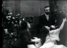
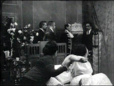
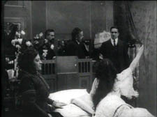
Vera, now ill, is visited by her suitor Prince Dol’skii. Her parents object, but she begs her father to let him in, and he reluctantly agrees. As the action starts, she clutches her father as the doctor looks on. The men’s bodies mask a doorway in the background, and as a servant comes through it, they pivot, revealing him.
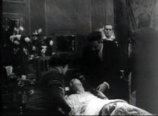
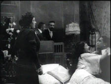
I’d argue that the servant’s entrance primes this area of the shot for the dramatically important entrance, that of Dol’skii. The father, the doctor, and the servant withdraw toward the back wall. After a pause, the Prince enters and advances.
Vera greets him warmly as he takes the father’s place in the shot.
I’m not arguing that these particular paintings influenced filmmakers, only that the principles that the painters employed were picked up by directors. The more general point is that in understanding film aesthetics, we can usefully compare movies to other movies, and movies to other arts. By doing this, we sharpen our sense of what various media can do. The professor in the Onion story wisely notes, “It’s not just similarities that are important, though—the differences between things are also worth exploring at length.”
All paintings shown here are in the permanent collection of the Auckland Art Gallery. Bauer’s film is available on a Milestone DVD. I hope to blog more about his work later this summer.
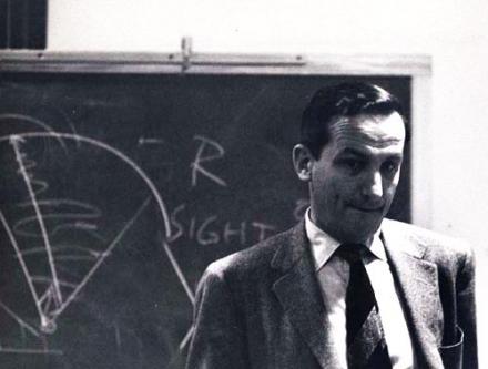
On Monday, at age 102, Rudolf Arnheim died. You can read his obituary here, and this is a lovely website devoted to his work. He was one of the most important theorists of the visual arts of the last century, and he had enormous impact on how people, including Kristin and me, think about film.
A good Gestalt
In parallel with E. H. Gombrich, who died in 2001, Arnheim brought modern psychological concepts into the study of visual art. His most famous work, Art and Visual Perception (1954, new version 1974) has the sort of magisterial presence that very few books in any era achieve. Arnheim delighted in the fact when, visiting a painter’s studio, he would find a spattered copy on the workbench. Of the revised edition, entirely rewritten, he noted:
All in all, I can only hope that the blue book with Arp’s black eye on the cover will continue to lie dog-eared, annotated, and stained with pigment and plaster on the tables and desks of those actively concerned with the theory and practice of the arts, and that even in its tidier garb it will continue to be admitted to the kind of shoptalk the visual arts need in order to do their silent work (new ed., x).
He aimed at theory that actively participates in the way artists do their job. The chapter titles of Art and Visual Perception deal with the nuts and bolts of picture-making: Balance, Shape, Form, Growth, Space, Light, Color, Movement, Dynamics, and Expression. No puns, slashes, dashes, or parentheses. What academic theorist today would so boldly announce their concern with the craft of creating images?
The book is subtitled, A Psychology of the Creative Eye, and the chapters’ subsection titles explain why. The hidden structure of a square . . . Vision as active exploration . . . Perceptual concepts . . . What good does overlapping do? . . . Why do children draw that way? . . . Gradients create depth . . . Visible motor forces . . . The priority of expression. Arnheim’s principal achievement in art theory was to integrate the Gestalt theory of perception with the traditional concerns of picture-making. He sought to show how perceptual laws discovered in the psychological laboratories of Berlin were intuitively applied by classic and modern artists.
As he put it, he was at the university at around age twenty:
My teachers Max Wertheimer and Wolfgang Köhler were laying the theoretical and practical foundations of gestalt theory at the Psychological Institute of the University of Berlin, and I found myself fastening on to what may be called a Kantian turn of the new doctrine, according to which even the most elementary processes of vision do not produce mechanical recordings of the outer world but organize the sensory raw material according to principles of simplicity, regularity, and balance, which govern the receptor mechanism.
This discovery of the gestalt school fitted the notion that the work of art, too, is not simply an imitation or selective duplication of reality but a translation of observed characteristics into the forms of a given medium (Film as Art, 3).
The Gestalters thought that these principles–figure/ground, completeness, good continuation, and the like–were fundamental to all human perception, across times and cultures. Art and Visual Perception makes a powerful case for this view. Today this position is so unfashionable that Arnheim’s calm confidence in it is quite stunning. For many scholars today, all that matters is what divides and differentiates us. But for eighty-plus years Arnheim emphasized ways in which we share a common experience of the world and of art.
It’s often said that Arnheim favored modernist styles, like Cubism and expressionism, and that his emphasis on art as going beyond mere copying reflects modern artists’ will to distorted form. But he saw a deep continuity between classic art and modern art. Both traditions explored the perceptual force of form. Amazingly, he argues that the cockeyed creche in Fig. a conveys a stronger sense of three-dimensionality than the correct perspective presented in b. The “inverted” perspective encloses baby Jesus’ head fully, just a hollow cradle would.
Arnheim saw the same form-giving activity at work in “primitive” art, the art of children, and even the art of the mentally ill. It turns out that the “universalism” of Gestalt theory underwrites diversity no less vigorously than the most ardent postmodernism.
Flexible striving
Arnheim made another contribution to our thinking about art, one that I think is rarely recognized. In a bold stroke, he extended the Gestalt conception of form beyond its concern with geometrical qualities and argued that form was inherently expressive. A triangle resting on its base wasn’t just balanced; it was weighty. We see the weeping willow as not just curved but sad; a skyscraper isn’t just tall, it’s aggressively thrusting upward. Every shape or movement we apprehend has a distinctive flavor and feeling. Indeed, he writes, “expression can be described as the primary content of vision”!
We have been trained to think of perception as the recording of shapes, distances, hues, motions. The awareness of these measurable characteristics is really a fairly late accomplishment of the human mind. Even in the Western man of the twentieth century it presupposes special conditions. It is the attitude of the scientist and the engineer or of the salesman who estimates the size of a customer’s waist, the shade of a lipstick, the weight of a suitcase. But if I sit in front of a fireplace and watch the flames, I do not normally register certain shades of red, various degrees of brightness, geometrically defined shapes moving at such and such a speed. I see the graceful play of aggressive tongues, flexible striving, lively color. The face of a person is more readily perceived and remembered as being alert, tense, concentrated rather than being triangularly shaped, having slanted eyebrows, straight lips, and so on (Art and Visual Perception, first ed., 430).
Arnheim found feeling in his forms.
Moving pictures
Arnheim wrote about many artforms, including mass media in his 1936 monograph on radio. His book on cinema, Film als Kunst (1932), was quickly translated into English as Film (1933). Always in search of greater clarity and point, Arnheim rewrote it in 1957. Oddly, he didn’t update it: You’ll search in vain for examples from the 1930s, 1940s, or 1950s. The touchstones remain Chaplin, Keaton, von Sternberg, and the Soviets. Arnheim held that cinema was essentially a pictorial art (see my earlier blog on this question) and that synchronized sound added very little; in fact, it might even inhibit visual experimentation. It was so easy to convey a story point with dialogue that lazy filmmakers would simply create photographed stage plays.
As a result, Arnheim is usually taken to be the summation of a certain strain of 1920s film theory. Like many earlier thinkers, Arnheim emphasized how film technique reshapes what is filmed. Close-ups, shot design, camera angles, and cutting make cinema no simple medium of reproduction. Film form transforms the world that is photographed. This position, commonplace today, was a real advance in the silent era and gave cinema artistic respectability, a subject that Arnheim reflected on thoughtfully in the 1933 edition of Film.
Again, Arnheim did more than synthesize current ideas. Theorists’ hunches that film stylized reality could now be grounded in Gestalt ideas about medium and form. In effect, Arnheim rewrote Film in the light of Art and Visual Perception, and the result was Film as Art. Here is the most famous passage:
Not until film began to become an art was the interest moved from mere subject matter to aspects of form. What had hitherto been merely the urge to record certain actual events, now became the aim to represent objects by special means exclusive to film. These means obtrude themselves, show themselves able to do more than simple reproduce the required object; they sharpen it, impose a style upon it, point out special features, make it vivid and decorative. Art begins where mechanical reproduction leaves off, where the conditions of reproduction serve in some way to mold the object (Film as Art, 57).
This, you might say, is Arnheim’s reply to Walter Benjamin’s theory of cinema as mechanical reproduction: no less than other artists, filmmakers use their medium, a photographic one, to create perceptually vivid effects akin to those in other arts.
Still, Arnheim held that film, like photography, has more limits than other arts. Tied to recording, film and photography can never achieve the range of expressive form we find in painting. I don’t believe this for a moment, but Arnheim clung to this opinion, I suspect, because of his deep love for creative freedom he found in other visual arts. And I sometimes think that for him, a painting harbored enough pushes, pulls, twists and torques. Movies just made explicit what was tactfully implied in still images.
Envoi
Kristin and I first saw Arnheim when we were graduate students at the University of Iowa, March 1972. He gave a lecture that stuck to his principles of 1933:
*Every art medium has a ceiling, beyond which it cannot effectively pass. The ceiling is somewhat low for the reproductive arts. Photography is more limited in what it can do than painting, and so is film.
*Films should be in black and white, the better to stylize reality. Are there no worthwhile color films? Pause. RedDesert, perhaps.
*Do you see many contemporary films? No.
Around 1980, I lined him up for a visiting lecture at UW. But he had to cancel; he had slipped on ice and broken his hip. He was then about seventy-five.
Later in the 1980s I visited Ann Arbor and had lunch with him. It was wonderful. By then I had read enough to ask him about Gombrich–an old friend and courtly opponent of his. (Read one of his reviews of Gombrich’s books to see what genuinely respectful disagreement looks like.) He saw pretty quickly that I was a Gombrichian and he gave a shrewd analysis of the dividing line: Gestalt psychology vs. ‘New Look’ cognitivism, illusions vs. expressive percepts, brain fields vs. schemas. He asked me to send me copies of my publications, which I did on and off during the decade. I never heard what he thought about my favorite fancy-pants sentence in Narration in the Fiction Film, when I contrasted J. J. Gibson’s theory of optical realism with Arnheim’s idea of expressiveness: “Gibson likes likeness, Arnheim loves liveliness.”
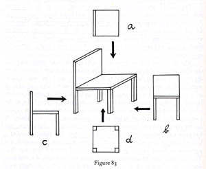
I thought of him often as I read more perceptual psychology. Gestalt work had once seemed to me a dead-end, but with David Marr’s theory of visual perception, a prototype of computational perceptual psychology, Gestaltism came roaring back. The “3D model representation” that Marr claimed operated in early vision uncannily echoes Arnheim’s discussion of our perception’s reliance on “characteristic aspects.” (Arnheim illustrates the idea with the various views of the chair, above. Which one is instantly recognizable as a chair?) And with contemporary interest in the relation between emotion and cognition, Arnheim’s theory of the expressive side of perception is creeping back too. Nothing worthwhile is forgotten, nothing goes away.
When we ran a book series at the University of Wisconsin Press, we were eager to publish an anthology of Arnheim’s film criticism, a collection originally published in German in 1977. Brenda Benthien, a close friend of Arnheim and his wife Mary, executed a lively translation and Arnheim supplied a touching introduction. A refugee of the Hitler years, an émigré across Europe and America, Arnheim summoned up the failure of the Weimar republic:
Even now I keep as a sort of talisman a bullet which in the days of the 1918 revolution, when I was fourteen, flew over the neighboring houses, bored a little hole through the windowpane, and fell inert on the carpet before my bed. Thus it began (Film Essays and Criticism, 3).
In the same introduction, Arnheim deplores the current state of cinema (“my basic objection to the talking film as a mongrel seems to me just as valid today as then”) and he warns against the cheapening of our vision:
Without the flourishing of visual expression no culture can function productively (5).
Aspiring film critics, and especially bloggers, should go back and read Arnheim on Keaton, Eisenstein, Gance, Pudovkin, Chaplin, von Sternberg, and other greats, as well as the essays “Style and monotony in film,” “Epic and dramatic film,” and especially “The Film Critic of Tomorrow.”
Scarcely a month goes by when I don’t have some idea that can be traced, however circuitously, to my reading of Arnheim. For instance, my blog on funny framings, posted a couple months ago, starts with his discussion of Chaplin’s The Immigrant. Arnheim’s theory of expression goes a long way toward explaining how composition can trigger laughter. I doubt that I’d be so alert to the possibilities of two-dimensional design in film shots if I hadn’t been tutored by Film as Art, Art and Visual Perception, The Power of the Center (1982, rev. 1988), his 1962 monograph on Picasso’s creative process in painting Guernica, and the essays in Toward a Psychology of Art (1966)–one of which is a skeptical review of Gombrich’s Art and Illusion. In preparing this entry, I found that my pleas that we probe the norms that guide filmmakers’ craft practices is just a clumsier restatement of this, which I discovered marked in Art and Visual Perception, the New Version:
Good art theory must smell of the studio, although its language should differ from the household talk of painters and sculptors (4).
Three years ago, after the Society for Cognitive Studies of the Moving Image convention in Grand Rapids, several of us from Madison–Ben Singer, Jen Chung, and Jonathan Frome–detoured back by way of Ann Arbor in order to call on Arnheim. He had just turned 100. He resided in an assisted-living facility, and his room was bright and clean, packed with books, remarkable drawings and paintings (Feininger, Köllwitz), a microfilm reader, and a worktable with a gigantic magnifying lens on an articulated arm. Conversation was difficult for him, but he seemed to understand everything we were saying. His smile was quick and his eyes were bright. When I showed him the first German edition of Film als Kunst I’d brought along, he turned it over in his hands as if he hadn’t seen one in years. He signed it, then shook his head apologetically at the shaky writing.
Now that Benjamin and Kracauer have become the prototypical Weimar intellectuals, it’s a pity that so many media students and professors are unaware of the importance of Arnheim’s work. His Leonardo-like interest in merging art and science is discouraged in a climate that posits the cultural construction of everything. He also writes with a grace and clarity that’s all too rare. In an unfashionable way, he exemplifies the passion, rigor, and dignity that interwar German intellectuals brought to the study of the arts. A lot of what he believed remains–what’s the word I want? Oh, yes–true.
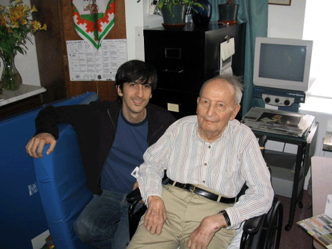
Rudolf Arnheim, with Jonathan Frome, July 2004.
Line illustrations come from Art and Visual Perception.
On May 29 we posted an entry responding to the inevitable badmouthing of sequels that journalistic movie critics tend to indulge in when the summer season starts. “Live with it! There’ll always be movie sequels. Good thing, too.” gathered comments from current and present “filmies” of the University of Wisconsin-Madison. They defended sequels for a wide variety of reasons.
Now another ex-Madisonian, Henry Jenkins, has weighed in with “The Pleasures of Pirates and What It Tells Us about World Building in Branded Entertainment.” Despite its somewhat formidable title, this essay jumps into the fray, taking critics to task for their knee-jerk tendency to lump virtually all sequels together into a category fraught with prior expectations and to dismiss the latest entries as mindless, inept films.
Henry takes Pirates of the Caribbean: At World’s End as his point of defense. Somehow critics seem by telepathy to agree to take the same stance on a particular blockbuster. Here they claimed that AWE is far too complicated and gets bogged down in exposition at the expense of action. (So much for claims that blockbusters are all CGI pyrotechnics and no plot!) They also kvetched that there is too little of Jack Sparrow’s character, apparently their main focus of interest in the film.
Henry takes AWE to be, alongside The Matrix, an example of elaborate world-building, a trait of the best of the big film series. In the age of DVDs and cross-media franchises, such films, he argues, are meant to be watched more than once. They also place a lot of faith in the viewer to be able to follow a complicated plot. Henry, like Steve Johnson in his Everything Bad Is Good for You, credits modern media as challenging viewers/readers with dense works that require a lot of figuring out.
Critics assume the opposite, that summer movies are supposed to be mindless entertainment, and they treat them as such. Complexity, which they would hail in an art-house release, becomes a fundamental flaw. Henry has some cogent remarks on the circumstances of reviewers’ screenings and how they handicap the writers’ approach to pop summer movies.
Whether or not one admires AWE, Henry mounts a strong defense of the film and in the process shows how much most reviewers are out of touch with audiences’ tastes and miss the various ways in which summer blockbusters work.
In other news, David’s The Way Hollywood Tells It has just been slated for translation into simplified-form Chinese. He’s now preparing a blog entry paying tribute to the great art theorist Rudolf Arnheim, who died on Monday at the age of 104. The family’s obituary is here.
The Cinema Ritrovato, which we’ll be attending in July, has posted a provisional schedule here. David will go on from Bologna to Brussels for research and the annual Cinedecouvertes and L’age d’or festival; films and other info available here.








 In 1979 Matsuda Eigasha compiled a documentary on the swordplay star Bando Tomasaburo. Now Digital Meme has made it available on DVD, complete with English subtitles. Bantsuma: The Life of Tomasaburo Bando is obligatory viewing for everyone interested in Japanese cinema. Not only does it handily trace Bando’s remarkable career through stills, interviews, and surviving footage. It also supports something I’ve tried to show for some time: that the Japanese action cinema of the 1920s and 1930s was one of the most powerful and creative trends in world filmmaking.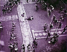
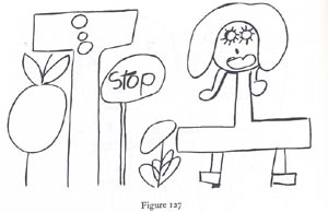
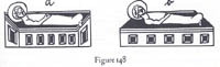 It’s often said that Arnheim favored modernist styles, like Cubism and expressionism, and that his emphasis on art as going beyond mere copying reflects modern artists’ will to distorted form. But he saw a deep continuity between classic art and modern art. Both traditions explored the perceptual force of form. Amazingly, he argues that the cockeyed creche in Fig. a conveys a stronger sense of three-dimensionality than the correct perspective presented in b. The “inverted” perspective encloses baby Jesus’ head fully, just a hollow cradle would.