


THE LIGHTHOUSE: A period film with period style
Tuesday | November 12, 2019 open printable version
Kristin here:
David and I first saw Robert Eggers’ The Lighthouse at the Vancouver International Film Festival, and he wrote briefly about it at the time. About halfway through the screening or less, I realized that what I was watching was a modern combination of two important historical trends of 1920s German cinema: Expressionism and the Kammerspiel.
I am partial to German silent cinema, particularly Expressionist films, for their daring stylization. The movement gave rise to some great films by two masters, F. W. Murnau and Fritz Lang. I’m even fond of the leisurely pacing that characterizes so many Expressionist and Kammerspiel films. At times some scenes resemble the slow cinema of recent decades.
Kammerspiel was a larger trend in the theater of the day, and it has its equivalent in English and American drama, the chamber play. Most of the Kammerspiel films in Germany were written by the great scenarist Carl Mayer, also responsible for many of the Expressionist classics from Das Cabinet des Dr. Caligari on. Kammerspiel films include most notably Hintertreppe (Backstairs, Leopold Jessner, 1921), Sylvester (1923) and Scherben (1923). Some would consider Murnau’s The Last Laugh (1924) to be a Kammerspiel. Carl Dreyer also made one in Germany, Michael (1924, with a scenario by Thea von Harbou) and one in Denmark, The Master of the House (1925). Such films typically involve a small cast of characters who come into conflict in various ways, invariably ending badly, typically with death, suicide, murder, and/or imprisonment. The Lighthouse clearly qualifies.
The Lighthouse is also a horror film, or at least a lot of critics think so. Thus it fits cozily into the Expressionist movement, of which several Expressionist films are now considered early classics of the horror genre: Caligari, Nosferatu, Der Golem, Warning Shadows, Die müde Tod and other less well-known films.
Critics did not fail to notice The Lighthouse‘s links to silent cinema, and in particular Expressionism. Richard Newby’s review in The Hollywood Reporter remarks on: “The filmmaker’s decision to shoot the film in black-and-white and in the aspect ratio of 1.19:1, giving The Lighthouse the appearance of a silent film born of German Expressionism.” He also calls it, “Equal parts Lovecraftian horror story and existential chamber piece in the vein of Jean-Paul Sartre’s No Exit.”
Screen Daily reviewer Lee Marshall caught both the Expressionist and Kammerspiel aspects:
Shot in an expressionist black and white that harks back to cinema’s earliest years, The Lighthouse provides a marvellous chamber-drama platform for two actors, Robert Pattinson and Willem Dafoe, who seize the opportunity with gusto.
[…]
Referencing everything from German expressionist cinema of the 1920s to US silent comedy, the photography of Edward Weston and the from-the-ground-up perspective in the paintings of Andrew Wyeth, Jarin Blaschke’s photography is starkly compelling.
Manohla Dargis’ review in The New York Times explicitly notes German Expressionist cinema:
With control and precision, expressionist lighting and an old-fashioned square film frame that adds to the claustrophobia, Eggers seamlessly blurs the lines between physical space and head space.
The film’s more sustained pleasures, though, are its form and style, its presumptive influences (von Stroheim’s “Greed,” German Expressionism), the frowning curve of Winslow’s mustache, the whites of eyes rolled back in terror.
One might add that the dreams and hallucinations, shown from Winslow’s viewpoint, reflect the innovations of French Impressionist cinema of the 1920s. This sort of stylistic subjectivity, however, was highly influential and has been widely used ever since. It was quickly picked up in German cinema of the 1920s, and some of the classics of the day, especially The Last Laugh (1924) and Variety (1925), are more noted for their subjective camerawork than are the earlier French films that originated the practice. Overall, The Lighthouse has the flavor of a German film from the 1920s.
Lots of filmmakers have attempted to imitate silent cinema, and often they succeed to a degree. They shoot in black-and-white (but don’t add tinting and toning), put just music and maybe some sound effects on the track, and have some exaggerated acting. Perhaps they set the story in the past, as Michel Hazanavicius does with The Artist (2011). A more careful attempt is Blancanieves (2013).
No matter how careful the combination of such elements is, the result usually doesn’t really look like an old film. The Lighthouse really does look like a silent film, in the sense that it looks as if it were shot using the film stock available in that era. It does not, however, pretend to be a silent film, as The Artist does. The Lighthouse doesn’t eliminate the dialogue. Its narrative and tone bear distinct resemblances to those of German and French films of the 1920s, but its story is presented with more overt sexual content and extreme violence than mainstream silent movies would have included.
It helps that Eggers is clearly a cinephile and has watched a wide variety of films from many periods. Cinematographer Jarin Blaschke has also worked as a still photographer and also knows a great deal about older film stocks and lenses. They both knew a lot about films of all periods.
When asked in an interview for American Cinematographer what were the team’s “references” (films shown to crew members as models), Blaschke responded:
A bit of Béla Tarr for tonal dreariness and patient use of camera. Bergman’s camera language, as always. [Eggers’ liked the strong night lighting of In Cold Blood. There were some nautical silent films, including Flaherty’s Man of Aran, [which was shot] on orthochromatic stock with strong, direct close-ups. [The influence of] Eisenstein was there for montage, and bold, hard cuts. Optically, the films we watched from the ‘20s and ‘30s were very appealing in their subtle fringe distortions and the way highlights would shimmer. [p. 63]
In the end, the most influential references were M—an inspirational and modern film in terms of visual language—and Bresson’s Pickpocket, which influenced [our] use of close-ups, especially actions with hands. These helped steer The Lighthouse away from the purist confines of the turn of the century, and more toward early modernism.” [pp. 63-64]
M seems rather an odd choice, but Blaschke describes its inspiration in an interview for Kodak:
Watching that, I found a very modern film with surprising camera movement but more importantly: a modern, creative mastery in how visual information was withheld from the audience, how information was rewarded, and when,” says Blaschke. “With this new inspiration, I felt there was a highly-effective framework for me to express myself visually. Stepping away from a mere 19th-century emulation, we were on to something more surprising and layered.
In a DGA podcast interview, Eggers discusses the nearly-square aspect ratio:
And then, the boxy aspect ratio, we were shooting in 1:19.1, early-sound aspect ratio. There’s a Pabst film, Kamaradschaft, that takes place in a mine, which is probably the only other film that makes sense to use this aspect ratio, because Pabst is shooting vertical objects, like the smokestacks, and we have our lighthouse tower, and then the cramped mineshafts, and then the cramped interiors of this thing. Because we’re using spherical lenses, it’s actually taller, so it’s a great aspect ratio for these close-ups. You don’t need flab on the side. You just have Robert Pattison’s cheekbones, Willem Dafoe’s cheekbones in all their glory on these old lenses.
Who knows what other films are these two are familiar with? But one can assume that they watched some of the classic German films of the 1920s, both Expressionist and Kammerspiel.
The Lighthouse and German Silents
Early German Expressionist films often used jagged, abstract sets, more like paintings than like actual buildings or landscapes. Caligari is the most familiar instance, but here are a couple of examples from Von Morgens bis Mitternachts (1921, Karlheinz Martin).
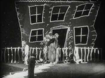
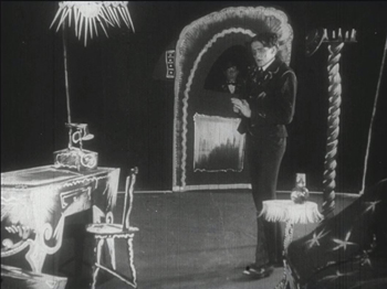
The second image demonstrates particularly well how light was often represented by streaks of paint. The overhead hanging lamp at the upper left is a fringe of spikes, and the flames on the huge candlestick at the left are five wisps of paint. Highlights from these “lights” are painted on the desk and chair at the lower left.
Hollywood films have seldom used distorted sets of this kind. They appear occasionally, as in Son of Frankenstein (1939, Rowland V. Lee) and Beetlejuice (1988, Tim Burton). Most of the time, though, when people speak of expressionist style in films noir or horror films, they’re talking about graphic effects created by lighting. That lighting is not created by streaks of paint but by fancy lighting effects. That’s mostly the case in The Lighthouse. The lighthouse tower and the service buildings around it were designed to be authentic copies of features in real historical lighthouses. The distorted stylization comes from lighting effects, from simple underlighting to patterns created by patterned holes in the lighthouse interior.
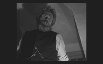
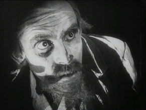
The same is true of acting. In German Expressionist films, actors’ faces were often painted, especially with dark patches around the eyes and pasty white skin. Compare this close-up of Ernst Deutsch’s face, as the Cashier in Von Morgens bis Mitternachts, with that of Robert Pattinson, where the distortions are created by light and shadow.
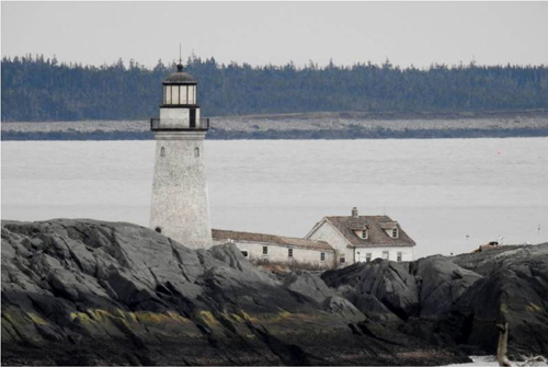
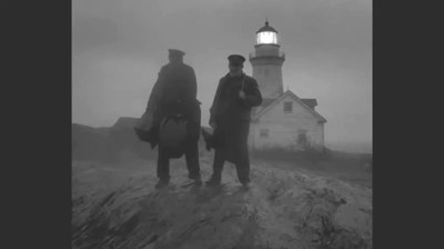
Most of the classic German Expressionist and Kammerspiel films were studio-created. Sets were built either in studios or on extensive backlots. In contrast, Eggers wanted to use an authentic lighthouse. Scouting failed to turn up one with adequate access roads, so the lighthouse and service buildings were built, with faithful adherence to period locales, near the tip of the Cape Forchu Lighthouse peninsula (down the road from a modern lighthouse).
This location is far from from isolated, but the film manages to create a sense of loneliness and dread nonetheless. The huge crashing waves and storms were not generated digitally but were practical effects. According to the Kodak story, “Most of the water work was shot in a large, emergency-responder’s training pool, capable of generating waves in varying sizes and patterns, located near Halifax.” The film contains a few digital effects, mainly to turn the peninsula into an island.
Eggers seems to share the sensibility of the German silent directors: “In a perfect world, I would have liked to have built every single building, for control, control, control, control, control.” (From the DGA interview)
As to Kammerspiel films, The Lighthouse reminds me most of Scherben, which deals with a man who works as a linesman for a railroad. He, his wife, and their daughter live in isolation in some woods and live a stultifyingly dull existence. The intrusion of a railroad inspector who seduces the daughter leads to drama as the linesman gradually becomes enraged and kills him. The style of the film is quite different from that of The Lighthouse, but the dynamics of conflict and gradual deterioration of the central character are somewhat similar–if more restrained in his slow burn and stolid demeanor.
Scherben only became generally available earlier this year, when I wrote about its Filmmuseum Edition DVD release. I have no idea whether Eggers ever saw it at an archive screening or in somewhere else. He more likely saw Hintertreppe, which has long been the only one of the classic Kammerspiele commonly accessible.
Bringing back orthochromatic, sort of
In the DGA interview, Eggers discusses the choice of film stocks:
We thought orthochromatic film stock would really be the way to go, which, among other things, the main thing about orthochromatic film stock is that it’s not sensitive to red, so red is rendered black. So the rosy skin tones on a Caucasian renders darker. So Eisenstein, that’s why all those Russian faces look so tan, and in Hollywood they’re wearing white pancake makeup to compensate for the orthochromatic stock [….] So we liked Double-X negative. The blacks bottom out suddenly in a way that’s very satisfying, as we remember it from watching old movies.
Apparently Eggers and Blaschke investigated having orthochromatic 35mm stock custom-manufactured for them, but the expense was too great. A cheaper way had to be found.
In the American Cinematographer interview, Blaschke describes testing Kodak’s Double-X 5222 35mm film, color 35mm negative film, and digital capture with an Arri Alexa: “In addition to much larger grain, the Double-X has more ‘tooth.’ Even if you match the overall contrast in the DI [digital intermediate], the Double-X had more ‘local’ or ‘micro’ contrast, which emphasizes texture and better differentiates similar tones” [p. 61]. (Double-X 5222 was introduced in 1959 and has been used on such films as Raging Bull [1980] and Schindler’s List [1993].)
Despite these advantages, however, Double-X is a panchromatic stock, with sensitivity to the entire visible spectrum. To solve this “problem,” Blaschke ordered a custom-made filter that would eliminate the red-to-mid-yellow end of the spectrum, thus simulating orthochromatic film effectively [AC, pp. 66-7].
The choice of lenses was also done with an eye to maintaining the artificial orthochromatic look. Blaschke tested many vintage lenses and settled on Baltars, designed in 1930s. The two used in the film were made in 1941 and 1944. In the Kodak interview, he says, “The vintage Baltars were the most shimmery of the bunch I tested, and really were the most stunning portrait lenses I have ever seen,” he says. “The highlights really glowed, but stopped just short of heavy-handedness. Optics like these could add a layer of complexity on top of our hard, orthochromatic look to pull people into the world of the film.” A rehoused 1905 50mm lens was used for some flashback images, and some replicas of 1840 Petzval lens designs were used in flashbacks and “heightened moments”[AC, p. 64]. Blaschke describes the effect in an interview on the Motion Picture Association website: “Blaschke says that for those more “out there sequences,” he had a special lens designed—called a petzval—that contains a lot of aberrations. “It creates a very squirrely look. The background almost falls out of focus, like a globe, and you get this very swirly effect.”
Lighting The Lighthouse
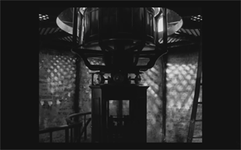
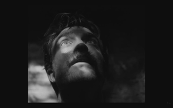
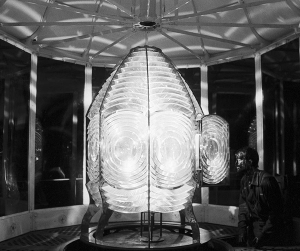
Those swirling light patterns you see on Pattinson’s face in the movie are a real phenomenon—we found ourselves just wanting to gaze into the Fresnel lens. We could have stayed all night staring into the light.
Robert Eggers, Cannes Press Release
Apparently the decision to set the film in the 1890s arose during the search for the ideal lighthouse. In an interview with Eggers in Architectural Digest, he remarks, “‘I wanted there to be a mystery in the light. Inside the beacon. So we knew we needed to set it in a period where we would have a Fresnel lens,’ he explains. Not many lighthouses still have functional ones today. ‘They look like Art Deco spaceships, and they are very magical and jewel-like. So we knew that was going to place us in the second half of the 19th century.'” (See the bottom for an image of the film’s custom-made Fresnel lens mesmerizing Winslow in the climactic scene.)
The decision to imitate orthochromatic film had a considerable impact on the lighting used. Ironically, it meant that a great deal of light from modern lamps, had to be used. Eggers admits as much in the DGA interview.
Obviously we weren’t lighting it like an old movie. We were lighting it using our practical fixtures, but of course, if this were an old movie, you would see the flame of the kerosene lamp and there would be a movie light lighting the scene. But what we did was we had a 600W halogen bulb on a flicker dimmer in all those scenes. And it was really, coming from Alexa and fast film stock, it was so bright. People were wearing sunglasses when we were doing night interiors.
Double-X is slow, even slower than color negative stocks. Modern digital cameras can typically shoot with less light than shooting on film requires. Putting together slow film stock, a filter (albeit one that cut down the light availability by less than one stop), and older, slower lenses meant that the cinematography crew had to use huge amounts of light, as a Variety interview with Blaschke explains:
Blaschke says he prefers to model his lighting in a real-life way, which was tricky on “The Lighthouse.” He and gaffer Ken Leblanc worked with Kodak Double-X stock — Blaschke calls it the only practical black-and-white film left after Plus-X was discontinued in 2011 — which is much less sensitive to light than even color film stock. Between the optics, the film stock and the filtration, Blaschke and Leblanc had to use about 15 to 20 times more light on set to get the look they wanted than on “The Witch,” which was shot on an Alexa.
“Even though it’s a very dark movie, the sets were actually blindingly bright,” says Blaschke. “We’d put 500- to 800-watt halogen bulbs in the lanterns that would flicker and were only a few feet from an actor’s face. The way we make movies now, people have gotten used to a very low light level; it’s trendy to shoot wide open, digitally at 800 or even 2,000 ASA. Our actors talked about how they couldn’t see each other sometimes, which I felt bad about.”
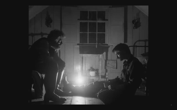
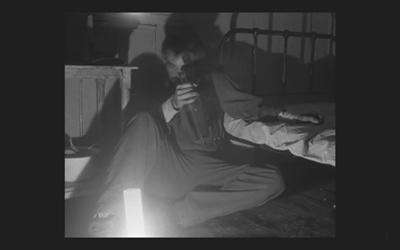
This halogen light is used in the night interiors, such as the scene of the drunken dance, below, and the later scene of the pair drinking in their shared bedroom, at the top of this section and the entry.
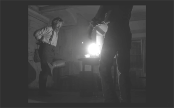
This combination of a very bright lamp with slow film and a filter cutting down part of the spectrum of light entering the lens meant that the light fell off very quickly away from the lantern. That effect is also very evident in these scenes. Backgrounds are dimly visible, and the actors often become silhouettes.
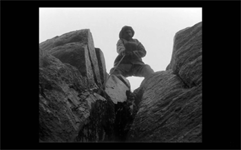
The result is a heightened sense of the two main characters being trapped together in small islands of light surrounded by blackness. We have no sense of how many lanterns the house contains, but we never see more than one at a time. At one point Winslow is seen in bed with a book, and the dim light from the window above him makes it hard to believe that he can see well enough to read. Even the daytime scenes are gloomy and gray. A low angle with the blank, light sky as rendered by the “orthochromatic” film makes Winslow and the dark rocks around him look nearly black.
Few silent films shot on orthochromatic film look this consistently dark, and it’s clear that the filmmakers were not simply trying to replicate the look of an old film. Blaschke admits as much in yet another of the many interviews on the film’s techniques: “It wasn’t about trying to make it look like older films but rather choosing a frame that lends itself to the tall and narrow sets and helps you visually withhold information from the audience. It also had a secondary effect of evoking compositions of 20th century modernist photography,”
In the DGA interview, after describing the various technical details of design, setting, and cinematography, Eggers explains:
This is fussy and it’s nerdy and it’s fun to talk about in this forum, but why do this? One, it says the movie’s old; it takes place in a time when black-and-white photography existed. But two, this is a bleak, austere story, and I feel like black-and-white is the best way to tell this story, and color is only going to mar things. Again, with this orthochromatic filter, it knocks our blue skies, which if we have them—which we really did—into something white and bleak and stark and harsh.
To get really nerdy about it, panchromatic film stock had largely replaced orthochromatic by the late 1920s and early 1930s, the only period in which a nearly square aspect ratio was standardly used. Moreover, the Baltar lenses were invented in the 1930s. Halogen lamps are a comparatively recent innovation in film lighting. So the combination of the ortho and the boxy look and the rest of it aren’t “authentic” in any strict sense. The filmmakers were not using lighting equipment of the 1920s or any modern equivalent. In short, they weren’t trying to replicate the look of any one specific type of old film. As a way of creating the illusion of an old film, as well as an appropriately grim tone, it works better than anything else I’ve seen.
A few final notes
First, I have seen The Lighthouse’s budget given as $4 million. That’s in the film’s Wikipedia entry, which cites an AP release from May 2019 that says only that the film’s budget was larger than that of The Witch but still modest. The New York Times ran a story about the film’s trailer in July, noting that the budget for The Witch had been $4 million, which Box Office Mojo also gives as the cost of the earlier film.
I have not been able to find a reliable figure for The Lighthouse’s budget, but clearly it was distinctly more than $4 million.
Second, according to Eggers in the DGA interview linked above, that’s real dirt (sifted to rid it of the odd pebble) that Winslow shovels down onto Wake in the climactic scene–not some namby-pamby ground chocolate. Not to mention that the puddle he’s lying in was frigid. Even the Expressionist actors didn’t go so far. The Academy should give Dafoe his Oscar already.
Third, watching The Lighthouse with a sell-out crowd in the biggest venue at the Vancouver International Film Festival, The Centre for the Performing Arts, was one thing. There people were eager to see this film, which had premiered in the Directors’ Fortnight thread at Cannes in May. It won the International Federation of Film Critics (FIPRESCI)’s prize for best film. It was quite another thing to watch it by myself during its run at a local multiplex.
The Lighthouse played at three multiplexes in Madison, with full-day schedules at each. It’s still playing at one of them, twice a day. I was alone when I saw it a few days ago at a 10:25 am screening. After being in a crowded festival audience, the second experience made me wonder how in the world such a challenging film made it into such wide release and how a more mainstream audience would react to it. (It maxed out at 958 theaters November 1-6 and has been falling since. Its gross through November 10 is $8,915,216 domestically; Box Office Mojo so far has no figures for foreign markets.)
The frames from The Lighthouse have mostly been taken from trailers. I have not cropped the frames reproduced above to their 1.19:1 format, since on theatrical screens, the audience sees the image as window-boxed, with black stretches on either side. (The exception is the bottom image, a press image released by distributor A24; it is either a frame with the black sides cropped or possibly a production still.) Perhaps Eggers and Blaschke’s idea would have been for theaters to move the screen’s masking to the edges of their images. Given the realities of modern exhibition, however, such versatility is not part of the screening technology. I found that the window-boxing on the big screen was a constant, subtle way to call attention to the unusual compositional results. What The Lighthouse will look like on various formats for streaming is hard to imagine.
Speaking of the aspect ratio, a number of critics have called 1.19:1 a silent-film format. In fact it was only used in the early sound era, when room had to be made on the filmstrip for the optical soundtrack; later the image was shrunk slightly into the classic Academy ratio of roughly 4:3. During the silent period there was no absolute standard ratio, though the image was in usually not far from the Academy ratio.
The American Cinematographer article cited is Patricia Thomson, “Stormy Isle,” AC (Nov 2019): 60-67.
In one of the quotations above, Blaschke says that Man of Aran (1934) was shot on orthochromatic film. This seems unlikely, given that Flaherty had made one of the first American features to use the new panchromatic film stock, Moana (1926). Kodak stopped making ortho in 1930. Possibly Flaherty, who started work on the film in 1931, did revert to ortho for it, but it seems unlikely.
Ernst Deutsch, who plays the Cashier in Von Morgens bis Mitternachts, was one of the great Expressionist actors of stage and screen. I have mentioned him before, for his role in Der Golem; when Von Morgens bis Mitternachts was released on DVD; and for his role in the non-Expressionist Das alte Gesetz, released on Blu-ray by Flicker Alley last year.
On horror and fantasy in German silent films, see my “Im Angang war …: Some Links between German Fantasy Films of the Teens and the Twenties,” in Paolo Cherchi Usai and Lorenzo Codelli, eds., Before Caligari: German Cinema, 1895-1920 (Pordenone: Edizioni Biblioteca dell-Immagine, 1990), pp. 138-161.
Baschke mentions Eisenstein as an influence in the editing, but presumably neither he nor Eggers had read Eisenstein’s essay arguing in favor of a square aspect ratio. His belief was that such a frame would give equal compositional weight to the horizontal and vertical dimensions of the screen. (“The Dynamic Square,” Jay Leyda, ed., Film Essays and a Lecture [New York: Praeger, 1970], pp. 48-65.
The photograph of the lighthouse set on Cape Forchu is by Dan Robichaud and appears in Carla Allen’s story on the filming in the local Digby Courier. A search for “Cape Forchu Lighthouse” on Google Maps yields many photos of the area and reveals the very rocky terrain over which Winslow pushed his wheelbarrow. The modern lighthouse is a popular tourist attraction, in case you ever visit Yarmouth in Nova Scotia. There is even a restaurant inside it. (Appropriately enough, “The grilled lobster and cheese sandwich was amazing,” according to one visitor.)
[January 13, 2020. Blaschke has been nominated for an Oscar in the Best Cinematography category. Unfortunately the film was not nominated in any other category, as it deserved to be.
February 8, 2020. Blaschke has won a number of awards for the film, most notably the American Society of Cinematographers Spotlight Award, and, just today, the Film Independent Spirit Award for best cinematography.]
Last Modified: Saturday | February 8, 2020 @ 18:58 open printable version
This entry was posted
on Tuesday | November 12, 2019 at 9:46 pm and is filed under Festivals: Vancouver, Film comments, Film genres, Film technique: Cinematography, Film technique: Performance, Film technology, Independent American film, Silent film.
Both comments and pings are currently closed.


