


Archive for the 'Film technique: Widescreen' Category
THE HATEFUL EIGHT: A movie is a really big thing
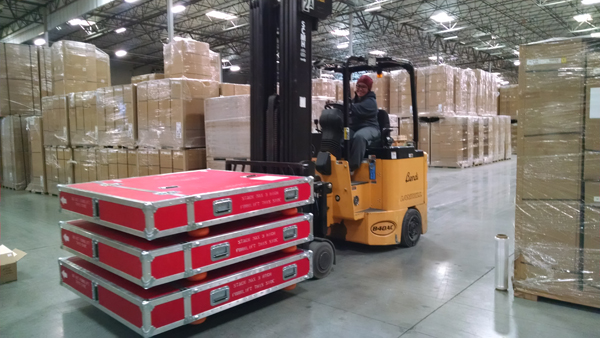
Photo: Barbara Grassia.
DB here:
The latest dispatch from the Hateful Eight platter farm in Valencia CA, overseen by veteran film guru Chapin Cutler of Boston Light & Sound. Chapin writes:
This is a picture of the last three Hateful Eight prints leaving our print assembly location in Valencia. They are destined for local LA presentation locations.
Most of the other prints have been delivered or will be today [18 Dec.].
All locations have had their equipment delivered, save one; due to facility issues, that venue’s equipment will be delivered Monday. By Sunday night or early Monday morning, all but the expected and remaining nine venues will be complete. The remaining nine will be done by end of day, Wednesday, 23.
Just to remind you, from Chapin’s previous message:
Each shipping case is 5 ft. x 5 ft. by 1 ft. thick. When loaded, it weighs about 400 lbs. . . . With the reel full, out of the box, the film and reel weigh about 250 lbs. Four people can easily lift it onto a platter deck.
I’m asking Santa for one.
Thanks to Chapin for his work on the project and his cooperation with our blog. Thanks as well to the thriving and inspiring Art House Convergence.
If you haven’t yet seen the list of Hateful Eight 70mm venues and showtimes, you can find it here.
P.S. 23 December 2015: Thanks to Gary Meyer of Art House Convergence, here’s a link to a very full story on the rehabbing of projectors for Tarantino’s Great Experiment.
P.P.S. 31 December 2015: Be sure to check this suspenseful tale of projecting the movie…with Tarantino in the audience.
THE HATEFUL EIGHT: The boys behind the booth
DB here:
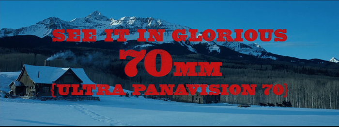
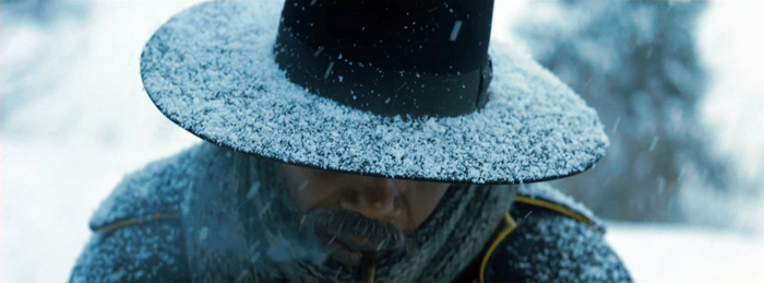
By now everybody knows that Tarantino’s forthcoming The Hateful Eight was shot on film in the Ultra Panavision 70 format. This anamorphic widescreen process yields a projected aspect ratio of 2.76–in a word, humongous. An early version of it, MGM Camera 65, was employed on Ben-Hur (1959), but Panavision quickly developed a new generation of cameras and renamed the process. It wasn’t heavily used; supposedly Khartoum (1966) was the last film shot in the format.
The process by which Tarantino, ace cinematographer Robert Richardson, and the enthusiastic boffins at Panavision revived Ultra Panavision 70 is detailed in the current American Cinematographer (alas, not yet online). The production is an extraordinary tale. But what about exhibition? Luckily, the widescreen fans among us can glean a lot about that from veteran projectionist Paul Rayton’s interview with Chapin Cutler, co-owner of Boston Light & Sound. It was the task of Chapin and his team to find over 100 projectors, refurbish them, test them, and set them up in theatres all over America.
Chapin is a legendary figure in movie exhibition. Trained as a projectionist during his college years, he and Larry Shaw have made BL&S one of the very top companies for installation and maintenance of theatre projection equipment. He has supervised theatrical setups at festivals (Sundance, Telluride, TCM), industry gatherings (CinemaCon), and at some of the world’s top-notch theatres.
He’s more than a professional’s professional: He loves film and prides himself on delivering a powerhouse show. He was a natural choice for a movie geek like Tarantino to arrange the roadshow screenings of The Hateful Eight.
Chapin has discussed the nearly military precision necessary to fulfill Tarantino’s mandate in The New York Times and The Boston Globe. You should read these pieces for essential background. When Chapin added some new information courtesy of the listserv of the Art House Convergence, I jumped at the chance to include you in the audience. I know that many of our readers are keen to devour whatever they can learn about this film, one of the year’s major American releases.
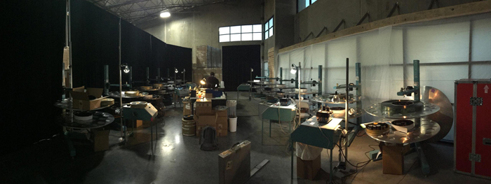
So here are Chapin’s notes on how you prepare and ship out 100+ 70mm film prints.
For those of you that are interested in these things, attached is a picture of our “platter farm” in Valencia CA. This is where all the prints are being made up.
The space before, in Academy ratio.
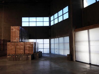
The space after, in sort of Ultra Panavision.
We are getting the prints as 1000 ft. loads, so we have to assemble 20 rolls to make a print up.
About 90 of the prints will be made up for platter operation and shipped totally assembled. The prints are being ultrasonically welded so that it is one continuous piece of film; no splices. The remaining prints are going out for reel to reel houses.
On the right of the frame above you can see part of one of the shipping cases. It is 5 ft. x 5 ft. by 1 ft. thick. When loaded, it weighs about 400 lbs. On the platter next to it, there is a partially disassembled platter reel. With the reel full, out of the box, the film and reel weigh about 250 lbs. Four people can easily lift it onto a platter deck.
We have a dedicated team of four folks working 7 days a week to get this done.
All this makes you appreciate the effort behind the scenes that makes this remarkable enterprise work. (So far, there have been a couple of problematic press screenings, but a dozen or so other shows–notably last night’s SAG screening at the Egyptian–have gone off perfectly.) Whatever you think of Tarantino as a filmmaker (I like him), he deserves credit for exposing a new generation to the volcanic fun of a roadshow presentation. And we should thank Chapin, the guru with the bandit mustache, as well.
Photo credits: Chas. Phillips.
The Hateful Eight.
Filling the box: The Never-Ending Pan & Scan Story

The Limey (1999).
DB here:
Here’s a story, so far not finished.
Chapter 1: You can’t put ten pounds of mud in a five-pound sack (Dolly Parton)
Once upon a time, before home video and cable, movies were broadcast on television. They might be drawn from local TV stations’ 16mm collections or transmitted from the networks on “movie of the week” shows. When the film was a widescreen film, especially in anamorphic processes, it was adjusted, as we now say, “to fit your screen.”
That TV screen was in an aspect ratio of about 1.33:1 (4 x 3), like pre-1950s commercial films. But the film to be shown might be 1.75, 1.85, or 2.35. How to show it?
You could retain the whole original frame with letterboxing at top and bottom. This was done more often in Europe than in the US, I believe. Our TV system had 100 fewer lines, so the tiny picture area became quite degraded. And then (as now) there were people who persisted in believing that those black bars at top and bottom were somehow taking away part of the movie.
Far more common was the tactic of somehow making the wider image fill the box. This tactic came to be called “pan and scan.” It gained the name because in preparing the TV version, an engineer would sometimes swivel the TV frame across the original image, carving into it and sliding to and fro. The term pan and scan covered another tactic, simply making two shots out of one. We might call it “cut and scan.” Here’s an instance from an old VHS tape of Advise and Consent, one of the most daring American widescreen films. The slightly fatter faces are due to the distortion of the CRT monitor I shot from.


Sometimes there was neither scanning nor cutting, just simple cropping. The engineer would find a 4×3 chunk and extract it from the bigger image. To keep things simple, that chunk was usually around the center. This “center-cutting,” as it was called, could yield some funny results, as in the protruding nose in a 16mm TV print of Tarnished Angels.


Chapter 2: Shoot, protect, screw up
Some widescreen processes from the 1950s onward didn’t frame the image wide during filming. The image would be captured “full frame.” The result might later be “hard matted,” or letterboxed, during printing, as in the shot from The Limey surmounting today’s entry.
Sometimes, the 35mm theatrical prints would retain a 4:3 image, or something even squarer. The frames in a 35mm print of Do the Right Thing are about 1.19:1. Note the extensive headroom in the left image, from a 35mm print. For screenings the projectionist would mask the image to the proper proportions—typically 1.85. Here’s the version on the Criterion DVD, at 1.75 for widescreen monitors.


The full-frame image was available for cropping to 4:3 TV viewing. Many cinematographers used the “shoot and protect method” by composing for both 1.85 and 1.33.
There were problems with this “open matte” process in theatres. I recall a mis-framed version of Jerry Maguire in which the locker-room scene showed more of Cuba Gooding’s goodies than was intended. And a full-frame print of Godfather II reveals the duct-taped marks on the set floor (as if Pacino would ever hit them).
The same problem would appear in full-frame TV versions that were carelessly transferred from film. Microphones, unfinished stretches of the set, and other production elements might jut in. Some cinematographers didn’t consider TV versions important enough to worry about. “Fuck TV,” was heard occasionally.
More basically, the full-frame result wasn’t faithful to the “original” theatrical version, which was designed to be shown wide. Purists objected that TV versions, even if shot full-frame, didn’t fulfill the intention of the director.
Chapter 3: 16 into 9 won’t go
 In the 1990s there came laserdiscs and DVDs. These offered properly letterboxed framings. Cinephiles cheered. It seemed that the days of pan and scan were over.
Actually, pan-and-scan hung on quite a bit. Many laserdisc editions weren’t letterboxed. Airline versions offered cropped images, and still do. (Those tiny screens, after all.) Some DVDs were released in pan-and-scan versions, while others offered a letterboxed version of the film on one side of the disc and a full-frame version on the other. But serious cinephiles could assume that the general public was starting to understand that films intended to be seen at a certain ratio should be shown that way.
As the new disc formats emerged, so did a plan to standardize High Definition video for a 16 x 9 display. The European Union promoted it during the mid-1990s, and over the next twenty years it became accepted for both computer monitors and video displays. The new format developed in sync with the gradual replacement of analog broadcasting by HD transmission.
The problem is that 16:9 is a ratio of 1.77:1, close enough to 1.85 for most purposes but far off the ratio of 2.20:1 (many 70mm films) and 2.40 (anamorphic widescreen after about 1970). Yet maybe this isn’t a problem. Why not just letterbox those wider images within the 16:9 format?
If only things were so simple.
Chapter 4: Slightly off, and more
Today, at least 77% of US households have HD monitors. (Surprisingly, 41% of TVs still in use are Standard Definition, many presumably comforting children and old people.) Broadcasters make concessions to the 4:3 ratio by keeping the key action centered and cropping the 16:9 image.
Nature abhors a vacuum, and TV monitors apparently can’t bear blank space. So some purveyors of movies on video have updated pan-and-scan for the HD age. Cable, for instance.
It’s been years since I clicked my cable remote to the Sundance Channel and the Independent Film Channel, now known as IFC. Seeing them a couple of weeks ago was a mild shock. Now each boasted a bug in the lower right corner, and swarming over the image were lots of texts plugging other programs. Worse, there were commercials for weight-loss scams, Burger King, and Portlandia. More to the point here, these services give us a new version of pan-and-scan.
Thanks to the center-cutting method, I found plenty of examples of anamorphic 2.40 films sliced up to fit our monitor. Here are a couple of examples from IFC’s version of Jaws. In the first pair, the wider image gives Bruce room to move, and Brody is more salient. In the second pair, Hooper is speaking, but in the IFC image he’s even more peripheral than Mr. Nose in Tarnished Angels.


In rare cases, IFC seems to run full-scope prints; I spotted one of Chinatown. But it doesn’t seem to be the norm. Maybe IFC’s New Age pan-and-scan is trying to live up to the channel’s slogan: “Always on. Slightly off.”
Many films of the early widescreen era are compromised even at 16:9. The nose shot from Tarnished Angels would be a bit cramped in a 1.77 format, and many other shots would suffer as well.

When the wide format was still new, filmmakers were exploring what they could do it, and that included scattering important information throughout the frame. Preminger was all over the place in the Senate and Committee-Room scenes of Advise and Consent. What would you do to fit these shots into 16:9? I make a silly stab at center-cutting.


Films like this remind you of how the technology of home video has made our filmmakers less daring in their compositions. Would anyone today risk the bold composition that Richard Fleischer uses in the mortuary scene of Compulsion? As you can see from the image at the end of the entry, the crucial pair of eyeglasses rests on the lower frameline, as if on a shelf. ‘Scope nudged some directors toward quite intricate shot designs.
By the time Tootsie was made, with home video on the rise, filmmakers were pressed to shoot and protect better. So here there’s plenty of unused space on the sides, and most action will fit into any old frame proportions. In the shot below, the 1.33 version (available on the flip side of the DVD) is extracted from the Scope version (and slightly squeezed as well). The 1.77 version I grabbed from the Sundance Channel is also extracted from the wider framing. Both reframe the image to emphasize Michael and Jeff, the comic duo. The original 2.35 image centers the food counter and for some reason gives equal space to the inconsequential aisle and stove on the right.


Obviously, composition isn’t particularly important here. Solid as Tootsie is at the level of writing and performance (“Oh, God, I begged you to get some therapy”), we wouldn’t point to it as a model of pictorial finesse.
Moreover, pan-and-scan isn’t just a matter of retaining the action in different framings. Recasting the image changes the scale of the things in it. Old TV pan-and-scan, as in my first Advise and Consent example, makes the figures chopped out of the composition seem closer to us. Sometimes today’s pan-and-scan makes the figures seem smaller. That’s because the full-frame original image offers a bit more space at the top or bottom than we see in the anamorphic version, and that gets incorporated into the 1.77 or 1.33 version. (You can see it in the Jaws example above, with the space above Quint’s head.)
The push-pull of different versions is particularly noticeable in close views. The center-cut (and perhaps slightly squeezed) IFC version of The Matrix keeps Cypher prominent in the foreground, with the car crash in the rear. Yet do you see him and the crash as closer to us in the wide original? I do. Maybe it’s because both Cypher and the background plane are larger in the second frame.


By contrast, several shots in the IFC version of The Matrix have areas at the top and bottom not visible in a wider-frame DVD. In any case, extracting from an anamorphic frame or here, pulling the 1.77 version out of a full frame, can subtly alter the scale and perspective relations within the shot.
In the old TV days, networks would show credit sequences in full widescreen, as they were obliged to make all the contributors’ names visible. So you often had the odd situation of a widescreen credits sequence that would end a movie shown in 4:3. Sundance has updated the technique. Tootsie’s penultimate shot of Julie is at 1.77, but as she and Michael walk off, we cut immediately to a final shot at 2.35 letterboxed, over which the credits roll.


Another old trick has been revived. Back in 1960s TV, you’d have an obligatory widescreen image with credits information, but the shot might go on to show story action. Then the TV framing would close in on the wide image and gradually fill the screen with a 4:3 composition. Damned if I didn’t find the same thing happening last weekend on Sundance. The opening credits for The Graduate were in full ‘scope. That shot dissolved to the famous shot of Benjamin sitting in front of his aquarium, blankly facing the camera.


To retain the credits and keep the dissolve smooth, the engineer slowly enlarged the original shot to 16:9 proportions as Ben’s father comes in. (You can see the Sundance bug lift slowly into the lower right of the image.)


The result is a camera movement, a zoom in, that isn’t in the original film. In the original framing below, the shot scale on Ben isn’t much different, but the little scuba diver remains prominent in a way he isn’t in the 16×9 image.

Chapter 5: VOD = Variants On Demand
On cable TV we Americans can go to TCM for a purer experience of widescreen from the old days. But the more recent films shown on IFC, Sundance, Pivot, and other cable channels are likely to be hacked up in the new way. In this respect as well as others, cable has become the network TV of the new age. We get shows of all types, not just sports and movies but original series, except that now we get to pay to watch commercials.
Surely things are better with streaming?
In the spot-checking I did on Amazon and Hulu Plus, I didn’t find instances of cropping. In particular, the Criterion films I checked retain their proper aspect ratios. Netflix is another story. At this point we must thank the anonymous genius behind What Netflix Does. This site exposes a great many ways that the most popular streaming service has relied on pan-and-scan, with different crops for different markets.


In fairness, once the anonymous genius contacted Netflix, some deficient versions were replaced by proper ones. But several of the more recent examples have not been changed. Who knows how many others remain panned and scanned because the alterations haven’t yet been detected?
In the light of all this, I’m wondering if filmmakers have been protesting this mangling of their work. During the early days of TV broadcasts, directors complained about cuts and commercials, and in more recent years we’ve learned that directors were won over to digital projection in theatres because then “the film would be shown exactly as the director intended.” With many more people seeing the film on video platforms than see it in theatres, you’d think we’d have heard more from the creative community. Once more their movies are being jammed and lopped to fit whatever box they’re put in.
I’m tempted to say that when we want to get the movie in a form close to the ways its makers wanted it to be seen, we need to see it in a theatre or get it on DVD/Blu-ray. There are exceptions, of course. Theatres can botch aspect ratios today just as they have in earlier decades, chiefly by using the wrong masking. And we have filmmakers who alter the aspect ratio on DVD, usually to expand the field from 2.35:1 to 1..77 in hopes (vain) of evoking the Imax effect (Tron: Legacy, The Hunger Games: Catching Fire).
Without getting into technicalities, some of the 1.77 versions you’ll see have a bit more area at the top and the bottom of the frame than we find in the full anamorphic image. In many cases, like the shot of Cypher in The Matrix, it’s because the film was shot in Super-35. This very full-frame capture format allowed filmmakers to extract a 2.40-proportioned image, or a 4:3 image, or images in other aspect ratios. The Wikipedia entry on Super-35 is very helpful on this and other aspect ratios, both for cinema screens and TV. Some shots in the IFC Jaws had a little more vertical area as well. I assume that’s because the ‘scope image on the DVD cropped a tad off the top and bottom of the full-frame image on the film.
Thanks to Jonah Horwitz for pointing me toward the site What Netflix Does. More general thanks to James Quandt for our long-running conversation about aspect ratios. Other entries on aspect ratio on this site involve Fritz Lang, Jean-Luc Godard, and Wes Anderson. I set out some ideas on CinemaScope aesthetics in this video lecture.
P.S. 28 January: Thomas Zorthian was ahead of the curve on this. Back in 2011 he noticed the Netflix pan-and-scan.
Your article hit home for me as I have been trying to bring attention to this problem for a while. I even wrote Roger Ebert hoping he could use his influence. He was kind enough to publish my letter: http://www.rogerebert.com/letters/netflix-stream-sometimes-overflows-the-banks. I have also written to HBO and am considering a petition to ask them to show movies in the proper ratio before HBO GO becomes a standalone service. This would enhance the value of this new service.
Thanks to Thomas for corresponding!

Compulsion (1959).
Il Cinema Ritrovato: Strands from the 1950s and 1960s

Faraon (1966).
Kristin here:
David has already posted an early report on his first full day at Il Cinema Ritrovato in Bologna. It conveys something of the overwhelming abundance of offerings at this year’s festival. Writing another entry during the festival itself proved impossible, given our packed schedules, but now we have time to catch our breath and reflect on what we were able to see.
As with the 2013 festival, I decided that the only way to navigate the many simultaneous screenings was to pick out some major threads and stick with them. I chose the retrospective of Polish widescreen films of the 1960s, that of Indian classics from the 1950s, and the third season of early Japanese talkies. Miraculously, none of these conflicted with each other, the Polish films being on mainly in the mornings, the Japanese ones directly after the lunch break, and the Indian films starting late in the afternoon.
Again, it was possible to fit in a few films from the other programs on offer, including a series of Germaine Dulac’s films, restorations of East of Eden and Rebel without a Cause, a selection of Riccardo Freda’s work, Italian contributions lifted from various anthology films of the 1950s and 1960s, a celebration of the 50th anniversary of the Österreichisches Filmmuseum, and many Chaplin shorts (the festival was preceded by a brief conference on Chaplin).
The annual Cento Anni Fa program, showing films from 100 years ago, has changed, in part to accommodate the fact that the transition to feature films was well underway. The series programer, Mariann Lewinsky, has also branched out. Having discovered many unknown or little-known early silents during her annual quests, she has included other brief thematic programs, such as fashion in early films. In addition, there was a lengthier selection of early films dealing with war, given that we are now in the centenary of World War I.
A Journey from Pole to Pole

The Saragossa Manuscript (1965).
To me the biggest revelation of the festival was the program of Polish anamorphic widescreen films. Representing most of the major Polish directors working in widescreen in the 1960s, these were shown in 35mm, mostly in original release prints from the period, on the big screen of the Cinema Arlecchino theatre. Despite occasional wear in the prints, they looked great.
The series kicked off with Aleksander Ford’s little-known The First Day of Freedom (Perwszy dzień wolności, 1964). Like many of the films in the program, it dealt with World War II. Polish soldiers, escaped from a POW camp, enter a nearly deserted German town. They disagree on whether to help protect the civilians they encounter or participate in the general rape and pillage in the wake of the Nazi retreat. It’s a grim and realistic look at a topic seldom tackled in films about the war.
Also on the program was Andrej Munk’s Passenger (Paseżerka, 1963), left unfinished when the director was killed in a car accident. His colleagues eventually decided to assemble the film without additional footage, drawing upon still photos for some scenes and an effective voiceover filling in the action. The effort works well, and the result is a powerful examination of a Nazi death camp. The story does not concentrate on Jews but on political prisoners, implicitly communists and other rebels. The result is the sort of disguised political comment on Poland’s contemporary situation that is common in these films.
Early on, a middle-aged woman aboard a ship tells her companion about her life in as an official in the camp–a story that is contradicted when the actual scenes of her activities at the camp play out. The woman singles out a female prisoner, Marta, and rationalizes her irrational mixture of rewards and punishments as efforts to save her from the other prisoners’ fates. With its depictions of cat-and-mouse games between prisoners and captors and its references to mysterious sadistic rituals played out by the guards, the film is a powerful meditation on the camps, worthy, as Peter von Bagh’s program notes say, to sit alongside Resnais’s documentary, Night and Fog.

Among the unexpected delights of the series was Lenin in Poland (Lenin w Polsce, 1966) by Sergei Yutkevich (or, as he is credited here, Jutkevič). Yutkevich began as a member of the Soviet Montage movement, contributing a little-known, late feature, Golden Mountains (1932). Working in Poland, he managed the formidable task of humanizing Lenin in unorthodox ways. Yutkevich concentrates on the leader’s Polish exile on the eve of World War I. Framed by Lenin’s brief imprisonment on charges of espionage, the film proceeds through flashbacks to his recent activities. As portrayed by Maksim Strauch, whose resemblance to the revolutionary leader gave him a long career in numerous films, Lenin is humorous, kind, thoughtful, and a likeable protagonist. Yutkevich includes touches from the Montage movement, with some passages of quick cutting and frequent heroic framings of the protagonist.
With my interest in ancient Egypt, I was particularly curious about Faraon (Pharaoh, Jerzy Kawalerowicz, 1966). The director tackles the unusual and obscure topic of the end of the 20th Dynasty, which led to the end of the golden age of the New Kingdom and the instability of the Third Intermediate Period. The film’s drama comes from the real-life conflict between the impoverished, weakened monarch and the wealthy, powerful priests of Amun in Thebes. I’m not sure how well an audience not familiar with this era would follow the plot, even simplified as it is. There are some remarkable crowd scenes, as at the top of this entry, when Herhor, the chief of the priests, rallies the crowd against the pharaoh. Still, I did not find the story engaging. Presumably it was a covert commentary on politics in Poland at the time.
The best-known of Polish directors, Andrzej Wajda, was represented by two films. One was the earliest film shown in the series, Samson, from 1961. It concerns a young Jewish man who is lured to escape from the Warsaw Ghetto and spends most of the film dodging the police by moving from one temporary haven to another. Wajda creates a compelling depiction of the ghetto early on, and I wished he had stayed in that environment longer.
My favorite film of the festival was Wajda’s little-known Ashes (Popioły [not to be confused with Ashes and Diamonds], 1965), an epic tale of the Napoleonic wars and Poland’s unwise participation in them on the side of the French. The protagonist, Rafal Olbromski, is a naive young nobleman from a rural area, a Candide-like figure whom we follow as he leaves his estate to go to war and moves from locale to locale, manipulated by more sophisticated characters. The result is a dizzying succession of battle scenes, largely without any context being established, punctuated by visits to the estates of those who are backing the Polish participation in Napoleon’s conquests. Wajda seemed to have had nearly limitless funds for the film, and the battle scenes are monumental.
Far less obscure is Wojciech Has’s The Saragossa Manuscript (Rękopis znaleziony a Saragossie, 1965), a cult item among film buffs and reputedly one of Luis Buñuel’s favorite films. It’s a complex, surreal tale of a wandering soldier of the 18th Century who passes the gibbets of two executed men in a bleak Spanish landscape and enters a mysterious inn. There he encounters a large bound manuscript that leads him into a world of shifting fantasy and tales within tales within tales. Has’s was certainly one of the most humorous and entertaining films in the series.
The latest film in the program, Adventure with a Song (Przygoda z piosenka, Stanisław Bareja, 1969), was radically different from the others and provided a look at popular Polish cinema of the 1960s. Bareja was a successful director of comedies and musicals. This one follows a young singer who wins a local singing contest with the improbably named “The Donkey Had Two Troughs,” and decides to head for a professional career in Paris. The filmmakers’ attempts to replicate the Mod styles and garish colors of the 1960s in the West yield an incongruous and awkward but fascinating film .
The one disadvantage of seeing these vintage distribution prints (mostly with English subtitles) was that some were abridged versions, occasionally radically so. Samson, The First Days of Freedom, Adventure with a Song, and, inevitably Passenger were shown complete. Judging by imdb’s timings, however, others were missing significant amounts footage: Ashes (shown at 169′, originally 234′), The Saragossa Manuscript (155′ vs. 175′), Pharaoh (149′ vs. 180′).
Recently there seems to be a revival of interest in Polish classic films. Martin Scorsese has curated a large program that is currently touring the US with digital copies of restored films. (For links to numerous articles on the series and the restorations, see its Facebook page.) I hope that some enterprising company will issue the complete versions of these Polish classics in their proper widescreen ratios. Ashes is a particularly good candidate for such treatment. Having sat through it once at nearly three hours, I would happily watch it at closer to four.
Worthy of restoration
There’s a growing interest in recent Indian films, at least in the USA. Our biggest local multiplex nearly always devotes  one screen to a Bollywood musical, and sometimes two. Yet few know the great classics of the early post-colonial period in India, following World War II and independence from Great Britain, which are seldom seen, even by film historians.
One reason is because many of these classics still await restoration. While most programs shown in Bologna consist of newly restored prints, this series was titled “The Golden 50s: India’s Endangered Classics.” Each of the features was accompanied by an episode of “Indian News Review,” a newsreel that for years was shown in film programs across India. Shivendra Singh Dungarpur, founder of the Film Heritage Foundation, curated the series and introduced each film, emphasizing that even the eight classics selected for the program are in danger if not properly restored soon.
The need was evident from the prints. Some were old distribution prints, but three of the films could only be shown on Blu-ray. Even under these conditions, however, the range and quality of Indian cinema of the 1950s was apparent.
The earliest film in the series, Chandralekha (S. S. Vasan), was made a little before that decade, in 1948. Its presence stems from its crucial importance in Indian film history. It was the first big, successful Indian musical of the post-colonial era and set the pattern for many of the country’s subsequent films. The story has a fairy-tale setting, with a good and an evil brother fighting over the throne of their father’s kingdom and also for the hand of the beautiful Chandralekha. The rambling plot includes lots of songs and dance numbers, leading up to the climactic, legendary Drum Dance (below right), with dozens of dancers atop rows of enormous drums. It lives up to expectations. (For more on Chandralekha, see fellow Ritrovato fan Antii Alanen’s epic blog post.)
 David has already described seeing the sole Raj Kapoor film in the series, the very popular Awara. Bimal Roy’s Two Acres of Land (Do Bigha Zameen, 1953) is a very different sort of film. Quite consciously inspired by Bicycle Thieves, Roy’s film eschews the standard musical numbers and deals with a poor farmer destined to lose his small farm unless he can pay off a large debt. His journey to Kolkata, with his son trailing after, throws obstacle after obstacle in his path, and Roy avoids a happy ending. The film was shot on the streets of Kolkata, which Dungarpur assured us have not changed much since this record of them.
One of the great Indian directors, Ritwik Ghatak, has become somewhat familiar in the West, thanks in part to the British Film Institute’s issuing two of his masterpieces on DVD: A River Called Titas and The Cloud-Capped Star. The series at Bologna included Ghatak’s first feature, Ajantrik (1957). It is set among the poverty-stricken Oraons, an isolated population in Central India, and follows a man who is devoted to his dilapidated taxi, which he manages to hold together well enough to supply him a marginal living. He has come to think of the car as a human companion. (Accordingly, the title means, roughly, “not mechanical,” although for western distribution it was given the unenticing title Pathetic Fallacy.) Though Ajantrik is not a major film on the level of the others in the program, it was good to have the rare opportunity to see Ghatak’s first film.
The star of the series was undoubtedly an equally respected director, Guru Dutt. Two of his films, in both of which he also starred, were shown. One of his finest films, Pyaasa (The Thirsty One, 1957), was perhaps the best film of the program. Dutt is considered to have integrated the conventional song episodes of Indian cinema into his films more skillfully and in more original ways than other directors.
Dutt plays a great but unappreciated poet whose work is ignored by the intelligentsia of his own class. He wanders in despair among the poor and outcast, for whom he has great sympathy. In one haunting scene, he walks through a brothel district and sings of his despair for humanity (below). Early in the film he meets a prostitute who appreciates his poetry and falls in love with him. Only after the poet’s apparent death does his work become widely loved among the the common people, but his reputation is exploited by his hypocritical family and publisher.
Dutt’s Kaagaz Ke Phool (Paper Flowers, 1959), was also shown. Again Dutt plays an unappreciated artist. A film director divorces his wife and becomes the target of gossip when he casts a beautiful young actress in his next movie. His personal misery affects his ability to direct, and after a slow slide into alcoholism, he loses his job. The plot allows Dutt to express self-pity more obviously than in Pyaasa, and the comic scenes with his ex-wife’s family strike an odd tone in such a grim story. Kaagaz Ke Phool was not a success, and Dutt gave up filmmaking altogether, dying of an overdose of sleeping pills five years later. As Dungparapur pointed out, he was one of several important Indian filmmakers who died rather young, which makes the rescue of these classics all the more essential.

Pyaasa (1957).


