Archive for the 'Directors: Godard' Category
Class of 1960
DB here:
By now most people accept the idea that 1939 was a kind of Golden Year of cinema. You know, Rules of the Game, Stagecoach, Wizard of Oz, that movie about the Civil War, etc. TCM has even made a movie about 1939. On this site Kristin and I have talked about earlier wonder years, like 1913 and 1917. So in planning this year’s Bruges week-long Zomerfilmcollege (aka Cinephile Summer Camp), Stef Franck and I discussed building my lectures around a single year. I proposed 1941, but he countered with 1960.
1960 was a logical choice in providing spread for the whole program. At Bruges we intertwine several threads of lectures and screenings, and this year we had silent films (The Cat and the Canary, The Wind), Hollywood’s cinema of emigration (Florey, Siodmak, Ophuls, etc.), and contemporary Korean film. All in 35mm, of course. So picking 1960 filled in another area.
As so often happens, a contingent choice came to seem a necessary one. By the time I opened my mouth to introduce The Bad Sleep Well, I had convinced myself that 1960 was another watershed year. Consider these releases:
Rocco and His Brothers (Visconti), La Dolce Vita (Fellini), L’Avventura (Antonioni), Le Testament d’Orphée (Cocteau), Plein Soleil (Clement), À bout de souffle (Godard), Les Bonnes femmes (Chabrol), La Verité (Clouzot), The Bridge (Wicki), Wild Strawberries (Bergman), The Devil’s Eye (Bergman), Lady with the Little Dog (Heifetz), The Letter that Wasn’t Sent (Kalatozov), The Steamroller and the Violin (Tarkovsky short), The Teutonic Knights (Alexander Ford), Innocent Sorcerors (Wajda), Saturday Night and Sunday Morning (Reisz), Tunes of Glory (Neame), Sergeant Rutledge (John Ford), Psycho (Hitchcock), Spartacus (Kubrick), Elmer Gantry (Brooks), 101 Dalmatians (Disney/ Reitherman), The Magnificent Seven (Sturges), Exodus (Preminger), Home from the Hill (Minnelli), Comanche Station (Boetticher), Verboten! (Fuller), The Bellboy (Lewis), The Young One (Buñuel), TheYoung Ones (Alcoriza), The Shadow of the Caudillo (Bracho), Devi (Ray), The Cloud-Capped Star (Ghatak), This Country Where the Ganges Flows (Karmakar), Red Detachment of Women (Xie Jin), The Back Door (Li Han-hsiang), Enchanting Shadow (Li Han-hsiang), The Wild, Wild Rose (Wang Tian-lin), Desperado Outpost (Okamoto), Spring Dreams (Kinoshita), When a Woman Ascends the Stairs (Naruse), Daughter, Wives, and Mother (Naruse), Cruel Story of Youth (Oshima), The Sun’s Burial (Oshima), Night and Fog in Japan (Oshima), The Island (Shindo), Pigs and Battleships (Imamura), Sleep of the Beast (Suzuki), and Fighting Delinquents (Suzuki).
We didn’t show any of them.
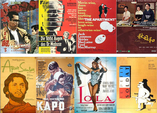
Several factors constrained our choices, including the availability of good prints with Dutch subtitles, or at least English ones. We also didn’t want to run too many official classics. And we fudged a little for pedagogy’s sake. We had to include a Godard, but instead of À bout de souffle, we picked Le Petit soldat—made in 1960 but not released until 1963. The World of Apu was released in 1959 in India, though it made its world impact in the following year. Lola was finished in 1960 but released in early 1961. A dodge, but I wanted a Nouvelle Vague counterpoint to Godard, and it fit well with the Ophuls thread, and—well, it’s Demy. In any case, we wound up with a list of outstanding movies.
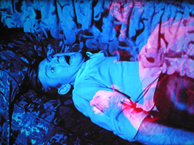
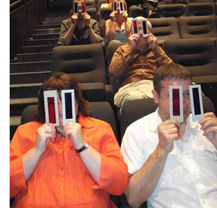 Running alongside my titles were horror films and thrillers from the same year, including Peeping Tom, Black Sunday, The Leech Woman, and Corman’s House of Usher. William Castle’s 13 Ghosts was shown with reconstructed versions of the original two-color Ghost Viewers. (Look through red if you believe in ghosts, blue if you don’t.) Imagine the shot above through a red filter. The creature, pink on the print, turns satanically crimson—confirmation that ghosts exist, although they look less like Casper and more like those Red Devil candies you ate in theatres as a kid. In a prologue, available here, Mr. Castle explains it all.
All in all, quite a week. My sessions ran from 9:00 AM to 12:30 or 1:00 PM, with the film embedded. After lunch, there were more talks and screenings, usually winding up at about 1:00 AM. Other speakers included Kevin Brownlow, Tom Paulus, Steven Jacobs, Muriel Andrin, Egbert Barten, and Christophe Verbiest (linking his talks on contemporary Korean film to the absolutely nuts 1960 Kim Ki-yong melodrama The Maid). The locals’ lectures were in Dutch, but these worthies are fluent in English, so sharing meals with them allowed me to catch up with their ideas.
Pegging a batch of movies to a single year can seem gimmicky, so I treated the films as exemplifying different trends, many of which started before 1960 and have continued since. I concentrated on trends within world film culture, though in several cases those were tied to still broader social and political developments. Above all, the 1960 frame allowed me to do the sort of comparative work I enjoy.
Generations
My first grouping was “Twilight of the Masters.” This allowed me to develop the idea that, remarkably, people who had started making films in the 1910s and 1920s were still active in the 1960s—and often making films that recalled their youthful efforts. Renoir revisited La Grande illusion in The Elusive Corporal, and Dreyer returned to his origins in tableau cinema through the staging of Gertrud.
In this connection, Fritz Lang’s 1000 Eyes of Dr. Mabuse, his final movie, revisits his Mabuse cycle in the way his previous films for Artur Brauner revise the “sensation-films” he wrote for Joe May (especially The Indian Tomb). Drawing on some ideas in my online essay, “The Hook,” we studied Lang’s crisp transitions between scenes. From this angle, 1000 Eyes is a sort of encyclopedia of ways you can connect scenes (visual link, auditory link, association of ideas, etc.). The transitions whip up a breathless pace and steer past some plot holes, and sometimes they generate a level of mistrust, implying story possibilities that don’t turn out to be valid.
Testament’s motif of eyes and vision became expanded to television surveillance in 1000 Eyes. There might even be an oblique connection between the Hotel Luxor’s panopticon and the rise of television ownership in Europe at the period. Here, as ever, cinema doesn’t have good things to say about TV.
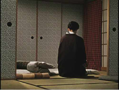
Twilight of another, not quite so old master: Late Autumn by Ozu. I reviewed some features of Ozu’s style and then analyzed the film as a multiple-character drama. Ozu and his collaborator Noda Kogo split up the plot in order to present different characters’ attitudes to the central situation: the question of a daughter’s marriage. The plot ingeniously withholds information about the attitude of Akiko, the mother, by deleting certain scenes that would clarify it. Here too, the old master recalls earlier films by having characters discuss their college flirtations, which invoke scenes from Days of Youth and Where Now Are the Dreams of Youth?
Both Billy Wilder and Akira Kurosawa furnished me with a second generational cohort. I know, probably nobody in his right mind would see common features between these two directors. But desperation can fuel audacity. Both emerged during the late 1930s, began directing in the 1940s, and enjoyed a string of great successes in the 1950s; but both fell on harder times in the 1960s. Both became accusatory living legends, haunting local industries that had kept them from working.
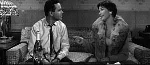
Leading up to The Apartment, I considered Wilder’s contribution to two trends. First, the industry had hit the doldrums. In Europe television and new leisure lifestyles were not yet the threat they would become, but in America, the industry needed to pull its audience away from the TV set and the barbecue. Wilder proved skilful in using Hollywood’s turn to sex as the basis for his cynical comedies. The Lubitsch touch, a worldly appreciation of the oblique approach to matters of sex, was replaced by something harsher. In Wilder’s world, there are mostly sharks and shnooks, those who take and those who are taken.
Second, I situated Wilder as a leading figure in the emergence of the writer-turned-director in the 1940s (Sturges, Huston, Brooks, Fuller, Mankiewicz, etc.). This encouraged me to probe his dramaturgy, and so we analyzed the taut structure of The Apartment’s plot. It has rightly been recognized as a model screenplay, making us sympathize with a careerist covering up his bosses’ infidelities, all the while whetting our interest by shifting the range of knowledge away from the protagonist at key moments. It also displays a nice interweaving of motifs that function both dramatically and metaphorically (especially Miss Kubelik’s hand mirror). Of course at the end I had to run a clip showing the influence of The Apartment on the opening of Jerry Maguire.
By the mid-1960s, however, Wilder was pushing his luck, especially with Kiss Me Stupid. In The Apartment he wanted to make “a movie about fucking,” and he predicted that some day people would do the deed onscreen. But having glimpsed the promised land of the 1970s, he was unable to enter. Despite some worthy efforts, notably The Private Life of Sherlock Holmes, he haunted Hollywood as a major director who had outlived his moment.
Human, all too human
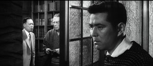
Kurosawa’s international fame came largely through the growth of the film festival as a prime institution of international movie culture. This situation let me sketch in the importance of festivals in bringing directors like him to world recognition. (By the way, Richard Porton has just brought out an informative collection of thoughts on film festivals.) With The Bad Sleep Well, I was able to talk a bit about something that is often forgotten—Kurosawa’s efforts in social, even political cinema. From Sugata Sanshiro, a tribute to Japanese martial arts, and The Most Beautiful, the loveliest movie you’ll ever see about girls making lenses for gunsights, up through Occupation projects like No Regrets for Our Youth and Scandal, Kurosawa engaged with political subject matter. Ikiru and I Live in Fear made this side of his work even more salient in the 1950s.
The Bad Sleep Well’s attack on corporate corruption sits well with this tendency. It considers the “iron triangle” of Japanese politics, the collusion of bureaucrats, politicians, and private industry—particularly the building industry, whose livelihood depends on bids for government projects. Still, it’s hard to believe that while Kurosawa made the film, and while Ozu made the serene Late Autumn, students were fighting police in the streets over the US-Japan security treaty. That turmoil surfaced in Oshima Nagisa’s demanding and formally daring Night and Fog in Japan.
The movie is shot with Kurosawa’s usual muscularity, including virtuoso compositions in what he called, following Toland, “pan-focus.”
The film’s twists also seemed to me worth examining. The protagonist is a minor presence in the first scenes, and his reticence in the beginning is mirrored in the finale, when he simply vanishes and his pal has to tell us what happened to him. Such a daring structure, reminiscent of the abrupt midway break in Ikiru, gives the film an almost Brechtian discomfiture, as well as highlighting the secondary characters’ rather perverse reaction to the hero’s fate.
Kurosawa was widely called a “humanist” director, and this concept sheds light on what we might call the “international film ideology” pervading festivals in the 1950s. In various areas of social and philosophical thought, a notion of humanism emerged out of disillusionment with the “age of ideology” that had engulfed the world in war. Several thinkers declared that the age of religious dogma and social collectivism, either Nazi or Communist, was over. Now what mattered were the features that drew people of all societies together, and the prospect of enlightened social action based on those commonalities—tolerance, respect, and a belief that people ultimately took individual responsibility for their communities. Catholics, Communists, and people of all stripes scrambled to call themselves humanists. As Dwight Macdonald, former Trotskyite, put it, “The root is man.”
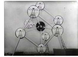 This frame of reference can be seen in Steichen’s 1955 photo exhibition, circulated around the world in a best-selling book, called The Family of Man, as well as in the 1958 Brussels Expo, the first major world’s fair since the war. There films like For a More Human World (frame right) presented technology, science, education, and cooperation as teaming up to improve the lives of people in all nations.
Film festivals embraced this universalism, pointing to the great films of Italy’s Neorealist trend as proof of cross-cultural communication. Although these films often scored specifically Italian political points, they could also be seen as human documents speaking to audiences anywhere. Who could not empathize with Ricci and his son in Bicycle Thieves (named at the 1958 Expo as the third-greatest film ever made)?
The turn to humanism helps answer a puzzling question: Why Satyajit Ray? Virtually no Europeans had ever seen a film from India. What enabled a director from this country to achieve worldwide renown? And why not other Indian directors of his era, such as Raj Kapoor, Guru Dutt, Mrinal Sen, and Ritwik Ghatak? All of these had to wait many years for discovery by European tastemakers.
For one thing, Ray was highly westernized himself. He was a child of the Bengali Renaissance, a virtuoso in many fields (he composed music, drew with facility, wrote detective stories and children’s books), and an admirer of European cinema. A stint assisting Jean Renoir exposed him to one of the greatest of Western filmmakers. A viewing of The Bicycle Thieves determined him to make films. He was skeptical of imitating Hollywood, which had been a prime inspiration for Hindu cinema. He criticized Bollywood’s reliance on schematic romance and musical numbers. If any Indian director was to make the move to the festival circuit, it would be him. (You can argue that other non-European filmmakers who made it into the fold were the most “western”—Kurosawa, Leopoldo Torre Nilsson, etc.).
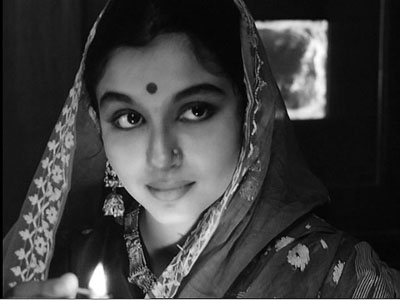
Just as important, Ray’s stories suited the humanist program. Whereas Ghatak and Sen made politically charged films, Ray concentrated on the individual. In The World of Apu, social conditions are shown, but as a background to the development of personality and psychological tensions. At the film’s start, students are holding a street march demanding political rights, but they are offscreen, a backdrop to Apu’s meeting with his old professor as he gets his letter of recommendation. What follows is a drama of artistic failure, blossoming love, and a young man’s confused growth to maturity and responsibility.
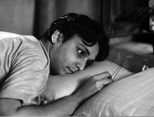
It’s a simple story, rendered lyrical through constantly developing imagery: Apu stretched out prone, the famous grimy window curtain, and a cluster of visual motifs I hadn’t noticed on previous viewing. Ray’s concise direction links the torn curtain in Apu’s room to the famous (Langian?) transition from a movie screen to a carriage window, the cluster unified by associating Apurna with male children. Thanks to Andrew Robinson’s book on Ray, we know that in the carriage scene she is already thinking of the son she will bear.
It’s easy to romanticize this handsome, happy-go-lucky hero. I think the College participants thought I was a little hard on Apu, since I treated him as far from the “conscientious and diligent” young man his professor wrote of. Surely his idealistic-novelist persona is sympathetic. But if he is to grow as the film suggests, he must have failings, and Ray shows them to us—dreamy indolence, self-centeredness, even poutiness. The film is a character study, a sort of Bildungsroman tracing how Apu learns his place in his world. Our discussion after this film was particularly rich, with one participant suggesting that in accepting his son he isn’t abandoning his art entirely, but giving it human significance: He promises to tell Kajal stories.
Ray came to directing in middle age, a somewhat rare option. So too did Gillo Pontecorvo, but the latter made many fewer films. Although Kapò, isn’t as strong a movie as our other entries, it did allow us to talk a bit about coproduction, about European cinema’s relation to World War II, and about what came to be known as the morality of technique.
European coproductions are another fundamental part of the 1960 landscape, and they illustrate how economic considerations penetrate artistic choices. (Why are American and Italian actors in the “German” film 1000 Eyes of Dr. Mabuse? Why do we find Anouk Aimée in 8 ½ and Jeanne Moreau in La Notte? Follow the money.) For the Italian production Kapò, the primary roles are taken by an American (Susan Strasberg, playing the heroine Edith) and two French actors—the concentration camp translator played by Emmanuelle Riva and the heroic Soviet soldier played by Laurent Terzieff. The film was shot in Yugoslavia.
The story centers on a young Jewish girl who, in order to survive Nazi internment, passes herself off as a Gentile and becomes a camp commandant, whipping other prisoners into line. Other Italian films of the period, notably Rossellini’s Generale Della Rovere, were dealing with issues of conscience during the war, but Kapò was apparently the first fictional feature in Western Europe to confront the Holocaust since Alessandrini’s Wandering Jew of 1947. In 1960, Adolf Eichmann had been captured by the Mossod and stood trial the following year, and after Kapò came a few other films addressing the camps, notably Wajda’s Samson (1961) and Lumet’s The Pawnbroker (1965). So the film had a strong contemporary resonance; after its US release, it would be nominated for an Oscar.
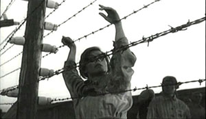
One reason Stef and I picked Kapò was the controversy around Jacques Rivette’s accusation in Cahiers du cinéma that for a particular tracking shot Pontecorvo deserved “the most profound contempt.” The film, as Rivette indicates, is dominated by an already compromised conception of realism: grimed faces, make-up that hollows cheeks, somewhat ragged clothes, moderately shabby bunks. The shot shows the body of Theresa hurled against the electrified barbed wire, with the camera coasting slowly toward it. Her silhouette is almost classically composed, with the hands artfully pivoted and standing out against the sky. For Rivette this pictorial conceit is virtually obscene.
It seems to me that Rivette’s essay sought in part to reply to those who thought that Cahiers’ policy amounted to pure formalism. In calling for an ethics of technique, Rivette argues that artistic choices which might seem to be in the service of correct politics can betray a deeper immorality: using a historical cataclysm as an occasion for a safe realism and self-congratulatory flourishes. Similar complaints could be lodged against Kramer’s Judgment at Nuremberg and Stone’s World Trade Center. And because for the Cahiers team artistic cinema was an expression of a creator’s vision, the morally maladroit traveling shot brands the director as a man of bad faith.
Rivette isn’t saying that film artists shouldn’t try to represent historical trauma. He simply argues that other paths could be taken. For instance, Resnais’ Night and Fog and Hiroshima mon amour acknowledge that some events cannot be encompassed by normal understanding, and the form of each film enacts an effort to understand, not a fixed conclusion. What we see in Night and Fog is “a lucid consciousness, somewhat impersonal, that is unable to accept or understand or admit this phenomenon.” For Rivette, Pontecorvo seems convinced that romantic love and self-sacrifice can overcome Nazism, albeit with some help from the Red Army. He tries to explain, even prettify, an event that cannot be understood within the usual humanistic categories.
New Wave, still new
Lola.
Godard’s Le Petit soldat is far more preoccupied with uncertainties, even confusions, than Kapò is. 1960 saw an extraordinary number of former colonies, especially in Africa, gain independence, and during that year the Algerian war of resistance was spreading to Europe. Godard’s central character Bruno is working with the OAS vigilantes dedicated to killing Algerian terrorists, but when he meets the lovely Veronica Dreyer he decides to leave politics behind and flee with her to Brazil. Perhaps “decides” is the wrong word, since his actions are impulsive: he abruptly shies away from committing a political assassination, and he abruptly abandons his colleagues. But he’s captured by FLN terrorists and, in the film’s most famous sequences, tortured. At the end, he commits the assassination, not knowing that Veronica, herself in league with the Algerians, has been captured by his pals and killed. But his final voice-over is almost a shrug, and his act of murder takes on the flavor of an existentialist acte gratuite.
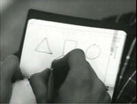
Le Petit soldat doesn’t offer heroic figures, as Kapò does in Theresa and the Soviet soldier. Nor does it allow us to sympathize much with the egotistical, capricious Bruno. The texture is more disjunctive, littered with the usual digressions and citations. Since the film was shot in Geneva, there’s a persistent motif of Swissness, with citations of Paul Klee. A sneaky one I never noticed before: the seduction game Bruno plays is modeled on the three fundamental shapes in the Bauhaus basic course, which Klee taught.
Having experimented with discontinuous imagery in À bout de souffle, Godard in his second feature turns his attention to the soundtrack, creating one of the most minimalist ones I know. If Bresson whittles down his soundtrack to a spare but recognizable realism, Le Petit soldat goes a step further, scrubbing out nearly every noise until we’re almost watching a silent film. Traffic scenes lack traffic noises, with only a car horn or a bit of dialogue breaking in. One passage on a train could almost be a sound loop.
The strategy of suppressed sound is carried to a paroxysm in the torture scenes, with the clink of handcuffs and the soft tapping of typewriter keys highlighted and bits of music played spasmodically…but no sounds of pain. Only during the rushed and almost throwaway climax, is something like a plausible city ambience heard. In a dichotomy that will be familiar throughout Godard’s work, there’s a split between image (Bruno is a photographer, and in the early part of the film he takes snapshots of Veronica in her apartment) and sound (the political factions rely on telephones and tape recorders, and the OAS thugs trick their way into Veronica’s apartment through sound recording).
In all, Le Petit soldat isn’t exactly fun but it’s exhilarating in its bursts and unexpected frictions. Next time somebody tells me that Godard’s technical innovations have all become commonplace, I’ll point to this film of 1960, which would be daring and demanding if released tomorrow.
Fun, albeit grave, is what Lola is all about. It takes formal artifice far beyond realism, creating a sort of non-musical musical. (It has one number, and even that is a sketchy rehearsal.) As geometrical as a minuet, its plot plays out in a hall of mirrors, where characters share names, pasts, and sentiments. The sailor Frankie and the wandering Michel, both in love with Lola, are blonde giants. Lola is actually named Cécile, and the little girl of the same name seems in some ways an early version of her, while Cécile’s mother has a dash of Lola in her past.
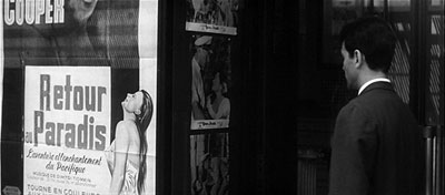
Roland starts out as the protagonist, but as he warms and cools and warms to Lola, the story momentum shifts to others. There’s Lola of course, and young Cécile who strikes up a friendship with Frankie, and Cécile’s mother who yearns a bit for Roland, and Michel, who left Nantes years ago and has lived in another movie, specifically, Mark Robson’s Return to Paradise (1952). Here the structure of the plot unfolds the network of relationships among people, linked mostly by casual encounters across a few days. The last section accordingly consists of a series of farewells, as if the story can end only by breaking ties of affection.
In surveying these films, I was struck by how much most of them owed to the growth of postwar institutions of film culture, and how strong those institutions remain. Coproductions and subsidies were feeding a massive buildup of European cinema. Contrary to what you might expect, as attendance cratered from the late 1950s onward, the number of European films produced went up. The EU countries still overproduce, releasing nearly 1200 theatrical features in 2008.
Film festivals were promoting not only universal humanism; they were also packaging films under rubrics of authorship or the New XXX Cinema and the Young ZZZ Cinema. 1940s Neorealism, aka “New Realism in Italian Cinema,” seems to have been, once more, the prototype. Festivals must make discoveries and emphasize novelties. At the same period film schools taught professional standards, and film archives showed classics and gave postwar filmmakers a more secure sense of the medium’s history. Lang, Ozu, and Wilder weren’t dependent on such institutions, but younger filmmakers were. And still are.
1960 is an arbitrary data point, but it stands out as an extraordinary year for quality. In addition, picking it as a benchmark allowed me to think about some important trends of the period. What probably didn’t show through my lumbering PowerPoints, with their charts, diagrams, and frame enlargements, was how much I learned from my Bruges stay. One of the deep satisfactions of teaching is remembering, no matter how confidently you declare your claims, how much more there is to know. Of things cinematic there is no end.
We also asked participants to read Serge Daney’s essay, “The Tracking Shot in Kapò.” Daney’s elaborate exercise in autobiography, irony, and moral reflection could not be plumbed in the time at my disposal, there or here. But it did help me understand Rivette’s argument. In preparing my lectures, I also owed a debt to some excellent books, notably Tom Gunning, The Films of Fritz Lang: Allegories of Vision and Modernity; Andrew Robinson, Satyajit Ray: The Inner Eye; Carlo Celli, Gillo Pontecorvo: From Resistance to Terrorism; and Richard Brody, Everything Is Cinema: The Working Life of Jean-Luc Godard. As ever, the invaluable documentation provided by the print editions of Screen Digest over the years enabled me to compile my tables of attendance, releases, and the like.
Late Autumn.
P.S. 3 Aug: Stef has posted snapshots from our Zomerfilmcollege here.
P.P.S. 3 Aug: This helpful correction from Roland-François Lack on Le Petit Soldat:
One small point: the organisation Bruno works for cannot be the O.A.S., which wasn’t active until the end of 1960.
He is working, rather, for ‘La main rouge’, a government sponsored counter-terrorist agency run by a Colonel Mercier (hence the name of Bruno’s associate).
Nice! Thanks.
What happens between shots happens between your ears
DB here:
In Number, Please? (1920) Harold Lloyd plays a lovesick boy who’s been jilted by his girl. Moping at an amusement park, he sees her arrive with a new beau.
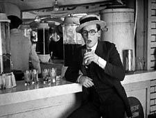
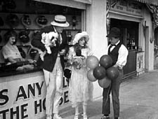
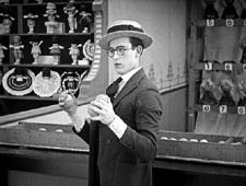
He shifts to another spot to watch them. When she notices him, she scorns him, and he reacts.
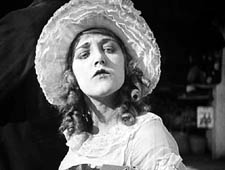
She and the escort stroll past, then she turns and cuddles up to him, making sure Harold notices.
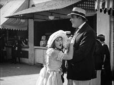
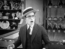
Her flirting precipitates the rest of the action in this very funny short.
In this scene from Number, Please? Harold and the couple aren’t shown in the same frame. The action is built entirely out of singles of Harold and two-shots of the couple, with an especially emphasized close-up of the girl’s snooty reaction. The sequence is rapidly paced and carefully matched in angle; note the shift in eyelines as the girl and her beau walk a little way and then she looks back at Harold.
This approach to building a scene was consolidated in American studio cinema in the late 1910s, as we noted recently, and it soon spread around the world. One of the places it caught on most fervently was Soviet Russia.
Kuleshov glories in the gaps
The great director and theorist Lev Kuleshov always claimed that he and his associates learned the power of editing from American cinema. Russian films were slowly paced, consisting of long tableaus occasionally broken by an inserted closer view of an actor. (For examples, see my Bauer blog entry from the summer.) Kuleshov noted that the Hollywood films brought into Russia grabbed audiences’ interest more intently, and Kuleshov attributed this effect to the fact that the Americans exploited editing more fully, creating the scene out of many shots.
Kuleshov’s example was the formulaic scene of a man sitting at his desk and deciding to commit suicide. The Russians, Kuleshov claimed, would handle this all in one distant framing, with the result that the key actions were just part of the overall view. By contrast, Americans would shoot the scene in a series of close-ups: the man’s face, his hand taking a pistol out of a desk drawer, his finger tightening on the trigger, and so on. This gave the scene a powerful concreteness, and was cheaper to film besides (no need to have a full set).
But most American filmmakers didn’t create the scene wholly out of close-ups. Typically there would be an establishing shot before the action was broken down into detail shots. The process has come to be called analytical editing. (We discuss it in Chapter 6 of Film Art.) As the label implies, the cutting analyzes an orienting view into its important details.
Less commonly, as in our Number, Please? example, American directors could create a scene entirely out of separate areas of space, without ever showing a master framing. This technique, usually called constructive editing, remains common today as well, especially in action scenes.
While praising analytical editing, Kuleshov was particularly taken with constructive editing, because that shows that cinema can call on the spectator’s tacit understanding to assemble the separate shots. Kuleshov realized that we will build a sense of the scene’s space and action out of separate shots without need for the comprehensive view supplied by an establishing shot.
What the Americans developed, the Soviets thought seriously about. Around 1921, Kuleshov and his students mounted some experiments, several of which he discusses in his books and essays. He probably didn’t need to experiment; the American films were full of examples. Indeed, the Number Please? passage is more intricate than any experiment Kuleshov seems to have mounted. But he had a bit of the engineer about him, and he sought to break the technique into its simplest components.
For one thing, constructive editing offered production efficiencies. You could film two actors separately, at different times, and then cut them together. Further, Kuleshov saw that editing could abolish real-world constraints. It created events that existed only on the screen, with an assist from the viewer’s mind.
This is perhaps best seen in his experiment involving an “artificial person.” Evidently it wasn’t a case of constructive editing, because it seems to have begun with an establishing shot. The first shot shows a girl sitting at her vanity table putting on makeup and slippers. A series of close-ups of lips, hands, legs, and the like were derived from different women, and they were edited together to create the impression of a single woman. (Something of this effect survives in the idea of a body double in contemporary films and TV commercials.) But the point is that the woman on screen, made out of different parts, doesn’t exist in the real world.
The same possibility could apply to geography, if we delete the establishing shot. As Kuleshov describes his experiment, we initially get a shot of a woman walking along a Moscow street. She stops and waves, looking offscreen. Cut to a man on a street that is in actuality two miles away. He smiles at her and they meet in yet a third location, shaking hands. Then together they look offscreen; cut to the Capitol in Washington DC. Kuleshov saw the potential for imaginary geography as both a useful production procedure and a demonstration that editing could create a purely cinematic space, one not beholden to reality.
Kuleshov’s most famous experiment, the one he identified with the “Kuleshov effect” proper, involves a stock shot of the actor Ivan Mosjoukin, taken from an existing film. In his writing he’s rather vague and laconic about the results.
I alternated the same shot of Mosjoukin with various other shots (a plate of soup, a girl, a child’s coffin), and these shots acquired a different meaning. The discovery stunned me—so convinced was I of the enormous power of montage. (1)
Kuleshov’s pupil the great director V. I. Pudovkin offers a different description of the shots: a plate of soup, a dead woman in a coffin, a little girl playing with a teddy bear. He also goes farther in reporting how the audience responded. People read emotions into the neutral expression on Mosjoukin’s face.
The audience raved about the actor’s refined acting. They pointed out his weighted pensiveness over the forgotten soup. They were touched by the profound sorrow in his eyes as he looked upon the dead woman, and admired the light, happy smile with which he feasted his eyes upon the girl at play. But we knew that in all three cases the face was exactly the same. (2)
Now it isn’t only geography or a human body that has been created by editing; it’s an emotion.
These experiments have been poorly documented, and only a couple have survived. One consists of fragments of the imaginary geography exercise. Here is Alexandra Khokhlova waving, but we don’t have the answering shot of the male actor responding. The two meet at the foot of a statue.
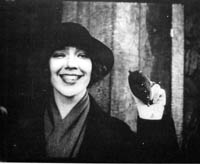
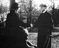
After the two shake hands, they look up and out of the frame, but unfortunately we lack the shot of the Capitol.
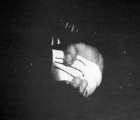
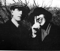
Kristin and other scholars have written more about these surviving fragments, and their essays are published along with Kuleshov’s proposal for funding the experiments and his wife Khokhlova’s memoir of filming them. (3)
It’s worth taking these prototypes of constructive editing apart a little bit. Clearly, there are several cues that prompt us to see the shots as continuous.
One cue is a common background, or at least a consistent one. Kuleshov thought that sometimes a neutral black background worked best, especially for close shots, as you can see with the handshake shot. Another cue is roughly consistent lighting from shot to shot. Yet another is the presumption of temporal continuity; no moments seem to be omitted in the cut from shot A to shot B. It never occurs to us to consider that Kuleshov’s man is looking at something hours or days before the soup is laid on the table in the second shot.
One of the most important cues goes unmentioned by Kuleshov: the very act of looking. Like most commentators, he seems to take it for granted. Yet it’s crucial in prompting us to imagine an overall space in which the actions take place. Knowing the real world as we do, we can infer that if you’re close enough to watch someone, both people are probably in a shared space, such as the arcade strip in the amusement park in Number, Please?
Another cue is facial expression. In his soup/girl/coffin sequence, Kuleshov supposedly picked a shot of Mosjoukin that doesn’t have a clearly identifiable expression. If Mosjoukin was smiling in his interpolated shot, he would presumably seem not grieving but wicked. Normally, though, performers seen in the single shot are expected to express the appropriate emotion more fully, in order to specify what we take the characters’ mental states to be. Our sequence from Number, Please? makes sure we understand the drama by giving the actors unambiguous expressions.
Finally, in the Kuleshov prototypes each shot should be simple. Its action can be stated in a brief sentence. A woman waves. A man responds. A man looks. A plate of soup sits on a table. Even in Number, Please? we can summarize each shot: Harold looks off. His former girlfriend disdains him. That’s to say that the shots are composed to present only one, quickly grasped point of interest.
Filmmakers don’t need to tease apart all these cues; they use them intuitively. Soon after Number, Please?, Hollywood filmmakers were creating amazing passages of eyeline-match editing—the most virtuoso being probably the racetrack sequence in Lubitsch’s Lady Windermere’s Fan (1926). Within a few years of Kuleshov’s experiments, Soviet filmmakers were creating their own masterworks, like Battleship Potemkin (1925) and Kuleshov’s By the Law (1926). Benefiting from a very compressed learning curve, filmmakers took constructive editing to new heights.
Constructive editing, dissolved relationships
Sometimes constructive editing is used to save a scene when production goes astray. When Doug Liman reshot the climax of The Bourne Identity, Julia Stiles couldn’t be on set, so singles of her taken from the first version were wedged in among the retakes, to create the impression that she was watching Jason confront his controller. More positively, a carefully calibrated constructive editing is central to a sequence I analyzed a while back in In the City of Sylvia. For over 100 shots, the spatial relations are built up without an overall establishing shot. (4)
Constructive editing can be used systematically throughout a film. A good example is Alan J. Pakula’s thriller Presumed Innocent (1990). Spoilers coming up!
Harrison Ford plays Rusty Sabitch, a prosecutor in the District Attorney’s office who becomes infatuated with a new woman on the staff. He has a brief affair with her, but after she’s broken it off she’s found brutally murdered. He has to investigate the crime without involving himself, but eventually he becomes the prime suspect.
At the start of the film before Rusty learns of the murder, Rusty and his wife Barbara are shown at breakfast, and establishing shots bring them together.
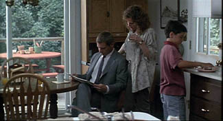
At the office Rusty learns of Carolyn’s death, and after he comes home, the conversation between Rusty and Barbara is treated without an establishing shot. Barbara knows about the past affair, and Rusty is wracked by guilt and shame. The cutting seems to reflect the fact that Carolyn’s death has revived the pain in their marriage.
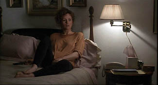
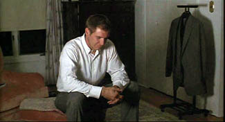
In a series of flashbacks, Rusty relives his affair with Carolyn. Pakula treats their early encounters by means of constructive editing. The common-background cue is especially helpful in this scene in a kindergarten.
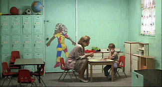
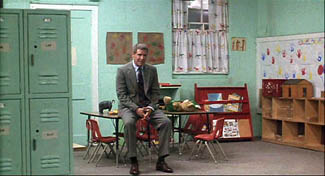
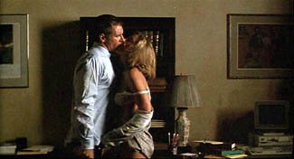
Only after Carolyn and Rusty cooperate and win a child-abuse case does the cutting’s rationale become clear. Pakula has saved the traditional two-shot framing for their moment of passion, as they make furious love in the office.
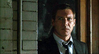
But soon their affair wanes and Rusty is reduced to watching Carolyn from across the street in point-of-view shots.
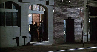
After the flashbacks end, Rusty is investigated and eventually charged with Carolyn’s murder. In these scenes Pakula often situates Rusty and Barbara in the same frame, as if the threat to him has healed the breach between them.
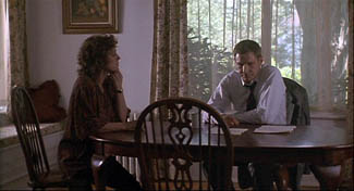
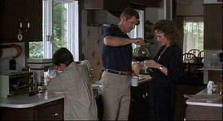
Yet in the film’s climax—and here is the big spoiler—they are pulled apart again. The last scene is a sustained monologue by Barbara. As Rusty listens, across twenty-six shots the two are never shown in an establishing shot.
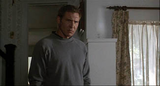
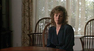
Contrary to the standard Hollywood ending, in which the loving couple embrace in reunion, here they are left divided.
Pakula’s use of constructive editing has effectively traced two arcs: the growth and dissolution of Rusty’s affair, and the reuniting and dissolution of his marriage. In such ways, what might seem a purely local effect, confined to a handful of shots, can create stylistic patterning across a film. The judicious use of constructive editing matches the dramatic development.
Godard of the gaps
Robert Bresson has made more varied and complex uses of constructive editing across a film, as I tried to show in Narration in the Fiction Film and in an Artforum essay. (5) A more radical approach, somewhat in the purely Kuleshovian spirit, can be seen in Godard’s films since the late 1970s. In presenting a scene, Godard often omits an establishing shot, so constructive editing takes over. But he makes the technique quite abrasive and ambivalent.
In watching films like Number, Please? and Presumed Innocent, we fill in the gaps between shots with ease. Godard, however, makes his images and sounds more fragmentary by equivocating about the Kuleshovian cues. The background elements and lighting don’t match entirely; time seems to be skipped over; glances and facial expressions are ambivalent. Adding to these factors, lines of dialogue slip in from offscreen. Godard does present a dramatic scene taking place, but he also creates a sense that images and sounds have been pried loose from their place in an ongoing action, floating somewhat free and functioning as objects of contemplation for their own sake. The cues that Lloyd insists on and that Kuleshov plays with are ones that Godard suppresses or makes ambiguous.
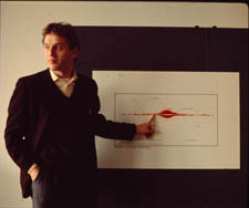
I’ve mentioned this tendency in a recent entry, but to elaborate a little, consider the science lecture in Hail Mary (Je vous salue Marie, 1985). A professor who has emigrated from an Eastern bloc country is explaining his theory that life on earth began and evolved because it was directed by extraterrestrials. No establishing shot of the classroom shows us where he, Eva, and two male students are located, so we have to construct a rough sense of their positions on the basis of a few cues. As Eva, perched on a windowsill, toys with a Rubik’s cube, we hear the professor’s lecture begin to speculate on whether life could have evolved spontaneously. His remarks about sunlight coincide with a burst of sun on her face.
After the Biblical title, “In those days,” we get a series of shots that allow us to apply our mental schema of a classroom lecture: attentive students looking off, a professor at the blackboard.
Lacking an establishing shot, we can’t specify how many people are in the class, nor indeed where Eva and her classmate are sitting—since the professor looks off in several directions during his talk.
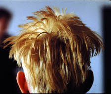
At the end of his talk he remarks, still scanning the room, that we can presume that life exists in space. “We come from there.” At that point Godard cuts to the head of another student, seen from behind. The sproingy haircut is a little explosion of yellow, and it’s accompanied by a burst of choral music. And as the shot goes on, we start to notice that the professor is pacing in the background, out of focus.
The student, whom we’ll learn is named Pascal, asks a question (at least the slight head movement suggests that it comes from him), and the professor replies. Pascal scratches his head as the professor continues, still out of focus. If I had to choose one shot that condenses Godard’s strategy of suppression in this sequence, this shot would be my candidate.
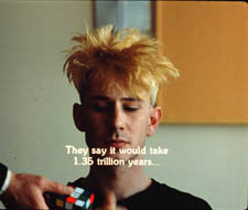
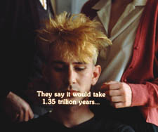
At the end of the shot, the professor asks Eva to stand behind Pascal. Cut 180 degrees and somewhat farther back to Pascal, now seen from the front. The professor’s hand brings the Rubik’s cube into the shot and Eva comes up behind Pascal as the professor passes.
Later she and the prof will become lovers, but Godard lets them meet first as simply two torsos intersecting behind Pascal. The purpose is a demonstration that a “blind” agent can be steered toward a goal through simple yes/no commands. This models the professor’s theory that an alien intelligence could have guided evolution.
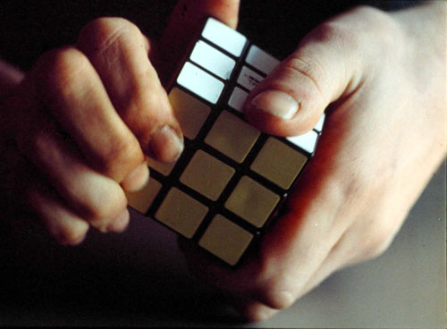
Pascal will twist the facets of the cube under Eva’s hints. Godard makes this a tactile, even erotic exchange, with the close-up of her by his ear and Eva saying, “Yes,” more urgently as Pascal’s hands arrive at a solution, in the close-up surmounting this blog entry.
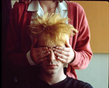
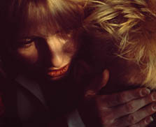
The next two shots of the sequence center on the prof, who has exited frame right from the “three-shot.” Now he’s at the window, recalling the initial shot of Eva; but unlike her he’s little more than a silhouette. As crashing organ music is heard, he seems to be watching the experiment from afar. The second shot, an axial cut-in, coincides with the offscreen voice of a male student: “Were you exiled for these ideas?”
“These ideas, and others,” the prof replies. He says he’ll see the class on Monday, evoking the idea that he’s dismissing the offscreen students, and he turns his head slightly, though we can’t be sure they’re on his right. This shot will be held for some time as students quiz him more about his theory, and Eva asks him if he’d like to come over for a drink some evening. But we don’t see her say it. Godard cuts to a shot of Eva at the window, bathed in sunlight, opening and shutting her eyes as she slightly lifts and lowers her head.
As we see her, we hear the rustling of people leaving (so the class was evidently larger than three). And we hear him reply to her invitation, “That’s another story [scénario].” Are Eva and the prof looking at each other? We’re inclined to say yes, but her closed eyes and tilting head suggests someone lost in contemplation rather than engaged in conversation. Here the classic facial-expression cue is made indeterminate. We have no way of knowing if the prof’s line comes from offscreen, or is displaced from another point in time; maybe he has left the room. Such displaced diegetic sound occurs elsewhere in the film.
We don’t have to decide; our indecision is the point. By pruning away the most reliable cues, Godard wins both ways. We’re kept somewhat oriented to an intelligible action: a prof sets forth his far-fetched theory of human origins and a woman in his class invites him for coffee. This side of the balance allows us to feel that a story, however sketchy, is moving forward.
But the moment-by-moment texture of the scene allows the individual shots, gestures, and sounds to drift somewhat free. Each image takes on a more intrinsic weight, and the juxtaposition of picture and sound acquires a resonance that we usually call poetic. A shot of Eva in the sun playing with the Rubik’s cube, unanchored in time (during class? before class started?), invites us to apply metaphors, especially once we learn her name. Pascal’s thorny hair suggests not only extraterrestrials but the explosion of a nova. The silhouetted prof, detached from the mechanism he has set in motion, hints at an unknown deity watching the game play out according to his rules. Why do Godard films spawn long essays built out of erudite associations? Because the narrative progression relaxes and we can weave our own connotations out of what we see and hear.
If you don’t want to go down the expanding-association route, there’s another one open. When individual moments no longer accumulate ordinary dramatic pressure, we can savor the fugitive pleasures of the separate shots (light on face, lips by ear) and the patterns they form: flipover cuts, yellow hair and yellow facets, bookended shots of Eva at the window.
Those patterns, it should be clear, depend on our sensing a bump at every shot change, looking for a way to skip across the gap that Godard creates. The same belief that meaning and effect are born of gaps impelled Kuleshov too, and perhaps even Lloyd. If we pay attention to those gaps we can feel minds—both the filmmaker’s and ours—at work in them.
(1) Lev Kuleshov, “’50’: In Maloi Gznezdinokovsky Lane,” Kuleshov on Film, trans. and ed, Ronald Levaco (Berkeley: University of California Press, 1974), 200.
(2) V. I. Pudovkin, “The Naturschchik instead of the Actor,” Selected Essays, ed. and trans. Richard Taylor (Oxford: Seagull, 2006), 160.
(3) See Kristin Thompson, Yuri Tsivian, and Ekaterina Khokhlova, “The Rediscovery of a Kuleshov Experiment: A Dossier,” Film History 8, 3 (1996), 357-367.
(4) The sequence does begin with a long shot of the café, but it is so distant, crowded, and brief that it can’t really be said to establish the spatial relationships among the several characters we see.
(5) “Sounds of Silence,” Artforum International (April 2000): 123.
Godard comes in many shapes and sizes
DB here:
James Quandt started it.
The indefatigable Senior Programmer of the Cinémathèque Ontario emailed me in early 2004 to ask if I had any thoughts on the aspect ratios of Godard films. He attached an essay which eventually appeared in the gorgeous anthology, For Ever Godard. Reading a Quandt essay is like eating a ripe nectarine, tangy and nourishing. So you should find the original and indulge yourself. (1)
You might be asking what the term aspect ratio means. It refers to the ratio of the width to the height of the film image. The image was fairly square in the early silent era, then became roughly standardized at 4 x 3, or as the pros say, 1.33:1. Sound filming made the format a tad more horizontal, at 1.37. Anamorphic widescreen (CinemaScope and its brethren) was more or less standardized at 2.35 (more recently 2.40). Various non-anamorphic, or “flat” aspect ratios have appeared since the early 1950s. The US has favored 1.85, Europe has been known to use the squarer 1.66, and some films, like E. T., are designed for 1.75. Widescreen TVs are set at 16:9, or about 1.78:1, so that’s likely to be a common proportion in the future. We discuss aspect ratios at more length in Film Art: An Introduction (pp. 183-185 in the newest edition).
Filmies care about aspect ratios because shot composition matters. Sometimes the print is “hard-matted,” with the correct proportions given as black bars at the top and bottom of the frame, like video letterboxing. Here’s an example, from a 16mm print of Godard’s 1972 Tout va bien. It is hard-matted to 1.66. (The original film is in color.)
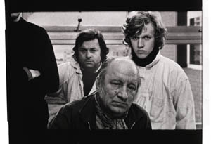
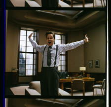
If the image isn’t hard-matted, the projectionist must insert an aperture plate that will mask the image properly. But what plate? Should she set it for 1.37? That’s a very rare option nowadays, and many theatres aren’t really designed to show it. Typically, if the print doesn’t indicate, the US projectionist will fall back on 1.85. Nowadays, if a Hollywood film isn’t in Scope, the projectionist is expected to use that ratio. Some shots will be problematic if the projectionist includes more than the 1.85 format allows. Here’s a full-frame film strip from The Hudsucker Proxy, where you can see that a chunk of the set is blocked or missing in the bottom area, and a microphone peeks into the frame from the top. (2)
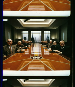
Like many other movies, the films made by Godard since the mid-1970s show up at the projection booth without hard matteing. So at what ratio do we show them?
A great many careful viewers have voiced their views on the Internets, and I’ve learned a lot from the discussions here and here. In part this blog entry is an effort to introduce readers to this debate.
Moreover, this apparently film-wonkish question has wider implications. It can teach us a fair amount about how film images work, and the implications of any masking, matteing, or cropping of an image—especially on DVD. So if you’re interested in Godard, keep reading. If not, skip to the final section, “Relationships: The fundamental question,” where I talk about some artistic effects of cropping any film image.
It’s a just image, not just an image
James Q was mounting one of his typically ambitious retrospectives, this time on JLG, and so his essay posed a question that had long been ignored.
A disturbing discovery of the retrospective was how frequently the full-frame compositions of Godard’s late films have been ignored and overruled. Many of the prints are clearly marked by the lab with the widescreen ratios of 1.66 or (the almost standard) 1.85, and their subtitles are printed in the frame at the height indicated by those standards. Our meticulous projectionist Kate Mackay experimented with whole reels of films, showing them first in 1.33 and then in the prescribed wider screen ratio, revealing the violence done to the compositions when shown the latter way.
James found that several films, including Passion, Je vous salue Marie (Hail Mary), Nouvelle Vague, Hélas pour moi, and For Ever Mozart, looked “abjectly constricted” in 1.85. So James wrote the man himself.
Disturbed by some oddly cropped compositions in Éloge de l’amour, which result in seemingly unintentional beheadings and concretions, I consulted Godard by fax about the aspect ratio and he confirmed that it was indeed, as stated, 1.66 (rather old-fashioned in its own way). That he occasionally still seems to be jamming a 1.33 composition into a frame that cannot accommodate it suggests his instinctual preference for the open image.
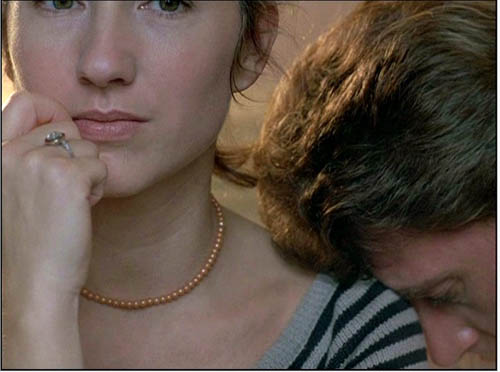
I couldn’t help James much at the time, but I did send him a couple of frames that favored squareish compositions and that came from 35mm prints. Other frames we reproduced, at 1.37, in both editions of Film History: An Introduction. The still that pretty much settles the matter for me is the gorgeous shot of Nathalie Baye and Johnny Hallyday at the top of this entry. Here’s the image as it is on a 35mm print.
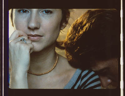
Downsize that to 1.66 without losing those eyes!
Later I sent James another killer example, drawn also from a 35mm print of Detective. (It’s in the new Film Art, p. 46.)
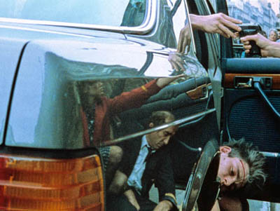
Here’s what it would look like in one try at 1.66 matteing.
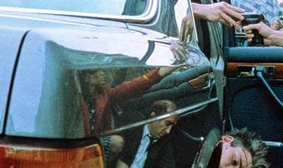
I say “one try” at a matted version because I didn’t take as much off the top as a normal aperture plate would; I didn’t want to slice into the hands and the gun. Not only is the 1.37 image preferable (we get to see Claude Brasseur’s slumping posture) but 1.66 looks, as James says, jammed. The 1.37 ratio lets Godard load information in the very top of the shot, as we’ll see often in the examples to come. And, needless to say, at 1.85 the shot would make no sense.
Soon after James and I had our exchange, Godard—perhaps prodded by James’ query—sent a diagram to Cahiers du cinéma. (3) (Thank you, Craig Keller, aka evillights, who called attention to it on this thread.) The Cahiers editors report that Godard has asked that Notre musique be shown in 1.37. His photomontage lines up two shots from the film and arranges them according to the three major “flat” ratios, and for each one he supplies a tart annotation.
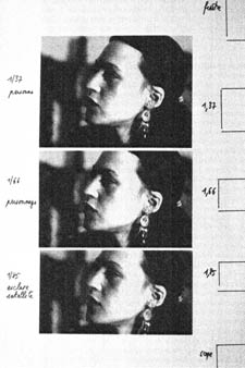
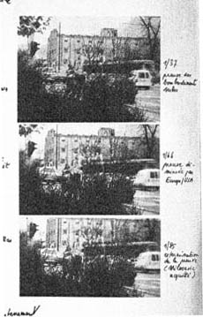
For the close-up of the woman, the captions translate as: 1.37 person. 1.66 character. 1.85 satellite slave. For the long shot of the street, we get: 1.37 Proof of Serbian bombing. 1.66 Proof diminished by Europe/ USA. 1.85 Extermination of proof (Milosovec acquitted).
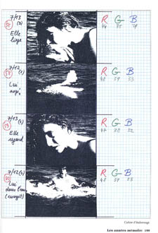
Pretty strong evidence that JLG doesn’t like cropping the classic format. But these remarks are about Notre musique. What about the other films? Apart from the evidence onscreen and on the film strip, we can add one thing. Evidently he shoots at 1.37, but there’s also evidence that in the late stages of postproduction he seems to preserve that ratio. Here, for example, is a sheet of color timing instructions for Nouvelle Vague. (4) Godard has pasted in a frame for each shot in the sequence, and alongside he notes how much red, green, and blue he wants. The frames he mounted are 1.37.
Recently our Cinematheque has been holding a Godard retrospective, and I’ve taken the opportunity to revisit the aspect ratio issue. As an archival venue, we can screen at any ratio, even the squarish silent and early-sound ones. Our projectionist Jared Lewis has run the Godards at 1.37. They look fine.
Jared pointed out to me that one other factor leans toward screening them in the 1.37 format: the thickness of the spaces between frames. In a modern “full-frame” film like Hudsucker Proxy, there is very little space between the frames. The line separating one from another is quite thin. That tends to make the frames squarer, closer to 1: 1.2, as I mention in endnote 2.
In a classic sound film, there is often more space between the frames. Usually that space is black, but I can’t resist showing what it looked like in Technicolor.
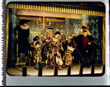
This frame, from Renoir’s Golden Coach, shows the characteristic silver frame surround (and silver soundtrack) of a true Tech print. Nifty, huh?
Anyhow, the sort of thick spacing between frames that we get usually find in Godard prints, and that’s visible in the Baye/Hallyday frame above, favors the classic ratio. The thickness of these spacers is similar to what we find in a modern film that was explicitly designed for 1.37 screening, Hans-Jürgen Syberberg’s Parsifal (1982).
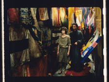
This array, Jared points out, gives different frame proportions than one would find in a print hard-matted to 1.66 or 1.85.
One more wrinkle. On the film strip, Godard’s frames aren’t all the same dimensions. Here are two from Je vous salue Marie; note that the first is taller, with narrower spacers, than the second.
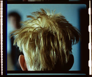
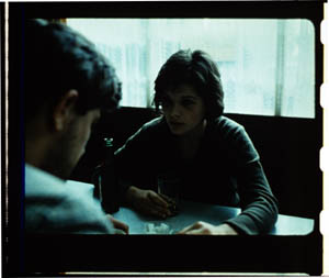
Both, however, would be appropriately shown at 1.37.
How then are we to explain Godard’s saying the films should run at 1.66? Perhaps, as one of the online commentators has suggested, Godard assumed that 1.66 is the closest that most commercial venues can come to 1.37. Perhaps too he was just being contrary–that is, just being Godard.
Fortunately, some DVD producers seem to recognize his full-frame aesthetic. The UK version of Detective is full-frame and preserves my nifty shots. Also, the Cahiers du cinéma discs for Prénom Carmen, Hélas, and so on are at 1.37. Bowing to Godard’s wishes, Wellspring’s version of Notre Musique announces that it is presented “in its original theatrical aspect ratio of 1.33.” Although purists may say that virtually no theatres showed it that way, we should appreciate the gesture.
Relationships: The fundamental question
Even if you’re not that interested in Godard, everybody should be aware of what video cropping can do to the film image. I’m not talking about panning and scanning, that process which begins with a widescreen film, typically one of an aspect ratio 1:2.40, and extracts a 1.37 frame out of it for video purposes. This is deplorable, but most of us are alert to it. What’s more interesting is the sort of thing that happened when a film is cropped inaccurately, either in projection or for DVD.
My example will be from the first reel of Godard’s Éloge de l’amour/ In Praise of Love, which is available on DVD in a full frame version from Optimum in the UK and in a cropped version from New Yorker in the US. I won’t be focusing on the quality of each transfer, though the Optimum one looks superior to me.
Nor will I do a detailed narrative account, because I find the characters and their interactions still fairly baffling. I’m always amazed that critics can praise a Godard film without ever getting down to explicating what’s literally happening in a scene. They write as if these films were telling their stories straightforwardly. Without help from the presskits, could journalists discern even the sketchy plots they refer to? A great deal of the fascination of Godard’s late works comes from his refusal of the most elementary forms of exposition–picking out characters, explaining their relations, and the like. There is always a story, but it’s about three-quarters hidden, and this seems to me to require a lot more analysis than people tend to give it.
Anyhow, in studying Éloge de l’amour‘s video versions, I learned that there can be a big difference between tiny numbers. For instance, the Optimum version is prepared at 1.35:1. No big deal between this and 1.37:1, surely? Except that the New Yorker version seems to have started from a 1.37 frame. Even though it’s cropped on the top and bottom, it consistently supplies a tad more information on the right and left edges, and these extra bits are visible in side-by-side comparison. First, a 35mm frame.
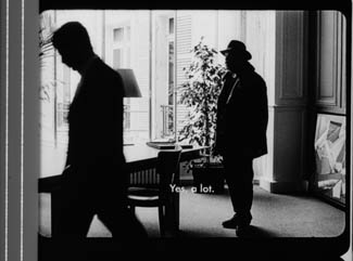
Needless to say, the projector’s aperture plate won’t preserve everything in the physical frame; at a minimum it masks off the curved corners. But if we look at the two video versions, there are some surprises.
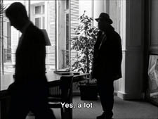
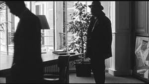
The 1.37 version of this shot is of course much closer to the overall composition of the original. But more areas of the window frame (on the left) and the painting (on the right) are visible in the widescreen version than in the full-frame one. Did going for 1.35 shave off those areas? Moreover, New Yorker’s cropping is at 1.77, for all intents and purposes the same as 1.75. But to achieve this wide frame, the transfer of some shots seems to have been optically stretched a little. In some upcoming examples the faces are a bit plumper and the surroundings a bit more horizontally spacious.
Okay, maybe I’m splitting hairs. So let me assume that the UK DVD preserves a reasonable amount of the 35mm original. I want to consider some effects of the cropping we get in the US DVD. Some are obvious, some more subtle, and all go beyond this individual case to suggest the results of overcropping any movie.
(1) Of course we lose the top and bottom. In the full-frame shots from Hudsucker Proxy, no problem; the filmmakers are counting on the projectionist to mask the frame. But in Godard the cropping makes us lose stuff. Godard likes to frame heads pretty high in the shot, and this means that we often lose part of them.
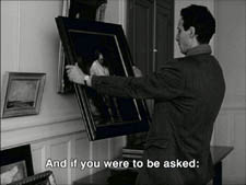
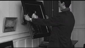
Heads are trimmed in movies all the time, and it doesn’t much matter in close views. But in Éloge, Godard is composing long shots with heads quite high up. He will even daringly chop off heads himself. This is partly a strategy to conceal who is present, to block our recognizing characters by their faces. It also has the effect of activating areas of the frame that aren’t usually so important. We have to strain to see partially visible things, tucked away in bits of the shot.
In the example below, I submit, the original composition creates a tension among three centers of interest: the two very visible paintings and the almost indiscernible face of the art dealer standing by the rear window. That tension is lost when the 1.77 cropping lops off the head in the background. Significantly, the man offscreen left is talking about how classic painting displayed “relationships” (rapports)–presumably both personal and pictorial. “That’s the fundamental question.”
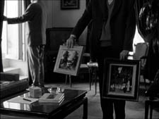
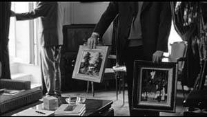
The framing of the assistant in the foreground, incidentally, shows that spotting a decapitation in a video version doesn’t necessarily mean that Godard wanted every head to be seen.
In a later scene, we strain to see the older man’s face as he bends over Bruno. As he speaks Picasso’s immortal line, his profile scrapes the very top of the shot, but not in the cropped version.
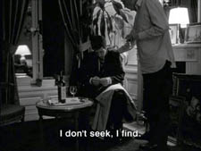
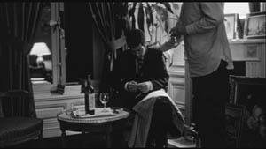
In most film shots, the upper half of the frame harbors what we look at first, so we’re probably most likely to notice when something goes missing there. But actually, the area at the bottom of the frame is important too, especially as part of Godard’s all-over approach to composition.
Throughout early scenes of the film, Godard’s compositions favor the art works and minimize the humans trafficking in them. So the picture (by Delacroix? Matisse?) on the coffee table is foregrounded when the art collector signs the papers proffered by a mostly unseen woman, but it vanishes in the cropped version.
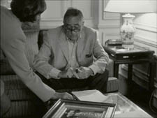
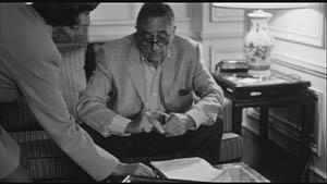
Likewise, the old man on the bed can rub his glasses fretfully at the very bottom of the 1.37 format, but that performance detail goes for naught in the 1.77 format.
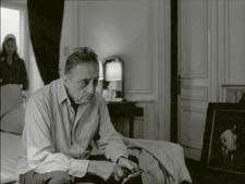
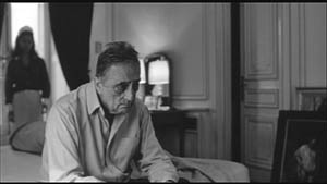
More generally, even when we scan the top half of the frame for major information, we tend to take for granted that people are anchored to a ground plane, the earth or the floor or whatever. Often, of course, film shots don’t show us this ground. But the material at the bottom of a distant view can weight the shot, providing a sense of gravity. Here, the dealer peering over his balcony is minimally tied to the patio ground (as minimally as he was visible in the earlier shots when his head grazed the upper edge, I suppose). But in the 1.77 version he floats free.
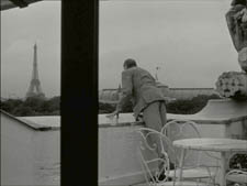
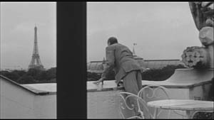
(2) The top and bottom zones include the corners of the frame as well, but I single them out for special mention because I like them so much. Again, we don’t expect key information to be tucked there, but it can happen—in Godard, in Tati (a big influence on the late Godard), and even in one remarkable shot in Lumet’s recent Before the Devil Knows You’re Dead. In the first reel of Éloge de l’amour, the best example I can find comes with the long-shot of the woman, turned from us, standing at the window. In the lower right corner of the shot sits a woman’s photograph on a table. The 1.77 frameline chops it off and makes it less segregated for our notice: we lose the spacing that separates it from the other objects on the table. Since the voice-over is meditating on memory, the photo adds an overtone to the shot, but less clearly in the cropped version.
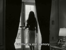
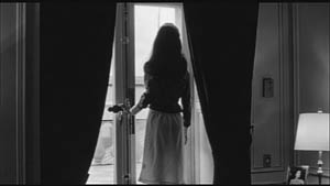
Maybe it matters, maybe not; but it’s a lot harder to see in 1.77 than in the 1.37 transfer. Something similar happens with the businessman’s hand in the lower left of this shot.
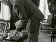
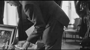
(3) Cutting off top and bottom alters the shot scale. All other things being equal, cropping not only eliminates; it enlarges. Figures come closer to us. A medium shot becomes a medium close-up. All of the examples so far indicate this to some degree, but it comes across clearly in these variants.
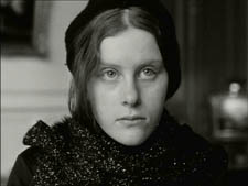
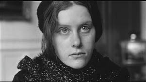
Again, note the stretching. It seems that someone decided that the image had to be 1.75 and instead of cropping it, stretched the 1.66 one. Yikes!
(4) Overambitious cropping changes the compositional dynamics. In reducing information, it reorganizes the composition. Rudolf Arnheim (I blogged about his achievements here) suggested that we consider a picture as a field of vectors and forces, pushes and pulls, balance and imbalance, rival centers of attention. By changing the framing we change the relation of the figures to the edges, and this can alter the composition.
The clearest examples come from the sort of reframings we find when a Super-35mm film is rendered in home video versions in both 2.40 and 1.37.
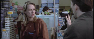
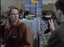
In this shot from 8mm (the movie, not the gauge), the cashier questioned by Cage looks more isolated in the Scope framing, while in the full frame they seem closer together and he seems to press in on her. Cropping can change a lot.
Now consider this comparison.
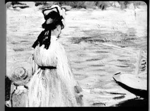
Godard’s original shot (here from 35mm) keeps the painting’s upper horizon, the darker, frothy waterline as a kind of backboard, halting the water’s recession into the distance. Graphically, the water on the right center becomes a negative space for the two figures, with the boy counterbalanced by the tip of the skiff.
But the cropped version loses the distant waterline, creating an infinite stretch of space top to bottom, and the boy’s head seems to float more freely. Most starkly, the skiff, by losing its shadow, seems to have swung more toward us.
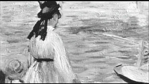
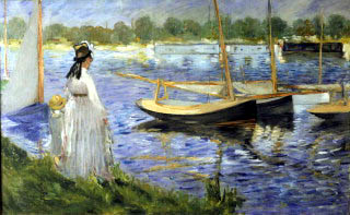
It’s worth noting that Godard himself is a mean hand at radical cropping. I’ll forebear from rambling on about what his original framing above does to the original, Manet’s Seine at Argenteuil (1874), but it could constitute a lesson in how framing changes effect and meaning.
Several factors come into play when we look at this shot from the two DVD versions.
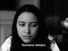
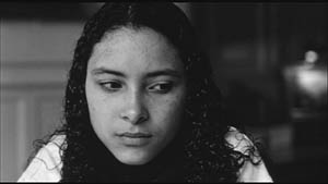
The woman’s face is off-center in both images, but it looks more off-center in the 1.77 transfer. In fact, despite the extra bits on left and right, it is measurably more off-center, because of this transfer’s optical stretching. Yet I’d argue in addition that the cropping of the frame has squeezed the pictorial elements into a stronger horizontal to-and-fro, giving a sense that she has been pushed more out of the middle. You can see it more markedly if we crop it more drastically, and it may help to hide the others when you look at this.
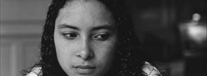
This effect is akin to what happens in the cropping of the 8mm example: the spatial relations have reorganized in relation to the frame edges. Rapports again.
(5) Overcropping can affect the way we experience the time of the shot. Before you call the men in the white coats, I hasten to say that cropping is purely a spatial effect, but in cinema space is bound up with time.
We’ve seen that Godard manipulates the vertical dimension of the frame to an unusual degree, and the effect on time becomes apparent in one scene of Éloge in which Bruno talks with an older man, in a sort of casting session for his project. First we see Bruno alone, and as he walks to the window the old man comes in, his back to us. We presume it’s a man by the bulk, the gait, and the fedora, making its appearance in the upper right corner.
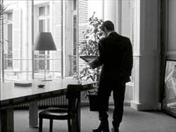
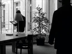
Or does a man come in? In the 1.77 version, at the corresponding point in the shot, we can’t tell it’s a man until the figure comes further into the room.
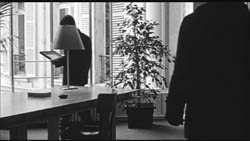
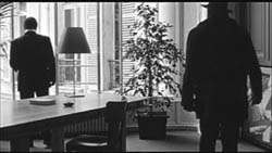
Godard’s reliance on the upper part of the frame allows us to discern the caller sooner in the 1.35 version. Seconds, even split-seconds, matter in cinema. Insofar as cropping affects the timing of a shot’s unfolding, it affects our experience.
( 6) Cropping affects perspective, the perceived distances and volumes of objects in the visual array. Blowing up the center of an image creates a flatter, more friezelike space than we discern in the original. This becomes evident in a later phase of the scene I just mentioned. After Bruno leaves the shot, the old man is left standing in the office.
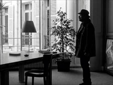
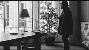
The 1.77 image looks more like it was shot with a long lens than does the full-frame version. The result recalls the sort of perpendicular telephoto framings so common in the 1970s, in films like The Parallax View and The Conversation (below).
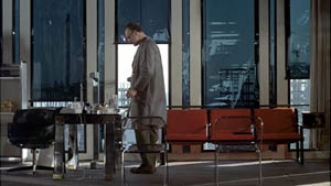
Godard has said that he preferred 30-40mm lenses for much of Sauve qui peut (la vie) because a focal length of 50mm (and presumably one longer than that) will “destroy perspective.” (5)
Many of these differences wouldn’t matter in most films, which aren’t composed as meticulously or as daringly. Hollywood images aren’t typically as dense as those in late Godard. (I must do a blog some day on fussbudget filmmakers like him.) But even if these niceties seem negligible, I think you’ll grant that the film would be much more compromised by being shown in a 1.85 ratio, the squarest option available in most commercial theatres today.
Critical discussions of Godard’s late films have treated them as poetic meditations, and that seems partly right to me. Yet few critics ask how they manage to create their lyrical, associative quality. I think, as I hope to show in a future blog, this has to do with his treatment of narrative (naturally) and his layout of scenes. But even before we get there, I think that we find in the very texture of his images (let alone his sounds) a daring decentering of faces and bodies—the usual nodes of our attention. If he often blocks the flow of our glance, it’s in order to rechannel it to unexpected areas and textures, crannies and gaps, within the image. And so we want all those areas and textures, along with the crannies and gaps, available to our eyes and minds.
(1) James Quandt, “Here and Elsewhere: Projecting Godard,” in For Ever Godard, ed. Michael Temple, James S. Williams, and Michael Witt (London: Black Dog, 2004), 126-139.
(2) Geek note: You may notice that this “full-frame” image isn’t itself in the 1.37 ratio. It’s very square. The reason is that many 1.85 frames will be exposed in the camera at a ratio of 1: 1.2! I believe this was standardized for the Panavision cameras of the 1970s and afterward, though I’d appreciate more information about this. See the entry on Panavision cameras in American Cinematographer Manual, fifth ed., ed. Charles G. Clarke (Hollywood: American Society of Cinematographers, 1980), 104. See also Rob Hummel, “Comparison of 1.85, Anamorphic and Super 35 Film Formats,” American Cinematographer Manual, eighth ed., ed. Rob Hummel (Hollywood: ASC Press, 2001), 24-29.
(3) Jean-Luc Godard, “Formats,” Cahiers du cinéma no. 591 (May 2004), 78.
(4) This image is taken from Jean-Luc Godard par Jean-Luc Godard, vol. 2: 1984-1998, ed. Alain Bergala (Paris: Cahiers du cinéma, 1998), 199.
(5) Jean-Luc Godard, “Propos rompus,” in Godard par Godard vol. 2, 466.
Thanks to Suzy Buenger and Nancy Marshall for identifying the Manet painting for me.
PS 15 Dec: And thanks to James Quandt, Michael Kerpan, and Yogesh Raut for a name correction I’m too embarrassed to specify further.
PS 7 April 2008: The issue is raised anew with Gus van Sant’s Paranoid Park. It’s designed to be shown at 1.37, with more than a few shots reminiscent of Godard. Joe Beres explains here.
PPS 25 January 2009: Ranjit Sandhu provides a lively and detailed discussion of aspect ratios and matteing strategies, along with remarks on Godard’s frames.
PPPS 21 Sept 2009: Thanks to editor John Olivio for a correction on the 1.78 aspect ratio.
JLG par JLG (1995).
Summer camp for cinephiles
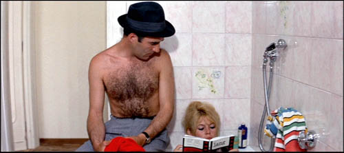
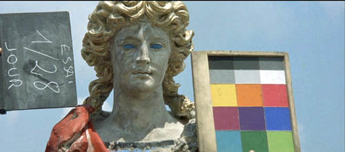
Bruges, Belgium is a tourist haven. This reconstructed medieval city boasts museums, canals, cafes, an impressive town square, and other attractions guaranteed to keep credit cards flowing through. It’s a wonderful place to stroll in the sunshine, shop, or watch windmills slowly spin.
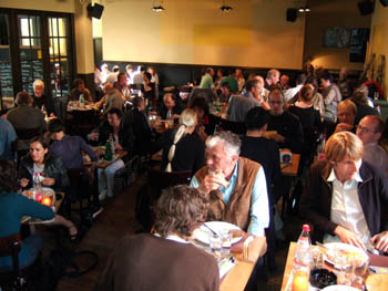
In alternating summers, though, Bruges plays host to people who prefer to sit in the dark. This strange cult includes professors, students, and cinephiles from all walks of life. For a small fee Belgians and Netherlanders can plunge into eight intensive days of viewing, lectures, and discussions. While tourists shuttle by unsuspecting, the devout are gathered to watch such items as Rebel without a Cause, the entire Niebelungen, and Destroy All Monsters.
It’s the Zomerfilmcollege, funded by the Flemish side of the Belgian government and run by the Flemish Service for Film Culture in partnership with the Royal Film Archive. In English we’d call it Film Summer Camp. There are no papers or grades. It’s a college in the original sense, a gathering of minds for purposes of deepening knowledge and expanding ideas.
It’s held in the Lumière cinema, a central three-screen moviehouse specializing in arthouse fare (and, for part of our stay, The Simpsons Movie). On the ground floor is a cozy bar, which also serves the lunches and dinners for the collegians. The whole building, like the atmosphere of the event, is unpretentious and welcoming.
Typically there are two principal courses and a sidebar. This year, one course was on Fritz Lang, the other was on widescreen film, and the sidebar was devoted to the French cinematographer Henri Alékan (La Belle et la Bête, Wings of Desire). The schedule is fairly full. At 9:00 AM there’s a lecture, followed by a film screening, then lunch. After lunch, another lecture and another screening. Dinner follows at about 6:30, and evening events follow, with a film or special presentation at 8:00 and then at least one more film afterward. All films are in 35mm prints.
A real workout
Kristin and I had been lecturers here several times, but this year I came alone. The Lang cycle was to have been handled by Tom Paulus, who gave us Hawks last time, but illness kept him away. He was replaced by several other fine Flemish scholars: Hilde D’haeyere, Steven Jacobs, and Roel Vande Winkel. They supplied lectures on Lang and architecture, on his relationship to the German “street film,” on his relation to the Nazi regime, and on his American work. The retrospective gave a good sampling, running from the Dr. Mabuse films (1922) to Moonfleet (1955; very nice print). For Alékan, there was the filmmaker/ archivist/ novelist Eric DeKuyper, for whom Alékan shot A Strange Love Affair (1984), and the Belgian professor Muriel Andrin, who incisively introduced us to visual influences on Alékan’s aesthetic.
Most lectures are in Dutch, but fortunately for me some are conducted in English. In previous years I’ve lectured on modern Asian film, Hollywood in the 1970s, and the history of film staging. This year my topic was anamorphic widescreen. The talks grew out of my research for an essay to appear this fall in my collection Poetics of Cinema.
The week is now about three-quarters done, and I’ve had a great time. Using clips and slides, I started with a block tracing CinemaScope in the US, with my main examples being Rebel, River of No Return, Moonfleet (intersecting with Lang), The Girl Can’t Help It, and Compulsion. Tonight we’ll get our example of modern usage of the widescreen with a showing of Three Kings.
The next three sessions concentrate on non-US usage of the anamorphic format. Le mépris screened today and will be discussed tomorrow. Oshima’s The Catch will represent a Japanese approach. On Sunday, we end with Johnnie To Kei-fun’s The Mission as illustrating one Hong Kong approach. By nice synergy, To’s Election and Election 2 are playing on other Lumière screens, so collegians can sneak off for some extracurricular viewing.
I enjoy visiting the college, and not just because I like to lecture. A schedule of screenings negotiated by what’s available in a good print from the archive or a distributor forces me to confront films I haven’t studied before. Even for those I know pretty well, seeing them big and beautiful can stimulate new musings. And as any teacher will tell you, even going back over familiar material shows you something fresh.
No lack of scope
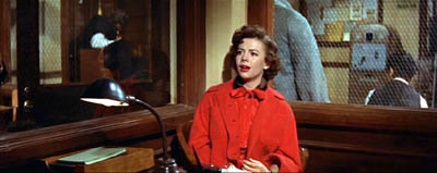
For example, I had always loved the way Nicholas Ray used deep space to link his young protagonists in the police station at the start of Rebel. But this time I noticed how Dean’s performance was fitted to the wide frame: He begins the movie prone and pretty much ends there.
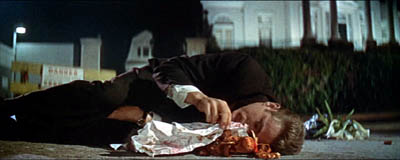
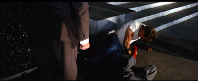
I also noticed how Jim’s gesture of covering the toy monkey at the start is echoed by his and Judy’s protective covering of Plato, and by the climax when Jim’s father covers him.
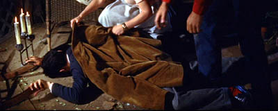
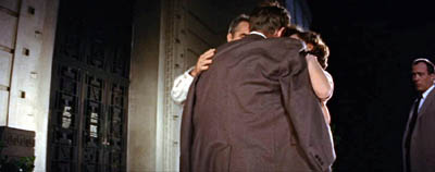
Viewers more familiar with Rebel than me have probably noticed these rhyming gestures and attitudes, but finding them on my own, innocently if you like, fueled my interest in teaching a film I had never studied closely.
Likewise, I wasn’t aware that the glasses motif in Compulsion is linked to imagery of blinding light, a kind of supernatural authority that not only points to the guilty party but also leads the monstrous, pathetic Judd to mercy. The dynamic is given diagrammatically in the closing and opening credits.
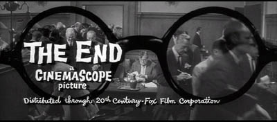
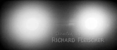
My previous post was about watching movies small and super-slow; now I’m reaping the advantage of watching films big and normally. Today, watching Godard’s Contempt on the screen I was able to enjoy those motifs of color, light, and composition that move almost musically through every Godard film (See top of entry.) I was able to identify some more citations (the novel adorning BB’s fanny is John Godey’s noir Frapper sans entrer) and feel the full force of the bold geometry of the framings. I hadn’t noticed before that the first image of the table lamp in the apartment sequence prepares, inversely, for the villa steps in Capri.
And I’d never noticed before how the last time Paul sees Camille, at the rocky outcropping that overlooks the seascape, she becomes that nymph seen in Lang’s rushes and identified as Penelope of the Odyssey.
Perhaps Camille is Penelope for Paul, but not necessarily for us. One task of the film is surely to make us suspicious of neat parallels between contemporary and classical culture; what Godard gives us graphically he often qualifies or negates elsewhere in the film. (1)
I expect to have some further fun with The Catch and The Mission, both of which will look splendid on the Lumière screen.
I turned sixty on the day I showed Rebel. Being here, though, I don’t feel so old. I have to keep up with the collegians and the dedicated archive team–Stef, Tim, Vico, Esther, and Joost. Their energy turns a medieval city into an exuberant adventure in cinema.
(1) After preparing my lecture, I discovered a wonderful website on citations in Godard, with special focus on Le mépris.
The Zommerfilmcollege gang, in 2.35 Scope. Photo by Esther Dijkstra.


