


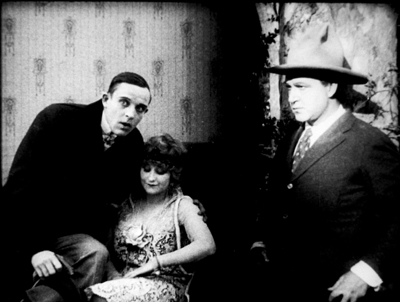
Archive for the 'Film technique: Staging' Category
Venice 2017: Sensory Saturday; or, what puts the Virtual in VR?
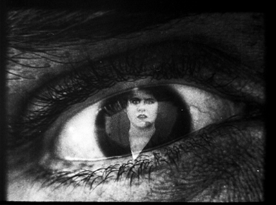
La Camera Insabbiata (2017) by Laurie Anderson and Hsin-chien Huang.
DB here (still at the Mostra):
Kristin and I are Virtual Reality novices, so when we got a chance to sample some pieces at Venice VR, we jumped. The demand was great for the 22 pieces on display, and you had to book each encounter separately in advance. The event was held on its own island, Lazzaretto Vecchio, which was startling in itself; the facility was once a hospital for plague victims.
We took in four pieces in one afternoon and may go back to see some others. We didn’t see exactly the same ones, so my report and speculations are limited to mine. Apart from being fairly wild, sometimes creepy, sensory experiences, they set me thinking about how VR seems to work as a medium.
Angels of artifice
My quartet was a varied assortment, each somewhat parallel to a film genre or narrative prototype. The first was Greenland Melting, by Catherine Upin, Julia Cort, Nonny de la Peña, and Raney Aronson-Rath. It’s part of a Frontline documentary series, and it follows the format, but with immersion. Presenters addressed the camera (me) and took me via helicopter to the glaciers so I could watch them heaving themselves into the sea.

The camera took me underwater as well, and I experimented with voluntarily bobbing under and above the waterline; it worked. Again, as in a film, the transitions between shots was managed through quick dissolves.
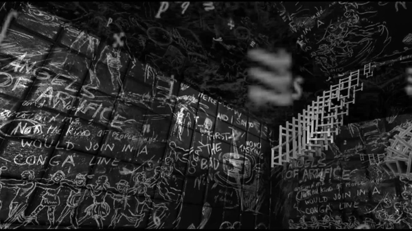
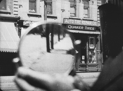
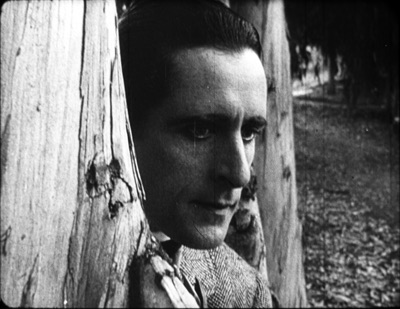
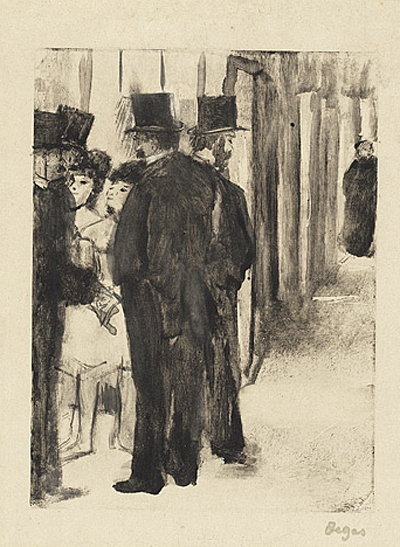
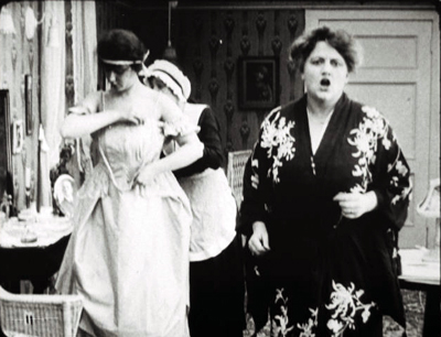
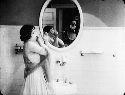
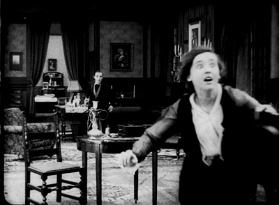
La Camera Isabbiata, by Laurie Anderson and Hsin-Chin Huang, is an installation running 20 minutes. It presents a fantasy landscape that you can move through. With two controllers, one in each hand, you choose one of several virtual domains to explore. As far as I could tell, all of them were based on cavernous arrays of blackboards chalked with graffiti. (See the image surmounting today’s entry.)
I first chose the sound domain, which asked me to speak. My words were not only played back to me, but then assumed vase or candy-bowl shapes of gleaming color.
Getting bored with hearing myself and seeing my words made solid, I switched to flying.
Flying was most excellent. Once I figured out how the remotes governed direction, speed, and angle, I could steer a swift path through, over, and around those huge black surfaces. The sense of self-initiated optical flow was powerful, although there were no other cues (e.g., balance, air pressure) to mimic actual flight. But I could have fun playing with this a long time. This was pure subjective POV cinema, or first-person gameplay if you like, and everything was one single shot.
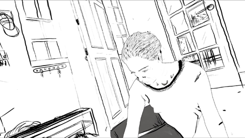
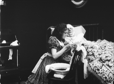
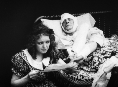
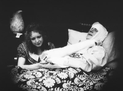
If La Camera Isabbiata put the onus on the user to initiate everything, Draw Me Close: A Memoir by Jordan Tannahill, made me respond to a situation. Once the goggles went on, I was guided to a black-and-white broken-line image of a woman on her sickbed. The artist’s voice-over presented the situation of his mother, dying of cancer, and me-as-him visiting her. Unseen by me, except as her avatar in the goggles, a performer filled the role of the mother, occasionally taking my hand and responding to my responses with more or less scripted comments.
I made my way to a cartoon bed and actually sat on it. The illustrated woman spoke to me, with Tannahill’s voice-over responding. On instructions, I went outside to fetch her paper, but coming back in I moved into a flashback of Tannahill (me) as a little boy playing with Mum. She chatted with me and I feebly responded, and followed her instructions to make colored marks on paper stretched out on the floor.
Later that night Tannahill’s narration guided me to a more unpleasant memory, one reminiscent of Terence Davies’ Distant Voice, Still Lives. It was a minimal narrative to match the images, but I could fill it thanks to the familiarity of the scenario and the tactility of furnishings (bed, door) and physical human contact.
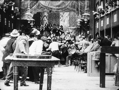
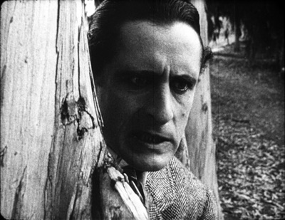
The Deserted, a 55-minute piece, was frankly billed as “a film by Tsai Ming-liang.” A series of fixed long-shots joined by cuts shows a typical Tsai situation: a young man and his mother live in a ruined temple. He apparently administers electrotherapy to his back and chest; he floats in his bath with a fish; it rains in buckets and water comes seeping in to where you’re hovering. A woman in white, perhaps a ghost, appears at times, once in the man’s bathtub.
You make the choices in La Camera Isabbiata, and you role-play in Draw Me Close, but in The Deserted you’re locked down as a witness. No images from the piece seem to be available, but this, from a shot of a camera monitor, roughly indicates the film’s first shot (which isn’t as distorted as this looks).
You can’t move to another spot, and you can’t even crane your neck to peek around corners. You can swivel your head to look 360 degrees horizontally and vertically. But nothing much happens behind your back or over your head. All the action, such as it is, takes place squarely in front of you. Given Tsai’s penchant for static long takes and deep areas of space, The Deserted isn’t putting you inside a real or virtual space; it’s putting you inside a Tsai film.
Reality has the most bandwidth
Since I’m no expert on VR, all I have are initial observations based on this sampling and on a bit of reading.
First observation: VR doesn’t have to be photorealistic to engage you. The image in Draw Me Close is quite impoverished in terms of real-world cues, and the shots of The Deserted are almost shockingly fuzzy. (Tsai, a fan of razor-sharp focus, would never let them in one of his film films.) Other pieces in Venice VR, visible on monitors while users were getting the full dose, are often quite cartoonish. Why are they then so compelling?
E. H. Gombrich suggested long ago that illusion can rely more on stimulation than simulation. That is, choose just a few sensory triggers and you’ll be aroused even if the image isn’t particularly lifelike. Baby geese can, if primed properly, take a box for their mothers, and frogs can snap at anything floating in a fly-ish sort of way around their heads. Outlines, it seems, are central for creatures like us, but they don’t have to be detailed. We also respond, fast and stupidly, to configurations that suggest faces.
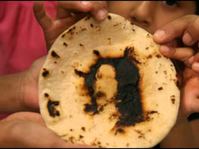

Try not to see Jesus, or Janis Joplin, in the tortilla, or a stare on the wings of a Caligo butterfly.
As caricaturists and camouflagers know, a few distinctive features can suffice to summon up the target, and the same goes for the partial and degraded input we see in Draw Me Close and The Deserted. In addition, concepts play a role; our ideas about what to expect in certain surroundings, such as a household, help the illusion cohere. And the information needs to be consistent. When I turn my head in Tsai’s temple, nothing I see contradicts the other cues.
A second point: The VR experiences subtract on some channels of input and compensate on others. Normally, perceptual reality is massively redundant. Our sensory systems reinforce one another. Tilting your head sends signals about balance and vision, while sight and sound and touch and muscular activity offer mutually confirming information. And when things are uncertain, you can always test your environment by moving around.
But the VR systems I encountered impoverish the input on certain channels. Standing in the helicopter of Greenland Melting, I saw the passenger seat beside me as vividly three-dimensional, but when I tried to grab it for support, nothing was there. In The Deserted, I looked down and didn’t see my feet; in fact I was an eye in a bubble floating midway up the wall, where the camera was. And in neither of these pieces could I move voluntarily to poke around much in the space.
I could do that in La Camera Insabbiata, but it was an impoverished environment along other parameters. I could fly, but not touch any of the surfaces–which were without color or shadow, beyond a spotlight that shifted to follow my attention (presumably guided by eye-tracking software). I couldn’t land atop one one of the monoliths, or bump into an edge.
Reciprocally, Draw Me Close provided other sensory inputs: locomotion (though not wholly voluntary), touch (initiated by the performer playing Mum, and by the prop bed and door), and an array of skimpy visual-spatial cues. In principle, smell could have been included. Why not, then, go the whole hog and use a photorealistic rendering of the space and Tannahill’s mother? Perhaps a very faithful representation of Mum and the household would have raised the problem of the Uncanny Valley.
Just as important, we might ask: Since a performer is always required for the piece, why not simply play out the scenes with her and the user? Just go for reality, not virtual reality. I’m guessing that the move toward drawn imagery marks the project as stylized enough to be a media artifact, rather than a piece of interactive theatre. (Though it is partly that.) Here, I’m thinking, the impoverishment of information on certain channels was a deliberate aesthetic choice, rather than being obligated by computer processing power, though that would probably have been a factor too.
One of the biggest compensations for what’s missing in some channels would seem to be good old peripheral vision. This is a very strong cue to immersion, and it can override inputs that contradict it. I remember being in one of the Disney World attractions back in the 1980s, a wraparound theatre that put visitors at the center of a travelogue. Even though there were plenty of cues that you weren’t in front of Buckingham Palace–such as your awareness of people around you looking in different directions–if you concentrated on the filmed display, there was a compelling illusion that you were riding down the street toward the Palace.
Peripheral vision would seem to be a powerful sensory trigger for creatures like us. This was the insight that drove widescreen cinema and the curved screen of Cinerama. But efforts to activate peripheral vision maximally come at a cost. You lose the frame and thus a sense of significantly composed imagery. The Disney display had, as I recall, borders at top and bottom, but in modern VR those too are abolished. VR gives with one hand and takes away with the other, so to speak: Greater immersion yields less of the pictorial structuring that’s inherent in framing. Tsai’s film somewhat overcomes this problem by making the surrounding space neutral and fairly uninformative, but the result still loses the sharp dynamic of offscreen and onscreen space we find in his feature films.
One more thought, which seems more solid than the others. Some have asked whether VR can accommodate narrative. I had presumed so theoretically, but now I’m convinced. Greenland Melting told a real-world story, an alarming one at that. Draw Me Close had emotion-laden scenes, a crisis and climax, and a flashback. The Deserted presented a typical Tsai scenario of humid stasis–a thin narrative, but a narrative. (As often in Tsai, what we miss in psychology and causal density we get in slight spatial changes and pictorial surprises.) It wouldn’t be hard to “narrativize” the Camera Insabbiata soaring, either, say by prodding me to go on a cosmic scavenger hunt. I conclude that of course VR can deal with narrative.
John Landis worried that VR was too wedded to long takes to suit cinematic storytelling. That worry was in turn tied to the assumption that narratives must guide your attention. True! But it’s wrong to assume that only continuity editing can shape a film story. Our attention can be precisely guided through long takes. Indeed, to a degree the sort of open and exploratory attitude some find in VR was already there in locked-down long-take directors like Mizoguchi, Akerman, Hou, and Tsai. And they told stories, plenty of good ones.
Many thanks to Peter Cowie, Alberto Barbera, Michela Lazzarin, and all of their colleagues for inviting and assisting us. Special thanks to Andrea Vesentini for guiding us through the array of events at Venice VR.
For details on Venice VR, go here. Variety covers the Venice event in articles by Elsa Keslassy and Nick Vivarelli. Patrick Frater interviews Tsai on The Deserted here. I found this Wired piece a good VR primer, and Ty Burr offers an update in MIT Technology Review.
Gombrich’s key essay on simulation and stimulation is “Illusion and Art,” available without illustrations here. In full form it appeats in Illusion in Nature and Art, edited by Gombrich and Richard L. Gregory (Scribners, 1973), 193-243.
For discussions of how storytelling cinema guides attention within the shot, see the categories Film Technique: Staging and Tableau Staging.
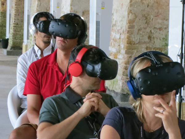
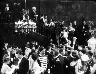
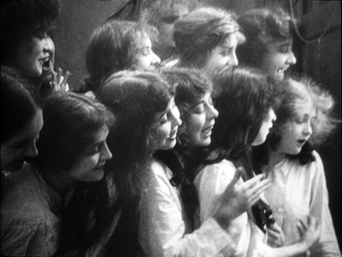
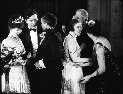
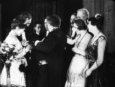
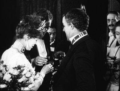
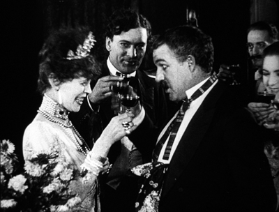
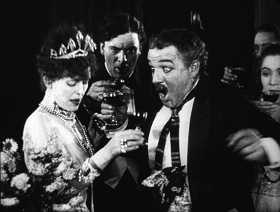
Better than a cellphone? Viewers at Venice VR.
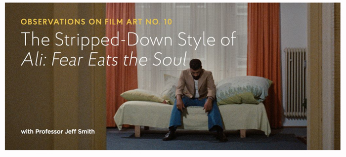
Fassbinder’s figures: Jeff Smith on ALI: FEAR EATS THE SOUL
DB here:
Normally our co-conspirator Jeff Smith would be guest-blogging to fill in background on his new installment on the Criterion Channel. That entry is devoted to Fassbinder’s great social melodrama Ali: Fear Eats the Soul. But Jeff is ramping up for the start of a semester, and we’re hustling to get ready for a trip, so let this notice do duty.
In this month’s entry, Jeff digs deep into Fassbinder’s directorial style and shows how it connects to the film’s portrayal of bigotry–ethnic, racial, age-related. Since at least Katzelmacher (1969), and right up to Querelle (1982), Fassbinder was constantly experimenting with performance and staging. Ali is one of his triumphs. Jeff is especially acute, I think, in showing how before-and-after parallels in the drama emerge from shrewd repetitions of compositions and mise-en-scene. Thanks to the boffins at Criterion, these become crystal-clear through judicious split-screen.
Jeff’s entry is one of our very best, and we hope subscribers to FilmStruck and the Criterion Channel will enjoy it. The transfer is very pretty too. Coming up in future months: entries on M, The Phantom Carriage, Brute Force, and Chungking Express.
As for Kristin and me, we’re off to the Venice International Film Festival. Peter Cowie has kindly invited me to be on the panel devoted to discussing the projects in the Biennale College Cinema 2017. From the press release:
“The thirteen feature films already produced and screened during the first four years of the Biennale College Cinema program have met with acclaim throughout the world. Produced on an ultra-modest budget, each of them showed an unusual talent and an innate gift for filmmaking,” notes moderator Peter Cowie (film historian and former Int’l Publishing Director of Variety). “The Biennale College Cinema scheme is exciting chiefly because it is in essence a workshop – a workshop and laboratory that places the focus squarely on two essential themes: the making of low-budget films in a period of global recession, and the need to find youthful auteurs if the cinema is to be reinvigorated.” The laboratory was created by the Biennale di Venezia in 2012 and is open to young filmmakers from all over the world.
This is very exciting. And while we’re in Venice, we hope to reconnect to old friend Mark Johnson (producer of innumerable outstanding films, including Rain Man, Logan Lucky, and Galaxy Quest) and newer friend Alexander Payne. They’re arriving with Downsizing. Many other major films will be there, and we hope to report on some of them here over the next two weeks. And then there’s some scary Virtual Reality….
Thanks as ever to Peter Becker, Kim Hendrickson, Grant Delin, and all their teammates at Criterion. A complete list of the Observations on Film Art series (ten already!) is here.
Videos of earlier Biennale College Cinema panels can be found here. Glenn Kenny discusses last year’s event on RogerEbert.com.
Our own efforts at split-screen analysis yielded a comparison of the murder and its replay in Mildred Pierce. You can see that here, and the accompanying blog entry here.
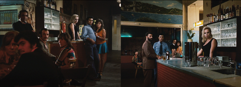
Ali: Fear Eats the Soul.
Wayward ways and roads not taken
DB here:
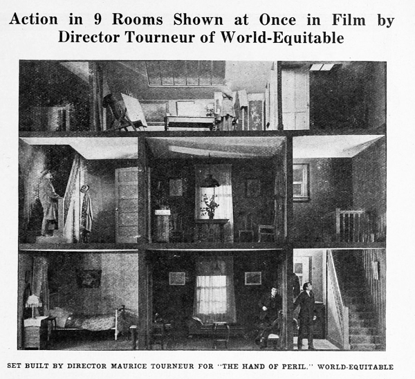
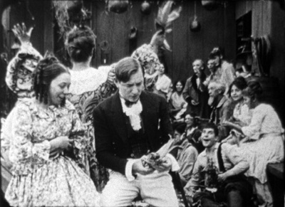
The Hand of Peril (1916) was trumpeted as something new in movie storytelling. It avoided the “cut-back”—that is, crosscutting between different lines of action. In this film, according to the Motion Picture News story above, “nine rooms of a house are shown, with action occurring in each room simultaneously. . . . The action occurring in one room . . . would have to be ‘flashed back’ were the nine rooms not shown.”
Variety found the innovation valuable for pacing. The movie “unfolds in the first four reels with the speed of a race horse. The suspense is constant and there isn’t any let-up whatever until the last few hundred feet.” It’s not clear whether the whole action took place in the house, but for the scenes that did, it appears that the cutaway set served a reference point, a sort of macro-establishing shot. This view gave way to cut-in closer views of the scenes in specific rooms.
Another trade journal noted: “The experiment is quite novel and attractive and fits in admirably in the story, but if it will prove of general worth cannot be told yet.” Now we can tell. This was a road not taken. Crosscutting remained in force, being far more cheap and flexible than dollhouse sets.
No copies of The Hand of Peril are known to have survived. Yet the fact that it was made suggests just how energetic the 1910s were in raising striking creative possibilities—some of which became conventional, some of which fell by the wayside. Seeing this sifting and winnowing at work was a constant delight during my recent stay in the Kluge Center at the Library of Congress. Watching nearly a hundred American features from 1914-1918 drove home to me how excitingly strange movies can sometimes be.
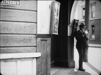
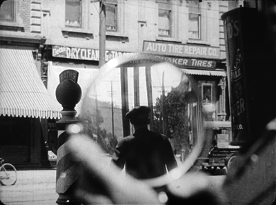
On the one hand, the conformist side of the films was there in abundance. Most of what I encountered were variants of an emerging “classical Hollywood cinema,” as they (we) say. Some efforts were crude, some smooth, but you could tell what the filmmakers were going for, and it was a thrill to see obscure films effortlessly exploiting schemas that would become central to our films. What a kick to see, in The Sign of the Spade (1916), a detective using a hand mirror to trail a suspect, with beautiful control of POV, frame composition, and rack-focus.
Hitchcock, eat your heart out. Well, wait until you start making films.
Yet looking for norms sensitized me to non-normative things—not merely clumsy efforts, but genuine attempts to try something different. Different and, to our eyes, often odd. American features of the 1910s include cuts and framings and camera moves and lighting choices and performance bits that no one now could imagine using.
My viewing companion James Cutting compared the week’s worth of films he saw to the Cambrian explosion in evolution, a period where all manner of organisms burst forth in profusion—before selection pressures wiped many out. While filmmakers were mastering classical plotting and continuity style, lots of other stuff was going on.
Have a look. Actually, several looks.
Widescreen, no. Tallscreen, yes.
Ready Money (1914).
In this shot, the story action is taking place at the nightclub table, but the society types gathered there are overwhelmed by all the hubbub around and above them. And we aren’t given closer views to help us sort it all out.
In all periods of film history, directors usually tried to center the action. Yet in early years, they sometimes favored framings that would today be considered strangely decentered. One of my favorite tactics from the ‘teens involves putting important elements in the bottom of the frame, notably in extreme long shots. In The Spoilers (1914), Cherry flops back in her saddle when she sees the devastated mining camp.
At the big reception in The Sowers (1916), a modern director would have put Paul and the dignitaries he greets in the foreground, and let Princess Tanya descend in the distance. But William C. de Mille creates a vast vertical composition, setting Paul in his braided uniform in the lower third of the frame and putting Tanya far back on the staircase.
Such top-heavy shots look odd to us, but they have a sort of grandeur, and the taste for them can be acquired. You can see a more intimate example in the fine recent release of Thanhouser films restored by the Library of Congress. The opening sequence of The Picture of Dorian Gray (1915) shows Dorian at the theatre, in a box in the foreground with Romeo and Juliet playing onstage behind him.
Even in the teens, I think this is an outlier. Most theatre scenes are handled with cutting to reverse angles of the audience and the onstage players. When there’s a box in the foreground, it’s usually anchored as such, as in Feuillade’s Fantômas (1913) or Willliam Wauer’s Der Tunnel (1915).
The strange symmetry of the Dorian Gray composition, aided by putting Dorian’s head along the vertical axis rather than off to the side, and by putting the object of his attention, the actress, directly above him, is really startling. The all-over quality of these compositions usefully remind us that every inch of frame space is there to be used if you have the imagination. We’ll see this hypersaturation of the frame in some later examples, but eventually the tactic would go away. Shots would put the human figures in the center of the format, or in long shots place them gracefully on foreground right or left.
Scene + insert
Both European and American directors of the 1910s employed what I’ve called the tableau approach. Within a fixed camera setup and fairly distant framing, the viewer’s attention is controlled through staging, either lateral or in depth. I’ve given plenty of examples elsewhere of how flexible and precise this style can be. A beautiful example occurs in Lois Weber’s False Colours, which I’ve already analyzed along these lines.
During the years I examined, directors were already discarding this approach in favor of cutting-based ways of guiding our eye. Some freely put the camera at various points around a set or an outdoor scene. (In all national cinemas of the period, we find more variety of camera placement on location than in sets, for obvious reasons.) More common was the tendency toward what was called the “scene-insert” method. A master shot of middle range (the “scene”) would be followed by a closer view of something within that space (the “insert”). Very often that cut would be an axial one—that is, a setup straight along the camera axis. Although sometimes decried as a mistake, the axial cut has been used by filmmakers of all eras.
The corn-husking bee in The Hoosier Schoolmaster (1914) illustrates how a basic tactic of the tableau style may be integrated with the scene-insert method. The new schoolteacher is boarding with Mrs. Means, who’s trying to get him to marry her daughter. As the community gathers (that corn won’t husk itself), Mrs. Means forces her daughter on him. The teacher, though, is more attracted to the demure town outcast Hannah. First, Mrs. Means stands behind the schoolmaster and her daughter. Back to us, she addresses the hayseeds.
She moves away to show Hannah in the background. In the tableau approach, this blocking-and-revealing action is usually repeated throughout the shot, but here it’s a one-off device. As soon as it happens, the schoolmaster turns to look back.
Now comes an axial cut to Hannah in the background.
Simple and efficient, this is a good example of the scene-insert method, here enabled by a bit of depth staging. Later stretches of the scene will use the blocking-and-revealing tactic in conjunction with further axial editing.
Sometimes the “insert” phase takes a turn that doesn’t look so simple. Consider this shot from The Spoilers (1914). In another wildly decentered framing, the hero Roy Glenister has jumped down from a balcony (upper right) to land on the floor of a big dance hall as seedy as anything in Deadwood. He lands and faces the crowd in the far distance, while the foreground area of gamblers clears away in a panic, so we can see him a bit better.
This is a very distant framing, so we get an axial cut in to him crouching before the surly crowd.
This is a striking insert because in order to give a sense of the massed crowd Roy faces, the director has apparently stacked people up—by height, and perhaps on risers of some sort—so that a welter of faces appear piled up against him. The showgirls at the very top of the frame are on the stage, but the people in the middle were on the same floor as Roy in the master shot. The technique is reminiscent of the stacking of crowds we find in classic Western painting. Here’s a detail from one of the weirdest pictures I saw in the National Gallery, Christ in Limbo by Benvenuto di Giovanni (ca. 1436).
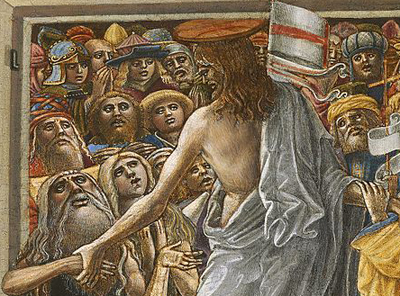
Later filmmakers would presumably have used a high angle to let us see the faces; but then we’d lose the looming effect of Roy’s back in the foreground. Artistic choices are always trade-offs, and here, for the sake of a strong expressive effect, director Colin Campbell has sacrificed spatial realism in a way that probably wouldn’t occur to a contemporary filmmaker.
The shift from long shot to a closer view here is pretty extreme. At several points in my viewing I noticed that when using the scene-insert method, filmmakers often didn’t try for a smooth gradation of shot scales. The old triumvirate long shot/ medium shot/ close-up aims to lead the viewer gradually to the heart of the action, but in the 1910s directors seemed almost impatient to get to the meat of things.
So, for instance, in William Desmond Taylor’s Pasquale (1916), the good-hearted hero is trying to keep up appearances at the wedding of the woman he loves. We get a cut from a very long shot to a tight close-up, accentuated by the vignetting that isolates Pasquale’s face. No medium-shot eases the transition.
For modern audiences, I think this is a bit of a bump–but nothing compared to the scene-insert leap we get in Vanity Fair (1915). In what is everybody’s idea of what those old movies look like, Becky is exploring the parlor. It’s a very distant shot, atypical for an interior of this scale. And the abrupt jump to a very close insert shows not Becky but the photograph she studies.
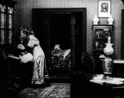
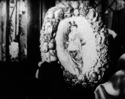
This is quite odd. Even stranger, the camera stays back from Becky throughout the film.
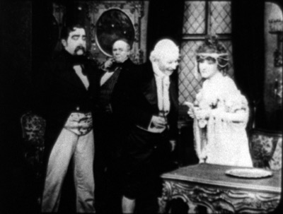
It’s unusual for an American movie of 1915 to avoid inserts, especially since Becky is played by the famous Minnie Maddern Fiske, who had popularized the part on stage. Where are the star close-ups, as in Pasquale? Are we dealing with simple incompetence? Apparently not, Variety suggests.
This seems plausible. By shooting most scenes in anachronistic long shots, the director could play down the fifty-something performer portraying a young girl. In the process he could associate the classic story with pre-teens photodramas, which seldom used close-ups. This deliberate anachronism suggests that filmmakers were already aware of the choices of shot scale they now had, and what the scene-insert method committed them to.
What survives of Weber’s marvelous False Colours offers a great many lessons in the range of 1910s techniques, but one sequence flaunts the all-over long shot and the jolting insert. The conman Bert has persuaded his wife Flo to pose as the missing daughter of the wealthy actor Lloyd Phillips. In this scene, Flo and Phillips have retreated to a park bench to get better acquainted. Bert hides behind a tree to watch them.
This is a pretty standard situation, but it’s handled in an eccentric way. As the couple sit in awkward silence on the bench, in the far left background Bert creeps in. Problem is, you can barely see him: only his hand, on the far, far left center, is visible in silhouette as it approaches the tree, followed by a dark blot. Thanks to Photoshop, I give you the insert that Weber denies us.
Who would see this? Maybe a viewer from the time, trained in different viewing skills–someone used to the frame’s being packed full? I consider this possibility in an older entry. And there’s certainly a slice of light space left vacant to allow for the hand, creating an extreme case of aperture framing. Anyhow, Weber then does what Taylor did with Pasquale. She cuts from the fairly distant shot to a big close-up of Bert peering out from the tree.
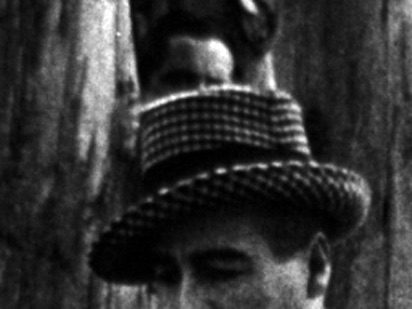
Compared to the bare hint of his arrival with the fugitive hand, this strenuous shot is overcompensation. All we needed was a sort of medium shot of him listening, preferably with the couple in the foreground to orient us. That shot comes, but again in an eccentric way. At first, Phillips blocks our view of Bert, so the actor in the rear has to raise his head–creating the impression of floating just above Phillips’ hat. Again, I supply a blow-up.
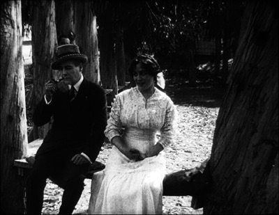
And when Flo, lying, says in a dialogue title that her mother talks of Phillips constantly, Bert’s head jerks up angrily. He’s still stuck atop Phillips’ hat. Another huge close-up reinforces his reaction.
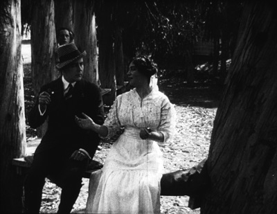
Maybe it’s all a mistake? Did Weber screw up a simple scene? Why not just settle Flo and Phillips a little more to the right on the bench, leaving plenty of space on the distant left for Bert to creep behind the tree and peer out, perfectly visible to us throughout? Then, if you insist, you could have the big close-ups of Bert’s reaction? Or did the DP not allow for Phillips’ blocking Bert? (Remember, they didn’t have reflex viewing back then; the viewfinder didn’t show exactly what the lens took in.)
I can’t say. Maybe this is bold, maybe just a botch. But scenes like this in False Colours demonstrate the far-reaching possibilities that people were trying out in the Cambrian explosion of film style.
Jam sessions
Liberty Belles (1914).
In Ready Money, The Spoilers, and other instances we’ve already seen a penchant for stuffing the frame with figures, props, and items of setting. People at the time apparently noticed it too. Charlie Keil, in his indispensable survey of film style from 1907-1913, writes:
Critics advised against “crowded groupings” for numerous reasons: first, if a massing of characters seemed unnaturally pressed together, it would expose the limits of the shooting conditions and destroy the illusionism that cinema was meant to sustain; second, such unnatural staging would violate the standard of composition derived primary from photography, which stressed balance and order; and third, overly compressed staging might obscure the central narrative action and create problems of comprehension for the viewer.
Widescreen, as I’ve mentioned before, poses problems. How do you fit in the human body? How do you fill up the lateral expanse, or do you leave it empty? The squarer rectangle of the 1.33 (or even narrower) frame of early cinema allowed bodies to be packed in, and we’ve seen a surprising vertical dimension to the compositions. Filmmakers found ingenious ways to jam in their figures, especially when they began moving them closer to the camera. By 1914, with the “American foreground,” the front line of action might get pretty crowded.
The climax of Kindling (1915) shows that Cecil B. DeMille was no slouch at filling up the midshot space and then developing the scene through small gestures and changes of posture. It’s far too long for me to run through here, but I think you get the idea.
The blocking and revealing, the slight changes that hide or unmask someone behind someone else, the tendency for actors to freeze so that one performer’s movement draws our eye: all these tactics of long-shot tableau staging are played out in small compass. Call it a jam session.
Cecil’s brother William followed suit in a film of the following year, The Heir to the Hoorah (1916). This comedy of class differences centers on three newly rich gold miners, all bachelors. The roughnecks Bud and Bill urge Joe to marry Geraldine so that there will be an heir to their fortunes. Geraldine’s mother, Mrs. Kent, invites the men to a dinner with her swanky friends. For once, the rich folks aren’t snobs but are good-natured folks–and they have to be, for the clumsy ways of Bud and Bill would outrage anyone less tolerant.
William C. de Mille often avoided long shots and instead covered scenes in fairly tight medium shots and plans américains. Just before the guests go into dinner, they’re huddled together in just such a composition. On the left, Bud is chatting with Joe and a fancy lady. On the right, Geraldine and her mother watch. Behind them are the lady’s husband and Bill. At first the action is on the right, as Mrs. Kent frets about the deplorables Geraldine has brought into the house.
Faces now get diced and sliced, masked and shifted. The gag is set up by servants emerging out of distant darkness. A small aperture opens up so we can see Bud and the others on the left picking up their drinks from a tray.
The insert is a surprisingly tight long-lens shot of the group on the left, though with others hovering around the right frame edge. Drinks are taken, a toast proposed.
And Bud proceeds to spill his drink on the lady, who responds without rancor.
Another insert shows a reaction shot of Bill and the lady’s husband, also unflapped, before cutting back to the full “scene.” By now, with waiters coming out from behind foreground figures, there are nine characters crammed into the shot.
There’s more to come when Bud’s spur gets caught in the lady’s gown, but you get the idea. Axial cuts carve into this mob and shove bits and pieces of faces, bodies, and gestures out at us. The principles of tableau staging are squeezed down into medium shots. William C. de Mille was a pioneer of multiple-camera shooting for ordinary scenes, and he may well have used a separate camera for the long-lens shots (even though the position of Geraldine on the right is wildly cheated between shots 2 and 3 and 3 and 4).
Later Hollywood filmmakers would favor much cleaner images of groups, with heads evenly spaced out across the frame. But visual artists had long explored the bunched-faces option. Here, for instance, is Degas’ daringly unbalanced and crowded Pauline et Virginie of 1876.
Yet these somewhat wild experiments weren’t dead ends. They remained artistic possibilities to be explored more, when other filmmakers hit upon them. Altman’s and Jancsó’s crowded telephoto shots revive the packed frames we see in the 1910s, and other filmmakers found artistic rewards in fanning out figures as in the lovely frame above from Liberty Belles. Those cute girls come back to life in Hou’s Cute Girl (1981) and Millennium Mambo (2001).
Even The Hand of Peril‘s dollhouse set didn’t go absolutely extinct, as admirers of Jerry Lewis (The Lady’s Man), Godard (Tout va bien), and Wes Anderson (The Life Aquatic with Steve Zissou) know. Film style, it seems, knows few dead ends, only detours.
There’s a tendency to think that the history of style constitutes an ever-expanding menu of options. Today, you can cut the way Griffith or Eisenstein or Godard did, right? A similar case has been made for technological change. For decades it was much harder to make a color film than a black-and-white one, but now filmmakers can pursue either option. Most filmmakers in the silent era couldn’t make a talkie, but today’s filmmakers can go silent if they want.
Yet it’s proven surprisingly hard to make a contemporary film look and sound like one from an earlier era. On the sheerly technological front, it’s not easy to recapture the tonal range of orthochromatic nitrate, or the sound texture of early talkies, or the saturation of Technicolor. As for style—how you stage, how you cut, how you frame, and so on—again certain things are hard to recapture. It seems that certain stylistic possibilities, like purely technological ones, have been taken off the menu.
Why is style so hard to recapture? Some elusive nuances of lighting and color depend on technological factors we can’t recreate. IB Tech can’t easily be mimicked with a dropdown menu. On other dimensions, the range of creative options in earlier eras just doesn’t come easily to today’s filmmakers. But maybe by looking at those films we can reconstruct that range. We might also encourage filmmakers to take the sort of chances people did at the very beginning of what we have come to call Hollywood.
This is, I think, my last post for a while on my 1910s adventures at the Library of Congress. I must move on to other projects. As ever, I’m tremendously grateful to the John W. Kluge Center, and particularly its director Ted Widmer, for enabling me to conduct this research under its auspices. A special thanks to Mike Mashon of the Motion Picture Division, and all the colleagues who have been helping me in the Motion Picture and Television Reading Room: Karen Fishman, Alan Gevinson, Rosemary Hanes, Dorinda Hartmann, Zoran Sinobad, and Josie Walters-Johnston. Thanks as well to James Cutting for enjoyable discussion as we watched old movies together.
The new collection of Thanhouser films that includes The Picture of Dorian Gray also provides an enjoyable tour of the LoC Culpeper facility I blogged about in the spring.
I’m grateful to Charlie Keil for ideas and help with sources. The passage I’ve cited from him is in Early American Cinema in Transition: Story, Style, and Filmmaking, 1907-1913 (University of Wisconsin Press, 2001), 134-135.
The quotations from Variety come from anonymous reviews of The Hand of Peril (24 March 1916), 24, and Vanity Fair (29 October 1915), 22.
Other entries about my DC viewing are Anybody but Griffith, Movies in the mountain, and on the machine, Film noir, a hundred years ago, and When we dead awaken: William Desmond Taylor made movies too. More generally, see the category of entries on Tableau staging and my books On the History of Film Style and Figures Traced in Light: On Cinematic Staging. The relation of the tableau style to Hou’s work is considered in the latter, as well as here.
On the difficulty of replicating older film styles, see our blog entries on The Good German and forging a film.
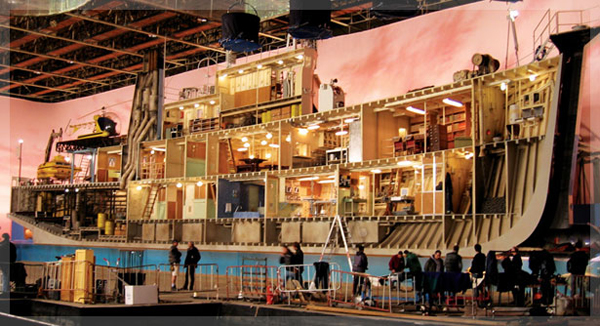
Building the set for The Life Aquatic (Wes Anderson, 2004).
When we dead awaken: William Desmond Taylor made movies too
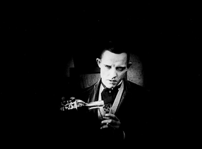
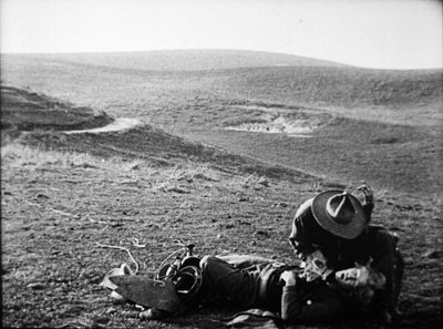
Ben Blair (1916).
DB here:
It wasn’t until they turned the body over that they realized he had been shot. By then, the crime scene had become chaos. Studio employees swarmed over the bungalow and swiped incriminating letters, while neighbors and reporters drifted in freely. The police left their own fingerprints around the place. No wonder the case remains unsolved.
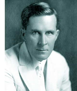 William Desmond Taylor’s place in film history is secure, but not because of his movies. His 1922 murder galvanized the nation. Suspects included stars Mabel Normand and Mary Miles Minter, Minter’s mother, an embezzler, an estranged brother, bootleggers, drug pushers, blackmailers, and assorted low-lifes. The case reeked deliciously of scandal.
Minter was infatuated with him, her mother owned a .38, and Taylor’s secretary had absconded with a car and forged checks. Speculation spread in many directions. Was Taylor gay or bisexual? Was he a drug addict, or a supplier, or someone trying to rescue a friend from addiction? Did Mary and Mabel quarrel over his affections? Who was his late-night male visitor? Did the bungalow actually contain tagged items of ladies’ lingerie, and pornographic photos of Taylor cavorting with starlets?
For nearly a hundred years fans and tabloid TV have returned obsessively to the murder. Even King Vidor began sleuthing late in life with the aid of Colleen Moore.
Taylor cut quite the figure. Tall, handsome, and solemn of mien, he left Ireland and led a barnstorming life in America. He abandoned a wife and daughter in New York to take up touring stage work. He wound up in Hollywood. After some acting successes, he directed shorts before graduating to the popular serial The Diamond from the Sky (1915). His feature films were widely respected, and he became a key figure in forming the Directors Guild (then the Motion Picture Directors’ Association).
Okay, it makes a swell mystery. But what about Taylor’s movies?
The other sort of teenpix
Back in 1976, Richard Koszarski had the very good idea of mounting a program called The Rivals of D. W. Griffith for the Walker Art Center. Auteurism was at its height, so it’s no surprise that the program’s subtitle was Alternative Auteurs: 1913-1918.
Remember, this was before all those festivals that today specialize in exhuming silent classics. Beta and VHS had just been introduced and were not yet popular. There was no Criterion, Flicker Alley, or TCM, or any other platform that would give these old movies a mass-market afterlife.
Since then, things have improved a lot. We can now see on video nearly everything in Richard’s show: Wild and Woolly, Stella Maris, Juve vs. Fantômas, The Italian, Hell’s Hinges, The Mysterious X, Straight Shooting, The Gun Woman, Behind the Screen, The Rink, The Immigrant, The Outlaw and His Wife, The Cheat, and The Blue Bird. Some of the copies are shabby, but they’re out there. Anyhow, collectors’ 16mm dupes that circulated back in the day were hardly impeccable.
The program helped balance out historical accounts. Richard’s opening essay in the program’s catalogue flung down the challenge. Most historians had ignored the period, but:
Even the most casual investigation must reveal the years 1913-18 as the most hectic, tumultuous and progressive in the entire history of the cinema.
Richard’s aim wasn’t to attack Griffith. This was a time when cinephiles were discovering the superb Biograph shorts, and appreciation of his artistry was expanding. Instead, Richard usefully reminded us of all the other things going on as features emerged.
Looking at the films in this program will help anyone appreciate even more fully Griffith’s strengths, and pinpoint more certainly his weaknesses. Often his individual achievements will be matched, sometimes surpassed.
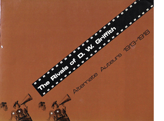 Richard’s introduction ably sums up the changes in the industry that made the period so fertile. And the contributors’ notes that follow, while brief, point up valuable things about the program. The Rivals of D. W. Griffith is still very much worth having.
My recent investigation of nearly a hundred U.S. features from the period wasn’t exactly casual, but it seems merely a depth sounding of a vast body of extraordinary work. I’ve offered you glimpses of it in earlier entries (here and here and here), but there’s a lot more I’d like to share.
Which brings me back to William Desmond Taylor. He doesn’t figure in Richard’s Rivals show, probably because few of his films were available. Most of his work is lost. He signed forty features between 1915 and 1922, of which seventeen apparently survive, many incomplete. Most of those I’ve seen are solid but not dazzling. The amiable Tom Sawyer (1917) is a good example of how polished Hollywood cinema already was in 1917, and the leisurely Mary Pickford item Johanna Enlists (1918) is ingratiating as well. At the film’s climax Taylor tries for triangular staging of the type that would come in the 1920s, but he botches it with mismatched eyelines and screen directions. By the time of The Soul of Youth (1920), a touching movie about juvenile delinquency, the cutting is very meticulous, as in Huckleberry Finn (1920). Both films use startlingly tight close-ups, some of them shot with a wide-angle lens.
Taylor also claimed innovations in visual narration. His now-lost Sacred and Profane Love (1921) was promoted as including scenes in which an expository title rises up over character action, makes its comment, and melts away while the scene continues. Perhaps the opening of The Soul of Youth was a step in this direction. In chiseled silhouettes we see an unwed mother selling her baby to a gangster’s girlfriend, introduced through “art titles” dissolving away to reveal the action.
The Soul of Youth also includes some embedded scene movement in the corners of titles. Such experimentation with intertitles was a trend of the period.
So we have a director of some ambition. That inference is backed up by some flashy moments in earlier 1910s work. In 1916 Taylor released a remarkable nine features, and during my DC stay I saw what remains of four of them. Although they’re in parlous shape, they show a lively pictorial and dramatic intelligence. Are they auteur films in the strong sense? At least we can say that Taylor, like many other directors, was channeling just that exuberant creative energy that Richard evokes. Certain moments in two of these movies have genuine flair, and one film is an all-out stunner. I had never heard of any of them.
1916 and all that
My first 1916 title is Pasquale. It stars George Bevan, famous for his stage roles as good-natured Italians. It’s a story of friendship betrayed. Two immigrants who return home to fight for Italy are shown to be more honorable than the American men who cheat them and beat their women.
“A mighty good feature,” said Variety’s reviewer, but you can’t prove it by me. The Library of Congress print lacked the first and last reels, and what was in between consisted of scenes and parts of scenes jumbled up. While it’s certainly competent, I didn’t see much subtlety in its staging or cutting. The use of crosscutting to tie together its story lines was standard for the period.
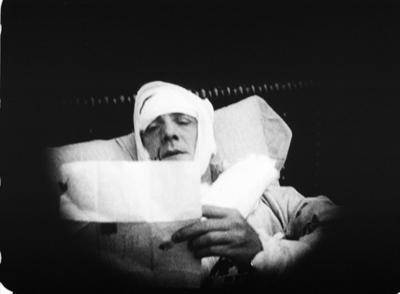
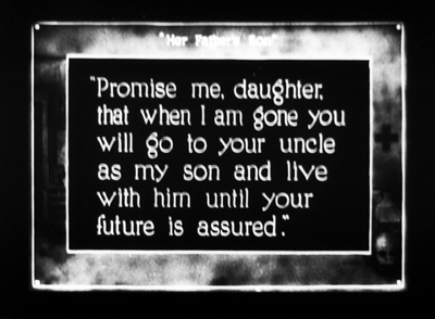
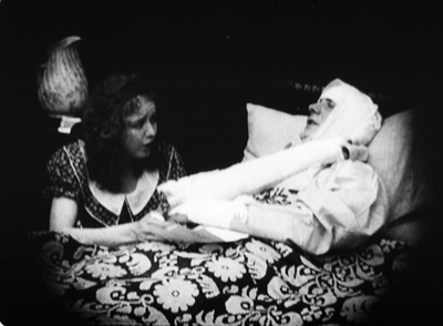
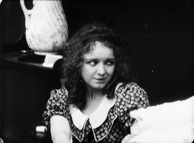
The print of the Civil War story Her Father’s Son was a little scrambled too, and it lacked the final reel, but it was more coherent. A girl from the North must pretend to be a boy—first, to satisfy an old Southerner’s urge for an heir, then after the war starts she is pressed into service as a courier, and eventually a sterling supporter of the confederacy. The most noteworthy bit of technique, I thought, involved the varied camera setups in one scene. Frances (Vivian Martin) is asked by her dying father to go live with his brother as a boy. The changes in shot scale and angle emphasize her moment of decision, as well as her reaction to her father’s death.
This passage shows more flexibility of camera setup than Griffith displays in the sequences in the Union hospital in The Birth of a Nation (1915), or in Intolerance, from the same year as Taylor’s film. Taylor here joins a general push toward finer-grained analytical editing in dialogue scenes. Other examples are Reginald Barker’s The Bargain (1914) and DeMille’s The Cheat (1915).
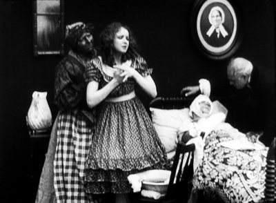
The House of Lies is more flamboyant and peculiar. Edna is an ethereal girl who likes waterfalls, poetry, children, and rabbits. Her stepsister Dorothy is vain and soulless. Mrs. Coleman is determined to marry both off to wealthy men. Refusing to trade her beauty for social position, Edna splashes her face with acid. She becomes the secretary of the sensitive author Marcus Auriel. But the stepmother is plotting to snare him for Dorothy, while also joining forces with a thief who wants to steal a financial document from Auriel’s safe.
Variety considered The House of Lies a good example of “what a feature picture should not be.” The reviewer considered it old-fashioned melodrama. Fair enough, but it doesn’t creak much and has considerable visual fluency. Sometimes there are echoes of the tableau style, as when Edna steps aside to reveal her sister and stepmother dressing in the background.
But the same tableau setup gets overridden by the sort of axial cut so common at the period. Earlier in the scene when the stepsisters get dressed for the big party at which they’ll be displayed, instead of letting Dorothy step aside to reveal the other women, Taylor “cuts through” Edna’s blocking figure to the women behind her.
The transition would be jumpy were it not for a (mispunctuated) title: “I don’t understand all this display mother; when we should still be in mourning for father.”
A variant of the axial cut employs a 180-degree reversal. We’ve already seen Edna’s reluctance to enter “the auction” at which rich men will look her and Dorothy over. She pauses at the doorway, which in wealthy houses of this period always seem to be covered with a heavy curtain.
Later, after her mother has taken Dorothy around to meet her guests, we see the poet Auriel remark to a friend that it’s like a modern slave market. Cut to the opposite side of the men to reveal Edna’s reaction to his line.
It’s this that drives her upstairs to destroy her beauty.
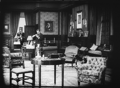
The acid-splashing is of course the grisly high point of this drama. It’s handled with what at first seems a tactful obliqueness.
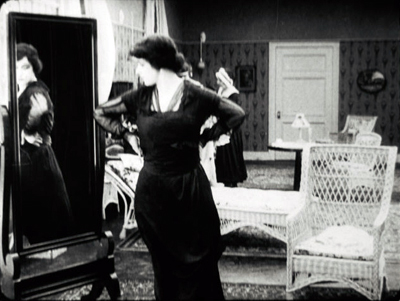
Mrs. Coleman has summoned a maid to bring Edna back to the gathering. As she enters, Edna stands at the mirror, pondering. Since Dorothy is the sister associated with mirrors, this seems out of character for Edna.
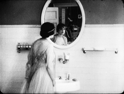
Seeing the maid, she picks up the bottle of acid. Before opening it, she experimentally rubs her face.
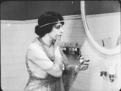
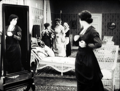
A closer view of her at the mirror shows her ostentatiously lifting the bottle, as if making sure the maid sees it. In retrospect, it may be that she’s staging the scene for an eyewitness.
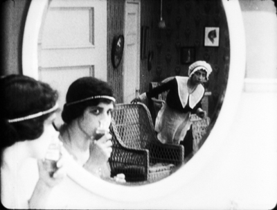
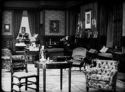
Cut back to the original bathroom framing as Edna seizes her cheek and cries out. She runs into the next room, as seen in the reflection.
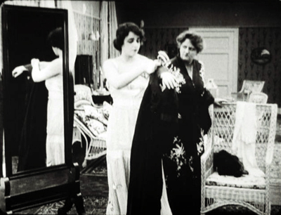
A nice match on action brings Edna into the boudoir, where she collapses.
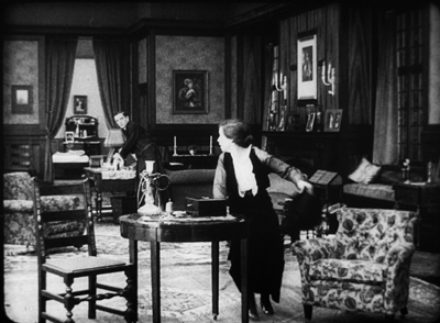
Thereafter Edna sports a ravaged cheek or a discreet bandage. Eventually Auriel declares that he loves her despite her deformity. She then reveals that her scar is mere makeup. She never really applied the acid. She wanted out of the marriage auction and sought someone to love her for herself.
Taylor’s framing and cutting conspire with Edna to conceal her deception. Mirrors create spatial trickery in 1910s films from both America and Europe, often doing duty for reverse angles or POV cutting. The embedded image usually serves to expand what we know, as it does here.
But Taylor’s mirror reflection also makes the maid into a decoy, teasing us to watch her as well as Edna. Hiding what Edna was up to would have been more obvious if we didn’t have the maid to distract us. Of course Taylor could simply have cut away from Edna at the crucial moment, but that wouldn’t carry as much conviction as seeing an apparently full, if discreet, shot of the self-mutilation.
A noir western?
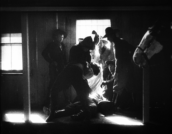
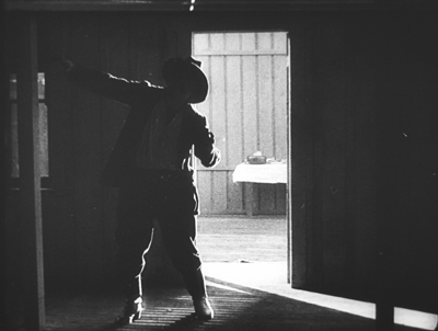
Noirish westerns like Duel in the Sun (1947), Pursued (1947), and The Furies (1950) revolve around dysfunctional families, tyrannical patriarchs, childhood anguish, and sadistic corruption. Somewhat in this vein is one of the story lines that inform Taylor’s Ben Blair (1916). The noirish action is embedded within a larger plot involving the clash of New York decadence and prairie rectitude. As a bonus, certain scenes evoke that proto-noir style I considered in an earlier entry. One scene of violence is spectacularly beautiful—Ford meets Mann, shall we say, before both showed up.
The film roughly follows the plot of the 1905 novel. When Tom Blair’s common-law wife dies of illness and neglect, he sets fire to his ranch house in an effort to destroy her corpse and kill her son Ben. The boy escapes and is adopted by the good-hearted rancher Rankin. Ben grows up alongside Florence, daughter of another rancher. When Flo’s father dies, his widow takes Flo to New York in search of a husband for her. In the meantime, Tom Blair has returned and is raiding local ranches for horses. He shoots Rankin, and Ben sets out to avenge both his mother and his benefactor.
The second half of the novel, and the film, brings Ben to New York. He finds Flo captivated by the urbane but unstable Clarence Sidwell. After Ben sees the depravity of city life, he tries to lure Flo away.
Second things first. Critics found the New York section of the book less evocative than the Western half, but such can’t be said for the film. An eyebrow-raising introduction to the rake Sidwell leaves little to the imagination.
Flo had told Ben she wanted to leave the West for “the things of civilization.” Now we get a title: “The things of civilization. Exhibit 1: Clarence Sidwell.” Fade in on a louche creature pouring himself a drink.
Shock cut back: In an extreme long-shot, a young woman bursts out from the distant bedroom, dodges Sidwell, zigzags desperately through the vast parlor, and hurls herself out of the foreground.
As the deep space of 1910s cinema becomes an obstacle course, we’re obliged to understand that the poor woman has been raped. The power of the scene comes from her frantic rush toward us in contrast with Sidwell’s bored calm.
When she collapses in the next room, he moves as if to follow her, then shrugs and returns to his post-coital drink. In the novel, Sidwell is a neurotic workaholic, nothing like this chilling libertine.
A parallel scene occurs later, when Ben has come to Manhattan to visit Flo. On the street at night, he chivalrously agrees to see a woman to her apartment, only to find that he’s been tricked into visiting a brothel.
As in the novel, he shoots his way out (these sissies can’t handle him), but not before he glimpses Sidwell there with a floozy. This, along with Sidwell’s rape of the woman we’ve already seen, reminds you of what all those censors were complaining about in the era of scandals around Fatty Arbuckle, Wallace Reid, and other Taylor contemporaries.
Ben learns that Flo has agreed to marry Sidwell, and Ben’s memory compares the brothel revelation with Flo’s farewell to him back on the ranch.
He must save her from this man.
Ben is too honorable to snitch on Sidwell. He simply walks in the family mansion and tells Flo that she is leaving with him in half an hour, or he will kill Sidwell. He counts on her underlying love for him and their childhood home. After her indignation dies down, she agrees happily to go “back to God’s country.”
The tension of the film’s first half centers on Tom Blair’s murder of the genial old Raskin and Ben’s pursuit of Blair. Tom, it turns out, isn’t Ben’s biological father; Raskin is. Tom has killed Ben’s mother through abuse and his natural father through homicide, so the son’s quest gains mythical overtones.
There are some majestic vistas, along with flashy exchanges of gunfire among rocks. The clincher comes when at the height of their fistfight, Ben is ready to strangle Tom and bends over him. The false father gasps for mercy.
A brutal cut takes us to Ben’s eye, which fills with the image of Florence.
We realize that he couldn’t face Flo if he murdered a man in cold blood. So he lets Tom live, drags him back to town, and even saves him from a lynch mob. But this moment—in 1916, remember—shows how eager filmmakers of this period were to maximize the emotional power of a scene. Often we’ll find that an expository title and a bit of facial emoting has been replaced by tactics of cutting, framing, and here, precise special effects.
Devil’s doorway
Skilful backlighting is more precious than a gallon of peroxide!
William Desmond Taylor
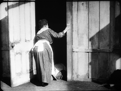
This isn’t the film’s only prefiguration of the noir hero driven to the brink. Ben has nearly lost control earlier in the film, and this scene involves the noir look as well. It grows out of Tom Blair’s cold-blooded murder of Raskin.
In the novel, Ben witnesses it from the barn, but he’s too late to catch Tom before he rides off. In the film, Ben is in town, seeing off Flo and her mother at the train. Now the scene is played out for us, with the cook as an appalled side participant.
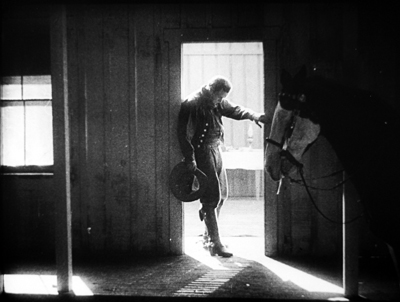
Hearing noise in the corral, Raskin steps out on the porch. The edge lighting outlines him vividly enough to be visible, and cut down.
A 180-degree reverse shot puts us inside as the cook rushes to the door and peers out.
Cut 180 degrees again to a variant of the first shot, framing the bunkhouse in long shot. After a beat, Tom Blair and his horse appear in the foreground. The lighting here is of remarkable delicacy: the silhouettes are barely picked out.
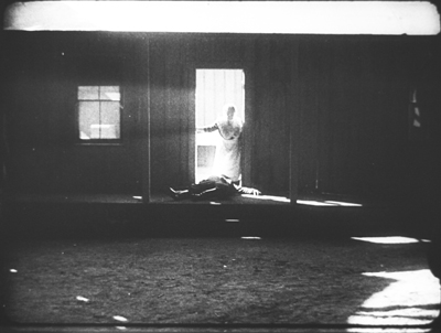
We return to the shot inside the bunkhouse. Another beat: The face of the man passing emerges as she turns away in horror.
Tom mounts his horse and rides off. Soon, in another shot from outside, the ranch workers gather at the doorway, as Ben arrives with his horse. One standard option would be to have the dead man carried in, to have the men assemble around the body, and in clear light and shot/ reverse-shot, to show Ben issuing his orders. Instead, Rankin’s body lies blocking the threshold and all the action is played in the bright rectangle and made emphatic by axial cuts.
The first cut comes as Ben reacts to what has happened. He’s in darkness, with the cook and cowpokes watching.
Ben tells them to take care of Rankin: “Put up your guns, boys–This is my affair.”
When one of the men accuses him of trying to cover up for his father, Ben explodes and starts beating him. A cut in to a closer view shows him strangling the offender. As in later cinema, the abrupt cut accentuates the violence of Ben’s attack.
An axial cut back shows the victim protesting: “Let up–I didn’t mean it!” Ben shoves him aside and bends over the dead man sorrowfully.
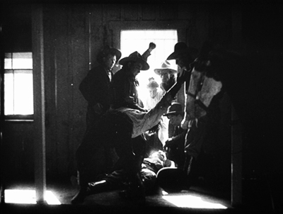
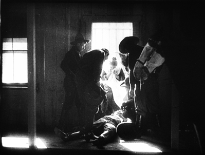
The ranch hands carry Rankin’s body in. Ben is left in the doorway brooding on what he must do to avenge the death of his surrogate father.
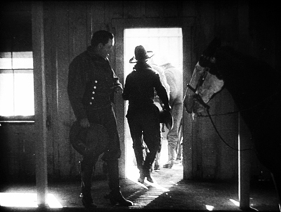
Call it Fordian if you want. I wouldn’t object.
Given the fame of Dustin Farnum as a star at that moment, it seems fairly daring to subordinate a dramatic high point to this incisive visual design, with all the action squeezed into the doorway. Stance and gesture have replaced close-ups and facial reactions. The scene varies so much from the book that we might want to credit the scenarist, Julia Crawford Ivers. Ivers, who who had directed films herself, collaborated closely with Taylor on his projects. The cinematographer, perhaps Homer Scott (another Taylor mainstay and a significant DP before 1923), may also have had a big say in this virtuoso scene. The film could claim its “Lasky lighting” as typical of the Paramount brand.
All of Taylor’s surviving films I’ve seen are of interest; he’s clearly one of the more talented directors to give up the tableau and work in the continuity style that would define Hollywood. In particular, Ben Blair would definitely be worth reconstructing and restoring. The LoC print, while jumbled in its last two reels, is fairly complete, and the shots could be rearranged coherently. At the risk of spoilers, I wanted to share with you my discovery of this exciting piece of work. Taylor deserves to be remembered for more than his fate that night in February 1922.
Thanks again to the John W. Kluge Center for providing me a long stay at the Library of Congress. The Moving Image Research Center was my host, and so I’m grateful to Mike Mashon, Greg Lukow, Karen Fishman, Dorinda Hartmann, Josie Walters-Johnston, Zoran Sinobad, and Rosemary Hanes. They’re doing a wonderful job. Special thanks to Richard Koszarski for background on his Rivals program, and to Alan Gevinson for discussions of 1910s cinema generally and Taylor in particular.
Relevant to this entry is Kristin’s article is “The International Exploration of Cinematic Expressivity,” in Film and the First World War, ed. Karel Dibbets and Bert Hogenkamp (Amsterdam University Press, 1995), 65-85. She discusses American lighting practices of the period in The Classical Hollywood Cinema: Film Style and Mode of Production to 1960 (Columbia University Press, 1985), 223-227. See also Lea Jacobs’ article “Belasco, DeMille and the Development of Lasky Lighting,” Film History 5, 4 (December 1993), 405-418.
Some Taylor films are available on DVD. The most authoritative is the beautiful restoration of The Soul of Youth that’s included in Treasures of American Film Archives vol. III: Social Issues in American Film 1900-1934. Tom Sawyer is available in a fairly good copy, as is Huckleberry Finn, which doesn’t survive complete; it has played on TCM in a tinted version. Copies of Johanna Enlists and Nurse Marjorie are problematic but watchable.
Ben Blair was mostly liked in the trade papers, though Variety claimed that the film was “hardly up to the Paramount standard.” But using the same phrase, Manhattan’s Broadway movie theatre declined to show it. You wonder if the Sidwell rape scene had something to do with the decision. After some wrangling, the management cut it to two reels and “used it as ‘filler.'” Tastes do change.
On Taylor’s career, see Richard Koszarski, “The William Desmond Taylor Mystery,” Griffithiana 38/39 (October 1990), 253-56. The most authoritative reference on Taylor’s life is Bruce Long’s collection of clippings and commentary William Desmond Taylor: A Dossier (Scarecrow, 1991), from which my backlighting quotation comes (p. 162). Alan Gevinson’s filmography in Long’s book is the most comprehensive I know. Long also ran the online publication Taylorology, which offered exhaustive coverage and analysis of the murder.
Speaking of the murder, there’s enough material in books and online to keep aficionados busy for years. Whodunit? Since this entry is spoiler-filled, I’ll summon a lineup. The principal books on the case finger four suspects: Mary Miles Minter’s mother (favored by King Vidor, as reported by Kirkpatrick); Mary herself (Higham); a hitman for a drug gang (Giroux); and one of a trio of blackmailers (Mann). Long’s Dossier lists many errata in the first two of these. Of these, Giroux’s is the most sober and avoids High Tabloidese, as well as the confident reporting of the thoughts and feelings of people long dead. My own hunch is that too much evidence has been destroyed to permit a plausible conclusion.
Still, the Taylorologists have supplied fascinating information on what Hollywood culture was like at the period. It still astonishes me that celebrities like Taylor, Minter, and Edna Purviance could live without bodyguards and security, while Mabel Normand could just stroll down the street to buy a bag of peanuts. And all chroniclers agree that the studios kept a lid on an investigation that law enforcement conveniently botched.
A quick and entertaining overview of the scandal is Rick Geavy’s graphic novel Famous Players: The Mysterious Death of William Desmond Taylor (NBM, 2009).
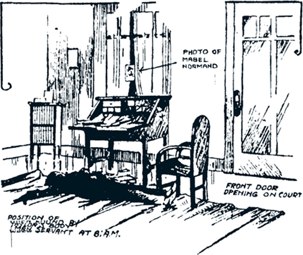
Okay, I can’t refrain from going a bit sleazy too. Below is a drawing of the crime scene from a newspaper of the period.
P.s. 4 January 2021: Add Erle Stanley Gardner to the list of distinguished investigators of the crime. His “1922: William Desmond Taylor,” summarizing press reports and offering some speculative inferences, appeared in Los Angeles Murders, ed. Craig Rice (Duell, Sloan and Pearce, 1947), 83-119.
Thanks to Taylorology and The Silent Era.


