


Archive for the 'Film technique: Cinematography' Category
Wayward ways and roads not taken
DB here:
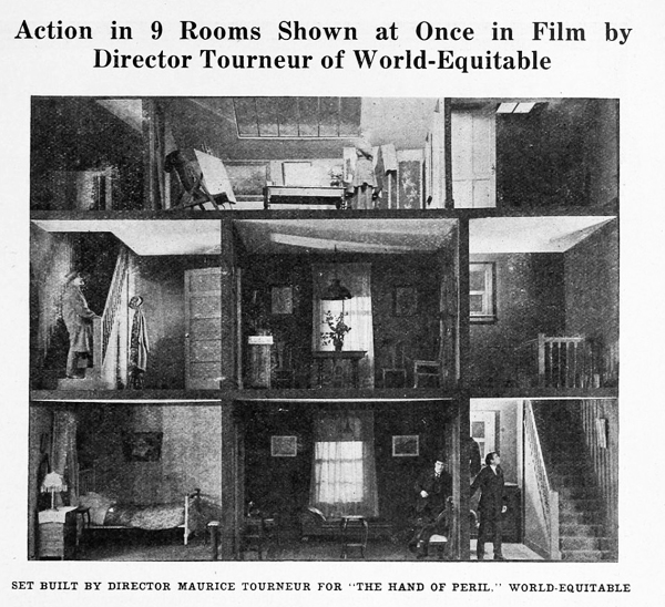
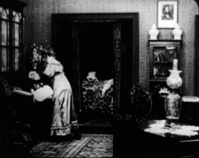
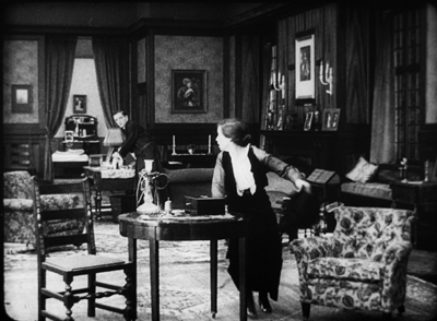
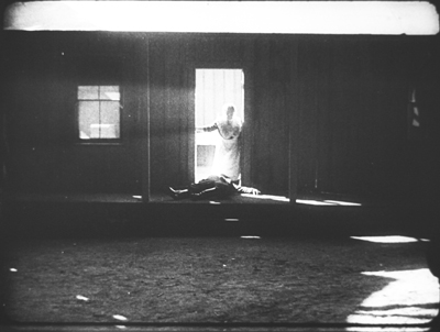
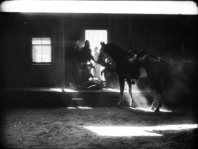
The Hand of Peril (1916) was trumpeted as something new in movie storytelling. It avoided the “cut-back”—that is, crosscutting between different lines of action. In this film, according to the Motion Picture News story above, “nine rooms of a house are shown, with action occurring in each room simultaneously. . . . The action occurring in one room . . . would have to be ‘flashed back’ were the nine rooms not shown.”
Variety found the innovation valuable for pacing. The movie “unfolds in the first four reels with the speed of a race horse. The suspense is constant and there isn’t any let-up whatever until the last few hundred feet.” It’s not clear whether the whole action took place in the house, but for the scenes that did, it appears that the cutaway set served a reference point, a sort of macro-establishing shot. This view gave way to cut-in closer views of the scenes in specific rooms.
Another trade journal noted: “The experiment is quite novel and attractive and fits in admirably in the story, but if it will prove of general worth cannot be told yet.” Now we can tell. This was a road not taken. Crosscutting remained in force, being far more cheap and flexible than dollhouse sets.
No copies of The Hand of Peril are known to have survived. Yet the fact that it was made suggests just how energetic the 1910s were in raising striking creative possibilities—some of which became conventional, some of which fell by the wayside. Seeing this sifting and winnowing at work was a constant delight during my recent stay in the Kluge Center at the Library of Congress. Watching nearly a hundred American features from 1914-1918 drove home to me how excitingly strange movies can sometimes be.
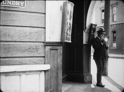
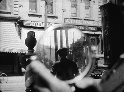
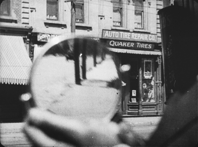
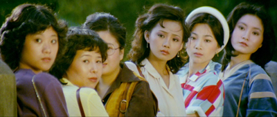
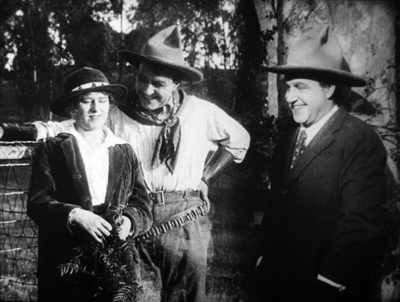
On the one hand, the conformist side of the films was there in abundance. Most of what I encountered were variants of an emerging “classical Hollywood cinema,” as they (we) say. Some efforts were crude, some smooth, but you could tell what the filmmakers were going for, and it was a thrill to see obscure films effortlessly exploiting schemas that would become central to our films. What a kick to see, in The Sign of the Spade (1916), a detective using a hand mirror to trail a suspect, with beautiful control of POV, frame composition, and rack-focus.
Hitchcock, eat your heart out. Well, wait until you start making films.
Yet looking for norms sensitized me to non-normative things—not merely clumsy efforts, but genuine attempts to try something different. Different and, to our eyes, often odd. American features of the 1910s include cuts and framings and camera moves and lighting choices and performance bits that no one now could imagine using.
My viewing companion James Cutting compared the week’s worth of films he saw to the Cambrian explosion in evolution, a period where all manner of organisms burst forth in profusion—before selection pressures wiped many out. While filmmakers were mastering classical plotting and continuity style, lots of other stuff was going on.
Have a look. Actually, several looks.
Widescreen, no. Tallscreen, yes.
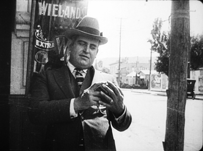
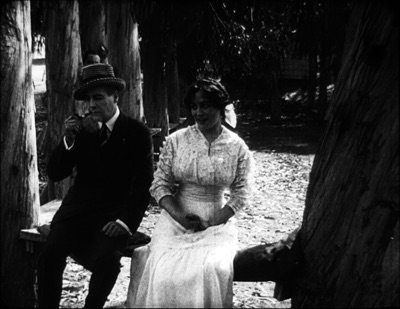
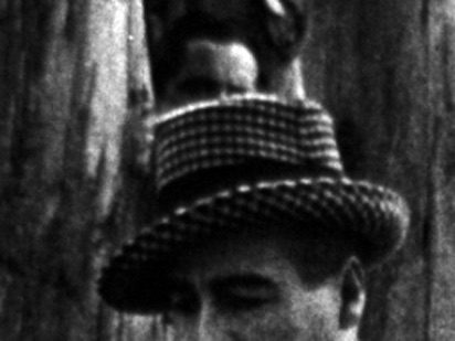
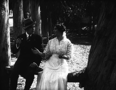
Ready Money (1914).
In this shot, the story action is taking place at the nightclub table, but the society types gathered there are overwhelmed by all the hubbub around and above them. And we aren’t given closer views to help us sort it all out.
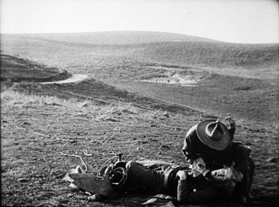
In all periods of film history, directors usually tried to center the action. Yet in early years, they sometimes favored framings that would today be considered strangely decentered. One of my favorite tactics from the ‘teens involves putting important elements in the bottom of the frame, notably in extreme long shots. In The Spoilers (1914), Cherry flops back in her saddle when she sees the devastated mining camp.
At the big reception in The Sowers (1916), a modern director would have put Paul and the dignitaries he greets in the foreground, and let Princess Tanya descend in the distance. But William C. de Mille creates a vast vertical composition, setting Paul in his braided uniform in the lower third of the frame and putting Tanya far back on the staircase.
Such top-heavy shots look odd to us, but they have a sort of grandeur, and the taste for them can be acquired. You can see a more intimate example in the fine recent release of Thanhouser films restored by the Library of Congress. The opening sequence of The Picture of Dorian Gray (1915) shows Dorian at the theatre, in a box in the foreground with Romeo and Juliet playing onstage behind him.
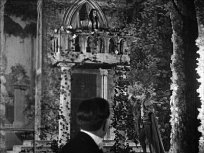
Even in the teens, I think this is an outlier. Most theatre scenes are handled with cutting to reverse angles of the audience and the onstage players. When there’s a box in the foreground, it’s usually anchored as such, as in Feuillade’s Fantômas (1913) or Willliam Wauer’s Der Tunnel (1915).
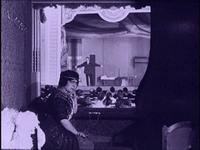
The strange symmetry of the Dorian Gray composition, aided by putting Dorian’s head along the vertical axis rather than off to the side, and by putting the object of his attention, the actress, directly above him, is really startling. The all-over quality of these compositions usefully remind us that every inch of frame space is there to be used if you have the imagination. We’ll see this hypersaturation of the frame in some later examples, but eventually the tactic would go away. Shots would put the human figures in the center of the format, or in long shots place them gracefully on foreground right or left.
Scene + insert
Both European and American directors of the 1910s employed what I’ve called the tableau approach. Within a fixed camera setup and fairly distant framing, the viewer’s attention is controlled through staging, either lateral or in depth. I’ve given plenty of examples elsewhere of how flexible and precise this style can be. A beautiful example occurs in Lois Weber’s False Colours, which I’ve already analyzed along these lines.
During the years I examined, directors were already discarding this approach in favor of cutting-based ways of guiding our eye. Some freely put the camera at various points around a set or an outdoor scene. (In all national cinemas of the period, we find more variety of camera placement on location than in sets, for obvious reasons.) More common was the tendency toward what was called the “scene-insert” method. A master shot of middle range (the “scene”) would be followed by a closer view of something within that space (the “insert”). Very often that cut would be an axial one—that is, a setup straight along the camera axis. Although sometimes decried as a mistake, the axial cut has been used by filmmakers of all eras.
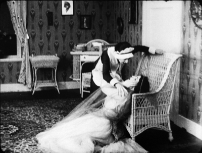
The corn-husking bee in The Hoosier Schoolmaster (1914) illustrates how a basic tactic of the tableau style may be integrated with the scene-insert method. The new schoolteacher is boarding with Mrs. Means, who’s trying to get him to marry her daughter. As the community gathers (that corn won’t husk itself), Mrs. Means forces her daughter on him. The teacher, though, is more attracted to the demure town outcast Hannah. First, Mrs. Means stands behind the schoolmaster and her daughter. Back to us, she addresses the hayseeds.
She moves away to show Hannah in the background. In the tableau approach, this blocking-and-revealing action is usually repeated throughout the shot, but here it’s a one-off device. As soon as it happens, the schoolmaster turns to look back.
Now comes an axial cut to Hannah in the background.
Simple and efficient, this is a good example of the scene-insert method, here enabled by a bit of depth staging. Later stretches of the scene will use the blocking-and-revealing tactic in conjunction with further axial editing.
Sometimes the “insert” phase takes a turn that doesn’t look so simple. Consider this shot from The Spoilers (1914). In another wildly decentered framing, the hero Roy Glenister has jumped down from a balcony (upper right) to land on the floor of a big dance hall as seedy as anything in Deadwood. He lands and faces the crowd in the far distance, while the foreground area of gamblers clears away in a panic, so we can see him a bit better.
This is a very distant framing, so we get an axial cut in to him crouching before the surly crowd.
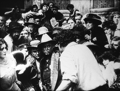
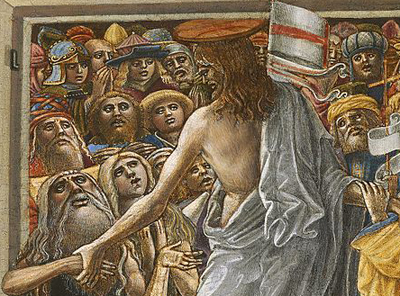
This is a striking insert because in order to give a sense of the massed crowd Roy faces, the director has apparently stacked people up—by height, and perhaps on risers of some sort—so that a welter of faces appear piled up against him. The showgirls at the very top of the frame are on the stage, but the people in the middle were on the same floor as Roy in the master shot. The technique is reminiscent of the stacking of crowds we find in classic Western painting. Here’s a detail from one of the weirdest pictures I saw in the National Gallery, Christ in Limbo by Benvenuto di Giovanni (ca. 1436).
Later filmmakers would presumably have used a high angle to let us see the faces; but then we’d lose the looming effect of Roy’s back in the foreground. Artistic choices are always trade-offs, and here, for the sake of a strong expressive effect, director Colin Campbell has sacrificed spatial realism in a way that probably wouldn’t occur to a contemporary filmmaker.
The shift from long shot to a closer view here is pretty extreme. At several points in my viewing I noticed that when using the scene-insert method, filmmakers often didn’t try for a smooth gradation of shot scales. The old triumvirate long shot/ medium shot/ close-up aims to lead the viewer gradually to the heart of the action, but in the 1910s directors seemed almost impatient to get to the meat of things.
So, for instance, in William Desmond Taylor’s Pasquale (1916), the good-hearted hero is trying to keep up appearances at the wedding of the woman he loves. We get a cut from a very long shot to a tight close-up, accentuated by the vignetting that isolates Pasquale’s face. No medium-shot eases the transition.
For modern audiences, I think this is a bit of a bump–but nothing compared to the scene-insert leap we get in Vanity Fair (1915). In what is everybody’s idea of what those old movies look like, Becky is exploring the parlor. It’s a very distant shot, atypical for an interior of this scale. And the abrupt jump to a very close insert shows not Becky but the photograph she studies.
This is quite odd. Even stranger, the camera stays back from Becky throughout the film.
It’s unusual for an American movie of 1915 to avoid inserts, especially since Becky is played by the famous Minnie Maddern Fiske, who had popularized the part on stage. Where are the star close-ups, as in Pasquale? Are we dealing with simple incompetence? Apparently not, Variety suggests.
This seems plausible. By shooting most scenes in anachronistic long shots, the director could play down the fifty-something performer portraying a young girl. In the process he could associate the classic story with pre-teens photodramas, which seldom used close-ups. This deliberate anachronism suggests that filmmakers were already aware of the choices of shot scale they now had, and what the scene-insert method committed them to.
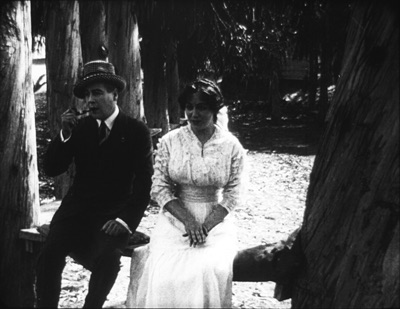
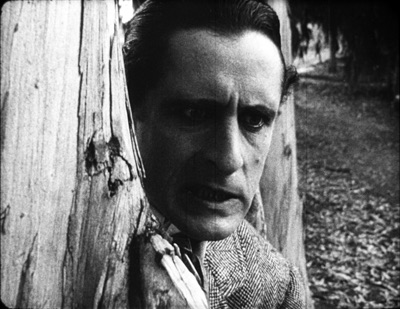
What survives of Weber’s marvelous False Colours offers a great many lessons in the range of 1910s techniques, but one sequence flaunts the all-over long shot and the jolting insert. The conman Bert has persuaded his wife Flo to pose as the missing daughter of the wealthy actor Lloyd Phillips. In this scene, Flo and Phillips have retreated to a park bench to get better acquainted. Bert hides behind a tree to watch them.
This is a pretty standard situation, but it’s handled in an eccentric way. As the couple sit in awkward silence on the bench, in the far left background Bert creeps in. Problem is, you can barely see him: only his hand, on the far, far left center, is visible in silhouette as it approaches the tree, followed by a dark blot. Thanks to Photoshop, I give you the insert that Weber denies us.
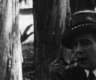
Who would see this? Maybe a viewer from the time, trained in different viewing skills–someone used to the frame’s being packed full? I consider this possibility in an older entry. And there’s certainly a slice of light space left vacant to allow for the hand, creating an extreme case of aperture framing. Anyhow, Weber then does what Taylor did with Pasquale. She cuts from the fairly distant shot to a big close-up of Bert peering out from the tree.
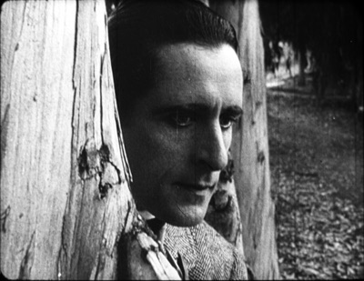
Compared to the bare hint of his arrival with the fugitive hand, this strenuous shot is overcompensation. All we needed was a sort of medium shot of him listening, preferably with the couple in the foreground to orient us. That shot comes, but again in an eccentric way. At first, Phillips blocks our view of Bert, so the actor in the rear has to raise his head–creating the impression of floating just above Phillips’ hat. Again, I supply a blow-up.
And when Flo, lying, says in a dialogue title that her mother talks of Phillips constantly, Bert’s head jerks up angrily. He’s still stuck atop Phillips’ hat. Another huge close-up reinforces his reaction.
Maybe it’s all a mistake? Did Weber screw up a simple scene? Why not just settle Flo and Phillips a little more to the right on the bench, leaving plenty of space on the distant left for Bert to creep behind the tree and peer out, perfectly visible to us throughout? Then, if you insist, you could have the big close-ups of Bert’s reaction? Or did the DP not allow for Phillips’ blocking Bert? (Remember, they didn’t have reflex viewing back then; the viewfinder didn’t show exactly what the lens took in.)
I can’t say. Maybe this is bold, maybe just a botch. But scenes like this in False Colours demonstrate the far-reaching possibilities that people were trying out in the Cambrian explosion of film style.
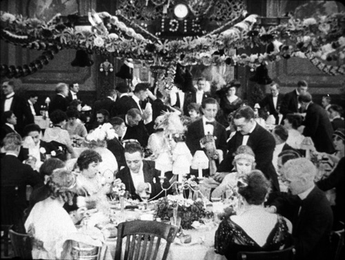
Jam sessions
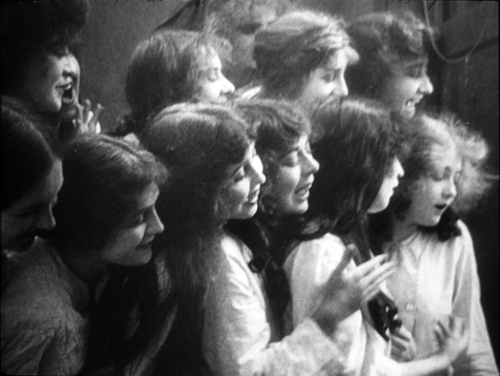
Liberty Belles (1914).
In Ready Money, The Spoilers, and other instances we’ve already seen a penchant for stuffing the frame with figures, props, and items of setting. People at the time apparently noticed it too. Charlie Keil, in his indispensable survey of film style from 1907-1913, writes:
Critics advised against “crowded groupings” for numerous reasons: first, if a massing of characters seemed unnaturally pressed together, it would expose the limits of the shooting conditions and destroy the illusionism that cinema was meant to sustain; second, such unnatural staging would violate the standard of composition derived primary from photography, which stressed balance and order; and third, overly compressed staging might obscure the central narrative action and create problems of comprehension for the viewer.
Widescreen, as I’ve mentioned before, poses problems. How do you fit in the human body? How do you fill up the lateral expanse, or do you leave it empty? The squarer rectangle of the 1.33 (or even narrower) frame of early cinema allowed bodies to be packed in, and we’ve seen a surprising vertical dimension to the compositions. Filmmakers found ingenious ways to jam in their figures, especially when they began moving them closer to the camera. By 1914, with the “American foreground,” the front line of action might get pretty crowded.
The climax of Kindling (1915) shows that Cecil B. DeMille was no slouch at filling up the midshot space and then developing the scene through small gestures and changes of posture. It’s far too long for me to run through here, but I think you get the idea.
The blocking and revealing, the slight changes that hide or unmask someone behind someone else, the tendency for actors to freeze so that one performer’s movement draws our eye: all these tactics of long-shot tableau staging are played out in small compass. Call it a jam session.
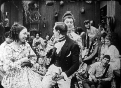
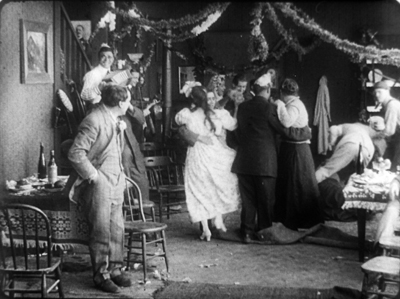
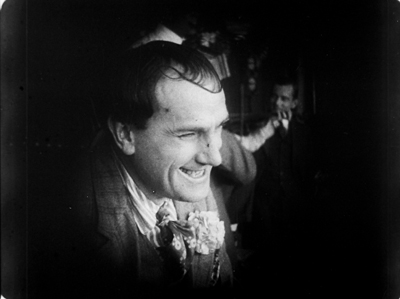
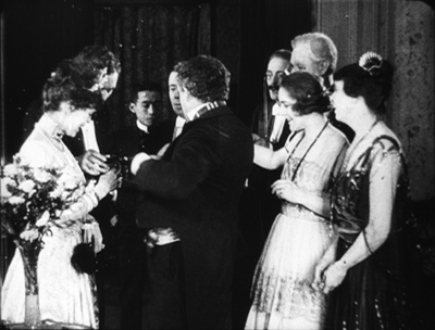
Cecil’s brother William followed suit in a film of the following year, The Heir to the Hoorah (1916). This comedy of class differences centers on three newly rich gold miners, all bachelors. The roughnecks Bud and Bill urge Joe to marry Geraldine so that there will be an heir to their fortunes. Geraldine’s mother, Mrs. Kent, invites the men to a dinner with her swanky friends. For once, the rich folks aren’t snobs but are good-natured folks–and they have to be, for the clumsy ways of Bud and Bill would outrage anyone less tolerant.
William C. de Mille often avoided long shots and instead covered scenes in fairly tight medium shots and plans américains. Just before the guests go into dinner, they’re huddled together in just such a composition. On the left, Bud is chatting with Joe and a fancy lady. On the right, Geraldine and her mother watch. Behind them are the lady’s husband and Bill. At first the action is on the right, as Mrs. Kent frets about the deplorables Geraldine has brought into the house.
Faces now get diced and sliced, masked and shifted. The gag is set up by servants emerging out of distant darkness. A small aperture opens up so we can see Bud and the others on the left picking up their drinks from a tray.
The insert is a surprisingly tight long-lens shot of the group on the left, though with others hovering around the right frame edge. Drinks are taken, a toast proposed.
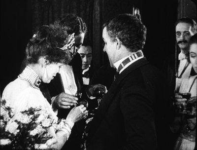
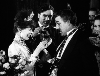
And Bud proceeds to spill his drink on the lady, who responds without rancor.
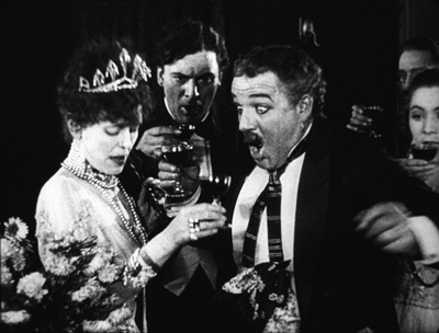
Another insert shows a reaction shot of Bill and the lady’s husband, also unflapped, before cutting back to the full “scene.” By now, with waiters coming out from behind foreground figures, there are nine characters crammed into the shot.
There’s more to come when Bud’s spur gets caught in the lady’s gown, but you get the idea. Axial cuts carve into this mob and shove bits and pieces of faces, bodies, and gestures out at us. The principles of tableau staging are squeezed down into medium shots. William C. de Mille was a pioneer of multiple-camera shooting for ordinary scenes, and he may well have used a separate camera for the long-lens shots (even though the position of Geraldine on the right is wildly cheated between shots 2 and 3 and 3 and 4).
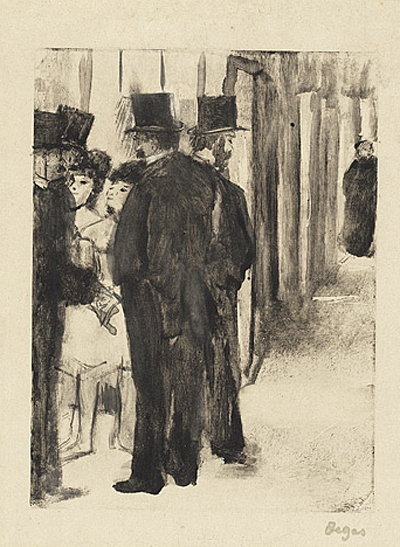
Later Hollywood filmmakers would favor much cleaner images of groups, with heads evenly spaced out across the frame. But visual artists had long explored the bunched-faces option. Here, for instance, is Degas’ daringly unbalanced and crowded Pauline et Virginie of 1876.
Yet these somewhat wild experiments weren’t dead ends. They remained artistic possibilities to be explored more, when other filmmakers hit upon them. Altman’s and Jancsó’s crowded telephoto shots revive the packed frames we see in the 1910s, and other filmmakers found artistic rewards in fanning out figures as in the lovely frame above from Liberty Belles. Those cute girls come back to life in Hou’s Cute Girl (1981) and Millennium Mambo (2001).
Even The Hand of Peril‘s dollhouse set didn’t go absolutely extinct, as admirers of Jerry Lewis (The Lady’s Man), Godard (Tout va bien), and Wes Anderson (The Life Aquatic with Steve Zissou) know. Film style, it seems, knows few dead ends, only detours.
There’s a tendency to think that the history of style constitutes an ever-expanding menu of options. Today, you can cut the way Griffith or Eisenstein or Godard did, right? A similar case has been made for technological change. For decades it was much harder to make a color film than a black-and-white one, but now filmmakers can pursue either option. Most filmmakers in the silent era couldn’t make a talkie, but today’s filmmakers can go silent if they want.
Yet it’s proven surprisingly hard to make a contemporary film look and sound like one from an earlier era. On the sheerly technological front, it’s not easy to recapture the tonal range of orthochromatic nitrate, or the sound texture of early talkies, or the saturation of Technicolor. As for style—how you stage, how you cut, how you frame, and so on—again certain things are hard to recapture. It seems that certain stylistic possibilities, like purely technological ones, have been taken off the menu.
Why is style so hard to recapture? Some elusive nuances of lighting and color depend on technological factors we can’t recreate. IB Tech can’t easily be mimicked with a dropdown menu. On other dimensions, the range of creative options in earlier eras just doesn’t come easily to today’s filmmakers. But maybe by looking at those films we can reconstruct that range. We might also encourage filmmakers to take the sort of chances people did at the very beginning of what we have come to call Hollywood.
This is, I think, my last post for a while on my 1910s adventures at the Library of Congress. I must move on to other projects. As ever, I’m tremendously grateful to the John W. Kluge Center, and particularly its director Ted Widmer, for enabling me to conduct this research under its auspices. A special thanks to Mike Mashon of the Motion Picture Division, and all the colleagues who have been helping me in the Motion Picture and Television Reading Room: Karen Fishman, Alan Gevinson, Rosemary Hanes, Dorinda Hartmann, Zoran Sinobad, and Josie Walters-Johnston. Thanks as well to James Cutting for enjoyable discussion as we watched old movies together.
The new collection of Thanhouser films that includes The Picture of Dorian Gray also provides an enjoyable tour of the LoC Culpeper facility I blogged about in the spring.
I’m grateful to Charlie Keil for ideas and help with sources. The passage I’ve cited from him is in Early American Cinema in Transition: Story, Style, and Filmmaking, 1907-1913 (University of Wisconsin Press, 2001), 134-135.
The quotations from Variety come from anonymous reviews of The Hand of Peril (24 March 1916), 24, and Vanity Fair (29 October 1915), 22.
Other entries about my DC viewing are Anybody but Griffith, Movies in the mountain, and on the machine, Film noir, a hundred years ago, and When we dead awaken: William Desmond Taylor made movies too. More generally, see the category of entries on Tableau staging and my books On the History of Film Style and Figures Traced in Light: On Cinematic Staging. The relation of the tableau style to Hou’s work is considered in the latter, as well as here.
On the difficulty of replicating older film styles, see our blog entries on The Good German and forging a film.
Building the set for The Life Aquatic (Wes Anderson, 2004).
Camera connections: RED on FilmStruck: A guest post by Jeff Smith
Red (1994).
Jeff Smith here:
The Criterion Channel’s new installment in our Observations on Film Art series on FilmStruck presents me talking about Krszystof Kieslowski’s late masterpiece, Three Colors: Red (1994).
In the film’s final scene, chance and fate combine to bring a couple together. My comments trace how a cluster of cinematographic techniques has indicated the couple’s connectedness long before they become aware of one another. Red explores one of the director’s favorite themes: the ways that characters can be linked by mysterious, unspoken emotional bonds transcending the bounds of time and space.
Today I go into a little more depth regarding Kieslowski’s use of cinematography. Since there are spoilers, you may want to watch the film, on FilmStruck or some other platform, before going on.
Three colors, many meanings
Blue (1993).
Kieslowski made Red after Blue (1993) and White (1994). Although all were well received by critics, Red was the most celebrated. It won the Palme d’Or at the Cannes Film Festival and was nominated for three Oscars, including Best Cinematography and Best Director.
The widespread acclaim for Red proved to be bittersweet; Kieslowski died just two weeks before the Academy Awards ceremony took place. Although the director’s untimely passing might have given his film a boost in Oscar voting, Red ended up being overshadowed by other more high-profile nominees. Forrest Gump took home six awards, including Best Picture, Best Actor, and Best Director. Pulp Fiction topped Red for Best Original Screenplay. And the conventionally pretty imagery of Legends of the Fall aced out Piotr Sobocinski’s much more innovative work for Best Cinematography.
The basic conceit of the Three Colors trilogy derives from the nationalist ideals associated with the French tricolor: freedom, equality, and brotherhood. Kieslowski himself downplayed the significance of the tricolor by claiming that the films’ “Frenchness” was largely a result of the film’s financing. In interviews, Kieslowski claimed that the three colors of the trilogy could just as easily have been red, yellow, and brown if the money for the films had come from East Germany rather than France.
Still, even as Kieslowski himself made light of the films’ connection to French values, his comments can seem a bit coy. While the films continue Kieslowski’s longstanding interest in chance, fate, and parallel lives, each entry also offers an idiosyncratic take on the particular ideal associated with its respective color.
In Blue, Julie, the young wife of a composer, is devastated by the deaths of her husband and daughter in a tragic car accident. Forced to start anew after the loss of her family, Julie learns that her husband was not the man she thought she knew. In the midst of tragedy, the combination of grief and new knowledge paradoxically affords Julie a revitalized sense of existential freedom. With everything she had once cared about now gone, Julie relinquishes her roles as wife and mother, and her life takes unexpected paths as a result.
Deep sadness is not usually a trait that we associate with liberté. But Kieslowski’s surprising treatment of this theme is reminiscent of the famous line from Bob Dylan’s “Like a Rolling Stone” that states, “When you ain’t got nothing, you got nothing to lose.” Reduced to nothing, Julie finds new love and new purpose.
In a similar vein, White explores the idea of equality in rather unusual and unexpected way. One might expect Kieslowski film’s to be about political equality given his home country’s long struggle to achieve independence. Yet Kieslowski instead offers a dark comedy of betrayal and revenge.
The film explores the power dynamics of marriage by focusing on a young couple living in Paris. Dominique seeks a divorce from her husband Karol Karol, a Polish immigrant working as a Parisian hairdresser. The divorce leaves Karol impoverished. He is forced to go back to his native Poland where he plots revenge. White then takes an almost Hitchcockian turn as Karol fakes his own death but leaves evidence that incriminates Dominique. When Dominique is convicted for murder, Karol is finally able to “balance the scales” in his relationship. But the film’s haunting conclusion leaves Karol’s future with Dominique completely in doubt. In a distant POV shot, Karol gazes at his ex-wife through the window of her prison cell.
They exchange sad smiles, realizing that they still share an emotional bond despite their earlier duplicities.
He ain’t heavy, he’s my brother(hood)
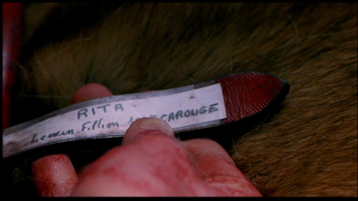
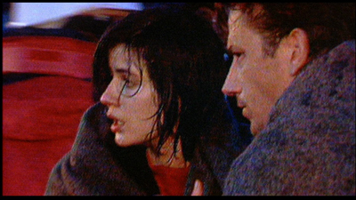
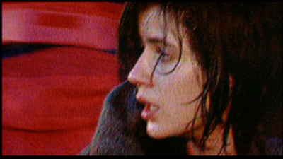
Kieslowski’s take on brotherhood (fraternité)in Red proves to be equally askew. The film’s central plotline concerns Valentine, a young model and student living in Zurich. She is brought by circumstance into the personal orbit of Joseph Kern, a cynical retired judge. Valentine has accidentally injured Kern’s dog, Rita, and seeks him out to see what she should do. Upon learning of the accident, Kern replies with indifference. Shocked by his apathy, Valentine asks Kern whether he would react any differently if it was his daughter who was run over.
Later Valentine returns to Kern after he sends money to pay for the dog’s veterinary care. During this visit, she discovers that the judge is using a radio to monitor the phone calls of his neighbors. Once again, Valentine rebukes Kern, this time for invading the privacy of others.
Chastened by Valentine’s disapproval, Kern begins to reform. He voluntarily confesses his spying to both his neighbors and police. He also accepts Valentine’s invitation to attend a fashion show in which she is a model. Under Valentine’s influence, Kern rejoins life, coming out of his isolation and resuming normal human interactions.
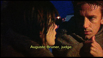
Red features a subplot involving a younger judge, Auguste, who is betrayed by his girlfriend, Karin. While the professions of the two men, Kern and Auguste, provide a simple story parallel, Kieslowski pushes this idea further than most other directors would. In fact, Kieslowski introduces so many similarities between the two characters that Auguste seems to be simply a younger version of Kern.
For example, the manner in which Auguste learns that Karin is cheating on him is remarkably similar to Kern’s account of his own wife’s infidelity. Moreover, Auguste owns a dog that he later appears to abandon much as Kern seems to give up on Rita after Valentine injures her. Both characters share a physical proximity to the other’s female counterpart. That is, Auguste lives near Valentine just as Kern lives near Karin. Lastly, Kern and Auguste both stop their cars at an intersection dominated by Valentine’s image on a huge billboard.
In a more telling parallel, Auguste describes an odd coincidence that occurs as he is walking to the site of his law exam. Auguste accidentally drops his book, and the book falls open to a page that contains information that later appears as a question on the exam. Later, after the fashion show, Kern describes an identical situation when he was a young man. Although Kern and Auguste never meet, viewers are further encouraged to recognize these similarities based on the physical resemblance of Jean Pierre Lorit to Jean-Louis Trintignant.
Instead of exploring brotherhood through more familiar conceits, like family, friends, or community, Red treats it as a metaphysical concept. In Red, brotherhood is an unseen force that binds people together, often in ways of which they are unaware. More importantly, though Kieslowski develops this idea through a story that is riddled with similarities, parallelisms, and synchronicities. And these apply not just to our two male protagonists, but also to the film’s central couple, Auguste and Valentine.
How do you represent destiny?
You’re a filmmaker. The story you’re telling is about a couple that spends much of the movie separate from one another. Perhaps they don’t meet until late in the film, maybe not until its final scene. How do you communicate to the audience that these two people are destined to be together? Over the years, filmmakers have utilized a wide range of techniques and devices to solve this problem.
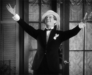
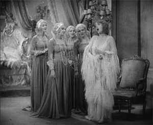
In some early musicals, filmmakers created parallel scenes featuring each character to foreshadow their later romance, as in Ernst Lubitsch’s The Love Parade. First, the caddish Count Alfred talks with his valet and sings “Paris, Stay the Same.” Then Queen Louise talks with her courtiers and sings “Dream Lover.”
More recently, filmmakers include certain plot details to suggest that the characters are meant to be together. In Sleepless in Seattle, Annie believes herself to be reenacting scenes from the Cary Grant-Deborah Kerr weepie, An Affair to Remember. Annie takes each of these uncanny experiences as signs that the radio caller named Sleepless in Seattle is her true soul mate.
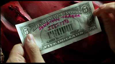
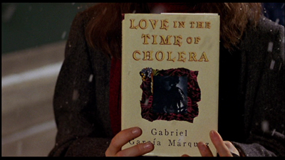
In Serendipity, John and Sarah meet in the film’s first scene. They separate, but they send personal tokens into the world inscribed with their names and phone numbers: a $5 bill and a copy of Love in the Time of Cholera. If these items return to their lives, it will be a sign that the couple will reunite.
In other cases, a filmmaker might use the formal properties of the medium to hint at the character’s destiny. In Turn Left, Turn Right, Johnnie To uses color and composition to anticipate the couple’s fateful encounter late in the film.
In Red, Kieslowski relies on a similar cluster of devices to suggest the workings of chance and fate for Valentine and Auguste. Like the films mentioned above, the director foreshadows the fate of his characters through a number of odd coincidences. At one point in the film, Valentine voices her hopes that her boyfriend, Michel, will call when the phone suddenly rings. Similarly, during one of Valentine’s visits to Kern’s home, they eavesdrop on Auguste and Karin discussing their plans for the evening. Auguste decides to flip a coin to determine whether he will sit home studying or will join Karin for an evening of bowling. As Kern and Valentine listen to this conversation, the judge also flips a coin, which comes up with the same result reported by Auguste.
Later in a visit to a music shop, Valentine listens to an album of music by the composer Van den Budenmayer. Unbeknownst to her, Auguste and Karin listen to the same album just a few feet away. (Taste in music seems to link all four of these characters, as we see this same Van den Budenmayer record in Kern’s home.)
Although these parallels provide a narrative basis for Kieslowski’s theme of connectedness, they are strengthened by his stylistic choices. Four particular techniques emerge as the most salient: the use of color, framing, deep staging, and camera movement. Of these, camera movement is the most important.
Oh, telephone line, please give me a sign
The use of camera movement to suggest the couple’s connectedness is established in the film’s first sequence, which follows a phone call’s path through a communication network that links England to Switzerland. Red begins with a medium close-up of a man dialing a telephone.
Although we don’y realize it at this early point in the film, in retrospect, we can surmise from the framed photograph of Valentine and the copy of The Economist sitting on the desk that this is Valentine’s boyfriend, Michel, who is working in England.
As we hear the number being dialed, the camera follows the phone line down to the socket in the wall. The next shot of the sequence traces the phone’s electromagnetic signal as it feeds into a major trunk line for thousands of other phone customers. The camera begins to spin as it moves forward through these wires. The resulting image is a welter of color and movement.
In the next shot, the camera continues to move forward rapidly, following the signal as it passes through the underwater cables buried beneath the English Channel. Here again, we might easily miss the significance of this shot since it comes so early in the film. Yet it plays an important role by foreshadowing the location of the tragic ferry accident that concludes the film.
The camera dips into, then out of the water, and reverses course, now tracking rapidly backward. It seems to pass through several red brackets that arch over the phone company’s transatlantic cables. The next two shots chase the signal as it travels in the phone lines of an apartment complex. By now, the camera is moving so fast that the lateral tracking movement is seen as a blur of light and metal. The next shot shows the camera spinning wildly. The camera then swishes past a telephone switchboard until it finally stops on a single flashing red light.
For a director not especially known for stylistic flourishes, this opening camera movement is a real corker. Yet its significance goes beyond extravagance. It previews the way Kieslowski will use camera movement to underscore the characters’ physical proximity to one another. It also foreshadows the many missed connections Valentine and Auguste will experience before finally meeting one another at the end of the film.
Morning routines, broken glasses, and fortuitous falls
Later camera movements creating physical connections are more staid than this bravura opening sequence. But they do establish a pattern that carries through the remainder of the film.
The next scene begins with a shot of Auguste gathering his books and preparing to take his dog for a walk. The camera follows Auguste and his dog as they cross the street, but drifts away from them, craning up past the red awning of Chez Joseph to introduce our protagonist, Valentine. The camera reframes Valentine as she moves about her apartment engaged in a phone conversation, confessing her loneliness as she prepares to leave for a photo shoot.
When Valentine mentions the weather, the camera tracks toward an open window, allowing us a glimpse of Auguste in the distance, returning to the entrance of his building. By blocking and framing the scene in this way, Kieslowski cleverly creates a bookend effect. It begins and ends by underlining the characters’ proximity to one another, suggesting a strange synchronicity to their actions in the process.
As the film goes on, Kieslowski encourages the viewer to notice the way that Valentine and Auguste’s paths continually cross, even as they remain largely ignorant of one another’s presence.
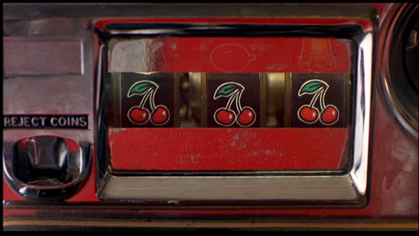
Consider the scene in which Valentine wins a jackpot playing the slot machine. Kieslowski begins the scene with a shot of Valentine exiting her car. The camera tracks slightly to the left to reframe Valentine as she walks to the entrance of Chez Joseph. Valentine buys a newspaper, and as she begins to read the front page, a figure steps in front of her holding a carton of Marlboro cigarettes.
The figure passes through the frame so quickly that it’s only in the subsequent shot that we realize it was Auguste, seen here entering his apartment with his dog. After Auguste has exited the frame, the camera racks focus at the same time that it pans left and tilts down to reveal the slot machine. We then see a close-up of Valentine’s hand as it enters the frame and pulls the handle downward. In this instance, Kieslowski’s framing makes us work harder to see the connectedness of the characters. Auguste is framed so that we only see his torso. Valentine is framed so that we only see her hand.
Later in the film, Auguste is unable to contact his girlfriend and drives off in a panic. He makes a hasty U-turn, framed through the window of Chez Joseph. As the red Jeep pulls away, the camera tracks right to follow it, but then continues its movement toward the slot machine, revealing three cherries that earlier produced Valentine’s jackpot.
The owner of Chez Joseph had told Valentine the three cherries were a bad omen. It will prove to be true as well for her counterpart, Auguste.
Another example of the couple’s connectedness occurs in the brief scene at the bowling alley. After a couple of shots that establish the setting and Valentine’s presence within it, Kieslowski cuts to a shot of Valentine rolling her second ball of the frame. The camera is positioned in the space behind the seating area in the alley.
From this initial set-up, the camera then tracks left past several other bowlers and stops on a close-up of a broken beer glass, a lit cigarette, and a crumpled package of Marlboros. The camera cranes up slightly on these objects, lingering briefly to enable the viewer to grasp their significance. Here again, Kieslowski has opted for a slightly elliptical way to suggest Auguste’s presence, which was presaged by the phone conversation overheard by Kern. The broken beer glass and lit cigarette suggest that Karin never showed up for their date, and further that Auguste left the alley in a huff.
Perhaps the most interesting camera movement in Red occurs in the scene in which Kern and Valentine meet after her fashion show. Kern explains that when he was a young man, he used to sit in the balcony in that same auditorium. On one occasion, he dropped a book and it fell several feet to the floor below, but opened to a section that is covered on the law exam he was about to take. (Recall that the same thing happens to Auguste as he crosses the street.)
Kieslowski could simply have Kern recount his story, but instead the director treats the moment much more dynamically. The camera traces the path of the book’s fall. The camera starts at a high angle looking down at Kern and Valentine near the stage, and ends at a low angle looking up at them.
Through a simple camera movement, Kieslowski has reinforced another of the film’s major themes: the interpenetration of the past with the present.
The unbearable redness of Being
As I’ve already suggested, camera movement seems to be the most important device for conveying Kieslowski’s central themes. It’s a vivid way to physically embody the unseen connections that link Valentine and Auguste together before their coincidental meeting after the ferry accident.
Still, camera movement is not the only technique to carry such significance. Color also proves important, especially since the film’s title prompts particular attention to it.
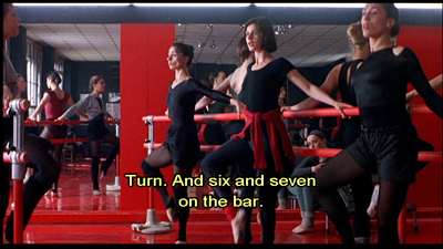
Toward the start of the film, Kieslowski seems to tease us with all of the red things that appear in the frame as in the shots of Valentine’s apartment and the ballet studio.
Yet he was also careful to point out that red is not even the dominant color in the film’s palette. Working with the film’s production designer, Kieslowski opted to emphasize browns and blacks, in part because the colors are associated with the world of courtrooms and legalese that connect Kern with Auguste.
Yet, even as an accenting color, red still draws the eye toward it. One reason for this is Kieslowski’s restricted palette, which features very little green and almost no blue. Red pops out because it is often the only bright color within the mise en scene, which mostly features more neutral earth tones.
Because red is conventionally associated with things like love, passion, anger, and danger, we might be tempted to match those meanings to the film’s story. And there are some moments in Red where such color symbolism seems like a possibility. Consider, for instance, the insert of Valentine’s bloodstained hand checking Rita’s tag.
Yet, for every one of these moments, there are a dozen others where the color seems to have no such correlation. Why, for instance, would we ascribe passion or anger to Chez Joseph’s awning or to the three cherries on the slot machine?
Since the color is present in almost every scene, one would be hard-pressed to find any coherent pattern based on such traditional associations.
Instead, like camera movement, red seems to function as a visual metaphor for the film’s off-kilter treatment of brotherhood. Indeed, Kieslowski anticipates Auguste and Valentine’s eventual coupling by consistently linking them to red props and decor. Auguste has his red jeep, which we see several times throughout the film. He also is shown toting cartons of Marlboro cigarettes, which are identifiable through the brand’s signature color.
Valentine, on the other hand, is frequently shown with red colored clothing and textiles. When Valentine takes Rita out for a walk, she wears a red sweater and carries a red leash. She sleeps with a red shirt that serves as a substitute for her absent boyfriend, Michel. During a photo shoot, Valentine poses against a vibrant red backdrop. Lastly, Valentine is shown in several different settings where the décor is dominated by red, such as the ballet studio, the bowling alley, and the auditorium where the fashion show takes place.
Viewed in this respect, color in Red functions as a classic instance of an intrinsic norm. By rejecting more conventional extrinsic meanings associated with the color, Kieslowski instead treats red as something that develops more localized significance. Given his longstanding interest in the workings of chance, fate, and destiny, it should not surprise anyone that red objects, costumes, and settings come to symbolize these larger cosmic forces.
The Breath of Life
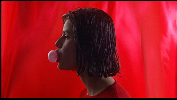
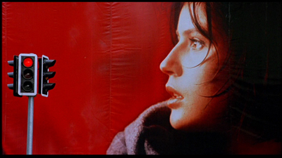
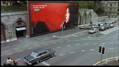
The color red is also prominent in Valentine’s “breath of life “ billboard ad. The ad is shown at least six times in the film, and its recurrence will play an important role in preparing for the film’s climax.
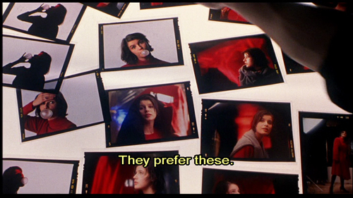
We first see the ad in production during Valentine’s photo shoot. She is posed in profile, and her mood seems playful. She blows a bubble with her gum, presumably using the product featured in the campaign. The photographer asks Valentine to remove the gum from her mouth and to tie her sweater around her neck. He then instructs her, “Be sad. Sadder. Think of something awful.” By asking Valentine to imagine tragedy, the photographer is able to get the image he wants.
We see the resulting photograph a few scenes later amongst a pile of other snapshots from the session. Jacques, the photographer, calls our attention to it by indicating that the shot likely will be used in the campaign.
The billboard itself is later shown on two separate occasions. We first see it looming over the traffic intersection where Auguste’s red jeep is stopped.
We see the same image again when Kern drives to Valentine’s fashion show.
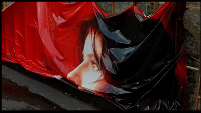
It appears again just before the film’s climax in a brief shot showing workmen taking the billboard down.
One might assume that Kieslowski has put a cap on the “breath of life” visual motif. But he revives it one final time, albeit in a way that inverts much of its earlier significance in the film’s plot. Red’s climactic scene begins with Kern walking outside to retrieve his newspaper. On his way back, he glances at the headline, which notes that hundreds of people are dead in a ferry accident on the English Channel.
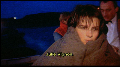
Kern then turns on his television to learn the latest news of this tragedy. A reporter states that there were only seven survivors of the accident. In a rather tongue-in-cheek gesture, six of the seven survivors happen to be characters from the Three Colors trilogy. We first see a shot of Julie Vignon, who is described by the reporter as a composer’s widow.
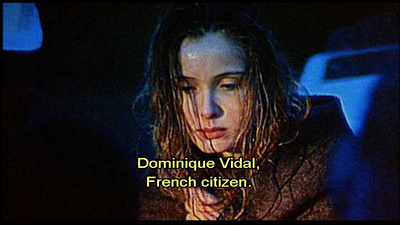
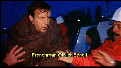
This is followed by shots of Karol Karol and his wife Dominique.
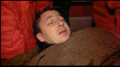
Next comes a shot of Olivier Benoît, a family friend who had become Julie’s lover in Blue.
Finally, we see a shot of the two Swiss survivors, Auguste and Valentine.
For the first time in the film, the two characters are shown looking at one another. The television image freezes on Valentine and Auguste.
The camera slowly zooms in on the image on the television to get a closer view of Valentine. When the zoom ends, the video image is eerily similar to the “breath of life” billboard.
The gray blanket has taken the place of Valentine’s sweater and the red windbreaker of a rescue worker replaces the red cloth backdrop of the ad. But Valentine’s facial expression and pose approximate that in the ad.
The video image, however, seems to reverse many of the advertisement’s earlier associations. During the shoot, Valentine only pretends to be sad. Her expression and pose are commodified, used to sell chewing gum to punters taken in by the image’s sensuous visual appeal. In contrast, the video image of Valentine’s rescue captures her genuine response to tragedy. Valentine’s look expresses a sense of shock and surprise that she survived when so many of her fellow passengers died. Moreover, the gloss of the billboard advertisement has been replaced by the roughhewn look and “on the fly” reality of video reportage.
From this shot, Kieslowski cuts to an enigmatic medium close-up of Kern, who stares into the morning sunlight through his window.
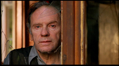
The shot seems to pose more questions about the story than it answers. Is Kern merely relieved by the news that Valentine has survived? Or is there something deeper behind his rueful smile? Does Kern feel responsible for Valentine’s situation? After all, he recommended that she take the ferry rather than fly and asks to examine Valentine’s ticket in their last meeting together.
For some critics, the shot adds a Shakespearean wrinkle to Kieslowski’s film. For these critics, this shot suggests that Kern, like Prospero in The Tempest, has conjured the storm out of thin air in order to satisfy his psychological desires.
Whether or not we see this moment as a reference to The Tempest, it seems clear that Kern has uncannily anticipated Valentine’s fateful encounter with Auguste throughout the film. Consider the following:
- Kern predicts Karin’s breakup with Auguste. He also claims that, despite Auguste’s declaration of love for Karin, that Auguste has not yet met the right woman. This language is echoed later when Kern describes his own despair after learning of his wife’s affair. The Judge says to Valentine, “Perhaps you are the woman I never met.”
- Earlier in the film, Valentine says she is thinking of cancelling her trip to England because of her brother Marc’s legal troubles. Kern insists that she keep her travel plans saying it is her “destiny.”
- Kern acknowledges that he crossed the English Channel as a younger man in pursuit of his wife and her lover, Hans Holbling. His quest came to naught, however, when he learned that his wife died in an accident. Both the trip and his wife’s fate prefigure the ferry tragedy that ends the film.
- Kern describes a dream he has of Valentine as an older woman. Kern’s account of the dream prophesies that Valentine will meet a man and that the couple will grow old together.
All of these things seem to foreshadow Auguste’s fortuitous meeting with Valentine in the aftermath of the accident. Since Kern is, at least in some indirect way, responsible for the couple’s meeting, he has given Valentine a gift in addition to the pear brandy that the two previously enjoyed together. In Auguste, he has given Valentine a younger version of himself.
At its heart, Red is an existential mystery. When Valentine and Auguste meet at the end, their union seems less like coincidence and more like the outcome of divine intervention. Yet, in retrospect, Kieslowski has carefully prepared us for this moment by using color and camera movement not only to underscore their physical proximity, but their many missed connections.
In exploring the French value of fraternité, Kieslowski’s unusual treatment of the subject emphasizes the invisible forces that bind people together even as they elude our conscious grasp. Although Kieslowski likely didn’t intend Red to be a valedictory film, it is a fitting testament to his larger oeuvre as a director. In a story suffused with grief and regret, Red’s final scene suggests that love and hope can bloom in even the most bleak situations.
Thanks as usual to the Criterion team, particularly Peter Becker and Kim Hendrickson, for their support. Kristin, David, and I are very happy to be involved with their FilmStruck activities.
For more on Krzysztof Kieslowski’s films, see Annette Insdorf’s Double Lives, Second Chances: The Cinema of Krzysztof Kieslowski, Joseph G. Kickasola’s The Films of Krzysztof Kieslowski: The Liminal Image, and Marek Haltof’s The Cinema of Krzysztof Kieslowski: Variations on Destiny and Chance. Two collections of interviews with Kieslowski have been published: Kieslowski on Kieslowski and Krzysztof Kieslowski: Interviews. For a concise overview of the films in the Three Colors trilogy, see Geoff Andrews’ monograph in the BFI modern classics series.
An earlier entry considers the ways that film stories rely on chance and coincidence, with Serendipity as a central example.
When we dead awaken: William Desmond Taylor made movies too
Ben Blair (1916).
DB here:
It wasn’t until they turned the body over that they realized he had been shot. By then, the crime scene had become chaos. Studio employees swarmed over the bungalow and swiped incriminating letters, while neighbors and reporters drifted in freely. The police left their own fingerprints around the place. No wonder the case remains unsolved.
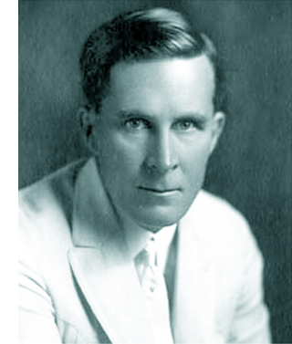 William Desmond Taylor’s place in film history is secure, but not because of his movies. His 1922 murder galvanized the nation. Suspects included stars Mabel Normand and Mary Miles Minter, Minter’s mother, an embezzler, an estranged brother, bootleggers, drug pushers, blackmailers, and assorted low-lifes. The case reeked deliciously of scandal.
Minter was infatuated with him, her mother owned a .38, and Taylor’s secretary had absconded with a car and forged checks. Speculation spread in many directions. Was Taylor gay or bisexual? Was he a drug addict, or a supplier, or someone trying to rescue a friend from addiction? Did Mary and Mabel quarrel over his affections? Who was his late-night male visitor? Did the bungalow actually contain tagged items of ladies’ lingerie, and pornographic photos of Taylor cavorting with starlets?
For nearly a hundred years fans and tabloid TV have returned obsessively to the murder. Even King Vidor began sleuthing late in life with the aid of Colleen Moore.
Taylor cut quite the figure. Tall, handsome, and solemn of mien, he left Ireland and led a barnstorming life in America. He abandoned a wife and daughter in New York to take up touring stage work. He wound up in Hollywood. After some acting successes, he directed shorts before graduating to the popular serial The Diamond from the Sky (1915). His feature films were widely respected, and he became a key figure in forming the Directors Guild (then the Motion Picture Directors’ Association).
Okay, it makes a swell mystery. But what about Taylor’s movies?
The other sort of teenpix
Back in 1976, Richard Koszarski had the very good idea of mounting a program called The Rivals of D. W. Griffith for the Walker Art Center. Auteurism was at its height, so it’s no surprise that the program’s subtitle was Alternative Auteurs: 1913-1918.
Remember, this was before all those festivals that today specialize in exhuming silent classics. Beta and VHS had just been introduced and were not yet popular. There was no Criterion, Flicker Alley, or TCM, or any other platform that would give these old movies a mass-market afterlife.
Since then, things have improved a lot. We can now see on video nearly everything in Richard’s show: Wild and Woolly, Stella Maris, Juve vs. Fantômas, The Italian, Hell’s Hinges, The Mysterious X, Straight Shooting, The Gun Woman, Behind the Screen, The Rink, The Immigrant, The Outlaw and His Wife, The Cheat, and The Blue Bird. Some of the copies are shabby, but they’re out there. Anyhow, collectors’ 16mm dupes that circulated back in the day were hardly impeccable.
The program helped balance out historical accounts. Richard’s opening essay in the program’s catalogue flung down the challenge. Most historians had ignored the period, but:
Even the most casual investigation must reveal the years 1913-18 as the most hectic, tumultuous and progressive in the entire history of the cinema.
Richard’s aim wasn’t to attack Griffith. This was a time when cinephiles were discovering the superb Biograph shorts, and appreciation of his artistry was expanding. Instead, Richard usefully reminded us of all the other things going on as features emerged.
Looking at the films in this program will help anyone appreciate even more fully Griffith’s strengths, and pinpoint more certainly his weaknesses. Often his individual achievements will be matched, sometimes surpassed.
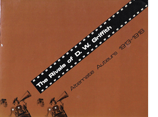 Richard’s introduction ably sums up the changes in the industry that made the period so fertile. And the contributors’ notes that follow, while brief, point up valuable things about the program. The Rivals of D. W. Griffith is still very much worth having.
My recent investigation of nearly a hundred U.S. features from the period wasn’t exactly casual, but it seems merely a depth sounding of a vast body of extraordinary work. I’ve offered you glimpses of it in earlier entries (here and here and here), but there’s a lot more I’d like to share.
Which brings me back to William Desmond Taylor. He doesn’t figure in Richard’s Rivals show, probably because few of his films were available. Most of his work is lost. He signed forty features between 1915 and 1922, of which seventeen apparently survive, many incomplete. Most of those I’ve seen are solid but not dazzling. The amiable Tom Sawyer (1917) is a good example of how polished Hollywood cinema already was in 1917, and the leisurely Mary Pickford item Johanna Enlists (1918) is ingratiating as well. At the film’s climax Taylor tries for triangular staging of the type that would come in the 1920s, but he botches it with mismatched eyelines and screen directions. By the time of The Soul of Youth (1920), a touching movie about juvenile delinquency, the cutting is very meticulous, as in Huckleberry Finn (1920). Both films use startlingly tight close-ups, some of them shot with a wide-angle lens.
Taylor also claimed innovations in visual narration. His now-lost Sacred and Profane Love (1921) was promoted as including scenes in which an expository title rises up over character action, makes its comment, and melts away while the scene continues. Perhaps the opening of The Soul of Youth was a step in this direction. In chiseled silhouettes we see an unwed mother selling her baby to a gangster’s girlfriend, introduced through “art titles” dissolving away to reveal the action.
The Soul of Youth also includes some embedded scene movement in the corners of titles. Such experimentation with intertitles was a trend of the period.
So we have a director of some ambition. That inference is backed up by some flashy moments in earlier 1910s work. In 1916 Taylor released a remarkable nine features, and during my DC stay I saw what remains of four of them. Although they’re in parlous shape, they show a lively pictorial and dramatic intelligence. Are they auteur films in the strong sense? At least we can say that Taylor, like many other directors, was channeling just that exuberant creative energy that Richard evokes. Certain moments in two of these movies have genuine flair, and one film is an all-out stunner. I had never heard of any of them.
1916 and all that
My first 1916 title is Pasquale. It stars George Bevan, famous for his stage roles as good-natured Italians. It’s a story of friendship betrayed. Two immigrants who return home to fight for Italy are shown to be more honorable than the American men who cheat them and beat their women.
“A mighty good feature,” said Variety’s reviewer, but you can’t prove it by me. The Library of Congress print lacked the first and last reels, and what was in between consisted of scenes and parts of scenes jumbled up. While it’s certainly competent, I didn’t see much subtlety in its staging or cutting. The use of crosscutting to tie together its story lines was standard for the period.
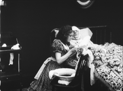
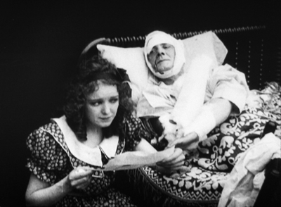
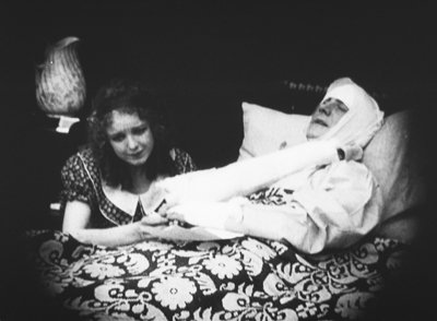
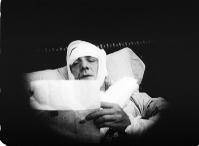
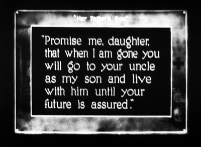
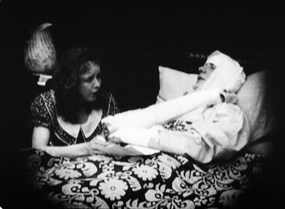
The print of the Civil War story Her Father’s Son was a little scrambled too, and it lacked the final reel, but it was more coherent. A girl from the North must pretend to be a boy—first, to satisfy an old Southerner’s urge for an heir, then after the war starts she is pressed into service as a courier, and eventually a sterling supporter of the confederacy. The most noteworthy bit of technique, I thought, involved the varied camera setups in one scene. Frances (Vivian Martin) is asked by her dying father to go live with his brother as a boy. The changes in shot scale and angle emphasize her moment of decision, as well as her reaction to her father’s death.
This passage shows more flexibility of camera setup than Griffith displays in the sequences in the Union hospital in The Birth of a Nation (1915), or in Intolerance, from the same year as Taylor’s film. Taylor here joins a general push toward finer-grained analytical editing in dialogue scenes. Other examples are Reginald Barker’s The Bargain (1914) and DeMille’s The Cheat (1915).
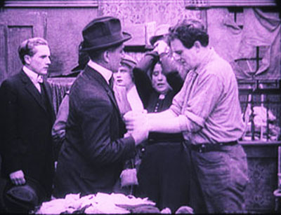
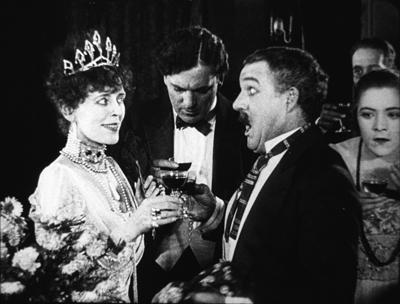
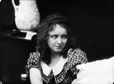
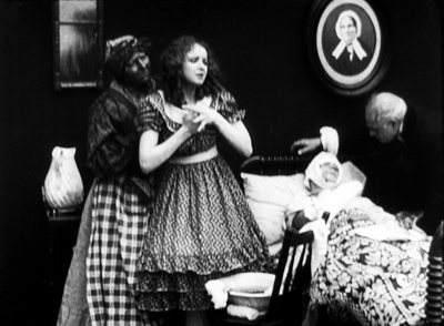
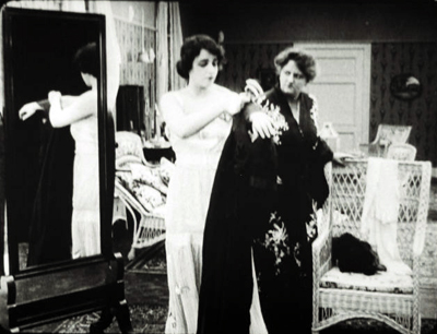
The House of Lies is more flamboyant and peculiar. Edna is an ethereal girl who likes waterfalls, poetry, children, and rabbits. Her stepsister Dorothy is vain and soulless. Mrs. Coleman is determined to marry both off to wealthy men. Refusing to trade her beauty for social position, Edna splashes her face with acid. She becomes the secretary of the sensitive author Marcus Auriel. But the stepmother is plotting to snare him for Dorothy, while also joining forces with a thief who wants to steal a financial document from Auriel’s safe.
Variety considered The House of Lies a good example of “what a feature picture should not be.” The reviewer considered it old-fashioned melodrama. Fair enough, but it doesn’t creak much and has considerable visual fluency. Sometimes there are echoes of the tableau style, as when Edna steps aside to reveal her sister and stepmother dressing in the background.
But the same tableau setup gets overridden by the sort of axial cut so common at the period. Earlier in the scene when the stepsisters get dressed for the big party at which they’ll be displayed, instead of letting Dorothy step aside to reveal the other women, Taylor “cuts through” Edna’s blocking figure to the women behind her.
The transition would be jumpy were it not for a (mispunctuated) title: “I don’t understand all this display mother; when we should still be in mourning for father.”
A variant of the axial cut employs a 180-degree reversal. We’ve already seen Edna’s reluctance to enter “the auction” at which rich men will look her and Dorothy over. She pauses at the doorway, which in wealthy houses of this period always seem to be covered with a heavy curtain.
Later, after her mother has taken Dorothy around to meet her guests, we see the poet Auriel remark to a friend that it’s like a modern slave market. Cut to the opposite side of the men to reveal Edna’s reaction to his line.
It’s this that drives her upstairs to destroy her beauty.
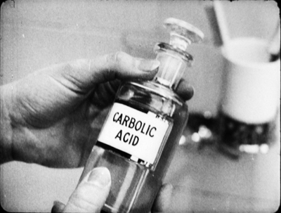
The acid-splashing is of course the grisly high point of this drama. It’s handled with what at first seems a tactful obliqueness.
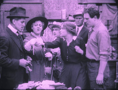
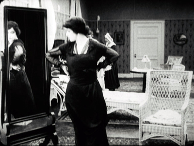
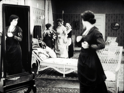
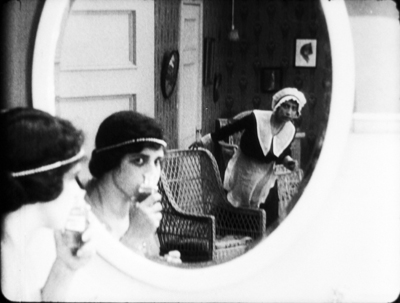
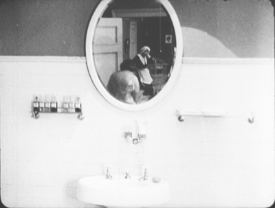
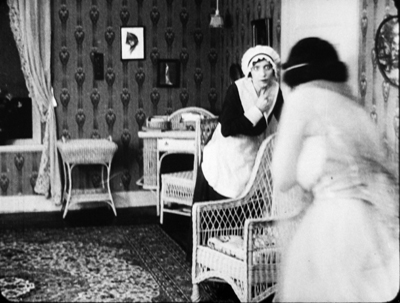
Mrs. Coleman has summoned a maid to bring Edna back to the gathering. As she enters, Edna stands at the mirror, pondering. Since Dorothy is the sister associated with mirrors, this seems out of character for Edna.
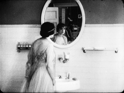
Seeing the maid, she picks up the bottle of acid. Before opening it, she experimentally rubs her face.
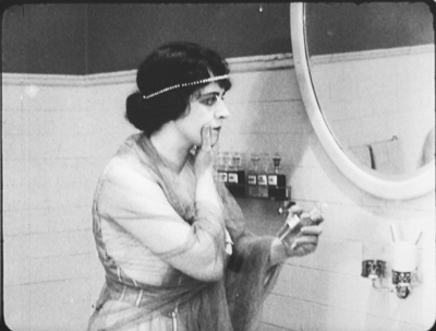
A closer view of her at the mirror shows her ostentatiously lifting the bottle, as if making sure the maid sees it. In retrospect, it may be that she’s staging the scene for an eyewitness.
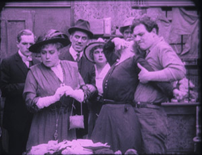
Cut back to the original bathroom framing as Edna seizes her cheek and cries out. She runs into the next room, as seen in the reflection.
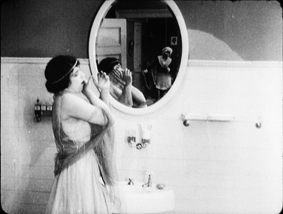
A nice match on action brings Edna into the boudoir, where she collapses.
Thereafter Edna sports a ravaged cheek or a discreet bandage. Eventually Auriel declares that he loves her despite her deformity. She then reveals that her scar is mere makeup. She never really applied the acid. She wanted out of the marriage auction and sought someone to love her for herself.
Taylor’s framing and cutting conspire with Edna to conceal her deception. Mirrors create spatial trickery in 1910s films from both America and Europe, often doing duty for reverse angles or POV cutting. The embedded image usually serves to expand what we know, as it does here.
But Taylor’s mirror reflection also makes the maid into a decoy, teasing us to watch her as well as Edna. Hiding what Edna was up to would have been more obvious if we didn’t have the maid to distract us. Of course Taylor could simply have cut away from Edna at the crucial moment, but that wouldn’t carry as much conviction as seeing an apparently full, if discreet, shot of the self-mutilation.
A noir western?
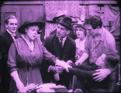
Noirish westerns like Duel in the Sun (1947), Pursued (1947), and The Furies (1950) revolve around dysfunctional families, tyrannical patriarchs, childhood anguish, and sadistic corruption. Somewhat in this vein is one of the story lines that inform Taylor’s Ben Blair (1916). The noirish action is embedded within a larger plot involving the clash of New York decadence and prairie rectitude. As a bonus, certain scenes evoke that proto-noir style I considered in an earlier entry. One scene of violence is spectacularly beautiful—Ford meets Mann, shall we say, before both showed up.
The film roughly follows the plot of the 1905 novel. When Tom Blair’s common-law wife dies of illness and neglect, he sets fire to his ranch house in an effort to destroy her corpse and kill her son Ben. The boy escapes and is adopted by the good-hearted rancher Rankin. Ben grows up alongside Florence, daughter of another rancher. When Flo’s father dies, his widow takes Flo to New York in search of a husband for her. In the meantime, Tom Blair has returned and is raiding local ranches for horses. He shoots Rankin, and Ben sets out to avenge both his mother and his benefactor.
The second half of the novel, and the film, brings Ben to New York. He finds Flo captivated by the urbane but unstable Clarence Sidwell. After Ben sees the depravity of city life, he tries to lure Flo away.
Second things first. Critics found the New York section of the book less evocative than the Western half, but such can’t be said for the film. An eyebrow-raising introduction to the rake Sidwell leaves little to the imagination.
Flo had told Ben she wanted to leave the West for “the things of civilization.” Now we get a title: “The things of civilization. Exhibit 1: Clarence Sidwell.” Fade in on a louche creature pouring himself a drink.
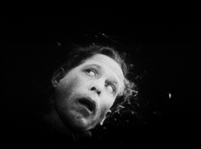
Shock cut back: In an extreme long-shot, a young woman bursts out from the distant bedroom, dodges Sidwell, zigzags desperately through the vast parlor, and hurls herself out of the foreground.
As the deep space of 1910s cinema becomes an obstacle course, we’re obliged to understand that the poor woman has been raped. The power of the scene comes from her frantic rush toward us in contrast with Sidwell’s bored calm.
When she collapses in the next room, he moves as if to follow her, then shrugs and returns to his post-coital drink. In the novel, Sidwell is a neurotic workaholic, nothing like this chilling libertine.
A parallel scene occurs later, when Ben has come to Manhattan to visit Flo. On the street at night, he chivalrously agrees to see a woman to her apartment, only to find that he’s been tricked into visiting a brothel.
As in the novel, he shoots his way out (these sissies can’t handle him), but not before he glimpses Sidwell there with a floozy. This, along with Sidwell’s rape of the woman we’ve already seen, reminds you of what all those censors were complaining about in the era of scandals around Fatty Arbuckle, Wallace Reid, and other Taylor contemporaries.
Ben learns that Flo has agreed to marry Sidwell, and Ben’s memory compares the brothel revelation with Flo’s farewell to him back on the ranch.
He must save her from this man.
Ben is too honorable to snitch on Sidwell. He simply walks in the family mansion and tells Flo that she is leaving with him in half an hour, or he will kill Sidwell. He counts on her underlying love for him and their childhood home. After her indignation dies down, she agrees happily to go “back to God’s country.”
The tension of the film’s first half centers on Tom Blair’s murder of the genial old Raskin and Ben’s pursuit of Blair. Tom, it turns out, isn’t Ben’s biological father; Raskin is. Tom has killed Ben’s mother through abuse and his natural father through homicide, so the son’s quest gains mythical overtones.
There are some majestic vistas, along with flashy exchanges of gunfire among rocks. The clincher comes when at the height of their fistfight, Ben is ready to strangle Tom and bends over him. The false father gasps for mercy.
A brutal cut takes us to Ben’s eye, which fills with the image of Florence.
We realize that he couldn’t face Flo if he murdered a man in cold blood. So he lets Tom live, drags him back to town, and even saves him from a lynch mob. But this moment—in 1916, remember—shows how eager filmmakers of this period were to maximize the emotional power of a scene. Often we’ll find that an expository title and a bit of facial emoting has been replaced by tactics of cutting, framing, and here, precise special effects.
Devil’s doorway
Skilful backlighting is more precious than a gallon of peroxide!
William Desmond Taylor
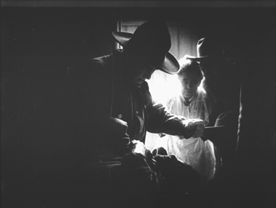
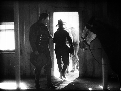
This isn’t the film’s only prefiguration of the noir hero driven to the brink. Ben has nearly lost control earlier in the film, and this scene involves the noir look as well. It grows out of Tom Blair’s cold-blooded murder of Raskin.
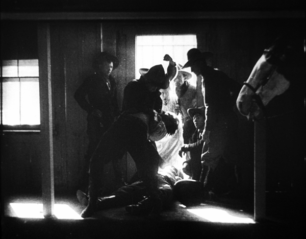
In the novel, Ben witnesses it from the barn, but he’s too late to catch Tom before he rides off. In the film, Ben is in town, seeing off Flo and her mother at the train. Now the scene is played out for us, with the cook as an appalled side participant.
Hearing noise in the corral, Raskin steps out on the porch. The edge lighting outlines him vividly enough to be visible, and cut down.
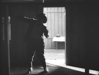
A 180-degree reverse shot puts us inside as the cook rushes to the door and peers out.
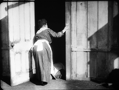
Cut 180 degrees again to a variant of the first shot, framing the bunkhouse in long shot. After a beat, Tom Blair and his horse appear in the foreground. The lighting here is of remarkable delicacy: the silhouettes are barely picked out.
We return to the shot inside the bunkhouse. Another beat: The face of the man passing emerges as she turns away in horror.
Tom mounts his horse and rides off. Soon, in another shot from outside, the ranch workers gather at the doorway, as Ben arrives with his horse. One standard option would be to have the dead man carried in, to have the men assemble around the body, and in clear light and shot/ reverse-shot, to show Ben issuing his orders. Instead, Rankin’s body lies blocking the threshold and all the action is played in the bright rectangle and made emphatic by axial cuts.
The first cut comes as Ben reacts to what has happened. He’s in darkness, with the cook and cowpokes watching.
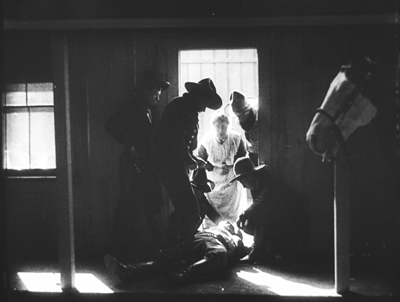
Ben tells them to take care of Rankin: “Put up your guns, boys–This is my affair.”
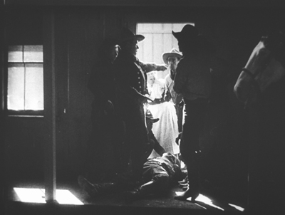
When one of the men accuses him of trying to cover up for his father, Ben explodes and starts beating him. A cut in to a closer view shows him strangling the offender. As in later cinema, the abrupt cut accentuates the violence of Ben’s attack.
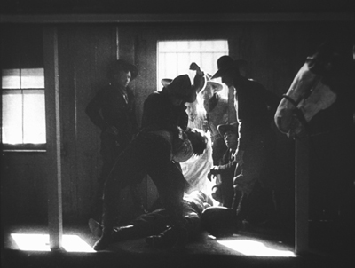
An axial cut back shows the victim protesting: “Let up–I didn’t mean it!” Ben shoves him aside and bends over the dead man sorrowfully.
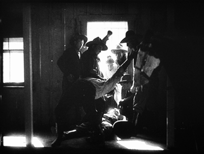
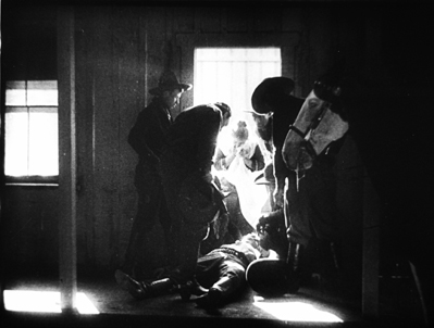
The ranch hands carry Rankin’s body in. Ben is left in the doorway brooding on what he must do to avenge the death of his surrogate father.
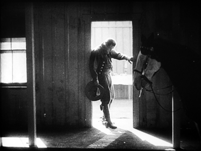
Call it Fordian if you want. I wouldn’t object.
Given the fame of Dustin Farnum as a star at that moment, it seems fairly daring to subordinate a dramatic high point to this incisive visual design, with all the action squeezed into the doorway. Stance and gesture have replaced close-ups and facial reactions. The scene varies so much from the book that we might want to credit the scenarist, Julia Crawford Ivers. Ivers, who who had directed films herself, collaborated closely with Taylor on his projects. The cinematographer, perhaps Homer Scott (another Taylor mainstay and a significant DP before 1923), may also have had a big say in this virtuoso scene. The film could claim its “Lasky lighting” as typical of the Paramount brand.
All of Taylor’s surviving films I’ve seen are of interest; he’s clearly one of the more talented directors to give up the tableau and work in the continuity style that would define Hollywood. In particular, Ben Blair would definitely be worth reconstructing and restoring. The LoC print, while jumbled in its last two reels, is fairly complete, and the shots could be rearranged coherently. At the risk of spoilers, I wanted to share with you my discovery of this exciting piece of work. Taylor deserves to be remembered for more than his fate that night in February 1922.
Thanks again to the John W. Kluge Center for providing me a long stay at the Library of Congress. The Moving Image Research Center was my host, and so I’m grateful to Mike Mashon, Greg Lukow, Karen Fishman, Dorinda Hartmann, Josie Walters-Johnston, Zoran Sinobad, and Rosemary Hanes. They’re doing a wonderful job. Special thanks to Richard Koszarski for background on his Rivals program, and to Alan Gevinson for discussions of 1910s cinema generally and Taylor in particular.
Relevant to this entry is Kristin’s article is “The International Exploration of Cinematic Expressivity,” in Film and the First World War, ed. Karel Dibbets and Bert Hogenkamp (Amsterdam University Press, 1995), 65-85. She discusses American lighting practices of the period in The Classical Hollywood Cinema: Film Style and Mode of Production to 1960 (Columbia University Press, 1985), 223-227. See also Lea Jacobs’ article “Belasco, DeMille and the Development of Lasky Lighting,” Film History 5, 4 (December 1993), 405-418.
Some Taylor films are available on DVD. The most authoritative is the beautiful restoration of The Soul of Youth that’s included in Treasures of American Film Archives vol. III: Social Issues in American Film 1900-1934. Tom Sawyer is available in a fairly good copy, as is Huckleberry Finn, which doesn’t survive complete; it has played on TCM in a tinted version. Copies of Johanna Enlists and Nurse Marjorie are problematic but watchable.
Ben Blair was mostly liked in the trade papers, though Variety claimed that the film was “hardly up to the Paramount standard.” But using the same phrase, Manhattan’s Broadway movie theatre declined to show it. You wonder if the Sidwell rape scene had something to do with the decision. After some wrangling, the management cut it to two reels and “used it as ‘filler.'” Tastes do change.
On Taylor’s career, see Richard Koszarski, “The William Desmond Taylor Mystery,” Griffithiana 38/39 (October 1990), 253-56. The most authoritative reference on Taylor’s life is Bruce Long’s collection of clippings and commentary William Desmond Taylor: A Dossier (Scarecrow, 1991), from which my backlighting quotation comes (p. 162). Alan Gevinson’s filmography in Long’s book is the most comprehensive I know. Long also ran the online publication Taylorology, which offered exhaustive coverage and analysis of the murder.
Speaking of the murder, there’s enough material in books and online to keep aficionados busy for years. Whodunit? Since this entry is spoiler-filled, I’ll summon a lineup. The principal books on the case finger four suspects: Mary Miles Minter’s mother (favored by King Vidor, as reported by Kirkpatrick); Mary herself (Higham); a hitman for a drug gang (Giroux); and one of a trio of blackmailers (Mann). Long’s Dossier lists many errata in the first two of these. Of these, Giroux’s is the most sober and avoids High Tabloidese, as well as the confident reporting of the thoughts and feelings of people long dead. My own hunch is that too much evidence has been destroyed to permit a plausible conclusion.
Still, the Taylorologists have supplied fascinating information on what Hollywood culture was like at the period. It still astonishes me that celebrities like Taylor, Minter, and Edna Purviance could live without bodyguards and security, while Mabel Normand could just stroll down the street to buy a bag of peanuts. And all chroniclers agree that the studios kept a lid on an investigation that law enforcement conveniently botched.
A quick and entertaining overview of the scandal is Rick Geavy’s graphic novel Famous Players: The Mysterious Death of William Desmond Taylor (NBM, 2009).
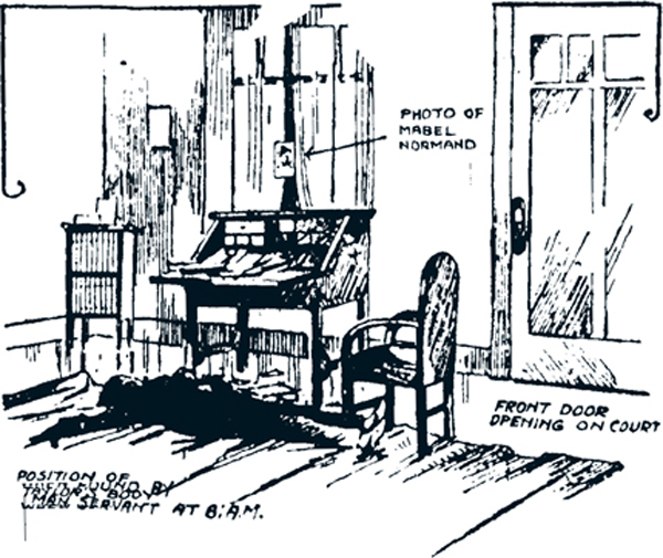
Okay, I can’t refrain from going a bit sleazy too. Below is a drawing of the crime scene from a newspaper of the period.
P.s. 4 January 2021: Add Erle Stanley Gardner to the list of distinguished investigators of the crime. His “1922: William Desmond Taylor,” summarizing press reports and offering some speculative inferences, appeared in Los Angeles Murders, ed. Craig Rice (Duell, Sloan and Pearce, 1947), 83-119.
Thanks to Taylorology and The Silent Era.
Film noir, a hundred years ago
A Romance of the Air (1918).
DB here:
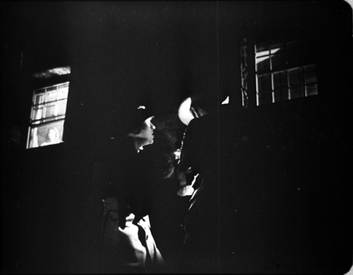
One of the most persistent conventions in American cinema associates dark images with dangerous doings—crime, mystery, violence, espionage, sexual depredations, visits from beyond the grave. The strategy is most apparent in what critics eventually called film noir. Those 1940s “films of darkness” are sometimes said to derive from German Expressionist cinema, but the look was already a Hollywood tradition. Filmmakers had long treated scenes of mystery and suspense with hard, low-key lighting that yielded rich chiaroscuro.
When does it start? You can find very early examples, but it seems to have crystallized during the 1910s. Kristin has talked about this as a period when filmmakers were collectively struggling to tell somewhat lengthy stories in a clear fashion. Along with clarity, she argues, came efforts to add emotional impact to a scene. Those included dynamic staging, fast cutting, close-up framings, subtle but arresting performance styles, ambitious camera movements, and lighting that enhanced the mood of the action. She points to many European and American films of the years 1912-1916 that flaunt silhouettes and selective lighting.
I found a lot of prototypes of noirish images during my recent trawling through Library of Congress films from 1914-1918. In this era, it seems, filmmakers competed to create striking, even shocking, lighting effects. Later directors and cinematographers would adopt many of them as proven tools for boosting their scenes’ emotional power.
So today’s entry is mostly just some pictures that try to convince you, once more, that the 1910s laid down a great deal of what we take for granted in films ever since. You may want to turn up your display. We’re going dark.
No sunshine here
Start with the shot up top, from the independent production A Romance of the Air (1918). Produced by and starring Bert Hall, flyboy and author of the source book, it traces how German spies posing as French refugees win his confidence and try to steal secrets about troop movements. It was released in the month of the Armistice, and it got what appears to be a welcome reaction from audiences.
A Romance of the Air, nearly amateurish in its opening stretches, gets more competent as it goes along. But there’s only one real uptick from a pictorial viewpoint. Two spies have attempted to gas Edith, Bert’s sweetheart, but fortunately their incompetence leads them to the wrong room. They meet outside the house, and suddenly we get a shot that had me hollering.
As the man lights a cigarette, a low-slung angle shows the flare of the match illuminating his hatbrim and the countess beside him. In the upper left Edith peers down from a window. We might be in Hollywood, 1945, perhaps in the hands of production designer William Cameron Menzies or ace DP John Alton.
It’s interesting that a title pops in here, coaxing the audience to notice the face at the window.
The mistaken placement of “From up above” tells you something of the clumsiness of this whole production. Yet bad grammar is redeemed when we return to the framing as the spies twist around in surprise and the man clutches the countess.
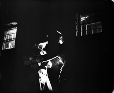
Other filmmakers of the period would have trusted the audience to spot Edith, but nonetheless an undistinguished, forgotten film bequeathes us one bold moment.
We can see a more conventional look emerging when characters get sent to jail. By the end of the 1920s, filmmakers had found a way to crosslight cell bars to make them stand out crisply, as here in von Sternberg’s Thunderbolt (1929).
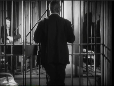
A jail scene in The Unknown (1915) isn’t so flashy, but the concept of edge-lighting the bars is there. If all you wanted was clarity, the naked cell door suffices, but the sidelight makes the barrier more vivid.
At this point, some directors were willing to leave large patches of the image in darkness, even at the risk of off-balance compositions. This is not only expressive; it saves money on set construction. So trust Maurice Tourneur to go further. In Alias Jimmy Valentine (1915), one of the most accomplished films of the era, we get cons as patient silhouettes.
No need to see their expressions; the outlines of their poses express their resignation.
Speaking of prisoners, consider the plight of Ivanoff, the revolutionary who has been sentenced to Siberia in Cecil B. DeMille’s The Man from Home (1914). He has escaped from the mines and taken refuge in a stable. Filing off his chains, he crouches as guards pass by outside. First, he’s in a glare, but when he hears them….
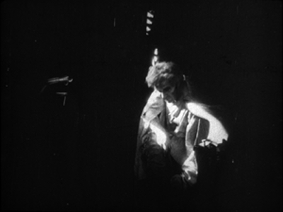
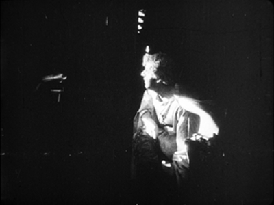
… he shifts into semi-shadow.
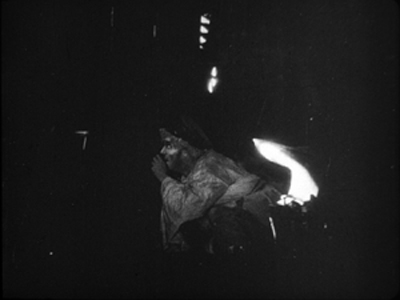
The guards’ approach is measured by a barely noticeable change: the gleaming surface on the far left is briefly darkened.
This is a bold instance of “Lasky lighting,” the brilliant effects which DeMille worked up with Wilfred Buckland, Belasco’s stage designer. Several films in my sample exemplify this style, which became part of Jesse Lasky’s Paramount brand. Examples are comparatively abundant because many Paramount films have survived from the silent era.
Camera obscura
In A Romance of the Air, the darkness is motivated as a night scene, and naturally prisons and hiding places are associated with danger. Another option is to stage scenes in darkened rooms, populated by sneaking and skulking characters. Again, the association with criminality is evident. In Alias Jimmy Valentine, hoods hide from cops and are visible thanks to diagonal edge lighting.
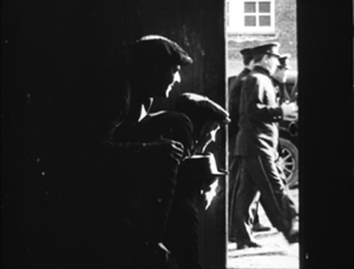
More dynamic are two suspense scenes in Madam Who (1918), the story of a plucky Southern belle who goes undercover for the Confederate cause. In the first, disguised as a man, she peers down from a hayloft to watch the meeting of the Sons of the North gang. We get an optical POV shot straight down, and then a close reaction shot, with a fish-hook of light snagging her face as she glances at us.
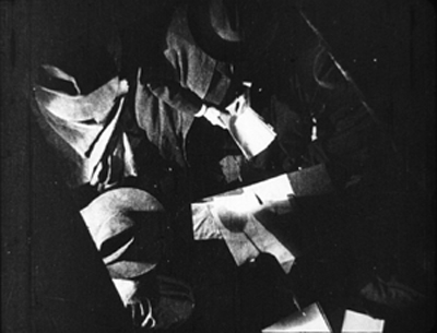
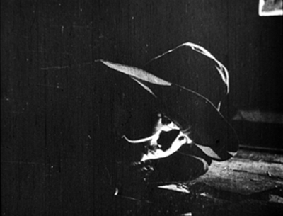
Reginald Barker, one of the most resourceful directors of the era, didn’t let up in a later scene of Madam Who. Jeanne and the secret agent Henry Morgan get the drop on the Sons’ leader Kennedy. The action plays out in layers of darkness, with her poking a pistol through the doorway right of center, and it’s capped by a stark close-up.
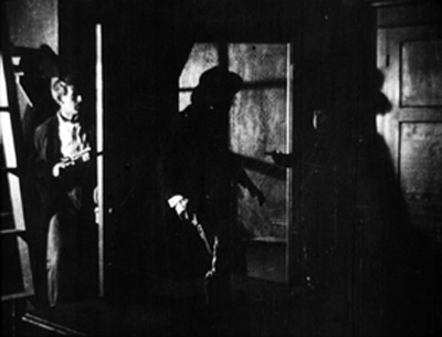
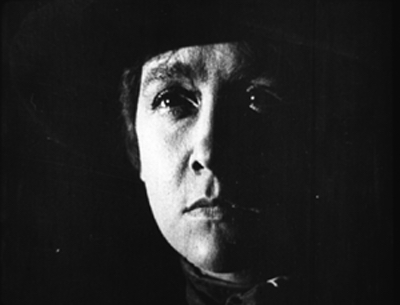
In the late 1910s, several directors use such darkened interiors for fight scenes. In De Luxe Annie (1918), the heroine’s husband takes a brutal beating from the criminal he’s trapped. The accomplice runs to administer a hypodermic.
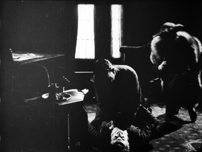
Something similar happens in The Family Skeleton (1918), when dissolute Billy (Charles Ray) battles the bully who has tormented him throughout the movie.
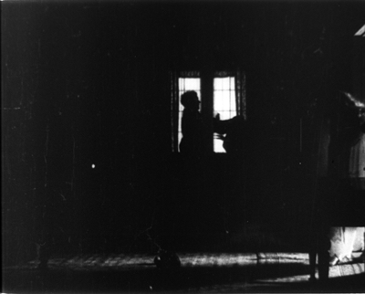
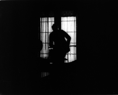
Shadow-filled rooms help amp up suspense during fistfights. We can’t be sure who’s winning, and the enveloping darkness can also suggest more savage violence than could be shown in normal light.
Or you can stage a fight or a chase in a darkened area outdoors. The Sign of the Spade (1918) sets its climactic abduction and rescue under a seaside pier, and the silhouettes that result would not have shamed Panic in the Streets (1950).
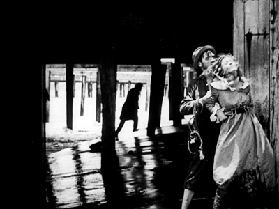
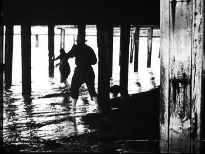
As with the jail in Jimmy Valentine, we have to read the characters’ emotions–chiefly, the desperation of the fleeing woman–from their body language. And as often happens, the more we have to strain to see the action, the more gripping it becomes.
Billy and two Annies
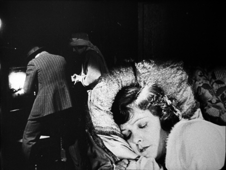
De Luxe Annie (1918).
Of course what we call film noir includes more than visual style. Like many terms in the arts, film noir picks out a cluster concept. It links together distinctive subjects (urban life, abnormal mental states, misogyny), attitudes (alienation, nihilism, malaise, mistrust of authority and the upper class), themes (official corruption, revenge, male friendship and betrayal), plots (investigation, pursuit, deception), narrational devices (flashbacks, voice-over commentary, dreams and hallucinations), and visual techniques. Because noir is a cluster concept, eager acolytes can choose some noir-ish qualities of Film A and declare it a more or less plausible instance, while with Film B a quite different set of features might help it qualify too.
For example, in visual technique, only a few shots of Laura carry traces of the lighting style we think characteristic of noir. But the film does present a decadent, treacherous milieu harboring a mysterious, perhaps dangerous woman who may be feeding a man’s delusions and obsessions. Laura, I’d suggest, counts as a noir on thematic and narrative grounds more than on stylistic ones.
So do we find non-stylistic features of noir in the 1910s? Sometimes, yes. I’ll save my prime example, an intricate and beautiful thing, for an entry of its own. But here are two nifty cases where the visual pyrotechnics spring from noirish narrative and thematic pressures.
Billy Bates is warned that alcoholism runs in his family, but on getting his inheritance he holds a party and learns that he likes the stuff. Not needing to work, he keeps drinking. He falls in love with chorus girl Poppy Drayton, but when she’s insulted in a saloon he’s too crocked to defend her from the hulking Spider, who beats and shames him. Billy learns that Spider is planning to abduct Poppy and so lays a trap. He waits in Polly’s parlor, resolving to stay sober long enough to defend her. Unfortunately, there’s a decanter of scotch within easy reach….
The Family Skeleton (1918) was touted as a “semi-farcical production” but the semi- parts took alcohol addiction fairly seriously. The popular Ray often played the country-boy underdog, so audiences were probably unprepared to see him as a millionaire twitching from the D.T.’s. The scenes of his drunkenness are truly unnerving, even when the plot is lightened by the revelation that Spider is a detective hired by Poppy to force Billy to man up. Billy does, in the nocturnal fistfight illustrated above. There darkness makes Billy’s ultimate victory more plausible; we can’t really see his winning punches.
In the buildup to the fight, however, we get Billy’s growing anxiety over the scotch across the room. He stares at the decanter.
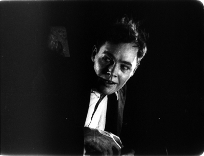
A cut shows us a condensed mental image: what would happen if he drank the contents. In this hypothetical future, the decanter is empty, and in it we see Spider breaking in and carrying off Polly while drunken Billy lolls helplessly.
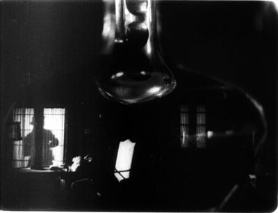
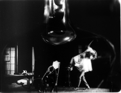
As in the hallucinations of The Lost Weekend (1945), the filmmaker has taken us inside the addict’s fantasy.
Other subjective effects, like memories and dreams, were common in silent cinema too, though usually not plunged so deeply in darkness. In De Luxe Annie, Julie Kendall is worried that her husband is taking a risk by setting a trap for two dangerous swindlers. He will pose as an innocent mark and then arrest them when they try to con him. Julie’s concern emerges in a virtuoso split-screen dream sequence in which her husband is shot by the crook.
Later in the film, Julie will lose her memory and become the con man’s confederate, the new De Luxe Annie. The screenwriter’s old friend amnesia transforms an upper-class wife into down-at-heel swindler.
What triggers the amnesia? The most remarkable scene in the film. It’s either a brilliant coup or a happy accident, but either way it can stand as proof of the boiling energies of this era.
Worried about her husband, Julie follows him to the site of his trap. She goes in through the basement kitchen and enters almost total blackness. She stands in a tiny pool of light before a big double door, and it opens a crack.
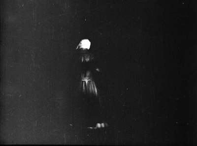
Suddenly, and I mean instantly, the doors are wide open and we get a burst of light.
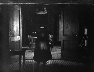
A jump cut has eliminated the movement of the doors swinging apart. (You can see the splice at the bottom of the second frame and the top of the third.) This is a very bold stylistic flourish.
Kristin suggests that it’s something of an accident. The overhead kitchen light is now lit up, and it was common at the time to cut out some frames when a light source is snapped on. That may be what led to this jump cut, though it’s not clear how anyone in the scene could have hit the power switch. In any event, the force of the cut is amplified by the ellipsis; the doors simply pop open.
Another pictorial surprise emerges when Julie moves a bit and it’s revealed that her figure has blocked De Luxe Annie, who’s facing her over the threshold. They start to grapple with one another and move into darkness on the right.
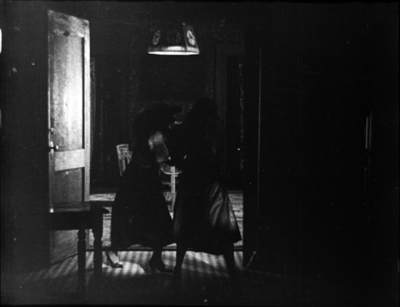
Annie runs off, but Jimmy the con man is fleeing too, and he shows up to wrestle with Julie. A slamming axial cut shows him punching her fiercely in the head. The edge lighting here is remarkable.
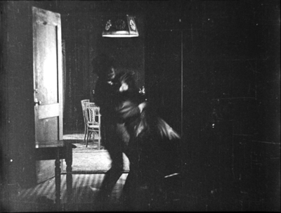
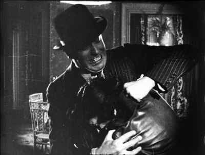
Jimmy gets away, leaving Julie to stagger out and into the fog. She’s contracted amnesia. Later she’ll meet Jimmy again and become his new partner in crime.
This scene is even replayed as a brief flashback, when the original Annie recounts to Jennie’s husband the clash that led to Julie’s disappearance.
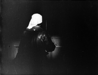
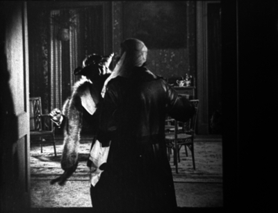
This is presented in a more unsurprising way, since there’s nothing new to be learned about the fight. The shot shows the full swinging open of the doors and a clearer revelation of Annie’s presence.
All this won’t be news to aficionados of silent film, who are well aware that the 1910s, and then the 1920s, burst with ingenious creativity. But everybody needs reminding, and the rare films I was lucky enough to study are just part of a huge corpus. The official classics by Chaplin and Griffith and others can be restored and reissued again and again, and we’re grateful. Yet if they’re the peaks of a landscape, there are plenty of luscious valleys that remain unexplored.
Problem is, most of the films from which my scenes come are incomplete, often missing entire reels. So they’ll probably never be screened much, or made available on DVD or streaming services. This is why archives remain indispensable to keeping the entirety of our film heritage, fragments and all, available to researchers. It’s also why I wrote this entry, to share with you my enjoyment of films you may never have a chance to see.
More broadly, scenes like these help us nuance our thinking about those films we do know well. For one thing, they indicate just how rich the creative energies of the 1910s were, and how many options were not embraced by…oh, let’s say for example D. W. Griffith.
For another thing, if these neglected works throw up willy-nilly an alcoholic’s hallucinations, an anxious wife’s dream, a plot based on amnesia, and a strategic replay of a crucial scene, we ought to think twice about claiming that such storytelling strategies are somehow unique to film noir, or the zeitgeist of the 1940s–or our movies today, which continue to use them.
American commercial cinema has drawn on particular themes, plot structures, formal designs, and narrational strategies again and again throughout the decades. My book Reinventing Hollywood floats the claim that silent-cinema narrative devices like flashbacks and subjective sequences went somewhat quiet during the 1930s but were brought back fortissimo in the 1940s, when sound techniques could raise them to a new level of intensity. And I’ve been at pains to argue over the years that we still encounter them.
Again, no surprise once we think about it. This is just history at work: the continuity of a powerful, proven storytelling tradition. Once we’ve learned to love darkness, we can’t give it up.
Again I must give my thanks to the John W. Kluge Center for providing me a long stay at the Library of Congress. The Moving Image Research Center was my host, and so I’m grateful to Mike Mashon, Greg Lukow, Karen Fishman, Dorinda Hartmann, Josie Walters-Johnston, Zoran Sinobad, and Rosemary Hanes. They’re doing their utmost to preserve our film heritage.
For information on the survival of US silent films, download David Pierce’s indispensable study, done for the Library of Congress. The information on Paramount is on p. 41.
Kristin’s article is “The International Exploration of Cinematic Expressivity,” in Film and the First World War, ed. Karel Dibbets and Bert Hogenkamp (Amsterdam University Press, 1995), 65-85. She discusses American lighting practices of the period in The Classical Hollywood Cinema: Film Style and Mode of Production to 1960 (Columbia University Press, 1985), 223-227. In the same volume in discussing film noir I consider the established practice of chiaroscuro for scenes involving crime and mystery (p. 77).
The most in-depth account of Paramount’s lighting styles is Lea Jacobs’ article “Belasco, DeMille and the Development of Lasky Lighting,” Film History 5, 4 (December 1993), 405-418. This is a good place to record my deep debt to Kristin, Lea, and Ben Brewster, for years of tutelage in what makes the 1910s so important.
There are many good books on film noir, but the most comprehensive reflection on the category’s many implications is James Naremore’s More Than Night: Film Noir and Its Contexts, 2d ed. (University of California Press, 2008).
For more on 1910s film style, see this video lecture and this category of blog entries. I talk about other forays into the LoC collections here and here.
Lately, two video distributors have brought out less-known films from the period. There’s DeMille’s The Captive (1915) from Olive, and Irvin Willat’s Behind the Door (1919). The somewhat noirish frame below is from the latter. Flicker Alley, whose commitment to silent cinema from all countries has been extraordinary, deserves our thanks for making the San Francisco Silent Film Society’s restoration of this sensational, and sensationalistic, film available. For more on this restoration, visit the Flicker Alley site.
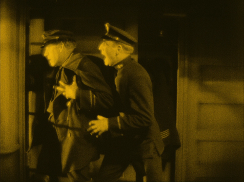
Behind the Door (1919).


