


Archive for the 'Silent film' Category
French silents from Il Cinema Ritrovato 2021
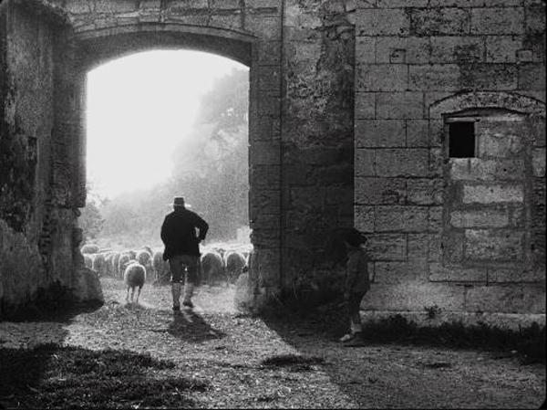
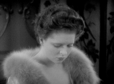
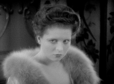
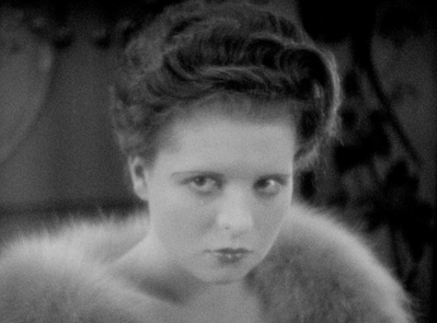
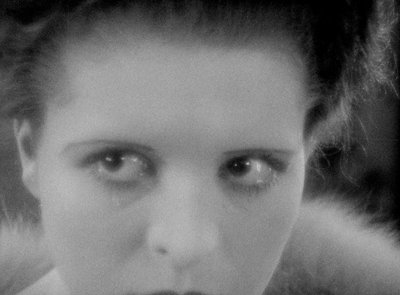
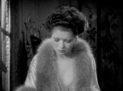
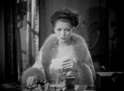
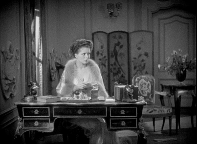
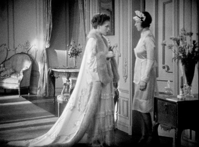
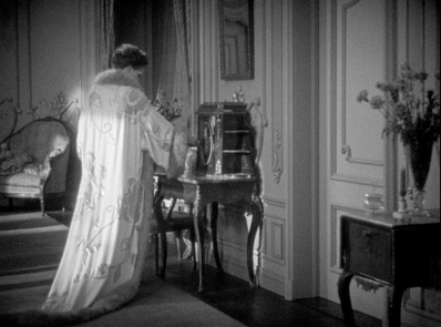
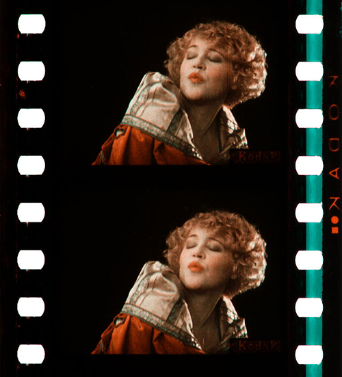
L’Arlésienne (1922)
Kristin here:
Like so many of our fellow festival-goers, David and I were not able to visit Bologna for Il Cinema Ritrovato, the annual festival of restored films and curated thematic threads. Fortunately the organizers made a selection of the films and events (interviews, discussions of films by archivists) available online.
We were not able to watch all of these, so we concentrated on an area in which we have both worked, French silent cinema. There were three of these, or six if you count the four episodes of the 1927 serial, Belphégor. They were beautiful restorations, all presented in black and white. (I must admit, beautiful though tinted and/or toned films are, I prefer the black-and-white versions. That’s mainly because if one is taking frame enlargements for reproduction in black and white in a publication, it is often impossible to get a decent copy from a tinted print.)
No doubt it is frustrating to read about films that are unavailable to see outside archives. Still, some of the Cinema Ritrovato films travel after their presentations at the festival, and some appear on DVD/Blu-ray. These are three to keep an eye open for.
L’Arlésienne
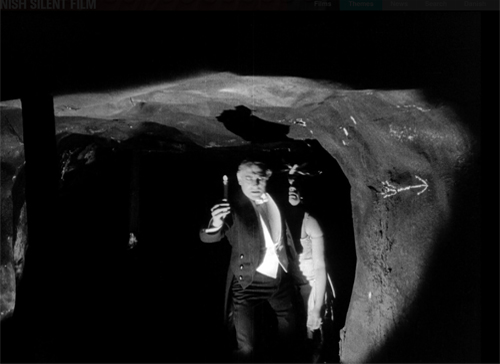
I must admit, this was the only title of the three that I recognized. David and I had been very impressed by André Antoine’s earlier films. (See our brief comments on and some frames from his extraordinary 1917 Le coupable here and here.)
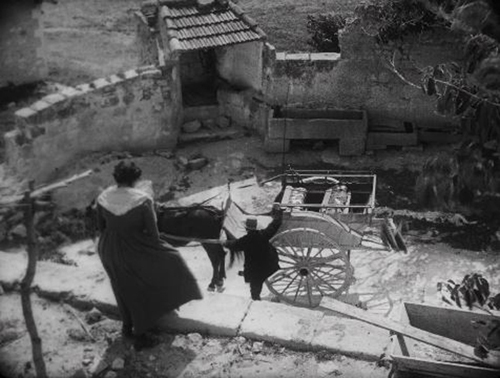
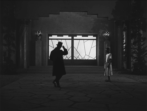
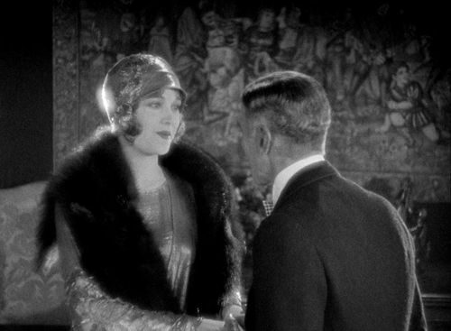
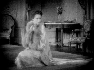
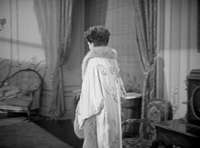
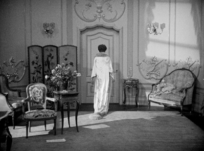
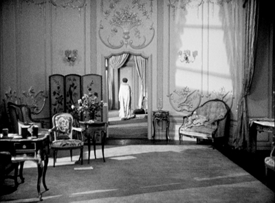
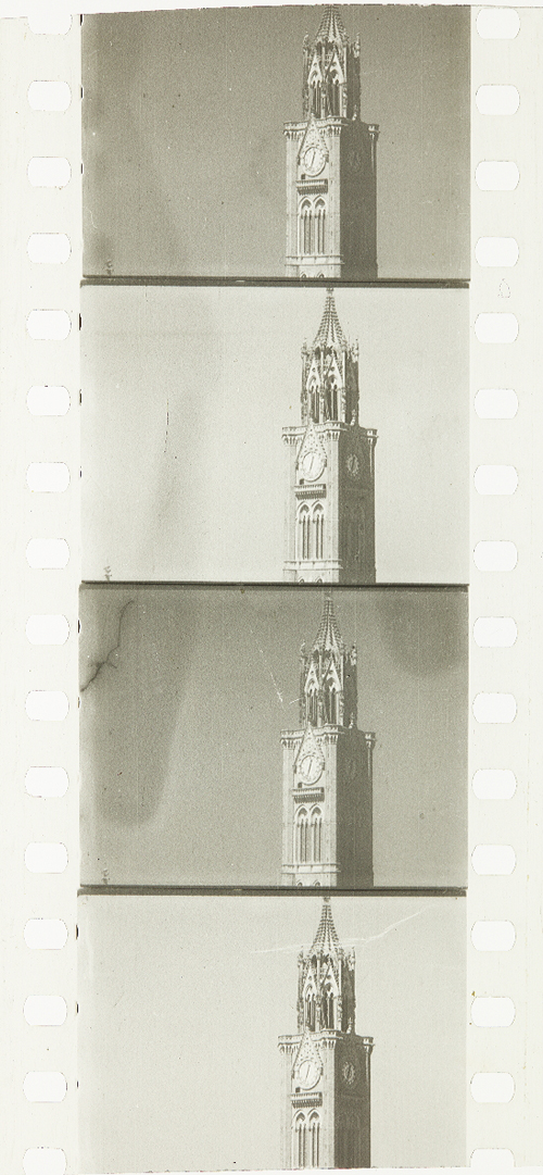
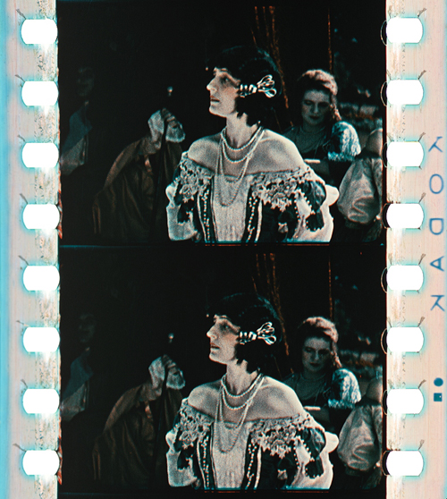
While Le coupable was a courtroom melodrama set in Paris, L’Arlésienne follows his 1921 naturalistic film La terre by being shot in the French countryside. In this case the story takes place in and around Arles, at that time a village in the south of France, not far from the Mediterranean coast northwest of Marseilles. The familiar tale concerns the family of Rose Mamaï, a widow who runs her large farm, aided by her cheerful, naïve son Frédéri, who seems destined to marry Vivette, from a nearby farm, until he falls under the spell of the unnamed title character.
The film is not as splendid as the two earlier ones, but it is well worth seeing nonetheless. It gets off to a somewhat slow start, with a leisurely exposition of the locales and the characters. Frédéri’s growing obsession with l’Arlésienne takes its time. Still, conflict eventually creates greater drama as Rose learns of her son’s love for a woman “with a past” and the woman’s lover shows up to try and thwart her golddigging attempt to marry Frédéri.
The gorgeous cinematography and use of authentic locations, however, more than offset the plot problems (see frames above and at top). Like so many French directors of the silent era, Antoine took advantage of local carnivals and holidays, economizing by filming the crowds candidly. The frequent glances into the camera by locals testify to that.
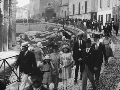
To the far left of this frame, one can glimpse the well-known Roman amphitheatre of the town, used in L’Arlésienne for a bullfight scene, whither the villagers in their best clothes are headed.
Antoine’s film makes an interesting comparison with Alberto Capellani’s 1908 version, shown in the first Cinema Ritrovato season of his films. Capellani shot most of his excellent version in Arles as well, though in a very different style. (I discuss it briefly here and here; the latter entry gives information on the DVD releases of various Capellani films shown at the festival, including L’Arlésienne.)
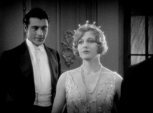
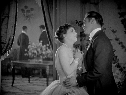
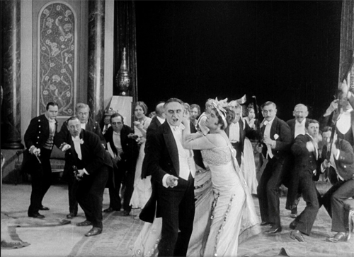
Figaro (1927)
Gaston Ravel is a director whom many of us have heard of, but few of us have seen his films. His reputation is as a director of high-budget, prestigious films–comparable to Raymond Bernard, whose The Miracle of the Wolves (1924) is perhaps the most familiar of the epic period films of the period, excepting Napoléon vue par Abel Gance (1927).
With Figaro, Ravel manages to condense all three of Pierre-Augustin Caron de Beaumarchais’s three Figaro plays (Le Barbier de Séville [1775], Le Mariage de Figaro [1781 but banned from performance until 1784], and La Mère coupable [1792]) into a two-hour film.
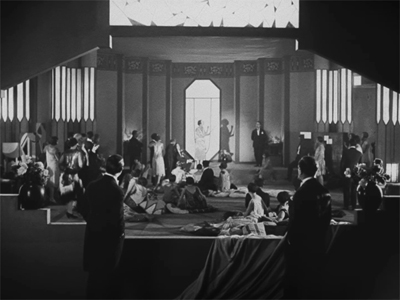
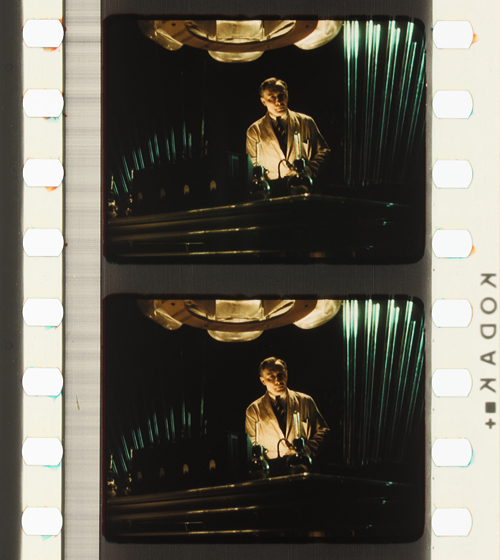
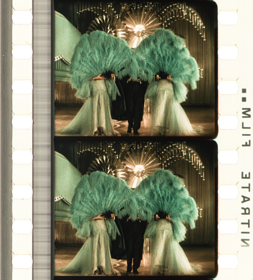
The result is a lavish spectacle. The costumes were designed by J. K. Benda, who later created those of La Kermesse héroïque (Jacques Feyder, 1935). The interior sets were studio-built (see bottom), though the exteriors of the later parts of the film were shot at a huge chateau with extensive grounds, the Rochefort-en-Yvelines. At least some French directors had by this point adopted and mastered Hollywood three-point lighting, as the frame above demonstrates.
Visually the film in fact looks like it could have been made in one of the big Hollywood studios, though the story is a bit too risqué to have been made there. (The young lady dancing and trailing a long, diaphanous veil in the frame at the bottom eventually spins until it drops off, leaving her completely nude.)
I found the casting of “artistic dancer” Edmond van Duren (as the program notes describe him) unfortunate. He reminded me of the overly merry Merry Men in Alan Dwan’s 1922 Robin Hood, bounding through nearly every scene. The rest of the actors were fine, particularly Arlette Marchal as Rosine, later the Countess Almaviva.
The tone also changes across the film, from comedy in the first part, to drama in the second, and then to tragedy (or melodrama?) in the third. The original plays premiered so far apart that the changes might have been less noticeable or made more sense. Mozart, however, was wise to confine himself to the middle play.
Apart from such problems, however, the film is entertaining, as well as being an important example of how ambitious a project French studios could occasionally manage–as does the film immediately below.
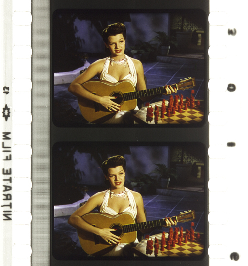
Belphégor (1927)
By the 1920s, Hollywood serials had declined from being the center of a program to being a low-budget side attraction. In France, however, serial storytelling remained quite central to the industry. Some serials were presented as discrete episodes, each involving a continuing set of characters, as in a television series. Other installment-films were “ciné-romans,” telling a continuous tale in blocks that might be published at the same time in newspapers and magazines.
Louis Feuillade’s death in 1925 ended his long string of beloved serials and ciné-romans for Gaumont. Other studios made equally popular, big-budget items, including Albatros, with Alexandre Volkoff’s 1923 La Maison du mystère. That film’s reputation lingered in film history despite the unavailability of complete prints until recently. By contrast, Henri Desfontaines’ Belphégor has remained largely forgotten.
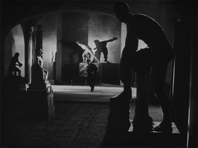
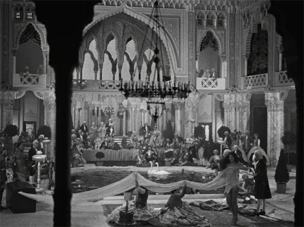
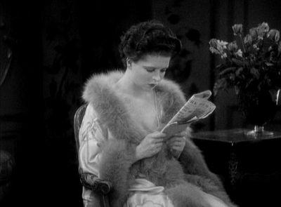
Now it has been restored in a beautiful version. Although it, too, centers around a mysterious master criminal out to control the world, it is miles away from the wonderful mid-1910s serials of Feuillade. It’s instead a strange and impressive combination of various elements of French cinema of the 1920s. Where Feuillade shot in a rough-and-tumble way in the streets of Paris or the environs of Nice, with cheap sets for interiors, Belphégor‘s settings immediately remind one of L’Herbier’s L’Inhumaine and L’Argent. In particular, the exterior (above) and interiors (below) of the Baroness Papillon recall that of Claire Lescot in the former film.
Like Figaro, Belphégor has impressive production values and a grasp of Hollywood three-point lighting that creates dark, suspenseful shots. The film gained some prestige by supposedly being the first story to be set inside the Louvre. The interiors, of course, are sets, but ones that successfully convey the look of a major museum at night.
The script has a certain looseness, perhaps caused by the fact that the episodes were being released in parallel to the serialization of Arthur Bernède’s novel in Le Petit Parisien. That journal’s director also headed Cinéromans, a production firm making films exclusively for distribution by Pathé.
A meandering and repetitious plot is not the film’s main problem. The common–and probably correct–assumption that a film’s villain must be a strong, interesting character is completely ignored here. We see “Belphégor” only occasionally, looking like a person dressed in a burka with some checkered decoration around the head. Unlike Fantômas and other Feuillade villains, we never see Belphégor out of costume until the very end. Instead the villain’s machinations are largely carried out by a pair of thugs who have a faintly ludicrous, not-very-dangerous air. Belphégor, when encountered in the Louvre by the guards and investigators, invariably runs and, after a brief chase, escapes.
Oddly enough, the main detective, Chantecoq, is played by René Navarre, so memorable as Fantômas. (He was one of the co-founders of Cinéromans in 1919.) His presence hovers over the film, emphasizing that the main villain is barely present and does little.
Like the two other films discussed here, Belphégor’s pristine restoration, its beautiful sets and cinematography, and the expert lighting make it a pleasure to view. Complete serials from this era are so rare that as an historical document, it is welcome indeed.
Although these three films are not among the masterpieces of the 1920s (though L’Arlésienne comes closest), they give us more insight into French cinema of the day–a national cinema that has remained somewhat in the shadows of the German Expressionist and Soviet Montage movements of the same period.
As usual, the festival held its Il Cinema Ritrovato DVD Awards ceremony, though by this point the competition is dominated by Blu-ray releases. Our friends at The Criterion Collection, Flicker Alley, and Kino Lorber figured prominently in the awards and jury members’ favorites, as did international archives and companies. I have blogged about the two Flicker Alley jury favorites, Waxworks and Spring Night Summer Night.
Figaro (1928).
A tantalizingly anonymous Josef von Sternberg film
Children of Divorce (1927)
Kristin here:
In 2008, David and I attended Il Cinema Ritrovato for the sixth time. The Hollywood director being featured that year was Josef von Sternberg. We saw some of the gorgeous prints on show, most notably (for me), a chance to re-watch the underrated Thunderbolt (1929), his first sound feature. To us the big auteur of the year, however, was Lev Kuleshov. Astonishingly, we only blogged from the festival once that year. It was a busy summer.
We and a great many other festival-goers lined up to see one of the rarer items on the program: Children of Divorce, credited to Frank Lloyd but with reportedly about half the footage re-shot anonymously by von Sternberg. We and a considerable number of those festival-goers did not get into the auditorium. For some reason this rare, legendary film was shown in the smallest venue, the Mastroianni, which was packed, with the two side aisles full of standees. (See the bottom image of our blog from the festival, as we caught a glimpse of those lucky enough to get in before retreating to find something else to watch or perhaps to wander around the always enticing Film Book Fair.)
Eight years later, in 2016, Flicker Alley released a Blu-ray/DVD combo of the Library of Congress’ 4K restoration of Children of Divorce. That two-disc set is out of print, but last month a MOD (manufacture-on-demand) version was made available. It is a single disc, Blu-ray only, and its main supplement is a pretty good one-hour documentary on Clara Bow produced in 1999 for TCM. (The original booklet is not included.) Somehow we missed the original release, but now I have a chance to catch up with this elusive film.
Naturally I wanted to find out if any information on which scenes of the film von Sternberg re-shot were available, I looked at various internet sources, including books in our library the reviews of the original 2016 Flicker Alley release and books. I found nothing on the subject, not even from film buffs speculating on the basis of style which scenes were his. I suppose one reason why so little discussion of von Sternberg’s contribution is that for many viewers and purchasers of the Flicker Alley discs, this a Clara Bow and Gary Cooper film. Those online reviews from 2016 focus on them rather than on the two very different directors of Children of Divorce. The third star, Esther Ralston is excellent as Jean, and in 1929 she would go on to play the title character in The Case of Lena Smith, Sternberg’s last silent film, which survives only in a fragment. Still, she doesn’t have the lingering reputation and devoted following that her co-stars still enjoy.
Spoilers ahead, including a revelation of the ending.
Von Sternberg’s account
In trying to discover von Sternberg’s contribution, we seem to be entirely dependent on von Sternberg’s sketchy recollections of his work on the film in his memoir, Fun in a Chinese Laundry (1965). Needless to say, one cannot take his account as the unvarnished truth, but it may contain some elements of that commodity.
According to von Sternberg, B. P. Schulberg, head of Paramount, asked him to watch a film that the studio considered unreleasable. Could von Sternberg could improve it by adding the sort of clever intertitles that he was then known for?
I looked at the film as he requested. Its title was Children of Divorce, and it had been made by a prominent director, Frank Lloyd, normally an effective director of commercial films. This one was a sad affair, containing theatricals by Gary Cooper and Clara Bow, the “It” girl of her day. I reported back to the executive who had backed this venture with a million dollars, and told him that no skill of mine could restore life to the film by injecting text into the mouths of the players. I suggested that half the film be remade.
That Lloyd should fall down so badly seems odd, given that he had been cranking out films at a rapid pace since 1915. These included films that would be considered star vehicles and adaptations of popular literature, such as the first version of The Sea Hawk in 1924. He would soon go on to win two early best-director Oscars, one for the Greta Garbo vehicle The Divine Woman (1928) and one for Cavalcade (1933), as well as being nominated for what is probably his best-known film, Mutiny on the Bounty (1935)–which won Best Picture despite not winning any other of its seven other nominated categories. Cavalcade often shows up on lists of the worst films ever to won the highest prize, but nevertheless, it seems odd that a director so respected within the industry that he won an Oscar for a film made the year following Children of Divorce‘s release should fall down so badly in creating the latter. We shall probably never know what cause this strange failure.
I must admit to never having seen a Frank Lloyd film, but von Sternberg’s assessment of him as an “effective director” seems lukewarm. It suggests that although Lloyd was a good, solid Hollywood practitioner, he had created an unwonted lemon.
In assessing the verity of von Sternberg’s account, we should pause over von Sternberg’s claim that Children of Divorce had had a million-dollar budget. That was well above the average cost of a film in those days. (Von Stroheim’s Foolish Wives, with its giant Monte-Carlo set, had gone over budget to become the first million-dollar film in 1922, and Universal head Carl Laemmle made the best of the situation by blazoning the extravagant budget in publicity for the film.) The original costs estimate sheet on Flicker Alley’s site, along with other documents from the film’s production, puts the total budget at $334,000–pre-re-shoots–a far more plausible sum. Possibly, writing in the wake of the scandal over the cost overruns leading to an estimated $44 million budge for Cleopatra (1963), he had to boost the paltry-sounding budget of a late-1920s feature at least to seven figures to show that he was doing an important favor for Schulberg.
In response to von Sternberg’s suggestion that half the film be remade, Schulberg (according to von Sternberg) said that he could not allot another five weeks to making changes in a project that still might flop. Von Sternberg writes, “I carelessly replied that I could remake half the film in three days and turn over a successful version to him.”
Schulberg asked, “What can I do about the sets? They’ve been torn down and the stages are full.”
Again according to von Sternberg, “I told him to have a tent erected for use as a stage and to dig out the sets from storage, and not to bother about anything else.” Schulberg agreed.
Von Sternberg’s entire account of the process of re-shooting the scenes runs as follows:
The tent went up and the transfusion began. A rainstorm came and lasted three days and three nights. We waded through the new scenes, now and then dodging a heavy burst of water that penetrated the canvas overhead. The crew that helped me and the poor actors that I mercilessly put through their new paces had to take a prolonged rest cure when I had finished with them. To match the scenes I wished to retain I had to use the style of the replaced director. The assignment was completed on time and, after removing the old scenes and replacing them with the new material, I showed the film to the flabbergasted executives.
This tells us discouragingly little. The weather and the cast’s exhaustion make for a dramatic tale but tell us nothing about the film itself. The only statement of interest is “To match the scenes I wished to retain I had to use the style of the replaced director.” Von Sternberg certainly knew the well-established norms of Hollywood filmmaking and if he deliberately set to blend his work into an existing film, his style could be difficult to detect. After all, we don’t know exactly what was wrong with the original version. Bad performances? Von Sternberg’s reference to “theatricals by Gary Cooper and Clara Bow” suggests that this may have been the case. Bad storytelling? Von Sternberg doesn’t mention whether he re-wrote any of the scenes he revised.
The new version premiered on April 2, 1927. Von Sternberg was not paid for his labors (he says), but he did prove himself as a director. Schulberg allowed him to direct an entire feature himself. Later that year, on August 20, his first silent masterpiece, Underworld, came out. This item in Variety of March, 1927, seems to confirm the basic claim of von Sternberg’s account. Several trade papers mentioned that Sternberg had re-shot some scenes, but none specifies which ones.
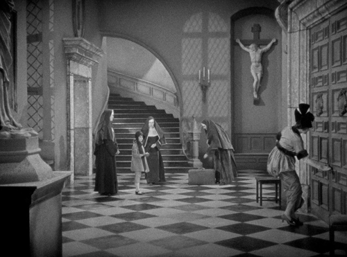
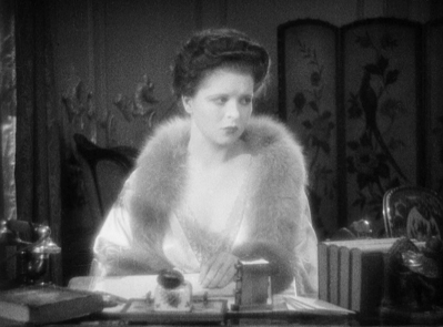
Briefly, Children of Divorce concerns two girls whose recently divorced parents have dumped them in a convenient French convent to be cared for. The parents return to the free life of single people, visiting their daughters infrequently. Kitty, a frightened, lonely girl, befriends the kindly Jean. Kitty introduces Jean to Teddy, an old neighbor of Kitty’s. Teddy and Jean hit it off and promise to marry as adults.
Kitty grows up and becomes Clara Bow. She is poor and must give up her love for the noble but impoverished Prince Ludovico (Einar Hansen) to pursue Teddy, now grown up to be Gary Cooper and very rich. His meeting with the grown-up Jean (Esther Ralston), herself now described as the richest woman in the USA, rekindles their love. Despite knowing this, Kitty uses the occasion of a drunken party to trick Teddy into marrying her, and they have a daughter.
Teddy wants to divorce Kitty and marry Jean, but insists that the daughter must not be as they were, a child of divorce. Kitty thinks this would free her to marry Ludo, but he informs her that his religion would not permit him to marry a divorced woman. She determines to hold onto Teddy. Jean decides to marry Ludo, thus quashing Teddy’s hopes of marrying her. Pure misery abounds–all the result, one way or another, of divorce.
What did von Sternberg do?
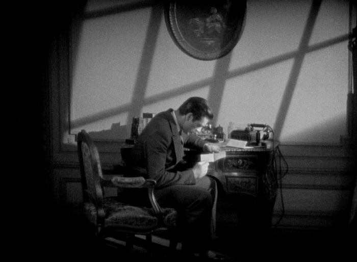
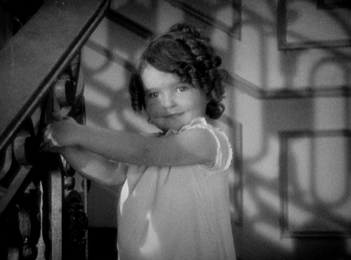
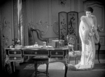
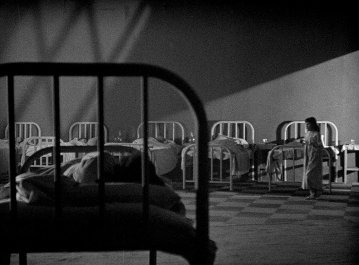
Naturally one would wish to know which scenes are Lloyd’s and which Sternberg’s. In her brief program notes for the film in the Bologna catalogue, Janet Bergstrom confidently comments, “You can’t miss the shadow language of his scenes.” Perhaps not, but there are actually very few Sternbergian shadowy shots in the film, and those are often brief touches. Here are the main examples. The second scene of the film shows the young Kitty (later to grow into Clara Bow) during her first night in the French convent where her newly divorced mother has dumped her (bottom). In another such atmospheric shot, Teddy reads Jean’s letter refusing to marry him if he divorces Kitty (top).
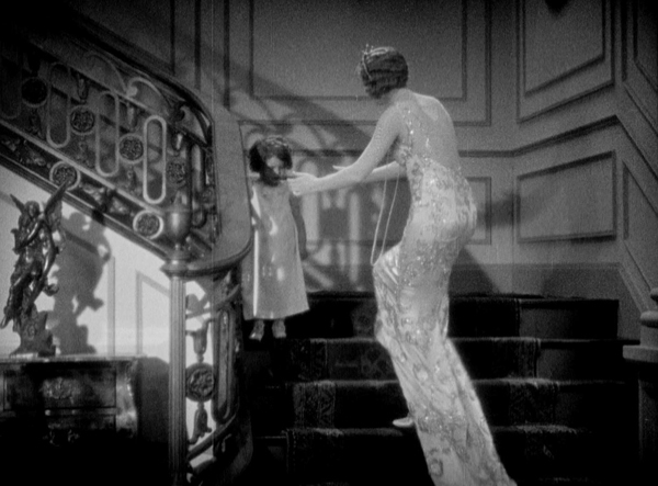
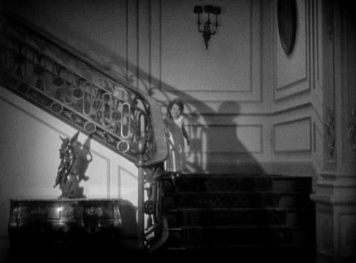
Other such shots occur occasionally. When Teddy and Kitty’s daughter totters winsomely down the stairs during a party, the elaborate railing casts a shadow over her. Jean’s first sight of her fixes her determination that for the sake of the child she will not agree to marry Teddy if he divorces Kitty.
These are the only shots that one could argue contained strongly Sternbergian shadows. The opening scene in the convent as Kitty’s mother leaves her has a shadow of an offscreen window on the wall at the center of the shot, but surely one could not be certain that an image directed by Lloyd could not have such a modest shadow simply to create the atmosphere of the setting.
Indeed, it seems like a typical shot from an A picture of the mid-1920s.
I do not think that one can determine which shots and scenes were redone by von Sternberg just by the lighting. “To match the scenes I wished to retain,” von Sternberg must have used the three-point lighting system that had been established as the norm during the second half of the 1910s. He did a very good job, and there are many scenes that look like they could have been shot by Lloyd or Sternberg, adhering to that same norm and of course using the same sets and costumes. Which of the two directors made this image, with its exemplary use of the three-point lighting system devised by Hollywood practitioners in the second half of the 1910s?
Von Sternberg’s reference to Lloyd as an “effective” director may sound like diplomatic, lukewarm praise, but he might have meant that any good Hollywood director with an experienced cinematographer could have produced such an image, with its perfect blend of key, fill, and back lighting.
Similarly, we might be tempted to identify this glamor shot of Ralston as directed by von Sternberg, but it seems a fairly conventional approach to filming a beautiful star in the late 1920s.
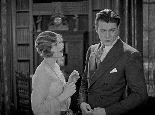
And here’s an impressive depth staging in the scene where Luco tells Kitty that he could never marry a divorced woman for religious reasons.
It is tempting to think that the stark juxtaposition of a sharply in-focus foreground cut off from the soft-focus background by the edge-lit fringes on the curtains is a von Sternbergian touch, but we cannot be certain that Lloyd and a good cinematographer could not create the same effect.
A possible, probable von Sternberg scene
The big climactic scene sure looks like a very skillful director made it. One is tempted to say that that director was von Sternberg.
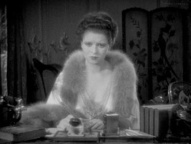
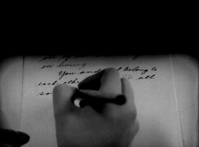
The action brings to a head Kitty’s machinations. Having been rejected by Luco, she realizes that her refusal to let Teddy and Jean be together is making them miserable and is not the best thing for her daughter, either. She writes a suicide note addressed to Jean, hugs her daughter for the last time, and heads into her bedroom clutching a bottle of poison.
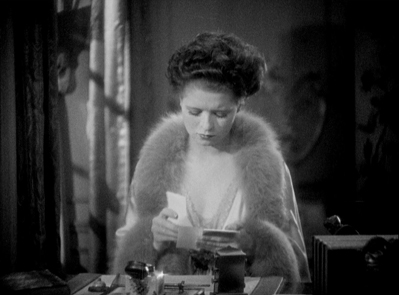
Here is a breakdown of the scene. It begins with Kitty reading a newspaper. We see her point-of-view, revealing that Luco is going to marry Jean. Luco has already rejected her, but this scene is the moment when she learns that he is to marry her friend. The newspaper shot is followed by a closer view of Kitty.
She looks up and to her right, her face grim. It is notable that Bow has been de-glamorized for this scene, with her eyebrows minimized and her hair swept back from her face in a matronly style quite different from her usual bouncy curls. The camera pulls in toward her until it is in extreme close-up.
The pull-in reveals a tear that has slid down from her right eye. It is worth pointing out that this is Clara Bow, noted for her flapper image, always lively and carefree. Clearly she could play drama and even melodrama. Perhaps this is an instance of von Sternberg’s famous ability to direct female performances.
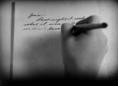
The intense close view is interrupted by a cut to Kitty dropping the newspaper. A long shot follows as she stands and moves to sit down at the desk. A cut-in to a medium shot shows her thinking and beginning to write.
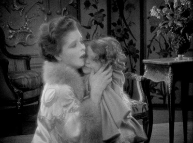
This leads to her point-of-view on what she writes. We learn only that it is a letter to Jean and that Kitty has had a realization. A return to the medium-shot framing shows her reacting to a knock at the offscreen door and saying, “Come in” as she hides the letter under the desk-blotter. An eyeline-match cut shows her daughter entering. A pan follows as she crosses to the desk and Kitty kneels to embrace her.
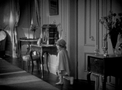
A cut-in shows Kitty emotionally embracing the girl. During the course of this, the girl’s hat falls off. In a return to the medium-long shot, Kitty carries the girl to her nurse. Another shot shows her returning to fetch the fallen hat and hugging it while displaying despair.
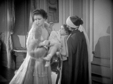
A more distant framing shows her putting the hat back on the child. The nurse’s cheery expression as she helps put the hat on contrasts greatly with Kitty’s unnoticed emotion. Once the others leave, Kitty returns to sit at the desk and pulls out the unfinished letter. Again we see her point-of-view as she completes the letter and we realize that it is an apology and suicide note, telling Jean to marry Teddy and raise the daughter that should have been hers. A return to the medium shot shows her putting the letter into an envelope.
A rather clumsy and unnecessary cut-in to a tighter shot of Kitty might suggest a blend of Lloyd and von Sternberg footage is occurring, but the lighting on the set, Kitty’s hair-do and costume are identical, so the footage is probably all from the same director. A return to the previous medium shot shows Kitty hesitating as she finishes addressing the envelope and presses a button to summon a servant. A cut back to a more distant shot shows her rising and starting rightward toward the door.
A cut to the doorway shows Kitty handing the envelope to a maid, who leaves. Kitty than moves away from the camera to reach for a small cabinet on a table. A cut-in with match-on-action shows her unlocking the cabinet and taking out an object barely recognizable as a small bottle.
A cut to the mirror above the cabinet shows Kitty looking at herself, with the image of her face going out of focus. A cut to a medium-long shot leads to the camera panning with Kitty as she moves to a door at the rear.
She opens the door and walks into the distance as the camera tracks slowly back.
That’s a pretty flashy scene, and it certainly seems more likely than not that von Sternberg directed it.
Once again Flicker Alley deserves credit for bringing us another important film from the silent era.
Thanks to our friends at Flicker Alley for facilitating this entry.
How the world ended in 1916
The End of the World (1916).
DB here:
The pull-quote might be “Gripping entertainment and a vivid introduction to storytelling strategies characteristic of Danish silent cinema!” (Too long for a poster, though.) It appears in my essay on a remarkable silent film you may not know. I bet you’d like it.
Danish cinema has gripped my interest for about fifty years. Like most cinéphiles, I started with Dreyer, moved on to Christensen, and then just tried to keep up with trends leading to Scherfig, Vinterberg, Winding Refn, Anders Thomas Jensen, and Dogme. There always seemed to be a new comedy or noir or psychological drama or just weird-ass experiment to keep my loyalty (most recently, the well-crafted Another Round).
One of our first blog entries, on 20 October 2006, was devoted to an anthology on the great film company Nordisk. Soon I was chattering about von Trier’s editing in The Boss of It All and surveying a big batch of recent releases.
Now this national cinema’s silent-era history is coming steadily online. The Danes are too modest to brag about the enormous accomplishment of making so many beautifully restored classics available for anyone to watch. But here they are, accompanied by thematic essays from critics and historians.
Like other Little Cinemas That Could (Hong Kong, Taiwan. Iran), Denmark attracts me because it has shown what can be done a lot of imagination on smallish budgets. Or sometimes, biggish budgets. That’s an impulse that emerged in the 1910s when Nordisk was struggling to keep a foothold in the international market during the Great War. One result was a pair of remarkable spectacles.
A Trip to Mars (Himmelskibet, 1918) is a massive, nutty plea for peace and international—make that interplanetary—understanding. The Martians are more or less like us, except they don’t kill other creatures, which leaves them time to assemble in carefully picturesque crowds and invest in ambitious infrastructure projects.

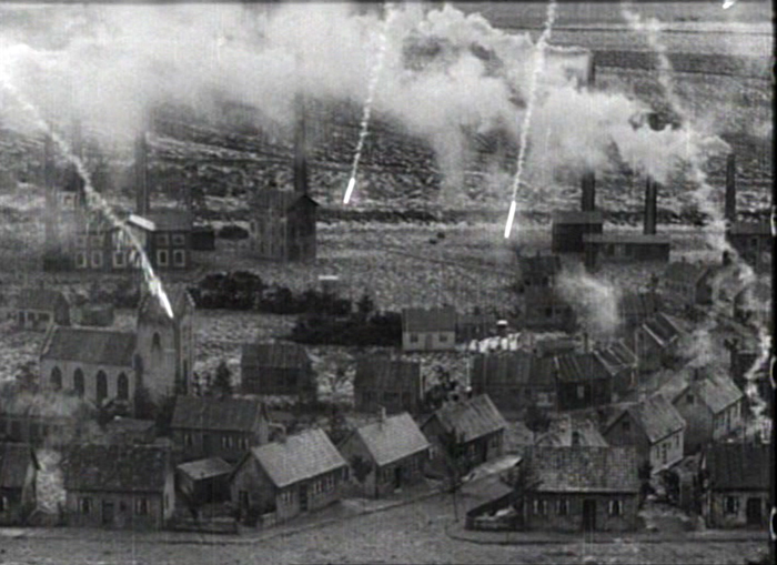
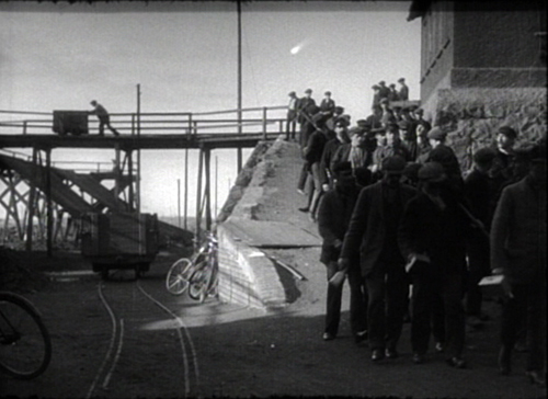
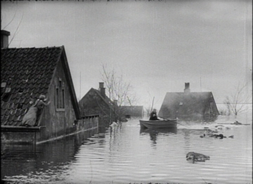
The other big Nordisk production was The End of the World (Verdens Undergang, 1916). A comet is plunging toward earth. Can we avoid collision? Or at least survive?
All the conventions of the cosmic disaster movie (Armageddon, Independence Day, 2012) are already in place. We have the innocent family, the corrupt capitalist squeezing money out of catastrophe, the scientists trying to calm the public, and of course the separated lovers who must find one another in the midst of chaos.
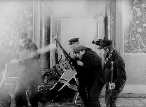
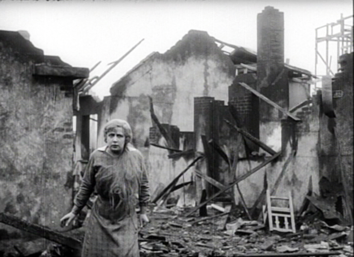
The special effects range from passable to truly impressive, as in the model of the village under fiery bombardment, surmounting today’s entry. The comet’s approach is cleverly suggested as a blip in the sky, and the shots of the heroine’s drowned neighborhood are splendid.
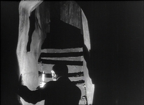
Just as remarkable are other technical achievements. The lighting in the underground passages of the capitalist’s mansion, with its Caligariesque steps, could teach the Germans a few tricks, and the miners’ fierce assault on the plutocrats is cut with rowdy, immersive vigor.
August Blom had made his reputation with Asta Nielsen dramas and another would-be blockbuster (Atlantis, 1913). He’s often considered a stolid director, but The End of the World seems to me an underrated achievement. Dismissed by many critics as over-produced, its ambitious spectacle is probably more to our current taste for overwhelming scale. For us, it seems, too much is never enough.
So I recommend to your attention this remarkable movie. As usual, I throw in a case for the 1910s as one of the great and glorious eras of film history. You can handily sample further evidence in the film links alongside the essay.
Thanks to Thomas Christensen and his colleagues at the Danish Film Archive. It was fun!
There’s always more to say about the Danes. Outside our blog entries, I’ve written about Nordisk and the “tableau aesthetic” and on early Dreyer in another essay on the Danish Film Institute site.
The End of the World (1916).
Historical film colors: A guest entry from Barbara Flueckiger
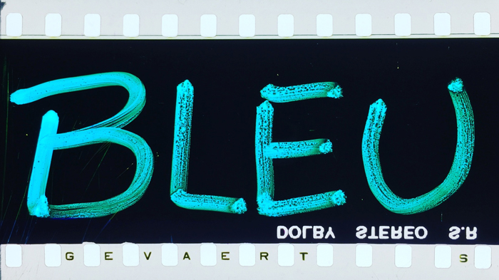
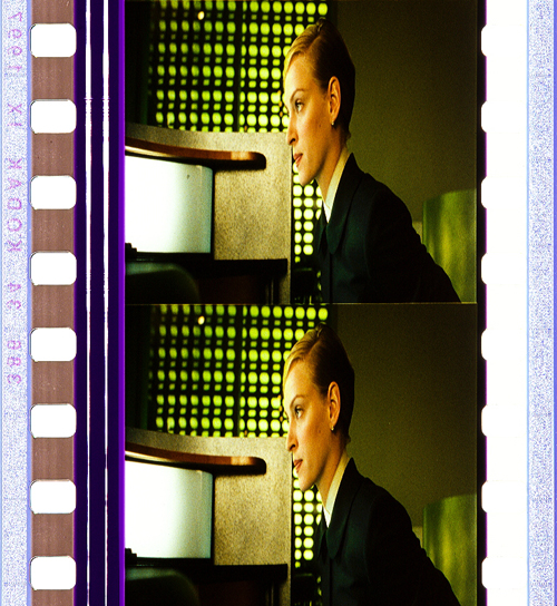
Trois couleurs: Bleu (France/Poland/Switzerland 1993, Krzysztof Kieślowski). Credit: Library of Congress. Photograph of the Agfa Gevaert safety print by Barbara Flueckiger.
Kristin here:
To the general film-going public, old films are in black-and-white. They may be vaguely aware that before The Wizard of Oz and Gone with the Wind, color film was invented.
The history of film color, however, is vastly more complicated than that. Prof. Barbara Flueckiger, of the University of Zurich, has devoted much of her career to studying that history. With Eva Hielscher and Nadine Wieylisbach, she co-edited the 2020 collection, Color Mania: The Material of Color in Photography and Film (Zurich: Eds. Lars Müller/ Fotomuseum Winterthur). Barbara has also spent the past decade leading a team who have created a recently inaugurated and invaluable website that acts as a boundless resource for information on color processes.
We are delighted that Barbara has accepted our invitation to write a guest blog entry for us. She describes the website and gives a succinct outline of the history of film color, loaded with beautiful illustrative frames. Most of these were taken from original archival prints that reveal how seldom–especially in this age of digital home video–we see color films as they looked when they were released.
Barbara Flueckiger
From their earliest days, films were colored. During the first three decades, most color imagery was obtained by applying dyes to black and white prints, either by hand, through stencils, or as tinting and toning of the filmstrips. From the beginning, however, many ideas emerged to capture colors directly on film as so-called mimetic colors. That could be done either by optical and mechanical means, such as colored rotary filters, or by chemical interventions, often in combination with optical configurations of cameras. Several hundred analog color processes and film stocks were invented in the first 100 years of film history. Many of them were never successful commercially.
Ali Baba et les quarante voleurs (France 1902, Ferdinand Zecca). Credit: BFI National Archive. Photograph of the stencil-colored nitrate print by Olivia Kristina Stutz.
This history is largely unknown to the general audience as well as to many film scholars and historians.
To close this gap in our knowledge, in 2011 I started to develop the Timeline of Historical Film Colors, a comprehensive web resource. I wanted to document the development of film colors from their prehistory in still photography in the 19th century to the latest developments in the analog domain. As of 2021, the platform contains hundreds of primary and secondary sources, patents, links, selected analyses, physical measurements and downloads, as well as more than 23,000 photographs of historical film prints and negatives. These items provide film historians, researchers, archivists, curators, film restorers and students easy access to a vast array of information. A tagging system connects the entries, galleries, photos and quotes to an underlying thesaurus containing certain topics, persons, aesthetic concepts, technologies, archives, genres, persons or companies. A comparison function allows side-by-side inspection of different prints of the same film.
Why film color?
The comparison function allows the side-by-side inspection of different prints of the same film.
High-resolution photographs displayed in galleries are a central part of the Timeline of Historical Film Colors. Early on I developed a method to photographically capture and document historical film materials in a standardized way. It uses a modular and calibrated camera set-up based on a DSLR camera with a macro lens and remote control from the computer to adjust all the parameters. It is crucial to show the full range of color processes in an aesthetically pleasing way, one that aims at recreating the visual impression on the bench, including the edge information and color distribution in the perforation area. These elements are vital for the identification of film stocks and the genealogy of prints.
These photos allow researchers and students to examine individual historical prints, since they often have to work with less-than-ideal digitizations on DVDs and Blu-rays that are just a faint echo of the historical source material. In recent years this photographic method has been adopted by my teams in the current research projects. Some archives, such as the Academy Film Archive, have started to use the method, and the BFI National Archive and the George Eastman Museum plan to do so soon.
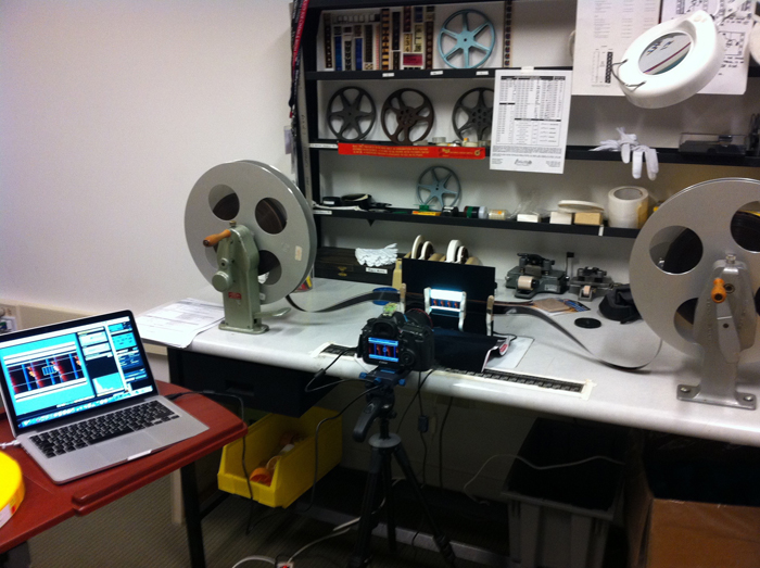
Our modular camera set-up in use at the bench.
During the last years my teams and I visited many archives in Europe, the US and Japan to take these photographs, such as the Harvard Film Archive, EYE Filmmuseum Amsterdam, National Film Archive Prague, Deutsche Kinemathek Berlin, the Academy Film Archive, the Library of Congress, George Eastman Museum, the BFI National Archive, Cinémathèque française Paris, the UCLA Film & Television Archive, Bundesarchiv Filmarchiv Berlin, Museum of Modern Art, DFF Deutsches Filminstitut & Filmmuseum Frankfurt, the National Film Archive of Japan and others.
On the Timeline of Historical Film Colors each contributing archive is represented with a header slide that gives access to the film elements from their collection.
The lost colors of film history
Most films produced before the mid-1930s have been passed on in black-and-white prints. It was not until the famous FIAF conference in Brighton 1978 that the colors of the first decades of film history began to attract some attention from insider circles focusing on silent film.
To this day, the lack of awareness of film’s colorful past has persisted. Early applied colors such as tinting, toning, hand-coloring, and stencil-coloring are ephemeral by nature, since each exhibition print was dyed separately, in a variety of shades and hues. Moreover, these prints were produced with highly flammable nitrate cellulose as a base. Many deadly cinema fires in the early decades of the 20th century demonstrated the dangers of nitrate stock. Therefore, many original colored film prints have been hidden in cans sitting on the shelves in archives’ nitrate vaults. These facilities are fitted with special safety measures such as break-off walls and earth dams.
Eventually in the 1950s safety celluloid film stocks replaced nitrate. From that point on, new prints of colored early films were made on safety stock from the black-and-white camera negatives, intermediate negatives, or positive distribution prints. When colored distribution prints were used, the new copies were usually made only in black-and-white.
In the early 1980s a second threat to the history of colors in film became apparent. Martin Scorsese was among the prominent filmmakers and scholars who rang the alarm bell over the fading of so-called chromogenic stocks produced from the late 1930s to the 1980s. Due to the physical decay of mainly the cyan dye in these film stocks, original prints become nearly monochromatic, retaining mainly colors in the magenta to red spectrum. To this day, dye fading has remained one of the most pervasive problems for the search of authentic film colors.
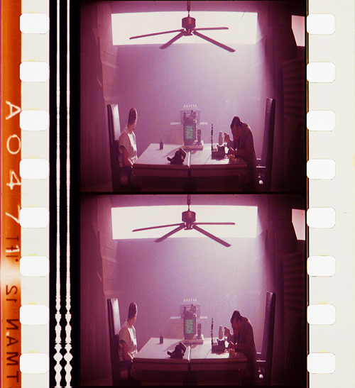
Color fading. Blade Runner (USA 1982, Ridley Scott). Credit: Library of Congress. Photograph of the Eastman Color Print Film by Joëlle Kost.
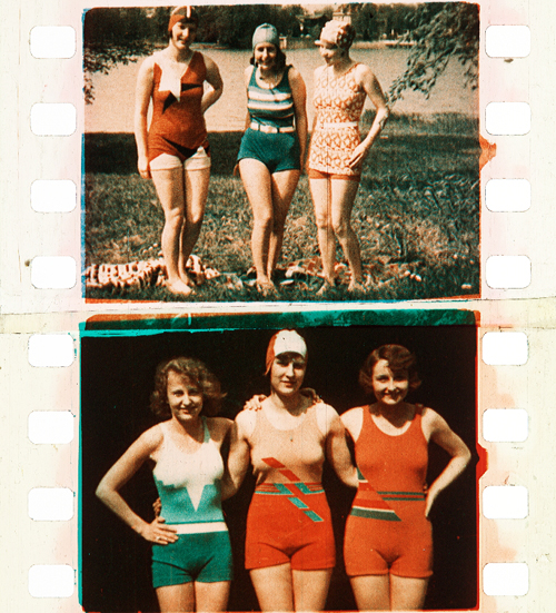
Applied colors
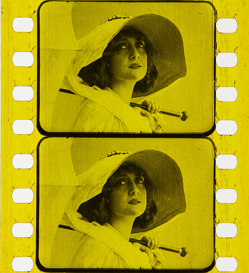
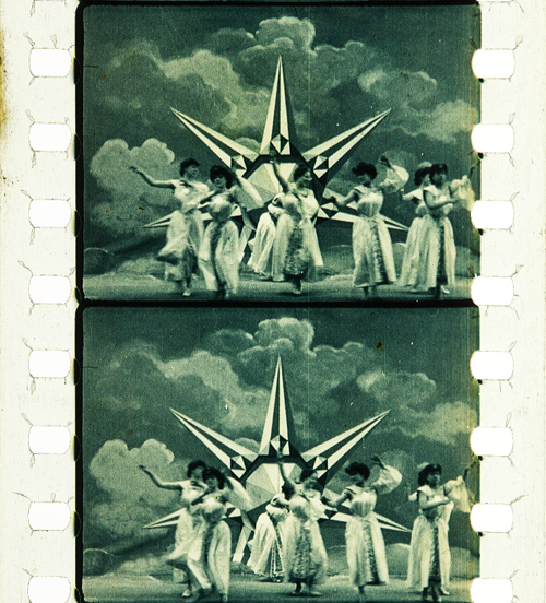
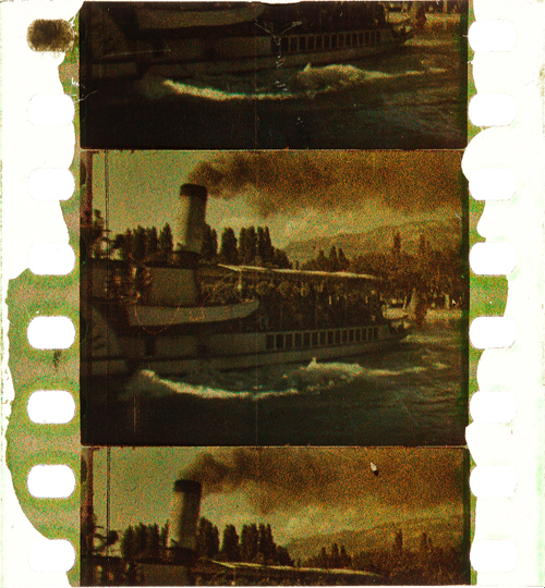
During the first three decades, so-called applied colors dominated. Historians estimate that about 80% of film prints were colored by tinting, toning, or hand- and stencil-coloring.
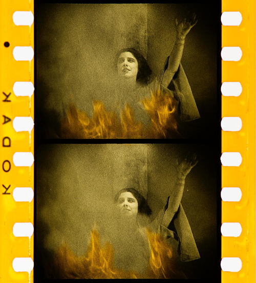
Tinting means submerging black-and-white film positives into dye baths, so that the prints’ gelatin emulsion acquired a more or less uniform, mostly monochrome color. Tinting can be identified by the inspection of the perforation area that is also uniformly colored. Toning, on the other hand, is a complementary process whereby the silver image is replaced by colored metallic pigments (metallic toning) or dyes (mordant or dye toning). In contrast to tinting, toning leaves the perforation area mostly colorless.
Tinting. Malombra (ITA 1917, Carmine Gallone). Credit: Cineteca di Bologna. Photograph of the tinted and toned nitrate print by Barbara Flueckiger.
Toning. Voyage autour d’une étoile (France 1906, Gaston Velle). Credit: Cineteca di Bologna. Photograph of the toned nitrate print by Barbara Flueckiger.
For these coloring processes the individual prints had to be cut into segments that were then dyed in batches and reassembled into the final distribution print. As a result, individual prints can vary considerably in their color schemes.
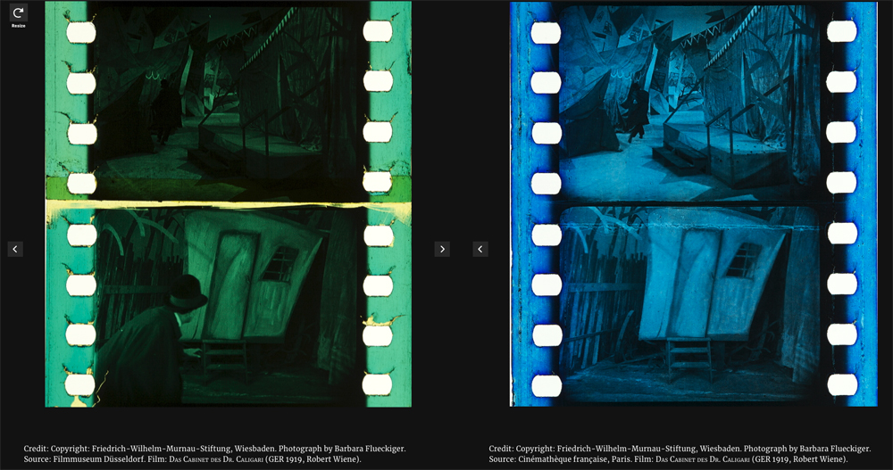
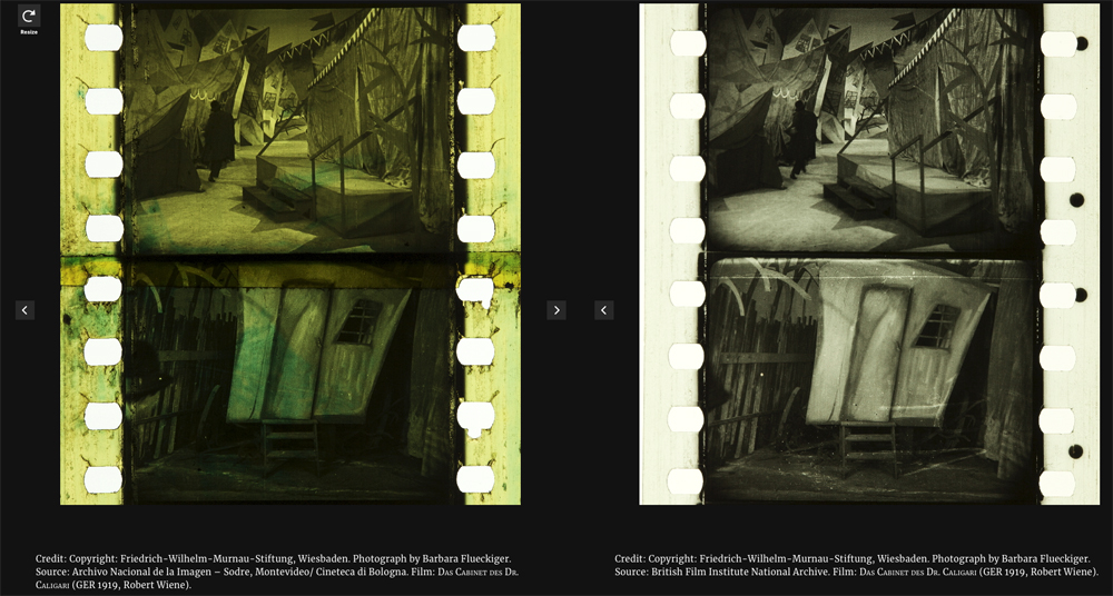
Comparison of four differently tinted and toned distribution prints of Das Cabinet des Dr. Caligari (Germany 1919, Robert Wiene). Copyright: Friedrich Wilhelm Murnau Foundation. Photographs by Barbara Flueckiger.
Whether tinting and toning schemes vary due to cultural norms and tastes has remained a topic of debate. To a high degree it is also uncertain who made the decisions about the coloring, except for cases where scripts, production notes, or film negatives indicate the attribution of colors. In addition to colored prints there were so-called copyright books that show the color scheme by single frames attached to the pages of the booklets, deposited at the Library of Congress by distributor George Kleine. Subtle shades emerged that often make it difficult to distinguish between the two, because the black silver image gives way to nuanced interactions with the tinting dyes in middle tones.
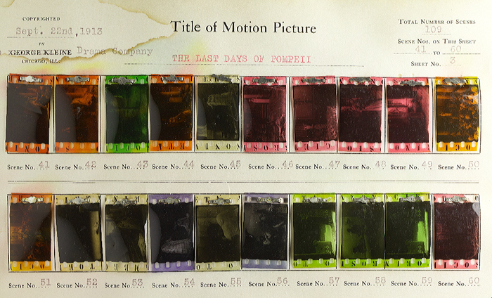
Copyright book from George Kleine: Gli ultimi giorni di Pompei (Italy 1913, Eleuterio Rodolfi). Credit: Library of Congress. Photograph Barbara Flueckiger.
In some cases, combining tinting and toning allowed for two colors to appear within a single image.
Tinting and toning combined. Sumurun (Germany 1920, Ernst Lubitsch). Credit: Bundesarchiv-Filmarchiv. Photograph of the tinted and toned nitrate print by Olivia Kristina Stutz.
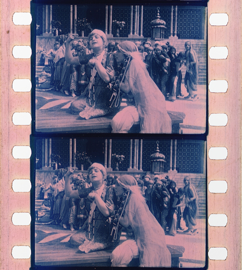
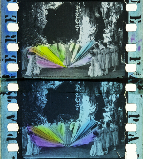
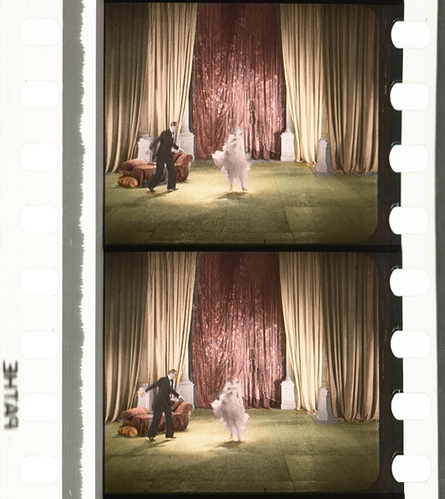
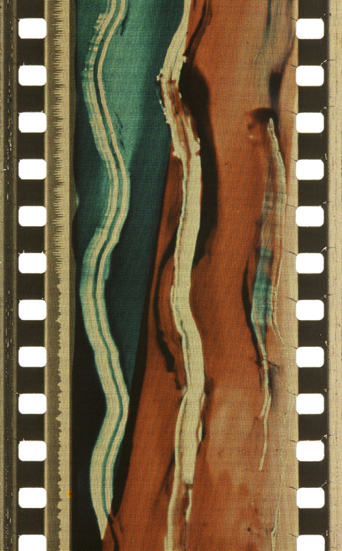
The range and variety are even greater in the case of hand and stencil coloring. These techniques generally required the application of up to six dyes on each individual frame, either by hand through tiny brushes or by cut-out stencils. These laborious processes were demanding, given the small image area and the huge number of frames, generally 16 to 18 per second of running time. Hand-colored films show an uneven application of dyes with soft transitions between individual colors. For stencil coloring, each dye necessitated a separate, colorless print from which the stencils were cut out by needles or metallic styluses. As a result, shapes appear more or less sharp-edged. It was a mechanized version of hand coloring that allowed the coloring of feature-length films and higher numbers of distribution prints. Over the years, improved techniques were introduced to transfer the shapes from projected magnifications onto the film prints with the help of pantographs.
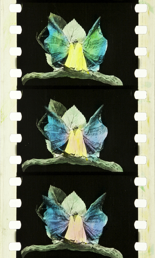
Hand coloring: Métamorphoses du papillon (France 1904, Gaston Velle). Credit: Library of Congress. Photograph of the hand-colored nitrate print by Barbara Flueckiger.
Stencil coloring. Cyrano de Bergerac (Italy/France 1923, Augusto Genina). Credit: EYE Filmmuseum Amsterdam. Photograph of the tinted, toned and stencil colored nitrate film by Barbara Flueckiger.
Needless to say, stencil and hand coloring were reserved for more ambitious or luxurious films. However, they also allowed for the creation of a higher reality effect in documentaries, travelogues, or fashion films by anticipating the development of mimetic colors. Exotic places, ethnicities, or historical settings were among the prevailing topics of stencil-colored films.

Documentary. La mangouste ou rat des pharaons (France 1914). Credit: Cineteca di Bologna. Photograph of the stencil-colored nitrate print by Noemi Daugaard.
Fashion film. Modeflitsen (France 1918). Credit: EYE Filmmuseum Amsterdam. Photograph of the stencil-colored nitrate print by Bregt Lameris.
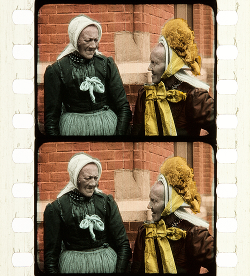
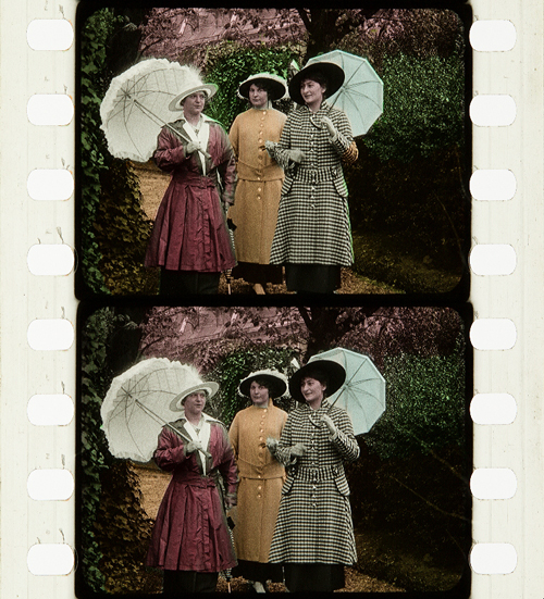
Travelogue. Coiffures et types de Hollande (France 1910, Alfred Machin). Credit: Cineteca di Bologna. Photograph of the stencil-colored nitrate film by Barbara Flueckiger.
In fact, the richness and scope of stencil-colored films can be fascinating to the modern viewer. That holds true for both the bolder color in the first decade of the 20th century or the more nuanced pastel shades that became increasingly prevalent in the 1920s.
Bold colors in early film. L’Amour d’esclave (France 1907, Albert Capellani). Credit: Library of Congress. Photograph of the stencil colored nitrate film by Barbara Flueckiger.
Subtle pastel shades in the 1930s. Elstree Calling (Great Britain 1930, André Charlot; Jack Hubert; Paul Murray; Alfred Hitchcock ). Credit: BFI National Archive. Photograph of the stencil colored nitrate print by Olivia Kristina Stutz.
A special case of applied colors is the Handschiegl process, a printing process developed by Max Handschiegl and Alvin Wyckoff, often used in Cecil B. DeMille’s films, especially for title cards. It produces highly detailed and precise colors with stunning effects.
Handschiegl. Joan the Woman (USA 1916, Cecil B. DeMille). Credit: George Eastman Museum. Photograph of the tinted, toned and Handschiegl nitrate print by Olivia Kristina Stutz.
Mimetic colors
Already in France in the 1860s, Charles Cros and Louis Ducos du Hauron separately wrote descriptions of many of the principles for achieving mimetic colors in still photography. As it turned out, however, it was a much more demanding task to develop solutions for moving pictures. Some of the problems related to the high throughput during projection of 16 or more single frames per second. Other problems resulted from much higher requirements for image size on the big cinema screen, where resolution and registration were paramount. Due to the rapid succession of frames necessary for the illusion of movement, minute deviations occurring between frames created disturbing amounts of flicker or color fringing. Contemporary commentators often labeled the result as “color bombardment” that caused “eye strain”.
To this day, mimetic colors combine two to four color components either in additive or subtractive admixtures. In the 19th century their development followed psychophysical insights into the human visual system by Thomas Young and Hermann von Helmholtz. They showed that color impressions are the result of physiological sensors in the human retina sensitive to three different spectral ranges of the visible light.
Additive colors
Additive admixtures operate with colored light where the sum of the three additive primaries red, green and blue results in white light. The earliest attempts to create colors on the screen by optical means employed additive principles by rotary filters in front of the camera and projector respectively. These included the three-color Turner Lee and the most successful additive two-color process Kinemacolor.
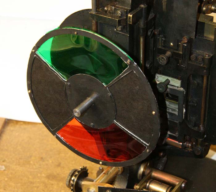
Rotary filter in front of the Kinemacolor projector used for David Cleveland’s and Brian Pritchard’s reconstruction. Credit: Brian Pritchard.
Kinemacolor positive from the Kodak Film Samples Collection. Credit: National Science and Media Museum Bradford. Photograph by Barbara Flueckiger in collaboration with Noemi Daugaard.
In Kinemacolor, rotary filters in red and green spinning in front of camera and projector recorded and transmitted the color information by temporal synthesis. The impression of color was created in the eyes of the spectators. Based on contemporary reports and digital reconstructions, the poor quality and limited color spectrum were readily apparent. Due to the temporal shift between the two successive frames with the red and green color separations, Kinemacolor and all processes operating by the same principle created color fringes and a headache-inducing amount of flicker.
Mroz Farbenfilm. Urlaubfarbenfilm F. Apfelthaler (AUT 1932, Friedrich Apfelthaler). Credit: Österreichisches Filmmuseum. Video and reconstruction by Giorgio Trumpy, David Pfluger and Martin Weiss.
Attempts with temporal synthesis were followed by additive processes that employed spatial synthesis by the application of beam splitters. In this configuration, up to three color records were taken through filters simultaneously to eliminate temporal parallax. But this approach introduced spatial parallax instead, and this arrangement could also create color fringes by poor registration. Gaumont’s Chronochrome process was certainly the most convincing attempt to combine three color separations with this principle.
Gaumont Chronochrome positive from the Kodak Film Samples Collection. Credit: National Science and Media Museum Bradford. Photograph by Barbara Flueckiger in collaboration with Noemi Daugaard.
A third type operating with additive admixtures of light are the so-called screen processes. Additive colors are mixed, either by random, small-scale mosaic image elements or by organization into lines. Color impressions in these systems result from the fusion of the individual dots or lines into red, green and blue in visual perception. The effect resembles that of pointillist paintings where colors are divided into small dots.
Lenticular screen processes, by contrast, combine tiny lenses imprinted onto a black-and-white film strip with colored filters in front of the camera and projector.
Kodacolor lenticular filter for the projector. Lichtspiel/Kinemathek Bern.
Mosaic screens created by colored potato starch were popular in still photography with the Lumière brothers’ Autochromes, introduced in 1907 and widely used by professionals and advanced amateurs. The principle was later adopted in the Cinécolor process for color film but failed due to the uneven distribution of the starch particles. Among the line screen processes, Dufaycolor was the most successful one, widely used in documentaries and famously in Len Lye’s experimental films with direct animation painted directly onto the film strip and then captured and distributed on Dufaycolor film stock. Apparently, Lye was not convinced by the somewhat muted color palettes of the process.
Stereoscopic Autochrome Lumière. Exhibition Color Mania – Materiality of Color in Photography and Film, Fotomuseum Winterthur, September 7 to November 24, 2019. Photo by Barbara Flueckiger.
Photomicrograph of Cinécolor (20x). Credit: Photomicrograph by Silvana Konermann.
Cinécolor sample. Credit: Gert Koshofer Collection. Photograph by Barbara Flueckiger.
Photomicrograph of Spicer-Dufay, early Dufaycolor (20x). Credit: Photomicrograph by Silvana Konermann.
Dufaycolor. A Colour Box (Great Britain 1935, Len Lye). Credit: BFI. Photograph of the Dufaycolor di-acetate print by Barbara Flueckiger.
Lenticular films such as Kodacolor were also mostly used for home movies with the exception of Thomson color for Jacques Tati’s Jour de fête (France, 1949).
None of the additive principles proved to be successful for the long term. Many of them required special installations in the cinema, and most delivered poor results, most notably dim images.
Subtractive colors
Finally, subtractive admixtures became the norm. The three primaries cyan, yellow and magenta filtered the light, with black being the sum of these three subtractive colors. Two or three differently colored emulsion layers are attached to the film base, on one side or both sides of the film.
Most early two-color films were using double coated film stock. The earliest one was Kodachrome Two-color developed in 1915, presented in 1916 with the short film Concerning $1000, but mostly in use in the 1920s for fashion films, for the dance film The Flute of Krishna (USA 1926) by choreographer Martha Graham and for the experimental film [Kaleidoscope] by Loyd A. Jones. Kodachrome Two-color film was shot through a beam splitter and combined two emulsions in orange-red and bluish green on either side of the film carrier, with beige, brown and golden tones in the spectrum between the two color components.
Kodachrome Two-color Test Shoot No. III (USA 1922, Anonymous). Credit: George Eastman Museum. Photograph of the Kodachrome two-color double coated stock by Olivia Kristina Stutz.
Kodachrome Two-color. [Kaleidoscope] (USA ca. 1927, Loyd A. Jones). Credit: George Eastman Museum. Photograph of the Kodachrome two-color double coated stock by Barbara Flueckiger.
Sirius Farbenfilm. [Farbfilmversuche] (Germany 1920s or 1930, Ludwig Horst; Hans Horst). Credit: Deutsches Filminstitut DFF. Photograph of the Sirius color nitrate print by Barbara Flueckiger.
Multicolor. Credit: Gert Koshofer Collection. Photograph by Barbara Flueckiger.
Prizma II. The Glorious Adventure (Great Britain 1922, J. Stuart Blackton). Credit: BFI National Archive. Photograph of the tinted and Prizma II nitrate print by Olivia Kristina Stutz.
In the 1930s subtractive processes turned to three colors, most famously with Technicolor No. IV and the subsequent Technicolor No. V, which was printed from chromogenic camera negatives. Founded in 1915, the Technicolor Company went through many failures and set-backs, with the exception of a short color rush in the late 1920s with the two-color dye-transfer process Technicolor No. III. Following the series Great Events with 12 short films produced by the Technicolor company to establish the process, mostly musicals and a few other genres exploited the two-color process during this short boom. But some of them are highly remarkable, with sophisticated camerawork by Technicolor’s own cinematographer Ray Rennahan, including the musical Whoopee! (USA 1930, Thornton Freeland) choreographed by Busby Berkeley, King of Jazz (USA 1930, John Murray Anderson, Pál Fejös), Doctor X (USA 1932, Michael Curtiz), and Mystery of the Wax Museum (USA 1933, Michael Curtiz).
Technicolor No. III. Doctor X (USA 1932, Michael Curtiz). Credit: UCLA Film & Television Archive. Photograph of the Technicolor No. III dye-tranfer nitrate print by Barbara Flueckiger.
Technicolor No. III. King of Jazz (USA 1930, John Murray Anderson; Pál Fejös). Credit: Library of Congress. Photograph of the Technicolor No. III dye-tranfer nitrate print by Olivia Kristina Stutz.
While the technologies applied in Technicolor’s various processes changed considerably over the years, the beam splitter was one of the few constants. Both in Technicolor No. II and III, a beam splitter separated the two color records and captured them mirrored upside down on one black-and-white negative. The bulky and heavy Technicolor No. IV camera recorded the color separations on three black-and-white 35 mm negatives. From these three negatives matrices were produced as wash-off reliefs, ready for the dye-transfer of the three primaries onto the positive print. The result was a series of color images, along with the frame lines and the soundtrack as silver images.
For almost two decades Technicolor dominated the market for high-quality color films. Part of its success was due to a comprehensive package that included the camera, specialized cinematographers, and all the lab works executed exclusively in Technicolor’s own plants. One of the building blocks of Technicolor’s long-term dominance, however, was the so-called Color Advisory Service, famously led by color consultant Natalie M. Kalmus. She defined aesthetic guidelines for film productions shot with the process, informed by color norms related to concepts of “elevated taste,” located in a broader cultural context with references to the concept of “color consciousness.”
Technicolor No. IV. The Life and Death of Colonel Blimp (Great Britain 1943, Michael Powell; Emeric Pressburger). Credit: BFI. Photograph of the dye-transfer nitrate print by Barbara Flueckiger.
Technicolor No. IV. Blood and Sand (USA 1941, Rouben Mamoulian). Credit: BFI. Photograph of the dye-transfer nitrate print by Barbara Flueckiger.
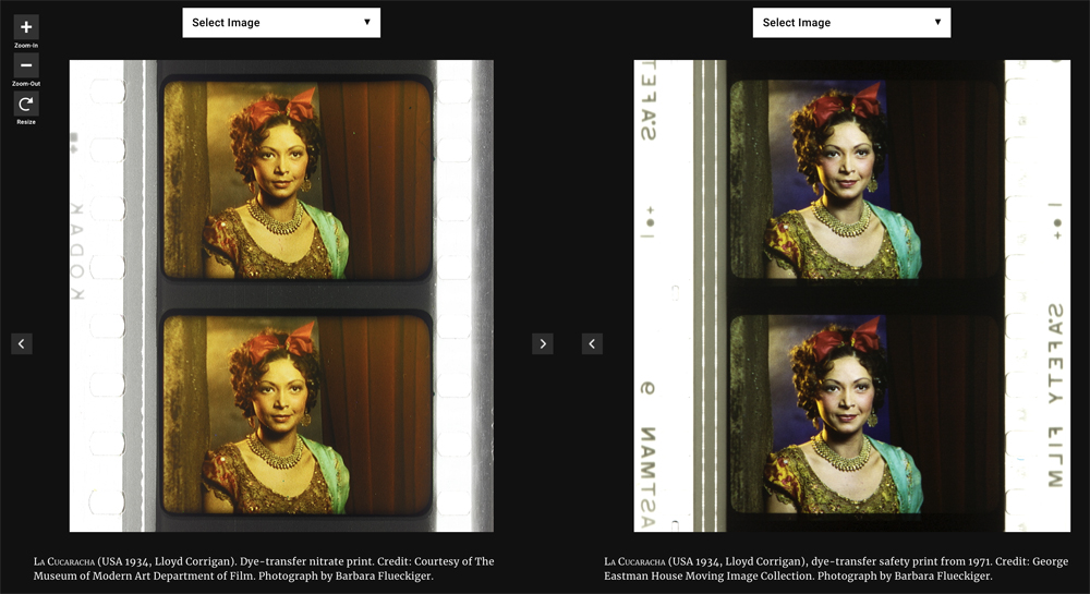
Technicolor No. IV. Gentlemen Prefer Blondes (USA 1953, Howard Hawks). Credit: Library of Congress. Photograph of the dye-transfer safety print by Barbara Flueckiger.
Despite all the efforts to control the color schemes, people often associate Technicolor with highly saturated, deep colors. On close inspection in our detailed analyses of color films, however, we have observed that many films adhere to the rules with mostly restrained color schemes and unsaturated backgrounds to guarantee optimal figure/ground separation. But there are also deviations from these self-imposed norms, surprisingly clashing hues even in films produced with Natalie M. Kalmus as color consultant.
Moreover, there is a great variability of different looks and color applications during the almost two decades. Individual color aesthetics were related to personal styles of cinematographers, directors or production companies, genres or changing preferences in fashion and design, and changing color compounds and recipes employed in the process. Technicolor’s idiosyncrasies – what we perceive as typical “Technicolor look” – are mostly due to the dye-transfer process itself. Pasty, dense colors in patchy structures create an almost opaque appearance on the screen, an effect somewhat like oil paint. When we work with the film elements on the bench in archives, we not only have to increase exposure considerably due to the density of the film stock, but we also notice the color layer’s almost sticky viscosity, often visible as a relief on the surface.
Compared to Technicolor, Gasparcolor produced much more saturated, brilliant and luminous colors. In fact, the process, developed in the early 1930s by Hungarian emigré Béla Gaspar in Germany, was possibly the most advanced and complex process at the time. In its principle–the silver dye-bleach process described by Raphaël E. Liesegang in the late 1890s – the silver acted as a catalyst for the local destruction of the dyes embedded in the three emulsion layers on the two sides of a reversal positive. It is thus a chromolytic reversal process. Due to the political circumstances during the Third Reich in Germany, Gaspar eventually had to flee.
Like Technicolor Gasparcolor required the recording of three color separations on black-and-white negatives. Since most of the Gasparcolor films were animations, these separations were captured in succession on adjacent film frames but could of course also have been shot through a beam splitter similar to Technicolor No. IV. In fact, only one documentary is widely known, Colour on the Thames (Great Britain, 1936), shot by Adrian Cornwell-Clyne. Among the films produced with Gasparcolor are famous avant-garde experimental films by Oskar Fischinger, Hans Fischinger, and Len Lye. Gasparcolor prints can easily be identified by the black perforation area and the colored soundtrack.
Gasparcolor. The Ship of the Ether (Netherlands 1934, George Pal). Credit: BFI National Archive. Photograph of the Gasparcolor nitrate print by Barbara Flueckiger.
Gasparcolor. Colour on the Thames (Great Britain 1935, Adrian Klein). Credit: BFI National Film Archive. Photograph of the Gaspar color nitrate print by Barbara Flueckiger.
Gasparcolor. Rainbow Dance (Great Britain 1936, Len Lye). Credit: Museum of Modern Art. Photograph of the Gaspar color nitrate print by Barbara Flueckiger.
Both Technicolor and Gasparcolor prints stored in archives are in remarkably good shape, due to their stable colors. Ironically, chromogenic film stocks, the technical principle that ultimately won the competition and became the new standard, had the least stable dyes. Chromogenic means that the dyes need to be developed after exposure. Embedded in the emulsion of a single strip of film stock are three or more layers. These layers are sensitive to different spectra. All contain silver halides and the color-forming substances, so-called dye couplers that are subsequently developed into dyes. In a second stage the silver is bleached out and leaves the color information in the form of finely dispersed dye clouds in the three or more emulsion layers in cyan, magenta and yellow. The result is a highly translucent, glowing image whose fine-grain structure depends on the speed of the film stock. The slower the speed, the finer the grain.
In contrast to Technicolor the shooting of the chromogenic film could be done with normal cameras on one negative or camera reversal. Chromogenic films increasingly became the norm, starting with Agfa’s first negative-positive process Agfacolor. Emerging in the late 1930s, Agfacolor was promoted by German propaganda in a bid to counteract Technicolor’s dominance. Agfacolor had particularly soft colors in the pastel range with a typical, slightly darkened orange-tomato red. Difficulties in the blue range produced turquoise shades that become quite apparent in skies. Greens had a tendency to look brownish or blackened; shadows had a greenish tinge. Chromogenic multilayer film stocks were incredibly difficult to balance and to produce, requiring a high level of knowledge in physics and chemistry.
Agfacolor. Münchhausen (Germany 1943, Josef von Báky). Credit: Copyright Friedrich Wilhelm Murnau Foundation. Bundesarchiv Filmarchiv. Photograph of the Agfacolor safety print (acetate) by Barbara Flueckiger.
Agfacolor. Opfergang (Germany 1944, Veit Harlan). Credit: Copyright Friedrich Wilhelm Murnau Foundation. Filmmuseum Düsseldorf. Photograph of the Agfacolor Safety Print by Barbara Flueckiger.
Agfacolor. Grosse Freiheit Nr. 7 (Germany 1944, Helmut Käutner). Credit: Copyright Friedrich Wilhelm Murnau Foundation. Bundesarchiv Filmarchiv. Photograph of the Agfacolor nitrate print by Michelle Beutler.
Agfacolor. Der schweigende Stern (German Democratic Republic 1960, Kurt Maetzig). Credit: Bundesarchiv Filmarchiv. Photograph of the Agfacolor safety print by Josephine Diecke.
After World War II ended, the Allies were able to exploit German color-film patents. The result was the appearance of Fujicolor, Eastman Color, and many derivatives, such as Ferraniacolor, Ansco Color, and Sovcolor. The worldwide adoption of color in film production soon followed.
Sovcolor. Ivan the Terrible, Part II (Russia 1958, Sergei M. Eisenstein). Credit: Museum of Modern Art. Photograph of the Sovcolor safety print by Barbara Flueckiger. (The film was shot in the 1940s on captured Agfacolor stock, but the delay in the release of the film until 1958 meant that distribution prints were on Sovcolor stock.)
Fujicolor. Matador (Spain 1986, Pedro Almodóvar). Credit: Library of Congress. Photograph of the Fujicolor safety print by Barbara Flueckiger.
Eastman Color. Aliens (USA/Great Britain 1986, James Cameron). Credit: Academy Film Archive. Photograph of the Eastman Color Print Film Type 5384 by Joëlle Kost.
Eastman Color. Gattaca (USA 1997, Andrew Niccol). Credit: Library of Congress. Photograph of the Eastman EXR Color Print Film Type 5386 reference print by Barbara Flueckiger.
A plurality of styles emerged, less defined by technical limitations than by cultural contexts and individual preferences of filmmakers, art directors, costume designers, and cinematographers. Color aesthetics in film are not only created by hues, color schemes, and color contrasts, but also by lighting styles, by material properties of surfaces and textures, by depth of field, image composition, and by movement. The combination of these factors influences the image’s figure-ground relationships.
In the course of our research, we investigated a large corpus of more than 400 films – mainly from 1895 to 1995 – with a computer assisted workflow. A video annotation software has been developed based on our approach since 2017, when we figured out that tools available then were not well suited to the detailed annotation and visual analysis of film (color) aesthetics. The visual analysis and annotation software VIAN has been created by Gaudenz Halter in collaboration with the Visualization and MultiMedia Lab of the University of Zurich. The tools enable researchers to create detailed analyses including figure/ground separation and a large range of visualizations that make diachronic developments immediately evident or support the testing of new hypotheses.
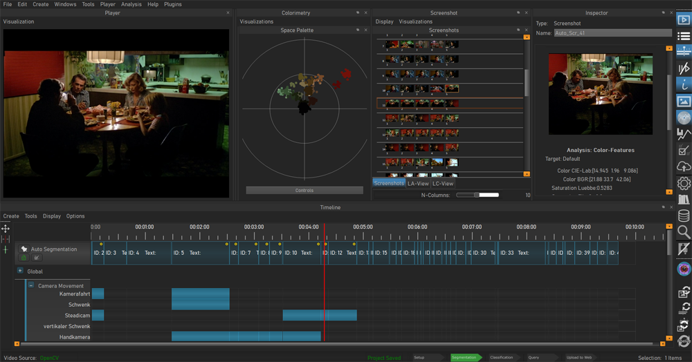
Video analysis and annotation software VIAN, developed by Gaudenz Halter. User interface.
A deepened understanding of color film technologies and aesthetics is an essential prerequisite for the scientifically sound digitization and restoration of color films, which is one of the most pressing topics today and therefore remains at the center of our research activities.
Acknowledgements
I would like to express my immense gratitude to Kristin Thompson and David Bordwell for publishing this blog post and for all the inspiration that guided my research.
A huge thank you to my teams ERC Advanced Grant FilmColors, SNSF Film Colors. Technology, Cultures, Institutions, ERC Proof-of-Concept VeCoScan.
Special gratitude is dedicated to all the film archives with their wonderful collections.
This project has received funding from the European Research Council (ERC) under the European Union’s Horizon 2020 research and innovation programme, grant agreement No 670446 FilmColors.


