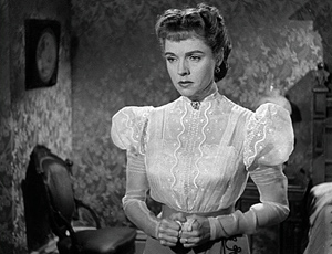
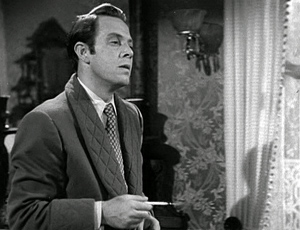
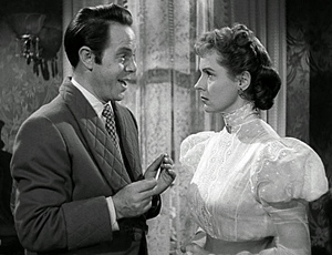
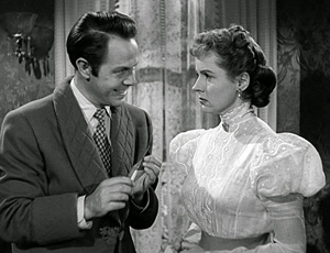
Archive for the 'Directors: Lang' Category
Alignment, allegiance, and murder
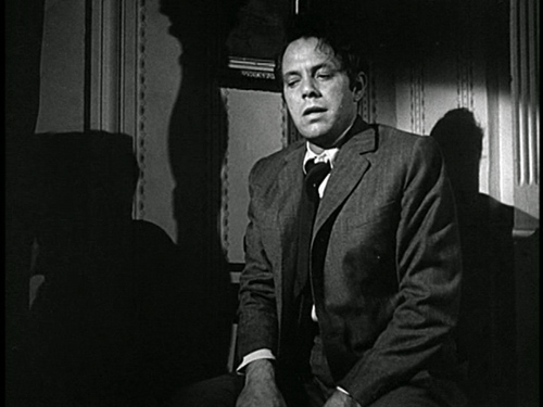
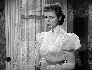
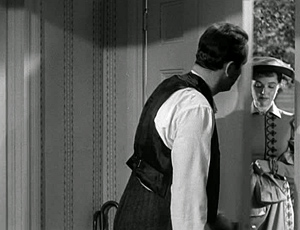
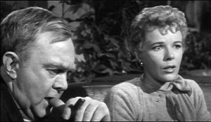
House by the River (1950).
DB here:
“Point of view” is one of those terms that we can’t seem to do without, but it’s rather vague. The clearest application of the term would be to shots that conform more or less to what a character sees, presenting what we might call optical point of view.
But sometimes we’re given access to what a character sees, hears, and knows less narrowly. Without any optical pov shots, we might still be restricted to a character’s range of knowledge. This happens in detective films like The Big Sleep, which confines us almost completely to what Philip Marlowe knows. We follow him into scenes, stay with him as the action plays out, and then leave the scene when he does. We’re “with” him, but not via optical point of view.
In his book Engaging Characters, Murray Smith calls this sort of restriction to character knowledge alignment. He points out that it has both objective and subjective sides. Objectively, we’re spatially attached to a character in the course of a scene or several scenes. Subjectively, we may get access to the character’s thoughts, memories, dreams, or immediate perceptions (as with a POV shot). Spatial attachment refers to the limited range of our knowledge; subjective access refers to the depth of knowledge about the character’s inner experience.
But what about our emotional engagement with the characters? We usually call this “identification,” but Smith shows that this is a misleading way to think about what happens. Identification seems to imply taking on another’s state of being, but we don’t necessarily mimic a character’s emotions. We might pity a grieving widow, but she isn’t feeling pity, she’s feeling grief. Smith talks instead of allegiance, the extending of our sympathy and other emotions to characters on the basis of their emotional states. Allegiance, Smith maintains, depends partly on the moral evaluations we make about the character’s actions and personality.
Alignment and allegiance don’t necessarily involve us with only one character in the course of a film. Cases like The Big Sleep, which put us “with” Marlowe all the way through, are rare. Often a filmmaker shifts our alignment and allegiance away from one character to another, perhaps in the course of a single scene. That may involve some careful choices about staging, framing, sound, and cutting.
I offer you an example from Fritz Lang’s marvelously perverse House by the River. I’m afraid I can’t avoid spoilers, but at least I don’t give away the ending.
At the point of a nail file
Stephen Byrne, a struggling but well-to-do writer is married to the lovely Marjorie. But this doesn’t stop him from trying to seduce their maid Emily. While struggling with Emily, Stephen strangles her. With the help of his brother John, he stuffs Emily’s body into a large sack and deposits it in the river. Stephen’s crime has stirred something in him, and he begins writing a new book, Death on the River, with its plot based on what he has done. Meanwhile, an inquest into Emily’s disappearance casts suspicion on John as her killer.
The very end of the inquest scene has shown the prosecutor and chief inspector confronting Stephen, who says he won’t do anything to incriminate his brother. Since neither John nor Marjorie knows of this conversation, we’re aligned with Stephen. He now has precious information: the police are likely to be watching his brother, not him.
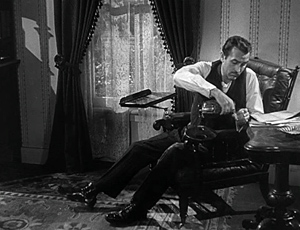
Our alignment with Stephen continues at the start of the next scene, which shows him at work on his manuscript. Marjorie comes in and asks to talk with him about Inspector Sarten.
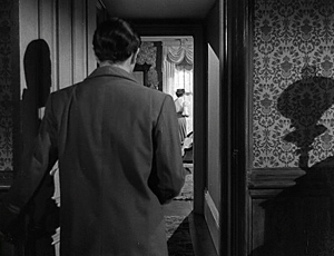
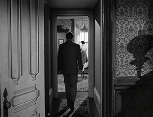
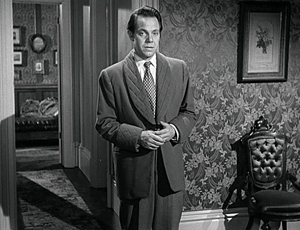
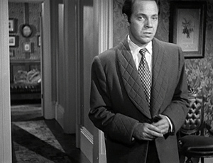
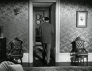
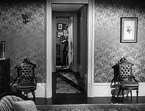
After a pause to consider, Stephen reluctantly follows her into her bedroom. Lang’s camera, angled along the corridor, puts us strongly with him.
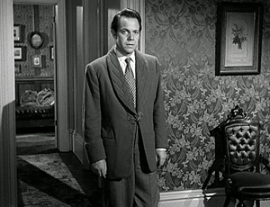
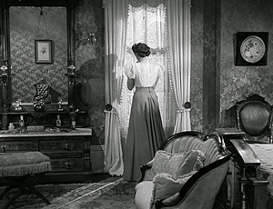
As Stephen enters the bedroom, Lang continues to favor him. Stephen comes into a knees-up shot facing front, but the answering shot of Marjorie weeping at the window is more distant, approximating his optical point of view.
Often filmmakers give us slightly stronger alignment with one character than another by framing one more closely than another. That happens here, I think, for Lang repeats these camera setups several times as Stephen apologies for being snappish and asks Marjorie what she wants to tell him. We know he’s being pleasant only because he wants information.
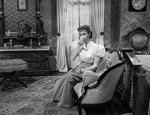
She comes forward and sits, reporting that she has seen the detective following her. Now we can see her expression more clearly and she is less remote from our concerns.
Again the setups repeat for a bit, with the framings still making Stephen more salient. Aligned with him, and to some extent allied as well, we are able to share his sense that danger is approaching. Stephen comes forward and steps into a more neutral and balanced framing. I’d argue that our sense of being “with” him now begins to taper off.
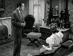
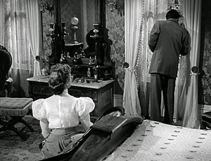
Marjorie points to the window (in one of Lang’s compositionally accented gestures) and suggests that an officer may be watching the house. Stephen goes to look out.
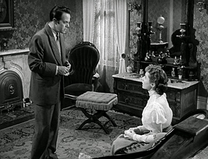
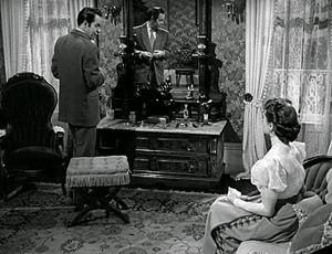
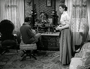
Stephen suggests that the police should be targeting John, since he’s acted suspiciously after the inquest. As Stepehn talks, he saunters to the dressing table and uses the file there to smooth his nails. He suggests that John may very well have had an affair with Emily. Although the framing is in long shot, we can see Stephen’s expression clearly, and it’s duplicated in the mirror. By contrast, when Marjorie rises indignantly and upbraids him, her back is mostly to us.
Stephen sits, remarking, “There’s a limit to this business of being brothers, Marjorie.” She turns slightly, saying, “Stephen, you’re insane.” This line prompts a cut to Stephen, still smoothing his nails but turned from us.
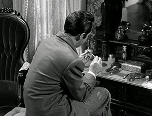
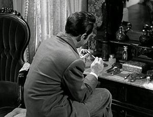
His face turned away and no longer visible in the mirror, Stephen says casually, “You’re very fond of him, aren’t you?” Now we’re more aligned with Marjorie, seeing more or less what she could see. Lang could have staged this phase of the scene to give us more information about Stephen’s expression (say a low-angle depth shot with his face in the foreground), but the opaque shot we get is balanced by a close, clear view of Marjorie for the first time in the scene–another step toward alignment and allegiance with her. The turned-away shot of Stephen also highlights his gesture of filing his nails, important in what will come next.
Cut to a medium shot of Marjorie’s reaction. “You know that.” Back to Stephen: “Are you in love with him?”
Stephen doesn’t see her reaction, which confirms his guess about her feelings for John, but we do. More important, our allegiance shifts toward her too. We know that Stephen is lustful (he’s seeing women in town every night), but Marjorie is suppressing her fondness for John for the sake of her marriage vows. She has the moral edge.
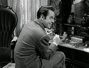
He questions her further, finally turning to her and grinning: “Don’t think I haven’t been aware of it.” Cut back to her: “You have a filthy mind”—something we know to be true. Her moral scheme fits ours, and sympathy for her builds.
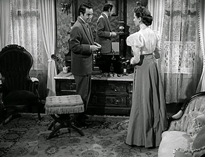
This riposte wipes the smile from his face and he walks slowly toward her, the nail file extended like a knife, but also waggling jauntily in his hand. He recovers his flippancy and assures her he doesn’t feel any jealousy toward John because he no longer finds Marjorie attractive.
After he says he finds cheap perfume exciting, she calls him a swine. He resumes filing his nails. Stephen leaves the shot but, crucially, Lang’s camera dwells on Marjorie, glaring after him.
The scene’s final shot shows Stephen strolling down the corridor, and it ends with him smiling and slamming his door. It is a kind of symmetrical reply to the early shot of him going to her room.
This point-of-view shot anchors us with Marjorie, both perceptually and morally. She now realizes that she is the only ally John has.
Marjorie doesn’t know that Stephen is the killer and that John helped him dispose of the body. As often happens in films, we know more than any one character. As a result, we can register suspense when Stephen approaches with the nail file (we know he’s capable of stabbing her), but she evidently doesn’t feel herself in danger. To put it more generally, a string of scenes which restricts us to one character after another gives us a moderately unrestricted knowledge of the overall narrative.
Still, moment by moment, the director can use film technique to weight one character’s reaction more than another’s. We can balance those short-term reactions against our wider compass of knowledge. Our sympathies can shift as we register characters’ changing awareness of their situation, however partial their awareness may be.
Interestingly, the end of this scene, emphasizing Marjorie’s new understanding of Stephen’s turpitude, links to the next scene rather neatly. We see John at home, drinking with grim determination, but when he answers the door he finds Marjorie there.
The segue to Marjorie as a center of consciousness in the bedroom scene prepares for her going to comfort John.
More broadly, the shift initiates a new phase of the film in which Stephen must further cover up his crime. For nearly all of the film’s first half-hour, we’re restricted to Stephen’s ken, when he commits and covers up his crime. After that, the film’s narration alternates between scenes organized around Stephen and ones organized around John, with two brief ones centering on Marjorie. The inquest, at twelve minutes the longest sequence in the film, gathers together all the characters and functions as something of a neutral and objective reset.
That scene is followed by the one I’ve examined, in which we return to Stephen writing a manuscript, as we saw him at the start of the film. The new scene’s narrational weight briefly shifts, as we’ve just seen, from him to Marjorie. After she leaves John’s house, however, the film will build suspense by attaching itself almost wholly to Stephen as he plots to kill both his brother and his wife.
Smith points out throughout his book that alignment and allegiance are complicated matters. It sometimes happens that we have sympathy for the devil–someone who’s acted immorally but whom we might root for to some degree. Bruno in Strangers on a Train is a classic example. And we can think of instances of villains who engender some sympathy because they have some admirable features or because they are treated unfairly.
So I don’t want to leave you with the impression that Lang hasn’t toyed with our allegiances more severely in other stretches of House by the River. At the start, Stephen is at best a bounder, but who doesn’t want him to succeed initially in hiding his crime? (For one thing, if he didn’t try, the story would be over too soon.) And there may be something admirable in his cleverness and bravado as he tries to palm the guilt off on John. My discussion of this scene simply wants to show that the fluctuations of alignment and allegiance can be quite small-scale, and they often depend on niceties of directorial technique.
Craftiness
Artistry depends on craft, and craft is something both cinephile critics and academics have neglected.
Coming across that sentence in a recent essay in Film Comment, you might have a question. What is craft, and how is it different from artistry?
Some thinkers, most famously R. G. Collingwood, saw a sharp line dividing the two. I’m more inclined to see them on a continuum, at least in certain art traditions. In film, I’d suggest that craft consists in fulfilling the task at hand with skill and efficiency.
Craft implies a set of norms, a default or standard that any competent artisan should be able to fulfill. Artistry then, we might say, becomes a plus. It goes beyond the task’s narrow purpose. Ozu’s establishing shots, for example, do more than establish the locale of the upcoming scene. They create intricate plays with compositional motifs that recur through the entire film. Artistry may not necessarily add complexity, though; it can also compress and concentrate. Bresson eliminates establishing shots and providing environmental information through glimpses of background or information on the soundtrack.
Sometimes artistry adds a psychological complexity not apparent in the bare-bones task. This might be given through performance and/or the way the scene is shot. This is what I think happens in the House by the River scene. It’s not a flamboyant job of direction. We need to take a little effort to see how Lang has set up the master shot to allow Stephen to go to the window, then to the dressing-table; and to see how Lang has reserved the closer shots of the couple for a new level of conflict.
But so much might have been done by any solid artisan. And you could imagine other ways to shoot the scene. Someone like Preminger might have presented the entire encounter in a few balanced two-shots. Lang’s extras—the discreet use of optical point of view, the analogous corridor shots, and the subtle variation in shot scale between Stephen and Marjorie, not to mention Stephen’s playful waggling of the nail file—build subtle attitudes toward the characters.
Call it artistry, or cunning craft. Either way, it shows how directors can shape our experience by adjusting the range and depth of our knowledge, sometimes in small but powerful ways.
The distinction between range and depth of information in cinematic narration is presented in Film Art: An Introduction, Chapter 3 and in my Narration in the Fiction Film. For more on these concepts, see Meir Sternberg’s Expositional Modes and Temporal Ordering in Fiction. Murray Smith’s Engaging Characters refines these and other distinctions in order to understand how we grasp character in film.
Tom Gunning’s The Films of Fritz Lang offers a detailed, fascinating commentary on House by the River, concentrating especially on motifs of writing, mirroring, and filth.
For other entries on the craft of staging dialogue scenes, go here and here and here and here elsewhere on this site. For more on niceties of direction, from a director seldom credited with such, try here.
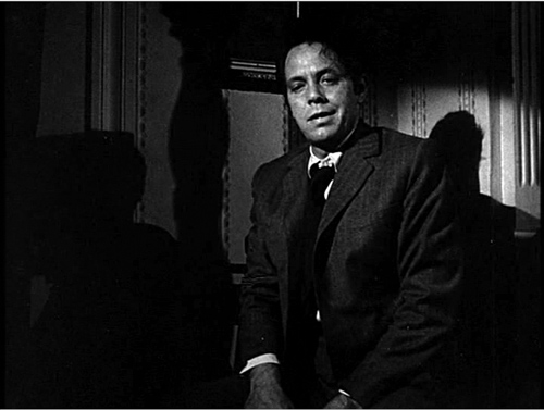
House by the River (1950).
An all-too-short visit to Ebertfest 13
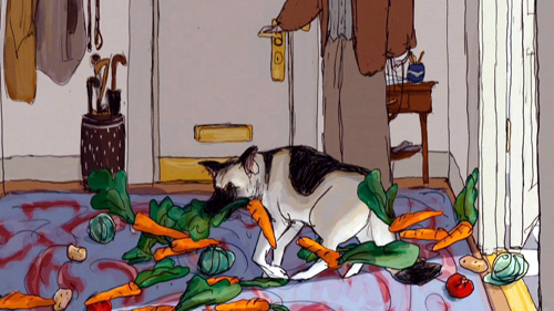
Tulip’s unique way of expressing delight at the prospect of walkies.
Kristin here–
With David still recovering from pneumonia, I drove down to Champaign-Urbana by myself for a truncated Ebertfest visit. As always, 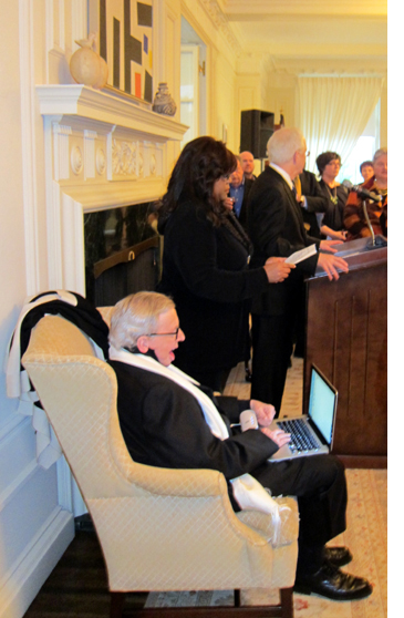 the event began with a reception at the president’s home, where Roger delivered a speech via his talking computer (left).
This year, rather than kicking off the festival with a Wednesday-night screening of a 70mm print, the opening program was a screening of the restored version of Metropolis, incorporating footage found in Argentina. (David has already blogged about the new version, having seen it last year at the Hong Kong Film Festival.) I had the privilege of introducing the screening.
Roger’s program notes gave a good summary of the film and its latest restoration, so I talked a little about why it’s not all the odd that a nearly complete print should be found in Argentina. First there’s the matter of what happened to prints at the end of their theatrical circulation in the silent era. Films didn’t open around the world day and date the way they do now. Prints might be exhibited in one country, then move onto another with new intertitles in a different language cut in. They might be shown for years, until their useful life was over. By that point they might have reached places far away from their place of origin. They were also usually covered with scratches and lines, and they weren’t worth the cost of shipping them back to their makers. They might be buried, as was the case with the 1978 Dawson City find in Alaska, or stored in the attic of a theater, or rescued by a projectionist who tucked them away in a garage. In some cases, collectors acquired them, as happened with the Argentinian Metropolis print. Occasionally these treasures come to light, as recently happened when the Film Archive of New Zealand located several American titles, such as John Ford’s lost silent film Upstream. So far-flung places that long ago were the end of the line for prints are where we might expect them to resurface. Indeed, New Zealand’s archive also held a print of Metropolis that contained some shots not found in earlier restorations or in the Argentinian print, and these appear in this latest version.
A second reason why Argentina is not a surprising place to find a long print of Metropolis has to do with the German film industry’s strength after World War I. Despite having been defeated, the country built up its production until it was second only to Hollywood. European companies found it difficult to sell their films in the U.S.; then, as now, American films dominated their domestic market. German companies sought other areas where they could compete on a more equal footing. They were quite successful in South America, and Fritz Lang’s films were among the most popular there. Small wonder, than, that a well-worn, largely complete print should survive there.
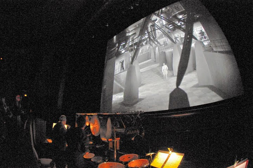
The original score has been reconstructed, but as has become customary at Ebertfest, the Alloy Orchestra supplied their own original accompaniment. (See below.)
Dog-lovers’ delight
The thing that sets Ebertfest apart from other festivals is that it reflects the taste of one person. Roger chooses the films, and his reviews are reprinted in the program as notes. When Roger saw the acclaimed animated film My Dog Tulip, based on J. R. Ackerley’s memoir about life with his Alsatian, he was reminded of another man whose only love was his dog, Umberto D. So, having the ability to program of double feature of the two films, Roger did. Apart from the annual silent film, Ebertfest seldom shows older classics, so this was something of a departure. I had only seen a 16mm copy of Umberto D, way back in my graduate-school days, so it was great to see a 35mm print on the big Virginia Theater screen.
The juxtaposition of the two films worked well, with the grim image of old age and despair of Umberto D followed by the nostalgic but fairly upbeat My Dog Tulip. Judging by the questions and comments afterward, the latter struck a particular chord with dog lovers in the audience, and during the remainder of my stay I heard many pet anecdotes exchanged among people around me.
The film was created by a husband-wife team, with Paul Fierlinger drawing on a digital tablet and Sandra Fierlinger painting in the colors with a computer program. As I pointed out during the panel discussion after Nina Paley’s Sita Sings the Blues was shown at Ebertfest in 2009, computer animation doesn’t mean that the computer does all the work. Far from it. A computer has to have a lot of material fed into it before it can aid in the filmmaking process. Each frame of My Dog Tulip was done by hand, and it has the look of traditional cel animation. (As with traditional cel animation, the Fierlingers use each image twice in a row, so that only twelve drawings suffice for a second of film.) There’s a deliberately rough, slightly jittery look to the outlines of the figures in the shots, helping give that impression of drawn animation.
Ordinarily I would have preferred to see the film in 35mm, but Paul and Sandra told me that the 35mm prints actually washed out some of the vibrancy of the intended colors. The digital print projected at Ebertfest definitely did the colors justice.
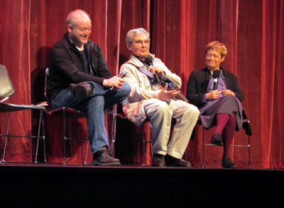
Matt Soller Zeitz with Paul and Sandra Fierlinger onstage after the screening
Filling the big screen
On Friday, two very well-known directors presented beautiful, color, widescreen 35mm prints that looked terrific–and huge–on the big screen. (I was sitting in the second row for one, the first row for the other, so the effect was particularly overwhelming.) I had missed Richard Linklater’s most recent release, Me and Orson Welles, in first run, so it was a pleasure to catch up with it. As all the reviewers remarked, Christian McKay uncannily impersonates the real Orson Welles. As Linklater pointed out, McKay was in his  mid-30s at the time of filming, while Welles was a mere 22 during the time depicted–and yet the portrayal works, since Welles didn’t really look young, even at the beginning of his career.
The film pulls a great deal of humor out of rehearsals for Welles’s famous 1937 staging of Julius Caesar, with the director’s whims and ego dominating the proceedings, and Zac Efron’s stagestruck high-school kid providing a naive point of view of the backstage politicking. Given all the antics in the lead-up to the premiere, it’s impressive that Linklater manages to switch gears abruptly and present snippets from the production itself that genuinely suggest the impact of Welles’s revolutionary staging. It wowed New York and pioneered the way for modern-dress versions of the Bard’s works.
The on-stage discussion after the film revealed that the production, which manages to convey 1930s New York so convincingly, was mostly shot on the Isle of Man. The British island not only offered favorable production incentives, but it boasted a well-preserved local playhouse that could double for the long-since-destroyed Mercury Theater.
That evening veteran director Norman Jewison presented one of his less well-known films, Only You (1994). It’s a screwball, absurdly romantic comedy starring Marisa Tomei and Robert Downey Jr., both looking very young and very gorgeous.
After Jewison moved from television into feature films in the 1960s, his early projects included two Doris Day and Rock Hudson comedies (The Thrill of It All and Send Me No Flowers), and he returned to the genre with Moonstruck.
Only You has a slender plot in which the heroine, convinced that a Ouija board has given her the name of the man she will marry, abandons her fiancé to follow a man she thinks is her destined true love across Italy. Cinematography by Sven Nykvist and location shooting in Venice, Rome, and Positano give the film considerable charm.
David has been recovering well, but I didn’t want to leave him alone too long. I returned home today rather than staying through the entire festival. But it was a wonderful few days, and I enjoyed talking with Michael Barker, Paul and Sandra Fierlinger, Kevin Lee, Michael Phillips, David Poland (when he wasn’t busy chasing his lively 15-month-old son), some of Roger’s “Far-flung Correspondents,” and many of the devoted audience members who return year after year to this unique event. With luck, both David and I will be there for the whole event next year.
(From the Ebertfest website)
Note: For a second year, the introductions, post-film discussions, and morning panels were streamed live, and they’re also archived online.
Ratio-cination
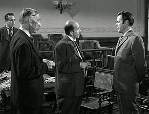
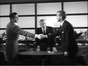
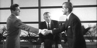
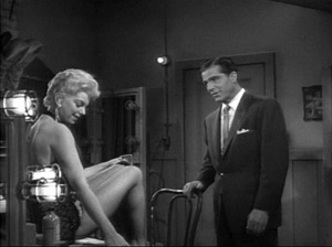
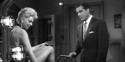
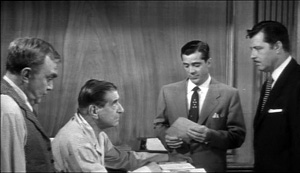
Beyond a Reasonable Doubt.
DB here:
Good timing. Just as I was about to enable more aspect-ratio fetishism, I got news of the publication of Widescreen Worldwide, from John Libbey. Edited by John Belton, Sheldon Hall, and Steve Neale, it has its distant origins in a 2003 conference at the National Media Museum in Bradford, England. Widescreen Worldwide will be a very useful volume, with material on little-studied U. S. systems and a lot of information on formats in Japan, France, Italy, and Russia, even Norway. 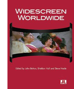 Most studies of widescreen technology seldom discuss the creative uses to which it was put. But this collection features several essays focusing on the artistry of the wide formats, emphasizing the work of Preminger, Peckinpah, Okamoto, Suzuki, et al. As the publisher’s blurb puts it:
The book documents how the aesthetic strategies explored during the first wave of American widescreen films underwent revision in Europe and Asia as filmmakers brought their own idiolect to the language of widescreen mise-en-scène, editing, and sound practices. As a global phenomenon, widescreen cinema thus presents the opportunity to examine how different cultures appropriate the technology to advance extremely different cultural and aesthetic agendas.
I have an essay included on the Shaw Brothers directors, and I’m happy to be in such distinguished company in this major publication. My essay is available on this site. The paper I gave at the conference, on Hou Hsiao-hsien’s early anamorphic films, is also posted here.
Speaking of widescreen: Today, we go back to While the City Sleeps and SuperScope, thanks to some correspondents and further fooling around on my part.
Ratio decidendi
The story so far: SuperScope was a widescreen system devised by Irving and Joseph Tushinsky for RKO . It extracted a wide image from the 1.37 standard frame and printed it as a squeezed anamorphic frame, to be unsqueezed at a ratio of 2.0 to 1. (A later version allowed for a 2.35 stretch.) In principle, it’s an early version of what Super 35 does now. Some RKO films, notably Invasion of the Body Snatchers (1956), were shot in knowledge that they would be given the SuperScope treatment; others were SuperScoped after the fact.
The question before the jury was: Do SuperScope prints of Lang’s While the City Sleep (1956) faithfully reflect his intentions? The answer I settled on was: Probably not. A Variety story indicated that the SuperScope prints were made for European distribution, though perhaps some sneaked into the US theatrical market or the 16mm aftermarket.
Now for a little more on Lang’s compositions. Several viewers have commented on all the headroom visible in the full frame. The ‘Scope print I examined displayed some as well, but not as much, as my illustrations for the earlier entry indicate. More likely the film was masked in the US to something like 1.66 or 1.75. I reproduced some frames from a 1.75 laserdisc version, and they look reasonably good. Overall, I suggested that City’s fairly open compositions suggest that Lang was expecting the film to be masked somewhat in projection, but not to the full 2.0:1 ratio we get with SuperScope.
Although for most of its length, While the City Sleeps seems quite okay at 2.0, I found one shot that would be quite awkward in full SuperScope. Alas, I didn’t photograph it from the 35mm European print I examined, but I’ve used my stills from the print to guide my cropping of the 1.37 frame in this instance. The results are, as the lawyers say, probative.
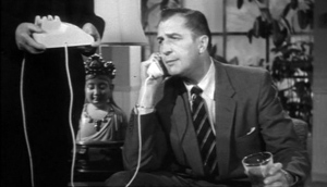
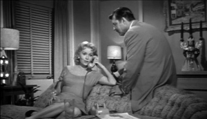
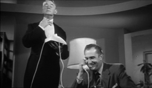
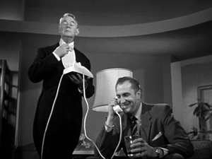
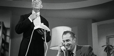
The scene is mundane: Walter Kyle gets a phone call from his errant wife Dorothy. She’s carrying on an affair with Harry, the art director of the newspaper Walter runs. Walter talks with her, and Lang cuts to her responding. I show you the 1.75 versions.
When Lang cuts back to Walter, he provides a new camera setup featuring the butler Steven. This is to prepare us for a joke: Walter says he’ll have Steven meet Dorothy at the front door in his underwear. Steven reacts with embarrassment. Given that a lot of the film plays on the sexual rapacity of men, the humor is a shade sick.
A narrative convention: The stuffy, puritanical butler. But notice that in the 1.75 frame, Steven’s full face is quite visible. Of course it’s even more visible in the full-frame version. (Fussy Lang, or fussy somebody, seems to have aligned the face with the swoop of the ceiling.)
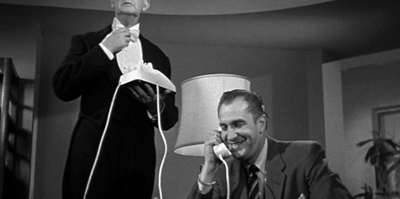
But the composition would look more awkward if chopped in the SuperScope 2.0:1 version. Here’s one framing, using the cropping points typical of other anamorphic shots in the European 35mm print.
In addition, since the crop slices more off the bottom region than the top, Walter’s body is also lost in the anamorphic version. But this is still probably the best compromise. Some frames in the 35mm S’Scope version favor the lower region of the original shot. But in this shot that option would be disastrous.
It’s hard to imagine that the director of the painstakingly composed Moonfleet (1955) would have wanted to saw Steven’s skull in half.
Mors ultima ratio
So Lang didn’t shoot the film expecting it to be SuperScoped. Nevertheless, things that escape directors’ intentions can have their own impact on viewers. In the codicil to the earlier blog entry, I wondered if French critics’ admiration for While the City Sleeps might have been based on their seeing wider prints than Americans did—in effect, gathering Lang into the cohort of skilled anamorphic filmmakers that included Ray, Preminger, Minnelli, et al. Samuel Bréan wrote to tell me that one critic, Jacques Lourcelles, raised this issue explicitly. Lourcelles writes:
For both this film and Lang’s next film, Beyond a Reasonable Doubt, the format poses a thorny problem that can be resolved only by considering aesthetic matters. The film, not shot in CinemaScope, was exhibited in Superscope (a wide format used at RKO and created through laboratory processes), and then in a normal format. Which is better? In my opinion, the wider one. Only there, for instance, do the camera movements and the newspaper-office set have their true impact. Even if the Superscope version was “manufactured” in the lab, Lang knew that the film would be seen on the wide screen and his direction was conceived as a function of that. The same goes for Beyond a Reasonable Doubt; to cite just one instance, the first sequence showing the condemned man walking toward the electric chair is obviously conceived for the wider format.
This does lead to some intriguing speculation on how “misreadings” of films can have positive consequences. The French celebration of Lang’s 1950s films led American and British critics to reevaluate them.
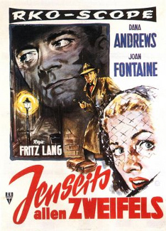
The case of Beyond a Reasonable Doubt is quite parallel to that of While the City Sleeps. Released in September 1956, it too was reviewed in Variety as a non-anamorphic picture. Its U. S. publicity makes no reference to a widescreen format. But its overseas posters claim that it is in “RKO-Scope.” Huh?
By the end of 1956, the Tushinskys had split from RKO and were selling SuperScope generally. So in November 1956 RKO simply announced that it had developed “a new widescreen, anamorphic process” that would carry a ratio of 2.0:1. Historians of widescreen have assumed that this is SuperScope by another name. The same publicity announced that soon all the studio’s films would be in RKO-Scope. But RKO ceased making movies on 1 January 1957. Universal took over distributing the remaining pictures.
Again, on the basis of the posters and Lourcelles’ comments we can be confident that Beyond a Reasonable Doubt was shown in a 2.0:1 aspect ratio in some overseas markets. As airless a movie as Lang ever made, with disconcertingly generic sets and severe framings and camera movements, it engendered a fascination in French critics. The story itself is a model of Langian guilty conscience. A reporter looking for a new book to write agrees to a hoax that will attack capital punishment. He’ll plant clues indicating that he’s a murderer in order to prove that an innocent man can be convicted. Lang’s narration offers his customary feints and ellipses. Smooth hooks, verbal and visual, carry us across scenes. Casual details are dropped in, or a sudden cutaway appears, and we’re misled into thinking we’re ahead of the plot. We are in fact behind it. Crucial story information is skipped over, but we’re not aware of what has been deleted until much later. We should have noticed.
Appearing in the same year as Around the World in 80 Days, The King and I, Lust for Life, Giant, Anastasia, War and Peace, and other sweeping spectacles, Beyond a Reasonable Doubt was a bare-bones programmer. Lang’s last American film doesn’t waste its energy on the pictorial flourishes of budget-strapped directors like Siegel or Fuller. Other B-films could whip up visual flair with chiaroscuro, close-ups, and fast cutting, but Lang’s images seem disconcertingly banal; yet their simplicity gives them an odd purity. In an influential review, Jacques Rivette declared that Lang was, in effect, filming concepts.
I don’t find any shots in Beyond with a vertical bias comparable to the shot featuring Steven the butler in City. The 1.37 frame shots are very empty up top. So here’s an experiment in reconstructing an approximation of what Europeans saw.
Dux vitae ratio
As I suggested in the earlier blog, for decades Lang composed his frames carefully, balancing figures in dynamic patterns and sometimes putting important elements along the sides or in a corner. Here are some examples from one of his most beautiful films, The Ministry of Fear. He likes triangular compositions that tuck heads into corners, as well as camera angles that let foreground items anchor the faces and bodies.
When the frame is unbalanced, it’s for a reason, such as purse-rifling.
A director so committed (like Ozu) to putting heads high in the shot must have felt annoyed when he had to hang inexpressive space over his players, as in the shot at the very top of today’s entry. When he left headroom in earlier films, it served an exacting compositional purpose, as you see below. Those wedge-formations of tapers, backing up threatening cobras, look back to the decor of his German films.
I suspect that it pained him to accept the more open framing demanded by non-anamorphic ratios. In CinemaScope you could count, more or less, on the proportions of your image being respected. But shooting flat, could you really be sure what would stay in the shot? Projectionists could mask it to 1.66, 1.75, 1.85, and even wider. These ratios were so imprecise, and this is one precise director. Lang “shot to protect,” as they say, but he couldn’t protect what was already gone: his compact, quietly masterful compositions.
John Belton wrote to me to echo the idea that Lang would probably have realized that While the City Sleeps would be cropped to as much as 1.75.
Certainly every director after 1954 composed for wide screen projection. As for SuperScope, why didn’t they just project it flat with a 2:1 matte in the aperture? It certainly would have looked sharper. Maybe the answer lies in the relative abundance of CinemaScope installations overseas?
Good question for further research. Another interesting sidelight: Who was the SuperScope representative for Europe? For a time, apparently none other than Edgar G. Ulmer! Ulmer is identified as a SuperScope representative in “Tushinsky’s Teuton Deal,” Variety, 7 September 1956, p. 5. Michael Campi wrote to inform me that in Australia he too saw a 2.0:1 print of While the City Sleeps.
RKO’s announcement of RKO-Scope can be found in “And Now–RKO-Scope,” Variety, 30 November 1956, p. 1. More background on the winding down of the studio is provided in Richard B. Jewell and Vernon Harbin, The RKO Story (London: Octopus, 1982), pp. 242-245.
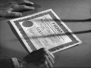
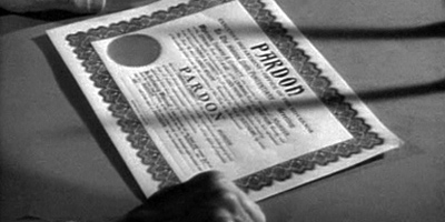
The Jacques Lourcelles comment appears in his Dictionnaire du cinéma vol. 3 (Paris: Laffont, 1992), p. 294. I’m grateful to Samuel Bréan for calling my attention to it. Rivette’s 1957 essay on Beyond a Reasonable Doubt, “The Hand,” is available in Cahiers du cinéma: The 1950s: Neo-Realism, Hollywood, New Wave, ed. Jim Hillier (Cambridge: Harvard University Press, 1985), pp. 140-144. It has been included in a site devoted to Jacques Rivette, Order of the Exile. (The hand Rivette refers to is that in the shot of the warrant above; had Rivette not seen the RKO-Scope print, he might have had to title the essay, “The Hands.”) The poster images for Beyond a Reasonable Doubt come from the ever-generous DVD Beaver, and its review of a Spanish disc.
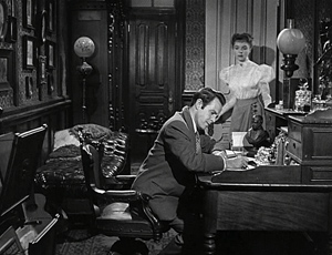
The Ministry of Fear.
Trade secrets
DB here:
Over the last couple of months, some strange things have been happening to America’s most venerable show-business trade papers. In the case of Variety, the strange thing is very important and yields almost unalloyed good news. In the case of The Hollywood Reporter, the strange thing is, at least for the moment, a step backward.
Kristin and I have subscribed to weekly editions of both newspapers since the mid-1990s. With the advent of Web 2.0, each paper created an online archive, more or less searchable, stretching back into the 1990s. Not everything you would wish for, since Variety started publishing in 1905 and The Hollywood Reporter began in 1930. But film historians are grateful for anything. I found both papers’ archives very helpful in reworking Planet Hong Kong over the last year. Now, however, some of the recent happenings affect our ability to do research.
Issues about issues
First the bad strange new thing. In a collapsing advertising market, The Hollywood Reporter has done a makeover. From being a daily and weekly trade paper it turned into an upscale lifestyle weekly, sort of an industry-slanted version of Vanity Fair‘s movie issue, with a soupçon of airline magazine. Among the recycled press releases, superficial interviews, soft-focus profiles, and awards-season handicapping, you find fashion tips like “Into the Blue: Punch up your executive look—top to toe—with the season’s blockbuster hue.” There’s also the sort of feature that movers and shakers can use to promote themselves: “Hollywood’s Young Guns ….Where they work, why they matter, how they’re changing the game.”
True, Variety sometimes resorted to such frippery in these desperate years. V-Life was in some ways a forerunner of the new HR, but V-Life was a supplement. In the main paper you could still find reportage, analysis, overviews, and opinion. There’s relatively few of these ingredients in the new Hollywood Reporter.
If this is the strategy for fighting Movie City News and Deadline Hollywood and IFC, I’m betting on the webroots.
Anyhow, forget the daily THR ephemera. I want to go into the past, as I did until October, scrambling through elusive coverage of Hong Kong stuff. Problem is: I can’t do that any more.
THR not only remade its magazine; it remade its website, radically. So radically that when I go there via Safari or Chrome I get this welcome.
Well, you say, skip your bookmarks and go through Google. But then:
Only Firefox does the trick.
Anyhow, at last I’m on. Breaking News today starts with “Jennifer Grey Wins ‘Dancing with the Stars’; Bristol Palin Comes in Third.” Skip that. As a subscriber, I ought to be able to log in to the proprietary content, right?
Here is the routine. Using my old password, I have no luck. When I call the 800 number, an ominous recording tells me that they are aware of the “issues” (what we used to call “problems”) with the website and subscriber logins. After half an hour, a hard-working person answers and with a few magic passes of her mouse she gets me into the subscriber areas.
Yet the next time I try, I’m refused again. So I write to the email service they announce, and immediately get a form reply saying that my problem will be addressed in 1-2 business days. The next communiqué, from some days later, begins: “We apologize for the delayed response.” They give me a password which is suspiciously generic.
This has been going on for nearly three weeks. But I can live with it because I’m not so concerned with Jennifer Grey or Bristol Palin. I’m there for the archive.
Problem is, the Archive isn’t there for me. Once I’m inside as a subscriber, I find no way to get into the two decades of stories and stats I could reach under the earlier incarnation of the website.
Another call, another recording apologizing for the “issues,” another half-hour of wait, and now a very puzzled answerperson. Where’s the Archive? Nobody ever asked him that before. He’s no better than I am at finding a button for it. He consults his supervisor. The supervisor doesn’t know where the Archive went either.
You can search the site, he points out. True, but the search takes me only to items posted since the makeover began.
Hmmm. The best they can do is suggest I call the Editorial Offices. When I do, the recording instructs me to leave my story tip and someone will get back to me. I might say, “Psst, I have it on good authority that the next big color will be vermillion,” but instead I hang up.
Trying tonight, I find that the search function now turns up articles published throughout calendar 2010, but no earlier. So maybe THR will gradually expand its backfile. It would be too bad if the dolled-up version of the print mag drained resources from maintaining a stable and deep website. I worry that THR intends to dump the old (already very partial) online archive altogether, resetting the clock at the year of the makeover. If so, they send a signal that the past—theirs, that of the industry they cover—doesn’t matter. They wouldn’t even agree with Jack Valenti, who supposedly did say, “It’s only history,” and then opened the MPPDA papers for research.
Infinite Variety
13 September 2010 was the date of the good thing that happened to the trade papers. At that point, Variety went the opposite direction of The Hollywood Reporter. It opened up its vault completely.
For many years film historians have relied on Variety for detailed information about how Hollywood and other national industries have worked. Most of these historians have scanned the paper on microfilm, cranking through reel after reel, getting dizzy from the whizzing lines your eyes try to fasten on. But these scholars managed to do real research. You couldn’t believe everything you read in the paper, of course; you had to be skeptical. Still, getting something was always better than getting nothing.
More recently, Variety has kept an online archive of its materials since the early 1990s. These stories were in html-friendly format, not in the form of published pages, and some stories that appeared in the paper never made it online or were revised for the net. Older stories, mostly film reviews, were summarized and undated. So as records, they were only partly reliable. Still, even this iceberg-tip was well worth surveying.
In September, though, Variety put online its back file from 1906 to the present. Every page of the weekly and daily paper has been digitized. You can access it for a year for a $600 subscription fee, probably what many people pay for designer coffee over the same period. If you want shorter-term access, $60 gets you into up to 50 issues per month.
Reader, I signed up.
There were teething pains for a few weeks. Some pages failed to load, and often you had to scroll through an entire issue to find the page you wanted. But those “issues” are mostly in the past. Now you can plunge into an ocean of well-mapped movie coverage.
As usual with people of my generation, I’m shaken by the abrupt transition from a research economy of scarcity to one of overabundance. Had this bounty existed when Kristin and Janet Staiger and I wrote The Classical Hollywood Cinema, we might still be writing it. Type in “John Ford” or “Meet Me in St. Louis” and you’re led into the labyrinth, with one item teasing you to search others, forever.
Some things, for instance, seem never to change. “CINEMAS TO SURVIVE HI-TECH ERA,” wrote A. D. Murphy in the 4 August 1982 issue’s top story. People were claiming that the theatre experience would soon vanish (presumably because of home video, although that’s barely mentioned). No way, says Murphy, citing several reasons, including the plausible assumption that “Nothing yet has managed to keep young people confined to their homes.” He adds that going out to the movies is the most robust form of “pay per view….free of all that bother of billing, dunning, disconnects and such.”
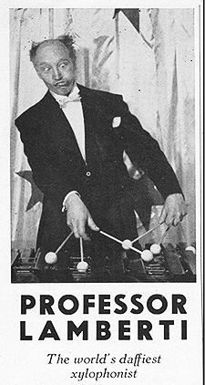 Yet a stroll through the vault can also remind you of how strange things were back then. How’d you like to sit through a live opening act before Citizen Kane? Variety tells us that in San Francisco’s Golden Gate theatre in early September 1941, Kane did brisk business at popular prices. It was accompanied by the vaudeville act of one Prof. Lamberti. The local Hearst newspapers, while refusing to advertise Kane for the unsurprising reason that Hearst thought the movie was about him, did advertise Prof. Lamberti’s act at the house. He was worth paying attention to. He never made snide fun of Marion Davies.
But who was Prof. Lamberti? A magician, a musician, a real prof? We check Variety for 22 March 1950 and learn from his obituary that “Professor” Lamberti was a comedian who played on stage and in nightclubs. According to the obit:
Lamberti’s best known act was playing the xylophone, while shapely gal did a striptease back of him and he was apparently unaware of the goings on. This provided the delusion that successive encores on the semi-classic tunes such as “Listen to the Mocking Bird” were prompted by the audience’s music appreciation, rather than the bumps and grinds of the peeler. Howl finish had the comic get hep and seltzer squirt the gal off stage.
I ask you: How could a red-blooded American male viewer concentrate on the ambiguities of Thompson’s quest after an opening act like that? And as a mood-setter for the opening sequence at Xanadu, the World’s Daffiest Xylophonist might not be ideal. Even more striking, we learn from the same obit that Prof. Lamberti did his signature bit in the film Tonight and Every Night (1945) with Rita Hayworth “as the strip-gal”—the same Rita Hayworth who was then married to Citizen Kane’s director.
Aha, you say, but Wikipedia has an article on Prof. Lamberti too, and with more details than the Variety obit. (Please visit this orphan entry; it needs hits.) I would never badmouth Wikipedia, that wonder of our young century, but it’s not yet the poor man’s Variety vault. For one thing, it doesn’t use the phrase “bumps and grinds of the peeler.” Further, I can find no help on Wikipedia on a looming question that has vexed some of our best minds: At what aspect ratio should Lang’s While the City Sleeps (1956) be shown?
A lack of ‘Scope
There is a full-frame version occasionally broadcast on Turner Classic Movies and now available on Region 2 DVD. There’s also a 1.66 crop that was released on laserdisc many years ago. Some older cinephiles recall seeing a widescreen anamorphic version circulating on 16mm. Yet Lang apparently claimed he did not shoot the film in anamorphic widescreen.
When While the City Sleeps was made, the releasing studio RKO was supporting a widescreen system called SuperScope. That’s what Variety called it, anyhow, though sometimes you’ll see the name with a small middle s, or with “Super” italicized.
Invented by the brothers Joseph and Irving Tushinsky, SuperScope was a progenitor of the Super-35mm system of today. A film shot in standard full-frame 35mm would be turned into an anamorphic one. A portion of the frame was extracted, optically squeezed, and printed as an anamorphic image, which would then be unsqueezed in projection. The aspect ratio was 2.0:1. The reasoning was that it was easier to shoot a movie in the standard way and then “SuperScope” it than it was to shoot a CinemaScope film. Some projectionists called this process BogusScope, not just because it was fake but because Benedict Bogeaus was then a producer feeding projects to RKO, and some of his titles used the format.
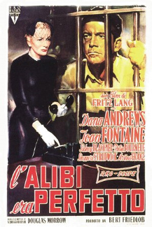
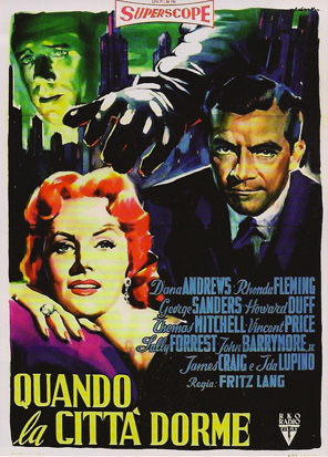
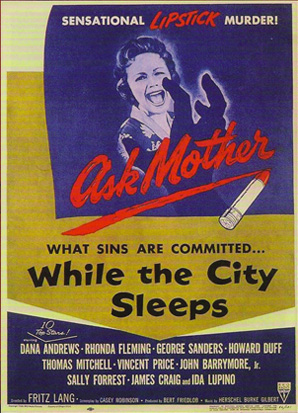
Slightly Scarlet and Invasion of the Body Snatchers, both released in 1956, were designed to be given the SuperScope treatment. The films carry the logo in their credits, and contemporary Variety reviews mention the process by name (15 February 1956 and 29 February 1956). The accompanying Italian poster for While the City Sleeps also makes reference to the SuperScope process. But there is no mention of SuperScope on the release print, or in the Variety review (2 May 1956), or in the US release poster, or in the pressbook kindly posted online by TCM.
Lang is on record, in Peter Bogdanovich’s Who the Devil Made It, as saying that he disliked CinemaScope. He told Bogdanovich that he agreed with his famous claim in Godard’s Contempt that “CinemaScope is only good for snakes and funerals” (p. 224). But SuperScope is not CinemaScope (which is 2.35:1 or sometimes even wider), and moreover Lang made one of the better CinemaScope films in Moonfleet (1955). So the question can’t immediately be resolved on auteur grounds.
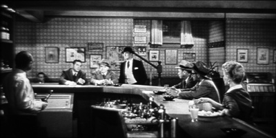
Moreover, SuperScope prints of While the City Sleeps do exist. I found one in a European archive some years ago. It was pretty fuzzy (a chronic problem with SuperScope prints, because of the rephotography involved), but I took some frames from it. Here are some comparisons with the 1.37 DVD.
For my purposes here, I could have simply cropped and blown up the full-aperture frame grabs, but I’d rather preserve the slightly bulgier quality that seems to have come with the anamorphic optics. Also, because the wider versions are from 35mm frames, they include a little more area on the sides, which is lost in video versions like my DVD grabs on the left.
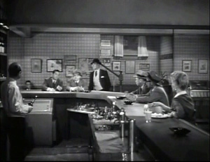
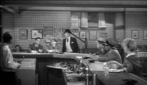
Actually, the widescreen version isn’t terribly offensive to me. For one thing, it slices off that slab running across the top of the bar set in the first image above. But in some cases the change in shot scale and internal relations make for mild differences in emphasis. The SuperScope version brings characters quite a bit nearer to us. Do they also seem seem closer together? There’s also the matter of taste. Some will dislike the headroom in the left shot below, while noting that the right one looks like a classic early ‘Scope composition.
So which one is the original? You can sample the online cinephile discussions from 2003 onward here and here and here. The ever-diligent folks at DVD Beaver have much to add as well.
Fortunately, about five minutes of snooping in the Variety vault reveals the answer.
Joseph and Irving Tushinsky yesterday concluded a contract with RKO for conversion of “While the City Sleeps” into the SuperScope process for foreign release (“SuperScoping ‘City,’” Variety, 12 April 1956, p. 3).
According to other stories in Variety, several films were given the SuperScope treatment ex post facto, including a re-release of Olivier’s Henry V (1945).
So we can confirm the hunch expressed by some of the cinephiles above that the SuperScoped copies were destined for overseas screenings. The Variety vault proves useful for things both great and small. Okay, mostly small, but you get my point.
Scoping things out: An epilogue for ratio fetishists
SuperScope logo for Invasion of the Body Snatchers.
There’s still all that headroom in the full-frame images. That roominess is fairly uncharacteristic of Lang. In his pre-widescreen films, he used the whole frame, even the corners. Try SuperScoping this tightly-packed shot from Kriemhilde’s Revenge.

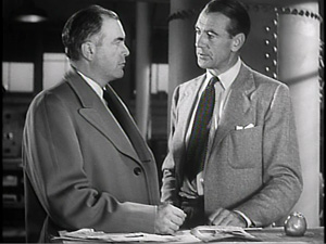
In Cloak and Dagger, Cooper’s character uses the apple on the workbench to explain the power locked up in the atom, and apples will become thematically significant in a later Adam-and-Eve scene.
Moonfleet also takes advantage of the lower right corner (see the image at the very end of today’s entry). But Lang’s last two American films, While the City Sleeps and Beyond a Reasonable Doubt (1956), seem to me to have more open and less compact compositions. There’s quite a bit of unused furniture in City‘s mise-en-scene, even though it adds a Vidor-Fountainhead air of vastness.
At this point we should recall that by 1956, most U. S. theatrical releases were shown in something wider than 1.33. There was a lot of variability, but films were commonly cropped in printing or projection to 1.66 or 1.75 or 1.85. Even if Lang did not shoot City with an anamorphic ratio in mind, he might well have assumed there would be cropping to some wide ratio. The approximately 1.75 ratio seen on the laserdisc version looks like a reasonable compromise between the extremes.
I’m inclined to say that Lang expected the film to be cropped somewhat in projection, but probably not to the full 2.0 proportions. He could no longer count on projectionists’ framing a single ratio, so he doesn’t tuck details along the edges or into the corners.
Unfortunately, I can’t find confirmation of Lang’s wide-frame choices in the fabled Variety vault. But I’m still looking, there and elsewhere. And maybe some researcher reading this entry can clarify things further. In any case, Variety has given a magnificent gift to those of us interested in film history–who ought to be everybody.
The standard source on widescreen systems of the postwar era is Robert E. Carr and R. M. Hayes, Wide Screen Movies: A History and Filmography of Wide Gauge Filmmaking (Jefferson, NC: McFarland, 1988). Carr and Hayes discuss SuperScope, or as they call it SuperScope (the credit logo is actually in caps, as in SUPERSCOPE) on pp. 67-72 and list the films in that format on p. 104. They don’t include While the City Sleeps. See also Daniel Sherlock’s comments on the book at Film-Tech.
Writing this has led me to wonder whether the admiration of European, especially French, critics for While the City Sleeps is based on their seeing the anamorphic version. In their writings I haven’t found specific reference to SuperScope. Raymond Bellour’s probing 1966 essay “On Fritz Lang” is one of the few I know from that period to scrutinize the patterns of composition and framing in While the City Sleeps, but I can’t tell whether he’s referring to the widescreen version. An English translation is in Fritz Lang: The Image and the Look, ed. Stephen Jenkins; see pp. 31-35.
Although Turner Classic Movies has run While the City Sleeps in 1.37, the TCM website recommends that it play at 1.66. Interestingly, the illustrations in Tom Gunning’s Films of Fritz Lang are in about 1.75:1 ratio. Another SuperScope production, Jacques Tourneur’s Great Day in the Morning (1956), runs on TCM in this ratio. Since projectionists of the period, and still today, are fairly flexible about ratios, it’s possible that even anamorphic 2.0 SuperScope was projected with a little trimmed from the sides.
A DVD release of Invasion of the Body Snatchers includes both a SuperScope 2.0 version and a 1.37 one. But the 1.37 one is a pan-and-scan version of the SuperScope one, not the integral frame that SuperScope worked from. The DVD version of Slightly Scarlet from VCI International is framed at 1.78, and the transfer (of poor optical quality) has been bungled so that everything is slightly stretched left to right. Both Arlene Dahl and Rhonda Fleming are more zaftig than they should be.
For more on aspect ratios, you can go here and here on this site. I experiment with extracting ‘Scope proportions from a 1930s movie in a general essay on widescreen aesthetics, “CinemaScope: The Modern Miracle You See without Glasses,” in Poetics of Cinema, p. 323.
Correction (28 November 2010): The original version of the piece claimed that the Search function of the Hollywood Reporter website found only pieces published since the recent makeover. That was the case when I used it two weeks ago. A more recent search I conducted this evening turned up articles from throughout 2010. I have recast the entry to reflect this change.
PS (17 December 2010): More developments on the Hollywood Reporter backfile, and more on the uses of the Variety Vault are discussed in this later entry.
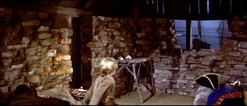
Moonfleet.


