


Archive for the 'Directors: Coens' Category
A well-deserved honor for Criterion and Janus
Blood Simple (1984).
We were delighted to learn that our friends at sister companies The Criterion Collection and Janus Films will be receiving an award at the upcoming San Francisco International Film Festival (April 21-May 5). It’s the Mel Novikoff Award, named for an important San Francisco art-house exhibitor. (The article linked above has a full list of past winners.)
The award will be given to the heads of the two companies, Peter Becker (Criterion) and Jonathan Turell (Janus), by Joel and Ethan Coen on April 30, when a restored version of their debut feature, Blood Simple, will be shown. Before the screening, the Coens, along with Amazon Studios executive Scott Foundas, will have an onstage discussion with the two honorees. (Tickets available here.)
For more on Criterion/Janus and our links with them, see our report on Peter and Jonathan’s 2013 appearance at Il Cinema Ritrovato and our discussion of our latest edition of Film Art: An Introduction.
P.S. 8 March: Thanks to Geoff Gardner for a correction.
Foreground, background, playground


The Devil and Miss Jones (1941); The Hudsucker Proxy (1994)
DB here:
I’ve been waiting for thirty years for Alice in Wonderland. No, not the theatrical release of Tim Burton’s version. That interests me only mildly. I’m referring to the DVD release of the 1933 Paramount picture. I saw it on TV as a kid, and remembered it only dimly. But it bobbed up on my horizon in the summer of 1981 when I was doing research on our book The Classical Hollywood Cinema.
 I was in the old Academy library in Los Angeles studying the emergence of certain compositional schemas. I can’t recall what put me on the track, but I requested the shooting script of Alice. What came was Farciot Edouart’s copy, over six hundred pages teeming with sketches for each shot. And a lot of those shots had a startling similarity to good old Citizen Kane.
I was reluctant to attribute pioneering spirit to director Norman Z. McLeod. Instead, I realized that these images’ somewhat freaky look owed more to one of the strangest talents in Hollywood history.
I tried to see Alice in Wonderland, but I couldn’t track down a print. So for years I’ve been waiting to find if it confirmed what I saw on those typescript pages. In the meantime, for the CHC book and thereafter, I’ve bided my time, sporadically looking in on the career of one of Hollywood’s most eccentric creators. He’s the subject of a new web essay I’ve just posted here (or click on the top item under “Essays” on the left sidebar). Today’s blog entry is a teaser trailer for that.
Deep thinkers

It’s commonplace now to say that Citizen Kane (1941) pioneered vigorous depth imagery, both through staging and cinematography. Many of the film’s shots set a big head or object in the foreground against a dramatically important element in the distance, both kept in fairly good focus. But where did this image schema come from?
The standard answer used to be: The genius of Gregg Toland and Orson Welles. In the 1980s, however, I wanted to explore the possibility that something like the deep-focus look had been a minor option on the Hollywood menu for some time. Once you look, it’s not hard to find Kane-ish images in 1920s studio films, from Greed (1924) to A Woman of Affairs (1929).


During the 1930s, William Wyler cultivated such imagery in some films shot with Toland, such as Dead End (1937), and some films shot by other DPs, such as Jezebel (1938). In turn, Toland had undertaken comparable depth experiments in films with other directors. Moreover, yet other directors, notably John Ford, had used this sort of imagery in films shot by Toland and others, such as George Barnes, Toland’s mentor. There are plenty of non-auteur instances too. (See my post on 1933 Columbia films.) We also find similar imagery in films from outside America. Here’s a stunner from Eisenstein’s Bezhin Meadow (banned 1937).

You see how complicated it gets.
What I concluded in Chapter 27 of CHC was that Toland and Welles didn’t invent the depth technique. They fine-tuned it and popularized it. Their predecessors, in the US and elsewhere, had staged the action in aggressive depth and used many of the same compositional layouts. But the wide-angle lenses then in use couldn’t always maintain crisp focus in both planes (below, American Madness, 1932).

Welles and Toland found ways to keep both close and far-off planes in sharp focus. They deployed arc lamps, coated lenses, and faster film stock. Although it wasn’t publicized at the time, we now know that some of the most famous “deep-focus” shots were also accomplished through back-projection, matte work, double exposure, and other special effects, not through straight photography. Again, though, this tactic was anticipated in earlier films. One of my favorite examples comes from a matte shot in Mr. Moto’s Gamble (1935).

Menzies seems to have planned for similar fakery. In the script for Alice in Wonderland we find: “CLOSE UP, leg of mutton. The room and characters in the background are on a transparency.”
The flashy depth compositions of the 1920s and 1930s were typically one-off effects, used to heighten a particular moment. Welles and Toland pushed further by making the depth look central to Kane’s overall design and by featuring such imagery in fixed long takes. The prominence of Kane may have encouraged several 1940s filmmakers, such as Anthony Mann, to make the depth schema part of their repertoire. But as the style was diffused across the industry, the hard-edged foregrounds became absorbed into dominant patterns of cutting and spatial breakdown. The static long takes of Kane remained a rare option, perhaps because they dwelt on their own virtuosity.
Digging up films made around the time of Kane, I found many filmmakers experimenting with the look that Toland and Welles highlighted. You can see touches of it in The Maltese Falcon (1941) and All That Money Can Buy (1941). Above all, there are two remarkable movies directed by, of all people, Sam Wood. Our Town (1940) turns Wilder’s play (itself surprisingly melancholy) into a Caligariesque exercise.

Several shots anticipate the low-slung depth, bulging foregrounds and all, that became the hallmark of Citizen Kane a year later.

Our Town also uses postproduction techniques that yield depth-of-field effects you couldn’t get in camera.

Perhaps even more startling is Wood’s Kings Row (1942), with deep-focus imagery that occasionally rivals Kane‘s.

From the evidence I was encountering, it seemed that Welles and Toland’s accomplishment was to synthesize and push further some deep-space schemas that were already circulating in ambitious Hollywood circles. Connecting some dots, I realized that one of the earliest champions of aggressive imagery in general, not just big foregrounds and deep backgrounds, was William Cameron Menzies.
Menzies frenzies

Menzies started out as an art director, most famously for United Artists. He designed sets for Mary Pickford’s Rosita (1923, directed by Lubitsch) and several Fairbanks films, notably The Thief of Bagdad (1924). He won the first Academy Award for set design and went on to a noteworthy career—most famously as production designer for Gone with the Wind (1939). He also directed films, such as Things to Come (1936) and Invaders from Mars (1953). Most significant for my purposes, he was production designer for Our Town, Kings Row, and three other films of the early 1940s directed by Sam Wood. And he designed the 1933 Alice in Wonderland. The drawings I saw in Edouart’s script were by Menzies or his assistants.
Menzies was one of the chief importers of German Expressionist visuals to the US. Although his early efforts leaned toward Art Nouveau effects, by the end of the 1920s he was cultivating a dark, contorted look keyed to the harsh geometry of city landscapes.

Since the late 1920s, Menzies had explored the possibility of steep depth compositions. He didn’t usually employ a big foreground, but he did favor overwhelming perspective–either abnormally centered or abnormally decentered. Here is his sketch for Roland West’s Alibi (1929) and the shot from the finished film.


Menzies loved slashing diagonals created by architectural edges and worm’s-eye viewpoints. The harrowing opening of Things to Come is full of such flashy imagery.


Menzies calmed his style down for GWTW, although the sequences he directed bear traces of his inclinations. And in his work for other directors he managed to slip in a few odd shots. Here, for instance, is a typically maniacal central perspective view from H. C. Potter’s Mr. Lucky (1943). Squint at this image and you’ll see that it’s weirdly symmetrical across both horizontal and vertical axes.

When he met Sam Wood, it seems, Menzies found a director ready to let his imagination roam further. In these collaborations, we get depth shots à la Welles and Toland, but also skewed perspectives. Pride of the Yankees (1943/44) searches for ways to make a baseball stadium look like a Lissitzky abstraction.

Menzies subjects the partisans of For Whom the Bell Tolls (1944) to his sharp diagonals as well.

Alice, we hardly knew ye
What then of Alice in Wonderland? Back in the early 1980s, I wasn’t permitted to photocopy or photograph script pages. Here is one of the few sketches I later found for the film. Alice crawls into the mirror with looming armchairs in the foreground.

Surely, I thought, the film would be an early example of the depth aesthetic that would be developed by Welles, Wyler, and Wood/ Menzies. Alas, the film has nothing like those imperious armchairs.

In fact, Alice proves a huge disappointment on the pictorial front. Menzies expended all his ingenuity on the special effects, coordinated by Paramount master Farciot Edouart. Although the spfx are not in the league of that other big 1933 effects-film King Kong, they are pretty solid for the time. It’s just that this remains a painfully arch, flatly filmed exercise.
But I look on the bright side. Menzies created some memorable movies, both on his own and with other directors. (Of his directed films, not only Things to Come but Address Unknown, 1944, remain of interest today.) Perhaps most important, his stylistic boldness may have encouraged other filmmakers to try something fresh. Most immediately there is Since You Went Away (1944), a big Selznick production that bears traces of the Menzies touch.

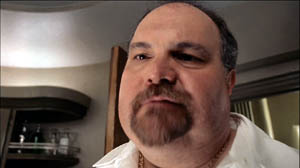
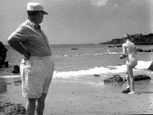
More broadly, Menzies represents a strand in American cinema that never really disappeared. His frantic Piranesian perspectives, canting the camera and filling the frame with grids, whorls, and cylinders, are still in use. And his head-on, wide-angle grotesquerie looks ahead to the Coen brothers. This shot of a department-store manager in The Devil and Miss Jones (1941) could come from any of their films.

Menzies’ films, though mostly not celebrated as classics, gave American cinema the permission to be peculiar. Meet me in the sidebar for a closer look at one of Hollywood’s most eccentric creators. Special thanks to Meg Hamel for going beyond the call of duty in posting that essay.


Invaders from Mars (1953); Shutter Island (2010).
Funny framings
DB asks: Can a film shot be amusing in itself?
Of course a shot can show us a gag that’s funny. If Jerry Lewis or Adam Sandler is going to fall off a ladder into a Dumpster, we want to see everything clearly. Here the framing can be modestly functional. But can the very choice of lens, angle, scale, or composition play a stronger role? Can camerawork itself provide the gag?
Barry Sonnenfeld, cinematographer for the Coens and now a prominent director, thinks so. He’s remarked that an extreme wide-angle lens is inherently funny. In the commentary for the DVD of RV, he explains, “You just put a big 21mm lens really close to [Will Arnett’s] face and you get comedy without him having to do anything.” I don’t have an RV frame handy, but here’s an example from Big Trouble, with both the wide lens and the low-angle creating the sort of grotesque disproportions that Sonnenfeld finds funny.
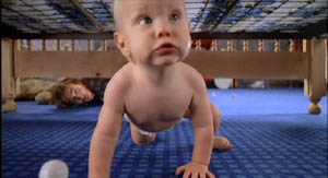
Sonnenfeld got this idea, he claims, by working on the Coens’ early films, which used wide-angle shots for cartoonish exaggeration. In Raising Arizona, the angle and lens length make the wandering baby loom; we’re not used to seeing an infant rampant.
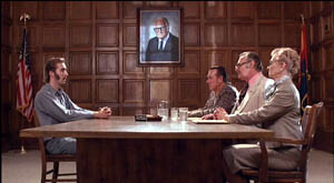
But the Coens had a broader approach to funny framings than Sonnenfeld acknowledges. For instance, they created humor by means of geometrical tableaus. In H. I.’s parole hearing in Raising Arizona, an absurd solemnity is set up by the symmetrical layout of actors. At the apex of the triangle, a portrait of Senator Barry Goldwater blesses the occasion.
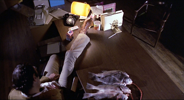
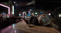
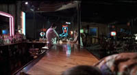
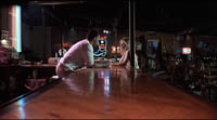
Even more memorable is the forward tracking shot down the bar top in Blood Simple. The camera, encountering a drunk sprawled in its path, simply crawls over him.
The silent comedians knew how to use camera position to build up their gags. Long ago Rudolf Arnheim praised the opening scene of Chaplin’s The Immigrant. As a ship rocks treacherously, we see Charlie from the rear heaving and kicking on the railing. As Arnheim puts it, “Everyone thinks the poor devil is paying his toll to the sea.” (1)
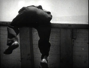
But then Charlie turns toward the camera to reveal he’s been struggling to reel in a fish.
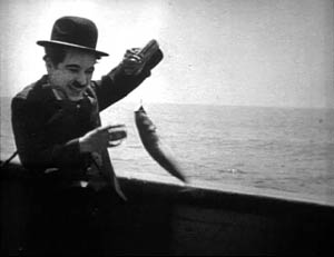
Here the framing creates the gag by what it doesn’t show. “The element of surprise,” Arnheim notes, “exists only when the scene is watched from one particular position.” The camera setup also makes an expressive analogy; we probably never noticed the similarity between vomiting and wrestling a fish.
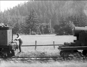
One of my favorite comic framings occurs in The General. Buster’s train is hurtling along, and a cannon on one car is suddenly trained on him. The first shot gives us the situation with maximum clarity, in a profiled shot. But then Keaton cuts to another angle, showing the cannon in the foreground and Buster trying to escape it.
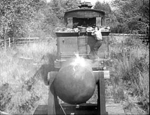
Nothing much has changed in the scene’s action, just the camera setup. But now we get to watch the cannon draw a bead on Buster. Audiences invariably laugh at this shooting-gallery image.
Jacques Tati is in many ways the modern heir of Keaton, and humor in his sequences often stems simply from a juxtaposition of elements in a single frame. An older man ogling a pretty woman on the beach is funny in a standard way, but in M. Hulot’s Holiday, we get more.
No words are spoken, but Tati’s staging and framing juxtapose the very different bodies in telling ways. We’re invited to note the difference between age and youth, paunchiness and health, passing yearning and its likelihood of fulfillment.
Play Time, Tati’s masterpiece and one of the greatest films ever made, offers an abundance of subtly comic framings. The shot below promotes the film’s theme that modern architecture has homogenized the world. The posters present the same building in different locales, with only stereotyped add-ons to distinguish the US, Hawaii, Mexico, and Stockholm. As one of the ladies on Barbara’s tour says, “I feel at home everywhere I go.”
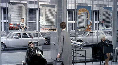
Again, though, a juxtaposition adds to the humor. Throughout Play Time, Tati suggests the disparity between the joy of travel as promoted by our culture and the stress of hustling from place to place. The promise of the posters is undercut by the dazed traveler who’s flopped underneath them, clutching maps and flightplans. And he in turn contrasts with the no-nonsense businesswoman on the far right.
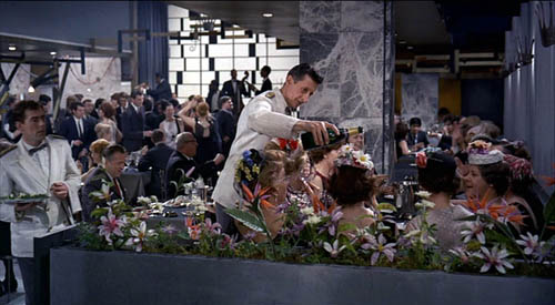
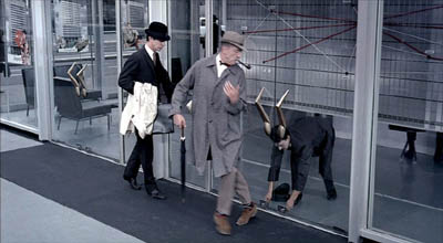
Tati can create comedy by the exact placement of the camera; a foot to the left or right and the gag would vanish. In the image at the start of this entry, the waiter is pouring champagne, but he seems to be watering the ladies’ flowery hats, which mask their champagne glasses. The same sort of exactitude of placement occurs in a shot we use as an illustration in Film Art (p. 195). M. Hulot is leaving an office building when it’s closing. As a guard locks down a doorway, his cap falls off and Hulot is startled: the guard seems to have grown horns.
Can we find funny framings in current films? Yes! I was prompted to write this blog while rewatching Shaun of the Dead. Zombies have overrun London, and two groups of human survivors meet. Shaun is leading one, Yvonne is leading the other. Instead of being presented as a mingling of the two groups, the scene plays out along two lines of people. Have a look.
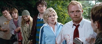
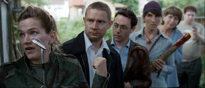
The gag’s premise is that each survivor has a counterpart in the other line. There are two posers in brown leather jackets, two can-do girls, two matrons, and two distracted videogame geeks. I wonder how many first-time viewers catch this? (Kristin did, I didn’t.)
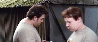
These mirror-image depth shots set up the real gag, which pays off in another clever composition. When the two groups set off on separate paths, each member passes and smiles awkwardly at her/his lookalike, while the framing underscores their likenesses.
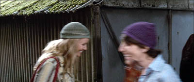
As they walk through the frames, the similarities increase.
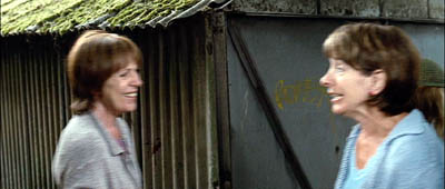
The framing makes a clever point about conformity and social stereotypes. Ending the procession with the two gamers, oblivious to the danger and to one another, tops the topper, as gag writers would say.
Tati would have loved these shots.
Of course I’ve simplified things for the sake of making my point. It’s not that the camera is somehow capturing a free-standing event by selecting the most amusing view. In all these examples, the staging is calculated to match the camera position. Staging, like camerawork and other film techniques, creates filmic narration. I’m only suggesting that in these scenes, the staging wouldn’t work on its own to create humor, nor would a simply functional framing. Choices of lens, camera position, and the like seem to be critical in making the gags work.
Finally, a borderline case that intrigues me. In last year’s Crank, our hero is in overdrive thanks to a constant intake of drugs. Stepping into an elevator, he faces a man who starts speaking Japanese. Naturally, his line is subtitled.
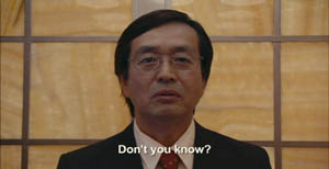
But then we get this:
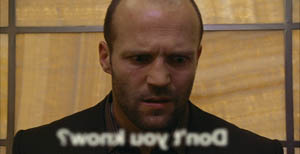
The idea of the head-on reverse angle is carried to comic extremes by reversing the subtitle as well (and blurring it to reaffirm the hero’s muzzy mental state).
I think that aspiring filmmakers can learn a lot from this tradition. Our films need more pictorial creativity, which often doesn’t require fancy CGI. Stylistic handling can add fresh layers to a basic story situation, and astute filmmakers can be alert to the possibilities of comic compositions and funny framings.
(1) Rudolf Arnheim, Film as Art (Berkeley: University of California Press, 1957), p. 36.
PS 4 May: Owen Williams writes to point out that the gag in Crank depends not just on a reverse framing but a play on the idea of lens focus. “The subtitle is fuzzy because it’s supposed to exist in real space (at least in this character’s head), with the letters hanging in mid-air in front of the Japanese man. Therefore in the reverse angle they appear out of focus (fuzzy) because they are closer to the camera. It’s a great gag.” Thanks, Owen.
PPS 8 May: I’ve gotten a lot of correspondence about this blog entry. Here are some nifty supplements:
Kent Jones was reminded of the shot in High Anxiety in which the camera moves to a picture window, with people dining behind it, and then crashes through the glass.
Sam Adams recalled a shot in Killer of Sheep that had something of the same effect, showing men trying to load a car engine onto the bed of a pickup truck. But the context isn’t itself comic. Sam reflects: “Based on the examples you choose, it seems that ‘comic framing’ invariably involves a level of self-consciousness, a feeling that the audience is being deliberately toyed with by the figure behind the camera. We get a sense that the scene has been staged for our amusement, rather than feeling that we must identify emotionally with whatever the characters are going through (which even in comedies is often quite sad).”
Stew Fyfe found a host of in-jokes in the Shaun of the Dead shots:
“Viewers of British television might notice an extra parallel between the shots. The actors playing each of the group leaders, Simon Pegg (Shaun) and Jessica Stevenson (Yvonne), were the leads in the sitcom Spaced (also directed by Edgar Wright, the TV predecessor to Shaun). Also split between the two groups are Lucy Davis (Shaun’s Group, hat) and Tim Freeman (Yvonne’s group, second in line), from original The Office and Dylan Moran (Shaun’s group, glasses) and Tamsin Greig (Yvonne’s group, hat), the leads of the sitcom Black Book. Yvonne’s mum (second matron) is played by Julie Deakin, who played the drunk and desperately lonely/horny landlady in Spaced.”
Thanks also to Bryan Wolf for a note on the same subject.
Finally, this from Jeremy Butler:
“I like your example from The General, but my favorite example of comic framing from Keaton’s work (and one I use in class to illustrate how he was more “cinematic” than Chaplin) is in Sherlock, Jr. Buster runs along the top of a freight train, and is then flushed to the tracks by a spout from a water tank. What makes it funny, I’d suggest, is the choice to frame it from the side, at a right angle to the tracks (much like the first General frame in your example). It minimizes the size of Buster’s body and contrasts him with the size of the train cars. Plus, it emphasizes the movements in opposite directions of his body and the train.
All these elements make it visually funny in a way that would not be apparent if it were filmed from an oblique angle or from behind the train.
But then, maybe I just like to show it because it’s the scene in which Buster literally broke his neck–which he didn’t realize until decades later when being x-rayed for something completely different!”
Thanks to everyone who wrote in with comments and who linked to this entry.


