




Archive for the 'Directors: Anderson, Wes' Category
THE GRAND BUDAPEST HOTEL: Wes Anderson takes the 4:3 challenge
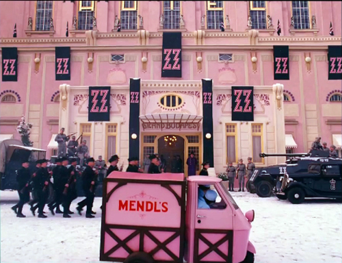
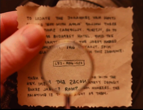
The Grand Budapest Hotel (2014).
DB here:
Be shot-conscious! I urged in a blog entry some years ago. I illustrated the point with a tradition of staging and shooting that seemed simple and modest but was actually quite flashy, and even fashionable. Although many filmmakers resorted to it, either often or occasionally, critics hadn’t attended to it. Wes Anderson’s work yielded one of many examples of what I called (swiping from art historian Heinrich Wölfflin) a “planimetric” style.
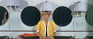
Ideally, you should look at that entry before reading this one. (To encourage you, I link it again. Not for the last time.) Very briefly, this style involves a frontal presentation of the action. You frame people against a perpendicular background, as if they were in a police line-up. Usually you face them to camera, as in this shot from Godard’s Made in USA.
As we’ll see, sometimes you can frame the characters at right angles to the camera, or turned directly away from the camera. Here are examples from Napoleon Dynamite and from Angelopoulos’ The Traveling Players. (Is this the first time these two movies have been mentioned together?)
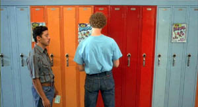
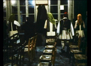
The key idea is that the people and the setting aren’t observed from an oblique angle; if the background is perpendicular, the people will stand or sit at 90 or 180 degrees to that.
You can arrange them in some depth too, but again, they are stacked in perpendicular fashion, making each area a pretty strict plane. Here’s an example from Pulp Fiction.
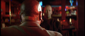
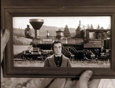
One point of my earlier entry is that this is a surprisingly old strategy; Keaton used it occasionally, and Godard was using it heavily fifty years ago. Here are two shots from Contempt (Le Mépris, 1963).
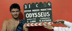
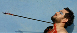
It has endured in some surprising places. It’s now a go-to option for one-off effects in mainstream cinema. Here are examples from Shutter Island and The Secret Life of Walter Mitty (2013 version).
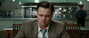
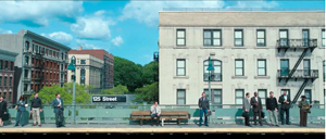
A few filmmakers make it the basis of an entire film, as I indicate in this entry on Oliveira’s Gebo and the Shadow. And since I wrote the original entry, I’ve drawn on other examples from time to time, particularly from directors who are pastiching Ozu to some degree or another.
Still, Anderson is today the most widely visible example of the style, partly because while others use it sporadically, he is single-minded about it. He has made people shot-conscious (at least when they watch his movies). So after seeing his newest film, I thought it would be fun to think about what distinguishes his approach.
Playing with planes
With the release of The Grand Budapest Hotel, several bloggers have pointed to recurring compositional features, most obviously bilateral symmetry. I’d just add that such symmetry is often used by practitioners of the planimetric approach, with results that sometimes exceed Anderson’s. Here are two shots from Angelopoulos’ Weeping Meadow.
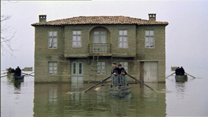
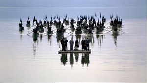
When you think about it, it takes a brave filmmaker (e.g., Godard) to use this approach and not deploy symmetry.

Anderson has used the planimetric approach more extensively in recent years, and he modifies it some distinctive ways. I think particularly of his habit of crowding people together in layers rather than stretching them along a single line. He makes some images look like group portraits or over-posed highschool yearbook shots (The Royal Tenenbaums; Fantastic Mr. Fox).

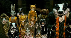
By employing the planimetric strategy, Anderson gains a somewhat awkward formality, a sense that we are looking from a distance into an enclosed world that sometimes looks back at us. There are as well the sort of comic possibilities that Keaton recognized in Neighbors and The General. A rigid perpendicular angle can endow action with an absurd geometry.
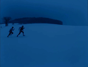
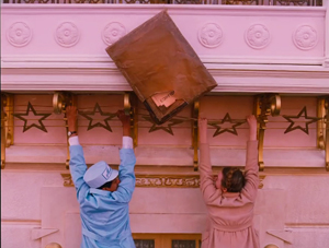
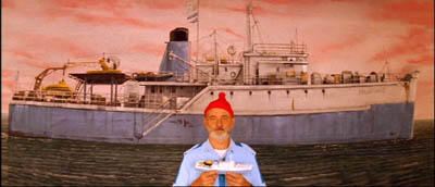
These apparently simple framings often evoke a world of childhood. Just as Kitano Takeshi shows us gangsters behaving like little boys, Anderson’s dollhouse-room frames make adults seem to be toy people arranged just so–like items laid out in a Joseph Cornell box. It’s a style suitable for magical-realist premises like The Life Aquatic with Steve Zissou, and in Moonrise Kingdom it finds its echo in children’s illustrated books.
All in all, then, I have to salute an American filmmaker who thinks about his images carefully and has incited sensitive viewers to notice them. I think we should go further, though. We can ask: How does Anderson, staying loyal to this tradition, vary the look of the shots? And how does he cut them together?
Cutting around
Consider the editing option first. Unless every scene is to consist of only one shot, the question comes up: How do you maintain the style while cutting? Either you make all your cuts axial, straight in or straight back.; or you create a sort of compass-point editing. This can involve cutting 180 degrees, to what’s “behind” the camera in the initial shot. So if characters are confronting one another, the camera is in effect sitting between them as each looks over or through the lens at the other (Ozu’s Late Autumn).
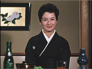
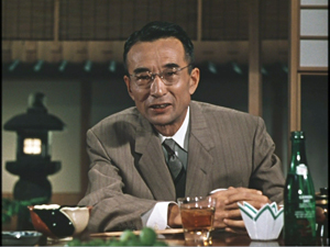
In effect, this option respects the classic 180-degree line, or axis of action, between the characters. It’s just that the camera sits right on that line. Parking the camera on the axis is a common tactic for subjective cutting, showing us first a person looking, more or less at the camera, then what she or he sees from their vantage point. Our example in Film Art: An Introduction comes from Rear Window.
Ozu used this 180-degree reversal often, but not absolutely; he had a more complicated way of conceiving space, and the 180-degree frontal cuts were only part of it. Kitano made a simpler variant central to his early films.
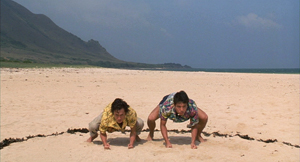
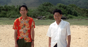
When I asked Kitano why he did it, he explained that it was exactly the way people saw each other in ordinary life. We face each other. He then added that he was such a naive director when he started that it was the only way he knew to set up scenes. We get kindred images in Terence Davies’ work; his frontality may owe something to the Hollywood musical.
Compass-point editing offers another possibility, that of cutting at 90-degree angles to the background plane or the figures’ position. Chantal Akerman does it throughout Jeanne Dielman 23 Quai du Commerce 1080 Bruxelles (1975).
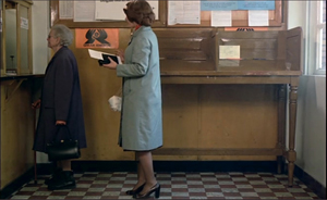
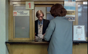
Anderson exercises all these cutting options inThe Grand Budapest Hotel. Here a planimetric profile 2-shot yields two frontal shots; we shift 90 degrees and then 180 degrees.
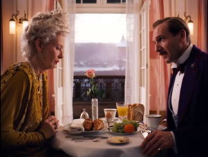
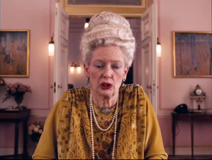
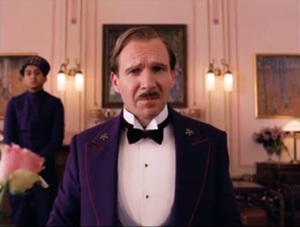
Now here’s a 90-degree shift for the reverse shot.
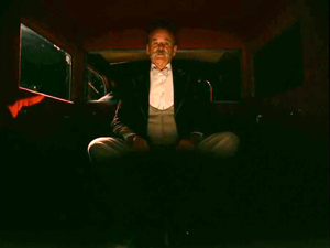
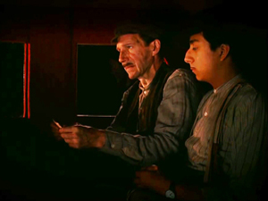
In the passage below, the first cut rotates 90 degrees, and the second cuts in right on the lens axis. In this tradition, an axial cut respects the perpendicular layout of the space.
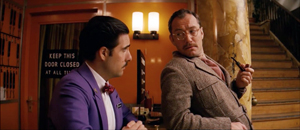
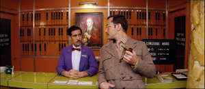
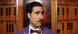
In such cutting patterns, the compositions keep the action in the same upper zone of the frame from shot to shot. As a result, our eye doesn’t wander much. In long shots, Anderson sometimes follows the classic Hollywood practice of allowing some decentering, as long as the cuts balance one off-center composition against another. Here the changing angles obey the compass-point principle across three shots, and they crisply shift the emphasis from the right side of the frame to the center to the left.
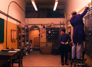
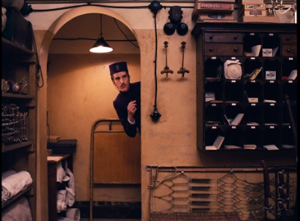
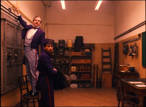
Someone who wanted to deflate Anderson’s visual ambitions could say that his shots are monotonous. Having imposed a big constraint on himself, he’s now obliged to show us that this approach can be varied–in obvious or subtle ways.
One way is through lens length. Most planimetric filmmakers use long lenses, which flatten the space even more. The figures can look like clothes hanging on a line. But Anderson favors quite wide-angle lenses (often 40mm). These make horizontal lines bulge, as in early CinemaScope films (Rushmore, The Life Aquatic).

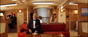
You can see similar distortions in the straight-on shots of the hotel desk in Grand Budapest, above.
Another way Anderson varies his images is by departing from straight-on angles. As long as the framing maintains a planimetric geometry, we can look down or up at the action. In this passage, again the camera makes 180-degree reverses. This contrasts with the more orthodox shot/reverse shot framings in a comparable scene in The Little Foxes.
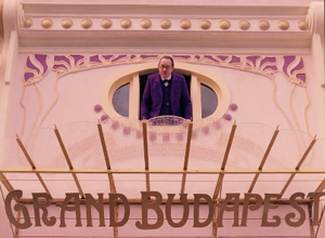
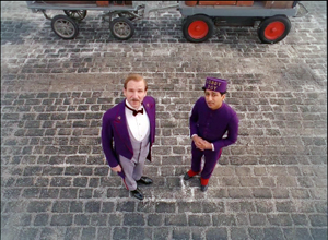
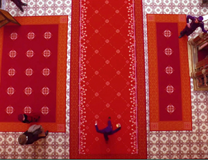
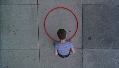
In this spirit, Anderson can give us bird’s-eye views, as Matt Zoller Seitz points out in his sumptuous book-length interview with the director. It’s rare, but there are precedents, as in the work of the Coens. In one shot of The Hudsucker Proxy, a movie with an inordinate number of straight-down angles, the inflexible framing creates a joke.
Grand Budapest Hotel has room for some classically funny framings. If you want somebody to look lonely, common practice says, frame the figure off center in a long shot. Here Anderson seems to be having a joke on the convention. He presents it as a POV, although presumably if the Writer were looking at the mysterious man he would put the object of attention in the center of his field of vision.
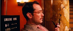
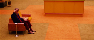
I think that Anderson’s earliest films weren’t quite so strict in obeying the planimetric and compass-point strategies. Those options were often slipped in as alternatives to more orthodox framing and cutting. But as he’s become more rigorous about using them, he has found ways to put his stamp on some common techniques. Like Ozu incorporating devices of classical continuity into his unique stylistic system, Anderson can recruit certain conventions while staying faithful to his basic approach.
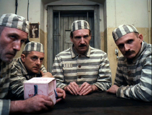
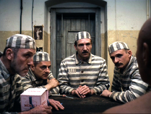
For instance, Anderson sneakily brings in the OTS–the over-the-shoulder framing standard in shot/ reverse-shot dialogue scenes. In one prison scene, Harvey Keitel’s Ludwig is granted an OTS that varies subtly from the more purely straight-on views.
Much the same thing happens with in the punching scene at the reading of the will, when frontal characters are assaulted by fists coming in as if in reverse angles.
Anderson has figured out another way to vary his compositions. I learned this before I saw the movie, thanks to some comments by the cinematographer Robert Yeoman (great name).
High or wide, and handsome
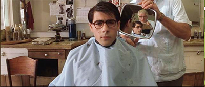
Rushmore (1998).
To get the criticky part of this entry out of the way: The Grand Budapest Hotel has all the charm, fussiness, and intricate whimsy typical of Anderson’s work. As often in his films, it cuts its preciosity with moments of offhand brutality (sliced-off fingers) and flashes of naughty sexuality (fellatio, the lesbian painting). With its ensemble cast, sometimes deployed in cameos, it suggests a PoMo remake of those sprawling, self-congratulatory spoofs of the 1960s like The Great Race, Those Magnificent Men in Their Flying Machines, and It’s a Mad, Mad, Mad, Mad World. (The film’s title evokes those all-star films set in hotels, like Grand Hotel and Hotel Berlin.) It’s much better than those, partly because it engages in an oblique way with history, creating a comic-pathetic alternative account of Nazi imperialism. It imagines the collapse of Europe in operetta terms, filtered through Anderson’s pawky humor and distinctive style. I admired the film but don’t feel able to analyze it much after only one viewing. Fortunately for me if not you, its stylistic aspects fit today’s sermonette.
The Grand Budapest Hotel is set in several time periods, and they’re presented via The Blog’s old friend, the device of flashbacks within flashbacks. One character recalls the past or tells a story, and inside that line of action another character recalls or recounts a story, and so on. In Grand Budapest Hotel we move from the present, more or less, to events in the 1980s, then the 1960s, and eventually the 1930s, which constitute the central episodes.
Anderson has shot the frame stories in different aspect ratios. It’s 1.85 for the near present and the 1980s, when the Author recounts meeting the hotel owner. That meeting, set in the 1960s, is shown in 2.40, the anamorphic aspect ratio. The central story, taking place in the 1930s, is presented in classic 1.37, or 4:3 imagery. With typical Anderson butterfly-collector wit, each era gets a ratio that could have been used in a movie at the time. It’s remarkable that Anderson could persuade Fox Searchlight to let him do this.
Most commercial releases in the 1950s and afterward were filmed in some widescreen ratio. In the early days, a popular option was a sort of clothesline staging, centering a single character or balancing others around the central axis: two side by side, three across, four as a pair of pairs, and so on. These shots are from Demetrius and the Gladiators and How to Marry a Millionaire.
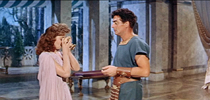
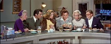
Thanks to the widening of the frame, there is less air above the characters and less ground below them. The empty spaces are typically on the sides, particularly in the anamorphic 2.40 ratio. The problem of filling that up was solved, at least for some directors, by moving the camera very close to the actors. Spielberg remarked that he began shooting more close-ups when he filmed in anamorphic.
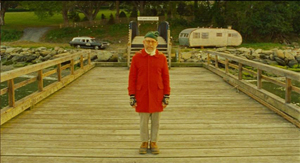
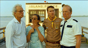
If you’re inclined to the planimetric approach, it fits the wider format nicely. Anderson wasn’t worried by the extra acreage; he just used the set or empty areas to balance one side against the other. Shots of only one character could be centered, as if posed, and shots of groups could be arranged more or less symmetrically, as in this passage from Moonrise Kingdom. Central perspective helps drive your eye to the main items.
In Grand Budapest, Anderson’s signature framings fit snugly into the scenes shot in 1.85 and 2.40. (The latter has been his favored ratio over the years.) But what about the 1.37 scenes? This brings me to Mr. Yeoman’s remark.
Explaining why he and Anderson watched a lot of films from the 1930s, especially by Lubitsch, Yeoman notes:
We looked at those more to familiarize ourselves with the 1.37:1 aspect ratio, which Wes wanted to use for the 1930s sequences. This aspect ratio opens up some interesting compositional possibilities; we often gave people a lot more headroom than is customary. A two-shot tends to be a little wider than the same shot in anamorphic. It was a format I’d never used before on a movie, and it was a fun departure. You can get accustomed to 1.85 or 2.40 to the point that the shots become more predictable.
Put it another way: Anderson’s penchant for centering and symmetry inclines him toward widescreen compositions that could be simply cropped right and left to fit the 1.37 ratio. His single characters and huddled groups could remain much as before. But in more distant framings you might get a lot of extra space at top and bottom–areas that simply aren’t there in the wide ratios. In other words, Anderson’s multi-format strategy gave him a new problem in maintaining his signature style.
How did he solve it? Many Budapest Hotel shots do leave considerable headroom, as you see in most of the 1.37 examples above. But other shots show Anderson filling his 4:3 frame in varied and engaging ways.
As Ozu showed, for instance, the planimetric option can fill the frame’s upper area when the camera height is below eye level. During the conversation in the car, above, Anderson gets the head of M. Ivan (Bill Murray) in the top of the frame thanks to a low angle. Here are two more examples of filling the upper reaches of the format by use of a lowish camera position.
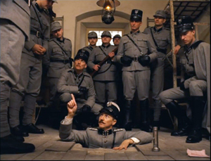
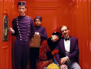
In the elevator shot, the headroom becomes comic, with M. Gustave and Madame D. seated on the right, the morose bellboy filling the vertical area on the left, and Zero in the middle. The empty space above the couple creates a lively imbalance emphasizing them in a way different from the very balanced framing that centers Henckel among his men.
The set can cooperate. In the first shot below, Zero’s and Agatha’s centered embrace leaves lots of headroom, but the slightly disheveled stack of pastry boxes in the upper background contributes to the sense that they’re engulfed. In the second shot below, part of its humor comes from the rigid geometry of the grid and the way M. Gustave and his colleagues fill in the matrix with their intent faces and busy hands.
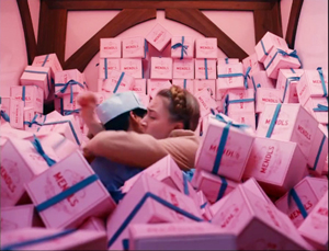
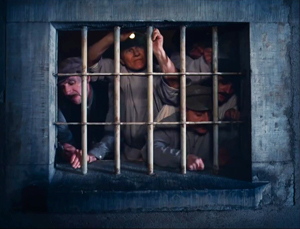
In all, Anderson seems to me to find intringuing ways to create visual interest in the 4:3 format. But as with any severe style, you wonder about what’s been lost.
Most obviously, Anderson loses some of the intimacy that comes with more angular and less strict approaches to the classic ratio. We like to see people from 3/4 views too. We also like depth shots that plunge us into a dynamic, diagonal playing space. Here’s a shot from John Huston’s In This Our Life, as precious in its own way as Anderson’s imagery.
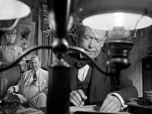
As Hogarth pointed out, with the serpentine line in painting and drawing, such shots can lead our eye on “a wanton kind of chase.”
Because directors of the 1920s-1940s accepted a wider range of compositional options than Anderson embraces, headroom simply wasn’t an important problem, as in the Huston shot. Even in simpler shots, classical uses of the 4:3 ratio permitted a flexible organization of figures.
Centered symmetry against a flat ground is a fairly easy compositional strategy, after all. It wasn’t used much in the mainstream tradition because it looks artificial; perhaps only with the rise of art cinema was this sort of self-conscious composition welcomed. In any case, sticking with symmetry sacrifices the more delicate spotting of figures and faces around the frame.
A lot of visual art tries for more supple and subtle twists, torsions, and counterbalancing. Apart from organizing your space along the horizontal and vertical axes, you can try to set figures in delicate array along diagonals. This is why some old-time cinematographers argued that the 4:3 ratio was the best suited to the human body: it can flatter it from any angle.
To get a sense of these possibilities, I’ve compiled a little collection of images from a film that doesn’t boast any outrageously pretty shots: Otto Preminger’s Angel Face (1953). It’s typical of the unassertive approach we find in Preminger’s work of the 1940s and 1950s. He avoids the flashy depth of the post-Kane directors and offers something less aggressive but no less fascinating. Composition and staging integrate expressions, posture, glances, and gestures to create a smooth flow of action. My samples also indicate how rare straight-on views of faces and bodies are in American studio cinema. The 3/4 angle rules.
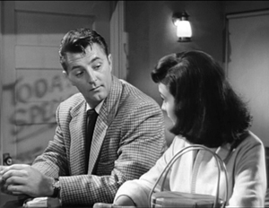
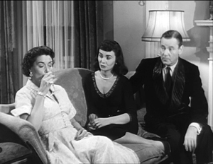
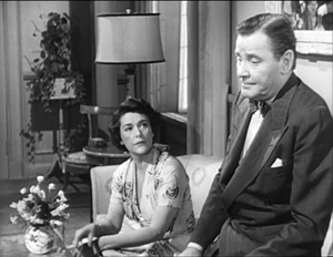
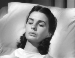
As with the American films of Lang, Preminger’s work displays a style that’s tough to analyze because the technique isn’t obvious. There’s a marvelous variety in the ways that the 4:3 ratio can render a single figure or two figures, or three, shifting them not around the perfect center of the picture format but around curves and diagonal axes–that yield interest in their own right.
This last comparison isn’t a slam on Anderson. I think well of many of his films, particularly the most recent ones, and I appreciate anyone who takes on a challenge of narrowing his range of creative choices. Once you narrow that range, it turns out there’s a host of new possibilities that pop out. Call it the Ozu strategy: refine your means and you discover nuances nobody else notices.
Still, in art as in life, every choice is a trade-off. It’s worth remembering what one loses by pursuing a particular path. By sticking to his signature look in working with 4:3, Anderson gave himself a problem that didn’t exist for directors of an earlier time, the problem of maintaining a frontal style in a squarish format. I’m glad he faced it and solved it. But I’m also glad that classical filmmakers, quite intuitively, showed how much you could do with an alternative option.
Without any conspiring between us, Matt Zoller Seitz, top expert on Wes Anderson, has just urged critics to write more about film form–to be, among other things, shot-conscious.
Iain Stasukevich’s American Cinematographer article on the making of The Grand Budapest Hotel is well worth your attention beyond the technical matter I latched onto.
The Huston image came to hand because of the previous entry. Go there for more instances of the sort of framing and staging that Anderson and his planimetric colleagues don’t aim at.
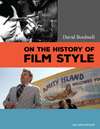
I survey the planimetric style in On the History of Film Style and in Figures Traced in Light. A search of this blog’s archive will bring other instances to light. I analyze Ozu’s style in Ozu and the Poetics of Cinema, available as a pdf here. For more on CinemaScope, you can visit my online lecture.
P.S. 27 March (Hong Kong time): Jonah Horwitz writes with a useful point:
One thing I would add to your summary is that as early as Rushmore, most notably in The Darjeeling Limited, Anderson purposely inserts into his limited stylistic palette selected, isolated “foreign” devices like loose framings, handheld camera, and relatively aimless zooms (as opposed to his more common precise shock-zooms). In some cases, as in the drama-club staging of “Serpico” in Rushmore, these devices serve as citations, in that case to “realist” New Hollywood cinematography. But they also feel very much like the exceptions that prove the rule: they stand out from his usual stylistic register so much that they effectively reinforce the latter. I’m looking forward to seeing Grand Budapest to see if this continues, or if he emphasizes instead a further refinement of his typical gestures.
I agree with Jonah that importing foreign devices often throws into relief a filmmaker’s signature style–a matter of a film’s intrinsic norm getting reinforced by some marked deviation from it. I think of Ozu’s pans or tracking shots, which occur in all his black and white films, and which often just remind us how narrow the style is in the rest of the movie. And sometimes, as in The Flavor of Green Tea over Rice, those camera movements are hybrids or compromises with with his static style. Thanks to Jonah for corresponding.
P.P.S. 27 March: This entry has been revised to eliminate an error. Originally I had said that the play with aspect ratios in the film wouldn’t have been possible before digital projection. Bryce Utting wrote to point out that it was indeed possible on film, since Peter Greenaway’s Pillow Book used both 1.85 and anamorphic widescreen. I had even seen the film and forgotten that! Thanks to Bryce for the correction.
P.P.P.S. 30 March (Hong Kong time): Jim Healy, impresario of our Wisconsin Cinematheque, writes to point out several other films that mix aspect ratios:
The first hour of Redford’s The Horse Whisperer, the urban-set part, is in 1.85. When the characters make it to the open horse country, the image widens to ‘scope. . . . The 2002 Disney animated feature Brother Bear (which isn’t so bad) is 1.85 for about the first 20 minutes and when the principal Inuit character (voiced by Joaquin Phoenix) is transformed into a bear, the picture goes to Scope.
The Grand Budapest Hotel (2014).
Shot-consciousness
Most professional critics seem uninterested in the film shot as a shot. They might notice when the images call flagrant attention to themselves, as in Zhang Yimou’s recent films, or in those protracted walk-and-talk Steadicam takes. On the whole, though, reviewers prefer to talk about plot and acting.
Granted, it’s hard to be aware of shots, especially if you get engrossed in the story. But if we want to be fully alert to how movies work on us, we should keep our eyes open. Back in 1968, I read The Moving Image by Robert Gessner, one of the first teachers of cinema studies in the US. There Gessner offered a sturdy piece of advice: Be shot-conscious.
About twenty years later, trying to be shot-conscious and all, I started to notice a certain type of image becoming more common, especially in European and Asian films. Then it started to appear in US films as well, especially indie items. Now it’s very common everywhere, though it’s still not the predominant sort of shot.
Here’s a fairly early example, from R. W. Fassbinder’s Katzelmacher (1969).
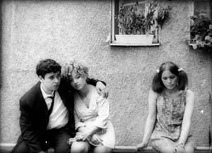
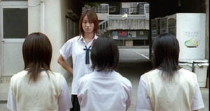
How to characterize it? The camera stands perpendicular to a rear surface, usually a wall. The characters are strung across the frame like clothes on a line. Sometimes they’re facing us, so the image looks like people in a police lineup. Sometimes the figures are in profile, usually for the sake of conversation, but just as often they talk while facing front.
Sometimes the shots are taken from fairly close, at other times the characters are dwarfed by the surroundings. In either case, this sort of framing avoids lining them up along receding diagonals. When there is a vanishing point, it tends to be in the center. If the characters are set up in depth, they tend to occupy parallel rows.
Linda Linda Linda (2005)
No one to my knowledge had noticed this sort of shot, let alone named it. I started to call it mug-shot framing, but I found that art historian Heinrich Wölfflin had called it planar or planimetric composition. I went with “planimetric” because that term suggests the rectangular geometry so often seen in these shots.
What’s striking is that such imagery is quite rare before, say, 1960. We can find some examples, principally in silent comedy and especially the films of Buster Keaton (himself a pretty geometrical director). But in the 1960s, we find Antonioni and Godard using planimetric shots fairly often.
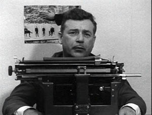
Vivre sa vie (1962)
This image design became more popular from the 1970s onward. Why? In On the History of Film Style and Figures Traced in Light, I tried to trace out some sources and functions of it. Briefly, I think that the planimetric shot emerged from filmmakers’ growing reliance on long lenses, which tend to create a flatter-looking, more cardboardy space than wide-angle lenses do. A telephoto shot makes an image seem less voluminous. It seems to be made of slices of space lined up one behind another.
Filmmakers began using long lenses for many purposes, often because of the demands of filming on location. And some directors realized that long-lens optics offered fresh resources for staging and composition.
For instance, the planimetric scheme is well-suited to a “painterly” or strongly pictorial approach to cinema. In Figures, I discuss two directors who made planimetric shots central to their style. Hou Hsiao-hsien saw very deeply into the possibilities of these shots; I think he learned it from his early skill at shooting on the street with long lenses. You can find more about that here. By contrast, Angelopoulos used the planimetric image in conjunction with architecture and landscape to create a sort of de-dramatized spectacle, a spare grandeur reminiscent of icon painting.
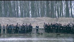
The Suspended Step of the Stork (1991)
The functions of the planimetric image can vary a lot. Often it’s used to suggest stasis and passivity, as in the Katzelmacher instance. Kitano Takeshi picks up on this sense of torpor in certain shots of Sonatine, which suggests that being a gangster means having a lot of time to kill just hanging out.
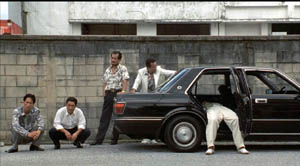
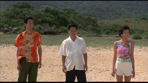
Kitano’s use of the image also suggests a kind of childish simplicity or naïve cinema. Unlike Hou and Angelopoulos, Kitano uses the planimetric schema as if it were just the most basic way to film anything. Line up your characters and shoot ’em, as if they were figures in South Park or Cathy.
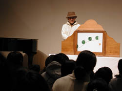
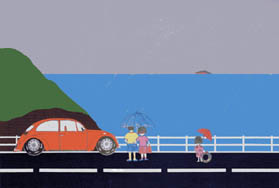
Kitano has compared himself to the kamishibai man, the street performer who narrates stories for children by flipping through illustrated cards, and Kitano’s paintings are more sophisticated, often planimetric versions of those drawings.
The planimetric schema can suggest something more oppressive too. That’s one purpose, I think, of certain shots in Terence Davies’ remarkable Distant Voices, Still Lives. The film’s stylistic system is quite rigorous in its use of straight-on compositions, and it’s worth more attention than I can give it here. For now I’ll just mention that the first part presents tableaux of unhappiness that suggest bleak family portraits.
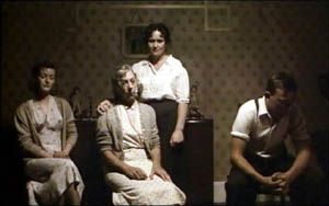
Here and more generally, the planimetric image often carries the connotations of a posed photograph. Possibly the dry, rectilinear imagery of Walker Evans and the wide-eyed attitudes of Diane Arbus’s portraits have contributed to the sense of stiff ceremony such shots sometimes have.
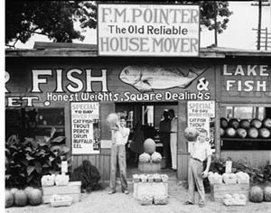
Walker Evans, Roadside Stand Near Birmingham (1936)
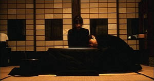
Asian filmmakers combined the planimetric image with very long takes. In Kore-eda Hirokazu’s Maborosi, Yumiko’s husband comes home drunk, a slip from his usual reliable habits. She has just been remembering her previous husband, dead in a bike accident. The rocklike stability of the shot, aided by the grid backing the characters, throws every gesture into relief, particularly when Yumiko’s face lifts slightly into and out of shadow in the course of the action.
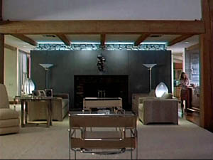
In the 1990s US indie filmmakers adapted this staging strategy. In Safe, Todd Haynes uses it to suggest the hard-edged sterility of the wife’s suburban life, which surrounds her with cubical furniture.
Wes Anderson used the image schema occasionally in Bottle Rocket but came to rely on it more and more. (He tended to use wide-angle rather than longer lenses, though; note the bulging effect in the Life Aquatic shot below.)
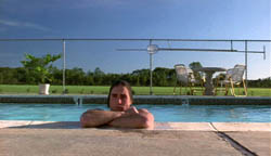
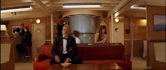
For Anderson, as for Keaton and Kitano, the static, geometrical frame can evoke a deadpan comic quality. This comes out as well in Jared Hess’s Napoleon Dynamite.
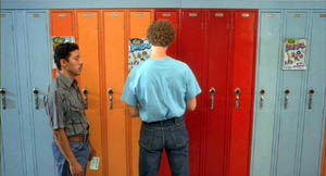
Initially, this scheme also helped filmmakers distinguish their work from Hollywood. Mainstream American films tend to film players in 3/4 views, except for certain situations, such as a theatrical performance or a scene showing a mammoth image display.
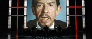
V for Vendetta (2005)
Some American directors seem to have used the planimetric shot decoratively, as a nifty one-off touch, as here in Kiss Kiss Bang Bang.
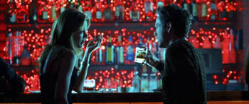
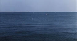
Many overseas directors who rely on this schema adjust their cutting accordingly. In Figures I called it compass-point editing. The usual tactic is to follow one planimetric shot with a reverse shot that’s also planimetric. In the first four shots of Kitano’s A Scene at the Sea, the camera angle switches either 180 degrees or zero degrees.
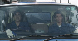
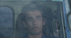
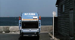
When I asked Kitano why he cut this way, he gestured toward me, then at himself. “When we are speaking, this is the way we look toward each other. It’s the most natural way to show a conversation.” Apparently this is why over-the-shoulder shots are pretty rare in Kitano’s films.
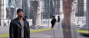
Planimetric shot/ reverse shot is seldom used in Hollywood films, and it seems to be reserved for certain confrontational situations, or institutional scenes (e.g., doctor/ patient conversations). It can sometimes suggest an unnerving or unnatural encounter, as in I, Robot. The detective Spooner is calling on his old friend Dr. Lanning, and their dialogue is shot in to-camera medium-shots.
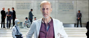
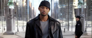
At the climax of the conversation, the camera takes up a 3/4 position and arcs around Lanning, revealing him to be only a hologram, presenting his dying message to Spooner. The planimetric image is motivated as suitable for a flat, virtual presence.
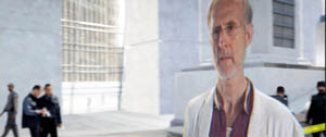
Proyas has cleverly prepared us for this subterfuge by ending the previous scene with an unremarkable planimetric framing on Spooner as elevator doors close on him.
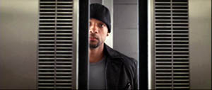
This shot leads directly to the initial shot of Dr. Lanning above, apparently addressing us, in a sort of shot/ reverse shot cut across two scenes.
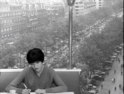
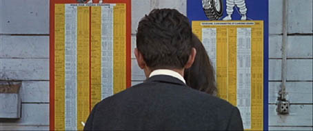
As we might expect, Godard, who helped disseminate the schema, is all up for upsetting it, in Vivre sa vie and Made in USA. The first shot below teases us to read the flat background as a high-angle vista; the second carries the idea of a conversation in a planimetric frame to a beautiful absurdity.
My quick survey doesn’t exhaust the various forms and uses of this strategy. I just wanted to show how shot-consciousness can lead us to notice when filmmakers take up new pictorial tools and modify them for particular purposes.