


Archive for March 2016
A Hobbit is chubby, but is he pleasingly plump?
Kristin here:
Some readers have been kind enough to ask if I would be writing a wrap-up entry on The Hobbit: The Battle of the Five Armies now that the entire set of Peter Jackson’s films have appeared, including the extended edition of the last part. I was somewhat hesitant to do so. Five Armies is my least favorite among the six parts, and I have many fond associations with researching and writing about the Lord of the Rings films for The Frodo Franchise book and blog. Still, it makes sense to follow up on my previous comments on the strengths and weaknesses of the two earlier parts of the HOB trilogy and suggest how they continued on into this concluding chapter.
I have previously blogged three times about The Hobbit at intervals since just before the release of the first part. In September of 2012, I posted “A Hobbit is chubby, but is he padded?” In it I discussed the July 30 announcement that the film would be released in three parts rather than the originally announced two. I expressed cautious optimism, suggesting that there was enough material in the original novel plus the appendices of Tolkien’s The Lord of the Rings to create a film reasonably faithful to the original.
In mid-January of 2013, I posted a follow-up entry, “A Hobbit chubby, but is he off-balance?” The first part of the film, An Unexpected Journey, had been out for about a month, and I felt the additions mostly worked well, or at least were acceptable. I still think the first part is the best.
Almost exactly a year later, I added a third entry, based on the release of The Desolation of Smaug: “Is Tauriel more powerful than Eowyn? and other questions we shouldn’t have to ask.” By this point I felt that the project had considerably strayed in directions that betrayed Tolkien’s source material. As the title implies, I felt that the modest “prequel” film had also begun to swell inordinately and threatened to overshadow the fine trilogy that the filmmakers had made earlier.
These problems are even more evident in the final installment.
Marvelous moments
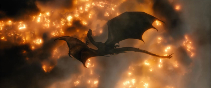
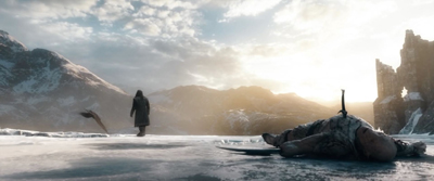
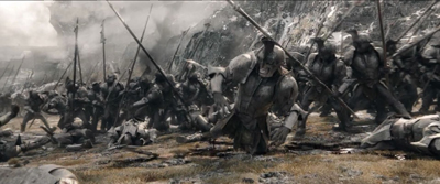
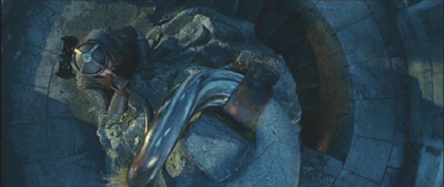
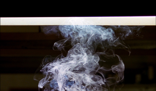
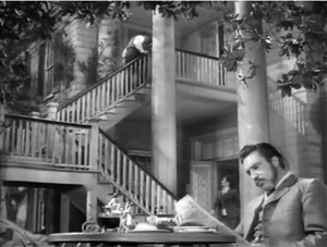
To be sure, there are some impressive shots and scenes in the final film. In the opening sequence of Five Armies, Smaug’s flights over the town and his confrontation with Bard are the most impressive parts of the scene, and the dragon’s death is appropriately enough its high point, both literally and figuratively. The overhead shot of his lifeless body drifting downward, seen against the inferno that he has created, is one of the best of the film (see top). It recalls the marvelous shot of him at the end of Desolation, emerging from Erebor covered in the coating of molten gold that the Dwarves had hoped would kill him and rising into the sky as he effortlessly shakes it off.
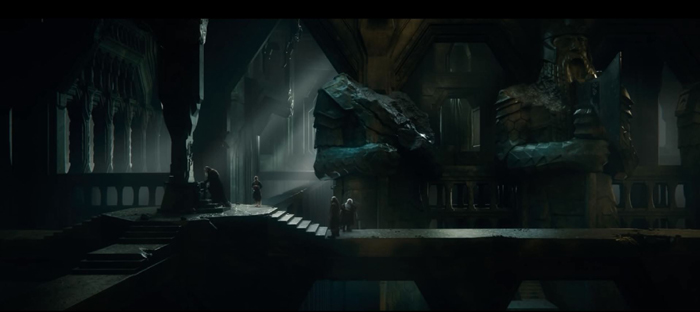
Some of the later shots in Erebor are wonderful as well. (See the image at the bottom.)
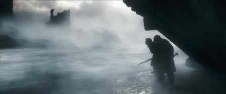
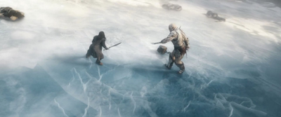
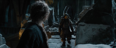
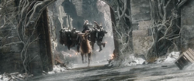
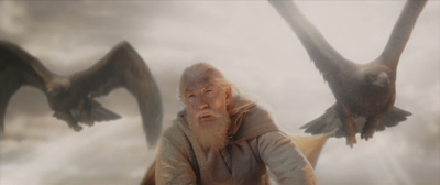
The climactic confrontation between Thorin and Azog on the frozen lake has been widely praised. It’s a complete invention of the filmmakers; there is nothing like it in the novel. It contains many lovely shots which, I must say, provide a welcome change from the crowded battle scenes. The lake is introduced as Kili and Fili creep along its edge, hoping to reach the summit of Ravenhill, where Azog had been located as he commands the battle. (See top of this section.)
The confrontation itself contains many impressive compositions, both as the two competitors circle each other and later as Thorin, mortally wounded, watches the Eagles swooping as Azog’s corpse lies in the foreground.
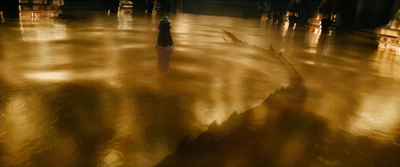
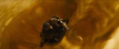
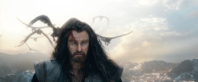
Surely one of the film’s best scenes is the one where Thorin, driven nearly mad by his obsession with the treasure, wanders on the solid-gold floor left behind by the failed attempt to kill Smaug by flooding him with molten gold. We see him wander over the floor as a hallucinatory vision of Smaug slithers through the gold below him (left). Finally Thorin imagines himself sinking into the gold 9Right), an overhead shot that echoes the one of Smaug’s death at the top of this entry.
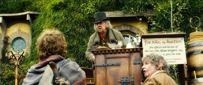
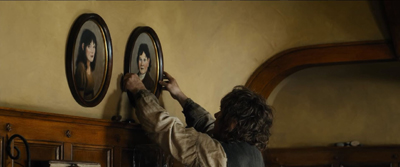
Another very different high point is Bilbo’s arrival back at Bag End only to find himself presumed dead and an auction of his effects going on. No doubt fans were looking forward to seeing this scene from the book, and it delivers considerable humor as well as poignancy once Bilbo gets inside his nearly empty house and replaces the portraits of his parents on their hooks.
Gaps and missed opportunities
Some things that one would expect to see in the film are simply not there. In the opening framing scene in Unexpected Journey, the elderly Bilbo remarks that the little trunk in which he has stored the treasured objects from his adventure still “smells of troll.” In Unexpected Journey we see the Dwarves bury treasure in trunks, so that it may be collected later. In Five Armies, we see Bilbo carrying his trunk on his journey as he nears home. Yet we never see him and Gandalf return to the scene of the encounter with the trolls and dig up the treasure. In the book, they do so and agree to divide the loot. Why bother to place such emphasis on the trunk and show Bilbo taking it home with him if the story does not include him retrieving it on the way back to Bag End? We last saw the trolls’ trunks two films ago, and surely at least a mention of their retrieval would remind those unfamiliar with the book where Bilbo got this rather large piece of luggage. Surely at least in the extended version a minute or so could have been spared from the overextended battle scene.
As to gaps, the big battle at Dol Guldur ends with Saruman telling Elrond to take the weakened Galadriel back to Lothlorien and “Leave Sauron to me!”
This is one the largest dangling causes in the film, and yet it never comes to anything. In between the Hobbit and LOTR films, Saruman seems to have come under Sauron’s sway, but there is no indication as to how that might have happened. Causes that dangle need to be taken up and explained.
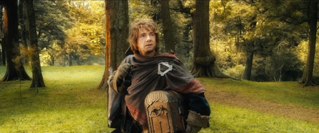
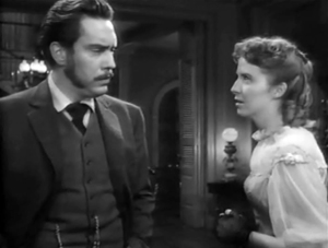
More generally, fans have complained that Bilbo often seems to be missing from his own story.
The original novel is told almost entirely from Bilbo’s point of view. There are only a few scenes where he is not present, and his personality gives the book considerable unity of narrative tone. In Martin Freeman, the filmmakers found the perfect actor to portray him. It is a pity that Bilbo has to cede so much of his screen time to Azog and Bolg and Alfrid and even Tauriel, pleasant though she is in some ways.
The expanded edition
As with all five other parts of this serial, Five Armies was released in an extended version. This added 20 minutes, as compared with 13 minutes for An Unexpected Journey and 25 for The Desolation of Smaug. (For a list of which scenes were extended or added to all three parts, see here.) In the two previous parts, the additions were mainly more conversations and characterization. In Desolation, for example, the brief scene of Gandalf, Bilbo, and the Dwarves visiting Beorn were significantly expanded. In Five Armies, however, much of the extra footage expanded the already lengthy battle scene. There are some pluses and minuses in this new material.
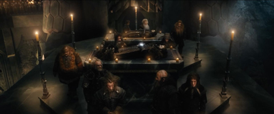
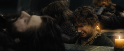
Fans of the book were particularly annoyed by the elimination of the funeral of Thorin, Kili, and Fili, and a short but touching scene of the Dwarves and Bilbo grieving over their bodies was restored. This scene establishes that the Arkenstone, the cause of so much strife, has been returned to Thorin and will rest on his body, thus wrapping up the question of what ultimately happened to it.
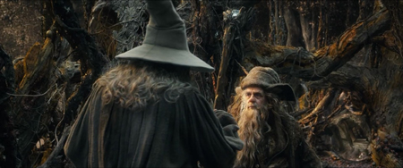
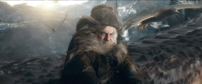
A few additions provided explanations for plot points, as when Gandalf visits Radagast’s home after being rescued from Dol Guldur and receives Radagast’s staff to replace his own–thus confirming fans’ speculations about where he got the new one. (See above.)
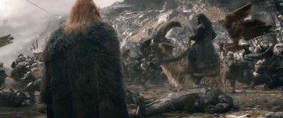
Whence came the giant rams on which Thorin, Kili, Fili, and Dwalin ride up Ravenhill? Now we learn that they were the mounts of part of Dain’s Dwarf army.
By the way, I’m puzzled by the Hobbit film’s the obsession with using odd animals for transportation: Thranduil’s elk, Dain’s hog, other Dwarves’ rams, and Radagast’s bunny sled. The only one that comes from the book is the habit of orcs riding wolves and wargs, though we do know from LOTR that Dwarves don’t like riding horses–but Elves certainly do.
The one quiet conversation that was added has Bilbo talking with Bofur (in a track entitled “The Night Watch”). Bofur strongly hints that Bilbo would be justified if he simply slipped out and returned home before the battle starts, but Bilbo assures him he’s not leaving.
I suppose it’s a nice little reversal in the scene in Unexpected Journey when Bilbo does try to slip out of the cave in which the group are sleeping and go home. There Bofur spots him and kindly wishes him well. He is one of the few Dwarves that Bilbo seems especially to befriend, but it doesn’t really add much. In fact, about half of the Dwarves have been relegated to barely speaking. Some seem to have no audible lines, and some are barely glimpsed. It’s a considerable change from the earlier parts, where the writers took care to give each of them bits of business or dialogue.
One Dwarf’s role is considerably filled out from his relatively brief role in the theatrical edition. Dain Ironfoot, Thorin’s hog-riding cousin, now has considerable dialogue and swings a mighty war-hammer in battle. He is a much more comic character than in the book, which is unfortunate in that it makes him seem an inappropriate figure to replace the serious, majestic Thorin as King under the Mountain.
![Dain speaks to Elves [extra] p 2 back](https://www.davidbordwell.net/blog/wp-content/uploads/Dain-speaks-to-Elves-extra-p-2-back.jpg)
His salty language, though relatively mild as profanity (calling his foes bastards and buggers), is out of keeping with the language in the rest of the series. There is also some unintended humor as Dain and Thorin are able to pause in the midst of a crowded and chaotic battle to greet each other, exchange pleasantries, and discuss strategy, with the melee conveniently receding to provide them a little safety zone. Their discussion does help us a bit in understanding what is now an even more scattered, confusing battle scene.
Finally, we find out in this longer version how the comic villain Alfrid met his well-deserved end. Attempting to flee with some gold coins he has discovered, he hides on a catapult and inadvertently sends himself hurtling into the mouth of a large troll.
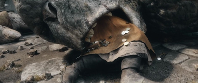
Alfrid, who does not exist in the novel, was a tolerable figure while the characters were still in Laketown and he could interact with the Master. Bringing him safely ashore and making him part of the actions of the citizens as they take refuge in the ruins of Dale, however, was in my opinion a big mistake. Without any justification, he becomes a sort of assistant to Bard. Fans widely expressed mystification as to why Bard and even Gandalf would give him important duties to perform when both should know that he is completely unreliable, foolish, dishonest, and selfish. In general he injects a humor that undercuts the serious nature of many of the scenes. He, like the Master, should have been left to go down with the ship back in Laketown.
Increased violence
Throughout the LOTR and Hobbit series, the filmmakers have pushed the limits of the rating system, always achieving a hard PG-13 label for both the theatrical and extended versions. With Five Armies, they have for the first time crossed the limit and been given an R rating, though only for the extended edition.
I see this as something of a betrayal of the fans, especially families, who have fallen in love with this franchise, sharing the films over many years. The reason for the R rating is probably entirely due to some extreme violence and cruelty. Certainly there is no sexual basis for such a rating, and the mild profanity mentioned above, introduced with the character of Thorin’s cousin Dain seems unlikely to have been a significant cause of the stricter rating.
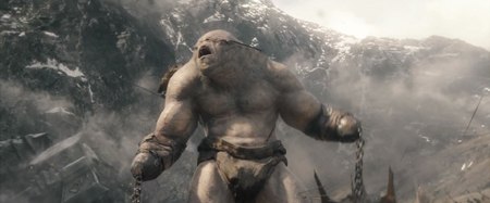
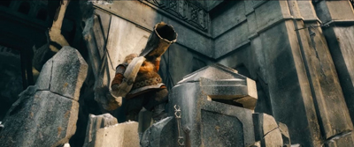
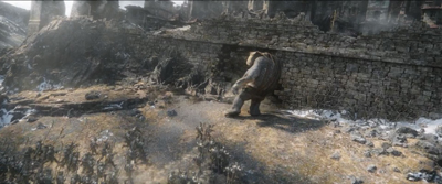
One particularly disturbing figure is a troll who figures prominently in the battle. He has apparently had all four limbs systematically amputated and replaced with prostheses in the form of giant metal weapons. Moreover, he is controlled by a rider who guides him with reins made of large chains attached to his blinded eye sockets with hooks. While most of the trolls who serve the enemy’s troops seem to do so more-or-less willingly, this one does so through sheer torture. This is all the more disturbing because at one point Bofur manages to gain control of this troll and delightedly uses him as a weapon in the same fashion, directing him with the reins and hooks.
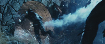
Apart from such scenes, there are numerous new moments where decapitations and amputations are copiously meted out, often in humorous fashion. In one scene Thranduil’s battle elk scoops up eight or so orcs, and the Elven King beheads them all with a single sweep of his sword.
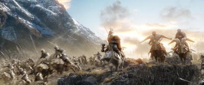
The chariot drawn by large rams has blades sticking out from the hubs of its wheels, and these provide the opportunity for much carnage, as when one cuts off a large orc’s legs and it staggers about on the stumps of his thighs or when a row of trolls are rapidly decapitated as the the chariot bounces past them.
I watch and write about movies for a living and have been exposed to a great deal of cinematic violence, but such scenes as these seem particularly out of place to me in a series aimed at an audience intended to include young people.
More echoes of LOTR
In the third entry, I discussed what I consider a serious problem with The Hobbit: the tendency to copy so many elements from LOTR.
Most crucially, I think, instead of using these already established characters in Desolation or just sticking more closely to the book, the filmmakers have introduced many new elements that are essentially diminished versions of characters and events in LOTR. That strikes me as a bad idea and perhaps really does betray a lack of inspiration. Already fans of the LOTR films have complained that so many echoes of LOTR appear in Desolation. Worse is to come, though. When people view LOTR as part of a series of six parts beginning with The Hobbit, they will end up seeing things in LOTR as echoes of Desolation. The result will be to rob LOTR of some of its originality and effectiveness.
Take Tauriel. She’s a pleasant, admirable character, with a stubborn, headstrong streak that keeps her from being bland. Evangeline Lilly’s performance strikes me as excellent. A lot of fans worried about her inclusion in the film but came to like her. They seem to see her as blending well into the world of the film. But there’s a reason for that. She does come from the world of LOTR.
Was it really a good idea to add a major character who’s basically a blend of Arwen and Eowyn? Doesn’t she make both of those characters less distinctive?
Similar things happen in Five Armies. Bombur blows a big horn outside Erebor during the Battle, just had Gimli had done to signal the big charge out of Helm’s Deep in The Two Towers (in a more impressive composition).
Yes, one takes place in daytime and is seen in low angle, the other at dawn and from above, but still.
Or take the appearance of the Eagles, which in both films drift out of the bright clouds in the background, their leader carrying a wizard. (Radagast does not appear at all in the book, let alone as part of the battle.)
The berserker troll that butts his head into the protective wall at Dale recalls the similar Uruk Hai with a torch who dived into a drain tunnel at Helm’s Deep, sacrificing himself to set off an explosive and create a similar entryway for the attacking army of orcs.
In addition, there’s the scene of the arming of the men and boys in Dale echoing the one in Helm’s Deep. Or Dale in flames, see from above and looking very like Minas Tirith in a similar situation.
I wish I could give the filmmakers the benefit of the doubt and say that these echoes are attempts to create motifs that would knit the two films into a single, unified tale. That’s not the effect of them, however. Aren’t these just repetitions without any real connections? Why would things so often happen in the same way? Doesn’t it distract from the drama at hand to keep thinking back to when we’ve seen something like this before? Wouldn’t we’d rather be seeing something new and original?
There should instead be more echoes like the one mentioned above, between the death of Smaug above a lake of fire and the scene where Thorin’s hallucinations are staged on a similarly glowing golden floor. That’s the way to create a rich narrative, and that comparison resembles nothing in LOTR–except perhaps the shot of Gollum, also seen from above, falling into the pit of lava. Whether or not the similarity of the two shots in Five Armies were intended to echo the Gollum one, it’s a reasonable comparison to make.
I haven’t yet tried the experiment of watching all six parts straight through, The Hobbit and then LOTR, to see how they work as a complete serial. More than ever I fear that the result will be to diminish LOTR, which is clearly the better of the two by a long way.
Basically I do not think that many of The Hobbit‘s problems result from the splitting of the adaptation into three rather than two parts. Done in service to the original book, it could have worked. Rather, those problems stem from a fundamental mistake made by the filmmakers.
They decided to adapt The Hobbit into an adult story with the same sorts of somber moments and terrors that LOTR contains. I basically agreed with that decision in a previous entry, saying this was now Peter’s Hobbit. But given how far he took all this–with the overextended battles, the urge to interject grotesque humor into serious situations, and the extra characters who turn Bilbo into a supporting player in his own tale–I believe he should have done what Tolkien did: let the two books (or films) be different. Let one be aimed at children—less violent, simpler, more humor—and the other be aimed at adults.
So what if the two aren’t consistent with each other? Generations have read Tolkien’s two novels and noticed that they are essentially in different genres and simply accepted that. The problem has been compounded by the fact that so much that happens in The Hobbit is copied so closely from LOTR. Now that we have every bit of the second trilogy, I’m afraid I must conclude that yes, this Hobbit is chubby but also off-balance and padded.
My “A Hobbit is chubby” phrase refers to the fact that Tolkien’s Hobbits are all to some degree chubby. This is not the case with three of the four main Hobbits in LOTR, nor is it true of Bilbo. Still, given the controversy over the added length of the film adaptation, it was impossible to resist the reference.
Although much has been made of the idea that the two trilogies are the same length, in that they are three parts each, it’s worth pointing out that the extended version of The Hobbit (8 hours 52 minutes) totals an hour and a half shorter than that of The Lord of the Rings (11 hours 22 minutes). Over such a span it may not seem like much, but it’s the equivalent of a shortish feature film.
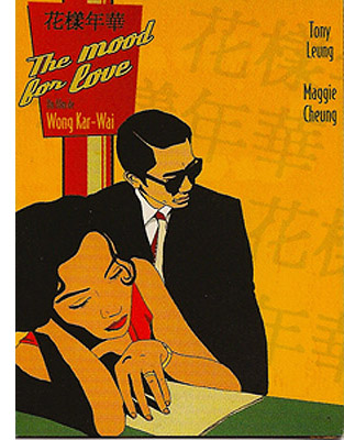
In the mood for WKW
In the Mood for Love (2000).
DB here:
For quite a while, many of us have been looking forward to a book called Wong Kar-wai on Wong Kar-wai, a collection of interviews conducted by Tony Rayns. Alas, that is evidently never to be, for reasons that Tony hints at in his new BFI monograph on In the Mood for Love. Bits of those interviews make their way into the book anyhow, along with information and ideas reflecting Tony’s unique access to Hong Kong’s illustrious filmmaker. All lovers of WKW will want this energetic, accessible study.
 In fewer than a hundred pages, many of which are occupied with color illustrations, Tony has done a lot. We get background on the production, with attention to Wong’s circuitous creative process. Beginning as Summer in Beijing, the project underwent constant rethinking, reshooting, re-editing, along with modifications even after the festival premiere. Tony draws attention to the film’s parallel with Days of Being Wild, also set in 1960s Hong Kong and Wong’s first essay in revise-as-you-go production.
The thankless task of providing a detailed synopsis is carried off briskly, sustained by many explanations of culturally specific references. We learn of the daibaitong, the open-air restaurant where both Mr. Chow and Mrs. Chan stop for a night’s noodles. We’re led to notice the inside joke about wuxia novels’ outlandish plots, as well as the changing of seasons as reflected in costumes. The synopsis is also sprinkled with critical-analytical points about parallels between the characters, relationships merely hinted at, and cross-references among the kindred films.
The talk around the Jet Tone office during the production of In the Mood for Love was of Chow Mo-wan setting out to seduce Mrs. Chan as a prelude to abandoning her: an act of wilful emotional cruelty intended as a revenge for being cuckolded himself. This inference is nowhere evident in the film as released, so Wong perhaps recycled the idea into Chow’s smiling rejection of a romance with “taxi-dancer” Bai Ling (Zhang Ziyi) in 2046–although that rejection is itself a gentler replay of the playboy’s treatment of Carina Lau’s needy hooker Lulu, also known as Mimi, in Days of Being Wild.
There’s also quite a lot about the soundtrack, with close attention to the recurring melodies in the score and to the shifts between Cantonese and Shanghai in the dialogue.
After the synopsis comes an analysis/interpretation. When the central couple reenacts their spouses’ affair, Tony suggests they’re testing the limits of their own inhibitions. He stresses the distinctiveness of Wong’s style, from its cinematic punctuation (the synopsis has emphasized the patterns of fades and straight cuts) to its handling of time–especially the strategically opaque narration, its “ostentatiously selective presentation of the action.” Of course the guilty spouses are never fully shown, but Tony also traces how time is skipped around via flashforwards and ellipses, sometimes barely noticeable ones. He points out how one cut relies on false continuity. Smoking alone in room 2046, Chow hears a knock on the door. Cut to a long shot of Mrs. Chan at the door–but she’s leaving.
We’ll never know what transpired during her visit. This exemplifies Wong’s “discontinuity in continuity”; flowing music, gentle tracking shots, and slight slow motion create a smooth surface that can conceal crucial information.
Tony has more to tell than the BFI format can squeeze in. I’d like more on the way quite disjunctive techniques fit into the film’s stylistic sheen. Wong deploys off-center framings, judicious use of depth in apparently real apartments, and variations in lighting among Hong Kong, Singapore, and Kuala Lampur. Tony’s hunch about continuity covering discontinuity might be extended to these aspects, and of course insider information on these matters would be welcome. I also wonder: Could there have been a hotel at the period boasting twenty stories? My Hong Kong friends say not. Tony argues that Wong’s films aren’t deeply political, but he was willing to violate plausibility to invoke the fateful year when HK becomes integrated into China.
Calm and ingratiating, the monograph is disarmingly personal as well. (How many books on a director start by noticing that the author has been dropped from a Christmas-card list?) It’s agreeably contrarian too. Tony teases academics, claiming at one point that the clock shots are “self-parodies” and “sucker bait” for critics who believe that Wong is the great cineaste of time. The book ends with a miscellany of observations about actors in bit parts, filmic offshoots of the project, and a little gossip. In all, reading In the Mood for Love gets you in the mood for In the Mood for Love.
Tony Rayns tells more in interviews on the Blu-ray disc of In the Mood for Love available from Criterion. That version of the film’s color seems far superior to other DVD versions I’ve seen, some of which have a dim, brownish cast. This is a hard film to replicate, though, as I found in taking 35mm frames: the tonal range is extraordinary, and your choice is often between exaggerating and lowering contrast.
Tony makes reference to the famous epilogue of Days of Being Wild that shows Tony Leung Chiu-wai, an apparently brand-new character cryptically introduced in this scene. The shot implies that there’ll be a sequel, and Wong has occasionally suggested the possibility. But there is a version of the film that includes a prologue showing the same character dressing to go out. Along with that scene is a sensuous passage in an underground gambling parlor. The sequence looks forward to imagery in In the Mood, including a sinuous shot of a woman ascending a staircase. If Wong chopped off the prologue to create the version of Days we have, he perversely left the dangling epilogue to tantalize us. For more about this “lost” version see my entry “Years of Being Obscure.”
I analyze Wong’s career, along with In the Mood for Love, in Planet Hong Kong 2.0, and I talk about The Grandmaster (which Tony considers a weak entry) here. I offer thoughts as well on Ashes of Time Redux. This project was the casus belli for Tony’s departure from Planet WKW. “The sometimes hair-raising tales of my experiences with Jet Tone will have to wait for another time.” What if we can’t wait?
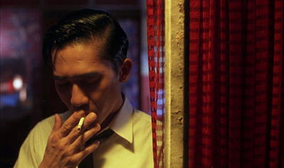
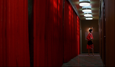
In the Mood for Love.
A well-deserved honor for Criterion and Janus
Blood Simple (1984).
We were delighted to learn that our friends at sister companies The Criterion Collection and Janus Films will be receiving an award at the upcoming San Francisco International Film Festival (April 21-May 5). It’s the Mel Novikoff Award, named for an important San Francisco art-house exhibitor. (The article linked above has a full list of past winners.)
The award will be given to the heads of the two companies, Peter Becker (Criterion) and Jonathan Turell (Janus), by Joel and Ethan Coen on April 30, when a restored version of their debut feature, Blood Simple, will be shown. Before the screening, the Coens, along with Amazon Studios executive Scott Foundas, will have an onstage discussion with the two honorees. (Tickets available here.)
For more on Criterion/Janus and our links with them, see our report on Peter and Jonathan’s 2013 appearance at Il Cinema Ritrovato and our discussion of our latest edition of Film Art: An Introduction.
P.S. 8 March: Thanks to Geoff Gardner for a correction.
Off-center 2: This one in the corner pocket
DB here, again:
We got a keen response to my entry on widescreen composition in Mad Max: Fury Road. Thanks! So it seemed worthwhile to look at composition in the older format of 4:3, good old 1.33:1–or rather, in sound cinema, 1.37: 1.
The problem for filmmakers in CinemaScope and other very wide processes is handling human bodies in conversations and other encounters (such as stomping somebody’s butt in an an action scene). You can more or less center the figures, and have all that extra space wasted. Or you can find ways to spread them out across the frame, which can lead to problems of guiding the viewer’s eye to the main points. If humans were lizards or Chevy Impalas, our bodies would fit the frame nicely, but as mostly vertical creatures, we aren’t well suited for the wide format. I suppose that’s why a lot of painted and photographed portraits are vertical.
By contrast, the squarer 4:3 frame is pretty well-suited to the human body. Since feet and legs aren’t usually as expressive as the upper part of the body, you can exclude the lower reaches and fit the rest of the torso snugly into the rectangle. That way you can get a lot of mileage out of faces, hands and arms. The classic filmmakers, I think, found ingenious ways to quietly and gracefully fill the frame while letting the actors act with body parts.
Since I’m watching (and rewatching) a fair number of Forties films these days, I’ll draw most of my examples from them. after a brief glance backward. I hope to suggest some creative choices that filmmakers might consider today, even though nearly everybody works in ratios wider than 4:3. I’ll also remind us that although the central area of the frame remains crucial, shifts away from it and back to it can yield a powerful pictorial dynamism.
Movies on the margins
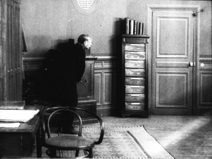
Early years of silent cinema often featured bright, edge-to-edge imagery, and occasionally filmmakers put important story elements on the sides or in the corners. Louis Feuillade wasn’t hesitant about yanking our attention to an upper corner when a bell summons Moche in Fantômas (1913). A famous scene in Musketeers of Pig Alley (1912) shows Griffith trying something trickier. He divides our attention by having the Snapper Kid’s puff of cigarette smoke burst into the frame just as the rival gangster is doping the Little Lady’s drink. She doesn’t notice either event, as she’s distracted by the picture the thug has shown her, but there’s a chance we miss the doping because of the abrupt entry of the smoke.
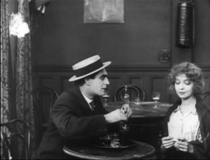
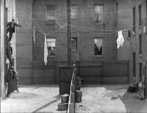
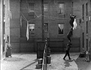
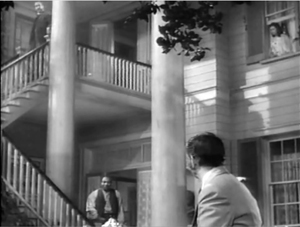
In Keaton’s maniacally geometrical Neighbors (1920), the backyard scenes make bold (and hilarious) use of the upper zones. Buster and the woman he loves try to communicate three floors up. Early on we see him leaning on the fence pining for her, while she stands on the balcony in the upper right. Later, he’ll escape from her house on a clothesline stretched across the yard. At the climax, he stacks up two friends to carry him up to her window.
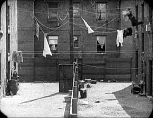

Thankfully, the Keaton set from Masters of Cinema preserves some of the full original frames, complete with the curved corners seen up top. It’s also important to appreciate that in those days there was no reflex viewing, and so the DP couldn’t see exactly what the lens was getting. Framing these complex compositions required delicate judgment and plenty of experience.
Later filmmakers mostly stayed away from corners and edges. You couldn’t be sure that things put there would register on different image platforms. When films were destined chiefly for theatres, you couldn’t be absolutely sure that local screens would be masked correctly. Many projectors had a hot spot as well, rendering off-center items less bright. And any film transferred to 16mm (a strong market from the 1920s on) might be cropped somewhat. Accordingly, one trend in 1920s and 1930s cinematography was to darken the sides and edges a bit, acknowledging that the brighter central zone was more worth concentrating on.
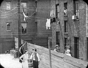
That tactic came in handy with the emergence of television, which established a “safe area” within the film frame for video transmission. TV cropped films quite considerably; cinematographers were advised in 1950 that
All main action should be held within about two-thirds of the picture. This prevents cut-off and tube edge distortion in television home receivers.
Older readers will remember how small and bulging those early CRT screens were.
By 1960, when it was evident that most films would eventually appear on TV, DP’s and engineers established the “safe areas” for both titles and story action. (See diagram surmounting this section.) Within the camera’s aperture area, which wouldn’t be fully shown on screen, the safe action area determined what would be seen in 35mm projection. “All significant action should take place within this portion of the frame,” says the American Cinematographer Manual.
Studio contracts required that TV screenings had to retain all credit titles, without chopping off anything. This is why credit sequences of widescreen films appear in widescreen even in cropped prints. So the safe title area was marked as what would be seen on a standard home TV monitor. If you do the math, the safe title area is indeed 67.7 % of the safe action area.
These framing constraints, etched on camera viewfinders, would certainly inhibit filmmakers from framing on the edges or the corners of the film shot. And when we see video versions of films from the 1.37 era (and frames like mine coming up) we have to recall that there was a bit more all around the edges than we have now.
All-over framing, and acting
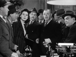
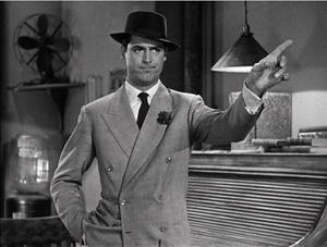
Yet before TV, filmmakers in the 40s did exploit off-center zones in various ways. Often the tactic involved actors’ hands–crucial performance tools that become compositional factors. In His Girl Friday (1940), Walter Burns commands his frame centrally, yet when he makes his imperious gesture (“Get out!”) Hawks and DP Joseph Walker (genius) have left just enough room for the left arm to strike a new diagonal.
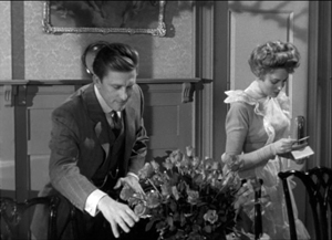
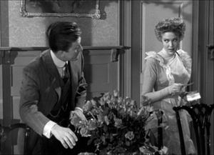
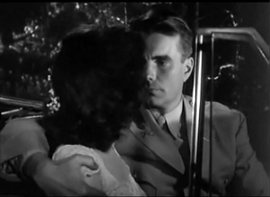
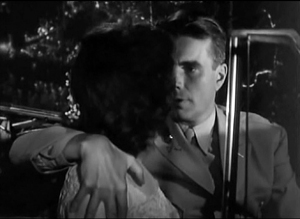
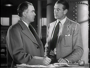
The framing of a long take in The Walls of Jericho (1948) lets Kirk Douglas steal a scene from Linda Darnell. As she pumps him for information, his hand sneaks out of frame to snatch bits of food from the buffet.
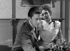
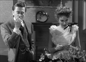
As the camera backs up, John Stahl and Arthur Miller (another genius) give us a chance to watch Kirk’s fingers hovering over the buffet. When Linda stops him with a frown, he shrugs, so to speak, with his hands. (A nice little piece of hand jive.)
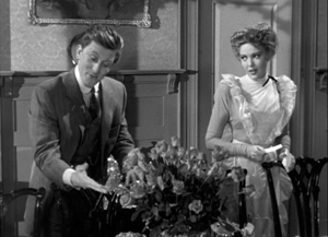
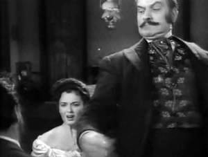
The urge to work off-center is still more evident in films that exploit vigorous depth staging and deep-focus cinematography. Dynamic depth was a hallmark of 1940s American studio cinematography. If you’re going to have a strong foreground, you will probably put that element off to one side and balance it with something further back. This tendency is likely to empty out the geometrical center of the shot, especially if only two characters are involved. In addition, 1940s depth techniques often relied on high or low angles, and these framings are likely to make corner areas more significant. Here are examples from My Foolish Heart (1950): a big-head foreground typical of the period, and a slightly high angle that yields a diagonal composition.
Things can get pretty baroque. For Another Part of the Forest (1948), a prequel to The Little Foxes (1941), Michael Gordon carried Wyler’s depth style somewhat further. The Hubbard mansion has a huge terrace and a big parlor. Using the very top and very bottom of the frame, a sort of Advent-calendar framing allows Gordon to chart Ben’s hostile takeover of the household, replacing the patriarch Marcus at the climax. The fearsome Regina appears in the upper right window of the first frame, the lower doorway of the second.
In group scenes, several Forties directors like to crowd in faces, arms, and hands, all spread out in depth. I’ve analyzed this tendency in Panic in the Streets (1950), but we see it in Another Part of the Forest too. Again, character movement can reveal peripheral elements of the drama.
At the dinner, Birdie innocently thanks Ben for trying to help her family with their money problems and bolts from the room, going out behind Ben’s back. The reframing brings in at the left margin a minor character, a musician hired to entertain for the evening. But in a later phase of the scene he will–still in the distance–protest Marcus’s cruelty, so this shot primes him for his future role.
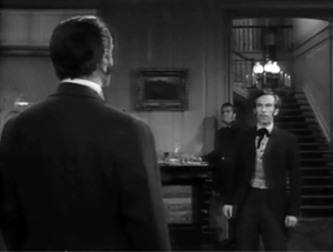
At one high point, the center area is emptied out boldly and the corners get a real workout. On the staircase, the callow son Oscar begs Marcus for money to enable him to run off with his girlfriend. (As in Little Foxes, the family staircase is very important–as it is in Lillian Hellman’s original plays.) Ben watches warily from the bottom frame edge. Nobody occupies the geomentrical center.
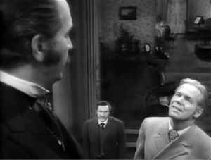
Later, on the same staircase, Ben steps up to confront his father while Regina approaches. It’s an odd confrontation, though, because Ben is perched in the left corner, mostly turned from us and handily edge-lit. Marcus turns, jammed into the upper right. Goaded by Ben’s taunts, he slaps Ben hard. Here’s the brief extract.
The key action takes place on the fringes of the frame, while the lower center is saved for Regina’s reaction–for once, a more or less normal human one. Even allowing for the cropping induced by the video safe-title area, this is pretty intense staging.
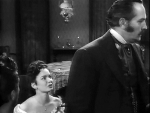
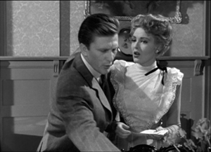
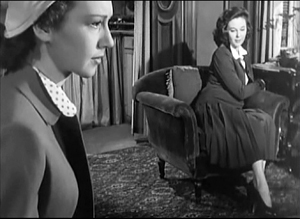
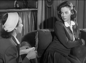
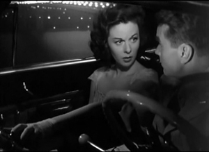
The corners can be activated in less flagrant ways. Take this scene from My Foolish Heart. Eloise has learned that her lover has been killed in air maneuvers. Pregnant but unmarried, she goes to a dance, where an old flame, Lew asks her to go on a drive. They park by the ocean, and she succumbs to him. Here’s the sequence as directed by Mark Robson and shot by Lee Garmes (another genius).
In the fairly conventional shot/ reverse-shot, the lower left corner is primed by Eloise’s looking down at the water and Lew’s hand stealing around her.
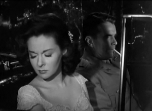
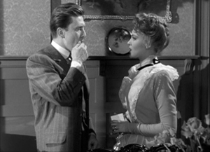
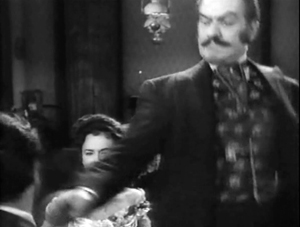
Later, when Lew pulls her close, (a) we can’t see her; (b) his expression doesn’t change and is only partly visible; so that (c) his emotion is registered by the passionate twist of his grip on her shoulder. Lew’s hand comes out from the corner pocket.
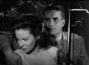
Perhaps Eloise is recalling another piece of hand jive, this time from her lost love.
For many directors, then, every zone of the screen could be used, thanks to the good old 4:3 ratio. It’s body-friendly, human-sized, and can be packed with action, big or small.
Mabuse directs
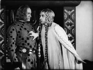
In other entries (here and here) I’ve mentioned one of the supreme masters of off-center framing, Fritz Lang. Superimpose these two frames and watch Kriemhilde point to the atomic apple in Cloak and Dagger (1946).
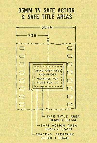
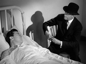
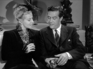
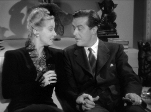
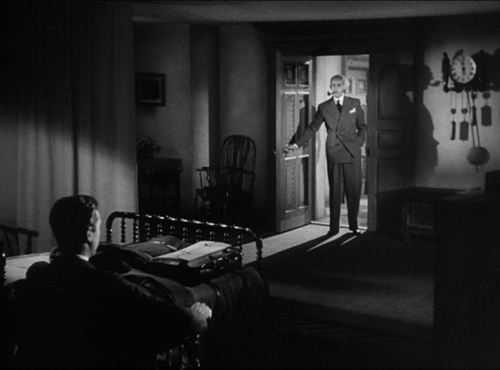
From the very start of Ministry of Fear (1944), the visual field comes alive with pouches, crannies, and bolt-holes. The first image of the film is a clock, but when the credits end the camera pulls back and tucks it into the corner as the asylum superintendant enters. (The shot is at the end of today’s entry.) Here and elsewhere, Lang uses slight high angles to create diagonals and corner-based compositions.
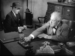
In the course of the film, pistols circulate. Neale lifts one from Mrs. Bellane (strongly primed, upper left), keeps her from appropriating it (lower center), and secures it nuzzling his left knee (lower right).
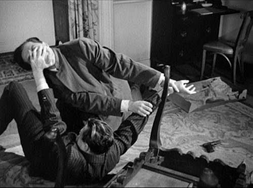
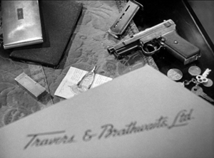
Later, Neale’s POV primes the placement of a pistol on the desktop (naturally, off-center), so that we’re trained to spot it in a more distant shot, perilously close to the hand of the treacherous Willi.
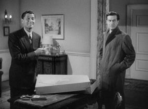
Amid so many through-composed frames, an abrupt reframing calls us to attention. Unlike Hawks and Walker’s handling of Walter in His Girl Friday, Lang and his DP Henry Sharp (great name for a DP, like Theodore Sparkuhl and Frank Planer) gives things a sharp snap when Willi raises his hand.
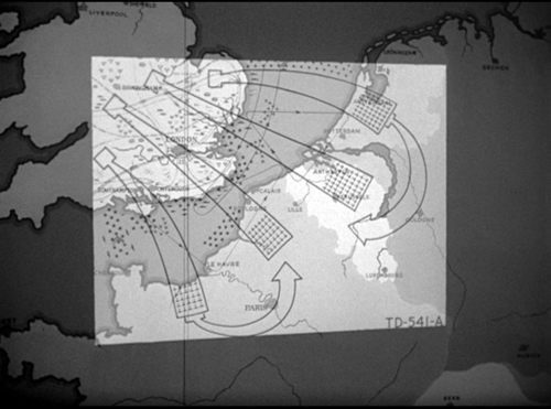
Lang drew all his images in advance himself, not trusting the task to a storyboarder. Avoiding the flashy deep-focus of Wyler and company, he created a sober pictorial flow that can calmly swirl information into any area of the frame. It’s hard not to see the stolen attack maps, surmounting today’s entry, as laying bare Lang’s centripetal vectors of movement. No wonder in the second frame up top, as Willi and Neale struggle in a wrenching diagonal mimicking the map’s arrows, that damn pistol strays off on its own.
Sometimes film technology improves over time. For instance, digital cinema today is better in many respects than it was in 1999. But not all changes are for the better. The arrival of widescreen cinema was also a loss. Changing the proportions of the frame blocked some of the creative options that had been explored in the 4:3 format. Occasionally, those options could be modified for CinemaScope and other wide-image formats; I trace some examples in this video lecture. But the open-sided framings in most widescreen films today suggest that most filmmakers haven’t explored the wide format to the degree that classical directors did with the squarish one.
More generally, it’s worth remembering that the film frame is a basic tool, creating not only a window on a three-dimensional scene but also a two-dimensional surface that requires composition–either standardized or more novel. Instead of being a dead-on target, the center can be an axis around which pictorial forces push and pull, drift away and bounce around. After all, we’re talking about moving pictures.
Thanks to Paul Rayton, movie tech guru, for information on 16mm cropping.
My image of the safe areas and the second quotation about them is taken from American Cinematographer Manual 1st ed., ed. Joseph C. Mascelli (Hollywood: ASC, 1960), 329-331. The older quotation about cropping for television comes from American Cinematographer Handbook and Reference Guide 7th ed., ed. Jackson J. Rose (Hollywood: ASC, 1950), 210.
I hope you noticed that I admirably refrained from quoting Lang, who famously said that CinemaScope was good only for…well, you can finish it. Of course he says it in Godard’s Contempt (1963), but he told Peter Bogdanovich that he agreed.
[In ‘Scope] it was very hard to show somebody standing at a table, because either you couldn’t show the table or the person had to be back too far. And you had empty spaces on both sides which you had to fill with something. When you have two people you can fill it up with walking around, taking something someplace, so on. But when you have only one person, there’s a big head and right and left you have nothing (Who the Devil Made It (Knopf, 1997), 224).
For more on the stylistics and technology of depth in 1940s American film, see The Classical Hollywood Cinema: Film Style and Mode of Production to 1960 (Columbia University Press, 1985), which Kristin and I wrote with Janet Staiger, Chapter 27, and my On the History of Film Style (Harvard University Press, 1997), Chapter 6. Many blog entries on this site are relevant to today’s post; search “deep-focus cinematography” and “depth staging.” If you want just one for a quick summary, try “Problems, problems: Wyler’s workarounds.” Some of the issues discussed here, about densely packing the frame, are considered more generally in “You are my density,” which includes an analysis of a scene in Lang’s Hangmen Also Die (1943).
Ministry of Fear (1944).


