 [1]
[1]
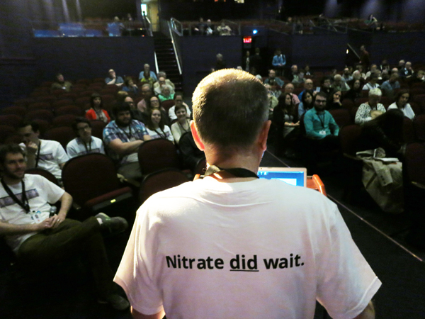
Paolo Cherchi Usai introducing a session of The Nitrate Picture Show.
DB here:
Our entries have been laggardly lately because of various factors: a trip to a family wedding in DC, work on a new edition of Film Art, a stubborn cold, and not least, a bustling trip to Rochester’s George Eastman House for The Nitrate Picture Show [2]. This last event is the topic for today, and hoo boy was it something.
Handle with care, respect, and admiration
 [3]
[3]
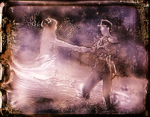
Light Is Calling (2004).
For the first fifty years or so of cinema, commercial feature films were shot and shown on nitrate-based film stock. The film emulsion, consisting of silver halide crystals (for black and white) or dyes (for color), was supported by the base, a clear, flexible strip. That strip was made of nitrocellulose.
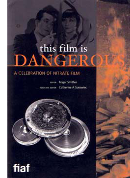 [4]In a talk at the Picture Show, Roger Smither, editor with Catherine Surowiec of the definitive compendium This Film Is Dangerous, reviewed some essential features of nitrate. As most people know, it catches fire easily. Quentin Tarantino built the climax of Inglourious Basterds around a theatre fire deliberately set by touching off heaps of nitrate. Robert Flaherty famously barbecued his initial footage of Nanook of the North by smoking while he worked on editing it. No surprise that nitrocellulose was used in munitions, where it was often called “gun-cotton.”
Once ignited, nitrate is hard to control. It will burn under water, and it can feed on its own flames. A dramatic 1948 documentary screened at the Picture Show presented almost comically horrifying ways in which a nitrate fire resists extinction. Nitrate also produces highly toxic gases. For such reasons, nitrate projection booths are designed to slam shut tight and let the fire eventually exhaust itself. God help you if nitrate goes up in an open warehouse or theatre space.
It was this volatility that forced most national film industries to convert from nitrate-based stock to acetate, or “safety,” stock. In America, the process began soon after World War II and, among other advantages, allowed exhibitors to lower their fire-insurance costs. Other countries were slower to convert; at the Picture Show, some people mentioned that the Soviet Union was still using nitrate stock in the early 1960s. As for archives and laboratories storing nitrate films, conflagrations were distressingly common. Roger and Catherine’s book list dozens of major nitrate fires from 1896 to 1993.
Apart from its tendency to blow up, nitrate is chemically unstable and can decompose. Heat, moisture, and exposure to chemicals can wreck nitrate in a host of ways. It can become infiltrated with a blotchy growth that some find piquant (viz. Bill Morrison’s Light Is Calling, above). The base can flake off from the emulsion. A nitrate print can shrink, warp, blister, or become brittle. The film can start to smell, or turn to brown powder. Some of these problems are present with acetate as well, but combined with the possibility of nitrate combustion, acetate had an advantage.
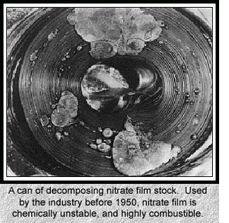 [5]A string of well-publicized explosions in the 1970s at the Library of Congress, Eastman House, and the Cinémathèque Française resulted in millions of feet of film being lost. National governments became aware of the threat to their film heritage. Archivists seized upon the slogan, “Nitrate won’t wait,” and circulated scary images like the one on the left. Money was given, and thousands of feet of film were transferred to safety stock. In the process, however, a fair amount of nitrate was discarded. In 2000, Roger noted, archivists were surprised to learn that a great deal of nitrate around the world remained in good shape. The late Susan Dalton, our archivist here at Madison for many years, argued that all of today’s films should be transferred to nitrate, the most proven and reliable long-term format.
There was also an argument for keeping nitrate around on artistic grounds. As Roger put it: “It’s pretty.” Everyone I know agrees. In the late 1970s Kristin and I saw at MoMA a double bill of two nitrate prints, Gance’s La Roue and Ford’s How Green Was My Valley. They glistened. Later, attending the Pordenone Giornate del Cinema Muto and Bologna’s Cinema Ritrovato, we saw lots of nitrate prints and were always overwhelmed. The images, especially from very early films, seemed at once sharp in contour and soft in textures.
So nitrate images look great. But why? Some say that nitrate prints have more silver in the emulsion than acetate ones. In This Film Is Dangerous, John Reed suggests that the increased “silver load” yields solidity in shadow areas and vitality in white ones. He also speculates that nitrate-based copies may benefit from projector lenses, screen surfaces, and carbon-arc projection (this last a topic I’ve touched on briefly with respect to Technicolor [6]). If all these factors are in play, the beauty of the copy may be only contingently related to nitrate as such.
Moreover, can we specify the Nitrate Look, in the way we can tell oil paint from water colors? Conducting an informal survey of archivists at the Picture Show, I could find no one who would claim that he or she could confidently spot a nitrate print simply from seeing it projected. Perhaps we are not yet at the stage of connoisseurship of a traditional art historian. Or it may be that foreknowledge that a print is a nitrate one biases us toward ascribing more beauty to the images. To get a precise sense of the Nitrate Look, Reed suggests we’d need an A/B test, running a nitrate print side by side with a fine-grain acetate positive from the same negative.
Richard Koszarski pointed out in conversation that watching a nitrate print we know we’re getting something old–if not an original (it could be a re-release print), at least a copy that audiences did see back in the day. Paolo Cherchi Usai, in introducing the Show, pointed out that the goal was not simply to screen a lot of classic films but to present an experience of cinema from another time. In addition, you have to admire the sheer robustness of these survivors: the prints have been shown a lot and still look lustrous.
To put the emphasis on the “nitrate experience,” nearly all the titles of the films were kept under wraps until we arrived. The goal was not to enhance or deflate the mystique of nitrate, but to call attention to the unique beauties of specific copies and to ask us to reflect on the purposes and consequences of film preservation. To the same end, in a lecture Kevin Brownlow surveyed his efforts to rescue rare footage by Chaplin, Gance, and others.
A panel discussion of archivists considered whether 35mm, in any form, was still viable for public showing. Answer: Most definitely. If a venue meets archival screening conditions, libraries are willing to loan copies. Just don’t count on nitrate ones. Paolo estimates that there are fewer than half a dozen nitrate-secure projection booths functioning in Europe and the US.
No pixels, please, we’re purists
 [7]
[7]
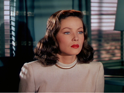
Leave Her to Heaven (1945).
Whatever the cause, the films looked undeniably spectacular. I was least taken with the 1930s Selznick items, A Star Is Born (1937, in a 1946 reissue print) and Nothing Sacred (1937). They have never seemed to me first-rate movies: I think the Cukor Star Is Born is far superior, and Nothing Sacred, after a lively opening, seems to me to run out of comic steam. Not enough characters, maybe; not enough twists, possibly; too much Walter Connolly, I’m sure. Twentieth Century beats it hands down. But of course the prints were very good, and the genial William Wellman, Jr., came by with informative background information keyed to his new biography of his dad [8]. (Lest I seem to be opposed to Wild Bill, let me record my admiration for G. I. Joe, Battleground, The Ox-Bow Incident, and Track of the Cat.)
The Selznick prints suggested progress in 1930s Technicolor. I was struck by the problems of matching brightness and hues from shot to shot, or sometimes right after a cut, as early in A Star Is Born.
 [9]
[9]  [10]
[10]  [11]
[11]
By the end of the decade, of course, with Snow White, The Wizard of Oz, and Gone with the Wind, Technicolor had created a more consistent palette.
The 1940s, the great era of Tech, was on rich display in other titles. I had to miss Black Narcissus, but this may have been the British Film Institute copy I’ve seen. I remember the color as being as both gloomy and ripely unrealistic. [Nope! It was the Academy copy, and everybody told me it was gorgeous.]
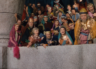
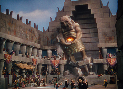
The copy of Leave Her to Heaven (from UCLA) made Gene Tierney’s ruby lips all but float off the screen at you. Even wilder was a demonically gorgeous print of Samson and Delilah from the Library of Congress. The movie is typically silly DeMille, but it’s fun to watch how a story you already know gets padded out with a fierce lion, bevies of dancing girls, and a somnolent George Sanders, the man who died of boredom.
The spectacle is what the audience was paying for, and the color design gave them their money’s worth. No movie I’ve seen lately galvanizes the spectrum the way this one does. The almost shadowless lighting makes every color pop. I don’t think I’ve ever seen as many shades of pink and purple in a movie, and the pastels admirably set off the burnished beefcake of Victor Mature.
 [12]
[12] 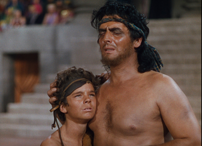 [13]
[13]
Richard Koszarski, still on a roll, pointed out that Sunset Blvd., the film in which the Gloria Swanson character visits DeMille on the Samson set, features an odd homage. The phone table at the apartment of Artie Green (Jack Webb) boasts a statuette of the god Dagon, whose temple Samson pulls down.
 [14]
[14] 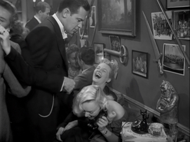 [15]
[15]
Did Artie pilfer a model? Is it an in-joke like Pike’s Pale [16]? Or a piece of remote cross-promotion? There’s always more to see.
Monochrome as multichrome
 [17]
[17] 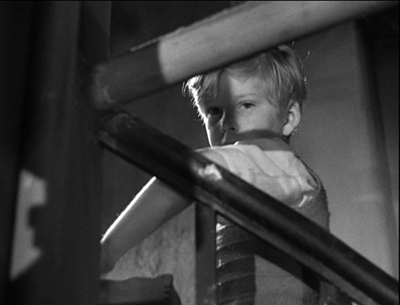 [18]
[18]
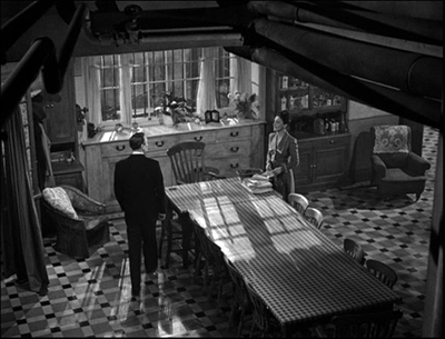
The Fallen Idol.
The black-and-white nitrate titles were just as astonishing. Casablanca had a subtle gray scale I had never noticed before; it would be worth comparing this print with the digital copy piped to theatres as part of the recent classics revival series. Can the latter be anything like this? The first Man Who Knew Too Much (1934) is no stranger to this blog [19]; the 1943 print looked crisp and sounded exceptionally good.
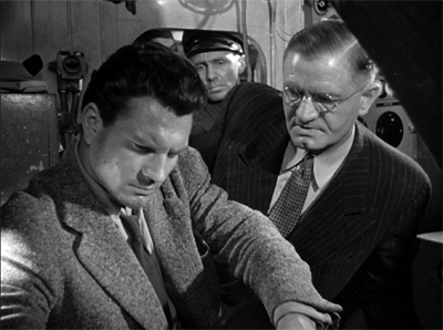
Rene Clément’s Les Maudits (1947, “The Damned”) was previously unknown to me. It’s a remarkable wartime thriller, with long, tight tracking shots through a submarine and cramped, noirish deep-space compositions.
 [20]
[20] 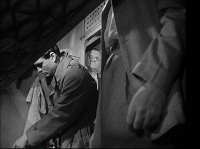 [21]
[21]
Clément employs a flashback narration that stems from the protagonist writing his memoir of the incident. It looks forward to Bresson’s Diary of a Country Priest, but in a way it’s a bit more daring, because it mixes the character’s voice-over but with the commentary of an impersonal objective narrator.
Somewhere between color and black-and-white was the delirious fantasy romance Portrait of Jennie. It has its problems, chiefly a subplot showing the painter Eben Adams working on a barroom portrait of Michael Collins, but there is a goofy grandeur to the whole enterprise. The magnificent corps of Eastman projectionists managed to re-create the splashy climax of original 1948 screenings. Not only does the image go green, but it gets bigger. Bosley Crowther reports it an apotheosis of kitsch.
Then, when a green flash of lightning electrifies the screen, which expands to larger proportions, and sound vents around the theatre roar with the ultimate and savage fury of a green-tinted hurricane, the final vulgarization of Mr. Nathan’s little fable is achieved.
The effect is indeed overblown, but I didn’t hear anybody in Rochester complain.
The final title, kept secret until the moment of projection, was The Fallen Idol, one of the great staircase movies in an era of great staircase movies. An exercise in Jamesian restricted viewpoint–What Maisie Knew, for the cinema–it confines us almost wholly to a little boy who worships the family butler but can’t quite fathom the currents of grownup unhappiness and betrayal swirling around him. Carol Reed’s love of low angles and looming foreground planes is kept under precise control, and the moments of suspense, notably the famous swooping circuit of the paper airplane, remain just as strong as ever.
I have to believe that James Card, legendary master of Eastman House, would have approved of the whole shebang. This is his centenary, and along with the Picture Show there was an informative display surveying the career of the man who, with saintly George Pratt at his side, gave Eastman House its unique cachet.
The Nitrate show drew about 300 passholders and as many as 100-150 locals for some shows. It’s planned as the first in a series. Next year’s session is slated for 29 April-1 May. See you there?
Thanks to Paolo Cherchi Usai and Jared Case for their hospitality during my visit. Thanks as well to the Eastman House staff, especially Deborah Stoiber, Jurij Meden, and Ben Tucker, who made the weekend memorable. In all, excellent programming and presentation!
An entertaining account of the preservation movement is Anthony Slide’s Nitrate Won’t Wait: Film Preservation in the United States [22] (McFarland, 1992). It’s there I learned that Kemp Niver once pulled a gun on Raymond Rohauer. Archivists were tough in those days.
The stupendous volume edited by Roger and Catherine, This Film Is Dangerous: A Celebration of Nitrate Film [23] (Brussels: FIAF, 2002) is full of information, anecdotes, and whimsy (poems, caricatures). On the history of the technology, the best starting points in this collection seem to me Deac Rossell’s “Exploding Teeth, Unbreakable Sheets and Continuous Casting: Nitrocellulose from Gun-Cotton to Early Cinema” and Leo Enticknap’s “The Film Industry’s Conversion from Nitrate to Safety Film in the Late 1940s: A Discussion of the Reasons and Consequences.” John Reed’s skepticism is recorded in “Nitrate? Bah! Humbug! A Personal View from an Archive Heretic.”
All of the films screened are available on DVD, but I want to signal Les Maudits [24], on the Cohen label, as a real find. My Star Is Born frames comes from the Kino Blu-ray release [25], itself drawn from the Eastman House print we saw.
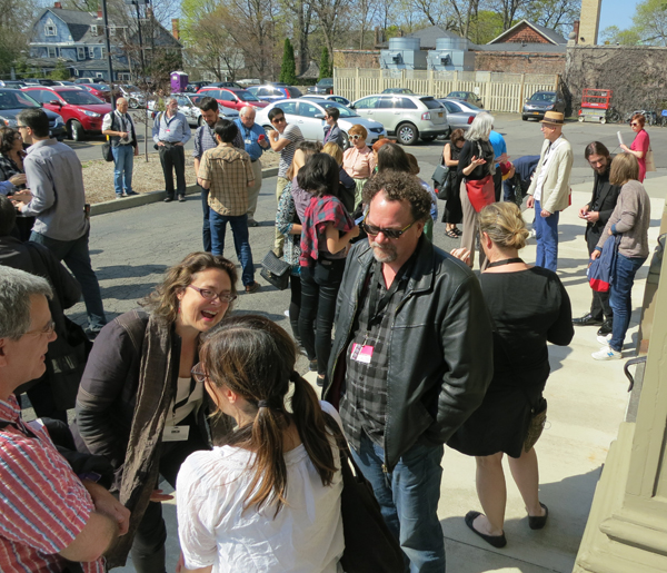 [26]
[26]
A sunny spring day in Rochester: the perfect time to head into the Dryden Theatre for a movie.
P.S. 13 May 2015: During the fest I hung around with Richard Leskosky, retired prof and Ebertfest buddy, and he’s written a fine column about the event [27].
P.S. 15 May 2015: Thanks to André Habib for correcting my attribution to the Bill Morrison film; I’d originally identified it as Decasia. And thanks to Mike Pogorzelski of the Academy for correcting me on the source of Black Narcissus. I sure wish I hadn’t been too logy to stay for it.