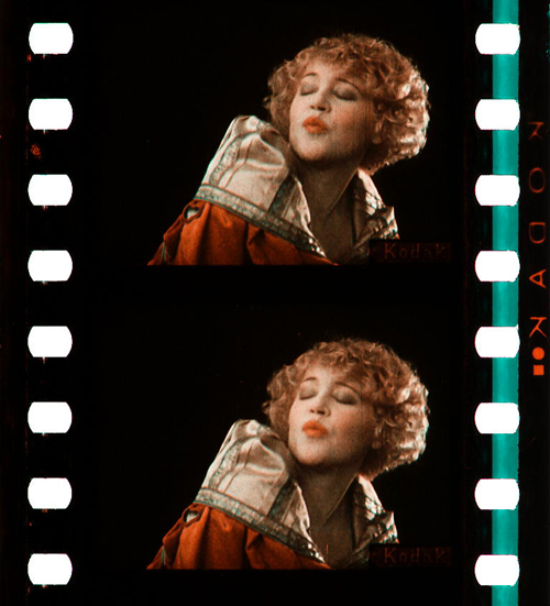
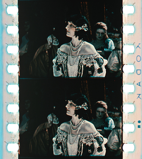
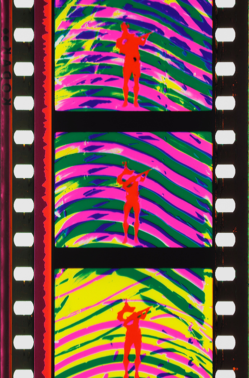
 [1]
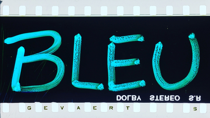
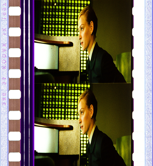
[1]Trois couleurs: Bleu (France/Poland/Switzerland 1993, Krzysztof Kieślowski). Credit: Library of Congress. Photograph of the Agfa Gevaert safety print by Barbara Flueckiger.
Kristin here:
To the general film-going public, old films are in black-and-white. They may be vaguely aware that before The Wizard of Oz and Gone with the Wind, color film was invented.
The history of film color, however, is vastly more complicated than that. Prof. Barbara Flueckiger, of the University of Zurich, has devoted much of her career to studying that history. With Eva Hielscher and Nadine Wieylisbach, she co-edited the 2020 collection, Color Mania: The Material of Color in Photography and Film [2](Zurich: Eds. Lars Müller/ Fotomuseum Winterthur). Barbara has also spent the past decade leading a team who have created a recently inaugurated and invaluable website [3] that acts as a boundless resource for information on color processes.
We are delighted that Barbara has accepted our invitation to write a guest blog entry for us. She describes the website and gives a succinct outline of the history of film color, loaded with beautiful illustrative frames. Most of these were taken from original archival prints that reveal how seldom–especially in this age of digital home video–we see color films as they looked when they were released.
Barbara Flueckiger
From their earliest days, films were colored. During the first three decades, most color imagery was obtained by applying dyes to black and white prints, either by hand, through stencils, or as tinting and toning of the filmstrips. From the beginning, however, many ideas emerged to capture colors directly on film as so-called mimetic colors. That could be done either by optical and mechanical means, such as colored rotary filters, or by chemical interventions, often in combination with optical configurations of cameras. Several hundred analog color processes and film stocks were invented in the first 100 years of film history. Many of them were never successful commercially.
 [4]
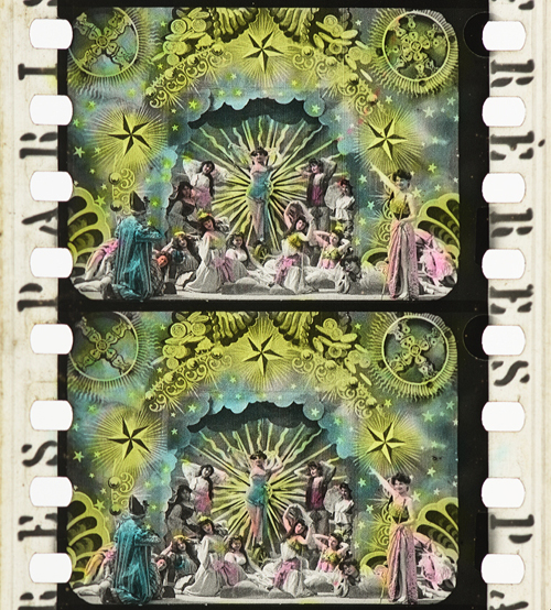
[4]Ali Baba et les quarante voleurs (France 1902, Ferdinand Zecca). Credit: BFI National Archive. Photograph of the stencil-colored nitrate print by Olivia Kristina Stutz.
This history is largely unknown to the general audience as well as to many film scholars and historians.
To close this gap in our knowledge, in 2011 I started to develop the Timeline of Historical Film Colors [3], a comprehensive web resource. I wanted to document the development of film colors from their prehistory in still photography in the 19th century to the latest developments in the analog domain. As of 2021, the platform contains hundreds of primary and secondary sources, patents, links, selected analyses, physical measurements and downloads, as well as more than 23,000 photographs of historical film prints and negatives. These items provide film historians, researchers, archivists, curators, film restorers and students easy access to a vast array of information. A tagging system [5] connects the entries, galleries, photos and quotes to an underlying thesaurus containing certain topics, persons, aesthetic concepts, technologies, archives, genres, persons or companies. A comparison function [6] allows side-by-side inspection of different prints of the same film.
Why film color?
 [7]
[7]The comparison function allows the side-by-side inspection of different prints of the same film.
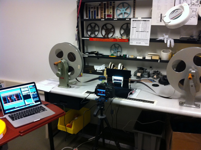
High-resolution photographs displayed in galleries [8] are a central part of the Timeline of Historical Film Colors. Early on I developed a method to photographically capture and document historical film materials in a standardized way. It uses a modular and calibrated camera set-up based on a DSLR camera with a macro lens and remote control from the computer to adjust all the parameters. It is crucial to show the full range of color processes in an aesthetically pleasing way, one that aims at recreating the visual impression on the bench, including the edge information and color distribution in the perforation area. These elements are vital for the identification of film stocks [9] and the genealogy of prints.
These photos allow researchers and students to examine individual historical prints, since they often have to work with less-than-ideal digitizations on DVDs and Blu-rays that are just a faint echo of the historical source material. In recent years this photographic method has been adopted by my teams in the current research projects. Some archives, such as the Academy Film Archive, have started to use the method, and the BFI National Archive and the George Eastman Museum plan to do so soon.
 [10]
[10]Our modular camera set-up in use at the bench.
During the last years my teams and I visited many archives in Europe, the US and Japan to take these photographs, such as the Harvard Film Archive [11], EYE Filmmuseum Amsterdam [12], National Film Archive Prague [13], Deutsche Kinemathek Berlin [14], the Academy Film Archive [15], the Library of Congress [16], George Eastman Museum [17], the BFI National Archive [18], Cinémathèque française Paris [19], the UCLA Film & Television Archive [20], Bundesarchiv Filmarchiv Berlin [21], Museum of Modern Art [22], DFF Deutsches Filminstitut & Filmmuseum Frankfurt [23], the National Film Archive of Japan [24] and others.
 [25]
[25]On the Timeline of Historical Film Colors each contributing archive is represented with a header slide that gives access to the film elements from their collection.
The lost colors of film history
Most films produced before the mid-1930s have been passed on in black-and-white prints. It was not until the famous FIAF conference in Brighton 1978 that the colors of the first decades of film history began to attract some attention from insider circles focusing on silent film.
To this day, the lack of awareness of film’s colorful past has persisted. Early applied colors such as tinting, toning, hand-coloring, and stencil-coloring are ephemeral by nature, since each exhibition print was dyed separately, in a variety of shades and hues. Moreover, these prints were produced with highly flammable nitrate cellulose as a base. Many deadly cinema fires in the early decades of the 20th century demonstrated the dangers of nitrate stock. Therefore, many original colored film prints have been hidden in cans sitting on the shelves in archives’ nitrate vaults. These facilities are fitted with special safety measures [26] such as break-off walls and earth dams.
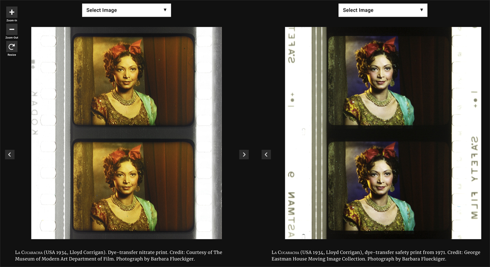
Eventually in the 1950s safety celluloid film stocks replaced nitrate. From that point on, new prints of colored early films were made on safety stock from the black-and-white camera negatives, intermediate negatives, or positive distribution prints. When colored distribution prints were used, the new copies were usually made only in black-and-white.
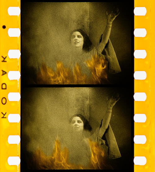
In the early 1980s a second threat to the history of colors in film became apparent. Martin Scorsese was among the prominent filmmakers and scholars who rang the alarm bell over the fading [27]of so-called chromogenic stocks produced from the late 1930s to the 1980s. Due to the physical decay of mainly the cyan dye in these film stocks, original prints become nearly monochromatic, retaining mainly colors in the magenta to red spectrum. To this day, dye fading has remained one of the most pervasive problems for the search of authentic film colors.
 [28]
[28]Color fading. Blade Runner (USA 1982, Ridley Scott). Credit: Library of Congress. Photograph of the Eastman Color Print Film by Joëlle Kost.
Applied colors
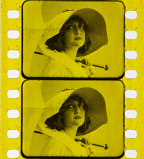
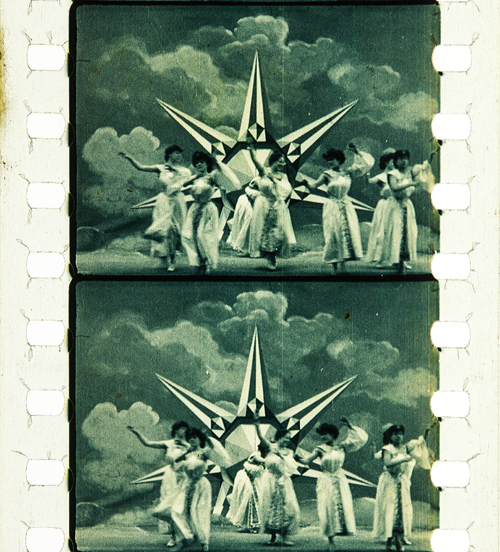
During the first three decades, so-called applied colors dominated. Historians estimate that about 80% of film prints were colored by tinting, toning, or hand- and stencil-coloring.
Tinting [29] means submerging black-and-white film positives into dye baths, so that the prints’ gelatin emulsion acquired a more or less uniform, mostly monochrome color. Tinting can be identified by the inspection of the perforation area that is also uniformly colored. Toning [30], on the other hand, is a complementary process whereby the silver image is replaced by colored metallic pigments (metallic toning) or dyes (mordant or dye toning). In contrast to tinting, toning leaves the perforation area mostly colorless.
 [31]
[31]Tinting. Malombra (ITA 1917, Carmine Gallone). Credit: Cineteca di Bologna. Photograph of the tinted and toned nitrate print by Barbara Flueckiger.
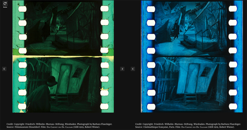
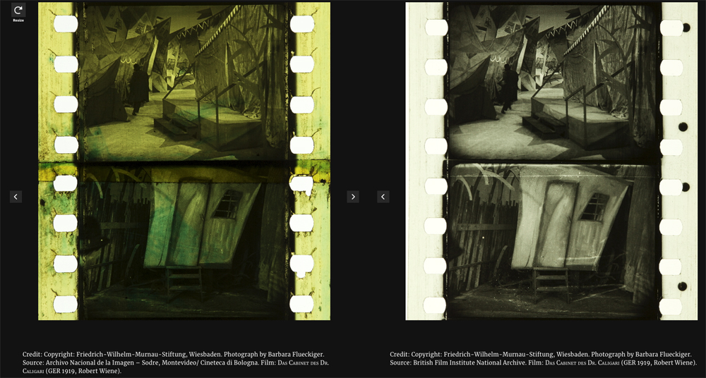
 [32]
[32]Toning. Voyage autour d’une étoile (France 1906, Gaston Velle). Credit: Cineteca di Bologna. Photograph of the toned nitrate print by Barbara Flueckiger.
For these coloring processes the individual prints had to be cut into segments that were then dyed in batches and reassembled into the final distribution print. As a result, individual prints can vary considerably in their color schemes [33].
 [34]
[34]
 [35]
[35]Comparison of four differently tinted and toned distribution prints of Das Cabinet des Dr. Caligari (Germany 1919, Robert Wiene). Copyright: Friedrich Wilhelm Murnau Foundation. Photographs by Barbara Flueckiger.
Whether tinting and toning schemes vary due to cultural norms and tastes has remained a topic of debate. To a high degree it is also uncertain who made the decisions about the coloring, except for cases where scripts, production notes, or film negatives indicate the attribution of colors. In addition to colored prints there were so-called copyright books [36] that show the color scheme by single frames attached to the pages of the booklets, deposited at the Library of Congress by distributor George Kleine. Subtle shades emerged that often make it difficult to distinguish between the two, because the black silver image gives way to nuanced interactions with the tinting dyes in middle tones.
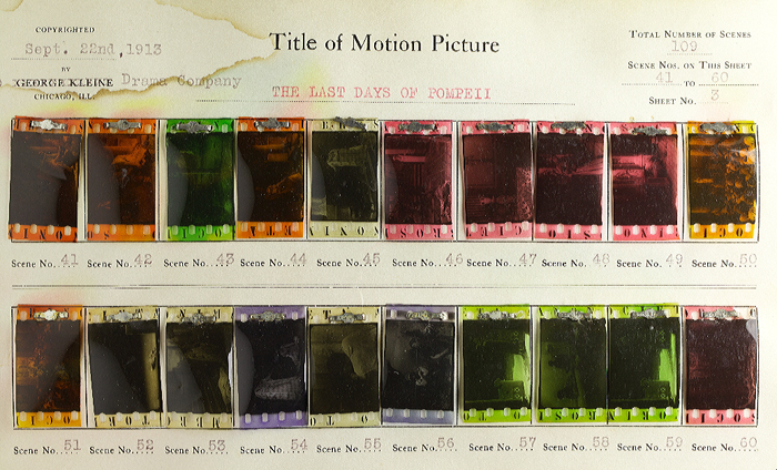 [37]
[37]Copyright book from George Kleine: Gli ultimi giorni di Pompei (Italy 1913, Eleuterio Rodolfi). Credit: Library of Congress. Photograph Barbara Flueckiger.
In some cases, combining tinting and toning allowed for two colors to appear within a single image.
 [38]
[38]Tinting and toning combined. Sumurun (Germany 1920, Ernst Lubitsch). Credit: Bundesarchiv-Filmarchiv. Photograph of the tinted and toned nitrate print by Olivia Kristina Stutz.
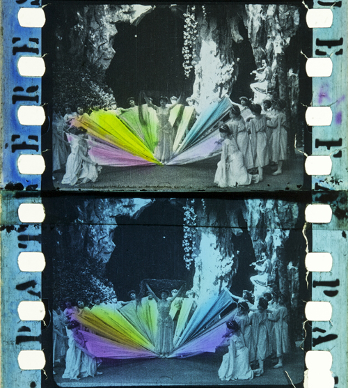
The range and variety are even greater in the case of hand [39] and stencil coloring [40]. These techniques generally required the application of up to six dyes on each individual frame, either by hand through tiny brushes or by cut-out stencils. These laborious processes were demanding, given the small image area and the huge number of frames, generally 16 to 18 per second of running time. Hand-colored films show an uneven application of dyes with soft transitions between individual colors. For stencil coloring, each dye necessitated a separate, colorless print from which the stencils were cut out by needles or metallic styluses [41]. As a result, shapes appear more or less sharp-edged. It was a mechanized version of hand coloring that allowed the coloring of feature-length films and higher numbers of distribution prints. Over the years, improved techniques were introduced to transfer the shapes from projected magnifications onto the film prints with the help of pantographs.
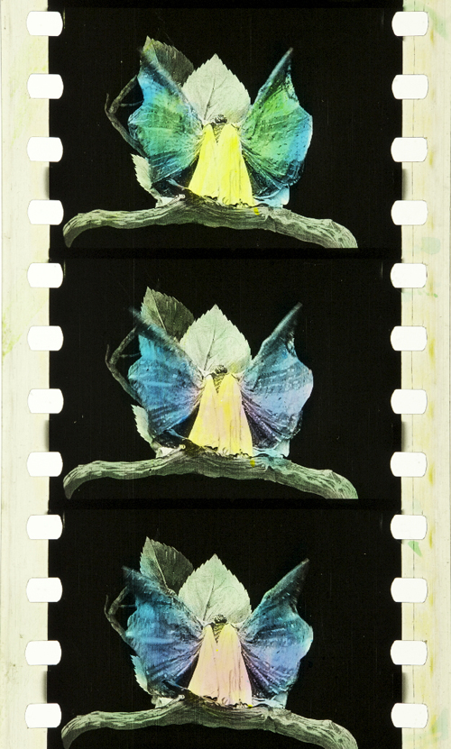 [42]
[42]Hand coloring: Métamorphoses du papillon (France 1904, Gaston Velle). Credit: Library of Congress. Photograph of the hand-colored nitrate print by Barbara Flueckiger.
 [43]
[43]Stencil coloring. Cyrano de Bergerac (Italy/France 1923, Augusto Genina). Credit: EYE Filmmuseum Amsterdam. Photograph of the tinted, toned and stencil colored nitrate film by Barbara Flueckiger.
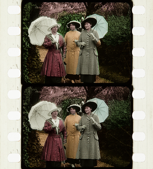
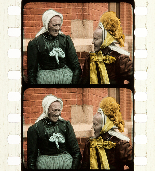
Needless to say, stencil and hand coloring were reserved for more ambitious or luxurious films. However, they also allowed for the creation of a higher reality effect in documentaries, travelogues, or fashion films by anticipating the development of mimetic colors. Exotic places, ethnicities, or historical settings were among the prevailing topics of stencil-colored films.
 [44]
[44]Documentary. La mangouste ou rat des pharaons (France 1914). Credit: Cineteca di Bologna. Photograph of the stencil-colored nitrate print by Noemi Daugaard.
 [45]
[45]Fashion film. Modeflitsen (France 1918). Credit: EYE Filmmuseum Amsterdam. Photograph of the stencil-colored nitrate print by Bregt Lameris.
 [46]
[46]Travelogue. Coiffures et types de Hollande (France 1910, Alfred Machin). Credit: Cineteca di Bologna. Photograph of the stencil-colored nitrate film by Barbara Flueckiger.
In fact, the richness and scope of stencil-colored films can be fascinating to the modern viewer. That holds true for both the bolder color in the first decade of the 20th century or the more nuanced pastel shades that became increasingly prevalent in the 1920s.
 [47]
[47]Bold colors in early film. L’Amour d’esclave (France 1907, Albert Capellani). Credit: Library of Congress. Photograph of the stencil colored nitrate film by Barbara Flueckiger.
 [48]
[48]Subtle pastel shades in the 1930s. Elstree Calling (Great Britain 1930, André Charlot; Jack Hubert; Paul Murray; Alfred Hitchcock ). Credit: BFI National Archive. Photograph of the stencil colored nitrate print by Olivia Kristina Stutz.
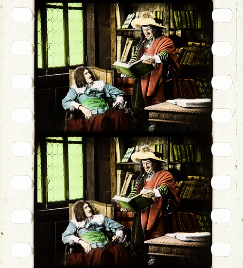
A special case of applied colors is the Handschiegl [49]process, a printing process developed by Max Handschiegl and Alvin Wyckoff, often used in Cecil B. DeMille’s films, especially for title cards. It produces highly detailed and precise colors with stunning effects.
 [50]
[50]Handschiegl. Joan the Woman (USA 1916, Cecil B. DeMille). Credit: George Eastman Museum. Photograph of the tinted, toned and Handschiegl nitrate print by Olivia Kristina Stutz.
Mimetic colors
Already in France in the 1860s, Charles Cros and Louis Ducos du Hauron separately wrote descriptions of many of the principles for achieving mimetic colors in still photography. As it turned out, however, it was a much more demanding task to develop solutions for moving pictures. Some of the problems related to the high throughput during projection of 16 or more single frames per second. Other problems resulted from much higher requirements for image size on the big cinema screen, where resolution and registration were paramount. Due to the rapid succession of frames necessary for the illusion of movement, minute deviations occurring between frames created disturbing amounts of flicker or color fringing. Contemporary commentators often labeled the result as “color bombardment” that caused “eye strain”.
To this day, mimetic colors combine two to four color components either in additive or subtractive admixtures. In the 19th century their development followed psychophysical insights into the human visual system by Thomas Young and Hermann von Helmholtz. They showed that color impressions are the result of physiological sensors in the human retina sensitive to three different spectral ranges of the visible light.
Additive colors
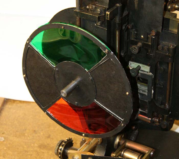
Additive admixtures operate with colored light where the sum of the three additive primaries red, green and blue results in white light. The earliest attempts to create colors on the screen by optical means employed additive principles by rotary filters [51] in front of the camera and projector respectively. These included the three-color Turner Lee and the most successful additive two-color process Kinemacolor.
 [52]
[52]Rotary filter in front of the Kinemacolor projector used for David Cleveland’s and Brian Pritchard’s reconstruction. Credit: Brian Pritchard.
 [53]
[53]Kinemacolor positive from the Kodak Film Samples Collection. Credit: National Science and Media Museum Bradford. Photograph by Barbara Flueckiger in collaboration with Noemi Daugaard.
In Kinemacolor, [54]rotary filters in red and green spinning in front of camera and projector recorded and transmitted the color information by temporal synthesis. The impression of color was created in the eyes of the spectators. Based on contemporary reports and digital reconstructions, the poor quality and limited color spectrum were readily apparent. Due to the temporal shift between the two successive frames with the red and green color separations, Kinemacolor and all processes operating by the same principle created color fringes and a headache-inducing amount of flicker.
Mroz Farbenfilm. Urlaubfarbenfilm F. Apfelthaler (AUT 1932, Friedrich Apfelthaler). Credit: Österreichisches Filmmuseum. Video and reconstruction by Giorgio Trumpy, David Pfluger and Martin Weiss.
Attempts with temporal synthesis were followed by additive processes that employed spatial synthesis [55] by the application of beam splitters. In this configuration, up to three color records were taken through filters simultaneously to eliminate temporal parallax. But this approach introduced spatial parallax instead, and this arrangement could also create color fringes by poor registration. Gaumont’s Chronochrome [56] process was certainly the most convincing attempt to combine three color separations with this principle.
 [57]
[57]Gaumont Chronochrome positive from the Kodak Film Samples Collection. Credit: National Science and Media Museum Bradford. Photograph by Barbara Flueckiger in collaboration with Noemi Daugaard.
A third type operating with additive admixtures of light are the so-called screen processes [58]. Additive colors are mixed, either by random, small-scale mosaic image elements or by organization into lines. Color impressions in these systems result from the fusion of the individual dots or lines into red, green and blue in visual perception. The effect resembles that of pointillist paintings where colors are divided into small dots.
Lenticular screen [59] processes, by contrast, combine tiny lenses imprinted onto a black-and-white film strip with colored filters in front of the camera and projector.
 [60]
[60]Kodacolor lenticular filter for the projector. Lichtspiel/Kinemathek Bern.
Mosaic screens [61] created by colored potato starch were popular in still photography with the Lumière brothers’ Autochromes [62], introduced in 1907 and widely used by professionals and advanced amateurs. The principle was later adopted in the Cinécolor [63] process for color film but failed due to the uneven distribution of the starch particles. Among the line screen [64] processes, Dufaycolor [65] was the most successful one, widely used in documentaries and famously in Len Lye’s experimental films [66] with direct animation painted directly onto the film strip and then captured and distributed on Dufaycolor film stock. Apparently, Lye was not convinced by the somewhat muted color palettes of the process.
 [67]
[67]Stereoscopic Autochrome Lumière. Exhibition Color Mania – Materiality of Color in Photography and Film, Fotomuseum Winterthur, September 7 to November 24, 2019. Photo by Barbara Flueckiger.
 [68]
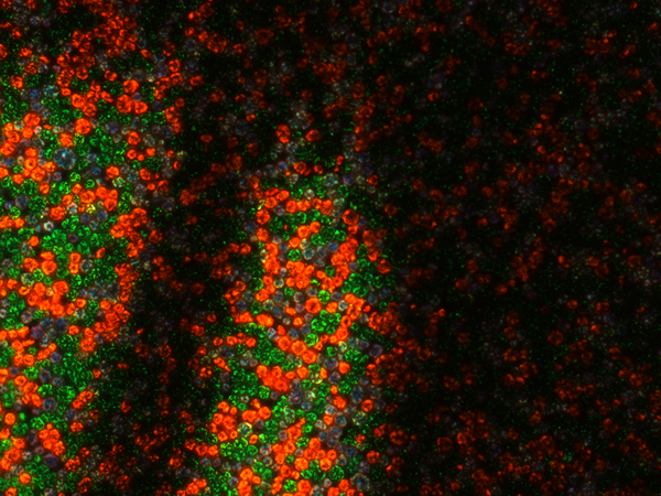
[68]Photomicrograph of Cinécolor (20x). Credit: Photomicrograph by Silvana Konermann.
 [69]
[69]Cinécolor sample. Credit: Gert Koshofer Collection. Photograph by Barbara Flueckiger.
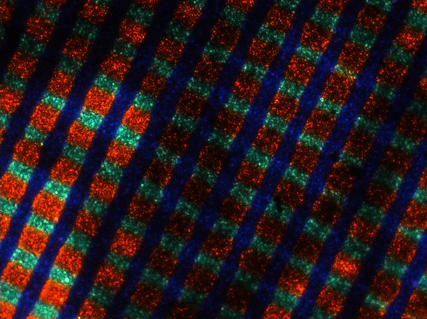 [70]
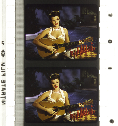
[70]Photomicrograph of Spicer-Dufay, early Dufaycolor (20x). Credit: Photomicrograph by Silvana Konermann.
 [71]
[71]Dufaycolor. A Colour Box (Great Britain 1935, Len Lye). Credit: BFI. Photograph of the Dufaycolor di-acetate print by Barbara Flueckiger.
Lenticular films such as Kodacolor [72] were also mostly used for home movies with the exception of Thomson color for Jacques Tati’s Jour de fête (France, 1949).
None of the additive principles proved to be successful for the long term. Many of them required special installations in the cinema, and most delivered poor results, most notably dim images.
Subtractive colors
Finally, subtractive admixtures became the norm. The three primaries cyan, yellow and magenta filtered the light, with black being the sum of these three subtractive colors. Two or three differently colored emulsion layers are attached to the film base, on one side or both sides of the film.
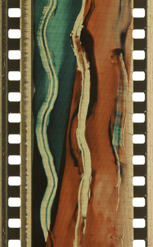
Most early two-color films were using double coated [73] film stock. The earliest one was Kodachrome Two-color [74] developed in 1915, presented in 1916 with the short film Concerning $1000, but mostly in use in the 1920s for fashion films, for the dance film The Flute of Krishna (USA 1926) by choreographer Martha Graham and for the experimental film [Kaleidoscope] by Loyd A. Jones. Kodachrome Two-color film was shot through a beam splitter and combined two emulsions in orange-red and bluish green on either side of the film carrier, with beige, brown and golden tones in the spectrum between the two color components.
 [75]
[75]Kodachrome Two-color Test Shoot No. III (USA 1922, Anonymous). Credit: George Eastman Museum. Photograph of the Kodachrome two-color double coated stock by Olivia Kristina Stutz.
 [76]
[76]Kodachrome Two-color. [Kaleidoscope] (USA ca. 1927, Loyd A. Jones). Credit: George Eastman Museum. Photograph of the Kodachrome two-color double coated stock by Barbara Flueckiger.
 [83]
[83]Sirius Farbenfilm. [Farbfilmversuche] (Germany 1920s or 1930, Ludwig Horst; Hans Horst). Credit: Deutsches Filminstitut DFF. Photograph of the Sirius color nitrate print by Barbara Flueckiger.
 [84]
[84]Multicolor. Credit: Gert Koshofer Collection. Photograph by Barbara Flueckiger.
 [85]
[85]Prizma II. The Glorious Adventure (Great Britain 1922, J. Stuart Blackton). Credit: BFI National Archive. Photograph of the tinted and Prizma II nitrate print by Olivia Kristina Stutz.
In the 1930s subtractive processes turned to three colors, most famously with Technicolor No. IV [86] and the subsequent Technicolor No. V [87], which was printed from chromogenic camera negatives. Founded in 1915, the Technicolor Company went through many failures and set-backs, with the exception of a short color rush in the late 1920s with the two-color dye-transfer process Technicolor No. III [88]. Following the series Great Events with 12 short films produced by the Technicolor company to establish the process, mostly musicals and a few other genres exploited the two-color process during this short boom. But some of them are highly remarkable, with sophisticated camerawork by Technicolor’s own cinematographer Ray Rennahan, including the musical Whoopee! (USA 1930, Thornton Freeland) choreographed by Busby Berkeley, King of Jazz (USA 1930, John Murray Anderson, Pál Fejös), Doctor X (USA 1932, Michael Curtiz), and Mystery of the Wax Museum (USA 1933, Michael Curtiz).
 [89]
[89]Technicolor No. III. Doctor X (USA 1932, Michael Curtiz). Credit: UCLA Film & Television Archive. Photograph of the Technicolor No. III dye-tranfer nitrate print by Barbara Flueckiger.
 [90]
[90]Technicolor No. III. King of Jazz (USA 1930, John Murray Anderson; Pál Fejös). Credit: Library of Congress. Photograph of the Technicolor No. III dye-tranfer nitrate print by Olivia Kristina Stutz.
While the technologies applied in Technicolor’s various processes changed considerably over the years, the beam splitter was one of the few constants. Both in Technicolor No. II and III, a beam splitter separated the two color records and captured them mirrored upside down on one black-and-white negative. The bulky and heavy Technicolor No. IV camera [91] recorded the color separations on three black-and-white 35 mm negatives. From these three negatives matrices were produced as wash-off reliefs, ready for the dye-transfer of the three primaries onto the positive print. The result was a series of color images, along with the frame lines and the soundtrack as silver images.
For almost two decades Technicolor dominated the market for high-quality color films. Part of its success was due to a comprehensive package that included the camera, specialized cinematographers, and all the lab works executed exclusively in Technicolor’s own plants. One of the building blocks of Technicolor’s long-term dominance, however, was the so-called Color Advisory Service, famously led by color consultant Natalie M. Kalmus. She defined aesthetic guidelines for film productions shot with the process, informed by color norms related to concepts of “elevated taste,” located in a broader cultural context with references to the concept of “color consciousness.”
 [92]
[92]Technicolor No. IV. The Life and Death of Colonel Blimp (Great Britain 1943, Michael Powell; Emeric Pressburger). Credit: BFI. Photograph of the dye-transfer nitrate print by Barbara Flueckiger.
 [93]
[93]Technicolor No. IV. Blood and Sand (USA 1941, Rouben Mamoulian). Credit: BFI. Photograph of the dye-transfer nitrate print by Barbara Flueckiger.
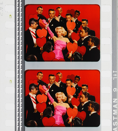 [94]
[94]Technicolor No. IV. Gentlemen Prefer Blondes (USA 1953, Howard Hawks). Credit: Library of Congress. Photograph of the dye-transfer safety print by Barbara Flueckiger.
Despite all the efforts to control the color schemes, people often associate Technicolor with highly saturated, deep colors. On close inspection in our detailed analyses of color films, however, we have observed that many films adhere to the rules with mostly restrained color schemes and unsaturated backgrounds to guarantee optimal figure/ground separation. But there are also deviations from these self-imposed norms, surprisingly clashing hues even in films produced with Natalie M. Kalmus as color consultant.
Moreover, there is a great variability of different looks and color applications during the almost two decades. Individual color aesthetics were related to personal styles of cinematographers, directors or production companies, genres or changing preferences in fashion and design, and changing color compounds and recipes employed in the process. Technicolor’s idiosyncrasies – what we perceive as typical “Technicolor look” – are mostly due to the dye-transfer process itself. Pasty, dense colors in patchy structures create an almost opaque appearance on the screen, an effect somewhat like oil paint. When we work with the film elements on the bench in archives, we not only have to increase exposure considerably due to the density of the film stock, but we also notice the color layer’s almost sticky viscosity, often visible as a relief on the surface.
Compared to Technicolor, Gasparcolor [95]produced much more saturated, brilliant and luminous colors. In fact, the process, developed in the early 1930s by Hungarian emigré Béla Gaspar in Germany, was possibly the most advanced and complex process at the time. In its principle–the silver dye-bleach process described by Raphaël E. Liesegang in the late 1890s – the silver acted as a catalyst for the local destruction of the dyes embedded in the three emulsion layers on the two sides of a reversal positive. It is thus a chromolytic [96] reversal process. Due to the political circumstances during the Third Reich in Germany, Gaspar eventually had to flee.
Like Technicolor Gasparcolor required the recording of three color separations on black-and-white negatives. Since most of the Gasparcolor films were animations, these separations were captured in succession on adjacent film frames but could of course also have been shot through a beam splitter similar to Technicolor No. IV. In fact, only one documentary is widely known, Colour on the Thames (Great Britain, 1936), shot by Adrian Cornwell-Clyne. Among the films produced with Gasparcolor are famous avant-garde experimental films by Oskar Fischinger, Hans Fischinger, and Len Lye. Gasparcolor prints can easily be identified by the black perforation area and the colored soundtrack.
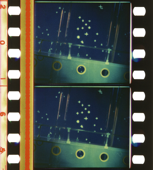 [97]
[97]Gasparcolor. The Ship of the Ether (Netherlands 1934, George Pal). Credit: BFI National Archive. Photograph of the Gasparcolor nitrate print by Barbara Flueckiger.
 [98]
[98]Gasparcolor. Colour on the Thames (Great Britain 1935, Adrian Klein). Credit: BFI National Film Archive. Photograph of the Gaspar color nitrate print by Barbara Flueckiger.
 [99]
[99]Gasparcolor. Rainbow Dance (Great Britain 1936, Len Lye). Credit: Museum of Modern Art. Photograph of the Gaspar color nitrate print by Barbara Flueckiger.
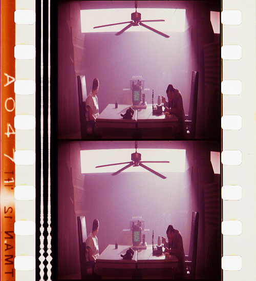
Both Technicolor and Gasparcolor prints stored in archives are in remarkably good shape, due to their stable colors. Ironically, chromogenic film [100] stocks, the technical principle that ultimately won the competition and became the new standard, had the least stable dyes. Chromogenic means that the dyes need to be developed after exposure. Embedded in the emulsion of a single strip of film stock are three or more layers. These layers are sensitive to different spectra. All contain silver halides and the color-forming substances, so-called dye couplers that are subsequently developed into dyes. In a second stage the silver is bleached out and leaves the color information in the form of finely dispersed dye clouds in the three or more emulsion layers in cyan, magenta and yellow. The result is a highly translucent, glowing image whose fine-grain structure depends on the speed of the film stock. The slower the speed, the finer the grain.
In contrast to Technicolor the shooting of the chromogenic film could be done with normal cameras on one negative or camera reversal. Chromogenic films increasingly became the norm, starting with Agfa’s first negative-positive process Agfacolor [101]. Emerging in the late 1930s, Agfacolor was promoted by German propaganda in a bid to counteract Technicolor’s dominance. Agfacolor had particularly soft colors in the pastel range with a typical, slightly darkened orange-tomato red. Difficulties in the blue range produced turquoise shades that become quite apparent in skies. Greens had a tendency to look brownish or blackened; shadows had a greenish tinge. Chromogenic multilayer film stocks were incredibly difficult to balance and to produce, requiring a high level of knowledge in physics and chemistry.
 [102]
[102]Agfacolor. Münchhausen (Germany 1943, Josef von Báky). Credit: Copyright Friedrich Wilhelm Murnau Foundation. Bundesarchiv Filmarchiv. Photograph of the Agfacolor safety print (acetate) by Barbara Flueckiger.
 [103]
[103]Agfacolor. Opfergang (Germany 1944, Veit Harlan). Credit: Copyright Friedrich Wilhelm Murnau Foundation. Filmmuseum Düsseldorf. Photograph of the Agfacolor Safety Print by Barbara Flueckiger.
 [104]
[104]Agfacolor. Grosse Freiheit Nr. 7 (Germany 1944, Helmut Käutner). Credit: Copyright Friedrich Wilhelm Murnau Foundation. Bundesarchiv Filmarchiv. Photograph of the Agfacolor nitrate print by Michelle Beutler.
 [105]
[105]Agfacolor. Der schweigende Stern (German Democratic Republic 1960, Kurt Maetzig). Credit: Bundesarchiv Filmarchiv. Photograph of the Agfacolor safety print by Josephine Diecke.
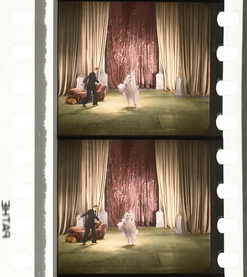
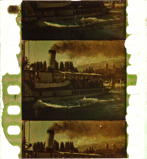
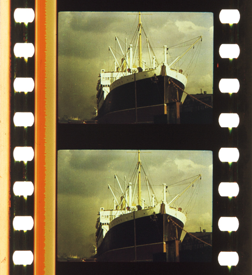
After World War II ended, the Allies were able to exploit German color-film patents. The result was the appearance of Fujicolor [106], Eastman Color [107], and many derivatives, such as Ferraniacolor [108], Ansco Color [109], and Sovcolor [110]. The worldwide adoption of color in film production soon followed.
 [111]
[111]Sovcolor. Ivan the Terrible, Part II (Russia 1958, Sergei M. Eisenstein). Credit: Museum of Modern Art. Photograph of the Sovcolor safety print by Barbara Flueckiger. (The film was shot in the 1940s on captured Agfacolor stock, but the delay in the release of the film until 1958 meant that distribution prints were on Sovcolor stock.)
 [112]
[112]Fujicolor. Matador (Spain 1986, Pedro Almodóvar). Credit: Library of Congress. Photograph of the Fujicolor safety print by Barbara Flueckiger.
 [113]
[113]Eastman Color. Aliens (USA/Great Britain 1986, James Cameron). Credit: Academy Film Archive. Photograph of the Eastman Color Print Film Type 5384 by Joëlle Kost.
 [114]
[114]Eastman Color. Gattaca (USA 1997, Andrew Niccol). Credit: Library of Congress. Photograph of the Eastman EXR Color Print Film Type 5386 reference print by Barbara Flueckiger.
A plurality of styles emerged, less defined by technical limitations than by cultural contexts and individual preferences of filmmakers, art directors, costume designers, and cinematographers. Color aesthetics in film are not only created by hues, color schemes, and color contrasts, but also by lighting styles, by material properties of surfaces and textures, by depth of field, image composition, and by movement. The combination of these factors influences the image’s figure-ground relationships.
In the course of our research, we investigated a large corpus of more than 400 films – mainly from 1895 to 1995 – with a computer assisted workflow. A video annotation software has been developed based on our approach since 2017, when we figured out that tools available then were not well suited to the detailed annotation and visual analysis of film (color) aesthetics. The visual analysis and annotation software VIAN [115] has been created by Gaudenz Halter in collaboration with the Visualization and MultiMedia Lab of the University of Zurich. The tools enable researchers to create detailed analyses including figure/ground separation [116] and a large range of visualizations that make diachronic developments immediately evident or support the testing of new hypotheses.
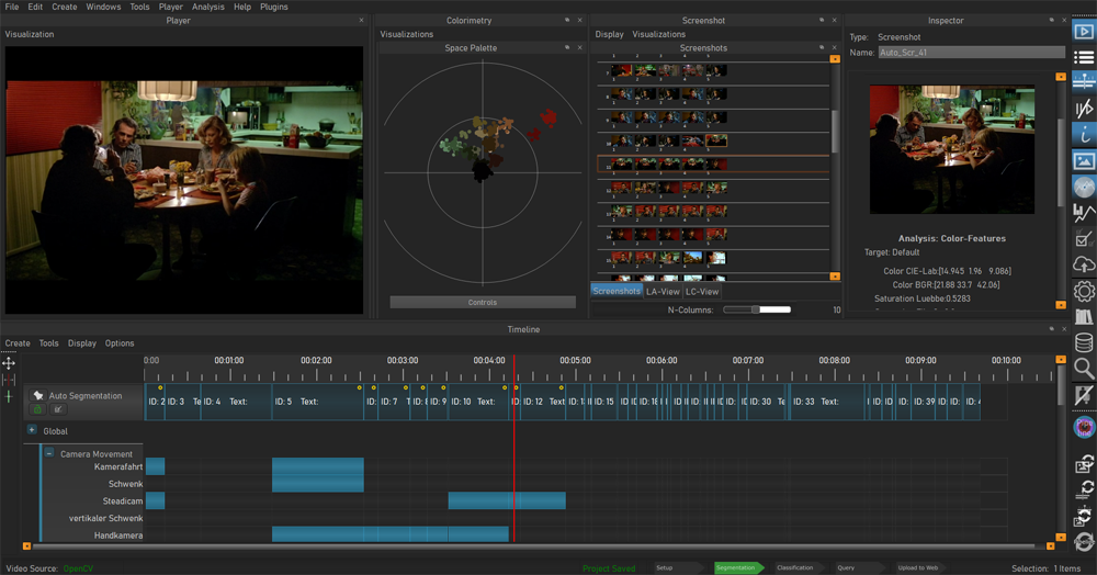 [117]
[117]Video analysis and annotation software VIAN, developed by Gaudenz Halter. User interface.
A deepened understanding of color film technologies and aesthetics is an essential prerequisite for the scientifically sound digitization and restoration of color films, which is one of the most pressing topics today and therefore remains at the center of our research activities.
Acknowledgements
I would like to express my immense gratitude to Kristin Thompson and David Bordwell for publishing this blog post and for all the inspiration that guided my research.
A huge thank you to my teams ERC Advanced Grant FilmColors [118], SNSF Film Colors. Technology, Cultures, Institutions [119], ERC Proof-of-Concept VeCoScan [120].
Special gratitude is dedicated to all the film archives with their wonderful collections.
This project has received funding from the European Research Council (ERC) under the European Union’s Horizon 2020 research and innovation programme, grant agreement No 670446 FilmColors.