


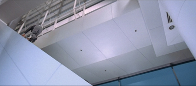
Off-center: MAD MAX’s headroom
Wednesday | February 10, 2016 open printable version
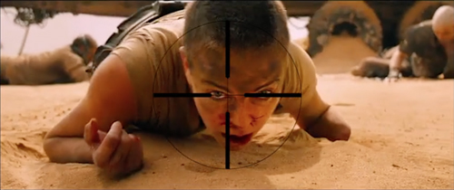
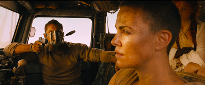
From Mad Max: Center Framed, by Vashi Nedomansky.
DB here:
If you’re a filmmaker, how do you frame the action you’re shooting? Put aside documentary shooting, which doesn’t allow you as many options as staged filming does. A lot of your compositional decisions depend on the aspect ratio of the image.
After the mid-1910s, filmmakers relied heavily on close views—framing typically two or three people, or even just one. These “portrait” framings were well-suited to the 4:3 format that was standardized in the silent era. But what happens when filmmakers must compose in wider frames, especially the 2.35:1 format that became common with CinemaScope?
Too much scope in ‘Scope?
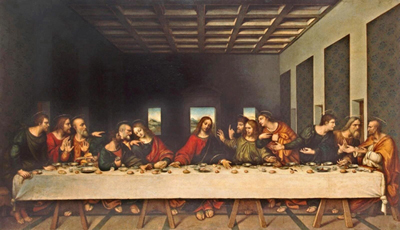
In classic Western painting and other traditions as well, a horizontal format is associated with fairly distant views of groups or landscapes.

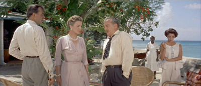
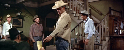
Early ‘Scope filmmakers did sometimes favor distant, spread-out ensemble staging, with greater or less depth. (Below: Island in the Sun; Bad Day at Black Rock.)
I try to track some of those early options in this online lecture.
But as technology improved, filmmakers managed to shoot medium- and close shots in the wide format. They “tamed” ‘Scope to a more traditional continuity. And as there were pressures toward “intensified continuity,” filmmakers adapted those tenets to ‘Scope. They gave us close-ups, fast cutting, and roaming camera movements within the widescreen array.
Like all solutions, this involved trade-offs. The 4:3 format was well-suited to the human body, and even a tight facial close-up could fill it fairly well. But a single or even a two-shot, in anamorphic widescreen, can leave a lot of the frame vacant or relatively unimportant.
Cinematographer Boris Kaufman objected to the extra real estate. In traditional arts, the design should fit snugly into the format, with all areas contributing to the image’s effect:
The space within the frame should be entirely used up in composition.
But close views in widescreen typically leave a lot of dead space. If you put the figure in the center, that dead space can be on the sides.
The bilateral symmetry of Wes Anderson’s frames is achieved on the premise that the figure is facing straight out at the viewer, so Anderson has the problem of filling up the flanking areas.
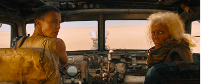
Or the dead space can be bigger on one side of the frame than the other. In that case, the figure, even a close one, is placed off-center in the 2.35/2.40 frame. This can suggest that the object of attention is somewhere beyond the empty zone.
To avoid sheer dead space, you can try to settle something in the background. If it’s dramatically important, you can generate some nice compositional tension, in the manner of the wide-angle, deep-focus look of the 1940s.
So as with most creative options, making a choice involves (a) tradeoffs and (b) further choices, some of them fairly forced. Go with widescreen, and you have to fill the frame somehow. Make one choice, and you have some dead areas, but you can control the viewer’s attention. If you fill the areas with significant action, you need to find some dynamic compositions. But you divide the viewer’s attention. You now have to make people look where you want and when you want.
Cuts for composition
Now add in cutting. How do you cut widescreen shots together, say in a conversation scene?
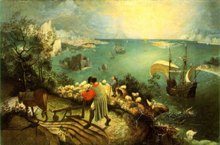
Go back to painting. Sometimes the most important item sits in the geometrical center of the picture format. Rudolf Arnheim points out that often the exact center is vacant and items are grouped around it. The result is a pictorial tension, with elements balanced, either symmetrically or in more complex patterns. In Bruegel’s Fall of Icarus, the major action is split–a dramatic splashdown, a world that doesn’t notice. The fall takes place somewhat off right of center, in a bright but far-offf area. It’s still almost indiscernible. The indifference of the peasants is given in the very composition of the image.
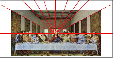
So too with cinema. In a single image, when the main point of interest isn’t dead center, there can be either symmetry, or important items grouped around the center.
Going beyond the single image, we find that editing can create a fairly gentle seesawing around the central area. A common tactic is shot/ reverse-shot, with over-the-shoulder framings. In widescreen, that option tends to make the center fairly empty.

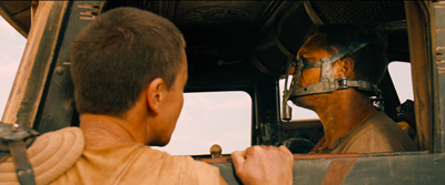
Or you can try “compensatory” shot/ reverse-shot cutting, so that the empty area of the first shot is filled by the corresponding figure or action in the next shot.
This second isn’t a bad solution, since the two shots together satisfy Kaufman’s dictum in a roundabout way. They become a “cinematic” way of filling the horizontal format, but in time rather than purely in space. And in this instance the main characters’ angled eye levels fit together snugly, in the upper center.
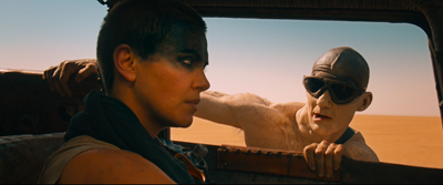
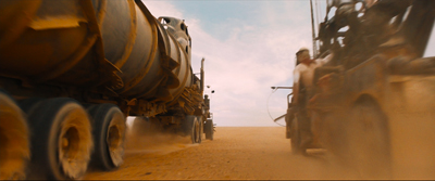
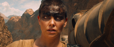
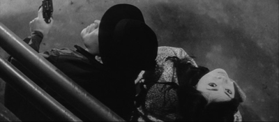
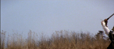
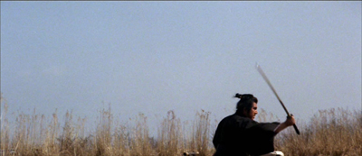
There can be a certain suspense added, as the second frame slowly fills up to reveal the item. When Furiosa looks off right, we cut to a shot of what’s caught her attention–an attack vehicle drawing into the frame on the right.
Assume, as most people do, that our attention fastens on certain aspects of the frame—typically those that attract us perceptually (brightness, movement, color, sound source, etc.) and that provide ongoing story information. So now you have to consider: How closely do you want your second shot to pick up on the crucial area of the first shot? That is, is the smoothest cut the one that starts the next shot with the viewer’s eye in the same part of the frame?
Some editors argue for this sort of continuity. “If the eye is led to one side of the screen,” notes one primer, “the action of character in the next shot might be located on that side also. Again, the purpose of the cut is to allow the eye to follow the movement.”
We’re back with our old friend the guided saccades, the fast, jerky eye movements that sample our environment. We’ve seen saccades at work in a single shot, thanks to staging that guides our attention. (Go here for a first-pass analysis, here for the eye-tracking evidence.) What about the cuts? The research of psychologist Tim Smith suggests that many editors intuitively try to match the point of interest across cuts. This is especially evident in the default zone, the geometrical center.
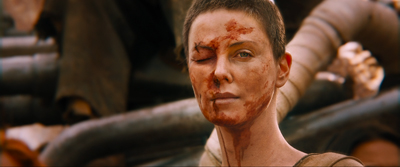
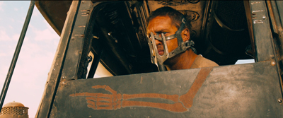
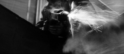
Keeping the viewer’s attention fastened on one area of the screen across the cut could be of great value in fast-cut action scenes. That way the viewer couldn’t miss the most important thing—a face, a gesture, a prop. This was the aim of George Miller in certain scenes of Mad Max: Fury Road. According to cinematographer John Seale, the centered compositions make it easier for the viewer to follow the action.
Your eye won’t have to shift…to find the next subject when you’ve only got 1.8 seconds of time to do that.
Vashi Nedomansky has created a striking video, complete with centered crosshairs, that shows the strictness of framing and composition during one action scene. Both long shots and fairly close ones are center-framed.
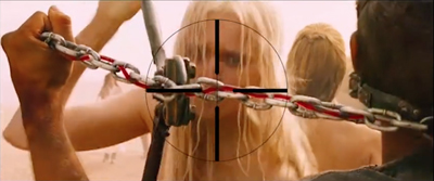
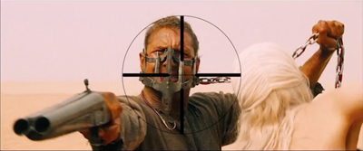
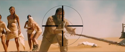
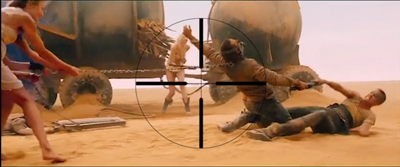
Vashi notes that Michael Bay and other directors seem to rely on fast cutting without due concern for where the viewer’s eye lands at the end of each shot. Combined with very short shots, compositional confusion can flummox us. We don’t know where we should be looking.
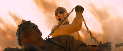
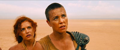
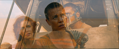
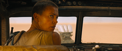
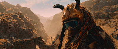
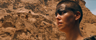
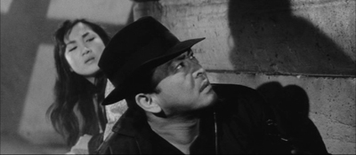
Miller uses a greater variety of compositions in other stretches of the film, as my illustrations above indicate. At times he applies his “matching zone system” to more off-center layouts. Furiosa is shown waiting for the biker gang to complete the deal, and she’s center framed.
We cut to one biker surveying the scene. He (she?) is positioned off-center, so that we get a certain foreground/background dynamic between him (her?) and the truck far in the background. Now cut to Furiosa, who’s now in the same area of her frame; the empty space on the left seems to confirm what her eyeline suggested about the biker’s position above the canyon. (Interestingly, Miller slightly breaks the axis of action to get this smooth graphic cut.)
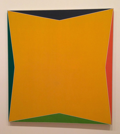
Still, you can argue that for fast-cut scenes it’s better to adopt a brute-force simplicity of composition, favoring the center. (While of course assuming that ordinary continuity principles, such as matching of movement, screen direction, eyelines, and so on, are obeyed.) Tim Smith’s experiments have shown that all other things being equal, our eyes drift to the center of the format from shot to shot–a point that Arnheim also makes about “the power of the center” in all images. This visual habit is challenged by so-called empty-center painting of the 1960s and 1970s, as seen in Kenneth Noland’s Shadow on the Earth and Larry Zox’s Decorah.
Mad Max: Fury Road seems to me a superbly directed film in its chosen style, but we can find alternatives. What about fast cutting that tries, as a part of an action scene’s kinetic drive, to shuttle or bounce the viewer’s attention more widely across the frame? This option wouldn’t be helter-skelter in the Bay manner; it’s calculated, and engenders its own pictorial excitement.
Not exactly a picture scroll, but kind of
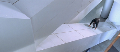
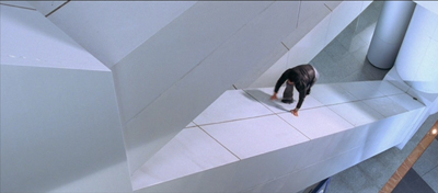
We can find many examples in the Asian action tradition. Take for example one of the extended pursuits in Benny Chan’s New Police Story, a 2004 Jackie Chan vehicle. Jackie is clambering up along an angled beam of the Hong Kong Convention Center, and the framing puts him far to the right, emphasizing the distance and steepness of the climb.
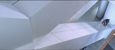
As he scrambles up, he seems not to notice that his pistol falls out of his pocket. But we do, because it stands out against the pale cladding as it slides down to the bottom of the slope. Miller would have given us a separate, centered shot of this crucial action, but here it becomes an instance of that “gradation of emphasis” that widescreen encourages.
Before Jackie can hit frame center, there’s a cut that reverses the design of the first shot. A low angle puts him at the far left corner of the frame as he reaches the top. We never really see Jackie in the center of the frame in either shot.
The two shots are cut fast (about 3 seconds each), but there’s no problem grasping the action. Hong Kong filmmakers realized that you could cut long shots quickly if the composition and lines of movement were very clear. There is, it turns out, enough time for the eye to catch up to the main point of the composition, but it does ask us to exercise.
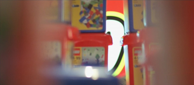
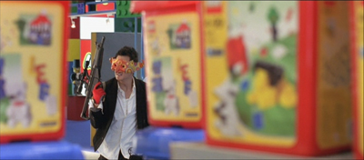
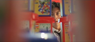
A more percussive cut comes when Frank, also unarmed, searches out Joe, the gang leader, in a toy department. A snap-movement of the kind HK filmmakers love shows an off-center empty slot; Frank pops in from screen right.

Cut to Joe stalking Frank, seen in another slot. It’s an optical POV shot, but it’s also off-center, balancing the composition of the first shot. A cut back to Frank closes the POV pattern. Perhaps the oscillation around the frame center can prime us for the next shot.
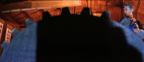
To get a sense of this “all-over” frame composition, have a look at this sequence from Yuen Kwai’s Ninja in the Dragon’s Den (1982). The combat swiftly passes from the center to the sides or to a corner. Thanks partly to the architecture of the cabin and the mill wheel, and partly to the judicious framing, there’s a sense that Kaufman might be satisfied that the space in the frame is “entirely used up”–not in a single shot, but in the totality of shots. (I’ve left in the English dubbing so subtitles don’t distract your eye.)
Hong Kong filmmakers mastered dynamic compositions during fights, but they were seldom as eccentric as their Japanese colleagues. Once anamorphic widescreen became common in Japan, directors pushed points of interest to frame edges and exploited unusual framing.
Consider the shootout at the climax of Suzuki Seijin’s Underworld Beauty (1958). A gang has trapped the protagonist Miyamoto and a young woman in a boiler room and is subjecting them to some heavy ordnance. In one series of shots, we see a gunman fire to the right, and as a result of his strafing, one boiler starts to blow.
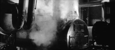
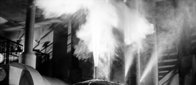
The progression of boiler shots shifts us more or less rightward across the basement, and the empty area on the far left of shot 3 suggests that the gunman remains offscreen in the upper left. Now we get a sort of establishing shot showing the two boilers of shot 2 more fully.
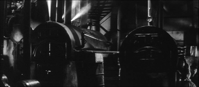
I think we’re inclined to place the offscreen gunman still in the upper left. The spraying boiler we’ve seen is now on frame left. What’s surprising is that Miyamoto and the woman are crouching way down in the lower right corner. As you watch the shot, you might not notice them at first, but Suzuki has them change position after a moment so their movement attracts our eye. In addition, the shot is fairly prolonged as the boss calls out to his prey, so viewers have time to discover them. This is, I think you’ll agree, a pretty bold use of the anamorphic frame.
Once we’ve noticed them, how does Suzuki cut closer to the couple? Unpredictably.
I feel a bump here every time I see it, because it’s hard to read the facial expressions from this angle. Instead, we get an almost abstract composition spread in a diagonal across the frame. Again, the geometrical center is less important than the shapes, edges, and tones that cross it.
At last we get something like an orthodox framing of the couple, eased by a match on action as the woman tips her head.
So the passage ends with a center-framed image. As often happens, decentering registers as an accent, a transitory departure from the baseline, the centered image. Not only will most action pass through the center, but we can be yanked to other regions in confidence that we’ll eventually return to it.
The shots in Underworld Beauty aren’t especially fast-cut, but I’ll close with another extract that is. This is the opening of Baby Cart at the River Styx (in the Lone Wolf and Cub series; dir. Misumi Kenji, 1972). Again, I’ve disabled the subtitles. (NB: Probably not best for children to see this.)
In a burst of shots, we get centered images, off-center ones, and radically off-center ones.
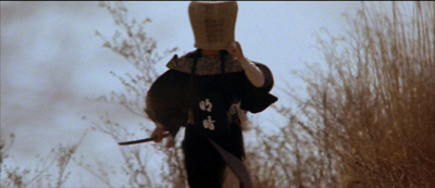
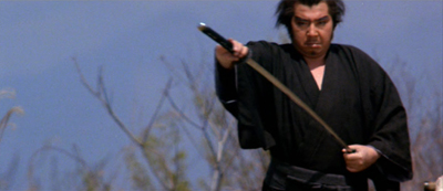
Continuity rules are respected and the camera is angled properly; but the compositions bounce from perfectly readable to perversely indiscernible. Some shots keep us in suspense about what’s about to happen, yet at no point is the action unclear. Again, the impact comes partly from simply composed, but highly varied, images.
George Miller’s strict target-framing is very powerful, but there are other options, even in fast-cut sequences. The idea of leading our attention across areas of the screen goes back to Eisenstein, the theorist-director who enjoyed zigzag graphic designs and the pictorial clatter created by a cut. One lesson: Every bit of the frame can be used, if only to jolt the viewer’s eye. All the action on the screen isn’t just in the story.
My quotation from Boris Kaufman is taken from Edward L. de Laurot and Jonas Mekas, “An Interview With Boris Kaufman,” Film Culture 1, no. 4 (Summer 1955): 5. The quotation about matching screen zones comes from Steven E. Browne, Video Editing: A Postproduction Primer, 3d ed. (Focal Press, 1997), 147. Bruce Block discusses “affinity continuums” from shot to shot in Chapter 7 of The Visual Story: Seeing the Structure of Film, TV and New Media, 2d ed. (Focal Press, 2013).
The Rudolf Arnheim book I’ve mentioned is The Power of the Center: A Study of Composition in the Visual Arts: The New Version (University of California Press, 1988). “Empty-center” painting is discussed by Thomas B. Hess in the essay of that title in New York (2 April 1973), 64-65 and in “Olitsky without Flattery,” New York (1 October 1973), 76-77. Hess describes paintings in which “the picture plane is stretched like a trampoline, with lots of spring action at its quivering edges.”
Tim Smith’s eye-tracking research is relevant to the framing principles I’ve been considering. Although he has yet to consider the more complicated cases of dispersed points of attention, he has found strong evidence that the default area remains the geometrical center of the screen. See his “Watching You Watch Movies: Using Eye Tracking to Inform Cognitive Film Theory,” in Psychocinematics: Exploring Cognition at the Movies, ed. Arthur P. Shimamura (Oxford, 22013), 170-171; the relevant video, with a heatmap of viewers’ attention, is here. Tim’s website is full of other examples from his research. Thanks to Tim for correspondence on this point.
Thanks also to Patrick Keating for email discussion of some of these matters.
I discuss principles of early widescreen shooting and staging in the online chapter “CinemaScope: The Modern Miracle You See Without Glasses.” See also the video lecture of the same name. For another example of radical decentering during a fast-cut combat, though put to different uses than in the Japanese examples here, see my entry on a King Hu jump cut.
Incidentally, we might wonder whether the centered compositions in Mad Max: Fury Road aren’t also acknowledging that on some displays (cable, streaming, airlines) these images will be cropped. To put important material too close to the frame edge risks losing it on downstream platforms. See “Filling the Box: The Never-Ending Pan-and-Scan Story.”
Ninja in the Dragon’s Den.
P.S. 1 March 2016: There’s a sequel to this entry here.
Last Modified: Thursday | September 29, 2022 @ 18:11 open printable version
This entry was posted
on Wednesday | February 10, 2016 at 10:04 am and is filed under Film comments, Film technique: Cinematography, Film technique: Editing, Film technique: Staging, Film technique: Widescreen.
Responses are currently closed, but you can trackback from
your own site.


