Kristin here:
Recently I received the June issue of Empire magazine. After the shock of realizing that, Ack! It really is almost June, I turned to the letters to the editor. I received an even worse shock when I read this one:
I recently discussed 2001: A Space Odyssey with my Film Studies teacher (I’m an A-level student), and mentioned (what the back of the DVD case says): “One of the most mind-blowing jump cuts ever conceived.” He told me the bone to satellite scene is actually a match cut. I then read issue 262 of Empire, and was very happy to see a Stanley Kubrick special. I noticed you also called it a “stunning jump cut”. After being told what a jump cut and what a match cut is and seeing a few examples (the jump cut at the start of Don’t Look Now, and then the match cut in 2001: A Space Odyssey), I am now confused as to why the DVD and Empire would call it a jump cut when it is a match cut.
Robby Burke, via email
It is a match cut. The offending writer has been put into a small room with only Eisenstein films for company. The moral of this story is always listen to your teachers, kids. And good luck to Owen Robinson on your Kubrick Film Studies unit. This is turning into hospital radio.
No wonder Mr. Burke is confused. His teacher and Empire both gave him answers that I would consider wrong, or at best imprecise to the point of vagueness. This rather surprised me. I enjoy reading Empire, which has somehow managed to keep itself fat and glossy when magazines like Entertainment Weekly have shrunk to the size of brochures. It even has occasional useful articles, like its retrospective section on Back to the Future in the April, 2010 issue. (As far as I can tell, this section has never made its way to the Empire website.)
The term “match cut” is, out of context, virtually meaningless. There are different kinds of match cuts, and not specifying which type one is referring to will leave Mr. Burke and the rest of us clueless as to what the teacher and the unnamed staff member for Empire mean.
Thinking I was missing something about the term “match cut,” I looked it up on Wikipedia [3]and discovered that the teacher and the Empire staff member might have gotten their misinformation from the entry on that phrase. Its definition of a “match cut” is:
A match cut, also called a graphic match, is a cut in film editing between either two different objects, two different spaces, or two different compositions in which an object in the two shots graphically match, often helping to establish a strong continuity of action and linking the two shots metaphorically.
While the Empire use of “match cut” was only vague, this definition is simply inaccurate. The author goes on to say:
Match cuts form the basis for continuity editing, such as the ubiquitous use of match on action. Continuity editing smoothes over the inherent discontinuity of shot changes to establish a logical coherence between shots. Even within continuity editing, though, the match cut is a contrast both with cross-cutting between actions in two different locations that are occurring simultaneously, and with parallel editing, which draws parallels or contrasts between two different time-space locations.
I’ll agree that continuity editing is designed to smooth over the potentially disruptive quality of cuts. Matching anything within a scene is definitely different from cutting from an action in one place to a different action in a different place. But graphic matches are neither synonymous with “match cuts” nor the basis for continuity editing.
I also discovered that the “Further Reading” list at the bottom included two items, one of which was Film Art: An Introduction. One of those good news/bad news situations. The good news is, if you read the book, you will find out what graphic matches, and matches in general, really are. The bad news is, if you don’t, you might blame us for the contents of the Wikipedia entry.
A little detour into history
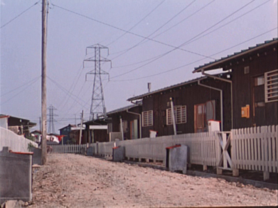
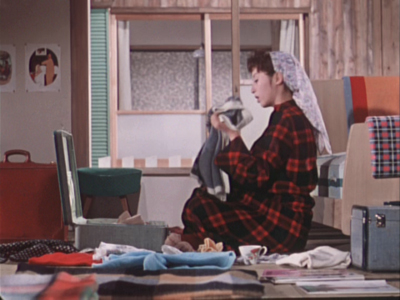
Most people don’t realize this, but David and I invented the term “graphic match.” As we recall, this happened in 1975. David was teaching a course that involved screening Yasujiro Ozu’s second color film, Ohayu (1959), a wonderful comedy about television, farting, and small talk. We had never seen the film before and were watching a 16mm print of it.
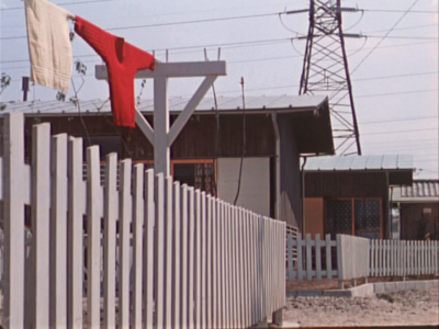
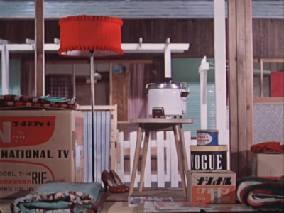
When the two shots below passed before our eyes, we both gasped and lunged for the projector. We ran the film back and watched the cut again. There was no doubt that Ozu had deliberately placed a bright red sweater in the upper left quadrant of the frame in one shot and a bright red lamp in the same basic position in the next shot. We didn’t know what to call this technique, so we dubbed it a “graphic match.” Two years later, when we started writing Film Art: An Introduction, we included the term as one technique of film editing and used Ozu’s match on red as one example. By now “graphic match” has been picked up to the point where we occasionally see it used in print.
If people, however, are tossing that term and “match cut” around so inaccurately–and even equating the two–then some definitions and examples seem in order.
Matcharama
“Match” as applied to editing simply means that some element is carried over from one shot to the next. That doesn’t necessarily mean that this element creates a sense of continuity.
In general, “continuity” means that a coherent space and time are continuing over the cut, so that the spectator’s understanding of a story isn’t disturbed by a sense that bits of time have been left out or that characters have changed positions at the cut. Most people watching a mainstream narrative film probably aren’t even aware of the editing, especially in conventional conversation scenes.
More specifically, “continuity” means a set of guidelines or loose “rules” that American filmmakers devised, mostly during the 1910s, to allow them to help create that clarity of narrative action in time and space. Within a scene, the most basic of these is the 180-degree rule or “axis of action,” the invisible line that runs through the scene perpendicular to the camera. If the camera stays on one side of that line, characters will stay in a consistent spatial relation to each other. Character A will be on the left in every shot, Character B on the right—unless one of them walks to a different part of the setting. In other words, the axis creates consistent screen direction.
The most basic kinds of matches are on appearance, position, action, and eyelines. Everyone knows that if a character is wearing a blue hat, showing her wearing a red one after the cut is a continuity error. Her appearance has not been matched. The same is true if she is resting her cheek on her hand in one shot, but has both hands flat on the table after the cut. If she is walking in one shot, she should not be running or standing still in the next. Even if the shots are made with a single camera and the actress repeats her actions, her position and movement should ideally be repeated so precisely that her action appears continuous. That’s a match on action, one of the most common continuity devices.
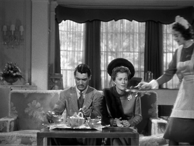
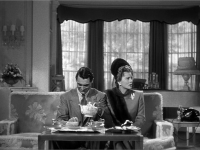
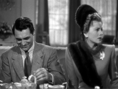
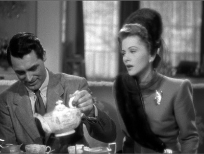
Smooth matches on action are difficult, especially if, as often happened in classic studio filmmaking, the two shots are made hours or even days apart. Even a supreme technician like Hitchcock can err. Here is a flagrantly mismatched passage from Suspicion. In the long shot, Johnnie (Cary Grant) reaches for the teapot with his left hand and starts to pour.
But then Hitchcock cuts in axially [8], the teapot is back where it was, and Johnnie once more reaches for it. By the time he’s pouring now, Lina has turned to watch him.
Editors traditionally like an overlap of 2-4 frames when they’re matching action on cuts, but this is a much longer overlap, something on the order of four seconds. Why we don’t usually notice such things is a source of considerable discussion in film circles.
The eyeline match is also very common. If a character looks at something offscreen, a cut shows us something in a different space, and we tend to assume that the character is looking at what we now see. Screen direction is important here, since if the character looks off right, when the next shot appears, we assume he is now offscreen left.
Not all continuity devices involve matches of these kinds. Crosscutting and flashbacks may move the action away from the space and even the time of a scene, but there are other cues that help us keep track of the ways in which these new spaces relate to the storyline.
None of this requires what we would consider a graphic match. Of course, if we see the same characters in the same setting from shot to shot, there will be an overall graphic consistency. They’re wearing the same costumes, and the background colors probably won’t shift greatly. But precisely because of that general consistency, we probably won’t notice the graphic qualities of the scene as being that important as elements of the editing. We’re busy following the story.
Graphic matches precise enough to be noticed as such tend to jolt us a little out of our smooth concentration on the story action. They are not the basic of continuity, as the Wikipedia definition claims. On the contrary, they often appear in films outside the continuity tradition. Abstract films often play on the graphic similarities (matches) or contrasts (mismatches) among shapes from shot to shot. Such abstract play is, in effect, their subject, and we pay attention to the pictorial flow as we would pay attention to story in a conventional narrative film.
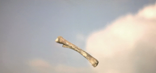
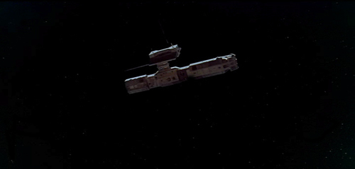
When close graphic matches or jolting graphic contrasts appear in narrative films, they may or may not play a narrative role. The famous bone/spaceship cut in 2001 is a graphic match. It’s not a match on action, since two different objects in completely different times and places are shown. It’s not a jump cut for the same reasons.
Here the graphic match is not really very close. The sky is bright and blue behind the bone, while it is dark behind the spaceship. Similarly, the bone is light in color, while the spaceship is initially dark, though it does brighten slightly as it moves. The only graphic element matched is the general shape and motion of the two objects.
The function, I assume, is to jolt the audience with the dramatic transition across millions of years and from earth into space. Thus here the graphic match has a narrative function, though it does not create the smooth movement from one scene to another that classical films tend to have. It’s more like what is sometimes called a “shock cut,” one which startles the viewer. The cut to the screeching cockatoo in Citizen Kane is one of the most famous examples, though it primarily involves sound and a strong graphic contrast.
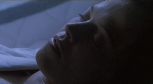
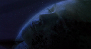
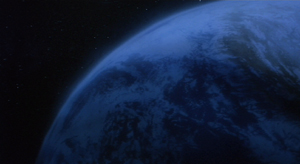
A transition somewhat similar to the one in 2001 occurs early in Aliens, an example which we use in recent editions of Film Art. A dissolve moves from a close-up of Ripley’s sleeping face to a view of part of the earth seen from space. Again there is a passage through time and space, though the interval is presumably only a few months. Here the graphic match is much closer than in the 2001 transition, with the colors as well as the shapes being kept fairly consistent. This graphic similarity and the dissolve that emphasizes it ease us from one scene to another rather than jolting and surprising us.
In the hands of an experimental filmmaker or of an unconventional director like Ozu, who avoids obeying Hollywood’s continuity guidelines, graphic matches don’t necessarily play a narrative role. They are included as an extra layer of engagement for the viewer. We don’t, or at least shouldn’t, expect to be able to interpret them. I would contend that the link between the red sweater and the red lampshade is there for pure pleasure. You can come up with an interpretation of the graphic match if you try hard enough—but if you do, please don’t tell me about it. I suspect it would interfere with my enjoyment of that scene when I next watch Ohayu.
I don’t think the cut serves even so modest a function as establishing space at the beginning of a scene. Here’s the shot that actually begins the scene and leads to the sweater and lampshade shots:
And here’s the one that follows the lampshade shot:
The woman is a minor character. She and her husband live in the suburban housing complex where the much of the action is set. They are more modern in their habits than their neighbors, wearing western clothes rather than kimonos and owning the only TV in the complex. They function primarily to introduce the two young boys in the central family of the story to TV, since they hospitably let the local kids visit them to watch it. The scene following the graphic match shows the wife packing to move. Their absence will precipitate a crisis when the boys demand that their parents buy them a television. The strife among the family members forms the basis for much of the rest of the action.
So the packing scene is important. Yet Ozu uses two shots that he wouldn’t need, thus delaying the scene’s beginning. The extreme long shot of the housing complex doesn’t tell us which house will form the setting for the upcoming scene. The red sweater is in the distance, but barely visible. We certainly wouldn’t notice it or get any clues about the narrative from it. Yet Ozu cuts to a closer view of the sweater and a towel. The houses in the background are all identical, and we don’t know which one belongs to which characters or which we will enter in the next shot.
The first interior view would be a logical establishing shot for the scene. The modern furnishings and especially the television box let us know where we are, and the boxes might hint that the inhabitants are packing to leave. So we are not surprised when we see the modern wife in the subsequent shot. But Ozu puts in the other two as part of his typical series of transitional shots that show the spaces between locales where action occurs.
The graphic match, I would suggest, is simply part of Ozu’s distinctive style. It’s playful and fits in with the general graphic beauty of his films, which includes bright splashes of color, careful compositions using the lines of the sets, and precise placements of props.
Returning to the Wikipedia entry for “match cut,” there is a section that mentions several examples, including the one that inspired Mr. Burke’s letter:
Stanley Kubrick’s 2001: A Space Odyssey contains a famous example of a match cut. After an ape discovers the use of bones as a tool and a weapon, there is a match cut to a spacecraft or satellite in orbit. The match cut helps draw a connection between the two objects as exemplars of primitive and advanced tools respectively.
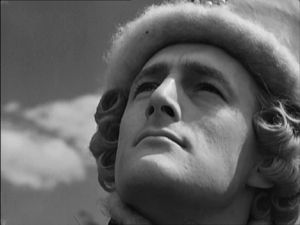
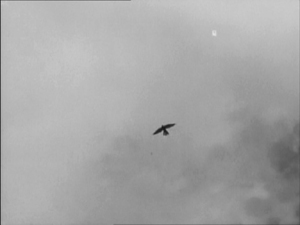
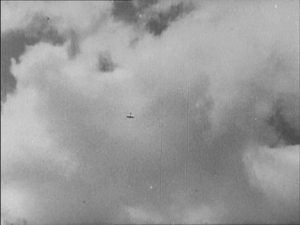
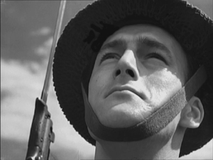
Michael Powell and Emeric Pressburger’s A Canterbury Tale contains the influence for the 2001: A Space Odyssey match cut in which a fourteenth century falcon cuts to a World War II aeroplane. The sense of time passing but nothing changing is emphasised by having the same actor, in different costumes, looking at both the falcon and the aeroplane.
An early example comes from Orson Welles’s Citizen Kane which opens with a series of match dissolves that keeps the lit window of C.F. Kane’s in the same part of the frame while the cuts take us around his dilapidated Xanadu estate, before a final match dissolve takes us from the outside to the inside where Kane is about to die.
Another match cut comes from Lawrence of Arabia (David Lean, 1962) where an edit cuts together Lawrence blowing out a lit match with the desert sun rising from the horizon. Director David Lean credits inspiration for the edit to the experimental French New Wave. The edit was later praised by Steven Spielberg as inspiration for his own work.
How the author knows that A Canterbury Tale (see below) influenced 2001 is not clear. The site footnoted (here [16]) simply says that the cut (below) “anticipated” Kubrick’s scene in 2001. The film was released in the U.S. in early 1949, so possibly Kubrick saw it and remembered the scene nearly twenty years later. By the way, Powell and Pressburger create a double graphic echo, roughly matching the two similar dark objects against a light sky and making the two shots of the men looking upward strongly resemble each other as well.
The Citizen Kane opening, with its precise placements of the one lit window from shot to shot, is a good example of graphic matches. I am not going to touch the question of what a “match dissolve” is.
The cut from the match to the Jordanian desert horizon in Lawrence of Arabia is a trickier case. The match is placed in the left half of the anamorphic widescreen frame, while the sun rises in the right half. Moreover, the match shot is very bright, while the desert scene is fairly dark, with the sun only beginning to glow above the horizon a short way into the shot. Graphically there is not much to link them, though I think the spectator does get a strong sense of a connection between the match and sun. I’d say it’s a conceptual link, not a graphic one. It’s a link that we make on the basis of two bright objects that are not compositionally or spatially matched but simply juxtaposed.
Mr. Burke, your inquiry was perfectly reasonable, and I hope I have helped clear up your confusion.
We supply two flagrant examples of mismatched action, figure placement, and setting in Bringing Up Baby in this blog entry [17]. Interestingly, probably no one but a professional notices them, because the relative positions of the major figures are consistent, as are the overall compositions of the shots. But then, as Dan Levin points out [18], we are not that sensitive to continuity disruptions in the real world either!
A Canterbury Tale.
