Tintinopolis
Friday | July 30, 2010 open printable version
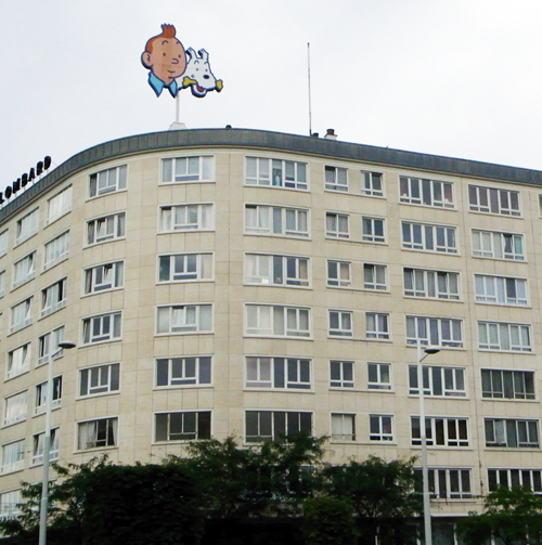
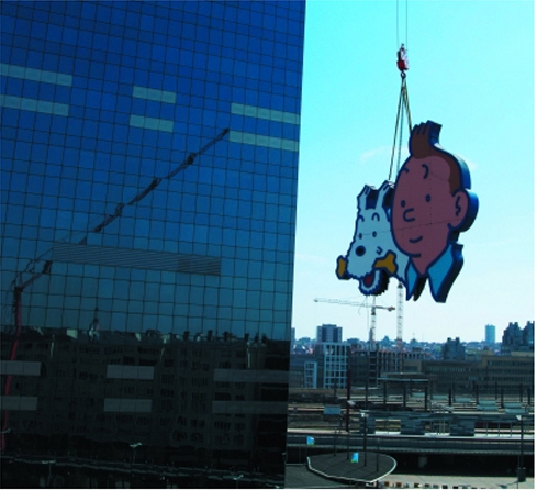
Photo by David Bordwell, July 2009. Tous droits réservés.
DB here:
He’s the world’s most famous fictional Belgian, miles ahead of Hercule Poirot. But I ignored him for about sixty years. Tintin wasn’t part of my childhood, and I didn’t get interested in his adventures until recently. Now, though, the scales have fallen from my eyes and I realize that Hergé is a great comics artist. And naturally I see him doing some things that shed light on cinema.
I came to the work obliquely. Since the 1980s Kristin and I have admired the Dutch cartoonist Joost Swarte. When we started to collect his books, lithographs, and CDs back in the 1980s, he was becoming known in the US through Art Spiegelman and Francois Mouly’s Raw. We were much taken with Swarte’s exact drawing style and mordant wit. I then got interested in the crisply drawn “clear line” tradition of French, Belgian, and Dutch cartoon artists stemming from Hergé—Chaland, Floc’h, Goffin, Ted Benoît, etc.—but I still didn’t pay much attention to the master himself.
This spring I gave a talk on La Ligne Claire to Kristin’s reading group, which explores fantasy (especially Tolkien), science fiction, comics, movies, and almost everything else. In preparing that, naturally I had to go back and read Hergé. Now I’m a believer. Some day I may polish that presentation and put it up as a web essay, but for now I just offer some notes, sojourning as I was recently in Tintin’s home town.
His own museum
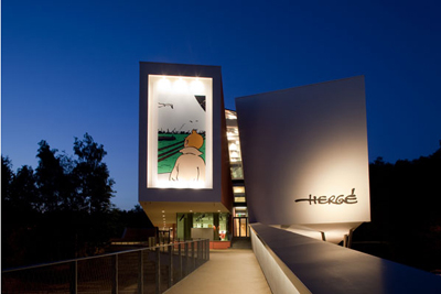
Photograph copyright Nicholas Borel; Christian de Portzamparc, architect.
Brussels has its own superb museum of comic art, the Belgian Comic Strip Centre in Rue des Sables. Last year, however, the Musée Hergé opened in Louvain-La-Neuve.
Louvain-La-Neuve is itself an unusual place: a town created more or less from scratch when the Catholic University of Louvain split off from the Dutch-speaking University of Leuven. Originally designed for students, the town now has a population of about 30,000, with many citizens commuting to jobs in Brussels. This planned city has been hailed as a model of urban design; parking and car traffic, for instance, are underground.
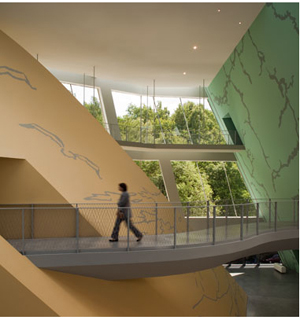
Go through the square to a wooded park and soon you’re in the Musée Hergé. It is one those buildings that aim to awe you. There are few right angles, and huge spaces are dominated by pyramids, cylinders, and other three-dimensional solids, all in muted colors and bearing the sorts of squiggles Herge might use for foliage.
Photograph copyright Nicholas Borel; Christian de Portzamparc, architect.
Architect Christian de Portzamparc‘s statement of principles is here.
 The first floor consists of the lobby, rest rooms, a restaurant, and a space for temporary exhibitions. As luck would have it, a tribute to Joost Swarte’s 40-year career was on display, and it was jammed with material. I could easily have spent the whole day here, even though I’d seen much of the material before. Swarte was also the “scenographer” of the Musée, offering ideas on interior design and decoration. The witty museum logo, as well as details like the signage, seem to be Swarte’s creations.
According to the guidebook, 80 % of Herge’s working material survives. This mountain of sketches, layouts, inked pages, color pages, and the like gives the curators a huge amount to pick from. Although the exhibition halls don’t feel stuffed, you quickly realize that you are in for total immersion.
You start at the third floor, and the first room supplies a survey of Hergé’s career. The information on the walls is pretty skimpy; the details are offloaded onto the headset commentary, I suspect. Charles Trenet’s ditty “Boum!” is playing over and over in this room, presumably not as an homage to Toto le héros but as a broad gesture to the interwar period. There are some intriguing Hergé illustrations here, including a 1939 political cartoon showing a Belgian shaking his fist at German planes flying over Brussels and shouting, “Dirty Boches!” before running to hide in his basement.
Another room is devoted to Hergé’s commercial art–posters, magazine advertisements, and book covers (including one for Christ, King of Business, 1929). Also on display are some striking images from less-known Hergé comic series, such as Quick and Flupke, Tom and Millie, and especially Jo, Zette, and Jocko. From here you move to a room devoted to the characters. Each one (except Tintin) gets a vitrine full of imagery. The final room on the floor is devoted to the cinema. The displays trace many of the situations and characters that Hergé borrowed from films of the 1920s and the 1930s. There’s also a filmed biography of Hergé screening on a loop.
The second floor was what held my interest most intently. One room includes a huge display of research materials for each book–not only notes and photos, but artifacts too. There’s also a case showing early Tintin games, toys, apparel, and other merchandise. The next hall gets to the root of my interest, Hergé’s creative process. Several displays trace the progress of a single page from rough layout to final coloring and printing. He was quite explicit about his aesthetic: Color is applied uniformly, with no shading, which yields “une grande lisibilité.” As I’ll suggest below, story legibility is central.
In this display room as well you can see how Hergé designed pages for periodical publication in landscape mode, then redesigned them for the vertical book format. That entailed cutting out panels, drawing new ones, and even changing gags. The books would then sometimes be recast for later editions. All these multiple versions have kept Hergé scholars busy for decades.
At about age 40 Hergé began to take on collaborators, and he eventually created a team of scenarists, lettering specialists, inkers, painters, and the like. In the next display room, you can see a TV documentary touring the studio and interviewing staff. This room also includes some gorgeous black-and-white ink drawings of pages and one-off projects, like Christmas cards. Your tour of the Museé ends with a room devoted to Hergé’s fame, starting with the famous wishes sent by Alain Saint-Ogan, creator of the breakthrough French comic strip Zig et Puce. In here you find praise from Balthus, Philip Pullman, Andy Warhol, and Alain Resnais: “Belgium belongs to the realm of fantasy. I found this out through reading Tintin.”
All in all, an exhilarating place to visit. It is unabashedly a tribute to Hergé and makes no effort to invoke the controversies around the man. I could find no reference to his wartime career and the political controversies that followed, to his divorce, or to the spiritual quest of his later years. This is the modern art museum in wholly celebratory mode. Still, few exhibitions of comic art I’ve seen make such a persuasive case for the enduring quality of an artist’s achievement.
Cinema on the page
I have taken from the current cinema its devices of découpage: once a character becomes important, you show what he’s doing, you vary the shots, you show the same scene from far off and then quite close.
Hergé, 1939
I’m a man of order, you see, even in drawing. I draw orderly things so one can read what I am drawing.
Herge, 1975
All comic strips and books remind us of cinema in one way or another, and many researchers have analyzed the affinities. The panels can simulate cutting, or panning camera movements, or even the fixed frame in which actions unfold over time. (Blondie is a classic example.) Artists have provided unusual angles and dynamic compositions that have a filmic feel. And like films, comics are usually narratives, stories told in pictures, so we can study how different comics artists use point-of-view, plot structures, suspense, and the like. (I did this last year with a recent twist in the Archie series.)
Most commentators on Hergé mention that he was a film fan and drew many situations from movies of the 1920s and 1930s. Like Hollywood studio cinema, his tales put striking technique in the service of fluent storytelling. Pause to study the narrative and you’ll find a surprising richness to the imagery; start by looking at the pictures as pictures, and you’ll see how composition, color, and detail smoothly advance the action. Hergé was well aware that his polished imagery could stand scrutiny in its own right, but he saw it as serving a larger narrative dynamic. He noted (my emphasis added):
I don’t try only to tell a story, but rather I try above all to tell a story. There’s a slight difference.
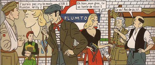
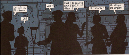
We can get a sense of this approach by contrasting it with one of the best Clear Line followers. Jean-Claude Floc’h’s albums are retro studies of a cozy, more or less imaginary England of the 1920s through the 1950s. He has provided his main characters, Francis Albany and Olivia Sturgess, with fake biographies that tie them to real artistic circles of the period. A series of books set in wartime (Blitz, 1983; Underground, 1996; Black Out, 2010) presents gorgeous tableaux. Here are two panels from facing pages of Underground. Londoners are huddling during a Nazi bombing run.
The images are designed to be compared in detail; we’re to note the slight changes in figures’ position. The story halts while you study the panels (and admire the artist’s finesse). This is technique calculated to dazzle.
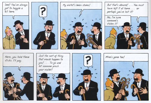
Hergé’s pages warrant the same sort of scrutiny, but you aren’t invited to dwell on them through a flagrantly overdesigned layout. The echoes and rhymes in this passage of the final English-language version of The Secret of the Unicorn are at least as intricate as Floch’s, but they’re at the service of symmetrical gags nestled in a broader comic buildup. Thompson and Thomson have had their pockets picked in a street market.
Hergé erases the background detail to allow us to concentrate on the graphic play of the black-suited figures (“spotting blacks,” as it’s called in the trade). The second panel reverses Thom(p)son’s attitude in the first, and both find a neat mate in the next-to-last panel. The third panel on top is rhymed with the last panel on the bottom. In between, the interplay of the two detectives is given in slightly varied compositions, with the extra walking sticks shifting around in their own patterns. The gag is a variant of the basic premise of Thompson and Thomson’s existence: they are mirror-images in all they do and say.
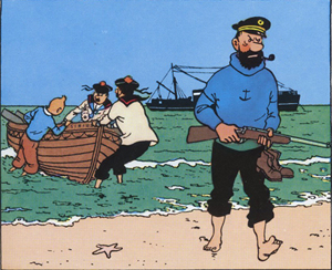
Given this play of variations, how does Hergé achieve narrative flow? One factor is the width of the panels, expanded or pinched according to the information in each and coordinated rhythmically across the page. Hergé also avoids gesture lines. Instead, one panel presents a point of motion as if captured by snapshot, and then the next panel provides the next phase of the movement. We might notice as well how the left-to-right propulsion of his drawings lays out narrative elements concisely. He declared this panel, from Red Rackham’s Treasure, one of two images that gave him most satisfaction:
Solely through the drawing, which shows the captain striding onto the beach with naked feet while his companions haul their boat onto shore, the viewer-reader [spectateur lecteur] mentally reconstructs everything that has already happened: The Sirius was put at anchor, the rowboat was lowered, Tintin and his companions set out; they have rowed to arrive at the island, where the captain climbed out. . . Everything that preceded the action shown in the drawing is expressed by a single composition.
Here’s another subtle technique Hergé used to make his stories flow. Psychologists speak of the “priming” effect. You’ll notice something faster if it chimes with something you’ve recently encountered. The classic experiment uses a string of words. If you’re first shown the word yellow, you’ll identify the word banana faster than if the trigger word is red.
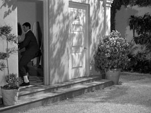
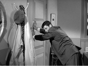
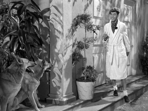
Priming is a basic filmmaking resource. What the screenwriter calls “planting”–the pistol on the mantelpiece in Act I–is a type of longer-range priming. On a smaller scale, one purpose of an establishing shot is to prime certain areas of a locale for future action. Here’s a simple example from Norman Taurog’s The Caddy (1953). Jerry Lewis is fleeing from a pair of German Shepherds and he takes refuge in a men’s changing room.
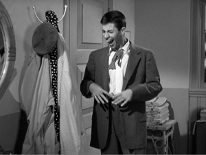
A new shot shows him closing the door, and it makes prominent the coat rack nearby. Eventually Jerry notices it and expresses happiness as only Jerry can.
Using the robe and beret hanging there, he tries to disguise himself.
A close look at my first frame shows that the coat rack was (subliminally?) primed in that shot too; you can glimpse it when Jerry opens the door. This reminds us that the filmmaker can prime our response by including a little something at the end of one shot that ties it to the next. Both Spielberg and Johnnie To are skilful at this; see earlier blog entries (here and here) for examples.
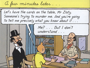
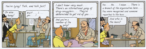
It seems to me that Hergé makes use of fine-grained priming in the flow of his panels. Here’s an example from the final English-language version of Cigars of the Pharaoh. The “establishing shot” shows Tintin and Sarcophagus consulting Zloty. The composition is simple and balanced, with Tintin as the fulcrum. The window behind Zloty is unobtrusively primed.
The next stretch of panels breaks this overall layout down into two sorts of shots: a profile view and an over-the-shoulder view of Zloty.
The first and the third panels are variants, with the framing getting closer as we proceed. Hergé often propels his story through these tighter framings, as if to ratchet up the tension in a filmic way. The more compressed array of figures at the end of the series also allows for more spacious speech balloons, always a major consideration in the Tintin saga. Hergé didn’t reiterate the window in every framing; only the middle panel re-primes it through our angled view of Zloty.
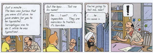
Now the framing will get even tighter on Tintin and Zloty, losing Sarcophagus altogether, and the window will become more salient, even though it’s still a minor element of each design.
The massive balloon at the top of the first frame in this series obliges Hergé to push his figures quite low, but he compensates by letting them lean on the bottom edge as if it were the desktop. (Hergé likewise often makes his characters stand directly on the frameline.) The first panel retains the window frame. The second, another over-the-shoulder shot but even tighter than the first, introduces the shutters in a prominent position behind Zloty. These shutters prime the third frame. They now anchor a crucial action: the Fakir is lurking outside those shutters.
The final panel provides the payoff. The open window frame that seemed at first just a realistic detail becomes necessary to understanding the action. It could have been established in a wider shot, but in keeping with his urge for economy Hergé has primed it in the most compact way possible–as a peripheral element, in the background or on the frame edge. (Compare Taurog’s thrusting the coat rack under our noses.) You have to wonder if such economy of expression will be on display in the Spielberg-Jackson Tintin movie project.
I know, I know: David, it’s just a window. Or: David, it’s just a comic strip. But as film students we ought to be interested in how images shape our experience, and we can learn from any craftsmanship as precise and engaging as Hergé’s.
For more on the Clear Line style, see the series of articles at Paul Gravett’s excellent site.
The official Tintin website is available in an English version here. Since photography is not permitted in the Musée, for illustrative purposes I have drawn on the official images on the building’s website, with copyright and credit as noted in the captions. Bart Beaty, expert on Eurocomics, provides a carefully considered report on his trip through the galleries. The Musée’s catalogue is a trilingual survey of major items on display, although it neglects to illustrate changes in layouts across different editions.
On the aesthetics of comics and cinema, see Manuel Kolp, Le Langage cinématographique en bande dessinée (Brussels, 1992). Principles of page composition, including spotting blacks, are explained in Gary Spencer Millidge, Comic Book Design: The Essential Guide to Designing Great Comics and Graphic Novels.
The best general introductions to Hergé’s artistry seem to me to be Benoît Peeters’ Tintin and the World of Hergé and Michael Farr’s Tintin: The Complete Companion. Both offer occasional comparisons of different editions of the books. See as well Philippe Goddin’s multi-volume set of primary materials. Goddin supplies a shorter sampling of the artist’s creative process in his charming but now rare Comment naît une bande dessinée: Par-dessus l’épaule d’Hergé. For an example of in-depth inquiry into the various changes that a tale underwent from one edition to another, see Étienne Pollet, Dossier Tintin: L’Isle noir: Les Tribulations d’une aventure.
My first and fourth Hergé quotations come from Bob Garcia’s Hergé et le 7ème art, pp. 6 and 9. My second quotation is taken from the English edition of the Musée Hergé guidebook (Moulinsart, 2009), p. 48; I don’t find it to be available for purchase online. My third quotation comes from Numa Sadoul’s Entretiens avec Hergé: Tintin et moi, p. 46. According to Harry Thompson in another good introduction, Tintin: Hergé and His Creation, the young Hergé wanted to be a film director (p. 26).
A very extensive web resource on Floc’h is here. As for Archie’s wedding: It did turn out to be one of those parallel-universe stories. It has developed over seven issues since last September in a “mini-series.” Abrams will be publishing a special collector’s edition, according to the press release, “for the Archie fan in all of us.”
This is probably as good a place as any to mention that Intellect Press has just launched a new journal, Studies in Comics. Details, as well as downloadable essays from the first issue, are here.
PS 24 January 2011: This essay was named one of the best pieces of online comics criticism of 2010 in an exercise conducted by The Hooded Utilitarian of The Comics Journal. What an honor! Thanks to the judges, and congratulations to the other writers who earned places on the list.
Les dessins, textes et symboles extraits de l’oeuvre de Hergé cités dans ce essai sont la propriété exclusive de © Moulinsart S. A. ou © Hergé ou © Casterman et sont montrés à titre de référence et d’exemple.
Photo, uncredited, from this site.


