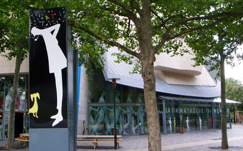
Early last month I posted an entry [2] on Jacques Tati’s friend and long-time artistic collaborator, Jacques Lagrange. I mentioned that there is currently an exhibition on Tati [3] at the Cinémathèque Française-though it closes August 2. On my last day in Europe David and I took the fast train from Brussels to Paris to see it. It was our first visit to the Cinémathèque since it moved into its handsome, surprisingly restrained Frank Gehry building, on the corner of the Rue de Bercy and the Rue Jean Renoir.
I have to confess to being a little disappointed. The exhibition seems to follow the current belief among curators that such events are meant more to be clever and entertaining than informative.
To be sure it was fun to ride up to the fifth floor, where the Cinémathèque’s exhibition space is, in an elevator that played the garbled loudspeaker voice from the opening of Les vacances de M. Hulot and had the meaningless escape-plan diagram from Play Time hanging on its wall. It was a treat to enter through a hallway that had all the original skyscraper-based posters from the travel agency in Play Time lining it. But beyond that, I couldn’t see much rhyme or reason to the layout.
Some of the objects on display were replicas of props and set elements from the films, while others were the originals, with not much labeling to tell which was which. The original fish from the fountain in Mon oncle was there in a central location, but the rest of the real props were in a small room on the side. There glass cases occupied a wall, so that the highest ones were almost impossible to see.
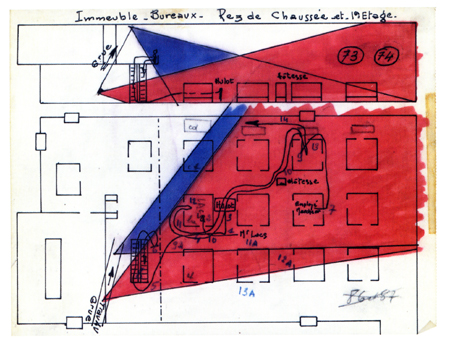
We skipped a lot of the reproductions and the video clips and spent time studying some small, traditional flat cases with script pages, old family photos, and, most intriguingly, pages of plans for the shooting of Mon oncle and Play Time. These were not like traditional sorts of scripts or production schedules, and we tried to figure out the meaning of the columns and color-coding. (At left, a plan for the movements of Hulot and the camera down the escalator and among the cubicles in Play Time.) Unfortunately these documents were arranged in a collage fashion, so that one page overlapped another and one couldn’t read the entirety of any of them. About the best one can say as a result is that it’s good to know that all this material was saved, so that a researcher might someday be able to make sense of it all.
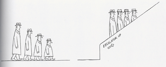
A surprising amount of the exhibition was given over to artworks inspired by Tati, including some new ones apparently done for this event. Some captured the spirit of the filmmaker fairly well, while others didn’t, but they seemed to diffuse the focus of the whole. There were earlier artworks as well, whether to suggest that they influenced Tati or simply to relate him to some sort of zeitgeist was unclear. It was fascinating to note how much the work of the great American cartoonist Saul Steinberg shared what we think of as a Tatian sense of humor. (See below for a specimen.) Whether Tati knew Steinberg’s work is another matter. And I doubt that Play Time’s grim little eating scene, with its green, neon-lit faces, owes anything to Edward Hopper’s “Nighthawks” painting (the one in the diner at night) or that the comparison tells us much about either.
These and other comparisons in the exhibition owe much to the curators’ decision to stress the overused concept of “modernity.” Tati and the modern, what a concept! The films have the distinct advantage of being utterly clear in their implications about society, and it seemed to me that the exhibition plays a lot with the notion of the Tatian sensibility without a systematic coverage of the man’s work.
The co-curator of the exhibition and designer of the catalogue, Macha Makeïeff, appears in a four-minute online interview [5] (no English subtitles). That interview takes place in the exhibition space, so those who can’t make it to Paris in the next week and a half can get a glimpse of it.
The catalogue reflects the content of the exhibition, though interestingly, there are no pictures of the original props and costumes from the display. (Maybe there was some sort of legal restriction imposed by Tati’s estate.) Some of the replicas show up, as do a very few of the original documents that so intrigued us  [6](printed very small). There’s the requisite section where filmmakers write about their admiration for the Master. These include David Lynch (who might conceivably be said to reflect a Tatian influence only in The Straight Story) and more obvious students of his work, Elia Suleiman and Otar Iosseliani.
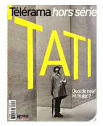
There are a few designs by Lagrange and Pierre Etaix reproduced, and some other interesting and useful items. Still, one would actually be better off buying the special issue of Télérama issued in conjunction with the exhibition. (The Play Time plan illustrated above comes from it, not the catalogue.) It reproduces more of the original objects and documents from the exhibition than the catalogue does, and it consists of a lot of short articles and far more historical photos than the exhibition contains. Apart from everything else, it reproduces a picture from Tati’s quietly hilarious and lengthy fashion-photo shoot for the September, 1979 issue of French Vogue. The special issue is available online from fnac [7].
So, all in all, we were glad we went. That’s partly because there were some gems to be found in the exhibition, such as some footage of the false-perspective buildings of Tativille being built and moved. In addition, we had a lovely day in Paris.
[July 23: Two colleaguess have taken exception to my statement that David Lynch’s work displays little influence from Tati. Jonah Horwitz, currently a graduate student in film here at the University of Wisconsin-Madison, makes these cogent remarks via email:
I think the Tati influence–really just a PLAYTIME influence– is evident in the way he stages gags, often in ELS with ample “dead time” between actions, or an eternity spent waiting for a gag to reach fruition. (I would even argue that the Tati influence can be detected in Lynch’s subtly disorienting long shots, in general.) There are definitely examples in STRAIGHT STORY, but also in a variety of other things he’s done, features, television, and experimental shorts alike.
An example of a pretty obviously PLAYTIME-derived gag (I’d even call it an homage) of this sort is in the final episode of TWIN PEAKS, which Lynch directed. Audrey Horne has locked herself to the bars of a bank vault as an act of civil disobedience. A decrepit bank manager responds to her request for a glass of water. In two lengthy ELSs, interrupted by a reaction shot of Audrey, Lynch makes us wait and watch as the manager waddles from one end of the expansive bank lobby (made to seem even larger by the wide-angle lens) to a water fountain at the other–and back again.
Jonathan Rosenbaum has blogged on the subject here [9], with additional cogent remarks.
Jonathan also refers on my claim that the title of Tati’s masterpiece is Play Time rather than Playtime, as it is usually written. He’s undecided on that issue. My opinion is based on the way the title is written in the credits and posters, with a capital T and the hint of a space between the words. In my analysis of the film (in Breaking the Glass Armor), I wrote “The difference is not negligible, since the separation puts more emphasis upon the implications of the two words (especially “time”), while retaining the meaning of the single term” (p. 250, footnote). Of course, it’s possible that the title is really PlayTime, but that sort of capitalization of an internal letter in a single word was still pretty rare in those days (apart from CinemaScope), and once it did come into vogue in the eBay, PayPal age, I doubt Tati would have resorted to it.
I forget just when it happened, but years ago Leonard Maltin’s Movie Guide (which tends to be quite careful in its attempts to make all titles match the way they appear in a film’s credits) changed its spelling from Playtime to two words. At the same time, it sensibly upped the number of stars awarded the film from two and a half to four. I am happy to see what I assume is my influence there. Perhaps more people have decided to watch the film on the basis of those one and a half extra stars.
Jonathan adds, “For me, the cinching argument either way would be how Tati spelled the title himself. I’m sorry that I never thought to ask him, during the brief period in 1973 when I worked for him.”
David and I never met Tati, but we did receive a letter from him. In 1974 we had hopes to bringing him to Madison for a visit. He replied (10 October 1974) that he was currently involved in a lawsuit with his producers and could not make a commitment. Alas, we were never able to lure him here, but in the letter he mentions “Playtime,” spelling it as one word. My own belief is that when the film came out no one had noticed that the title was supposed to be two words, and Tati simply adopted what was then the universal way of referring to the film. Perhaps it wasn’t important enough to him to make an issue of. As I pointed out in the entry on Lagrange, his sketch for the hat-watering gag clearly has the title as two words. The best evidence on the subject, however, is presumably the way the title is spelled on the final script, which I’ve never seen. Maybe the capital T on “Time” was just a whim of the designer’s, but whatever the case, I still think it makes more sense as two words.]


