


Archive for the 'Comic strips and cartoons' Category
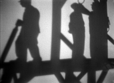
Who will match the Watchmen?
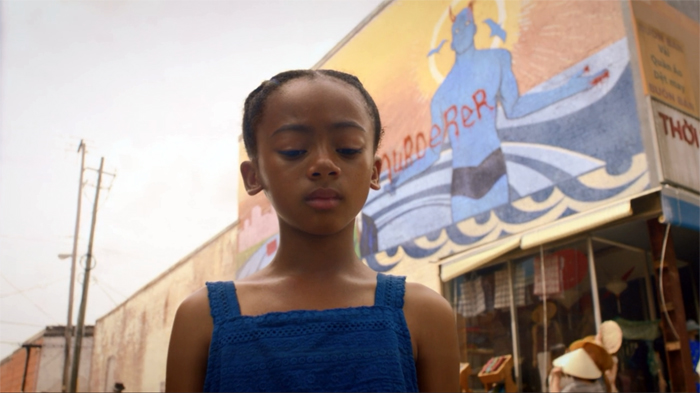
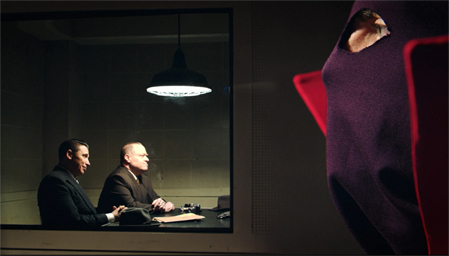
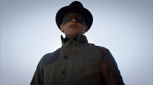
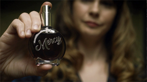
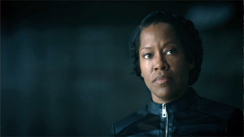
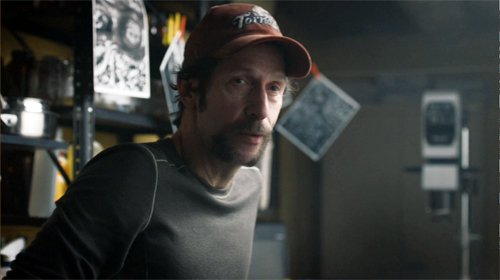
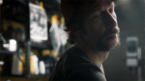
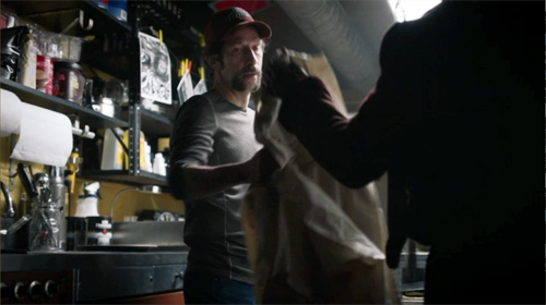
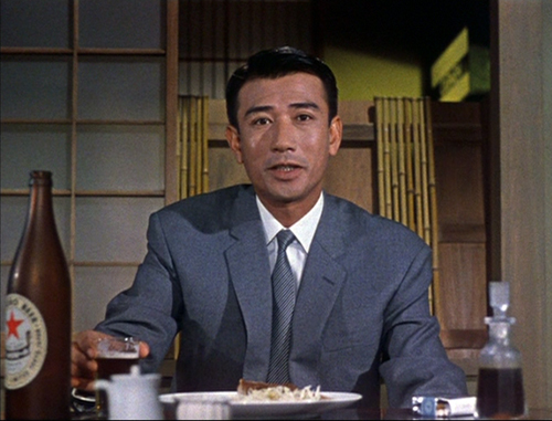
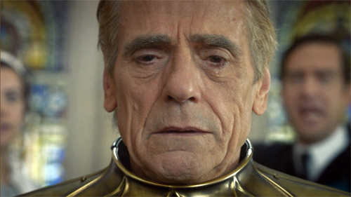
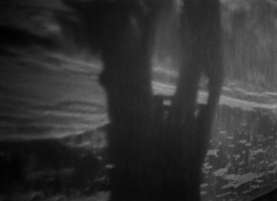
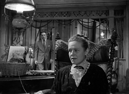
Watchmen (2019), Episode 7.
DB here:
If we want to understand the craft of filmmaking, we should pay attention to what filmmakers say about their technique. Sometimes we have to confirm what they tell us with other evidence and the onscreen results, but practitioners usually offer unique angles on their creative choices. For this reason I found it fascinating to come upon what Director of Photography Gregory Middleton had to say about his work on HBO’s limited-series Watchmen.
I had read the comic back in the 1980s and was intrigued by its experiments in pictorial storytelling. I’d also seen the movie, which I thought not as adventurous as the book and vitiated by the book’s adolescent nihilism. (Your mileage may vary.) But Middleton’s interview made me watch the series. So I thought I’d use this anxious pause in normal activities to share some ideas with you.
Middleton has a lot to say about the visual design, such as the sort of lenses he used to get startling depth effects. These echo some common graphic-novel compositions.

But I got more interested in other questions. How does the show adapt some classical cutting techniques? And how do those techniques square with the “editing” techniques we get in the original comic?
Here’s the relevant passage:
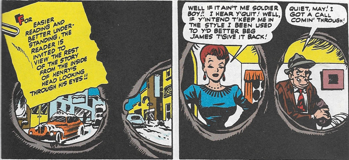
And transitions are the biggest tell when you cut from a beat of one thing to a beat of something else. In the case of the comics, one of the transitional devices we wanted to use to echo the graphic novel is the match cut. In the comic you’ve got one panel with a character in the foreground and someone in the background. The next panel is the same character in the foreground, but they are somewhere else — or somewhere else in a different outfit. And the background is something similar, but it’s something else, and you’re basically just jumping time because you’re really with the character and where their state of mind is, so the intervening time between how they went from here to there is irrelevant.
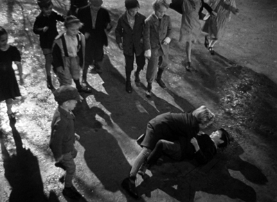
There is a great one in episode two where Angela walks back after they just sat down, and she sort of disagrees with the idea of going to rustle up the people at Nixonville, and she walks away, and she’s pacing as a match cut to her pacing at the police lineup at Nixonville. You go right where she’s thinking, like Okay, I don’t want to be here, but now I’m gonna be here, and suddenly you’re right there.
The match cut is also a way to instantly transport the audience without introducing a lot of other extraneous visual information. In episode four, we did her opening and closing her trunk when she is going to just get rid of the wheelchair she’s cut apart. She chucks it in the trunk, slams the trunk, and it’s a match cut to her opening the trunk, and she’s already somewhere else. And that just works — you don’t need to see her driving and parking and all that. The point is you just know she is dumping this thing, and it’s a nice, clever way to keep you on point with where she is with her intent.
Afterward, it’s like he’s just jumped ahead again — both places, same time. So it’s a way to sort of double-use that technique. It just takes a lot of planning and preparation. Nicole [Kassell, director/producer] and I worked hard on all the transitions in that episode to try and achieve that effect and make it interesting.
The transitions between scenes that Middleton is discussing are, I think, what have been since the 1940s called “hooks.” His comments open up some ideas about how editing works with them.
There are some spoilers, but not my usual quota.
Matchmaking
We can enhance our understanding of filmmakers’ creative options if we systematize a little bit the choices they face and the terms they use. That’s what I try to do in the online essay on hooks between scenes. There I suggest that we can have four sorts of palpable hooks from shot to shot: sound/sound, sound/image, image/sound, image/image. My examples come from National Treasure (2004), a movie that revels in tricky transitions.
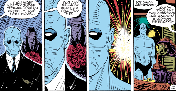
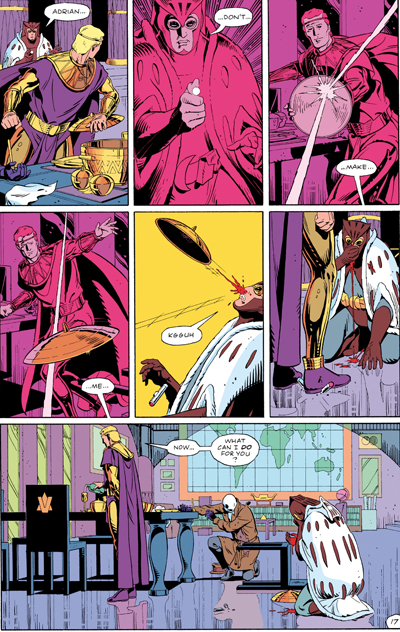
For example, one transition in Watchmen creates a sound/ image hook. The Game Warden tells Adrian, “No Mercy” and we cut to a close-up of a Mercy perfume being tested on a focus group.
Middleton calls the cuts that create image/ image hooks “matches.” “Match” is a broad term that points up a general principle of cutting for continuity. In a match shot-change, which might be a cut or a dissolve, something in shot B picks up something that was in shot A. Without distinguishing different types of matching, Middleton is stressing how continuity editing techniques, normally applied within scenes, can be used as transitions between scenes as well.
So let’s create an initial menu of possibilities. Within scenes, there’s the eyeline match, which shows a single character looking, followed by a shot of what the character sees (not necessarily from their optical viewpoint).
Shot/reverse exchanges like this one often rely on the eyeline match, but need not; you can have a shot/reverse pattern if the characters aren’t looking at each other. (Imagine two people talking with their backs to each other.) The eyeline match can link more than two characters within story space.
There’s also the match on action, where a bit of movement in A is carried over into B, despite the change of camera position. The scene between Wade and Angela continues with a combination of the eyeline match and the match on action.
Another sort of match plays upon the sheer pictorial qualities of the two shots. As Middleton says, shapes and color patches can be carried over from the background or foreground or both. Filmmakers don’t seem to have developed a specific term for this type of shot change, although they were clearly using it from at least the 1920s onward. (Eisenstein was the most explicit.) In Film Art: An Introduction, Kristin and I proposed calling the lining-up of compositional features from A to B a graphic match.
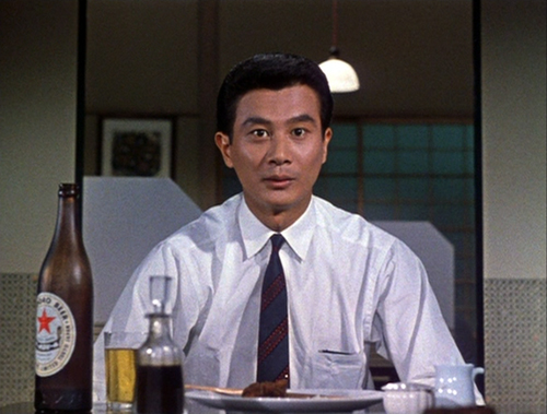
Precise graphic matches are common in experimental films, but they seldom show up within scenes of narrative films. Still, Eisenstein, Lang, Ozu (here, from An Autumn Afternoon), and a few other directors made bold use of them. And they’re obviously a matter of degree: Ozu can match an overall shot in some detail, as above, or just one portion of the frame.
We might add the possibility of the “category match,” as when a prop in shot A is followed by something comparable in shot B. Imagine cuts among wanted posters inside a sheriff’s office.
When we move beyond the individual scene, what are the possibilities? Clearly, all types of match-cutting can be used for transitions.
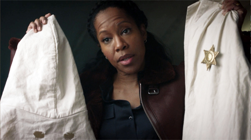
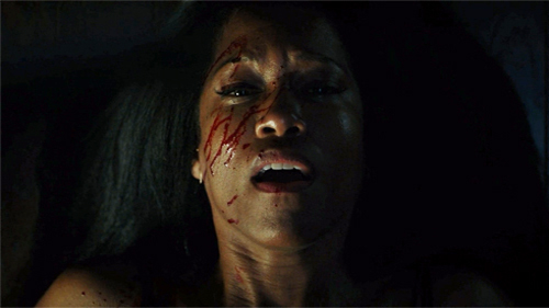
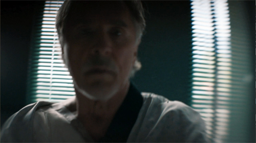
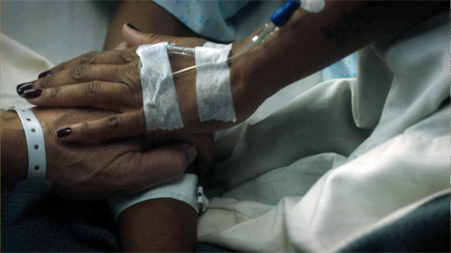
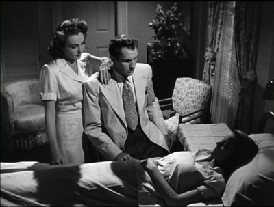
In Watchmen, an eyeline match shifts us from Angela, lying wounded on her living room floor, to a view of Judd looking down at her in the hospital when she awakens. Here the eyeline yields an optical POV.
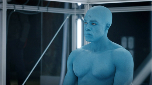
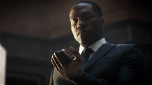
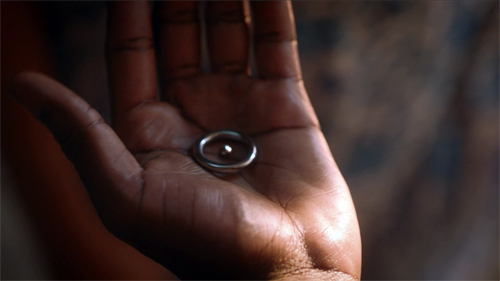
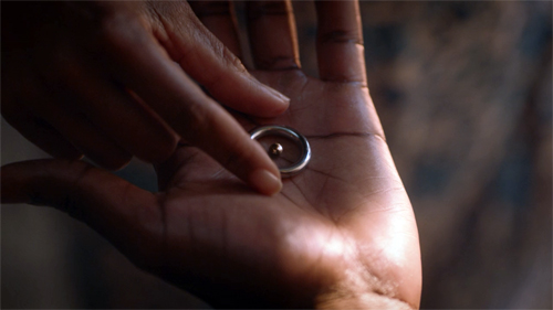
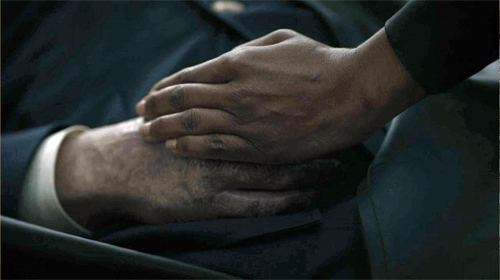
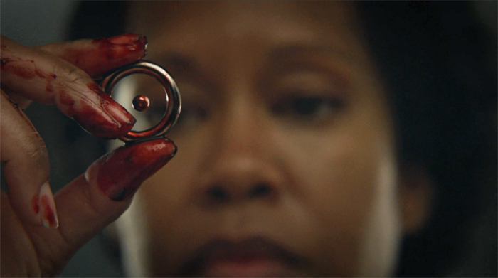
A match on action takes us from one scene of Cal opening his hand to another as Angela reaches for the hydrogen-atom ring.
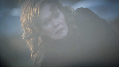
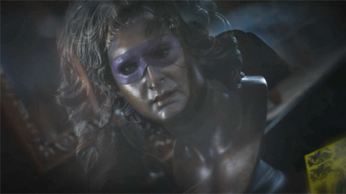
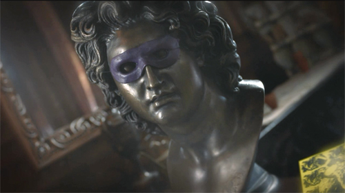
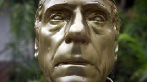
A hook can also exploit a graphic match. As Laurie lies sideways after a bomb blast, the image dissolves to a similar composition, a twisting view of a masked bust.
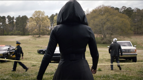
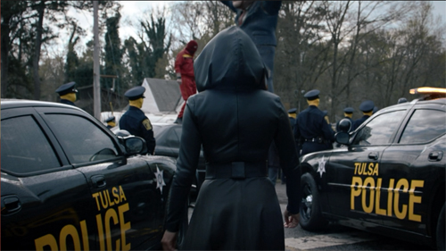
Middleton points to one striking moment that viewers are likely to notice: a match on action that’s also a bold graphic match. Angela strides away from one scene and continues her movement, and her compositional thrust, in a new location, Nixonville.
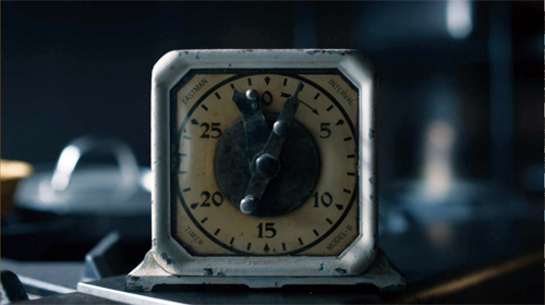
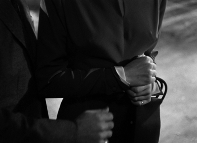
The “category match” is at work on occasion too, as when one scene ends on a pocket watch and the next starts on a clock face.
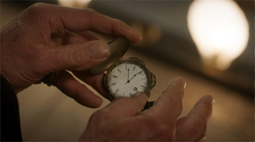
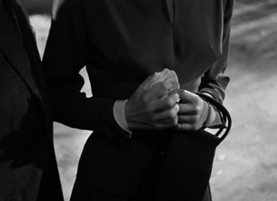
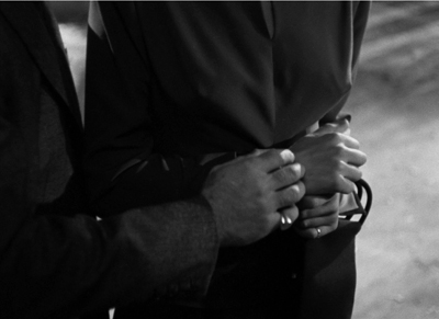
The category match blends with the graphic match when hands links scenes.
What seems to have sensitized the show’s creators to the possibilities of hooks is the fact that the Moore/Gibbons comic makes punchy use of graphic matches between panels. These are often used to signal character memories by opening and closing flashbacks.
Vivid as these examples and others are, the hook, even the graphically matched one, has a long lineage, as my essay tries to show. The creators of Watchmen are working in a distinct tradition of classic filmmaking.
Showing and showing off
More broadly, that classic tradition favors speed and quick pickup. The new Watchmen is essentially a police procedural, unlike the comic and the feature film. Accordingly, the investigation of a crime is interwoven with the personal lives of the police, the “cop soap opera” that brings in friends, family, lovers, and secrets from the investigators’ pasts.
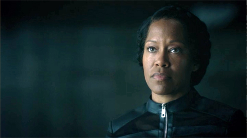
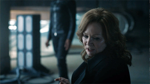
The crucial backstory involves Angela Abar, who knits together many threads. The child of a US black soldier and a Vietnamese woman, she became a policewoman in Tulsa and underwent the new militarization of the force in response to white supremacy. Some of the earlier Watchmen team, notably Adrian Veidt and Dr. Manhattan, are still exercising their power, while Laurie Blake, the daughter of Silk Spectre, is now working for the FBI.
Like the comic, the series must move the plot swiftly between past and present. The comic splinters time more audaciously, jumping back and forth across its grid of nine vertical panels. But in a classical film, where you don’t normally pause or go back, the story must unwind linearly, and so other strategies come forward to impose a felt pattern.
Older films might dwell on the aftermath of a scene, letting the tension relax a little, and provide a cadence that marks off a distinct section. Modern films, especially if they’re presented in the distracting environment of home viewing, display a need to maintain a rapid pace. So scenes push to a high point, then provide a “button” like that close-up of Laurie, and then move swiftly to the next. Among other advantages, this tactic keeps people from pausing or changing the input. Still, the scene shifts need to be clear fairly quickly.
Hooks can help on both fronts. They snap up the pace, keep us alert, maintain interest from moment to moment. A less clear-cut hook can provide a bump of surprise that teases us into the next scene. Soon, though, we will get imagery, and especially dialogue, that anchors us in the ongoing action.
Hooks also provide motifs that can cascade through the film. Adrian’s ambitions to be the new Alexander the Great are provided by cuts that mock his pretentions.
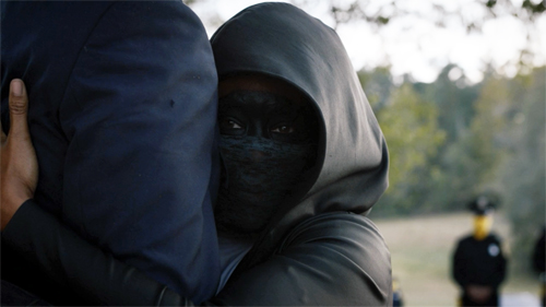
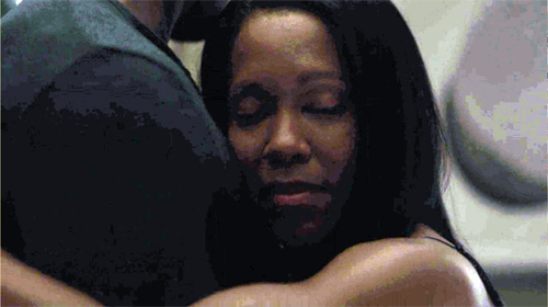
And, as in the comic, the cinematic hooks facilitate subjectivity. The most common way classical storytelling justifies unrealistic or nonlinear narration is through getting into characters’ heads. (Middleton: “You’re really with the character and where their state of mind is.”) Abrupt and startling cuts can be motivated if what we see is a memory, a dream, or a hallucination. This is what we get when Angela embraces Judd’s legs: a match-on-action hook to a flashback of her slow-dancing with Cal.
The most elaborate hooks can provide something more: a certain elation in virtuosity. The precise matching of Angela’s stride across those two scenes above is a stylistic flourish that asks us to appreciate the care and bravado of the filmmakers.
Watchmen‘s hooks, however flamboyant, stand out against a pervasive backdrop of classically constructed scenes. We get lots of over-the-shoulder reverse angles, properly timed reaction shots, now-standard cuts to extreme distant shots that provide a “beat” for the scene, and other devices that have been around for decades. Plenty of other traditional strategies for narrative coherence are on display, from goal-oriented protagonists and deadlines to newspaper headlines and TV broadcasts as sources of impersonal narration. There’s even the inevitable Hollywood line: “What are you doing here?” As usual, striking moments emerge out of a familiar flow of narrative cause and effect, with some mysterious gaps eventually filled.
Paging the Watchmen
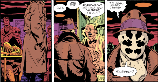
Comics artists absorbed the lessons of continuity filmmaking. If the hooks in films stand out by contrast with the overall smoothness and linearity of classic construction, something similar happens in comics. Here are three “continuity shots” from the Watchmen graphic novel, complete with obedience to the axis of action, reverse-angle cutting, and a “single” for emphasis on Rorschach’s reaction.
Even a match-on-action hook can be suggested, as when Laurie’s lifting a goblet on Mars “cuts” to her as a teenager lifting a dumbbell.

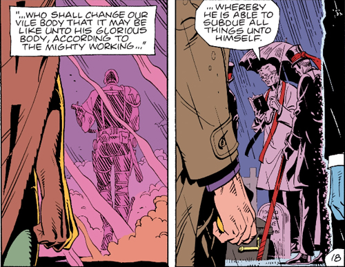
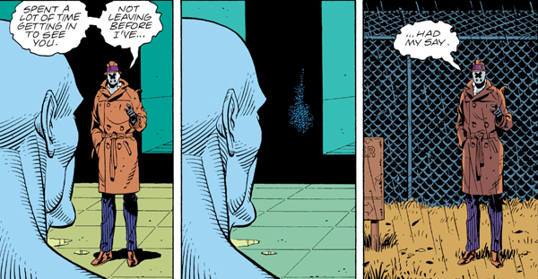
Graphic continuities and discontinuities can be motivated by science-fiction premises, as when Dr. Manhattan teleports Rorschach out of the facility. The sense of instantaneous change wouldn’t be so strong if Rorschach’s size and placement in the format weren’t kept constant.
In a way, the graphic continuities are almost needed for the time-shifting transitions. A new angle on Adrian at the start of the funeral flashback below would be more confusing than the frontal close-up that completes a gradual enlargement of his face. The new costume and the “offscreen” dialogue cue us to a new scene.
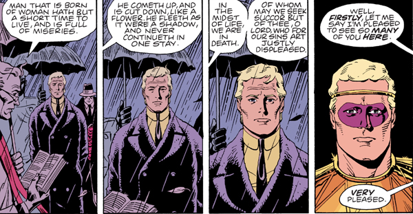
To keep things tidy, the flashback ends with a foreground graphic match on Adrian, leading us back to the funeral.
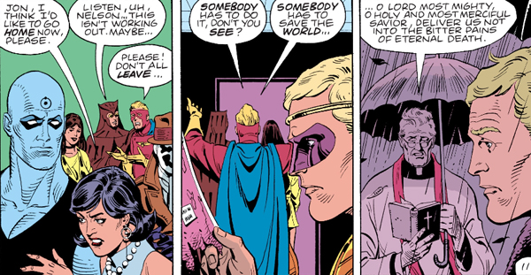
As ever, popular narrative maintains symmetry and redundancy to keep the action clear. Here’s a more “staggered” but no less symmetrical foreground graphic match–used, again, for subjectivity.
The rectilinear staging evokes either a track-in (the first two panels) and a track-back (the last two) or axial cuts in to and back from Dr. Manhattan. (The Soviets called these in-and-out edits “accordion” cuts.)
So there are some rough equivalents between film editing and the principles binding comic panels, especially ones this jammed with information. But comics have unique resources too–ones that Watchmen‘s creators were well aware of. Dave Gibbons notes that he exploited techniques articulated by the great Will Eisner, “where you could, say, hold the camera’s point of view and have characters walk past it, or follow the characters through a scene acrosss a changing background, where you could echo panel compositions . . . .”
The echoes Gibbons mentions depend on the fact that the book page and its role in a two-page spread create a force-field that displays the story both as a timeline and a spatial array. Panels are at once phases of action and a simultaneous order of images, and the interplay of story information and pictorial pattern can become quite rich, even baroque.
Consider when Rorschach rummages in the Comedian’s closet. Even if we could replicate the panels in a movie shot by shot, the page’s severe structure couldn’t be grasped as a simultaneous whole onscreen.
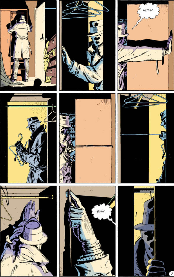
The echoes are striking. Panel 1, the establishing shot, is enlarged in panel 7 on the bottom row, as is panel 2 in panel 8. Each lower-tier mate is markedly closer than the top one, emphasizing the growing sense of discovery. Panel 2, with its sidelong strips of solid black, is echoed in panel 4 and panel 6 (a slight “pan” left from 4) and, with another enlargement, in panel 9, the climax. The color slabs (yellow/black, grey/purple) accentuate the repetitions and variations. The middle stretch, panels 3-6, forms a suite of variations as well (5 picks up 3, 6 picks up 4), while Eisensteinian cuts flip us back and forth across the axis formed by the straightened coat hanger. All the cuts are compass-point shifts, moving us in 90-degree multiples. The crisp geometry of the découpage renders the unhurried professionalism of Rorschach’s search, an effect accentuated by the snapshot imagery (no motion lines).
The effect depends in large part on the presence of all these images on the page at once. The alternation of shot scale and color fields can be discerned only by seeing the overall architecture of the page.
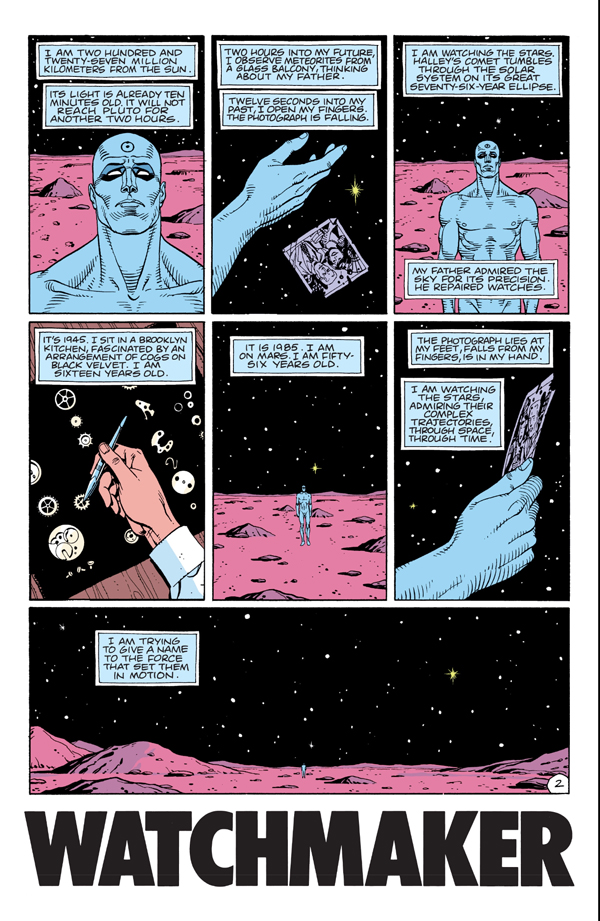
Panels 1, 3, and 5 build to the climax of the wide framing on the bottom as we pull farther back from Dr. Manhattan during his soliloquy. Panels 2 and 6, echoes of a close-up of the photograph, provide a sharp contrast to the landscape and emphasize the power of memory. That power is enacted in another variant of the hand image, as the young Jon Osterman arranges watch parts, like stars, on a velvet ground.
The page is one standard mid-size unit for the comics story, but the two-page spread is the next phase up. A continuous action can be spread across the open book, with echoes emerging. In the big fight scene, the shifting POV (occasionally objective, but also bouncing us among Rorschach, Adrian, and Daniel) is capped by symmetrical wide panels at the bottom of each page. The rose-tinted panels on the right page add their own fillip of pattern.
In a film such symmetries and variations unfold over time. We can make them apparent only through a “spatialized” analysis, spread out on the page like a comic-album layout. (Such were those pioneered by Raymond Bellour in the 1960s and 1970s.) In comics, these patterns strike us immediately, as a primary and palpable expressive vehicle. One-off devices like the graphic match can be sustained both on the screen and on the page, but each medium stamps its own structures on the flow of time.
There’s a lot more chop and change in the space-time continuum of the Watchmen comic than I can do justice to here. (Some pages run three time periods simultaneously.) But my main point should be clear. As usual, when we start to pay attention to the films and media artifacts that fascinate us, we always find more going on than we realized. Both movies and comics work on us so directly that their design subtleties can easily pass unnoticed. We can keep reverse-engineering them as long as we like, and we’ll learn a lot. And the creators can be very helpful guides about what to pay attention to.
I first became aware of Gregory Middleton’s comments by reading the review essay by Namwali Serpell, “In the Time of Monsters,” New York Review of Books (9 April 2020). I’m grateful to Serpell for calling my attention to the problem of cutting in the Watchmen series.
The essay is somewhat misleading in its account of match cutting, which is said to create “‘jumps’ rather than flows from shot to shot.” It’s actually just the opposite. The match cut creates continuity of time, space, and graphics between shots. It need not, as the essay claims, link two settings, and it’s not an alternative to a “splice cut,” which is a term with no currency I’m aware of. (A splice is simply the physical join between film strips, and it can govern any type of cut. Splices are increasingly rare with the dominance of digital editing.) The alternative to match cutting would be discontinuity cutting.
Serpell’s essay is worth reading for its interpretive dimension. She argues that for all the creators’ efforts to create strong images of minority heroes fighting white supremacy, there is a critical, antiheroic aspect to the original comic that isn’t picked up in the series. The sanctioned violence of Angela, Wade, and others is treated as unproblematically righteous.
I’d largely agree. Yet I’m not sure that the original book’s portrayal of superhero trauma (the result of the go-to source, childhood abuse) elevates these caped crusaders much. They seem to me best understood as part of that cycle of debunked superheroes we find in other 80s comics, notably The Dark Knight. Why would someone put on a mask to fight crime alone? What dignifies vigilantism? Are these “the heroes we need now”? These, we’re told, are deep questions, but they seem to me the tropes of a quickly standardized set of conventions. They signal a “new complexity” and “adult attitude” comparable to the romanticism of film noir and the cynicism about samurai ideals we find in Japanese swordplay movies. Bringing heroic genres low is itself a genre convention.
More broadly, I’d propose that the the storytelling strategy Serpell highlights is part of the common move within thematically ambitious mass-market movies to be strategically ambiguous. Creators, I’ve suggested here, often throw many things against the wall to see what will stick. They can then point to contradictory aspects which show balance. So yes, Angela tortures members of the Seventh Kavalry, but (a) they’d do the same to her; and (b) she’s driven by righteous vengeance for ancient wrongs; and (c) we want to make you a little uncomfortable with her vigilantism anyhow. Nowadays, it may be that what seem involuntary contradictions are deliberate efforts to have things many ways at once. This maximizes viewer outreach and gives critics fodder for debate. For another recent instance, see the previous entry on The Hunt.
The Dave Gibbons quotation comes from the supplement “The Phenomenon: The Comic That Changed Comics” available on the DVD of the Director’s Cut of Watchmen, 9:35-10:14.
Raymond Bellour’s “spatialized” analyses of repetition and variation can be found collected in The Analysis of Film (Indiana University Press, 2001). Some efforts of mine are in On the History of Film Style and in Ozu and the Poetics of Cinema (available for free, if patient download here), as well as in other material on this site.
Watchmen (2019).
REINVENTING HOLLYWOOD in paperback: Much ado about noir things
From “The Killer,” Spirit Comics (8 December 1946), by Will Eisner and studio.
DB here:
This is my final effort to cram my latest book down the resisting gullet of the reading public. Reinventing Hollywood: How 1940s Filmmakers Changed Movie Storytelling has just come out in paperback and I’ve been using our blog to trace out some relevant ideas that surfaced in recent books and DVD releases. The first entry dealt with some general issues, the second with popular culture’s drive toward variation, the third with craft and auteurism. This one has murder on its mind.
Noir as mystery and mystique
Sorry, Wrong Number (1948).
Crime looms large in Reinventing Hollywood. But I forsake the usual category of film noir. It didn’t exist as a concept for the filmmakers or audiences of the day. It’s the creation of critics, first overseas and then, much later, here at home. That doesn’t make the category invalid, though. Many art-historical categories (Baroque, Gothic) are later inventions, and those can be illuminating. Still, I think we gain some understanding if we situate our inquiry, for a time at least, at the level of what people seemed to be trying to do at the time.
Put it another way. By focusing on noir as the model of Forties narrative, we miss the ways in which the films we pick out under that rubric participate in wider trends. We miss, for instance, the new importance of mystery in all plotting of the period.
In the 1930s, mystery was mostly confined to detective stories. Think of your prototypical 1930s movie; it’s unlikely to have a mystery at its center. (Okay, maybe we’re curious about the identity of Oz the Great and Powerful.) In the 1940s, though, filmmakers began to scatter mystery devices into other genres. Mystery became a central storytelling strategy for personal dramas (Citizen Kane, 1941; Keeper of the Flame, 1943), romantic comedies (The Affairs of Susan, 1945), war films (Five Graves to Cairo, 1943), social comment films (Intruder in the Dust, 1949), and domestic melodrama (Mildred Pierce, 1945; The Locket, 1946; A Letter to Three Wives, 1948). Some of what we call noir is part of this trend.
Over the same period, a fairly minor genre got promoted. Psychological thrillers can be traced back to Gothic novels and sensation fiction, but they became a distinct part of crime literature in the 1930s. They became an important genre for cinema in the 1940s, and so Reinventing Hollywood devoted a chapter to films like The Spiral Staircase (1945) and Sorry, Wrong Number (1948).
These aren’t canonical “noir” films, at least if your notion of noir stems from hard-boiled fiction. Some rely on the guilty-party plot exemplified in C. S. Forester’s novel Payment Deferred (1926), Patrick Hamilton’s play Rope (1929), and Anthony Berkeley Cox’s novel Malice Aforethought (1931). Less famous but just as interesting is the “woman-in-peril” thriller.
This was an upmarket version of romantic suspense novels associated in earlier decades with Mary Roberts Rinehart and Mignon Eberhart. Daphne du Maurier’s Rebecca (1938), one of the top-selling books of the 1940s, lifted the genre to respectability. Revisiting traces the wide-ranging variations that followed in film, fiction, and theatre. (An early draft of that chapter is elsewhere on this site.) Mystery is central to this subgenre. Who is endangering the protagonist? What are the real motives of the people around her, especially her lover or husband? Are her friends complicit? How will she escape?
The gynocentric thriller remains powerful in popular literature today. We’re currently in a rapid-fire cycle of it, typified by the work of Laura Lippman and Gillian Flynn. Some of the books have come to the screen: Gone Girl (2014), The Girl on the Train (2016), and A Simple Favor (2018). The HBO series Big Little Lies (2017-on), turns a fairly satiric domestic-suspense novel into a heavier exploration of spousal abuse. I’ll be writing more about this cycle later (and giving a paper on it this summer), but let me note two recent examples. One takes its Forties sources for granted, the other flaunts them. Both are coming to a screen near you.
In Alex Michaelides’ new novel The Silent Patient Alicia Berenson, an emerging painter, is found guilty of shooting her husband. Because she seems in permanent shock and refuses to speak a word, she’s confined to a mental institution. There the ambitious young psychotherapist Theo Faber tries to ferret out why she remains silent. The narration alternates, Gone Girl fashion, between Theo’s first-person investigation and Alicia’s diary of events leading up to the killing.
It’s a spare tale narrated in a clumsy style that doesn’t distinguish the two voices. And it reminds us that if you become a character in a novel or movie, don’t get into a car. But it does show the persistence of Forties strategies.
There’s the Crazy Lady (recalling Shock of 1946, above, and Possessed of 1947, as well as John Franklin Bardin’s 1948 novel Devil Take the Blue-Tail Fly). There’s the sinister side of the artworld, with a predatory dealers, a demented painter, and portraits that suggest sinister psychic forces. There’s the apparently rational man who becomes obsessed with a woman in a picture (as in Laura, 1944). There’s a mythological parallel to the heroine (here, Alcestis; in The Locket of 1946, Cassandra). There’s the therapeutic motif of a doctor falling in love with a mentally disturbed patient (Spellbound, 1945). And there is, of course, a twist depending on suppressive narration.
The Silent Patient quietly absorbs these Forties conventions, with virtually no mention of the tradition. At the other extreme sits the self-conscious geekery of A. J. Finn’s The Woman in the Window. In an earlier entry on the eyewitness plot I swore I wouldn’t give space to this novel, largely because I resist people swiping titles of movies I admire. But after alert colleague Jeff Smith told me, “It’s as if he read your Forties book,” I figured I could break my rule.
Indeed this eyewitness thriller relies on a great many narrative tricks from the period. We get a Crazy Lady, dreams, hallucinations, an unreliable narrator, the drama of doubt, flashbacks within flashbacks (with the revelatory one coming at the end), and a Gothic climax punctuated by lightning bursts. Also, inevitably, a car crash.
The book’s epigraph comes from Shadow of a Doubt, and the pages that follow are littered with references to 1940s movies. Our homebound heroine lives in thrall to DVDs and TCM, though her impending fate gives a new meaning to “Netflix and chill.”
The Woman in the Window is soaked in contemporary movie-nerd culture. The heroine updates Jeffries’ tech gear in Rear Window by shooting video footage of the suspects across the way. She mentions Kino and Criterion discs, and even refers to “diegetic sound.” (Has she read Film Art: An Introduction?}
Like The Silent Patient, Finn’s book illustrates how much modern thrillers owe to Forties movies. But it also exemplifies how noir has become a kind of brand and a signal of hip tastes. Maybe that’s a reason to back off the label for a while.
Noir in brief
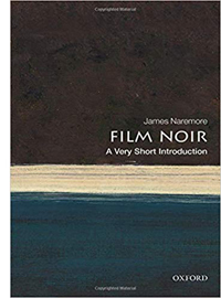
But let’s not back off too far. Any student of 1940s Hollywood can learn a lot from the vast literature on noir. The most recent item to cross my desk is James Naremore’s Film Noir: A Very Short Introduction. (It’s due to be published in April.) As you’d expect, the author of More Than Night will bring a wide-ranging expertise to a compact survey of books, films, and ideas.
 I wish I could’ve signaled his study of “the modernist crime novel” in my book. I emphasize how modernist narrative techniques shaped middlebrow fiction, which in turn made their way into movies. Naremore points out some more direct affiliations:
In the previous two decades modernism had influenced melodramatic fiction of all kinds, and writers and artists with serious aspirations now worked at least part time for the movies.
When the trend reached a peak in the early 1940s, it made traditional formulas, especially the crime film, seem more “artful.”. . . And yet there was a tension or contradiction within the Hollywood film noirs of the 1940s. Certain attributes of modernism—its links to high culture, its formal and moral complexity, its frankness about sex, its criticism of American modernity—were a potential threat to the entertainment industry and were never fully absorbed into the mainstream.
Naremore goes on to discuss several influential writers—Hammett, Greene, Cain, Chandler, Woolrich—and key films such as The Maltese Falcon and Double Indemnity as examples of “tough modernism” in fiction and film. One of the virtues of the book is its sweep: it covers nearly eighty years of noir on the page and on the screen. Like everything else Jim writes, it’s essential for film fans and researchers. His recently inaugurated webpage displays his range of interests.
The Big Nutshell
Did the 1940s give us the habit of calling a movie The Big Whatever? True, we had The Big Parade in 1925 and The Big Broadcast of 1935 but it seems that the next decade was quite big on bigness. Apart from The Big Sleep (1946), we had The Big Store (1941), The Big Street (1942), The Big Shot (1942), The Big Clock (1948), The Big Steal (1949), and The Big Cat (1949). Many episodes of Dragnet, as both radio show and later TV program, had The Big . . . as their title prefix.
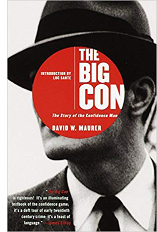 So I wish I’d known about David W. Maurer’s 1940 book The Big Con: The Story of the Confidence Man. It’s hard-boiled reportage in the vein of Courtney Riley Cooper’s flinty Here’s to Crime (1941). Maurer introduces us to a repertoire of grifts that will nimbly extract dough from the mark (aka the fink).
There are small-scale operations (the short con), as well as complex ensemble efforts using, naturally, the Big Store (fitted out with a fake racetrack wire). The scam shown in The Sting (1973) is a Big Store con. Maurer provides a sociological study as well: “Confidence men, like civilians, mate once or more (usually more) in their lives.” I don’t know exactly how I would have worked in a footnote to The Big Con, but I would have tried.
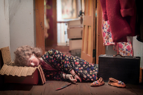
While Maurer was writing The Big Con, something more sinister was going on. In her four-story farmhouse, Frances Glessner Lee was laboring over the Nutshell Studies of Unexplained Death.
These were crime scenes presented on an itty-bitty scale. Little corpses—stabbed, drowned, hanging—are surrounded by the most banal furnishings. Exquisitely miniaturized chairs, rugs, lamps, beer bottles, calendars (“Corn Products Sales Company”) surround the pathetic figures. A woman stares up from a bathtub alongside tiny towels, hanging socks, and even a simulacrum of tap water endlessly gushing. Frank Harris is found drunk and crumpled in front of a saloon; the next scene shows him dead in his cell. What happened?
Ms Lee, a wealthy devotee of criminal investigation, recreated these grim tableaus as audio-visual aids for police training. Exactly how useful they were as pedagogy isn’t clear. The imagery recalls classic mysteries, and it’s not surprising that Lee was a friend of Erle Stanley Gardner, creator of Perry Mason. Yet her scenes have a creepy melancholy quite alien to Golden Age puzzle plots. As a testimony to the 1940s fascination with aestheticized homicide, they’re close to Weegee or Chester Gould. But they’re rendered as fastidiously as a Joseph Cornell box. I see in the Nutshells the populist Surrealism that led, at the other end of the scale, to Wisconsin’s House on the Rock (which began construction in the 1940s).
Corinne May Botz is the David Fincher of the Lee oeuvre. Her camera in The Nutshell Studies of Unexplained Death gets deep into the scene and renders the most upsetting images with a cold precision that matches the staging. These bits of cloth and plastic, sculpted and arranged with maniacal precision, make death at once childish and bleak. Blown up in Botz’s photos, the scenes radiate anxiety and menace. Dollhouse noir?
Frozen movies
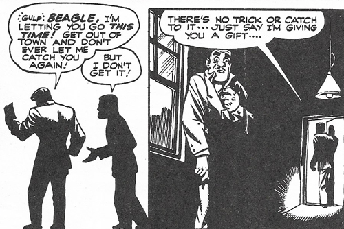
Will Eisner, “Beagle’s Second Chance,” Spirit Comics (3 November 1946).
In Reinventing Hollywood I suggest that techniques we find in the films have their counterparts in popular novels, short stories, plays, and radio shows. Artists in these media were also exploring shifting time frames and viewpoints, voice-over narration, and other devices. I called it the multimedia swap meet, where mass-culture wares were available for use and revision (thanks to the variorum).
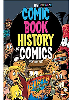 A Christmas gift from alert programmer Jim Healy reminded me of my neglect of a major medium. Jim gave me the wondrous Comic Book History of Comics by Fred Van Lente and Ryan Dunlavey. Each teeming page is jammed with facts, figures, and follies from the history of American comic art, illustrated with frantic drawings and exploding panels. As a comics fan, I should have mentioned how the narrative strategies I traced in film have counterparts in many of the trends Van Lente and Dunlavey cover.
One example is shown at the top of today’s entry: an effort toward optical POV in Will Eisner’s The Spirit. Eisner renders almost all the panels on that page as subjective. At the time, films were exploring the same idea for certain scenes (e.g., Hitchcock’s work), for long stretches (Dark Passage, 1947), and for nearly the whole movie (The Lady in the Lake, 1947).
Of course Eisner’s Spirit tales evoke noir visuals as well–and become more noirish as the Forties go along, at least to my eye. Other cartoonists, particularly Chester Gould and Milton Caniff, push toward the steep compositions and chiaroscuro lighting we find in the films. I’m inclined to say that the movies got there first; I argued in The Classical Hollywood Cinema that noirish visual designs were often recruited for scenes of crime and mystery in the 1920s and 1930s. (A blog entry found examples from the 1910s.) I suspect that artists of the comics adopted those schemas when they started to make cops-and-robbers strips. By the 1940s, though, with Eisner and others, the visual dynamism pushed beyond what we see in most films. Except, as always, for Welles: Mr. Arkadin seems an Eisner comic brought to life.
Vanilla noir
The Man Who Cheated Himself (1950).
Noir is a tricky category because it’s a cluster concept. It can refer to visual style, matters of narrative or narration (haunted protagonists, plays with viewpoint), genre (drama, not comedy), and themes (betrayed friendships, dangerous eroticism, male anxiety). Take away one dimension and you might still be inclined to call the movie a noir. Beyond a Reasonable Doubt (1956) has a noir plotline, but its disarmingly drab images mostly lack the low-key look. And maybe someone would call Murder, He Says (1945) a noir comedy.
A good example of mild noirishness is The Man Who Cheated Himself (1950), now made available in a handsome UCLA restoration from Flicker Alley. Ed Cullen is a tough homicide cop lured by a rich woman into a murder plot. He helps her cover it up, but his younger brother, just starting out in the police force, gets too close to solving the case.
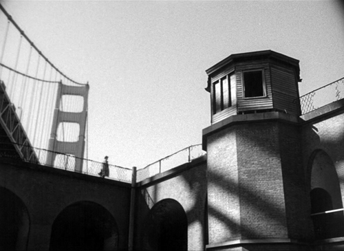
The action climaxes in a vigorous showdown in San Francisco’s Fort Point compound. Director Felix Feist, who gave us the better-known The Devil Thumbs a Ride (1947) and The Threat (1949), exploits this impressive location.
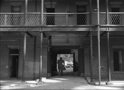
Most of the film is more soberly shot, but one long take of an interrogation uses the typical Forties image: a low-slung camera, figures deployed in depth and rearranged as the pressure intensifies.
The Blu-ray release includes a well-filled booklet and two excellent documentaries. Brian Hollis pinpoints the use of San Francisco locations and has interesting comparisons with Vertigo. A second short provides background on the participants and the film’s production, with shrewd remarks on the film’s casting by Eddie Muller. I was also pleased to see that the film, full of smokers, includes Hollywood’s favorite brand of the Forties, Chesterfields.
From Sunrise to Moonrise
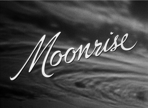
Moonrise offers a different negotiation of noir conventions. The Criterion Blu-ray release, produced by Jason Altman, makes this 1948 classic available in a much better version than I’ve seen before. I discuss the opening in Reinventing, taking it as an example of a deeply subjective montage sequence, and I posted the clip online as a supplement.
After knowing the film for years, I expected that the 1946 source novel by Theodore Strauss would have some of the delirious prose we get in Steve Fisher’s I Wake Up Screaming (1941). Strauss wrote film journalism for the New York Times, so it seemed likely he would incorporate some of the pseudo-cinematic techniques of voice-over, subjectivity, and the like, as do other crime novels I mention in Reinventing. Instead, the storytelling is standard hardboiled. Here, for instance, is Strauss sketching the buildup of grudges that leads Danny to kill his long-time nemesis Jerry:
Every time his fist smacked into Jerry’s soft side or smashed Jerry’s mouth against his teeth Danny knew he was paying back. He was paying back for that first day at grade school when he was the new kid and Jerry had whipped him with the whole playground backing him. He was paying back for the night Jerry and his gang took him into the alley and tarred him because Jerry said he’d squealed to the principal. He was paying back for the scar on his shoulder left by Jerry’s cleats in scrimmage seven years ago. He was paying back for every dirty crack jerry had ever made about him or his father in public or private, to his face and behind his back. Paying back. Paying pack good.
Borzage’s movie turns this compact backstory into something much more hallucinatory.
The montage intersperses a hanged man with vignettes of his son being bullied from childhood on. First the rippling miasma seen under the credits gives way to blobs appearing as if in reflection. The camera reveals them as mysteriously projected on a wall (or is it a screen?), and then it picks up feet stalking toward the gallows.
Witnesses are revealed standing in the rain, and the camera rises to show the execution as shadows flung onto the wall/screen.
It seems more of a feverish childhood vision of the hanging rather than any veridical presentation. Cut to a view of a baby with a doll dangling over his crib. This traumatic image is followed by scenes of jeering schoolboy cruelty. (“Danny Hawkins’ dad was hanged!”)

It’s a murky, delirious passage. Its tactility, with mud smeared into Danny’s face, admirably prepares us for a film steeped in swamp water and dank foliage. Here, as elsewhere, 1940s filmmakers are rehabilitating the expressionist devices of late silent film.
The rest of the film doesn’t present such overpowering imagery, but by continuing the opening sequence in the present, following Danny as he drifts past a dance pavilion, the narration makes Danny’s fight with the bully Jerry a furious culmination of all the indignities he’s suffered.
The plot traces a familiar Forties trajectory, following a flawed but not despicable man driven to conceal a crime. In the course of his evasions, he tries to make a life with a compassionate woman. There are many wonderful scenes, including a suspenseful ride on a ferris wheel and a lyrical dance in an abandoned mansion. The lawman tracking Danny comes off as gentle and compassionate. The rippling imagery of the opening recurs in the background of shots, as if the swamp were waiting to claim Danny. As Hervé Dumont points out in a bonus conversation with Peter Cowie on the Criterion disc, all this gloom eventually clears to arrive at a sun-drenched resolution quite different from your typical noir payoff. (Though it’s faithful to the novel, as indeed most of the film’s plot is.)
This time around I was struck by the delicacy of Frank Borzage’s direction in the less flamboyant passages. This master of silent cinema knows how to let a pair of hands show distress, an effort toward tenderness, and then rejection.
Borzage was most famous for his feelingful melodramas Humoresque (1920), Seventh Heaven (1927), and Street Angel (1928). He made those last two features at Fox while F. W. Murnau was there, and it’s probably not too much to see the brackish mist of Borzage’s 1948 film as reviving the look of the nocturnal countryside scenes of Sunrise (1927).
Some shots might almost be homages to Murnau’s film.
The compositions remind us that the 1940s deep-focus style isn’t far from the wide-angle imagery Murnau pioneered in the silent era. Although Strauss’s novel gives the Borzage film its title, we’re free to imagine Sunrise (in which the moon figures prominently) as a prefiguration of Moonrise, in which we never see the moon rise.
A final thanks to all who have picked up a copy of Reinventing Hollywood. Apart from its arguments, I hope that it steers you toward some new viewing pleasures.
Film rights to The Silent Patient, whose author has an MFA in screenwriting, have been sold to Annapurna and Plan B. Amy Adams is set to star in The Woman in the Window, from Fox 2000.
It seems that The Woman in the Window owes a debt to more than movies. A detailed profile of its author in The New Yorker suggests that exposure to Highsmith’s Ripley novels at an impressionable age can have serious consequences, especially if you wind up among the Manhattan literati.
Robert C. Harvey offers a careful analysis of Eisner’s Spirit story, “Beagle’s Second Chance,” in The Art of the Comic Book: An Aesthetic History (University Press of Mississippi, 1996), 178-191. Interestingly, the chapter is titled, “Only in the Comics: Why Cartooning Is Not the Same as Filmmaking.”
The most comprehensive book on Borzage’s career I know is Hervé Dumont’s de luxe edition Frank Borzage: Sarastro à Hollywood (Cinémathèque Française, 1993). An English translation was published in 2009.
The following errors are in the hardcover version of Reinventing Hollywood but are corrected in the paperback.
p. 9: 12 lines from bottom: “had became” should be “had become”. Urk.
p. 93: Last sentence of second full paragraph: “The Killers (1956)” should be “The Killing (1956)”. Eep. I try to do the film, and its genre, justice in another entry.
p. 169: last two lines of second full paragraph: Weekend at the Waldorf should be Week-End at the Waldorf.
p. 334: first sentence of third full paragraph: “over two hours” should be “about one hundred minutes.” Omigosh.
We couldn’t correct this slip, though: p. 524: two endnotes, nos. 30 and 33 citing “New Trend in the Horror Pix,” should cite it as “New Trend in Horror Pix.”
Whenever I find slips like these, I take comfort in this remark by Stephen Sondheim:
Having spent decades of proofing both music and lyrics, I now surrender to the inevitability that no matter how many times you reread what you’ve written, you fail to spot all the typos and oversights.
Sondheim adds, a little snidely, “As do your editors,” but that’s a bridge too far for me. So I thank the blameless Rodney Powell, Melinda Kennedy, Kelly Finefrock-Creed, Maggie Hivnor-Labarbera, and Garrett P. Kiely at the University of Chicago Press for all their help in shepherding Reinventing Hollywood into print.
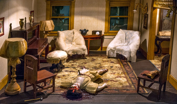
The Nutshell Studies of Unexplained Death: Parsonage Parlor, by Lorie Shaull.
Eep, omigosh, urk, smerp, and other Archie epithets
DB here:
Not all cinephiles are comics fans, but quite a few are. I guess it’s partly a matter of the Adolescent Window, and partly an intuition that both are forms of what Will Eisner calls “sequential art.”
For my part, a Boomer childhood spent with Nancy and Little Lulu and Scrooge McDuck was followed by a boyhood fastened on Superman and Batman. Then came the cutoff. I went to college as the Marvel Universe was populating, and I never got into Underground Comix. Only Krazy Kat stayed with me through my college years.
 In the 80s Kristin and I followed young talents like Matt Groening, Berke Breathed, and Lynda Barry, while becoming fans of McCay. When I encountered Eurocomics, particularly the Clear Line style and its heirs, I perked up. Joost Swarte (and here) was a special favorite of ours. At about the same time I revisited the old stuff, like Cliff Sterritt. During the 90s and 00s, I tracked the emergence of Ware, Clowes, and other independents.
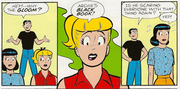
Somewhere in all this, Archie abides. I can’t remember when I started reading him, or when I stopped, but he was for me, as for many others, simply and permanently there. Only when I accidentally learned in 2009 that he was to marry Veronica did I go back to him. Finding an interesting variant of the three-roads motif of folklore, I whipped up a blog entry. I added some thoughts about the skillful graphic design of Bob Montana’s 40s work, but in the process I was too dismissive of the later decades chronicling life at Riverdale High.
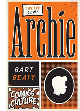
I realize my error now thanks to Bart Beaty’s wonderful Twelve Cent Archie. It’s a critical and historical study of Archie’s world from December 1961 to July 1969, a period when the comics sold for a princely $.12. That’s also the period, Beaty maintains, when the books’ most skilful writers and artists were at work: Stan Lucey (the Archie titles), Dan DeCarlo (Betty and Veronica), and Samm Schwartz (Jughead). Beaty read every book in the nineteen series, over 900 volumes in all. This admirable undertaking yields funny and enlightening results. It’s one of the best books of comics criticism I’ve ever read.
The Archie Machine
For many of us, Archie is surpassed only by Nancy in the Bland Storytelling Sweepstakes. Archie is a freckle-faced guy on the make, rich girl Veronica alternately two-times him and flies into jealous rages, and Betty pines for Arch from afar. Archie’s rival Reggie tries to gum everything up, while Jughead watches with a mix of scorn and indifference. The plots are filled with deception, misunderstandings, horrible coincidences, and slapstick. Needless to say, the adults—teacher Miss Grundy, principal Mr. Weatherbee, Coach Kleats, Archie’s parents, Veronica’s dad Mr. Lodge—don’t have a clue.
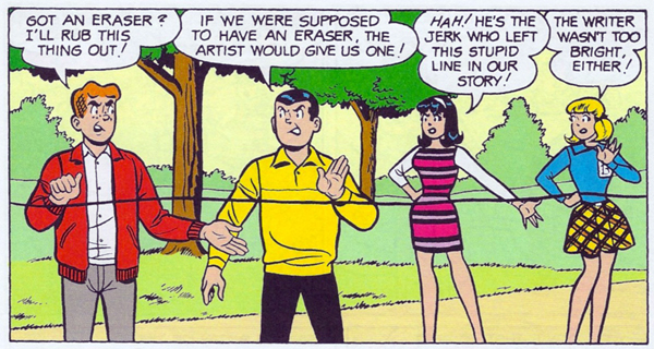
The saga is so cut-and-dried that the makers could publish a story called “How to Write Comics” (1965), in which the moves are laid out with daunting clarity.
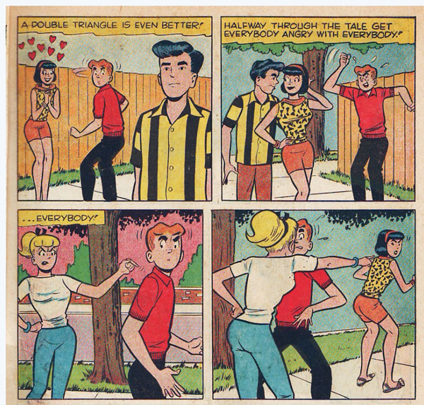
These tips remain good advice for plot-making. Had Beaty done no more than unearth this tale, we’d owe him a lot. As ever in popular culture, though, things aren’t so simple. Beaty shows us why.
At one level he embraces the sheer repetitiveness of it all—what he calls the Archie Machine. Oddly, as he points out, Arch is, narratively speaking, null. He can be a good student or a poor one, a clever manipulator or a klutz. Only a few traits, such as his need for money and his innocent lust for vertiginous kisses, persist. Reacting to situations rather than creating them, neither hero nor antihero, he’s more of an unhero, “a blank space on which stories are written.” As a result, there’s little continuity in the stories. If the plot demands Archie to be good in French, he will be, even if previous stories have shown him to be linguistically inept. Besides, as Beaty asks, “Does Riverdale High even have a French teacher?”
The same goes for Riverdale, which despite its name, seems serenely indifferent to its river, which hardly ever appears. There are four seasons, but the topography is fluid, provided with mountains, beaches, forests, and farm fields as needed. This Borgesian landscape reminds you of the Simpsons’ Springfield, but that municipality has landmarks for ready reckoning. Homer always lives next door to Ned, Moe’s bar is always beside King Toot’s Music Store. Beaty points out that in Riverdale, we can’t say whether Veronica’s house is on Archie’s way to school: sometimes it is, sometimes not. “It depends on the needs of the story.” And unlike Springfield, Riverdale is forbiddingly WASP: “a wish-dream of white privilege and normative sexualities.”
Given this mixture of relentless monotony and casual vagueness, the challenge for the writers and artists was to make something interesting. Here’s where Beaty’s book pulls me in: Artists need to solve problems. He shows that his three main artisans created fun and cleverness out of nearly nothing.
I dimly remember thinking, as a kid, that there was more going on in those books than I could understand, but finally, sixty years later, I get a glimpse of it.
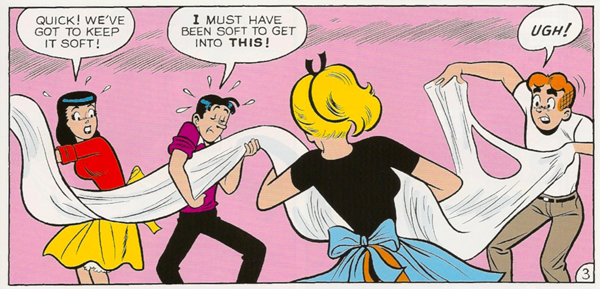
Take Betty. Betty isn’t just the lovelorn also-ran. She plots against “best friend” Veronica, pulls pranks to fool the hapless Arch, and generally acts, as Beaty notes, like a stalker. As for Veronica, she can be quite the schemer too. Pictorially, though, they might be twin sisters. “Betty = Veronica,” one of Beaty’s 100 (!) chapters, asks: “Why does Archie struggle to choose between Betty and Veronica when, for all intents and purposes, they are exactly the same person?” Okay, Betty has a ponytail (to which Beaty devotes another chapter), but you take his point. Even when the girls decide to change hairstyles, they wind up looking cloned.
In scenes like this, you have to believe that the creators were having fun with the standard-issue look of our two heroines. Their cookie-cutter similarity allows for ingenious changes in posture, costume, and expression (see below), and can be a source of gags, as here–when their peekaboo hair styles keep them from seeing a pop star’s passing below them.
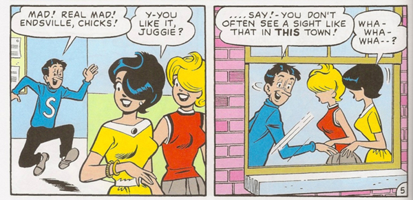
Silly dialogue that made me snicker still does. Reggie strolls along singing, “I love me, I think I’m grand. When I’m with me I hold my hand.” In the summer I graduated from high school, I don’t think I read the following exchange, but I would have mostly understood it.
Archie, at Betty’s door: “Howdy! I’m a mild mannered reporter for a great metropolitan newspaper!”
Betty: “Come in, mild-mannered reporter! Do something super!”
Archie: “I’ll try!” (Kisses Betty off her feet)
Betty (staggered): “Whew! That’s what I call SUPER, man!”
Betty (recovered, ushering Archie to the door): “Let’s go! I’m not a good first violinist, but I can play second fiddle with the best!”
Archie (serious): “You wound me!”
You wound me?! Denying he’s grabbing Betty on the rebound is an act of supreme callousness. No Superman, Arch. Beaty credits some of the best lines to writer Frank Doyle, source of “I never snapped a whipper in my life.” I wonder if Doyle wrote the oft-reprinted Tiger (1961) with its memorable “A boiling, bubbling volcano flames behind this mild-mannered facade.”
Fun lovin’
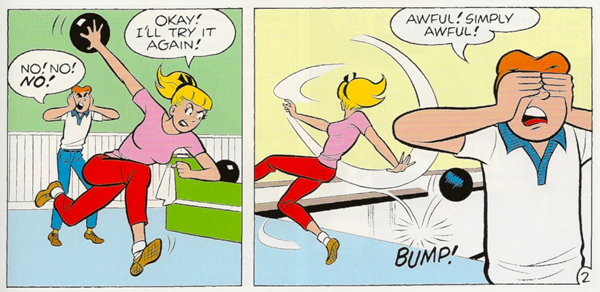
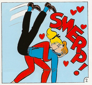
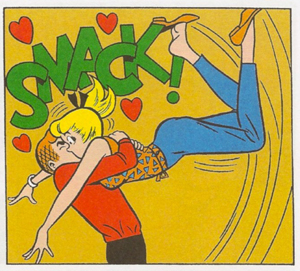
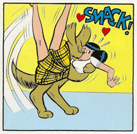
Beaty offers so many ideas and observations that I can pause only on the major thing he convinced me of: the fine comic draftsmanship of Harry Lucey. Beaty waxes eloquent on Mr. Lodge’s anatomical twists and turns across a single page. That called my attention to the fact that Lucey drew funny, especially in scenes of manic action. It’s all in the legs and toes, kids.
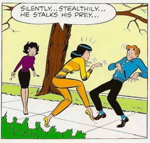
Who expects contrapposto in an Archie comic? But we get it when Betty goes bowling.
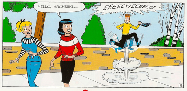
At times we get the classic comic multiple-image stuff that not only cartoonists but animators like Disney and Bob Clampett used in movies. Archie has been spotted carrying his mother’s purse.
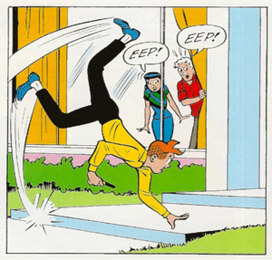
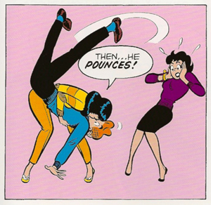
As Beaty shows, Lucey excelled at calisthenic clinches and tornado-intensity smooches. When a character, even a dog, kisses another character, he/she/it sweeps the kissee off his/her feet, literally.
Perhaps because the action is often so violent, Lucey can spare a panel that’s a virtual freeze-frame. Any other artist would have wrapped Mr. Weatherbee, plummeting out of his taffy shroud, in a flurry of speed lines, as above. The near-absence of those lines makes the poor man seem suspended forever before his fall.
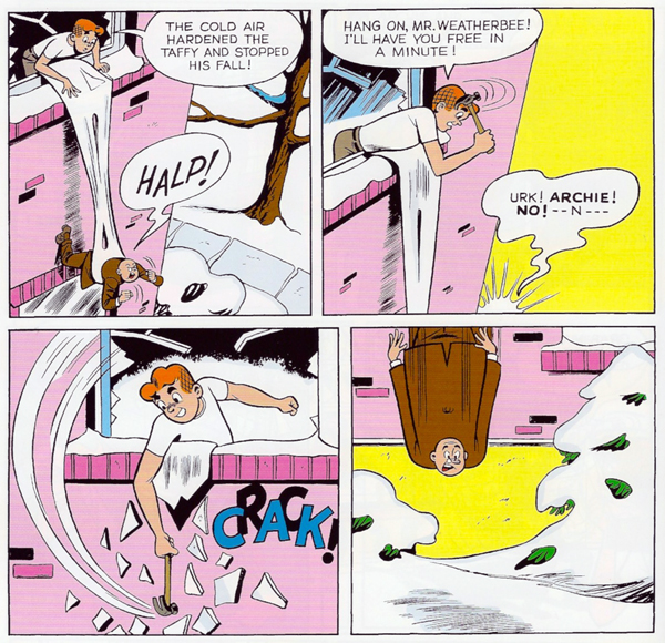
Actually there are speed lines, but they’re so slight and striated they might be creases in the brown suit. Only the sharpest eye will catch the ones around Mr. Weatherbee’s left wrist.
Thanks to Lucey’s technique, in the same panel the hapless Riverdale principal both falls and hangs suspended.
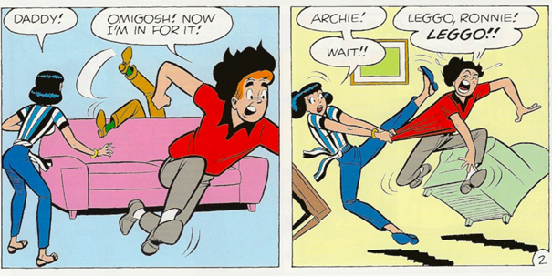
Hergé likeds to keep his scene’s space clear and consistent, modifying it slightly with “cut-ins” and “pans.” Lucey, like other American comics artists, freely changes angle and even character arrangement to create variety and to point up dialogue. In one pair of panels, the change of angle is bold, slicing off half of Archie’s face to give greater emphasis to Betty’s angry arm-thrust and Ronnie’s reaction on the far right.
A slight change of angle can accentuate background action–below, a flattened Archie raising his head. But Ronnie and Betty have already slid toward the foreground as well.
Characters are freely shifted around the frame, usually in obedience to a left-to-right reading of the balloons. But across a page these spatial reorientations can create a vivacious pattern. Against the mild purple chair, for example, Betty’s scandalous polka-dot dress pops out in each panel while dominating the layout as a whole.
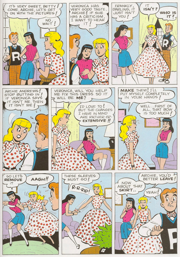
Lucey could do detail too. In any given panel or set of panels, there are little touches that distinguish Betty from Veronica—typically, the lips. Here Betty’s mouth in the second panel seems to catch Veronica’s sideways twist in the first. By the third, Veronica’s mouth has straightened out a little.
Like Archie comics or despise them, but don’t talk about Cathy or Dilbert in the same breath. If you’re a cartoonist, you should be able to draw. If you can infuse your drawing with vivacity, so much the better.
I’ve followed Beaty’s work since his magisterial series, “Eurocomics for Beginners” ran in The Comics Journal in the 1990s. His many books are major contributions to comics scholarship. For sheer pleasure, though, nothing of his I’ve read surpasses Twelve-Cent Archie. It’s at once personal–he recalls his childhood encounter with a cache of Archie books on summer vacation–and analytical in a sympathetic way. Like a lot of good criticism, it opens your eyes while making you smile.
Bart Beaty provides background on Twelve Cent Archie in this interview. A worthwhile review is in The Atlantic Monthly. Beaty talks with indefatigable media analyst and blogger Henry Jenkins at Confessions of an Aca-Fan.
Thanks to Hank Luttrell of 20th Century Books and Bruce Ayers of Capital City Comics for help in finding some Archie stories. Thanks as well to Jim Danky for many long lunches about comics, film, and less important things.
The Archie-marries-Veronica issue I wrote about in 2009 was but the beginning of a long parallel-universe cycle. For a list of the many other revisions in the Archie-verse, see this article. Then there are the Betty and Veronica reboots. The horror cycle, Afterlife with Archie, went in another direction. (And you thought the original kids were zombified.) It’s been a big success. Urk!
In timely fashion, Mad City Movie Guy Gerald Peary has come out with his own contribution, a documentary called Archie’s Betty. He too has reviewed Beaty’s book for The Arts Fuse.
P. S. 23 January 2017: Here’s some fascinating backstory on the “reimagining” or “rebooting” or “reinvention” of the Archie saga. Turns out Forking-Path Archie, which got my attention, was a turning point for the company as well as its protagonist.
Pesky brats, adventurous ducks, and jiving swamp critters

Carl Barks, Ghost of the Grotto (1947).
DB here:
We never need an excuse to write about comic strips or comic books. We’re fans and, just as important, we think of them as having important connections to film. We’re particularly fond of classic funny-animal comics, from Krazy Kat (the greatest) onward. So I got a double dose of pleasure reading Mike Barrier’s Funnybooks: The Improbable Glories of the Best American Comic Books. It taught me a lot about the history of some favorites, and it set me thinking about some overlaps and divergences between film and graphic art.
No Girls Allowed

Like Mike’s Disney book The Animated Man, Funnybooks is at one level a scrupulously researched business history. It explains how publisher Western Printing and Lithography (of Racine, WI) became the center of a thriving industry. Before the mid-1930s the company’s juvenile line came out chiefly under the Whitman imprint. Its illustrated storybooks licensed characters from Disney and comic strips like Dick Tracy and Little Orphan Annie. But Hal Horne and Oskar Lebeck pushed toward creating comic books proper, those inviting items that could compete with the superhero titles that were emerging. Their instincts were sound: Western’s comics, distributed by the Dell company, sold hundreds of thousands of copies.

After several tries at compiling daily comic strips into a single volume, Lebeck turned to original content. In the early 1940s he hired Walt Kelly, Carl Barks, and John Stanley. All had worked in film animation (Kelly and Barks for Disney, Stanley for Max Fleischer), but they adjusted to the demands of more static cartoon art. Into the rise and fall of Western and Dell, Barrier weaves the personal stories of the three creators and their less famous peers. Funnybooks is at once industrial history and a collective biography.
John Stanley, the least known of the trio, was brought on to do stories of Little Lulu, the stolid, crisply-curled girl created by Marjorie Buell. Stanley wrote and drew the entirety of the first book in 1945. The cover presents a heroine as blank as Hello Kitty and a background grid as febrile as a Chris Ware design. Afterward, Stanley chiefly served as writer on the Lulu stories, providing other artists with detailed scenarios and sketches. The panels might be somewhat stiff, but the plots were admirable. Often turning on mean childhood pranks, they were steeped in spite and petty revenge.
I remember enjoying Lulu’s stories, especially their verbal comedy. When Tubby (I think it was) hits Lulu with a pie, he says, “I’ve thrown a custard to her face.” Lulu replies: “I liked breathing out and breathing in.” This was probably a post-Stanley passage, but the fact that I’ve remembered it for sixty years indicates the ways grown-up jokes can stick in the unformed brain. (I knew Boris Badenov before I knew Boris Godunov.)
Mike is very good on the bitter humor that Stanley puts on display as Lulu and her girl pals skirmish with Tubby and his gang of sexist bullies.
His characters were never vulnerable to the suggestion so often made about the children in Charles Schulz’s comic strip Peanuts—that they were adults masquerading as children. They were instead children whose quarrels and schemes echoed adult life.
Lulu evolved, Mike shows, into a trickster who constantly showed up the boys, even as she herself was sometimes slapped down. In one story a rich boy, seeing Lulu longing for pastries in a shop window, doesn’t consider buying her one. Instead, he buys the shop and drops the shade on the window. Walking away on his golden stilts, “he felt very happy because now the poor little girl wouldn’t have to look at things she couldn’t buy.” Another compassionate conservative.
Stanley drew many other characters, including Bushmiller’s Nancy and the ingratiating Melvin Monster. His career fizzled out when comic-book publishing hit hard times in the 1950s. He wound up working in a factory that made aluminum rulers.
Rowrbazzle

Walt Kelly fared better. In the beginning he he worked on many series but he gained fame with his own creation, the enduring swampland of Pogo Possum and his friends. “Ensemble comedy,” Mike calls the remarkable menagerie Kelly assembled.
At first speaking in mangled Southern accents, Pogo, Albert the Alligator, Porkypine, Howland Owl, Churchy la Femme (another joke passing over kids’ heads), and a host of other creatures developed a patois as bizarre as the rodomontade you hear in Coconino County. Characters sang nonsense songs, recited garbled poetry, and engaged in pun-filled miscommunication. The wordplay was enhanced by lettering adjusted to different characters, notably the Gothic script associated with Deacon Mushrat and the circus-ballyhoo font employed by con artist P. T. Bridgeport.
Slapstick went along with the verbal pyrotechnics. Kelly’s fluid line created complex equivalents of movie pratfalls, each one enlivened by fussy details (check the bear’s glasses below) and punctuated by unique sound effects. Barrier reports that in one Kelly comic, a cannon explodes with the sound “FRED.”

In all, eccentricity was the watchword, usually accompanied by food, or characters trying to get it. Albert had a disconcerting habit of accidentally eating his friends. Any of the crew might launch into retelling a classic children’s story featuring the entire cast. These were fairy tales not so much fractured as splintered. In all, it’s astonishing how many pictorial and verbal gags Kelly could cram into four daily panels.

Kelly, a superb draftsman, learned the secret of round forms in his Disney days, and Mike traces how this tendency toward cuteness helped make Pogo a success. But Kelly also had a nutty sense of humor that set him apart from other Western/Dell artists. Mike surveys Kelly’s range, from liberal political cartoons to Our Gang comics, and he treats with care how Kelly’s work included both racial caricatures and more affirmative images of African Americans.
Mike shows how Kelly’s talents outgrew the Dell family. As Pogo and his pals became more popular with intellectuals, the comic-book format proved a rickety vehicle for the artist’s ambitions. Kelly shifted his energies toward daily and Sunday strips that attracted nation-wide attention, not least for satirizing Joseph McCarthy and the Jack Acid (aka John Birch) Society. Pogo’s swamps, I thought at the time, became the liberal counterweight to Al Capp’s reactionary Dogpatch. Like Doonesbury and Calvin & Hobbes later, the dailies became incorporated into best-selling books published by Simon & Schuster. Those collections, to be found on every college kid’s bookshelf in the 1960s and 1970s, made Pogo as much a part of the official counterculture as Frodo Baggins. “We have met the enemy and he is us” became the slogan of a generation.
A peculiar affinity with those damn Ducks

If Funnybooks has a protagonist, it is Carl Barks. No wonder. Unlike Stanley, he both wrote and drew his books. Unlike Kelly, he was anonymous. A modest worker prized by all who knew him, he simply spent year after year turning out the beautifully crafted adventures of Donald Duck, Uncle Scrooge, and their associates. He was, it seems, born to make funny-animal comic books.
 Mike Barrier is a long-time Barksian. His 1981 Carl Barks and the Art of the Comic Book is at once a biography, an appreciation, and a catalogue raisonné of this master of precision artwork. The new book fits some of Mike’s earlier arguments into the wider tale of Western and Dell, but he has also deepened his ideas about the nature of Barks’ achievement. He is able to expand his recognition of Barks’ gift for characterization, mood, and emotional expression.
Instead of merely recycling an iconic character from the Disney animated shorts, Barks gave Donald his own town, Duckburg, populated by a new cast of characters—Gyro Gearloose, Gladstone Gander, the Beagle Boys, and others. Barks, it seems, gained this creative freedom because everyone at Western admired him. Mike quotes one old timer who calls Barks “the genius of the group. . . . He had a particular affinity with those damn Ducks.” Barks once thought he could support himself raising chickens. Fortunately for us, he turned his poultry fascination to comic books displaying elegant storytelling.
Here’s where Mike set me thinking about some relations between film and comics. He points out that a panel often needs to convey the passage of time—not through movement, as in film, but through devices for suggesting interplay among characters and their environment. The staging of the action, the composition, and the placement of dialogue balloons all create a rhythm of reading. Whereas Japanese manga can split an instant into many single, striking images (and thus create very long books), American comics developed ways to suggest the ripening of the story, moment by moment, within each panel.
My last Pogo panel featuring the self-aggrandizing hound Beauregard is a good example.

Without the balloons, the image would be a snapshot, but the balloons produce a temporal flow. The most prominent balloon, filling about a quarter of the frame, reports the frog urging Beauregard to jump. The next balloon that we notice, snuggled against the first, shows the bug trying to exploit the rescue (“Step right up”). Farthest right, Beauregard replies to the bug, talking diagonally past the frog. The speeches are the usual Kelly demotic, incorporating low slang, literary references, and pompous rhetoric, and the order in which we read them and attach them to action accentuates the differences in diction.
Barks could create this sense of rhythmic duration with his ready-made chorus of Huey, Dewey, and Louie. In this panel from “Frozen Gold” (1944), the cascade of balloons assumes a left-to-right reading and creates a pulse capped by Donald’s brusque reply.

Most panels don’t create such a dense sense of time unfolding. That is more commonly achieved through several panels depicting a stretch of action. Or sometimes inaction. In a wonderful passage, Mike discusses how Barks uses a pause to suggest Donald’s growing guilt feelings after sending the odious Gladstone to the North Pole. At first he gloats, but then in a series of panels he starts to question what he’s done.

Barrier takes this page as a turning point in Barks’s evolution as an artist. Eight panels, some without action, convey a deepening psychological state, capped with an image of Donald crushed by his imagination of what could happen to Gladstone. The sense of food stuck in Donald’s craw is nicely hinted at by two motion lines near his neck.
Instead of stretching action by a pause, the artist can accelerate it through ellipsis. Here’s a lovely Barks passage from “Christmas on Bear Mountain” (1947) that’s somewhat filmlike, and yet not. Huey, Dewey, and Louie are checking out a snowstorm and Donald approaches with his telescope. The suggestion is that he approaches their window from off right, with only a few steps until he gets there.

Now comes the first ellipsis: The boys have left the window, and Donald is already spotting what he thinks is a bear. This is very concise storytelling. A sharp change of angle shows another ellipsis: the boys are back at the window identifying the squirrel.

In the “cut” between panels 3 and 4, Donald has disappeared. Where’d he go? The next panel shows us.

The jumps in time are covered by the smoothly varied compositions: 1 and 2, sitting side by side, flow neatly, while 3 and 4, overlapping pictorially, actually cover a time gap. The gap is filled by panel 5, a nice variant on what we saw in 1 and 2. You’d seldom find cuts like these in a film, though I’d welcome somebody trying.
I don’t want to give the impression that Funnybooks is a theoretical study. Mike Barrier, who has thought seriously about the aesthetics and history of comics for fifty years, has given us another precious historical account of this extraordinary popular art and three of its masters. It’s up to us to recognize how his discoveries can shed light on pictorial storytelling generally.
P.S. 28 April 2015: Funnybooks has been nominated for an Eisner Award. Congratulations to Mike! Another fine nominee is Thierry Smolderen’s The Origins of Comics: From William Hogarth to Winsor McCay (University Press of Mississippi), translated by Bart Beaty & Nick Nguyen.
My illustrations are drawn from The Best of Walt Disney Comics 1944 and The Best of Walt Disney Comics 1947 (Western Publishing, n.d.); Walt Kelly, Pogo: The Complete Dell Comics, vol. 2 (Hermes, 2014); Walt Kelly, Pogo: The Complete Syndicated Comic Strips, vol. 2: Bona Fide Balderdash (Fantagraphics, 2012); and Little Lulu Color Special (Dark Horse, 2006). The model sheet of Donald heads comes from Mike Barrier, Carl Barks and the Art of the Comic Book (M. Lilien, 1981), 43.
Thanks to Hank Luttrell of Twentieth Century Books for helping me find some rare items. And be sure to check Mike Barrier’s encyclopedic website. His 23 April entry rounds up several reviews of Funnybooks.
If anyone reading this doesn’t know Scott McCloud’s superb surveys of the art and craft of comics, I should mention Understanding Comics (Morrow, 1993) and Making Comics (Morrow, 2004). Both books contain many observations on how comics manipulate time.
Looking back at my blog entry on Tintin, I think that the sense of time unfolding within the frame is what Hergé was getting at when he picked a certain image of Captain Haddock as the essence of his method. In the same entry, I suggest that Hergé was creating continuity and ellipses in ways similar to Barks’s Bear Mountain story. Still, Hergé offers more tightly constrained choices of angle and less drastically changing compositions.


