 [1]
[1]
DB here:
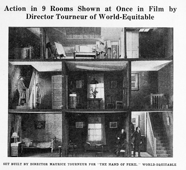
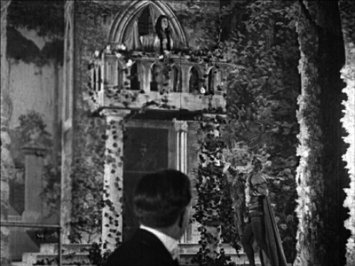
The Hand of Peril (1916) was trumpeted as something new in movie storytelling. It avoided the “cut-back”—that is, crosscutting between different lines of action. In this film, according to the Motion Picture News story above [2], “nine rooms of a house are shown, with action occurring in each room simultaneously. . . . The action occurring in one room . . . would have to be ‘flashed back’ were the nine rooms not shown.”
Variety found the innovation valuable for pacing. The movie “unfolds in the first four reels with the speed of a race horse. The suspense is constant and there isn’t any let-up whatever until the last few hundred feet.” It’s not clear whether the whole action took place in the house, but for the scenes that did, it appears that the cutaway set served a reference point, a sort of macro-establishing shot. This view gave way to cut-in closer views of the scenes in specific rooms.
Another trade journal noted: “The experiment is quite novel and attractive and fits in admirably in the story, but if it will prove of general worth cannot be told yet.” Now we can tell. This was a road not taken. Crosscutting remained in force, being far more cheap and flexible than dollhouse sets.
No copies of The Hand of Peril are known to have survived. Yet the fact that it was made suggests just how energetic the 1910s were in raising striking creative possibilities—some of which became conventional, some of which fell by the wayside. Seeing this sifting and winnowing at work was a constant delight during my recent stay in the Kluge Center at the Library of Congress [3]. Watching nearly a hundred American features from 1914-1918 drove home to me how excitingly strange movies can sometimes be.
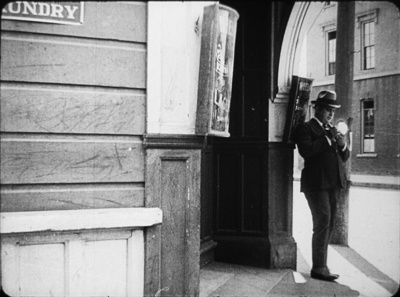
On the one hand, the conformist side of the films was there in abundance. Most of what I encountered were variants of an emerging “classical Hollywood cinema,” as they (we) say. Some efforts were crude, some smooth, but you could tell what the filmmakers were going for, and it was a thrill to see obscure films effortlessly exploiting schemas that would become central to our films. What a kick to see, in The Sign of the Spade (1916), a detective using a hand mirror to trail a suspect, with beautiful control of POV, frame composition, and rack-focus.
 [4]
[4] 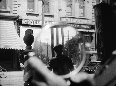 [5]
[5] 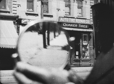 [6]
[6]  [7]
[7]
Hitchcock, eat your heart out. Well, wait until you start making films.
Yet looking for norms sensitized me to non-normative things—not merely clumsy efforts, but genuine attempts to try something different. Different and, to our eyes, often odd. American features of the 1910s include cuts and framings and camera moves and lighting choices and performance bits that no one now could imagine using.
My viewing companion James Cutting compared the week’s worth of films he saw to the Cambrian explosion in evolution, a period where all manner of organisms burst forth in profusion—before selection pressures wiped many out. While filmmakers were mastering classical plotting and continuity style, lots of other stuff was going on.
Have a look. Actually, several looks.
Widescreen, no. Tallscreen, yes.
 [8]
[8]
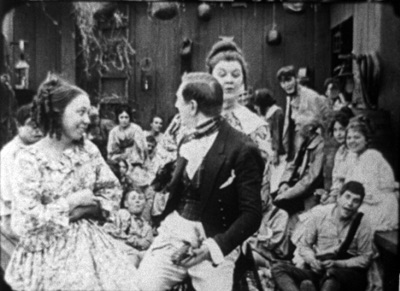
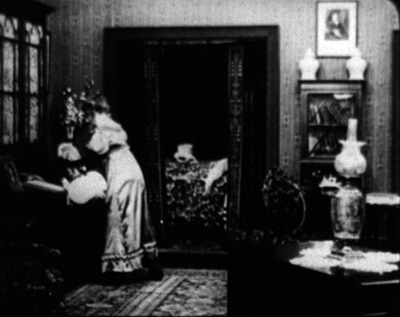
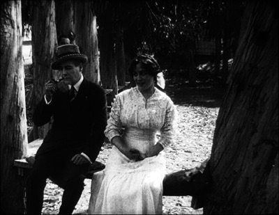
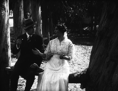
Ready Money (1914).
In this shot, the story action is taking place at the nightclub table, but the society types gathered there are overwhelmed by all the hubbub around and above them. And we aren’t given closer views to help us sort it all out.
In all periods of film history, directors usually tried to center the action. Yet in early years, they sometimes favored framings that would today be considered strangely decentered. One of my favorite tactics from the ‘teens involves putting important elements in the bottom of the frame, notably in extreme long shots. In The Spoilers (1914), Cherry flops back in her saddle when she sees the devastated mining camp.
 [9]
[9]
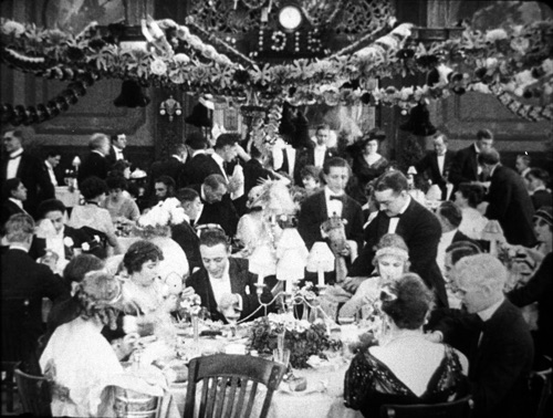
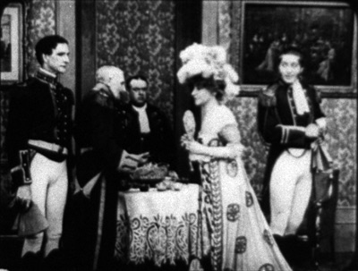
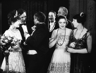
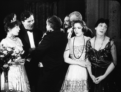
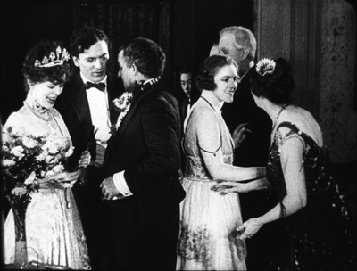
At the big reception in The Sowers (1916), a modern director would have put Paul and the dignitaries he greets in the foreground, and let Princess Tanya descend in the distance. But William C. de Mille creates a vast vertical composition, setting Paul in his braided uniform in the lower third of the frame and putting Tanya far back on the staircase.
 [10]
[10]
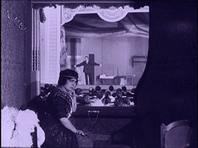
Such top-heavy shots look odd to us, but they have a sort of grandeur, and the taste for them can be acquired. You can see a more intimate example in the fine recent release of Thanhouser films restored by the Library of Congress [11]. The opening sequence of The Picture of Dorian Gray (1915) shows Dorian at the theatre, in a box in the foreground with Romeo and Juliet playing onstage behind him.
 [12]
[12]
Even in the teens, I think this is an outlier. Most theatre scenes are handled with cutting to reverse angles of the audience and the onstage players. When there’s a box in the foreground, it’s usually anchored as such, as in Feuillade’s Fantômas (1913) or Willliam Wauer’s Der Tunnel (1915).
 [13]
[13]  [14]
[14]
The strange symmetry of the Dorian Gray composition, aided by putting Dorian’s head along the vertical axis rather than off to the side, and by putting the object of his attention, the actress, directly above him, is really startling. The all-over quality of these compositions usefully remind us that every inch of frame space is there to be used if you have the imagination. We’ll see this hypersaturation of the frame in some later examples, but eventually the tactic would go away. Shots would put the human figures in the center of the format, or in long shots place them gracefully on foreground right or left.
Scene + insert
Both European and American directors of the 1910s employed what I’ve called the tableau approach. Within a fixed camera setup and fairly distant framing, the viewer’s attention is controlled through staging, either lateral or in depth. I’ve given plenty of examples elsewhere of how flexible and precise this style can be. A beautiful example occurs in Lois Weber’s False Colours, which I’ve already analyzed [15] along these lines.
During the years I examined, directors were already discarding this approach in favor of cutting-based ways of guiding our eye. Some freely put the camera at various points around a set or an outdoor scene. (In all national cinemas of the period, we find more variety of camera placement on location than in sets, for obvious reasons.) More common was the tendency toward what was called the “scene-insert” method. A master shot of middle range (the “scene”) would be followed by a closer view of something within that space (the “insert”). Very often that cut would be an axial one—that is, a setup straight along the camera axis. Although sometimes decried as a mistake, the axial cut has been used by filmmakers of all eras.
The corn-husking bee in The Hoosier Schoolmaster (1914) illustrates how a basic tactic of the tableau style may be integrated with the scene-insert method. The new schoolteacher is boarding with Mrs. Means, who’s trying to get him to marry her daughter. As the community gathers (that corn won’t husk itself), Mrs. Means forces her daughter on him. The teacher, though, is more attracted to the demure town outcast Hannah. First, Mrs. Means stands behind the schoolmaster and her daughter. Back to us, she addresses the hayseeds.
 [16]
[16]
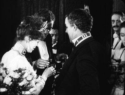
She moves away to show Hannah in the background. In the tableau approach, this blocking-and-revealing action is usually repeated throughout the shot, but here it’s a one-off device. As soon as it happens, the schoolmaster turns to look back.
 [17]
[17]
Now comes an axial cut to Hannah in the background.
 [18]
[18]
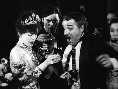
Simple and efficient, this is a good example of the scene-insert method, here enabled by a bit of depth staging. Later stretches of the scene will use the blocking-and-revealing tactic in conjunction with further axial editing.
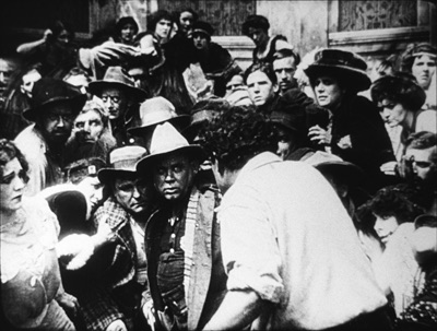
Sometimes the “insert” phase takes a turn that doesn’t look so simple. Consider this shot from The Spoilers (1914). In another wildly decentered framing, the hero Roy Glenister has jumped down from a balcony (upper right) to land on the floor of a big dance hall as seedy as anything in Deadwood. He lands and faces the crowd in the far distance, while the foreground area of gamblers clears away in a panic, so we can see him a bit better.
 [19]
[19]  [20]
[20]
This is a very distant framing, so we get an axial cut in to him crouching before the surly crowd.
 [21]
[21]
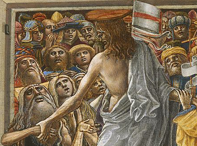
This is a striking insert because in order to give a sense of the massed crowd Roy faces, the director has apparently stacked people up—by height, and perhaps on risers of some sort—so that a welter of faces appear piled up against him. The showgirls at the very top of the frame are on the stage, but the people in the middle were on the same floor as Roy in the master shot. The technique is reminiscent of the stacking of crowds we find in classic Western painting. Here’s a detail from one of the weirdest pictures I saw in the National Gallery, Christ in Limbo [22] by Benvenuto di Giovanni (ca. 1436).
 [23]
[23]
Later filmmakers would presumably have used a high angle to let us see the faces; but then we’d lose the looming effect of Roy’s back in the foreground. Artistic choices are always trade-offs, and here, for the sake of a strong expressive effect, director Colin Campbell has sacrificed spatial realism in a way that probably wouldn’t occur to a contemporary filmmaker.
The shift from long shot to a closer view here is pretty extreme. At several points in my viewing I noticed that when using the scene-insert method, filmmakers often didn’t try for a smooth gradation of shot scales. The old triumvirate long shot/ medium shot/ close-up aims to lead the viewer gradually to the heart of the action, but in the 1910s directors seemed almost impatient to get to the meat of things.
So, for instance, in William Desmond Taylor’s Pasquale (1916), the good-hearted hero is trying to keep up appearances at the wedding of the woman he loves. We get a cut from a very long shot to a tight close-up, accentuated by the vignetting that isolates Pasquale’s face. No medium-shot eases the transition.
 [24]
[24] 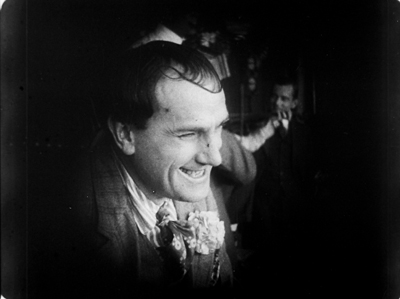 [25]
[25]
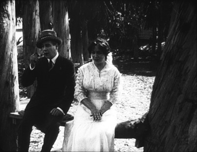
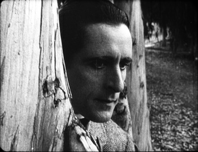
For modern audiences, I think this is a bit of a bump–but nothing compared to the scene-insert leap we get in Vanity Fair (1915). In what is everybody’s idea of what those old movies look like, Becky is exploring the parlor. It’s a very distant shot, atypical for an interior of this scale. And the abrupt jump to a very close insert shows not Becky but the photograph she studies.
 [26]
[26]  [27]
[27]
This is quite odd. Even stranger, the camera stays back from Becky throughout the film.
 [28]
[28] 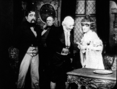 [29]
[29]
It’s unusual for an American movie of 1915 to avoid inserts, especially since Becky is played by the famous Minnie Maddern Fiske [30], who had popularized the part on stage. Where are the star close-ups, as in Pasquale? Are we dealing with simple incompetence? Apparently not, Variety suggests.
 [31]
[31]
This seems plausible. By shooting most scenes in anachronistic long shots, the director could play down the fifty-something performer portraying a young girl. In the process he could associate the classic story with pre-teens photodramas, which seldom used close-ups. This deliberate anachronism suggests that filmmakers were already aware of the choices of shot scale they now had, and what the scene-insert method committed them to.
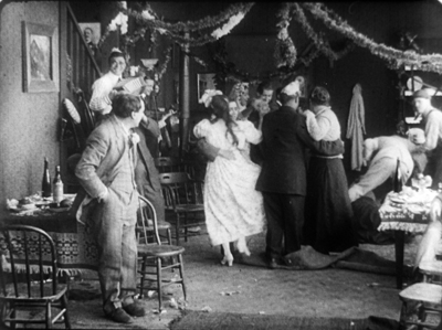
What survives of Weber’s marvelous False Colours offers a great many lessons in the range of 1910s techniques, but one sequence flaunts the all-over long shot and the jolting insert. The conman Bert has persuaded his wife Flo to pose as the missing daughter of the wealthy actor Lloyd Phillips. In this scene, Flo and Phillips have retreated to a park bench to get better acquainted. Bert hides behind a tree to watch them.
This is a pretty standard situation, but it’s handled in an eccentric way. As the couple sit in awkward silence on the bench, in the far left background Bert creeps in. Problem is, you can barely see him: only his hand, on the far, far left center, is visible in silhouette as it approaches the tree, followed by a dark blot. Thanks to Photoshop, I give you the insert that Weber denies us.
 [32]
[32] 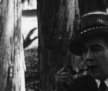 [33]
[33]
Who would see this? Maybe a viewer from the time, trained in different viewing skills–someone used to the frame’s being packed full? I consider this possibility in an older entry [34]. And there’s certainly a slice of light space left vacant to allow for the hand, creating an extreme case of aperture framing [35]. Anyhow, Weber then does what Taylor did with Pasquale. She cuts from the fairly distant shot to a big close-up of Bert peering out from the tree.
 [36]
[36]
Compared to the bare hint of his arrival with the fugitive hand, this strenuous shot is overcompensation. All we needed was a sort of medium shot of him listening, preferably with the couple in the foreground to orient us. That shot comes, but again in an eccentric way. At first, Phillips blocks our view of Bert, so the actor in the rear has to raise his head–creating the impression of floating just above Phillips’ hat. Again, I supply a blow-up.
 [37]
[37]  [38]
[38]
And when Flo, lying, says in a dialogue title that her mother talks of Phillips constantly, Bert’s head jerks up angrily. He’s still stuck atop Phillips’ hat. Another huge close-up reinforces his reaction.
 [39]
[39]  [40]
[40]
Maybe it’s all a mistake? Did Weber screw up a simple scene? Why not just settle Flo and Phillips a little more to the right on the bench, leaving plenty of space on the distant left for Bert to creep behind the tree and peer out, perfectly visible to us throughout? Then, if you insist, you could have the big close-ups of Bert’s reaction? Or did the DP not allow for Phillips’ blocking Bert? (Remember, they didn’t have reflex viewing back then; the viewfinder didn’t show exactly what the lens took in.)
I can’t say. Maybe this is bold, maybe just a botch. But scenes like this in False Colours demonstrate the far-reaching possibilities that people were trying out in the Cambrian explosion of film style.
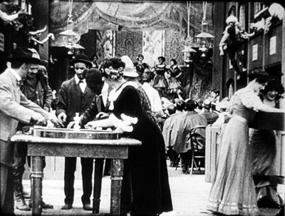
Jam sessions
 [41]
[41]
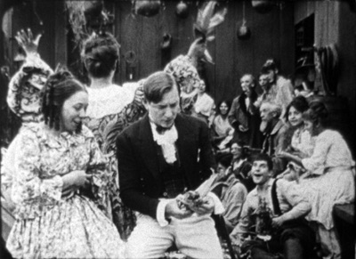
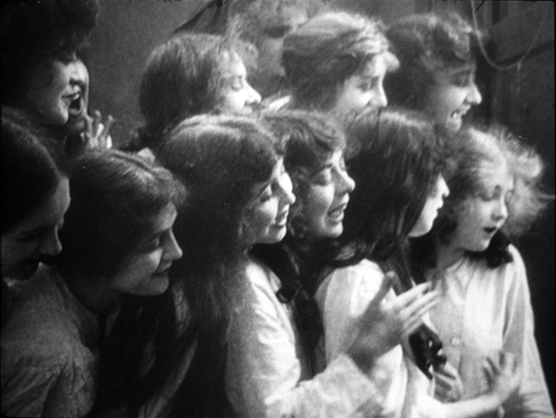
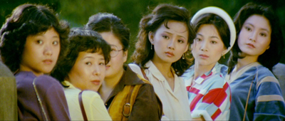
Liberty Belles (1914).
In Ready Money, The Spoilers, and other instances we’ve already seen a penchant for stuffing the frame with figures, props, and items of setting. People at the time apparently noticed it too. Charlie Keil, in his indispensable survey of film style from 1907-1913, writes:
Critics advised against “crowded groupings” for numerous reasons: first, if a massing of characters seemed unnaturally pressed together, it would expose the limits of the shooting conditions and destroy the illusionism that cinema was meant to sustain; second, such unnatural staging would violate the standard of composition derived primary from photography, which stressed balance and order; and third, overly compressed staging might obscure the central narrative action and create problems of comprehension for the viewer.
Widescreen, as I’ve mentioned before, poses problems. How do you fit in the human body? How do you fill up the lateral expanse, or do you leave it empty? The squarer rectangle of the 1.33 (or even narrower) frame of early cinema allowed bodies to be packed in, and we’ve seen a surprising vertical dimension to the compositions. Filmmakers found ingenious ways to jam in their figures, especially when they began moving them closer to the camera. By 1914, with the “American foreground,” the front line of action might get pretty crowded.
The climax of Kindling (1915) shows that Cecil B. DeMille was no slouch at filling up the midshot space and then developing the scene through small gestures and changes of posture. It’s far too long for me to run through here, but I think you get the idea.
 [42]
[42] 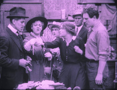 [43]
[43]
 [44]
[44] 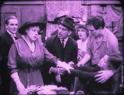 [45]
[45]
The blocking and revealing, the slight changes that hide or unmask someone behind someone else, the tendency for actors to freeze so that one performer’s movement draws our eye: all these tactics of long-shot tableau staging are played out in small compass. Call it a jam session.
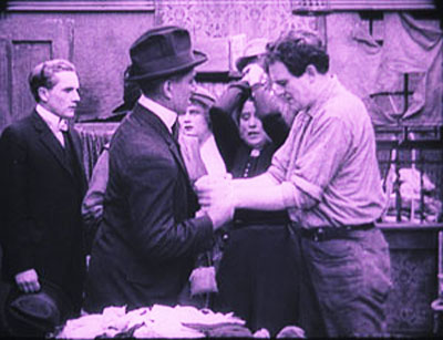
Cecil’s brother William followed suit in a film of the following year, The Heir to the Hoorah (1916). This comedy of class differences centers on three newly rich gold miners, all bachelors. The roughnecks Bud and Bill urge Joe to marry Geraldine so that there will be an heir to their fortunes. Geraldine’s mother, Mrs. Kent, invites the men to a dinner with her swanky friends. For once, the rich folks aren’t snobs but are good-natured folks–and they have to be, for the clumsy ways of Bud and Bill would outrage anyone less tolerant.
William C. de Mille often avoided long shots and instead covered scenes in fairly tight medium shots and plans américains. Just before the guests go into dinner, they’re huddled together in just such a composition. On the left, Bud is chatting with Joe and a fancy lady. On the right, Geraldine and her mother watch. Behind them are the lady’s husband and Bill. At first the action is on the right, as Mrs. Kent frets about the deplorables Geraldine has brought into the house.
 [46]
[46]
Faces now get diced and sliced, masked and shifted. The gag is set up by servants emerging out of distant darkness. A small aperture opens up so we can see Bud and the others on the left picking up their drinks from a tray.
 [47]
[47] 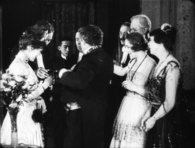 [48]
[48]
The insert is a surprisingly tight long-lens shot of the group on the left, though with others hovering around the right frame edge. Drinks are taken, a toast proposed.
 [49]
[49] 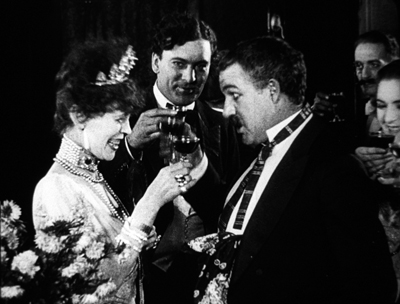 [50]
[50]
And Bud proceeds to spill his drink on the lady, who responds without rancor.
 [51]
[51] 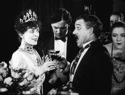 [52]
[52]
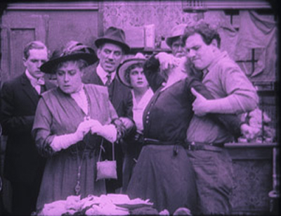
Another insert shows a reaction shot of Bill and the lady’s husband, also unflapped, before cutting back to the full “scene.” By now, with waiters coming out from behind foreground figures, there are nine characters crammed into the shot.
 [53]
[53]  [54]
[54]
There’s more to come when Bud’s spur gets caught in the lady’s gown, but you get the idea. Axial cuts carve into this mob and shove bits and pieces of faces, bodies, and gestures out at us. The principles of tableau staging are squeezed down into medium shots. William C. de Mille was a pioneer of multiple-camera shooting for ordinary scenes, and he may well have used a separate camera for the long-lens shots (even though the position of Geraldine on the right is wildly cheated between shots 2 and 3 and 3 and 4).
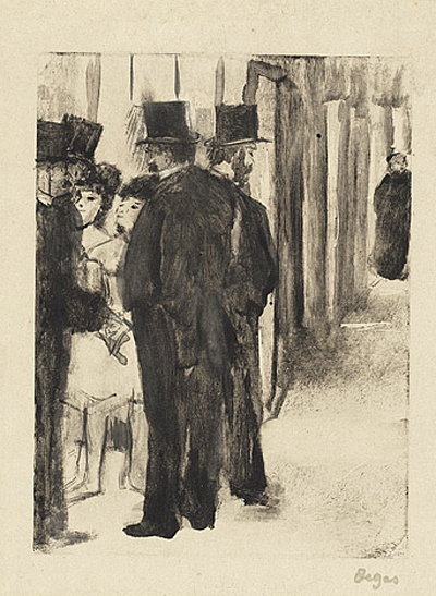
Later Hollywood filmmakers would favor much cleaner images of groups, with heads evenly spaced out across the frame. But visual artists had long explored the bunched-faces option. Here, for instance, is Degas’ daringly unbalanced and crowded Pauline et Virginie of 1876.
 [55]
[55]
Yet these somewhat wild experiments weren’t dead ends. They remained artistic possibilities to be explored more, when other filmmakers hit upon them. Altman’s and Jancsó’s crowded telephoto shots revive the packed frames we see in the 1910s, and other filmmakers found artistic rewards in fanning out figures as in the lovely frame above from Liberty Belles. Those cute girls come back to life in Hou’s Cute Girl (1981) and Millennium Mambo (2001).
 [56]
[56]  [57]
[57]
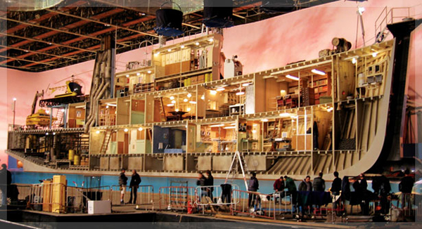
Even The Hand of Peril‘s dollhouse set didn’t go absolutely extinct, as admirers of Jerry Lewis (The Lady’s Man), Godard (Tout va bien), and Wes Anderson (The Life Aquatic with Steve Zissou) know. Film style, it seems, knows few dead ends, only detours.
There’s a tendency to think that the history of style constitutes an ever-expanding menu of options. Today, you can cut the way Griffith or Eisenstein or Godard did, right? A similar case has been made for technological change. For decades it was much harder to make a color film than a black-and-white one, but now filmmakers can pursue either option. Most filmmakers in the silent era couldn’t make a talkie, but today’s filmmakers can go silent if they want.
Yet it’s proven surprisingly hard to make a contemporary film look and sound like one from an earlier era. On the sheerly technological front, it’s not easy to recapture the tonal range of orthochromatic nitrate, or the sound texture of early talkies, or the saturation of Technicolor. As for style—how you stage, how you cut, how you frame, and so on—again certain things are hard to recapture. It seems that certain stylistic possibilities, like purely technological ones, have been taken off the menu.
Why is style so hard to recapture? Some elusive nuances of lighting and color depend on technological factors we can’t recreate. IB Tech can’t easily be mimicked with a dropdown menu. On other dimensions, the range of creative options in earlier eras just doesn’t come easily to today’s filmmakers. But maybe by looking at those films we can reconstruct that range. We might also encourage filmmakers to take the sort of chances people did at the very beginning of what we have come to call Hollywood.
This is, I think, my last post for a while on my 1910s adventures at the Library of Congress. I must move on to other projects. As ever, I’m tremendously grateful to the John W. Kluge Center, and particularly its director Ted Widmer, for enabling me to conduct this research under its auspices. A special thanks to Mike Mashon of the Motion Picture Division, and all the colleagues who have been helping me in the Motion Picture and Television Reading Room: Karen Fishman, Alan Gevinson, Rosemary Hanes, Dorinda Hartmann, Zoran Sinobad, and Josie Walters-Johnston. Thanks as well to James Cutting for enjoyable discussion as we watched old movies together.
The new collection of Thanhouser films [11] that includes The Picture of Dorian Gray also provides an enjoyable tour of the LoC Culpeper facility I blogged about [58] in the spring.
I’m grateful to Charlie Keil for ideas and help with sources. The passage I’ve cited from him is in Early American Cinema in Transition: Story, Style, and Filmmaking, 1907-1913 [59] (University of Wisconsin Press, 2001), 134-135.
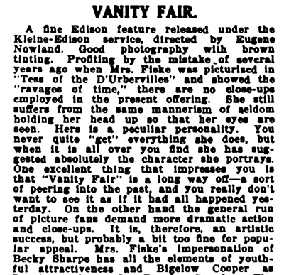
The quotations from Variety come from anonymous reviews of The Hand of Peril [60] (24 March 1916), 24, and Vanity Fair [61] (29 October 1915), 22.
Other entries about my DC viewing are Anybody but Griffith [15], Movies in the mountain, and on the machine [58], Film noir, a hundred years ago [62], and When we dead awaken: William Desmond Taylor made movies too. [63] More generally, see the category of entries on Tableau staging [64] and my books On the History of Film Style and Figures Traced in Light: On Cinematic Staging. The relation of the tableau style to Hou’s work is considered in the latter, as well as here [65].
On the difficulty of replicating older film styles, see our blog entries on The Good German [66] and forging a film [67].
 [68]
[68]
Building the set for The Life Aquatic (Wes Anderson, 2004).